Article

Interactive Web-Based Visual Analysis on Network Traffic Data

1
Department of Computer Science and Information Technology, University of the District of Columbia, Washington, DC 20759, USA
2
Department of Computer Science, Virginia Tech., Blacksburg, VA 22043, USA
3
Department of Computer Science, University of Texas at Dallas, Richardson, TX 75080, USA
4
DEVCOM Army Research Laboratory, Adelphi, MD 20783, USA
5
Department of Informatics, University of Oslo, 0373 Oslo, Norway
6
Department of Computer Science, Bowie State University, Bowie, MD 20715, USA
*
Authors to whom correspondence should be addressed.
Information 2023, 14(1), 16; https://doi.org/10.3390/info14010016
Submission received: 1 October 2022 / Revised: 1 December 2022 / Accepted: 22 December 2022 / Published: 28 December 2022
(This article belongs to the Section Information Security and Privacy)

Abstract

:
Network traffic data analysis is important for securing our computing environment and data. However, analyzing network traffic data requires tremendous effort because of the complexity of continuously changing network traffic patterns. To assist the user in better understanding and analyzing the network traffic data, an interactive web-based visualization system is designed using multiple coordinated views, supporting a rich set of user interactions. For advancing the capability of analyzing network traffic data, feature extraction is considered along with uncertainty quantification to help the user make precise analyses. The system allows the user to perform a continuous visual analysis by requesting incrementally new subsets of data with updated visual representation. Case studies have been performed to determine the effectiveness of the system. The results from the case studies support that the system is well designed to understand network traffic data by identifying abnormal network traffic patterns.

1. Introduction

Since massive amounts of network traffic data are generated daily, understanding them by integrating various scientific and data analysis approaches has received substantial attention in network security. Visualization is one of the approaches that has received an emerging interest in analyzing network traffic data [1]. Visually representing network traffic data with supporting interactive visual analysis is essential to advance network traffic data analysis. Thus, a significant amount of research has been performed to develop cutting-edge visualization approaches to present the patterns and characteristics of network traffic data [2]. However, numerous research challenges have emerged in handling complex network traffic data, manipulating various data attributes, incorporating different analytical approaches, and eventually identifying domain-specific insights from visual representations. Although researchers have utilized various visualization approaches to analyze the data successfully [3,4,5], integration of data analysis with interactive visual analysis is essential to support analyzing such complex network traffic data. Furthermore, visualization techniques can become major roles in analyzing large data sets because they can be applied to every step in data analysis, including initial exploration, hypothesis generation, experimental validation, and final presentation of results [6].
In the visualization community, supporting interactive visualization is emphasized because it assists users in analyzing data more efficiently. Interactive visualization indicates a combination of user interactions with visualizations to enhance the comprehension of data through manipulation and exploration of visually represented data. Commonly used user interaction techniques include selection, filtering, zooming, distortion, linking and brushing, etc. [7]. The user interactions can enable users to control the visual representations of data to increase their understanding of the data and support them in solving domain problems through identifying meaningful information. Although numerous visualization techniques have been introduced in the past, visually representing data along with supporting both interactive data analysis and increased user accessibility has not been fully integrated into network traffic data analysis. Furthermore, adding uncertain information into a visualization has not been emphasized, even if it increases the understandability of network traffic data.
Thus, this paper presents a new web-based visualization system by incorporating various visualization techniques to illustrate network traffic data with supporting interactive functions for the user to conduct an interactive visual analysis of the representation. In detail, the added interactive functions help users select visually represented instances and navigate them through zooming and panning. To present network traffic data, we performed a data wrangling process consisting of data cleaning, data transformation, feature extraction, and uncertainty quantification to design accurate visual representations to assist the user in analyzing the data more precisely. Furthermore, in the visualization system, the user is allowed to initiate data analysis continuously by creating multiple views based on network traffic events that appeared in different time frames. To understand the effectiveness of the system, several case studies have been performed to identify abnormal network traffic patterns. The main contributions of our work are as follows:
  • We designed a new web-based interactive visual analysis system to assist the user in performing a continuous visual analysis with updated visual representation.
  • To the best of our knowledge, our work is the first visual analysis system that utilizes uncertainty quantification and discrete wavelet transform in analyzing network traffic data.
  • We performed a series of use-case studies to determine the effectiveness of the system. The study results prove the usefulness of the system.
The rest of this paper is structured in six sections. Section 2 provides previous studies on utilizing visualization techniques in network traffic data analysis. In Section 3, the conducted data wrangling process is explained. Section 4 includes a detailed explanation about the designed web-based visualization system. Section 5 shows conducted case studies of analyzing network traffic data in consideration of identifying abnormal network events. After providing interesting insights and possible limitations of the system in Section 6, we conclude this paper by providing possible future work in Section 7.

2. Related Work

Visualization approaches have been broadly utilized in network traffic data analysis to support users in exploring network traffic events more effectively through visual representations. Among various visualizations, simple statistical tools along with charts and diagrams have been commonly utilized to support understanding the data distributions of network traffic events [8,9,10,11]. Instead of using simple visualizations, researchers designed new visualization systems to advance network traffic data analysis. For instance, Krokos et al. [12] proposed 2D and 3D network flow visualization by integrating pattern recognition and deep learning. Gove and Deason [13] introduced a flow visualization by integrating Discrete Fourier Transforms. Cappers and van Wijk [14] designed a composite visualization system by creating multiple visualizations, including heatmap, node-link diagram, and bar graphs. Xiao et al. [15] considered upgrading a simple network visualization by adding domain knowledge to help users understand network patterns more clearly through the colored representation of network traffic data. Although various visualization techniques and systems were proposed in the past, the effectiveness of utilizing visualization in network traffic analysis has not been clearly stated. Thus, Ji et al. [1] conducted an in-depth literature review and identified four key approaches to be considered in designing an effective network traffic visualization system, such as data filtration and transformation, pixel-based visualization, graph representation, and coordinated multi-views. They also identified six commonly known and used visualization techniques in security—scatter plot, bar graph, node-link diagram, heatmap, parallel coordinates, and glyph representation—by evaluating necessary requirements to be managed for utilizing the visualization techniques, such as data wrangling, evaluation of visual complexity and visual scalability, and identifiability of abnormal events or activities. Understanding complex network traffic data on static visualization images is difficult for the user to identify meaningful results because the static images deliver limited insightful information. Thus, it is essential to provide multiple user interactions to help the user understand the visualization more effectively.
In network security, several researchers have focused on integrating visualization. Nunnally et al. [16] introduced a visualization module called NAVSEC. It was designed to assist users as a recommender system to investigate experts’ interactions to identify attacks with 3D network security visualization tools. Cai and M. Franco [17] integrated an interactive visualization and clustering algorithm to show anomalous network events. They developed a signature detection algorithm to detect abnormalities by utilizing clustering techniques and presenting them using different forms of glyphs. Theron et al. [18] introduced a new interactive visualization tool called IGPCA that combines Principal Component Analysis (PCA) with a PCA variant called group-wise Principal Component Analysis (GPCA) to help users incorporate a high volume of network traffic data into their analysis in identifying abnormal network events. Since GPCA is good for finding a structural distinctiveness of data, they used both PCA and GPCA to determine possible outliers by removing common outcomes from the results of the two algorithms. Besides the newly designed visualization approaches, utilization of commonly known bar graph, line graph, and hive plot is also broadly used in analyzing network traffic data. For instance, Tremel et al. [19] utilized advanced versions of line and bar graphs to analyze network traffic. They introduced an interactive network traffic analysis tool called VITALflow (Visual Interactive Traffic Analysis with NetFlow). It integrated a clustered time series view with a visual analytics approach to improving the representation of enormous time series data. Angelini et al. [20] introduced a new visual analytics tool called PERCIVAL. Instead of simply showing network traffic data, they emphasized users’ situational awareness of abnormal network events by providing network security status with attack path graphs utilizing IP address information. Although most visualization techniques have been designed as 2D visualizations, Zong et al. [21] proposed a 3D interactive visualization approach to present network intrusion detection data to help users understand machine learning results. They presented different attack types with a 3D decision space supporting ML-based classification. Their approach possesses a unique and interesting idea for analyzing network traffic data. However, 3D visual representation is not broadly considered because of an occlusion problem (e.g., one 3D element blocks another partially) that often makes users difficult to understand visualization results [22].
In addition, researchers identified several concerns that should be addressed when designing a web-based visualization system to enhance the network traffic data analysis. Zhang et al. [23] introduced a simple web-based visualization prototype focusing on interpreting the effects of visualization techniques, such as area charts, Gantt charts, Treemaps, and network graphs, for gaining valuable information from visual representations. They emphasized that combining multiple techniques might help users understand and evaluate network anomalies. Hao et al. [24] implemented a web-based visualization system that supports creating user-configurable charts to analyze network traffic data. They focused on identifying security alerts from malicious activities by extending a charting library (RGraph). The system includes multiple functionalities for supporting users’ analytical processes of analyzing network traffic data. Arendt et al. [25] introduced a web-based decision support visualization prototype, Ocelot, to help cyber analysts to determine network threats and identify affected computers utilizing a circle packing (Petri dish) and a sunburst plot. It allows users to filter network traffic data by constructing a simple AND/OR boolean logic expression for attributes. Since most network traffic data are captured as flow packets (generating PCAP data files) using packet sniffers, analyzing PCAP data often requires a precise understanding of network flow and environment. Ulmer et al. [26] designed a web-based visualization tool to analyze PCAP data by presenting them into multiple views such as timeline, protocol, graph, source, destination, and filter status views [26]. They presented raw data with a table-based view, including timestamps, source and destination IPs, ports, and payload size. Chen et al. [27] introduced an online visual analysis system, OCEANS (Online Collaborative Explorative Analysis on Network Security), that was built using HTML5, D3, and jQuery, to provide multi-level visualization temporal views of IP connections and their detailed connections by combining visual analytics and collaboration features. The events submitted by users constructed an event timeline and graph, allowing other users to review and provide feedback on the identified events. Cherepanov et al. [28] designed an interactive visual tool by combining the classification of network data with a 1D Convolutional Neural Network (CNN). Schufrin et al. [29] designed a visual firewall log analysis system in collaboration with an IT service provider. They designed the system having two interlinked parts by following human-centered design process (HCD).
Table 1 shows a summary of existing web-based visualization systems with emphasizing utilized visualization techniques and evaluation approaches. Most of them emphasized the importance of utilizing multiple user interactions with various visualization techniques to support interactive analysis of network traffic data. Commonly supported user interaction techniques include Brushing and Linking, Selection and Manipulation, and Zooming and Panning. Although time-series data analysis with dimension reduction technique is important in analyzing network traffic data [30], it has not been broadly applied in visualization. We also found that parallel coordinates and scatterplot visualizations are not broadly used due to the difficulty of handling massive network traffic data. Among the different visualization systems, two of them [14,18] are not clearly stated in the paper whether they are designed as web-based visualizations or not. Although visualization offers essential features for users to analyze network traffic data, many studies still have focused on presenting original network traffic data with simple visualization techniques [31,32]. Furthermore, when designing a visualization system, supporting interactive visual analysis needs to be emphasized because it is the key to advancing the network traffic data analysis. Thus, this paper aims to address the limitations by designing an interactive web-based temporal visualization to deliver easy network traffic data comprehension and analysis.

3. Data Wrangling

For designing a network traffic visualization system, applying data wrangling should be considered to represent network traffic events with visual elements more effectively. Data wrangling is a process that focuses on manipulating data into a usable cleaned data form [1,36]. Kandel et al. [36] defined data wrangling as “a process of iterative data exploration and transformation that enables analysis”. It primarily focuses on making data usable for understanding the phenomena of events that occurred within domains. To make the network traffic data become usable forms, we defined data wrangling to have four steps: data cleaning, data transformation, feature extraction, and uncertainty quantification. Detailed explanations about the used dataset and the performed steps as part of the data wrangling process are included in the following subsections.

3.1. Dataset

In this study, we used the CIC-IDS2017 dataset [35] that was created at the Canadian Institute for Cybersecurity (CIC) to address the unreliability of existing intrusion detection datasets because of the lack of current network traffic patterns. As the name indicates, it was captured within a period of five days in 2017. More specifically, it was generated by capturing all network activities from Monday, 3 July 2017 to Friday, 7 July 2017. It includes benign traffic as well as attack traffic patterns. The original full packet payload dataset is about 51 GB. It also provides a processed dataset by a network traffic flow analysis tool (called CICFlowMeter), which includes labeled network flows with time stamps, IP addresses, network ports, protocols, and attack information. In the rest of this paper, we refer to CICIDS2017 to indicate this processed dataset. As shown in Table 2, it includes about 2.8 million network events. Among them, about 0.17% represents abnormal events (about 0.5 million). Each event indicates a single network activity (or instance) captured over the network. Thus, each abnormal event denotes a single network attack. As indicated in the table, no abnormal event was captured on Monday. The dataset contains eighty-five variables, including timestamp and label information. The label includes specific types of attack information.
When performing the data wrangling process, we found errors in the dataset, including inaccurate representation of date and time information and the existence of unknown attacks (not mentioned anywhere in the dataset description). The date information of the captured network traffic data was formatted by following the European style as day/month/year. However, the authors’ computers follow the American style as /month/day/year. Thus, most programming languages (including JavaScript) automatically parse the date information incorrectly. Furthermore, the time information was set incorrectly. For example, the time (“5:30”) was used to indicate afternoon 5:30. Thus, manual interpretation and translation of the data have been performed by referencing the original data description to correct such imprecisely entered time information (e.g., converting 5:30 to 17:30).
Table 3 describes normal and abnormal network events that appeared each day in the CICIDS2017 dataset. We observed several unknown attacks when evaluating the abnormal events with our visualization system. The unknown attacks indicate that they are not described in the dataset description. By conducting an additional data wrangling process, we found numerous network events that could be considered unknown attacks. The conducted case study of discovering the unknown attacks with the system is included in Section 5. We also found that several attacks mentioned in the dataset description did not exist. They include infiltration attacks (Cool disk—MAC) in the time range of 14:53–15:00 on Thursday.
As discussed above, we defined the data wrangling process to have four steps—data cleaning, data transformation, feature extraction, and uncertainty quantification. Data cleaning sanitizes the data by eliminating errors and unwanted attributes. Since CICIDS2017 is a preprocessed dataset, it does not require extensive data cleaning. However, it includes ‘null’ and ‘infinity’ values in the variables of ‘Flow Packets/s’ and ‘Flow Bytes/s’. Thus, all instances having either ‘null’ or ‘infinity’ are removed from the dataset. Data transformation changes the data into usable forms to be mapped into visual glyphs. Our designed visualization system uses aggregated network traffic data per minute to build an overview representation. The average number of network events in every minute is about 1153 ± 2114 (mean ± std). Feature extraction extracts hidden information from the data. Uncertainty quantification identifies uncertain information from the network traffic data. Detailed information about the applied feature extraction and uncertainty quantification is included in the following sub-sections.

3.2. Feature Extraction

Feature extraction is important when analyzing network traffic data because it identifies unique characteristics of different network traffic events [37]. Since capturing rapid changes in network traffic over time is key to detecting attack behaviors precisely, wavelet transformation (WT) is suitable for finding such behaviors in network events. It also benefits analyzing non-stationary signal data like network traffic analysis by identifying significant patterns of network event behaviors. Discrete Wavelet Transform (DWT) is used in this study. It is a broadly known technique for time-frequency analysis because of several merits, including (a) analyzing non-stationary data (e.g., internet traffic data), (b) detecting any rapid changes in the data, and (c) revealing information that is underlying in the data. It repeatedly decomposes input data into multiple levels of frequency components. The input data are split at each level into two sub-band components (i.e., low and high frequencies). The high frequency represents detail coefficients, and the low frequency indicates approximate coefficients. Since the detail coefficients can detect rapid changes in the data, they are broadly used to identify discontinuity or sudden changes. Our previous studies [38,39] showed the advantage of extracting features with DWT to detect hidden but important patterns. Although using the DWT features is effective at analyzing data, selecting a mother wavelet is often considered a challenging task because performances would be different depending on data types. For this reason, we evaluated various wavelets and found that Daubechies 3 (db3) wavelet with decomposition level (i.e., l = 3 ) provided a good presentation examining rapid changes within the network traffic dataset [38,40]. Thus, db3 (with level three) decomposition is used for extracting features from the network traffic data. The extracted features include,
σ j = [ 1 N Σ i = 1 N ( | d i , j | μ d i , j ) 2 ] , m j = 1 N Σ i = 1 N ( d i , j ) 2 , e j = Σ i = 1 N ( | d i , j | ) 2 υ j = M e d ( d i , j )
where d i , j = { d 1 , j , d 2 , j , , d i , j } represents wavelet coefficient at the jth level, and i is the length of the coefficient. M e d ( d i , j ) presents median of d i , j , μ presents the average of d i , j . The feature set F = { σ j , m j , e j , υ j } , j = 1 , 2 , , ( l + 1 ) is used for further analysis. A total of 1280 wavelet features are extracted from eighty variables, excluding timestamp, label, and three categorical attributes.

3.3. Uncertainty Quantification

To increase the capability of understanding network traffic data, uncertainty quantification has been applied with subjective opinions based on a binomial beta distribution. Subjective opinions are defined as part of subjective logic (SL) for expanding traditional belief functions. The opinions represent epistemic uncertainty indicating vacuity of evidence by measuring the probabilities through a belief mass distribution, a prior probability distribution, and epistemic uncertainty mass [41]. In detail, the type of opinion (or belief) indicating normal and abnormal has been applied to binomial opinions. Since binomial opinions in SL corresponds to statistical Beta distribution, we applied Binomial Beta Distribution to project normal and abnormal activity with quantifying uncertainty.
In SL, a binomial opinion is represented as ω x = ( b x , d x , u x , a x ) , in where opinion is applied to the value x in the binary domain X = { x , x ¯ } , b x indicates belief mass of being x = t r u e , d x represents disbelief mass of being x = f a l s e (i.e., x ¯ = f a l s e ), u x denotes epistemic uncertainty, and a x shows prior probability of being x = t r u e . In our study, a binomial opinion is used to denote if a captured network traffic event indicates normal vs. abnormal activity. Jøsang et al. [42] showed the relationship between a binomial opinion and a beta probability density function (PDF) through a bijective mapping. The Probability Density Function (PDF) for a Beta X is represented as,
f ( x ; α , β ) = x α 1 ( 1 x ) β 1 Beta ( p | α , β ) , Beta ( p | α , β ) = Γ ( α + β ) Γ ( α ) + Γ ( β ) p α 1 ( 1 p ) β 1
where shape parameters α , β > 0 , prior probability 0 p 1 , Γ is the Gamma distribution. α and β can be represented by a x with observed numbers of evidences ( q a , q n ) as,
α = q a + a x W , β = q n + a x W
where q a and q n denote the number of evidence being abnormal (i.e., attack) and normal events measured by referencing the labels in the dataset. W is non-informative prior weight in the absence of q a or q n . With q a and q n , the bijective mapping rule is defined as to show the equivalence of a binomial opinion and a Beta PDF as,
b x = q a q a + q n + W , d x = q n q a + q n + W , u x = W q a + q n + W
where the summation of q a and q n represents the overall observation of events. If both q a = 0 and q n = 0 (indicating no network traffic events), uncertainty quantification ( u x ) becomes equal to the non-informative prior weight (W). With this mapping rule, uncertainty quantification is performed to show the probability of having attacks in every hour and minute. A detailed explanation of how the quantified uncertainty information has been used in our visualization is included in Section 4.3.

4. Web-Based Visual Analysis System

Figure 1 shows an overview of the designed web-based visualization system. For supporting users in conducting interactive analysis of network traffic data, the system is designed with three main visualization layouts and system controls. Each layout manages a distinctive visual representation to show different features and attributes of data. When interacting with multiple visual representations, it is crucial to support users’ flow of interactions maintained within visualization - not hindering their analytical processes [43]. Thus, our visualization system has been designed by following the coordinated multi-view (CMV) paradigm [44] to help users conduct interactive visual analysis of the data. The CMV paradigm is important because it focuses on maintaining user interactions in multiple views with supporting integrated reflections caused by users on all other views [45]. Based on our previous study [1], we also found that supporting the CMV paradigm is critical when designing visualization systems for network traffic data analysis because one or two visualization views are not sufficient enough to support users conducting complex analytical tasks.
Due to the restriction of handling and representing a massive amount of network traffic data, it is necessary to design an innovative visualization technique. Visually representing large-scale data has been actively performed in the visualization community by proposing new visualization layouts or glyph representations. In the context of visualization, glyph indicates a visual form or object that represents a single data item or a set of data elements. Designing and finding an appropriate visualization is not an easy process, even for visualization experts [46]. Thus, we considered using a known visualization with applying data aggregation to support easy interpretation for users with maintaining high cognitive efficiency by adapting a common visualization (i.e., time series line graph). Cognitive efficiency [47] is an important component in designing visualizations because it helps users understand visual forms and interpret their meaning effectively. Since cognitive efficiency is closely connected to visual difficulties indicating the obstruction of understanding the meaning of visualizations, utilization of a known visualization is a suitable approach because it maintains high cognitive efficiency due to increased user familiarity. As shown in Figure 1, the designed visualization system consists of three views (A∼C) and one system setting (D). The three views include (A) Uncertainty View, (B) Network View, (C) Detailed Analysis View. The Network View shows time-series network traffic events. The Uncertainty View represents uncertainty information measured based on the data that appeared in the Network View. The Detailed Analysis View is designed to help users conduct interactive visual analysis on the selected network traffic data within the Network View. The system setting options (D) are added to allow changing the parameters of visualizations and internal computations of t-distributed Stochastic Neighbor Embedding (t-SNE), Uniform Manifold Approximation and Projection (UMAP), and PCA. Detailed explanations about them are added in the following sub-sections.
We designed the visualization system as a single-page application (SPA) because it loads a single-page web document and updates its content through JavaScript APIs. Since several SPA frameworks (e.g., Angular, AngularJS, Vue.js, React, Meter, Next.js, ASP.NET, and more) are available, an evaluation has been conducted to determine the benefits and limitations of each framework. Among them, the most broadly used SPA frameworks are Angular, Vue.js, and React. React is often considered a JavaScript UI library rather than a framework. Therefore, the customization of UI modules is more flexible than others. Vue.js is also popular because it contains best practices in React and Angular. Unlike the other frameworks, Angular uses MVVM (Model-View-ViewModel) architecture, which is a simplified version of a Model-View-Controller (MVC) architecture that separates an application into three main logical components: the model, the view, and the controller [48]. However, MVVM is a software architectural pattern that separates views (i.e., GUIs) from business logic or back-end logic (i.e., model). It supports two-way data binding between View and ViewModel to allow automatic propagation to change within ViewModel’s state to the view. Therefore, modifying and upgrading a view can be performed easily because complete rewriting of all related views is unnecessary. In addition, Angular uses a component-based structure that makes designed components highly reusable across an app. Thus, designed visualization components with Angular can be recycled when designing other visualization systems. As discussed above, supporting user interactions is essential because it can initiate multiple user inputs that affect the web application changes by dynamically rewriting the current web page document. Thus, our visualization system has been designed by utilizing the Angular framework (v13) because it supports controlling the UI, reacting to user inputs, managing multiple applications, and connecting them. In the system, Apache Arrow (https://arrow.apache.org/, accessed on 10 December 2021) is integrated to handle the network traffic data on the web-based visualization system. It manages data instances by following column-oriented data structures. Because of this reason, it includes several benefits of supporting more effective compression and data transmission speed while transferring data over the Internet and seeking information within the web-based visualization system. Data loading, aggregation, and computation on the system are handled with TypeScript to make it work seamlessly with the Angular framework.

4.1. User Interactions

With the system, the user is able to initiate a continuous analysis by generating detailed analysis views. To control the views interactively, several user interactions are added. The system supports commonly utilized user interaction techniques, including Brushing and Linking, Selection and Manipulation, and Zooming and Panning. Brushing and Linking support selecting the subsets of data in a view and identifying the correlations of the subsets in other linked views. Selection technique helps the user choose single or multiple network traffic events. It is useful for the user to find detailed underlying information about the events. Manipulation technique is often activated whenever the selection technique is applied. It supports changing the existing visual layout or initiating new visual representation (e.g., scatter plots). Since multiple visual elements (i.e., glyphs) are presented in the system, navigation techniques (i.e., Zooming and Panning [49]) are added.

4.2. Network View—Overview Representation

The Network View (Figure 1B) shows actual network traffic events. As discussed in Section 3.1, the CICIDS2017 dataset includes millions of network traffic records. Thus, data aggregation is applied to show network traffic data properly on a web browser. Two time-series line graphs are added to separately represent normal (above) and abnormal (below) network traffic data. When representing all network traffic data (including both normal and abnormal network events), we observed low cognitive efficiency caused by the high similarity between multiple network events as well as the existence of numerous variables in the data. Due to this reason, analyzing and detecting anomalous network activities is often considered a research challenge in network security. For the Network View, having the two time-series line graphs help the user understand the network traffic patterns more clearly. Within the graphs, the user is allowed to change network variables while navigating the network traffic data through zooming and panning. The user’s navigation on the Network View also generates updated results that reflect recomputed uncertainty quantification in the Uncertainty View.

4.3. Uncertainty View—Uncertainty Quantification and Representation

As discussed above, uncertainty quantification has been performed with SL through the bijective mapping rule. Figure 1A represents the measured uncertainty quantification based on the data selected within the Network View. The Uncertainty View projects quantified uncertainty in every hour and minute with stacked bar graphs. A binomial opinion is represented as ω x = ( b x , d x , u x , a x ) with satisfying the additivity requirement of ω x as b x + d x + u x = 1.0 . As shown in Figure 2, each binomial opinion represents the probability of having attacks in each time frame with different color attributes. If no normal and attack activities exist within a specific time frame, high uncertainty ( u x = 1.0 ) represents the region painted with only the yellow color attribute. Based on the bijective mapping rule, W needs to be determined for computing b x , d x , and u x . Since our system focuses on determining the possibility of having normal vs. abnormal within a selected timeframe, prior weight denoted by W is set to W = 2 . Beta PDF with default base rate a = 0.5 represents a uniform PDF because of no prior knowledge of being the status x becoming normal or abnormal. Projected probabilities supporting the attack state x by following the terminology of P ( x ) = b x + a x u x are measured and presented as a connected line graph on top of the representation of the binomial opinions. To help the user see the detail of each binomial opinion and the projected probability, a mouse hovering user interaction is supported. Figure 2B shows an example when the user moves the cursor over the opinion. It represents computed belief, disbelief, uncertainty, and projected probability.

4.4. Detailed Analysis View

In network traffic data analysis, supporting experts to conduct multiple visual analyses in analyzing a subset of data can help them to determine similar or distinctive network traffic patterns. Thus, our system is designed to help them perform continuous visual analysis on requesting incrementally new data sets with updated visual representation. The Detailed Analysis View consists of a parallel coordinates plot, multiple scatter plots, and a heatmap visualization. The parallel coordinates plot shows the user-selected network traffic data. Furthermore, the scatter plots display re-scaled high-dimensional data into lower-dimensional space (i.e., 2D display space) by applying different dimension reduction techniques such as t-SNE [50], UMAP [51], and PCA [52]. The heatmap visualization is added to show a global representation of data attributes with pixel-based visualization.
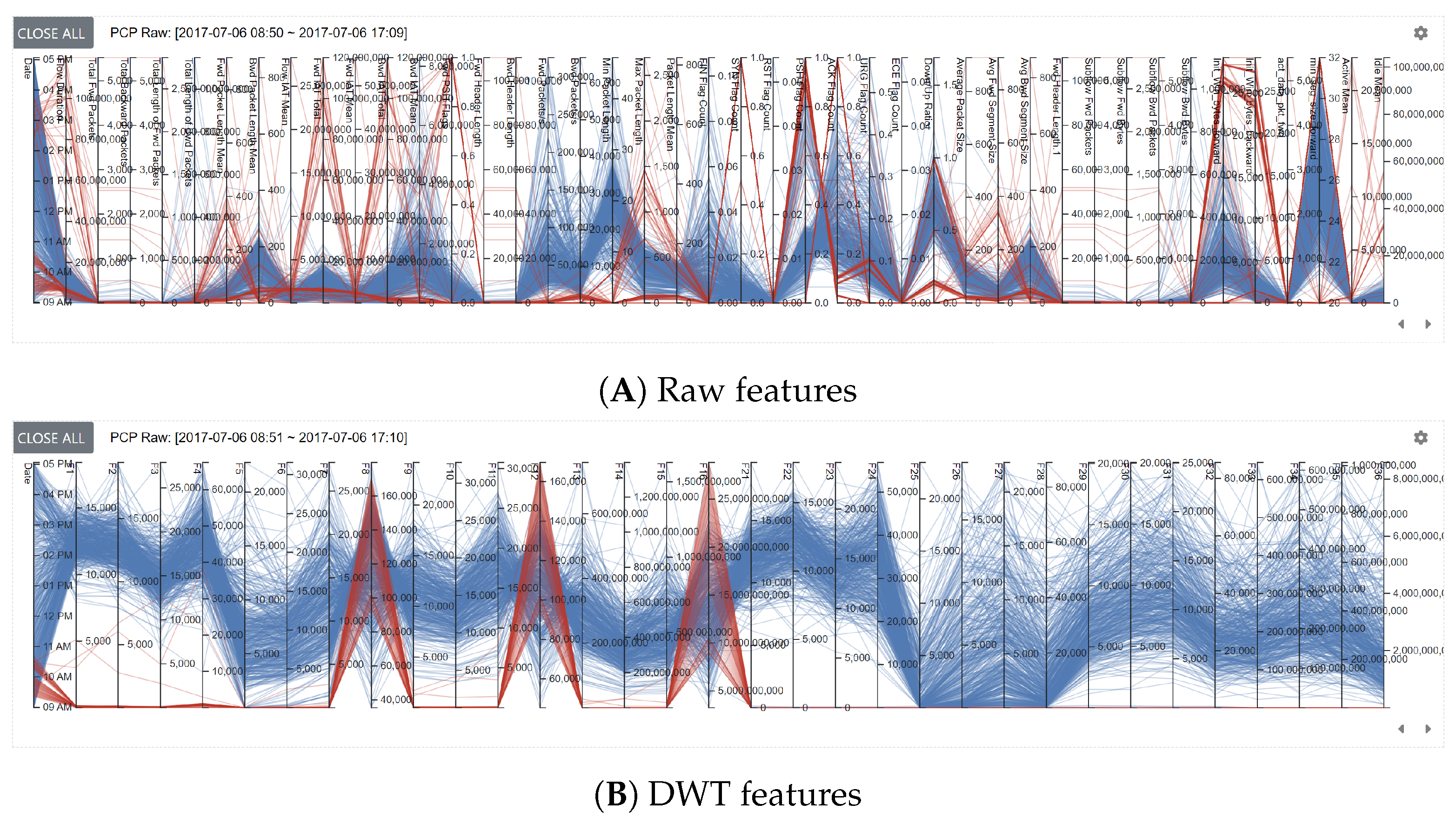
In the parallel coordinates plot, all network traffic data that appeared within the selected date and time range in the Network View are represented. In the plot, variables are represented as vertical bars to denote axes [53,54]. Figure 3 shows examples of user-selected data for the raw and DWT features on Day-3 (7 May 2017). The representation of the raw features (Figure 3A) does not show any distinctive network traffic patterns. This would be because network traffic data often maintain complete randomness in the distribution of cyberattacks [55]. This randomness is somewhat diminished when using the DWT features by making network traffic patterns visible (see Figure 3B). To help the user control the features and variables in the parallel coordinates plot, selecting network events is supported. Based on the user’s selection, corresponding network events are highlighted in multiple scatterplots. Furthermore, the selected events in the scatterplots become highlighted in the parallel coordinates plot. This feature is critical to increase the understandability of data. In the plot, axis translation [54] is also supported to help the user move the location of variables (i.e., dimensions—represented as vertical bars) through a drag-and-drop operation. This is useful for finding invisible patterns induced by different arrangements of variables.
Various dimension reduction techniques are commonly applied to show high-dimensional data on a lower-dimensional space (i.e., 2D or 3D display space). Among them, PCA is broadly applied because of its ability of detecting principal components by measuring eigenvectors and eigenvalues from data. However, to produce the best results, it must satisfy the linearity of the data attribute requirement. If the data include non-linear characteristics, they do not provide the best result when projecting it. Due to this reason, researchers proposed alternative techniques, such as t-SNE and UMAP. They use similar approaches to arranging data into a lower dimensional space using graph layout algorithms by determining and placing structurally similar elements in nearby locations. t-SNE requires more computational time than UMAP for finding an optimal layout, especially when handling a large amount of data. Although they are good projections for handling data that have both linear and non-linear attributes, projections of the data would not be effective if parameters are set inappropriately. There are two types of parameters, such as required (free) parameters (i.e., t-SNE: perplexity and UMAP: components, k-neighbours) and optimization parameters (i.e., learning rate, number of iterations). Determining optimal parameters is critical to producing the best results in projecting high-dimensional data into a lower-dimensional space [56,57]. However, it is not easy to find optimal parameters because every data has unique, distinctive characteristics requiring different parameter settings to capture local and global structures. Thus, the system allows the user to change the parameters manually to conduct interactive data analysis.
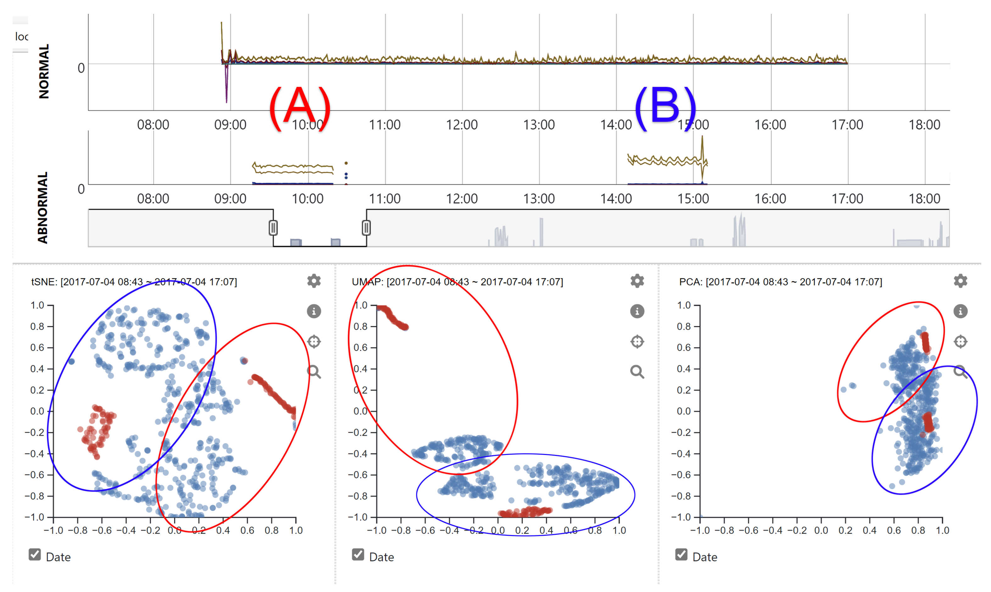
Figure 4 shows network traffic data on Day-2. All abnormal network traffic events were created by using brute force attacks with Patator and a multi-purpose brute-forcer. In detail, the visual patterns that appeared in the morning (A) and afternoon (B) indicate FTP and SSH brute force attacks, respectively. Although there was no difference in normal network traffic patterns throughout the day, the two attack patterns appeared to have different characteristics making them positioned at far distances (see the red-colored network events within the circles in the scatterplots). By default, all selected network events are projected onto the multiple scatterplots with considering date information (using UNIX timestamp). This approach is useful for understanding the changes in network traffic patterns over time. Date and time range selection is added in the parallel coordinates plot to support interactive visual analysis of network traffic events. Whenever a new date and time range is selected, corresponding network events within the range are populated in other visualizations. The user is allowed to exclude the inclusion of the date and time information from each dimension reduction computation by unchecking the checkbox (named “Date”) positioned at the bottom of scatterplots. Identifying the pattern changes of abnormal events over time can be performed by enabling time information. Furthermore, understanding the global network patterns considering both normal and abnormal events is allowed if time information is excluded. Examples of analyzing data without considering time information are added in Section 5.
Analyzing network traffic data is difficult due to the size of data is often large. Pixel-view representation is an excellent approach to showing a global layout of the network traffic data [1]. When representing network traffic data with pixels, appropriate pixel size needs to be determined to improve humans’ cognitive ability to understand the meaning of tiny pixel regions. Thus, representing information by measuring the physical size of displays and the number of pixels (defined as “visual scalability”) is essential when displaying large-scale datasets [1,58]. In our system, a heatmap view is added by applying a data aggregation to determine average values in every minute for the user-selected variable and map them to the 24 h projection. Figure 5 shows normal and abnormal heatmap representations of all network traffic on the variable “Flow Duration”. In the view, the user is allowed to change the variable. Whenever the variable is changed, data normalization is applied to show the correct distribution of the selected variable. Gray color attribute is used to indicate no network activity within a specified heatmap cell. Figure 5 represents no network activities from evening to next day morning: 5 p.m. to 8 a.m. A linear color gradient is applied to indicate the min and max of the attribute. Mouse hovering is supported to show the actual value of each heatmap cell.

5. Case Studies

When evaluating a visualization system, conducting a comparative user study helps determine the benefits and limitations of the system. Although organizing the comparative user study is effective, finding a system that acts similarly or provides identical functions is difficult. For evaluating our designed system, user study cannot be managed because no counterpart (or similar) application or system exists. Thus, we performed case studies to find the effectiveness of the designed system by conducting multiple analyses on the visually represented network traffic data to identify distinctive patterns of abnormal activities. Specifically, case studies were managed to assess if the system provides hidden, underlying information that can be used to identify unique characteristics of abnormal network traffic patterns.
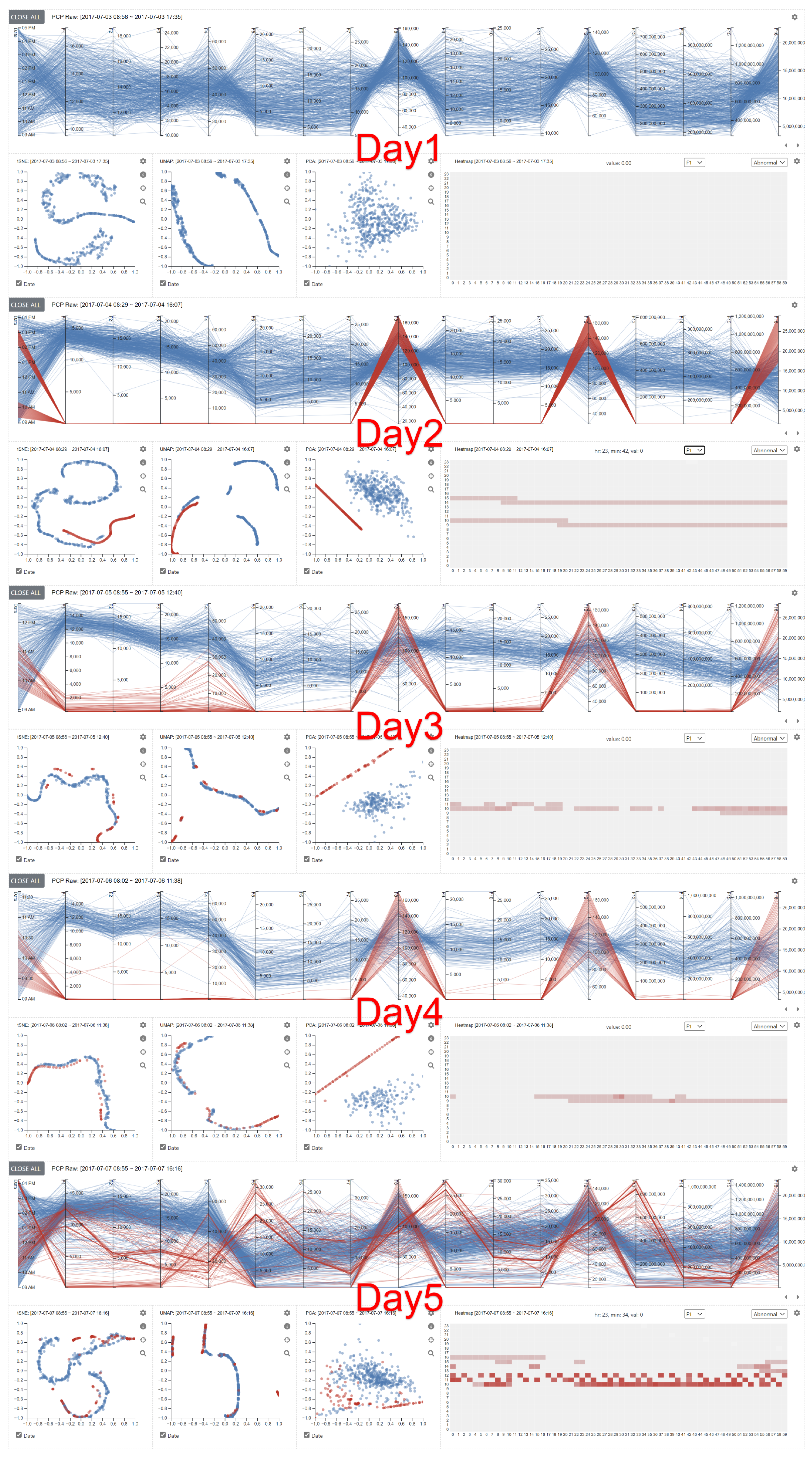
Figure 6 shows a series of visualizations of network traffic events on different days with sixteen DWT features. Since all the detailed analysis views appear on the same page of a web browser, the user can conduct a comparative analysis by evaluating multiple visual representations simultaneously. As discussed above, the CICIDS2017 dataset was created by embedding different daily attack scenarios. When analyzing the raw features data, it was difficult to see the unique differences between normal and abnormal. However, with the DWT features, distinctive patterns were observed. Since there was no abnormal (i.e., attack) activity embedded in Day-1, abnormal activity was not visible in the visualization. However, the abnormal activities on Days 2∼5 show apparent differences compared to the normal activities. In detail, there were high similarities among the abnormal activities on Days 2∼4. However, the activities on Day-5 were completely different. Based on the data description of the CICIDS2017 dataset, we found that three attack scenarios were embedded on Day-5. They are Botnet using ARES (A Command aNd Control server), port scan, and DDoS attack using LOIT (Low Orbit Ion Cannon). Since these attack scenarios were not included in other days, distinctive patterns were observed. We also found similar visual representations when analyzing network patterns that appeared on Day-3 and Day-4, even if different attack scenarios were embedded on these days. We could not locate a major reason causing this result. However, identifying the main cause of this could be vital for elevating our ability to understand network traffic data. Thus, a further study should be performed. When evaluating the scatter plots generated with t-SNE and UMAP (the 1st and 2nd views), we could not identify significant differences between normal and abnormal. However, we found almost complete separation between normal and abnormal when evaluating PCA results on Days 2∼4. The PCA projection on Day-5 indicates a high similarity between normal and abnormal. This would be because port scan activities generated similar network traffic patterns compared to normal network events.
To understand the difference between the attacks that appeared on Day-5, we created several scatterplots by selecting different time ranges by referencing the CICIDS2017 dataset description as 10:02–11:02 (Botnet ARES), 13:55–15:29 (port scan), and 15:56–16:16 (DDoS LOIT). When comparing the scatterplots of t-SNE and UMAP, we could not find any major difference between normal and abnormal activities. However, with PCA projections on scatterplots, we found a clear distinction between normal and abnormal. Figure 7 shows examples of PCA projections with DWT features in different time ranges. In addition, based on our analysis of understanding the difference between normal and abnormal patterns, we found unknown attacks in the time range of 11:03–12:59. These unknown attacks were not mentioned anywhere in the dataset description. Figure 7D represents unknown attacks (highlighted in red) overlaid with other network traffic activities (colored gray and blue) in 8:46–13:22. The highlighting was performed by the user within the parallel coordinates plot.
When analyzing network traffic data, it is important to support the user in finding network patterns and unexpected events in the data. With the designed system, the identification of unexpected network events can be performed with different visualizations. Figure 8 shows an example of identifying an unknown network event. With multiple visualizations, it is possible to explore the represented network traffic data to determine unique, distinctive patterns different from other network traffic events. While navigating the Network View, we identified an unexpected abnormal event on Tuesday morning at 10:30. Unfortunately, we could not locate any information about this event in the dataset description. Since brute force attacks on an FTP server were embedded from 9:20–10:20, we initially thought that it was a continuation of the same attack. However, by evaluating the data more closely, we noticed that the network traffic event was using port 80, indicating a web-based traffic event. This was completely new information detected with our designed system.
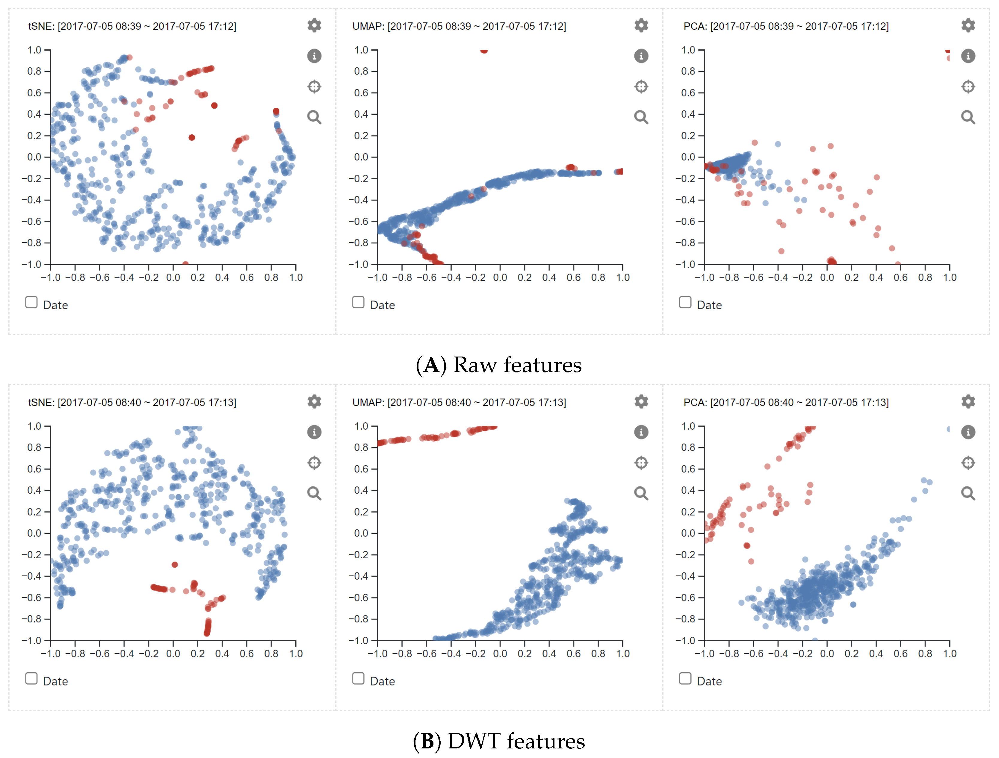
Since the system utilizes the raw and DWT features for analyzing network events, it is vital to determine the effectiveness of using the DWT features compared to using the raw features. Figure 9 shows examples of scatterplots of network traffic events on Day-3 using (A) raw and (B) DWT features. The used DWT features include standard deviation, median, and energy of the feature (“Flow Duration”). When using the raw features, the scatterplots with UMAP and PCA did not provide distinctive differences between normal and strange events. However, with t-SNE, we found that some abnormal events were positioned nearby. However, when using the DWT features, we observed improved projections of normal and abnormal events. Specifically, t-SNE and PCA showed better representations of network events indicating the difference between normal and abnormal.

6. Discussion

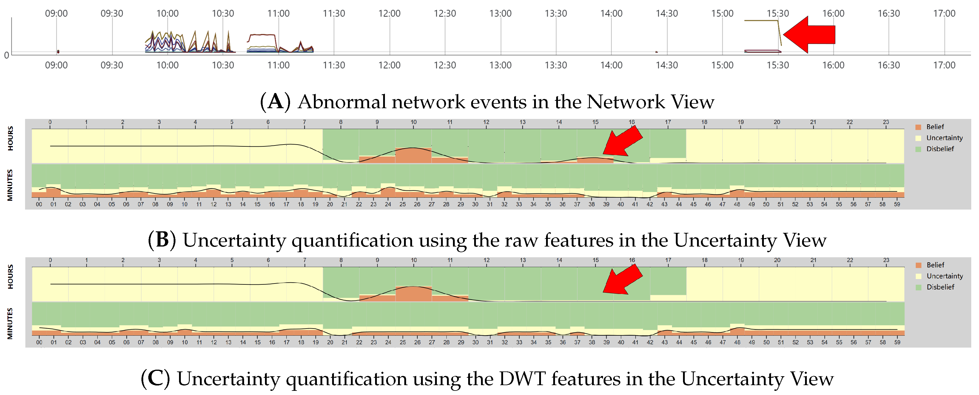
We proposed an interactive web-based visualization system to help users analyze network traffic data. Instead of using raw feature data, DWT-based feature extraction is applied as an alternative method to identify hidden but critical information from the network traffic and eventually help users determine abnormal network patterns. The DWT features (i.e., σ j , m j , e j , υ j ) presenting rapid changes and coarse approximation of network events in a time domain are extracted. Figure 10 shows examples of subjective opinions on the (A) raw and (B) DWT features of Day-3 network traffic data in the Uncertainty View. On Day-3, two types of attacks were embedded into the CICIDS2017 dataset as DoS/DDoS (9:47 a.m.–11:23 a.m.) and Heartbleed on port 444 (15:12 p.m.–15:32 p.m.). The arrows in the figure indicate the regions where the Heartbleed attacks were embedded. As shown in Figure 10B, the Heartbleed attacks (see the arrow in the figure) are clearly visible, indicating a belief probability of having abnormal events. However, the attacks are disappeared when utilizing the DWT features (see Figure 10C). Although the Heartbleed attacks generate high burst attacks (see Figure 10A) that can be easily detected with the DWT features, we identified that a single network event (indicating a Heartbleed attack) occurred every two minutes starting from 15:12 p.m. Because of such fewer attack events, applying DWT to extract features from such events may not be feasible. Interestingly, we found a possibility of detecting outliers by analyzing the difference between the two representations (Figure 10B,C) as comparing two outcomes is often utilized in detecting possible outliers [18]. Since finding possible outliers in network traffic data analysis is important, we plan to upgrade our system by adding a technique that supports comparing multiple results.
When analyzing network traffic data, integrating time information is critical for precisely identifying abnormal network patterns. Thus, as mentioned above, the initial representation of the raw network traffic data in the Network View shows aggregated network traffic data per minute. At the same time, when extracting the DWT features, feature extraction was applied to all network events that appeared every minute. However, we found that correct time information was not captured. In detail, time (“seconds”) information was not included in the dataset from Days 2∼5. For more precise data analysis, extracting a new set of data, including detailed time information (i.e., hour/minutes/seconds), should be performed by analyzing the original full packet payloads dataset with the PCAP analyzer (i.e., CICFlowMeter). Furthermore, we plan to perform feature extractions at different time scales as future work for conducting full-scale data analysis.
As discussed above, the Detailed Analysis View was added to support an interactive visual analysis by generating multiple visualizations based on different sets of network events. The user is allowed to create multiple visual representations of network events appearing in different time ranges. This feature is essential in network traffic data analysis because it supports the user in analyzing abnormal network patterns comparatively on multiple visualizations by selecting network traffic data on different time ranges. In the parallel coordinates plot, the user can move the location of variables. Since different arrangements of variables might produce dissimilar results depending on applied rearrangements, various automatic rearrangement methods have been proposed to find optimal configurations to support maximized readability [59,60]. For upgrading the system, this automatic rearrangement will be considered to enhance the capability of analyzing network traffic data more effectively.
Since multiple scatterplots are created by applying different dimension reduction techniques, analyzing the network traffic data on various projections is effective in identifying anomalous network events. Thus, the user is able to conduct a direct comparison of the projections to determine similarities and differences among network events. Among the dimension reduction techniques, PCA is the fastest approach compared to t-SNE and UMAP because t-SNE and UMAP use a different stochastic neighbor embedding method to combine potential neighbors [61]. However, PCA often generates unexpected outcomes if data include attributes that do not follow the characteristics of data linearity. Although both t-SNE and UMAP are good for handling numerical and categorical data simultaneously, their computational speed is slower depending on the parameters set for running the techniques and the scale of the network traffic data. For effective data analysis with the techniques, the user must set a relatively small number of network events. However, an additional study should be performed to determine the optimal scale of the network events for identifying unique network patterns for understanding abnormal network traffic events.
In network traffic data analysis, applying feature selection is critical for understanding network traffic events because numerous features often exist in network traffic data. Often, domain experts perform individual feature selection when analyzing the data. With the designed system, the user can perform a feature selection while conducting the network traffic analysis. Although individual feature selection techniques produce inconsistent performances, it provides freedom for the domain experts to understand the data. Since it is essential to integrate an automated feature selection process to assist the experts [62], it is helpful to add automated feature selection functionality as an assisted method for the user. Furthermore, it would be useful, especially if there are numerous feature selection options like DWT features. Thus, we plan to upgrade the system to include this functionality.
Network traffic data often produce a large amount of data and features that make users difficult to understand the data. For effectively representing a large amount of data, heatmap visualization is added to the system because it generates a color-mapped representation of network traffic events [1]. Thus, it can assist in displaying large amounts of data without causing visual clutter problems. However, heatmap visualization has a limitation of displaying values with matched colored representations that often lead to delivering an approximate visual perception of the original quantitative values. Furthermore, only a single variable can be used when mapping data with color representation. This often makes the user spend numerous amounts of time evaluating all heatmap representations with various attributes. Because of this limitation, heatmap visualization may not be used as a primary visualization. Thus, it is necessary to improve the heatmap visualization by adding the functionality of incorporating multiple attributes together to represent each network event. Alternatively, it can be used as a supplementary visualization to assist the user in understanding attributes through visual representation.
As described above, unknown attacks could be discovered with our visualization system. Since several unknown attacks exist in the dataset, it would be good to have a functionality (e.g., search-by-example [63]) that supports finding similar network events to the unknown attacks. More specifically, seeking closely relevant network events (having similar characteristics) can be performed within the visualization system by measuring similarities of network events with various statistical measurements, such as Cosine similarity, Euclidean distance, extended Jaccard coefficient, Pearson correlation coefficient, and more [40]. Alternatively, clustering or classification algorithms can be applied to find computationally similar network events closely related to unknown attacks.

7. Conclusions and Future Work

In this paper, we present an interactive web-based visualization system focusing on analyzing network traffic data. We integrated multiple coordinated views to design the system, supporting a rich set of user interactions. To support network traffic data analysis with the system, we performed data wrangling to sanitize unwanted information from the data and extract significant features. We performed several case studies and found the effectiveness of our system by identifying its benefits and limitations.
As discussed above, feature selection is important when analyzing network traffic data because there are numerous features to evaluate. Thus, for future work, we plan to upgrade our system by adding automatic or semi-automatic feature selection techniques to assist the user in the feature selection process. Since we found unknown attacks while analyzing the network traffic dataset, it is helpful to add a method “search-by-example” to understand network traffic events by identifying similar attack patterns. For evaluating the designed system, conducting an expert evaluation study should be considered to identify the benefits and limitations of the system. Thus, we plan to conduct a usability test to evaluate it to determine design intuitiveness and usefulness for conducting interactive visual analysis on network traffic data.

Author Contributions

Conceptualization, D.H.J. and S.-Y.J.; methodology, D.H.J. and S.-Y.J.; software, D.H.J. and S.-Y.J.; validation, D.H.J. and S.-Y.J.; formal analysis, D.H.J. and S.-Y.J.; investigation, D.H.J. and S.-Y.J.; resources, D.H.J. and S.-Y.J.; data curation, D.H.J. and S.-Y.J.; writing—original draft preparation, D.H.J. and S.-Y.J.; writing—review and editing, D.H.J., J.-H.C., F.C., L.K., A.J. and S.-Y.J.; visualization, D.H.J. and S.-Y.J.; supervision, D.H.J. and S.-Y.J.; project administration, D.H.J. and S.-Y.J.; funding acquisition, D.H.J., J.-H.C., F.C. and S.-Y.J. All authors have read and agreed to the published version of the manuscript.

Funding

This material is based upon work supported by the Army Research Office (Grant No. W911NF-18-1-0460) and the National Science Foundation (Grant No. 2107449, 2107450, and 2107451). The views and conclusions contained in this document are those of the authors and should not be interpreted as representing the official policies, either expressed or implied, of the National Science Foundation, the Army Research Office or the U.S. Government. The U.S. Government is authorized to reproduce and distribute reprints for Government purposes notwithstanding any copyright notation herein.

Institutional Review Board Statement

Not applicable.

Informed Consent Statement

Not applicable.

Data Availability Statement

Data were obtained from the Canadian Institute for Cybersecurity website and are available at https://www.unb.ca/cic/datasets/ids-2017.html (accessed on 10 December 2021). The complete code is available at https://github.com/sji321/idsviz (accessed on 10 December 2022). A supplementary video material is available online at https://youtu.be/9PTjpO8-dKg (accessed on 10 December 2022).

Conflicts of Interest

The authors declare no conflict of interest. The funders had no role in the design of the study; in the collection, analyses, or interpretation of data; in the writing of the manuscript; or in the decision to publish the results.

References

  1. Ji, S.Y.; Jeong, B.K.; Jeong, D.H. Evaluating visualization approaches to detect abnormal activities in network traffic data. Int. J. Inf. Secur. 2021, 20, 331–345. [Google Scholar] [CrossRef]
  2. Shiravi, H.; Shiravi, A.; Ghorbani, A.A. A Survey of Visualization Systems for Network Security. IEEE Trans. Vis. Comput. Graph. 2012, 18, 1313–1329. [Google Scholar] [CrossRef] [PubMed]
  3. Chishtie, J.; Bielska, I.A.; Barrera, A.; Marchand, J.S.; Imran, M.; Tirmizi, S.F.A.; Turcotte, L.A.; Munce, S.; Shepherd, J.; Senthinathan, A.; et al. Interactive Visualization Applications in Population Health and Health Services Research: Systematic Scoping Review. J. Med. Internet Res. 2022, 24, e27534. [Google Scholar] [CrossRef] [PubMed]
  4. Cui, W.; Liu, S.; Tan, L.; Shi, C.; Song, Y.; Gao, Z.; Qu, H.; Tong, X. Textflow: Towards better understanding of evolving topics in text. IEEE Trans. Vis. Comput. Graph. 2011, 17, 2412–2421. [Google Scholar] [CrossRef]
  5. Ma, J.; Liao, I.; Ma, K.L.; Frazier, J. Living liquid: Design and evaluation of an exploratory visualization tool for museum visitors. IEEE Trans. Vis. Comput. Graph. 2012, 18, 2799–2808. [Google Scholar] [CrossRef]
  6. Godfrey, P.; Gryz, J.; Lasek, P. Interactive visualization of large data sets. IEEE Trans. Knowl. Data Eng. 2016, 28, 2142–2157. [Google Scholar] [CrossRef]
  7. Keim, D.A. Information visualization and visual data mining. IEEE Trans. Vis. Comput. Graph. 2002, 8, 1–8. [Google Scholar] [CrossRef]
  8. Lakkaraju, K.; Bearavolu, R.; Slagell, A.; Yurcik, W.; North, S. Closing-the-loop in nvisionip: Integrating discovery and search in security visualizations. In Proceedings of the IEEE Workshop on Visualization for Computer Security, (VizSEC 05), Minneapolis, MI, USA, 26 October 2005; pp. 75–82. [Google Scholar] [CrossRef] [Green Version]
  9. Foresti, S.; Agutter, J.; Livnat, Y.; Moon, S.; Erbacher, R. Visual correlation of network alerts. IEEE Comput. Graph. Appl. 2006, 26, 48–59. [Google Scholar] [CrossRef]
  10. Goodall, J.; Lutters, W.; Rheingans, P.; Komlodi, A. Preserving the big picture: Visual network traffic analysis with TNV. In Proceedings of the IEEE Workshop on Visualization for Computer Security, (VizSEC 05), Minneapolis, MI, USA, 26 October 2005; pp. 47–54. [Google Scholar] [CrossRef]
  11. Koike, H.; Ohno, K.; Koizumi, K. Visualizing cyber attacks using IP matrix. In Proceedings of the IEEE Workshop on Visualization for Computer Security, (VizSEC 05), Minneapolis, MI, USA, 26 October 2005; pp. 91–98. [Google Scholar] [CrossRef]
  12. Krokos, E.; Rowden, A.; Whitley, K.; Varshney, A. Visual Analytics for Root DNS Data. In Proceedings of the 2018 IEEE Symposium on Visualization for Cyber Security (VizSec), Berlin, Germany, 22 October 2018; pp. 1–8. [Google Scholar]
  13. Gove, R.; Deason, L. Visualizing Automatically Detected Periodic Network Activity. In Proceedings of the 2018 IEEE Symposium on Visualization for Cyber Security (VizSec), Berlin, Germany, 22 October 2018; pp. 1–8. [Google Scholar]
  14. Cappers, B.C.M.; van Wijk, J.J. Understanding the context of network traffic alerts. In Proceedings of the 2016 IEEE Symposium on Visualization for Cyber Security (VizSec), Baltimore, MD, USA, 24 October 2016; pp. 1–8. [Google Scholar]
  15. Xiao, L.; Gerth, J.; Hanrahan, P. Enhancing Visual Analysis of Network Traffic Using a Knowledge Representation. In Proceedings of the 2006 IEEE Symposium On Visual Analytics Science And Technology, Baltimore, MD, USA, 31 October–2 November 2006; pp. 107–114. [Google Scholar] [CrossRef] [Green Version]
  16. Nunnally, T.; Abdullah, K.; Uluagac, A.S.; Copeland, J.A.; Beyah, R. NAVSEC: A Recommender System for 3D Network Security Visualizations. In Proceedings of the Tenth Workshop on Visualization for Cyber Security, Atlanta, GA, USA, 28–29 October 2013; pp. 41–48. [Google Scholar] [CrossRef]
  17. Cai, Y.; Franco, R.d.M. Interactive Visualization of Network Anomalous Events. In Proceedings of the 9th International Conference on Computational Science: Part I, Baton Rouge, LA, USA, 25–27 May 2009; pp. 450–459. [Google Scholar] [CrossRef] [Green Version]
  18. Theron, R.; Magán-Carrión, R.; Camacho, J.; Fernndez, G.M. Network-wide intrusion detection supported by multivariate analysis and interactive visualization. In Proceedings of the 2017 IEEE Symposium on Visualization for Cyber Security (VizSec), Phoenix, AZ, USA, 2 October 2017; pp. 1–8. [Google Scholar] [CrossRef]
  19. Tremel, T.; Kögel, J.; Jauernig, F.; Meier, S.; Thom, D.; Becker, F.; Müller, C.; Koch, S. VITALflow: Visual Interactive Traffic Analysis with NetFlow. In Proceedings of the 2022 IEEE/IFIP Network Operations and Management Symposium, Budapest, Hungary, 25–29 April 2022; pp. 1–6. [Google Scholar] [CrossRef]
  20. Angelini, M.; Prigent, N.; Santucci, G. PERCIVAL: Proactive and reactive attack and response assessment for cyber incidents using visual analytics. In Proceedings of the 2015 IEEE Symposium on Visualization for Cyber Security (VizSec), Chicago, IL, USA, 25 October 2015; pp. 1–8. [Google Scholar] [CrossRef]
  21. Zong, W.; Chow, Y.W.; Susilo, W. Interactive three-dimensional visualization of network intrusion detection data for machine learning. Future Gener. Comput. Syst. 2020, 102, 292–306. [Google Scholar] [CrossRef]
  22. Elmqvist, N.; Tsigas, P. A Taxonomy of 3D Occlusion Management for Visualization. IEEE Trans. Vis. Comput. Graph. 2008, 14, 1095–1109. [Google Scholar] [CrossRef]
  23. Zhang, T.; Liao, Q.; Shi, L. Bridging the Gap of Network Management and Anomaly Detection through Interactive Visualization. In Proceedings of the 2014 IEEE Pacific Visualization Symposium, Yokohama, Japan, 4–7 March 2014; pp. 253–257. [Google Scholar] [CrossRef]
  24. Hao, L.; Healey, C.G.; Hutchinson, S.E. Flexible Web Visualization for Alert-Based Network Security Analytics. In Proceedings of the Tenth Workshop on Visualization for Cyber Security, Atlanta, GA, USA, 28–29 October 2013; pp. 33–40. [Google Scholar] [CrossRef] [Green Version]
  25. Arendt, D.L.; Burtner, R.; Best, D.M.; Bos, N.D.; Gersh, J.R.; Piatko, C.D.; Paul, C.L. Ocelot: User-centered design of a decision support visualization for network quarantine. In Proceedings of the 2015 IEEE Symposium on Visualization for Cyber Security (VizSec), Chicago, IL, USA, 25 October 2015; pp. 1–8. [Google Scholar] [CrossRef]
  26. Ulmer, A.; Sessler, D.; Kohlhammer, J. Netcapvis: Web-based progressive visual analytics for network packet captures. In Proceedings of the 2019 IEEE Symposium on Visualization for Cyber Security (VizSec), Vancouver, BC, Canada, 23 October 2019; pp. 1–10. [Google Scholar] [CrossRef]
  27. Chen, S.; Guo, C.; Yuan, X.; Merkle, F.; Schaefer, H.; Ertl, T. OCEANS: Online Collaborative Explorative Analysis on Network Security. In Proceedings of the Eleventh Workshop on Visualization for Cyber Security, Paris, France, 10 November 2014; pp. 1–8. [Google Scholar] [CrossRef]
  28. Cherepanov, I.; Ulmer, A.; Joewono, J.G.; Kohlhammer, J. Visualization Of Class Activation Maps To Explain AI Classification Of Network Packet Captures. In Proceedings of the 2022 IEEE Symposium on Visualization for Cyber Security (VizSec), Oklahoma City, OK, USA, 19 October 2022; pp. 1–11. [Google Scholar] [CrossRef]
  29. Schufrin, M.; Lücke-Tieke, H.; Kohlhammer, J. Visual Firewall Log Analysis—At the Border Between Analytical and Appealing. In Proceedings of the 2022 IEEE Symposium on Visualization for Cyber Security (VizSec), Oklahoma City, OK, USA, 19 October 2022; pp. 1–11. [Google Scholar] [CrossRef]
  30. Ji, S.Y.; Jeong, B.K.; Choi, S.; Jeong, D.H. A multi-level intrusion detection method for abnormal network behaviors. J. Netw. Comput. Appl. 2016, 62, 9–17. [Google Scholar] [CrossRef]
  31. Braun, L.; Volke, M.; Schlamp, J.; Bodisco, A.; Carle, G. Flow-Inspector: A Framework for Visualizing Network Flow Data Using Current Web Technologies. Computing 2014, 96, 15–26. [Google Scholar] [CrossRef] [Green Version]
  32. Li, B.; Springer, J.; Bebis, G.; Gunes, M.H. A survey of network flow applications. J. Netw. Comput. Appl. 2013, 36, 567–581. [Google Scholar] [CrossRef]
  33. Anh Huynh, N.; Keong Ng, W.; Ulmer, A.; Kohlhammer, J. Uncovering periodic network signals of cyber attacks. In Proceedings of the 2016 IEEE Symposium on Visualization for Cyber Security (VizSec), Baltimore, MD, USA, 24 October 2016; pp. 1–8. [Google Scholar] [CrossRef]
  34. Cirillo, S.; Desiato, D.; Breve, B. CHRAVAT—Chronology Awareness Visual Analytic Tool. In Proceedings of the 2019 23rd International Conference Information Visualisation (IV), Paris, France, 2–5 July 2019; pp. 255–260. [Google Scholar] [CrossRef]
  35. Sharafaldin., I.; Habibi Lashkari., A.; Ghorbani., A.A. Toward Generating a New Intrusion Detection Dataset and Intrusion Traffic Characterization. In Proceedings of the 4th International Conference on Information Systems Security and Privacy, Madeira, Portugal, 22–24 February 2018; pp. 108–116. [Google Scholar] [CrossRef]
  36. Kandel, S.; Heer, J.; Plaisant, C.; Kennedy, J.; van Ham, F.; Riche, N.H.; Weaver, C.; Lee, B.; Brodbeck, D.; Buono, P. Research Directions in Data Wrangling: Visualizations and Transformations for Usable and Credible Data. Inf. Vis. J. 2011, 10, 271–288. [Google Scholar] [CrossRef] [Green Version]
  37. Iglesias, F.; Zseby, T. Analysis of network traffic features for anomaly detection. Mach. Learn. 2015, 101, 59–84. [Google Scholar] [CrossRef] [Green Version]
  38. Ji, S.Y.; Kamhoua, C.; Leslie, N.; Jeong, D.H. An Effective Approach to Classify Abnormal Network Traffic Activities using Wavelet Transform. In Proceedings of the 2019 IEEE 10th Annual Ubiquitous Computing, Electronics & Mobile Communication Conference (UEMCON), New York, NY, USA, 10–12 October 2019. [Google Scholar] [CrossRef]
  39. Ji, S.Y.; Jeong, B.K.; Kamhoua, C.; Leslie, N.; Jeong, D.H. Forecasting network events to estimate attack risk: Integration of wavelet transform and vector auto regression with exogenous variables. J. Netw. Comput. Appl. 2022, 203, 103392. [Google Scholar] [CrossRef]
  40. Jeong, D.H.; Jeong, B.K.; Ji, S.Y. Designing a hybrid approach with computational analysis and visual analytics to detect network intrusions. In Proceedings of the 2017 IEEE 7th Annual Computing and Communication Workshop and Conference (CCWC), Las Vegas, NV, USA, 9–11 January 2017; pp. 1–7. [Google Scholar] [CrossRef]
  41. Jøsang, A. Subjective Logic: A Formalism for Reasoning Under Uncertainty, 1st ed.; Springer Publishing Company: Berlin/Heidelberg, Germany, 2016. [Google Scholar]
  42. Jøsang, A.; Cho, J.H.; Chen, F. Uncertainty Characteristics of Subjective Opinions. In Proceedings of the 2018 21st International Conference on Information Fusion (FUSION), Cambridge, UK, 10–13 July 2018; pp. 1998–2005. [Google Scholar] [CrossRef] [Green Version]
  43. Elmqvist, N.; Vande Moere, A.; Jetter, H.C.; Cernea, D.; Reiterer, H.; Jankun-Kelly, T.J. Fluid Interaction for Information Visualization. Inf. Vis. 2011, 10, 327–340. [Google Scholar] [CrossRef]
  44. Roberts, J.C. State of the Art: Coordinated & Multiple Views in Exploratory Visualization. In Proceedings of the Fifth International Conference on Coordinated and Multiple Views in Exploratory Visualization, Zurich, Switzerland, 2 July 2007; pp. 61–71. [Google Scholar]
  45. Harrison, L.; Lu, A. The future of security visualization: Lessons from network visualization. IEEE Netw. 2012, 26, 6–11. [Google Scholar] [CrossRef]
  46. Bigelow, A.; Drucker, S.; Fisher, D.; Meyer, M. Reflections on How Designers Design with Data. In Proceedings of the 2014 International Working Conference on Advanced Visual Interfaces, Como, Italy, 27–29 May 2014; pp. 17–24. [Google Scholar] [CrossRef]
  47. Hullman, J.R.; Adar, E.; Shah, P. Benefitting InfoVis with Visual Difficulties. IEEE Trans. Vis. Comput. Graph. 2011, 17, 2213–2222. [Google Scholar] [CrossRef]
  48. Jain, N.; Bhansali, A.; Mehta, D. AngularJS: A modern MVC framework in JavaScript. J. Glob. Res. Comput. Sci. 2014, 5, 17–23. [Google Scholar]
  49. van Wijk, J.; Nuij, W. Smooth and efficient zooming and panning. In Proceedings of the IEEE Symposium on Information Visualization 2003 (IEEE Cat. No. 03TH8714), Seattle, WA, USA, 19–21 October 2003; pp. 15–23. [Google Scholar]
  50. van der Maaten, L.; Hinton, G. Visualizing Data using t-SNE. J. Mach. Learn. Res. 2008, 9, 2579–2605. [Google Scholar]
  51. McInnes, L.; Healy, J.; Saul, N.; Großberger, L. UMAP: Uniform Manifold Approximation and Projection. J. Open Source Softw. 2018, 3, 861. [Google Scholar] [CrossRef]
  52. Jolliffe, I. Principal Component Analysis; Springer: Berlin/Heidelberg, Germany, 1986. [Google Scholar] [CrossRef]
  53. Inselberg, A. Parallel Coordinates Visual Multidimensional Geometry and Its Applications, 1st ed.; Springer Series in Solid-State Sciences; Springer: New York, NY, USA, 2009. [Google Scholar] [CrossRef]
  54. Heinrich, J.; Weiskopf, D. State of the Art of Parallel Coordinates. In Proceedings of the Eurographics, Girona, Spain, 6–10 May 2013. [Google Scholar]
  55. Chen, Y.Z.; Huang, Z.G.; Xu, S.; Lai, Y.C. Spatiotemporal patterns and predictability of cyberattacks. PLoS ONE 2015, 10, e0124472. [Google Scholar] [CrossRef] [PubMed] [Green Version]
  56. Kobak, D.; Berens, P. The art of using t-SNE for single-cell transcriptomics. Nat. Commun. 2019, 10, 5416. [Google Scholar] [CrossRef] [PubMed] [Green Version]
  57. Kobak, D.; Linderman, G.C. Initialization is critical for preserving global data structure in both t-SNE and UMAP. Nat. Biotechnol. 2021, 39, 156–157. [Google Scholar] [CrossRef]
  58. Eick, S.G.; Karr, A.F. Visual Scalability. J. Comput. Graph. Stat. 2002, 11, 22–43. [Google Scholar] [CrossRef]
  59. Lu, L.F.; Huang, M.L.; Zhang, J. Two Axes Re-Ordering Methods in Parallel Coordinates Plots. J. Vis. Lang. Comput. 2016, 33, 3–12. [Google Scholar] [CrossRef]
  60. Tilouche, S.; Partovi Nia, V.; Bassetto, S. Parallel coordinate order for high-dimensional data. Stat. Anal. Data Mining ASA Data Sci. J. 2021, 14, 501–515. [Google Scholar] [CrossRef]
  61. Hinton, G.E.; Roweis, S. Stochastic Neighbor Embedding. In Proceedings of the Advances in Neural Information Processing Systems, Vancouver, BC, USA, 9–14 December 2002; Volume 15. [Google Scholar]
  62. Nakashima, M.; Sim, A.; Kim, Y.; Kim, J.; Kim, J. Automated Feature Selection for Anomaly Detection in Network Traffic Data. ACM Trans. Manage. Inf. Syst. 2021, 12. [Google Scholar] [CrossRef]
  63. Green, T.M.; Ribarsky, W.; Fisher, B. Building and Applying a Human Cognition Model for Visual Analytics. Inf. Vis. 2009, 8, 1–13. [Google Scholar] [CrossRef]
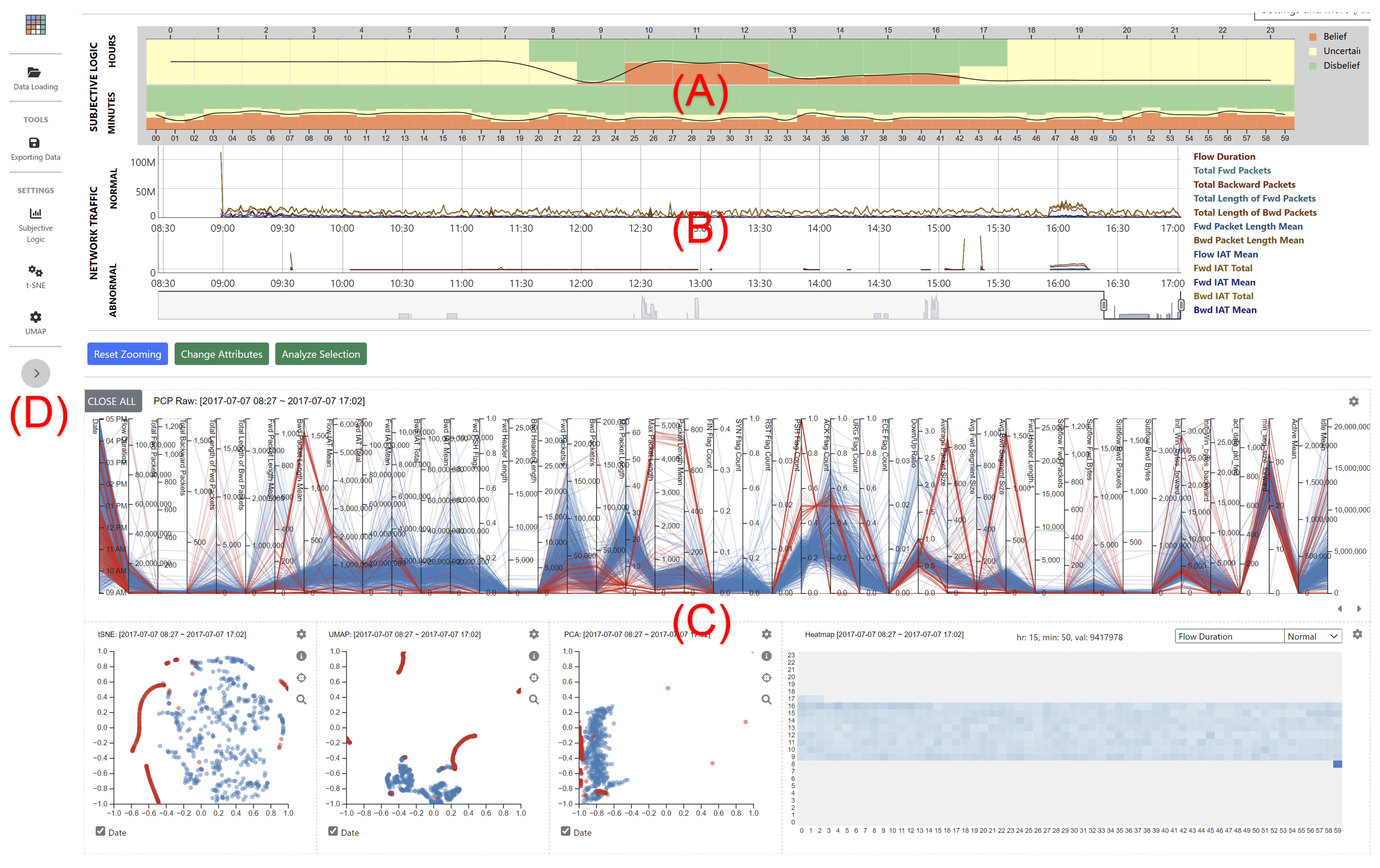
Figure 1. An overview of the designed visual analysis system that consists of (A) Uncertainty View: probability representation of network events in every hour and minute, (B) Network View: aggregated representation of original network events, (C) Detailed Analysis View: representation of multiple visualizations to support a continuous visual analysis, and (D) Control Options: settings to control visualizations.
Information 14 00016 g001
Figure 2. Binomial opinions of network events are represented with stacked bar graphs with different colors as belief (orange), disbelief (green), and uncertainty (yellow). (A) represents a schematic diagram of the stacked graph. (B) shows a representation of quantified uncertainty in every hour (00∼09) and minute (00∼23). Height indicates the amount of belief mass in supporting the truth of attack state x being true, false, uncommitted condition, accordingly.
Information 14 00016 g002
Figure 3. Visual representations of (A) 45 raw and (B) 33 DWT user-selected features of network traffic data on Day-4 with parallel coordinates plots. Red and blue color attributes are used to indicate attack and normal activities, respectively. The leftmost vertical bar represents time dimension denoting date and time information.
Information 14 00016 g003
Figure 4. Examples of presenting network traffic events on Day-2 on the Network View and scatterplots. (A,B) represent FTP and SSH brute force attacks, respectively.
Information 14 00016 g004
Figure 5. Heatmap visualizations of the attribute (i.e., Flow Duration). The vertical and horizontal axes in the heatmap view indicate hour (0∼23) and time (0∼59) information, respectively. Each heatmap cell holds an average value of the selected attribute within a specified time. In the view, blue and red colors are used to indicate normal and abnormal activities. Gray color represents no activities.
Information 14 00016 g005
Figure 6. A continuous data analysis with sixteen DWT features of the variable (“Flow Duration”) on all five days. All visual representations are appeared on the same web page to support a comparative analysis on different results.
Information 14 00016 g006
Figure 7. PCA projections on abnormal network activities on Day-5. (AC) represent known attacks described in the CICIDS2017 dataset. (D) highlights unknown attacks that are detected with the system.
Information 14 00016 g007
Figure 8. Identifying an unexpected network event while analyzing the network traffic data with the system.
Information 14 00016 g008
Figure 9. Scatterplots of network traffic events on Day-3 with (A) raw and (B) DWT features using t-SNE, UMAP, and PCA.
Information 14 00016 g009
Figure 10. Representations of network events on Day-3 using (A,B) raw and (C) DWT features.
Information 14 00016 g010
Table 1. A summary of web-based visualization systems that support interactive visual analysis on network traffic data. ◯ denotes fully supported. △ indicates partially supported due to limited information available in the paper.
PublicationHao et al. [24], 2013Zhang et al. [23], 2014Chen et al. [27], 2014Arendt et al. [25], 2015Cappers and van Wijk [14], 2016Anh Huynh et al. [33], 2016Theron et al. [18], 2017Gove and Deason [13], 2018Ulmer et al. [26], 2019Cirillo et al. [34], 2019Tremel et al. [19], 2022Cherepanov et al. [28], 2022Schufrin et al. [29], 2022Proposed System
DatasetNetwork flow data and Snort alertsVAST 2013 mini challenge datasetVAST 2013 mini challenge datasetVAST 2013 mini challenge datasetNetwork flow with WiresharkDARPA 1999 dataset and botnet dataset from UNBUGR16Bro network dataNetwork flow (PCAP) with WiresharkNetwork flow with ScapyNetFlow dataNetwork flow (PCAP) with WiresharkFirewall logCIC-IDS2017 [35]
Brushing and Linking 
Selection and Manipulation
Zooming and Panning 
Time Series Feature Extraction Analysis Discrete Fourier Transform Discrete Fourier Transform Discrete Wavelet Transform
Dimensionality reduction
Web-based System
Time-line Visualization §
Bar and line graphs §
Scatterplot §
Node-link diagram § circle packing (Petri dish)
Heatmap §
Parallel coordinates §
Unique Visualization Approaches § Ring graphPetri dish (a hybrid hierarchical/
node-link visualization)
Stacked histogramHive plot Geolocation vis. of the packet stream Cluster visualization with a flexible analytical toolUncertainty visualization
Case Study
User Evaluation
Supported User Interactions, Provided Special Features, § Applied Visualization Techniques, Conducted Evaluation Method.
Table 2. Number of network events in the CICIDS2017 dataset. All normal and abnormal events indicated after eliminating null instances from the dataset.
Monday, 3 July 2017∼Friday, 7 July 2017Benign (# of Normal Events)Attack (# of Abnormal Events)Included Attack TypesDropped Null Instances
Monday529,9180None64
Tuesday431,87313,835Brute Force attack201
Wednesday439,972251,723DoS/DDoS1008
Thursday456,7142216Web Attack and Infiltration38
Friday414,275288,923Botnet and Port Scan47
Table 3. Summary of normal and abnormal events in each day with initiated attack types.
Benign (# of Normal Events)Attack (# of Abnormal Events)Initiated Attack Types and their # of EventsUnknown Attack (# of Abnormal Events)
Monday529,918---
Tuesday432,07413,835[Brute Force]
FTP-Patator (9:20–10:20): 7937
SSH-Patator (14:00–15:00): 4993
905
Wednesday440,031252,349[DoS/DDoS]
DoS slowloris (9:47–10:10): 5464
DoS Slowhttptest (10:14–10:35): 5371
DoS Hulk (10:43–11:00): 230,726
DoS GoldenEye (11:10–11:23): 10,293
[SSL Attack]
Heartbleed Port 444 (15:12–15:32): 11
483
Thursday456,7622217[Web Attack]
Brute Force (9:20–10:00): 1494
XSS (10:15–10:35): 652
SQL Injection (10:40–10:42): 21
[Infiltration Attack]
Meta exploit Win Vista (14:19–14:35): 4
Cool disk–MAC (14:53–15:00): 0
Win Vista (15:04–15:45): 18
28
Friday414,322288,923Botnet ARES (10:02–11:02): 1472
[Port Scan]
Firewall Rule on (13:55–14:35): 289
Firewall Rule off (14:51–15:29): 158,558
DDoS LOIT (15:56–16:16): 128,027
577
Disclaimer/Publisher’s Note: The statements, opinions and data contained in all publications are solely those of the individual author(s) and contributor(s) and not of MDPI and/or the editor(s). MDPI and/or the editor(s) disclaim responsibility for any injury to people or property resulting from any ideas, methods, instructions or products referred to in the content.