Article

Combining 2D and 3D Visualization with Visual Analytics in the Environmental Domain

VRVis Zentrum für Virtual Reality und Visualisierung Forschungs-GmbH, 1220 Vienna, Austria
*
Author to whom correspondence should be addressed.
Information 2022, 13(1), 7; https://doi.org/10.3390/info13010007
Submission received: 12 November 2021 / Revised: 20 December 2021 / Accepted: 21 December 2021 / Published: 27 December 2021
(This article belongs to the Special Issue Trends and Opportunities in Visualization and Visual Analytics)

Abstract

:
The application potential of Visual Analytics (VA), with its supporting interactive 2D and 3D visualization techniques, in the environmental domain is unparalleled. Such advanced systems may enable an in-depth interactive exploration of multifaceted geospatial and temporal changes in very large and complex datasets. This is facilitated by a unique synergy of modules for simulation, analysis, and visualization, offering instantaneous visual feedback of transformative changes in the underlying data. However, even if the resulting knowledge holds great potential for supporting decision-making in the environmental domain, the consideration of such techniques still have to find their way to daily practice. To advance these developments, we demonstrate four case studies that portray different opportunities in data visualization and VA in the context of climate research and natural disaster management. Firstly, we focus on 2D data visualization and explorative analysis for climate change detection and urban microclimate development through a comprehensive time series analysis. Secondly, we focus on the combination of 2D and 3D representations and investigations for flood and storm water management through comprehensive flood and heavy rain simulations. These examples are by no means exhaustive, but serve to demonstrate how a VA framework may apply to practical research.

1. Introduction

Current trends in visualization research aim to transcend the limits of conventional methods for representing data (often static and of a narrow scope) in order to amplify the advanced cognition about the underlying data [1,2]. The optimal way to achieve such advanced enhancements is by utilizing the potential of interactivity to support complex data analytics. Such interactive systems enriched with integrated visual interfaces—a synergy of modules for simulation, analysis, and visualization—are designed with a very clear goal in mind—to surpass the limited human analytical capacity for synthesizing overwhelming volumes of disparate data into profound insights. The very process of this interactive visual data exploration is known as Visual Analytics (VA) [3]. VA is a thriving feature-rich field allowing visualization-based dialogue with the data at hand. Essentially, VA brings together practices such as data mining and statistical techniques to visualize and synthesize information in an intuitive manner, while further employing the human eye’s visual perception towards shaping these into fundamental knowledge.
The process of linking visualization with interactivity features is the key aspect in the design of VA systems. The focus of such coupling was commonly placed on 2D representations involving abstract data. These techniques are quite fitting when considering visualization of continuous, numeric attributes in order to detect potential relationships, patterns, and correlations amongst these attributes. Essentially, here we talk about exploring multiple time-varying quantities represented in time series datasets. However, 2D representations do not perform adequately in every context. For instance, when considering geospatial data, such visualizations often suffer from overplotting and occlusion leading to information loss [4]. This is namely due to a large number of data points being superimposed over each other, making it difficult for a human analyst to see individual data points and make inferences of potential relationships. In turn, this may impede the performance of three distinct visual perception tasks, as described by Elmqvist and Tsigas [5], pertaining to (a) discovery—localization of a geometric representation, (b) access—retrieval of the shape, color, or any other property, and (c) spatial relation—interrelation of geometric representations. Furthermore, the relative positioning in a 2D space is equally not suitable for performing an absolute positioning task in a 3D space as inherent physical constraints of a 2D space make it impossible to account for the full spectrum of additional multivariate geospatial attributes [6]. Hence, alternative visualizations using 3D depictions enriched with comprehensive navigation features may be better suited when exploring the internal structure of such data. In principle, 3D visualizations capture the full spectrum of dimensionality of the underlying data and supporting information, while interaction and navigation techniques emulate a sense of exploring a real-world environment in a familiar way.
Nowadays, however, there is an increasing need for combining both 2D and 3D visualizations and their inherent navigation and exploration techniques. Indeed, combining 3D views with traditional 2D data visualizations through multiple interlinked modules offers a multitude of advantages. Most prominently, as we do not rely on one single plane of representation for data exploration, the data exploration becomes more perceptive and holistic. Nevertheless, there is also a certain level of sophistication necessary when conceptualizing such integrated visual systems. These may be summarized into five distinct design goals, which strongly depend on the underlying data and domain problem [7]:
  • High-performance and quality of 3D geometric rendering (i.e., achieving high-detail context geometry).
  • Multivariate analysis capabilities (i.e., integration of various types of visualization diagrams to support multifaceted analysis).
  • Adequate computation and quantification of spatial phenomena (e.g., realistic shadow mapping and reflectance properties).
  • Common spatial context for geometric representations (e.g., considering the same coordinate system).
  • Tight integration between geometry and its attribute aspects (this essentially concerns integration of design goals 1 and 2).
A number of general-purpose tools exist that typically achieve one or a few of these design goals, but are lacking capabilities concerning some of the other aspects (see for example, [8,9,10,11,12,13,14,15,16,17,18,19,20,21,22]). The review of these existing tools and approaches, along their available visualization solutions, further guided our resolution to reflect on the usability and functionality of diverse visualization techniques in supporting a variety of data exploration tasks and concepts. We feel that it is equally crucial to evaluate the application potential of diverse visualization techniques given the different data types (e.g., temporal, spatial, spatiotemporal). As mentioned above, a suitable conceptualization of an effective VA system is closely related to the type of domain problem and exploration needs. Thus, having an analysis tool that may appear as a limited solution in one circumstance might not be perceived as disadvantageous in some other circumstance. In this context, we aim to illustrate a number of specific instances where such statements hold true.
Starting from a discussion of an interactive tool that supports 2D visual representations where we consider an in-depth analysis of multivariate time series data, we proceed to a discussion of an interactive simulation software where 2D and 3D visualizations are combined to provide an informed decision-support regarding a number of complex geospatial and temporal phenomena. These case studies portray different opportunities in data visualization and VA in the context of climate research and natural disaster management. These examples are by no means exhaustive, and some originate from our original previous case studies, whereby we generated novel insights and supporting figures for this particular contribution. However, they serve to demonstrate how a VA framework enriched by 2D and 3D visualizations may apply to practical research. Although the application of these approaches and the resulting knowledge holds great potential for supporting decision-making in the environmental domain, the consideration of such techniques have still to find their way to daily practice. Hence, through our demonstration, we aim to advance these developments.

2. Related Work and Best Visualization Practices

A number of commercial and research-based tools for multivariate data analysis supported by either 2D or 3D visualizations, or a combination of both, have emerged over the past decades. Some tools fall under a more general-purpose category, whereby the other are geared towards a certain domain or class of problems. Aligned with our research agenda, we will reflect on those tools and methods supporting multivariate time series and geospatial data visualization and analysis.
When dealing with time series data, the most prominent visualization techniques are mainly geared towards 2D representations [11,12,13]. In this regard, the most commonly used visualization for temporal data is the 2D line chart that relies on position encodings for both time and value to display time-based evolution of one or several numeric parameters [11]. Another valuable representation is a heatmap view that helps us explore two levels of time dimension in a 2D array (e.g., annual–monthly, monthly–daily) while offering a swift visual identification of the variance across multiple parameters and dimensions [12]. Additional noteworthy representation is a horizon graph—a compact visualization of time varying quantitative data with increased density achieved by dividing and layering filled line charts [13].
The current landscape of VA tools supporting such visualizations mostly lean towards the commercial realm (e.g., Tableau [14], QlikView [15], MS Power BI [16]). These tools offer a suitable richness of interactive built-in 2D visualization features to support informed time series data exploration and analysis at different levels of granularity. However, as they are mainly designed to drive business intelligence type of tasks, their suitability in supporting scientific inquiry may be debatable [17]. Hence, several research efforts were initiated focusing on the development of VA tools for time series analysis further complemented by model building or forecasting functionalities [18,19]. One notable effort relates to the work of Bögl et al. [18]. Here, a VA prototype was built consisting of coordinated and multiple views displaying time series plot (i.e., line chart), the toolbox for model selection and prediction, the autocorrelation and partial autocorrelation plots for selecting model orders, diagnostic plots for the residual analysis (i.e., vertical line chart), and a table view showing the model selection history. Although the main focus of this solution was on supporting users in finding the adequate model and parametrization for concerned time series, the usability of chosen visualization methods proved to be more than suitable for the given task and data type.
When dealing with geospatial data, the visualization techniques follow either a 2D or a 3D representation approach. Some solutions, as the commercial VA tools mentioned above, only offer 2D cartographic visualizations that are often confronted with unfavorable visibility issues (i.e., occlusion) of displayed parameters. For dealing with the 3D geometric data and geometric questions, Geographic Information Systems (GISs) are often used (e.g., ArcGIS [20], GeoMedia [21]). Their application is widespread in disciplines such as civil engineering, urban planning, or geosciences. However, these applications form a compromise between detailed 3D geometric rendering and 2D multivariate analysis in such way that they typically either lack complex analytical capabilities in favor of the 3D geometric rendering, or are restricted to 2D cartographic views but support certain analytical modalities.
In an effort to address such limitations, Chang et al. [22] presented an interactive solution that combines attribute views with geographical views in an interlinked two-view setting. The solution offered a 3D model view and a 2D multidimensional data view that adds an additional perspective essential for understanding the urban model. Such cohesive integrations demonstrated a notable improvement in exploring and inferring these types of data, both spatially and cognitively.

3. Visualization and Exploration Approaches for Time Series Analysis

3.1. Visual Analytics System with 2D Visualizations

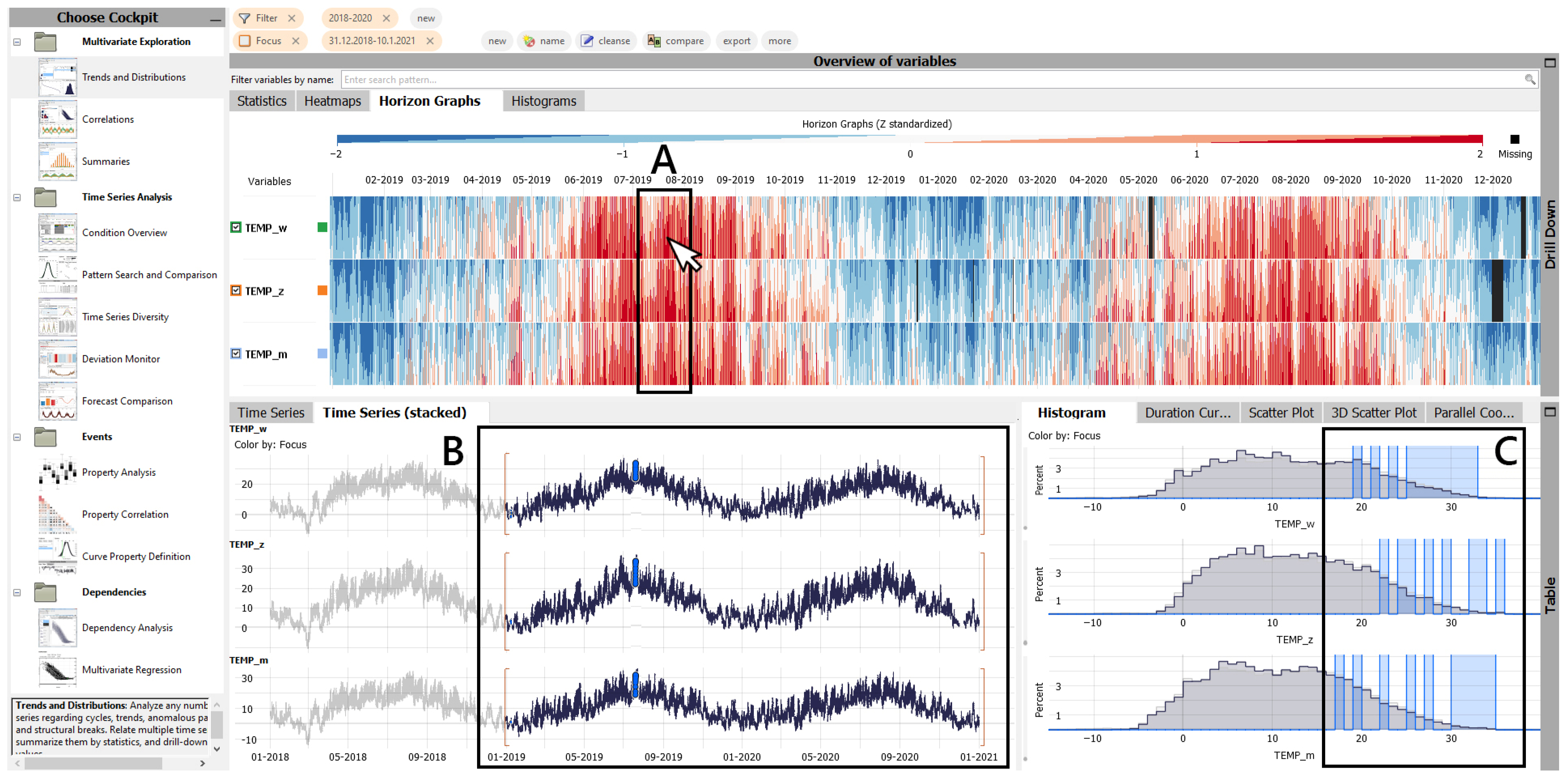
The VA solution used for interactive visual exploration of multi- and high-dimensional time series data is an analytical ensemble solution developed at our institution, specifically designed for such a purpose [23]. The solution offers intelligently engineered computational cockpits with diverse features for visualization, data analytics, workflow management, and external integration (e.g., with Python, R, Matlab). These computational cockpits are composed of a number of individual interlinked 2D views (e.g., histogram, time distribution plot, parallel coordinates plot, heatmap, etc.) with instantaneous response to any user activity (e.g., point click, sequence selection, labelling) across all concerned views (Figure 1). This essentially means that, once a selection of a data point or a data subset of interest has been made in one visual unit, the analogous data point/subset is highlighted in another unit within the same computational cockpit. To achieve such concurrent task execution and responsiveness to user inputs, the VA solution is based on a multi-threaded architecture.

3.2. Visual Analytics Opportunities in the Context of Climate Research

By deploying the VA system described above in the context of climate research, more specifically for high-resolution meteorological time series analysis, we can identify diverse features of time series data. For instance, we can detect the general temporal behaviors, unusual distributions and deviations, periodical transformative changes and discrepancies, with little effort. These functionalities hold great potential for specific explorative case studies such as climate change detection and the investigation of urban microclimatic development encoded in meteorological time series, which are illustrated in the following sections through a top-down descriptive portrayal (i.e., from higher to lower-level phenomena).

3.2.1. Climate Change Detection

In order to illustrate how a climate change signal can be detected from a high-resolution (denoted by a high temporal resolution) meteorological time series using a VA framework, we describe here a study conducted between three Central European cities (Vienna, Munich, and Zurich). The input data, originating from several international open data initiatives, was provided on a long-term (45 years, 1975–2020) and a short-term basis (5 years, 2016–2020), in a monthly and an hourly format, respectively. The long-term data pertained to monthly maxima, minima, and average values of concerned study parameters (i.e., air temperature, solar radiation, and precipitation). The short-term data pertained to a natural progression of air temperature recorded on an hourly base [24].
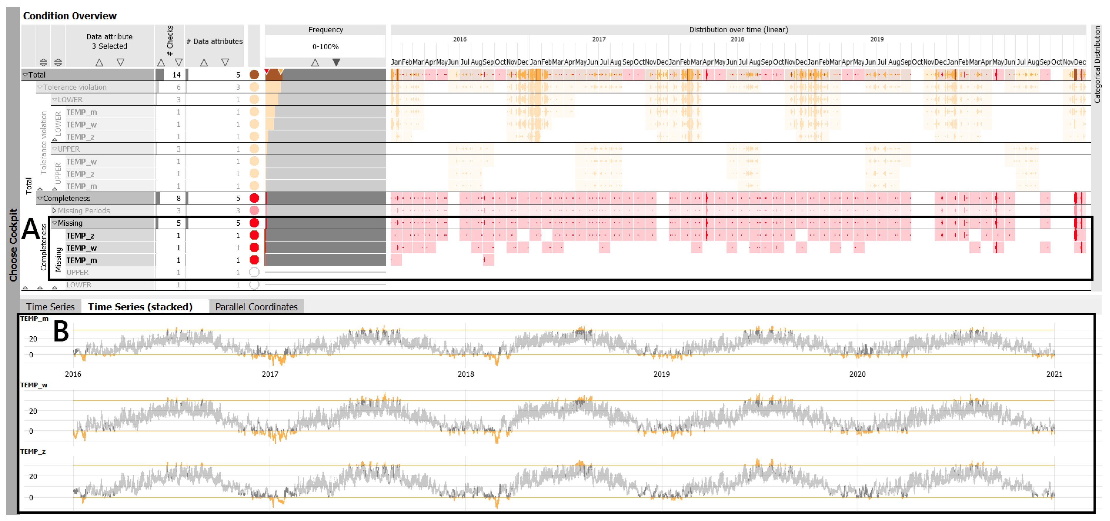
Prior to the analysis, we performed data structure preparation and data quality check. We followed logical naming and formatting conventions as imposed by the tool itself, in which a date–time format should be clearly specified along a clear distinction of the study parameters (i.e., air temperature, solar radiation, and precipitation). The tool further offers a specifically tailored toolkit for conducting a quality check (Figure 2). Here, information on conditions such as the missing values, duplicates, outliers, threshold breach, to name a few, may be assessed with little effort. In this context, we noted some instances of missing values, which, in order to preserve data integrity, were left as blank fields. Altogether, the amount of missing values was small (1.58% of the total data pool), thus, we were not concerned about such aspects affecting the analysis.
Considering the diverse resolutions of input data, by focusing on long-term time span, we can properly investigate historic local climate change at study cities, given the fact that data records of at least 30 years are considered appropriate to tackle such developments. On the other hand, by focusing on short-term time span, we can observe the respective present-day warming tendencies and trends in selected cities. Such observations are led by a current research consensus on Earth’s climate undergoing a rapid warming [25]. In this context, we were able to gain insights on different levels of granularity. More specifically, long-term monthly data (i.e., air temperature, solar radiation, precipitation) provided us with insights on general trends and distributions, whereby fine-grained hourly data (i.e., air temperature) offered insights on the exact positioning and duration of certain events in time, their periodic behaviors, and recognition of distinct structural changes. However, by utilizing the potentials of a VA system, we were equally able to perform a deeper feature extraction through intra-comparative studies within a single time series (e.g., originating from one single city).
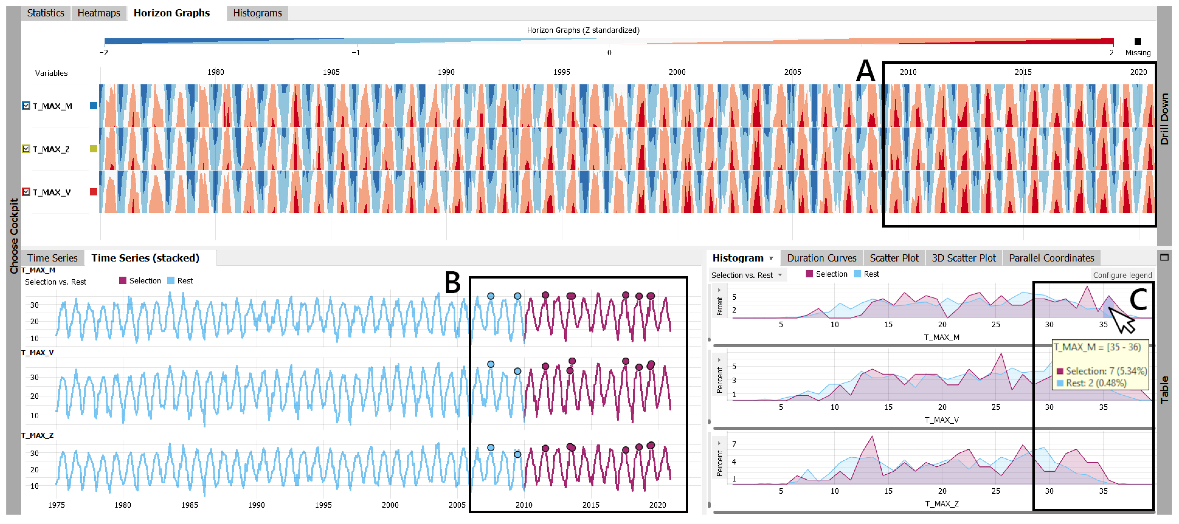
To exemplify, in order to go beyond a simple annual progression of a considered meteorological parameter (i.e., air temperature) for a long-term analysis, we compared a reference timespan (i.e., last 10 years, 2010–2020) to the rest of the dataset (1975–2010). Firstly, by comparing the temperature maxima, we were able to detect a prominent warming signal towards a recent period across all three concerned cities, denoted by an obvious higher representation of temperature peaks (colored in red in horizon graphs in Figure 3) when compared to a reference 1975–2010 timespan. The naming convention in Figure 3 corresponds to the cities under study: T_MAX_M stands for Munich, T_MAX_V stands for Vienna, and T_MAX_Z stands for Zurich. Secondly, we observed a more frequent and more probable occurrence of temperatures exceeding 35 °C in the past ten years, as seen in the data sequence selection marked in pink (denoting the last ten years) with highlighted instances of such events (individual points) compared to a blue sequence (rest of the dataset) in Figure 3 (as seen in the bottom graphs). We further noted an obvious shifting of the frequency area in histogram view towards generally higher temperature values, as seen in Figure 3 (bottom, right).
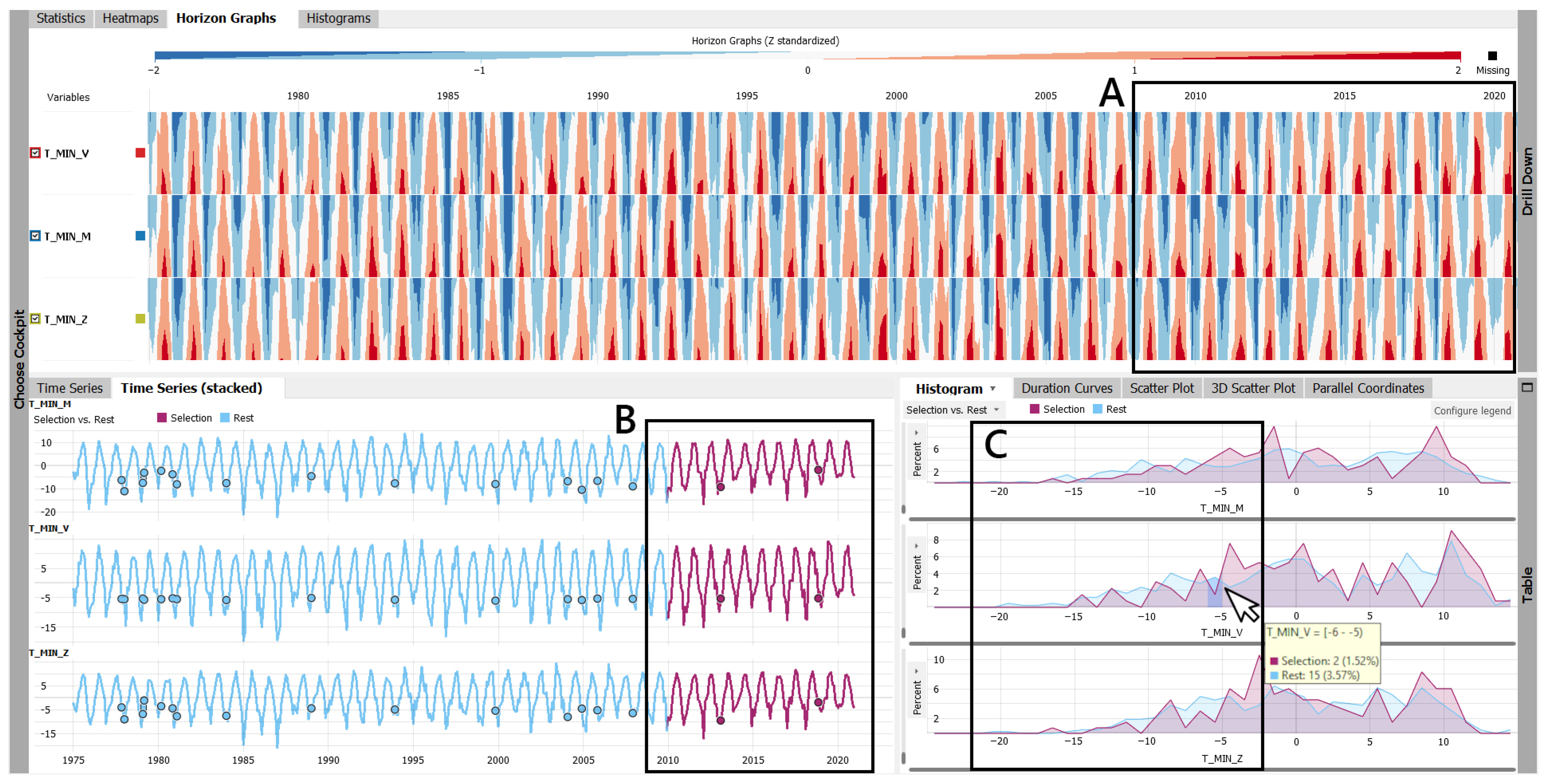
Similar observations are made for the air temperature minima, where the horizon graph revealed an equal warming trend suggesting a decline in lower temperatures in the past ten years for all three cities (Figure 4). Additionally, a notable decline in frequency of air temperatures below −5 °C is seen in time series and histogram graphs in Figure 4, suggesting a rare occurrence of such events in recent periods (as seen in highlighted data points marked in pink data subset). Such observations suggest generally warmer winters in the past ten years. This is further supported by a notable shift of the frequency area in histogram view towards higher values for air temperature minima, as seen in Figure 4.
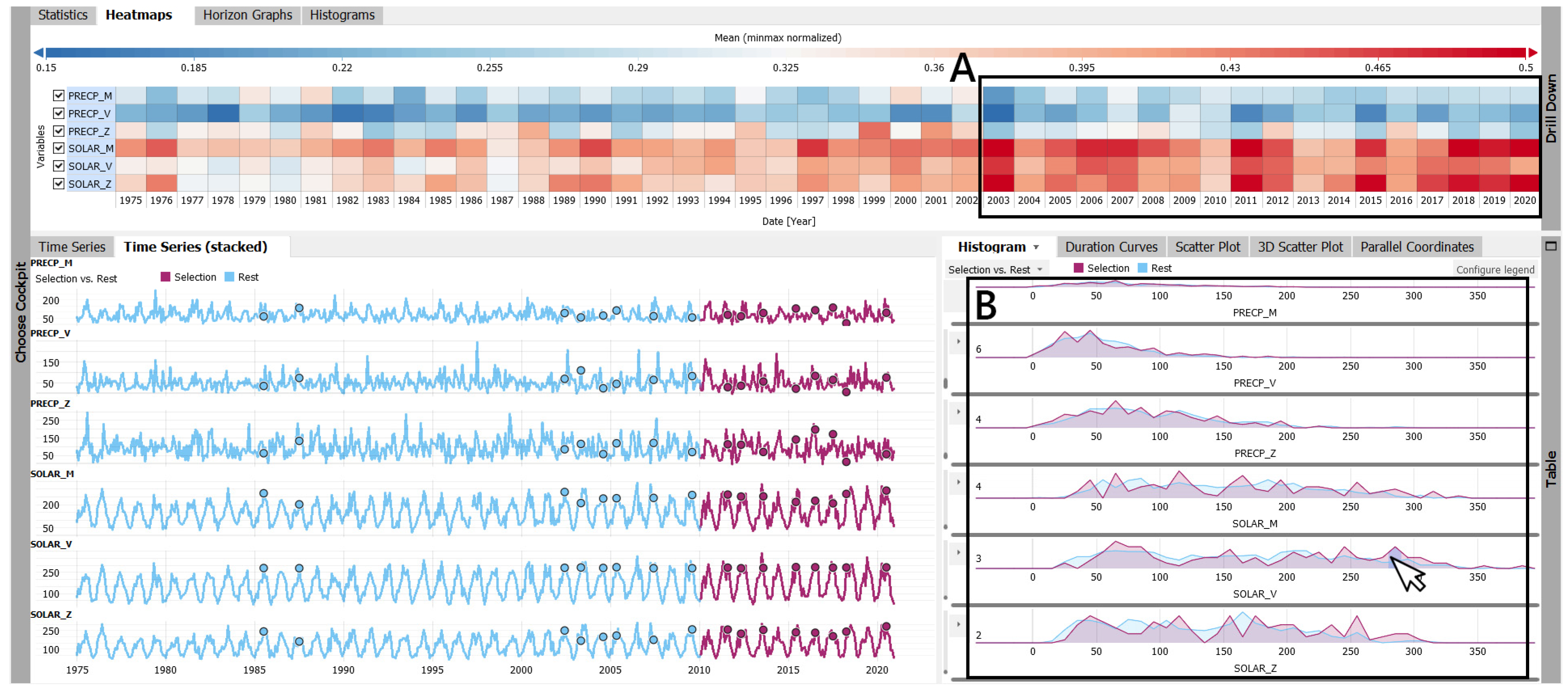
The visual analysis of the meteorological parameters pertaining to solar radiation and precipitation provided us with additional interesting insights (Figure 5). Namely, we can observe a generally higher duration of solar hours in recent periods, whereby the precipitation data revealed a slow but steady upward trend (as depicted in the heatmap view in Figure 5). This is further supported by the existing prominent peaks observed in the histogram view, representing the 2010–2020 data subset. Together, such observations may indicate a dry period with longer annual sunshine duration, along the more likely episodes of sudden precipitation events, such as the heavy rain events.
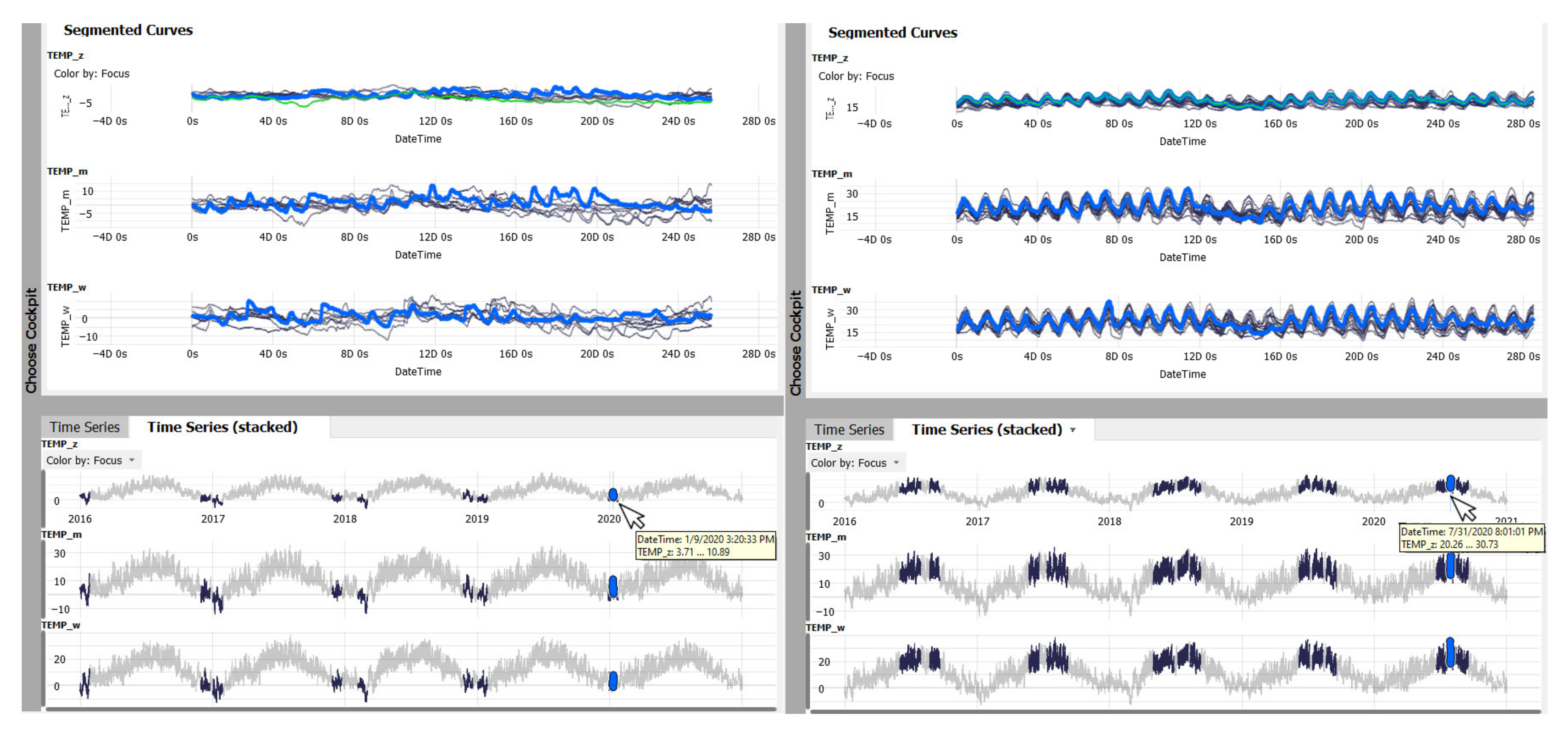
Looking at the short-term analysis, we observed the duration and positioning of both air temperature minima and maxima over the entire period of 2016–2020 (Figure 6). We performed a seasonal pattern search for cold (i.e., below −5 °C) and warm events (starting from 25 °C and exceeding 30 °C), as seen in Figure 6, left and right, respectively. We can see a clear decline in cold events, along with an apparent shorter seasonal duration. Once we isolated the conditions from the year 2020 and compared them to the past four years, it was rather clear that the temperature minima have a tendency towards generally higher values, as depicted with a blue line in Figure 6. Furthermore, we can see that the temperature minima in 2020 are beginning to rise at an earlier time, already after the 12th day of a cold event (Figure 6, top left). On the contrary, warm events were equally present throughout the entire period of five years; however, with a more prominent clustering in the year 2020. This may indicate a longer duration of heat waves in the current period. This is further supported by the respective duration of warm events in 2020 (depicted by a blue line in Figure 6, top right), where we can see that higher temperatures are still present after the 16th day of a warm event, whereby a decline may be observed for the previous years.

3.2.2. Urban Microclimate Development

In order to illustrate the degree of urban microclimate development that can be discerned from the meteorological time series, we describe here a study conducted for the city of Vienna, Austria. The acquired open source data represent a yearlong hourly-based air temperature information depicting the year 2020, simultaneously measured at an urban (Hohe Warte) and a rural (Vienna airport) station [26]. Prior to the study the same data structure and data quality check was performed, as described in climate change detection scenario. The aim of this comparative study was to provide an evidence of the magnitude and characteristics of the urban climate change on a local level, specifically focusing on urban overheating. Such investigations are driven by the fact that urban areas have a tendency to develop higher temperatures than the corresponding rural areas, forced by a generally higher thermal mass with greater heat absorption, storage, and release capacity, leading to the development of the urban heat island phenomenon [27,28].
However, it should be noted that the following study is limited in its scope due to the consideration of only one urban locality. The urban microclimate development is a phenomenon of a strong spatial and temporal character, with notable variations across a city. However, the inherent limitation of approaches focusing on empirical data is that only so many collection points in a city may be offered. This especially holds true for a study of this nature, which strongly depends on the availability of weather stations in a particular city. As we fully relied on the open data made available by the local meteorological institute, the possibility to include more stations at this stage was not feasible. We hope that in a near future a collaboration with the concerned institute may be established so that more data would be at our disposal with a better spatial coverage. However, the benefit of relying on open data is not only to allow for replicability of the research and related findings, supporting thus the validation activities, but also for testing the proof of concept, which in this regard refers to the detection of urban microclimate development using the suggested visualization techniques and methods.
We started our investigation by observing the full-length annual temperature distribution where, on such a high level, little discrepancy in hourly values across paired parameters was observed. However, with the aid of a VA system, we could perform a more comprehensive analysis and detect hidden and inexplicit events. To exemplify, we defined two distinct thresholds representative of cold (below 0 °C) and warm (above 28 °C) conditions (Figure 7). Cold conditions were observed from the rural station (T_SCHW) serving as a base line, whereby warm conditions were observed from the urban station (T_HW). From the histogram view in Figure 7, we can clearly perceive a prominent discrepancy between such events. In case of cold events, for the temperature range below 0 °C recoded in the rural dataset, a clear shift towards a higher range (up to 5 °C) was depicted in the urban dataset (histogram view in Figure 7). In contrast, for warm events, we observed a tendency towards higher temperatures in the urban dataset, whereby the range in rural dataset was wider (starting from 27 °C). Horizon graphs in Figure 6 further support these observations, as a larger area of lower temperatures (marked in blue) was noted in rural data for the corresponding paired instances in urban data. Similarly, a larger area of higher temperatures (marked in red) was noted in urban data for the corresponding paired instances in rural data. We further noted some cases with a reversed trend, where for higher urban temperature corresponding to lower rural temperatures were recorded. This is especially visible in horizon graphs in Figure 7, for the month of February, as well as from mid-November until the beginning of December.
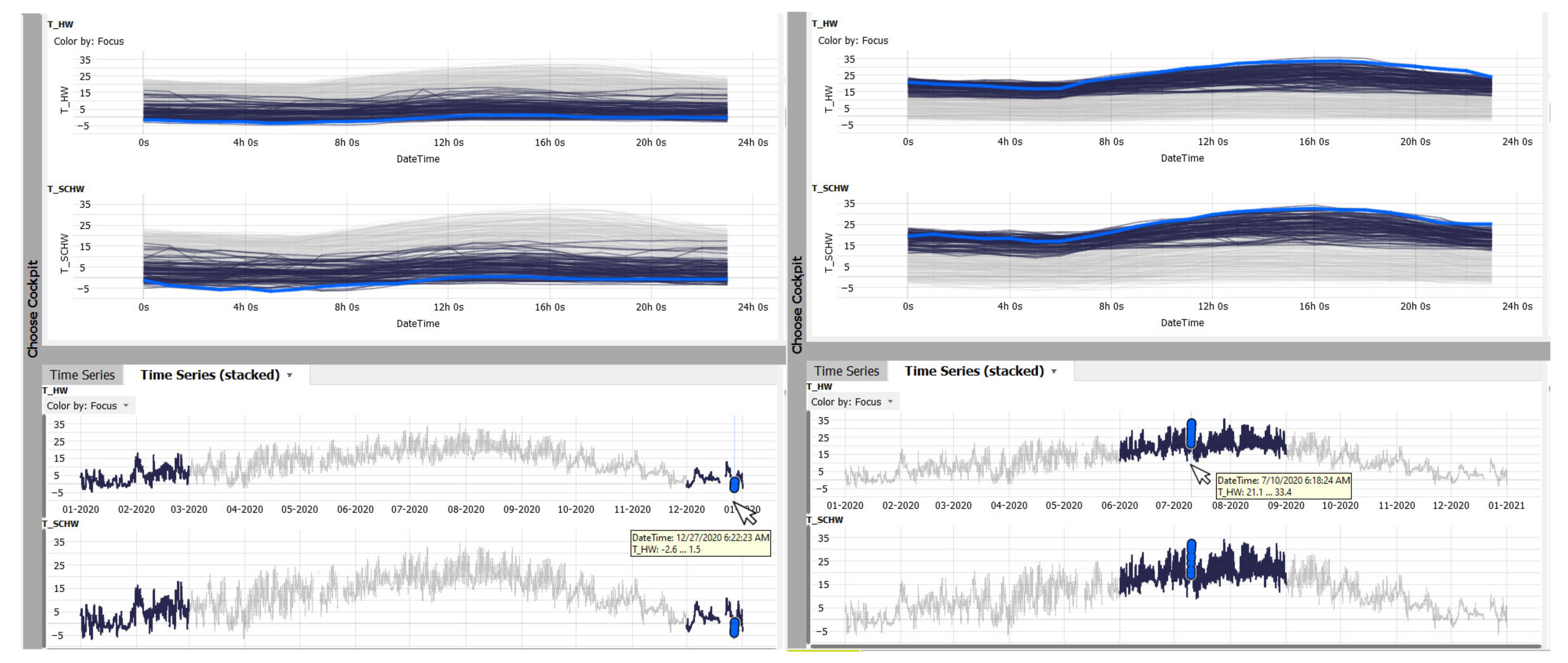
For a more in-depth analysis, we isolated temporal fragments of both time series, representative of meteorological seasons, specifically winter and summer (Figure 8). We further focused on diurnal segmentation within each of the concerned season, whereby all segmented curves of selected time series are superimposed over each other (Figure 8, top). This allowed us to observe discrepancies in peak values and daily amplitudes, along the warming and cooling trends encoded in both datasets. For instance, we could perceive a wider temperature range during winter for rural area going as low as −8 °C, whereby urban winter temperature rarely exceeded −5 °C. Regarding the diurnal distribution, a flatter curve can be observed for the urban area, suggesting less temperature variation throughout the day and a probable development of the urban heat island effect. Results pertaining to summer offered more insights on urban heating tendencies with the daily temperature maximum being up to 2.5 °C higher in urban than rural areas. Furthermore, the urban cooling process was equally delayed, as the temperature in rural area generally started to drop around 4 PM, whereby 6 PM was a cooling point noted for the urban area (Figure 8, top up). However, the overall cooling rate was slower in urban than in rural areas (depicted by a flatter blue line in urban dataset). Such observations indicate a possible development of tropical nights in urban areas.

4. Visualization and Exploration Approaches for Geospatial Analysis

4.1. Visual Analytics System with Combined 2D and 3D Visualizations

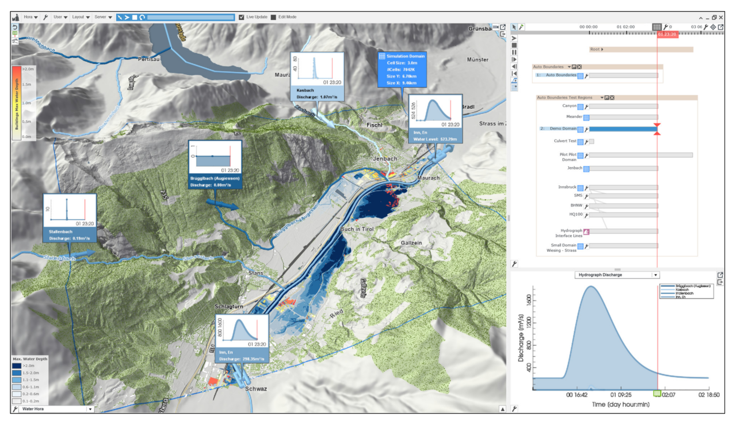
The system used for interactive visual investigation of geospatial data and corresponding real-world processes is an integrated ensemble-based flood simulation and visualization software developed at our institution [29]. More precisely, this is a scenario-based decision-support system, which combines state-of-the-art hydrodynamic modelling (i.e., simulation of water propagation and interaction with surrounding structures), 2D analysis, and 3D visualization methods to support exploration, planning, and decision-making in the context of flood management (Figure 9).
Diverse viewing units are used for this purpose. To support the time-based navigation across generated ensemble simulations, a 2D temporal view with world lines is offered, while a spatial 3D visualization is used to navigate through a design space via a 3D rendering of a scenario. World lines denote a novel interactive visualization system of multiple linked branching 2D views that enable interactive comparative analysis across alternative simulation runs. These simulations are commonly run with a different set of simulation parameters pertaining to the, for example, intensity and duration of rainfall, the magnitude of river floods, or the failure of existing protection measures [30]. These parameters can be interactively refined and modified on the fly, allowing a prompt visual feedback. For instance, users may directly interact with 3D visualizations and draw paths in a 3D view to design, e.g., protective measures such as mobile walls or sandbags. These actions are automatically translated into new simulation boundary conditions.

4.2. Visual Analytics Opportunities in the Context of Flood Management

By using the software framework described above, we can carry out comprehensive investigation and identification of flood-prone areas towards an informed flood risk assessment. More specifically, we can derive the following: (1) detailed flooding area maps with water level information; (2) flow maps (i.e., different water flow directions, water velocity, transportation paths of potentially dangerous debris); (3) consider and evaluate the performance of protective measures (i.e., physical barriers to flooding); (4) carry out an object-centered impact and vulnerability assessment, e.g., the flood-related vulnerability and impacts focusing on a particular object (i.e., a building). In the context of the present contribution, we will discuss flood damage under a heavy rainfall scenario and flooding probabilities along the façade computed for a building of interest.

4.2.1. Flooding under a Heavy Rainfall Scenario

Our analysis relied on a 3D visualization of dynamic water simulation with realistic water surface representation, flowing over a high-resolution digital terrain model embedded into a geospatial context, further interacting with existing high-resolution building meshes. For the terrain model, we considered elevation data originating from the Austrian open data initiative representing an Austrian city [31], where ground elevations are relative to the sea level. Likewise, high-resolution building meshes originated from the same open data initiative.
The software takes the height field of the terrain model (the so-called bathymetry) defined on a regular grid with cell size between 0.5 and 5 m [32]. A common practice is to have the bathymetry already prepared for hydrodynamic modelling, whereby the riverbeds are properly cut out by experts beforehand and bridges have been removed. Additionally, the simulation takes as an input a scalar field of surface roughness values (i.e., Manning’s roughness coefficients) that are derived from vector data pertaining to land use, which is available from open data services. Building footprint polygons are taken from the official cadastral map of the municipality and later rasterized following the same grid resolution, to create solid wall cells for the simulation that are defined as not flooded.
For the dynamic water simulation, as a result of heavy rainfall leading to surface runoff, we considered specific input boundary conditions such as the inflow and outflow conditions with hydrographs (a function of water flow rate over time), along the precipitation rates and duration. In our decision support system, the water flow is simulated with a shallow water simulator using a finite-volume method [33]. The output of the simulation is represented by cell-averaged water levels and velocities defined on a rectangular adaptive grid. In the background, the system processes the hydrological and geospatial input data to automatically compute inflow, outflow, and interior flow conditions required by the 2D flood simulator.
Figure 10 illustrates the resulting flooding scenario using a 3D rendering view, depicting the surface water runoff for the concerned spatial domain under a considered extreme weather event. We can immediately observe which areas are particularly affected given the terrain configuration and natural water flow. Additionally, we can inspect the site-specific water depth information by sampling target zones directly from the 3D rendering view. The visualization of the resulting information is supported by 2D analytical views. Besides such comprehensive urban flood forecasting and visualization, we can carry out the estimation of corresponding building structural damage. In this case, buildings are color coded with respect to their hazard (red = high, yellow = medium), as depicted in Figure 10. All of these aspects are also time-sensitive, which means that we can easily observe the natural progression of concerned events through time (Figure 10, left and right). Aggregated values such as maximum water levels or worst-case damages over the considered scenario duration can optionally be displayed as well.
It is rather clear that in order to fully understand the degree of the severity of such flooding scenarios in the generated virtual world, the 3D visualization and supporting navigation features are paramount. By deploying such features, we can inspect highly impacted zones in more detail and observe them from different angles. In turn, this may uncover hidden and occluded time-sensitive and location-sensitive events that would otherwise remain undetected. Figure 11 illustrates one such explorative study done for the same urban domain where we detected a potential for rainwater accumulation that could eventually overflow towards the surrounding building structures. These kinds of explorations generally lead to a conceptualization and informed placement of preventive measures such as, e.g., water retention basins.

4.2.2. Building-Oriented Impact and Vulnerability to Flooding Events

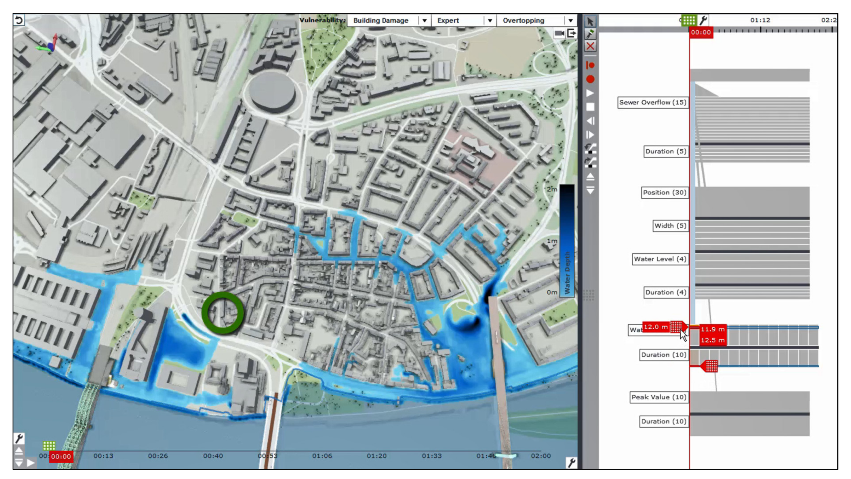
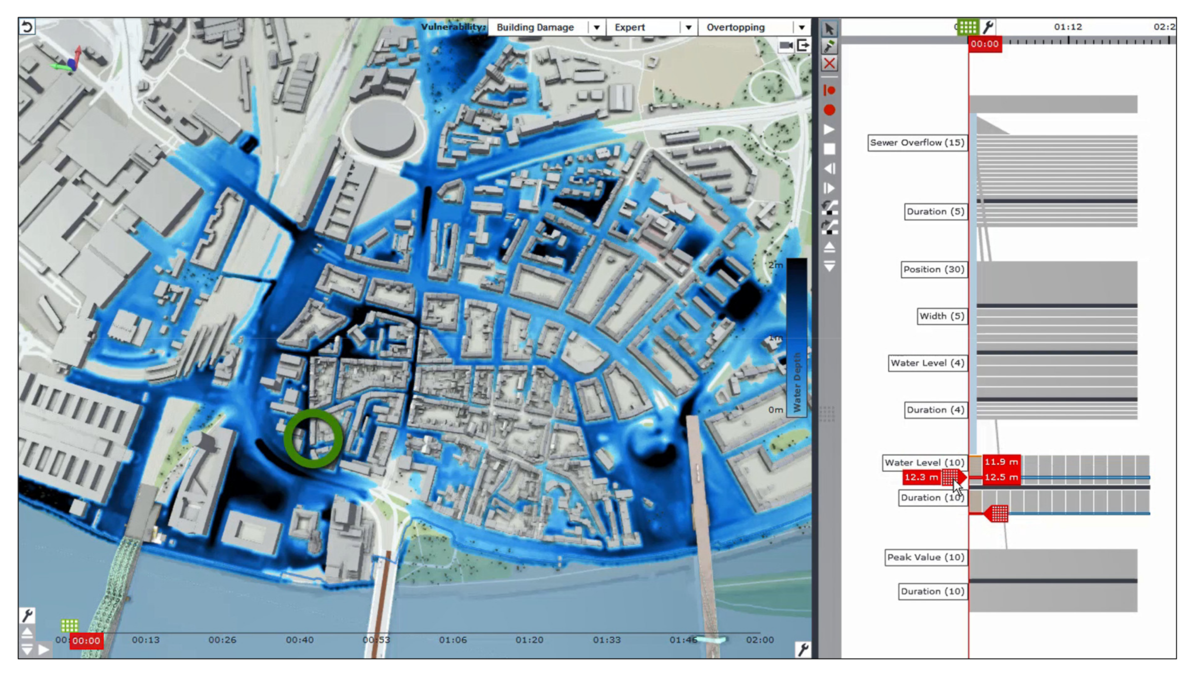
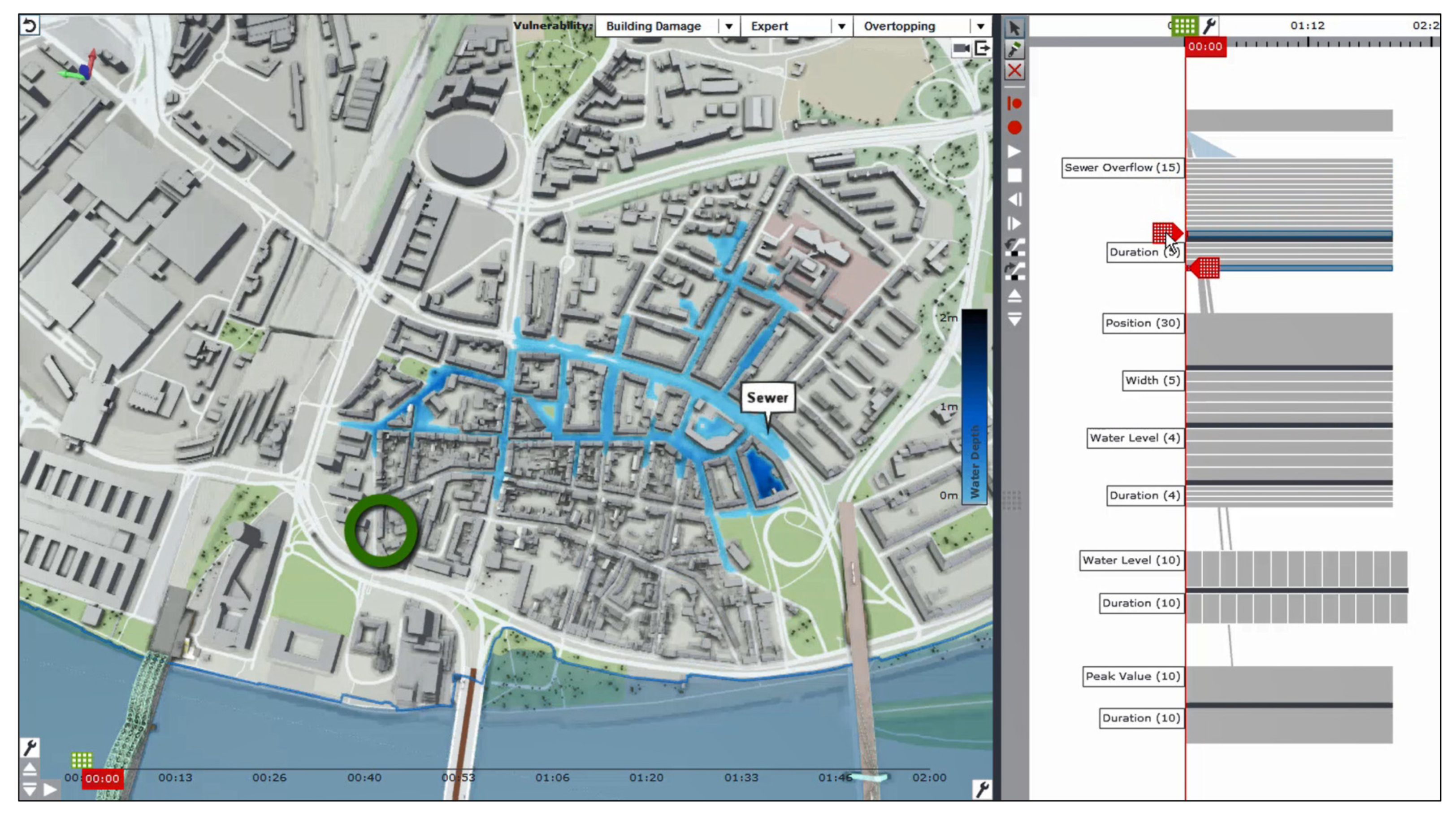
In addition to investigation of flood-prone areas within a certain spatial context, the understanding of the impact and vulnerability of existing infrastructure to flood-related hazards is equally imperative. We consider here the building-centered impact of flood-related hazards on the building of interest, estimated by the degree of exposure of the building façade to flood water. Considered flood-related events include floodwall breaches (dam breaks), sewer overflows, heavy rains, and floodwall overtopping (water spilling over the wall). Figure 12 and Figure 13 illustrate sample floodwall overtopping scenarios for a sample urban domain in the city of Cologne, Germany. The depicted flood events are a result of water discharge from the overtopping river, which is illustrated here for different water level rise (i.e., 12 and 12.3 m). Figure 14 illustrates the sewer overflow scenario for a given parameter selection (i.e., duration of the heavy precipitation event). On the right side of each software interface, we can see the afore-mentioned world lines depicting different simulation runs for each flooding event type run under different boundary conditions (e.g., different breach positions, water levels, precipitation rates, event durations, etc.). The green circle in Figure 12 and Figure 13 marks a building of interest.
We start by investigating the building-level impact due to a flooding event [34]. For this purpose, we carry out the mapping of the water levels aggregated over all relevant scenarios at each cell over time onto the building façade areas in a 3D city model. This aggregation provides us with a new scalar field of maximum water depths. We then sample the respective water depths along the footprint polygon of the building of interest in fine steps (e.g., 10 cm steps) to calculate the maximum water depth along the building facade. This results in a line depicted in 3D view (purple line along the façade in Figure 15, right), and the area below that line is assumed to be exposed to water. With all scenarios being mapped onto the building façade areas, we can further derive respective maximum water depth lines for each individual scenario. Additionally, we can calculate a probability for each of the points on the façade being flooded in any of the considered scenarios. These probabilities are then colored in the 3D visualization from red (absolutely certain flooding in every scenario) to green (very low chance of flooding).
In Figure 15, we illustrate the probability of a particular part of the façade to be exposed to the water under the floodwall overtopping scenarios. By interactively selecting the water level depicted on the façade (purple line along the façade in Figure 15, right), we can visualize the corresponding flooding scenario under which such damage and water level is the most probable to occur. The respective water depths map is shown on the terrain using shades of blue.
To enhance the perception of water levels along the entire building object, a rotation along the contour edges of the object is enabled (Figure 16). This allows for an informed flood risk assessment alongside the entire object, so that the appropriate mitigation measures may be planned. Furthermore, a (fictitious) door and the surrounding cars are always shown on the facing façade to further add to the sense of scale. Beside the exterior water levels, it is possible to also visualize the water levels inside a building, a computation that is driven by the water inflow through user-defined leaky windows.
We continue by visualizing the building-centered vulnerability to floodwall overtopping assisted by an interactive 2D tabular cell-based chart (Figure 17 and Figure 18). The vulnerability metrics are computed in relation to the previously derived lines depicting the maximum water depths along the building footprint. The maximum height of each line is taken as the highest exposure of any point of the building to water, which is then used to color the building-centered vulnerability. A plausible heuristic is used to translate the water range from 0–2 m to a respective damage level of 0–100%. We consider the 2 m height as the absolute maximum due to the fact that at this height, water pressure along the building would be so high that catastrophic damage to the building would be inevitable. This means that water would be forced through every window and door, with substantial flooding of the cellar and entire ground floor.
The present scenario illustrating building-centered vulnerability concerns the analysis of the city of Cologne’s (Germany) preparedness for and response to flood-related incidents [32]. More specifically, the potential of suggested protection walls along the river Rhine to withstand the raising water levels and water pressure on the walls is evaluated. The investigation concerned multiple scenarios where potential breaches are inspected and resulting overtopping analyzed (Figure 17 and Figure 18, right panel of each interface composite view). Additionally, we could select a particular building of interest to evaluate the building-centered vulnerability.
In this regard, the vulnerability is shown with respect to the damage inflicted on the building of interest (marked in a 3D city model view in Figure 17 and Figure 18). On the left side of the 2D tabular chart, a vertical gauge is given that indicates different water levels and the corresponding uncertain vulnerability values. Each cell in the 2D tabular chart depicts the color-coded vulnerability of the building of interest in the corresponding scenario (water level and duration). Here, the red color depicts vulnerability up to 100%, while the gray color depicts conditions that are considered safe (Figure 17). These vulnerability-sensitive scenarios can be directly selected from the 2D tabular chart (marked with a purple square in Figure 17) and further investigated.
Once a desired vulnerability-sensitive scenario is selected, the view plots a hydrograph (black line plot) that represents the evolution of the water level in the river over time. Essentially, a hydrograph represents an inflow boundary condition for the floodwall overtopping simulation. At the bottom of the hydrograph, we see the time navigation bar to support the time-sensitive investigation of the selected scenario (Figure 18). The blue horizontal line in Figure 14 and Figure 15 depicts the level of existing flood-protection structures and therefore the critical water level after which overtopping can be expected.

5. Development Process and Field of Applications of Presented Tools

As a research company, we strive to constantly improve the developed tools and integrate analysis techniques through a tight external collaboration and a constant reflection on the usability and functionality. Thus, the added value of the presented tools and their visualization techniques lies in constant feedback sessions conducted with domain experts and future users of such solutions, thus verifying usefulness but also improving the functionality of the developed tools. A number of such feedback sessions focusing on diverse aspects of developed tools are documented in Arbesser et al. [35] and Cornel et al. [29,34]. For instance, Arbesser et al. [35] described the evaluation process of the VA tool supporting 2D visualizations conducted with domain experts from the energy sector, whereby the focus was on usability of integrated 2D visualization solutions for data exploration and quality assessment of multiple energy-related time series data (e.g., data on power production, sensor data on meteorological variables). In summary, the domain experts found the concerned visualization solutions as suitable for visually exploring multiple datasets and presenting the data quality problems to other stakeholders. Additionally, the efficient overview of hierarchies were found to be effective in supporting argumentation of data quality problems to data providers. In Cornel et al. [29], the evaluation of the VA tool supporting 2D and 3D visualizations was done in close collaboration with domain experts working in the field of flood management. In addition to a discussion on best water surface reconstruction approaches, the experts generally welcomed the integrated visualizations of flow directions and high velocities through a 3D view. In Cornel et al. [34], the evaluation was conducted with flood manager and logistics experts, where they were asked to interpret different visualization results of object-centered vulnerability and evaluate their usefulness and readability. In general, they found the mapping of water levels onto the building facades as a particularly useful and visually descriptive feature on possible building-level damages. Likewise, the interactive 2D cell-based chart depicting different vulnerability-sensitive scenarios was seen as intuitive and well suited for exploring the entire scenario pool, suitable even for communication to non-professionals. Essentially, both solutions are a result of several years of research projects with our partners from the industry. All the features of developed systems are attentively tailored, allowing research-based further development and customer-based customization of developed analytical ensembles. In short, the visualization/analytical solutions offer the subsequent users of the technology the opportunity to participate directly in the development process to ensure that the developed solution can be well integrated into the existing work processes.
The pool of potential (and existing) use cases and related users of the tools is wide. In case of the VA tool supporting time series investigations, the majority of the existing use cases lies in applied industrial research. More specifically, the tool was commonly used in automotive engineering, industrial manufacturing, and the energy sector. In this context, the focus was, for example, on increasing the efficiency and effectiveness of tasks such as the optimization of engine designs by analyzing multiple time series data originating from numerous simulation runs. Some other use cases concern the control and optimization of manufacturing processes in metal industry, along with the ability to identify potential for optimization in forecasts and power grid operation. All of the tasks involved complex and high-dimensional data such as technical indicators, process parameters, and time series of energy production and consumption. As mentioned before, those are industrial applications. However, great application potential lies in climate and environmental research, which was demonstrated in this paper.
In case of the VA tool supporting flood and storm water management and flood-response planning, the main application lies with cities and municipalities to make decisions on disaster control plans, structural measures for flood protection, as well as for the preparation of evacuation plans. Local flood forecasts and alarm systems for industrial companies, but private individuals as well, are also of great importance with regard to their personal surroundings, office buildings, and homes, and are, as such, another relevant area of application. In addition, up-to-date local information on potential floods supports flood protection personnel in coordinating construction work to protect important infrastructure.

6. Conclusions

We have presented and discussed a number of application case studies in the environmental domain that explore the potential of using different interactive visualizations offered by Visual Analytics (VA) tools for data exploration and sense making. On the one hand, we used 2D visualizations in VA to analyze diverse multivariate attributes of meteorological time series data. On the other hand, we deployed tightly integrated 2D and 3D visualizations in VA to investigate complex attribute characteristics of spatiotemporal data pertaining to flood management. In both cases, the performance and computational capacities of the used interactive visualization options have proven to be invaluable given the domain tasks and the data type at hand.
When dealing with meteorological time series data, interactive linked 2D visualizations were found to be a powerful and a useful tool for addressing intricacies of such an abstract problem space. Additionally, the perceptive and highly responsive multi-view structure of deployed computational cockpits allowed us to simultaneously investigate a number of features native to the underlying data and to further define and apply a number of event-based and time-based filters. This allowed us to go beyond the obvious observations detected on a higher level, such as the simple annual progression of concerned meteorological parameters. For instance, we were able to detect fine-grained diverging trends, hidden periodic behaviors, significant threshold violation trends, and discrepancies in values and amplitudes, by categorizing seasonal and diurnal patterns and by observing inexplicit behavior events for concerned parameters. This was further done at various levels of granularity to gain novel and deeper insights on the current state of urban-level overheating.
In contrast, when exploring the flood-related spatiotemporal data, by combining the interactive 3D views of data with 2D analytical displays, we enhanced our visual perception of phenomena that inherently occur in a 3D physical space and thus have a strong spatial association. Such innovative integrated solutions were found to be authoritative when dealing with dynamically evolving scenarios and events. By further utilizing the integral intuitive visual control for spatial and temporal elements (i.e., navigation, rotation, zooming, and time-based progression), we were able to deal with occlusions and potential visual distortions in each scenario and its time sequence. This allowed us to have a more perceptive view on the simulated flood-related events and their far-reaching impacts and further uncover hidden and occluded time-sensitive and location-sensitive events that would otherwise remain undetected.
The above-mentioned advantages and applications of VA methodologies in the environmental domain could profoundly affect the way we approach the analysis of such phenomena in the future. In the case of climate research, the resulting insights may serve as a basis for general awareness rising, but also priority planning of mitigation measures based on the most critical localities (i.e., the most affected cities and regions). In case of flooding research, the resulting insights may serve as a basis for future decision-making on disaster control plans, structural measures for flood protection, as well as for the preparation of evacuation plans.

Author Contributions

Conceptualization, M.V. and J.S.; Methodology, M.V.; Software, M.V. and D.C.; Validation, M.V., J.S., D.C. and T.O.; Formal analysis, M.V. and D.C.; Investigation, M.V. and D.C.; Resources, M.V. and D.C.; Data curation, M.V. and D.C.; Writing—original draft preparation, M.V.; Writing—review and editing, J.S., D.C. and T.O.; Visualization, M.V. All authors have read and agreed to the published version of the manuscript.

Funding

This research received no external funding.

Institutional Review Board Statement

Not applicable.

Informed Consent Statement

Not applicable.

Data Availability Statement

Data used in this research is a part of open data initiatives of Austria, Germany, and Switzerland. Publicly archived datasets may be found at the following links: (AT) https://www.data.gv.at/katalog/dataset/wetter-seit-1955-hohe-warte-wien (accessed on 3 December 2021); http://at-wetter.tk/ (accessed on 3 December 2021); https://www.data.gv.at/ (accessed on 3 December 2021); (DE) https://opendata.dwd.de/ (accessed on 3 December 2021); (CH) https://data.stadt-zuerich.ch/dataset/ugz_meteodaten_stundenmittelwerte (accessed on 3 December 2021).

Acknowledgments

VRVis is funded by BMK, BMDW, Styria, SFG (Steirische Wirtschaftsförderungs-gesellschaft m.b.H. SFG) and Vienna Business Agency in the scope of COMET—Competence Centers for Excellent Technologies (879730), which is managed by FFG (Österreichische Forschungsförderungsgesellschaft).

Conflicts of Interest

The authors declare no conflict of interest.

References

  1. Anouncia, S.M.; Gohel, H.A.; Subbiah, V. Data Visualization: Trends and Challenges Toward Multidisciplinary PerceptionI, 1st ed.; Springer: Singapore, 2020; p. 179. [Google Scholar] [CrossRef]
  2. Schmidt, J. Visual Data Science. In Data Visualization; InTechOpen: London, UK, 2020. [Google Scholar] [CrossRef]
  3. Fisher, B.D. Visual Representations and Interactions Technologies. In Illuminating the Path: The Research and Development Agenda for Visual Analytics; Cook, K.A., Thomas, J.J., Eds.; IEEE Computer Society: Los Alamitos, CA, USA, 2005; pp. 69–104. [Google Scholar]
  4. Amini, F.; Rufiange, S.; Hossain, Z.; Ventura, Q.; Irani, P.; McGuffin, M.J. The Impact of Interactivity on Comprehending 2D and 3D Visualizations of Movement Data. IEEE Trans. Vis. Comput. Graph. 2015, 21, 122–135. [Google Scholar] [CrossRef] [PubMed]
  5. Elmqvist, N.; Tsigas, P. A taxonomy of 3D occlusion management for visualization. IEEE Trans. Vis. Comput. Graph. 2008, 14, 1095–1109. [Google Scholar] [CrossRef] [PubMed]
  6. Bleisch, S.; Nebiker, S. Connected 2D and 3D visualizations for the interactive exploration of spatial information. In Proceedings of the 21th ISPRS Congress, Beijing, China, 3–11 July 2008. [Google Scholar]
  7. Ortner, T. Tight Integration of Visual Analysis and 3D Real-Time Rendering. Doctoral Dissertation, Vienna University of Technology, Vienna, Austria, 29 December 2020. [Google Scholar]
  8. Jern, M.; Johansson, S.; Johansson, J.; Franzen, J. The gav toolkit for multiple linked views. In Proceedings of the 5th International Conference on Coordinated and Multiple Views in Exploratory Visualization, Zurich, Switzerland, 2 July 2007. [Google Scholar]
  9. Sorger, J.; Bühler, K.; Schulze, F.; Liu, T.; Dickson, B. Neuromap—Interactive Graph Visualization of the Fruit Fly’s Neural Circuit. In Proceedings of the IEEE Symposium on Biological Data Visualization, Atlanta, GA, USA, 13 October 2013. [Google Scholar]
  10. Miranda, F.; Doraiswamy, H.; Lage, M.; Wilson, L.; Hsieh, M.; Silva, T.C. Shadow accrual maps: Efficient accumulation of city-scale shadows over time. IEEE Trans. Vis. Comput. Graph. 2018, 25, 1559–1574. [Google Scholar] [CrossRef] [PubMed] [Green Version]
  11. Aigner, W.; Miksch, S.; Schumann, H.; Tominski, C. Visualization of Time-Oriented Data; Springer: London, UK, 2011. [Google Scholar]
  12. Heer, J.; Kong, N.; Agrawala, M. Sizing the Horizon: The Effects of Chart Size and Layering on the Graphical Perception of Time Series Visualizations. In Proceedings of the Conference on Human Factors in Computing Systems (CHI), Boston, MA, USA, 4–9 April 2009. [Google Scholar]
  13. Hashimoto, Y.; Matsushita, R. Heat Map Scope Technique for Stacked Time-series Data Visualization. In Proceedings of the 16th International Conference on Information Visualization, Montpellier, France, 11–13 July 2012. [Google Scholar]
  14. Tableau. 2021. Available online: https://www.tableau.com/ (accessed on 3 December 2021).
  15. QlikView. 2021. Available online: https://www.qlik.com/ (accessed on 3 December 2021).
  16. MS Power, BI. 2021. Available online: https://powerbi.microsoft.com/ (accessed on 3 December 2021).
  17. Behrisch, M.; Streeb, D.; Stoffel, F.; Seebacher, D.; Matejek, B.; Weber, S.H.; Mittelstaedt, S.; Pfister, H.; Keim, D. Commercial Visual Analytics Systems-Advances in the Big Data Analytics Field. IEEE Trans. Vis. Comput. Graph. 2018, 25, 3011–3031. [Google Scholar] [CrossRef] [PubMed] [Green Version]
  18. Bögl, M.; Aigner, W.; Filzmoser, P.; Gschwandtner, T.; Lammarsch, T.; Miksch, S.; Rind, A. Integrating Predictions in Time Series Model Selection. In Proceedings of the EuroVis Workshop on Visual Analytics, Cagliari, Italy, 25–26 May 2015. [Google Scholar]
  19. Fujiwara, T.; Shilpika Sakamoto, N.; Nonaka, J.; Yamamoto, J.; Ma, K. A Visual Analytics Framework for Reviewing Multivariate Time-Series Data with Dimensionality Reduction. IEEE Trans. Vis. Comput. Graph. 2021, 27, 1601–1611. [Google Scholar] [CrossRef] [PubMed]
  20. ArcGIS. 2021. Available online: https://www.arcgis.com/ (accessed on 3 December 2021).
  21. GeoMedia. 2021. Available online: https://www.hexagongeospatial.com/products/power-portfolio/geomedia (accessed on 3 December 2021).
  22. Chang, R.; Wessel, G.; Kosara, R.; Sauda, E.; Ribarsky, W. Legible Cities: Focus-Dependent Multi-Resolution Visualization of Urban Relationships. IEEE Trans. Vis. Comput. Graph. 2007, 13, 1169–1175. [Google Scholar] [CrossRef] [PubMed]
  23. Vuckovic, M.; Schmidt, J. Visual Analytics Approach to Comprehensive Meteorological Time-Series Analysis. Data 2020, 5, 94. [Google Scholar] [CrossRef]
  24. Vuckovic, M.; Schmidt, J. Visual Analytics for Climate Change Detection in Meteorological Time-Series. Forecasting 2021, 3, 18. [Google Scholar] [CrossRef]
  25. NASA Climate. 2021. Available online: https://climate.nasa.gov/scientific-consensus/ (accessed on 3 December 2021).
  26. ZAMG. 2020. Available online: http://at-wetter.tk/ (accessed on 29 October 2021).
  27. Santamouris, M. Urban Heat Island and Local Climate Change. In Minimizing Energy Consumption, Energy Poverty and Global and Local Climate Change in the Built Environment: Innovating to Zero; Santamouris, M., Ed.; Elsevier Inc.: Amsterdam, The Netherlands, 2019; pp. 65–102. [Google Scholar]
  28. Zinzi, M.; Agnoli, S.; Burattini, C.; Mattoni, B. On the thermal response of buildings under the synergic effect of heat waves and urban heat island. Sol. Energy 2020, 221, 1270–1282. [Google Scholar] [CrossRef]
  29. Cornel, D.; Buttinger-Kreuzhuber, A.; Konev, A.; Horváth, Z.; Wimmer, M.; Heidrich, R.; Waser, J. Interactive Visualization of Flood and Heavy Rain Simulations. Comput. Graph. Forum 2019, 38, 25–39. [Google Scholar] [CrossRef]
  30. Ribicic, H.; Waser, J.; Fuchs, R.; Blöschl, G.; Gröller, E. Visual analysis and steering of flooding simulations. IEEE Trans. Vis. Comput. Graph. 2012, 9, 1062–1075. [Google Scholar] [CrossRef] [PubMed]
  31. Austria Open Data Initiative 2021. Available online: https://www.data.gv.at/ (accessed on 29 October 2021).
  32. Cornel, D.; Buttinger-Kreuzhuber, A.; Waser, J. Integrated Simulation and Visualization for Flood Management. In Proceedings of the Special Interest Group on Computer Graphics and Interactive Techniques Conference Talks (SIGGRAPH ’20 Talks), New York, NY, USA, 17 August 2020. [Google Scholar] [CrossRef]
  33. Buttinger-Kreuzhuber, A.; Horváth, Z.; Noelle, S.; Blöschl, G.; Waser, J. A fast second-order shallow water scheme on two-dimensional structured grids over abrupt topography. Adv. Water Resour. 2019, 127, 89–108. [Google Scholar] [CrossRef]
  34. Cornel, D.; Konev, A.; Sadransky, B.; Horváth, Z.; Gröller, E.; Waser, J. Visualization of Object-Centered Vulnerability to Possible Flood Hazards. Comput. Graph. Forum 2015, 34, 331–340. [Google Scholar] [CrossRef]
  35. Arbesser, C.; Spechtenhauser, F.; Mühlbacher, T.; Piringer, H. Visplause: Visual Data Quality Assessment of Many Time Series Using Plausibility Checks. IEEE Trans. Vis. Comput. Graph. 2017, 23, 641–650. [Google Scholar] [CrossRef] [PubMed]
Figure 1. Illustration of real-time responsiveness to feature selection across 2D visual units within one computational cockpit: (A) by selecting a data sample from a horizon graph (top), (B) the corresponding data pair is highlighted in time series distribution (bottom left) and (C) histogram (bottom right) view across all active time series, allowing thus an instantaneous comparative analysis.
Information 13 00007 g001
Figure 2. Illustration of a toolkit for data quality check available at the used VA tool: (A) the detected missing values in the whole data pool with exact positioning of concerned missing instances marked with red lines, (B) visual detection of threshold breaches for those instances when a value exceeds 30 °C or goes below 0 °C.
Information 13 00007 g002
Figure 3. Warming progression denoted for the air temperature maxima with higher frequency of temperatures exceeding 35 °C in the past 10 years in comparison to the remaining 35 years: (A) the observed higher representation of temperature peaks marked in red; (B) the highlighted individual data points denoting instances of air temperature exceeding 35 °C; (C) shifting of the frequency area towards generally higher values for temperature maxima.
Information 13 00007 g003
Figure 4. Warming progression denoted for air temperature minima with higher frequency of temperatures not exceeding −5 °C in the past 10 years in comparison to the remaining 35 years: (A) the observed higher representation of temperature peaks marked in red; (B) the highlighted individual data points denoting instances of air temperature below −5 °C in 2010–2020 period; (C) shifting of the frequency area towards generally higher values for temperature minima.
Information 13 00007 g004
Figure 5. Annual changes observed for the solar radiation and precipitation data: (A) a prominent increase in solar radiation, along a more steady upward progression of precipitation events in recent periods; (B) higher peaks for the majority of values observed in the 2010–2020 period when compared to the rest of the dataset.
Information 13 00007 g005
Figure 6. Composite view of comparative seasonal pattern analysis for air temperature minima and maxima carried out for the short-term dataset: winter (left); summer (right).
Information 13 00007 g006
Figure 7. Comparative analysis of air temperature datasets originating from urban and rural environments showing a clear misalignment of low and high temperature ranges, along the warming signal in urban data.
Information 13 00007 g007
Figure 8. Composite view of comparative seasonal analysis of urban and rural air temperature depicting discrepancies in high and low values, along the different cooling and warming rates: winter (left); summer (right).
Information 13 00007 g008
Figure 9. Integrated ensemble-based flood simulation and visualization system with combined 2D (world lines, diverse analytical diagrams) and 3D visualization units.
Information 13 00007 g009
Figure 10. Time-sensitive urban flooding simulation under a heavy rainfall scenario with hazard representation for potential building structural damage (red = high, yellow = medium): earlier time stamp (left); later time stamp (right).
Information 13 00007 g010
Figure 11. Time-sensitive urban flooding simulation under a heavy rainfall scenario observed from additional angle: earlier time stamp (left); later time stamp (right). We can further observe how the degree of hazard for potential building structural damage changed for individual building objects.
Information 13 00007 g011
Figure 12. Selection of different floodwall overtopping scenario from the parameter-based and time-based world lines (green circle marks the building of interest). In this illustration, a water level of 12 m was selected and the resulting flooding scenario visualized for selected overtopping duration.
Information 13 00007 g012
Figure 13. Selection of different floodwall overtopping scenario from the parameter-based and time-based world lines (green circle marks the building of interest). In this illustration, a water level of 12.3 m was selected and the resulting flooding scenario visualized for selected overtopping duration.
Information 13 00007 g013
Figure 14. Selection of a sewer overflow scenario from the parameter-based and time-based world lines (green circle marks the building of interest). In this illustration, a sample scenario was visualized for a specific positioning of the sewage discharge point and the duration, given the 15 variations of overflow localities and 5 possible durations.
Information 13 00007 g014
Figure 15. Probability of a particular part of the building façade to be exposed to water: selection of the desired impact visualization and scenario (left); selection of a sample scenario from the entire scenario ensemble directly from the building façade (right). The colors denote a range from 0% probability (green) to a 100% probability (red).
Information 13 00007 g015
Figure 16. Rotation along the contour edges of the building object of interest with corresponding water levels mapped on each façade for an informed flood risk assessment and planning of appropriate mitigation measures: side view of the building (left); back view of the building (right) The colors denote a range from 0% probability (green) to a 100% probability (red).
Information 13 00007 g016
Figure 17. Interactive 2D cell-based chart for the vulnerability to floodwall overtopping showing the selection of different vulnerability-sensitive scenarios: the gray color depicts conditions that are considered safe for the building of interest (left); the red color depicts vulnerability up to 100% (right).
Information 13 00007 g017
Figure 18. Interactive 2D cell-based chart for the vulnerability to floodwall overtopping showing gauge with water levels on the far left of each interface view, along the hydrograph (black line) and time navigation bar (bottom).
Information 13 00007 g018
Publisher’s Note: MDPI stays neutral with regard to jurisdictional claims in published maps and institutional affiliations.