Article

Colvis—A Structured Annotation Acquisition System for Data Visualization

by
Pierre Vanhulst
1,*,†,
Raphaël Tuor
1,†,
Florian Évéquoz
2,† and
Denis Lalanne
1,†
1
Human-IST Institute, University of Fribourg, 1700 Fribourg, Switzerland
2
Institute Business Information Systems, University of Applied Sciences Western Switzerland, HES-SO Valais-Wallis, 3960 Sierre, Switzerland
*
Author to whom correspondence should be addressed.
These authors contributed equally to this work.
Information 2021, 12(4), 158; https://doi.org/10.3390/info12040158
Submission received: 28 February 2021 / Revised: 29 March 2021 / Accepted: 6 April 2021 / Published: 9 April 2021
(This article belongs to the Special Issue Trends and Opportunities in Visualization and Visual Analytics)

Abstract

:
Annotations produced by analysts during the exploration of a data visualization are a precious source of knowledge. Harnessing this knowledge requires a thorough structure of annotations, but also a means to acquire them without harming user engagement. The main contribution of this article is a method, taking the form of an interface, that offers a comprehensive “subject-verb-complement” set of steps for analysts to take annotations, and seamlessly translate these annotations within a prior classification framework. Technical considerations are also an integral part of this study: through a concrete web implementation, we prove the feasibility of our method, but also highlight some of the unresolved challenges that remain to be addressed. After explaining all concepts related to our work, from a literature review to JSON Specifications, we follow by showing two use cases that illustrate how the interface can work in concrete situations. We conclude with a substantial discussion of the limitations, the current state of the method and the upcoming steps for this annotation interface.

1. Introduction

Data visualizations allow analysts to generate new insights on a particular topic despite an overwhelming amount of data—that is, too much to be understood by looking at the raw, textual information only. Making sense out of a data visualization is an iterative process that can be supported by using annotations. These can either mark the progress of an evolving understanding of the data, or be shared with other analysts for various purposes, such as propagating and asserting hypotheses. When exploring a new visualization, analysts can also rely on prior annotations: they direct their understanding of the data, or conversely, highlighting potential unexplored areas.

1.1. Wording

This article uses a few technical terms that can take on different meanings depending on the background of the reader. In the context of this study, we define an “annotation” as the embodiment of one or several analysts’ observations made about the data, while interacting with a data visualization. Annotations are usually textual, and can optionally be enhanced by “visual cues” (such as arrows to highlight an increase, or lines to insist on the separation between two groups). An “annotation system” is thus a piece of software that allows analysts to leave annotations. An “analyst” is a person who looks at a visualization to understand its data—trying to confirm an hypothesis, expecting to answer a question, or even out of pure curiosity. The analyst gains new “insights” (pieces of knowledge) through “observations” (thoughts), that can be laid out as annotations. In this case, the analyst also becomes an “annotator”. Finally, while most systems try to manage both personal and public annotations, our study focuses mainly on the latter: our annotations are meant to be shared with other analysts.

1.2. Motivations

We developed Colvis (the name stands for collaborative visualization), a modular, fully-featured annotation system that aims to fill the gaps that we identified during our literature review, described in Section 2. While systems for user-authored annotations form a decently abundant research field, we identified three aims that are not perfectly supported by the existing propositions.
  • The first aim is the retrieval of annotations relevant for the analysts. We describe existing methods of retrieval in Section 2. We believe that there is a need for analysts to retrieve annotations based on the type of pattern identified by the annotators. A generic task that illustrates our point could be: “Find all annotations speaking of the entities that stand out from the trend within the dataset.” We also believe that an annotation should be attached to its related data, rather than to a view. An analyst would thus be able to retrieve annotations not just on their original view, but also under various conditions described in Section 5.2.
  • We assume that an efficient annotation system provides incentives for analysts to look at the data from various points of view, rather than sticking to similar cognitive patterns. To the best of our knowledge, this aim is simply not addressed by existing systems, at least not openly. There is a seemingly prohibitive stumbling block to this end: increasing the variety of annotations requires an objective way to assess them. If one manages to address this issue, the system should still provide incentives for analysts to go beyond their “comfort zone”.
  • The evaluation of data visualization has always been a problem difficult to tackle [1]. We believe that annotations offer an additional measurement of the quality of visualizations: if a visualization musters a significant amount of annotations, analyzing them objectively will allow us to understand what kind of insights it can provide. If we apply this method to a wide range of visualizations, we could even establish a ground truth to help designers select sets of complementary data visualizations.
The difficulty when striving for those aims is twofold: differentiating annotations and acquiring them. The former challenge requires a thorough and objective way of differentiating annotations. This alone would theoretically be enough, as it would enable (1) advanced search and retrieval (i.e., looking up for particular detection patterns, or specific parts of the data); (2) the analysis of the coverage of possible annotations; and through that (3) the ground truth mentioned above. This task has been addressed in a previous study [2] that structured annotations within a framework composed of six dimensions. This framework, however, is far too complex for analysts to use during the annotation process: literature [3,4] has already proven that most users are reluctant to use manual annotation interfaces. Asking them to fill obscure dimensions would only drive them further away. Solving this particular issue is far from trivial: it is about turning a theoretical framework into an usable solution that could foster results for the scientific community.

1.3. Contributions

The main contribution of the study is a method to acquire structured annotations, without harming user engagement. We are looking for a way to sort the annotations automatically according to the classification framework presented in Section 3.4. With this paper, we thus propose the first module of Colvis: an interface that feels familiar to a wide range of analysts and that translates seamlessly their inputs into the classification framework, this from both a technical and a theoretical points of view. Concretely, we offer the following contributions:
  • A proposal for a full-featured annotation system;
  • A design rationale, grounded in our observations, for the annotation interface;
  • Technical details of the implementation of the interface with web technologies, including how to recover data from visualizations built through common data visualization libraries;
  • A description of two use cases where the interface is being used, demonstrating how it can address the issues raised in Section 1.2.

2. Previous Work

This section presents the works and articles related to our proposal. We explored two leads: fundamental literature about the structure of annotations, and literature about annotation systems.

2.1. The Structure of an Annotation

While annotations in data visualization are now an active field of research [5,6,7], very few studies considered the definition of their structure—or their “grammar”—as a main topic. That is not to say that the literature is void of meaningful knowledge: when designing any visualization or annotation system, most researchers indirectly provide interesting clues to build our knowledge of how annotations can be structured.
We can offer a first answer to these questions by looking at the tasks an analyst would conduct for data visualization. This particular topic is abundant, and we choose to rely on Munzner’s taxonomy [8] as a starting point, her work being noticeably comprehensive and synthetic. This taxonomy relies on three steps—”what–why–how”—to design a visualization. The “why” step includes a list of tasks, and a list of visual features an analyst could find within a visualization.
Other authors, such as Bertin [9], Friel et al. [10], Curcio [11], and Boy et al. [12], developed various concepts to assess the level of comprehension of an analyst. Their research provided a solid foundation for design of a classification framework [2]. This framework was built on over 300 annotations gathered during the study and is presented in Section 2.3.
Annotations can be structured through other lenses, depending on their context, such as the annotation environment, or the nature of the data. In a study on co-located collaboration [13], Mahyar et al. differentiated the content of “notes” (annotations) between findings and cues, the former being mathematical observations extracted from the data, and the latter being interpretations. This distinction is akin to the “level of interpretation” dimension mentioned above. The authors then distinguished the “scope” of an annotation, some being aimed at other analysts, while others were mainly meant for further reference by the annotator. Finally, the authors also noted that the content of the annotations, written on paper, comprised text, drawings, numbers, and symbols. The symbols and drawings matched the definitions of graphical annotations, described comprehensively by Heer et al. [7]. While they increased the expressiveness of annotations, these various acquisition methods seem unlikely to adapt efficiently to remote collaboration through web interfaces: the authors of the classification framework [2], while limited by their number of participants, still found that less than a quarter of them were willing to use a stylus to draw shapes or symbols in controlled environment. Since our goal is to maintain an acceptable level of user engagement, we did not consider graphical annotations for this study. With annotation graphs, Zhao et al. [6] built a model based on the “Eight C’s”—eight approaches to analyze observational data from HCI studies. These approaches partially match with the dimensions mentioned above, although they focus on visualizations of time series. A notable illustration of this difference can be seen by matching the concept of “chunks” to that of “data units”. The idea is similar, but as the subjects of most analysis tasks supported by annotation graphs are usually parts of a flux of interaction, the authors did not consider these “chunks” as clear, discrete entities, unlike “data units”, which usually encompass persons, documents, or any named or nameable object.
The concept of annotation often encompasses external resources that do not strictly belong to data visualization. As an example, the definition of annotation by the W3C [14] could be summarized as the link between a number of resources describing other resources, such as texts or images that describe a video or a song. With this study, we argue that a specific focus on interaction methods related to data visualizations leads to improvements that general-purpose annotation systems could not provide. Therefore, features that are not strictly related to data visualizations are outside of the scope of this research. However, the W3C document contains a wide range of interesting, technical ideas that were used in the implementation of the interface presented below: of all concepts, selectors, and fragments are the most important to our research.

2.2. Annotation Systems

In the context of data visualization, annotation systems can be perceived as a textual or graphical representation that enrich a view. Since the seminal work of ManyEyes [15], new systems made their way to our knowledge. Libraries such as d3-annotation [16] offer options about annotating visualizations generated with the d3 library [17]. More interestingly, one option allows one to link the position of a graphical annotation to a data point, rather than to spatial coordinates, so that it remains relevant regardless of the position of that data point. This feature implements the notion of “link” to a resource, proposed by the W3C’s team. Heer, Schneiderman, and Park [7] further coined the term “data-aware” for annotations that are not simple graphical or textual entities over a visualization, but point to the underlying data through selections. Using data-aware annotations, we believe that it is possible to go much further than simply moving graphical annotations. Analyzing the selected data points, along with additional information given by the annotators, opens the door to the automatic acquisition of structured annotation exposed in our introduction.
Literature provides a few examples of annotation systems that go in this direction. CommentSpace [3] structured the exchanges between analysts by allowing them to tag their annotations as “hypothesis”, “question”, “evidence-for” and “evidence-against”. In our understanding, authors qualified the role of an annotation to structure discussions around insights. CommentSpace was, however, a prominent attempt at improving how annotations can be organized and retrieved, and we believe that this direction can be pushed forward by further structuring annotations. With InsideInsights [18], the authors advocate the idea that while distinct, the sense-making process and the presentation process are intertwined. According to them, analysts go back and forth between those two states, and current annotation systems do not offer satisfactory ways of handling this. They thus propose an interface very close to what Notebooks propose, like Jupyter or their own Codestrates’ [19], where annotations are taken directly in a side “block note” next to the visualization. Analysts can write down their observations, then pick and sequence a subset to present their results to external readers. The authors also used a concept similar to our “level of interpretation” dimension, when speaking of high-level annotations (generalities about the data) or low-level annotations (about very specific parts of the data). They group these annotations into hierarchical trees, where many low-level annotations belong to one high-level annotation. Users can then “zoom in and out” depending on the levels of information that they want to see. The concept of “active” annotation is also presented: InsideInsight highlights the annotation that corresponds to the state of the visualization, so that the most relevant insights are displayed during exploration. Finally, InsideInsight also capture the sequence of events that leads to the annotation, an idea also present in HARVEST [4] under the name “insight provenance”. With HARVEST, the authors managed to automatically record the sense-making process that leads to an annotation, while leaving out “noisy” low-level user interactions that are not relevant to the cognitive process of the annotator. This achievement was possible through the development of an “action tier” that bridges the gap between low-level user interactions, easy to capture but hardly informative, and high-level tasks and sub-tasks that require manual acquisition. ChartAccent [6] focuses on the narrative aspect of annotations: the authors consider annotations as part of a visualization and provide extensive means to leave visual annotations embedded within the visualization. In contrasts, Colvis regards annotations as meta-data that can be reused outside of a visualization, as their insights still stand true regardless of the way data are encoded.
With Vega [20], the authors defined a “grammar of visualization” that allows the creation of data visualization through a JSON specification. This JSON specification served as an inspiration for Colvis in general, and for the interface in particular. Building on this, the authors went on to create languages and systems that help designers make relevant data visualizations, such as CompassQL [21] and Voyager 2 [22]. These latter examples are based on the principle that recommendations for data visualizations come from the analysis of the datasets. Instead, our approach with Colvis is ultimately to rely on the analysis of annotations to assess and recommend visualizations, as mentioned in the Section 1.2.

2.3. The Classification Framework

Understanding the classification framework that serves as the basis of this study is paramount, and this section aims to inform the reader with a sufficient level of detail. This framework relies on six dimensions, as seen in Figure 1. We detail each of these dimensions below, first by presenting them as they were designed for the previous study, then by exposing the modifications that this study led us to implement. Other improvements, yet to be discussed, are presented in Section 5.3.
  • The “insight on data” dimension determines if the annotation speaks of the data, or if it assesses the visualization altogether. A sizable amount of annotations left during the study were commenting the visualizations—whether the participants liked it, whether they could discover information faster, etc.—rather than fostering knowledge about the data displayed. This current study led us to add an additional level to this dimension, inspired by Curcio’s “read beyond the data” [11]: some annotations definitely refer to the data, but only rely on external sources of knowledge rather than addressing what is displayed on the visualization. Such annotations are usually “explanatory replies” to hypotheses formulated by other annotators.
  • The “co-reference” dimension determines whether the annotation is referring to a previous one left by the same analyst, as the setting of the study did not allow participants to see each other’s annotations. This option being available to annotators in this study, we simply renamed this dimension “reference”.
  • The “multiple observations” dimension states whether there exists several observations within an annotation. The previous study suggested that while the first three dimensions apply to the annotation itself, the next three dimensions speak of the content of the annotation—the observations. Each observation would thus have distinct levels of interpretation, detected patterns, and data units, as seen in Figure 1.
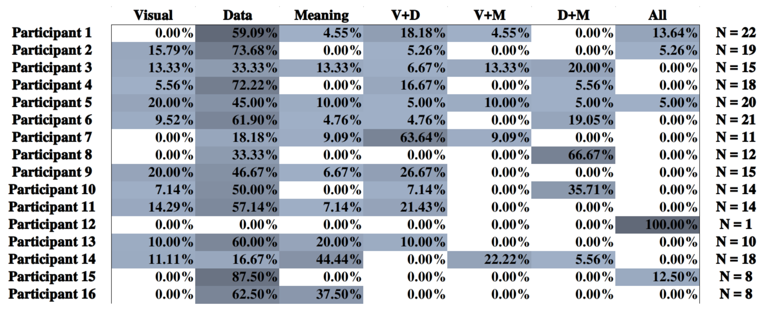
  • The “level of interpretation” describes how far the analyst went to understand the data. There are three possible levels of interpretation: “visual”, where the analysis focuses on visual objects (“there are more red dots at the left of the graph”), “data”, where the analysis relies on their understanding of the data (“most institutional websites are discovered by direct links”), and “meaning”, where the analysis goes beyond factual data to form a hypothesis or a statement (“it seems that most users were receptive to our last e-mail campaign”). It is possible for an observation to rely on several levels (“the red dots massed at the left of the graph imply that most institutional websites are discovered by direct links, meaning that users were receptive to our last e-mail campaign”). This dimension did not undergo any change during this study.
  • The “data units” are all segments of data that the observation involves. We distinguish units by their scope—either single in the case of individual datum or aggregated if several are involved—and their role—either subject if this unit is what the observation chiefly speaks about or complement if the observation uses the unit to compare the subject. Further considerations are mentioned in the discussion of this article regarding changes to this dimension.
  • The “detected patterns” dimension consists of three possible types of patterns observed by the analyst: either a small subset of the data compared to the rest, in which case he points out a “singularity”; or two subsets of relatively similar scope, in which case he denotes a “duality”; or the whole dataset, and he makes a “plurality”. With this study, we renamed the last pattern “generality”, as it conveys more accurately the meaning of this pattern.

3. Design of the Interface

We conducted the analysis of 302 annotations gathered during a previous study [2]. We found that most participants did not explore the totality of the dimensions of the classification. Notably, Figure 2 shows that they left a vast majority of annotations within the “data” level of interpretation, which were basically descriptions of content, sometimes linking visual information and knowledge of the data to form more complete observations. The sequence of the annotations did not yield any significant indications that analysts were increasing their level of interpretation as they left more annotations. In other words, participants stayed at a very descriptive level without thinking beyond. This discovery was the initial motivation for an interface that would prompt analysts to think about all levels of interpretation.

3.1. Design Rationale

The interface presented in this paper has been developed with the following goals in mind:
  • It should implement the classification framework that we presented in Section 3.4;
  • It should be usable by analysts who do not know that framework;
  • It should encourage analysts to explore the full extent of the classification framework;
  • It should adapt to existing systems rather than require specific development.
Early design decisions filtered out the least convenient options: on one hand, relying solely on users to manually classify their own annotations would have been difficult. This task is not only time-consuming, but also requires a certain degree of visual literacy [12] and a solid knowledge of the annotation theory. On the other hand, automatizing the classification process of free textual annotations was not an option either. Such solutions would have to rely on natural language interfaces [23], natural language processing (NLP) techniques and the natural language information method (NIAM), and this would unlikely result in an increase of the coverage of the classification: the “translation” process is done in the background, unknown to the analysts, and thus does not provide them with any incentive to go beyond their comfort zone. We settled for a mixed-initiative solution, by presenting an interface understandable by the end users, and translating their selections into the dimensions of our classification.

3.2. Technical Considerations

The web interface was built as a Vue.js plugin. It can be integrated in a larger Vue.js application or in any compatible platform. As it stands now, it is compatible with SVG-based data visualizations created either by D3.js or Vega (and by extension, Vega-lite and all platforms that rely on it). Designers willing to use the interface without the aforementioned libraries can, however, do so by embedding a __data__ property into the relevant DOM objects. Beyond these requirements, the plugin runs well with any databases, any authentication methods, and any visualization. Communication between the interface and the application works through regular Vue.js mechanics: props from the app to the plugins, events from the plugin to the app. The interface asks for a JSON specification to understand what data can be annotated. Optionally, it is possible to supply the interface with a “state” object that represents the evolving state of the visualization for re-contextualization. Recording that state is our way of implementing the concept of “insight provenance” described in yjr literature (see Section 2). As the main application sends state-related props to the interface, we can record their mutations, knowing that these are faithful representation of meaningful user interactions on the visualizations. Two other optional props are available: a list of users (useful to identify the source of the annotation) and a list of prior annotations (useful for references). In return, the interface sends back annotations as simple JavaScript objects that can be converted into JSON and stored in a database. These objects keep track of the state of the visualization by hashing its state and its data. With this, the interface can issue a warning if analysts are reading an annotation that was added at an earlier state of the dataset. A conceptual architecture schema can be seen in Figure 3.
The interface crawls the data within a visualization by using an array of data binders, JavaScript objects that link together a data object and the DOM Element it created. A data binder contains four properties:
binder := (id: string, obj: Object, domElement:HTMLElement, natureId: string)
id is a string that identifies the binder. obj is the JavaScript object containing all the properties of the entry being bound. domElement is the HTMLElement constructed by Vega or D3 thanks to the entry. natureId is a string matching the nature of the object. These data binders are generated thanks to the method getDataFromContainer, which looks up for a SVG container, and then browses through all elements in search of a __data__ property to analyze.
The code presented in this section can be found at the following URL: https://framagit.org/vanhulstp/colvis-client (accessed on 8 April 2021).

3.3. JSON Specification

Configuring the interface requires a JSON file with four properties for specifications. The first two properties define general settings of the interface, such as the container where to look up for Binders or the name of the instance, or whether the interface should appear as a drawer or a floating window.
The third property is a list of natures. Natures are types of entities that can be found within the data visualization. Readers familiar with the model–view–controller software design pattern could think of natures as models. For example, typical natures in the context of story analysis could include “characters”, “relationships”, or “chapters”.
nature := (id: string, annotable: boolean | selector, list: Data Binder[] )
id is a string identifying the nature. annotable is either false or a selector to filter the HTMLElements when crawling them from the visualization. If false, this nature is not supposed to be annotated itself: it can only be referenced in the second step of the annotation process as part of a combination. list is an array of data binders, initially empty but populated in the constructor method.
The fourth property is a list of combinations. Combinations explain how natures interact together. In the example of a story, the combination between “characters” and “chapters” produces “appearances”—the number of appearances of that character for that chapter that can be freely appreciated by the analyst.
combination := (id: string, first: Nature, second: Nature, products: (string|Nature)[], groupedSelection: boolean )
id is a string identifying the combination. first and second are both combined natures. products is an array either of strings or natures that represents the possible products between both natures. groupedSelection is a boolean that decides whether selecting an entry that belongs to either natures of this combination should also select all related products on the visualization.
The code of the Schema can be found at the following URL: https://framagit.org/vanhulstp/colvis-schema (accessed on 8 April 2021).

3.4. Annotation Interface

The interface proposes a structure that matches a mental scheme familiar to most analysts. We designed that structure as a four-steps stepper, as seen in Figure 4. The first three steps cover the actual “factual” observation and correspond to the subject-verb-complement (SVC) sentence pattern. The interface being built in English, we can assume that most analysts are well acquainted with this pattern. While inspired by the field of linguistic for the sake of familiarity, we do not claim to differentiate the rich predicative expressions of English grammar that NIAM experts need to account for [24]: in the context of data analysis, we cannot assert that these differences are relevant. The last step allows analysts to think beyond the data and interpret what they observed. What follows is a detailed description of all the four steps:
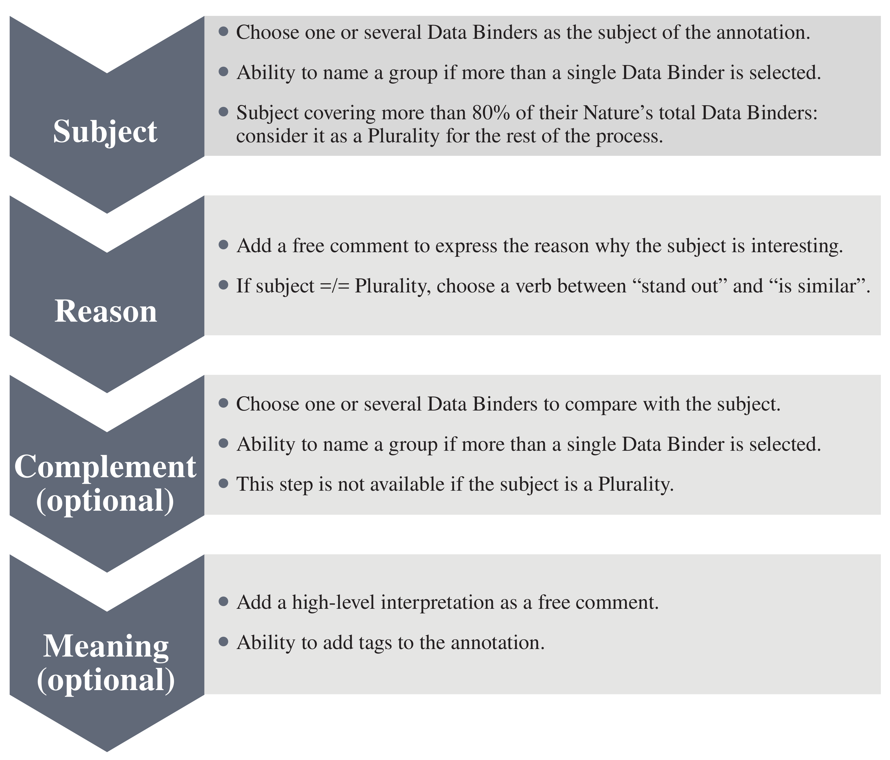
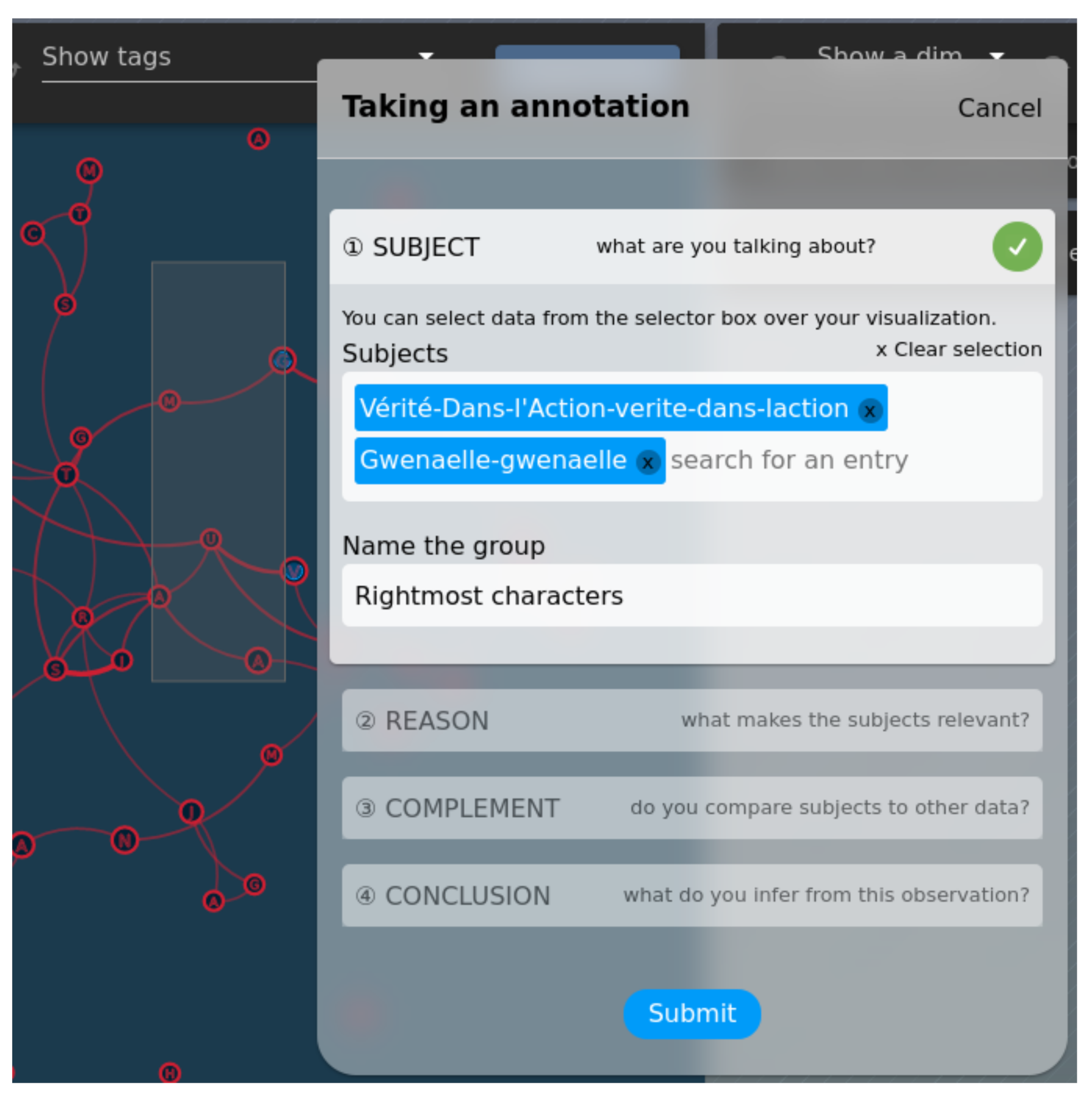
  • Subject allows analysts to select data binders they want to speak about. The interface proposes several methods: the analysts can use a rectangular selection directly on the visualization in order to select “visual” entities, use an autocomplete field to browse through the list of all data binders, or refer to a previous group from a prior annotation. If more than a single element is selected, the analysts are prompted to provide a “name” for the selected group of elements, allowing further annotations to refer to it. Furthermore, if the analyst selects a data binder that belongs to a combination with groupedSelection, all related products are also selected on the visualization. Figure 5 illustrates both the rectangular selection and the ability to name the set of selected data.
  • Reason allows analysts to explain what makes the subject interesting, using a set of pre-selected verbs. The analysts can choose between “stand out” or “is similar”. The latter requires a complement (see third step). Once they have chosen a verb, the analysts can leave a comment to further precise why the subject either stands out, or is similar to a complement. The list of products is displayed, at this step, to help formulate a comment.
  • Complement allows analysts to select potential complements, “opposed” or “compared” to the subject. The selection method is similar to that of the first step. All “named groups” can be retrieved in both the first and third step, regardless of their origin. This design choice allows analysts to refer to these groups sometimes as subjects, and sometimes as complements alike.
  • Meaning offers analysts to freely write a conclusion to their selection, along with free tags to help sort annotations.
The interface also offers a textual preview of the annotation, to inform how it is being structured by the interface. This textual preview is saved and can be reused to display the annotation anywhere.
Table 1 provides a correspondence between the steps and the options of the interface and the dimensions of our classification framework. The first three dimensions are being set independently of the content of the annotation:
  • All annotations relate to the data, general comments are not possible within the interface. The value of the dimension “insight on data” is always “true”.
  • Answering another annotation is allowed within Colvis. If an annotation is written as a reply, then its “co-reference” value is set to “true”, and to “false” otherwise.
  • Multiple observations are not possible per se. The system requires analysts to split them into separate annotations. The value of the dimension “multiple observations” is therefore “false”.
As it stands, the interface covers the whole extent of the classification. While most correspondences are self-explanatory, some require additional comments: retrieving elements by using the rectangle selection would point to a “visual” level of interpretation—where users would rely on visuals to make observations—while using the autocomplete field instead implies that the analyst knows of the relationship between the data and their encoding, and searches directly for data rather than visual shapes.
The “reason” and the “complement” steps of the interface could be considered redundant: while the fact stating a “verb” would explicitly determines which patterns have been detected by the analyst, these patterns can arguably be inferred by looking at the complements. We found that several annotations did not fit that definition, however, and decided to keep the “verb” step to handle these edge cases. As an example, let us consider the following annotation taken from Les Misérables: “Jean Valjean is similar to Marius’ group: he has a lot of connections”. Comparing “Jean Valjean”, a single data unit, to “Marius’ group”, an aggregated one, would point to a singularity, as the scope between both units differ. However, the very purpose of this annotation is to highlight a similarity between a character and a group of others, which falls into the description of “duality” according to the classification framework. The presence of the verb “is similar to” allows our interface to understand this distinction.

4. Use Cases

Our interface can adapt to various platforms, ranging from fun and entertaining ones to serious and demanding ones. It also supports both “exploratory” platforms that allow users to swap between various visualizations, and live platforms with predefined visualizations and evolving data. The following subsections present two cases where the interface is either being used, to illustrate its benefits to both analysts and visualization designers.

4.1. Vasco

Vasco [25] is an exploratory recommender system for data visualizations, similar to Voyager 2 [22] or Lyra [26]. It aims to help inexperienced users with the design of relevant visualizations. During the exploration phase, Vasco offers hints and comprehensive information about the data that the designers plan to use. It is built on top of Vega and Vega-Lite, composing CompassQL specifications on-the-fly to generate visualizations.
The annotation interface was integrated within Vasco as a way for analysts to comment their creations. The fact that Vasco can generate several workspaces, relying on the same data but encoding them differently, illustrates all the relevance of our approach: annotations are also bound to the dataset, and even if analysts browse through various visual representations, they can still retrieve and assess others’ observations despite the change.
An example of how Vasco and our interface work together can be seen in Figure 6. The platform already implemented the ability to retrieve and reply to annotations. For instance, the short version of the annotation seen in Figure 6 is the “meaning” of the “level of interpretation” dimension of the classification. Concretely, the annotations taken in the figures are translated as follows:
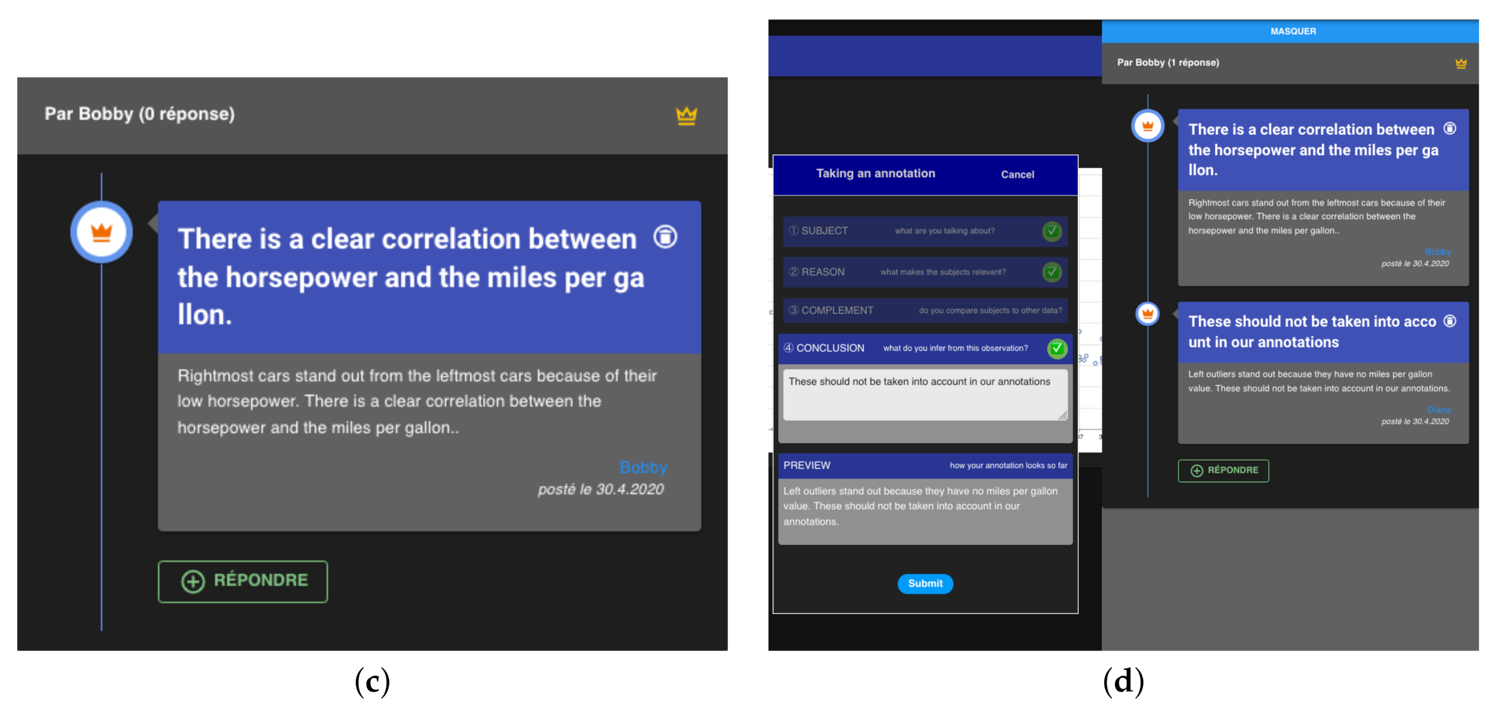
  • “Rightmost cars stand out from the leftmost cars because of their low horsepower. There is a clear correlation between the horsepower and the miles per galleon”. “Rightmost cars” is an aggregated subject data units of “car” nature. The verb “stand out” and the presence of a complement data unit indicates a “duality” pattern’. “Leftmost cars” is an aggregated complement data units of “car” nature. The selection—made through the autofill field—indicates a “visual” level of interpretation. Finally, the presence of a conclusion points to an additional “meaning” level of interpretation.
  • Left outliers stand out because they have no miles per galleon value. These should not be taken into account in our annotations.” “Left outliers” is the sole data unit, with a subject role, an aggregated scope and from the “car” nature. The verb “stand out” without a complement data unit indicates a “singularity”. There too, the units were selected through the autofill fields, implying a “visual” level of interpretation. The presence of a conclusion also points to a “meaning” level of interpretation.

4.2. premDAT: An Online Community for Tabletop Roleplaying Games

premDAT is an online, in-development platform dedicated to tabletop role-playing games, also known as pen-and-paper role-playing games. Users are invited to add their player characters (PCs) to its database, to describe them using generic attributes, and to visualize their similarities with other users’ characters in a force-directed graph. From a technical perspective, premDAT is built using two Node.js applications. The first one serves the client and relies on Vue.js, Nuxt.js, and Vuetify. The second one hosts the data and provides a REST Api. Strapi was used to this end, along with a MongoDB NoSQL database.
premDAT’s main graph displays characters and their similarity (nature:character). Characters are encoded as nodes, and defined by dimensions and tags that helped compute the similarity score (nature:dimension and nature:tag). The graph features various combinations:
  • The combination between characters and dimensions produces a score varying from 1 (weak) to 5 (strong). It is encoded as a sequential color scale for both nodes and edges, and only one can be displayed at a time depending on the state of the visualization. A secondary combination between characters and dimensions can be displayed by filling the nodes, allowing a comparison between both selected dimensions.
  • The combination between characters and tags is a boolean stating whether the character possesses that tag. It is encoded as little dot next to a node, that can be shown or hidden.
  • The combination between two characters is a similarity score ranging from 1 to 100. It is encoded as edges (links) between both nodes.
The way that the annotation interface and premDAT work together is pretty similar to Vasco’s, although the complexity of the visualizations outmatch those that can be created through an automated tool. In premDAT, the concept of “nature” (see Section 5.3 below) shines as annotators can comment dimensions, characters, or the strength of the links between two characters. In the example of Figure 7 and Figure 8, the annotation left is translated as follows: “Discrete characters stand out because they’re tightly linked together. I suppose this dimension is determinant regarding how similar characters are.” “Discrete characters” is an aggregated subject data unit of nature “character.” The verb “stand out” denotes a singularity. As we have no complement in this particular case, the singularity is thus implicit. As for the level of interpretation, two of the available levels are used: “visual” because it was selected through the selector, and “meaning” as a conclusion is present.

5. Discussion and Further Work

5.1. Limitations

The first and foremost technical limitation of the interface comes from its dependency on SVG. Canvas seems to overshadow SVG in modern web data visualizations. Whereas SVG has a structured format that can be manipulated from the DOM, Canvas boasts superior performances in most situations. Libraries such as Vega produce their visualizations in Canvas rather than SVG by default. WebGL renders canvas, allowing complex visualizations of thousands of elements with surprising performances. Libraries that leverage WebGL, such as Deck.gl or Openlayers, are becoming more mature and their popularity grows accordingly. To the best of our knowledge, there exist no standard ways to access data within a canvas, besides using hypothetical APIs provided by the library that produced it. Even in the case where such APIs exist, each library relies on a different way to bind data and visual elements, and adapting the interface to this abundant list of APIs would prove to be a hassle, if not simply impossible. With this in mind, we advocate the need for a standard, structured way to access elements within a Canvas, at least in the context of data visualization. This would open the door to many initiatives like Colvis, rather than limiting data visualizations to closed, black boxes.
Other limitations include:
  • Usability issues. Initial pilot tests with six users already found a few usability issues that relate to the name and the mandatory/optional nature of each step. These issues are not fundamental and we expect to fix them in further work.
  • Representing annotations for further retrieval through textual means is not optimal: the resulting text is bland and repetitive, and the interface might benefit from isotypes to display the dimensions of the annotation in a more attractive fashion. Figure 9 shows sketches of isotypes that could replace, or at least enhance textual representations of annotations.
  • Another situation where the interface currently fails is the presence of several views on the same page. Creating a specification for each view would prove inconvenient. Further works could lead to a more efficient way to this end, by avoiding the repetition of the most redundant aspects of the specification.
  • Using the two text areas at their disposal, annotators might be tempted to formulate their annotation by relying on graphical artifacts, such as positions and colors of data points, etc. These references lose their sense if the view changes too much, thus making parts of the annotation void of sense.
  • As it stands now, Colvis allows the selection of DOM elements, yet some visualizations rely on a single DOM element whose shape describes several “data points,” such as typical line charts. The ability to select only a subset of a DOM element has yet to be implemented, but we believe this could be easily achieved by leveraging scales from the D3 library and some SVG properties, such as the getTotalLength and getPointAtLength methods.
  • Finally, due to the amount of data transferred between Colvis and its parent application, it is unlikely that our system would fit the needs of a visualization containing several thousands data points. Keeping track of such large amount of points would require grouping techniques that are yet to be developed.

5.2. Relations between the Interface and Our End Goals

As mentioned in introduction, Colvis aims to leverage the structured annotations provided by the annotation interface. One of our goals is to display the most relevant parts of the annotations, in the most relevant fashion to the analysts. We identified four non-exclusive contexts of use:
  • User-centric, where individuals are likely to attract more attention than usual tasks-driven platforms (i.e., social platforms);
  • Data-centric, where analysts will focus on items (i.e., database platforms);
  • Visualization-centric, where most interactions happen directly on the visualization;
  • and Pattern-centric, where expert analysts would search for specific patterns in the annotations.
As seen in Figure 10, we already implemented three views related to these contexts, making use of the structured nature of the annotations to display relevant information where it fits the best. Vasco already implement a basic “visualization-centric” retrieval interface. Further work could improve it by using the “insight provenance” and display the annotations that match the current state of the visualization. Finally, the “pattern-centric” context is definitely the richest that the classification framework can provide and will be the subject of a dedicated study.
While the annotation interface should encourage annotators to think about all the dimensions of an annotation, we believe that the incentives to go beyond their comfort zone could be further strengthened. To this end, we aim to develop an automated feedback on their coverage of the classification, in the form of treillis treemaps for all dimensions, comparing the profile of a given annotator to the average of the platform. This would highlight potential lackings in the sense-making process of the analyst, prompting them to think about the data differently. As displaying this information alone might be cryptic for inexperienced analysts, we also suggest to display example of annotations corresponding to the types that lack the most, to inspire these unexplored approaches.
Finally, another interesting development for Colvis would be to allow the rating of annotations by peer analysts. Similar to the “like” button of Facebook, analysts could endorse the content of an annotation. As analyzing data is a complex task, Colvis should also allow analysts to assess whether the topic of an annotation is interesting, whether they agree with it or not. This would create a natural order between groundbreaking insights, trivial observations, interesting yet controversial proposals and uninteresting comments within the annotations. This crowdsourced evaluation, combined with the classification framework, would lead to a better understanding of what kind of annotations a visualization can foster, and how relevant they are to the eyes of other analysts.

5.3. Extending the Classification Framework

The design of Colvis yielded unexpected challenges for the classification, and we deem them interesting to discuss in this paper. By defining an interface with the familiar SVC sentence pattern, we came across the need for a reason step that does not directly belong to any dimension of the classification framework. As it stands now, the framework explains what the subject of an annotation is (subject data unit), what it is being compared to (complement data unit), and also by what is means (level of interpretation and detected patterns). However, we cannot infer why the subject data unit is worth an annotation. To handle this new aspect of the classification, we attempted to extend the set of possible roles for data units with a new distinction: “explanation.” Explanatory data units have a different “nature” than the subject data unit. The combination of two data units of different nature creates various products that annotators might refer to. When a non-subject data unit is selected and its nature is different from the subject, we hypothesize that this data unit is likely the “reason” that explains why the subject is interesting. This is in opposition to same-nature complement data units, that are used as comparison means. On top of those explanatory data units, we also need to keep track of the actual Product being annotated, and why it is being annotated. We contemplate the addition of a new dimension, “notable feature,” which would keep track of this.
This high-level theory deserves a concrete example. Consider the visualization in Figure 11. It displays the evolution of seven characters (nature:character) across 28 gaming sessions (nature:session). The combination between both natures foster three products:
  • Health level, an ordinal dimension that ranges from “fine” to “dead.” Encoded by colored cells.
  • Presence, a boolean that states whether the character appears in the session. Encoded by black cells.
  • Notes, free text to provide more explanations regarding a session and a character. Encoded by a circle within a cell.
To test the relevance of the proposed extension, we asked a participant to the premDAT study (described in Section 5.4) to create ten freeform annotations of which we will analyze a subset through this extended classification framework.
  • Meng is the only one who dies.” Meng is a subject single data unit. The annotation provides a singularity detected pattern and a data level of interpretation. “Dies” is a reference to the product “health level” between both natures of the dataset: we turn this into a notable feature. There is no explicit mention of an explanatory data unit.
  • Fernand doesn’t get hit, high level of health during the first half of the story.” Fernand is a subject data unit. As no mention of any other character is made, the annotation shows a singularity. “High level of health” is a reference to “high level,” whose particularity is “being high,” and “the first half of the story” is an explanatory data unit.
While enlightening, the addition of explanatory data units could theoretically be refuted if it is possible (1) to formulate a sensible annotation mentioning two data units of distinct natures with the same roles, or (2) to formulate a sensible annotation mentioning two data units of similar nature, with one being ostensibly an explanation. Unfortunately, we found out three exceptions that could apply.
First, it is possible to mention two data units of various natures with the same roles if the observation focuses on the “visual” Level of interpretation. Let us go back to the example visualization in Figure 11 and assume that the character “Jacques d’Oye” and the session “13” would be colored in red, to highlight some particular features. An annotator could write “Jacques d’Oye and Session 13 are both in red. I wonder if there’s a link between the two?.” This insight is about a visual artifact, but the annotation still stands.
Second, it is possible to mention two data units of various natures with the same role if the visualization itself focuses on their common attributes, rather than on their different. Consider a Google Trends chart: it displays Personalities, Books, Movies and many other elements as a single nature—an entity with a name and a popularity. As Colvis aims to attach annotations to the data, rather than to the visualizations alone, we expect the distinction between natures to be blurred when using different visual representations of the same data.
Finally, it is possible to mention two data units of similar nature, despite one being an explanatory data unit. Example of this can be seen in premDAT, where the product “similarity” relies on two characters. In the context of premDAT, it is theoretically possible to formulate annotations such as “Boris has a stronger similarity with Sirus than any other character.”
The addition of natures and notable features to the classification would thus require more work in order to tackle those issues, and we are confident it could be done in further study. From a technical perspective, there is another reason that explains why this extension was not considered for the current version of the interface: this addition would result in a higher complexity of the specification, to the point that the whole system would be rendered unusable by all but the most patient developers. The interface itself would also suffer from the convoluted distinction between all these concepts, a fact that would only worsen its usability.

5.4. User Evaluation

We led a six weeks experiment on premDAT, that aimed to determine the influence of Colvis on the analysts. Our main objectives were to figure out if Colvis (1) would correctly translate annotations into the classification framework, (2) would lower the user engagement of the analysts, (3) would foster a higher coverage of all dimensions of the classification framework, and (4) would make the retrieval of annotations easier. The platform thus proposed two ways of taking annotations: “free,” which offered a text area where the annotator could freely write her observations, and “structured,” which offered the step-by-step approach presented in this paper along with its automated classification. Our participants generated 390 annotations, 204 free and 186 structured.
A first analysis of the annotations, summarized in Table 2, reports significant differences in the way annotations are formulated. The structured approach clearly improved the coverage of the different levels of interpretation, prompting analysts to ground their observations in all three levels (visual, data and meaning). Visual references on free annotations were utterly rare, which makes the binding between visual elements and underlying data difficult. On the other hand, it is equally clear that analysts favored free annotations for replies, usually relying on external sources of knowledge to either endorse, oppose, or further explain the original observations. The same can be said of the “Generality” pattern: free annotations fostered 15 generalities, while structured annotations fostered 6 of them. The fact that Colvis requires analysts to select data units might nudge them to think more in terms of singularities and dualities, rather than reflecting on the whole dataset. Regarding data units, free annotations were extensively used to “select” natures that were not systematically represented visually, such as tags and dimensions. This fact only reinforces our belief that Colvis needs to take into accounts the various natures included in a dataset, and the ways they interact, as explained in Section 5.3. Free annotations were also used to denote absence of data, as in the following annotation: “There is no drug addict. Not a single one.” There too, our participants used free annotations to overcome an aspect of annotation that is not yet handled by Colvis. Further work will provide more insight on the data gathered during this study and detail more precisely how it influenced analysts during their annotation process.

6. Conclusions

With this paper, we presented a method to tackle the difficult issue of acquiring structured annotations from analysts in the context of data visualization. This method takes the shape of an interface inspired by the familiar SVC sentence pattern for annotation creation: with a comprehensive stepper, annotators are allowed to express their observations with limited amount of learning, thus reducing the risk of scaring them away. In the background, annotations taken thanks to the interface are translated within a rich, highly-structured classification framework. We proposed a concrete implementation of this interface, proving how it can adapt to two existing platforms without effort. This ability to acquire structured annotations opens the way to the design of advanced retrieval interfaces and the improvement of the variety of annotations, as well as posing the basis of a ground truth for the evaluation of visualizations.

Author Contributions

Conceptualization, P.V., R.T., F.É., and D.L.; methodology, P.V., F.É. and D.L.; software, P.V.; validation, P.V., R.T., F.É. and D.L.; formal analysis, P.V. and D.L.; investigation, P.V.; resources, P.V.; data curation, P.V.; writing—original draft preparation, P.V.; writing—review and editing, P.V. and D.L.; visualization, P.V.; supervision, D.L.; project administration, D.L.; funding acquisition, D.L. All authors have read and agreed to the published version of the manuscript.

Funding

This research received no external funding.

Institutional Review Board Statement

Not applicable.

Informed Consent Statement

Informed consent was obtained from all subjects involved in the study.

Data Availability Statement

The data presented in this study are available on request from the corresponding author. The data are not publicly available due to the privacy policy applied during the two experiments mentioned in the article.

Acknowledgments

We would like to express our sincere gratitude to all who participated in this study. In particular, we thank our fellow Human-IST and HES-SO members, Michael Papinutto, Julie Maltais and Julien Reichenbach for their precious inputs!

Conflicts of Interest

The authors declare no conflict of interest.

Abbreviations

The following abbreviations are used in this manuscript:
i. sing.Implicit Singularity (pattern)
e. sing.Explicit Singularity (pattern)
sScopeSubject’s scope (data unit)
cScopeComplement’s scope (data unit)

References

  1. Plaisant, C. The challenge of information visualization evaluation. In Proceedings of the Working Conference on Advanced Visual Interfaces, AVI 2004, Gallipoli, Italy, 25–28 May 2004; Costabile, M.F., Ed.; ACM Press: New York, NY, USA, 2004; pp. 109–116. [Google Scholar] [CrossRef]
  2. Vanhulst, P.; Evéquoz, F.; Tuor, R.; Lalanne, D. A Descriptive Attribute-Based Framework for Annotations in Data Visualization. In Computer Vision, Imaging and Computer Graphics Theory and Applications—13th International Joint Conference, VISIGRAPP 2018, Funchal, Madeira, Portugal, 27–29 January 2018, Revised Selected Papers; Bechmann, D., Chessa, M., Cláudio, A.P., Imai, F.H., Kerren, A., Richard, P., Telea, A.C., Trémeau, A., Eds.; Communications in Computer and Information Science; Springer: New York, NY, USA, 2018; Volume 997, pp. 143–166. [Google Scholar] [CrossRef]
  3. Willett, W.; Heer, J.; Hellerstein, J.M.; Agrawala, M. CommentSpace: Structured support for collaborative visual analysis. In Proceedings of the International Conference on Human Factors in Computing Systems, CHI 2011, Vancouver, BC, Canada, 7–12 May 2011; Tan, D.S., Amershi, S., Begole, B., Kellogg, W.A., Tungare, M., Eds.; ACM: New York, NY, USA, 2011; pp. 3131–3140. [Google Scholar] [CrossRef]
  4. Gotz, D.; Zhou, M.X. Characterizing users’ visual analytic activity for insight provenance. Inf. Vis. 2009, 8, 42–55. [Google Scholar] [CrossRef]
  5. Schmidt, C.; Rosenthal, P.; Schumann, H. Annotations as a Support for Knowledge Generation—Supporting Visual Analytics in the Field of Ophthalmology. In VISIGRAPP 2018, Proceedings of the 13th International Joint Conference on Computer Vision, Imaging and Computer Graphics Theory and Applications—Volume 3: IVAPP, Funchal, Madeira, Portugal, 27–29 January 2018; Telea, A.C., Kerren, A., Braz, J., Eds.; SciTePress: Setúbal, Portugal, 2018; pp. 264–272. [Google Scholar] [CrossRef]
  6. Zhao, J.; Glueck, M.; Breslav, S.; Chevalier, F.; Khan, A. Annotation Graphs: A Graph-Based Visualization for Meta-Analysis of Data Based on User-Authored Annotations. IEEE Trans. Vis. Comput. Graph. 2017, 23, 261–270. [Google Scholar] [CrossRef] [PubMed]
  7. Heer, J.; Shneiderman, B. Interactive dynamics for visual analysis. Commun. ACM 2012, 55, 45–54. [Google Scholar] [CrossRef]
  8. Munzner, T. Visualization Analysis and Design; A.K. Peters Visualization Series; A K Peters: Wellesley, MA, USA, 2014. [Google Scholar]
  9. Bertin, J. Sémiologie Graphique: Les Diagrammes, les Réseaux, les Cartes; Gauthier-VillarsMouton & Cie: Paris, France, 1967; p. 399. [Google Scholar]
  10. Friel, S.N.; Curcio, F.R.; Bright, G.W. Making Sense of Graphs: Critical Factors Influencing Comprehension and Instructional Implications. J. Res. Math. Educ. 2001, 32, 124–158. [Google Scholar] [CrossRef] [Green Version]
  11. Curcio, F.R. Comprehension of Mathematical Relationships Expressed in Graphs. J. Res. Math. Educ. 1987, 18, 382–393. [Google Scholar] [CrossRef]
  12. Boy, J.; Rensink, R.A.; Bertini, E.; Fekete, J. A Principled Way of Assessing Visualization Literacy. IEEE Trans. Vis. Comput. Graph. 2014, 20, 1963–1972. [Google Scholar] [CrossRef] [PubMed] [Green Version]
  13. Mahyar, N.; Sarvghad, A.; Tory, M. Note-taking in co-located collaborative visual analytics: Analysis of an observational study. Inf. Vis. 2012, 11, 190–204. [Google Scholar] [CrossRef]
  14. Sanderson, R.; Ciccarese, P.; Young, B. Web Annotation Data Model. W3C Recommendation, W3C. 2017. Available online: https://www.w3.org/TR/2017/REC-annotation-model-20170223/ (accessed on 29 March 2021).
  15. Viégas, F.B.; Wattenberg, M.; van Ham, F.; Kriss, J.; McKeon, M.M. ManyEyes: A Site for Visualization at Internet Scale. IEEE Trans. Vis. Comput. Graph. 2007, 13, 1121–1128. [Google Scholar] [CrossRef] [PubMed] [Green Version]
  16. Lu, S. D3-Annotation. 2017. Available online: https://d3-annotation.susielu.com/ (accessed on 29 March 2021).
  17. Bostock, M.; Ogievetsky, V.; Heer, J. D3 Data-Driven Documents. IEEE Trans. Vis. Comput. Graph. 2011, 17, 2301–2309. [Google Scholar] [CrossRef] [PubMed]
  18. Mathisen, A.; Horak, T.; Klokmose, C.N.; Grønbæk, K.; Elmqvist, N. InsideInsights: Integrating Data-Driven Reporting in Collaborative Visual Analytics. Comput. Graph. Forum 2019, 38, 649–661. [Google Scholar] [CrossRef]
  19. Rädle, R.; Nouwens, M.; Antonsen, K.; Eagan, J.R.; Klokmose, C.N. Codestrates: Literate Computing with Webstrates. In Proceedings of the 30th Annual ACM Symposium on User Interface Software and Technology, UIST 2017, Quebec City, QC, Canada, 22–25 October 2017; Gajos, K., Mankoff, J., Harrison, C., Eds.; ACM: New York, NY, USA, 2017; pp. 715–725. [Google Scholar] [CrossRef]
  20. Satyanarayan, A.; Wongsuphasawat, K.; Heer, J. Declarative interaction design for data visualization. In Proceedings of the 27th Annual ACM Symposium on User Interface Software and Technology, UIST’14, Honolulu, HI, USA, 5–8 October 2014; Benko, H., Dontcheva, M., Wigdor, D., Eds.; ACM: New York, NY, USA, 2014; pp. 669–678. [Google Scholar] [CrossRef] [Green Version]
  21. Wongsuphasawat, K.; Moritz, D.; Anand, A.; Mackinlay, J.D.; Howe, B.; Heer, J. Towards a general-purpose query language for visualization recommendation. In Proceedings of the Workshop on Human-In-the-Loop Data Analytics, HILDA@SIGMOD 2016, San Francisco, CA, USA, 26 June–1 July 2016; Binnig, C., Fekete, A.D., Nandi, A., Eds.; ACM: New York, NY, USA, 2016; p. 4. [Google Scholar] [CrossRef]
  22. Wongsuphasawat, K.; Qu, Z.; Moritz, D.; Chang, R.; Ouk, F.; Anand, A.; Mackinlay, J.D.; Howe, B.; Heer, J. Voyager 2: Augmenting Visual Analysis with Partial View Specifications. In Proceedings of the 2017 CHI Conference on Human Factors in Computing Systems, Denver, CO, USA, 6–11 May 2017; Mark, G., Fussell, S.R., Lampe, C., Schraefel, M.C., Hourcade, J.P., Appert, C., Wigdor, D., Eds.; ACM: New York, NY, USA, 2017; pp. 2648–2659. [Google Scholar] [CrossRef]
  23. Yu, B.; Silva, C.T. FlowSense: A Natural Language Interface for Visual Data Exploration within a Dataflow System. IEEE Trans. Vis. Comput. Graph. 2020, 26, 1–11. [Google Scholar] [CrossRef] [PubMed] [Green Version]
  24. Sykes, J.A. English grammar as a sentence model for conceptual modelling using NIAM. In Information System Concepts: Towards a Consolidation of Views, Proceedings of the IFIP International Working Conference on Information System Concepts (ISCO 1995), Marburg, Germany, 28–30 March 1995; Falkenberg, E.D., Hesse, W., Olivé, A., Eds.; IFIP Conference Proceedings; Springer US: Boston, MA, USA, 1995; Volume 26, pp. 161–176. [Google Scholar]
  25. Chipana, M.L.; Verma, H.; Evéquoz, F.; Vanhulst, P.; Lalanne, D. Vasco: Interactive tool for early-exploration of data. In Proceedings of the 31st Conference on l’Interaction Homme-Machine: Adjunct, IHM 2019, Grenoble, France, 10–13 December 2019; ACM: New York, NY, USA, 2019; pp. 4:1–4:7. [Google Scholar] [CrossRef] [Green Version]
  26. Satyanarayan, A.; Heer, J. Lyra: An Interactive Visualization Design Environment. Comput. Graph. Forum 2014, 33, 351–360. [Google Scholar] [CrossRef] [Green Version]
Figure 1. An example illustrating how the classification framework works.
Information 12 00158 g001
Figure 2. The coverage of our classification for the level of interpretation dimension, with N annotations per participant. Each row represents a participant. “V + D” means “visual and data”; “V + M” means “visual and meaning”; “D + M” means “data and meaning”.
Information 12 00158 g002
Figure 3. The plugin resides within a Vue.js application that encompasses one or several existing visualizations. (a) A database sends information to populate the state of the application. (b) The visualization changes state through user interactions. (c) The application communicates its state, including the specification, to the interface. (d) As the annotator submits an annotation, the interface returns it to the main application as a JavaScript object.
Information 12 00158 g003
Figure 4. The annotation process.
Information 12 00158 g004
Figure 5. The annotation interface, in floating window mode. The rectangular selection is visible on the visualization (left part of the figure). Selected units are listed in the “Subjects” area, and the annotator is currently naming this set of units “Rightmost characters”, as seen in the “Name of the group” area.
Information 12 00158 g005
Figure 6. Example visualizations to illustrate the usage of Vasco and the interface. (a) Bobby creates a new visualization out of a dataset. (b) Bobby then annotates his dataset. (c) The annotation is displayed in a drawer as a text. (d) Diana leaves a reply on the same dataset, with a different visualization, by clicking the “Répondre” (“Reply”, in French) button.
Information 12 00158 g006aInformation 12 00158 g006b
Figure 7. The annotator spots specific characters, names them, and receives suggestions based on the names she is typing.
Information 12 00158 g007
Figure 8. A preview allows her to check that her annotation matches her intent before she submits it.
Information 12 00158 g008
Figure 9. Sketches for isotypes to represent the various “detected patterns.” From left to right: singularity to generality. Bottom: duality.
Information 12 00158 g009
Figure 10. The annotation browsing interfaces in the context of premDAT. From top to bottom: data-centric, visualization-centric, and pattern-centric.
Information 12 00158 g010
Figure 11. This visualization fostered various annotations that illustrate the extension of the classification framework.
Information 12 00158 g011
Table 1. Correspondence between the interface and the classification. The first column indicates a step within the stepper; the second column indicates certain values or selections made during the step; the third column shows the dimensions covered by the classification.
Interface: StepInterface: OptionsClassification
1. SubjectSelecting a single elementData unit (subject single data unit)
Selecting several elementsData unit (subject aggregated data unit)
Selecting with rectangleLevel of interpretation (visual)
Selecting with autofillLevel of interpretation (data)
2. Verb“stands out”Patterns (singularity)
“stands out” + complementPatterns (duality)
“is similar” + complementPatterns (duality)
No verbPatterns (generality)
3. ComplementSelecting element(s)Data unit (complement single data unit or aggregated, as in step 1)
Patterns ((e. sing.) if (sScope) =\= (cScope), else duality)
No selectionPatterns ((i. sing.) if sScope is smaller than 80% of total units)
Selecting with rectangleLevel of interpretation (visual)
Selecting with autofillLevel of interpretation (data)
4. MeaningTyping a conclusionLevel of interpretation (meaning)
Table 2. Analysis of the annotations produced by premDAT, with the differences between free and structured annotations. * Annotations “beyond data” were not considered for the “multiple observations" dimension, as they usually take the shape of a large explanatory paragraph that can hardly be split into separate “observations.” ** Annotations “beyond data” were considered as “meaning,” as they provide further meaning to the data.
FreeStructured
Total204186
Related to data117178
Beyond data664
References8326
Multiple28 *15
Three levels of interpretation264
At least “meaning” level of interpretation **100145
Generalities156
Publisher’s Note: MDPI stays neutral with regard to jurisdictional claims in published maps and institutional affiliations.

