
Visually Explaining Uncertain Price Predictions in Agrifood: A User-Centred Case-Study


Abstract
:1. Introduction
- RQ1
- Usability: How user-friendly are the interaction functionalities and the visualisation in our visual DSS?
- RQ2
- Usefulness and needs: How useful is our visual DSS and how does it accommodate the needs of people active in agrifood?
- RQ3
- Model understanding: How does visualising uncertain predictions affect people’s understanding of the prediction model underlying our visual DSS?
- RQ4
- Trust: How does visualising uncertain predictions affect people’s trust in the prediction model underlying our visual DSS?
2. Background and Related Work
2.1. Visualisation for Decision Support Systems
2.2. Uncertainty Visualisation
2.3. Visualisation for Explainable Artificial Intelligence
2.4. Trust in Intelligent Systems
3. Materials and Methods
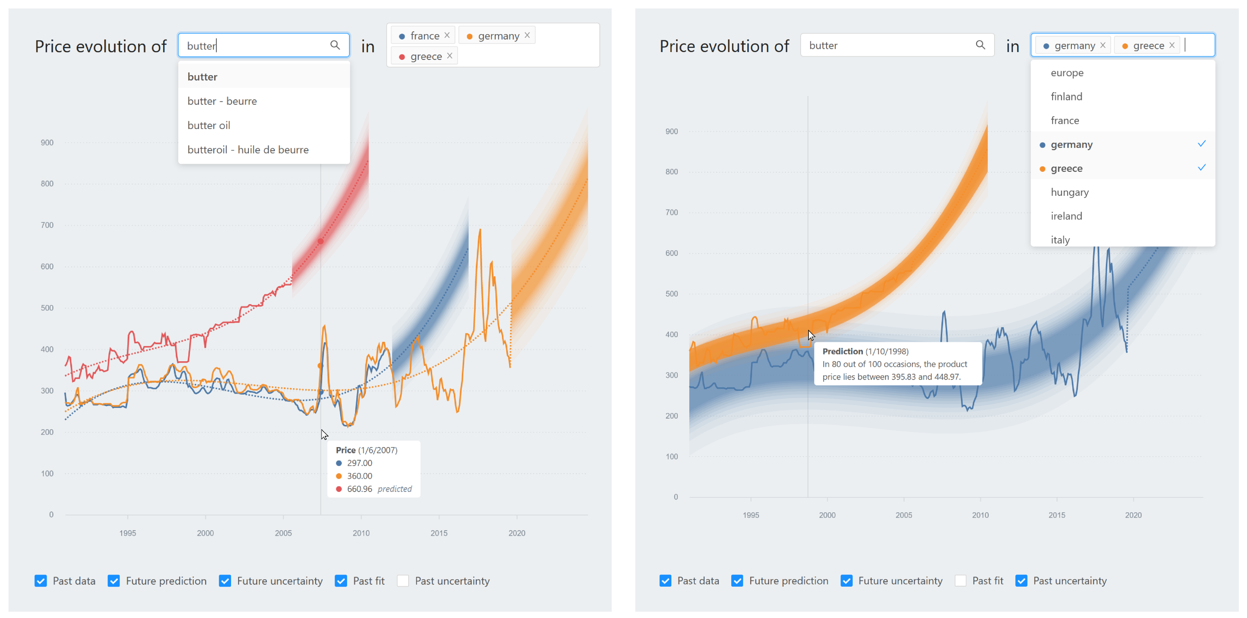
3.1. Visual Decision Support System
3.2. Study Rationale
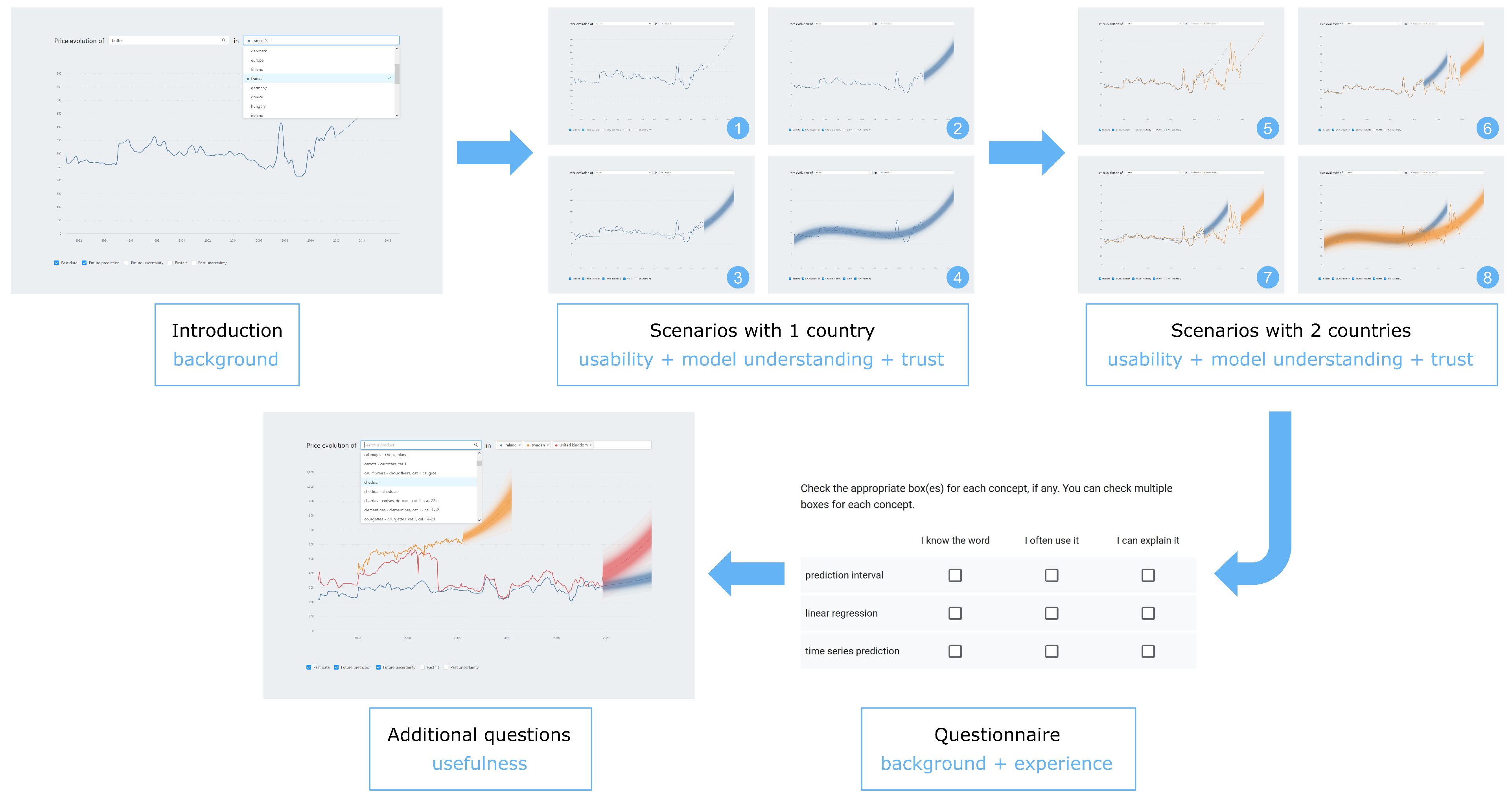
3.3. Study Design
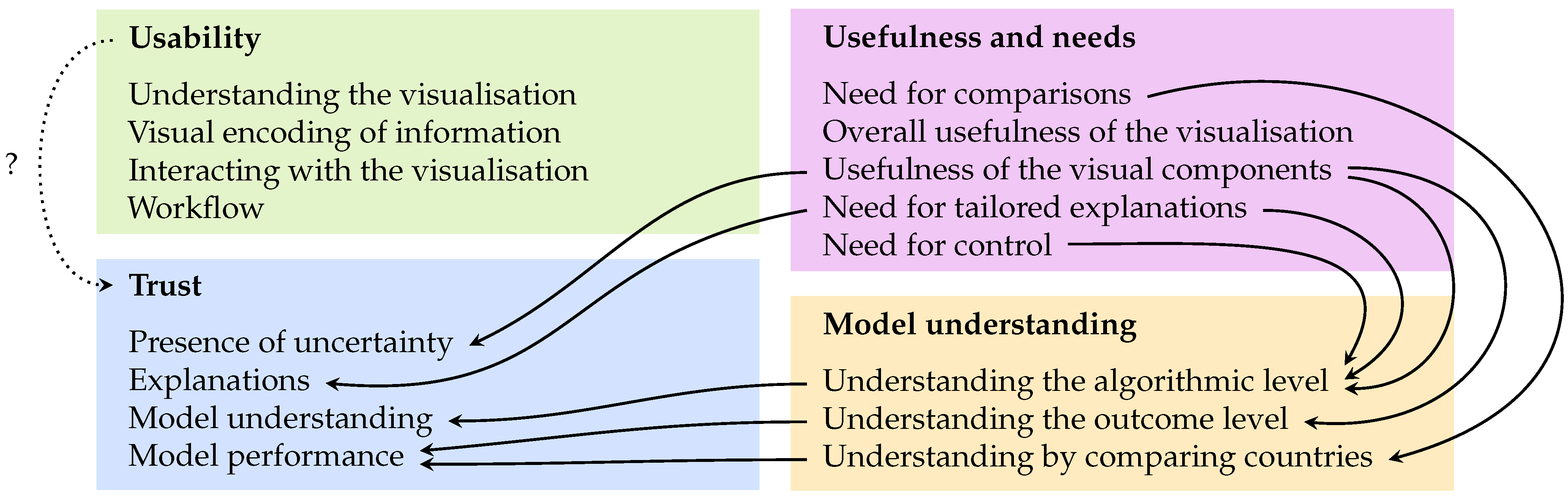
3.4. Measurement Instruments and Qualitative Analysis
- I am suspicious of the prediction model’s outputs (reverse-scored);
- I am confident in the prediction model;
- I can trust the prediction model;
- The prediction model is deceptive (reverse-scored).
4. Results
4.1. Usability


4.2. Usefulness and Needs


4.3. Model Understanding


4.4. Trust
4.4.1. Quantitative Results on Trust
4.4.2. Qualitative Results on Trust


5. Discussion
5.1. A User-Friendly and Useful Visual DSS
5.2. Tailoring, Tailoring, Tailoring: Different End Users, Different Needs
5.3. Gradual Model Understanding through Visual Analysis
5.4. Trust Is Multi-Faceted and Evolves
5.5. Fostering Appropriate Trust through Usefulness and Meeting Needs
5.6. Taking a Step Back: Increasing Uptake of DSSs in Agrifood with User-Centred Approaches
5.7. Limitations and Transferability
6. Conclusions
Author Contributions
Funding
Institutional Review Board Statement
Informed Consent Statement
Data Availability Statement
Acknowledgments
Conflicts of Interest
References
- Kamilaris, A.; Kartakoullis, A.; Prenafeta-Boldú, F.X. A Review on the Practice of Big Data Analysis in Agriculture. Comput. Electron. Agric. 2017, 143, 23–37. [Google Scholar] [CrossRef]
- Zhai, Z.; Martínez, J.F.; Beltran, V.; Martínez, N.L. Decision Support Systems for Agriculture 4.0: Survey and Challenges. Comput. Electron. Agric. 2020, 170, 105256. [Google Scholar] [CrossRef]
- Lezoche, M.; Hernandez, J.E.; Alemany Díaz, M.d.M.E.; Panetto, H.; Kacprzyk, J. Agri-Food 4.0: A Survey of the Supply Chains and Technologies for the Future Agriculture. Comput. Ind. 2020, 117, 103187. [Google Scholar] [CrossRef]
- Cisternas, I.; Velásquez, I.; Caro, A.; Rodríguez, A. Systematic Literature Review of Implementations of Precision Agriculture. Comput. Electron. Agric. 2020, 176, 105626. [Google Scholar] [CrossRef]
- Linaza, M.T.; Posada, J.; Bund, J.; Eisert, P.; Quartulli, M.; Döllner, J.; Pagani, A.; Olaizola, I.G.; Barriguinha, A.; Moysiadis, T.; et al. Data-Driven Artificial Intelligence Applications for Sustainable Precision Agriculture. Agronomy 2021, 11, 1227. [Google Scholar] [CrossRef]
- Wachowiak, M.P.; Walters, D.F.; Kovacs, J.M.; Wachowiak-Smolíková, R.; James, A.L. Visual Analytics and Remote Sensing Imagery to Support Community-Based Research for Precision Agriculture in Emerging Areas. Comput. Electron. Agric. 2017, 143, 149–164. [Google Scholar] [CrossRef]
- Wolfert, S.; Ge, L.; Verdouw, C.; Bogaardt, M.J. Big Data in Smart Farming—A Review. Agric. Syst. 2017, 153, 69–80. [Google Scholar] [CrossRef]
- Moysiadis, V.; Sarigiannidis, P.; Vitsas, V.; Khelifi, A. Smart Farming in Europe. Comput. Sci. Rev. 2021, 39, 100345. [Google Scholar] [CrossRef]
- Ayoub Shaikh, T.; Rasool, T.; Rasheed Lone, F. Towards Leveraging the Role of Machine Learning and Artificial Intelligence in Precision Agriculture and Smart Farming. Comput. Electron. Agric. 2022, 198, 107119. [Google Scholar] [CrossRef]
- Osinga, S.A.; Paudel, D.; Mouzakitis, S.A.; Athanasiadis, I.N. Big Data in Agriculture: Between Opportunity and Solution. Agric. Syst. 2022, 195, 103298. [Google Scholar] [CrossRef]
- Navarro, E.; Costa, N.; Pereira, A. A Systematic Review of IoT Solutions for Smart Farming. Sensors 2020, 20, 4231. [Google Scholar] [CrossRef] [PubMed]
- Liakos, K.; Busato, P.; Moshou, D.; Pearson, S.; Bochtis, D. Machine Learning in Agriculture: A Review. Sensors 2018, 18, 2674. [Google Scholar] [CrossRef] [PubMed] [Green Version]
- McCown, R. Changing Systems for Supporting Farmers’ Decisions: Problems, Paradigms, and Prospects. Agric. Syst. 2002, 74, 179–220. [Google Scholar] [CrossRef]
- Rojo, D.; Htun, N.N.; Parra, D.; De Croon, R.; Verbert, K. AHMoSe: A Knowledge-Based Visual Support System for Selecting Regression Machine Learning Models. Comput. Electron. Agric. 2021, 187, 106183. [Google Scholar] [CrossRef]
- Gutiérrez, F.; Htun, N.N.; Schlenz, F.; Kasimati, A.; Verbert, K. A Review of Visualisations in Agricultural Decision Support Systems: An HCI Perspective. Comput. Electron. Agric. 2019, 163, 104844. [Google Scholar] [CrossRef] [Green Version]
- Parker, C.; Campion, S. Improving the Uptake of Decision Support Systems in Agriculture. In Proceedings of the First European Conference for Information Technology in Agriculture, Copenhagen, Denmark, 15–18 June 1997; pp. 129–134. [Google Scholar]
- Parker, C. A User-Centred Design Method for Agricultural DSS. In Proceedings of the EFITA-99: Proceedings of the Second European Conference for Information Technology in Agriculture, Bonn, Germany, 27–30 September 1999; pp. 27–30. [Google Scholar]
- Rose, D.C.; Sutherland, W.J.; Parker, C.; Lobley, M.; Winter, M.; Morris, C.; Twining, S.; Ffoulkes, C.; Amano, T.; Dicks, L.V. Decision Support Tools for Agriculture: Towards Effective Design and Delivery. Agric. Syst. 2016, 149, 165–174. [Google Scholar] [CrossRef] [Green Version]
- Carroll, J.M. Human–Computer Interaction: Psychology as a Science of Design. Int. J. Hum.-Comput. Stud. 1997, 46, 501–522. [Google Scholar] [CrossRef] [Green Version]
- Shneiderman, B.; Plaisant, C.; Cohen, M.; Jacobs, S.; Elmqvist, N.; Diakopoulos, N. Designing the User Interface: Strategies for Effective Human-Computer Interaction, 6th ed.; Pearson: Hoboken, NJ, USA, 2016. [Google Scholar]
- Olson, G.M.; Olson, J.S. Human-Computer Interaction: Psychological Aspects of the Human Use of Computing. Annu. Rev. Psychol. 2003, 54, 491–516. [Google Scholar] [CrossRef] [Green Version]
- Keim, D.A.; Mansmann, F.; Schneidewind, J.; Thomas, J.; Ziegler, H. Visual Analytics: Scope and Challenges. In Visual Data Mining; Simoff, S.J., Böhlen, M.H., Mazeika, A., Eds.; Springer: Berlin/Heidelberg, Germany, 2008; Volume 4404, pp. 76–90. [Google Scholar] [CrossRef] [Green Version]
- Cui, W. Visual Analytics: A Comprehensive Overview. IEEE Access 2019, 7, 81555–81573. [Google Scholar] [CrossRef]
- Ham, D.H. The State of the Art of Visual Analytics. In Proceedings of the EKC 2009 Proceedings of the EU-Korea Conference on Science and Technology, Reading, UK, 5–7 August 2009; Springer Proceedings in Physics. Lee, J.H., Lee, H., Kim, J.S., Eds.; Springer: Berlin/Heidelberg, Germany, 2010; pp. 213–222. [Google Scholar] [CrossRef]
- Abdul, A.; Vermeulen, J.; Wang, D.; Lim, B.Y.; Kankanhalli, M. Trends and Trajectories for Explainable, Accountable and Intelligible Systems: An HCI Research Agenda. In Proceedings of the 2018 CHI Conference on Human Factors in Computing Systems, Montreal, QC, Canada, 21–26 April 2018; Association for Computing Machinery: New York, NY, USA, 2018; pp. 1–18. [Google Scholar] [CrossRef]
- Rose, D.C.; Parker, C.; Fodey, J.; Park, C.; Sutherland, W.J.; Dicks, L.V. Involving Stakeholders in Agricultural Decision Support Systems: Improving User-Centred Design. Int. J. Agric. Manag. 2017, 6, 10. [Google Scholar]
- Parker, C.; Sinclair, M. User-Centred Design Does Make a Difference. The Case of Decision Support Systems in Crop Production. Behav. Inf. Technol. 2001, 20, 449–460. [Google Scholar] [CrossRef]
- Lindblom, J.; Lundström, C.; Ljung, M.; Jonsson, A. Promoting Sustainable Intensification in Precision Agriculture: Review of Decision Support Systems Development and Strategies. Precis. Agric. 2017, 18, 309–331. [Google Scholar] [CrossRef] [Green Version]
- Munzner, T. Visualization Analysis and Design; A K Peters/CRC Press: Boca Raton, FL, USA, 2014. [Google Scholar] [CrossRef]
- Rind, A. Interactive Information Visualization to Explore and Query Electronic Health Records. Found. Trends Hum. Comput. Interact. 2013, 5, 207–298. [Google Scholar] [CrossRef]
- Botha, C.P.; Preim, B.; Kaufman, A.; Takahashi, S.; Ynnerman, A. From Individual to Population: Challenges in Medical Visualization. arXiv 2012, arXiv:1206.1148. [Google Scholar]
- West, V.; Borland, D.; Hammond, W. Innovative Information Visualization of Electronic Health Record Data: A Systematic Review. J. Am. Med. Inf. Assoc. 2015, 22, 330–339. [Google Scholar] [CrossRef] [Green Version]
- Verbert, K.; Govaerts, S.; Duval, E.; Santos, J.L.; Van Assche, F.; Parra, G.; Klerkx, J. Learning Dashboards: An Overview and Future Research Opportunities. Pers. Ubiquitous Comput. 2013, 18, 1499–1514. [Google Scholar] [CrossRef] [Green Version]
- Vieira, C.; Parsons, P.; Byrd, V. Visual Learning Analytics of Educational Data: A Systematic Literature Review and Research Agenda. Comput. Educ. 2018, 122, 119–135. [Google Scholar] [CrossRef]
- Savikhin, A.; Lam, H.C.; Fisher, B.; Ebert, D.S. An Experimental Study of Financial Portfolio Selection with Visual Analytics for Decision Support. In Proceedings of the 2011 44th Hawaii International Conference on System Sciences, Kauai, HI, USA, 4–7 January 2011; pp. 1–10. [Google Scholar] [CrossRef]
- Khakpour, A.; Colomo-Palacios, R.; Martini, A. Visual Analytics for Decision Support: A Supply Chain Perspective. IEEE Access 2021, 9, 81326–81344. [Google Scholar] [CrossRef]
- Basole, R.C.; Bellamy, M.A.; Park, H. Visualization of Innovation in Global Supply Chain Networks. Decis. Sci. 2017, 48, 288–306. [Google Scholar] [CrossRef]
- Yi, J.S.; ah Kang, Y.; Stasko, J.; Jacko, J. Toward a Deeper Understanding of the Role of Interaction in Information Visualization. IEEE Trans. Vis. Comput. Graph. 2007, 13, 1224–1231. [Google Scholar] [CrossRef] [Green Version]
- Keim, D.A.; Mansmann, F.; Thomas, J. Visual Analytics: How Much Visualization and How Much Analytics? ACM Sigkdd Explor. Newsl. 2010, 11, 5–8. [Google Scholar] [CrossRef]
- Hu, J.; Perer, A.; Wang, F. Data Driven Analytics for Personalized Healthcare. In Healthcare Information Management Systems; Weaver, C.A., Ball, M.J., Kim, G.R., Kiel, J.M., Eds.; Springer International Publishing: Cham, Switzerland, 2016; pp. 529–554. [Google Scholar] [CrossRef]
- Preim, B.; Lawonn, K. A Survey of Visual Analytics for Public Health. Comput. Graph. Forum 2020, 39, 543–580. [Google Scholar] [CrossRef] [Green Version]
- Di Silvestro, L.; Burch, M.; Caccamo, M.; Weiskopf, D.; Beck, F.; Gallo, G. Visual Analysis of Time-Dependent Multivariate Data from Dairy Farming Industry. In Proceedings of the 2014 International Conference on Information Visualization Theory and Applications (IVAPP), Lisbon, Portugal, 5–8 January 2014; pp. 99–106. [Google Scholar]
- Armstrong, L.J.; Nallan, S.A. Agricultural Decision Support Framework for Visualisation and Prediction of Western Australian Crop Production. In Proceedings of the 2016 3rd International Conference on Computing for Sustainable Global Development (INDIACom), New Delhi, India, 16–18 March 2016; pp. 1907–1912. [Google Scholar]
- Machwitz, M.; Hass, E.; Junk, J.; Udelhoven, T.; Schlerf, M. CropGIS—A Web Application for the Spatial and Temporal Visualization of Past, Present and Future Crop Biomass Development. Comput. Electron. Agric. 2019, 161, 185–193. [Google Scholar] [CrossRef]
- Ochola, W.O.; Kerkides, P. An Integrated Indicator-Based Spatial Decision Support System for Land Quality Assessment in Kenya. Comput. Electron. Agric. 2004, 45, 3–26. [Google Scholar] [CrossRef]
- Accorsi, P.; Lalande, N.; Fabrègue, M.; Braud, A.; Poncelet, P.; Sallaberry, A.; Bringay, S.; Teisseire, M.; Cernesson, F.; Le Ber, F. HydroQual: Visual Analysis of River Water Quality. In Proceedings of the 2014 IEEE Conference on Visual Analytics Science and Technology (VAST), Paris, France, 25–31 October 2014; pp. 123–132. [Google Scholar] [CrossRef] [Green Version]
- Jarvis, D.H.; Wachowiak, M.P.; Walters, D.F.; Kovacs, J.M. Adoption of Web-Based Spatial Tools by Agricultural Producers: Conversations with Seven Northeastern Ontario Farmers Using the GeoVisage Decision Support System. Agriculture 2017, 7, 69. [Google Scholar] [CrossRef] [Green Version]
- Sacha, D.; Senaratne, H.; Kwon, B.C.; Ellis, G.; Keim, D.A. The Role of Uncertainty, Awareness, and Trust in Visual Analytics. IEEE Trans. Vis. Comput. Graph. 2016, 22, 240–249. [Google Scholar] [CrossRef] [Green Version]
- Skeels, M.; Lee, B.; Smith, G.; Robertson, G.G. Revealing Uncertainty for Information Visualization. Inf. Vis. 2010, 9, 70–81. [Google Scholar] [CrossRef]
- Demmans Epp, C.; Bull, S. Uncertainty Representation in Visualizations of Learning Analytics for Learners: Current Approaches and Opportunities. IEEE Trans. Learn. Technol. 2015, 8, 242–260. [Google Scholar] [CrossRef]
- Spiegelhalter, D.; Pearson, M.; Short, I. Visualizing Uncertainty About the Future. Science 2011, 333, 1393–1400. [Google Scholar] [CrossRef] [Green Version]
- Franconeri, S.L.; Padilla, L.M.; Shah, P.; Zacks, J.M.; Hullman, J. The Science of Visual Data Communication: What Works. Psychol. Sci. Public Interest 2021, 22, 110–161. [Google Scholar] [CrossRef]
- Hullman, J. Why Authors Don’t Visualize Uncertainty. IEEE Trans. Vis. Comput. Graph. 2020, 26, 130–139. [Google Scholar] [CrossRef] [PubMed] [Green Version]
- Britton, E.; Fisher, P.; Whitley, J. Quarterly Bulletin February 1998; Technical Report; Bank of England: London, UK, 1998. [Google Scholar]
- Seipp, K.; Gutiérrez, F.; Ochoa, X.; Verbert, K. Towards a Visual Guide for Communicating Uncertainty in Visual Analytics. J. Comput. Lang. 2019, 50, 1–18. [Google Scholar] [CrossRef]
- Gutiérrez, F.; Ochoa, X.; Seipp, K.; Broos, T.; Verbert, K. Benefits and Trade-Offs of Different Model Representations in Decision Support Systems for Non-expert Users. In Human-Computer Interaction–INTERACT 2019; Lecture Notes in Computer Science; Lamas, D., Loizides, F., Nacke, L., Petrie, H., Winckler, M., Zaphiris, P., Eds.; Springer International Publishing: Cham, Switzerland, 2019; pp. 576–597. [Google Scholar] [CrossRef]
- Leffrang, D.; Müller, O. Should I Follow This Model? The Effect of Uncertainty Visualization on the Acceptance of Time Series Forecasts. In Proceedings of the 2021 IEEE Workshop on TRust and EXpertise in Visual Analytics (TREX), Virtual, 24 October 2021; pp. 20–26. [Google Scholar] [CrossRef]
- Gunning, D.; Aha, D. DARPA’s Explainable Artificial Intelligence (XAI) Program. AI Mag. 2019, 40, 44–58. [Google Scholar]
- Vellido, A. The Importance of Interpretability and Visualization in Machine Learning for Applications in Medicine and Health Care. Neural Comput. Appl. 2020, 32, 18069–18083. [Google Scholar] [CrossRef] [Green Version]
- Dhanorkar, S.; Wolf, C.T.; Qian, K.; Xu, A.; Popa, L.; Li, Y. Who Needs to Know What, When?: Broadening the Explainable AI (XAI) Design Space by Looking at Explanations Across the AI Lifecycle. In Proceedings of the Designing Interactive Systems Conference 2021, Virtual, 28 June–2 July 2021; Association for Computing Machinery: New York, NY, USA, 2021; pp. 1591–1602. [Google Scholar]
- Suresh, H.; Gomez, S.R.; Nam, K.K.; Satyanarayan, A. Beyond Expertise and Roles: A Framework to Characterize the Stakeholders of Interpretable Machine Learning and Their Needs. In Proceedings of the 2021 CHI Conference on Human Factors in Computing Systems, Virtual, 8–13 May 2021; Association for Computing Machinery: New York, NY, USA, 2021; pp. 1–16. [Google Scholar] [CrossRef]
- Wang, D.; Yang, Q.; Abdul, A.; Lim, B.Y. Designing Theory-Driven User-Centric Explainable AI. In Proceedings of the 2019 CHI Conference on Human Factors in Computing Systems, Glasgow, UK, 4–9 May 2019; Association for Computing Machinery: New York, NY, USA, 2019; pp. 1–15. [Google Scholar]
- Mohseni, S.; Zarei, N.; Ragan, E.D. A Multidisciplinary Survey and Framework for Design and Evaluation of Explainable AI Systems. ACM Trans. Interact. Intell. Syst. 2021, 11, 24:1–24:45. [Google Scholar] [CrossRef]
- Millecamp, M.; Htun, N.N.; Conati, C.; Verbert, K. To Explain or Not to Explain: The Effects of Personal Characteristics When Explaining Music Recommendations. In Proceedings of the 24th International Conference on Intelligent User Interfaces, Marina del Ray, CA, USA, 17–20 March 2019; ACM: New York, NY, USA, 2019; pp. 397–407. [Google Scholar] [CrossRef]
- Ooge, J.; Stiglic, G.; Verbert, K. Explaining Artificial Intelligence with Visual Analytics in Healthcare. Wires Data Min. Knowl. Discov. 2021, 12, e1427. [Google Scholar] [CrossRef]
- Endert, A.; Ribarsky, W.; Turkay, C.; Wong, B.W.; Nabney, I.; Blanco, I.D.; Rossi, F. The State of the Art in Integrating Machine Learning into Visual Analytics: Integrating Machine Learning into Visual Analytics. Comput. Graph. Forum 2017, 36, 458–486. [Google Scholar] [CrossRef]
- Liu, S.; Wang, X.; Liu, M.; Zhu, J. Towards Better Analysis of Machine Learning Models: A Visual Analytics Perspective. Vis. Inf. 2017, 1, 48–56. [Google Scholar] [CrossRef]
- Hohman, F.; Kahng, M.; Pienta, R.; Chau, D.H. Visual Analytics in Deep Learning: An Interrogative Survey for the Next Frontiers. IEEE Trans. Vis. Comput. Graph. 2019, 25, 2674–2693. [Google Scholar] [CrossRef]
- Lu, Y.; Garcia, R.; Hansen, B.; Gleicher, M.; Maciejewski, R. The State-of-the-Art in Predictive Visual Analytics. Comput. Graph. Forum 2017, 36, 539–562. [Google Scholar] [CrossRef]
- Chatzimparmpas, A.; Martins, R.; Jusufi, I.; Kucher, K.; Rossi, F.; Kerren, A. The State of the Art in Enhancing Trust in Machine Learning Models with the Use of Visualizations. Comput. Graph. Forum 2020, 39, 713–756. [Google Scholar] [CrossRef]
- Chatzimparmpas, A.; Martins, R.M.; Jusufi, I.; Kerren, A. A Survey of Surveys on the Use of Visualization for Interpreting Machine Learning Models. Inf. Vis. 2020, 19, 207–233. [Google Scholar] [CrossRef] [Green Version]
- Jacovi, A.; Marasović, A.; Miller, T.; Goldberg, Y. Formalizing Trust in Artificial Intelligence: Prerequisites, Causes and Goals of Human Trust in AI. arXiv 2021, arXiv:2010.07487. [Google Scholar]
- Madsen, M.; Gregor, S. Measuring Human-Computer Trust. In Proceedings of the 11th Australasian Conference on Information Systems, Brisbane, Australia, 6–8 December 2000; Volume 53, pp. 6–8. [Google Scholar]
- Vereschak, O.; Bailly, G.; Caramiaux, B. How to Evaluate Trust in AI-Assisted Decision Making? A Survey of Empirical Methodologies. Proc. ACM Hum.-Comput. Interact. 2021, 5, 327:1–327:39. [Google Scholar] [CrossRef]
- Nourani, M.; King, J.; Ragan, E. The Role of Domain Expertise in User Trust and the Impact of First Impressions with Intelligent Systems. In Proceedings of the AAAI Conference on Human Computation and Crowdsourcing, Virtual, 25–29 October 2020; Volume 8, pp. 112–121. [Google Scholar]
- Holliday, D.; Wilson, S.; Stumpf, S. User Trust in Intelligent Systems: A Journey Over Time. In Proceedings of the 21st International Conference on Intelligent User Interfaces, Sonoma, CA, USA, 7–10 March 2016; ACM: New York, NY, USA, 2016; pp. 164–168. [Google Scholar]
- Ooge, J.; Verbert, K. Trust in Prediction Models: A Mixed-Methods Pilot Study on the Impact of Domain Expertise. In Proceedings of the 2021 IEEE Workshop on TRust and EXpertise in Visual Analytics (TREX), Virtual, 24 October 2021; IEEE: New Orleans, LA, USA, 2021; pp. 8–13. [Google Scholar] [CrossRef]
- Hoff, K.A.; Bashir, M. Trust in Automation: Integrating Empirical Evidence on Factors That Influence Trust. Hum. Factors J. Hum. Factors Ergon. Soc. 2015, 57, 407–434. [Google Scholar] [CrossRef]
- Mayr, E.; Hynek, N.; Salisu, S.; Windhager, F. Trust in Information Visualization. In Proceedings of the EuroVis Workshop on Trustworthy Visualization (TrustVis), Porto, Portugal, 3 June 2019; p. 5. [Google Scholar] [CrossRef]
- Yin, M.; Wortman Vaughan, J.; Wallach, H. Understanding the Effect of Accuracy on Trust in Machine Learning Models. In Proceedings of the 2019 CHI Conference on Human Factors in Computing Systems, Glasgow, UK, 4–9 May 2019; ACM: New York, NY, USA, 2019; pp. 1–12. [Google Scholar] [CrossRef]
- Papenmeier, A.; Kern, D.; Englebienne, G.; Seifert, C. It’s Complicated: The Relationship between User Trust, Model Accuracy and Explanations in AI. ACM Trans. Comput. Hum. Interact. 2022, 29, 35:1–35:33. [Google Scholar] [CrossRef]
- Kizilcec, R.F. How Much Information?: Effects of Transparency on Trust in an Algorithmic Interface. In Proceedings of the 2016 CHI Conference on Human Factors in Computing Systems, San Jose, CA, USA, 7–12 May 2016; ACM: New York, NY, USA, 2016; pp. 2390–2395. [Google Scholar] [CrossRef]
- Han, W.; Schulz, H.J. Beyond Trust Building—Calibrating Trust in Visual Analytics. In Proceedings of the 2020 IEEE Workshop on TRust and EXpertise in Visual Analytics (TREX), Virtual, 25 October 2020; IEEE: Salt Lake City, UT, USA, 2020; pp. 9–15. [Google Scholar] [CrossRef]
- Solhaug, B.; Elgesem, D.; Stolen, K. Why Trust Is Not Proportional to Risk. In Proceedings of the The Second International Conference on Availability, Reliability and Security (ARES’07), Vienna, Austria, 10–13 April 2007; pp. 11–18. [Google Scholar] [CrossRef] [Green Version]
- Davis, B.; Glenski, M.; Sealy, W.; Arendt, D. Measure Utility, Gain Trust: Practical Advice for XAI Researchers. In Proceedings of the 2020 IEEE Workshop on TRust and EXpertise in Visual Analytics (TREX), Virtual, 25 October 2020; IEEE: Salt Lake City, UT, USA, 2020; pp. 1–8. [Google Scholar] [CrossRef]
- Brooke, J. SUS: A ’quick and Dirty’ Usability Scale. In Usability Evaluation in Industry; Jordan, P.W., Thomas, B., Weerdmeester, B.A., McClelland, I.L., Eds.; Taylor & Francis: London, UK, 1996; Volume 189. [Google Scholar]
- Bangor, A.; Kortum, P.T.; Miller, J.T. An Empirical Evaluation of the System Usability Scale. Int. J. Hum. Comput. Interact. 2008, 24, 574–594. [Google Scholar] [CrossRef]
- Jian, J.Y.; Bisantz, A.M.; Drury, C.G. Foundations for an Empirically Determined Scale of Trust in Automated Systems. Int. J. Cogn. Ergon. 2000, 4, 53–71. [Google Scholar] [CrossRef]
- Braun, V.; Clarke, V. Thematic Analysis. In APA Handbook of Research Methods in Psychology, Vol 2: Research Designs: Quantitative, Qualitative, Neuropsychological, and Biological; APA Handbooks in Psychology®, American Psychological Association: Washington, DC, USA, 2012; pp. 57–71. [Google Scholar] [CrossRef]
- Badam, S.K.; Zhao, J.; Sen, S.; Elmqvist, N.; Ebert, D. TimeFork: Interactive Prediction of Time Series. In Proceedings of the 2016 CHI Conference on Human Factors in Computing Systems, San Jose, CA, USA, 7–12 May 2016; ACM: New York, NY, USA, 2016; pp. 5409–5420. [Google Scholar] [CrossRef]
- Bögl, M.; Aigner, W.; Filzmoser, P.; Gschwandtner, T.; Lammarsch, T.; Miksch, S.; Rind, A. Visual Analytics Methods to Guide Diagnostics for Time Series Model Predictions. In Proceedings of the 2014 IEEE VIS Workshop on Visualization for Predictive Analytics, Paris, France, 9 November 2014; Volume 1. [Google Scholar]
- Ali, M.; Alqahtani, A.; Jones, M.; Xie, X. Clustering and Classification for Time Series Data in Visual Analytics: A Survey. IEEE Access 2019, 7, 181314–181338. [Google Scholar] [CrossRef]
- Sun, D.; Feng, Z.; Chen, Y.; Wang, Y.; Zeng, J.; Yuan, M.; Pong, T.C.; Qu, H. DFSeer: A Visual Analytics Approach to Facilitate Model Selection for Demand Forecasting. In Proceedings of the 2020 CHI Conference on Human Factors in Computing Systems, Honolulu, HI, USA, 25–30 April 2020; ACM: New York, NY, USA, 2020; pp. 1–13. [Google Scholar] [CrossRef]
- Kulesza, T.; Stumpf, S.; Burnett, M.; Yang, S.; Kwan, I.; Wong, W.K. Too Much, Too Little, or Just Right? Ways Explanations Impact End Users’ Mental Models. In Proceedings of the 2013 IEEE Symposium on Visual Languages and Human Centric Computing, San Jose, CA, USA, 15–19 September 2013; IEEE: San Jose, CA, USA, 2013; pp. 3–10. [Google Scholar] [CrossRef] [Green Version]
- Brockwell, P.J.; Davis, R.A. Introduction to Time Series and Forecasting; Springer Texts in Statistics; Springer International Publishing: Cham, Switzerland, 2016. [Google Scholar] [CrossRef]
- Hyndman, R.J.; Athanasopoulos, G. Forecasting: Principles and Practice. OTexts. 2018. Available online: https://otexts.com/fpp2 (accessed on 8 July 2022).
 low,
low,  medium,
  high).
low, medium, high).
high).
low, medium, high).

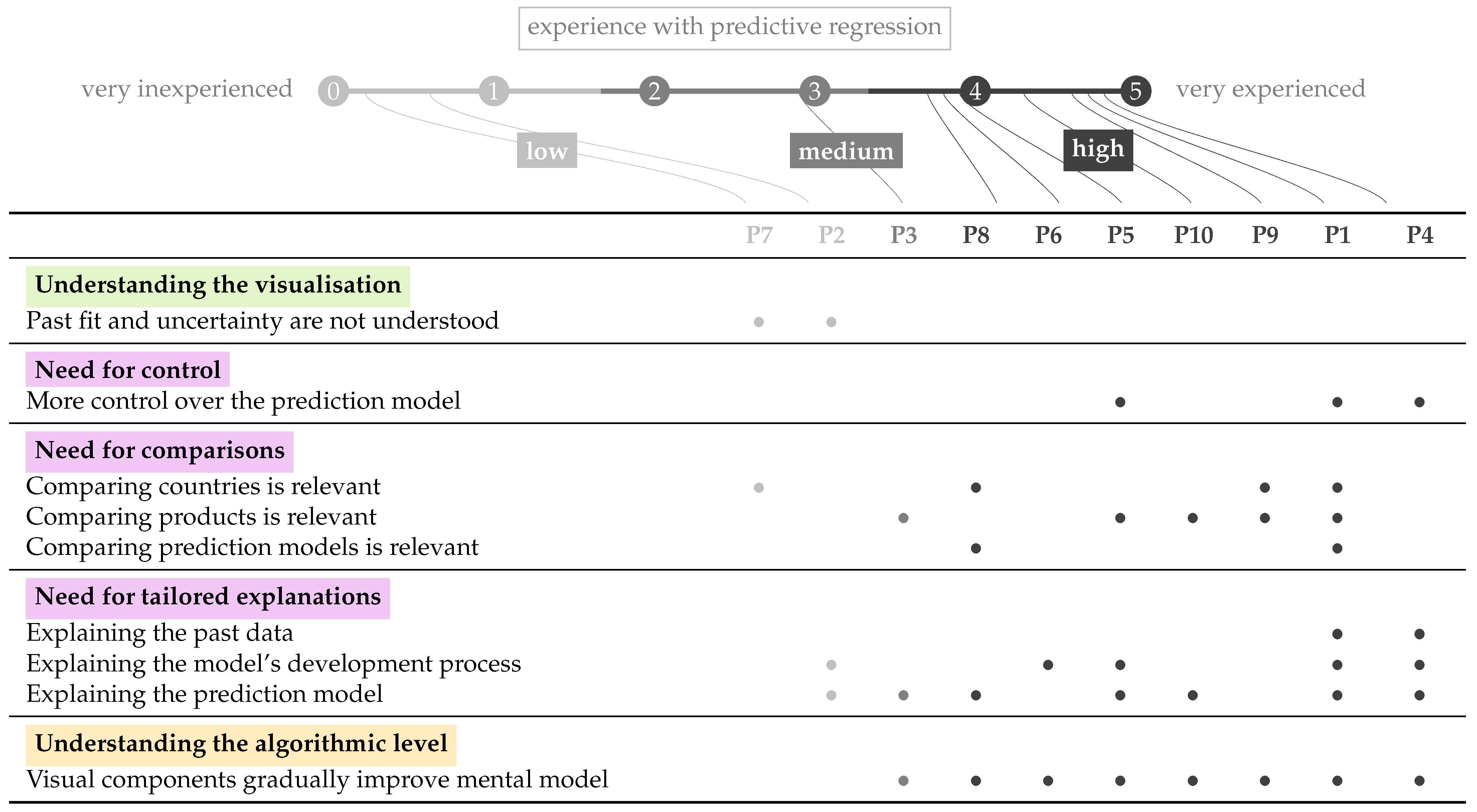
 low, medium, high) as an average of self-reported experience (), background (), and jargon use (). All participants identified as male and had a post-graduate education level.
low, medium, high) as an average of self-reported experience (), background (), and jargon use (). All participants identified as male and had a post-graduate education level.
low, medium, high) as an average of self-reported experience (), background (), and jargon use (). All participants identified as male and had a post-graduate education level.| ID | Profession | Country | Age | Experience () |
|---|---|---|---|---|
| P1 | Industry: quality manager in a biscuit factory; deals with food safety issues, supply simulations | Greece | 45–54 | 4.7 (4, 5, 5) |
| P2 | Industry: food safety auditor for a certification body; audits companies on food safety and fraud | Greece | 35–44 | 0.6 (0.3, 1, 0.5) |
| P3 | Industry: quality manager in a biscuit factory; deals with food safety issues, supply simulations | Greece | 35–44 | 2.9 (2.7, 3, 3) |
| P4 | Academia: professor in mechanical engineering; expertise in food quality and life cycle assessment | Italy | 45–54 | 4.8 (5, 5, 4.5) |
| P5 | Academia: agricultural economist; expertise in value chains, food security and consumption | Italy | 35–44 | 3.9 (2.3, 5, 4.5) |
| P6 | Industry: sales manager for a refrigeration manufacturer; buys raw materials and sells products | Greece | 35–44 | 3.8 (4.3, 4, 3) |
| P7 | Industry: raw materials manager in a food company; recruits agriculturalists and keeps bees | Greece | 18–34 | 0.2 (0, 0.5, 0) |
| P8 | Industry: settlements coordinator in a mortgages company; verifying and approving mortgages * | Australia | 35–44 | 3.7 (1, 5, 5) |
| P9 | Industry (Academia): researcher in agriculture; expertise in food chemistry and -microbiology | Greece | 35–44 | 4.6 (3.7, 5, 5) |
| P10 | Academia (Industry): researcher in natural cosmetics; expertise in food science | Tunesia | 18–34 | 4.3 (3, 5, 5) |
Publisher’s Note: MDPI stays neutral with regard to jurisdictional claims in published maps and institutional affiliations. |
© 2022 by the authors. Licensee MDPI, Basel, Switzerland. This article is an open access article distributed under the terms and conditions of the Creative Commons Attribution (CC BY) license (https://creativecommons.org/licenses/by/4.0/).
Share and Cite
Ooge, J.; Verbert, K. Visually Explaining Uncertain Price Predictions in Agrifood: A User-Centred Case-Study. Agriculture 2022, 12, 1024. https://doi.org/10.3390/agriculture12071024
Ooge J, Verbert K. Visually Explaining Uncertain Price Predictions in Agrifood: A User-Centred Case-Study. Agriculture. 2022; 12(7):1024. https://doi.org/10.3390/agriculture12071024
Chicago/Turabian StyleOoge, Jeroen, and Katrien Verbert. 2022. "Visually Explaining Uncertain Price Predictions in Agrifood: A User-Centred Case-Study" Agriculture 12, no. 7: 1024. https://doi.org/10.3390/agriculture12071024
APA StyleOoge, J., & Verbert, K. (2022). Visually Explaining Uncertain Price Predictions in Agrifood: A User-Centred Case-Study. Agriculture, 12(7), 1024. https://doi.org/10.3390/agriculture12071024