
Methodology for Conceptual Navigational 3D Chart Assessment Based on Eye Tracking Measures

 , , ,
, , ,  and
and
Abstract
1. Introduction
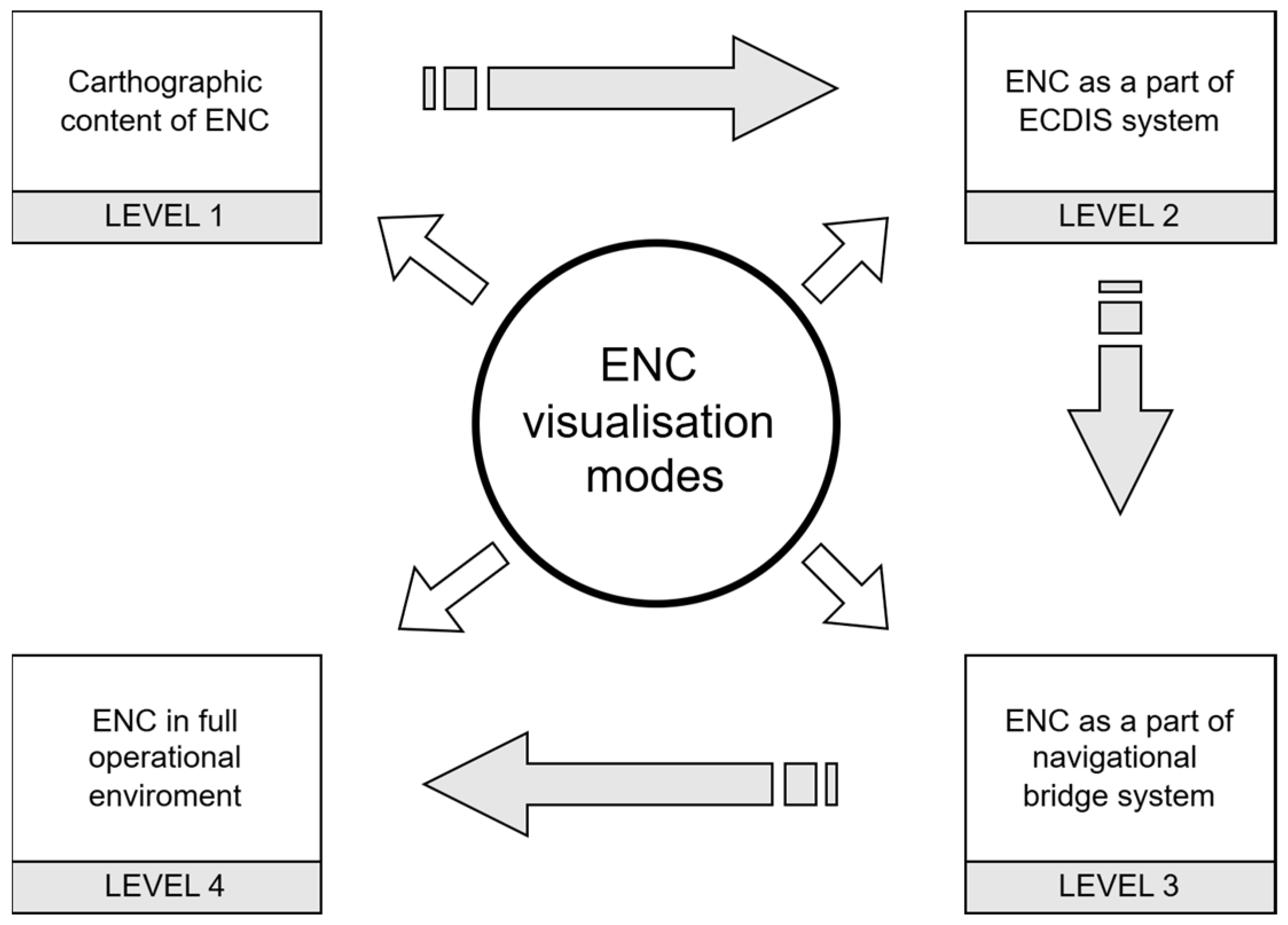
1.1. Technological Challenges
1.2. Application of Neuroscience in Effectiveness of Map Studies
1.3. Background and Aim of the Study
2. Materials and Methods
2.1. Procedure
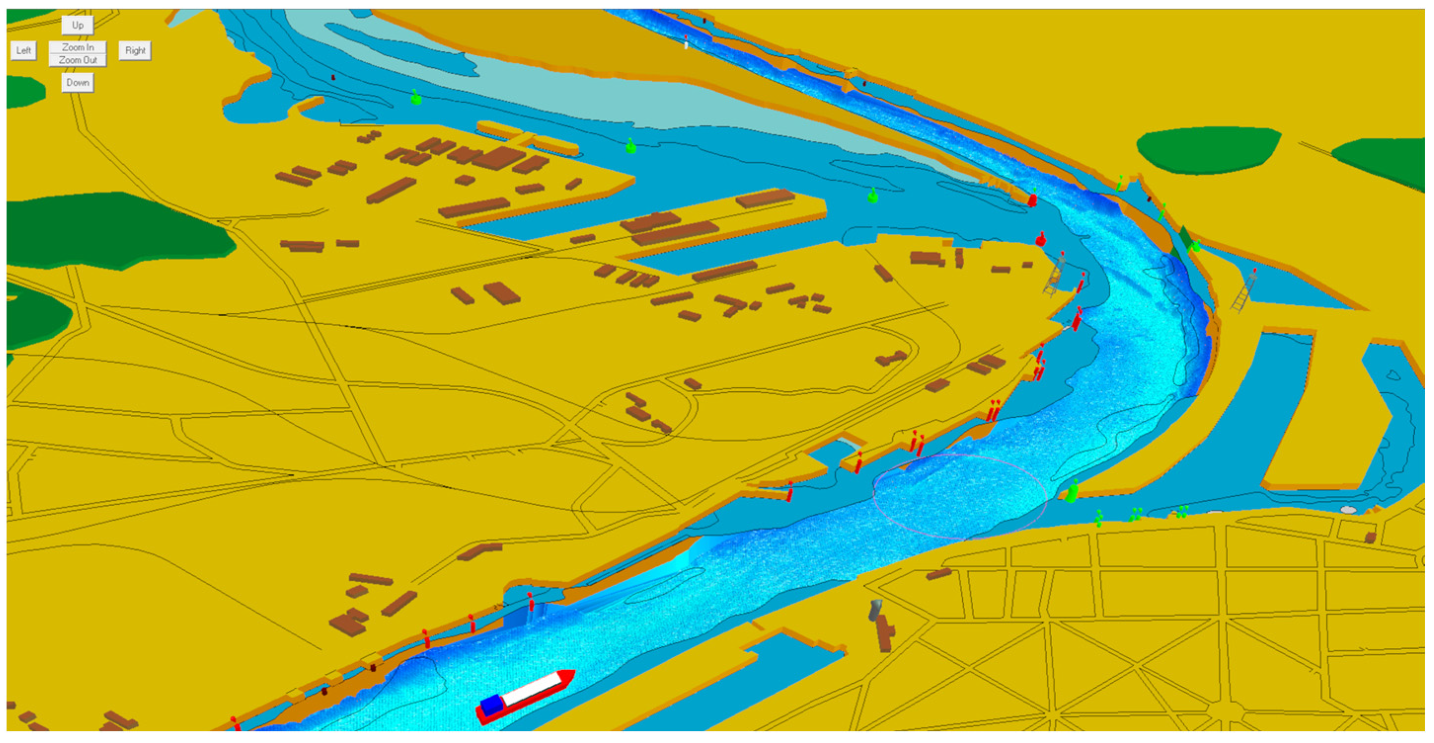
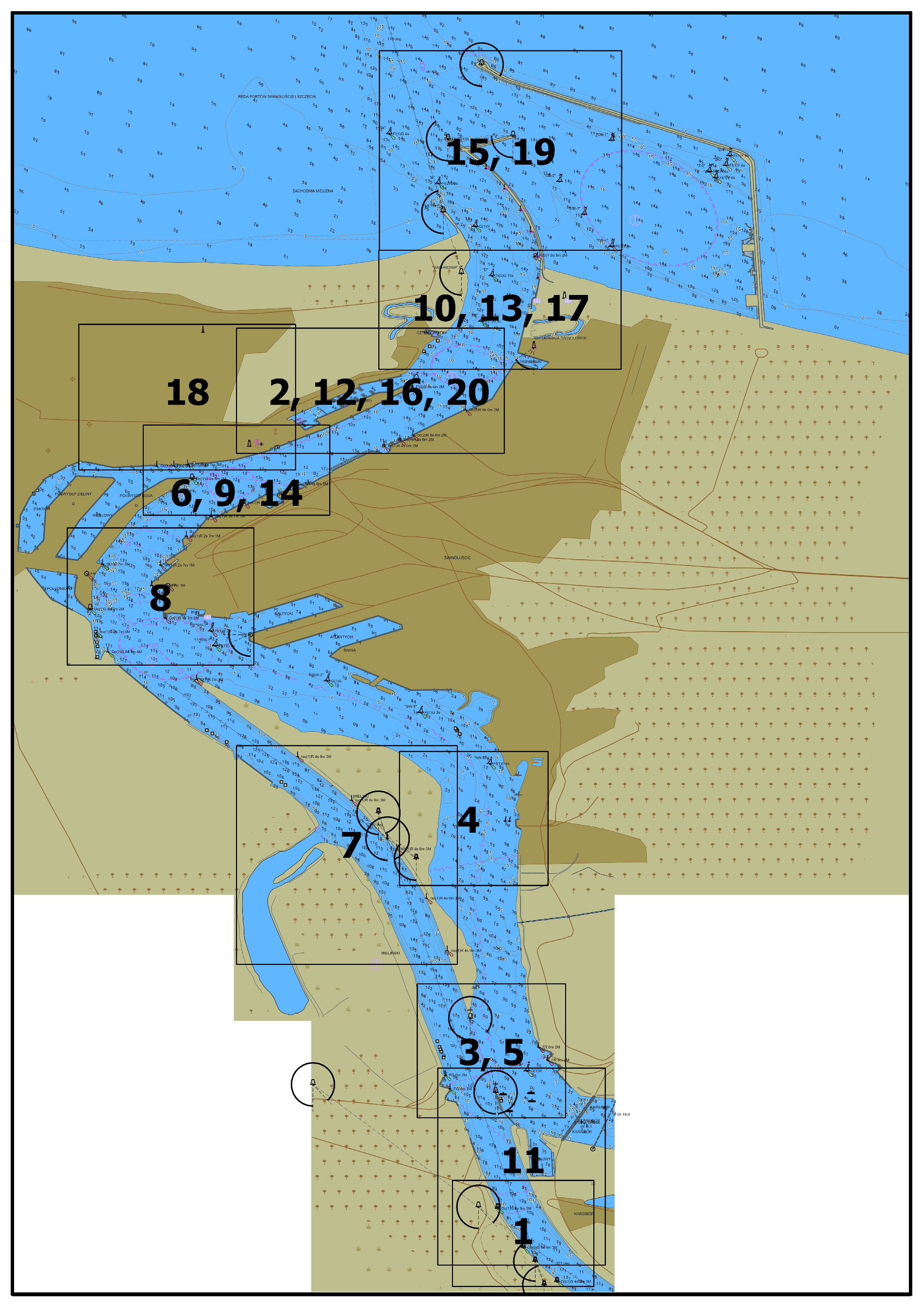
2.2. Stimuli
The 2D and 3D Chart Scenarios
2.3. Participants
2.4. Data Collection and Processing
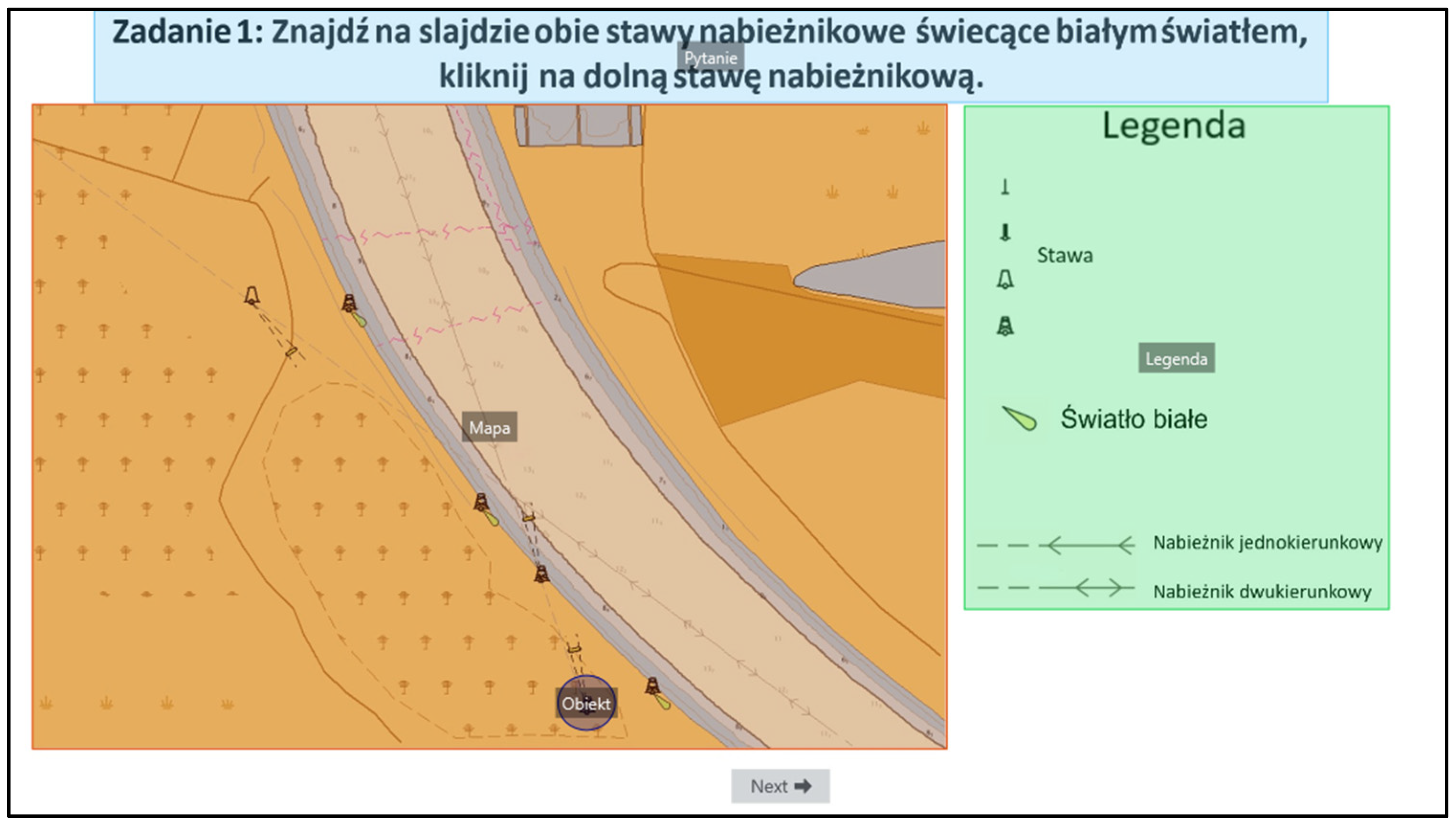
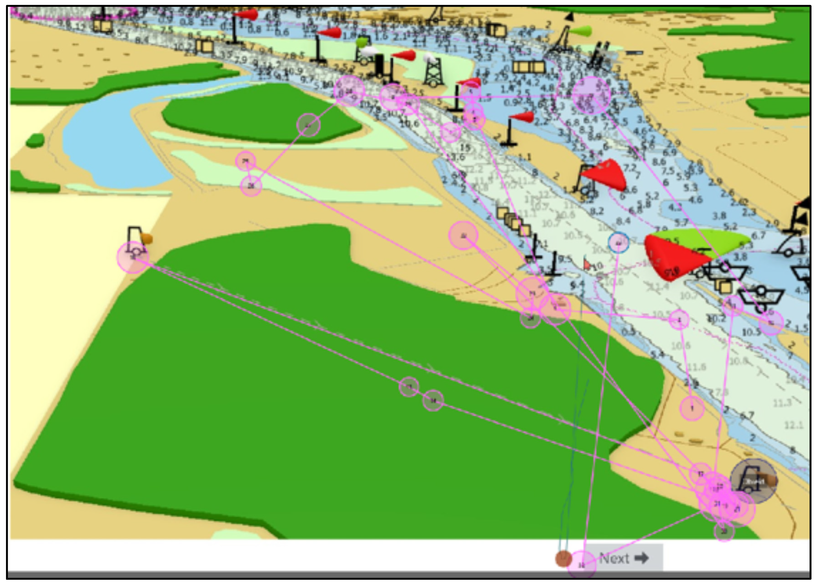
2.4.1. Preparation of Scenarios for Visual Assessment
2.4.2. Preparation of Questionnaires
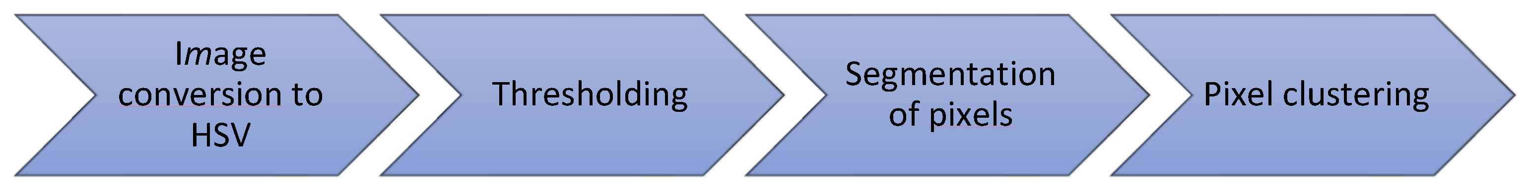
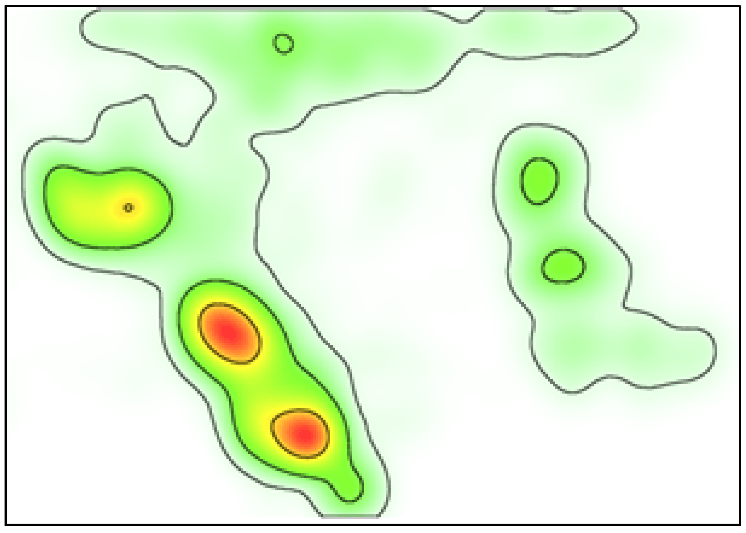
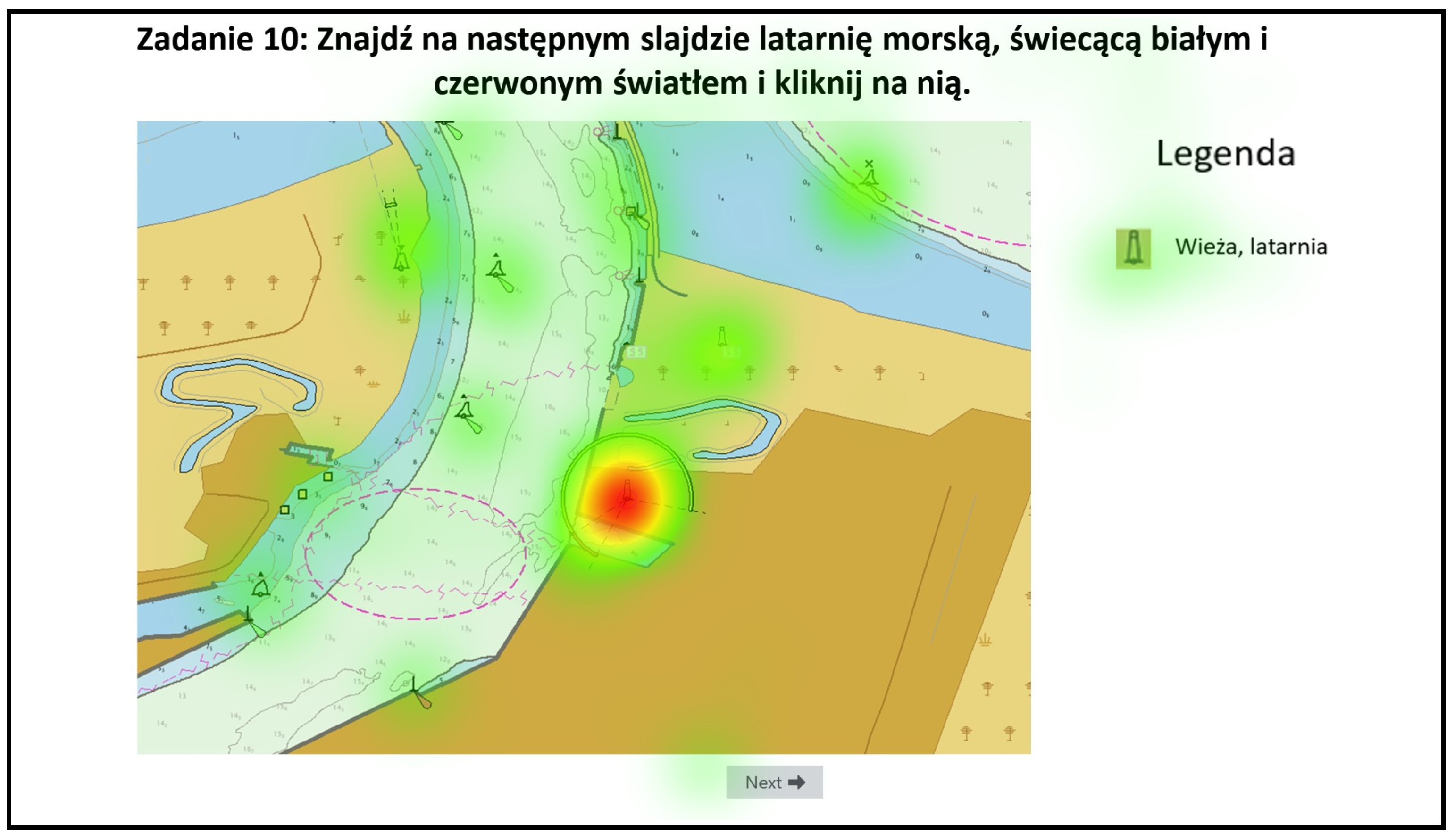
2.4.3. Preparation of Heatmaps for Indicator Elaboration
- Light green (low attention): [30, 30, 30] to [60, 255, 255];
- Yellow–green (medium attention): [20, 100, 100] to [50, 255, 255];
- Red (high attention): [10, 100, 100] to [25, 255, 255].
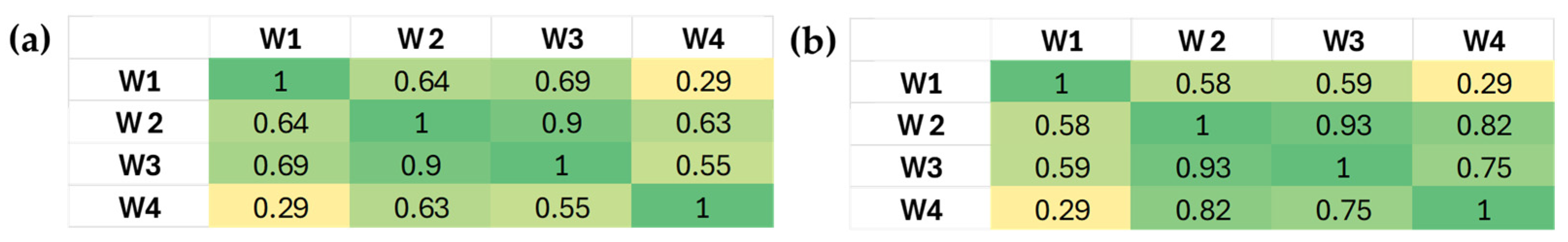
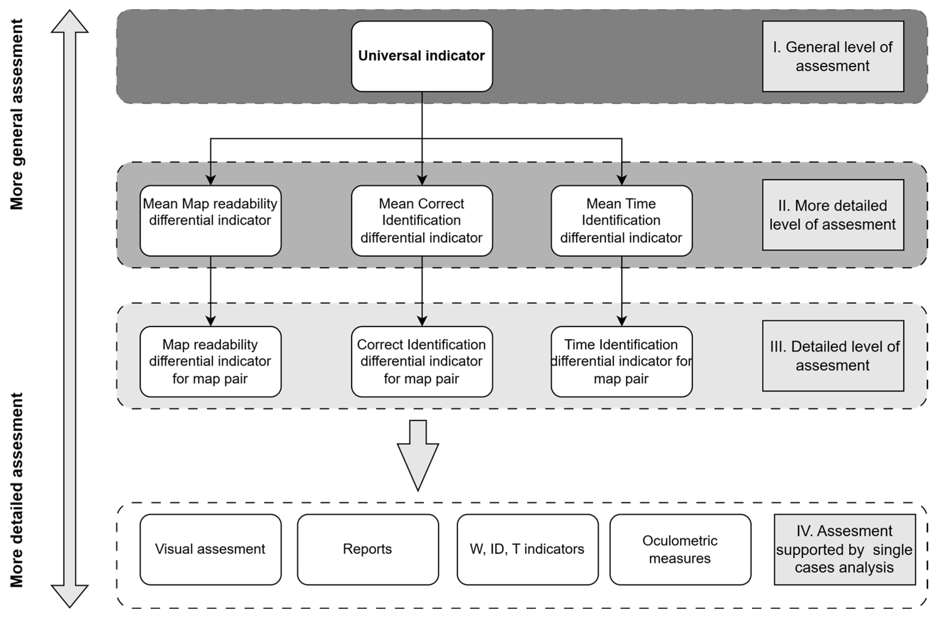
2.5. Indicator Elaboration
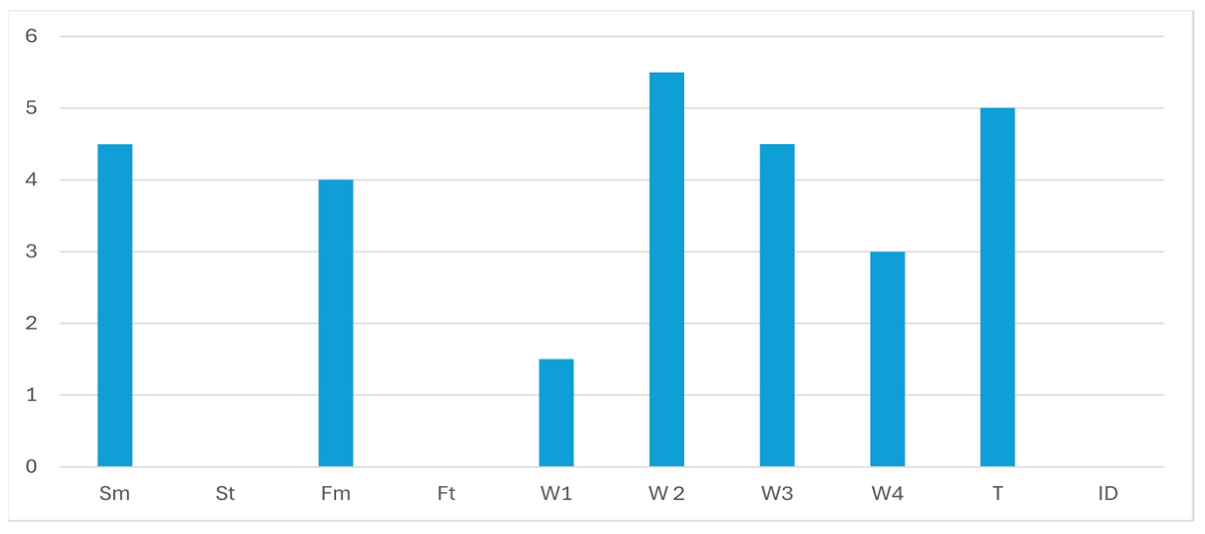
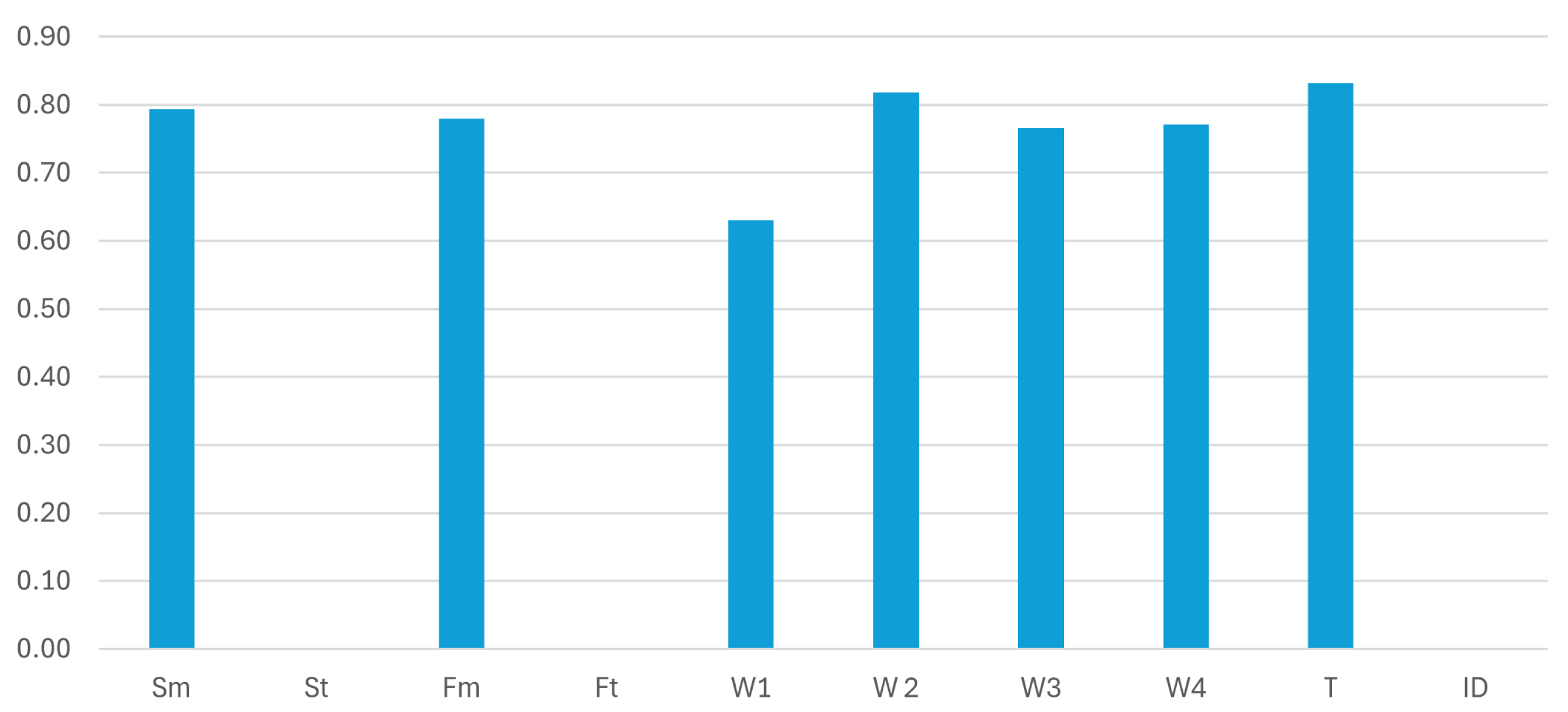
2.5.1. Measures
2.5.2. Readability Indicator
- j—index of the heatmap-based indicator, i.e., W1, W2, W3;
- s—scenario number;
- m—map type (2D or 3D);
- i—index of the surface area for a given region;
- R—number of regions in scenario s;
- —surface area in pixels for red regions (maximum attention on the target object);
- —surface area for light green regions, including the remaining ones (maximum defined area of the heatmaps);
- —surface area for green–yellow and red regions (significant areas of attention);
- A—total number of pixels in the entire image (scenario);
- N—numbers of testers per 2D and 3D scenarios (for each, N = 15).
- k—number of isolated focus fields (number of green-yellow and red areas).
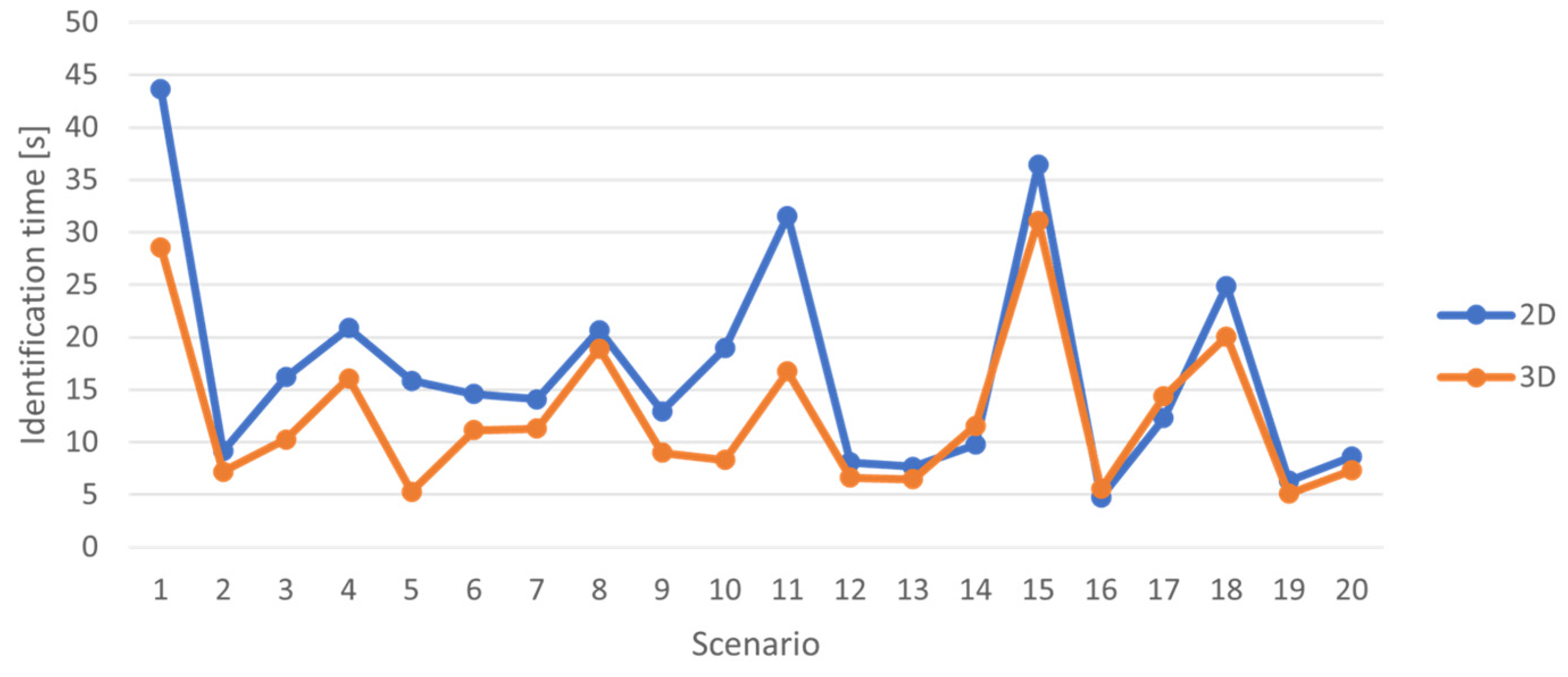
2.5.3. Correct Identification Indicator and Identification Time Indicator
2.5.4. Differential Indicators
2.5.5. Universal Indicator
3. Results
3.1. Visual Assesment
3.2. Surveys
3.3. Map Indicators
4. Discussion
5. Conclusions
Author Contributions
Funding
Institutional Review Board Statement
Informed Consent Statement
Data Availability Statement
Acknowledgments
Conflicts of Interest
Abbreviations
| ENC | Electronic Navigational Maps |
| IHO | International Hydrographic Organisation |
| ECDIS | Electronic Chart Display and Information Systems |
| IMO | International Maritime Organisation |
| SOLAS | Safety of Life at Sea |
| LiDAR | Light Detection and Ranging |
| GIS | Geographic Information System |
| AR | Augmented Reality |
| EEG | Electroencephalogram |
| fMRI | functional Magnetic Resonance Imaging |
| GSR | Galvanic Skin Response |
| LoD | Level of Detail |
| HSV | Hue Saturation Value |
| VR | Virtual Reality |
References
- Kastriosis, C.; Pilikou, M. Nautical cartography competences and their effect to the realisation of a worldwide Electronic Navigational Charts database, the performance of ECDIS and the fulfilment of IMO chart carriage requirements. Mar. Policy 2017, 75, 29–40. [Google Scholar] [CrossRef]
- International Maritime Organization (IMO). SOLAS: International Convention for the Safety of Life at Sea, Consolidated Edition 2024; International Maritime Organization: London, UK, 2024. [Google Scholar]
- International Hydrographic Organization (IHO). S-101 Electronic Navigational Chart (ENC), 2.0.0 ed.; International Hydrographic Bureau: Monaco, Monaco, 2024; Available online: https://iho.int/en/standards-and-specifications (accessed on 7 April 2025).
- International Hydrographic Organization (IHO). IHO S-52—Specifications for Chart Content and Display Aspects of ECDIS, 6.1.1 ed.; June 2015 (with Clarifications up to October 2018); International Hydrographic Bureau: Monaco, Monaco, 2015; Available online: https://iho.int/en/standards-and-specifications (accessed on 7 April 2025).
- Gaspar, J.A.; Leitao, H. What is a nautical chart, really? Uncovering the geometry of early modern nautical charts. J. Cult. Herit. 2018, 29, 130–136. [Google Scholar] [CrossRef]
- Gold, C.; Goralski, R. 3D Graphics Applied to Maritime Safety. In Information Fusion and Geographic Information Systems; Popovich, V.V., Schrenk, M., Korolenko, K.V., Eds.; Springer: Berlin/Heidelberg, Germany, 2007; pp. 243–256. [Google Scholar] [CrossRef]
- Gold, C.; Chau, M.; Dzieszko, M.; Goralski, R. 3D Geographic Visualization: The Marine GIS. In Developments in Spatial Data Handling; Fisher, P.F., Ed.; Springer: Berlin/Heidelberg, Germany, 2004; pp. 17–28. [Google Scholar] [CrossRef]
- Resch, B.; Wohlfahrt, R.; Wosniok, C. Web-based 4D visualization of marine geo-data using WebGL. Cartogr. Geogr. Inf. Sci. 2014, 41, 235–247. [Google Scholar] [CrossRef]
- Duan, H.; Li, Y.; Han, H. Progress of the research concerning 3D visualization of marine water environment in China. In Proceedings of the 2012 International Symposium on Geomatics for Integrated Water Resources Management (GIWRM 2012), Lanzhou, China, 19–21 October 2012; IEEE: Piscataway, NJ, USA, 2012; pp. 1–6. [Google Scholar] [CrossRef]
- Goralski, R.; Gold, C. Marine GIS: Progress in 3D Visualization for Dynamic GIS. In Headway in Spatial Data Handling; Ruas, A., Gold, C., Eds.; Springer: Berlin/Heidelberg, Germany, 2008; pp. 401–416. [Google Scholar] [CrossRef]
- Goralski, R.; Ray, C.; Gold, C. Applications and Benefits for the Development of Cartographic 3D Visualization Systems in Support of Maritime Safety. TransNav Int. J. Mar. Navig. Saf. Sea Transp. 2011, 5, 423–431. [Google Scholar]
- Su, T.; Cao, Z.; Lv, Z.; Liu, C.; Li, X. Multi-dimensional visualization of large-scale marine hydrological environmental data. Adv. Eng. Softw. 2016, 95, 7–15. [Google Scholar] [CrossRef]
- Naus, K.; Makar, A. Conception of Spatial Presentation of ENC. In Proceedings of the XIV International Scientific and Technical Conference the Part of Navigation in Support of Human Activity on the Sea, Gdynia, Poland, 17–19 November 2004. [Google Scholar]
- Liu, T.; Zhao, D.; Pan, M. Generating 3D Depiction for a Future ECDIS Based on Digital Earth. J. Navgation 2014, 67, 1049–1068. [Google Scholar] [CrossRef]
- Feixiang, Z.X.; Yingjun, Z.J.; Wenehai, S.H. Web marine spatial information service based on electronic nautical charts. In Proceedings of the Eighth Acis International Conference On Software Engineering, Artificial Intelligence, Networking, and Parallel/Distributed Computing, Qingdao, China, 30 July–1 August 2007; Volume 3. [Google Scholar] [CrossRef]
- Contarinis, S.; Nakos, B.; Tsoulos, L.; Palikaris, A. Web-based nautical charts automated compilation from open hydrospatial data. J. Navig. 2022, 75, 763–783. [Google Scholar] [CrossRef]
- Su, D.-T.; Lo, D.C.; Chen, C.-W.; Huang, Y.-C. The integration of nautical charts to reconstruct 3D harbor area models and apply assisted navigation. Nat. Hazards 2013, 66, 1135–1151. [Google Scholar] [CrossRef]
- Ng’ang’a, S.; Sutherland, M.; Cockburn, S.; Nichols, S. Toward a 3D marine cadastre in support of good ocean governance: A review of the technical framework requirements. Comput. Environ. Urban Syst. 2004, 28, 443–470. [Google Scholar] [CrossRef]
- Liu, T.; Zhao, D.P.; Pan, M.Y.; Bai, K. Fusing multiscale charts into 3D ENC systems based on underwater topography and remote sensing image. Math. Probl. Eng. 2015, 2015, 735–747. [Google Scholar] [CrossRef]
- Naus, K.; Makar, A. Mathematical Model of the Dynamic Perspective Projection for Presentation of ENC. Annu. Navgation 2002, 4, 81–95. [Google Scholar]
- Liu, T.; Zhao, D.; Pan, M. An approach to 3D model fusion in GIS systems and its application in a future ECDIS. Comput. Geosci. 2016, 89, 12–20. [Google Scholar] [CrossRef]
- Naus, K.; Zwolan, P. ABPP Motion Simulator Based on 3D ENC. Annu. Navig. 2018, 24, 137–145. [Google Scholar] [CrossRef]
- Porathe, T. 3-D Nautical Charts as Decision Support for Land Based Piloting. In Proceedings of the 1st International Ship-Port-Interface Conference (ISPIC 2008), Bremen, Germany, 19–21 May 2008; pp. 191–198. [Google Scholar]
- Ray, C.; Goralski, R.; Claramunt, C.; Gold, C. Real-time 3D monitoring of marine navigation. In Lecture Notes in Geoinformation and Cartography; Springer: Berlin/Heidelberg, Germany, 2011; pp. 161–175. [Google Scholar] [CrossRef]
- Garmin. Available online: https://www.garmin.com/pl-PL/p/866230#specs (accessed on 9 January 2025).
- Krassanakis, V.; Cybulski, P. Eye tracking research in cartography: Looking into the future. ISPRS Int. J. Geo-Inf. 2021, 10, 411. [Google Scholar] [CrossRef]
- Templin, T.; Popielarczyk, D.; Gryszko, M. Using Augmented and Virtual Reality (AR/VR) to Support Safe Navigation on Inland and Coastal Water Zones. Remote Sens. 2022, 14, 1520. [Google Scholar] [CrossRef]
- Gralak, R.; Muczyński, B.; Przywarty, M. Improving Ship Maneuvering Safety with Augmented Virtuality Navigation Information Displays. Appl. Sci. 2021, 11, 7663. [Google Scholar] [CrossRef]
- Raymarine ClearCruise, A.R. Available online: https://www.raymarine.com/en-us/our-products/marine-cameras/augmented-reality (accessed on 9 January 2025).
- Furuno. ENVISION AR Navigation System. Available online: https://www.furuno.com/special/en/envision/#page-header (accessed on 9 January 2025).
- Gazzaniga, M.S. Cognitive Neuroscience: The Biology of the Mind. W.W. Norton & Company: New York City, NY, USA, 2018. [Google Scholar]
- Zhao, Y.; Siau, K. Cognitive Neuroscience in Information Systems Research. J. Database Manag. 2016, 27, 58–73. [Google Scholar] [CrossRef]
- Nermend, K. The Implementation of Cognitive Neuroscience Techniques for Fatigue Evaluation in Participants of the Decision-Making Process. In Neuroeconomic and Behavioral Aspects of Decision Making; Nermend, K., Łatuszyńska, M., Eds.; Springer Proceedings in Business and Economics; Springer: Cham, Switzerland, 2017. [Google Scholar] [CrossRef]
- Borawska, A.; Mateja, A. The use of cognitive neuroscience tools for evaluating the cognitive overload caused by social advertising. In Proceedings of the AMCIS 2023 Proceedings, Panama City, Panama, 10–12 August 2023; Volume 4. Available online: https://aisel.aisnet.org/amcis2023/sig_core/sig_core/4 (accessed on 1 April 2025).
- Montello, D.R. Cognitive Map-Design Research in the Twentieth Century: Theoretical and Empirical Approaches. Cartogr. Geogr. Inf. Sci. 2002, 29, 283–304. [Google Scholar] [CrossRef]
- Fairbairn, D.; Hepburn, J. Eye-tracking in map use, map user and map usability research: What are we looking for? Int. J. Cartogr. 2023, 9, 231–254. [Google Scholar] [CrossRef]
- Opach, T. Zastosowanie okulografii (techniki eye-tracking) w kartografii. Pol. Przegląd Kartogr. 2011, 43, 155–169. [Google Scholar]
- Fuest, S.; Grüner, S.; Vollrath, M.; Sester, M. Evaluating the effectiveness of different cartographic design variants for influencing route choice. Cartogr. Geogr. Inf. Sci. 2021, 48, 169–185. [Google Scholar] [CrossRef]
- Putto, K.; Kettunen, P.; Torniainen, J.; Krause, C.M.; Sarjakoski, L.T. Effects of cartographic elevation visualizations and map-reading tasks on eye movements. Cartogr. J. 2014, 51, 225–236. [Google Scholar] [CrossRef]
- Bargiota, T.; Mitropoulos, V.; Krassanakis, V.; Nakos, B. Measuring locations of critical points along cartographic lines with eye movements. In Proceedings of the 26th International Cartographic Conference, Dresden, Germany, 25–30 August 2013. [Google Scholar]
- Havelková, L.; Gołębiowska, I.M. What went wrong for bad solvers during thematic map analysis? Lessons learned from an eye-tracking study. ISPRS Int. J. Geo-Inf. 2019, 9, 9. [Google Scholar] [CrossRef]
- Korycka-Skorupa, J.; Gołębiowska, I. Empirical evaluation of four-variate thematic maps for expert users. Abstr. Int. Cartogr. Assoc. 2021, 3, 157. [Google Scholar] [CrossRef]
- Çöltekin, A.; Heil, B.; Garlandini, S.; Fabrikant, S.I. Evaluating the Effectiveness of Interactive Map Interface Designs: A Case Study Integrating Usability Metrics with Eye-Movement Analysis. Cartogr. Geogr. Inf. Sci. 2009, 36, 5–17. [Google Scholar] [CrossRef]
- Dong, W.; Jiang, Y.; Zheng, L.; Liu, B.; Meng, L. Assessing map-reading skills using eye tracking and Bayesian structural equation modelling. Sustainability 2018, 10, 3050. [Google Scholar] [CrossRef]
- Popelka, L.; Brychtová, A. Eye-tracking study on different perception of 2D and 3D terrain visualisation. Geoinform. FCE CTU 2013, 10, 190–197. [Google Scholar] [CrossRef]
- Popelka, S.; Doležalová, J. Differences between 2D maps and virtual globe containing point symbols: An eye-tracking study. ISPRS Arch. 2016, XLI-B2, 637–644. [Google Scholar] [CrossRef]
- Liu, B.; Dong, W.; Meng, L. Using eye tracking to explore the guidance and constancy of visual variables in 3D visualization. ISPRS Int. J. Geo-Inf. 2017, 6, 274. [Google Scholar] [CrossRef]
- Liao, H.; Dong, W.; Peng, C.; Liu, H. Exploring differences of visual attention in pedestrian navigation when using 2D maps and 3D geo-browsers. Cartogr. Geogr. Inf. Sci. 2017, 44, 474–490. [Google Scholar] [CrossRef]
- Dong, W.; Liao, H. Eye tracking to explore the impacts of photorealistic 3D representations in pedestrian navigation performance. ISPRS Arch. 2016, XLI-B2, 641–648. [Google Scholar] [CrossRef]
- Lei, T.C.; Wu, S.C.; Chao, C.W.; Lee, S.H. Evaluating differences in spatial visual attention in wayfinding strategy when using 2D and 3D electronic maps. GeoJournal 2016, 81, 153–167. [Google Scholar] [CrossRef]
- Kristić, M.; Žuškin, S.; Brčić, D.; Car, M. Overreliance on ECDIS Technology: A Challenge for Safe Navigation. TransNav Int. J. Mar. Navig. Saf. Sea Transp. 2021, 15, 273–283. [Google Scholar] [CrossRef]
- Weintrit, A. The Electronic Chart Display and Information System (ECDIS): An Operational Handbook; CRC Press: Boca Raton, FL, USA, 2009. [Google Scholar]
- International Hydrographic Organization (IHO) (Ed.) S-100 Universal Hydrographic; Data Model (Edition 4.0.0); International Hydrographic Bureau: Monaco, Monaco, 2018. [Google Scholar]
- Muczyński, B.; Gucma, M. Application of Eye-Tracking Techniques in Human Factor Research in Marine Operations. Challenges and Methodology. Sci. J. Marit. Univ. Szczec. 2013, 36, 116–120. [Google Scholar]
- Galanda, J.; Jenčová, E. The Use of Eye Tracking in Aviation. Acta Avion. 2024, 26, 30–36. [Google Scholar] [CrossRef]
- TRESCO. Available online: https://www.tresco.eu/en/navigis-river/ (accessed on 3 April 2025).
- mKart. Available online: https://mkartapp.com/about-enc (accessed on 3 April 2025).
- Łubczonek, J. Marine Electronic Chart with 3D Presentation of Navigational Information (Morska mapa elektroniczna z trójwymiarowym zobrazowaniem informacji nawigacyjnej). Rocz. Geomatyki 2005, 3, 107–116. (In Polish). Available online: http://rg.ptip.org.pl/index.php/rg/article/view/892 (accessed on 26 April 2025).
- Kolbe, T.H.; Kutzner, T.; Smyth, C.S.; Nagel, C.; Roensdorf, C.; Heazel, C. OGC City Geography Markup Language (CityGML) Part 1: Conceptual Model Standard (Version 3.0.0). Open Geospatial Consortium. 2021. Available online: http://www.opengis.net/doc/IS/CityGML-1/3.0 (accessed on 26 April 2025).
- iMotions Fixation and Saccade Classification with the I-VT Filter. Available online: https://help.imotions.com/docs/fixation-and-saccade-classification-with-the-i-vt-filter (accessed on 3 April 2025).
- iMotions Basic Heatmap Explanation and Generation. Available online: https://help.imotions.com/docs/basic-heatmap-explanation-and-generation (accessed on 3 April 2025).
- Shapiro, L.G.; Stockman, G.C. Computer Vision; Prentice Hall: Hoboken, NJ, USA, 2001. [Google Scholar]
- Liang, Y.-C.; Cuevas, J.R. An Automatic Multilevel Image Thresholding Using Relative Entropy and Meta-Heuristic Algorithms. Entropy 2013, 15, 2181–2209. [Google Scholar] [CrossRef]
- Podlesek, A.; Veldin, M.; Peklaj, C.; Svetina, M. Cognitive Processes and Eye-Tracking Methodology. In Applying Bio-Measurements Methodologies in Science Education Research; Devetak, I., Glažar, S.A., Eds.; Springer: Cham, Switzerland, 2021. [Google Scholar] [CrossRef]
- Ball, L.J.; Richardson, B.H. Eye Movement in User Experience and Human-Computer Interaction Research. In Eye Tracking: Background, Methods, and Applications; Stuart, S., Ed.; Springer: New York, NY, USA, 2021. [Google Scholar] [CrossRef]
- Harrie, L.; Stigmar, H.; Djordjevic, M. Analytical Estimation of Map Readability. ISPRS Int. J. Geo-Inf. 2015, 4, 418–446. [Google Scholar] [CrossRef]
- Tourangeau, R.; Yan, T. Sensitive Questions in Surveys. Psychol. Bull. 2007, 133, 859–883. [Google Scholar] [CrossRef]
- Pronin, E. How We See Ourselves and How We See Others. Science 2008, 320, 1177–1180. [Google Scholar] [CrossRef]
- Bethlehem, J. Selection Bias in Web Surveys. Int. Stat. Rev. 2010, 78, 161–188. [Google Scholar] [CrossRef]
- International Hydrographic Organization (IHO). IHO S-57—Transfer Standard for Digital Hydrographic Data, 3.1 ed.; November 2000 (Updated 2014); International Hydrographic Bureau: Monaco, Monaco, 2000; Available online: https://iho.int/en/standards-and-specifications (accessed on 7 April 2025).
- Inland ENC Harmonization Group (IEHG). IENC Encoding Guide, Edition 2.4.1. 2018. Available online: https://ienc.openecdis.org/downloads/IENC_EG_2_4_1_adopted_20180320.pdf (accessed on 26 April 2025).
- Yang, M.; Li, X. A visual attention model based on eye tracking in 3D scene maps. ISPRS Int. J. Geo-Inf. 2021, 10, 468. [Google Scholar] [CrossRef]


| Category | Count | Percent [%] |
|---|---|---|
| Gender | ||
| Female | 11 | 37 |
| Male | 19 | 63 |
| Sum | 30 | 100 |
| Experience | ||
| Experienced | 7 | 23 |
| Inexperienced | 23 | 77 |
| Sum | 30 | 100 |
| Map | ||
| 2D: | 15 | 50 |
| Female | 4 | 27 |
| Male | 11 | 73 |
| Experienced | 4 | 27 |
| Inexperienced | 11 | 73 |
| 3D: | 15 | 50 |
| Female | 7 | 47 |
| Male | 8 | 53 |
| Experienced | 3 | 20 |
| Inexperienced | 12 | 80 |
| Sum | 30 | 100 |
| Indicator Type | Indicator Name | The Nature Associated with Map Efficiency |
|---|---|---|
| W [%] | Readability Indicator | Map readability |
| ID | Correct Identification Indicator | Correctness in identifying map symbols |
| T [s] | Time Identification Indicator | Identification time for map symbols |
| Criterion | Experienced | Inexperienced |
|---|---|---|
| Attention distribution (heatmaps) | Focused | Dispersed, chaotic |
| Focus on irrelevant elements | Rare | Frequent (e.g., off-task objects) |
| Frequency of looking at the legend | Rare | Frequent |
| Accuracy in object identification | Higher | Lower |
| Chaotic task performance | Lower | Higher |
| Criterion | Females | Males |
|---|---|---|
| Attention distribution (heatmaps) | More dispersed | Focused |
| Focus on irrelevant elements | More frequent | Less frequent |
| Frequency of looking at the legend | Frequent | Moderate |
| Accuracy in object identification | Higher | Lower |
| Chaotic task performance | Higher | Lower |
| Precision of Results | Interpretation of Results | Objectivity | Advantages and Disadvantages of the Method |
|---|---|---|---|
| Moderately accurate based on subjective assessments | Easy but often hard to interpret answers | Low level of objectivity; answers are generalised and depend on respondents’ opinions | Advantages: easy to use on a large sample Disadvantage: subjectivity of responses; difficult to use in map series analysis |
| Level of interpretability of the map symbols | Identified cause for distorting the interpretability | Most problematic map symbols | Indicated reason for the difficulty in identifying the map symbol |
| 75% of testers marked the answer that the map symbols were easy to find and interpret | High intensity of the symbols, giving a sense of clutter and confusion | Contours Wrecks Marine cable tracks Ferry routes | Colour scheme |
| Assessment of whether the 3D map correctly represented the navigational situation | Evaluation of a 3D map visualisation for its effectiveness as a navigational aid | Personal perception of the need for this type of visualisation | Suggestions for improving the map symbols or map content |
| 63% of testers (16 persons) marked YES 26% of testers (8 persons) did not have absolute certainty 11% of testers require further work | 56% of testers evaluated a 3D ENC map as an effective visualisation | 14 testers marked as very important 11 testers marked as valuable to have 3 testers marked as not useful | More distinctive colour scheme Increased symbol-to-background contrast Map symbol scaling to avoid cluttering the image Improved 3D presentation of map symbols Map symbol design more in line with the IHO standard |
| Type of Method | Precision of Results | Interpretation of Results | Objectivity | Advantages and Disadvantages of the Method |
|---|---|---|---|---|
| Visual (heatmap analysis) | Very accurate—allows detailed analysis of tester’s attention | Complex—requires experience in heatmap interpretation; heatmap analysis is difficult due to large colour and spatial variations | Objective for a single scenario, but interpretation depends on the algorithms processing the data and the subjective judgement of the analyst | Difficult to apply to a large sample; requires experienced professionals to interpret results; identifies individual problems; qualitative in nature |
| Survey (survey questions) | Moderately accurate—based on subjective assessments | Easy, but often hard to interpret answers | Low level of objectivity; answers are generalised and depend on respondents’ opinions | Easy to use on a large sample; main disadvantage is subjectivity of responses; difficult to use in map series analysis |
| Indicative (quantitative indicators) | Very accurate—based on measurable parameters | Easy—based on the analysis of indicators; covers all cases examined | Objective in quantitative analysis, but does not take qualitative aspects into account | Ability to automatise calculations; easy to apply in analysis of multiple test scenarios; disadvantage is quantitative nature; does not allow identification of specific problems |
Disclaimer/Publisher’s Note: The statements, opinions and data contained in all publications are solely those of the individual author(s) and contributor(s) and not of MDPI and/or the editor(s). MDPI and/or the editor(s) disclaim responsibility for any injury to people or property resulting from any ideas, methods, instructions or products referred to in the content. |
© 2025 by the authors. Licensee MDPI, Basel, Switzerland. This article is an open access article distributed under the terms and conditions of the Creative Commons Attribution (CC BY) license (https://creativecommons.org/licenses/by/4.0/).
Share and Cite
Lubczonek, J.; Biernacik, P.; Bodus-Olkowska, I.; Borawska, A.; Mateja, A. Methodology for Conceptual Navigational 3D Chart Assessment Based on Eye Tracking Measures. Appl. Sci. 2025, 15, 4967. https://doi.org/10.3390/app15094967
Lubczonek J, Biernacik P, Bodus-Olkowska I, Borawska A, Mateja A. Methodology for Conceptual Navigational 3D Chart Assessment Based on Eye Tracking Measures. Applied Sciences. 2025; 15(9):4967. https://doi.org/10.3390/app15094967
Chicago/Turabian StyleLubczonek, Jacek, Patryk Biernacik, Izabela Bodus-Olkowska, Anna Borawska, and Adrianna Mateja. 2025. "Methodology for Conceptual Navigational 3D Chart Assessment Based on Eye Tracking Measures" Applied Sciences 15, no. 9: 4967. https://doi.org/10.3390/app15094967
APA StyleLubczonek, J., Biernacik, P., Bodus-Olkowska, I., Borawska, A., & Mateja, A. (2025). Methodology for Conceptual Navigational 3D Chart Assessment Based on Eye Tracking Measures. Applied Sciences, 15(9), 4967. https://doi.org/10.3390/app15094967