Article

From Questionnaires to Heatmaps: Visual Classification and Interpretation of Quantitative Response Data Using Convolutional Neural Networks

1
Department of Business Administration, Triagon Academy, MRS1331 Marsa, Malta
2
Webasto Roof & Components SE, Werner-Baier-Strasse 1, 17033 Neubrandenburg, Germany
3
Department of Business Psychology, University Institute Schaffhausen, 8200 Schaffhausen, Switzerland
4
FIM Research Center, University of Applied Sciences Augsburg, 86161 Augsburg, Germany
5
Department of Business Psychology, Seeburg Castle University, 5201 Seekirchen am Wallersee, Austria
*
Authors to whom correspondence should be addressed.
These authors contributed equally to this work.
Appl. Sci. 2025, 15(19), 10642; https://doi.org/10.3390/app151910642
Submission received: 31 August 2025 / Revised: 26 September 2025 / Accepted: 30 September 2025 / Published: 1 October 2025

Abstract

Structured quantitative data, such as survey responses in human resource management research, are often analysed using machine learning methods, including logistic regression. Although these methods provide accurate statistical predictions, their results are frequently abstract and difficult for non-specialists to comprehend. This limits their usefulness in practice, particularly in contexts where eXplainable Artificial Intelligence (XAI) is essential. This study proposes a domain-independent approach for the autonomous classification and interpretation of quantitative data using visual processing. This method transforms individual responses based on rating scales into visual representations, which are subsequently processed by Convolutional Neural Networks (CNNs). In combination with Class Activation Maps (CAMs), image-based CNN models enable not only accurate and reproducible classification but also visual interpretability of the underlying decision-making process. Our evaluation found that CNN models with bar chart coding achieved an accuracy of between 93.05% and 93.16%, comparable to the 93.19% achieved by logistic regression. Compared with conventional numerical approaches, exemplified by logistic regression in this study, the approach achieves comparable classification accuracy while providing additional comprehensibility and transparency through graphical representations. Robustness is demonstrated by consistent results across different visualisations generated from the same underlying data. By converting abstract numerical information into visual explanations, this approach addresses a core challenge: bridging the gap between model performance and human understanding. Its transparency, domain-agnostic design, and straightforward interpretability make it particularly suitable for XAI-driven applications across diverse disciplines that use quantitative response data.

1. Introduction

Structured quantitative data, such as employee or customer surveys, are commonly analysed using traditional statistical (e.g., logistic regression). However, while these techniques often deliver accurate predictions, their outputs are usually abstract and difficult for non-specialists to interpret [1,2,3]. This creates a gap between predictive performance and stakeholder comprehensibility.
There is a need for a combination of strong predictive ability and intuitive interpretability. Existing Explainable Artificial Intelligence (XAI) techniques (e.g., SHAP, LIME) improve post hoc interpretability but still rely on abstract numerical measures. To address this gap, we propose a deterministic one-record-to-one-chart encoding, in which each survey response is transformed into a chart (bar or pie) and classified using convolutional neural networks (CNNs). Class Activation Maps (CAMs) are then applied to generate per-respondent heatmaps that directly highlight which survey dimensions influenced the classification.
The objectives of this study are threefold: (i) to evaluate whether CNN–CAM models achieve predictive performance comparable to logistic regression, (ii) to examine whether visual encodings provide stable and meaningful interpretability, and (iii) to demonstrate the practical applicability of this method as a transparent, domain-independent workflow.
The significance of this contribution lies in bridging the gap between predictive accuracy and practitioner accessibility. By combining visual representations, CNN classification, and CAM explanations, the approach provides intuitive, human-readable insights that are promising for applied decision contexts where trust and transparency are critical.
Convolutional neural networks (CNNs) are well established for analysing visual data and have achieved remarkable results, particularly in image classification and object recognition [4,5]. These approaches predominantly rely on natural image data and are applied in diverse fields such as beef carcass grading [6], plant growth stage classification [7], and medical images for dementia research [8]. Despite these developments, applying CNNs to structured tabular data remains unconventional [5] and challenging [9].
Although survey data and Likert-scale ratings are typically analysed in their quantitative form, humans usually perceive and evaluate information more effectively when presented as visually structured representations [10]. Bar charts, pie charts, and heatmaps are widely used in exploratory analysis because they support cognitive processes and reveal relationships between variables intuitively. The primary objective of this study was to transfer this visual potential to machine learning models. This addresses the challenge that non-specialists often cannot translate statistical coefficients or feature importance values into actionable insights, particularly in applied fields such as human resource management and healthcare.
While existing methods such as logistic regression, decision trees with SHAP or LIME, and 1D-CNNs or transformer models can already be used for tabular data, our approach differs in its combination of deterministic visual coding and simultaneous explainable classification at the individual-response level. One-dimensional CNNs or Transformer-based models can also process tabular inputs [11,12]; however, they typically do not provide outputs that are readily interpretable for non-specialists.
We propose an image-based method for classifying quantitative tabular data. Numerical scale values are transformed into graphical representations, such as bar or pie charts, which are then classified using a CNN. Rather than encoding data solely as vectors or matrices, this approach uses the visual structure itself as the analytical input, leveraging the established strengths of image-based neural networks for structured data analysis. Although this paradigm has received limited attention, it offers considerable potential for combining predictive performance with visual interpretability.
Moreover, image-based representations might lever visual explainability through Class Activation Maps (CAMs), which highlight the regions of an image most relevant for a CNN’s decision. In contrast to traditional models, in which interpretation relies on numerical coefficients or feature importance, CAMs provide direct visual explanations. This approach enhances the comprehensibility of the results for end users who may lack statistical expertise.
In this study, we evaluated survey data to demonstrate how simple visual coding techniques, such as bar charts with colour gradients corresponding to scale values, can create robust training datasets that are optimal for CNNs. We then compared different forms of visualisation, specifically bar charts versus pie charts, with respect to their classification efficacy and interpretability. The findings indicate that the choice of visualisation significantly influences both learning behaviour and the corresponding CAM outputs.
The methodological framework of this study followed a domain-independent approach. Although survey data in human resource management research serve as a demonstration case, the approach can be readily applied to other use cases, including patient evaluations in medicine, or product evaluations in e-commerce. Particularly in fields with high demands for explanation, such as regulatory compliance or user-centred decision-making, the integration of image-based classification and heatmap interpretation has the potential to contribute to model transparency.
Our contribution is a deterministic one-record-to-one-chart encoding combined with CNN–CAM analysis, producing per-respondent heatmaps within a lightweight, end-to-end workflow. This enables accessible, instance-level explanations while maintaining the predictive performance. Recent studies on image-based encodings of tabular data (e.g., [5,9]) demonstrate the potential of this paradigm; however, our approach is distinct in that it integrates intuitive visual aids directly into the classification pipeline. To our knowledge, this study is the first to present a complete pipeline that ranges from visual transformation to CNN-based classification to CAM-supported explanation. The potential implications of this contribution extend beyond predictive performance: the method aims to strengthen trust, transparency, and usability of AI systems in decision contexts where interpretability is essential.

2. Background and Related Works

This study lies at the intersection of several established research areas: the classification of structured data, the visualisation of ordinal information, the use of convolutional neural networks (CNNs) beyond natural image data, and explainable artificial intelligence (XAI). While significant advances have been achieved in each of these areas independently, their integration remains limited. To contextualise the methodological contribution of this study, the following section reviews relevant developments within these areas.

2.1. Ordinal Data Classification Methods

Traditionally, ordinal data obtained from surveys, product tests, or evaluations have been evaluated using classical machine learning (ML) models. The most common methods include logistic regression, random forests, support vector machines (SVMs), and k-nearest neighbours (k-NN). These models operate directly on numerically coded feature vectors, with ordinal scales typically interpreted as integers (e.g., 1 to 5) [13].
Recently, deep learning methods have been introduced for structured data, particularly in the form of tabular neural networks. These models use fully connected layers and attempt to model the interactions between features internally [14]. Despite their potential, a persistent challenge remains in ensuring interpretability and visual accessibility, particularly in decision-making contexts where transparency and traceability are as critical as predictive accuracy.

2.2. Visual Coding of Structured Data

The visualisation of structured or ordinal data has consistently played a crucial role in exploratory analyses. Diagram forms, such as bar charts, pie charts, heatmaps, or radar plots, enable the visual identification of patterns, differences, and trends. While such representations are primarily intended for human visual interpretation, the present work proposes an adaptation of these visualisations as an input for neural networks.
Similar concepts have been explored in related research areas, such as time-series analysis. Methods such as the Gramian Angular Fields (GAF) [15] or Recurrence Plots (RP) [16] transform temporal data into images that can subsequently be analysed with CNNs. Comparable approaches have also been applied in domains such as financial forecasting and analyses of sensor data. However, their application to statically structured, ordinally coded scales has received little attention to date.
A key advantage of this visual encoding is that the resulting images inherently embed semantic structures, such as sequences, intensities, or colour weightings, that CNNs can exploit without requiring explicit coding within the model [17,18]. Building on this idea, the present study proposes a visual representation of property values as spatial and colour patterns, enabling CNNs to process structured ordinal data both effectively and efficiently.

2.3. CNN Applications Beyond Natural Images

CNNs were originally developed for processing natural images, such as those encountered in computer vision or medical image processing [19]. Their primary strength lies in local filtering and hierarchical aggregation of features. Recently, CNNs have also been successfully applied to synthetic image data, for example, in the classification of hand gestures through key-point heatmaps, interpretation of machine-generated scans, or analysis of structured visualisations. One particularly relevant application area is the processing of graphical representations of numerical information, such as dashboards and digital user interfaces [17,20]. In these cases, CNNs have demonstrated strong performance even when the input does not consist of photographs of real-world objects but rather of constructed, geometrically organised visualisations [21,22].
This capability is essential in the context of the present study, as the bar and pie charts generated from ordinal values exhibit clear geometric structures and visual regularities that convolutional kernels can effectively capture. This opens up a new application domain for CNNs, namely, the analysis of semantically structured data through visual encoding.

2.4. Explainable AI and Class Activation Maps (CAMs)

A primary concern in modern AI research is the explainability of models. Particularly within the domain of deep learning, numerous models demonstrate high predictive accuracy yet remain challenging to interpret, a phenomenon often described as the “black box” problem [23,24]. In response, several approaches have been developed to enhance neural network interpretability. Prominent examples include Local Interpretable Model-Agnostic Explanations (LIME), SHapley Additive exPlanations (SHAP), and Integrated Gradients [25].
However, in an image-based context, Class Activation Maps (CAMs) have proven particularly effective [26]. CAMs highlight the regions of an input image that contribute most strongly to the model’s prediction by integrating the weights of the final convolutional layer with the output classifiers [24,27]. Further extensions, such as Grad-CAM, enable this approach to be applied to a wide range of CNN architectures [28].
In contrast to numerical methods, such as logistic regression, where interpretation relies on model coefficients, CAMs provide spatially weighted heatmaps that are intuitively comprehensible, even to non-experts. In addition, various explainable methods exist for tabular data, such as SHAP and LIME. However, these are usually employed as additional layers afterwards. Our approach differs in that explainability is integrated directly into the visual classification process, in a manner similar to Grad-CAM in the context of images.
This represents the principal advantage of the proposed approach: the integration of image-based representation and interpretation, which enables a coherent and visually grounded line of reasoning.

2.5. Synthesis and Positioning of Proposed Approach

The visual transformation of structured data, CNN-based classification, and CAM-based interpretation have not been integrated in the existing literature [29]. While isolated studies exist on GAFs or the visualisation of time series for CNNs [30,31], there is an absence of methods that visually encode structured Likert-scale or ordinal ratings and subsequently render them holistically interpretable through visual means.
The method presented in this study addresses this gap and demonstrates that visually encoded scale values can be efficiently classified by CNNs, while enabling the use of CAMs to provide transparent and comprehensible decision support.
Thus, this work positions itself as a methodological contribution to the integration of visual structures in tabular-dominated application fields, with the aim of transferring the advantages of image-based deep learning models to previously atypical data formats.
The purpose of this study is to extend the benefits of image-based deep learning models, particularly their explainable decision-making capabilities, to data formats that have traditionally been considered atypical for such approaches.

3. Materials and Methods

Comprehensive analyses were conducted in Jupyter Notebook (version 6.5.5) to validate the proposed method with three objectives: (i) to assess the classification performance of convolutional neural networks (CNNs) on visually encoded ordinal data, (ii) to evaluate interpretability using Class Activation Maps (CAMs), and (iii) to compare the effectiveness of bar chart versus pie chart representations in terms of predictive performance and explanatory value. The workflow comprised five steps: dataset preparation, visual encoding of features, CNN architecture design and training, interpretability analysis, and evaluation metrics. To ensure comparability with established numerical approaches, logistic regression was implemented as the benchmark model.

3.1. Dataset and Preprocessing

A real-world dataset from anonymised employee surveys was used as a demonstration case. The dataset (Table S1) was acquired from a publicly accessible employer review platform and contained 65,563 records (i.e., units of analysis). Each record included thirteen features measured on a 5-point Likert scale (1 = very poor to 5 = very good), reflecting aspects of the work environment. The categories covered aspects such as working atmosphere, communication, and career opportunities. The outcome variable was binary coded, indicating whether the respondent would recommend the employer (1) or not (0). Although the framework can be extended to multilevel or continuous outcomes, the present study focused on the binary case. Therefore, the underlying data structure is analogous to typical inputs for classical ML models, with the distinction that in the present approach, these vectors are subsequently transformed into visual representations
Formally, each data instance (observation) can be represented as a vector:
x = x 1 , x 2 , , x 13 , x i { 1 , 2 , , 5 }
In total, 44,417 missing values were found across the thirteen predictor variables, accounting for 5.2% of all possible responses (see Table A1). The target variable had no missing values. In the case of missing values, an iterative imputation method based on multiple regression estimates was used. The estimated values were then rounded to the nearest whole number on a scale from 1 to 5 to preserve the discrete numerical structure. We employed a stratified 70:30 split at the respondent level to form the training and validation data files. This approach ensures that both a bar chart and a pie chart for the same respondent are not included in different data splits, thereby effectively preventing data leakage. Prior to the analysis, the missing data were imputed.
Following the preprocessing and imputation of missing values, the class distribution was approximately balanced, ensuring that both outcome categories were adequately represented.
The class distribution was examined to ensure balance before splitting (Section 3.3). Analysing responses at the individual level is essential for developing a framework for the subsequent training process. The final overall dataset consisted of 65,563 units of analysis (i.e., employees) which were separated into a file of 45,894 for training (70% of the data) and 19,669 for validation (30% of the data). Employee survey data were chosen because they exemplify a common and practically relevant form of structured ordinal information that is widely used but often difficult to interpret using conventional numerical methods.
Their transformation into graphical representations (bar charts and pie charts), described in the following section, enabled integration into the CNN-based classification while preserving the semantic meaning of ordinal ratings for subsequent visual interpretation.

3.2. Visual Encoding of Features

The main idea is to convert ordinal property values into graphical representations. In this study, two visualisation strategies (bar chart and pie chart) were implemented and evaluated for comparative analysis. The colour mapping from red (=1) to green (=5) follows the theoretical logic of a Likert scale, in which low values are typically interpreted as negative and high values as positive. This intuitive scheme not only facilitates human readability but also supports consistency between visual encoding and content meaning. Alternative scales (e.g., blue-orange) were explored but showed no improvements in model accuracy. An image size of 65 × 65 pixels was chosen because it ensured sufficient visual resolution to clearly recognise differences in bar length and colour intensity while keeping the memory and computing requirements for the CNN models low. Preliminary tests with larger formats (e.g., 128 × 128 pixels) showed no significant gains in accuracy but resulted in significantly longer training times. The chosen size therefore represents a pragmatic compromise between visual interpretability and computational effort.
For model training, each of the 45,894 records in the training set was converted into two visual representations (one bar chart and one pie chart), resulting in a total of 91,788 training images. These images were used to train both the 1× Conv and 2× Conv architectures. For testing, each of the 19,669 records was represented four times: as a bar chart evaluated with the 1× Conv model, as a bar chart evaluated with the 2× Conv model, as a pie chart evaluated with the 1× Conv model, and as a pie chart evaluated with the 2× Conv model. This procedure yielded 183,576 labelled test images (19,669 × 4), ensuring that every record was consistently evaluated across both the visual encodings and model architectures.
(a)
Bar charts
Each instance was transformed into a horizontal bar chart, with each row representing one of the thirteen features. The bar length corresponds to the respective scale rating, while the colour ranges from red (1) to green (5). This colour gradient follows the theoretical logic of a Likert scale, associating lower values with negative evaluations and higher values with positive evaluations in a way that is intuitive for both humans and CNNs. Alternative scales (e.g., blue to orange) were considered, but no improvement in model accuracy was observed. Images were generated using the Python Imaging Library (PIL) at a fixed resolution (65 × 65 pixels) to ensure CNN compatibility. The image size of 65 × 65 pixels was chosen to ensure sufficient visual resolution to clearly recognise differences in bar length and colour intensity while keeping memory and computing requirements for CNN models low. Preliminary tests with larger formats (e.g., 128 × 128 pixels) showed no significant improvement in accuracy but resulted in significantly longer training times. The selected size therefore strikes a balance between intuitive visual aid contributed to interpretability and computational effort.
This representation preserves a consistent vertical ordering of features and highlights differences across instances, thereby facilitating subsequent processing with image-based methods.
(b)
Pie charts
In this variant, each feature vector is converted into a pie chart, with segment sizes proportional to the respective scale values. Colours were assigned using fixed RGB values for each category. This visualisation produces radially symmetrical patterns that may induce different spatial activations in CNNs. The benefit of this representation is its emphasis on ratios as parts of a whole, which may support cognitive grouping. However, the interpretation by CNNs can be more challenging in the presence of nonlinear arrangements.
Both encodings generated RGB images that were converted into arrays of the form (H × W × 3) and subsequently normalised (pixel values in [0, 1]). The resulting image arrays were used as inputs for the CNN training.
The models were trained over 200 epochs with a batch size of 1000 using the Adam optimiser and cross-entropy as the loss function.
(c)
Labelling process
Each generated chart was assigned the binary recommendation label directly from the target variable “employer recommendation” (“no” = 0, “yes” = 1). This ensured that both the bar and pie representations of the same record inherited the same outcome label.

3.3. CNN Architecture and Training

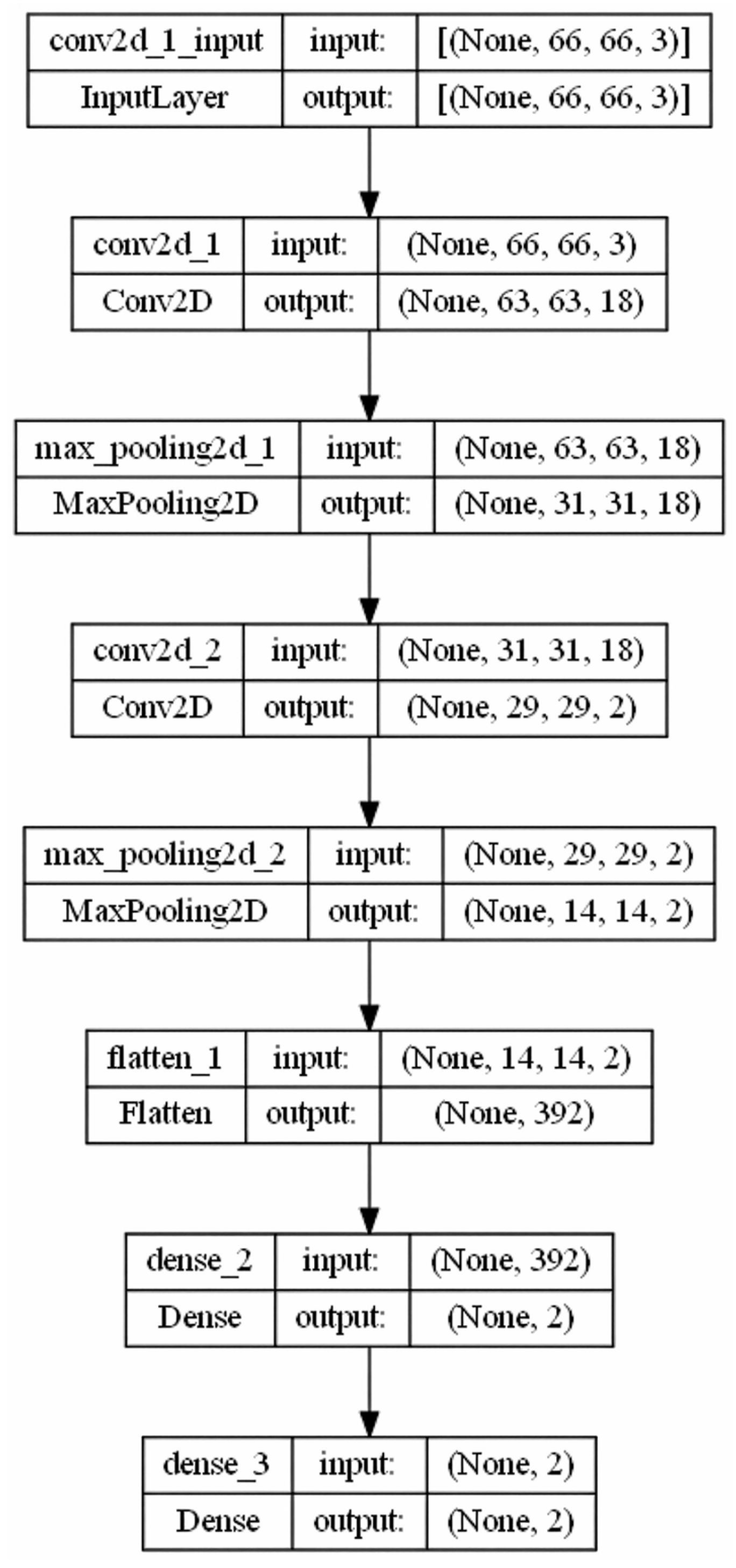
Two CNN architectures were implemented to classify the visually encoded survey data. The first, referred to as the 1× Conv model, comprised a single convolutional layer designed to capture local patterns, such as bar lengths and colour gradients, with minimal computational cost. Second, the 2× Conv model incorporates two convolutional layers, enabling the extraction of more complex spatial relationships at the expense of increased training time. Each dataset was transformed into a bar chart and pie chart. The bar charts were generated with a fixed vertical order of categories; the bar length corresponded to the respective Likert value, coloured in a gradient from red (1) to green (5). The pie charts were coded as segments, with each category assigned a fixed RGB colour. All images had a resolution of 65 × 65 pixels and were normalised in RGB. Each image directly adopted the label of the target variable “employer recommendation” (“no” = 0, “yes” = 1).
The dataset was divided into 45,894 training images and 19,669 test images with a fixed random seed in a ratio of 70:30. Both architectures were trained using the Adam optimiser with cross-entropy loss, a batch size of 1000, and 200 training epochs. The target variable was one-hot-encoded. The hyperparameters were set heuristically, following widely used defaults in CNN research, and were not systematically optimised. This limitation has been explicitly acknowledged in the Discussion (Section 5.5).
Data splitting was performed strictly at the level of individual respondents before image generation to ensure that no record appeared in both the training and testing sets. A fixed random seed (55) was applied to all the training runs to guarantee reproducibility. Training time varied substantially across architectures and visual encodings: while bar chart models converged within a few hours, the pie chart models required up to 61 h, reflecting the higher complexity introduced by their radial symmetry.
(a)
1× Conv model
This simple architecture comprises a single convolutional layer (Figure 1). It provides an optimal balance between computational efficiency and classification accuracy, effectively capturing local patterns such as bar lengths or colour distributions.
(b)
2× Conv model
To increase the representational depth, a version with two convolutional layers was implemented (Figure 2). This architecture enables the capture of more complex spatial relationships but requires higher computational resources.
Both architectures were trained using the Adam optimiser with cross-entropy loss and a batch size of 1000 over 200 epochs. The target variable was one-hot-encoded. For reproducibility, the data were randomly split with a fixed seed, allocating 70% for training and 30% for testing purposes. This split is a widely adopted heuristic in machine learning when no separate validation set is required, as it balances the availability of data for model training with sufficient hold-out data for evaluation (see, e.g., [32,33]).
The training time varied according to the model complexity: the 1× Conv model (bar images) required 2 h 14 min, the 2× Conv model (bar images) required 4 h 38 min, the 1× Conv model (pie charts) required 24 h 29 min, and the 2× Conv model (pie charts) required 61 h 14 min.

3.4. Integration of CAMs for Interpretability

To enhance model transparency, Class Activation Maps (CAMs) were applied as introduced by Zhou et al. (2016) [34]. The Grad-CAM variant was used in the procedure, with the last convolutional layer serving as the target layer. The resulting activation maps were interpolated and normalised on the input images before being overlaid with a Jet colour scale.
The underlying principle is to combine the activations of the final convolutional layer with the weightings of the output layer as follows:
C A M x , y = k w k c f k ( x , y )
where
  • C A M x , y : The value of the CAM at position (x,y)
  • f k ( x , y ) : The activation of the k-th feature map at position (x,y)
  • w k c : The weight indicating the contribution of the k-th feature map to the prediction of class c
The resulting output is a heatmap that can be superimposed on the original image to highlight the regions that are most influential in the decision. To achieve this, a separate model was constructed to extract both the feature maps of the final convolutional layer and the softmax output.
For each prediction, the feature maps from this layer were combined with the corresponding classification weights to generate class-specific activations. The resulting activation maps were normalised to the interval [0, 1], bilinearly upsampled to the original 65 × 65 pixel resolution, and overlaid as a heatmap on the corresponding bar or pie chart using a jet colour scale. This procedure created intuitive heatmaps that highlighted the image regions most influential for the model’s decision, thereby enabling practitioners to identify, for example, which aspects (e.g., salary/social benefits, supervisor behaviour, work–life balance) contributed to a positive or negative recommendation. The CAM procedure was fully integrated into the pipeline, so that each prediction was accompanied by a respondent-level visual explanation.
This approach provides an intuitive visual aid that contributes to high interpretative value. In the case of bar chart representations, for example, specific categories (e.g., salary/social benefits, career/training) can be identified as having strongly contributed to a positive or negative classification.
Compared with traditional methods, where interpretation relies on numerical coefficients or feature importance, CAMs produce intuitive, spatially weighted heatmaps that are accessible to non-experts. This makes them particularly valuable in application domains that require explainability and traceability in decision-making.

3.5. Evaluation Metrics

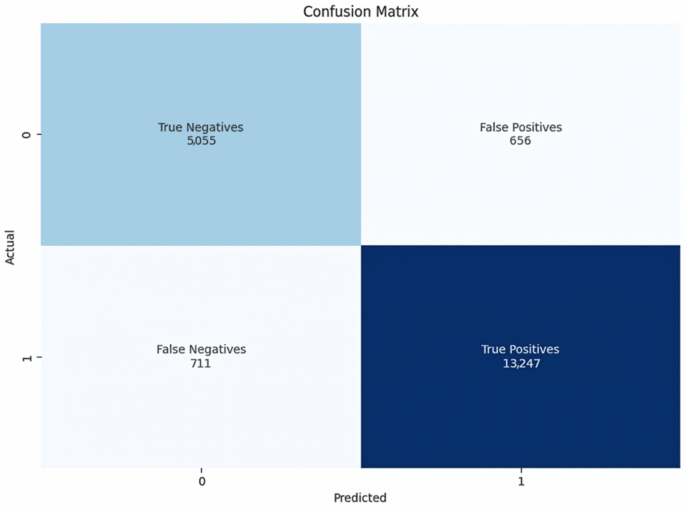
A set of standard classification metrics was employed to assess the model quality. Accuracy was defined as the proportion of correctly classified instances, providing an overall measure of the predictive performance. In addition to accuracy, precision, recall, and F1 score (macro-F1) were computed for both classes to obtain a more detailed picture of the classification performance. Precision and recall were calculated for both classes (recommendation vs. non-recommendation), and their balance was summarised using the F1-score as the harmonic mean of the two. Confusion matrices were generated to visualise the distribution of correct and incorrect classifications. To assess calibration of predicted probabilities, we computed the Brier score and the Expected Calibration Error (ECE). Beyond these static metrics, the learning process over several epochs (with loss and accuracy curves) was recorded and represented graphically.

3.6. Implementation Environment

The entire pipeline was implemented in Python (version 3.11.5), using the libraries listed in Table 1. The respective source code can be found in the Supplementary Materials (Files S1 and S2). To ensure reproducibility, a fixed seed (e.g., np.random.seed(55)) was applied, all models were stored, and image generation was performed deterministically.

4. Results

4.1. Performance Evaluation of Visual Encoding: Bar Charts

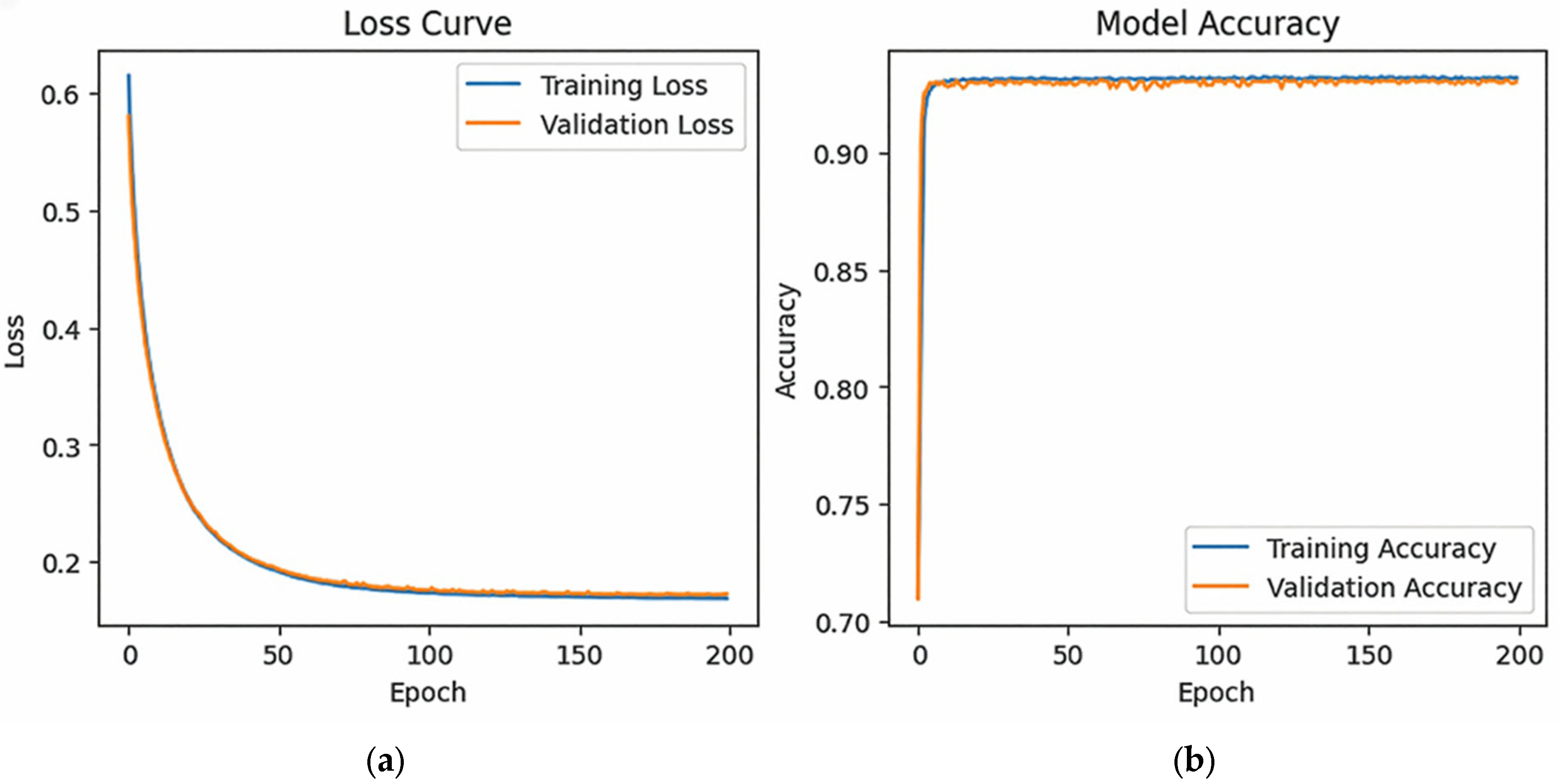
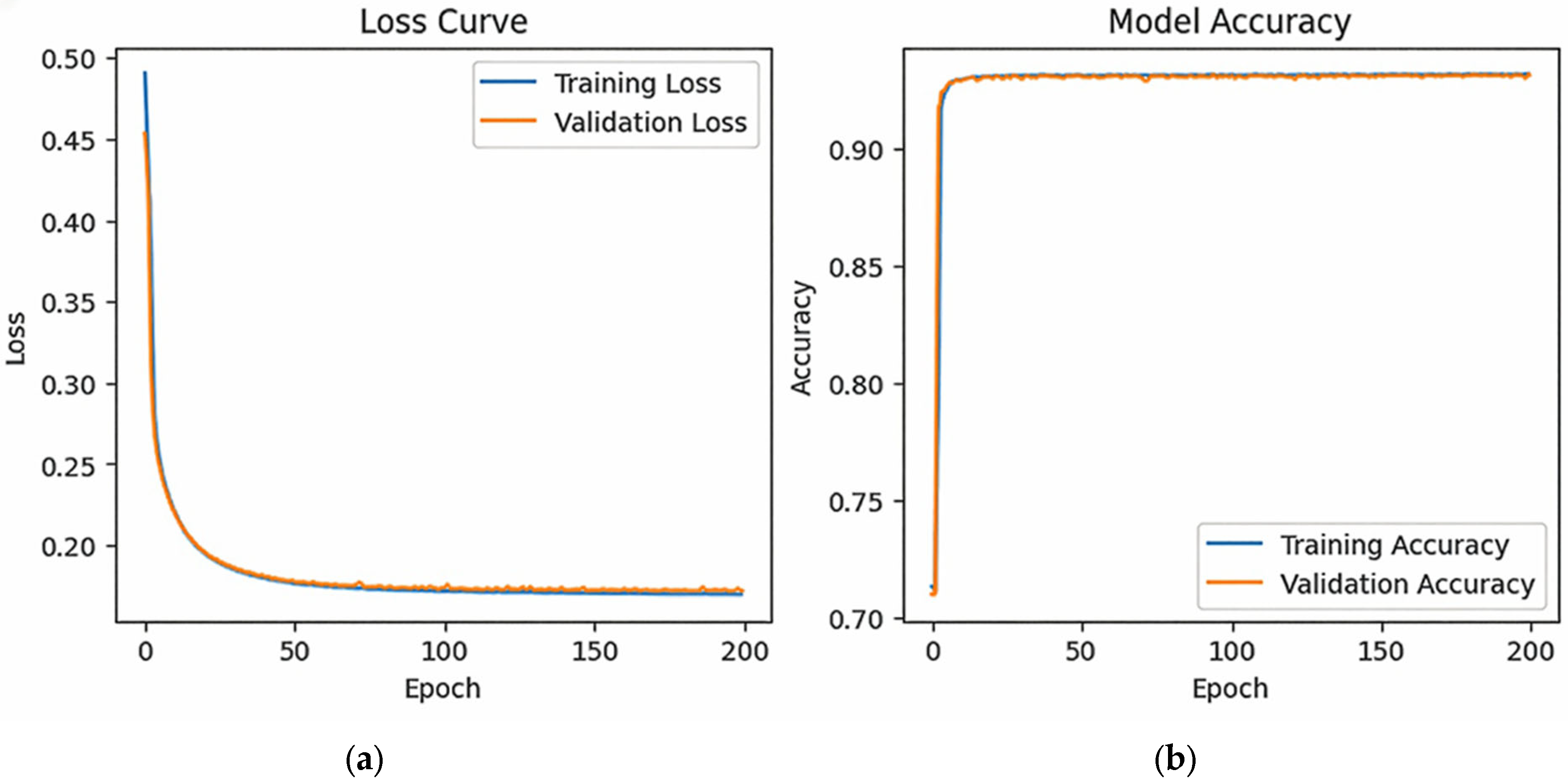
The CNN models based on bar charts showed excellent classification performance. The simple 1× Conv model achieved an accuracy of over 93.05% on the test dataset (Figure 3), while the 2× Conv achieved a slightly higher accuracy of 93.16% (Figure 4). Both corresponding confusion matrices indicated very low proportions of false positives and false negatives. These findings are confirmed by the additional metrics. For both CNN models, the precision, recall, and macro-F1 were all above 0.91 (1× Conv: Precision = 0.915, Recall = 0.917, Macro-F1 = 0.916; 2× Conv: Precision = 0.918, Recall = 0.916, Macro-F1 = 0.917). In addition, the calibration was checked using the Brier score and expected calibration error (ECE). Both values were in the low range (<0.04), confirming a reliable probability estimate.
It is particularly noteworthy that even the 1× Conv architecture achieved strong results, indicating that the bar structure is well-suited for encoding relevant patterns for classification. As shown in Figure 5 and Figure 6, the loss curves demonstrate uniform convergence without signs of overfitting.
CAM analyses demonstrated that the models relied on specific features for decision-making. The resulting heatmaps clearly overlapped with the bar regions, which would also be considered critical from an interpretive perspective. In other words, the areas highlighted by the model corresponded to the features that a human observer would regard as the most influential for the outcome, such as particularly high or low ratings in key categories. This alignment between model attention and human reasoning indicates the interpretability of the method.
For example, in one evaluated case (index 56648), the 1× Conv predicted a recommendation with a probability of 78.63% versus 21.37% for non-recommendation, which matched the true label (Figure 7). Similarly, the 2× Conv model yielded a probability of 85.40% for recommendation versus 14.60% for non-recommendation, again correctly classifying the instance (Figure 8).
A key advantage of the proposed method is its capacity for the visual interpretation of model decisions using CAMs. As illustrated in Figure 7 and Figure 8, each evaluated instance is displayed as a bar chart (left) alongside the corresponding CAM activation heatmap (right). The bar chart shows the evaluation outcome, and the heatmap highlights the feature areas to which the CNN paid particular attention during classification, thereby making the model’s reasoning visually accessible. The observed differences in the activation maps reflect the representational depths of the respective model architectures. The 1× Conv model assigns saliency at the level of individual bars, thereby emphasising localised features, whereas the 2× Conv model covers broader patterns. Despite these differences in granularity, both models produced identical predicted labels for the illustrated case and exhibited highly similar confidence values for the illustrated case. This consistency indicates that the models arrive at convergent decisions while relying on distinct representational strategies. Accordingly, we interpret the resulting CAMs as complementary perspectives on the same underlying evidence rather than conflicting explanations. These variations mirror the differences in abstraction inherent to the architectures and should not be construed as reflecting gains in predictive accuracy.
Within the broader framework of explainable artificial intelligence (XAI), the method fulfils a fundamental requirement: ensuring the traceability of decisions through visual evidence. By linking the prediction outcomes with feature-level attention maps, this method enhances transparency and fosters user trust. Such visual explainability is particularly valuable for fostering trust, acceptance, and the responsible deployment of models in sensitive domains, including human resource management, medicine, and the public sector.

4.2. Performance Evaluation of Visual Encoding: Pie Charts

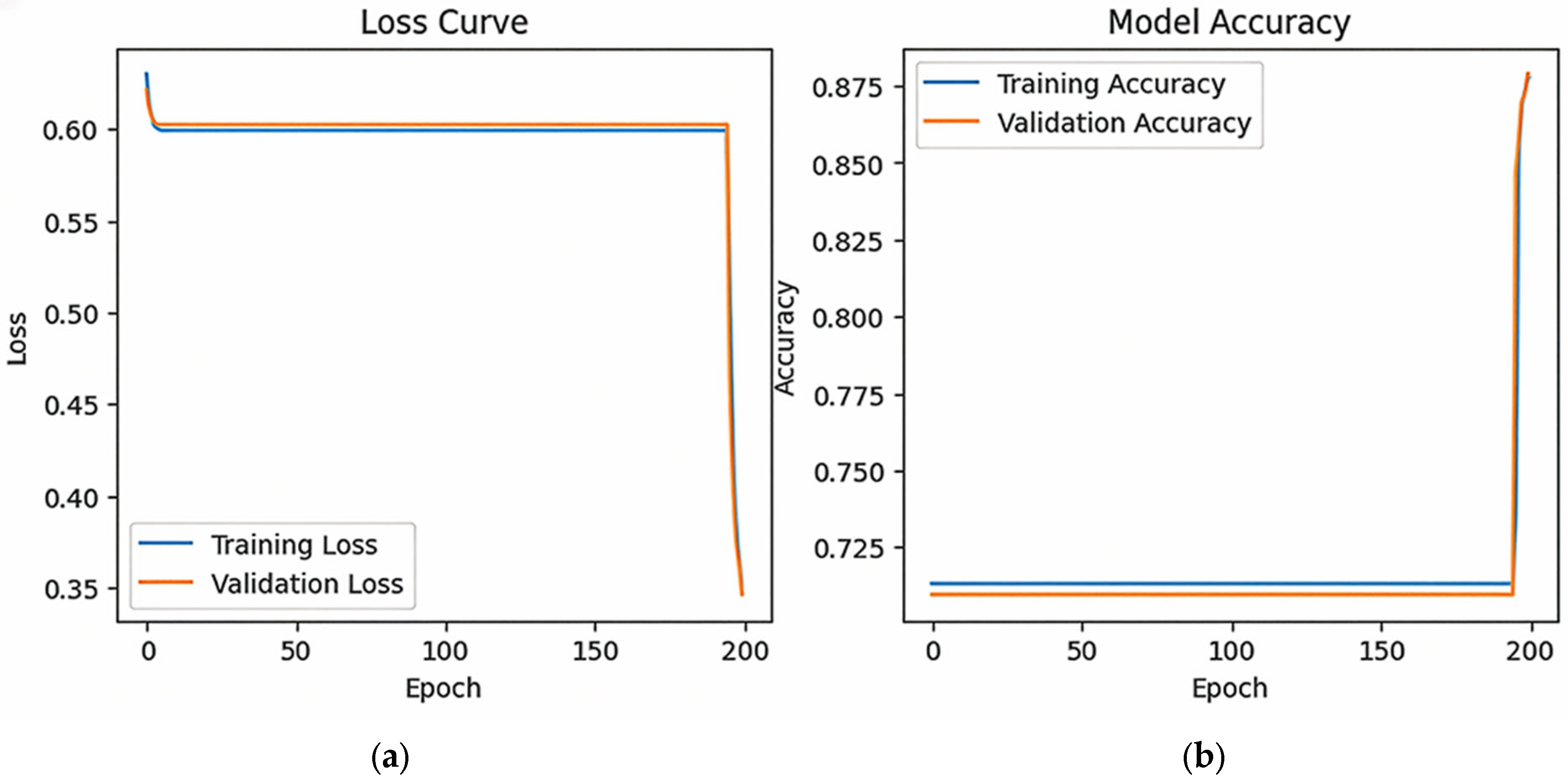
The CNN models trained on pie chart representations exhibited lower performance than those trained on bar charts. 1× Conv initially showed only slight improvements during the early training phase, with the accuracy plateauing at approximately 71% for an extended period. Performance increased markedly from approximately epoch 190, and by the end of the 200 epochs, the model achieved an accuracy of 87.88% (Figure 9). The late increase in performance from approximately epoch 190 onwards can be attributed to the greater structural complexity of the pie-chart representations. In contrast to the linear ordering of bar charts, pie charts encode information in a circular layout, requiring the network to learn global radial dependencies. This complexity delays convergence until the later training stages. While the learning curves of both pie chart models appear less smooth than those of the bar chart models, the overall training process was stable and ultimately convergent, yielding robust final results (87.88% with 1× Conv and 90.51% with 2× Conv).
The 2× Conv model exhibited a markedly accelerated improvement in accuracy. By the 50th epoch, an accuracy of 88.47% was achieved. This increased to 90.36% at epoch 100 and reached a final accuracy of 90.51% at the end of 200 epochs (Figure 10). Although these results indicate robust learning, they remained slightly below the performance achieved with the bar chart representations. The late increase in performance from approximately epoch 190 onward can be attributed to the greater structural complexity of the pie chart representations. In contrast to the linear ordering of bar charts, pie charts encode information in a circular layout, requiring the network to learn the global radial dependencies. This complexity delays convergence until the later stages of training. While the learning curves of both pie chart models appear less smooth compared to those of the bar chart models, the overall training process was stable and ultimately convergent, yielding robust final results (87.88% with 1× Conv and 90.51% with 2× Conv.
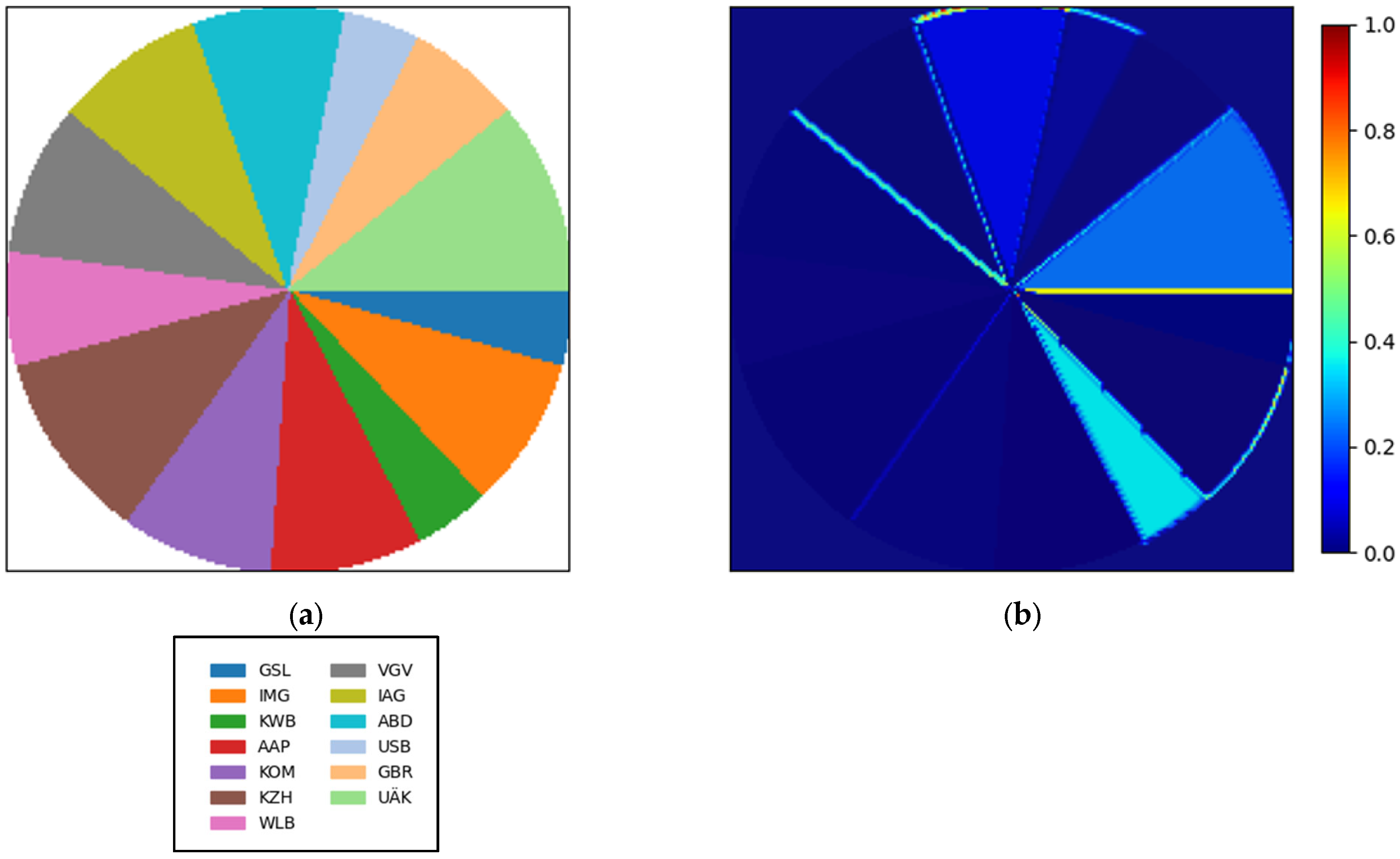
Furthermore, interpretability through CAMs was less distinct for pie chart inputs: the activation maps tended to distribute attention radially across the circular representation without clear focal regions, making differentiated interpretation more challenging. A possible explanation lies in the rotational symmetry of the circular shape, which may lead the model to generate less-structured activation patterns compared to the bar chart layout.
For instance, using the same evaluated case as in the bar chart analysis (index 56648), the 1× Conv model predicted a probability of 30.17% for recommendation versus 69.83% for non-recommendation, resulting in a misclassification (Figure 11).
In contrast, the 2× Conv model predicted 52.03% for recommendation versus 47.97% for non-recommendation (Figure 12). Although this was a correct classification, the decision boundary was narrow and the prediction ambiguous.
Taken together, these findings suggest that pie charts are feasible as an alternative form of visual encoding, but they offer lower predictive performance and reduced interpretability than bar charts. The results highlight the importance of visual design choices in shaping the accuracy of CNN-based classification for ordinal data.

4.3. Comparison with Logistic Baseline Models

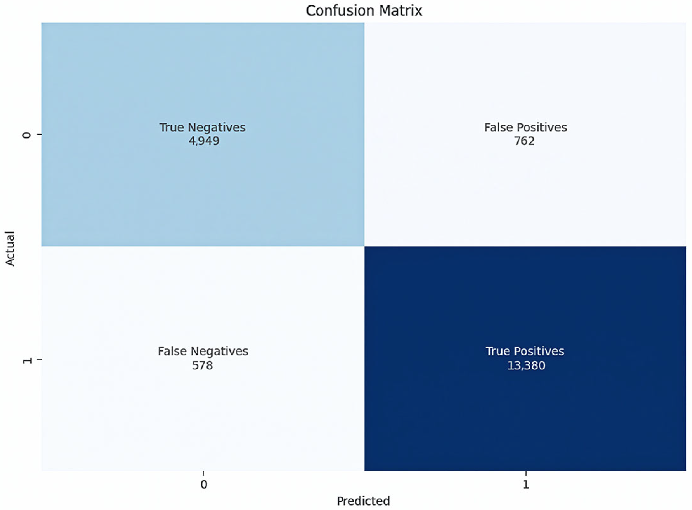
To contextualise the results, a logistic regression model was trained on the same dataset. Unlike CNNs, this model was applied directly to tabular data without visual transformation. Logistic regression achieved an accuracy of approximately 93.19% (Figure 13).
The regression coefficients (Table 2) indicate the relative importance of each category in predicting employer recommendations. Strong contributions were observed for variables such as working atmosphere (β = 0.57, p < 0.001), image (β = 0.49, p < 0.001), and supervisor behaviour (β = 0.46, p < 0.001). These results suggest that employees who perceive a supportive atmosphere, positive organisational image, and competent leadership are substantially more likely to recommend their employer.
In contrast, team spirit (β = −0.04, p = 0.073), equality (β = −0.01, p = 0.724), and treatment of older colleagues (β = −0.02, p = 0.423) were not significant predictors in this model, indicating that their contributions to employer recommendation were statistically negligible once other factors were accounted for.
Although these coefficients provide statistically robust insights, their interpretation requires methodological expertise, making them less accessible to practitioners without a statistical background.
In contrast, the CNN–CAM approach provided visual traceability: the heatmaps directly highlighted which parts of the graphical representation influenced the model’s prediction, thereby rendering the decision-making process comprehensible even to non-expert users.
A detailed examination of misclassified instances further revealed that CNNs and logistic regression emphasised different aspects of their error distributions. Specifically, the CNN correctly identified 138 false positives generated by the regression model, whereas the regression model corrected only 39 such errors in the CNN. Conversely, logistic regression was clearly superior in handling false negatives (172 vs. 32).
This complementary error structure indicates that the two models employ distinct decision rules, suggesting the potential for hybrid approaches or strategic model selection depending on whether false positives or false negatives are more critical in a given use case.

4.4. Analysis of CAM-Based Interpretability

A key component of the evaluation was the analysis of CAM heatmaps. Across multiple test cases, the CAMs consistently emphasised categories with extreme ratings, particularly when negative decisions were predicted. In such cases, several low-rated bars are activated simultaneously, indicating their strong influence on classification.
The colour scale, ranging from blue (low activation) to red (high activation), provides an intuitive means of identifying which scale values contributed most strongly to the decision.
Notably, the model does not limit its focus to extreme values but also emphasises categories with average or slightly deviating ratings—for example, in dimensions such as image (IMG), work–life balance (WLB), and equality (GBR). For users, this creates a tangible link between the input structures and model decisions, which is a connection not available in this form with conventional approaches, such as logistic regression.
For example, for bar charts, in cases where employees gave low ratings for salary/social benefits (GSL) and supervisor behaviour (VGV), the CAMs clearly highlighted these bars as the decisive features driving the “non-recommendation” prediction. Conversely, when high ratings were present for the working atmosphere (AAP) and communication (KOM), CAMs emphasised these categories in positive classifications. These examples illustrate how the proposed approach extracts actionable knowledge from survey data by visually linking the model predictions to the specific dimensions of the questionnaire. This provides a layer of intuitive visual assistance that goes beyond reporting predictive accuracy and directly supports practitioners’ understanding.
In addition, CAMs provide a form of visual redundancy check. When conflicting ratings were present (e.g., high values in certain categories but low values in others), the heatmaps revealed how the model weighted these factors to make a final decision.
For practitioners such as human resources managers, this means that CAM heatmaps can be used as a diagnostic tool. For instance, a case with low scores for “communication” and “supervisor behaviour” revealed that these specific areas were strongly activated by the model, which explained the negative recommendation. In another case, where the scores were high for “working atmosphere” and “career/training”, the heatmap clearly marked these segments, making the positive classification plausible. Such visual traceability transforms predictions into actionable insights.
Overall, CAMs offered clear indications of which features contributed most strongly to the classification outcomes, insights that are only indirectly available through traditional coefficient-based models. Nevertheless, CAMs should be interpreted as evidence-based visual aids rather than as causal explanations. While they reliably show where the model focused, the link to underlying psychological or organisational constructs remains partly subjective and should be interpreted in light of domain knowledge (see Section 5.5).

4.5. Interpretation of the Results

The simulation results demonstrate that the proposed method can accurately classify ordinally structured data while ensuring that the data remain visually interpretable. While CNN models with CAMs achieved accuracy comparable to that of logistic regression, they offered a distinct advantage in terms of explainability.
The critical difference lies in the mode of presentation: conventional models yield numerical coefficients, whereas CNNs with CAMs produce graphical and semantically meaningful explanations of model decisions. This approach introduces new opportunities for AI-assisted decision-making in contexts where trust, transparency, and traceability are essential.

5. Discussion

5.1. Key Findings

The results demonstrate that the visual encoding of ordinal data enables convolutional neural networks (CNNs) to achieve high classification accuracy while ensuring interpretability through class activation maps (CAMs). For bar chart representations, CNNs achieved test accuracies exceeding 93.16%, which is comparable to logistic regression (93.19%). CAMs consistently highlighted features with particularly high or low ratings, thereby linking the predictive outcomes to interpretable visual evidence. These findings show that the proposed method addresses the two fundamental requirements of modern AI systems: effectiveness and transparency.

5.2. Comparison with Existing Methods

Traditional models, such as logistic regression, operate directly on numerical data and frequently yield results with statistical interpretability. These methods are also efficient for training and require minimal computational resources [35]. Our approach is comparable in accuracy to logistic regression but adds value by integrating visual encoding with CNN-CAM to provide intuitive visual assistance. This extends recent work on tabular-to-image transformations with an integrated explanatory power.
Previous studies have also demonstrated that post hoc explanation frameworks, such as SHAP and LIME, can assign importance scores to features in structured datasets [11]. Although these methods are powerful, they generate numerical or abstract outputs that require statistical expertise for interpretation. For example, SHAP provides additive contribution values, and LIME produces local surrogate models, both of which are informative but not directly intuitive for non-specialists. Logistic regression offers another form of interpretability through model coefficients; however, these require methodological expertise and assume linear relationships between features and outcomes. In contrast, the CNN–CAM framework presented here provides direct visual, per-respondent explanations by overlaying heatmaps on familiar chart formats. This enables end users to see at a glance which survey dimensions influenced a given prediction, bridging the gap between statistical modelling and intuitive understanding.
Beyond predictive accuracy, the central novelty of our approach lies in combining deterministic one-record-to-one-chart encoding with per-respondent CAM explanations. Unlike logistic regression, which yields coefficients, or SHAP and LIME, which provide post hoc feature importance values, our framework integrates classification and explanation within a unified workflow, providing per-respondent visual explanations.
Compared with numerical models such as logistic regression, which served as a robust and transparent empirical baseline in this study, our approach does not aim to achieve a superior accuracy. CNN–CAM (93.16%) and logistic regression (93.19%) performed similarly. Its novelty lies in the combination of visual encoding and instance-level interpretability. This positions our method alongside emerging research on tabular-to-image transformations (Mamdouh et al., 2025 [9]; Alenizy & Berri, 2025 [5]) while extending the contribution by offering integrated interpretability through CAMs. However, their capacity to capture nonlinear interactions or visually complex patterns is limited [36]. CNNs overcome this by automatically extracting relevant feature combinations, and when combined with visual encodings, they leverage spatial and colour patterns analogous to those perceived by humans [37].
This advantage is further augmented by the use of CAMs. Whereas traditional models can often be interpreted only in numerical terms, the integration of CNNs with CAMs facilitates a decision-making process that is visually accessible and comprehensible to non-experts [38,39,40]. This method effectively bridges the gap between technical performance and human comprehension.
Finally, while alternative architectures, such as 1D-CNNs or Transformers, are well suited for tabular data, they are typically optimised for efficiency or scalability rather than intuitive interpretability. Our focus is on the visual pipeline because, in addition to comparable accuracy, it offers an intuitive visual aid that contributes to explainability. Our aim was not to surpass conventional methods in raw accuracy but to offer an interpretation format that is immediately legible to non-specialists. The trade-off of CNN-CAM is that it requires image encoding and CNN training (higher compute), and the explanations are faithful saliency cues rather than causal proofs. Moreover, the sensitivity to visualisation design (e.g., bar vs. pie) must be acknowledged.

5.3. Influence of Visualisation Forms

Another element of this study was the comparison of the two visualisation strategies. Bar charts were more effective than pie charts, achieving higher accuracies and clearer activation patterns. This effectiveness likely stems from the ability of bar images to present an ordered linear representation in which each category occupies a unique position. This enables the CNN to learn vertically correlated patterns and respond to visual cues, such as length and colour intensity.
In contrast, pie charts introduced rotational symmetry, which produced more diffuse CAM heatmaps and slightly reduced accuracy (~88% for 1× Conv; ~91% for 2× Conv). These findings suggest that the design of the visualisation is a critical factor in CNN performance, influencing both predictive accuracy and visual explainability. Therefore, future research should prioritise the optimisation of visual encoding strategies.
In addition, the choice of chart type can introduce unwanted distortions. While bar charts have a stable order, the rotational symmetry of pie charts can cause diffuse activation patterns. This suggests that visual coding itself is an important component of model success.

5.4. Implications for Practice

The proposed approach illustrates how traditional visualisation techniques can be combined with modern deep learning architectures to open new directions for the analysis of structured data. Its value lies not only in its predictive performance but also in providing a coherent, visually structured pipeline that encompasses data representation, classification, and explainability of model decisions. In this sense, the study not only provides a practical methodology but also contributes to the theoretical advancement of XAI for non-visual data formats.
A fundamental strength of the method is its flexibility: Because ordinal ratings are widely used across domains, the approach is applicable to a variety of use cases where transparency and interpretability are crucial. This feature is particularly relevant in practice. For example, in human resource management, a heatmap that visually emphasises salary/social benefits, working atmosphere (AAP), or supervisor behaviour (VGV) as key drivers of a prediction can be more readily understood and communicated to decision-makers than regression coefficients or numerical importance values.
Accordingly, CNN-based classification contributes beyond predictive capability by enabling knowledge discovery through linking outcomes to specific organisational factors. The identified survey dimensions correspond to constructs well-known to human resource practitioners and managers, thereby converting otherwise obscure model outputs into actionable insights that can guide policy development and targeted interventions. For example, the identification of supervisor behaviour and communication quality as decisive determinants of employee recommendations illustrates how the method advances from mere classification to substantive knowledge generation. In this way, the approach positions itself as a bridge between predictive modelling and practical decision support.
CNNs are well established as powerful classifiers, and our results confirm that they perform comparably to logistic regression on structured survey data. Accordingly, the contribution of this study does not lie in achieving higher accuracy but in providing interpretable per-respondent explanations through CAM overlays. This focus on intuitive visual aid to enhance interpretability positions CNN–CAM not simply as another classification technique but as a practical tool for knowledge extraction and communication. By linking predictions to familiar survey items in a visual format, the method makes AI-driven analysis more transparent and accessible to practitioners.
Building on this strength, it could support the analysis of employee surveys, feedback forms, and performance evaluations [41] to identify areas for development. Similarly, Marketing research can use our approach to better elucidate consumer responses to advertising [42] and customer loyalty formation based on self-reported customer data [43]. In healthcare, this framework might provide a tangible prediction of patient outcomes based on patient satisfaction reports [44]. Technology acceptance research might benefit from this approach to better understand the underlying processes of the use intentions of emerging technologies [45,46]. Applications also extend to quality management and manufacturing, where the method can be used to evaluate process metrics, product controls, or inspection reports.
Beyond these domains, the framework can also be adapted to areas where the data-driven decision-making process must be transparent and accountable, such as in regulatory processes. Taken together, these examples highlight the broad potential of this method as both a research tool and a practical decision-support system.

5.5. Limitations and Future Research

Despite the promising results, several limitations of the proposed approach must be acknowledged to ensure comprehensive evaluation. First, the transformation of numerical data into a visual form inevitably reduces the numerical precision of visual features, such as colour and area. Consequently, subtle variations in the data may be diminished during this process. Furthermore, the informative value of the visualisation depends strongly on design parameters, such as colour coding and image resolution. Currently, the selection of these parameters is heuristic rather than systematically optimised.
Second, while CNN architectures achieve satisfactory outcomes, they require considerably greater computational resources than conventional machine-learning models. The processes of image generation, training, and CAMs computation are resource-intensive, potentially posing challenges in settings with large data volumes or limited computational infrastructure.
Third, although CAMs provide visually intuitive explanations, their interpretation remains partially subjective. While they reliably show where the model focuses, the link to the underlying psychological or organisational constructs cannot be inferred directly. A highlighted region in a heatmap indicates saliency for the CNN, but it does not prove that the corresponding survey dimension was causally decisive for the outcome. This distinction is particularly important in applied contexts, such as human resource management or healthcare, where stakeholders may be tempted to equate visual evidence with causal mechanisms. Consequently, CAM-based explanations should always be interpreted in conjunction with domain expertise.
Fourth, another limitation lies in the dependence on the visual design. Since the model learns from visual patterns rather than semantic meaning, its generalisability can be affected by changes in layout, colour scales, or image structures. This poses a risk of overfitting to specific forms of visualisation, which may limit their broader applicability. In addition, although CAMs facilitate visual insights into the model’s decision-making process, their interpretation remains inherently subjective. Increased activation in a given image region does not necessarily imply a causal relevance. Therefore, CAMs offer an intuitive visual aid that contributes to evidence-based rather than causal explanations. This distinction is crucial, particularly in sensitive applications.
A further limitation is that the choice of visual representation itself influences performance. In our study, bar charts consistently yielded higher accuracies and clearer CAM overlays than pie charts, indicating that performance partly depends on representational characteristics (e.g., linear alignment, proportional scaling, and absence of rotational symmetry) rather than solely on the underlying data. This highlights that visualisation design decisions are not neutral; they can introduce systematic bias by making models appear stronger or weaker, depending on the encoding used. Although bar charts were effective in the present study, other contexts may benefit from alternative encodings. Future research should therefore systematically examine how different visualisation strategies affect both predictive accuracy and interpretability.
Moreover, the selection of hyperparameters (e.g., learning rate, batch size, and number of epochs) was heuristic rather than systematically optimised. While these settings yielded stable results, more sophisticated approaches such as grid search, Bayesian optimisation, or adaptive learning strategies could further improve performance and efficiency.
A heuristic method was also employed in selecting visualisation parameters, including the colour palette and image resolution. The generalisability of the approach could be strengthened by developing systematic procedures for selecting the visualisation parameters. Future research should also examine scalability strategies (e.g., parallelisation or model compression), multimodal extensions (e.g., combining survey data with free-text responses), and validation of CAM interpretability against expert judgement.
A further limitation concerns reproducibility across random seeds. Due to the high computational cost of training (with pie chart models requiring more than 60 h per run), we were unable to average the results over multiple seeds. Instead, we used a fixed random seed (55) to ensure the exact reproducibility of the reported results. While this provides stable benchmarks for replication, future work should explore robustness across different seeds and training initialisations.
Another drawback is the lack of comparison with other frameworks. A valuable extension of this study would involve systematically comparing image-based CNN-CAM approaches with alternative model classes, such as 1D-CNNs or Transformers, that directly process tabular data. Such comparisons would allow for a more precise assessment of the practical advantages of the visual encoding pathway.
Additionally, a limitation of the proposed approach is that transforming numerical responses into image-based representations may obscure fine-grained statistical relationships that are directly accessible in the raw tabular format. For example, subtle linear effects or interaction terms between survey dimensions are not explicitly modelled when values are converted into graphical features, such as bar length or segment size. Although CNN can still learn from visual cues, the abstraction into images necessarily reduces the precision of the original numerical structure. This trade-off highlights the complementary nature of our method: CNN–CAM adds intuitive visual aids but cannot fully replace statistical models when precise coefficient estimates or formal hypothesis testing are required.
Another possible robustness test would be to display the charts in greyscale or further randomise the elements. Since such an analysis was not implemented in this study, we see this as a useful extension for future work to systematically quantify the influence of colouring and order.
One more limitation involves the interpretability of CAMs themselves. Although the overlays consistently highlight regions of an image that influence the model’s decision, the connection between these highlighted areas and the underlying survey constructs is not always straightforward. For example, a bar segment may receive strong activation; however, translating this into a clear statement about the causal role of the corresponding survey item requires domain expertise. Therefore, CAMs should be regarded as visual aids, as they provide intuitive cues about which dimensions shape a prediction; however, they cannot replace expert interpretation.
The lack of standardisation further compounds this limitation. Currently, no formal evaluation metrics exist for assessing the validity of CAM-based explanations. Establishing systematic validation procedures (such as comparing CAM outputs with expert assessments) would strengthen the robustness and credibility of this approach. This issue is particularly important in sensitive domains, where over-interpreting highlighted regions without appropriate contextual knowledge could lead to misleading or even harmful conclusions.
Finally, the applicability of the proposed approach may depend on the type of survey and the response scale employed. Our study used a 5-point Likert scale with thirteen items, which lends itself well to visual encodings, such as bars and pie segments. In surveys with very different scales (e.g., continuous ratings, multi-choice items) or substantially larger numbers of questions, the transformation into compact, interpretable charts may be less effective. This limitation implies that CNN–CAM is not a universal solution for all quantitative-response datasets. Its value is strongest in cases where responses are structured and of manageable dimensionality. Identified as an area for future research, a broader validation across diverse survey types and scales is needed to assess generalisability and to adapt the method to contexts where visual encodings are less natural.
Building on these limitations, several directions for future research can be identified. One important question concerns the generalisability of the method to other data structures. This study focused on ordinal survey data with consistent response formats. Thus, future studies should investigate its applicability to heterogeneous datasets of varying quality and benchmark it against alternative numerical approaches. A potentially fruitful extension might be the use of visual social network data as input for our approach [47,48] to predict the responses of network-defining entities.
Exploring scalability is another potential direction for future research. The generation of image-based representations and subsequent CNN training can be computationally demanding for large-scale surveys, particularly when involving hundreds of variables or millions of respondents. While direct analysis of tabular data bypasses these steps and may therefore be more efficient in high-dimensional contexts, our study remained tractable due to the relatively small number of predictor variables (13). Nevertheless, scaling the method to more complex datasets may introduce practical bottlenecks in both the preprocessing and model training. To address this, future studies should investigate optimisation strategies, such as dimensionality reduction prior to visualisation, parallelised image generation, or model compression techniques. Moreover, many application domains combine ordinal ratings with free text responses or numerical indicators. Extending the approach to multimodal architectures that integrate visual encodings with text mining or numerical analysis could provide richer insights and enhance decision-support capacity.
Another promising research gap is the systematic optimisation of the visualisation parameters. Currently, decisions regarding the diagram type, colour palette, and image size are made manually. Developing systematic procedures for automatically optimising visualisation parameters in response to the model’s learning behaviour could enhance both efficiency and performance.
Further research is required to address scalability. The computational demands associated with image generation and CNN training may pose challenges for extremely large datasets. Future studies could explore solutions such as parallelisation techniques or model compression strategies to improve scalability. Furthermore, in many domains, ordinal data are accompanied by free-text responses or additional numerical indicators. The integration of multimodal data in hybrid architectures (e.g., combination with text mining) could provide richer insights and more powerful decision-support systems.
Furthermore, a systematic validation of faithfulness (e.g., by occluding the marked regions and measuring the decline in model confidence) is reserved for future work.
Finally, the standardisation of CAM interpretation remains an open challenge. Although CAMs provide intuitive visualisations, no formal evaluation metrics currently exist. Establishing systematic validation procedures, for example, by comparing CAM outputs with expert assessments, would enhance the robustness and credibility of CAM-based explanations.

6. Conclusions

This study introduced a domain-independent approach for the classification and interpretation of ordinal, structured data. This method combines the visual encoding of tabular data, classification using convolutional neural networks (CNNs), and explanation of outcomes through class activation maps (CAMs). This study demonstrates that the capabilities of image-processing neural networks can be extended to non-visual data formats when an appropriate transformation is applied.
The analyses performed showed that CNN models with bar chart encoding achieved accuracies of between 93.05% and 93.16%. This was comparable to the accuracy of logistic regression, which was 93.19%. The approach achieves high classification accuracy while also producing interpretable decision bases that are accessible to non-technical users, which is a crucial requirement in many real-world applications. More broadly, these qualities position this approach as a promising tool for data-driven decision-making in contexts where transparency, reliability, and efficiency are essential.
Importantly, the method does not merely replicate established CNN classification capabilities but also enables knowledge extraction from survey data by visually linking predictions to specific questionnaire dimensions, thereby directly supporting practitioner interpretation and communication. To our knowledge, this study presents the first integrated pipeline that transforms ordinal survey data through deterministic visual coding into CNN-based classification with CAM-supported explanations. This positions the approach as a novel methodological contribution to the field of explainable AI.

Supplementary Materials

The following supporting information can be downloaded at: https://www.mdpi.com/article/10.3390/app151910642/s1, File S1: CNN_bar_chart; File S2: CNN_pie_chart; Table S1: Dataset.

Author Contributions

Conceptualisation, M.W.; methodology, M.W. and M.S.; software, M.W.; validation, M.W. and M.S.; formal analysis, M.W.; writing—original draft preparation, M.W., M.N.; writing—review and editing, M.N., B.H. and M.S.; visualisation, M.W.; supervision, M.S. All authors have read and agreed to the published version of the manuscript.

Funding

This research received no external funding.

Data Availability Statement

Data is contained within the article or Supplementary Materials.

Acknowledgments

During the preparation of this manuscript, the authors used ChatGPT from OpenAI (GPT-5) and DeepL.com (Deepl Pro) to translate and improve the readability of this article. The authors have reviewed and edited the output and take full responsibility for the content of this publication.

Conflicts of Interest

When conducting this research, Michael Woelk was employed by the company Webasto Roof & Components SE. The remaining authors declare that the research was conducted in the absence of any commercial or financial relationships that could be construed as a potential conflict of interest.

Abbreviations

The following abbreviations are used in this manuscript:
AIArtificial Intelligence
CAMClass Activation Map
CNNConvolutional Neural Network
DLDeep learning
F1F1 score (harmonic mean of precision and recall)
GAFGramian angular field
HRHuman Resources
k-NNk-Nearest Neighbours
LIMELocal Interpretable Model-Agnostic Explanations
MLMachine learning
PILPython Imaging Library
RPRecurrence Plot
RGBRed Green Blue (colour space)
SHAPSHapley Additive Explanations
SVMSupport Vector Machine
XAIExplainable Artificial Intelligence

Appendix A

Table A1. Overview of missing values.
ItemsSubmitted ResponsesMissing Responses
Employer Recommendation65,5630
Salary/social benefits62,4163147
Image61,6163947
Career/training61,6023961
Working atmosphere65,134429
Communication62,7362827
Team spirit62,7032860
Work–life balance62,3413222
Supervisor behaviour62,7232840
Interesting tasks62,4203143
Working conditions62,2763287
Environmental/social awareness60,6744889
Equality61,1444419
Treatment of older colleagues60,1175446
85,23144,417
5.2%
Table A2. Mapping of variable codes to the full survey items.
CodeItems
WEWEmployer Recommendation
GSLSalary/social benefits
IMGImage
KWBCareer/ training
AAPWorking atmosphere
KOMCommunication
KZHTeam spirit
WLBWork–life balance
VGVSupervisor behaviour
IAGInteresting tasks
ABDWorking conditions
USBEnvironmental/social awareness
GBREquality
UÄKTreatment of older colleagues

References

  1. Chen, S.; Goo, Y.-J.J.; Shen, Z.-D. A Hybrid Approach of Stepwise Regression, Logistic Regression, Support Vector Machine, and Decision Tree for Forecasting Fraudulent Financial Statements. Sci. World J. 2014, 2014, 968712. [Google Scholar] [CrossRef]
  2. Dervovic, D.; Lécué, F.; Marchesotti, N.; Magazzeni, D. Are Logistic Models Really Interpretable? arXiv 2024, arXiv:2406.13427. [Google Scholar] [CrossRef]
  3. Ribeiro, M.T.; Singh, S.; Guestrin, C. “Why Should I Trust You?”: Explaining the Predictions of Any Classifier. In Proceedings of the 22nd ACM SIGKDD International Conference on Knowledge Discovery and Data Mining, San Francisco, CA, USA, 13–17 August 2016; ACM: New York, NY, USA, 2016; pp. 1135–1144. [Google Scholar]
  4. Ayachi, R.; Said, Y.; Atri, M. A Convolutional Neural Network to Perform Object Detection and Identification in Visual Large-Scale Data. Big Data 2021, 9, 41–52. [Google Scholar] [CrossRef]
  5. Alenizy, H.A.; Berri, J. Transforming Tabular Data into Images via Enhanced Spatial Relationships for CNN Processing. Sci. Rep. 2025, 15, 17004. [Google Scholar] [CrossRef]
  6. Lim, H.; Song, E. Beef Carcass Grading with EfficientViT: A Lightweight Vision Transformer Approach. Appl. Sci. 2025, 15, 6302. [Google Scholar] [CrossRef]
  7. Kim, J.-S.G.; Chung, S.; Ko, M.; Song, J.; Shin, S.H. Comparison of Image Preprocessing Strategies for Convolutional Neural Network-Based Growth Stage Classification of Butterhead Lettuce in Industrial Plant Factories. Appl. Sci. 2025, 15, 6278. [Google Scholar] [CrossRef]
  8. Knapińska, Z.; Mulawka, J. Patient-Tailored Dementia Diagnosis with CNN-Based Brain MRI Classification. Appl. Sci. 2025, 15, 4652. [Google Scholar] [CrossRef]
  9. Mamdouh, A.; El-Melegy, M.; Ali, S.; Kikinis, R. Tab2Visual: Overcoming Limited Data in Tabular Data Classification Using Deep Learning with Visual Representations. arXiv 2025, arXiv:2502.07181. [Google Scholar] [CrossRef]
  10. Hu, F.; Sinha, D.; Diamond, S. Perception of Wide-Expanse Symmetric Patterns. Vis. Res. 2024, 223, 108455. [Google Scholar] [CrossRef]
  11. Ullah, I.; Rios, A.; Gala, V.; Mckeever, S. Explaining Deep Learning Models for Tabular Data Using Layer-Wise Relevance Propagation. Appl. Sci. 2022, 12, 136. [Google Scholar] [CrossRef]
  12. Thielmann, A.; Reuter, A.; Saefken, B. Beyond Black-Box Predictions: Identifying Marginal Feature Effects in Tabular Transformer Networks. arXiv 2025, arXiv:2504.08712. [Google Scholar] [CrossRef]
  13. Li, X.; Xue, P. The Role of Social Work in Enhancing Social Governance: Policy, Law, Practice, and Integration of Machine Learning for Improved Outcomes. Alex. Eng. J. 2025, 118, 208–215. [Google Scholar] [CrossRef]
  14. Padmakala, S.; Chandrasekar, A. From Imputation to Prediction: A Comprehensive Machine Learning Pipeline for Stroke Risk Analysis. In Proceedings of the 2024 International Conference on Advances in Computing, Communication and Applied Informatics (ACCAI), Chennai, India, 9–10 May 2024; IEEE: Piscataway, NJ, USA, 2024; pp. 1–7. [Google Scholar]
  15. Jiang, W.; Zhao, M.; Li, H. Time Series Image Coding Classification Theory Based on Lagrange Multiplier Method. Sci. Rep. 2025, 15, 20697. [Google Scholar] [CrossRef]
  16. Corrêa, J.S.; Cavalca, D.L.; Fernandes, R.A.S. Gramian Angular Field and Recurrence Plots as Feature Engineering Techniques on Residential Appliances Labeling: A Comparative Analysis. In Proceedings of the 2023 IEEE PES Innovative Smart Grid Technologies Latin America (ISGT-LA), San Juan, PR, USA, 6–9 November 2023; IEEE: Piscataway, NJ, USA, 2023; pp. 230–234. [Google Scholar]
  17. Damri, A.; Last, M.; Cohen, N. Towards Efficient Image-Based Representation of Tabular Data. Neural Comput. Appl. 2024, 36, 1023–1043. [Google Scholar] [CrossRef]
  18. Halladay, J.; Cullen, D.; Briner, N.; Miller, D.; Primeau, R.; Avila, A.; Watson, W.; Basnet, R.; Doleck, T. BIE: Binary Image Encoding for the Classification of Tabular Data. J. Data Sci. 2025, 23, 109–129. [Google Scholar] [CrossRef]
  19. Frid-Adar, M.; Diamant, I.; Klang, E.; Amitai, M.; Goldberger, J.; Greenspan, H. GAN-Based Synthetic Medical Image Augmentation for Increased CNN Performance in Liver Lesion Classification. Neurocomputing 2018, 321, 321–331. [Google Scholar] [CrossRef]
  20. Naidu, G.R.; Rao, C.S. A CNN Based Discrimination between Natural and Computer Generated Images. Panam. Math. J. 2024, 35, 580–589. [Google Scholar] [CrossRef]
  21. Fang, W.; Zhang, F.; Sheng, V.S.; Ding, Y. A Method for Improving CNN-Based Image Recognition Using DCGAN. Comput. Mater. Contin. 2018, 57, 167–178. [Google Scholar] [CrossRef]
  22. Cui, Z.; Chen, L.; Wang, Y.; Haehn, D.; Wang, Y.; Pfister, H. Generalization of CNNs on Relational Reasoning With Bar Charts. IEEE Trans. Visual. Comput. Graph. 2025, 31, 5611–5625. [Google Scholar] [CrossRef] [PubMed]
  23. Nazir, M.I.; Akter, A.; Hussen Wadud, M.A.; Uddin, M.A. Utilizing Customized CNN for Brain Tumor Prediction with Explainable AI. Heliyon 2024, 10, e38997. [Google Scholar] [CrossRef] [PubMed]
  24. Garg, P.; Sharma, M.K.; Kumar, P. Transparency in Diagnosis: Unveiling the Power of Deep Learning and Explainable AI for Medical Image Interpretation. Arab. J. Sci. Eng. 2025, 1–17. [Google Scholar] [CrossRef]
  25. Narkhede, J. Comparative Evaluation of Post-Hoc Explainability Methods in AI: LIME, SHAP, and Grad-CAM. In Proceedings of the 2024 4th International Conference on Sustainable Expert Systems (ICSES), Kaski, Nepal, 15–17 October 2024; IEEE: Piscataway, NJ, USA, 2024; pp. 826–830. [Google Scholar]
  26. Kumar, S.; Abdelhamid, A.A.; Tarek, Z. Visualizing the Unseen: Exploring GRAD-CAM for Interpreting Convolutional Image Classifiers. J. Artif. Intell. Metaheuristics 2023, 4, 34–42. [Google Scholar] [CrossRef]
  27. Chakraborty, M.; Sardar, S.; Maulik, U. A Comparative Analysis of Non-Gradient Methods of Class Activation Mapping. In Recent Trends in Intelligence Enabled Research; Bhattacharyya, S., Das, G., De, S., Mrsic, L., Eds.; Advances in Intelligent Systems and Computing; Springer Nature: Singapore, 2023; Volume 1446, pp. 187–196. [Google Scholar]
  28. Alqutayfi, A.; Almattar, W.; Al-Azani, S.; Khan, F.A.; Qahtani, A.A.; Alageel, S.; Alzahrani, M. Explainable Disease Classification: Exploring Grad-CAM Analysis of CNNs and ViTs. J. Adv. Inf. Technol. 2025, 16, 264–273. [Google Scholar] [CrossRef]
  29. Shinde, S.; Tupe-Waghmare, P.; Chougule, T.; Saini, J.; Ingalhalikar, M. Predictive and Discriminative Localization of Pathology Using High Resolution Class Activation Maps with CNNs. PeerJ Comput. Sci. 2021, 7, e622. [Google Scholar] [CrossRef] [PubMed]
  30. Wang, Z.; Yan, W.; Oates, T. Time Series Classification from Scratch with Deep Neural Networks: A Strong Baseline. In Proceedings of the 2017 International Joint Conference on Neural Networks (IJCNN), Anchorage, AK, USA, 14–19 May 2017; IEEE: Piscataway, NJ, USA, 2017; pp. 1578–1585. [Google Scholar]
  31. Li, Y.; Zou, L.; Jiang, L.; Zhou, X. Fault Diagnosis of Rotating Machinery Based on Combination of Deep Belief Network and One-Dimensional Convolutional Neural Network. IEEE Access 2019, 7, 165710–165723. [Google Scholar] [CrossRef]
  32. Chakraborty, M.; Biswas, S.K.; Purkayastha, B. Rule Extraction from Neural Network Using Input Data Ranges Recursively. New Gener. Comput. 2018, 37, 67–96. [Google Scholar] [CrossRef]
  33. Lantang, O.; Tiba, A.; Hajdu, A.; Terdik, G. Convolutional Neural Network For Predicting The Spread of Cancer. In Proceedings of the 2019 10th IEEE International Conference on Cognitive Infocommunications (CogInfoCom), Naples, Italy, 23–25 October 2019; IEEE: Piscataway, NJ, USA, 2019; pp. 175–180. [Google Scholar]
  34. Zhou, B.; Khosla, A.; Lapedriza, A.; Oliva, A.; Torralba, A. Learning Deep Features for Discriminative Localization. In Proceedings of the 2016 IEEE Conference on Computer Vision and Pattern Recognition (CVPR), Las Vegas, NV, USA, 27–30 June 2016; pp. 2921–2929. [Google Scholar] [CrossRef]
  35. Ali, M.L.; Thakur, K.; Schmeelk, S.; Debello, J.; Dragos, D. Deep Learning vs. Machine Learning for Intrusion Detection in Computer Networks: A Comparative Study. Appl. Sci. 2025, 15, 1903. [Google Scholar] [CrossRef]
  36. Kaariniya, S.A.; Praneesh, M. Cardiac Disease Detection Using Machine Learning. Int. J. Adv. Res. Sci. Commun. Technol. 2025, 5, 387–394. [Google Scholar] [CrossRef]
  37. Fu, R.; Hu, Q.; Dong, X.; Guo, Y.; Gao, Y.; Li, B. Axiom-Based Grad-CAM: Towards Accurate Visualization and Explanation of CNNs. In Proceedings of the British Machine Vision Conference, Online, 7–10 September 2020; British Machine Vision Association: Durham, UK, 2020; pp. 1–13. [Google Scholar]
  38. Selvaraju, R.R.; Cogswell, M.; Das, A.; Vedantam, R.; Parikh, D.; Batra, D. Grad-CAM: Visual Explanations from Deep Networks via Gradient-Based Localization. Int. J. Comput. Vis. 2020, 128, 336–359. [Google Scholar] [CrossRef]
  39. Rheude, T.; Wirtz, A.; Kuijper, A.; Wesarg, S. Leveraging CAM Algorithms for Explaining Medical Semantic Segmentation. J. Mach. Learn. Biomed. Imaging 2024, 2, 2089–2102. [Google Scholar] [CrossRef]
  40. Lee, D.; Byeon, S.; Kim, K. An Inspection of CNN Model for Citrus Canker Image Classification Based on XAI: Grad-CAM. Korean Data Anal. Soc. 2022, 24, 2133–2142. [Google Scholar] [CrossRef]
  41. Schwarzmüller, T.; Brosi, P.; Spörrle, M.; Welpe, I.M. It’s the Base: Why Displaying Anger Instead of Sadness Might Increase Leaders’ Perceived Power but Worsen Their Leadership Outcomes. J. Bus. Psychol. 2017, 32, 691–709. [Google Scholar] [CrossRef]
  42. Bekk, M.; Spörrle, M.; Völckner, F.; Spieß, E.; Woschée, R. What is not Beautiful Should Match: How Attractiveness Similarity Affects Consumer Responses to Advertising. Mark. Lett. 2017, 28, 509–522. [Google Scholar] [CrossRef]
  43. Bekk, M.; Spörrle, M.; Landes, M.; Moser, K. Traits Grow Important with Increasing Age: Customer Age, Brand Personality and Loyalty. J. Bus. Econ. 2017, 87, 511–531. [Google Scholar] [CrossRef]
  44. Baumbach, L.; Frese, M.; Härter, M.; König, H.-H.; Hajek, A. Patients Satisfied with Care Report Better Quality of Life and Self-Rated Health—Cross-Sectional Findings Based on Hospital Quality Data. Healthcare 2023, 11, 775. [Google Scholar] [CrossRef]
  45. Jing, P.; Xu, G.; Chen, Y.; Shi, Y.; Zhan, F. The Determinants behind the Acceptance of Autonomous Vehicles: A Systematic Review. Sustainability 2020, 12, 1719. [Google Scholar] [CrossRef]
  46. Renz, S.; Kalimeris, J.; Hofreiter, S.; Spörrle, M. Me, Myself and AI: How Gender, Personality and Emotions Determine Willingness to Use Strong AI for Self-Improvement. Technol. Forecast. Soc. Change 2024, 209, 123760. [Google Scholar] [CrossRef]
  47. Anastasiei, B.; Dospinescu, N.; Dospinescu, O. Word-of-Mouth Engagement in Online Social Networks: Influence of Network Centrality and Density. Electronics 2023, 12, 2857. [Google Scholar] [CrossRef]
  48. Spörrle, M.; Strobel, M.; Stadler, C. Netzwerkforschung im kulturellen Kontext: Eine kulturvergleichende Analyse des Zusammenhangs zwischen Merkmalen sozialer Netzwerke und Lebenszufriedenheit. Z. Psychodrama Soziometr. 2009, 8, 297–319. [Google Scholar] [CrossRef]
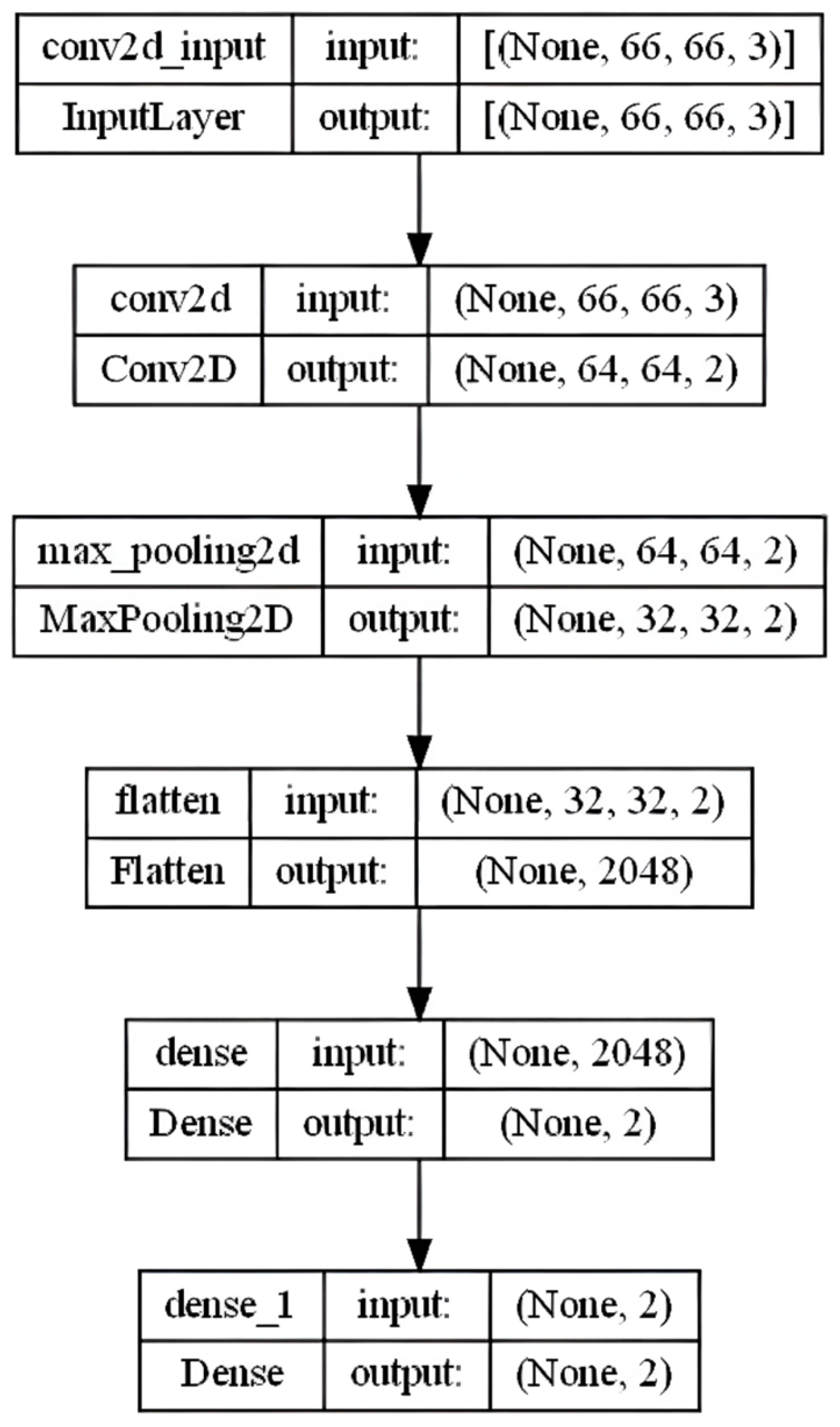
Figure 1. 1× Convolutional Layer.
Applsci 15 10642 g001
Figure 2. 2× convolutional layer.
Applsci 15 10642 g002
Figure 3. Bar charts—confusion matrix (1× Conv).
Applsci 15 10642 g003
Figure 4. Bar charts—confusion matrix (2× Conv).
Applsci 15 10642 g004
Figure 5. Bar chart representation: (a) Loss curve (1× Conv). (b) Model accuracy.
Applsci 15 10642 g005
Figure 6. Bar chart representation: (a) Loss curve (2× Conv). (b) Model accuracy.
Applsci 15 10642 g006
Figure 7. Bar charts—prediction with 1× Conv (a) evaluated instance; (b) corresponding CNN activation heatmap. See Table A2 for the mapping of variable codes (e.g., AAP, KOM, and WLB) to the full survey items.
Applsci 15 10642 g007
Figure 8. Bar charts—prediction with 2× Conv (a) evaluated instance; (b) corresponding CNN activation heatmap. The variable codes are explained in Table A2.
Applsci 15 10642 g008
Figure 9. Pie chart representation: (a) Loss curve (1× Conv). (b) Model accuracy.
Applsci 15 10642 g009
Figure 10. Pie chart representation: (a) Loss curve (2× Conv). (b) Model accuracy.
Applsci 15 10642 g010
Figure 11. Pie charts—prediction with 1× Conv. (a) evaluated instance; (b) corresponding CNN activation heatmap. The code definitions are provided in Table A2.
Applsci 15 10642 g011
Figure 12. Pie charts—prediction with 2× Conv. (a) evaluated instance; (b) corresponding CNN activation heatmap. The variable codes correspond to the survey items listed in Table A2.
Applsci 15 10642 g012
Figure 13. Logistic regression—confusion matrix.
Applsci 15 10642 g013
Table 1. Modules, versions, usage.
ModuleVersionUsage
opencv-python4.8.1.78Heatmap overlay
Matplotlib3.7.3Image generation and visualisation
NumPy1.23.5Data management
Pandas2.3.0Data management
Pillow10.0.1Image generation and visualisation
scikit-learn1.2.2Data preprocessing and splits
TensorFlow/Keras2.12.0Model training
Table 2. Logistic regression coefficients for determinants of employer recommendation.
VariableβStd. Errorzp-Value95% CI
[Lower, Upper]
Constant−9.910.12−80.63<0.001[−10.15, −9.67]
Salary/social benefits0.300.0214.48<0.001[0.26, 0.34]
Image0.490.0221.23<0.001[0.44, 0.53]
Career/training0.400.0218.34<0.001[0.36, 0.45]
Working atmosphere0.570.0320.80<0.001[0.51, 0.62]
Communication0.360.0314.70<0.001[0.32, 0.41]
Team spirit−0.040.02−1.790.073[−0.09, 0.00]
Work–life balance0.180.028.42<0.001[0.14, 0.22]
Supervisor behaviour0.460.0221.58<0.001[0.42, 0.50]
Interesting tasks0.240.0211.14<0.001[0.19, 0.28]
Working conditions0.190.037.86<0.001[0.15, 0.24]
Environmental/social awareness0.200.028.51<0.001[0.16, 0.25]
Equality−0.010.02−0.350.724[−0.05, 0.04]
Treatment of older
colleagues
−0.020.02−0.800.423[−0.06, 0.03]
Note: Logistic regression with β = regression coefficient, Std. Error = standard error of the coefficient, z = Wald statistic, p-value = coefficient significance, 95% CI = confidence interval for β. Target variable: recommendation value (no = 0; yes = 1).
Disclaimer/Publisher’s Note: The statements, opinions and data contained in all publications are solely those of the individual author(s) and contributor(s) and not of MDPI and/or the editor(s). MDPI and/or the editor(s) disclaim responsibility for any injury to people or property resulting from any ideas, methods, instructions or products referred to in the content.