1. Introduction
The development of multimedia systems, especially digital and internet content, highlights the need to optimize graphical user interface design parameters. Color is a key design element because it captures attention and affects the user’s mood. Another important aspect is typography and its impact on reading speed. Reading speed matters for both paper and screen reading. In modern graphical user interfaces, especially on mobile and multitasking platforms, users often rely on subtle peripheral cues, such as notifications, alerts, or ambient indicators, which appear outside the central focus area. As user attention is frequently divided across multiple tasks or windows, understanding how peripheral stimuli are perceived becomes increasingly vital for effective interface design.
Many studies highlight the importance of choosing suitable font styles, such as easy-to-read sans serif fonts like Arial or Verdana, which enhance clarity and simplicity [
1]. Sheedy et al. [
2] explored the impact of serif and sans serif fonts on the legibility of letters and words on the screen in their study. They tested three serif fonts (Georgia, Times New Roman, and Plantin) and three sans serif fonts (Verdana, Arial, and Franklin). Their findings revealed that Verdana and Arial are the most suitable fonts for on-screen reading, while Times New Roman and Franklin were the least legible. Notably, Franklin is a sans serif font, indicating that not all sans serif fonts are necessarily better for screen reading compared to serif fonts. Preference survey data strongly support using Verdana for on-screen reading. Verdana was the most preferred font, followed by Georgia, Arial, and Times New Roman for reading on a computer screen. Participants favored Verdana twice as much as Times New Roman for on-screen reading [
3].
Prior research on visual perception and interface design informed several methodological choices in our study. The use of the Verdana font, for instance, was guided by its demonstrated readability in digital contexts. Similarly, the selection of basic hues, such as red, blue, and green, was based on their frequent use in visibility and contrast studies, which underscore their effectiveness in eliciting perceptual responses. Franken et al. [
4] examined the impact of typeface and color combinations on LCD display legibility. They tested two fonts, Georgia and Verdana, both designed for screen use, using eye-tracking technology to measure reading speed and the number of fixations. Participants read texts in various color combinations on a 24-inch LCD display at 12 pt size. The results indicated that text written in the Verdana font was read more quickly when presented in a dark gray on white background combination. In the dark blue on white background combination, there was no significant difference in reading speed between Verdana and Georgia. In the remaining three color combinations, which were dark blue on light gray, red on white, and red on light gray, participants read the text written in Georgia more quickly.
Franken et al. [
5] compared two typefaces, Georgia and Verdana, designed for screen displays, using eye-tracking technology across eight different sizes. Texts in Verdana were read more quickly regardless of font size. For both typefaces, reading speed improved as the font size increased. In their research, Ali et al. [
6] studied the impact of serif and sans serif fonts on text readability on websites. They tested four fonts: Georgia (serif) and Verdana (sans serif), designed for screen display, and Times New Roman (serif) and Arial (sans serif), designed for print media. The results showed no significant difference in readability between serif and sans serif fonts on screens or in print. However, the findings suggest that Verdana and Georgia are better for displaying long texts on websites, while Times New Roman and Arial are superior for print media readability. In his research, Erdogan [
7] identified Verdana as the most readable font. He examined the readability of websites used for learning, testing three fonts: Verdana, Times New Roman, and Courier New, along with various background and text color combinations. Black or blue text on a white background was the most legible color combination, with contrast playing a key role in web design. High color contrast between the text and background significantly improves text readability. Matthew Carter designed the fonts Verdana and Georgia for Microsoft in 1996. These fonts were specifically created for on-screen display and internet use. At the time, they were among the few fonts reliable for web applications [
8].
Proper use of typography, color, and animation in the peripheral screen area can draw the subject’s attention to that part, improving its functionality. The perception of objects, visual acuity, resolution, and color vision decrease as one moves from the fixation point toward the peripheral space or away from the fixation point [
9]. To help users find information in the peripheral area, moving elements are designed to ensure excellent peripheral readability [
10]. Stone et al. [
11], in their research at the Ohio State University, showed that participants experienced stronger emotions with moving typography compared to static text. Unlike static text, moving typography can evoke more emotions while also improving visual form, meaning, and communication. This approach makes reading a message a richer and more memorable experience. The speed of reading is most affected by overly small letters [
12] and the brightness contrast between the text and background color [
12,
13]. In their work, Xie et al. [
14] showed that elevated luminance contrast ratios are associated with a reduction in visual fatigue and are preferred by users. Buljat et al. [
15] concluded that combining achromatic text with a chromatic background was the most effective way to improve the readability of promotional text. Jadhao et al. [
16] demonstrated a strong connection between background color and memory capacity in their study. Their measurements confirmed that chromatic colors improve visibility and retention more than black and white. They tested red, blue, and white colors, using black letters on a red background and black letters on a blue background. The results showed that a red background enhances short-term memory and attention more than blue or white colors.
Nuthmann and Malcolm [
17] investigated the role of color in the visual field during object search in a scene. They used eye-tracking technology to study color’s impact on central and peripheral vision in object search and recognition. Their findings show that color in the peripheral area helps locate objects more easily, making it simpler to identify an object’s position compared to grayscale. Participants’ gaze lingers longer on areas with color. Additionally, the time needed to search for objects increases as the amount of color in the scene decreases. Similar conclusions were reached in a study by Jergović [
18], which found that a user interface with a monochromatic color scheme has lower usability than multi-colored interfaces. What sets our work apart is its integrated focus on peripheral perception under dynamic and cognitively demanding conditions. Unlike previous studies that have primarily examined static stimuli or central attention tasks in isolation, our experimental design combines the detection of moving text in the peripheral visual field with varying text–background color contrasts, all while participants are engaged in a concurrent, attention-demanding central task.
This combination of variables allows us to explore an under-examined aspect of user experience that is increasingly relevant for modern graphical user interfaces. By explicitly combining these elements: motion, color contrast, peripheral positioning, and divided attention, our study introduces a methodological framework that fills a gap in the existing literature and provides new insights into how interface elements can be designed to remain noticeable even when they fall outside the user’s primary focus. Vater et al. [
19], in their systematic review on peripheral vision in real-world tasks, highlight its vital role in activities such as driving, walking, aviation, and sports. Peripheral vision enables continuous monitoring of the environment and supports both eye movements and physical actions, even in the absence of direct visual focus. Deciding whether to rely on peripheral vision or shift the gaze to engage foveal vision involves trade-offs. These decisions are shaped by factors such as task urgency, prior knowledge, potential distractions, and emotional states. Niu et al. [
20] explored how the size, position, and shape of eye-controlled graphical user interface (GUI) components impact visual search performance and user interaction, especially from the perspective of peripheral vision. The main finding showed that larger components placed closer to the center of the screen led to faster reaction times because central vision provides clearer and more detailed images, while components located in the peripheral vision area appear less distinct and are harder to recognize.
As a result, targets placed farther from the center require more effort to identify, increasing reaction time. When GUI elements were positioned too close together in the periphery, users found it difficult to distinguish between them, emphasizing the need for adequate spacing to avoid confusion. The study by Chen and Lee [
21] shows that peripheral vision is not only used for detecting movement or orienting ourselves in space but also helps us automatically direct our attention to important things around us. This means that lateral vision enables us to unconsciously learn where significant stimuli are located, and without it, this is not possible. Additionally, even when a task requires looking at the center, peripheral vision supports this unconscious attentional learning, while without it, only conscious learning remains. An interesting result was obtained by Haun [
22] who investigated color and acuity perception in the peripheral and foveal visual fields using a model of human spatial vision that simulates contrast and color sensitivity across different parts of the retina. The results show that, although spatial resolution and sensitivity are reduced in peripheral vision, the model does not predict significant qualitative differences in color and acuity perception between foveal and peripheral vision.
These findings challenge claims that peripheral vision is substantially poorer in these aspects and suggest that important visual information can also be obtained through peripheral vision. Our preliminary research [
23] provided foundational insights that directly influenced the current study’s design. It demonstrated the importance of standardizing response accuracy and timing through weighted evaluation methods, which helped isolate the effect of attention and perception in the peripheral field. Moreover, the study emphasized that engaging participants with meaningful central tasks, rather than passive fixation points, produced more realistic and reliable data on peripheral perception. Based on these findings, we transitioned from using simple geometric shapes (triangle, square, hexagonal, and octagonal) to text-based stimuli, introduced fixed stimulus timing and controlled motion speed, and focused on assessing how different text–background color combinations affect peripheral text visibility during attention-demanding tasks. The scope of this study is centered on investigating how visual stimuli, specifically combinations of text and background color, are perceived in the peripheral areas of a screen when the user’s attention is primarily focused on the central display region. This research focuses on the interaction between color contrast, attention distribution, and visual response efficiency, with the aim of identifying combinations that optimize both detection speed and accuracy.
The experiment simulates conditions in which peripheral cues must be recognized without direct focus, reflecting realistic scenarios in modern digital interfaces. This scope is particularly applicable to contexts where peripheral perception plays a critical role, such as in video game environments. Moving text on colored backgrounds in peripheral areas can be found in many modern video games. Notifications such as mission updates, damage alerts, or status effects frequently appear with dynamic transitions at the screen’s edges. These transient elements are often color-coded and briefly demand attention while players remain focused on central tasks, reflecting the kind of perceptual load modeled in our study. Given that the experimental setup is based on a desktop display configuration (a 21.5-inch LG 22M45 display with a 16:9 aspect ratio), the findings are primarily applicable to digital interfaces viewed on desktop monitors at typical viewing distances, such as video games played on PC gaming setups. The remainder of this paper is organized as follows. The Experiment section describes the experimental setup and the method used for stimulus presentation. This is followed by the Results and Discussion section, which presents the findings in detail, including the effects of stimulus direction and color combinations. Finally, the Conclusions section summarizes the key insights, discusses their implications for interface design, and outlines directions for future research.
2. Experiment
The experimental part aims to identify parameters affecting the visual perception of objects in the peripheral screen area while the user focuses on content in the center, as new information or a message appears in the peripheral part.
The research aimed to identify, from ten combinations tested, the most noticeable combination of text and background color for the stimulus appearing in the peripheral part of the screen.
The measurements were conducted under controlled conditions in a classroom during daylight, using multiple computers with the same configuration. LG 22M45 monitors with a 21.5” diagonal and a 16:9 aspect ratio were used. The average distance between the subjects and the screen was 70 cm ± 5 cm.
The target group consisted of students aged 20 to 26 years with a similar education level, involving undergraduate and graduate students from University North, Croatia. A total of 127 participants, including 71 males and 56 females, took part in this study. None had prior experience with this type of testing. The testing included five quizzes, with the stimulus appearing in the peripheral area at the same time for all participants, at the 26th second.
For this research, a web-based application was developed to perform the necessary measurements. Originally built with Adobe Flash, the tool now runs via Ruffle, a secure emulator that supports legacy Flash content in modern browsers. The experimental environment was configured with specially designed XML files. By adjusting these files, researchers could modify specific parameters, such as the direction and speed of changing shapes on the screen. Data from each participant were stored in a MySQL relational database via a custom API, developed with the PHP programming language. Communication between the application and the API used the JSON data format. Later, statistical analysis was performed on the collected data using SQL and standard analytical methods.
The mentioned application was tested and used in preliminary measurements to develop a research protocol and study the impact of color and shape on identifying moving objects in the peripheral screen area. The results were published in a scientific article by Ivančić Valenko [
23], and based on these findings, a plan for further research was created.
In the preliminary phase of this study, three quizzes were administered. The overall duration of the testing was relatively short (20–30 s), which allowed participants to maintain a high level of attention throughout the procedure. In the current phase of this study, the number of quizzes was increased to five in order to collect a larger amount of data. Including the time needed to enter basic personal information and answers, the total duration of the testing was slightly over two minutes. This adjustment made it possible to gather more data without significantly affecting participants’ cognitive engagement. The main difference from the preliminary studies was the change in the peripheral screen stimulus. Instead of various shapes, words in two colors (black and white) appeared on five different background colors (black, yellow, red, green, and blue).
The purpose of the preliminary measurement was to examine the influence of color and shape on the identification of moving objects in the peripheral part of the screen. Preliminary research findings indicated that the highest percentage of correct responses in the peripheral area of the screen was recorded for triangular shapes (93.96%), whereas the lowest percentage was observed for octagonal shapes (34.88%). These results suggest that more complex geometric forms, particularly those with a higher number of angles, are more difficult to detect in peripheral vision. Regarding the color of the stimuli, the results demonstrated no significant deviations, as all colors yielded a high percentage of correct responses in the peripheral screen area [
23]. Based on the processed results of the preliminary measurements, specific modifications were implemented in the application used for subsequent testing. These adjustments involved changes to the stimuli presentation in both the central and peripheral areas of the screen.
Before using the research application, participants underwent the Ishihara test to check for visual defects. The test used Ishihara color plates with 38 images to assess color perception. All 38 images used in this study are available online [
24]. Participants completed the test in person.
All participants who passed the Ishihara test launched the application and began testing. The application required users to enter their information (gender, age, education degree, and e-mail address) at the start and provided brief instructions before the first step. When ready, users independently started each quiz. A three-second countdown appeared just before the quiz began to help the participant prepare.
The quizzes displayed stimuli with black or white text on various background colors in the peripheral part of the screen. The background colors alternated between blue, red, yellow, green, white, and black. Saturation and brightness remained constant, while hue varied. The goal was to determine how much background color, combined with white or black text, attracts the subjects’ attention and to identify which background color makes a specific word most noticeable in the peripheral area. The most important factors were background and text color, so font size and type were kept constant (
Table 1).
Each participant completed all five quizzes. After collecting the data, processing was carried out, and several analyses were performed.
The normality of the research data was verified using the Kolmogorov–Smirnov test, which indicated that the data were normally distributed. To further assess the suitability of parametric analyses, Levene’s test was conducted to evaluate the homogeneity of variances among the groups under investigation. The results of Levene’s test demonstrated that the assumption of equal variances was met across all cases analyzed. Consequently, parametric statistical methods, specifically the t-test and one-way analysis of variance (ANOVA), were employed to determine the presence of statistically significant differences between the examined samples. Differences were considered statistically significant at the p < 0.05 level.
2.1. Design of the Images for the Central Part of the Screen
This research aims to improve the functionality of the peripheral part of the graphical user interface while the subject’s attention is focused on the central part of the screen. To maintain the subjects’ focus on the central area, they were given specific tasks to solve. Solving these tasks keeps subjects more focused on the center of the screen compared to simply looking at a cross or dot in the middle.
Many previous studies [
25,
26,
27,
28] did not require subjects to focus on a specific task. Instead, participants were simply instructed to look at a fixation point on the screen. This approach keeps subjects less focused on the central area, as they lack a task to perform, and their attention often shifts to other parts of the screen over time.
Vater et al. [
19] emphasize that in complex, real-world scenarios, individuals frequently rely on peripheral vision while multitasking. This reliance suggests that people can process multiple streams of visual information at the same time, with some being handled consciously and others automatically, depending on the demands of the situation. Importantly, peripheral vision is not merely a backup to central vision. It is a fundamental component of how humans interact with complex and dynamic environments. Understanding when and how peripheral vision is used provides deeper insight into visual behavior and decision-making in the real world.
All quizzes were designed to display a specific task in black text on a white background. This combination was chosen because Zorko et al. [
29] found it to be the most readable color combination for screen reading. In their measurements, subjects made the fewest errors with black text on a white background, and in a later survey, they also reported this combination as the least tiring for the eyes.
The subject was given a task to solve in the central part of the screen, and at the 26th second, a word appeared in the peripheral area. The subject stopped the test by pressing the space key. After stopping, they answered five questions, with the first question varying based on the image seen. The questions were as follows:
- 1.
a. How many circles were in the image?
b. How many triangles were in the image?
c. How many petals were in the image?
- 2.
Which word appeared in the peripheral area of the screen?
- 3.
Which color of text have you noticed in the peripheral area of the screen?
- 4.
What background color of the stimulus did you notice?
For the first two questions, subjects typed their answers, while for the third and fourth questions, they selected from options provided in a drop-down menu.
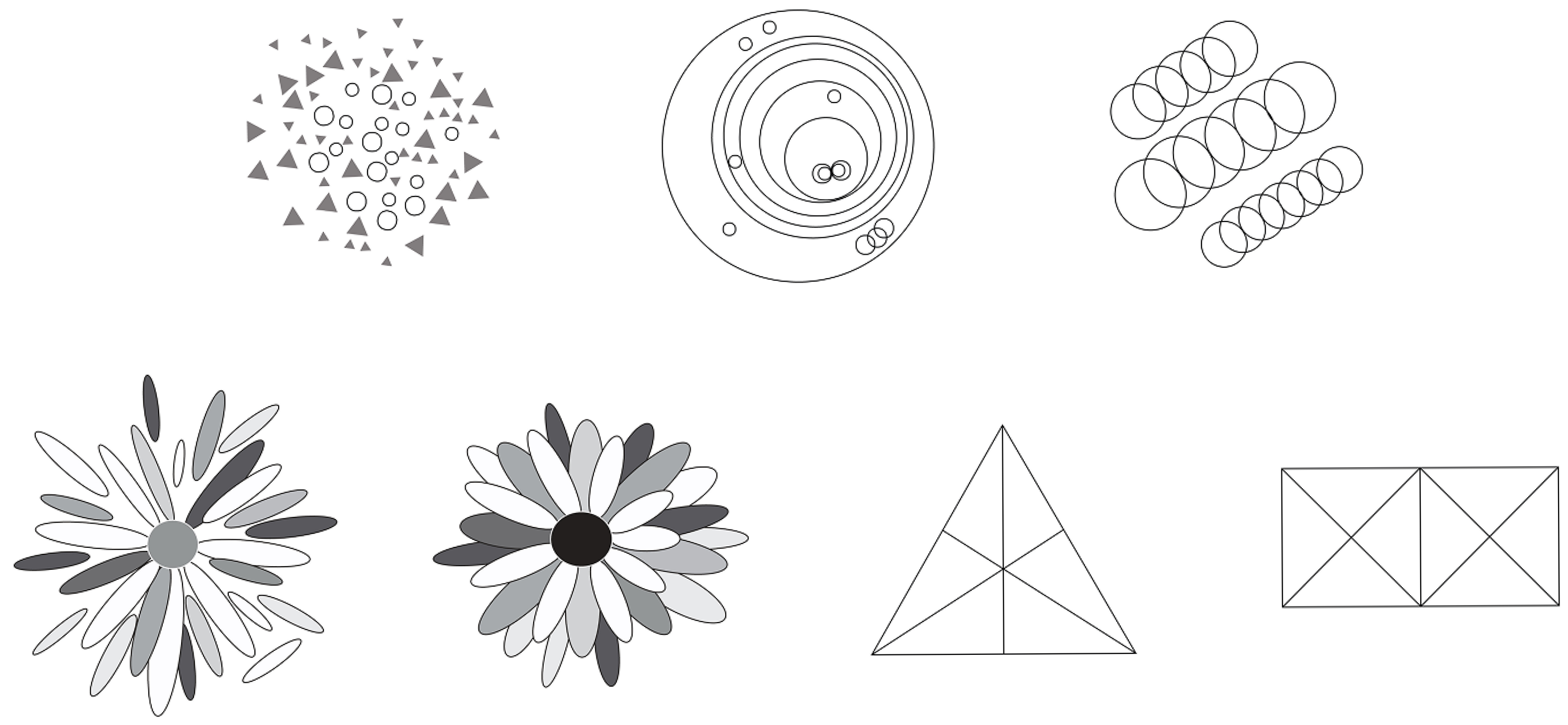
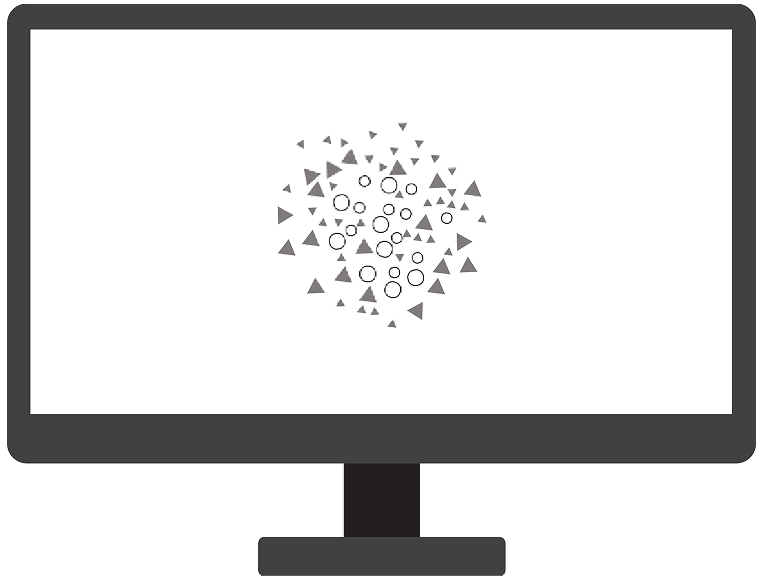
All images displayed in the central part of the screen had the same parameters: a resolution of 72 ppi (pixels per inch) and a size of 500 px × 500 px. The database contained 15 different images that appeared randomly for each subject, ensuring not all participants saw the same image at the same time. Below are examples of images shown in the central part of the screen (
Figure 1) and a simulation of one of the images on a desktop computer (
Figure 2).
2.2. Design of Stimulus for the Peripheral Area of the Screen
To enhance the visibility of the peripheral screen area, the shapes appearing there were in motion. Moving typography has long interested designers for its ability to capture attention. However, if not designed well, the speed of movement can make it hard to read. Previous research [
30] has shown that static text is read much faster than dynamic text. Therefore, moving stimuli must be carefully designed to ensure they are quickly noticed and easily readable.
In the preliminary measurements [
23], the stimulus appeared randomly between 20 and 30 s. Subjects with shorter test times were at a disadvantage compared to those with longer durations, as they had less time to solve the task. As a result, subjects with more time were expected to achieve better results.
To ensure objective test results, the appearance time of the stimulus in these measurements was fixed. The stimulus always appeared at the 26th second, a time chosen based on the results of preliminary measurements.
The speed of the stimulus was also fixed at 640 pixels per second (px/s), a value selected based on preliminary measurement results. In the preliminary tests, the stimulus movement speed varied randomly from 200 px/s to 1200 px/s. Stimuli noticed most quickly in those tests had an average speed of 640 px/s, which is why this speed was adopted for this study.
2.2.1. Selection of the Words for the Peripheral Area of the Screen
This study introduces the use of words in the peripheral area of the screen because most prior research has focused on the central part of the screen. While word readability in different screen positions has been studied [
31,
32], it has not been explored in scenarios where words appear in peripheral positions while attention is focused on the central area, mimicking real digital content consumption conditions. In this study, participants focused on a task in the central part of the graphical user interface, while the quality and speed of perception of the elements in the peripheral area were tested.
To avoid issues with word recognition and frequency in the Croatian language, this research uses only five-letter words chosen from the first 300 nouns in the Croatian Frequency Dictionary [
33].
In that dictionary, the words are arranged based on their frequency of use in the Croatian language. Among the first three hundred words of five letters are the following: sunce (sun), život (life), glava (head), danas (today), posao (work), vrata (door), snaga (strength), djeca (children), ulica (street), and majka (mother).
This study used only six different words: sunce (sun), život (life), glava (head), danas (today), posao (work), and vrata (door) due to the large number of different combinations of text and background color.
2.2.2. Selection of the Font for the Peripheral Area of the Screen
This study used the Verdana font at a size of 19 px (approximately 14 pt). While many earlier studies suggest that 12 pt is optimal for readability, a larger size was chosen here due to the added difficulty of detecting moving text compared to static text. The 14 pt size aligns with established guidelines for on-screen readability and interface legibility. Research in human–computer interaction has shown that font sizes below 12 pt can hinder legibility and slow reading speed, whereas sizes of 14 pt or greater enhance recognition and reduce visual strain during digital reading tasks [
5,
34,
35].
In all research phases, words were written in lowercase letters because text in all capital letters reduces reading speed by 10%. Such text can seem aggressive and unprofessional, so it is recommended only for short headings [
30].
2.2.3. Selection of Colors for the Stimulus in the Peripheral Area of the Screen
Words in the peripheral screen area appeared randomly across five different background colors (black, yellow, red, green, and blue) and in two text colors (black and white). All words were in pure black or white, with no additional emphasis like bolding, bordering, or italicizing. These colors were chosen because basic or primary colors are among the most easily noticed [
36].
Color is defined by three attributes: hue, saturation, and brightness. In this study, only the background color hue (tint) was varied, while saturation and brightness stayed the same (
Table 2).
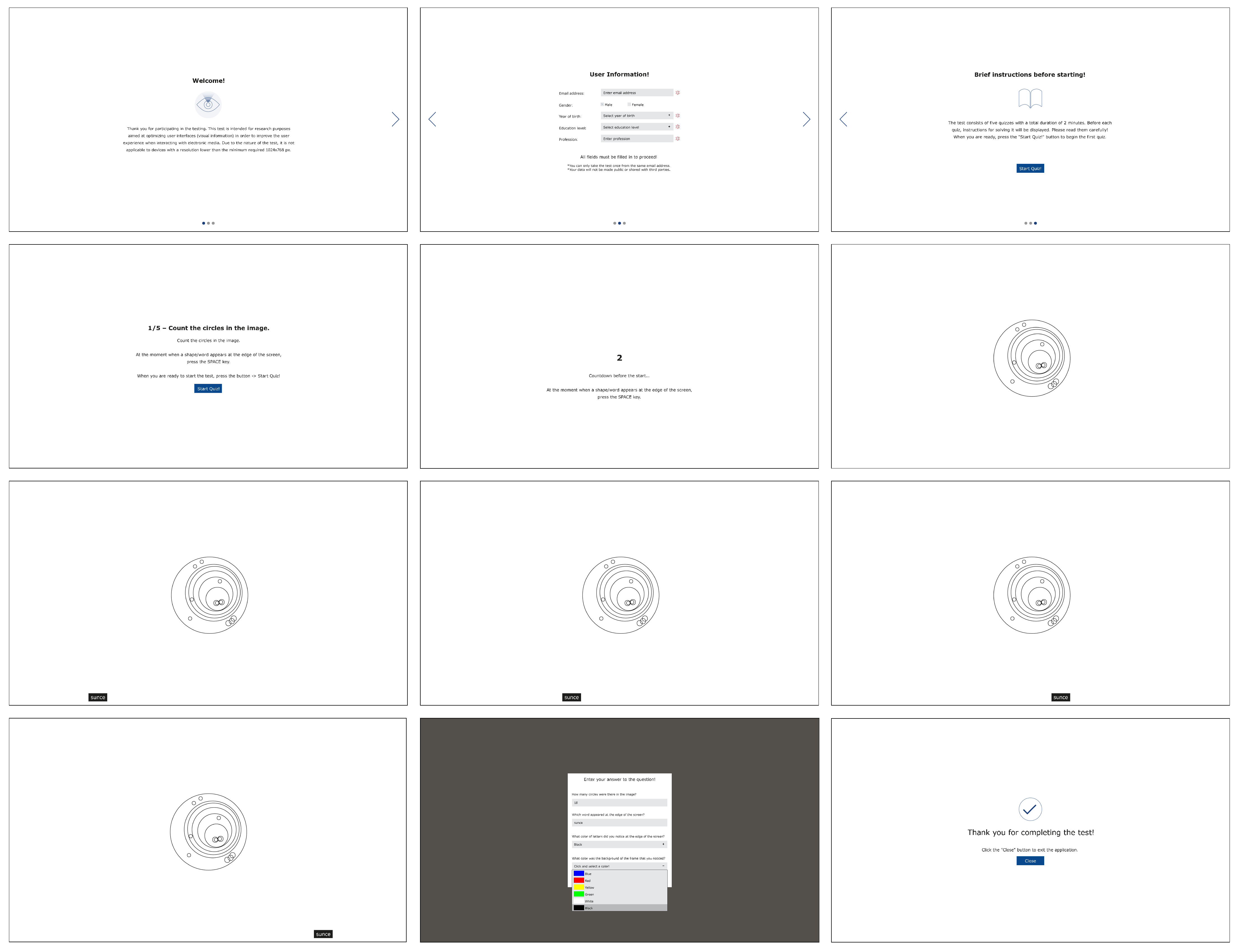
Figure 3 illustrates a sequence of screenshots representing the experimental interface as experienced by participants during one of the quiz sessions. The image sequence provides a step-by-step visual walkthrough of the application used in this study.
The first screen welcomes the participant with a brief explanation of this study’s purpose, emphasizing its role in optimizing user interfaces to enhance user experience. The second screen prompts the user to input demographic data, including e-mail, gender, year of birth, level of education, and occupation. The third screen presents concise instructions, informing the participant that the test consists of five short quizzes with a total duration of approximately two minutes. Before each quiz, specific instructions are displayed and must be read carefully. The quiz begins once the participant clicks the ”Start Quiz” button.
The next step introduces the central task: participants are asked to count the number of circles in a centrally displayed image. Simultaneously, they are instructed to press the spacebar as soon as a moving stimulus (a word displayed on a colored background) appears in the peripheral area of the screen. In the example shown, the stimulus appears at the bottom of the screen and moves from left to right, representing one of the tested motion directions. Upon pressing the spacebar in response to the peripheral stimulus, the participant is directed to a response form. They are prompted to input the number of circles seen in the central image, type the word that appeared in the periphery, and select both the perceived text color and background color from dropdown menus offering predefined options (blue, red, yellow, green, white, and black).
The final screen thanks the participant and proceeds to the next quiz. This process is repeated across different stimulus conditions, allowing for the systematic assessment of text and background color combinations, motion direction, and their impact on peripheral perception under central task engagement.
3. Results and Discussion
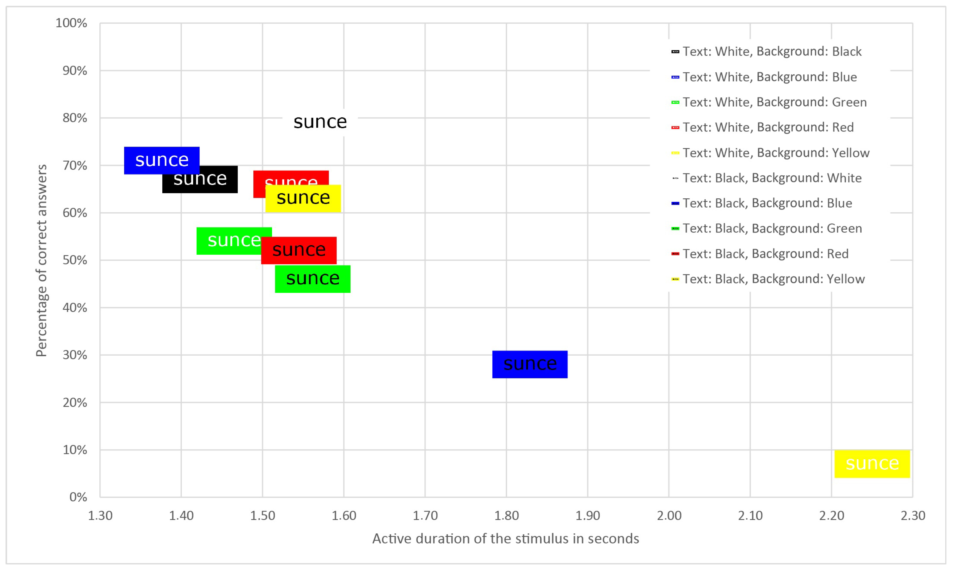
In the peripheral screen area, the stimulus appeared in ten different text and background color combinations, as shown in
Table 3. Some combinations had low contrast and were less legible, such as white text on a yellow background and black text on a blue background. These combinations received the fewest correct answers, and it was expected that such stimuli would not be quickly noticed.
The percentage of correct answers refers to stimuli in the peripheral area that were accurately read, meaning the word, text color, and background color were all correctly identified.
White text on a blue background had the shortest active duration of the stimulus, indicating that these stimuli were noticed the fastest. The superior performance of this color combination may be attributed to the strong luminance contrast and the fact that blue light stimulates retinal cells less aggressively than warmer hues, allowing the white text to stand out more clearly in peripheral vision. However, the highest response accuracy was observed with black text on a white background. One possible reason for the longer active duration of this combination is the absence of a visible frame, as both the stimulus and the quiz background were white, causing the stimulus to blend with the surrounding area and delaying detection.
The standard deviation values indicate moderate variability in the data, with the values being relatively uniform. Slightly larger deviations were observed for white text on a green background, black text on a yellow background, and black text on a blue background, indicating a somewhat greater dispersion of the data in these sets. Since the sample of correct answers for white text on a yellow background is very small, the standard deviation reflects the distance between the two values and not the actual dispersion.
Figure 4 displays all combinations of text and background color, clearly showing that white text on a blue background has the shortest active duration of the stimulus and a high percentage of correct answers.
3.1. The Relationship Between Different Combinations of Text Color, Background Color, and the Active Duration of Stimuli
The active duration of stimuli largely depends on the combination of text and background color, leading to a wide range of active durations. For instance, white text on a yellow background is often noticed later due to its low readability.
The results in
Table 3 and
Figure 4 were further confirmed using Levene’s test and ANOVA. A comparison was conducted to check for a statistically significant difference in the active duration of the stimulus between white text on various backgrounds and black text on various backgrounds (
Table 4).
The results of hypothesis testing for the equality of the arithmetic means across five samples using one-way analysis of variance (ANOVA) show a statistically significant difference in the active duration of stimuli based on varying background colors while keeping the font color the same.
To identify which specific samples showed statistically significant differences, a post hoc Tukey HSD test was used as part of the post hoc analysis.
According to the HSD test, for white text, the yellow background differs significantly from all other colors. White text on a yellow background offers very poor contrast, has the longest average active stimulus duration, and shows the lowest response accuracy.
For black text, statistically significant differences were observed only between red and blue backgrounds and between blue and green backgrounds. The following analysis examines whether there is a statistically significant difference in the active duration of the stimulus for black and white text on the same background color, such as black or white text on a red background.
Table 5 presents the results of Levene’s tests and
t-tests, indicating a statistically significant difference in the active duration of the stimulus for white and black text on a blue background and for white and blue text on a yellow background.
Blue and yellow backgrounds are notable because they produce distinctly different visual impressions when paired with black or white text. White text on a blue background offers the best active stimulus duration, while black text on a blue background performs almost the worst, with an accuracy of only 28%. Stimuli with white text on a yellow background have the lowest response accuracy at 7%, as this combination is hard to read.
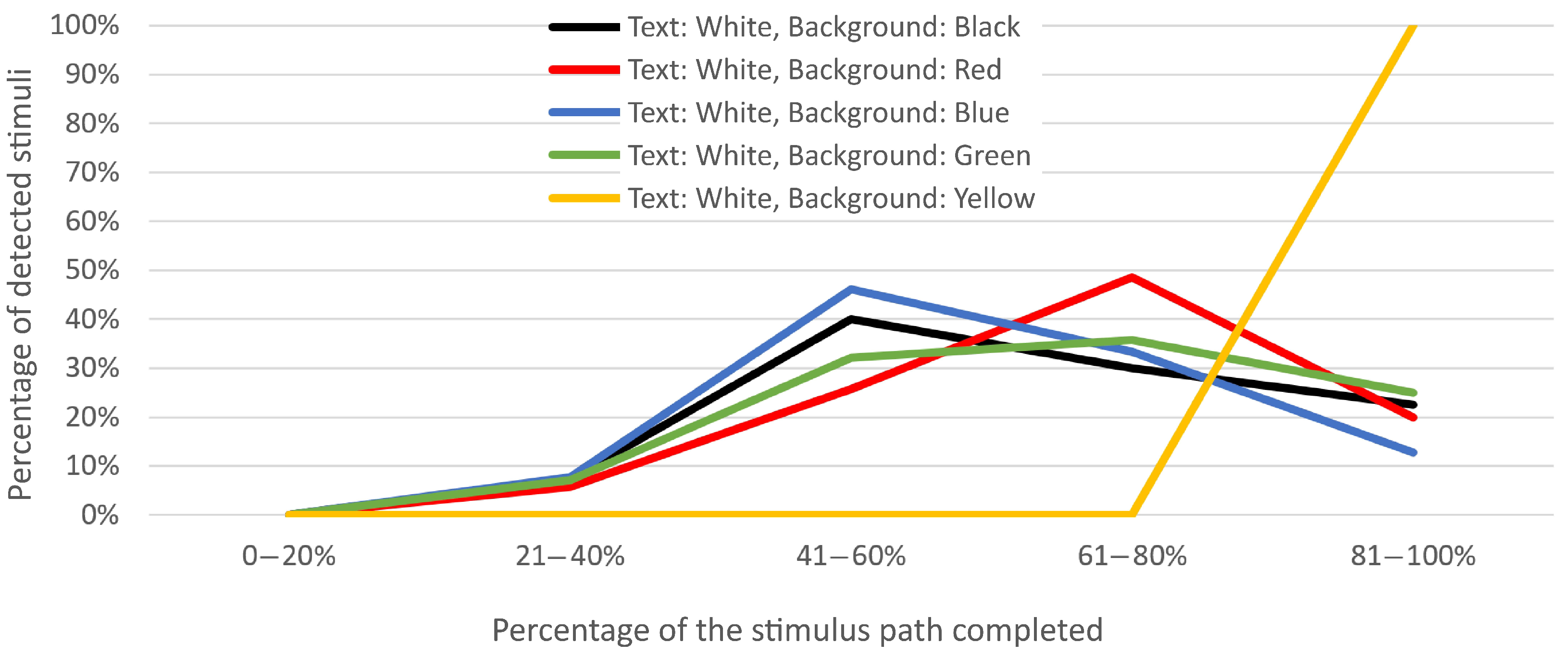
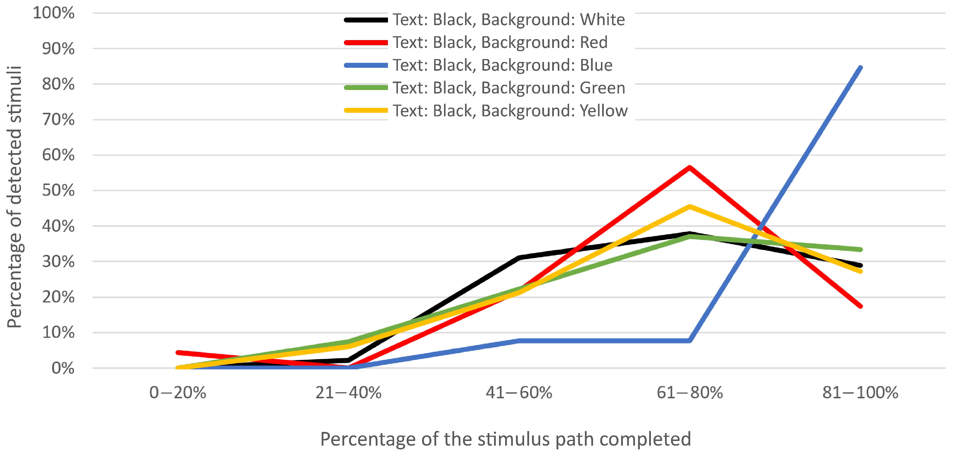
3.2. The Relationship Between Various Combinations of Text and Background Color and the Percentage of the Stimulus Path Traversed
As mentioned earlier, the stimuli moved across the screen, and participants pressed the spacebar to stop the quiz when they noticed a stimulus. The percentage of the stimulus’s traveled path is shown below to indicate where on the screen the stimuli were most often noticed. From
Figure 5 and
Figure 6, it is clear that the percentage of the distance traveled by the stimuli varies with different text and background colors. Stimuli with a yellow background and white text traveled over 80% of the path before being noticed. The highest visibility occurred with stimuli featuring blue, black, and green backgrounds with white text, often noticed halfway, or roughly in the middle of the screen. Stimuli with a red background and white text were noticed most frequently between 60% and 80% of the screen, later than those with blue, black, and green backgrounds and white text.
When analyzing the percentage of the distance traveled for stimuli with black text on various background colors (
Figure 6), it is evident that most stimuli were noticed later than those with white text. Black text on red, yellow, and green backgrounds was mostly noticed between 60% and 80% of the distance traveled. Black text on a white background showed greater visibility as early as halfway across the screen, while stimuli with black text on a blue background were noticed only at the end of their journey (80% to 100% of the distance traveled). Black text on a blue background, like white text on a yellow background, has low contrast, so it is expected that these combinations were not quickly noticed.
Next, Levene’s tests and ANOVA tests were used to assess the significance of differences in the percentage of the traveled distance of the stimulus for two text colors on the same background color.
The ANOVA test results indicate a statistically significant difference in the percentage of the stimulus path traversed with black font color across different background colors (
Table 6). Post hoc analysis showed significant differences between red and blue backgrounds, as well as blue and green. A difference also exists in the percentage of the stimulus path traversed with a white font color across different background colors, specifically between black and yellow, red and yellow, and blue and yellow backgrounds.
Table 7 presents the
t-test results, indicating statistically significant differences in the percentage of the traveled stimulus path for white and black text on black, blue, and yellow backgrounds.
3.3. The Relationship Between the Directions of Movement and the Active Duration of the Stimulus
This section compares the active duration of stimuli moving in opposite directions on the same part of the screen, as well as stimuli moving in the same direction but on opposite sides of the screen. As previously noted, the stimuli in these measurements moved in eight directions along the edge areas of the screen, as shown in
Table 1.
Table 8 provides a detailed overview of the average stimulus durations across all tested motion directions. Each column represents a pair of opposite motion directions presented on the same segment of the screen, allowing for direct comparison. The data clearly show that stimuli moving from left to right are, on average, detected earlier than those moving from right to left. A similar trend is observed for vertical motion, where stimuli progressing from the top to the bottom of the screen are perceived earlier than those moving in the opposite direction (bottom to top). These findings suggest a directional asymmetry in visual attention or perceptual sensitivity, potentially influenced by habitual scanning patterns.
Table 9 compares two identical stimulus movement directions on opposite sides of the screen, such as when the stimulus moves downward on both the left and right sides.
According to the
t-test results in
Table 9, there are no statistically significant differences in the active duration of the stimulus for movement from left to right on the upper and lower parts of the screen, from right to left on the upper and lower parts, from top to bottom on the left and right parts, and from bottom to top on the left and right parts (
p > 0.05).
In conditions where visual stimuli move in the same direction but are positioned on opposite parts of the screen, such as from left to right at the top and at the bottom, the average duration of the active stimulus, which reflects the speed of stimulus perception, remains approximately the same. This finding has practical implications for user interface design, as it suggests that users’ perceptual sensitivity is consistent in those areas of the screen, which can serve as a guideline for designers when arranging visual elements to optimize visibility and interaction efficiency.
3.4. The Ratio of the Average Active Stimulus Duration for All Combinations of Text and Background Color Across Different Screen Positions
The upper parts of web pages are much more noticeable than the lower ones [
37], as users often scan pages in an F-shaped pattern, in the Western pattern of reading. This means they first read the top part from left to right, move downward, and then read from left to right again but over a shorter distance. Finally, they quickly scan the remaining content on the left side of the screen [
38]. This scanning pattern indicates that the upper and left parts of the screen are more noticeable than the bottom and right parts.
To verify these findings, the following table presents the reaction times of participants to stimuli in different screen parts. The screen is divided into four sections: upper, bottom, left, and right. Stimuli appear randomly in all four sections. This analysis aims to examine how the appearance of identical stimuli in different screen parts affects the average active duration of the stimulus.
Table 10 displays the average active stimulus duration values for all combinations of text color and background color across all screen parts. The best values for each screen part are highlighted.
It is clear that the average active duration of stimuli varies for the same text and background color combinations on the upper and bottom parts of the screen. For example, on the upper part, the stimulus with a red background and black text is noticed the fastest, while on the bottom part, the stimulus with a black background and white text is noticed first.
When comparing the left and right parts of the screen, it is clear that stimuli with a blue background and white text are noticed the quickest on both sides, with the right side being faster than the left. The same holds true for the stimulus with a red background and white text, which is noticed sooner on the right side than on the left side of the screen.
4. Conclusions
Optimizing the design of elements in the peripheral screen area makes that space more functional and noticeable. This research aimed to identify, among ten combinations, the most visible combination of text and background color for stimuli in the peripheral screen area, when visual attention was engaged in the central portion of the screen. White text on a blue background had the shortest active stimulus duration (1.376 s), while the highest response accuracy (79%) was recorded for stimuli with black text on a white background.
The following colors were used in this study: red, blue, yellow, green, white, and black. The results show that visual stimuli formed by white text on a blue background are perceived most quickly in the peripheral parts of the screen, at a time when the user’s attention is directed towards the central part of the display. These results indicate a potential advantage of this color combination in the context of peripheral visual perception.
The results indicate that stimuli featuring white text were, on average, noticed more quickly than those with black text, with one notable exception: the stimulus with white text on a yellow background. The generally higher detectability of white text can be attributed to its strong luminance contrast against darker or more saturated backgrounds, which enhances peripheral visibility. In contrast, the reduced performance of the white-on-yellow combination likely stems from the low contrast ratio between two similarly bright hues, making it more difficult for peripheral photoreceptors to distinguish the text efficiently.
Stimuli moving from left to right are noticed more quickly than those moving from right to left. Stimuli moving from top to bottom are noticed sooner than those moving from bottom to top.
This aligns with the findings of Andersen et al. [
39], which investigated how principles from attention theories apply to the design of complex visual interfaces, focusing particularly on layout, clutter, and color usage. They found that placing important information in the top-left corner helps users locate it more quickly, as it aligns with natural reading patterns.
When results are divided by screen parts, it is clear that on the upper part, the stimulus with a red background and black text is noticed the fastest, while on the bottom part, the stimulus with a black background and white text is noticed first. On both the left and right sides, stimuli with a blue background and white text are noticed the quickest, confirming that the noticeability of peripheral stimuli depends on text and background color combinations.
These results are partly supported by an experiment conducted by Andersen and Maier [
40], which showed that colors can be grouped according to their ability to attract attention: red is the most effective, followed by medium-effective colors such as green, blue, and yellow, while orange and purple are the least effective. Differences in attentional capture increase further with increasing visual complexity of the display—when more distracting colors appear, red still retains its effectiveness, while the other colors gradually lose effectiveness.
The measurements also analyzed movement directions, with stimuli moving in eight directions. Stimuli moving in the same direction on opposite sides of the screen had approximately equal perception times, which is important for designing graphical user interfaces as it suggests equal importance for all peripheral screen areas.
Our results expand upon previous findings on color contrast and peripheral perception [
9,
16,
25] by incorporating dynamic text stimuli and simulating real-time GUI interactions. In contrast to static-font readability studies [
2,
5,
15], our design reflects more naturalistic attentional shifts during digital tasks. These insights complement and extend prior research on the role of peripheral vision in user interfaces [
23,
27,
28], offering additional evidence for optimizing design choices based on contrast, motion, and spatial layout.
This study highlights important considerations for interface designers seeking to optimize visual alert effectiveness. Specifically, high-contrast color combinations can enhance peripheral detection but should be used cautiously to avoid visual fatigue or distraction. We recommend applying these techniques primarily in contexts where immediate attention is critical, such as notification banners and safety-critical dashboards. By strategically leveraging contrast, designers can improve user responsiveness without compromising overall interface usability. Future design efforts should balance alert visibility with aesthetic and ergonomic factors to maximize both effectiveness and user comfort.
Future research should build on these findings by exploring differences in visual alert effectiveness across device types, such as mobile versus desktop interfaces, to better understand contextual influences on user attention. Additionally, incorporating gaze-tracking technology could provide objective measures of attention shifts, validating whether high-contrast alerts truly capture peripheral vision in practice. These directions will help refine design guidelines and ensure their applicability across diverse real-world settings.
The results of this study demonstrate that certain text–background color combinations, particularly high-contrast pairs such as white text on a blue background, significantly enhance detection speed and accuracy in the peripheral visual field under the conditions of divided attention. These findings are particularly relevant for the design of user interfaces that include peripheral visual elements requiring rapid recognition while the user’s attention is directed toward central content.
The experimental setup reflects scenarios commonly encountered in desktop-based interactive environments, where brief and dynamic visual information appears at the edges of the screen. The results support several design recommendations for improving peripheral visibility. High-contrast combinations, particularly white text on a blue background and black text on a white background, yielded the highest recognition accuracy (71% and 79%, respectively) and relatively short response times (1.376 s and 1.571 s). These combinations demonstrated a favorable balance between visibility and prompt detection. In contrast, combinations with lower luminance contrast or poor color pairing, such as white text on yellow (7% accuracy, 2.250 s) and black text on blue (28% accuracy, 1.829 s), were significantly less effective. Similarly, black text on green and black on red also showed lower accuracy rates (46% and 52%) and longer average durations, indicating slower and less reliable peripheral detection. These findings suggest that designers should prioritize strong luminance and hue contrast, particularly combinations involving dark backgrounds with light text or vice versa, to enhance peripheral detectability. Color pairs with insufficient perceptual differentiation, such as white on yellow, should be avoided due to their poor performance in both the recognition rate and response time.
While the results are most applicable to digital interfaces viewed on desktop monitors at typical viewing distances, further investigation is needed to determine their applicability across other display environments. These include television displays, mobile screens, and immersive systems such as augmented and virtual reality, where differences in viewing conditions and interaction modalities may influence perception.
In conclusion, this study offers practical, evidence-based guidance for improving the visibility of peripheral interface elements. These insights are particularly valuable for enhancing user performance in visually demanding digital environments, such as desktop video games, where notifications often appear dynamically at the edges of the screen. These principles are also applicable to a wide range of applications displayed on desktop PC monitors, including financial trading platforms, network monitoring tools, IT system performance dashboards, project management tools, communication platforms, and similar software where quick peripheral awareness is important.
This study has several limitations that should be acknowledged. First, there is a potential for response bias, as participants may have guessed answers rather than relying solely on perception, which could impact the accuracy of the findings. To ensure greater relevance and accuracy in the questionnaire section involving the quiz, a modification was introduced: participants were required to enter their answers manually instead of selecting from multiple-choice options. Additionally, a dropdown menu was used for color selection, further standardizing input and reducing the possibility of errors. Second, the experimental design employed five-letter words presented on solid color backgrounds, an artificial setup that may not fully capture the complexity of real-world graphical user interfaces (GUIs). These factors may limit the generalizability of the results to more naturalistic settings, where visual elements are more varied and interactive.
The research conducted in this paper has opened up new questions to be explored in the future. Future studies may use the eye-tracking method, which is considered a usability testing technique. This method could show to what extent moving and static stimuli influence participants’ attention and whether these stimuli draw attention away from the central part of the screen toward the peripheral area. The analysis of fixation duration at specific screen locations could reveal which areas are more noticeable to participants and where their gaze lingers longer or shorter.
The participants in the current study were undergraduate and graduate students. Future research could include different age groups. Students are frequently exposed to digital content through smartphones, tablets, and laptops, so they are generally accustomed to reading from screens of various sizes. It is assumed that for older target groups, who do not have such habits and whose attention is shaped differently, it may be necessary to adjust stimulus design parameters, such as font size or stimulus movement speed.
For future research, it is recommended to expand the palette of background colors by including pastel and secondary tones, with the aim of obtaining more detailed guidelines for the design of visual interfaces. It is recommended to retain black and white for text formatting, given their consistent readability on different background contrasts.
As 3D technology becomes more common in the design of graphical user interfaces, future research could also explore the use of three-dimensional static and dynamic objects placed in the peripheral areas of the screen.
A study by David et al. [
41] demonstrates that peripheral vision substantially influences visual search performance within three-dimensional environments. Their findings indicate that, in real-world settings, the brain relies considerably more on information obtained through peripheral vision than on information derived exclusively from central vision during a visual search. This phenomenon differs from situations where a search is conducted on computer or tablet screens, where central vision often plays a more dominant role.
In the central part of the screen, black-and-white images appeared where participants were asked to count triangles, circles, or flower petals. This section could also be redesigned by introducing more complex elements such as video materials or animations to better simulate real conditions of digital content perception.


