1. Introduction
A datamation [
1] is designed to interpret the results from an analysis task by animating the detailed analysis pipeline step by step. Although it has been demonstrated to be an intuitive and effective method, creating a datamation is not easy. It is necessary to define a coherent and purposeful sequence of steps that align with the overall analysis objectives, followed by translating the sequence into an intuitive animation. Consequently, one needs to acquire multiple skills, including data analysis, visualization, and animation design, which will be challenging for users who do not have rich experience in data animation.
In recent decades, in the field of data visualization, techniques for creating insightful animations have been extensively studied [
2,
3,
4,
5] and a number of authoring tools [
6,
7,
8,
9] have also been developed to help users create smooth transitions between charts. These techniques and tools greatly lower the technical barriers to designing meaningful animated transitions in data visualization. However, none of them are able to help generate datamations based on analysis intentions or tasks.
Designing such a datamation authoring tool is not simple and a number of challenges exist. First, it is usually difficult to clearly and precisely describe an analysis task. In most cases, users can only communicate what they would like to find from the data in natural language. Second, automatically selecting a series of data operations to resolve a user’s analysis task, even a simple one, is hard because the right solution should not only provide the correct analysis result but also ensure that each step is meaningful and coherent to avoid confusing the audience. Third, generating an intuitive datamation of the analysis pipeline is difficult. Even though the intermediate analysis results may be shown in different forms of visualization, the datamation should be able to smoothly connect them without increasing cognitive load.
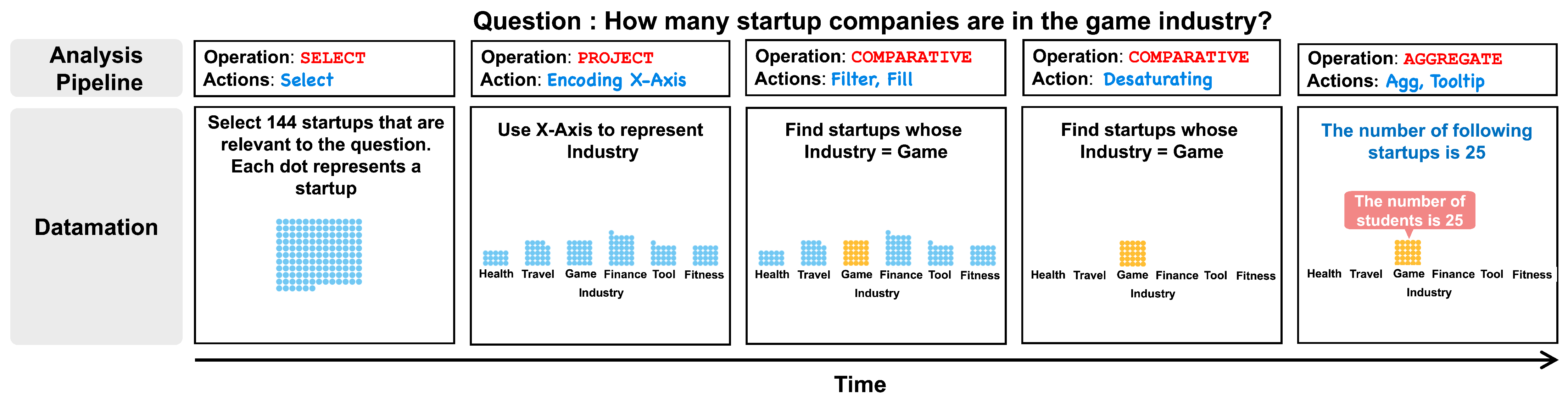
To address the above issues, in this paper, we introduce Datamator, an authoring tool developed for creating datamations. It incorporates a query analyzer to decompose a user’s data question into a sequence of analysis steps. The query analyzer demonstrates proficiency in processing queries that correspond to eight distinct categories of analytical operations or tasks (enumerated in
Table 1), either in isolation or in tandem. Subsequently, the generated analysis sequence guides the construction of a datamation, as the example shows in
Figure 1. The editor in Datamator showcases a preview of the generated datamation and affords users the ability to edit the generated analysis progression. The system also incorporates a deep knowledge editing network to help improve the model’s performance based on a very small amount of user feedback. Specifically, users can calibrate the decomposition results in the datamation editor and feed their modifications back into the decomposition network to improve it, with the improvement in the system being demonstrable even when only a single instance of user feedback is provided.
To the best of our knowledge, Datamator is the first authoring tool that has been developed to support datamation design and generation. Compared with existing tools for data animation creation, such as d3.js [
5] and DataParticles [
9], Datamator enables users to generate a datamation effortlessly by inputting a data question in natural language. Moreover, Datamator also affords users the ability to manipulate and refine the outcomes according to their specific preferences.
We evaluate Datamator via quantitative experiments on the performance of the query analyzer, a controlled user study to assess the effectiveness of the generated animations, and interviews with two expert users to verify the usability of the system.
The contributions of the paper are as follows:
System. We introduce an authoring tool that has been developed to support datamation design and generation. With this system, a user can easily generate an initial datamation by simply specifying a data query in natural language and then editing to refine it via rich interactions. The demo of the system can be found in the
Supplementary Materials.
Data Query Decomposition with Calibration. We introduce a data query analyzer that automatically converts a data query into a sequence of data analysis steps for generating a datamation. The model integrates a knowledge calibration network to support an efficient feedback mechanism.
Evaluation. We demonstrate the utility of Datamator via interviews with expert users and also show the performance of the data query analyzer via a quantitative evaluation. A controlled user study is also performed to verify the effectiveness of the generated datamations.
2. Related Work
Our discussion of related work covers the following most relevant areas: animation in data visualization, animation generation, and natural language interfaces (NLIs) for data visualization.
2.1. Animation in Data Visualization
Animation is the transformation of visual representations over time [
10]. In the field of data visualization, animations are often used for illustrating changes in data [
10], showing the transitions between visualization views [
11], highlighting relationships [
6,
12], and catching attention [
10]. It has also been used for supporting data analysis. Animation is a common technique to display the change in data mappings during data processing [
10,
11]. Communicating affects is viewed as a core spirit of animation design [
13], and has been introduced to the design of user interfaces, motion textures, and animated gifs to create affective systems or graphics [
14,
15,
16,
17,
18].
Some studies focus on using animation for highlighting [
19] or adding information shown in static plots to boost reading comprehension. Hypothetical outcome plots (HOPs) [
20], for example, augment static visualizations (e.g., error bars) with animated frames of random extracts from the underlying sampling distribution to convey uncertainty. Pu et al. [
1] presents the concept of datamation, aiming to assist users in comprehending intricate data analysis outcomes by animating the comprehensive analysis pipeline incrementally. This approach incorporates specific details obtained from the data analysis stage, enabling individuals to gain valuable insights and comprehend particular analysis results.
Following the idea of datamation [
1], we have developed Datamator, an intelligent authoring tool that supports datamation design and generation. We use unit visualization [
21] driven by a set of low-level data actions to illustrate datamations. The visualization uses captions to illustrate the semantics of each action and show the effects of the action via animated transitions of units.
2.2. Animation Generation
Creating animated visualization can be difficult and time-consuming. A range of tools have been introduced to help users create animated transitions. Comprehensive libraries, such as D3.js [
5] and VTK [
22], allow flexible creation and great expressiveness but require significant effort. Users need to write program code to calculate and assign values for low-level components, impairing the ease of use. High-level grammar can help balance the trade-off between flexibility and ease of use. Examples of this are Gemini and Gemini2 [
3,
23], which suggest and execute animated transitions between two Vega-Lite charts. While these grammar systems avoid imperative programming, it is still challenging for ordinary users with little programming background to operate them.
To provide a programming-free environment, existing approaches choose to either automatically generate animations using algorithms [
4,
24] or provide graphical interfaces for authoring [
7,
8,
25]. For instance, AutoClips [
4] takes a sequence of data facts (e.g., value, difference, proportion) as input and automatically generates a data video by selecting appropriate clips from an animation library. Data Animator [
8] and CAST [
7] allow users to create animations using a GUI. Users can create keyframes by importing Data Illustrator projects or selecting graphic components, and then design animations with timing parameters and data mappings between adjacent keyframes. While the aforementioned tools have eased the authoring process, creating a datamation is still not easy. Users have to prepare the keyframes or the data facts that are used to synthesize animations.
Unit visualization [
21,
26] facilitates smooth transitions between different visualization views. It presents data items as units and transforms them into various visual forms via animated transitions. Recent studies have utilized it for creating animated transitions [
7] and data stories [
27]. However, direct authoring of datamations, which requires careful consideration of the analysis pipeline and data flows, is not supported in these studies. Datamator leverages the flexibility of the unit visualization design to animate an analysis pipeline. It uses a set of low-level actions that precisely control the existence, appearance, and layout of the units to help with the datamation authoring.
2.3. NLIs for Data Visualization
Over the past decade, various NLIs for data visualization have been explored within the research community [
28,
29,
30,
31,
32,
33,
34,
35,
36,
37] and industry [
38,
39]. While NLIs provide flexibility in posing data-related questions, inherent characteristics of natural language such as ambiguity and under-specification make precisely understanding user intentions a challenging task. To overcome this obstacle, NLIs are designed to either guide users to provide a more concrete nature language query [
31,
35,
40] or untangle ambiguities in the query [
30,
36,
41] to capture user intent.
One approach to parsing natural language uses predefined grammar. Flowsense [
40] and Eviza [
31] depend on predefined grammar to capture query patterns. Articulate [
41] allows people to generate visualizations by deriving mappings between tasks and data attributes in user queries, and the translation of imprecise user specification is based on a natural language parser enriched with machine learning algorithms that can make reasoned decisions. ncNet [
42] builds a Transformer model to translate natural language queries to visualization specifications.
DataParticles [
9] is designed to author data stories with animated unit visualizations. In contrast to our system, DataParticles necessitates manual specification of each block of the data story rather than automatically organizing the entire one. Another recent approach that shares similarities with ours is Urania [
43], an NLI for exploratory data analysis that interprets the analysis process. Different from Urania, Datamator, to the best of our knowledge, is the first of its kind, providing an authoring tool designed to facilitate datamation design and generation. Our system enables users to effortlessly generate an initial datamation by specifying a data query in natural language and refining it through interactive editing. The model integrates a knowledge calibration network to enable the model output to be continuously updated based on user feedback.
3. System Overview
Within this section, we begin by outlining the prerequisites for the Datamator system’s design, subsequently providing an overview of its architecture. Lastly, we provide a concise overview of the definition of QDMR (Question Decomposition Meaning Representation) operations.
3.1. Design Requirements
The Datamator system was purposefully crafted to facilitate datamation authoring. Design requirements were derived from a review of the existing literature and consultations with domain experts. Below, we describe the critical requirements that motivated the design adopted in our work.
- R1
Facilitating generation driven by natural language. The explosion of large language models has led to the integration of natural language prompts in diverse application scenarios. This enables users to engage with the system in a more intuitive and effective manner [
44]. Therefore, our system should allow users to input queries about the data in natural language to facilitate datamation authoring.
- R2
Generating datamations that are easy to understand. The system should be able to generate coherent and comprehensible datamations, effectively demonstrating the transitions between any two consecutive steps in the analysis pipeline, thereby facilitating ease of comprehension and understanding
- R3
Learning from users’ feedback. The performance of language models is not always consistent. Therefore, to ensure the quality of the generated data, the system should allow users to refine the generated results. More importantly, the system should enable online learning that continuously improves the performance of the model based on users’ feedback.
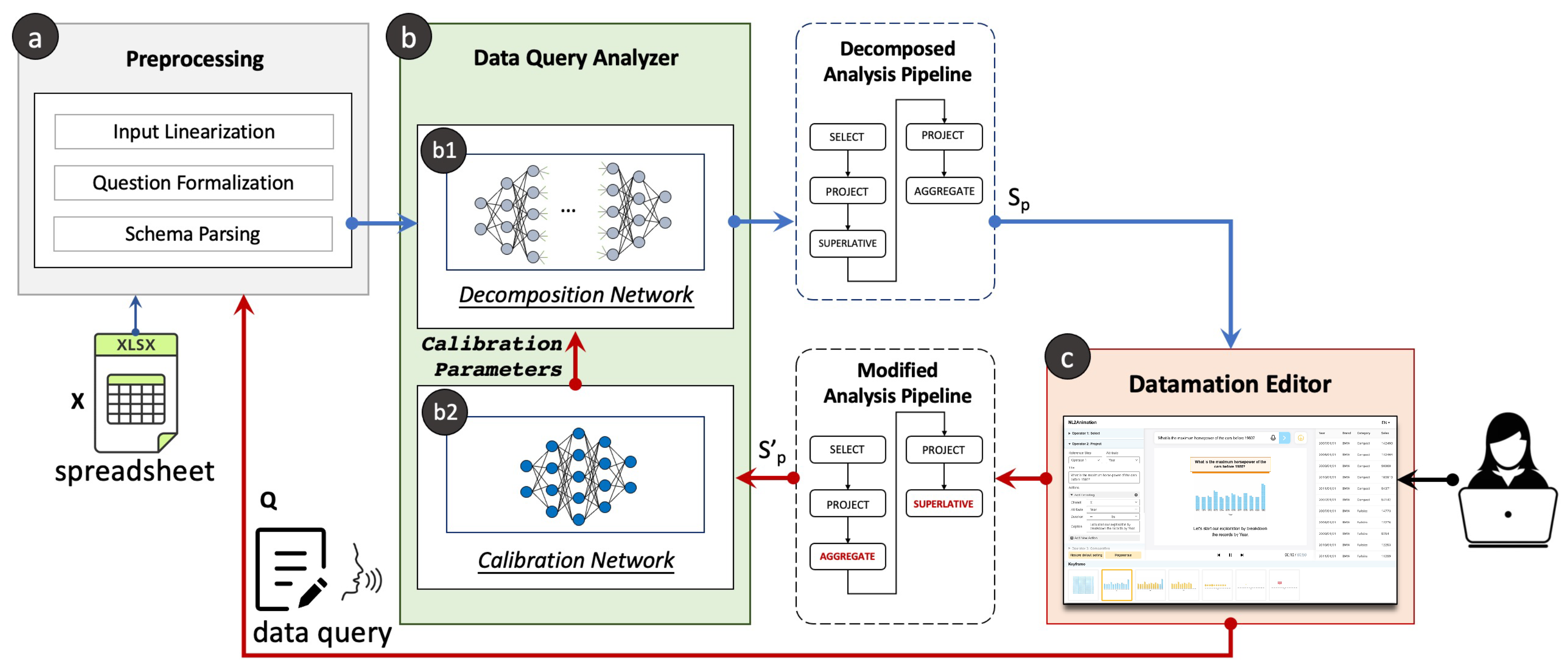
3.2. Architecture
The Datamator system was designed to address the aforementioned requirements.
Figure 2 illustrates the architecture of the system with its three main modules: (a) the
Preprocessing Module, (b) the
Data Query Analyzer, and (c) the
Datamation Editor.
In this system, when a user uploads a tabular dataset
X and inputs a natural language data query
q (
R1), the
Preprocessing Module (
Figure 2a) parses
X and
q into a word sequence
to facilitate subsequent calculations.
Then, the Data Query Analyzer translates the into a sequence of operations, where each operation indicates a simple calculation on the input data or the outputs of the previous operation(s). Ideally, executing these operations in order will provide the desired results regarding the data query (R2).
Lastly, each operation will drive Narrative Chart [
45] to generate a datamation. This datamation will be presented in the
Datamation Editor, allowing users to interactively remove, reorder, or add new operators to refine or correct the generated results. Real-time updates to the datamation will occur during the editing process. Users’ modifications will be recorded and fed back into the
Data Query Analyzer (
R3), where a pretrained deep knowledge editing network (
Figure 2(b2)) will utilize the modified sequence
to compute a set of parameters for fine-tuning the decomposition network.
3.3. QDMR
In our study, we utilize a set of operations known as QDMR operations, as introduced in [
46], to create pipelines for data analysis aimed at resolving analysis tasks. According to the definition given by Wolfson et al. [
46], each of these operations is responsible for querying the source data or analyzing the outputs of previous operations. We select eight types of QDMR operations employed to represent the data-related questions in Spider [
47], and use them to drive the datamation generation. For a description of each operation, including its formalization and detailed explanation, please refer to
Table 1.
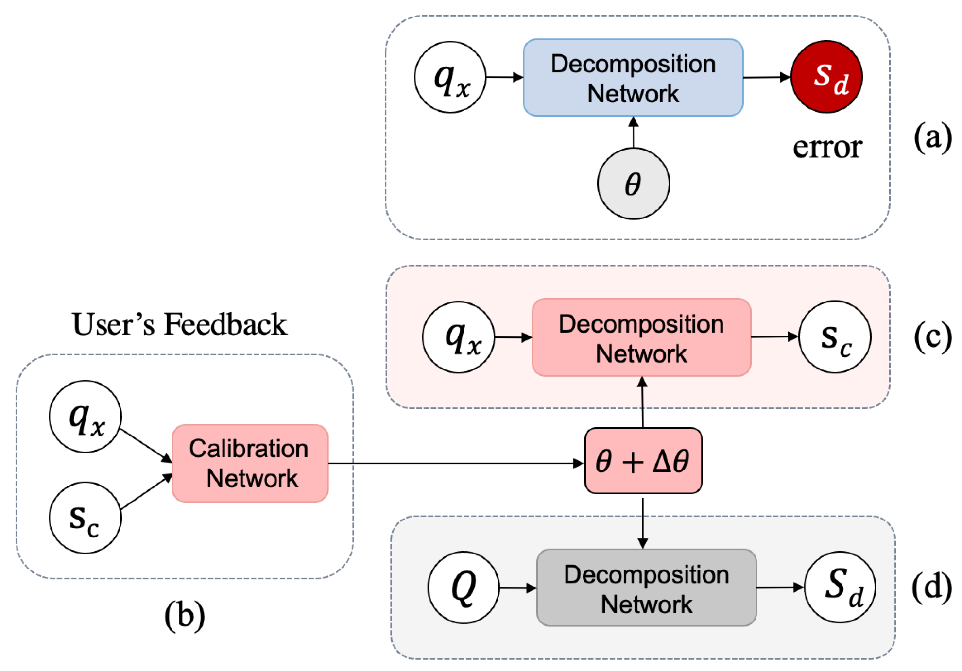
4. Data Query Analyzer
The
Data Query Analyzer was designed to resolve an input natural language data query in the context of a given dataset and decompose it into a sequence of data operations in the form of QDMR [
46]. Moreover, it has the ability to learn online, enabling the model output to be continuously updated based on user feedback. Specifically, as shown in
Figure 3, the design of the
Data Query Analyzer consists of two parts: the
decomposition network and the
calibration network. When the
decomposition network wrongly resolves a data query
into a problematic operation sequence
(
Figure 3a), the user can modify
to provide a calibrated sequence
. The
calibration network takes
as the input and produces a parameter calibration
for the
decomposition network (
Figure 3b). By adding
to the
decomposition network’s parameter
, it will be able to generate correct results given
or questions similar to
(
Figure 3c) without affecting the decomposition results of other questions (
Figure 3d). Next, we will introduce the technical details of the proposed
decomposition network and the feedback mechanism.
4.1. Decomposition Network ()
We adopted and fine-tuned the pretrained language model T5 [
48], which was developed based on the Transformer architecture [
49] to translate the input data query (and the corresponding data scheme) into a sequence of QDMR operations. T5 is used due to its many advantages shown in a wide range of translation-related tasks, such as natural language translation [
50], text2sql [
51], and text summarization [
52].
In general,
takes a preprocessed data query
as input, generating a sequence of operations:
where
indicates the
n-th operator. To encourage the output of
to be as identical as possible to the target analysis pipeline in our training corpus, the model was trained by using cross-entropy loss between the generated sequence and ground truth.
4.1.1. Training Corpus
We adopted the dataset introduced in [
53] to train our decomposition network. It was generated by manually annotating the Spider dataset [
47] based on the QDMR operations. In particular, it contains 7423 natural language data queries about a number of databases introduced in Spider. Each query corresponds to a sequence of manually annotated QDMR operations together with attributes such as the table and column names.
4.1.2. Implementation
Our decomposition network was implemented based on PyTorch (V1.12.1) [
54] and fine-tuned via 20 epochs with the gradient accumulation step as 16. The batch size was set to 8. The Adam [
55] optimizer was used and the learning rate was set to
. The overall training procedure took around 2 h on an Ubuntu server with a V100 GPU (Nvidia Corporation, Santa Clara, CA, USA).
4.2. Calibration Network ()
Although effective, the language model cannot guarantee accurate decomposition results, sometimes producing disordered or incomplete pipelines. User feedback can help address these issues, but accumulating enough feedback data for retraining or fine-tuning the deep learning model can be time-consuming, hindering quick responses. To solve this problem, we introduce an online post hoc knowledge calibration mechanism, as shown in
Figure 3, that uses feedback to modify the original decomposition network’s parameters (
) with a calibration (
) to produce desired results as suggested in user feedback.
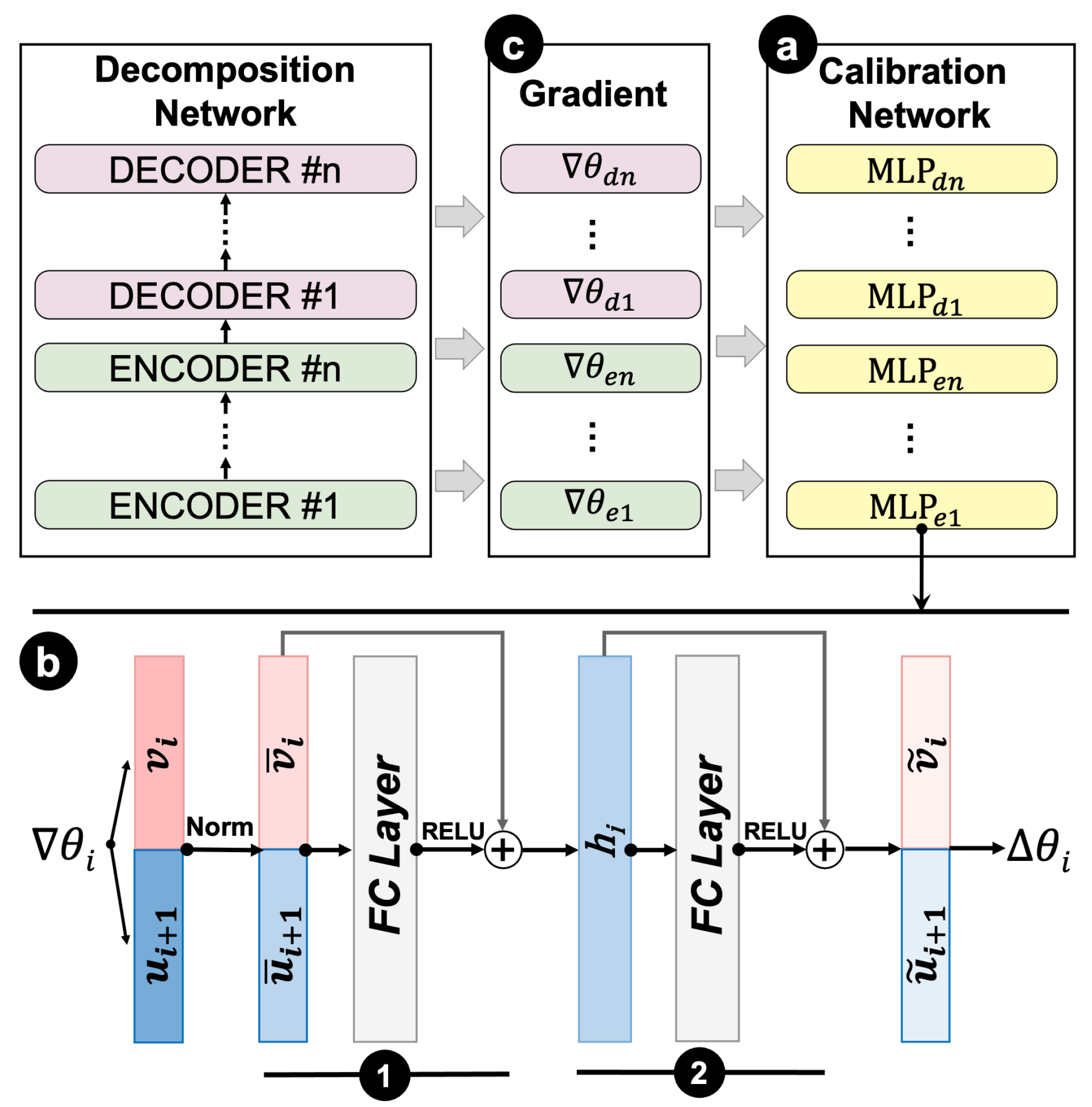
A deep knowledge calibration network (
Figure 4a), denoted as
, was designed to implement the above idea. It is a collection of auxiliary multilayer perceptrons (MLPs). We chose to use MLP in building the network due to its many advantages, such as excellent fault tolerance and strong adaptive and self-learning features. Each MLP is responsible for calibrating the parameters of a corresponding layer in the decomposition network toward the direction of making the model output the desired operation sequence
given by the users’ feedback regarding the data query
. We implemented the MLP with a single hidden layer and adopted skip connection [
56] to improve the performance and convergence of the MLP (
Figure 4b). The input of each MLP is the loss gradient
(
Figure 4c) of the decomposition network in the
i-th layer calculated when fine-tuning the decomposition network based on a user’s feedback
s under the parameter setting of
. The outputs of the MLP are the parameters
that calibrate
to make the decomposition network achieve a result that matches
. In particular, the loss gradient in the
i-th layer is calculated based on the chain rule during a back-propagation process when fine-tuning the decomposition network based on
. As the feedback
is processed token by token, the gradient is thus computed token by token as well. We can compute an averaged gradient that could be used as the input to the aforementioned MLP:
where
n is the total number of tokens in
, and
and
, respectively, indicate the loss gradient in the last
-th layer and the hidden vector in the current layer
i-th corresponding to the
j-th token in
. Equation (
2) is derived based on the chain rule of the back-propagation process. Details can be found in the book by Goodfellow et al. [
57] (Section 6.5).
However, the above gradient is a high-dimensional vector. Therefore, it requires even more parameters to directly train a network that maps such a gradient to a parameter calibration. There could be millions of parameters to tune when calibrating a large decomposition model like T5, making it very difficult to converge. To address this issue, we leverage the gradient decomposition strategy [
58] to reduce the number of parameters used in the calibration network. The idea is to directly map each gradient corresponding to a token
j in
into a parameter calibration
independently via an MLP, and then use the average as the overall calibration
:
where
and
are the output of an MLP that are derived based on
and
as follows:
where Equation (
5) indicates the computation of the two consecutive blocks in MLP as shown in
Figure 4(b1,b2). In particular, the first block takes a vector
that concats the normalized
and
(Equation (
4)) as the input and gradually transforms them into the final output. Here, we use ReLU as the activation function. The second block takes the previous output
to perform a similar computation as shown in
Figure 4(b2). The final result
is split into the desired
and
(Equation (
6)).
Finally, we update the parameter
in the
i-th layer of the decomposition network to
as follows:
4.2.1. Loss Function
The above calibration network is trained using one feedback
a time. The training samples consist of various data queries
, their original decomposition results
from the decomposition network, and the desired results
are given by users. In each round of training, the following loss function is minimized:
where
is the cross-entropy loss designed to make sure that the calibration is efficient. It estimates the similarity between the decomposition result after calibration and the desired results
:
where
estimates the probability of the model output token
aligned with the desired result
, after calibrating the decomposition network based on
.
In Equation (
8),
is the Kullback–Leibler divergence, which is used to ensure that there is minimal impact on the data queries
, which do not need to be adjusted. It estimates the similarity of the output distributions of decomposition network
over
before and after calibration:
Intuitively, minimizing ensures that the feedback will be accepted by the decomposition network and minimizing will prevent our calibration from affecting the decomposition results beyond the feedback.
4.2.2. Training Corpus
We prepared a corpus with 12 k data samples to train the calibration network. Each sample is a triplet that consists of a data query
, the corresponding problematic decomposition result
, and a correction
, denoted as
. To collect these data samples, we deliberately trained a decomposition model with low accuracy based on T5 [
48] by only using a small subset of training samples randomly selected from the aforementioned corpus. We tested the entire datasets on the model and selected the incorrect outputs
together with the corresponding data query
and ground truth
for our calibration dataset. We iteratively performed the above training and testing process by using a different subset of samples to train the model every time. As a result, a total of 12,227 unique training samples were collected, which covered two types of decomposition errors: missing operations (3340 samples) and disordered sequences (4693 samples).
4.2.3. Implementation
The calibration network was also implemented in PyTorch. We chose Adam [
55] as the optimizer and set the learning rate as
. The overall training procedure took around 16 h on an Ubuntu server with one NVIDIA V100 GPU.
5. Damation Generation
In this section, we first briefly describe Narrative Chart [
45] and then explain how we use it to generate datamations.
5.1. Narrative Chart
Narrative Chart [
45] is an open-source visualization library specialized for authoring charts that facilitate data storytelling. It utilizes an action-driven grammar that empowers users to precisely define the layout and characteristics of a chart using a sequence of actions. These actions serve as the building blocks for users to exert fine-grained control over the chart’s design, ensuring the desired representation is achieved. In the framework of Narrative Chart, three distinct types of low-level actions are supported, which are used to manipulate data, visual encoding, and annotations associated with the chart.
Data actions encompass a range of operations similar to SQL actions, such as select, filter, and aggregate. They are responsible for processing the data, manipulating them according to the specified criteria.
Visualization actions, in contrast, are responsible for manipulating the visual aspects of the data representation. Users can add, modify, and delete the encoding channels that determine how the data are visually represented in charts. The available visual channels differ depending on the type of chart being used. For instance, in line charts, control can be exerted over the
X-axis,
Y-axis, and color. In scatterplots, control is extended to the
X-axis,
Y-axis, color, and the size of the data points. In this work, we follow the design of Pu et al. [
1], which uses unit visualization to create datamations. Yet, our method can be readily extended to other forms of visualization, requiring only minor adjustments.
Lastly, annotation actions are employed to manipulate annotations associated with the charts. In Narrative Charts, there are 13 distinct types of annotations that can be utilized. For instance, one can alter the filling color to “Fill” a focal unit, or make the non-focal units invisible by “Desaturating” them. These actions allow users to enhance the visual representation and communicate additional information through annotations in the chart.
In our work, we used Narrative Chart to generate datamations, motivated by three key aspects. First, the utilization of Narrative Charts affords us the capacity to exercise precise control over the multitude of visual elements encompassing the chart. This grants us a wide range of freedom in the process of crafting a datamation, empowering us to exercise detailed control over its creation. Secondly, the design of an action-driven framework matches well with datamation, enabling a systematic and progressive manipulation of visual charts that facilitates the interpretation of analysis outcomes. Lastly, Narrative Chart possesses the capability to depict the execution process of action sequences through animation, thus intrinsically constituting a datamation.
5.2. Action Presets
In light of the aforementioned low-level actions, we generated a datamation by converting each data analysis pipeline into a series of actions. Specifically, we devised a set of low-level actions for each QDMR operation, with the objective of elucidating the meaning of the operation. The selection of actions was guided by two fundamental principles. Firstly, the presentations of operations should provide a comprehensive and explicit depiction of the data manipulation process, ensuring that the way data are altered is adequately conveyed. Secondly, the actions associated with each operation were carefully designed to be succinct and to minimize any potential interference with unrelated elements. This approach aims to mitigate the likelihood of conflicts arising within the sequence of actions. After several rounds of design and in-group discussion, we ultimately determined a set of valid actions for each operation, which are detailed in
Table 2.
In terms of organization and transition, we devised a structured sequence that ensures coherence and clarity throughout the data manipulation process. Specifically, for the low-level actions of a QDMR operation, our approach involves initially executing data actions to update the displayed data items within the view. By performing data actions first, we ensure that the data reflect the desired
Subsequently, we proceeded to systematically adjust the encoding methods and incorporate annotations. This was achieved through the utilization of visualization and annotation actions in subsequent stages. These actions were carefully chosen and implemented to enhance the understanding and interpretation of the data, providing additional context and insights to the viewers.
By organizing the actions in this manner, we established a logical progression from updating the data items to refining their encoding and incorporating annotations. In Narrative Chart, this sequential arrangement allows for a smooth transition between the different stages of the data analysis pipeline, ensuring a coherent and comprehensive representation of the data manipulation process.
5.3. Generation
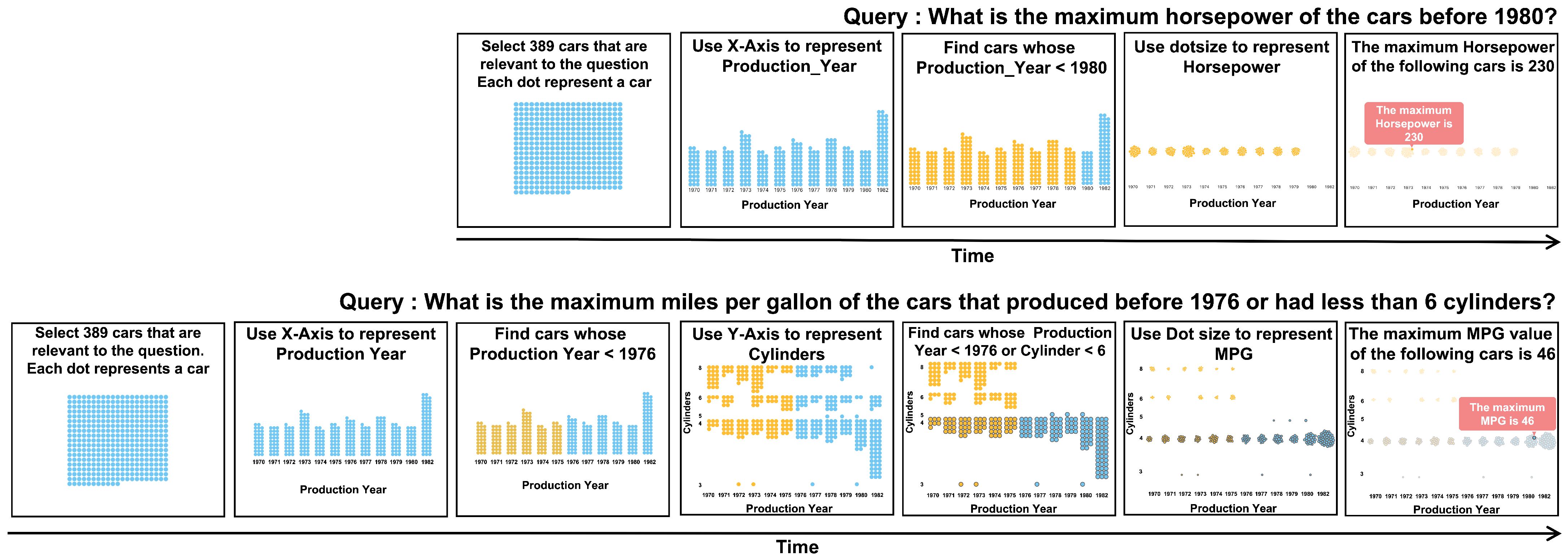
Finally, we transformed operations in a data analysis pipeline into the aforementioned actions, resulting in an action sequence that will be fed into Narrative Chart to render a datamation. To facilitate the communication of the meaning of each QDMR operation, we added a caption for each operation, utilizing a predefined template that takes into account the corresponding low-level actions. The caption provides a description of the data modifications and visual mappings involved in the operation. It is prominently displayed atop each view and undergoes progressive updates throughout the animation process. For example, the project operation can be described as “use size/color/x-axis to present/encode [attribute]” and the comparative operation is described as “Find records whose [condition]”.
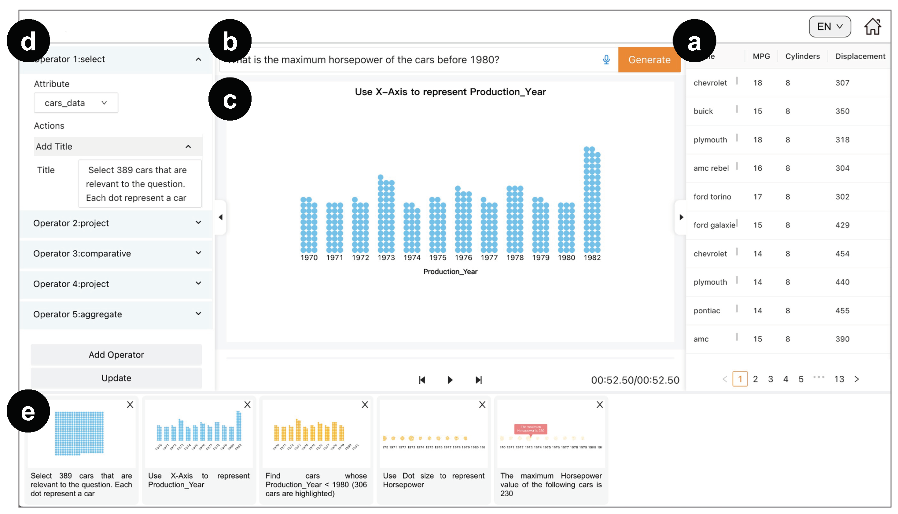
6. User Interface and Interactions
The
datamation editor was designed to translate the QDMR operation sequence into a datamation and help users refine it, and eventually acquire a datamation with correct analysis results and coherent animations. In particular, when a user uploads a spreadsheet into the system, the raw data are displayed in the data panel (
Figure 5a), which allows users to easily access the data during the authoring process. The user can preview the data and communicate an analysis task of interest by typing a data query into the input box (
Figure 5b).
By resolving the query input, the underlying system will generate an operation sequence to create an initial datamation. The datamation is displayed in the center of the interface (
Figure 5c) with playback buttons at the bottom to control the datamation. Meanwhile, the key-frames of datamation, which correspond to QDMR operations, are arranged and visualized (
Figure 5e) to illustrate the intermediate analysis result of each operation. Users can drag to rearrange their orders when necessary. Once modified, the order of the operations shown in the configuration panel (
Figure 5d) will be updated accordingly. Through the configuration panel, users can edit each of the QDMR operations or add new operations in the analysis pipeline. In particular, users can modify an operation’s parameter and the corresponding actions used to update the unit visualization to fully control the design of the datamation. Finally, by clicking the update button, users’ modifications can be fed back into the calibration network to update the decomposition model.
7. Evaluation
We first estimated the decomposition and calibration network via quantitative experiments and verified the effectiveness of the generated datamation via a controlled user study. Finally, expert interviews were performed to verify the usability of our system.
7.1. Quantitative Evaluation
We evaluated the performance of the decomposition network based on the corpus introduced in
Section 4.1. In particular, we computed the rate of exact match between the decomposition results and ground truth, and calculated the averaged SARI scores [
59] of the decomposition results. The SARI score is commonly used in text simplification tasks; it evaluates the goodness of words that are added, deleted, and kept in the simplified sentences. Two baseline models introduced in [
46] were used for comparison. Specifically, we employed two different baselines for our study. The first baseline, denoted as
, utilized a sequence-to-sequence neural network featuring a five-layer LSTM encoder and cross-attention. The second baseline, referred to as
, employed a distinct sequence-to-sequence model that integrated a copy mechanism [
60] in order to handle queries that were previously unseen. We trained these models based on the entire corpus and tested their performance via a validation set containing 30% of data that were randomly selected from the corpus, with the data queries being replaced by similar but different questions. The evaluation results are summarized in
Table 3.
We measured the effectiveness of the calibration network using the
success rate and the
retain rate. Here, the
success rate was defined as the percentage of the incorrect decomposition results
that could be successfully amended by the calibration network via the feedback
among all the incorrect results. The
retain rate was defined as the percentage of correct decomposition results that remain correct after updating the model’s parameters via calibrations. We performed the experiment based on the above decomposition network
and calculated the
success rate and the
retain rate based on the dataset introduced in
Section 4.2. In particular, we used 80% of the data to train the calibration network and used the remaining 20% for validation. As a result, the success rate was 76.61% and the retain rate was 91.79%.
7.2. User Study
To verify that the datamations generated by Datamator can effectively convey insights, we reperformed the experiment (Study-I) described in [
1]. In particular, 40 lab students (18 males and 22 females, mean age 25.1, SD 1.77) from a design college with a background in visual communication design were invited to take part in our study. They were divided into two groups (i.e.,
), where each group had 20 members. A between-subject study was performed, in which two groups of people were asked to answer the same question by exploring the data via datamations generated by Datamator and the static charts (the last frames of the datamations), respectively. The study sessions lasted about an hour and participants were compensated with USD 15.
Procedure and Tasks During the study, the participants were asked to resolve a paradox as shown in
Figure 6: it seems people with a higher education level (Ph.D.) have a lower average income (
Figure 6c), but when we take the work fields into consideration, we obtain the opposite result, i.e., people with a higher education level have a higher income in both industry and academia (
Figure 6d). The truth is that people with a lower education level tended to work in industry, where a higher salary is usually paid, and these people outnumbered the people with a higher education level by a large margin. We visualized the two opposite sides of the paradox in a pair of datamations generated by Datamator as illustrated in
Figure 6a,b. We showed these datamations to the participants in
and showed the last frames as static charts to the participants in
. These participants were asked to read these visual representations carefully and then select the truth of the paradox from eight potential choices (seven were distractors) provided by us (refer to [
1] for details about the choices). Our hypothesis was that
tends to have higher accuracy than
.
Results As a result, only 40% of participants in correctly found out the truth of the paradox, while 75% of participants in did so. A chi-squared test showed that performed significantly better ( = 5.01, p < 0.05, one-tailed) than in the experiment. The gap between and was 35%, which was a sizeable difference with Cohen’s h-value equal to 0.68.
Discussion This outcome serves to provide empirical validation for our hypothesis. Specifically, the participants enrolled in Group exhibited a notable trend towards achieving enhanced levels of accuracy when compared to their counterparts within Group . Building upon the implications of this finding, we conducted a validation of the efficacy of the datamation generated by Datamator in successfully imparting insightful information. Furthermore, these findings confirm the effectiveness of the visualization actions we designed for a variety of analytical operations.
7.3. Interview with Experts
Two expert users were interviewed separately. The first expert () was a researcher in data visualization who had published over 10 papers in IEEE Transactions on Visualization and Computer Graphics (TVCG). The second expert worked for an IT consulting company, and their job was to analyze customer data using tools like PowerBI and Tableau. During the interview, the experts were asked to create datamations using Datamator based on datasets selected from the Spider corpus. They tried a number of data queries and the corresponding datamations were created. Their operations, generation results, and comments were recorded in detail. Each interview lasted for about 1.5 h.
Interview Feedback Due to page limitations, we restrict our report to summarizing only some major feedback:
Data query decomposition. All the experts felt that starting a datamation generation process by inputting a natural language query was a “good idea that greatly reduces the technique barriers”. mentioned that to“resolve a natural language question into data operations is useful for users with little data analysis background”. said that “although [the system] cannot always provide a comprehensive [decomposition] result, it is always a good start by pointing out the potential directions to solve problem”.
The authoring tool. All experts were able to successfully generate datamations based on our system. They were quite excited when seeing an analysis pipeline shown in an animation. “This is my first time to see such kind of tool”, said
and he continued “this feature is very nice, I can hardly generate this kind of animations using the tools that I have ever used”.
believed that “showing the analysis via an animation is very intuitive” and “it is a good strategy for interpreting an analysis result”. At the same time, both
and
praised the interactive authoring functionalities supported in our system and even constructively suggested a number of new features such as “recommend proper operations for users to choose when creating an analysis pipeline (
)” and “provide more visualization styles (
)”. In addition,
believed that our feedback mechanism is useful as “it could help the underlying model to reduce errors in the next time”.
also mentioned that “[with the help of feedback] I can make the result better and better”. Two datamations authored by experts are shown in
Figure 7.
Discussion The feedback from experts indicates that they found our datamation compelling for conveying analysis pipelines. The interactive authoring features were well received, with experts suggesting enhancements like guided operations and varied visualization styles. The feedback mechanism was acknowledged as valuable for the iterative improvement of results. Overall, the experts’ responses affirm the system’s effectiveness in intuitive datamation authoring, underscoring its potential for practice.
8. Conclusions, Limitations, and Future Work
In this paper, we presented Datamator, developed for creating datamations. The quantitative evaluation shows that the decomposition network can understand the users’ questions and resolve them in a sequence of steps. Furthermore, the calibration network can precisely fine-tune the parameter of the decomposition network’s parameters to produce desired results as suggested in user feedback. Through our user study, we validated the data generated by Datamator and eventually showed that they can effectively convey insights. This validation was underscored by the outcomes of expert interviews, which consistently appraised Datamator’s proficiency in generating datamations that elucidate intricate data analysis procedures. The tool’s editing functionality also proved to be adept in rectifying machine-generated results, as evidenced by the study’s outcomes.
Still, based on the interview feedback and observations from the study, there are a number of limitations of our work that are worth studying in the future.
A limitation of the decomposition model stems from the fact that both the decomposition and calibration networks rely on pretrained models. Consequently, these networks exhibit restricted capabilities when confronted with difficult queries and queries that are very different from the training data. This constraint arises due to the finite scope of the training data used to pretrain the networks. One potential solution to address this limitation is to encompass transfer learning or continual fine-tuning on diverse datasets. A robust adaptation mechanism could enable the networks to gradually incorporate knowledge from new data instances, thereby enhancing their adaptability to unseen scenarios.
Another limitation pertains to the current calibration network’s inability to holistically enhance the performance of the decomposition network. This limitation is rooted in the limited interplay between the two networks, preventing synergistic refinements that could optimize the decomposition process based on both input data and user feedback. The design of the calibration network is intended to be a temporary solution used to optimize the performance of the model during the accumulation of new training samples. To improve the overall performance, the development of a dynamic knowledge accumulation mechanism is proposed. Such a mechanism would systematically gather new samples from user feedback and iteratively adapt the decomposition network, culminating in a more refined and effective model.
The last limitation centers around the scalability of the visualization design, specifically when dealing with multidimensional data [
61], time-series data [
62], and large amounts of data. To surmount this limitation, interactive visualizations that allow users to zoom, filter, and interact could be included. This way, users could focus on specific parts of the dataset without overwhelming the visualization with excessive data points. It would also be possible to interactively modify the attributes of the data being visualized.
Author Contributions
Conceptualization, Y.G., D.S., N.C. and D.W.; methodology, Y.G., D.S., N.C. and D.W.; software, Y.G., Y.W. and L.C.; validation, Y.G. and L.C.; formal analysis, Y.G. and L.C.; investigation, Y.G.; resources, Y.G.; data curation, Y.G. and L.C.; writing—original draft preparation, Y.G.; writing—review and editing, N.C. and D.W.; visualization, Y.G., Y.W. and L.C.; supervision, Q.C., N.C. and D.W.; project administration, N.C.; funding acquisition, Q.C., N.C. and D.W. All authors have read and agreed to the published version of the manuscript.
Funding
This research was funded by NSFC 62061136003, NSFC 62002267, NSF Shanghai 23ZR1464700, NSFC 62072338, and the Deutsche Forschungsgemeinschaft (DFG, German Research Foundation) 449742818.
Institutional Review Board Statement
Not applicable.
Informed Consent Statement
Not applicable.
Data Availability Statement
Not applicable.
Conflicts of Interest
The authors declare no conflict of interest.
References
- Pu, X.; Kross, S.; Hofman, J.M.; Goldstein, D.G. Datamations: Animated Explanations of Data Analysis Pipelines. In Proceedings of the CHI Conference on Human Factors in Computing Systems, Yokohama, Japan, 8–13 May 2021; pp. 1–14. [Google Scholar]
- Ge, T.; Zhao, Y.; Lee, B.; Ren, D.; Chen, B.; Wang, Y. Canis: A High-Level Language for Data-Driven Chart Animations. Comput. Graph. Forum 2020, 39, 607–617. [Google Scholar] [CrossRef]
- Kim, Y.; Heer, J. Gemini 2: Generating Keyframe-Oriented Animated Transitions between Statistical Graphics. In Proceedings of the IEEE Visualization Conference, New Orleans, LA, USA, 24–29 October 2021; pp. 201–205. [Google Scholar]
- Shi, D.; Sun, F.; Xu, X.; Lan, X.; Gotz, D.; Cao, N. AutoClips: An Automatic Approach to Video Generation from Data Facts. In Comput. Graph. Forum 2021, 40, 495–505. [Google Scholar] [CrossRef]
- Bostock, M.; Ogievetsky, V.; Heer, J. D3 Data-Driven Documents. IEEE Trans. Vis. Comput. Graph. 2011, 17, 2301–2309. [Google Scholar] [CrossRef]
- Amini, F.; Riche, N.H.; Lee, B.; Leboe-McGowan, J.; Irani, P. Hooked on data videos: Assessing the effect of animation and pictographs on viewer engagement. In Proceedings of the AVI, Castiglione della Pescaia, Italy, 1 June 2018; pp. 1–9. [Google Scholar]
- Ge, T.; Lee, B.; Wang, Y. CAST: Authoring Data-Driven Chart Animations. In Proceedings of the CHI Conference on Human Factors in Computing Systems, Yokohama, Japan, 8–13 May 2021; pp. 1–15. [Google Scholar]
- Thompson, J.R.; Liu, Z.; Stasko, J. Data Animator: Authoring Expressive Animated Data Graphics. In Proceedings of the CHI Conference on Human Factors in Computing Systems, Yokohama, Japan, 8–13 May 2021; pp. 1–18. [Google Scholar]
- Cao, Y.; E, J.L.; Chen, Z.; Xia, H. DataParticles: Block-based and Language-oriented Authoring of Animated Unit Visualizations. In Proceedings of the CHI Conference on Human Factors in Computing Systems, Hamburg, Germany, 23–28 April 2023; pp. 1–15. [Google Scholar]
- Robertson, G.; Fernandez, R.; Fisher, D.; Lee, B.; Stasko, J. Effectiveness of Animation in Trend Visualization. IEEE Trans. Vis. Comput. Graph. 2008, 14, 1325–1332. [Google Scholar] [CrossRef] [PubMed]
- Heer, J.; Robertson, G. Animated Transitions in Statistical Data Graphics. IEEE Trans. Vis. Comput. Graph. 2007, 13, 1240–1247. [Google Scholar] [CrossRef] [PubMed]
- Fisher, D. Animation for Visualization: Opportunities and Drawbacks. Beautiful Vis. 2010, 19, 329–352. [Google Scholar]
- Lasseter, J. Principles of traditional animation applied to 3D computer animation. Annu. Conf. Comput. Graph. Interact. Tech. 1987, 21, 35–44. [Google Scholar]
- Bakhshi, S.; Shamma, D.A.; Kennedy, L.; Song, Y.; De Juan, P.; Kaye, J. Fast, cheap, and good: Why animated GIFs engage us. In Proceedings of the CHI Conference on Human FACTORS in Computing Systems, San Jose, CA, USA, 7–12 May 2016; pp. 575–586. [Google Scholar]
- Feng, C.; Bartram, L.; Riecke, B.E. Evaluating affective features of 3D motionscapes. In Proceedings of the ACM Symposium on Applied Perception (SAP), Vancouver, BC, Canada, 8–9 August 2014; pp. 23–30. [Google Scholar]
- Lockyer, M.; Bartram, L. Affective motion textures. Comput. Graph. 2012, 36, 776–790. [Google Scholar] [CrossRef]
- Shi, Y.; Yan, X.; Ma, X.; Lou, Y.; Cao, N. Designing emotional expressions of conversational states for voice assistants: Modality and engagement. In Proceedings of the Extended Abstracts of the CHI Conference on Human Factors in Computing Systems, Montreal, QC, Canada, 21–26 April 2018; pp. 1–6. [Google Scholar]
- Yang, Z.; Zhang, Y.; Luo, J. Human-centered emotion recognition in animated gifs. In Proceedings of the 2019 IEEE International Conference on Multimedia and Expo, Shanghai, China, 8–12 July 2019; pp. 1090–1095. [Google Scholar]
- Ware, C.; Bobrow, R.J. Motion to Support Rapid Interactive Queries on Node–Link Diagrams. ACM Trans. Appl. Percept. 2004, 1, 3–18. [Google Scholar] [CrossRef]
- Hullman, J.; Resnick, P.; Adar, E. Hypothetical outcome plots outperform error bars and violin plots for inferences about reliability of variable ordering. PLoS ONE 2015, 10, e0142444. [Google Scholar] [CrossRef]
- Drucker, S.; Fernandez, R. A Unifying Framework for Animated and Interactive Unit Visualizations; Microsoft Research: Redmond, WA, USA, 2015. [Google Scholar]
- Schroeder, W.; Martin, K.; Lorensen, B. The Visualization Toolkit, 4th ed.; Kitware: Clifton Park, NY, USA, 2006. [Google Scholar]
- Kim, Y.; Heer, J. Gemini: A Grammar and Recommender System for Animated Transitions in Statistical Graphics. IEEE Trans. Vis. Comput. Graph. 2020, 27, 485–494. [Google Scholar] [CrossRef]
- Li, W.; Wang, Y.; Huang, H.; Cui, W.; Zhang, H.; Qu, H.; Zhang, D. AniVis: Generating Animated Transitions between Statistical Charts with a Tree Model. arXiv 2021, arXiv:2106.14313. [Google Scholar]
- Amini, F.; Riche, N.H.; Lee, B.; Monroy-Hernandez, A.; Irani, P. Authoring Data-Driven Videos with Dataclips. IEEE Trans. Vis. Comput. Graph. 2016, 23, 501–510. [Google Scholar] [CrossRef] [PubMed]
- Park, D.; Drucker, S.M.; Fernandez, R.; Elmqvist, N. Atom: A grammar for unit visualizations. IEEE Trans. Vis. Comput. Graph. 2017, 24, 3032–3043. [Google Scholar] [CrossRef] [PubMed]
- Lu, J.; Chen, W.; Ye, H.; Wang, J.; Mei, H.; Gu, Y.; Wu, Y.; Zhang, X.L.; Ma, K.L. Automatic Generation of Unit Visualization-based Scrollytelling for Impromptu Data Facts Delivery. In Proceedings of the IEEE PacificVis, Tianjin, China, 19–21 April 2021; pp. 21–30. [Google Scholar]
- Liu, C.; Han, Y.; Jiang, R.; Yuan, X. Advisor: Automatic Visualization Answer for Natural-Language Question on Tabular Data. In Proceedings of the IEEE Pacific Visualization Symposium, Tianjin, China, 19–21 April 2021; pp. 11–20. [Google Scholar]
- Wang, Y.; Hou, Z.; Shen, L.; Wu, T.; Wang, J.; Huang, H.; Zhang, H.; Zhang, D. Towards Natural Language-Based Visualization Authoring. IEEE Trans. Vis. Comput. Graph. 2022, 29, 1222–1232. [Google Scholar] [CrossRef]
- Gao, T.; Dontcheva, M.; Adar, E.; Liu, Z.; Karahalios, K.G. DataTone: Managing Ambiguity in Natural Language Interfaces for Data Visualization. In Proceedings of the User Interface Software and Technology, Charlotte, NC, USA, 11–15 November 2015; pp. 489–500. [Google Scholar]
- Setlur, V.; Battersby, S.E.; Tory, M.; Gossweiler, R.; Chang, A.X. Eviza: A Natural Language Interface for Visual Analysis. In Proceedings of the User Interface Software and Technology, Tokyo, Japan, 16–19 October 2016; pp. 365–377. [Google Scholar]
- Aurisano, J.; Kumar, A.; Gonzalez, A.; Leigh, J.; DiEugenio, B.; Johnson, A. Articulate2: Toward a Conversational Interface for Visual Data Exploration. In Proceedings of the IEEE Visualization, Baltimore, MD, USA, 23–28 October 2016. [Google Scholar]
- Narechania, A.; Srinivasan, A.; Stasko, J. NL4DV: A Toolkit for Generating Analytic Specifications for Data Visualization from Natural Language Queries. IEEE Trans. Vis. Comput. Graph. 2021, 27, 369–379. [Google Scholar] [CrossRef]
- Hoque, E.; Setlur, V.; Tory, M.; Dykeman, I. Applying Pragmatics Principles for Interaction with Visual Analytics. IEEE Trans. Vis. Comput. Graph. 2017, 24, 309–318. [Google Scholar] [CrossRef]
- Cox, K.; Grinter, R.E.; Hibino, S.L.; Jagadeesan, L.J.; Mantilla, D. A Multi-Modal Natural Language Interface to an Information Visualization Environment. Int. J. Speech Technol. 2001, 4, 297–314. [Google Scholar] [CrossRef]
- Wen, Z.; Zhou, M.X.; Aggarwal, V. An Optimization-based Approach to Dynamic Visual Context Management. In Proceedings of the IEEE InfoVis, Minneapolis, MN, USA, 23–25 October 2005; pp. 187–194. [Google Scholar]
- Srinivasan, A.; Lee, B.; Stasko, J.T. Interweaving multimodal interaction with flexible unit visualizations for data exploration. IEEE Trans. Vis. Comput. Graph. 2021, 27, 3519–3533. [Google Scholar] [CrossRef]
- Microsoft Power BI Q&A. Available online: https://powerbi.microsoft.com (accessed on 11 January 2022).
- Tableau Ask Data. Available online: https://www.tableau.com/products/new-features/ask-data (accessed on 11 December 2021).
- Yu, B.; Silva, C.T. Flowsense: A Natural Language Interface for Visual Data Exploration within a Dataflow System. IEEE Trans. Vis. Comput. Graph. 2019, 26, 1–11. [Google Scholar] [CrossRef]
- Sun, Y.; Leigh, J.; Johnson, A.; Lee, S. Articulate: A Semi-Automated Model for Translating Natural Language Queries into Meaningful Visualizations. In Smart Graphics, Proceedings of the 10th International Symposium on Smart Graphics, Banff, AB, Canada, 24–26 June 2010; Springer: Berlin/Heidelberg, Germany, 2010; pp. 184–195. [Google Scholar]
- Luo, Y.; Tang, N.; Li, G.; Tang, J.; Chai, C.; Qin, X. Natural Language to Visualization by Neural Machine Translation. IEEE Trans. Vis. Comput. Graph. 2022, 28, 217–226. [Google Scholar] [CrossRef] [PubMed]
- Guo, Y.; Cao, N.; Qi, X.; Li, H.; Shi, D.; Zhang, J.; Chen, Q.; Weiskopf, D. Urania: Visualizing Data Analysis Pipelines for Natural Language-Based Data Exploration. arXiv 2023, arXiv:2306.07760. [Google Scholar]
- Shen, L.; Shen, E.; Luo, Y.; Yang, X.; Hu, X.; Zhang, X.; Tai, Z.; Wang, J. Towards natural language interfaces for data visualization: A survey. IEEE Trans. Vis. Comput. Graph. 2022, 29, 3121–3144. [Google Scholar] [CrossRef]
- IDvXLab. Narrative Chart. 2022. Available online: https://github.com/narchart/narrative-chart (accessed on 12 January 2023).
- Wolfson, T.; Geva, M.; Gupta, A.; Gardner, M.; Goldberg, Y.; Deutch, D.; Berant, J. Break it down: A question understanding benchmark. Trans. Assoc. Comput. Linguist. 2020, 8, 183–198. [Google Scholar] [CrossRef]
- Yu, T.; Zhang, R.; Yang, K.; Yasunaga, M.; Wang, D.; Li, Z.; Ma, J.; Li, I.; Yao, Q.; Roman, S.; et al. Spider: A Large-Scale Human-Labeled Dataset for Complex and Cross-Domain Semantic Parsing and Text-to-SQL Task. In Proceedings of the Empirical Methods in Natural Language Processing, Brussels, Belgium, 31 October–4 November 2018; pp. 3911–3921. [Google Scholar]
- Wolf, T.; Debut, L.; Sanh, V.; Chaumond, J.; Delangue, C.; Moi, A.; Cistac, P.; Rault, T.; Louf, R.; Funtowicz, M.; et al. Transformers: State-of-the-Art Natural Language Processing. In Proceedings of the Empirical Methods in Natural Language Processing, Online, 16–20 November 2020; pp. 38–45. [Google Scholar]
- Vaswani, A.; Shazeer, N.; Parmar, N.; Uszkoreit, J.; Jones, L.; Gomez, A.N.; Kaiser, Ł.; Polosukhin, I. Attention is All You Need. Adv. Neural Inf. Process. Syst. 2017, 30, 5998–6008. [Google Scholar]
- Vaswani, A.; Bengio, S.; Brevdo, E.; Chollet, F.; Gomez, A.N.; Gouws, S.; Jones, L.; Kaiser, Ł.; Kalchbrenner, N.; Parmar, N.; et al. Tensor2tensor for Neural Machine Translation. arXiv 2018, arXiv:1803.07416. [Google Scholar]
- Wang, B.; Shin, R.; Liu, X.; Polozov, O.; Richardson, M. RAT-SQL: Relation-Aware Schema Encoding and Linking for Text-to-SQL Parsers. In Proceedings of the Annual Meeting of the Association for Computational Linguistics, Online, 6–8 July 2020; pp. 7567–7578. [Google Scholar]
- Liu, Y.; Lapata, M. Text Summarization with Pretrained Encoders. arXiv 2019, arXiv:1908.08345. [Google Scholar]
- Saparina, I.; Osokin, A. SPARQLing Database Queries from Intermediate Question Decompositions. In Proceedings of the Empirical Methods in Natural Language Processing. Punta Cana, Dominican Republic, 7–11 November 2021; pp. 8984–8998. [Google Scholar]
- Paszke, A.; Gross, S.; Massa, F.; Lerer, A.; Bradbury, J.; Chanan, G.; Killeen, T.; Lin, Z.; Gimelshein, N.; Antiga, L.; et al. Pytorch: An imperative style, high-performance deep learning library. Adv. Neural Inf. Process. Syst. 2019, 32, 8026–8037. [Google Scholar]
- Kingma, D.P.; Ba, J. Adam: A method for stochastic optimization. arXiv 2014, arXiv:1412.6980. [Google Scholar]
- He, K.; Zhang, X.; Ren, S.; Sun, J. Deep Residual Learning for Image Recognition. In Proceedings of the CVPR, Las Vegas, NV, USA, 26 June–1 July 2016; pp. 770–778. [Google Scholar]
- Goodfellow, I.; Bengio, Y.; Courville, A. Deep Learning; MIT Press: Cambridge, MA, USA, 2016; Available online: http://www.deeplearningbook.org (accessed on 5 January 2023).
- Mitchell, E.; Lin, C.; Bosselut, A.; Finn, C.; Manning, C.D. Fast model editing at scale. arXiv 2021, arXiv:2110.11309. [Google Scholar]
- Xu, W.; Napoles, C.; Pavlick, E.; Chen, Q.; Callison-Burch, C. Optimizing Statistical Machine Translation for Text Simplification. Trans. Assoc. Comput. Linguist. 2016, 4, 401–415. [Google Scholar] [CrossRef]
- Gu, J.; Lu, Z.; Li, H.; Li, V.O. Incorporating Copying Mechanism in Sequence-to-Sequence Learning. In Proceedings of the Annual Meeting of the Association for Computational Linguistics, Berlin, Germany, 7–12 August 2016; pp. 1631–1640. [Google Scholar]
- Zhao, Y.; Ge, L.; Xie, H.; Bai, G.; Zhang, Z.; Wei, Q.; Lin, Y.; Zhao, F. Astf: Visual abstractions of time-varying patterns in radio signals. IEEE Trans. Vis. Comput. Graph. 2022, 29, 214–224. [Google Scholar] [CrossRef] [PubMed]
- Zhao, Y.; Lv, S.; Long, W.; Fan, Y.; Yuan, J.; Jiang, H.; Zhao, F. Malicious webshell family dataset for webshell multi-classification research. Visual Inform. 2023. [Google Scholar] [CrossRef]
| Disclaimer/Publisher’s Note: The statements, opinions and data contained in all publications are solely those of the individual author(s) and contributor(s) and not of MDPI and/or the editor(s). MDPI and/or the editor(s) disclaim responsibility for any injury to people or property resulting from any ideas, methods, instructions or products referred to in the content. |
© 2023 by the authors. Licensee MDPI, Basel, Switzerland. This article is an open access article distributed under the terms and conditions of the Creative Commons Attribution (CC BY) license (https://creativecommons.org/licenses/by/4.0/).


 ,
, 


