Article

COVID-19: Worldwide Profiles during the First 250 Days

1
NOVA Information Management School (NOVA IMS), Universidade NOVA de Lisboa, 1070-312 Lisbon, Portugal
2
Department of Chemical Engineering, CIEPQPF, Universidade de Coimbra, 3030-790 Coimbra, Portugal
*
Author to whom correspondence should be addressed.
Appl. Sci. 2021, 11(8), 3400; https://doi.org/10.3390/app11083400
Submission received: 16 March 2021 / Revised: 7 April 2021 / Accepted: 8 April 2021 / Published: 10 April 2021

Abstract

:
The present COVID-19 pandemic is happening in a strongly interconnected world. This interconnection explains why it became universal in such a short period of time and why it stimulated the creation of a large amount of relevant open data. In this paper, we use data science tools to explore this open data from the moment the pandemic began and across the first 250 days of prevalence before vaccination started. The use of unsupervised machine learning techniques allowed us to identify three clusters of countries and territories with similar profiles of standardized COVID-19 time dynamics. Although countries and territories in the three clusters share some characteristics, their composition is not homogenous. All these clusters contain countries from different geographies and with different development levels. The use of descriptive statistics and data visualization techniques enabled the description and understanding of where and how COVID-19 was impacting. Some interesting extracted features are discussed and suggestions for future research in this area are also presented.

1. Introduction

COVID-19 has posed tremendous health challenges worldwide due to its high level of contagion and quick geographical spread. The interconnected world assisted in disseminating the virus at such a speed, achieving coverage of countries which led the World Health Organization (WHO) to declare COVID-19 as a pandemic in early 2020. In just 12 months, as of 31 December 2020, there were 82.8 million confirmed infections and 1.8 million deaths across the world [1,2].
The lessons learned from previous epidemics and pandemics, such as the 1918 influenza pandemic, severe acute respiratory syndrome (SARS) during 2002–2003, or H1N1 influenza virus (swine flu) during 2008–2010, showed that public health measures had a significant influence on the impact of the disease, in particular in terms of overall mortality. Voluntary and mandated quarantine, ban of mass gatherings and large events, closing schools and workplaces, and isolation of households/regions were some of the measures applied by governments to reduce diseases’ mortality [1,2,3,4,5]. Pandemics and epidemics also showed that such diseases can have a significant toll on the economies [1,3,4,5,6,7]. For this reason, countries and regions have to decide which mitigation measures to implement and when to apply them in order to avoid reaching peaks that would overwhelm healthcare services but also to define measures acting as moderators of the disease negative effects on the economy, a balance that is not easy to reach [1]. The imposition of the above-mentioned restrictions and lockdowns generated a heavy load of economic consequences in many countries, triggering a dramatic increase in unemployment rates as well as company closures. That has been followed by social repercussions, thus reinforcing the requirement for an understanding of the evolution of this pandemic, namely in terms of eventual different country profiles evolving across the planet [2,3,4,5].
From a comprehensive diagnosis perspective, the use of data science and machine learning methods and techniques constitutes an opportunity for research to achieve this purpose. Specifically, open data being shared by reputable organizations allow for almost real-time access to detailed data across the world and enable imperative data collection and analysis to be performed in order to advance with the necessary understanding and decision-making [4,6,7].
In addition, data science techniques can be powerful tools to understand the phenomena at hand, allowing for the development of support policies and facilitating decisions that can optimize resources, reach a proper balance between health and economy, and ultimately also save lives. To investigate the evolution of COVID-19 across time (a dynamic view) instead of doing it in a particular moment (a static photograph) is necessary because there have been differences in the time profiles of reported cases and deaths as well as the way the pandemic has progressed along.
As expected, the impact of the pandemic has led many entities and people to invest substantial resources in doing research on COVID-19 related topics. However, bibliographic search conducted in Google Scholar, Scopus, and Web of Science databases showed a small number of studies (seven) related to the comparative analysis of the pandemic impact among countries or regions in the world. As presented in Table 1, these studies differed in terms of techniques employed as well as time periods, data sources, and regions studied. Three out of these seven studies tried to focus on a more global perspective, studying as many countries as possible [8,9,10] and two considered a temporal analysis, comparing the disease evaluation’s similarity over time among different countries [4,11]. However, these latter studies were geographically circumscribed to twelve European countries and to the United States, respectively.
Considering the motivations presented above, together with the lack of previous studies that have examined the temporal evolution of the pandemic on a global scale as a way to characterize and understand the similarities among countries, this work aims to test the following hypotheses with regard to the country-wise time profile evolutions of COVID-19:
  • H1: Are there different types of behavior among countries/territories?
  • H1a: If so, how many behavior clusters can be identified?
  • H1b: If so, are there any significant features associated with such clusters?
  • H1c: If so, what are the characteristics of countries/territories in each cluster?
In terms of research methodologies, we used data science techniques, such as data visualizations and statistical tests, to do what in data mining is often called data characterization and data description, i.e., summarizing data by class and comparing classes [14]. We also employed time series and unsupervised learning machine learning-based techniques, namely to group countries by their similarity in terms of COVID-19 cases and deaths time profiles. Additionally, we carried out some preliminary analysis of the relationships between cases and deaths caused by COVID-19 and some countries’ development indicators.
The structure of this paper reflects the methodology employed during the corresponding research process, often known as CRISP-DM (CRoss-Industry Standard Process for Data Mining) [15]. Therefore, Section 2 describes the data used, including data sources, data transformation, and data analyses techniques, which under the CRISP-DM framework would correspond to the data understanding, data preparation, and modeling phases. Results are presented and discussed in Section 3 (equivalent to the CRISP-DM evaluation phase). Section 4 presents the study main conclusions. Finally, limitations of the study and recommendations for future research are presented in Section 5.

2. Materials and Methods

This section discusses data sources, data quality, data preparation, and employed analysis techniques.
All analyses were performed in Python, using the packages that are typically applied in data science, namely NumPy [16], Pandas [17], MatplotLib [18], and Seaborn [19], as well as others detailed in a later section.

2.1. Data Understanding

Two public datasets were used in this study. The European Centre for Disease Prevention and Control (ECDC) historical data on the daily number of new reported COVID-19 cases and deaths worldwide [20] were used for COVID-19 data. The 2019 values of the Human Development Index (HDI) dataset provided by the United Nations Development Program (UNDP) [21] were used to assess countries’ development indicators. HDI is a geometric mean of three key dimensions of human development: long and healthy life; being knowledgeable; and having a decent standard of living. Information on the structure and the original collection of data for both datasets can be seen on the respective websites.
As shown in Table 2, the ECDC dataset presented some data quality issues, as follows:
  • The variables geoId, countryterritoryCode, popData2019, and Cumulative_number_for_14_days_of_COVID-19_cases_per_100,000 have missing values.
  • The minimum values of the variables cases and deaths are negative, something that by definition is not possible.
Table 2 also shows that COVID-19 data are available for 336 different dates (variable dateRep) and that the data are also available for 214 countries and territories (variable countriesAndTerritories). Nevertheless, as shown in Figure 1, the number of observations (dates with data) varied significantly across countries, reflecting the different times it took for the COVID-19 pandemic to reach each particular country, but with the clear majority of them having over 200 days of accumulated time evolution for registered COVID-19 cases.
The ECDC database also had some incorrect ISO 3166-1 alpha-3 country and territory codes [22] (variable countryterrritoryCode), namely Namibia and Taiwan’s codes. While the first was missing, the second was coded as “CNG1925” instead of “TWN”.
As shown in Table 3, apart from some outliers in the Gross National Income Per Capita variable (for instance, the standard deviation portrays a larger number than the mean, which underlines significant levels of inequality among countries), no major data quality issues were found in the UNDP dataset used.

2.2. Data Preparation

Several transformations were applied to the original data in order to correct the identified quality issues and prepare the modeling data. In terms of the ECDC dataset, the following transformations were initially applied:
  • Correction of the ISO 3166 alpha 3 codes in the Namibia and Taiwan observations
  • Removal of observations with missing values in the countriesAndTerritories, which were related to two small territories (Wallis and Futuna and “Cases on an international conveyance Japan”)
  • Replacement of the character “_” by a space in countries’ names (variable countriesAndTerritories)
After these initial transformations, the dataset was sorted by country and date. Since the dataset did not include cumulative sums per day or measures normalized by the population, additional variables were created:
  • total_cases: Total cumulative cases
  • total_deaths: Total cumulative deaths
  • cases_100K: Daily cases normalized by 100,000 of the population
  • deaths_100K: Daily deaths normalized by 100,000 of the population
  • total_cases_100K: Total cumulative cases normalized by 100,000 of the population
  • total_deaths_100K: Total cumulative deaths normalized by 100,000 of the population
  • t: Number of days since the first case was identified (0 being the first day)
All normalizations were made using the following formula:
v a r i a b l e p o p D a t a 2019 × 100,000
As presented in Figure 1 and detailed in the previous subsection, since the virus did not affect all countries at the same time, it was also decided to follow the approach of Alvarez et al. (2020) to synchronize the scaled data with respect to time. Nonetheless, to have a broader panoramic view and since more data were available, it was decided this time to study a broader period, larger than the first 100 days of the pandemic. As detailed in Table 4, even after removing observations with missing values, the number of daily observations available in the country profile time series ranged from 19 to 335. A more detailed analysis revealed that a cut-off point equal to the second quartile (261 days) would remove 96 countries from the study, whereas a cut-off point equal to the first quartile (255 days) would remove 49 countries from the study. A cut-off point at 250 days would remove just 24 countries. Thus, it was decided to use 250 days as the cut-off point, i.e. we focused on the countries that had at least 250 days of pandemic prevalence, and therefore enough pandemic time maturity for the corresponding time profiles. Based on this criterion, the following 24 countries were removed from further studies: Anguilla; Bonaire, Saint Eustatius, and Saba; Botswana; British Virgin Islands; Burundi; Comoros; Falkland Islands (Malvinas); Guinea Bissau; Lesotho; Malawi; Mali; Marshall Islands; Northern Mariana Islands; Puerto Rico; Saint Kitts and Nevis; Sao Tome and Principe; Sierra Leone; Sint Maarten; Solomon Islands; South Sudan; Tajikistan; Vanuatu; Western Sahara; and Yemen. Hence, out of the initial list of 214 countries, 188 were kept for further analysis.

2.3. Modeling

2.3.1. Analysis of Temporal Sequences

To understand the temporal differences between countries at the level of cases and deaths, the version of the package DTAIDistance [23] of the algorithm Dynamic Time Warping (DTW) was applied. DTW is an algorithm aimed to measure the similarity between time series. Due to countries’ population differences, cases, and deaths, similarities were measured using the daily values normalized to 100,000 of the population, and over the time synchronized profiles of this scaled and standardized variable.
Although hierarchical clustering is a valuable type of algorithm to visualize hierarchical groups in small datasets, it rarely provides good results in larger datasets. Thus, it was decided to use the implementation of the package PyClustering [24] of the K-medoids algorithm for clustering countries based on squares matrices, where both rows and columns were the countries and the values the DTW distances. K-medoids is a variation of the K-means algorithm which instead of defining the clusters’ centers arbitrarily does so based on data points. Whereas in K-means the sum of the squared Euclidean distances of the data points is used to define the number of clusters, in K-medoids the sum of dissimilarities of data points is used. As such, K-medoids is better suited to measure the distances between data points, and it is more robust to tackle noise or outliers [14,25,26].
The silhouette method was used to identify the number of relevant clusters (k). The silhouette value measures how similar a data point is to its cluster as compared with other clusters. The silhouette value ranges from −1 to +1, where +1 indicates that the data point is well matched to its cluster and −1 indicates the opposite. The average silhouette value, also known as the silhouette score, provides an indication of the cluster validity [27].
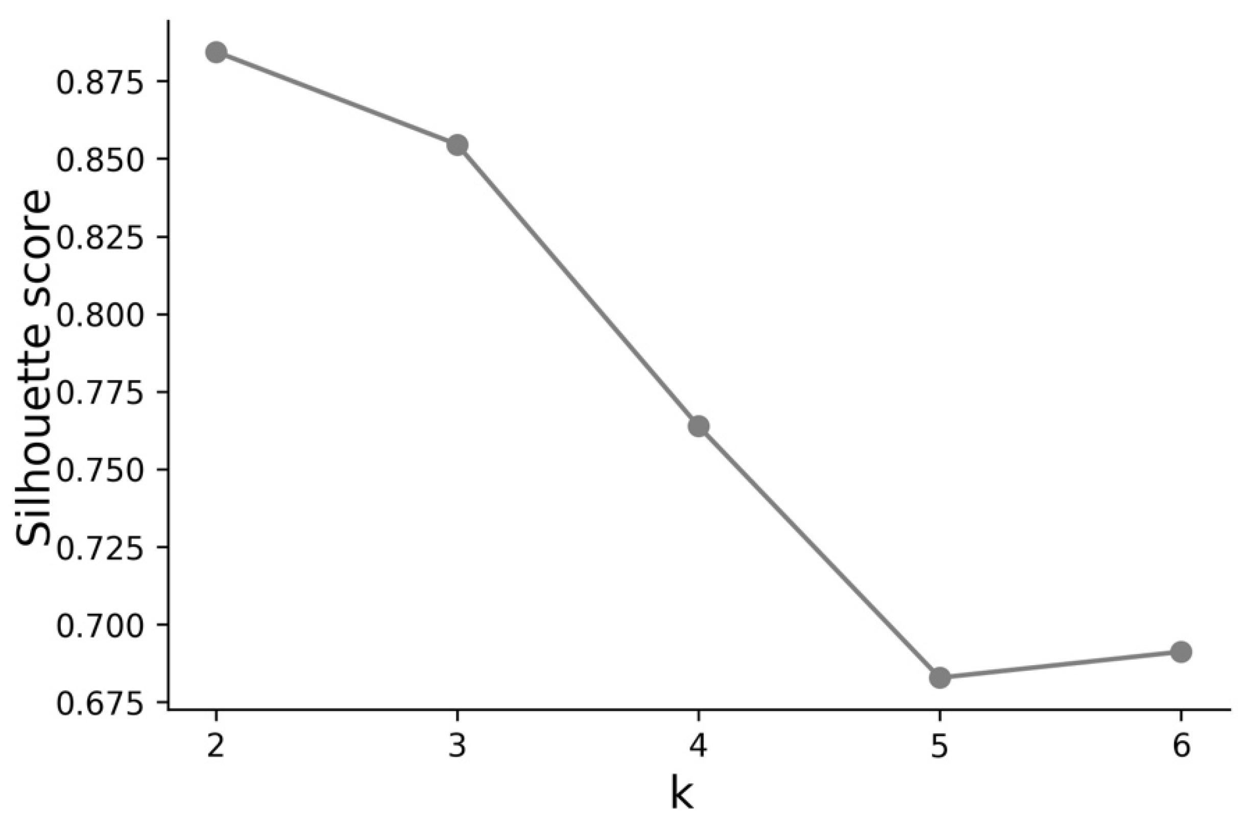
In the silhouette score analysis, as depicted in Figure 2, k = 2 presented the best results concerning the clustering of COVID-19 cases time profiles. However, the score for k = 3 was also very close to k = 2. While for k = 2 the two clusters were composed, respectively, by 123 and 65 countries, for k = 3 the three clusters were composed, respectively, by 51, 57, and 80 countries. Based on this observation, it was decided to classify the countries into three clusters in terms of their standardized and synchronized time profiles of COVID-19 cases.
The Kruskal–Wallis test was conducted using the module “stats” from the package SciPy [28] to examine the difference in total cases by 100,000 of the population per cluster. The results (statistic = 124.695, p < 0.001) show that the total number of cases mean values differed between the clusters. The post-hoc analysis, conducted with the package scikit-posthocs [29], showed that the total number of cases’ mean values also differed per each tuple of clusters. The p-value between Clusters A and B was 0.015, between Clusters A and C was less than 0.001, and it was also less than 0.001 between Clusters B and C.
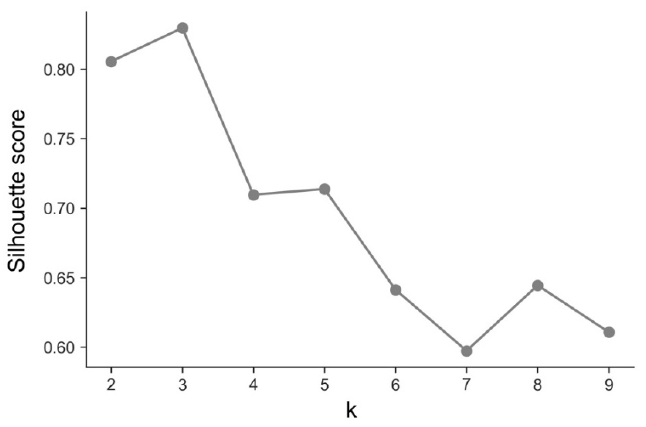
Regarding the clustering of deaths scaled and synchronized time profiles, in the silhouette score analysis, as depicted in Figure 3, k = 3 presented the best results, thus we grouped the countries in terms of standardized and synchronized deaths time profiles in three clusters, with 52, 61, and 75 countries, respectively.
As was also done for the cases time profiles clustering, the Kruskal–Wallis test was conducted to examine the difference in total deaths by 100,000 of the population per cluster. The results (statistic = 124.462, p < 0.001) reveal that the total number of deaths mean values differed across the clusters. The post-hoc analysis showed that the total number of deaths mean values also differed per each tuple of clusters. The p-value between Clusters A and B was 0.005. As happened with the clustering of the time profiles for COVID-19 cases, the p-value between Clusters A and C as well as between Clusters B and C was found to be less than 0.001.

2.3.2. Analysis at Day 250

To analyze the relationship between cases and deaths caused by COVID-19 and countries’ development metrics, UNDP indicators were merged with Day 250 (t = 249) of the ECDC dataset. However, the UNDP dataset does not include data for all countries and territories available in the ECDC dataset. For that reason, the resulting dataset did not include data for another 24 countries and territories: Aruba; Bermuda; Cayman Islands; Curacao; Faroe Islands; French Polynesia; Gibraltar; Greenland; Guam; Guernsey; Holy See (Vatican City); Isle of Man; Jersey; Kosovo; Moldova; Monaco; Montserrat; New Caledonia; San Marino; Somalia; Syria; Taiwan; Turks and Caicos Islands; and United States Virgin Islands. Hitherto, in the comparison with development indicators, a final list of 164 countries was considered for analysis.

3. Results and Discussion

This section presents the data visualizations, tables, and other results of the conducted analyses together with a discussion of obtained results. The first subsection presents results related to COVID-19 cases. The second subsection addresses results related to COVID-19 deaths. The third subsection undertakes a discussion confronting cases vs. deaths. The fourth subsection considers results related to the analysis of the cases and deaths vs. the countries’ development indicators.

3.1. Cases—Temporal Sequence

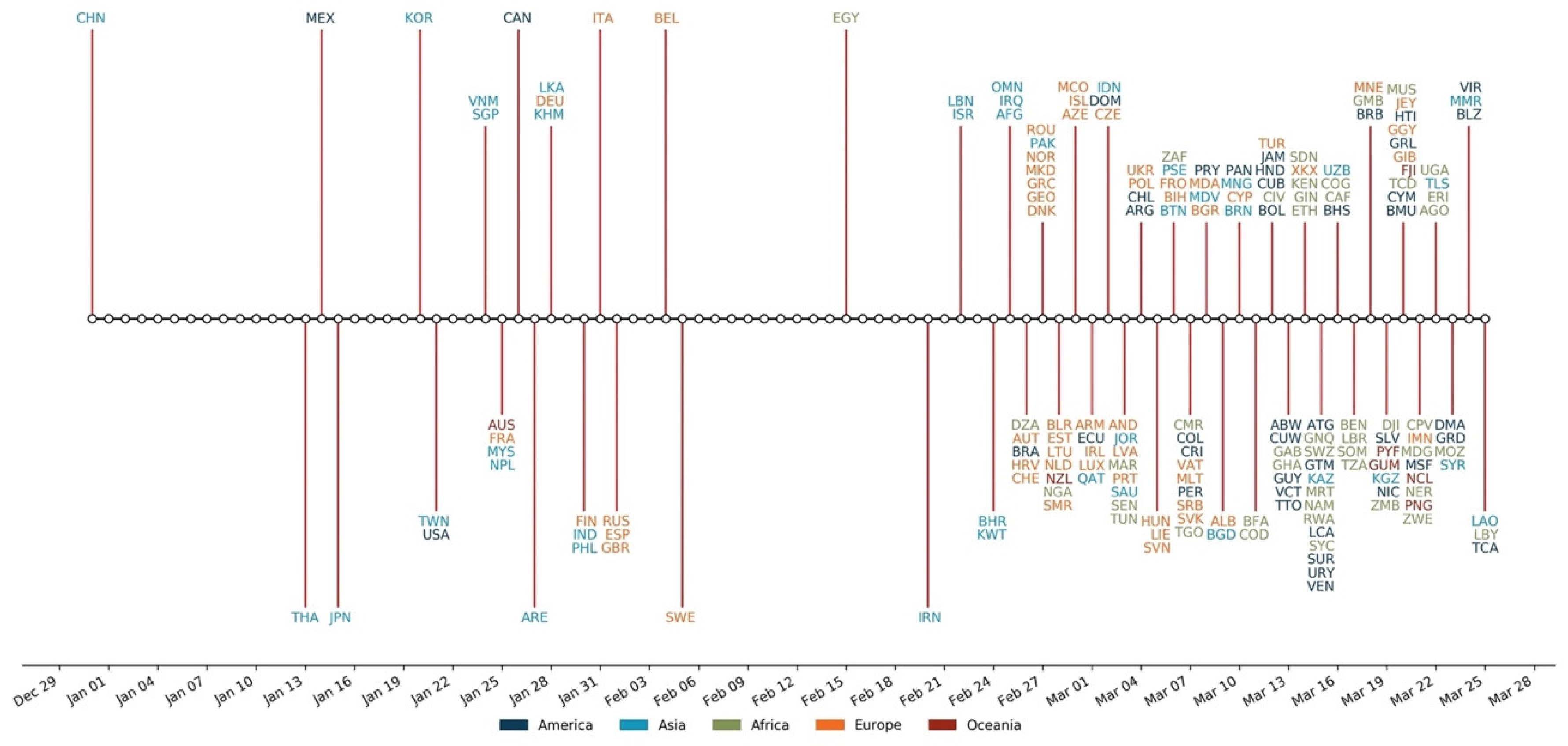
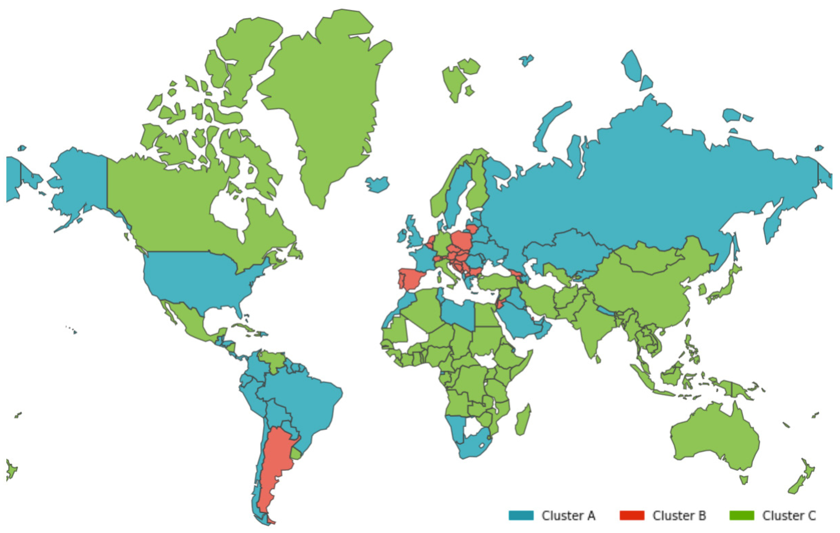
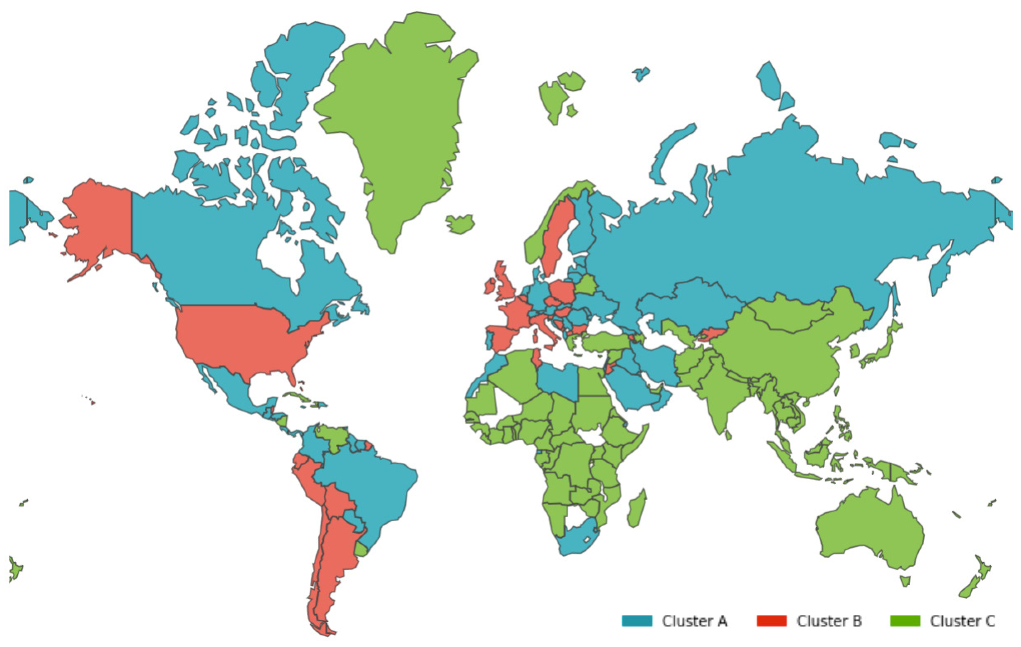
As presented in Figure 4, the coronavirus did not spread at the same time to all countries. It took from 31 December 2019 to 25 March 2020 (86 days) for cases to be identified in all 188 countries under study. Although the first case was reported on 29 December 2019, it was not until the end of February 2020 that its spread appears to have accelerated across the world. Before that time, more than 50% of the countries reporting cases were from Asia. Interestingly, whereas on all other continents only 8–15% of countries reported prior cases, 35% of Asian countries had already identified cases in their population. Although the first cases were mostly reported in Asia, they quickly spread across other continents. This dissemination across continents can be noticeably seen in Figure 5, categorized by cluster, as discussed below.
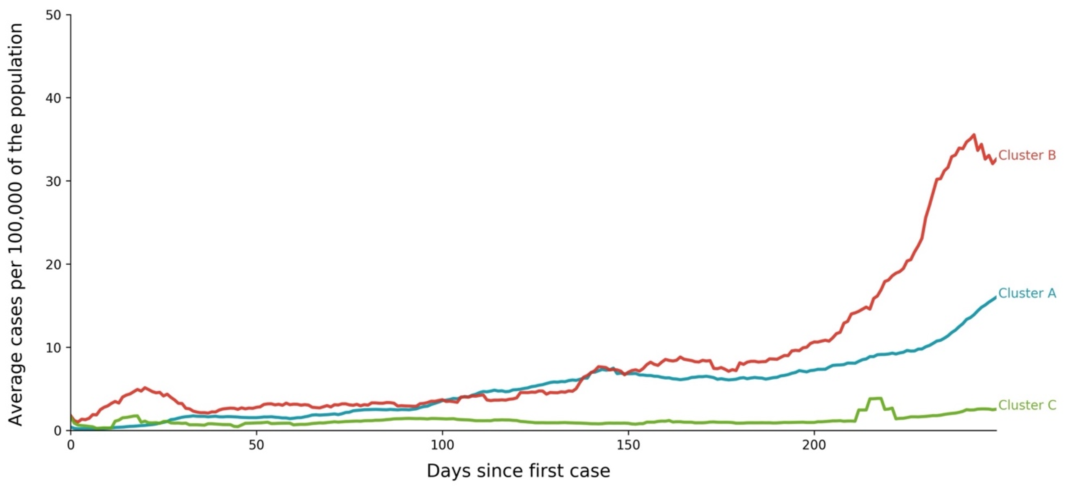
As clearly shown in Figure 6 and Figure 7 and Table 5, the three clusters of country profiles revealed distinct patterns, in terms of both values and shapes, as illustrated by the average profile computed for each cluster:
  • Cluster A corresponds to a two-wave profile, with the first peak at around Day 140, and values reaching 7 cases per 100,000 of the population. The second wave started around Day 240 and seems not to have peaked yet at Day 250. The daily average number of cases per 100,000 of the population was now 10.919. This cluster comprises countries from a large variety of geographies and sizes, with an average population of 23 million people.
  • Cluster B average profile indicates incidences that seem to have peaked only at around Day 240, at values above 35 cases per 100,000 of the population. This profile shows a different time constant and slower temporal dynamic with small slope linear growth until around Day 220, followed only after that by what seems to be exponential growth that has only recently reached a peak. The daily average number of cases per 100,000 of the population was 45.808. Except for Argentina, this cluster is composed mostly of small countries, much of them from Europe. The average population for these countries is seven million people.
  • Cluster C average time profiles correspond to countries with new cases that have always been below 6 cases per 100,000 of the population and clearly showing smaller numbers of people with confirmed infection (either less testing, less incidence, or both). The first small peak was reached around Days 30–40, and a second small peak seems to take place at around Day 115, but more recently an apparent third peak started at Day 240. The daily average number of cases per 100,000 of the population was 0.923. Similar to Cluster A, this cluster is also composed of countries from a large variety of geographies and sizes. However, this is the cluster with the highest average population, 66 million people.
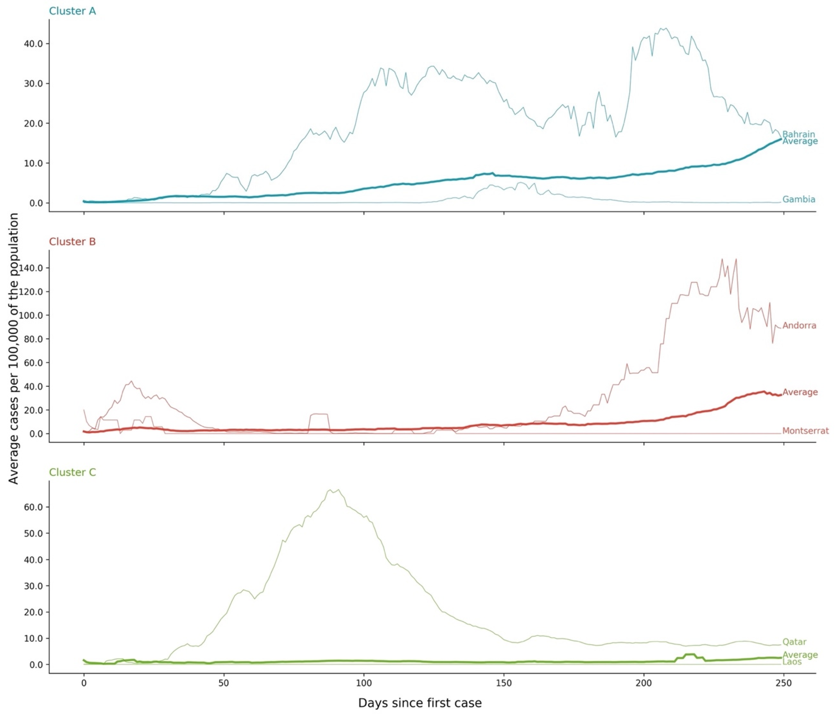
As illustrated in Figure 7, by the temporal sequence of cases of the countries from each cluster with the lowest and the highest number of cases by 100,000 of the population at Day 250, although sharing common features there is yet a perceptible difference among countries in each cluster. For example, in Cluster A it is possible to see that Equatorial Guinea did not report cases on all days and that, when it did, it created some spikes. However, it is also possible to note the difference in amplitude and shape per cluster. From the three clusters, at Day 250, Cluster C countries had the lowest average number of reported cases. Conversely, Cluster B countries present the highest average number of reported cases.
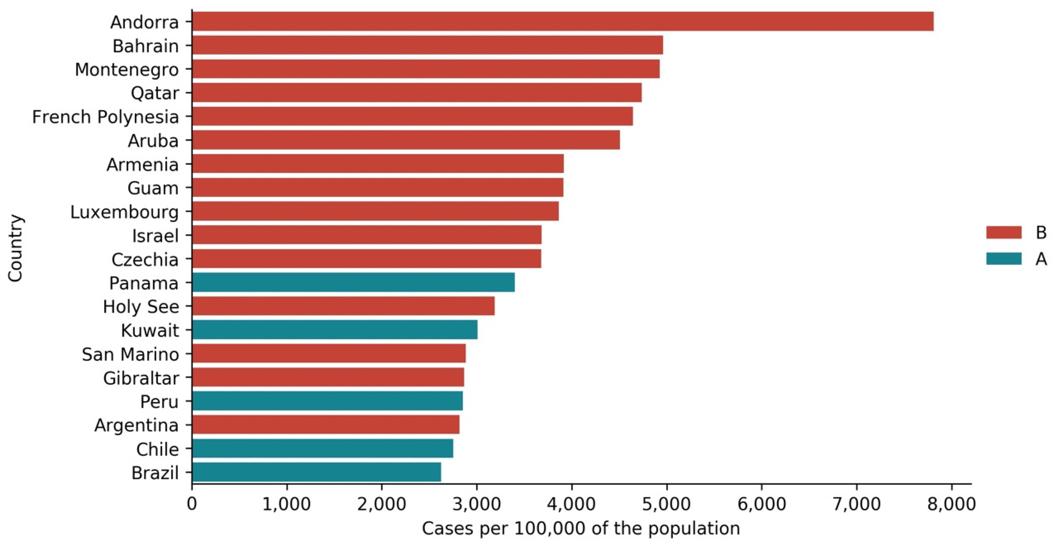
The contrast mentioned above between cases’ clusters at Day 250 is also visible in Figure 8. Only five countries from Cluster A are included among the top 20 countries with the highest number of cases per 100,000 of the population at Day 250. The remaining 15 countries are all from Cluster B. Except for the last four countries in this top 20, which are South American countries with a considerable population, the remaining 16 countries are mostly tiny and not highly populated.

3.2. Deaths—Temporal Sequence

Although the clustering of the temporal sequence of reported standardized and synchronized deaths also identified three clusters, countries were not grouped in the same way as in the time profiles of registered cases. As presented in Figure 9, the clusters’ geographic dispersion changed when compared with the one presented earlier on for the numbers of cases.
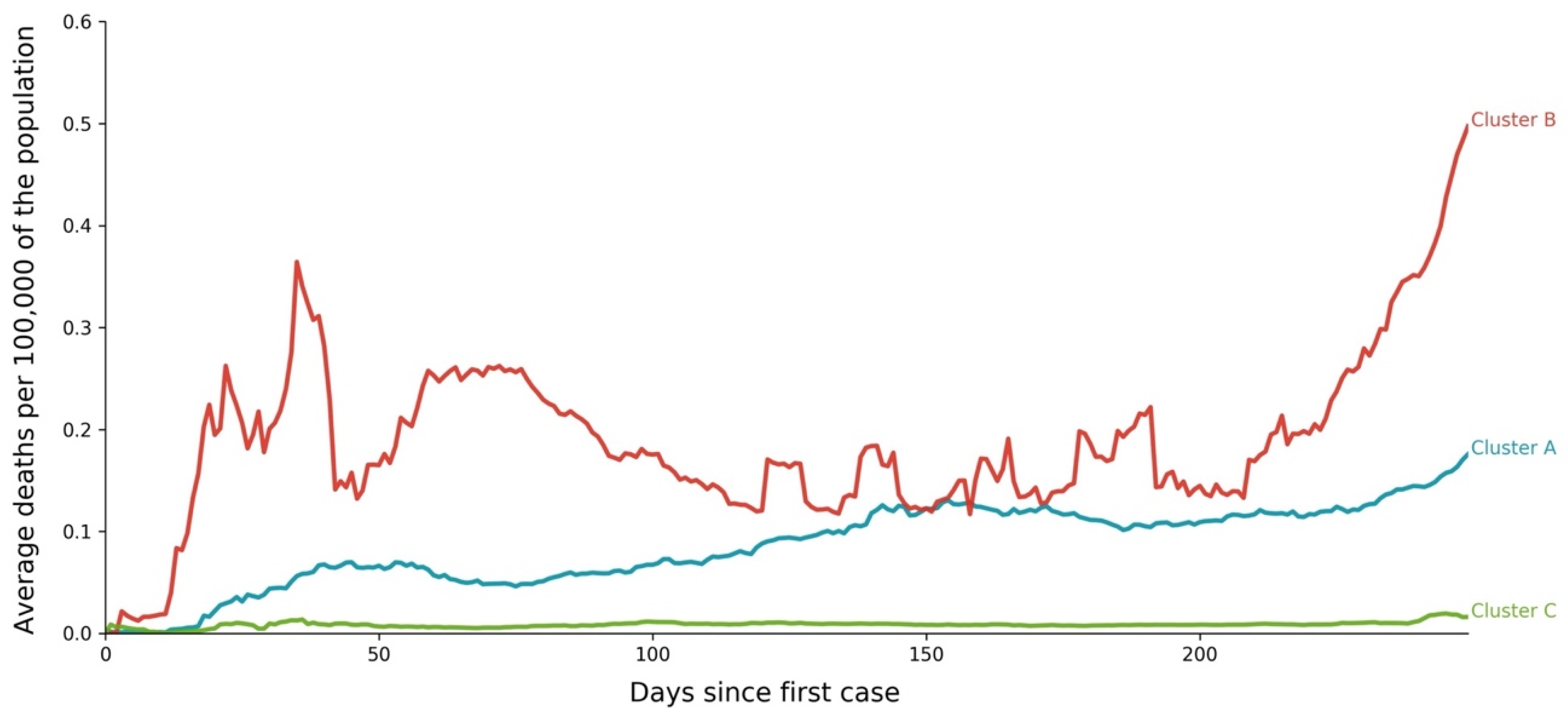
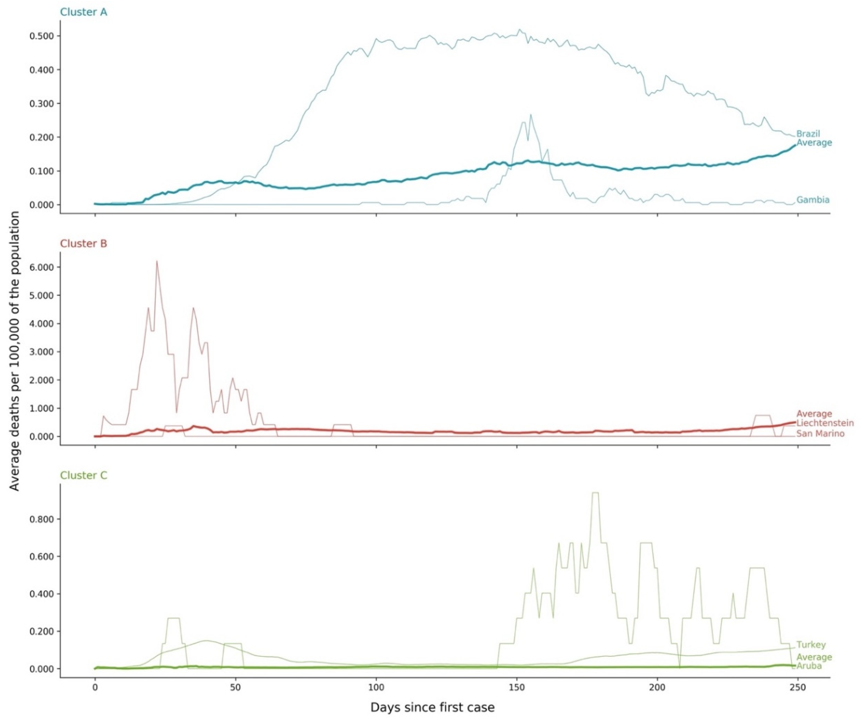
As it happened with the clusters of time profiles for COVID-19 cases, the three death standardized and synchronized time profiles clusters revealed a distinctive pattern, in terms of both values and shapes (Figure 10 and Figure 11 and Table 6):
  • Cluster A presents two waves of its average time profile. The first peak happens at around Day 50 and the second about 100 days later. However, another 100 days later, a third wave seems to be forming again. This cluster shows a slight trend line, with the average number of deaths increasing over time. The daily average number of deaths per 100,000 of the population was 0.190. This cluster is composed of countries from a diversity of geographies and sizes. The average population of the countries in this cluster is about 21 million people.
  • Cluster B is the cluster with the highest daily average deaths per 100,000 of the population, 0.562. It presents one first wave of average time profile before Day 50 and a second one around Day 70, followed by a period of irregularity, and, then, after Day 210, a rapid increase of deaths that did not slow down up to Day 250. This cluster includes several small countries and larger countries such as the United States of America, United Kingdom, Spain, Italy, and Sweden, as well as other countries known publicly for being highly impacted by the pandemic. The countries’ average population in this cluster is very similar to Cluster A, at around 20 million people.
  • Cluster C is the cluster with the lowest daily average deaths per 100,000 of the population, 0.029, which is six times less than Cluster A and 19 times less than Cluster B. This cluster presents a very flat average profile with no significant waves. Similar to Equatorial Guinea in Cluster A of cases, the country with the lowest number of deaths per 100,000 of the population, Aruba, seems to report data intermittently, thus causing spikes. Apart from some exceptions, this cluster is mostly comprised of countries from Africa, Asia, and Oceania. The countries’ average population in Cluster C is almost three times greater than the ones reported in Clusters A and B, reaching 61 million people.
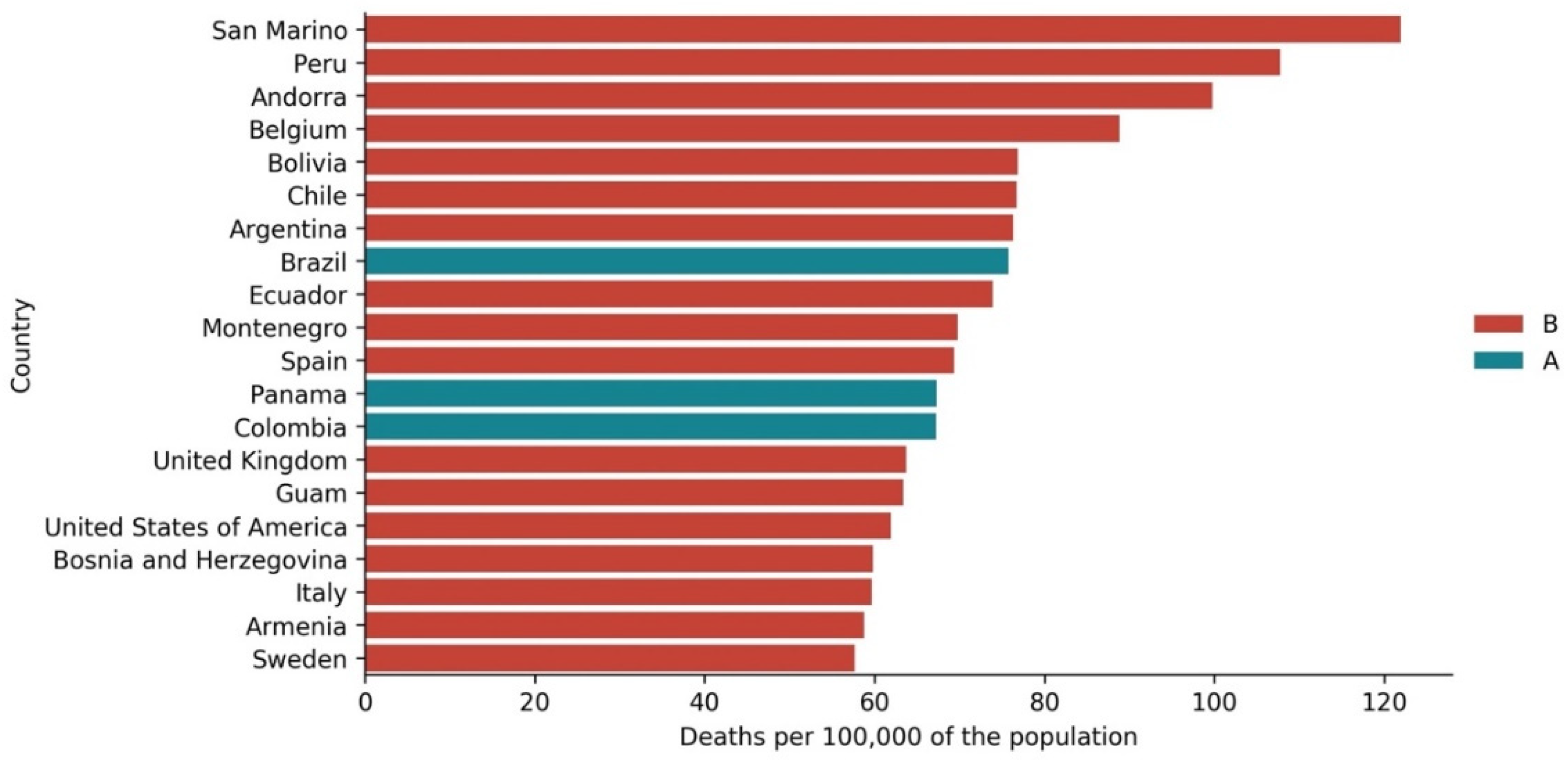
The top 20 countries with the highest cumulative number of deaths per 100,000 of the population at Day 250 (Figure 12) differ substantially from the top 20 countries regarding cumulative registered cases also at Day 250. Although only countries from Clusters A and B are present, actually only three are from Cluster A: Brazil, Panama, and Colombia. Nine of the top 20 countries with more deaths did not appear in the top 20 countries with more cases: Belgium, Bolivia, Spain, Colombia, United Kingdom, United States of America, Bosnia and Herzegovina, Italy, and Sweden. This difference could be explained by different levels of mortality, testing, or both. In contrast with the top 20 countries by cases, the top 20 countries in deaths do not include many small countries. In fact, this set includes larger and higher populated countries, most of them from the Americas and Europe.

3.3. Cases vs. Deaths

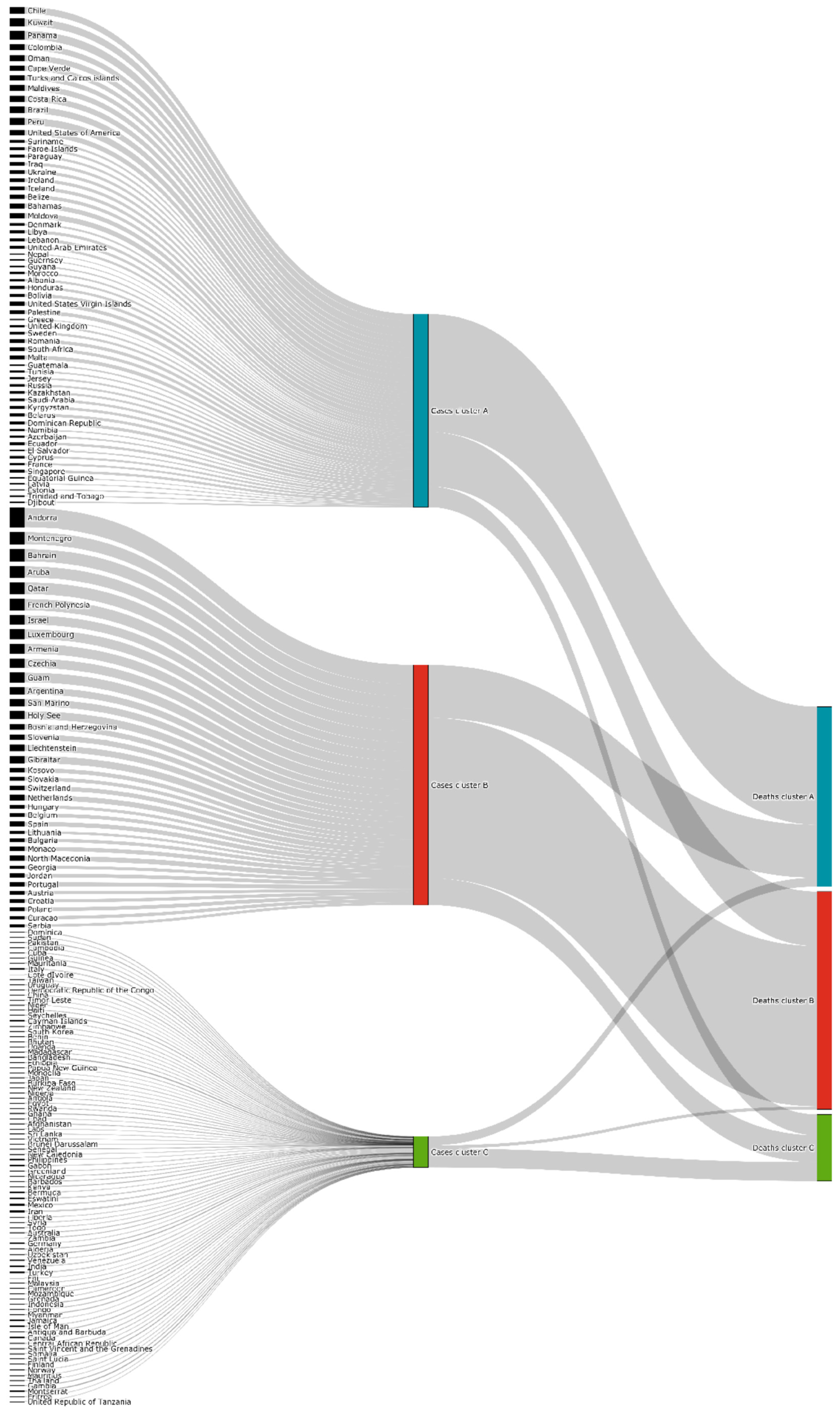
Despite the differences found in the top 20 countries for cases and deaths per capita at Day 250, as mentioned in the previous section and highlighted in the Sankey diagram of Figure 13, there is an association between the scaled and synchronized time profiles of clusters of cases and clusters of deaths per 100,000 of the population. The deaths cluster with the high number of deaths, Cluster B, is mostly composed of countries that also belonged to Cluster B of cases. The same relation exists between Cluster A of cases and Cluster A of deaths. Nevertheless, several examples also exist of countries that moved from “bad” clusters to “good” clusters, and vice versa. Once again, countries’ different clustering positioning in terms of cases and deaths suggests a possible relation between the capacity to fight the pandemic, namely testing capacity, ageing, and health conditions.
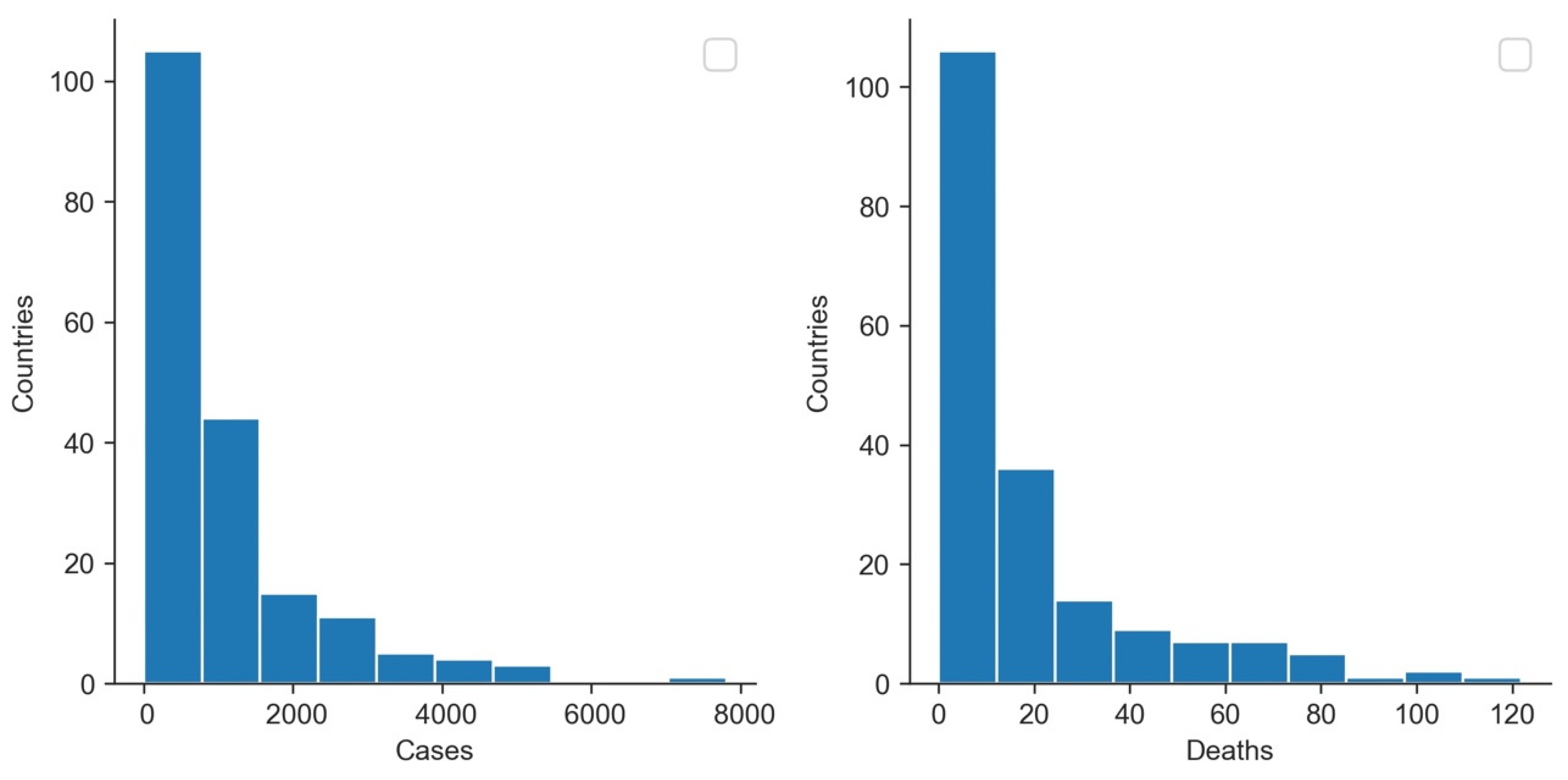
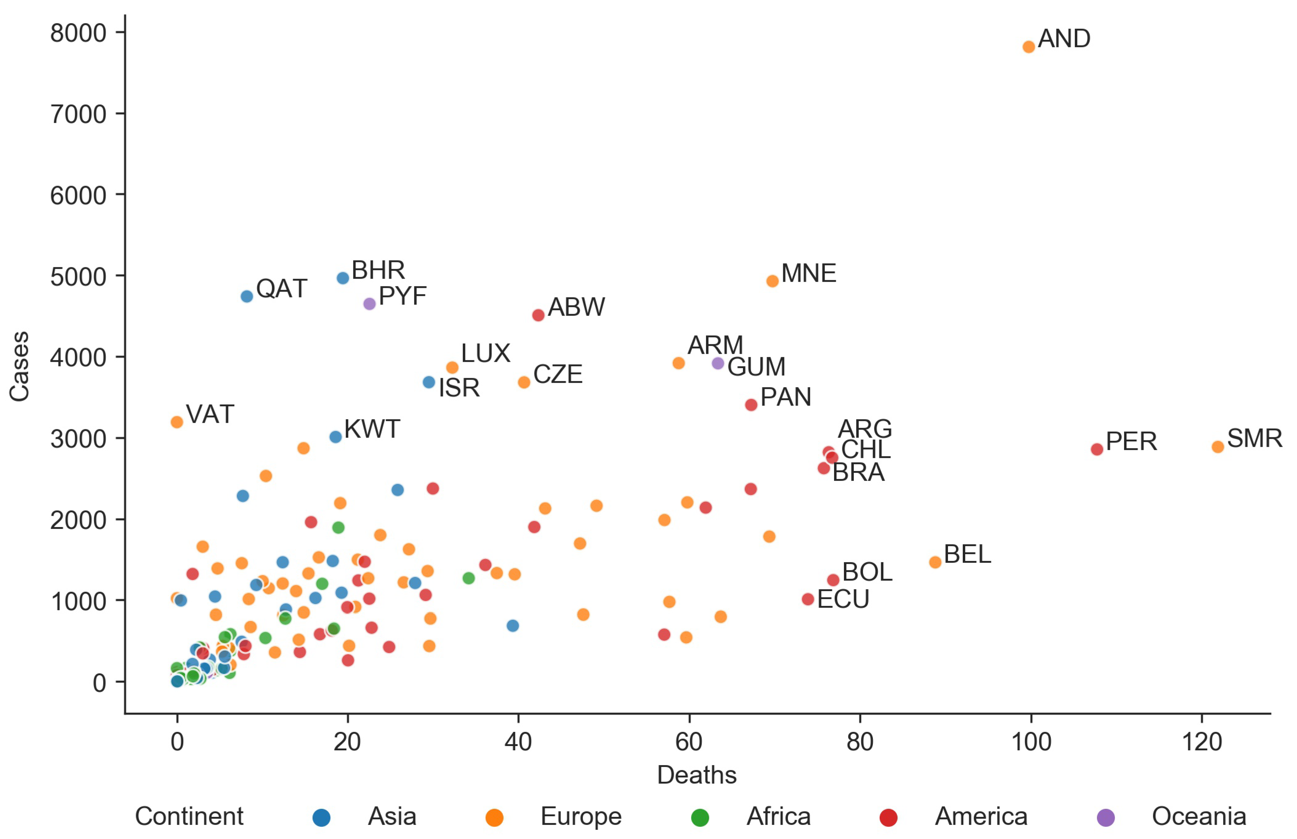
Despite histograms of accumulated cases and deaths per 100,000 of the population showing a similar shape distribution (Figure 14), the plot of cumulative scaled deaths versus cases at Day 250 (Figure 15) confirms that there is some relationship between them. However, there is also considerable variability (for the same number of scaled cases, there can be four times the number of scaled deaths as we move from one country to another).
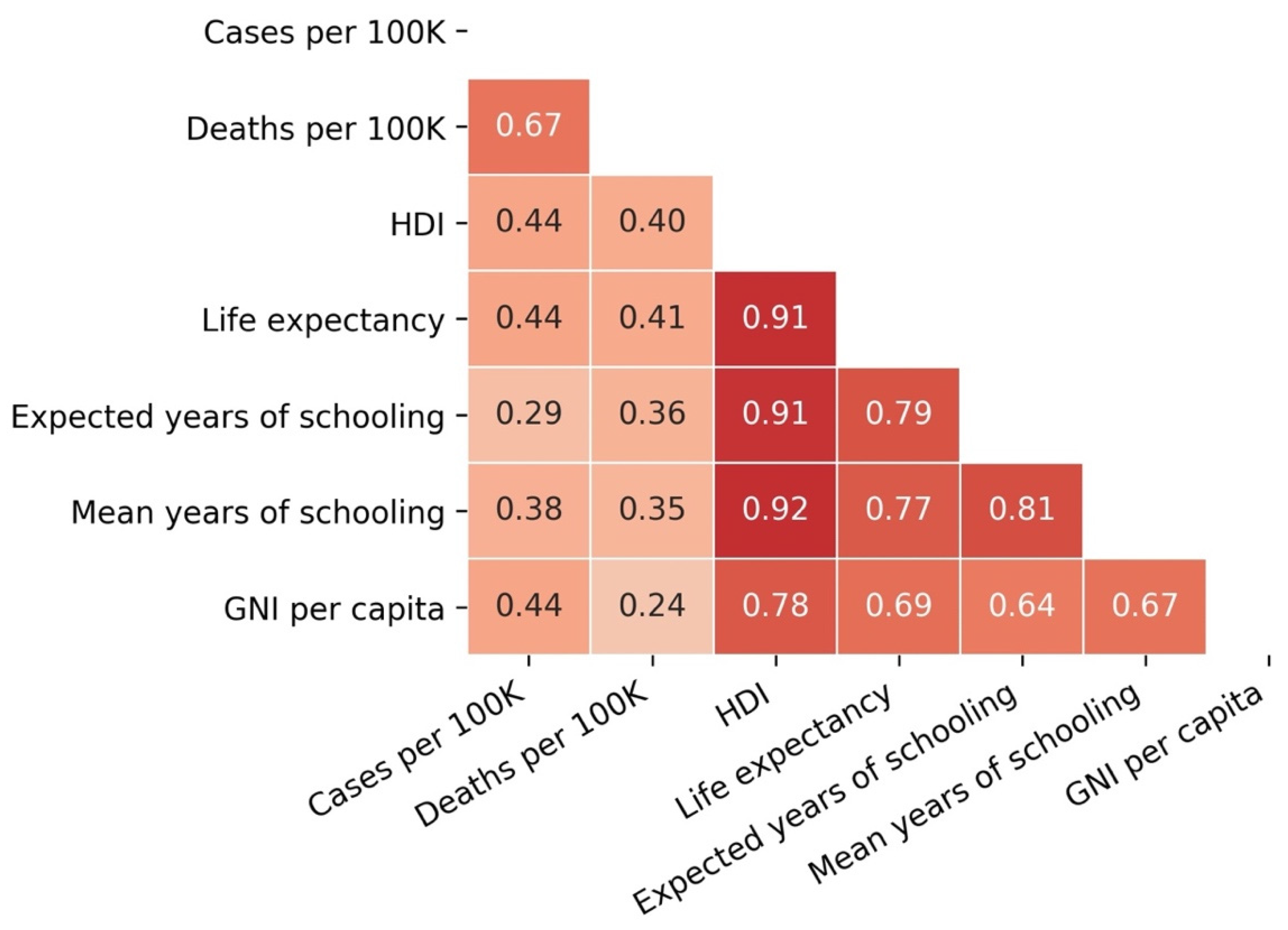
As illustrated in Figure 16, the Pearson correlation coefficient between scaled cases and deaths was found to be positive (0.67), as expected.

3.4. Cases and Deaths vs. Development Indicators

Table 5 and Table 6 and Figure 16 also show the differences found between the clusters’ development indicators and their relationship with the accumulated numbers of cases and deaths at Day 250. Figure 16 reveals a positive correlation of cases and deaths with the HDI of 0.44 and 0.40, respectively. The same range of correlation was found between scaled cases and deaths and the other variables that compose the HDI (life expectancy, expected years of education, average years of education, and GNI per capita). This correlation suggests that, to a certain extent, there is an association between countries’ development and cases/deaths of COVID-19. This association could be related to the fact that in developed countries the population lives longer and is older. However, it could also reveal that underdeveloped countries do not have the means to conduct a high number of tests, resulting in unidentified cases and deaths.
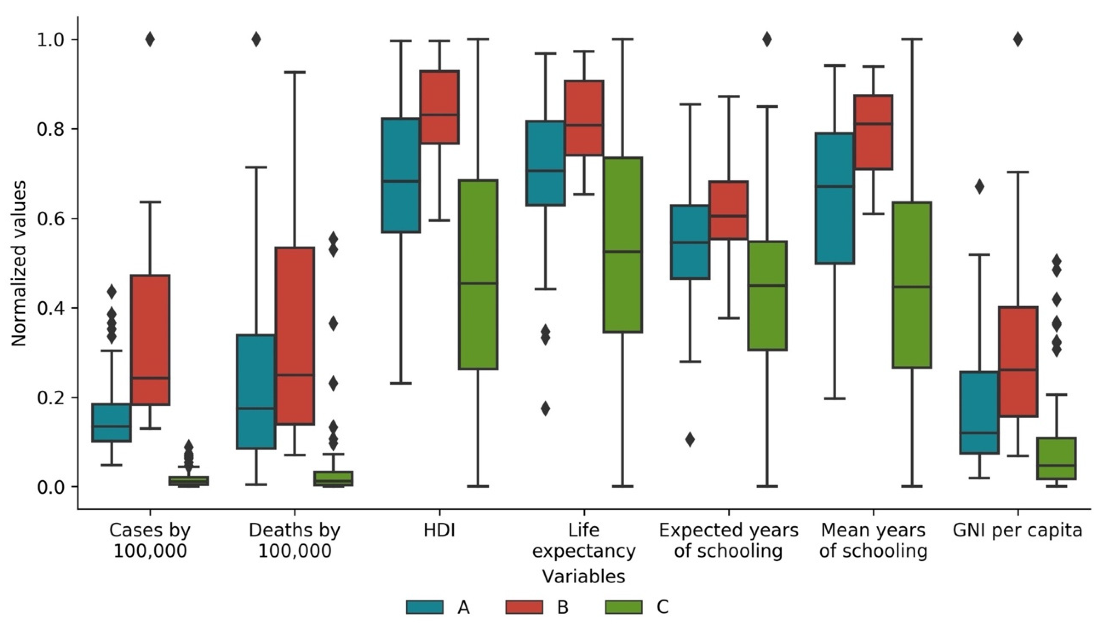
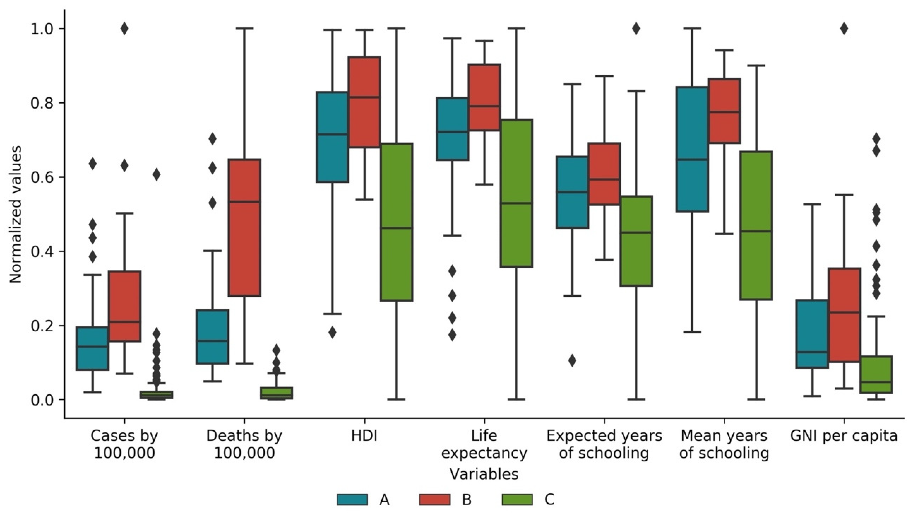
The associations mentioned above are also visible in the boxplots for variables’ averages per country of each cluster, as shown in Figure 17 and Figure 18, respectively. Overall, both boxplots show a statistically significant difference in the clustering of cases and deaths for all variables. These boxplots also show that cases and deaths in Cluster A comprise countries with a good HDI and a high life expectancy. Moreover, boxplots show that Cluster B is the one with the worst performance in terms of cases and deaths. This cluster comprises countries with higher HDI, which in turn means there is higher life expectancy, expected and frequented years of education, and GNI per capita. In turn, boxplots show that Cluster C countries in cases and deaths are mostly countries with low HDI and associated lower development indicators.

4. Conclusions

Despite COVID-19 being a worldwide pandemic, very significant differences and time profiles were found regarding both the registered cases and deaths time profiles for each country, when scaled and synchronized data were used, leading to the identification of three distinctive clusters in the corresponding country time series.
These findings seem to validate our initial Hypothesis H1: there are different types of country/territories behavior with regards to the corresponding scaled and synchronized COVID-19 time evolution and profiles.
Moreover, clusters could be found by unsupervised learning and were explored, and no geographical bases or obvious groupings were identified. In fact, one can see countries that show quite different patterns within the same continent or region. Such findings assist also in answering our initial research Hypotheses H1a and H1b: three clusters were identified regarding the time profiles of scaled COVID-19 cases, and another three clusters were found out for the time profiles of scaled COVID-19 deaths. Some features, such as the number or intensity of peaks or when they take place, seem to be associated with the different clusters that were identified.
Finally, regarding our initial research Hypothesis H1c, which deals with the characteristics of the countries/territories placed in each cluster, there are interesting relations but wide variability was also found in the scaled cases versus deaths values seen across countries. Although clusters’ mean results seem to validate Hypothesis H1c, wide variability is present in each cluster.
Countries presenting higher numbers of cases per 100,000 of population are only partially correlated with those that have the largest numbers of deaths per 100,000 of population. Usually, more developed countries have been able to step up the number of tests as compared to less developed ones, with the latter also suffering from comparatively worst sanitary conditions as well as weaker public health response mechanisms, but they also have younger populations, and therefore some effects can compensate for the others. These can explain the non-trivial connections found between variables and countries, as well as the corresponding COVID-19 time profiles, but some interesting partial correlations and findings were extracted from the analysis conducted.

5. Limitations and Future Research Directions

This study faced a number of challenges, which imposed some limitations to it. Specifically, some countries reported data intermittently, causing spikes, and affecting averages of both cases and deaths. Although not frequently, some countries erroneously reported excess values on some dates, leading them to declare negative values later on other dates to correct for those values. This situation also affected the daily averages of cases and deaths.
Future studies should keep updating information and extract further time profile observations and evolutions. Additionally, subsequent research is advised to try to model for instance deaths per capita with a number of country variables and see what can be concluded from this modeling analysis. The use of a ratio of population by area (population density) can also bring another quite interesting and enlightening perspective, since contagion of the COVID-19 is spearheaded by proximity between humans.
Finally, foreseeable studies should investigate what impacts may be derived by the number of people per capita who received vaccines and the corresponding scaled and synchronized vaccination time profiles.

Author Contributions

Conceptualization, N.A., P.R. and P.S.; Formal analysis, N.A., P.R. and P.S.; Methodology, N.A.; Visualization, N.A.; Writing–original draft, P.R. and P.S.; Writing–review & editing, N.A., P.R. and P.S. All authors have read and agreed to the published version of the manuscript.

Funding

This research received no external funding.

Institutional Review Board Statement

Not applicable.

Informed Consent Statement

Not applicable.

Data Availability Statement

The data used in this paper is available in the references presented in Section 2.1.

Conflicts of Interest

The authors declare no conflict of interest.

Acronym

ACAPSNon-profit organization (previously known as “The Assessment CAPacitieS Project”)
CRISP-DMCRoss-InduStry Process model for Data Mining
DTWDynamic Time Warping
ECDCEuropean Centre for Disease Control
GNIGross National Income
HDIHuman Development Index
ISOInternational Organization for Standardization
OWIDOur World In Data
STDStandard Deviation
UNDPUnited Nations Development Program
WHOWorld Health Organization
WTTCWorld Travel & Tourism Council

References

  1. Johns Hopkins University COVID-19 Map. Available online: https://coronavirus.jhu.edu/map.html (accessed on 31 December 2020).
  2. Nicola, M.; Alsafi, Z.; Sohrabi, C.; Kerwan, A.; Al-Jabir, A.; Iosifidis, C.; Agha, M.; Agha, R. The Socio-Economic Implications of the Coronavirus Pandemic (COVID-19): A Review. Int. J. Surg. 2020, 78, 185–193. [Google Scholar] [CrossRef] [PubMed]
  3. Pak, A.; Adegboye, O.A.; Adekunle, A.I.; Rahman, K.M.; McBryde, E.S.; Eisen, D.P. Economic Consequences of the COVID-19 Outbreak: The Need for Epidemic Preparedness. Front. Public Health 2020, 8. [Google Scholar] [CrossRef] [PubMed]
  4. Antonio, N.; Rita, P. March 2020: 31 Days That Will Reshape Tourism. Curr. Issues Tour. 2020, 1–16. [Google Scholar] [CrossRef]
  5. Sarkodie, S.A.; Owusu, P.A. Global Assessment of Environment, Health and Economic Impact of the Novel Coronavirus (COVID-19). Environ. Dev. Sustain. 2020. [Google Scholar] [CrossRef] [PubMed]
  6. Shorten, C.; Khoshgoftaar, T.M.; Furht, B. Deep Learning Applications for COVID-19. J. Big Data 2021, 8, 18. [Google Scholar] [CrossRef] [PubMed]
  7. Zohner, Y.E.; Morris, J.S. COVID-TRACK: World and USA SARS-COV-2 Testing and COVID-19 Tracking. BioData Min. 2021, 14. [Google Scholar] [CrossRef] [PubMed]
  8. Alvarez, E.; Brida, J.G.; Limas, E. Comparisons of COVID-19 Dynamics in the Different Countries of the World Using Time-Series Clustering. Health Econ. 2020. [Google Scholar] [CrossRef]
  9. Carrillo-Larco, R.M.; Castillo-Cara, M. Using Country-Level Variables to Classify Countries According to the Number of Confirmed COVID-19 Cases: An Unsupervised Machine Learning Approach. Wellcome Open Res. 2020, 5, 56. [Google Scholar] [CrossRef] [PubMed]
  10. Zarikas, V.; Poulopoulos, S.G.; Gareiou, Z.; Zervas, E. Clustering Analysis of Countries Using the COVID-19 Cases Dataset. Data Brief 2020, 31, 105787. [Google Scholar] [CrossRef] [PubMed]
  11. Rojas, I.; Rojas, F.; Valenzuela, O. Estimation of COVID-19 Dynamics in the Different States of the United States Using Time-Series Clustering. Health Inform. 2020. [Google Scholar] [CrossRef]
  12. Chandu, V. Identification of Spatial Variations in COVID-19 Epidemiological Data Using K-Means Clustering Algorithm: A Global Perspective. Epidemiology 2020. [Google Scholar] [CrossRef]
  13. Mahmoudi, M.R.; Baleanu, D.; Mansor, Z.; Tuan, B.A.; Pho, K.H. Fuzzy clustering method to compare the spread rate of Covid-19 in the high risks countries. Chaos Solitons Fractals 2020, 140, 110230. [Google Scholar] [CrossRef] [PubMed]
  14. Han, J.; Kamber, M.; Pei, J. Data Mining: Concepts and Techniques, 3rd ed.; Elsevier: Waltham, MA, USA, 2012. [Google Scholar]
  15. Chapman, P.; Clinton, J.; Kerber, R.; Khabaza, T.; Reinartz, T.; Shearer, C.; Wirth, R. CRISP-DM 1.0: Step-by-Step Data Mining Guide. Available online: https://the-modeling-agency.com/crisp-dm.pdf (accessed on 10 September 2015).
  16. Harris, C.R.; Millman, K.J.; van der Walt, S.J.; Gommers, R.; Virtanen, P.; Cournapeau, D.; Wieser, E.; Taylor, J.; Berg, S.; Smith, N.J.; et al. Array Programming with NumPy. Nature 2020, 585, 357–362. [Google Scholar] [CrossRef] [PubMed]
  17. McKinney, W. Data Structures for Statistical Computing in Python. In Proceedings of the 9th Python in Science Conference, Austin, TX, USA, 28 June–3 July 2010; pp. 56–61. [Google Scholar]
  18. Hunter, J.D. Matplotlib: A 2D Graphics Environment. Comput. Sci. Eng. 2007, 9, 90–95. [Google Scholar] [CrossRef]
  19. Waskom, M.L. Seaborn: Statistical data visualization. Open J. 2021, 6, 3021. [Google Scholar] [CrossRef]
  20. ECDC Download Historical Data (to 14 December 2020) on the Daily Number of New Reported COVID-19 Cases and Deaths Worldwide. Available online: https://www.ecdc.europa.eu/en/publications-data/download-todays-data-geographic-distribution-covid-19-cases-worldwide (accessed on 27 December 2020).
  21. United Nations Human Development Reports. Available online: http://hdr.undp.org/en/composite/HDI (accessed on 27 December 2020).
  22. International Standards Organization Online Browsing Platform (OBP). Available online: https://www.iso.org/obp/ui/#search (accessed on 27 December 2020).
  23. Meert, W.; Hendrickx, K. Wannesm/Dtaidistance (Version v2.0.0). Available online: https://zenodo.org/record/3981067#.YHOqOT8RVPY (accessed on 27 December 2020).
  24. Novikov, A. PyClustering: Data Mining Library. J. Open Source Softw. 2019, 4, 1230. [Google Scholar] [CrossRef]
  25. Arora, P.; Varshney, S. Analysis of K-Means and K-Medoids Algorithm For Big Data. Procedia Comput. Sci. 2016, 78, 507–512. [Google Scholar] [CrossRef] [Green Version]
  26. Shamsuddin, N.R.; Mahat, N.I. Comparison Between k-Means and k-Medoids for Mixed Variables Clustering. In Proceedings of the Third International Conference on Computing, Mathematics and Statistics (iCMS2017); Kor, L.-K., Ahmad, A.-R., Idrus, Z., Mansor, K.A., Eds.; Springer: Singapore, 2019; pp. 303–308. ISBN 9789811372780. [Google Scholar]
  27. Rousseeuw, P.J. Silhouettes: A Graphical Aid to the Interpretation and Validation of Cluster Analysis. J. Comput. Appl. Math. 1987, 20, 53–65. [Google Scholar] [CrossRef] [Green Version]
  28. Virtanen, P.; Gommers, R.; Oliphant, T.E.; Haberland, M.; Reddy, T.; Cournapeau, D.; Burovski, E.; Peterson, P.; Weckesser, W.; Bright, J.; et al. SciPy 1.0: Fundamental Algorithms for Scientific Computing in Python. Nat. Methods 2020, 17, 261–272. [Google Scholar] [CrossRef] [PubMed] [Green Version]
  29. Terpilowski, M. Scikit-Posthocs: Pairwise multiple comparison tests in Python. J. Open Source Softw. 2019, 4, 1169. [Google Scholar] [CrossRef]
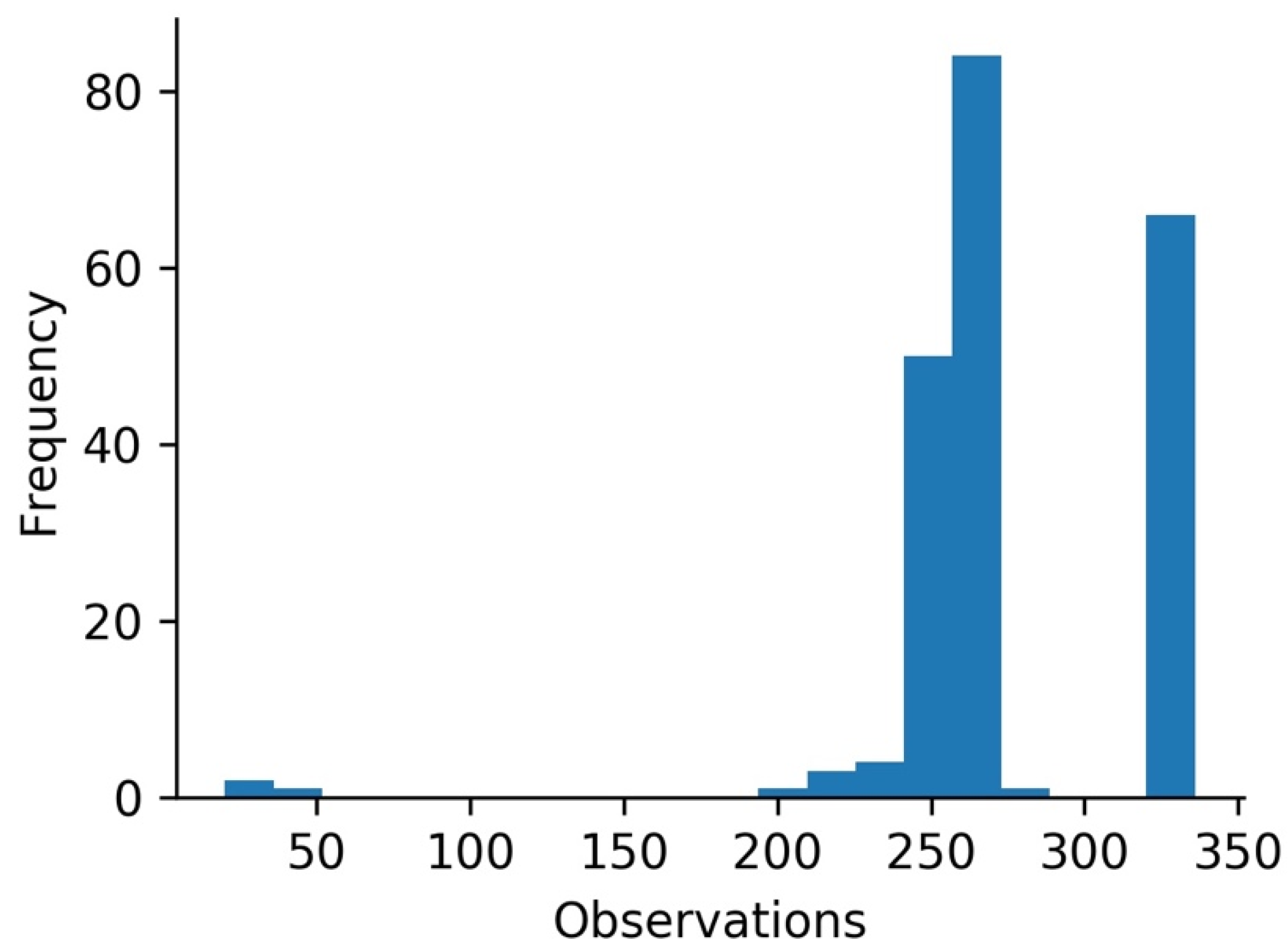
Figure 1. Histogram on the number of observations (dates with data) per country.
Applsci 11 03400 g001
Figure 2. Silhouette score for countries temporal clustering of COVID-19 cases by 100,000 of the population (k = number of clusters).
Applsci 11 03400 g002
Figure 3. Silhouette score for countries temporal clustering of COVID-19 deaths by 100,000 of the population (k = number of clusters).
Applsci 11 03400 g003
Figure 4. Timeline of first case reporting by country (due to space constraints, countries’ names are shown in ISO 3166 alpha 3 codes).
Applsci 11 03400 g004
Figure 5. Geographic distribution of clusters of cases per 100,000 of the population.
Applsci 11 03400 g005
Figure 6. Seven days moving averages of cases per 100,000 people in each cluster over time.
Applsci 11 03400 g006
Figure 7. Seven days moving average of cases per 100,000 people in each cluster, with also time series of countries with minimum and maximum accumulated cases by 100,000 of the population at Day 250 in each of these clusters.
Applsci 11 03400 g007
Figure 8. Top 20 of countries according to total cases by 100,000 of the population at Day 250 (color indicates the cluster each country belongs to).
Applsci 11 03400 g008
Figure 9. Geographic distribution of clusters of deaths per 100,000 of the population.
Applsci 11 03400 g009
Figure 10. Seven-day moving average of deaths per 100,000 people and in each cluster over time.
Applsci 11 03400 g010
Figure 11. Seven-day moving average of deaths per 100,000 people in each cluster (also with time series of countries with minimum and maximum accumulated deaths by 100,000 of the population at Day 250).
Applsci 11 03400 g011
Figure 12. Top 20 total deaths by 100,000 of the population at Day 250 (color indicates the cluster each country belongs to).
Applsci 11 03400 g012
Figure 13. Cases vs. deaths: Sankey diagram with mapping of countries from case time profile clusters and from death time profile clusters (values normalized to 100,000 of the population).
Applsci 11 03400 g013
Figure 14. Cases vs. deaths: Histograms for total cases and deaths per 100,000 of the population at Day 250.
Applsci 11 03400 g014
Figure 15. Cases vs. deaths: Accumulated deaths vs. cases (per 100,000 of the population) in the different countries studied.
Applsci 11 03400 g015
Figure 16. Cases vs. deaths: Matrix of Pearson correlation coefficients of total scaled values of cases and deaths with countries’ development metrics (HDI, Human Development Index; GNI, Gross National Income).
Applsci 11 03400 g016
Figure 17. Boxplots of variables per cluster of cases at Day 250 (excluding the 24 countries/territories that are not present in the UNDP dataset) (HDI, Human Development Index; GNI, Gross National Income).
Applsci 11 03400 g017
Figure 18. Boxplots of variables per cluster of deaths at Day 250 (excluding the 24 countries/territories that are not present in the UNDP dataset) (HDI, Human Development Index; GNI, Gross National Income).
Applsci 11 03400 g018
Table 1. Summary of Publications Related to the Temporal Analysis and Clustering of the Impact of COVID-19 by Country.
Authors (Date)Main PurposeCountries/
Territories
PeriodData SourcesTechniques
Alvarez et al. (2020) [8]Identify groups of countries with a similar spread of the coronavirus191
countries
100 days after the tenth caseOWIDStatistics tests, Hierarchical Clustering,
Hierarchical Trees, Minimal, and Spanning Trees
Antonio and Rita (2020) [4]Study the impact of the pandemic on tourism, particularly in hospitality12
European countries
March 2020ACAPS,
D-EDGE, ECDC, OWID,
STR,
WTTC
Dynamic Time Warping, data characterization, statistics tests, and Hierarchical Clustering
Carrillo-Larco and Castillo-Cara, (2020) [9]Understand the clustering of countries in groups using country-level pre-COVID-19 variables and COVID-19 cases and deaths 155
countries
23 March 2020John Hopkins University, Global Burden of Disease, Global Health Observatory, World BankStatistics tests, K-Means clustering
Chandu V. (2020) [12]Identify the spatial variations in COVID-19 and relation to countries’ public health expenditure89
countries
Countries with 1000 confirmed cases at 6 May 2020WHOK-Means clustering
Mahmoudi et al. (2020) [13]Understand the spread of the coronavirus among different countries7
countries
22 February 2020 to 18 April 2020WHOStatistics tests, Fuzzy Clustering
Rojas et al. (2020) [11]Determine the similarity of COVID-19 spread over timeStates of the United States of AmericaUntil 21 June 2020John Hopkins UniversityDynamic Time Warping and Hierarchical Clustering
Zarikas et al. (2020) [10]Understand the clustering of countries with respect to active cases 208
countries with territories, but with several being excluded from the results
22 January 2020 to 4 April 2020John Hopkins UniversityHierarchical Clustering
Table 2. ECDC Dataset [20] Summary Statistics.
VariableCountType
(Cat.)
MeanStandard
Deviation
Min.25%50%75%Max.
dateRep58,919Cat.
(336)
-------
day58,919Num.16.04038.8200218162431
month58,919Num.6.817582.80696157912
year58,919Num.20200.033702820192020202020202020
cases58,919Num.1066.96060.19−8261014247207,913
deaths58,919Num.24.801126.707−19180044928
countries
and
Territories
58,919Cat.
(214)
-------
geoId58,658Cat.
(213)
-------
country
territory
Code
58,810Cat.
(212)
-------
popData
2019
58,810Num41.2304 × 106153.732 × 1068151.32482 × 1067.81321 × 10628.6087 × 1061.43378 × 109
continent
Exp
58,919Cat.-------
Cumulative_number_
for_14_
days_of_
COVID19_
cases_per_
100000
56,054Num.60.0217150.082−147.420.6821356.3679747.34771900.84
Note: Count is the number of observations; Type is the type of variable (numerical or categorical); Mean is the mean of the variable (for numeric variables); Standard deviation is the standard deviation of the variable (for numeric variables); Min. is the minimum value (for numeric variables); 25% is the value of the first quartile (for numeric variables); 50% is value of the second quartile or median (for numeric variables); 75% is value of the third quartile (for numeric variables); and Max. is the maximum value (for numeric variables). For more details on the ECDC dataset, please check the corresponding link in the references.
Table 3. UNDP Dataset [21] Summary Statistics.
VariableCountType
(Cat.)
MeanStandard
Deviation
Min.25%50%75%Max.
Country189Cat.
(189)
-------
HDI189Num.0.7220.1500.3940.6020.7400.8290.957
Life
Expectancy
AtBirth
189Num.72.712738653.28067.44074.05077.91084.860
Expected
YearsOf
Schooling
189Num.13.3252.9415.00511.43113.18815.22721.954
MeanYearsOf
Schooling
189Num.8728308716446437903211.32614.152
GrossNational
IncomePer
Capita
189Num.20,219.72621,229.049753.9094910.20812,707.36629,497.232131,031.5
Note: Count is the number of observations; Type is the type of variable (numerical or categorical); Mean is the mean of the variable (for numeric variables); Standard deviation is the standard deviation of the variable (for numeric variables); Min. is the minimum value (for numeric variables); 25% is the value of the first quartile (for numeric variables); 50% is value of the second quartile or median (for numeric variables); 75% is value of the third quartile (for numeric variables); and Max. is the maximum value (for numeric variables). For more details on the UNDP dataset, please check the corresponding link in the references.
Table 4. ECDC T Variable Per Country Summary Statistics.
CountMeanStandard DeviationMin.25%50%75%Max.
212262.56634.03719.00255.00261.00270.00335.00
Note: Count is the number of observations; Mean is the mean of the variable; Standard deviation is the standard deviation of the variable; Min. is the minimum value; 25% is the value of the first quartile; 50% is value of the second quartile or median; 75% is value of the third quartile; and Max. is the maximum value.
Table 5. Averages and standard deviations (std) of variables per cluster of cases at Day 250 (* excluding the 24 countries/territories that are not present in the UNDP dataset).
VariableCluster A
(Std)
Cluster B
(Std)
Cluster C
(Std)
Total cases by 100,000 of the population1267.782
(727.131)
2639.816
(1525.025)
140.471
(160.356)
Total deaths by 100,000 of the population26.871
(23.739)
35.502
(29.556)
4.705
(10.374)
Population22,979,074
(52,365,381)
7,413,262
(11,664,577)
65,751,558
(209,744,281)
Total cases by 100,000 of the population *1263.896
(737.867)
2535.323
(1613.192)
136.453
(157.875)
Total deaths by 100,000 of the population *27.309
(24.475)
35.590
(26.512)
4.357
(10.327)
Human Development Index *0.783
(0.102)
0.863
(0.058)
0.664
(0.151)
Life expectancy at birth *75.577
(5.042)
78.915
(3.048)
70.053
(7.698)
Expected years of schooling *14.253
(2.420)
15.460
(1.912)
12.501
(3.081)
Mean years of schooling *9.685
(2.377)
11.580
(1.247)
7.462
(3.061)
Gross national income per capita *25,111.109
(19,968.660)
40,440.653
(26,746.722)
13,377.740
(15,688.465)
Table 6. Averages and Standard Deviations (Std) of Variables for Each Cluster of Deaths at Day 250 (* Excluding the 24 Countries/Territories That are not Present in the UNDP Dataset).
VariableCluster A
(Std)
Cluster B
(Std)
Cluster C
(Std)
Total cases by 100,000 of the population1307.134
(941.765)
2161.559
(1536.914)
296.200
(658.197)
Total deaths by 100,000 of the population21.771
(16.114)
48.434
(27.677)
2.124
(2.601)
Population21,259,945
(39,612,007)
20,258,924
(53,000,847)
60,766,034
(207,799,142)
Total cases by 100,000 of the population *1305.755
(962.065)
2141.249
(1519.509)
237.542
(575.844)
Total deaths by 100,000 of the population *21.390
(16.095)
51.949
(25.883)
2.251
(2.695)
Human Development Index *0.785
(0.108)
0.842
(0.079)
0.670
(0.152)
Life expectancy at birth *75.432
(5.509)
78.378
(3.524)
70.333
(7.649)
Expected years of schooling *14.204
(2.430)
15.423
(2.079)
12.538
(3.052)
Mean years of schooling *9.786
(2.602)
11.148
(1.441)
7.537
(3.308)
Gross national income per capita *24,960.222
(17,304.968)
34,852.913
(26,739.551)
15,312.351
(19,976.337)
Publisher’s Note: MDPI stays neutral with regard to jurisdictional claims in published maps and institutional affiliations.