Representing Data Visualization Goals and Tasks through Meta-Modeling to Tailor Information Dashboards


 ,
,  and
and 
Abstract
1. Introduction
2. Background
3. Materials and Methods
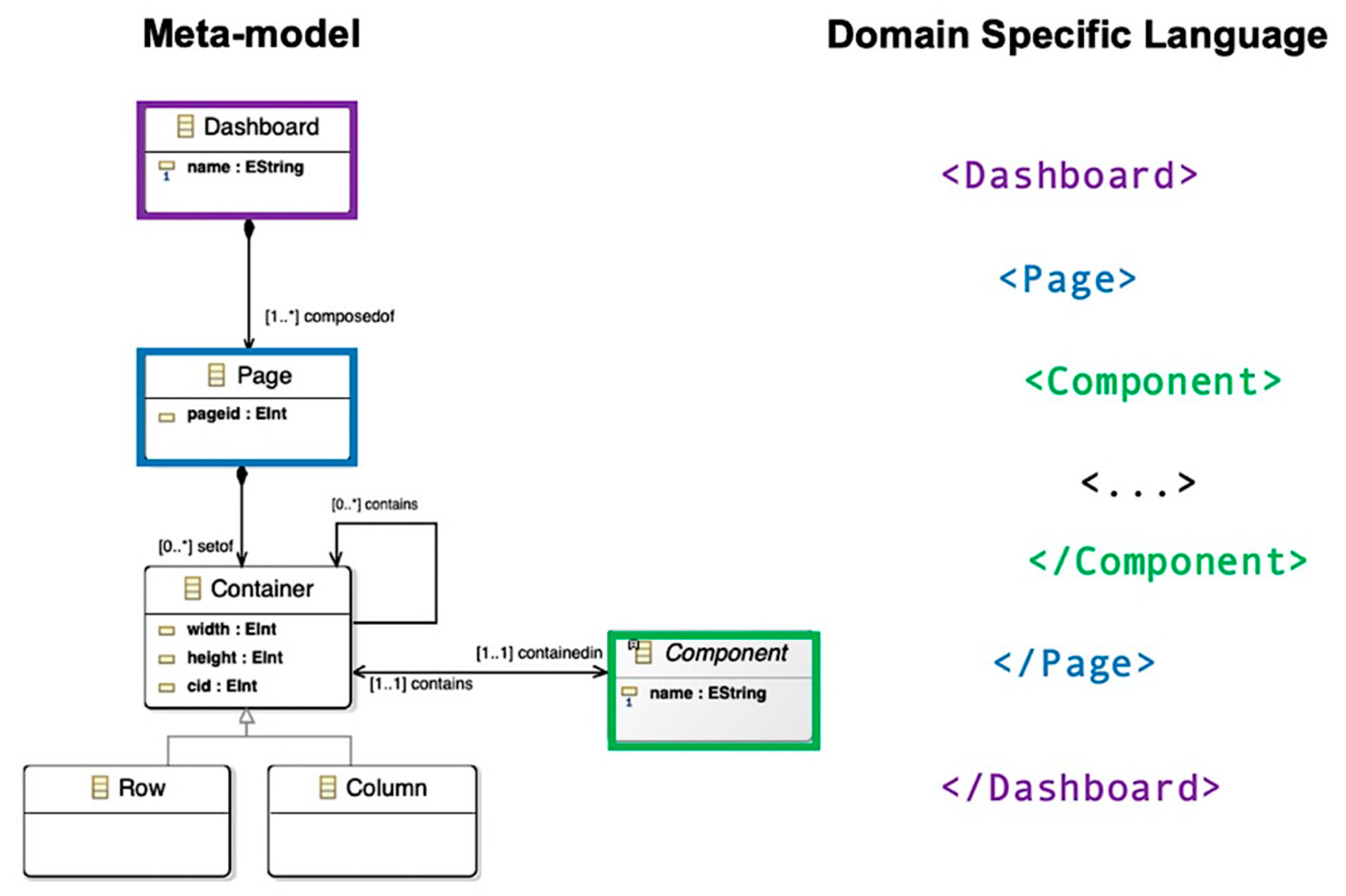
3.1. Metamodeling
3.2. Visualization Tasks’ Taxonomies
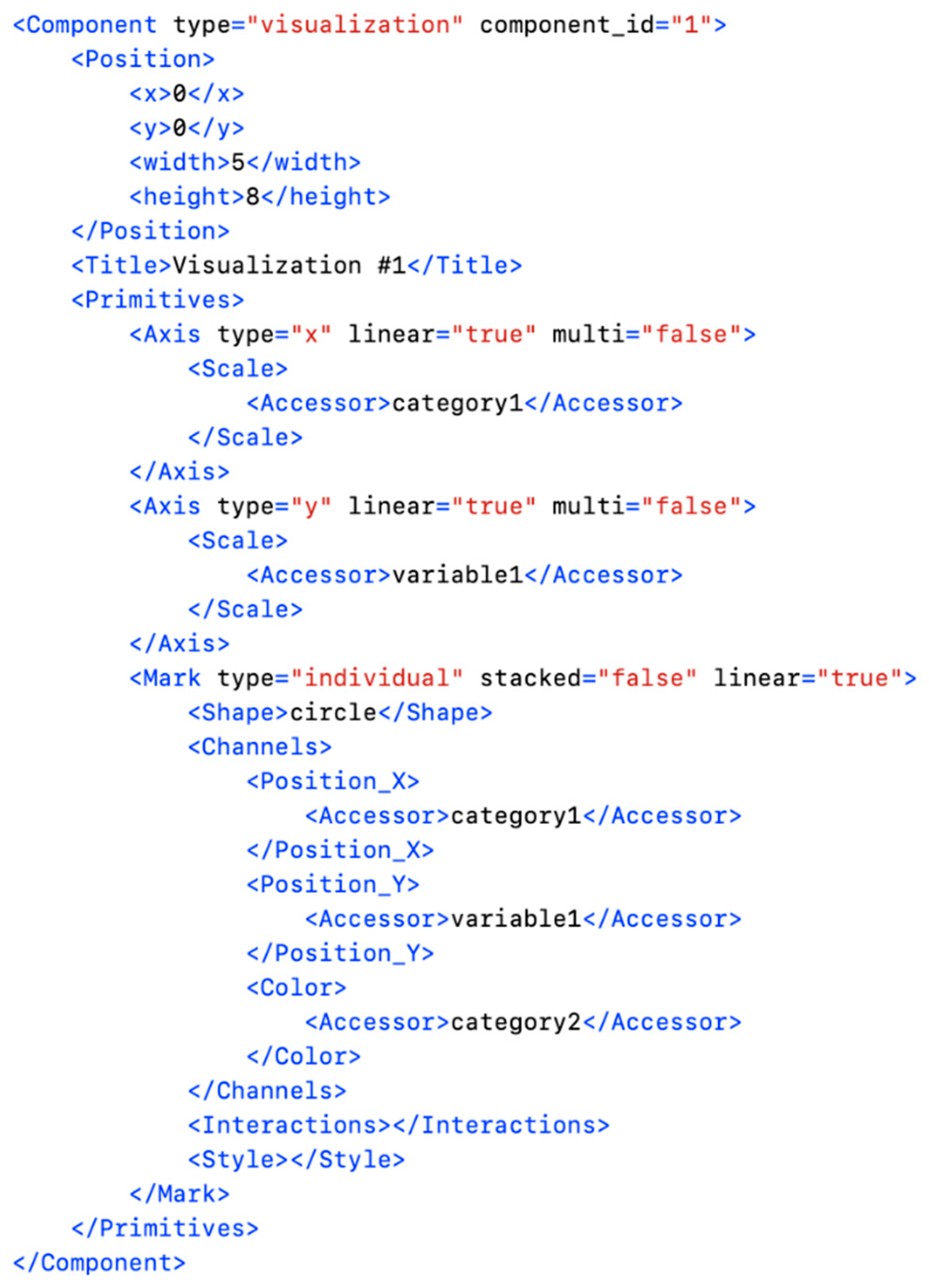
3.3. Domain Specific Language
3.4. Generation Process
4. Results
4.1. Meta-Model Extension
4.2. Dashboard DSL
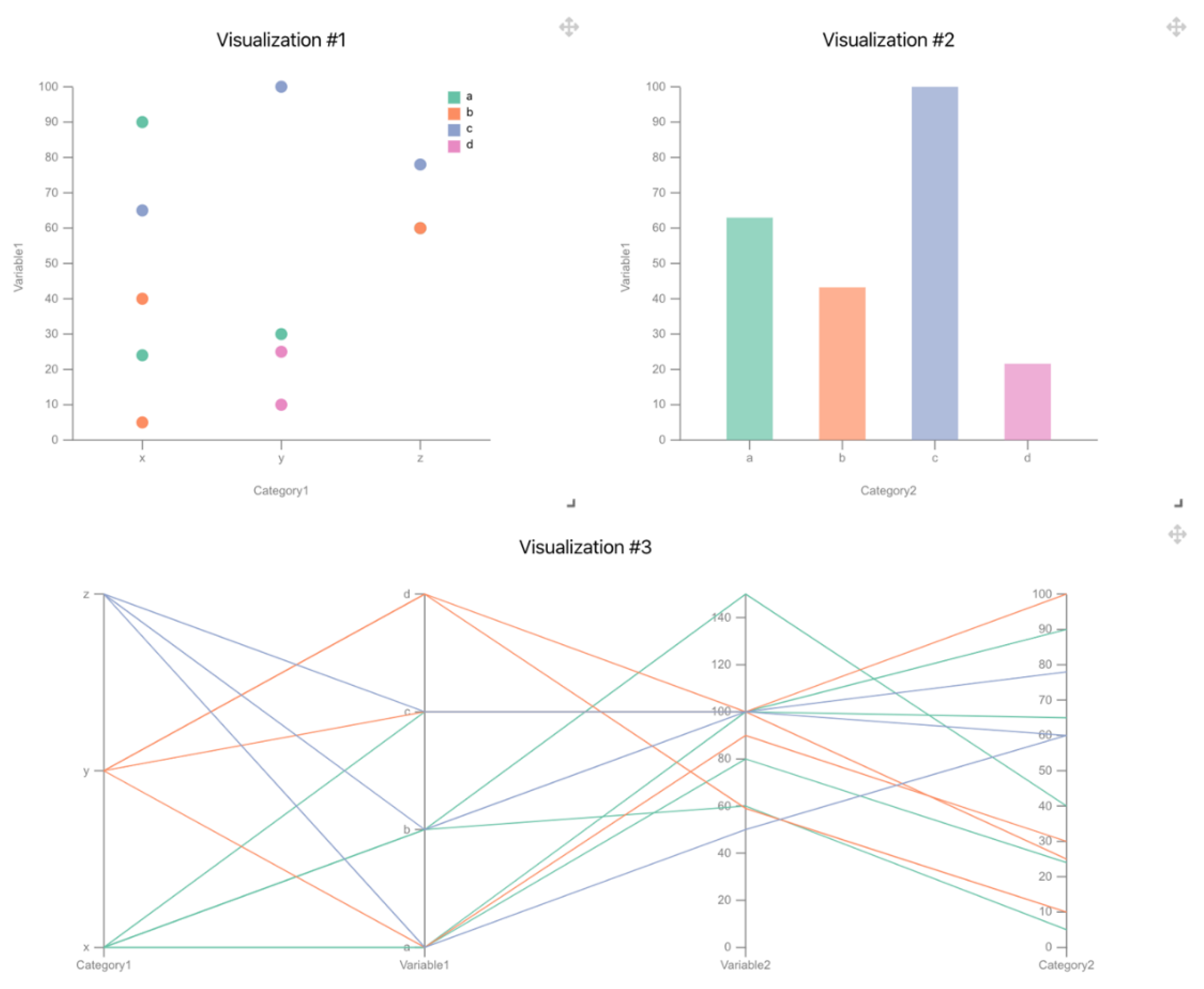
4.3. Example of Use
5. Discussion
6. Conclusions
Author Contributions
Funding
Acknowledgments
Conflicts of Interest
References
- Patil, D.; Mason, H. Data Driven; O’Reilly Media, Inc.: Sebastopol, CA, USA, 2015. [Google Scholar]
- Lu, H.; Zhu, Y.; Shi, K.; Lv, Y.; Shi, P.; Niu, Z. Using adverse weather data in social media to assist with city-level traffic situation awareness and alerting. Appl. Sci. 2018, 8, 1193. [Google Scholar] [CrossRef]
- Chang, K.-M.; Dzeng, R.-J.; Wu, Y.-J. An automated IoT visualization BIM platform for decision support in facilities management. Appl. Sci. 2018, 8, 1086. [Google Scholar] [CrossRef]
- Cardoso, A.; Vieira Teixeira, C.J.; Sousa Pinto, J. Architecture for Highly Configurable Dashboards for Operations Monitoring and Support. Stud. Inform. Control 2018, 27, 319–330. [Google Scholar] [CrossRef]
- Mayer, B.; Weinreich, R. A dashboard for microservice monitoring and management. In Proceedings of the 2017 IEEE International Conference on Software Architecture Workshops (ICSAW), Gothenburg, Sweden, 5–7 April 2017; pp. 66–69. [Google Scholar]
- Michel, C.; Lavoué, E.; George, S.; Ji, M. Supporting awareness and self-regulation in project-based learning through personalized dashboards. Int. J. Technol. Enhanc. Learn. 2017, 9, 204–226. [Google Scholar] [CrossRef]
- Aldrich, F.; Sheppard, L. Graphicacy-the fourth’R’? Prim. Sci. Rev. 2000, 64, 8–11. [Google Scholar]
- Balchin, W.G. Graphicacy. Am. Cartogr. 1976, 3, 33–38. [Google Scholar] [CrossRef]
- Few, S. Information Dashboard Design; O’Reilly Media, Inc.: Sebastopol, CA, USA, 2006. [Google Scholar]
- Sarikaya, A.; Correll, M.; Bartram, L.; Tory, M.; Fisher, D. What Do We Talk About When We Talk About Dashboards? IEEE Trans. Vis. Comput. Graph. 2018, 25, 682–692. [Google Scholar] [CrossRef]
- Berinato, S. Good Charts: The HBR Guide to Making Smarter, More Persuasive Data Visualizations; Harvard Business Review Press: Brighton, MA, USA, 2016. [Google Scholar]
- Vázquez-Ingelmo, A.; García-Peñalvo, F.J.; Therón, R. Information Dashboards and Tailoring—A Systematic Literature Review. IEEE Access 2019, 7, 109673–109688. [Google Scholar] [CrossRef]
- Kintz, M.; Kochanowski, M.; Koetter, F. Creating User-specific Business Process Monitoring Dashboards with a Model-driven Approach. In Proceedings of the MODELSWARD, 2017, Porto, Portugal, 19–21 February 2017; pp. 353–361. [Google Scholar]
- Palpanas, T.; Chowdhary, P.; Mihaila, G.; Pinel, F. Integrated model-driven dashboard development. Inf. Syst. Front. 2007, 9, 195–208. [Google Scholar] [CrossRef]
- Pleuss, A.; Wollny, S.; Botterweck, G. Model-driven development and evolution of customized user interfaces. In Proceedings of the 5th ACM SIGCHI Symposium on Engineering Interactive Computing Systems, London, UK, 24–27 June 2013; pp. 13–22. [Google Scholar]
- Logre, I.; Mosser, S.; Collet, P.; Riveill, M. Sensor data visualisation: A composition-based approach to support domain variability. In Proceedings of the European Conference on Modelling Foundations and Applications, York, UK, 21–25 July 2014; pp. 101–116. [Google Scholar]
- Vázquez-Ingelmo, A.; García-Peñalvo, F.J.; Therón, R. Tailored information dashboards: A systematic mapping of the literature. In Proceedings of the Interacción 2019, Donostia, Spain, 25–28 June 2019. [Google Scholar]
- Vázquez Ingelmo, A.; García-Peñalvo, F.J.; Therón, R.; Conde González, M.Á. Extending a dashboard meta-model to account for users’ characteristics and goals for enhancing personalization. In Proceedings of the Learning Analytics Summer Institute (LASI) Spain 2019, Vigo, Spain, 27–28 June 2019. [Google Scholar]
- Vázquez-Ingelmo, A.; García-Holgado, A.; García-Peñalvo, F.J.; Therón, R. Dashboard Meta-Model for Knowledge Management in Technological Ecosystem: A Case Study in Healthcare. In Proceedings of the UCAmI 2019, Toledo, Castilla-La Mancha, Spain, 1–15 July 2019. [Google Scholar]
- Vázquez-Ingelmo, A.; García-Peñalvo, F.J.; Therón, R. Capturing high-level requirements of information dashboards’ components through meta-modeling. In Proceedings of the 7th International Conference on Technological Ecosystems for Enhancing Multiculturality (TEEM 2019), León, Spain, 16–18 October 2019. [Google Scholar]
- Yoo, Y.; Lee, H.; Jo, I.-H.; Park, Y. Educational dashboards for smart learning: Review of case studies. In Emerging Issues in Smart Learning; Springer: Berlin/Heidelberg, Germany, 2015; pp. 145–155. [Google Scholar]
- Roberts, L.D.; Howell, J.A.; Seaman, K. Give me a customizable dashboard: Personalized learning analytics dashboards in higher education. Technol. Knowl. Learn. 2017, 22, 317–333. [Google Scholar] [CrossRef]
- Dabbebi, I.; Iksal, S.; Gilliot, J.-M.; May, M.; Garlatti, S. Towards Adaptive Dashboards for Learning Analytic: An Approach for Conceptual Design and implementation. In Proceedings of the 9th International Conference on Computer Supported Education (CSEDU 2017), Porto, Portugal, 21–23 April 2017; pp. 120–131. [Google Scholar]
- Schwendimann, B.A.; Rodriguez-Triana, M.J.; Vozniuk, A.; Prieto, L.P.; Boroujeni, M.S.; Holzer, A.; Gillet, D.; Dillenbourg, P. Perceiving learning at a glance: A systematic literature review of learning dashboard research. IEEE Trans. Learn. Technol. 2017, 10, 30–41. [Google Scholar] [CrossRef]
- Teasley, S.D. Student facing dashboards: One size fits all? Technol. Knowl. Learn. 2017, 22, 377–384. [Google Scholar] [CrossRef]
- Kaur, P.; Owonibi, M. A Review on Visualization Recommendation Strategies. In Proceedings of the 12th International Joint Conference on Computer Vision, Imaging and Computer Graphics Theory and Applications (VISIGRAPP 2017), Porto, Portugal, 27 February–1 March 2017; pp. 266–273. [Google Scholar]
- Mackinlay, J.; Hanrahan, P.; Stolte, C. Show me: Automatic presentation for visual analysis. IEEE Trans. Vis. Comput. Graph. 2007, 13, 1137–1144. [Google Scholar] [CrossRef] [PubMed]
- Viegas, F.B.; Wattenberg, M.; Van Ham, F.; Kriss, J.; McKeon, M. Manyeyes: A site for visualization at internet scale. IEEE Trans. Vis. Comput. Graph. 2007, 13, 1121–1128. [Google Scholar] [CrossRef]
- Wongsuphasawat, K.; Moritz, D.; Anand, A.; Mackinlay, J.; Howe, B.; Heer, J. Voyager: Exploratory analysis via faceted browsing of visualization recommendations. IEEE Trans. Vis. Comput. Graph. 2015, 22, 649–658. [Google Scholar] [CrossRef]
- Voigt, M.; Pietschmann, S.; Grammel, L.; Meißner, K. Context-aware recommendation of visualization components. In Proceedings of the Fourth International Conference on Information, Process, and Knowledge Management (eKNOW), Valencia, Spain, 30 January–4 February 2012; pp. 101–109. [Google Scholar]
- Key, A.; Howe, B.; Perry, D.; Aragon, C. Vizdeck: Self-organizing dashboards for visual analytics. In Proceedings of the 2012 ACM SIGMOD International Conference on Management of Data, New York, NY, USA, 20–24 May 2012; pp. 681–684. [Google Scholar]
- Mutlu, B.; Veas, E.; Trattner, C. Vizrec: Recommending personalized visualizations. ACM Trans. Interact. Intell. Syst. 2016, 6, 31. [Google Scholar] [CrossRef]
- Hu, K.; Bakker, M.A.; Li, S.; Kraska, T.; Hidalgo, C. VizML: A Machine Learning Approach to Visualization Recommendation. In Proceedings of the 2019 CHI Conference on Human Factors in Computing Systems, Glasgow, Scotland, UK, 4–9 May 2019; p. 128. [Google Scholar]
- Dibia, V.; Demiralp, Ç. Data2Vis: Automatic generation of data visualizations using sequence to sequence recurrent neural networks. IEEE Comput. Graph. Appl. 2019, 39, 33–46. [Google Scholar] [CrossRef]
- Saket, B.; Endert, A.; Demiralp, C. Task-based effectiveness of basic visualizations. IEEE Trans. Vis. Comput. Graph. 2018, 25, 2505–2512. [Google Scholar] [CrossRef]
- Vartak, M.; Huang, S.; Siddiqui, T.; Madden, S.; Parameswaran, A. Towards visualization recommendation systems. ACM Sigmod Rec. 2017, 45, 34–39. [Google Scholar] [CrossRef]
- Kleppe, A.G.; Warmer, J.; Bast, W. MDA Explained. The Model Driven Architecture: Practice and Promise; Addison-Wesley Longman Publishing Co., Inc.: Boston, MA, USA, 2003. [Google Scholar]
- Mellor, S.J.; Scott, K.; Uhl, A.; Weise, D. Model-Driven Architecture. In Advances in Object-Oriented Information Systems, Proceedings of the OOIS 2002 Workshops, Montpellier, France, 2 September 2002; Bruel, J.-M., Bellahsene, Z., Eds.; Springer: Berlin/Heidelberg, Germany, 2002; pp. 290–297. [Google Scholar]
- Álvarez, J.M.; Evans, A.; Sammut, P. Mapping between Levels in the Metamodel Architecture. In ≪UML≫ 2001—The Unified Modeling Language. Modeling Languages, Concepts, and Tools. UML 2001. Lecture Notes in Computer Science; Gogolla, M., Kobryn, C., Eds.; Springer: Berlin/Heidelberg, Germany, 2001; Volume 2185, pp. 34–46. [Google Scholar]
- García-Holgado, A.; García-Peñalvo, F.J. Validation of the learning ecosystem metamodel using transformation rules. Future Gener. Comput. Syst. 2019, 91, 300–310. [Google Scholar] [CrossRef]
- Kang, K.C.; Cohen, S.G.; Hess, J.A.; Novak, W.E.; Peterson, A.S. Feature-Oriented Domain Analysis (FODA) Feasibility Study; Carnegie-Mellon University, Software Engineering Institute: Pittsburgh, PA, USA, 1990. [Google Scholar]
- Voelter, M.; Visser, E. Product line engineering using domain-specific languages. In Proceedings of the 2011 15th International Software Product Line Conference (SPLC), Munich, Germany, 22–26 August 2011; pp. 70–79. [Google Scholar]
- Amar, R.; Eagan, J.; Stasko, J. Low-level components of analytic activity in information visualization. In Proceedings of the IEEE Symposium on Information Visualization, Los Alamitos, CA, USA, 23–25 October 2005; pp. 111–117. [Google Scholar]
- Schulz, H.-J.; Nocke, T.; Heitzler, M.; Schumann, H. A design space of visualization tasks. IEEE Trans. Vis. Comput. Graph. 2013, 19, 2366–2375. [Google Scholar] [CrossRef] [PubMed]
- Gotz, D.; Zhou, M.X. Characterizing users’ visual analytic activity for insight provenance. Inf. Vis. 2009, 8, 42–55. [Google Scholar] [CrossRef]
- Dimara, E.; Franconeri, S.; Plaisant, C.; Bezerianos, A.; Dragicevic, P. A task-based taxonomy of cognitive biases for information visualization. IEEE Trans. Vis. Comput. Graph. 2018, 26, 1413–1432. [Google Scholar] [CrossRef] [PubMed]
- Munzner, T. Visualization Analysis and Design; AK Peters/CRC Press: Boca Raton, FL, USA, 2014. [Google Scholar]
- Brehmer, M.; Munzner, T. A multi-level typology of abstract visualization tasks. IEEE Trans. Vis. Comput. Graph. 2013, 19, 2376–2385. [Google Scholar] [CrossRef] [PubMed]
- Lam, H.; Tory, M.; Munzner, T. Bridging from goals to tasks with design study analysis reports. IEEE Trans. Vis. Comput. Graph. 2017, 24, 435–445. [Google Scholar] [CrossRef] [PubMed]
- Munzner, T. A nested process model for visualization design and validation. IEEE Trans. Vis. Comput. Graph. 2009, 15, 921–928. [Google Scholar] [CrossRef]
- Bray, T.; Paoli, J.; Sperberg-McQueen, C.M.; Maler, E.; Yergeau, F. Extensible markup language (XML). World Wide Web J. 1997, 2, 27–66. [Google Scholar]
- Novák, M. Easy implementation of domain specific language using xml. In Proceedings of the 10th Scientific Conference of Young Researchers (SCYR 2010), Košice, Slovakia, 19 May 2010. [Google Scholar]
- Fallside, D.C.; Walmsley, P. XML Schema Part 0: Primer Second Version; W3C: Cambridge, MA, USA, 2004; Available online: https://www.w3.org/TR/xmlschema-0/ (accessed on 27 March 2020).
- Clements, P.; Northrop, L. Software Product Lines; Addison-Wesley: Boston, MA, USA, 2002. [Google Scholar]
- Vázquez-Ingelmo, A.; García-Peñalvo, F.J.; Therón, R. Addressing Fine-Grained Variability in User-Centered Software Product Lines: A Case Study on Dashboards. In Proceedings of the World Conference on Information Systems and Technologies, La Toja Island, Galicia, Spain, 16–19 April 2019; pp. 855–864. [Google Scholar]
- Ronacher, A. Jinja2 Documentation; Jinja2; Available online: https://jinja.palletsprojects.com/en/2.11.x/ (accessed on 27 March 2020).
- Vázquez-Ingelmo, A. Ecore Version of the Metamodel for Information Dashboards (v2). Available online: https://doi.org/10.5281/zenodo.3561320 (accessed on 27 March 2020).
- Gomaa, H. Designing Software Product Lines with UML: From Use Cases to Pattern-Based Software Architectures; Addison Wesley Longman Publishing Co., Inc.: Boston, MA, USA, 2004. [Google Scholar]
- Kästner, C.; Apel, S.; Kuhlemann, M. Granularity in software product lines. In Proceedings of the 30th International Conference on Software Engineering, Leipzig, Germany, 10–18 May 2018; pp. 311–320. [Google Scholar]
- Lee, S.; Kim, S.-H.; Kwon, B.C. Vlat: Development of a visualization literacy assessment test. IEEE Trans. Vis. Comput. Graph. 2017, 23, 551–560. [Google Scholar] [CrossRef]
- Boy, J.; Rensink, R.A.; Bertini, E.; Fekete, J.-D. A principled way of assessing visualization literacy. IEEE Trans. Vis. Comput. Graph. 2014, 20, 1963–1972. [Google Scholar] [CrossRef]
- Hullman, J.; Adar, E.; Shah, P. The impact of social information on visual judgments. In Proceedings of the SIGCHI Conference on Human Factors in Computing Systems, Vancouver, BC, Canada, 7–12 May 2011; pp. 1461–1470. [Google Scholar]
- Kim, Y.-S.; Reinecke, K.; Hullman, J. Data through others’ eyes: The impact of visualizing others’ expectations on visualization interpretation. IEEE Trans. Vis. Comput. Graph. 2018, 24, 760–769. [Google Scholar] [CrossRef]
- Perez, C.C. Invisible Women: Exposing Data Bias in a World Designed for Men; Random House: New York, NY, USA, 2019. [Google Scholar]
- Sarikaya, A.; Gleicher, M. Scatterplots: Tasks, data, and designs. IEEE Trans. Vis. Comput. Graph. 2017, 24, 402–412. [Google Scholar] [CrossRef] [PubMed]
- Iovino, L.; Pierantonio, A.; Malavolta, I. On the Impact Significance of Metamodel Evolution in MDE. J. Object Technol. 2012, 11, 1–33. [Google Scholar] [CrossRef]
- Harrison, L.; Yang, F.; Franconeri, S.; Chang, R. Ranking visualizations of correlation using weber’s law. IEEE Trans. Vis. Comput. Graph. 2014, 20, 1943–1952. [Google Scholar] [CrossRef]
- Cairo, A. How Charts Lie: Getting Smarter about Visual Information; WW Norton & Company: New York, NY, USA, 2019. [Google Scholar]
- Agudo-Peregrina, Á.F.; Iglesias-Pradas, S.; Conde-González, M.Á.; Hernández-García, Á. Can we predict success from log data in VLEs? Classification of interactions for learning analytics and their relation with performance in VLE-supported F2F and online learning. Comput. Hum. Behav. 2014, 31, 542–550. [Google Scholar] [CrossRef]
- Baepler, P.; Murdoch, C.J. Academic analytics and data mining in higher education. Int. J. Scholarsh. Teach. Learn. 2010, 4, 17. [Google Scholar] [CrossRef]
- Ferguson, R. Learning analytics: Drivers, developments and challenges. Int. J. Technol. Enhanc. Learn. 2012, 4, 304–317. [Google Scholar] [CrossRef]
- Jivet, I.; Scheffel, M.; Drachsler, H.; Specht, M. Awareness is not enough: Pitfalls of learning analytics dashboards in the educational practice. In Proceedings of the 12th European Conference on Technology Enhanced Learning (EC-TEL 2017), 12–15 September 2017; Springer: Tallinn, Estonia, 2017; pp. 82–96. [Google Scholar]
- Kim, J.; Jo, I.-H.; Park, Y. Effects of learning analytics dashboard: Analyzing the relations among dashboard utilization, satisfaction, and learning achievement. Asia Pac. Educ. Rev. 2016, 17, 13–24. [Google Scholar] [CrossRef]
- Liñán, L.C.; Pérez, Á.A.J. Educational Data Mining and Learning Analytics: Differences, similarities, and time evolution. Int. J. Educ. Technol. High. Educ. 2015, 12, 98–112. [Google Scholar]
- Sein-Echaluce, M.L.; Fidalgo-Blanco, Á.; Esteban-Escaño, J.; García-Peñalvo, F.J.; Conde-González, M.Á. Using learning analytics to detect authentic leadership characteristics at engineering degrees. Int. J. Eng. Educ. 2018, in press. [Google Scholar]


© 2020 by the authors. Licensee MDPI, Basel, Switzerland. This article is an open access article distributed under the terms and conditions of the Creative Commons Attribution (CC BY) license (http://creativecommons.org/licenses/by/4.0/).
Share and Cite
Vázquez-Ingelmo, A.; García-Peñalvo, F.J.; Therón, R.; Conde, M.Á. Representing Data Visualization Goals and Tasks through Meta-Modeling to Tailor Information Dashboards. Appl. Sci. 2020, 10, 2306. https://doi.org/10.3390/app10072306
Vázquez-Ingelmo A, García-Peñalvo FJ, Therón R, Conde MÁ. Representing Data Visualization Goals and Tasks through Meta-Modeling to Tailor Information Dashboards. Applied Sciences. 2020; 10(7):2306. https://doi.org/10.3390/app10072306
Chicago/Turabian StyleVázquez-Ingelmo, Andrea, Francisco José García-Peñalvo, Roberto Therón, and Miguel Ángel Conde. 2020. "Representing Data Visualization Goals and Tasks through Meta-Modeling to Tailor Information Dashboards" Applied Sciences 10, no. 7: 2306. https://doi.org/10.3390/app10072306
APA StyleVázquez-Ingelmo, A., García-Peñalvo, F. J., Therón, R., & Conde, M. Á. (2020). Representing Data Visualization Goals and Tasks through Meta-Modeling to Tailor Information Dashboards. Applied Sciences, 10(7), 2306. https://doi.org/10.3390/app10072306