Article

A Traffic-Based Method to Predict and Map Urban Air Quality

1
Grupo de Biodiversidad, Medio Ambiente y Salud (BIOMAS), Universidad de Las Américas, Quito 170125, Ecuador
2
Facultad de Ingeniería y Ciencias Aplicadas, Universidad de Las Américas, Quito 170125, Ecuador
3
Faculty of Data and Information Sciences, Dalarna University, 791 88 Falun, Sweden
*
Authors to whom correspondence should be addressed.
Appl. Sci. 2020, 10(6), 2035; https://doi.org/10.3390/app10062035
Submission received: 29 December 2019 / Revised: 21 February 2020 / Accepted: 25 February 2020 / Published: 17 March 2020
(This article belongs to the Special Issue Air Quality Prediction Based on Machine Learning Algorithms)

Abstract

:
As global urbanization, industrialization, and motorization keep worsening air quality, a continuous rise in health problems is projected. Limited spatial resolution of the information on air quality inhibits full comprehension of urban population exposure. Therefore, we propose a method to predict urban air pollution from traffic by extracting data from Web-based applications (Google Traffic). We apply a machine learning approach by training a decision tree algorithm (C4.8) to predict the concentration of PM2.5 during the morning pollution peak from: (i) an interpolation (inverse distance weighting) of the value registered at the monitoring stations, (ii) traffic flow, and (iii) traffic flow + time of the day. The results show that the prediction from traffic outperforms the one provided by the monitoring network (average of 65.5% for the former vs. 57% for the latter). Adding the time of day increases the accuracy by an average of 6.5%. Considering the good accuracy on different days, the proposed method seems to be robust enough to create general models able to predict air pollution from traffic conditions. This affordable method, although beneficial for any city, is particularly relevant for low-income countries, because it offers an economically sustainable technique to address air quality issues faced by the developing world.

1. Introduction

As the world evolves towards global urbanization, 56% of its cities (population over 100,000) in developed countries and 98% in low- and middle-income countries violate the World Health Organization’s (WHO) recommendations for air quality [1]. As a result, air pollution has become the number one environmental risk accountable for seven million premature deaths worldwide every year [2]. Furthermore, future projections estimate that these numbers will double by 2050 [3].
Among the regulated atmospheric pollutants, such as criteria gases (carbon monoxide—CO, nitrogen oxides—NOx, sulfur dioxide—SO2 and ozone—O3) and particles, the most complex is fine particulate matter (PM)—PM2.5 (aerodynamic diameter ≤2.5 µm). As it can originate directly and indirectly from anthropogenic activities, such as traffic, industries, and so forth, PM2.5 is a good indicator of the overall air quality and is useful to estimate the health impacts of air pollution exposure, due to its well-known respiratory and cardiovascular health effects [4,5]. While in high- to mid-income countries the concentrations of this pollutant are decreasing, due to strict environmental regulations, PM pollution is worsening in the developing countries, as the demand for power and transportation in urban areas grows [6,7,8,9]. In addition, old technologies and poor quality fuel in South America contribute to the fact that the major share of fine PM comes from traffic [10,11]. Due to the health implications of traffic-related particulate pollution, it is crucial to divulge the air quality conditions to the inhabitants of urban conglomerates.
Although concentrations of PM2.5 are higher in the developing countries, the largest share of atmospheric pollution studies and measurements are performed in less traffic-polluted developed countries [1,9,10]. Apart from costly scientific research, urban air quality monitoring is either very limited in resolution or simply inexistent, due to expensive and complex reference instruments [11]. In recent years, urban monitoring has been revolutionized by low-cost instruments [12]. As a result, a range of studies on urban air pollution measurements using networks of inexpensive sensors have been published [13,14,15,16,17]. While this is a more economical way to study air quality in an urban area, the resolution cannot possibly satisfy the full comprehension of health risks that are due to the non-homogeneous urban infrastructure or complex terrain and land use. Thus, another recent alternative is a mobile air quality laboratory, equipped with an array of sensors assessing air quality at the street level [18]. However, again, not all cities can afford mapping air pollution by covering the whole city, especially the ones housing millions of people. Furthermore, urban pollution is a dynamic parameter depending on different factors, such as traffic, which is always fluctuating. Therefore, in order to have representative information, the sampling requires multiple repetitions, including thousands of hours of monitoring.
Conventional approaches to local, regional, and even global representation of air pollution conditions are based on air pollution modelling (e.g., Gaussian and chemical transport models (CTMs)) [19,20]. These models contain a strong comprehension of topography, pollution sources, emissions, deposition, atmospheric conditions, and transport, among others. Different scale CTMs process the characteristics of chemical components of the atmosphere (e.g., emission, transport, mixing, and chemical transformation of trace gases and aerosols) simultaneously with meteorology [20]. On the other hand, these models are computationally costly and require a significant build-up of background and input information. They face additional challenges in regions with complex terrain. Another option is using costly software applications to build static urban pollution (noise, air quality, etc.) models, which require an elaborate list of input parameters [21]. Finally, air pollutants can be associated with predictive geographic attributes such as land use, traffic patterns, or population density to build land-use regression (LUR) models [22,23,24].
Alternatively, all cities have access to several applications that show the overall quality of traffic, such as Traffic by Google Maps, Waze, and so forth. Those applications quantify the intensity or severity of traffic on the basis of its corresponding velocities in any city of the world through geo-information (crowdsourcing). While these applications indicate the status of traffic in the city, it also might imply air quality conditions [25]. Our previous research work showed positive results in correlating traffic and urban PM2.5 pollution in the rapidly growing Ecuadorian capital [26]. This study presents an innovative way to map fine particulate pollution on the basis of real-time traffic intensity and seeks for a general model that is able to predict air quality from a sustainable approach.

2. Materials and Methods
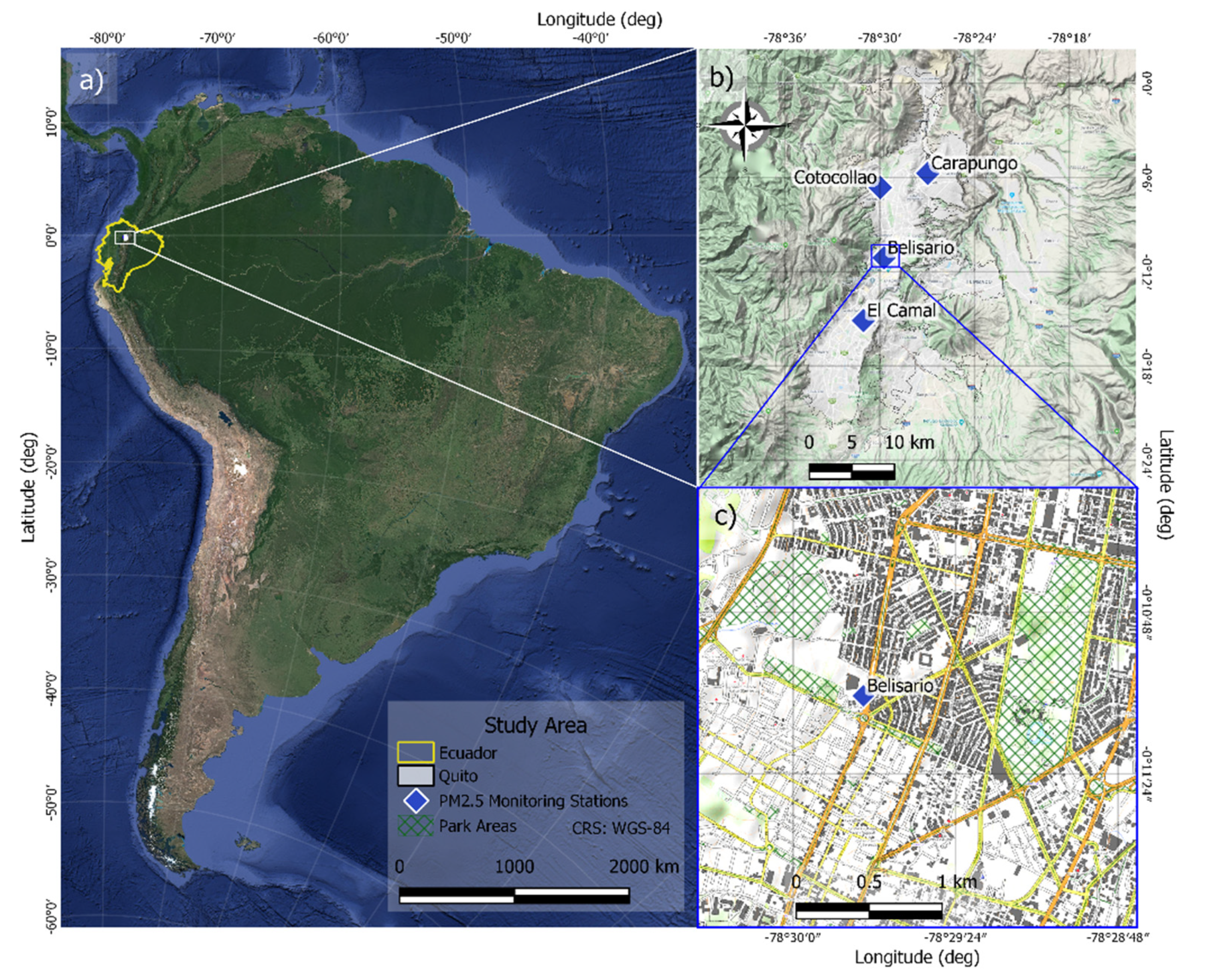
2.1. Study Site

The present study was conducted in a central part of Quito, Ecuador (see Figure 1). The world’s highest capital, housing 2.2 million people, is positioned at an average elevation of 2835 m above sea level (m.a.s.l.) [27]. This complex terrain city, although characterized by microclimates, has two well-defined seasons. The dry season that lasts from June to August has low precipitation (14 mm/month) and high winds, while the rainy season, from September to May, is characterized by convective precipitation during the afternoon hours (59 mm/month) [28]. Due to its nestling in the Andes cordillera, morning temperature inversions are commonly demonstrated by dark grey smog episodes during morning rush hours. As a result, the city deals with a decade-long PM2.5 pollution problem, not only violating World Health Organization (WHO) recommendations for air quality but even less strict limits of national standards [10].

2.2. Pollution Measurement

For street-level PM2.5 pollution mapping, a central area (approximately 2.5 km × 2.8 km), containing busy traffic avenues, a main city highway, secondary residential streets, and two parks was chosen. PM2.5 concentration scans were performed over four days (30 May and 3, 12, and 18 June, 2019) during the morning rush hours (8:00–10:00). It is considered that these data would contribute to building the most conservative and representative model for the worst air quality conditions, which is important for health implications in urban areas. A portable real-time CEL-712 Microdust Pro monitor [29] was paired with a GPS device [30]. The Microdust Pro sensor, based on a near forward angle light scattering technique, was calibrated before the experiment by using zero-air and a known concentration filter (164 mg m−3). In addition, the validity of this portable particle sensor was confirmed by collocating it for 8 h (battery life) with the Environmental Protection Agency approved method (EQPM-1102-150) showing a good correlation (R = 0.86) [31]. This automated Thermo Scientific 5014i Beta Continuous Ambient instrument forms a part of the air quality and meteorological (Vaisala WXT536) monitoring station (Belisario) in the center of the experimental site (Figure 1c). The background concentrations of PM2.5 and meteorological data were downloaded from this station, previously described elsewhere [10,28]. The portable PM2.5 and the GPS equipment were synchronized to function at a 5-s time step. Both instruments were held at the height of 1.5 m and faced the particle inlet forward while walking on a sidewalk following the traffic flow. The approximate speed of sampling was 4 km/h.

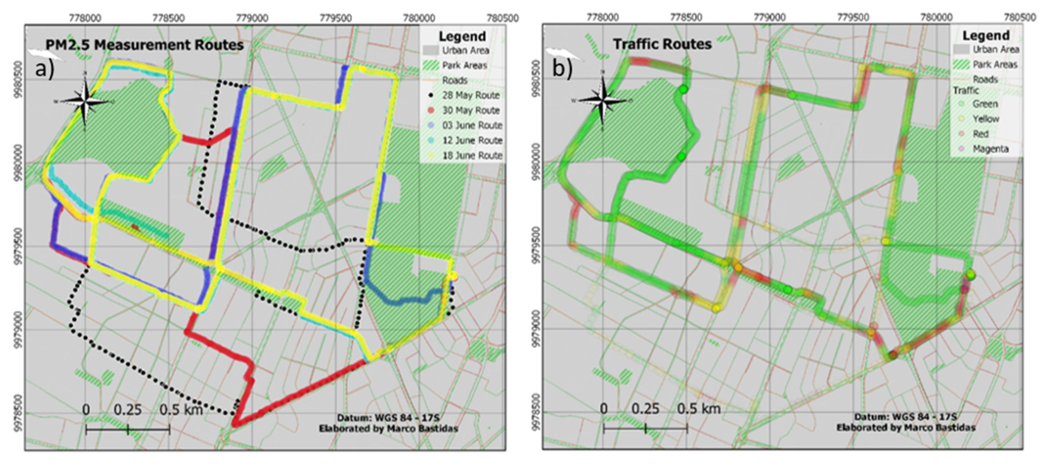
2.3. Traffic Measurement

An additional mobile phone application, developed by the group, was used to register the traffic conditions on the basis of the Google Maps Traffic tool. The quality of traffic in this application is represented by four colors: Green—fast-flowing traffic, Yellow—slower traffic with more vehicles, Red—more congested traffic, and Dark red—the most congested or completely stopped traffic. These data were collected by registering traffic representative colors in each segment of the road of a covered path (5-s time step). Apart from that, in a separate experiment on 19 June, 2019, traffic speed and category were registered by traveling the main city avenues with a car. Subsequently, the obtained data were used to produce PM2.5 pollution maps in QGIS software, using the Inverse Distance Weighting (IDW) function. IDW estimates unknown concentrations of pollutants through an interpolation method, which assumes that closer values are more related than further values.
To get a simplified and high-resolution urban pollution model based on traffic conditions, we started by performing a thorough analysis of the real traffic and the available traffic applications. First, a comparative analysis between the vehicle velocities, measured while driving around the city of Quito, and Google Traffic category was performed. Then, traffic speeds reported by a mobile application Waze were compared with Google Traffic categories. Unfortunately, in the Ecuadorian capital, the use of Waze is limited and mostly available on the major avenues, possibly due to a small number of users. However, over a few months, prior and during the study (April–June, 2019), of random sampling in different parts of the city, we were able to collect enough Waze-based data in parallel to Google Traffic to compare the road travel velocity to the traffic categories of Google Traffic. Finally, the correlation analysis between PM2.5 concentrations and Google Traffic velocity categories was performed. This data was used to create a hierarchical cluster analysis. It produces a dendrogram, which is a treelike diagram that summarizes the process of clustering, where similar variables are joined by lines whose vertical length reflects the Euclidean distance between these variables. We used the function hclust in R to get the best cutoff distance on the y-axis that separates the four levels of traffic into a set of two clusters.

2.4. Modeling

2.4.1. Decision Trees Algorithm

The predictive models were built by using a category of the machine learning method called Decision Trees. The chosen algorithm was C4.5 [32]. Besides its high classification performance, this method offers an easy tree-based visualization that facilitates the interpretation of the output of the model. C4.5 is based on a top-down recursive divide and conquer strategy. An attribute to split on is selected at the root node, and then a branch is created for each possible attribute value. This operation splits the instances into subsets, one for each branch that extends from the root node. Then, this procedure is repeated recursively for each branch, selecting an attribute at each node and choosing only instances that reach that branch to make the selection. The purest split defines the selection of the best attribute for each node. To do so, the heuristic used in C4.5 is based on information theory and quantification of entropy, which measures information in bits for each of the possible outcomes (p), as described in Equation (1). The idea is to know how much information is gained by knowing the value of an attribute. The information gain is obtained by calculating the entropy of the distribution before the split minus the entropy of the distribution after the split. At each node, the attribute to be selected is the one that provides the highest information gain. The process is repeated until reaching the end of the tree (pure nodes) or getting a maximum depth that preserves the readability of the model. The program J48 from the machine learning workbench Weka was used as the implementation of the algorithm C4.8 (upgraded version of C4.5) to train and test the models.
e n t r o p y ( p 1 ,   p 2 ,   ,   p n ) = p 1 l o g p 1 p 2 l o g p 2 p n l o g p n
In this study, three types of models were created from four days of measurements: 30 May 2019, and 3, 12 and 18 June 2019. The first one is based on an IDW to predict the concentration of PM2.5 at street level. The values used to proceed with this calculation are provided by the four closest monitoring stations of the Secretariat of the Environment: Belisario (elev. 2835 m.a.s.l., coord. 78°29′24″ W, 0°10′48″ S), Centro (elev. 2820 m.a.s.l., coord. 78°30′36″ W, 0°13′12″ S), Cotocollao (elev. 2739 m.a.s.l., coord. 78°29′50″ W, 0°6′28″ S), and El Camal (elev. 2840 m.a.s.l., coord. 78°30′36″ W, 0°15′00″ S) (see Figure 1b). Each of those stations are located about 4–6 km apart from each other (study radius of about 8 km). This method provides an estimation of the pollution concentration which is inversely correlated to the distance from the measured contamination (monitoring stations) [33]. IDW assumes that each measured point has a local influence that diminishes with distance. It gives greater weights to points closest to the prediction location, and the weights diminish as a function of distance, as described in Equation (2). Where Zp stands for the interpolated value of pollution, Zi stands for the actual values measured at the monitoring stations, n stands for the number of stations considered (here n = 4), and d stands for the distance between the monitoring stations and a given geolocation point. It is to note that different powers (p) can be used to calculate the distance. The p value defines the smoothness of the interpolation. Increasing the p raises the overall influence of the known values on the concentration gradient. For instance, a p = 2 will provide values more localized and not averaged out as much as a p = 1.
Z p = i = 1 n ( z i d i p ) i = 1 n ( 1 d i p )
The two other types of models are based on a closer but indirect measurement of the pollution: traffic intensity and time of the day. The collection and the cleansing of these data are described in the next section.

2.4.2. Data Preparation and Assessment

In order to prepare the dataset, the raw data (5-s step) measured at street level using Microdust Pro were smoothed by performing a running average on two minutes to mitigate the noise created by artefactual events (e.g., sudden passage of a bus). The concentration of PM2.5 was divided into two classes, low and high, depending on the median of the values of each day of measurements. The median value of PM2.5 did not vary significantly from one day to another (mean = 40.7 µg m−3; standard deviation = 7.8 µg m−3) and can be, consequently, considered as a standard concentration. Furthermore, this value is between the national standard (50 µg m−3) and WHO health recommendations (25 µg m−3) for 24-h PM2.5 concentrations.
Choosing the median as a threshold allowed us to get balanced classes (same number of instances in each class). If the classes are unbalanced, the machine learning algorithms tend to classify on the majority class (i.e., the class with the highest number of instances), which provides a misleadingly high accuracy by raising the baseline (i.e., the benchmark if the classification is simply based on the majority class). On the contrary, by using the median, we assure that the classification baseline is 50% (random choice between the two possible classes). Thus, the objective is to produce a model that gives an accuracy of classification significantly better than 50%, with the simplest tree as possible (no more than three nodes).
The models were tested through a 10-fold cross-validation. This method is the best alternative when the dataset is relatively small. Cross-validation is a procedure that partitions the data into non-overlapping samples (or folds). Usually, k = 10 folds is chosen, which means that the data are randomly partitioned into 10 equal parts, where each fold has 10% of the instances. A model is then fit k times. Each time, one of the folds serves as the testing set and the remaining k-1 folds are used as the training set. Consequently, each fold is used once as the training set to make a prediction for every record in the dataset. The overall performance of the model is then obtained by combining the model’s predictions on each of the k testing sets [34]. Equation (3) describes the formula used to calculate the accuracy of the prediction.
a c c u r a c y = T P + T N T P + T N + F P + F N
where TP stands for true positives (PM2.5 concentrations > median) and TN stands for true negatives (PM2.5 concentrations < median). These variables are the correctly classified instances. The wrongly classified observations FP and FN are false positives and false negatives, respectively.
Instead of predicting a spectrum of concentrations through a regression technique, this study is interested in a binary discrimination between high levels of contamination, which present a risk for public health, versus acceptable levels. This choice is supported by the recommendations of the WHO, which defines a standard threshold, and related work proposing a machine learning approach to classify air pollution [26,35,36,37,38].

2.4.3. Clustering Analysis

Once the different models were built from the methods described in Section 2.4.1., an unsupervised learning (clustering method) was performed in order to identify the model that generalizes the best. The popular iterative distance-based clustering k-Means was chosen. The Euclidean distance was selected as metric to assess the performance of the algorithm. First, the desired number of clusters, which is the k value, is specified. Here, k = 2, because two classes of pollution are expected: low (below the median value) vs. high (above the median value) concentration of PM2.5. Second, the algorithm chooses k points at random as cluster centers. Third, all the instances of the dataset are assigned to their closest cluster center. Fourth, the centroid (or mean) of all the instances in each cluster is calculated, which transforms these centroids into new cluster centers. Then, the algorithm goes back to the beginning and carries on until the cluster centers do not change. In other words, this algorithm searches for a minimization of the total squared distance from the instances to their cluster centers. The best model is the one that gets the minimum distance or error. The variables used to perform this clustering analysis were traffic and time of day for the whole city measurements and the PM2.5 prediction made by each model.

3. Results and Discussion

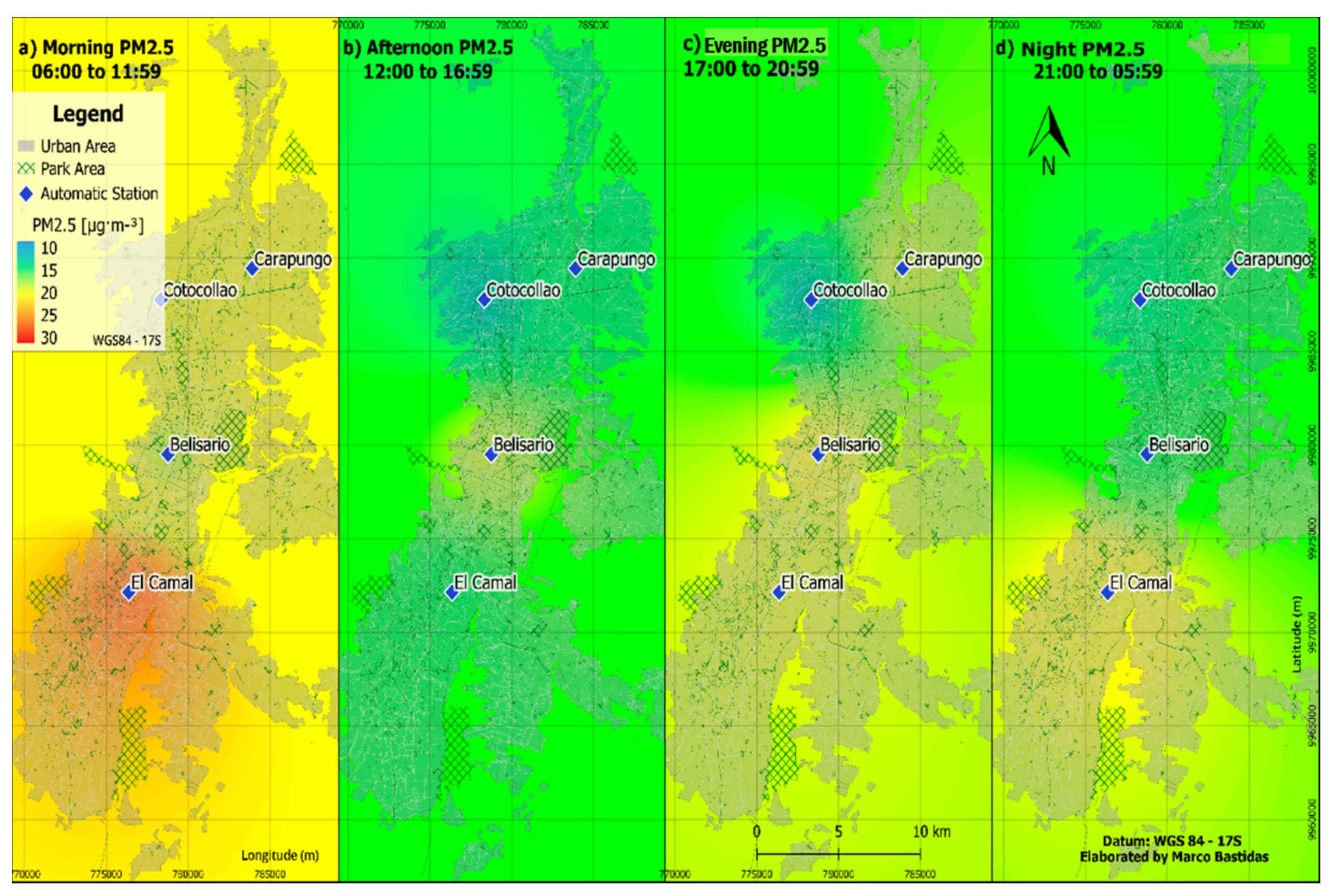
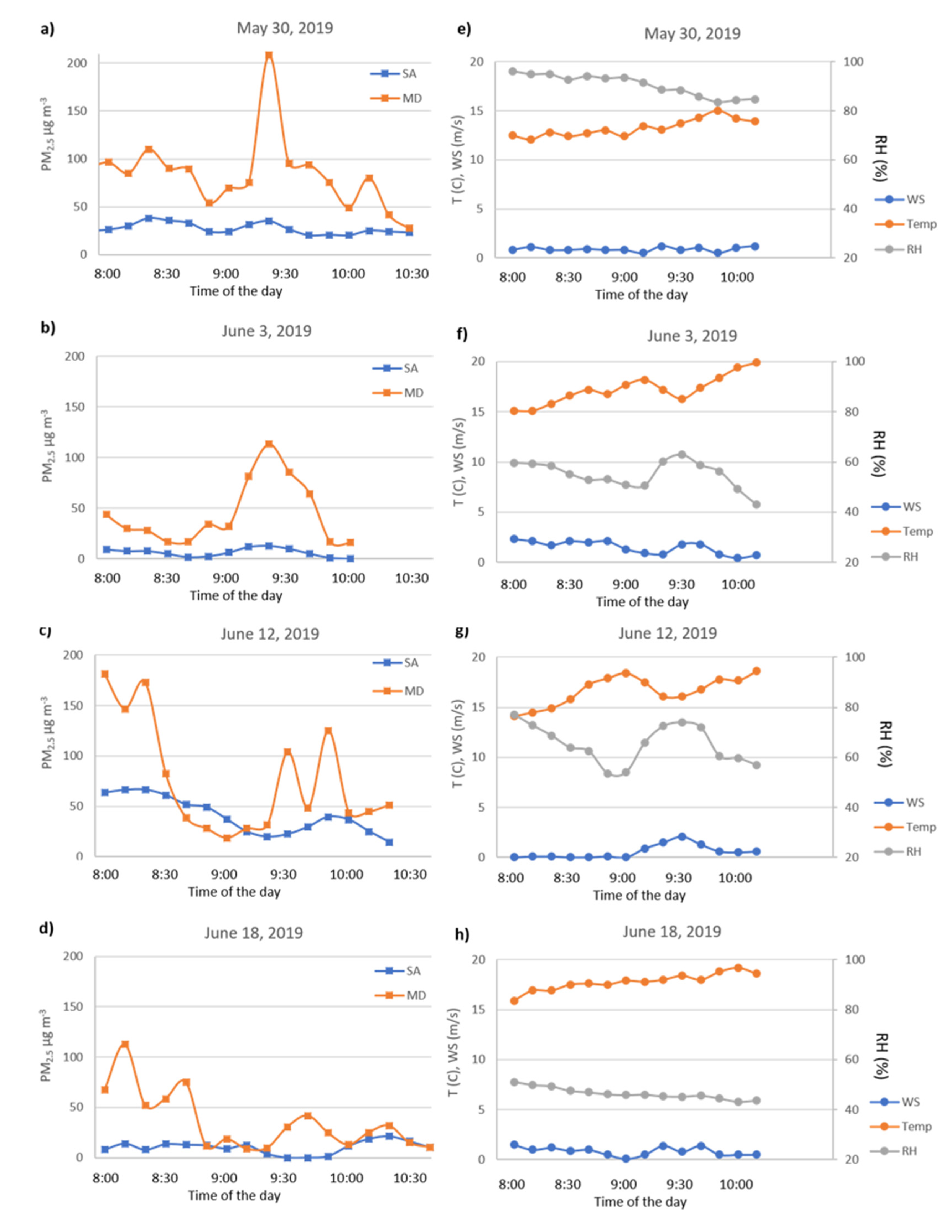
3.1. Urban PM2.5 Concentrations Based on the Air Quality Network

Long-term (2017–2018) average PM2.5 concentration IDW maps for different periods of the day (6:00–11:59, 12:00–16:59, 17:00–20:59 and 21:00–05:59) are presented in Figure 2. It can be seen that the resolution of the air quality information is relatively low, spatially not varying much. Only during the morning hours, the concentrations increase and show some variation, due to the elevated levels in the south of the city. This zone is known for industrial activities and usually shows the highest PM2.5 pollution in the city [10]. This method is worthy for representing the general air quality conditions in the city, as the monitoring stations are positioned on the elevated platforms 10–20 m above street level. At the same time, people are exposed to the street-level pollution that is highly variable and often more elevated, which implies more serious consequences to health, and must be understood. Apart from the fact that the background PM2.5 concentrations measured by the monitoring network are lower, they are also not very representative of the actual concentrations at an urban scale, due to mobile source pollution, which might reach as high as six times more than those reported by the air quality network (Figure A1a–d, Appendix A).

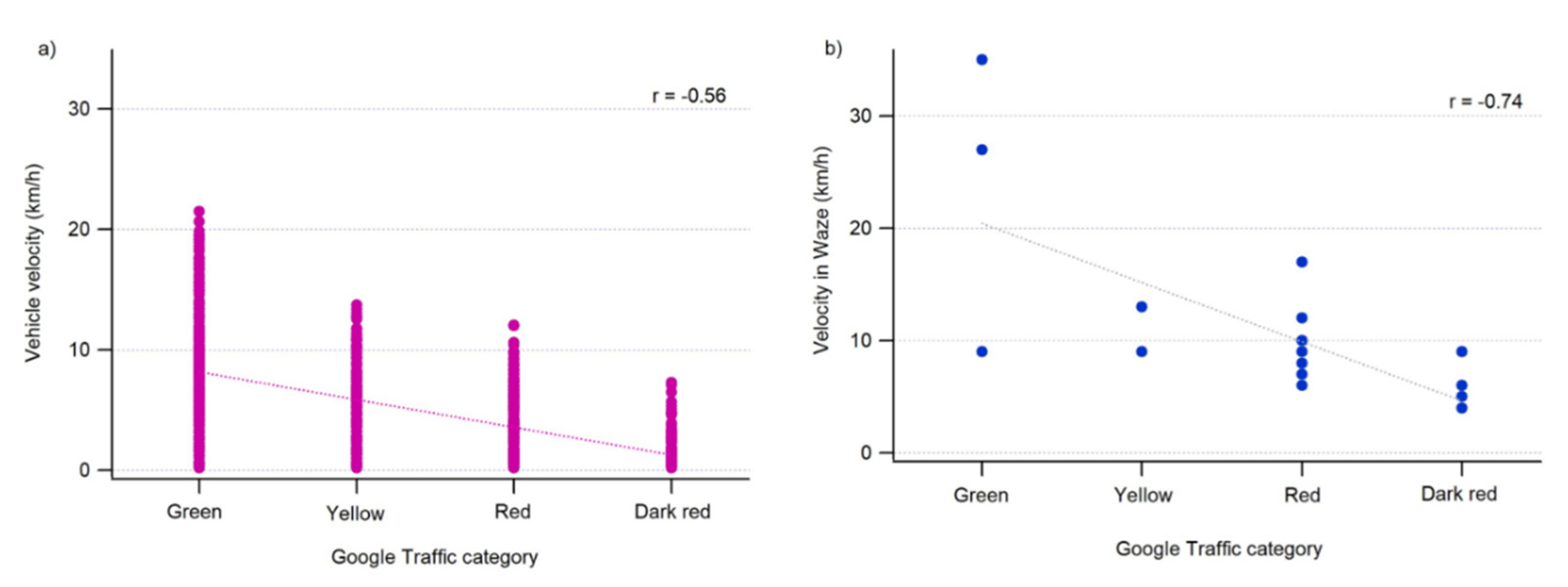
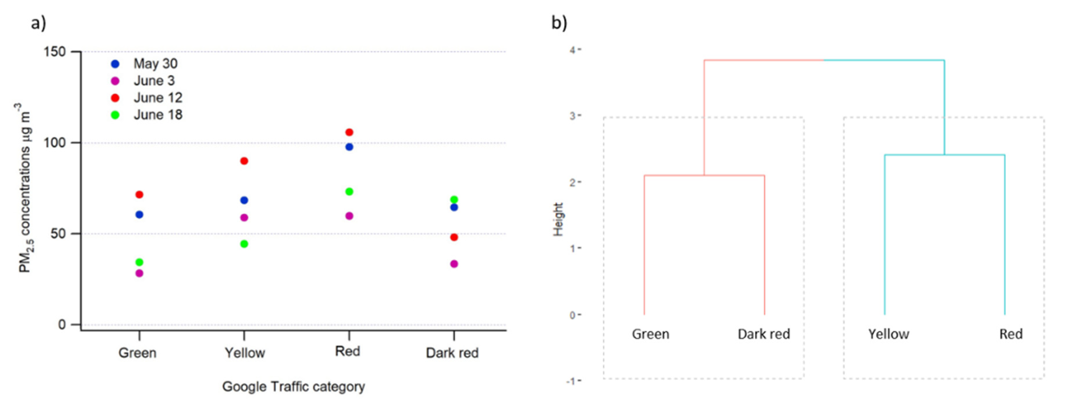
3.2. Traffic Data Validation and Relationship with PM2.5 Concentrations

A thorough analysis of the real traffic and the available traffic applications is displayed in Figure 3. The analysis of the measured vehicle velocities, while driving around the city, and the Google Traffic category shows a negative correlation (R = −0.56) between an increased velocity and a lightness of traffic (Figure 3a). A negative correlation (R = −0.74) was also found between the traffic velocity reported in the Waze application and Google Traffic congestion (Figure 3b). The correlations between data from Google Traffic/Waze and actual vehicle velocities suggest that these web-based applications are reliable estimators of the real-time traffic speed in the city of Quito.
Throughout the study, based on tens of hours of sampling (Figure 4a), visual observations confirmed that traffic reported by the Google Traffic application was highly accurate for the main avenues, but not always representative in the secondary residential streets. In several cases of sampling small streets, although the street had no traffic, the traffic application indicated congestion (Google Traffic—Red). This could be due to the parked or stopped cars idling on the side of the street. Based on this finding, we decided to focus our study on the main avenues avoiding secondary residential streets. It is not a significant limitation, for the health exposure to traffic-based pollution, because main avenues represent the principal sources of pollution in a city, as they contain the most polluting city transportation, such as diesel-powered bus lines in the case of Quito. In our study, we also show that the main avenues are highly representative of traffic issues, and most of our sampling data compares well with typical traffic conditions (Figure 4b).
PM2.5 concentrations plotted against Google Traffic velocity categories showed an inverse correlation between vehicle velocities and PM2.5 concentrations until a certain critical level of congestion of the traffic (Dark red, Figure 5a). It can be seen that Green—the fast-flowing traffic—and Dark red—the very slow or stopped traffic—tend to generate less PM2.5 pollution, due to a limited acceleration and braking when compared to Yellow and Red—the slower traffic (more braking and acceleration). The data represented in Figure 5a were used to create a hierarchical cluster analysis in the form of a dendrogram. On the x-axis are the variables (traffic levels). Similar variables are joined by lines whose vertical length reflects the Euclidean distance between these variables. The dendrogram shows that Green and Dark red are grouped as a single class that results in lower concentrations of fine particulate matter, whereas Yellow and Red constitute another class producing higher levels of particulate pollution (Figure 5b). Based on these findings, the traffic feature was divided into two categories: group 1 (Green + Dark red) and group 2 (Yellow + Red).

3.3. Models and Prediction Accuracy

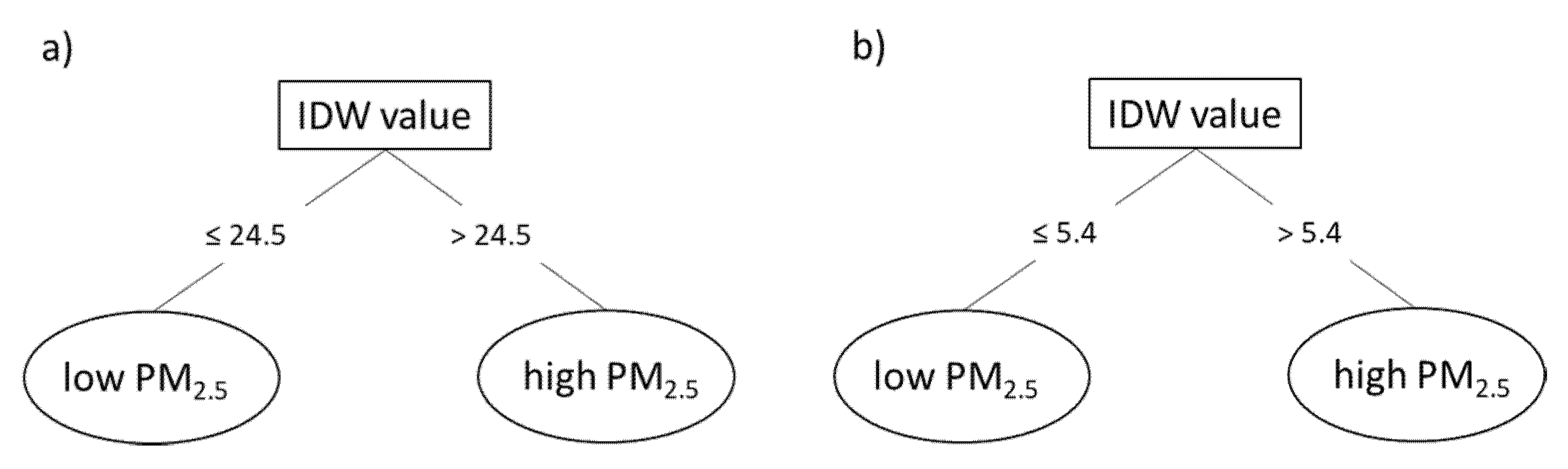
3.3.1. PM2.5 Prediction from Monitoring Stations and IDW

To study the prediction power of urban pollution based on monitoring stations, we verified the IDW interpolation data with the real measurements. We performed a sensitivity analysis on different p values (range from 1 to 5) to identify the power that provides the best prediction. Overall, the difference of accuracy from one p to another is not significant (Table 1). Nevertheless, the remaining analyses will focus on the models using p = 2, because they tend to give the best performance.
Two out of four models do not provide a prediction which is significantly different from a random choice between low and high concentration of PM2.5. The percentage of accuracy of the models for 30 May and 18 June, 2019 are both equal to 50%. However, 30 May, 2019 was a day with high relative humidity, low solar radiation, and thus low temperature, which may increase a variability in local source mixing (Figure A1e, Appendix A). On the other hand, 18 June, 2019 was warmer and, thus, windier (Figure A1h, Appendix A). For 12 June, 2019, increased cloudiness caused larger temperature changes (Figure A1g, Appendix A), therefore, the model is slightly better (accuracy = 57%) but still below the expectations (Figure 6a). The only model that provides us with good prediction is 3 June, 2019 (Figure 6f): accuracy = 71%. This day had relatively constant meteorological conditions during the measurements, pointing to the less variation in time of the air pollution. Figure A1b,f demonstrates the relationship between peak PM2.5 concentrations and a decrease in wind speed. Finally, Figure A1a–d (Appendix A) show that the evolution of the concentrations of fine particulate matter over time is quite different between the measurements at the station and the street level for the days 30 May, 2019, and 12 and 18 June, 2019. The levels registered by the monitoring stations for these days (several small peaks) are significantly noisier than for 3 June, 2019 (clear pollution peak at 9:20). These results tend to demonstrate that the use of the air quality network provides limited spatial resolution and can only be suitable in the case of typical days. For a more reliable prediction, another approach less dependent on the meteorological conditions needs to be adopted. The best way to reduce the effect of the meteorology is to, directly or indirectly, measure the pollution closer to its source of emission. This is the approach that consists of monitoring traffic, for which the resulting models are presented in the next sections.

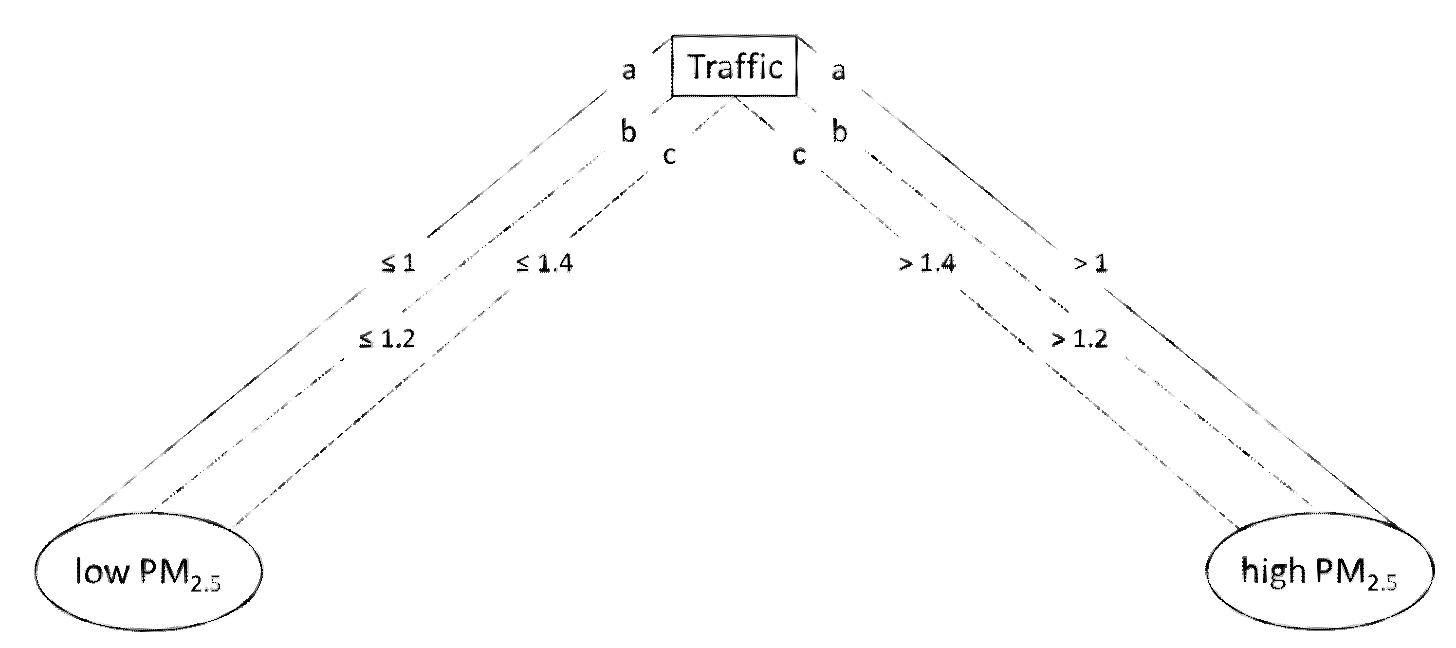
3.3.2. PM2.5 Prediction from Traffic Only

Four models were built from the four different days of collected data. Figure 7 shows a good consistency between these models. All of them tend to classify a traffic type 1 (fast or completely stopped) as a low source of contamination. On the contrary, a traffic type 2 (significant reduction of the vehicle flow) is always identified as a high source of pollution. The value of the split is slightly different from one day to another except for 3 and 18 June, 2019 (b—broken line in Figure 7), where the threshold is always equal to 1.2. The lower value obtained for 30 May, 2019 (a—solid line in Figure 7) could be explained by the fact that during that day, secondary streets were considered. On 12 June, 2019 (c—dashed line in Figure 7), highly variable concentrations of PM2.5 were registered because of variable meteorological conditions (e.g., cloudy weather and thus variations in temperature and humidity, Figure A1g, Appendix A). Considering these limitations, our results suggest that model b (b—broken line, see Figure 7) is the most representative of the city of Quito during the morning rush hours (worst air quality conditions). The assessment of each model supports this finding. The best performance is obtained for 3 June, 2019 (71% of accuracy), which outperforms 30 May, 2019 (66%), 12 June, 2019 (64%), and 18 June, 2019 (61%). The relatively lower accuracy of this latter model can be explained by the fact that on 18 June, 2019 weather conditions changed to typical of the dry season (i.e., warm temperatures that cause changes in wind speed, Figure A1h, Appendix A). This tends to increase the PM2.5 concentrations in the street canyons, due to dust resuspension caused by an increased ventilation, which also might reduce the pollution (noise due to ventilation of the anthropogenic PM and suspension of the natural PM) [39,40].

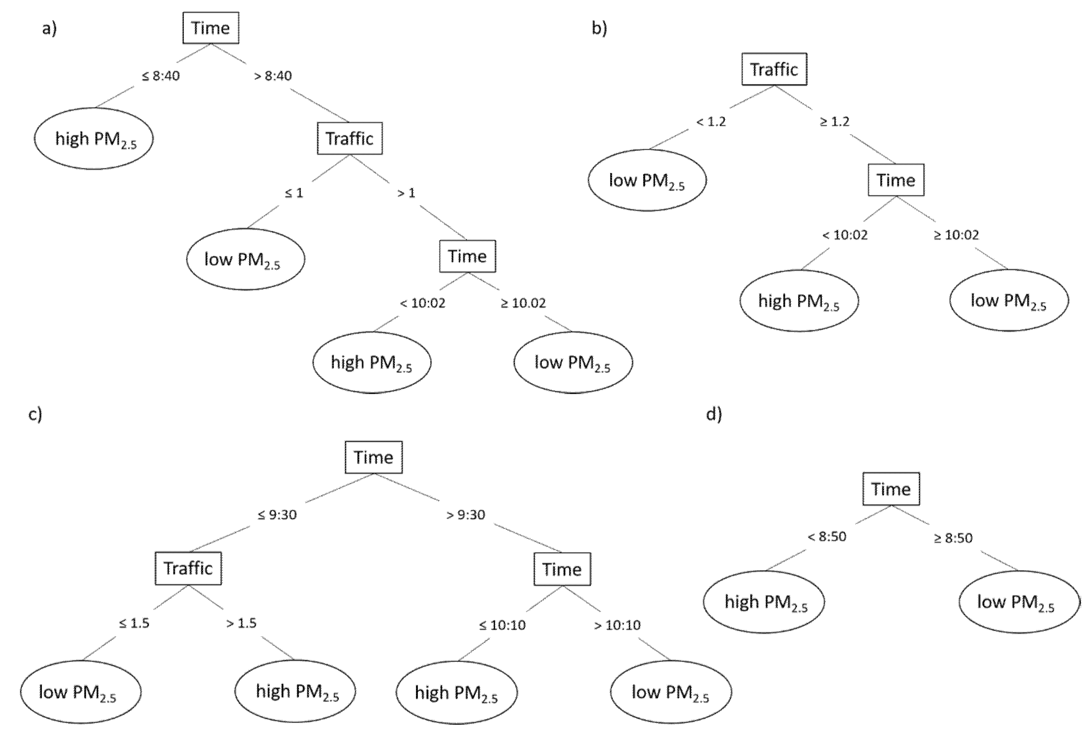
3.3.3. PM2.5 Prediction from Traffic and Time of the Day

Including time of the day in the models improves the accuracy by an average of 6.5% (mean performance of traffic-based only = 65.5%; mean performance of traffic + time of the day = 72%). Here, all the predictions are higher or equal to 70%. Three out of four models split first on time of day (Figure 8a,c,d), which means that the temporal factor is a dominant feature for the estimation of the pollution levels. The four models show that the earlier the time, the higher the PM2.5 concentration is. Two main reasons can explain this outcome. First, rush hour occurs before 9:00. Since the traffic is denser during this period, the emission of particulate matter increases. The second explanation is related to the height of the planetary boundary layer (PBL). PBL is low in the early morning and keeps growing all morning long, due to the intensification of solar radiation, which, in result, increases the dilution of PM2.5 in the atmosphere [36], especially after 10:00 (Figure 8b). These two phenomena account for the two thresholds (around 9:00 and 10:00) for which the time feature is split in the models presented in Figure 8. Regarding the split for the traffic feature, the models present similar thresholds as in the previous section. A traffic type 1 (fluid or completely congested) is a predictor of less contamination than a traffic type 2 (slower flow). To sum up, adding the time of day enables the weaker models solely based on traffic to get a similar performance as the best models (prediction ≥ 70%), but it does not significantly improve the accuracy of these latter.

3.3.4. Model Generalization
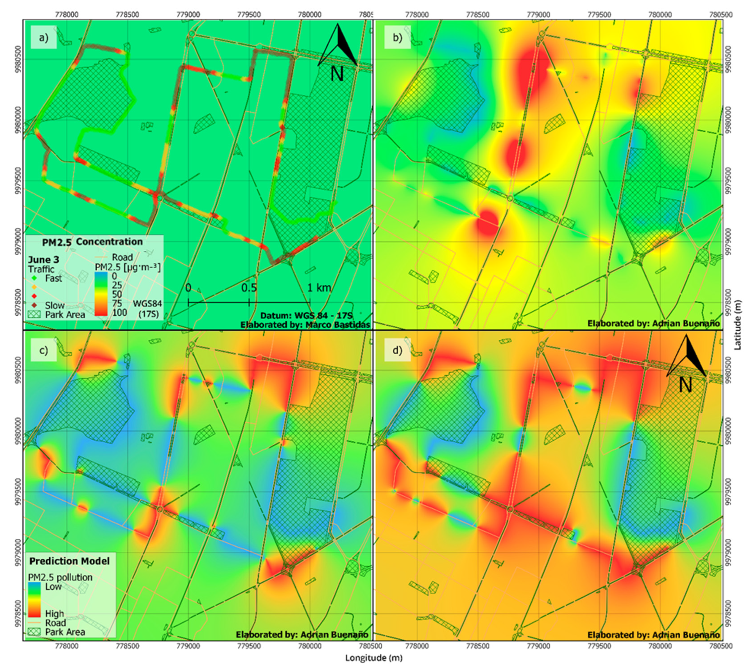
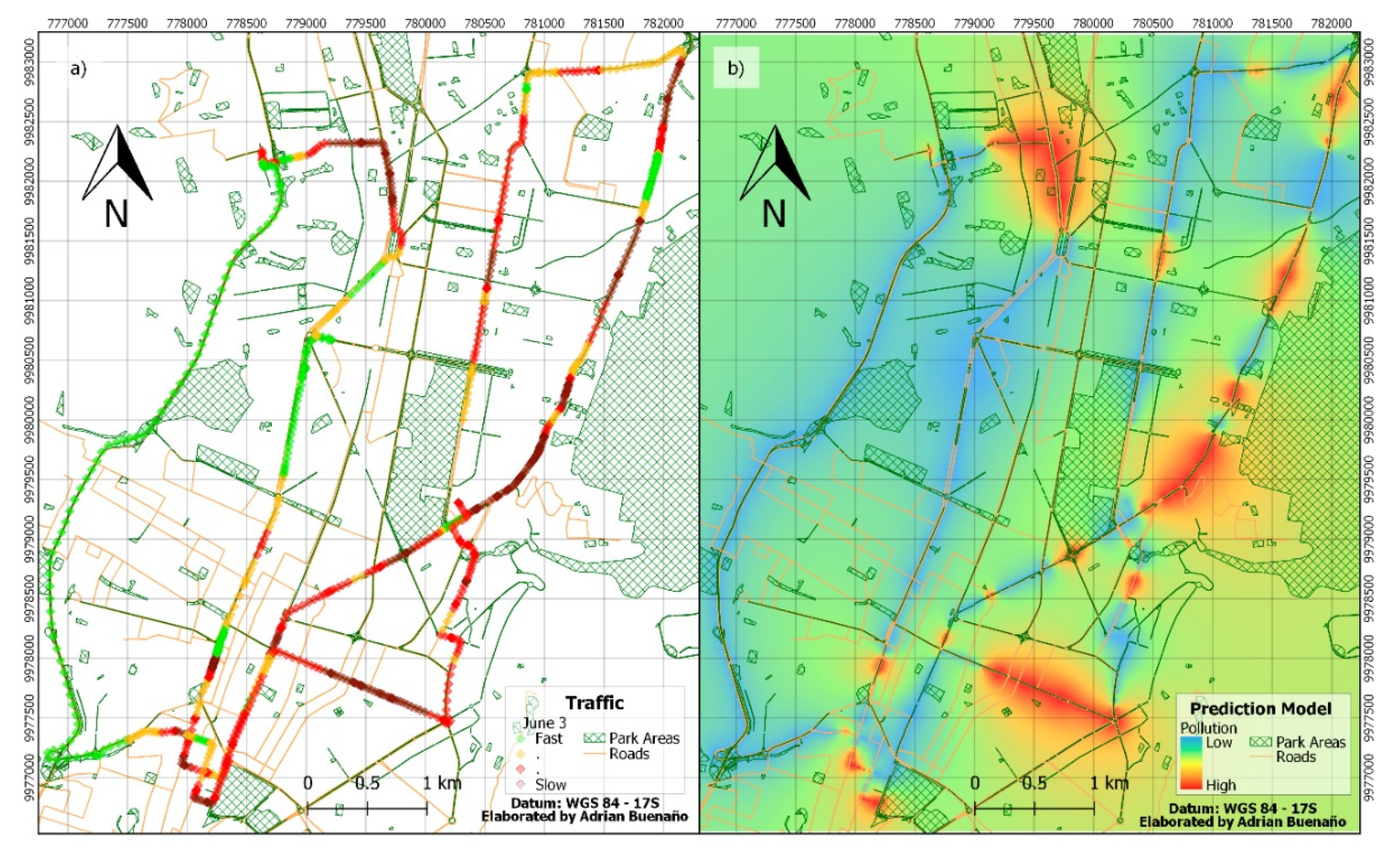
To confirm the proposed approach, which consists of a traffic-based model that can be applied for any day during the morning rush hour, the accuracy of the supposed best model (3 June, 2019) was tested on the three other days. In the case of the traffic-based model, the accuracy of the classification is as follows: 64% for 30 May, 2019, 64% for 12 June, 2019, and 61% for 18 June, 2019. When this performance is compared to the models trained on a proper day, it gives the difference as follows: 2% for 30 May, 2019, 30% for 12 June, 2019, and 0% for 18 June, 2019. This result suggests that the model of 3 June, 2019 can be applied with a very high accuracy on other days, even if they are characterized by different meteorological conditions. Regarding the models based on traffic and time of the day, the performances are: 68% for 30 May, 2019, 63% for 12 June, 2019, and 58% for 18 June, 2019. The difference of accuracy in comparison to the model of the proper day is: 4% for 30 May, 2019, 10% for 12 June, 2019, and 12% for 18 June, 2019. These outcomes tend to demonstrate that the traffic-based model of 3 June, 2019 can indeed be generalizable to other days, which confirms that it is reliable to predict atmospheric pollution from a machine learning model based on the flow of vehicles in the city. Nevertheless, this generalization seems to show some limitations when the factor of time is added in the model. The fact that a model based solely on traffic is more generalizable than a one based on traffic + time of the day has a mathematical and a physical explanation. First, the machine learning approach applies the Occam’s Razor principle, which states that for a similar performance, we prefer the simpler model over the more complex one [34]. The more complex the model is, the higher is the probability it was fitted accidentally (overfitting). This is the reason why a dimension reduction (or regularization) should be systematically performed before applying a machine learning algorithm, in order to tackle the affliction caused by increasing the variables in a predictive model (curse of dimensionality). The second interpretation is environmental. The unstable meteorological conditions during the measurements have caused an inconsistent dilution of the pollutants over time. In consequence, the resulting models based on the time of day are less robust to predict new data. Other features, such as land use, could also be considered to improve the prediction of the background concentration of PM2.5, as observed by [35]. Nevertheless, this factor was discarded for the purpose of this study, because it cannot account for the dynamic of human mobility and, consequently, is limited to forecast pollution peaks.
While we strongly insist on the good consistence between the models, a certain limitation of the study is the relatively reduced number of recorded days. However, the goal of this work goes beyond the identification of the “hotspots” of pollution in this specific city, in which case it would be crucial to repeatedly map the study area to assure the representability of urban pollution areas. The principal purpose of this investigation is to understand the correlation between live and dynamic traffic and urban PM pollution. We focused on a representative area of the city as it includes a rich variety of street types in the urban infrastructure. We are confident, that each section of the street has its own dynamics of traffic and pollution, which, as expected, might not be always the same. Thus, each of those few-minute records on several sections represents a separate experiment. The proposed method intends to demonstrate the potential of the real-time traffic monitoring to provide an automatic pollution mapping, as illustrated in the next section.

3.4. PM2.5 Mapping

Real measurements and modeling results are presented for 3 June, 2019 at 8:00–10:20 in Figure 9. First, we show the IDW interpolation of PM2.5 concentrations measured at the neighboring monitoring stations (see Figure 9a). It is clear that the PM2.5 pollution interpolation of sparsely distributed air quality network stations is simply not good enough to estimate exposure to urban pollution at the local level. We then compare the traffic conditions during the experiment (colored overlapping diamond markers, Figure 9a) and an IDW interpolation of the PM2.5 concentrations measured that same day during the same hours (Figure 9b). Frequently, increased traffic is a cause of the increase in PM2.5 concentrations, which can be observed in our study. Meanwhile, the lowest concentrations are registered in the city parks (green areas, Figure 9). Finally, we also compare the real PM2.5 measurements with the modeled PM2.5 based on traffic only (Figure 9c), and traffic + time of the day (Figure 9d). The heat maps are obtained by applying an IDW interpolation method on the results provided by the Decision-Tree model for each road segment. While both models performed well in predicting real PM2.5 pollution, adding the time of the day to the traffic predictor, insignificantly improved the model from 71 to 73% accuracy. However, time of the day is a crucial parameter accounting for the effect of atmospheric dilution. This might help to better predict the dynamics of PM2.5 concentrations in any city, which is illustrated in Figure 9. It can be seen that Figure 9d better spatially represents the real pollution (Figure 9b) than Figure 9c. Finally, it is by far much better than just relying on the information of the monitoring stations (Figure 9a).
A possible way to further improve this spatial model would be to include the road-type information. In the case of a highway, traffic behavior is very different, and even if the flow is relatively fast (Green), the concentration of the vehicles is high enough to cause a significant increase in PM2.5 concentrations. Besides, our measurements are based on the sampling at a human step (4 km/h), which might mean that by the time we would reach a congested area, the traffic had already started moving, and we would have to register a fast flow (Green), while a minute ago it was highly congested (Red) and would cause a cloud of pollution in that area. However, if our model would be applied to real-time traffic, the performance would likely be further improved. This suggests a potential power in using this model for real Google Traffic information.
Finally, we applied our best traffic-based model (3 June, 2019) on a larger (6.5 km × 5.5 km) area of Quito (Figure 10). Google traffic data was registered for the main avenues in Quito central area (Figure 10a) during 8:00–10:30 on 19 June, 2019. For practical reasons, the accuracy of this generalization was not verified through a classical supervised learning assessment. Instead, we used a clustering technique which consisted in applying a k-Means algorithm and calculating the within-cluster squared distance for the seven possible models (see Section 2.4.3 for more details). Table 2 shows that the lowest error is obtained for ‘Traffic_b’, which confirms that the model built from the data collected on 3 June, 2019 is the best to generalize the proposed approach to the whole city. This suggests the benefit of this method for citizen awareness of air quality in urban areas. Data extracted from Google Maps Traffic application, or other traffic monitoring application program interfaces (APIs), enables us to build a database on the urban traffic, which is used to predict the real-time urban air pollution.

4. Conclusions

In this first-of-its-kind study, we investigated different ways to predict and map street-level urban air pollution. We used machine learning techniques and Inverse Distance Weighting (IDW) on real measurements of fine particulate matter (PM2.5—aerodynamic diameters ≤ 2.5 µm). Firstly, urban PM2.5 concentration mapping, based on the air quality network of Quito, Ecuador, showed that the resolution of spatial variation of the air pollution is relatively low. While this method is important for representing the general air quality conditions for the city, it is not adequate to estimate the exposure of the urban population to street-level air pollution. Therefore, in this study, we propose an innovative way to model urban PM2.5 on the basis of traffic intensity. To confirm the suitability of available traffic applications, we compared traffic data provided by Google Traffic and Waze to the actual traffic speed measurements. Then, we performed a correlation study between the measured traffic and real-time PM2.5 concentrations, that helped us to split the data into two categories of high and low concentrations for slow traffic (increased acceleration and braking) and fluid or stopped traffic (reduced acceleration and braking), respectively.
To study the prediction power of every method, we verified the Inverse Distance Weighting interpolation data with the real measurements. The interpolation of the monitoring network data exposed limitations and low prediction accuracy (50%–71%), varying from random to improved results for the day with less varying meteorological conditions. The PM model solely based on traffic showed an increased representability of air quality conditions (61%–71% prediction accuracy). Furthermore, our model for PM2.5 prediction based on traffic and time of the day confirmed that including time in the model tends to improve the accuracy by an average of 6.5%. In the latter case, the temporal factor was a dominant feature for the estimation of pollution levels, confirming that the earlier the time, the higher the PM2.5 concentration. As the rush hour occurs before 9:00, the traffic is denser during this period and the concentrations of particulate matter increase. In addition, the height of the planetary boundary layer is low in the early morning, which inhibits the dilution of PM2.5 during the morning hours resulting in the peak concentrations.
Finally, we tested the best model on any day, in order to verify the robustness of the proposed approach. Since the accuracy was maintained, we were able to confirm the model generalization based on traffic (accuracy of 61%–64%). We also noted that the models including the time factor do not generalize very well, which suggests that the simplest models are the most robust and the most reliable feature to predict atmospheric pollution is the flow of vehicles in the city. Our finding is confirmed at a larger scale through an assessment based on an unsupervised learning technique. Since the traffic monitoring can be easily extracted from several application program interfaces (APIs) available on the web, this study provides a sustainable and affordable technique, which does not require expensive equipment to predict air quality in any urban area.

Author Contributions

Conceptualization, R.Z., and Y.R.; data curation, R.Z., A.B. and Y.R.; formal analysis, R.Z., M.B. and Y.R.; funding acquisition, R.Z.; investigation, R.Z., M.B., A.B. and Y.R.; methodology, R.Z. and Y.R.; project administration, R.Z.; resources, R.Z.; software, M.B., A.B. and Y.R.; supervision, R.Z.; validation, R.Z. and Y.R.; visualization, R.Z., M.B., A.B. and Y.R.; writing—original draft, R.Z. and Y.R.; writing—review and editing, R.Z. and Y.R. All authors have read and agreed to the published version of the manuscript.

Funding

The funding was provided by Universidad de Las Americas, Ecuador, as part of an internal research project AMB.RZ.19.01.

Acknowledgments

We would like to thank Secretaria de Ambiente de DMQ, especially V.D., for never-ending mentoring and support. In addition, we thank Instituto de Investigación Geológico y Energético (IIGE), especially, J.J., for the help with meteorology.

Conflicts of Interest

The authors declare no conflict of interest.

Appendix A

Figure A1. Comparison between PM2.5 concentrations at a fixed monitoring station (SA) and street-level (MD) for 30 May, 2019, 3, 12, and 18 June, 2019 (ad, respectively), and meteorological parameters (wind speed—WS, temperature—Temp and relative humidity—RH) for 30 May, 2019, 3, 12, and 18 June, 2019 (eh, respectively), in central Quito, Ecuador during morning rush hour.
Applsci 10 02035 g0a1

References

  1. WHO. Air Pollution Levels Rising in Many of the World’s Poorest Cities. Available online: http://www.who.int/mediacentre/news/releases/2016/air-pollution-rising/en/#.WhOQc25vn1Q.mendeley (accessed on 21 November 2017).
  2. WHO. 7 Million Premature Deaths Annually Linked to Air Pollution. Available online: http://www.who.int/mediacentre/news/releases/2014/air-pollution/en/#.WqBfue47NRQ.mendeley (accessed on 7 March 2018).
  3. Lelieveld, J.; Evans, J.S.; Fnais, M.; Giannadaki, D.; Pozzer, A. The contribution of outdoor air pollution sources to premature mortality on a global scale. Nature 2015, 525, 367. [Google Scholar] [CrossRef] [PubMed]
  4. Pope, C.A.; Dockery, D.W. Health Effects of Fine Particulate Air Pollution: Lines that Connect. Air Waste Manag. Assoc. 2006, 56, 709–742. [Google Scholar] [CrossRef] [PubMed]
  5. Pope, C.A.; Coleman, N.; Pond, Z.A.; Burnett, R.T. Fine particulate air pollution and human mortality: 25+ years of cohort studies. Environ. Res. 2019, 108924. [Google Scholar] [CrossRef] [PubMed]
  6. European Environment Agency. Air Quality in Europe—2017 Report. Available online: https://www.eea.europa.eu/publications/air-quality-in-europe-2017 (accessed on 10 February 2020).
  7. European Environment Agency. Air Quality in Europe—2018 Report. Available online: https://www.eea.europa.eu/publications/air-quality-in-europe-2018 (accessed on 10 February 2020).
  8. United States Environmental Protection Agency. Particulate Matter (PM2.5) Trends. Available online: https://www.epa.gov/air-trends/particulate-matter-pm25-trends (accessed on 10 February 2020).
  9. Karagulian, F.; Belis, C.A.; Dora, C.F.C.; Prüss-Ustün, A.M.; Bonjour, S.; Adair-Rohani, H.; Amann, M. Contributions to cities’ ambient particulate matter (PM): A systematic review of local source contributions at global level. Atmos. Environ. 2015, 120, 475–483. [Google Scholar] [CrossRef]
  10. Zalakeviciute, R.; Rybarczyk, Y.; Lopez Villada, J.; Diaz Suarez, M.V. Quantifying decade-long effects of fuel and traf fi c regulations on urban ambient PM2.5 pollution in a mid-size South American city. Atmos. Pollut. Res. 2018, 9, 66–75. [Google Scholar] [CrossRef]
  11. Castell, N.; Dauge, F.R.; Schneider, P.; Vogt, M.; Lerner, U.; Fishbain, B.; Broday, D.; Bartonova, A. Can commercial low-cost sensor platforms contribute to air quality monitoring and exposure estimates? Environ. Int. 2017, 99, 293–302. [Google Scholar] [CrossRef]
  12. Kumar, P.; Morawska, L.; Martani, C.; Biskos, G.; Neophytou, M.; Di Sabatino, S.; Bell, M.; Norford, L.; Britter, R. The rise of low-cost sensing for managing air pollution in cities. Environ. Int. 2015, 75, 199–205. [Google Scholar] [CrossRef] [Green Version]
  13. Morawska, L.; Thai, P.K.; Liu, X.; Asumadu-Sakyi, A.; Ayoko, G.; Bartonova, A.; Bedini, A.; Chai, F.; Christensen, B.; Dunbabin, M.; et al. Applications of low-cost sensing technologies for air quality monitoring and exposure assessment: How far have they gone? Environ. Int. 2018, 116, 286–299. [Google Scholar] [CrossRef]
  14. Clements, A.L.; Griswold, W.G.; Abhijit, R.S.; Johnston, J.E.; Herting, M.M.; Thorson, J.; Collier-Oxandale, A.; Hannigan, M. Low-cost air quality monitoring tools: From research to practice (A workshop summary). Sensors 2017, 17, 2478. [Google Scholar] [CrossRef] [Green Version]
  15. Lewis, A.; Edwards, P. Validate personal air-pollution sensors. Nature 2016, 535, 29–31. [Google Scholar] [CrossRef] [Green Version]
  16. Mead, M.I.; Popoola, O.A.M.; Stewart, G.B.; Landshoff, P.; Calleja, M.; Hayes, M.; Baldovi, J.J.; McLeod, M.W.; Hodgson, T.F.; Dicks, J.; et al. The use of electrochemical sensors for monitoring urban air quality in low-cost, high-density networks. Atmos. Environ. 2013, 70, 186–203. [Google Scholar] [CrossRef] [Green Version]
  17. Spinelle, L.; Gerboles, M.; Kok, G.; Persijn, S.; Sauerwald, T. Review of portable and low-cost sensors for the ambient air monitoring of benzene and other volatile organic compounds. Sensors 2017, 17, 1520. [Google Scholar] [CrossRef] [Green Version]
  18. Apte, J.S.; Messier, K.P.; Gani, S.; Brauer, M.; Kirchstetter, T.W.; Lunden, M.M.; Marshall, J.D.; Portier, C.J.; Vermeulen, R.C.H.; Hamburg, S.P. High-Resolution Air Pollution Mapping with Google Street View Cars: Exploiting Big Data. Environ. Sci. Technol. 2017, 51, 6999–7008. [Google Scholar] [CrossRef] [PubMed]
  19. Leelőssy, Á.; Molnár, F.; Izsák, F.; Havasi, Á.; Lagzi, I.; Mészáros, R. Dispersion modeling of air pollutants in the atmosphere: A review. Cent. Eur. J. Geosci. 2014, 6, 257–278. [Google Scholar] [CrossRef]
  20. Seigneur, C.; Moran, M. CHAPTER 8 Chemical-Transport Models. Available online: https://www.narsto.org/sites/narsto-dev.ornl.gov/files/Ch71.3MB.pdf (accessed on 10 February 2020).
  21. Bravo-Moncayo, L.; Chávez, M.; Puyana, V.; Lucio-Naranjo, J.; Garzón, C.; Pavón-García, I. A cost-effective approach to the evaluation of traffic noise exposure in the city of Quito, Ecuador. Case Stud. Transp. Policy 2019, 7, 128–137. [Google Scholar] [CrossRef]
  22. Hoek, G.; Beelen, R.; de Hoogh, K.; Vienneau, D.; Gulliver, J.; Fischer, P.; Briggs, D. A review of land-use regression models to assess spatial variation of outdoor air pollution. Atmos. Environ. 2008, 42, 7561–7578. [Google Scholar] [CrossRef]
  23. Chen, L.; Wang, Y.; Li, P.; Ji, Y.; Kong, S.; Li, Z.; Bai, Z. A land use regression model incorporating data on industrial point source pollution. J. Environ. Sci. 2012, 24, 1251–1258. [Google Scholar] [CrossRef]
  24. Kashima, S.; Yorifuji, T.; Tsuda, T.; Doi, H. Application of land use regression to regulatory air quality data in Japan. Sci. Total Environ. 2009, 407, 3055–3062. [Google Scholar] [CrossRef]
  25. Hilpert, M.; Johnson, M.; Kioumourtzoglou, M.-A.; Domingo-Relloso, A.; Peters, A.; Adria-Mora, B.; Hernández, D.; Ross, J.; Chillrud, S.N. A new approach for inferring traffic-related air pollution: Use of radar-calibrated crowd-sourced traffic data. Environ. Int. 2019, 127, 142–159. [Google Scholar] [CrossRef] [PubMed]
  26. Zalakeviciute, R.; Buenaño, A.; Sannino, D.; Rybarczyk, Y. Urban air pollution mapping and traffic intensity: Active transport application. In Air Pollution: Monitoring, Quantification and Removal of Gases and Particles; Del Real Olvera, J., Ed.; IntechOpen: London, UK, 2018; p. 13. [Google Scholar]
  27. INEC. Poblacion, Superficie (km2), Densidad Poblacional A Nivel Parroquial; Gobierno de la Republica del Ecuador: Quito, Ecuador, 2011. [Google Scholar]
  28. Zalakeviciute, R.; López-Villada, J.; Rybarczyk, Y. Contrasted effects of relative humidity and precipitation on urban PM 2.5 pollution in high elevation urban areas. Sustainability 2018, 10, 2064. [Google Scholar] [CrossRef] [Green Version]
  29. Casella. Microdust Pro Real-Time Dust Monitor. 1–62. Available online: https://www.casellasolutions.com/content/dam/casella/ecommerce/handbooks/Microdust-Pro-CEL-712-Handbook-English.pdf (accessed on 28 February 2020).
  30. Garmin. eTrex Owner’s Manual. Available online: http://static.garmin.com/pumac/etrex%2022x_32x_OM_EN-US.pdf (accessed on 28 February 2020).
  31. Hernandez, W.; Mendez, A.; Diaz, A.; Zalakeviciute, R. Robust analysis of PM2.5 concentration measurements in the Ecuadorian park La Carolina. Sensors 2019, 19, 4643. [Google Scholar] [CrossRef] [Green Version]
  32. Quinlan, J.R. C4.5: Programs for Machine Learning; Morgan Kaufmann Publishers Inc.: San Francisco, CA, USA, 1993; ISBN 1-55860-238-0. [Google Scholar]
  33. De Mesnard, L. Pollution Models and Inverse Distance Weighting: Some Critical Remarks. Comput. Geosci. 2013, 52, 459–469. [Google Scholar] [CrossRef]
  34. Shmueli, G.; Bruce, P.C.; Patel, N.R. Data Mining for Business Analytics: Concepts, Techniques, and Applications with XLMiner, 3rd ed.; Wiley Publishing: Hoboken, NJ, USA, 2016; ISBN 1118729277. [Google Scholar]
  35. Corani, G.; Scanagatta, M. Air pollution prediction via multi-label classification. Environ. Model. Softw. 2016, 80, 259–264. [Google Scholar] [CrossRef] [Green Version]
  36. Kleine Deters, J.; Zalakeviciute, R.; Gonzalez, M.; Rybarczyk, Y. Modeling PM2.5 Urban Pollution Using Machine Learning and Selected Meteorological Parameters. J. Electr. Comput. Eng. 2017, 2017, 1–14. [Google Scholar] [CrossRef] [Green Version]
  37. Rybarczyk, Y.; Zalakeviciute, R. Machine learning approach to forecasting urban pollution: A case study of Quito, Ecuador. In Proceedings of the IEEE ETCM, Guayaquil, Ecuador, 12–14 October 2016. [Google Scholar]
  38. Lei, M.T.; Monjardino, J.; Mendes, L.; Gonçalves, D.; Ferreira, F. Macao air quality forecast using statistical methods. Air Qual. Atmos. Health 2019, 12, 1049–1057. [Google Scholar] [CrossRef]
  39. Wang, J.; Ogawa, S. Effects of Meteorological Conditions on PM2.5 Concentrations in Nagasaki, Japan. Int. J. Environ. Res. Public Health 2015, 12, 9089–9101. [Google Scholar] [CrossRef]
  40. de la Paz, D.; Borge, R.; Vedrenne, M.; Lumbreras, J.; Amato, F.; Karanasiou, A.; Boldo, E.; Moreno, T. Implementation of road dust resuspension in air quality simulations of particulate matter in Madrid (Spain). Front. Environ. Sci. 2015, 3, 72. [Google Scholar] [CrossRef]
Figure 1. Location of the study area in the center of Quito, Ecuador (a). The upper right panel (b) indicates the locations of the air quality network stations, and the lower right panel (c) shows the study area in the urban infrastructure.
Applsci 10 02035 g001
Figure 2. Average (2017–2018) PM2.5 concentrations in Quito for: (a) morning rush hours (06:00–11:59), (b) afternoon (12:00–16:59), (c) evening rush hours (17:00–20:59), and (d) night (21:00–05:59), as shown by the IDW interpolation among monitoring stations.
Applsci 10 02035 g002
Figure 3. Linear correlation analysis of (a) real vehicle velocity measurements and traffic category in Google Traffic and (b) traffic velocity in Waze and traffic category in Google Traffic. Where Green represents fast-flowing traffic, Yellow—slower traffic with more vehicles, Red—more congested traffic, Dark red—the most congested or stopped traffic.
Applsci 10 02035 g003
Figure 4. Study area maps: (a) the paths in the study perimeter for different dates of measurements; (b) real traffic measurements based on the register of Google Traffic application for 3 June 2019, overlapped with the typical traffic in central Quito.
Applsci 10 02035 g004
Figure 5. Google traffic data analysis (Green—fast-flowing traffic, Yellow—slower traffic with more vehicles, Red—more congested traffic, Dark red—the most congested or stopped traffic): (a) Correlation analysis between average PM2.5 concentrations and Google Traffic categories; (b) Dendrogram from the cluster analysis of the traffic based on PM2.5 concentrations. The clustering splits the data of the four levels of traffic into two most representative classes, showing that Green and Dark red can be grouped, whereas Yellow and Red compose another independent class. Height reflects the distance between the levels (the clusters are defined by choosing a cutoff distance).
Applsci 10 02035 g005
Figure 6. Decision tree models to predict the levels of contamination by PM2.5 (high vs. low) according to an IDW interpolation of the concentrations measured at the four monitoring stations (Belisario, Centro, Cotocollao, and El Camal). The two models correspond to the days as follows: (a) 12 June, 2019 and (b) 3 June, 2019. The numbers indicate the cutoff values (in µg m−3) that permit the best split on the predictor (i.e., IDW) to separate low and high concentrations of PM2.5.
Applsci 10 02035 g006
Figure 7. Decision tree models to predict the PM2.5 pollution levels (high vs. low) according to the intensity of the traffic in the city. The traffic values are calculated from the groups defined by the clustering analysis (see Section 3.2.) and range from 1 (fast or completely stopped) to 2 (significant reduction of the vehicle flow). The three models correspond to the days as follows: 30 May, 2019 (a—solid line), 3/18 June, 2019 (b—broken line), and 12 June, 2019 (c—dashed line). The numbers indicate the cutoff values (in scale of traffic) that permit the best split on the predictor (i.e., traffic) to separate low and high concentrations of PM2.5.
Applsci 10 02035 g007
Figure 8. Decision tree models to predict the levels of concentration of PM2.5 (high vs. low) according to both the intensity of the traffic and time of the day. The four models correspond to the days as follows: (a) 30 May, 2019, (b) 3 June, 2019, (c) 12 June, 2019, and (d) 18 June, 2019. The numbers indicate the cutoff values (hours:minutes of the day for Time; and scale of flow for Traffic) that permit the best split on the predictors to separate low and high concentrations of PM2.5.
Applsci 10 02035 g008
Figure 9. Concentrations of PM2.5 for 3 June, 2019 8:00–10:20, for: (a) Quito monitoring station IDW interpolation of the real data from 4 closest monitoring stations and measured traffic intensity; (b) street-level measurements in this study, (c) model based on traffic only; and (d) model based on traffic and time of the day.
Applsci 10 02035 g009
Figure 10. Real-time traffic (a) and a model based on traffic for prediction of PM2.5 (b) for a larger (6.5 km × 5.5 km) area in central Quito.
Applsci 10 02035 g010
Table 1. Comparing the prediction accuracy for different powers (p).
p Valuesp = 1p = 2p = 3p = 4p = 5
May 30th50%50%50%50%49%
June 3rd67%71%70%70%70%
June 12th57%57%57%57%57%
June 18th50%50%50%50%50%
Table 2. Comparing the different models in terms of overall average within-cluster distance. The first three models are the ones obtained from traffic (columns 2–4). The last four models are the ones built from traffic and the time of day (columns 5–8).
ModelsTraf_aTraf_bTraf_cTraf_Tim_aTraf_Tim_bTraf_Tim_cTraf_Tim_d
Within-cluster squared distance15.7114.2120.393.6137.12145.3599.97

