Article

Evaluation of Effective Cognition for the QGIS Processing Modeler

Department of Geoinformatics, Faculty of Science, Palacký University, 17. Listopadu 50, 77146 Olomouc, Czech Republic
Appl. Sci. 2020, 10(4), 1446; https://doi.org/10.3390/app10041446
Submission received: 28 December 2019 / Revised: 12 February 2020 / Accepted: 17 February 2020 / Published: 20 February 2020
(This article belongs to the Special Issue Recent Advances in Geographic Information System for Earth Sciences)

Abstract

:
This article presents an evaluation of the QGIS Processing Modeler from the point of view of effective cognition. The QGIS Processing Modeler uses visual programming language for workflow design. The functionalities of the visual component and the visual vocabulary (set of symbols and line connectors) are both important. The form of symbols affects how workflow diagrams may be understood. The article discusses the results of assessing the Processing Modeler’s visual vocabulary in QGIS according to the Physics of Notations theory. The article evaluates visual vocabularies from the older QGIS 2.x and newer 3.x versions. The paper identifies serious design flaws in the Processing Modeler. Applying the Physics of Notations theory resulted in certain practical recommendations, such as changing the fill colour of symbols, increasing the size and variety of inner icons, removing functional icons, and using a straight connector line instead of a curved line. Another recommendation was to provide a supplemental preview window for the entire model in order to improve user navigation in huge models. Objective eye-tracking measurements validated some results of the evaluation using the Physics of Notations. The respondents read workflows to solve different tasks and their gazes were tracked. Evaluation of the eye-tracking metrics revealed the respondents’ reading patterns of the diagram. Evaluation using both Physics of Notation theory and eye-tracking measurements inspired recommendations for improving visual notation. A set of recommendations for users is also given, which can be applied easily in practice using a contemporary visual notation.

1. Introduction

Today, open source GIS software competes with commercial GIS software. The user’s choice not only depends on the price but also the degree of functionality in parts of the GIS software. Users need to satisfy their requirements. One of the demands is the automatic processing of spatial data as a sequence of steps. Visual programming languages (VPLs) are used to design steps of processes in the form of workflow diagrams. GIS operations are not used in isolation but as a part of a chain of operations to completely process data. An overview and basic description of several visual programming languages in GIS are given in this article [1]. ModelBuilder for ArcGIS, Macro Modeler for IDRISI, Model Maker and Spatial Model Editor for ERDAS IMAGINE and Workflow Designer for AutoCAD Map 3D are mentioned. All systematic description and evaluation of VPLs in GIS is presented as habilitation [2]. VPLs in GIS are data-centric notations that serve to express a process in detail. Only AutoCAD Map uses hybrid symbols where one symbol both for operation and input/output data altogether is. Other VPLs have a unique set of simple symbols for data and unique symbols for operations and control of flow. GIS workflow does not express a generalised conceptual model of processing, and they are more detailed.
Open source software QGIS is competitive with commercial GIS software in designing workflow diagrams using VPL. The accessibility of a visual programming language increases the usability of QGIS. The possibility of designing workflows could be a reason for selecting open source QGIS.
The Processing Modeler is a graphical editor in QGIS software. This editor allows workflows to be designed in graphical form using a visual programming language. Workflow diagrams in QGIS are termed as a model.
VPLs differ in their visual notation generally, and the symbols in GIS software are various. The visual notation consists of graphical symbols (visual vocabulary), a set of compositional rules (visual grammar) and definitions of the meaning of each symbol (visual semantics). The visual notation is important from the point of user perception and cognition. In his theory, the Physics of Notations, D. Moody stated that it is necessary to use cognitively effective visual notations [3]. Cognitively effective means optimised for processing by the human mind.
This article presents an assessment of the visual notation of the QGIS Processing Modeler using the Physics of Notations theory in combination with eye-tracking measurement. The presented research started with version QGIS 2 in 2014 and has been continued with version 3 up to now. The long-term release (LTR) version QGIS 3.4 Madeira and partly version 3.6 Noosa was used for assessment. Some features of visual notation were empirically tested using the eye-tracking method on version QGIS 2. Finally, some improvements to visual notations are suggested in this article.
The research question was “What is the level of effective cognition in QGIS Processing Modeler.” This research aimed to evaluate and improve cognition of visual notation in QGIS. The results bring new and innovative ideas that improve the usability of and satisfaction with QGIS software.
These tasks fall under investigation in Human-Computer Interaction (HCI) research. Standard ISO 9241-210:2019 Ergonomics of human-system interaction—Part 210: Human-centred design for interactive systems [4] provides requirements and recommendations for human-centred design principles and activities of computer-based interactive systems. In the center of HCI research and UX research (User Experience), is the understanding and design of interactive digital systems and their human users [5]. Their common aim is to innovate novel computing user interfaces to satisfy usefulness, ergonomics, and efficiency of using digital systems [6,7]. The improvement is based on theories and both on empirical testing in laboratories [8] e.g., the eye-tracking measurement presented in this article.

2. QGIS Processing Modeler and its Graphical Notation

2.1. History of QGIS Processing Modeler

The Processing Modeler was implemented in version QGIS 2.0 Dufour, released in 2013. The next development of the Processing Modeler aimed to increase the functionality of the editor. The author of the graphical editor was Victor Olaya from Spain. In version QGIS 2.6 Brighton, released in 2014, the Processing Modeler was rewritten and provided extra functionality, such as allowing nested models with no depth limit [9].
Furthermore, adding Python script to the model was supported in version 2.x. Python script could be downloaded from an online external collection of scripts created by different users and adopted to a newly created user model. The software architecture and features of the QGIS processing framework are described in this article [10].
In 2018, the new series of version QGIS 3.x began with version 3.0 QGIS Girona. The Processing Modeler underwent extensive changes and included additional and changed input parameters and algorithms. Specifically, the colours of basic symbols were changed, and the interface and degree of functionality were redone. For example, zoom in and zoom out functions [11,12]. The two Input and Algorithm panels can be positioned differently in the interface and now float above the processing window [11,12]. The storage format of the model was also changed [13]. File extension model 3 was used instead of extension model.

2.2. Description of Interface and Graphical Notation

A graphical editor Processing Modeler is embedded in QGIS and runs in a separate window. The interface is divided into two areas [14]. Two switchable panels are on the left side. The “Inputs” panel is the source for different types of input data. The “Algorithms” panel is the source of operations that can be added to the model (workflow diagram). The large window at right is a canvas for designing the model (Figure 1).
Selected inputs and algorithms can be added to the model by dragging and dropping it into the modeler canvas. Being movable, the position of the symbols is the user’s choice. When input data is added to the model, the type of data and name of data are set. The input data are considered input parameters. Inputs are not assigned to particular existing data at the directory or values of variables. Their names could, therefore, be more descriptive than the data’s real name. This would be an advantage because the names of parametrical inputs could be more general. It improves comprehension of the model for other users. The Algorithms panel provides GIS operations (processing algorithms) from several types of open source software apart from QGIS—these are GDAL, GRASS and SAGA. Previously, created QGIS models are also displayed. Python scripts and operations from the ORFEO library were accessible in the older version 2.
Grey connector lines are automatically drawn immediately after adding operations and assigning the existing inputs to the operation in the model. The lines connect symbols of input data with the symbol of operations. The output data symbol is also automatically linked to the model after naming outputs from the operation. The connector lines are then automatically drawn between operation and output data. The user cannot draw the connector lines manually with a mouse or reconnect the symbols. The shape of the connector lines is curved and ends with a black point. When the positions of the symbols change, the shape of lines is automatically redrawn with a different curvature.
Modeler’s visual vocabulary contains three rectangular symbols (Figure 2). The size of the symbols is the same and cannot be changed. Originally, the violet rectangle represented input data, the blue rectangle represented output data and the white rectangle represented the operation. The fill colours were changed in version 3. The symbol for input data is now yellow, the symbol for output data is green and the symbol for operations remains white. At first glance, this was perhaps to emphasise that this is a model from the new Processing Modeler version. The user can subsequently very clearly distinguish between existing models from older version 2 and the latest version 3. Comparing the brightness of symbols (compare the greyscale between versions in Figure 3), the input symbol is lighter in tone and the output symbol is darker than in version 3. The difference in brightness is important for colour-blind people or people with perception limitations. For these people, only the difference in brightness is helpful in distinguishing objects. The colour setting of any computer application, design of web pages respects the colour-blind people to apply different brightness of menus, text boxes and other graphical objects of interfaces. From that point, the new colours of symbols in version 3 are better due to different brightness. The difference in brightness maybe not made intentionally by QGIS designers but it is valuable.
The rectangular symbols contain some inner icons. The input data symbols are indicated with a plus sign icon. The output data symbol is indicated by an arrow. Both icons are on the left side. The operation symbols have different icons according to the source library of operation or type of operation. For example, the QGIS 2 icon for Zonal Statistics is shown in Figure 2. The input data symbols and operation symbols have two icons on the right side: across and pencil in version 2. These icons depict the delete and edit functions. They can be considered operational icons. In version 3, the cross icon remained, and the icon for editing is three dots. The green output symbol was also assigned these two operational icons. It means that the label of the output data symbol is editable. The option to assign a default name and path for the output data is provided in the editing dialogue. When the output symbol is deleted, the output data is automatically assigned as a temporary output in operation. No symbol in the model indicates a temporary output.
Generally, the use of icons is very helpful. According to Szczepanek, icons can be divided into three groups of icons in software interfaces [15]. The first group is universal icons, which can be understood without explanation (e.g., a floppy disk for the save operation). The second group is domain-specific icons (e.g., for any GIS software), and the third group is application-specific icons (e.g., for QGIS software). In the case of the QGIS Processing Modeler, the icons can be sorted as follows: a pencil, three dots and cross icons are universal icons. The plus icons for data are midway between universal and domain-specific icons. The plus icon is frequently used in some GIS interfaces and means adding a layer to the current project. The icons of source libraries (which are in the white operation symbol) belong to the application-specific group of icons. All icons can be understood very well.

3. Theory and Measurement Methods

3.1. Theory Physics of Notations

Physics of Notations is an objective theory for evaluating visual notation [3,16]. This theory is widely used in all areas of software engineering, not only GIS software because creating diagrams is frequently required in information technology (IT). The first work was an assessment of the Esri ModelBuilder in the area of VPL in GIS applications [17]. The Physics of Notations theory can be used not only for evaluating existing notation but also improving graphical notation or designing new ones. It means that the visual notation in QGIS can be assessed and improved if any drawbacks are identified. Exploring this theory for the new design is very beneficial in design new graphical vocabulary for any purpose. This paper presents the opportunity to make new suggestions according to the theory for QGIS Processing Modeler.
The Physics of Notations theory states nine principles that recommend fulfilling cognitively effective notation. Cognitive effectiveness is defined as the speed, ease and accuracy with which a representation can be processed by the human mind [18]. The aim is to read the diagram quickly, without mistakes, and comprehend it accurately.
The nine principles are organised as connected ideas where the first central principle is the Principle of Semiotic Clarity. The modular structure of Physics of Notations is designed to make it easy to add or remove principles, emphasising that they are not fixed or immutable but can be modified or extended by future research [19].
The principles are [3]:
  • Principle of Semiotic Clarity
The principle of Semiotic Clarity expresses a one to one correspondence between the syntactic model and semantic features. According to this principle, symbol redundancy, symbol overload, symbol deficit or symbol excess is not permissible. The principle reflects the ontological analysis.
  • Principle of Perceptual Discriminability
The second principle of Perceptual Discriminability states that different symbols should be clearly distinguishable from each other by visual variables.
  • Principle of Visual Expressiveness
The principle of Visual Expressiveness states that the full range of visual variables and their full capacity should be used to represent the notational elements. Colour is one of the most effective visual variables. The human visual system is very sensitive to differences in colour and can quickly and accurately distinguish them. Differences in colour are found three times faster than shape and are also easy to remember [20]. The level of expressiveness is measured from level 1 (lowest) to 8 (highest).
  • Principle of Graphic Economy
The principle states that the number of symbols in a graphical vocabulary must be manageable by human working memory. The choice of symbol affects the ease of memorizing and recalling visual diagrams. The magic number seven express a suitable number of symbols. The range for an of 7 ± 2 symbols is suitable. More different symbols in basic graphical vocabulary than nine are demanding for comprehension.
  • Principle of Dual Coding
The principle suggests using the text to support the meanings of symbols and clarity. Two methods (graphics and text) provide the user with information and improve comprehensibility. The base is on the duality of mental representation [21].
  • Principle of Semantic Transparency
This principle evaluates how symbols associate the real meaning of an element. Here, associations are sought between the shape or other visual symbol variables and their real properties, and the form implies content.
  • Principle of Complexity Management
This principle recommends producing hierarchical levels of the diagram and dividing it into separate modules and create hierarchical structures. It is suitable for large models when comprehension exceeds human working memory capacity. Modularity means scaling information into separate chunks. Modularisation is the division of large systems into smaller parts or separate subsystems. Practice shows that one subsystem should be only large enough to fit on one sheet of paper or one screen. This subsystem is then represented at a higher level by one symbol. Hierarchical structuring allows systems to be represented at different levels of detail (levelled diagram) with the ability to control complexity at each level. This promotes understanding of the diagram from the highest level to the lowest, which improves the overall understanding of the diagram. Both mechanisms can be combined into the principle of recursive decomposition.
  • Principle of Cognitive Interaction
The principle recommends increasing the options for navigating in the model. The reader must be able to follow the chain of operations easily. The connector lines affect navigation.
  • Principle of Cognitive Fit
The principle proposes to realize different sets of graphical vocabularies for the same type of semantics, where information is represented, for different tasks and different groups of users in different ways. It recommends the use of multiple visual dialects, each of which is suitable for different types of tasks and different user spectrums (according to experience).

3.2. Eye-Tracking Measurement and Experiment

The eye-tracking equipment was used to evaluate the comprehensibility and discriminability of visual symbols in models. This method was assumed as a combination and extension of Physics of Notations results as an experimental method.
Testing was conducted at an eye-tracking laboratory in the Department of Geoinformatics, Palacký University in Olomouc (Czech Republic). The eye-tracker SMI RED 250 with software SMI Experiment Suite 360° was used for the experiment. The test was designed using the SMI Experiment Center program. The results were visualised using SMI BeGaze. An evaluation was also conducted using software Ogama 4.5 and V-Analytics. For statistical evaluation, the STATISTICA software was used. The size of the monitor to record eye movements and display models was 1920 × 1080 pixels. The sampling frequency of the eye-tracker SMI RED was 250 Hz [22].
The complex eye-tracking experiment consisted of 22 workflow diagrams from Processing Modeler version 2. Several models with different sizes, functions, and arrangements of flow orientation (vertical, horizontal, and diagonal directions) were tested. The workflow diagrams were displayed individually on the screen in random order to prevent a learning effect [23]. Shuffling ensured that each respondent saw the models in a different order.
The respondents were first-year students at the end of the semester in a master’s programme of Geoinformatics. They had attended lectures where the design of models in Processing Modeler version 2 was practised. They created various examples of models with different functionalities and sizes. The group of respondents was assumed to be advanced users. A total of 22 respondents participated in the eye-tracking testing, aged 22–25.
The term stimulus is applied in the process of eye-tracking testing [24]. The stimuli, in this case, were the models (workflow diagrams). Each model was associated with a comprehension task to record the cognitive process. Response time and the correctness of user answers were measured for each comprehension task as in other research [25,26,27]. The set of models or maps and comprehension tasks are often used to evaluate the usability of visualisation methods in cartography and GIS [28,29].
Research in the area of workflow diagrams has also been organised at our eye-tracking laboratory for other GIS VPLs. The reading patterns are described for models in ArcGIS ModelBuilder [30]. The significant effect of the orientation of connector lines is mentioned. Also, the influence of bends on connector lines was tested for ModelBuilder [22]. Being able to change colour helps to discriminate graphical symbols in ModelBuilder. This was also demonstrated using eye-tracking experiments at our university laboratory [31].
The eye-tracking experiment consisted of two parts for the QGIS Processing Modeler. The first part only displayed models without any task. This part is called free viewing. The second part contained 22 models that were introduced with comprehension tasks. The respondents solved the tasks by clicking on the stimulus at the right location all answer the question. All tested diagrams are in Appendix A. Clicks were recorded as an answer. All stimuli were interleaved with a fixation cross in the middle of the screen to provide the same starting point for all respondents. The fixation cross was displayed for 600 milliseconds before each stimulus.
The research combined two above mentioned methods in evaluation. They were very different. The first report findings by application theoretical principles. It produced results in a text form with list of insufficiencies, good features, recommendations and ideas. The second is the experimental method where the objective measurement was constructed using user testing. Both methods could be assumed as cross-validation of results, but mainly eye-tracking is an extension of received results. The research tried to combine both attempt to receive more complexity results such as finding reading patterns. In the phase of preparing the eye-tracking experiment, we considered how to test the principles of Physics of Notations. The task was aimed to receive answers that correspond to the principle definitions. The design of the experiment was done so much coherent to the principles. However, only the set of principles is possible to test in a limited way. It is impossible to design the eye-tracking as one task to one principle. There are more influences on the respondent’s perception. Moreover, the last principles, Complexity Management and Principle of Cognitive Interaction, are hard to test because of no sufficient solution present in that visual vocabulary. It was also impossible to test case of the Principle of Cognitive Fit when no visual dialects exist in the Processing Modeler.
Two hypotheses were proposed before eye-tracking testing:
Hypothesis 1 (H1).
Insufficiencies in Semiotic Clarity, Perceptual Discriminability, Visual Expressiveness and Semantic Transparency adversely affect the correctness of user answers.
Hypothesis 2 (H2).
Insufficiencies in Semiotic Clarity, Perceptual Discriminability, Visual Expressiveness and Semantic Transparency adversely affect the effectiveness of comprehension.
To evaluate these two hypotheses, the number of correct answers (for H1), the time required to answer, and eye-tracking metrics were measured. Eye-tracking metrics such as the length of the scanpath, number of fixations and average time of fixations were calculated (for H2). All results are presented in Section 4.

4. Evaluation of Processing Modeler

4.1. Evaluation of Effective Cognition by Physics of Notations Method

Systematic application of Physics of Notations theory on Processing Modeler follows.

4.1.1. Principle of Semiotic Clarity

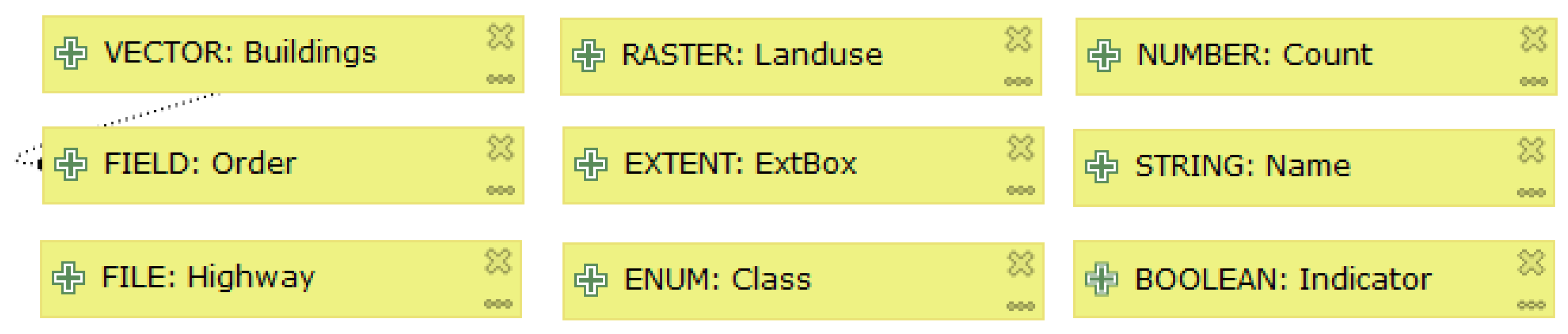
When this principle is applied to symbols in the Processing Modeler, it is evident that both input data and output data symbols are overloaded. In version 2, one symbol represents nine different data types: vector, raster, string, file, table, table field, number, extent and boolean. The newer version 3 offers 22 different types of input data. The user has to assign the data type immediately when an input data symbol is assigned to the model. The data type (for example point, line, polygon) is assigned immediately when a model is designed, despite there being no evidence about data type in the graphical symbol.
Detected symbol overloads could be solved in the following manner: remove the inner 
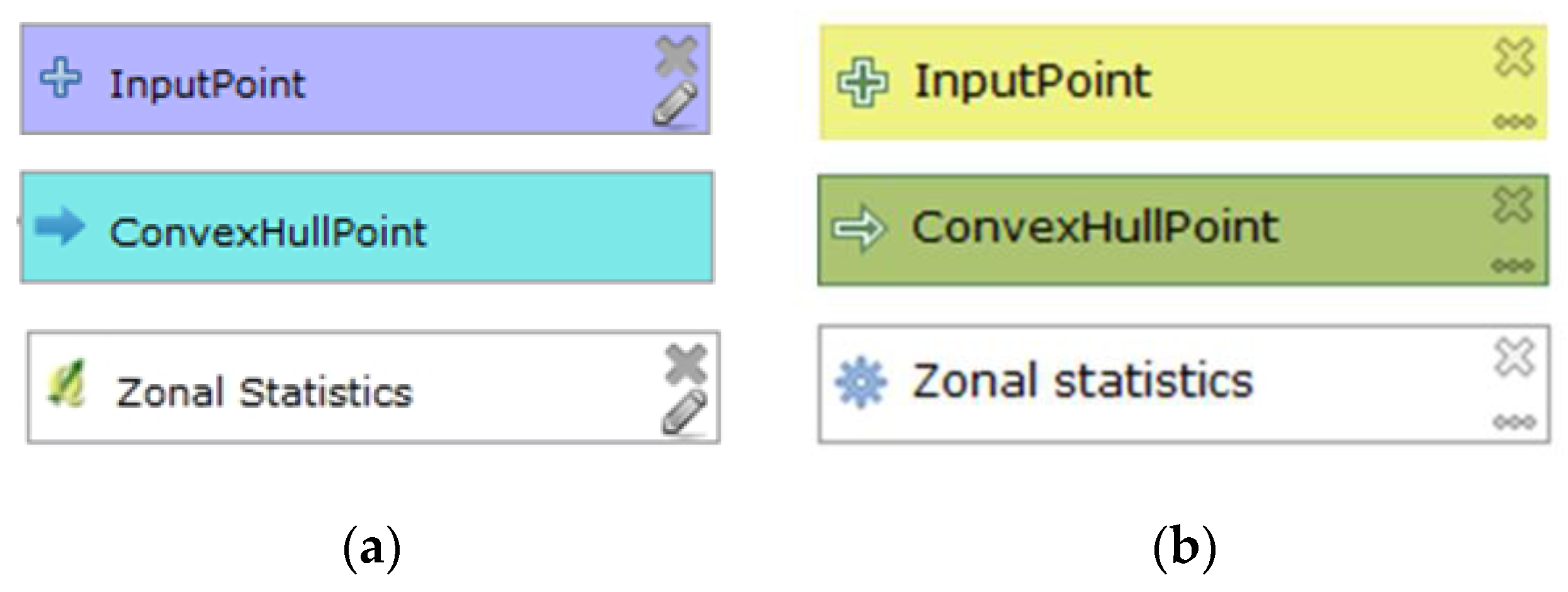
plus icon at the left in the symbol and replace it with more specific icons that express the type of data. Suggestions for vector and raster data symbols are given in Figure 4. Both icons are adopted from the QGIS interface. The lower pair uses the compound icons from version 3, where the symbols for vector and raster are supplemented by a small plus icon to express input of data. These compound icons are better than simple icons in version 2. The former and larger plus icon is substituted by a plus icon that forms a part of the vector or raster icon. New icons could be suggested for file, folder, string, number, table and field using any universal icon. Data such as extent, CRS, map layer, etc. need domain-specific icons. The same inner icon sets could be used for the output data symbol where a compound symbol can contain bigger icon of data type and small output arrow that is original in output symbol. The suggestions follow Szczpanek icon theory [15]. These suggestions would increase the number of icons in the graphical vocabulary and solve the overload of the two original symbols for input/output data.

4.1.2. Principle of Perceptual Discriminability

The colour, shape, orientation, brightness and other visual variables are what the user uses for discrimination of symbols in practice. Systematic couple comparison shows the distance between every two symbols. The visual distance is measured by several different characteristics (number of visual variables). Pairwise comparison of the version 3 symbols according to this principle is given in Table 1. In the Processing Modeler, the symbols differ only in colour and brightness, and the rectangular shape is the same for all symbols. The visual distance is two in all pairs. The characteristics are poorer in the symbols of the older version 2. The only differences are in colour, and there the visual distance is one (the difference in brightness is only between the data symbol and operation symbol). Perceptual discriminability of the symbol through colour is almost satisfactory by differing in tone. The Processing Modeler does not have the option for the user to define the colour to express other meanings of symbols, for example, to distinguish the final data and intermediate data in a large model.
Considering this principle of perceptual discriminability, the distinctiveness of the white symbol from the canvas is poor. The model’s canvas and symbol for operation have the same white colour, from which a new recommendation emerged: change the fill colour for the operation symbol from white to orange-brown (Figure 5). The result of the pairwise comparison of all symbols in the vocabulary remains the same. The discriminability of symbol and canvas is better than with the white symbol.

4.1.3. Principle of Visual Expressiveness

The recommendation according to this principle is to use maximum visual variables in symbols. Only colour is used as the fill for graphic elements. Other visual variables such as symbol shape, size, texture, orientation and position are not used in the Processing Modeler. The shape is the same rectangle for all symbols. The size of the symbols does not vary and cannot be changed. Brightness is used in version 3 (
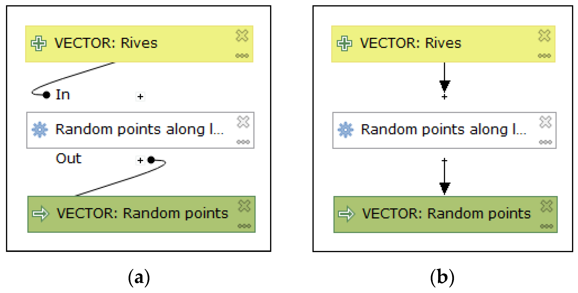
Figure 3). The new symbol vocabulary is improved by using a greater variation in brightness between symbols and maybe various shapes of symbols. The visual variable of position is only applied when the output data symbol is automatically placed near the right side of the producing operation (Figure 6). This manner of near-automatic placement of output symbols is the same in version 3 (Figure 13). However, the position of the output data symbol is very often changed by the user, which then moves the operation symbol. The former position of output data remains without following the symbol of the sourcing process. The mutual position linking the symbol is not fixed. The positioning of the output data symbol is only a weak and unstable use of the position variable.
The graphical vocabulary is at a low level 1 in a maximum scale of 8 in terms of the principle of Visual Expressiveness.
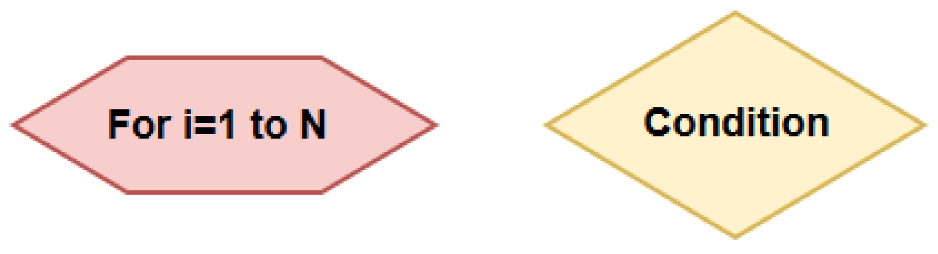
The QGIS Processing Modeler does not offer the loop and condition functions. To implement these functions in order to control operations, the draft offered in this paper uses the visual variables of shape and colour (Figure 7). The pink rectangle with oblique sides represents the cycle operation, and the light yellow rhombus represents the condition. These symbol shapes correspond to the classic shapes of flowchart symbols. In the vocabulary in version 3, these shapes differ from basic rectangular shapes in vocabulary and colour. By using these new symbols, the number of variables used increases to two. The total number of symbols would be five in the vocabulary. These symbols fulfil the principles of Discriminability and Visual Expressiveness. The principle of Graphic Economy would also be fulfilled (explanation of the principle of Graphic Economy follows).

4.1.4. Principle of Graphic Economy

The number of base graphical elements is three, which meets the requirement for cognitive management and the requirement for a range of 7 ± 2 symbols. Even with all the previous suggestions for changes with two symbols for the condition and cycle (under the principle of Visual Expressiveness) and suggestion for a blue symbol for the sub-models (see below in the Complexity Management principle), the total number of symbols is six. Altogether, the requirement of that principle is fulfilled. The vocabulary will be economical.

4.1.5. Principle of Dual Coding

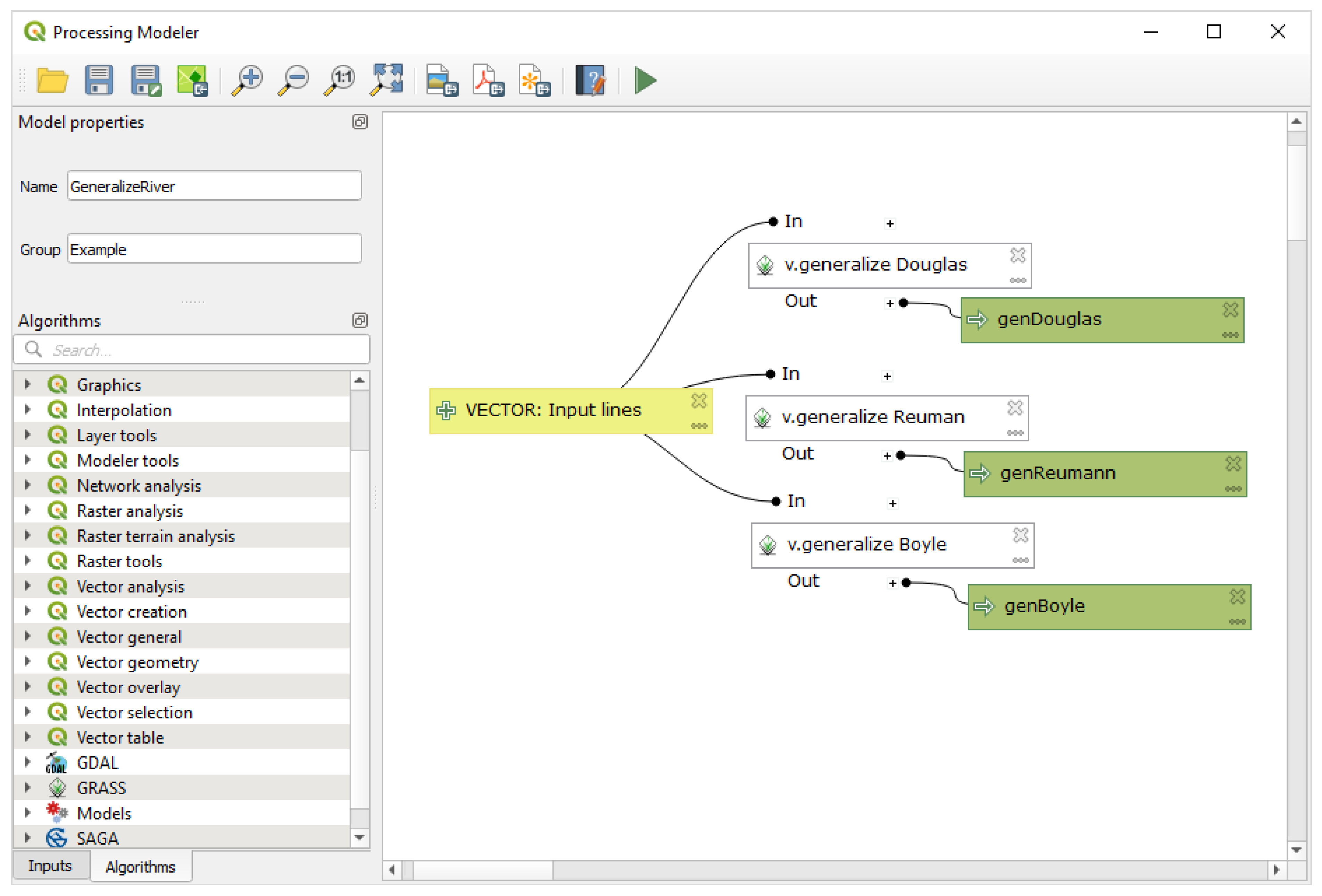
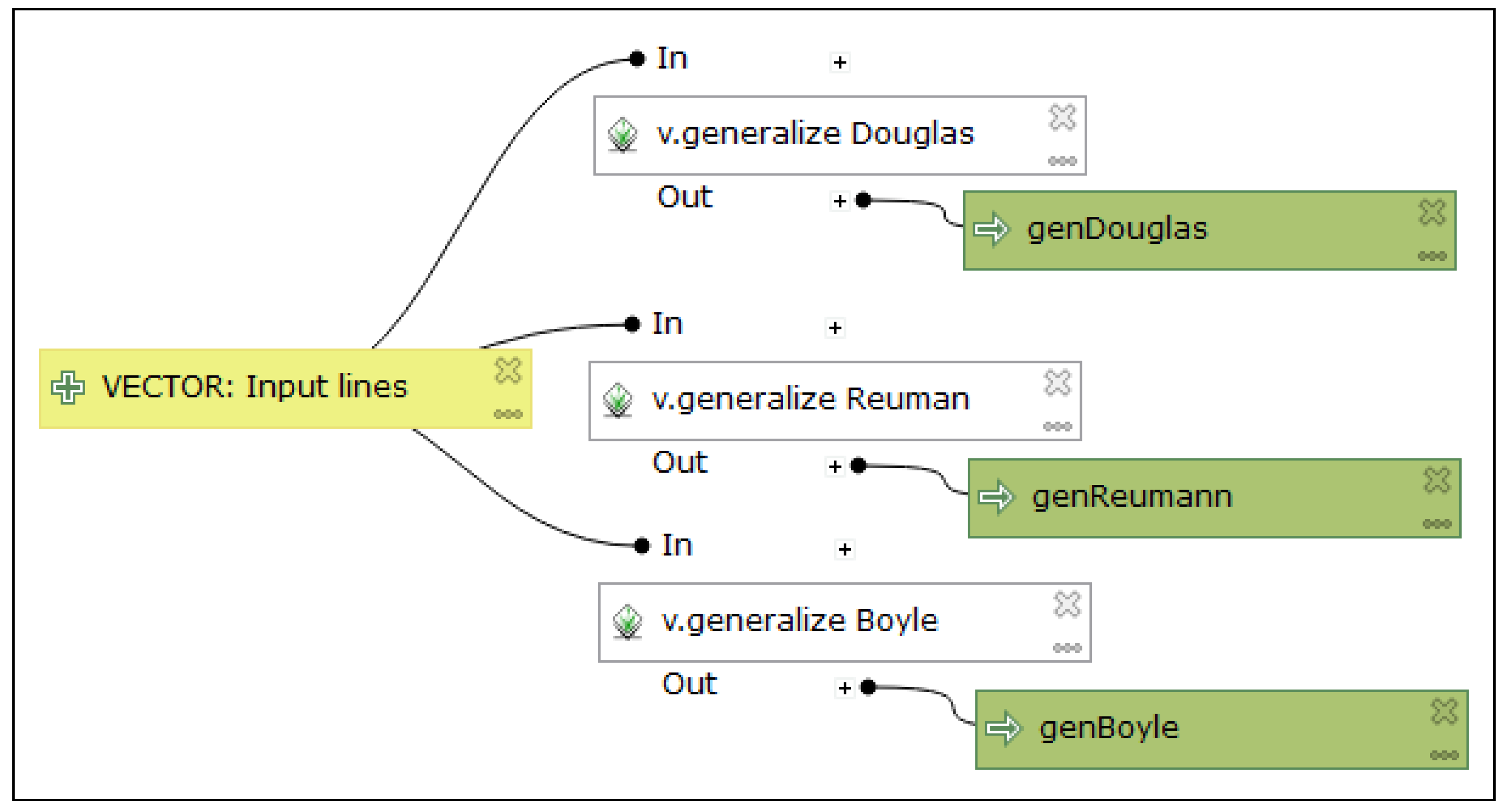
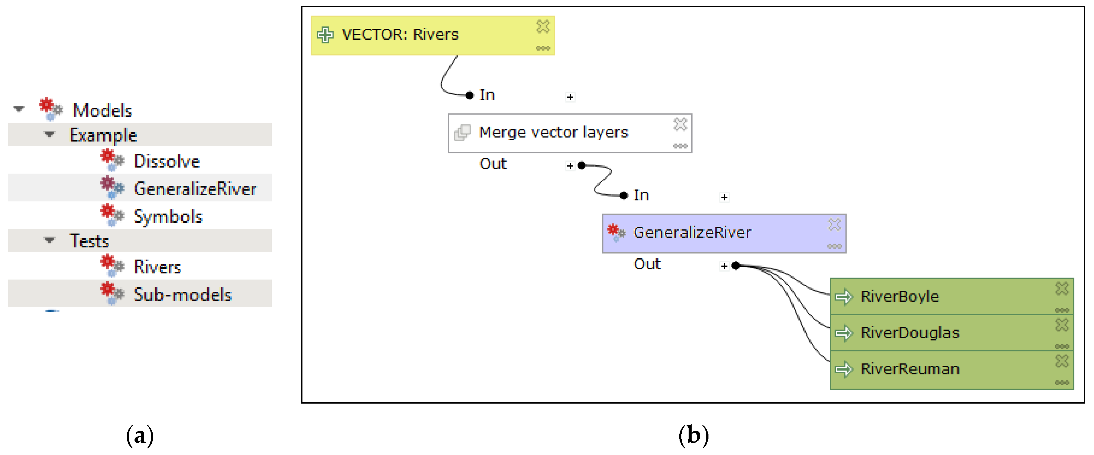
This principle suggests accompanied descriptive text to the symbols. For models in the Processing Modeler, the text completes the data symbol with the data name and the operation symbol with the operation name. The user assigns the data name arbitrarily, which is always an input parameter. The input data symbol is never bound to specific data stored on the storage medium in the model’s design mode. The name can be edited as desired. The operation name is added to the symbol automatically according to the selected operation and can also be changed in version 3 (not possible in version 2). The option to edit the operation name is a good improvement in functionality and allows the model to be better understood. Renaming the operation is especially advantageous when the same operation appears multiple times in one model. Therefore, it is possible to describe or specify the meaning of the operation. Figure 8 depicts a diagram where v.generalize operations are called three times, but each time with a different generalisation algorithm. The selected algorithm is added manually by the user to the operation name. The operation name’s editing option improves the clarity of the model.
For long names that do not fit into the rectangle, the name is automatically truncated and completed with an ellipsis (Figure 9). If a Semantic Transparency modification (see below—deletion of functional icons) were implemented, it would increase the space for longer operation and input data names, which would be beneficial.
To follow the principle of Dual Coding, modifying the input data labels is suggested. It would be helpful if labels concerning the data type improved the data symbols by using capitals. Examples are given in Figure 10. If this is added automatically when symbols are added, the user only need arbitrarily select the data name. Additionally, the user’s data name (e.g., input lines) emphasises the spatial type. Manually describing a data type is possible in the current stage of notation. There is a space for good use of Dual Coding by users in naming symbols. The Processing Modeler meets the Dual Coding principle; however, comprehensibility could be improved with the proposed modification by specifying the data type with captioning.
The text is still used in the models to list the operation parameters when the plus symbol is pressed above the operation (Figure 11). After this, the black dot divides itself into several black dots according to the number of join connector lines. The operation parameter list does not contain the values of these parameters and often dumps overlapping lines leading to the rectangle. This is retained in version 3. It would be useful to add a list of specific parameter values here. The current form of textual information is not useful to users. It is perhaps only useful in terms of expressing which symbol assigns concrete parameters to the operation.

4.1.6. Principle of Semantic Transparency

Symbols could be associated with the real meaning of an element according to this principle. The shape and colour of the symbols do not carry any association; they are semantically general in the Processing Modeler. This is the same in other visual programming languages for the GIS application. In those symbols, the inner icon of the plus sign symbol on the input data symbol is used at the left. The output data symbol depicts an inward arrow icon. Icons can also carry semantic meaning. These icons can be considered almost semantically immediate. The plus icon indicates new data for processing. The arrow icon indicates the processing result in a certain direction. However, the previous proposal under the principle of Semiotic Clarity is useful and also improves semantic immediacy. It suggests that each data type has an icon, such as in Figure 4 (the plus icon is replaced or is a part of the compound symbol in version 3). Here, it is clear that the change resulting from applying the Semiotic Clarity principle also leads to an improvement in Semantic Transparency.
For operations, icons are mainly used to represent the source library. Rather, these icons are semantically generic because they do not explain anything about the purpose of the operation. However, these icons are a good guideline for determining the source library. It should be considered that many libraries contain operations with the same name (clip, buffer, etc.). In the Processing Modeler, version 3 sometimes uses an icon that represents the type of operation (namely for QGIS operations). 
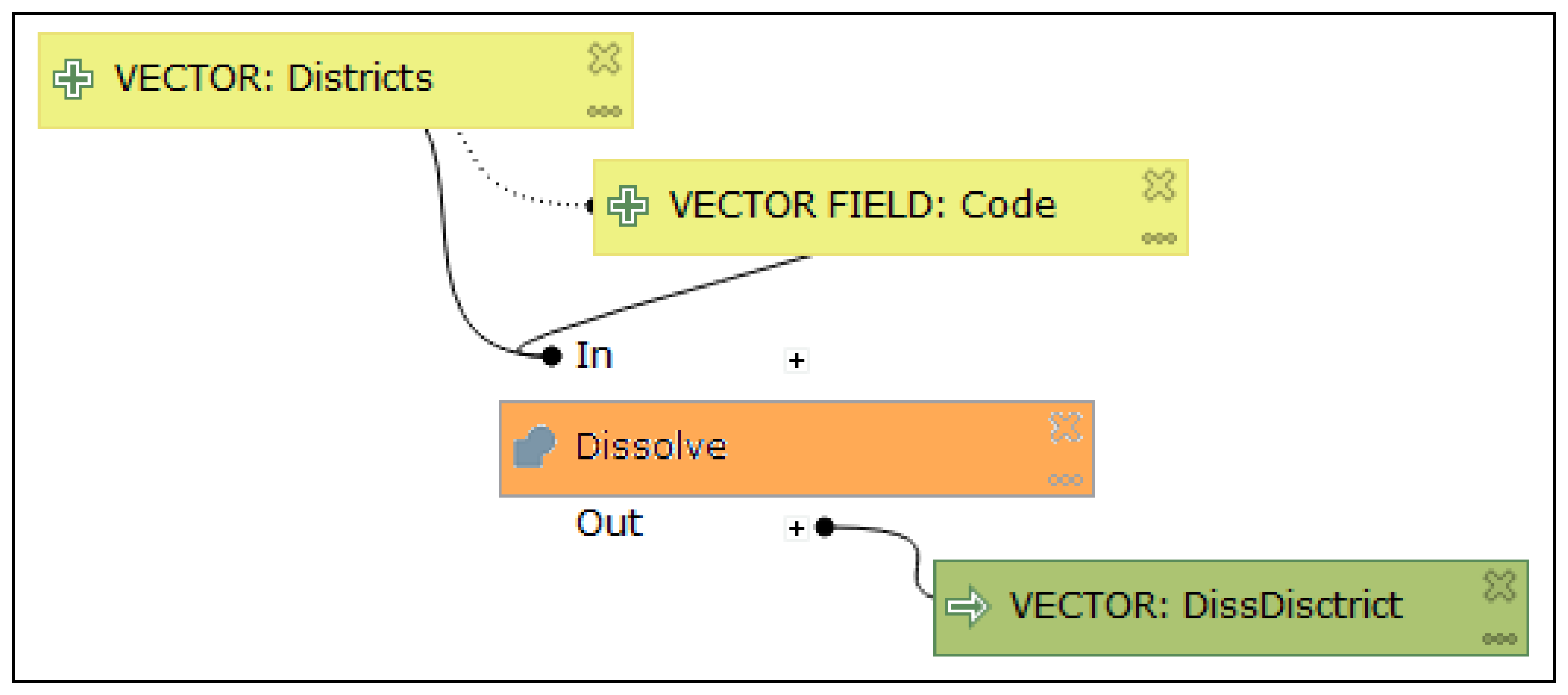
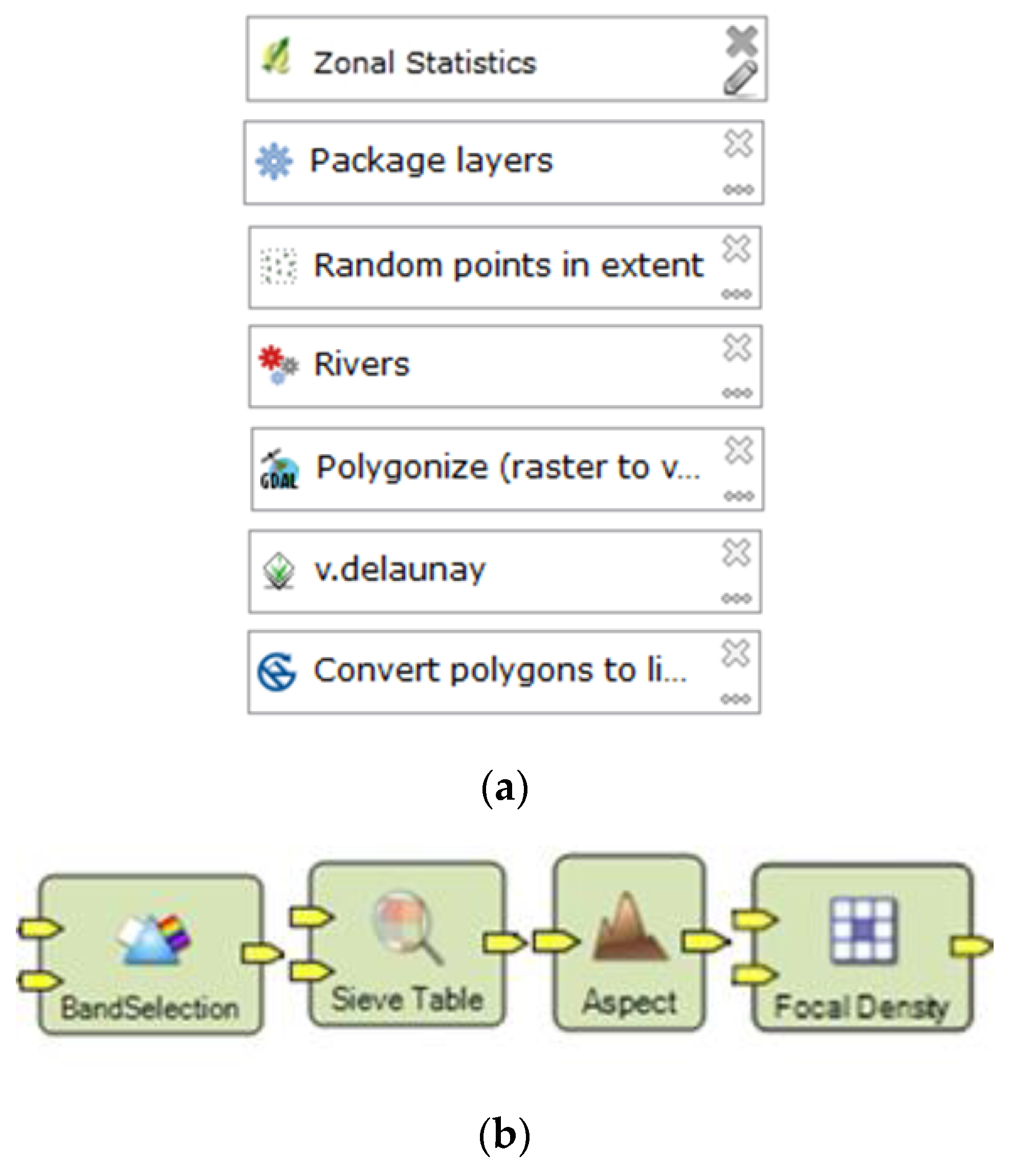
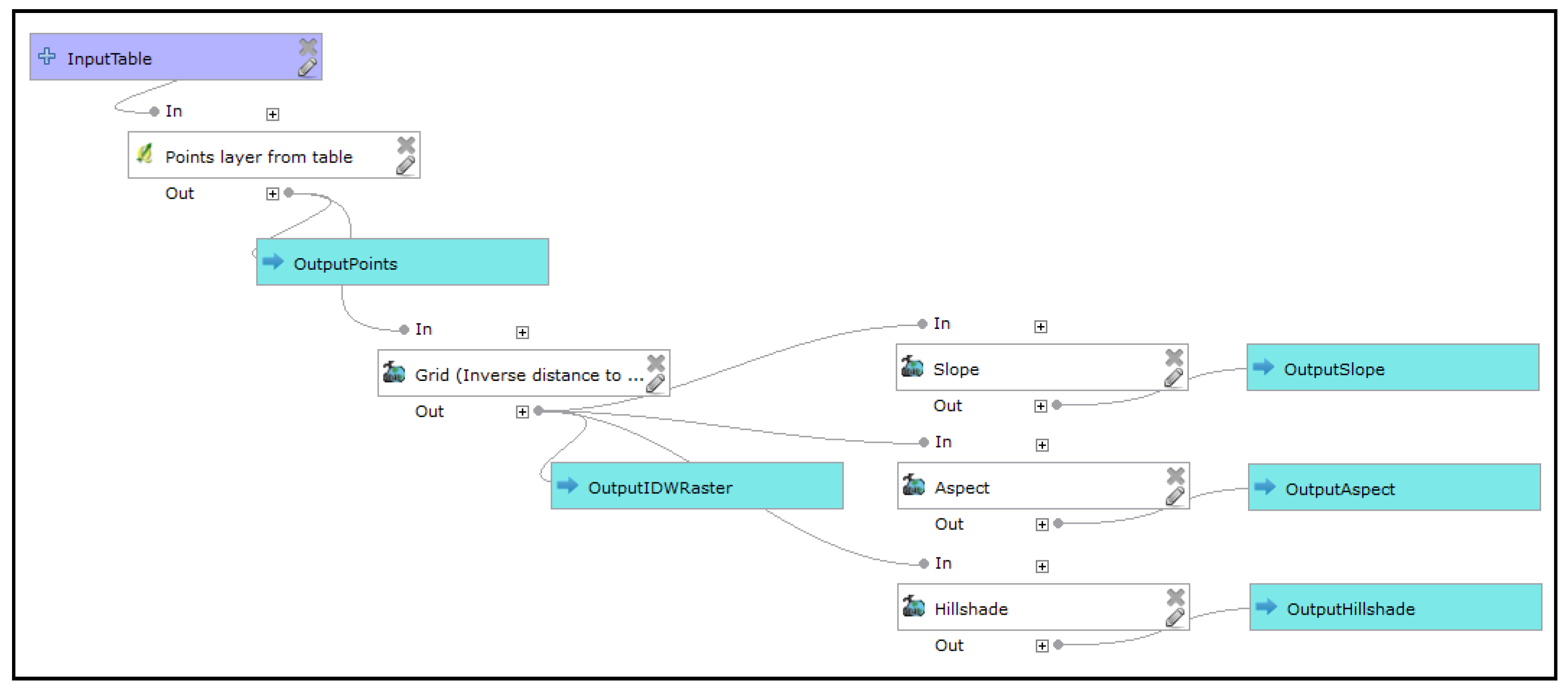
Figure 5 shows the operation Dissolve, which has a specific icon that represents this operation. Another specific icon for the operation ‘Merge vector layer’ is a model in Figure 13. The size and graphics of the icons are not suitable for improving the association of operation and their meanings. The icons are small and use only grey tones. A good example of large colour and detailed icons that describe the purpose of the operation is demonstrated in the Spatial Model Editor (Figure 12) embedded in the ERDAS IMAGINE software [32]. The icons take up more space than the lower text in the symbol. The icons are prominent. The graphical vocabulary of the Spatial Model Editor has a high Semantic Transparency. The graphical vocabulary of the Spatial Model Editor is inspiring for the redesign of Processing Modeler symbols. The final recommendation is to reshape the rectangle to square to adopt bigger icons and then put the text label bellow icon.
The graphical vocabulary of the QGIS Processing Modeler has semantic opacity, except for some operations, where a greater positive semantic immediacy can be observed (Figure 12—a third symbol from the top: Random points in extent).

4.1.7. Principle of Complexity Management

This principle recommends producing hierarchical levels of the diagram and dividing it into separate modules and hierarchy. In textual/visual programming, this is achieved with sub-programs (sub-routines) or sub-models that can be designed and managed separately. The hierarchical model contains only two levels, no more.
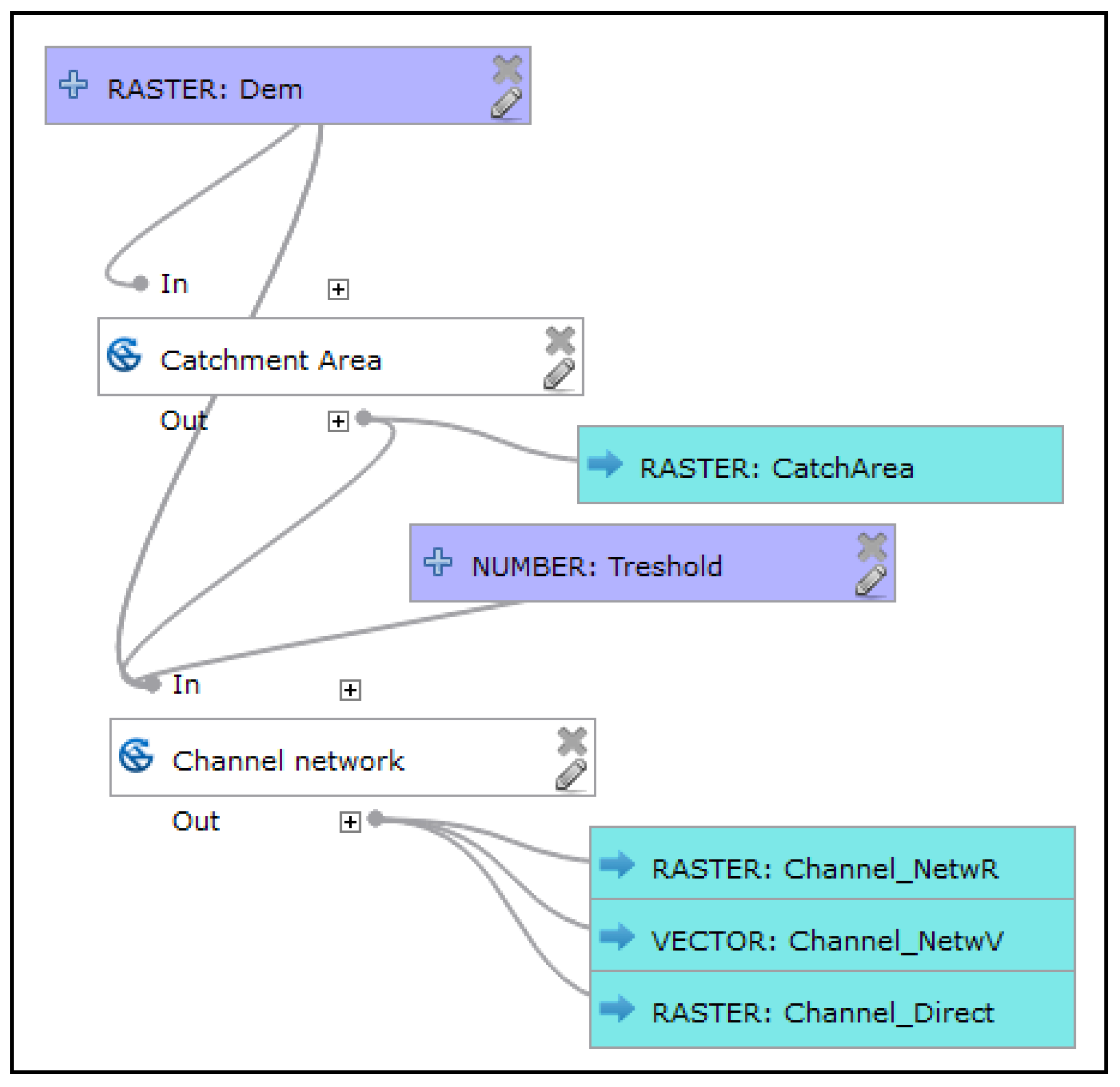
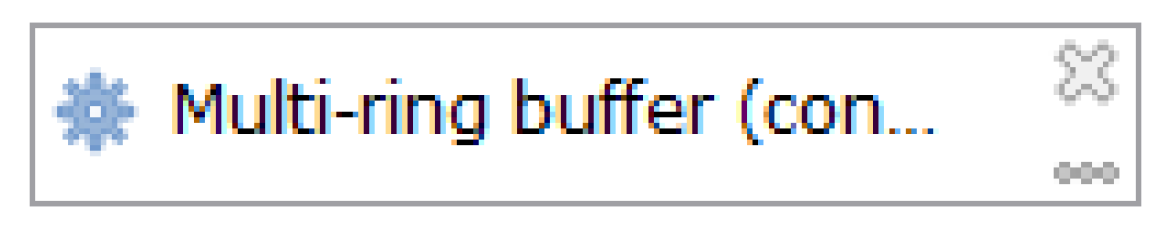
The Processing Modeler allows existing models to be added to other models in the interface—panel algorithms (Figure 13). This has the right degree of modularity according to Complexity Management in both versions 2 and 3. The symbol of the model has a three-gear wheel icon (three connected balls in version 2) at the left of the symbol. Otherwise, a white rectangle is used. Since it would be good to differentiate the symbol of the individual operation from the sub-model with an icon, a colour fill other than white would be appropriate. A suggested depiction—blue fill colour for sub-models—is shown in Figure 13. The visual resolution of other symbols is maintained. The number of symbols increases to seven after a new one is added for the sub-model. The final count of seven symbols fulfils the principle of Graphic Economy.

4.1.8. Principle of Cognitive Interaction

The principle recommends increasing the options for navigating in the model. The connector lines affect navigation. In the Processing Modeler, round connector lines join symbols. The lines are rendered automatically. Symbols very often overlap lines when symbols are manually moved (Figure 6). Lines also sometimes cross each other, and they are not parallel. The user must manually attempt to find the best position for symbols in order to prevent overlapping and perplexing criss-crossing of curved lines. Previous research recommended that the number of edge crossings in drawings should be minimised [33]. For these reasons, curved connector lines do not appear to be the proper solution. It is often difficult to trace the connector’s direction. A suggested change is to replace curved lines with straight lines (Figure 14). Straight lines ensure good continuity for reading. Good continuity means minimizing the angular deviation from the straight line of two followed edges connecting two nodes [34]. In this new suggestion for the Processing Modeler, straight lines could be optionally angled at an oblique or right angle when it is necessary to avoid a symbol. An acute angle is not suitable because of its smooth line tracking. If curved connectors remain in notation, there is necessary to add the user control over shaping these connectors to prevent crossing and overlapping.
Operation symbols linked with lines and a black dot offset from the edge of the symbol unnecessarily occupy space in the model’s area. It would be possible to terminate the lines directly on an edge or at the plus sign of the symbol to save space.
Finally, the ability to display a model’s thumbnail in the separate preview window helps to navigate the model. The preview window has not yet been implemented. In terms of cognitive interaction, version 3 was supplemented by a zooming function. The functions zoom in and zoom out in the model was absent in version 2.
Aligning the symbols makes reading the model quicker and easier. No automatic function for aligning the model to the grid is implemented. Symbols usually snap to a grid in other graphical software. No snapping function is given in the Processing Modeler. Post alignment to the vertical or horizontal line of the model could, therefore, be beneficial for design. All arrangement of symbol positions depends on user diligence, which is entirely manual work in the Processing Modeler. Manually aligning is a time-consuming activity.

4.2. Evaluation by Eye-Tracking Measurements

The eye-tracking experiment was designed in a complex way to confirm or reject the hypothesis H1 and H2. All tested diagrams are in Appendix A. The design of the test contain more tasks to find maximum information. Some models serve for evaluation repetitively for a different purpose, e.g., find symbol, compare orientation, or read the labels. After testing only reliable answers and correct record by eye-tracker were finally evaluated and presented in the article.
The first evaluation concerned the discriminability of symbols. These tasks required finding input data and output data symbols in the models. The task was: “Click on the symbol where the input data are” (task A1, A2, A3 in Appendix A). The number of incorrect answers recorded was zero. The next task was “Click on the symbol where the output data are” (task A4, A5, A6). The wrong answers were two times 2 (A4, A5), and 4 for task A6. However, model A6 has a big influence of arrangement to answer. It means that the input and output symbols were nearly high in Perceptual Discriminability, but the errors report about space for improvements of symbols such as inner icons that are suggested in Section 4.1. for increasing transparency and using all visual variables.
Besides the number of correct/wrong answers, the time of the first click was recorded. The distribution of times had not normal distribution (tested by Shapiro-Wilk test). Non-parametrical test Kruskal-Wallis tested if the medians of the “first click time” of all tasks (A1–A5) is equal. Kruskal-Wallis tested whether time samples originate from the same distribution. The result of the statistical test revealed the there is no significant difference between finding the symbol of input and output. It means that basic symbols are discriminable and none of them is dominant in perception.
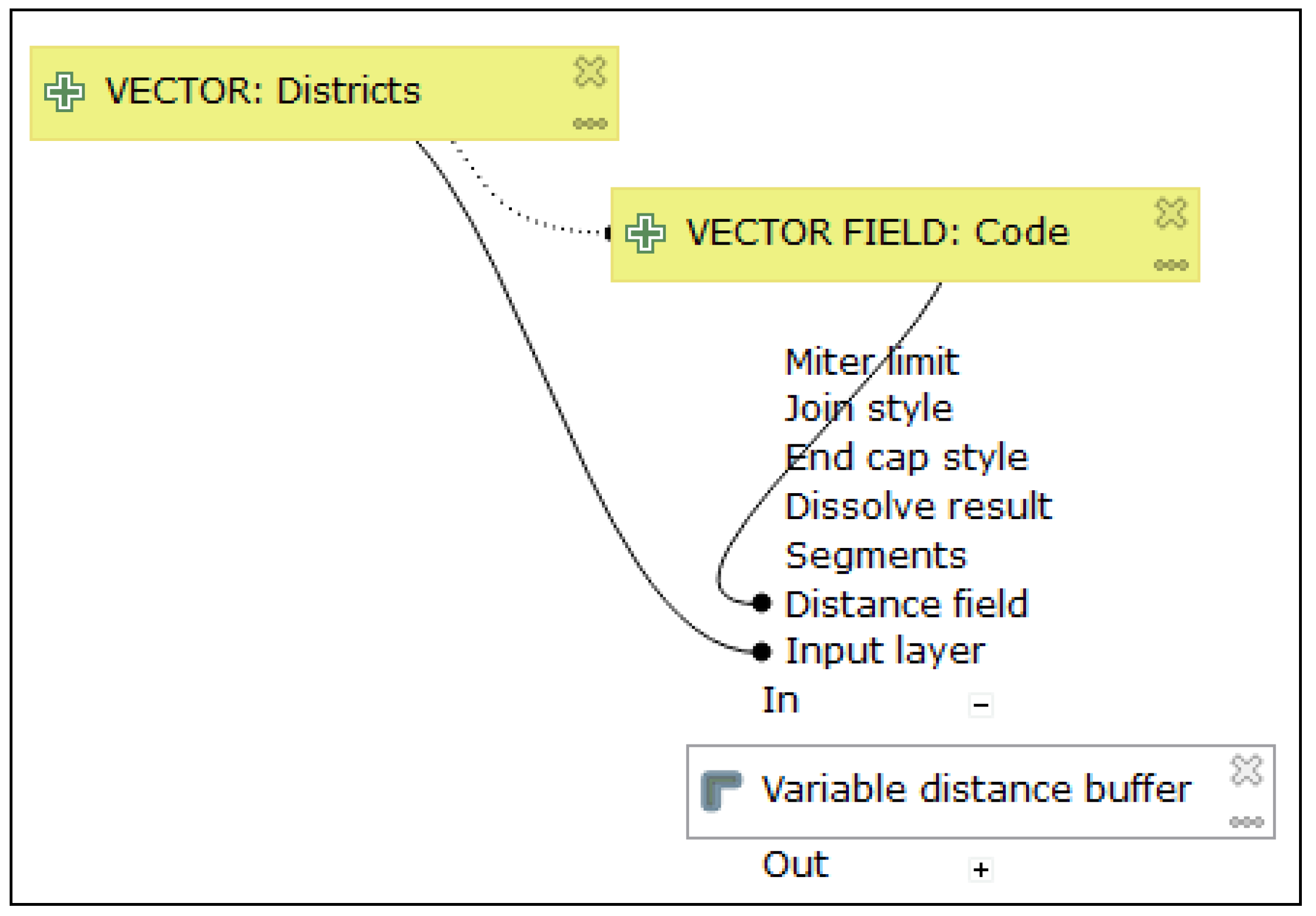
The next task aimed to verify the influence of Dual Coding (but the influence of the discriminability present). The task was: “
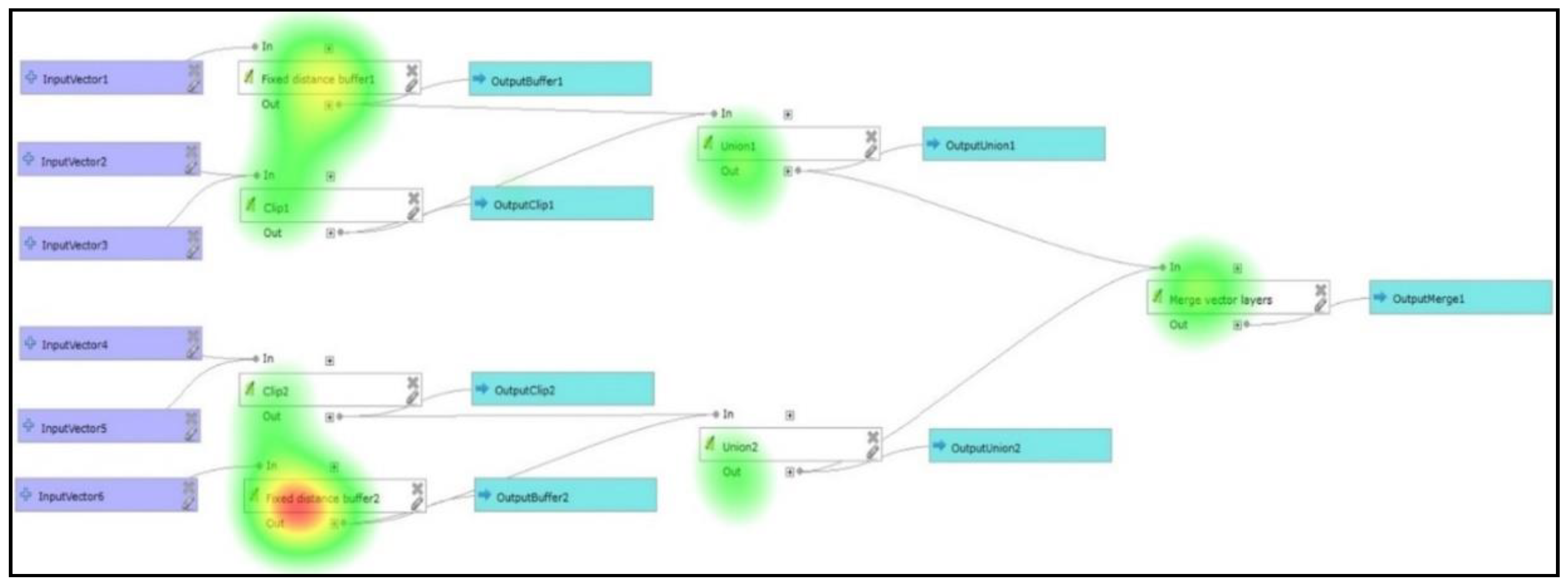
Click on the symbol where the ‘Fixed Distance Buffer’ operation is called” (task A13, A14, A15). Once again, it was necessary to find the white symbol and read the labels in the symbols. A total of 21 correct answers were recorded (one incorrect). The results for 22 respondents were calculated as an attention heat map (Figure 15). The heat map expresses the calculation of places where the peaks of gaze fixations are by all respondents. The figure shows that all white symbols correctly attracted the gaze of respondents. Respondents searched for white operation symbols and then read a particular operation label. The highest attentions were recorded at the two places where the Fixed Distance Buffer operation was (top and bottom). Next, the lower peaks of fixations are at another white symbol with the different operation. It is evident that white colours of operation attract the gaze. Both principles of Visual Expressiveness (and also Perceptual Discriminability), by using white colour fill, and Dual Coding were verified. In fact, this stimulus did not confirm the poor distinguishing of white symbols from a white canvas. The poorest distinguishing result was expected in the theoretical part of this article.
The principle of Semantic Transparency was difficult to test. The transparency of the icons was tested with the task: “Are all operations from the same source library?” The tested model is shown in Figure 16 (Appendix A16, 17, 18). Three incorrect answers were recorded from 22 respondents.
Semantic Transparency of data types was only possible to solve in the Processing Modeler with expressive text. This was verified in a model where the task was: “Does the input data have the same data type as the output data?(A10, 11, 12). The data symbols were labelled with the words “table” and “raster” as a part of the data name in the model. It is “user design help” to the respondents to distinguish the data type. The number of incorrect answers was three for two models and two incorrect answers for A11 task. In these models, the response time was longer than the previously presented models and tasks. The average time of fixation was also longer. It verifies the necessity of reading labels by users. The solution of semantic transparency by text label consume more time for comprehension. The longer times confirms the hypothesis H2 about negative influences of insufficiencies to effective comprehension.
Both of the experiments mentioned above (about source library and the comparison of the data type of input and output data) verified that Semantic Transparency was low in the Processing Modeler.
The results about the number of correct and incorrect answers in all tasks presented in this section report that some insufficiencies adversely affect the cognition as it is stated in hypothesis H1.
From eye-tracking testing, we received not only cross-validation of results by Physics of Notations but other new information. The interesting information was finding the reading patterns and influence of flow orientation to the respondent reading directions. To find the reading pattern of users, gazes were aggregated. A comparison of the same diagram from the free viewing section and a section with tasks is given in Figure 17. Aggregations in both cases revealed that the orientation of data flow expressed by connector lines had a significant influence. Reading began in the middle of the stimulus according to the middle fixation cross in the previous stimulus. Gazes were attracted to the upper left corner and continued horizontally to the right. People’s habits of reading lines of text were very strong, especially in free viewing (Figure 17a). The lower part of Figure 17b also depicts strongly followed lines. Only a small number of gazes skips between two main horizontal workflow lines. Free viewing was not as systematic as task-oriented gaze aggregations.
Two models tested the effect of symbol alignment in the model. This finding can be linked to the principle of Cognitive Interaction. The first model had aligned symbols; the second model had no aligned symbols. The functionality was the same. The question was the same for both models: “How many functions are in the model?” (task A8, A9). It was enough to count only the white rectangles in large models. The number of the expected correct answers was eight. The first aligned model recorded two incorrect answers and the second recorded seven. The average task time was much shorter in the first tasks. The non-parametrical Kruskal-Wallis test was used for eye-tracking metrics due to non-parametrical distribution of measured values. It tested if medians of groups are equal means they have the same distribution [
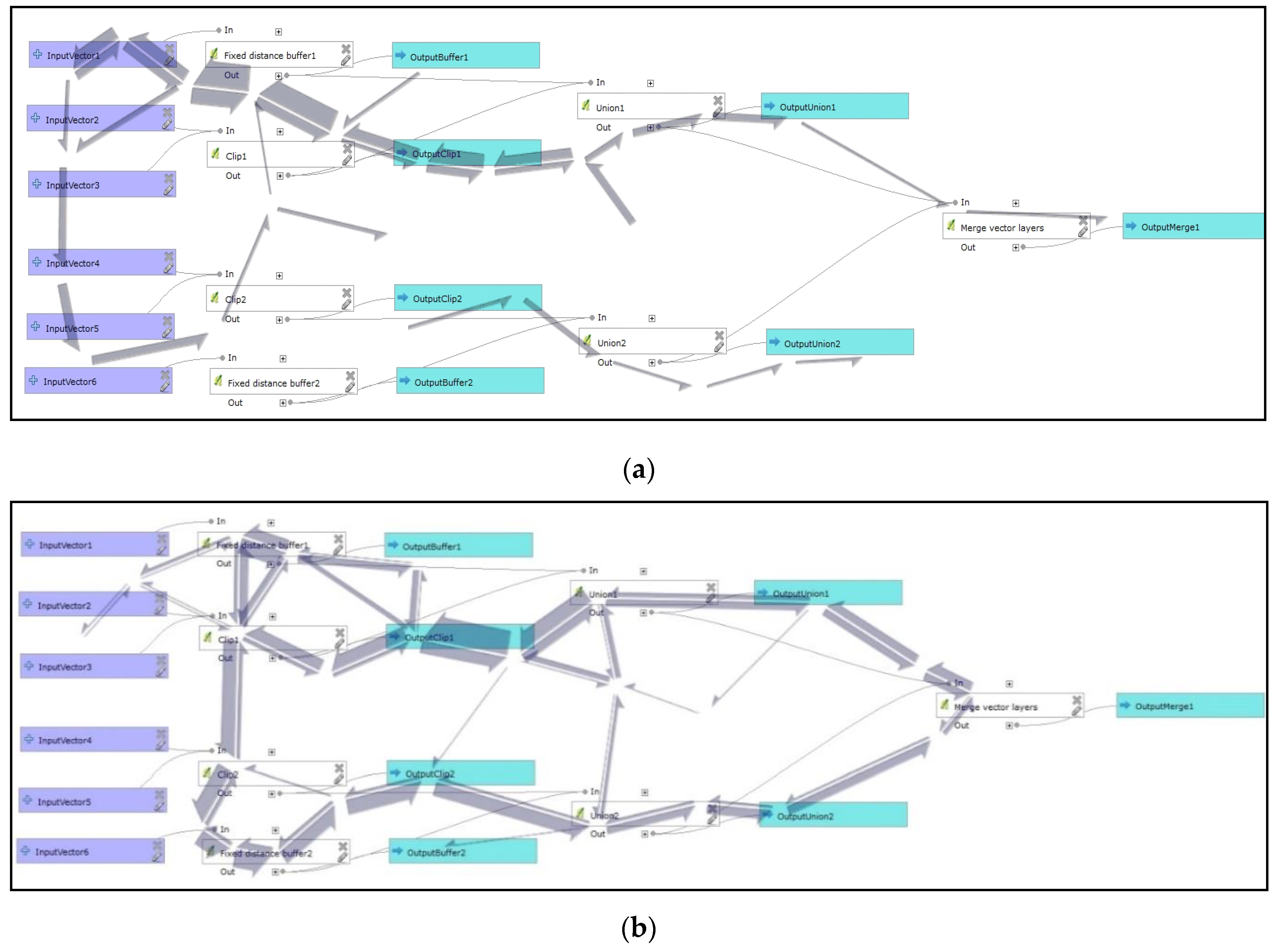
35]. The significance level for all Kruskal-Wallis tests was set to p-value 0.05. The test was run three times for several fixations, scanpath lengths and number of fixations per second. The test compared tree measured values for the aligned and non-aligned model (A8 and A9). Kruskal-Wallis test found statistically significant differences for all metrics: the number of fixations, scanpath lengths, and number of fixations per second. The model where the symbols were unaligned showed much worse values for all metrics (task A9). Therefore, aligning the symbols in the model made it easier to read and understand the model. This eye-tracking evaluation supports the recommendation for the new function of the automatic alignment of symbols in this graphical editor.
Three groups of models with the same functionality were prepared to test the orientation of flow and find if any orientation is better for users. The models in each group differed only by orientation. Three orientations were tested: vertical, horizontal, and diagonal. Comparing the orientation could be also assumed as a contribution to the principle of Cognitive Interaction. An example diagonal orientation of flow in a model is shown in Figure 16, horizontal in Figure 17. Variations of these models with three types of orientations were designed. The triplets are [A10, A11, A12], [A13, A14, A15], [A16, A17, A18] in Appendix A. To prevent the bias, the same task was in each group. The aim was to find the best model orientation. The results from a Kruskal-Wallis test were not statistically significant. In some cases, horizontal orientation had the shortest average time of solution. In some models, diagonal orientation was better in average times of fixation, and horizontal models had the shortest scanpath length. The results were completely ambiguous, and the orientation preferences were not the same in all triplets. There is certainly a great deal of effect depending on the given question and model sizes. Eye-tracking did not reveal the best orientation of flow.

5. Results

Research into the QGIS Processing Modeler brought useful results and suggestions. The combination of Physics of Notations theory and eye-tracking measurements determined that Perceptual Discriminability, Dual Coding and Graphic Economy were nearly good with space of improvements. The worst situation is in Semantic Transparency. Some of the recommendations can help improve Semiotic Clarity, Visual Expressiveness and Semantic Transparency.
All recommendations can be divided into two groups. The first group is for developers of the Processing Modeler and the second for users in practice. Suggestions for the first group for larger sizes and colours for inner meaning icons increased the Semantic Transparency. This solution also increased the Semiotic Clarity of symbols. Another suggestion for improvement was adding colour fill to the operation symbol of sub-models. Straight connector lines are better than curved lines, optionally users shaped lines are more suitable. New symbols for IF and loop FOR commands were based on new shapes and different colours. The readability of models improved the automatic alignment function of the symbols to the grid.
Users can benefit from some recommendations in practice. Correct labelling of symbols and expressing data types in capitals (VECTOR, RASTER, STRING, NUMBER, etc.) is very useful. Aligning symbols, preventing overlapping, and crossing of lines improved the effective comprehensibility of a model. Design and using of sub-model fulfil the Complexity Management principle. There is a space for user broader use of sub-models. Reading speed increased in one type of orientation (horizontal or diagonal) without any changes to one of the flow direction. These user recommendations were presented to students attending lectures at the Geoinformatics department at the Palacký University in Olomouc every year. The author of the article has had a positive experience in applying the knowledge acquired by the teacher in research and solving practical problems. This positive teacher experience is described in an article about the database design for the university’s botanical gardens (BotanGIS project) [36].
The presented evaluation and list of suggestions could assist by inspiring designers of visual programming languages in GIS software. Some recommendations could also be useful for the broader community of users to increase effective cognition of any graphical depiction.
Table 2 reports all findings and recommendation in summarised form, and concrete graphical improvements are in the figures of the article.

Funding

This research received no external funding.

Acknowledgments

This article was created with the support of the Education for Competitiveness Operational Programme – European Social Fund (project CZ.1.07/2.3.00/20.0170 Ministry of Education, Youth, and Sports of the Czech Republic).

Conflicts of Interest

The authors declare no conflict of interest.

Appendix A

Eye-tracking experiment: List of tasks and models from QGIS Processing Modeler
The appendix presents the list of models and assigned tasks that were used in the eye-tracking experiment. The order of models was random in testing.
Note 1: All models were also used in the first part of testing – free viewing part
1. Symbols for data and operations (testing of discriminability)
Task A1. Click on the symbol where the input data are.
Applsci 10 01446 i007
Task A2. Click on the symbol where the input data are.
Applsci 10 01446 i008
Task A3. Click on the symbol where the input data are.
Applsci 10 01446 i009
Task A4. Click on the symbol of output data.
Applsci 10 01446 i010
Task A5. Click on the symbol of output data.
Applsci 10 01446 i011
Task A6. Click on the symbol of output data.
Applsci 10 01446 i012
Task A7. How many functions are in the model? (Correct answer 8)
Applsci 10 01446 i013
Task A8. How many functions are in the model? (Correct answer 8)
Applsci 10 01446 i014
Task A9. How many functions are in the model? (Correct answer 8)
Applsci 10 01446 i015
2. Test of dual codding
Task A10. Are the input data the same type as output data?
Applsci 10 01446 i016
Task A11. Are the input data the same type as output data?
Applsci 10 01446 i017
Task A12. Are the input data the same type as output data?
Applsci 10 01446 i018
Task A13. Click on the symbol where the ‘Fixed Distance Buffer’ operation is called.
Applsci 10 01446 i019
Task A14. Click on the symbol where the ‘Fixed Distance Buffer’ operation is called.
Applsci 10 01446 i020
Task A15. Click on the symbol where the ‘Fixed Distance Buffer’ operation is called.
Applsci 10 01446 i021
3. Test of inner icons (semantic transparency)
Task A16. Are all operations from the same source library? (Correct answer No)
Applsci 10 01446 i022
Task A17. Are all operations from the same source library? (Correct answer No)
Applsci 10 01446 i023
Task A18. Are all operations from the same source library? (Correct answer No)
Applsci 10 01446 i024
4. Other tested models and tasks
Task A19. What operation is used? (Correct answer: Clip)
Applsci 10 01446 i025
Task A20 What operation is used? (Correct answer: Fixed Distance Buffer)
Applsci 10 01446 i026
Task A21: Click on the symbol of operation.
Applsci 10 01446 i027
Task A22: Click on the symbol of operation.
Applsci 10 01446 i028

References

  1. Dobesova, Z. Data flow diagrams in geographic information systems: A survey. In Proceedings of the 14th SGEM GeoConference on Informatics, Geoinformatics and Remote Sensing, Albena, Bulgaria, 19–25 June 2014; pp. 705–712. [Google Scholar] [CrossRef]
  2. Dobesova, Z. Graphical notation of visual programming languages in GIS. Habilitation Thesis, University of Pardubice, Pardubice, Czech Republic, 2017. [Google Scholar]
  3. Moody, D.L. The “Physics” of Notations: Toward a Scientific Basis for Constructing Visual Notations in Software Engineering. IEEE Trans. Softw. Eng. 2009, 35, 756–779. [Google Scholar] [CrossRef]
  4. ISO. ISO 9241-210:2019 Ergonomics of human-system interaction. In Part 210: Human-Centred Design for Interactive Systems; ISO: Geneva, Switzerland, 2019. [Google Scholar]
  5. Marsh, J. UX for Beginners; O’Reilly Media, Inc.: Sebastopol, CA, USA, 2016. [Google Scholar]
  6. Komarkova, J.; Machova, R.; Bednarcikova, I. Users requirements on quality of Web pages of municipal authority. E M Ekon. Manag. 2008, 11, 116–126. [Google Scholar]
  7. Reeves, S. What Is the Relationship Between HCI Research and UX Practice? Available online: https://www.uxmatters.com (accessed on 4 February 2020).
  8. Komárková, J. Quality of web geographical information systems; University of Pardubice: Pardubice, Czech Republic, 2008; ISBN 978-80-7395-056-9. [Google Scholar]
  9. QGIS. Changelog for QGIS 2.6. Available online: http://www.qgis.org/en/site/forusers/visualchangelog260/index.html?highlight=processing%20modeler#processing (accessed on 5 June 2016).
  10. Graser, A.; Olaya, V. Processing: A Python Framework for the Seamless Integration of Geoprocessing Tools in QGIS. Isprs Int. J. Geo-Inf. 2015, 4, 2219–2245. [Google Scholar] [CrossRef]
  11. GIS_Geography. The Hidden Powers of QGIS 3: 33 Truly Underappreciated Features and Plugins. Available online: https://gisgeography.com/qgis-3/ (accessed on 4 May 2019).
  12. KARTOZA. Changelog for qgis Version 3.0.0. Available online: http://changelog.qgis.org/en/qgis/version/3.0.0/ (accessed on 5 April 2019).
  13. Schwarze, J. Using QGIS 2.x Processing Model in QGIS 3.0? Available online: https://gis.stackexchange.com/questions/277373/using-qgis-2-x-processing-model-in-qgis-3-0 (accessed on 15 May 2019).
  14. QGIS. Documentation for QGIS 2.6, QGIS User Guide, QGIS Processing Framework, the Graphical Modeler. Available online: https://docs.qgis.org/2.6/en/docs/user_manual/processing/modeler.html (accessed on 20 August 2016).
  15. Szczepanek, R. Toolbar icons for applications. Geoinform. Fce Ctu 2008, 3, 79–89. [Google Scholar] [CrossRef] [Green Version]
  16. Moody, D.L. The “Physics” of Notations: A scientific Approach to Designing Visual Notations in Software Engineering. In Proceedings of the 32nd ACM/IEEE International Conference on Software Engineering—Volume 2, Cape Town, South Africa, 8–10 May 2010; pp. 485–486. [Google Scholar] [CrossRef]
  17. Dobesova, Z. Using the Physics of Notations to analyse ModelBuilder diagrams. In Proceedings of the 13th International Multidisciplinary Scientific GeoConference, Albena, Bulgaria, 28 June–6 July 2019; pp. 595–602. [Google Scholar] [CrossRef]
  18. Larkin, J.H.; Simon, H.A. Why a Diagram is (Sometimes) Worth Ten Thousand Words. Cogn. Sci. 1987, 11, 65–100. [Google Scholar] [CrossRef]
  19. Moody, D. Theory development in visual language research: Beyond the cognitive dimensions of notations. In Proceedings of the Visual Languages and Human-Centric Computing, Corvallis, OR, USA, 20–24 September 2009; pp. 151–154. [Google Scholar] [CrossRef]
  20. Mackinlay, J. Automating the design of graphical presentations of relational information. Acm Trans. Graph. 1986, 5, 110–141. [Google Scholar] [CrossRef]
  21. Paivio, A. Mental Representations: A Dual Coding Approach; Oxford University Press: London, UK, 1986; p. 322. [Google Scholar]
  22. Dobesova, Z. Empirical testing of bends in workflow diagrams by eye-tracking method. Adv. Intell. Syst. Comput. 2017, 3, 158–167. [Google Scholar]
  23. Martin, D.W. Doing psychology experiments; Wadsworth Cengage Learning: Belmont, TN, USA, 2008; p. 363. [Google Scholar]
  24. Holmqvist, K.; Nyström, M.; Andersson, R.; Dewhurst, R.; Jarodzka, H.; Van de Weijer, J. Eye tracking: A Comprehensive Guide to Methods and Measures; Oxford University Press: Oxford, UK, 2011; p. 537. [Google Scholar]
  25. Figl, K.; Mendling, J.; Strembeck, M. The influence of notational deficiencies on process model comprehension. J. Assoc. Inf. Syst. 2013, 14, 312–338. [Google Scholar] [CrossRef]
  26. Störrle, H.; Baltsen, N.; Christoffersen, H.; Maier, A.M. On the Impact of Diagram Layout: How Are Models Actually Read? In Proceedings of the 2014ACM/IEEE International Conference on Model Driven Engineering Languages and Systems, Valencia, Spain, 28 September–3 October 2014. [Google Scholar]
  27. Störrle, H. On the impact of layout quality to understanding UML diagrams: Diagram type and expertise. In Proceedings of the IEEE Symposium on Visual Languages and Human-Centric Computing (VL/HCC), Innsbruck, Austria, 30 September–4 October 2012; pp. 49–56. [Google Scholar] [CrossRef]
  28. Pődör, A. Usability study on different visualization methods of crime maps. Int. J. Geoinform. 2015, 11, 15–22. [Google Scholar]
  29. Sedlák, P.; Komárková, J.; Hub, M.; Struška, S.; Pásler, M. Usability evaluation methods for spatial information visualisation case study: Evaluation of tourist maps. In Proceedings of the ICSOFT-EA 2015—10th International Conference on Software Engineering and Applications, Proceedings; Part of 10th International Joint Conference on Software Technologies, Colmar, France, 20–22 July 2015; pp. 419–425. [Google Scholar]
  30. Dobesova, Z. Student reading strategies of GIS workflow diagrams. J. Adv. Soc. Sci. Educ. Humanit. Res. 2016, 70, 319–325. [Google Scholar]
  31. Dobesova, Z. Testing of Perceptual Discriminability in Workflow Diagrams by Eye-Tracking Method. In Advances in Intelligent Systems and Computing; Springer: Cham, Switzerland, 2018; Volume 661, pp. 328–335. [Google Scholar] [CrossRef]
  32. ASPRS. American Society for Photogrammetry and Remote Sensing; ERDAS IMAGINE: Bethesda, Maryland, 1993. [Google Scholar]
  33. Reingold, E.M.; Tilford, J.S. Tidier Drawings of Trees. IEEE Trans. Softw. Eng. 1981, 7, 223–228. [Google Scholar] [CrossRef]
  34. Ware, C.; Purchase, H.; Colpoys, L.; McGill, M. Cognitive measurements of graph aesthetics. Inf. Vis. 2002, 1, 103–110. [Google Scholar] [CrossRef] [Green Version]
  35. Hendl, J. Overview of Statistical Methods: Data Analysis and Meta Analysis; Portál: Prague, Czech Republic, 2009; p. 695. [Google Scholar]
  36. Dobesova, Z. Teaching database systems using a practical example. Earth Sci. Inform. 2016, 9, 215–224. [Google Scholar] [CrossRef]
Figure 1. The interface of the QGIS Processing Modeler version 3 and an example model in visual programing language.
Applsci 10 01446 g001
Figure 2. Graphic symbols (from top, input data, output data and operation); (a) symbols from version 2 at left, (b) symbols from version 3 at right.
Applsci 10 01446 g002
Figure 3. Greyscale symbols (a) symbols from version 2 at left, (b) symbols from version 3 at right.
Applsci 10 01446 g003
Figure 4. Graphic Examples of data symbols with the addition of inner icons according to data types; (a) symbols for version 2 at the top, (b) symbols for version 3 at the bottom.
Applsci 10 01446 g004
Figure 5. Suggested orange-brown fill for the operation symbol used in the workflow.
Applsci 10 01446 g005
Figure 6. The default placement of blue output data symbols near the producing white operations in version 2.
Applsci 10 01446 g006
Figure 7. Draft for loop and condition symbols.
Applsci 10 01446 g007
Figure 8. Default label of white symbols of operation supplemented by the user with the generalisation algorithm names: Douglas, Reuman, Boyle.
Applsci 10 01446 g008
Figure 9. Automatic truncation of the long operation name ending in an ellipsis.
Applsci 10 01446 g009
Figure 10. Suggestions for improving the labels of input data symbols with labels for a data type in capitals.
Applsci 10 01446 g010
Figure 11. List of the operation parameters of the ‘Variable distance buffer’ with missing values.
Applsci 10 01446 g011
Figure 12. (a) Samples of operation symbols with inner icons that represent the source or library (top to bottom): QGIS 2, QGIS 3, QGIS 3—specific icon for operation Random points in extent, existing model Rivers, GDAL, GRASS, SAGA; (b) symbols of operations in the Spatial Model Editor (bottom line).
Applsci 10 01446 g012
Figure 13. (a) Groups of existing models that can be added to other models; (b) suggested blue colour fill for the sub-model.
Applsci 10 01446 g013
Figure 14. Replacing curved connector lines (a) with straight connector lines (b).
Applsci 10 01446 g014
Figure 15. Attention heat map for the task to find the ‘Fixed Distance Buffer’ operation.
Applsci 10 01446 g015
Figure 16. The model with different source libraries of operations in a diagonal arrangement.
Applsci 10 01446 g016
Figure 17. Aggregate directions of scanpaths of respondents in the model during free-oriented reading (a) and task-oriented reading (b).
Applsci 10 01446 g017
Table 1. Pairwise comparison of graphical symbols and their visual distances.
PairSymbol 1Symbol 2Visual Distance
Pair 1 Applsci 10 01446 i001 Applsci 10 01446 i0022 (colour, brightness)
Pair 2 Applsci 10 01446 i003 Applsci 10 01446 i0042 (colour, brightness)
Pair 3 Applsci 10 01446 i005 Applsci 10 01446 i0062 (colour, brightness)
Table 2. List of principles, level of satisfaction by Physics of Notations, eye-tracking findings, and recommendations for Processing Modeler v.3.
PrinciplePhysics of Notations EvaluationEye-Tracking ResultsRecommendations
Semiotic ClaritySymbols of data are overloaded. Some wrong answers indicate an overload.
  • Add various icons in symbols of data types.
  • Add all icons for spatial functions.
Perceptual DiscriminabilityVisual distance is 2.No dominant symbols in perception.
  • Change the colour of the operation to orange.
Visual ExpressivenessLevel 1, the only colour is used as visual variables.Some wrong answers indicate weak expressiveness.
  • The new pink symbol for loop and light yellow for the condition symbol. It increases expressiveness to level 2.
Graphic Economy3 symbols fulfils the economy.Only some wrong answers.
  • With the addition of new symbols, a total number of 7 fulfil better the economy.
Dual CodingGood possibility to change the text.The text helps users find the proper symbols.
  • User renaming to express the data type. User supplement the operation name with some other information about parameters.
Semantic TransparencySemantically general Low
  • Remove functional icons on the right side.
  • Add larger sizes inner domain-specific colour icons like in the Spatial Model Editor.
  • Reshape the rectangle to adopt bigger icons and put the text label bellow icon.
Complexity ManagementModularisation to sub-models is possible.Only one level in the hierarchy.Not tested
  • Change the colour of a sub-model to blue.
Cognitive InteractionUnmanageable crossing and overlapping of lines worsen interaction.The arranged model has lower time, scanpath,
  • Straight lines or curved user lines
  • Add ending arrow to lines.
  • Add preview window.
  • Add the function of the automatic alignment.
Cognitive FitDialects are missingNot tested
  • In the area of GIS users, dialects have not to sense to make them.

