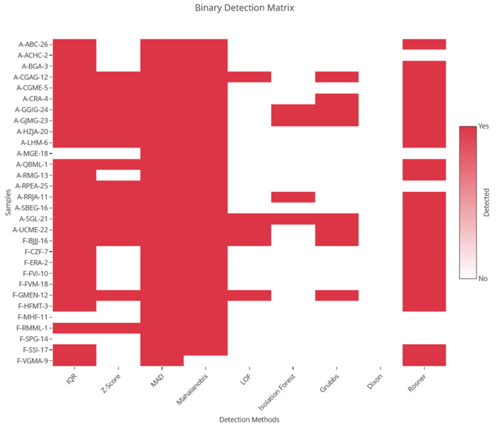
Figure 1.
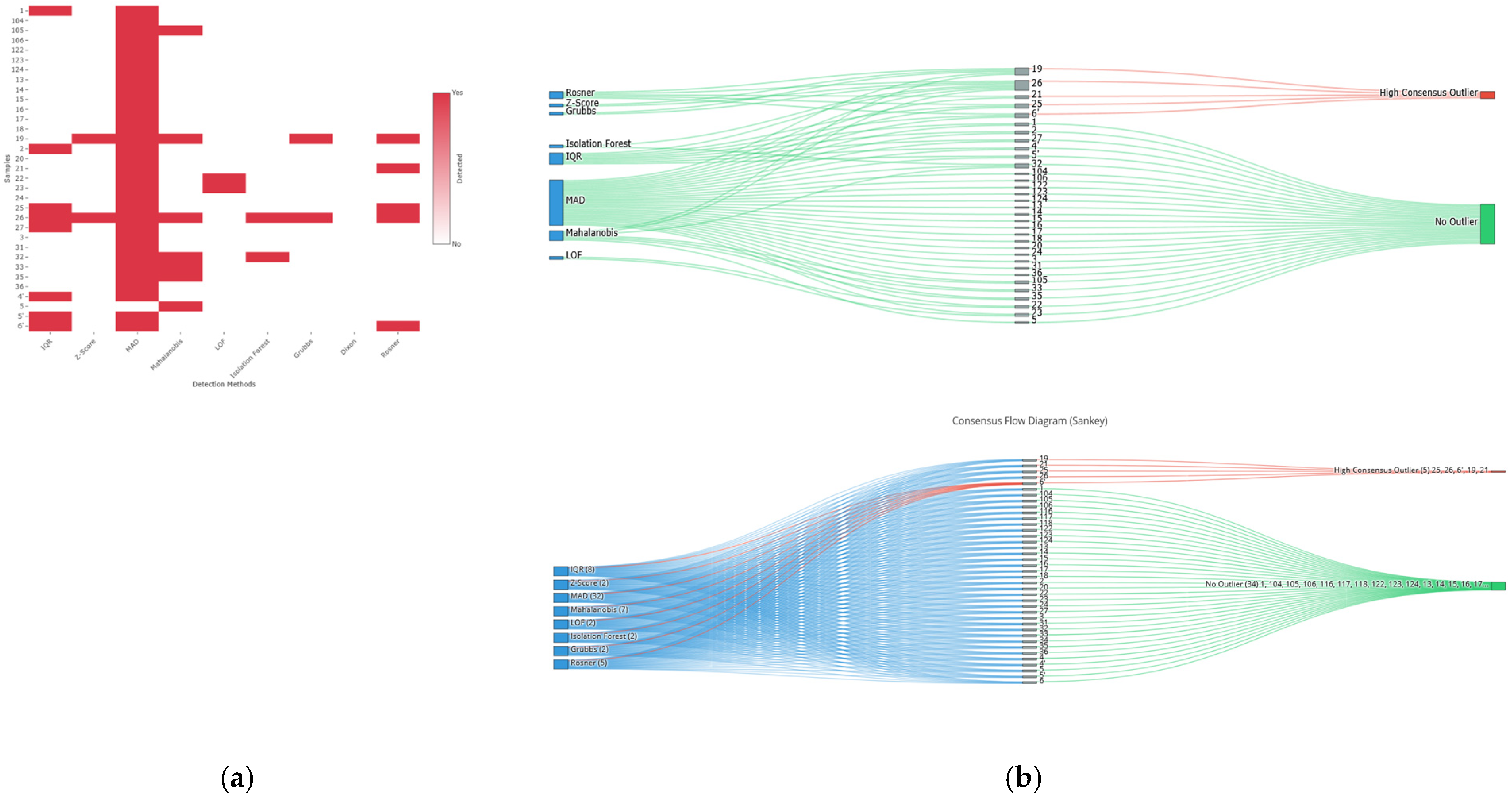
Multi-algorithm detection process and consensus convergence in the diabetic neuropathy cohort. A binary detection matrix (heatmap) showing the results of the 9 applied methods for the 93 samples (rows). Each red cell indicates the sample was identified by the corresponding method (column). A dispersed detection pattern is observed, with specific samples being flagged consistently by multiple algorithms.
Figure 1.
Multi-algorithm detection process and consensus convergence in the diabetic neuropathy cohort. A binary detection matrix (heatmap) showing the results of the 9 applied methods for the 93 samples (rows). Each red cell indicates the sample was identified by the corresponding method (column). A dispersed detection pattern is observed, with specific samples being flagged consistently by multiple algorithms.
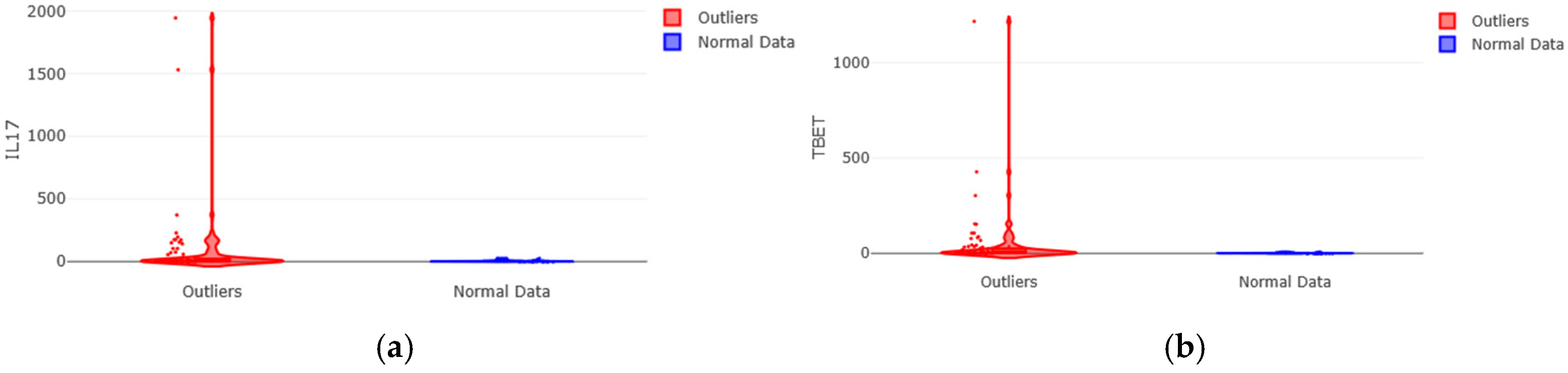
Figure 2.
Most extreme gene expression profiles in the outlier subgroup of diabetic neuropathy. (a) IL-17. (b) T-bet. For each marker, a violin plot is shown with internal box plots and overlaid points representing individual observations. The distribution of the outlier group (red) exhibits extreme asymmetry, with a highly elongated right tail denoting the presence of exceptionally high values, in stark contrast to the compact distribution of the normal group (blue). Differences in the Y-axis scale (implicitly logarithmic due to the dispersion) are notable.
Figure 2.
Most extreme gene expression profiles in the outlier subgroup of diabetic neuropathy. (a) IL-17. (b) T-bet. For each marker, a violin plot is shown with internal box plots and overlaid points representing individual observations. The distribution of the outlier group (red) exhibits extreme asymmetry, with a highly elongated right tail denoting the presence of exceptionally high values, in stark contrast to the compact distribution of the normal group (blue). Differences in the Y-axis scale (implicitly logarithmic due to the dispersion) are notable.
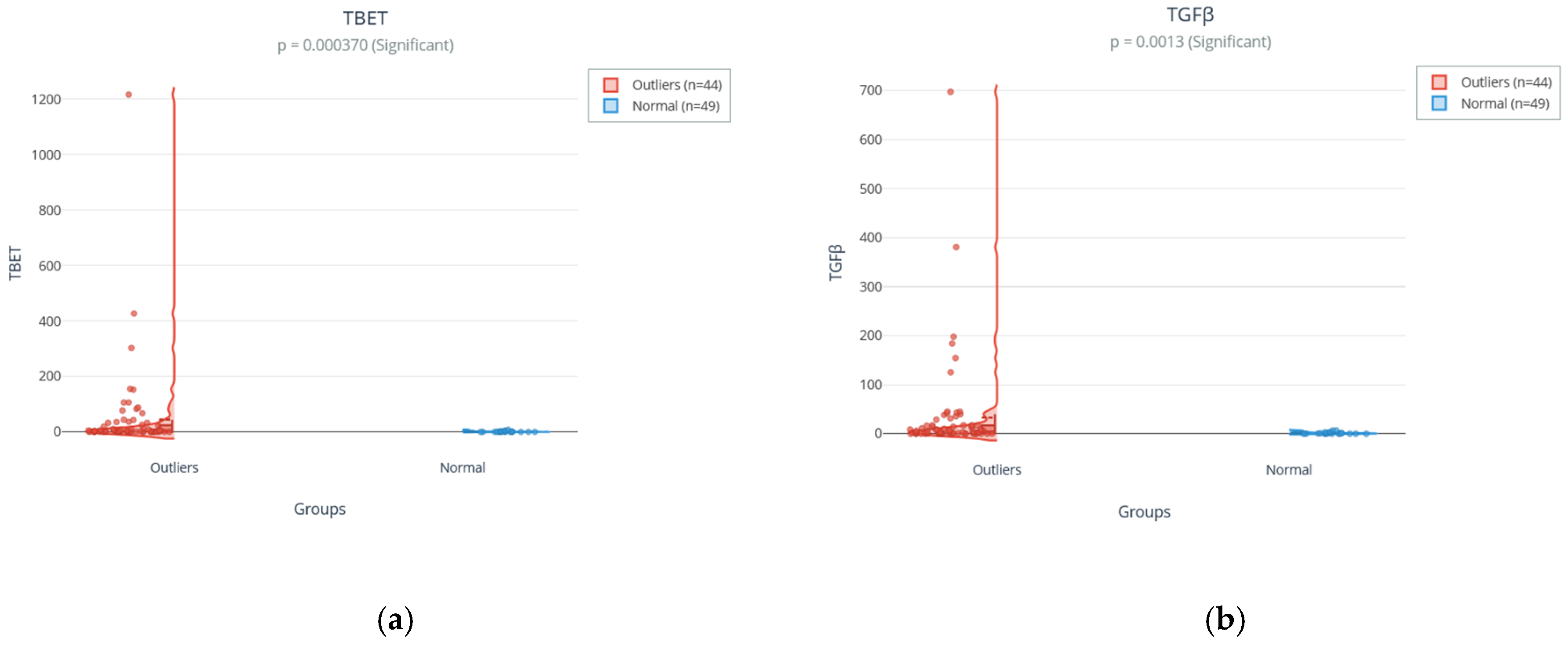
Figure 3.
Significant differences in the most relevant immunological markers. (a) T-bet and (b) TGFβ, the two markers with the most robust differences (lowest p-value and largest effect size). Violin plots with internal box plots show the significantly higher distribution of these markers in the outlier group (red) compared to the normal group (blue), confirming the selective hyperactivation of these specific pathways.
Figure 3.
Significant differences in the most relevant immunological markers. (a) T-bet and (b) TGFβ, the two markers with the most robust differences (lowest p-value and largest effect size). Violin plots with internal box plots show the significantly higher distribution of these markers in the outlier group (red) compared to the normal group (blue), confirming the selective hyperactivation of these specific pathways.
Figure 4.
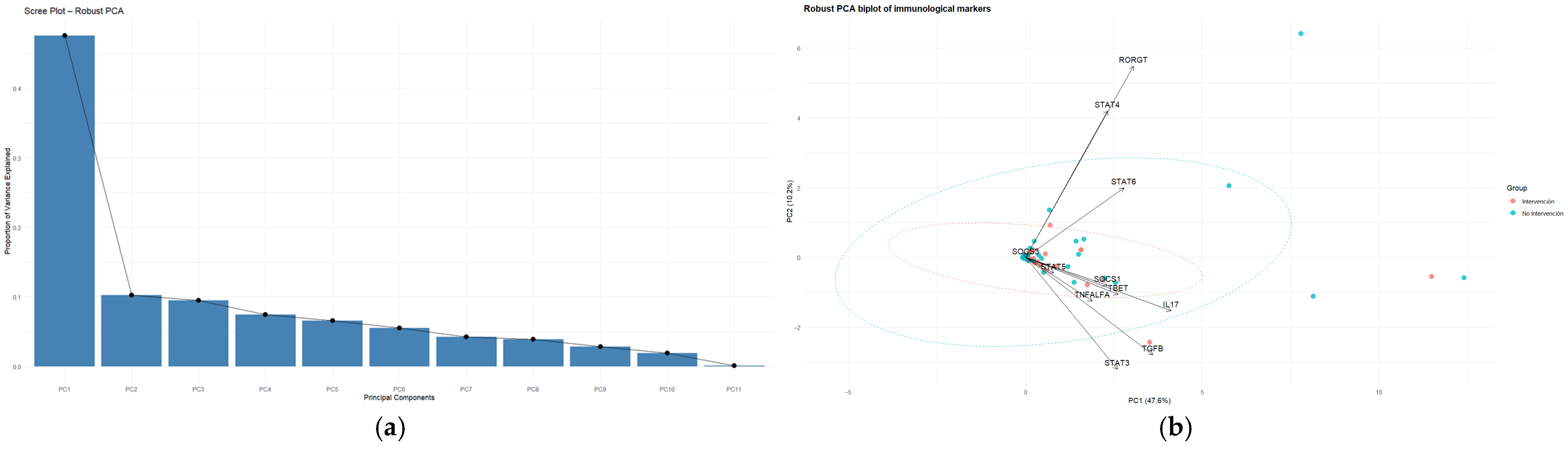
Robust Principal Component Analysis (robust PCA) of the immunological profile. (a) Scree plot showing the proportion of variance explained by each principal component. (b) Robust PCA biplot (PC1 vs. PC2). Points represent individual observations (blue: normal group, n = 49; red: outlier group, n = 44). Arrows (vectors) indicate the direction and magnitude of the loadings of the immunological markers. Outlier samples occupy more peripheral regions of the multivariate space, evidencing distinct combinations of immune signaling alterations.
Figure 4.
Robust Principal Component Analysis (robust PCA) of the immunological profile. (a) Scree plot showing the proportion of variance explained by each principal component. (b) Robust PCA biplot (PC1 vs. PC2). Points represent individual observations (blue: normal group, n = 49; red: outlier group, n = 44). Arrows (vectors) indicate the direction and magnitude of the loadings of the immunological markers. Outlier samples occupy more peripheral regions of the multivariate space, evidencing distinct combinations of immune signaling alterations.
Figure 5.
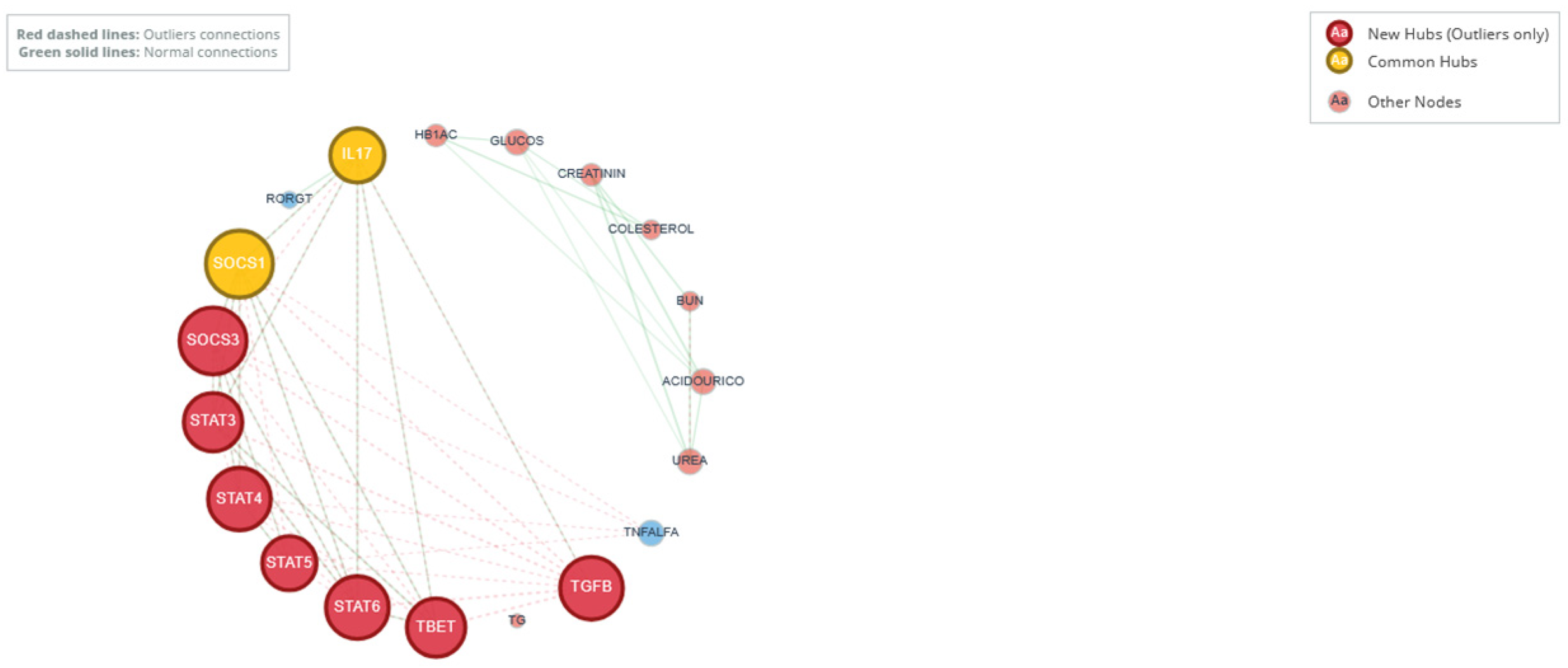
Comparative co-expression network analysis. Schematic representations of the networks derived for the normal group (solid gray connections) and outlier group (dashed red connections) are overlaid. Nodes (circles) represent variables; their size is proportional to degree centrality. Key topological changes are highlighted: in the outlier network, TGFβ and STAT4 emerge as new high-centrality hubs (large nodes with thick borders), while uric acid and glucose have drastically reduced size and connectivity. SOCS1 and IL-17 (yellow) are common on both networks.
Figure 5.
Comparative co-expression network analysis. Schematic representations of the networks derived for the normal group (solid gray connections) and outlier group (dashed red connections) are overlaid. Nodes (circles) represent variables; their size is proportional to degree centrality. Key topological changes are highlighted: in the outlier network, TGFβ and STAT4 emerge as new high-centrality hubs (large nodes with thick borders), while uric acid and glucose have drastically reduced size and connectivity. SOCS1 and IL-17 (yellow) are common on both networks.
Figure 6.
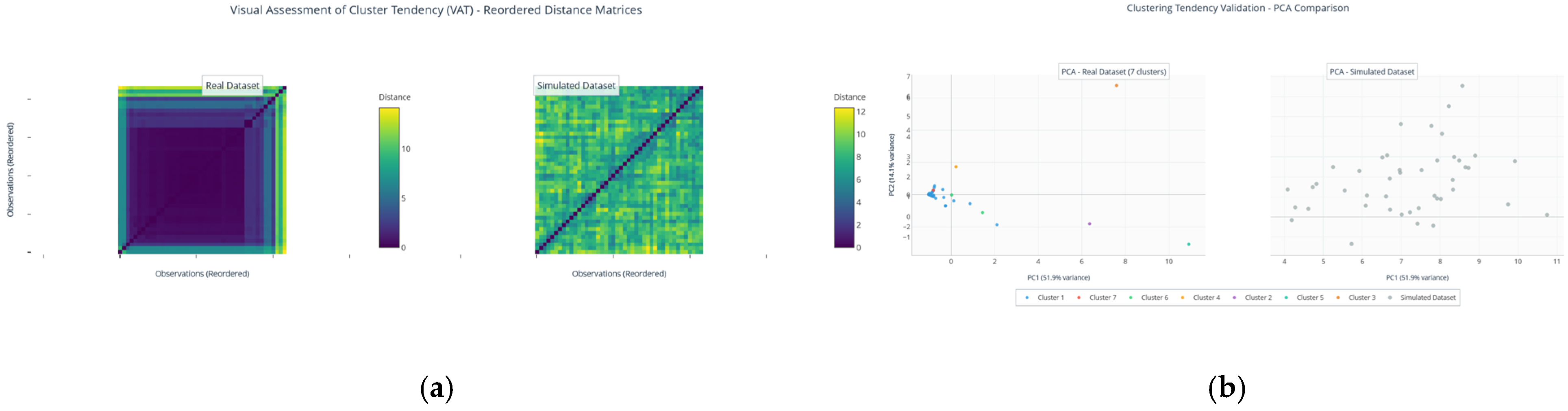
Evaluation of cluster tendency. (a) Reordered Euclidean distance matrices (VAT) for the real dataset (left) and a simulated random dataset (right). The presence of dark square blocks along the diagonal in the real dataset is a diagnostic pattern indicating the existence of natural clusters. (b) PCA projections (PC1 vs. PC2) of the real dataset (colored by preliminary automatic clusters) and the simulated data (gray). The real data show discernible groupings and structure, in contrast to the uniform distribution of the simulated data.
Figure 6.
Evaluation of cluster tendency. (a) Reordered Euclidean distance matrices (VAT) for the real dataset (left) and a simulated random dataset (right). The presence of dark square blocks along the diagonal in the real dataset is a diagnostic pattern indicating the existence of natural clusters. (b) PCA projections (PC1 vs. PC2) of the real dataset (colored by preliminary automatic clusters) and the simulated data (gray). The real data show discernible groupings and structure, in contrast to the uniform distribution of the simulated data.
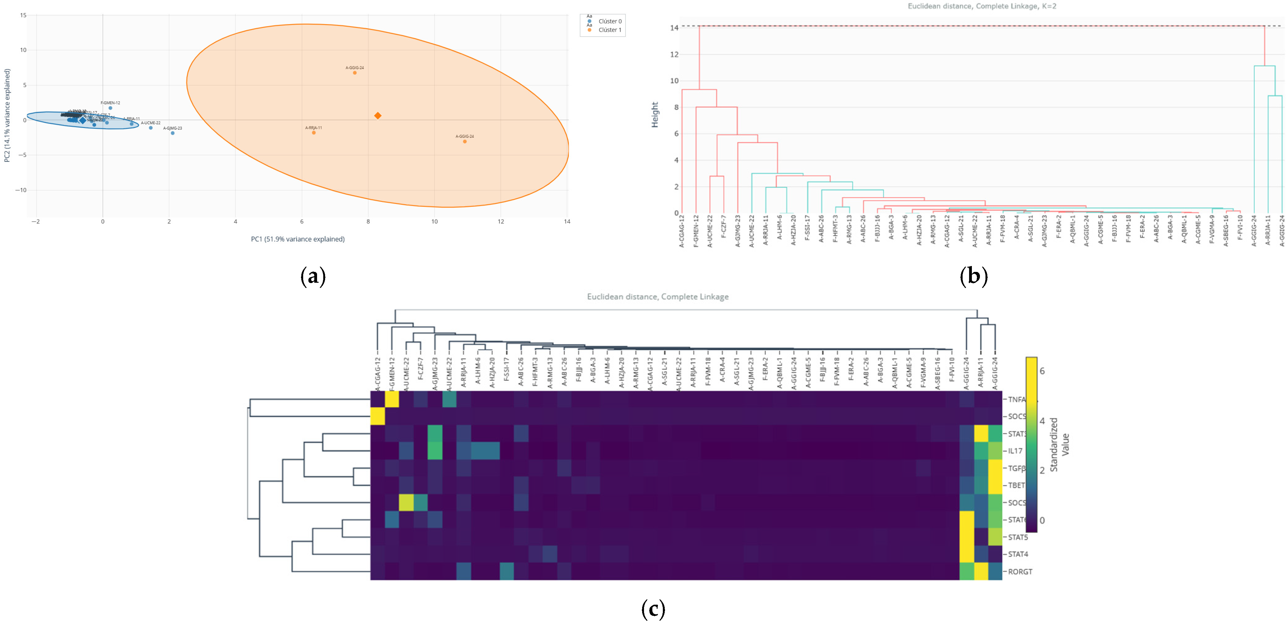
Figure 7.
Identification and characterization of discrete immunological sub-phenotypes within the outlier subgroup via unsupervised clustering. (a) Projection onto the PCA plane (PC1 vs. PC2) of the hierarchical algorithm results (k = 2) applied to the 44 outlier observations. Points are colored by cluster assignment: orange (Cluster 0, n = 3, ultra-extreme phenotype) and purple (Cluster 1, n = 41, core outlier phenotype). Ellipses represent 95% confidence intervals. The clear spatial segregation highlights the distinct multivariate profile of Cluster 0. (b) Dendrogram of agglomerative hierarchical clustering (Euclidean distance, complete linkage). The early and deep split (dashed line) separates the branch containing the three individuals of Cluster 0 (orange) from the main branch comprising Cluster 1 (purple), independently validating the partition. (c) Heatmap showing the standardized expression profiles (Z-score) of the 11 immunological markers, ordered according to the dendrogram structure. The pattern of massive, coordinated hyper-expression across multiple markers (IL-17, T-bet, STAT4, SOCS3, TGFβ) in Cluster 0 (orange sidebar) contrasts with the more moderate and heterogeneous profile of Cluster 1 (purple sidebar).
Figure 7.
Identification and characterization of discrete immunological sub-phenotypes within the outlier subgroup via unsupervised clustering. (a) Projection onto the PCA plane (PC1 vs. PC2) of the hierarchical algorithm results (k = 2) applied to the 44 outlier observations. Points are colored by cluster assignment: orange (Cluster 0, n = 3, ultra-extreme phenotype) and purple (Cluster 1, n = 41, core outlier phenotype). Ellipses represent 95% confidence intervals. The clear spatial segregation highlights the distinct multivariate profile of Cluster 0. (b) Dendrogram of agglomerative hierarchical clustering (Euclidean distance, complete linkage). The early and deep split (dashed line) separates the branch containing the three individuals of Cluster 0 (orange) from the main branch comprising Cluster 1 (purple), independently validating the partition. (c) Heatmap showing the standardized expression profiles (Z-score) of the 11 immunological markers, ordered according to the dendrogram structure. The pattern of massive, coordinated hyper-expression across multiple markers (IL-17, T-bet, STAT4, SOCS3, TGFβ) in Cluster 0 (orange sidebar) contrasts with the more moderate and heterogeneous profile of Cluster 1 (purple sidebar).

Figure 8.
Predictive analysis of the outlier phenotype using Random Forest. (a) ROC curve of the model on the test set (AUC = 0.783). (b) Confusion matrix showing the distribution of correct and incorrect classifications for the normal and outlier classes. (c) Variable importance plot (top 10) based on the mean decrease in Gini impurity, reflecting each variable’s contribution to the model’s classification capability.
Figure 8.
Predictive analysis of the outlier phenotype using Random Forest. (a) ROC curve of the model on the test set (AUC = 0.783). (b) Confusion matrix showing the distribution of correct and incorrect classifications for the normal and outlier classes. (c) Variable importance plot (top 10) based on the mean decrease in Gini impurity, reflecting each variable’s contribution to the model’s classification capability.
Figure 9.
Distribution of the experimental design in the in vitro study with 3T3-L1 adipocytes. Stacked bar chart showing the distribution of the 39 experimental samples according to the categorical variables “group” (bar color) and “treatment” (subdivision within each bar). Each bar represents the total sample count for a group. The absence of the TNF-α condition in the silencing groups is evident.
Figure 9.
Distribution of the experimental design in the in vitro study with 3T3-L1 adipocytes. Stacked bar chart showing the distribution of the 39 experimental samples according to the categorical variables “group” (bar color) and “treatment” (subdivision within each bar). Each bar represents the total sample count for a group. The absence of the TNF-α condition in the silencing groups is evident.
Figure 10.
Multi-algorithm detection process and consensus convergence in the in vitro model. (a) Binary detection matrix (heatmap) showing the results of the 9 methods applied to the 39 samples (rows). Each red cell indicates that the sample (ID) was identified by the corresponding method (column). A scattered detection pattern is observed, with some samples (6, 27) being flagged by multiple methods. (b) Sankey flow diagram illustrating the adaptive consensus process. The nodes on the left represent each detection method. The flows (connections) show the samples identified by each method converging towards central nodes representing inclusion criteria. Only the flows that meet the consensus criteria (samples 6, 19, 21, 25, 26) converge at the final “high consensus” node, while unconfirmed detections are filtered out.
Figure 10.
Multi-algorithm detection process and consensus convergence in the in vitro model. (a) Binary detection matrix (heatmap) showing the results of the 9 methods applied to the 39 samples (rows). Each red cell indicates that the sample (ID) was identified by the corresponding method (column). A scattered detection pattern is observed, with some samples (6, 27) being flagged by multiple methods. (b) Sankey flow diagram illustrating the adaptive consensus process. The nodes on the left represent each detection method. The flows (connections) show the samples identified by each method converging towards central nodes representing inclusion criteria. Only the flows that meet the consensus criteria (samples 6, 19, 21, 25, 26) converge at the final “high consensus” node, while unconfirmed detections are filtered out.
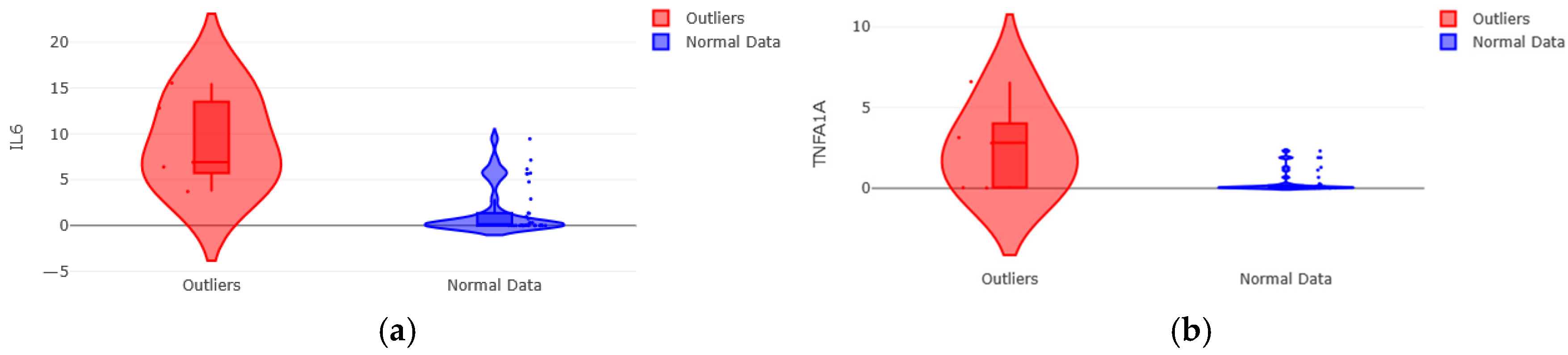
Figure 11.
Extreme gene expression profile in outliers from the 3T3-L1 in vitro model. (a) Distribution of IL-6 (violin plot with overlaid points). Outliers (red) show notably elevated levels compared to the normal group (blue). (b) Distribution of the Tnfrsf1a. Expression of the type 1a receptor is markedly increased in the outlier group. Plots include the median and IQR. All measures are in normalized relative expression units.
Figure 11.
Extreme gene expression profile in outliers from the 3T3-L1 in vitro model. (a) Distribution of IL-6 (violin plot with overlaid points). Outliers (red) show notably elevated levels compared to the normal group (blue). (b) Distribution of the Tnfrsf1a. Expression of the type 1a receptor is markedly increased in the outlier group. Plots include the median and IQR. All measures are in normalized relative expression units.
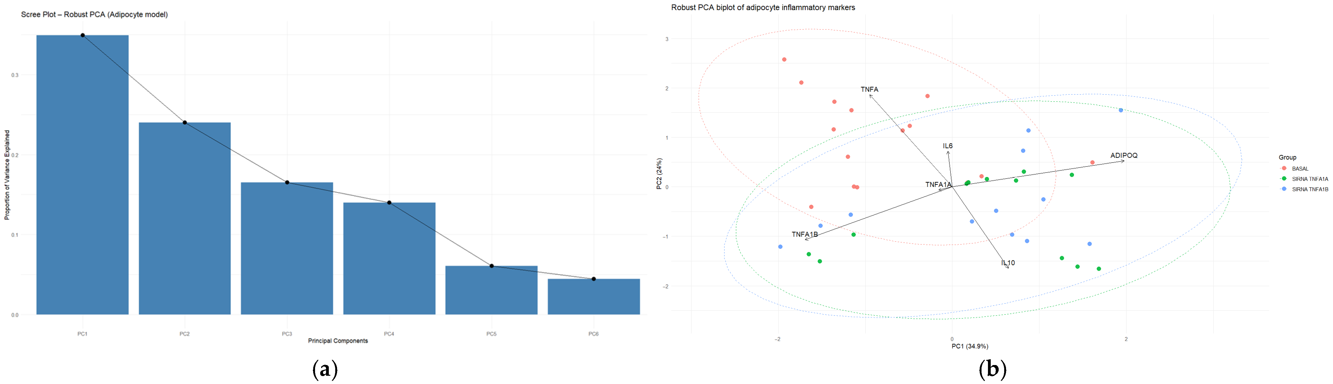
Figure 12.
Robust Principal Component Analysis of the gene expression profile in 3T3-L1 adipocytes. (a) Scree plot showing the proportion of variance explained by each principal component. (b) Robust PCA biplot (PC1 vs. PC2). Points represent individual samples grouped by experimental conditions. Arrows (vectors) indicate the direction and magnitude of the loadings for the six analyzed markers (IL-10, ADIPOQ, IL-6, TNF-α, Tnfrsf1a, Tnfrsf1b). Samples positioned toward peripheral regions of the multivariate space represent atypical transcriptional profiles relative to the central cluster of observations.
Figure 12.
Robust Principal Component Analysis of the gene expression profile in 3T3-L1 adipocytes. (a) Scree plot showing the proportion of variance explained by each principal component. (b) Robust PCA biplot (PC1 vs. PC2). Points represent individual samples grouped by experimental conditions. Arrows (vectors) indicate the direction and magnitude of the loadings for the six analyzed markers (IL-10, ADIPOQ, IL-6, TNF-α, Tnfrsf1a, Tnfrsf1b). Samples positioned toward peripheral regions of the multivariate space represent atypical transcriptional profiles relative to the central cluster of observations.
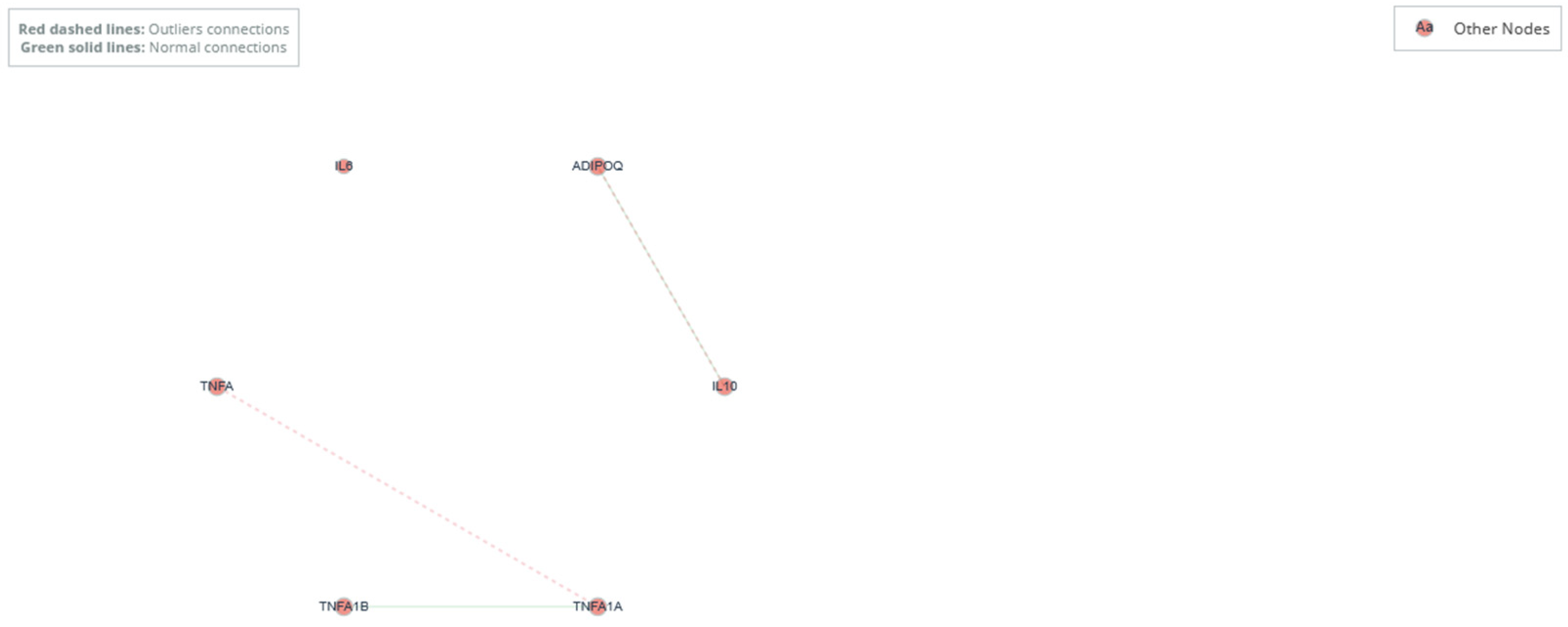
Figure 13.
Gene co-expression network analysis in the 3T3-L1 model. Integrated comparative network. Both networks are overlaid. Connections from the normal network are shown in solid gray, and connections specific to the outlier network in dashed red. The shift centrality of TNF-α and Tnfrsf1b is evident.
Figure 13.
Gene co-expression network analysis in the 3T3-L1 model. Integrated comparative network. Both networks are overlaid. Connections from the normal network are shown in solid gray, and connections specific to the outlier network in dashed red. The shift centrality of TNF-α and Tnfrsf1b is evident.
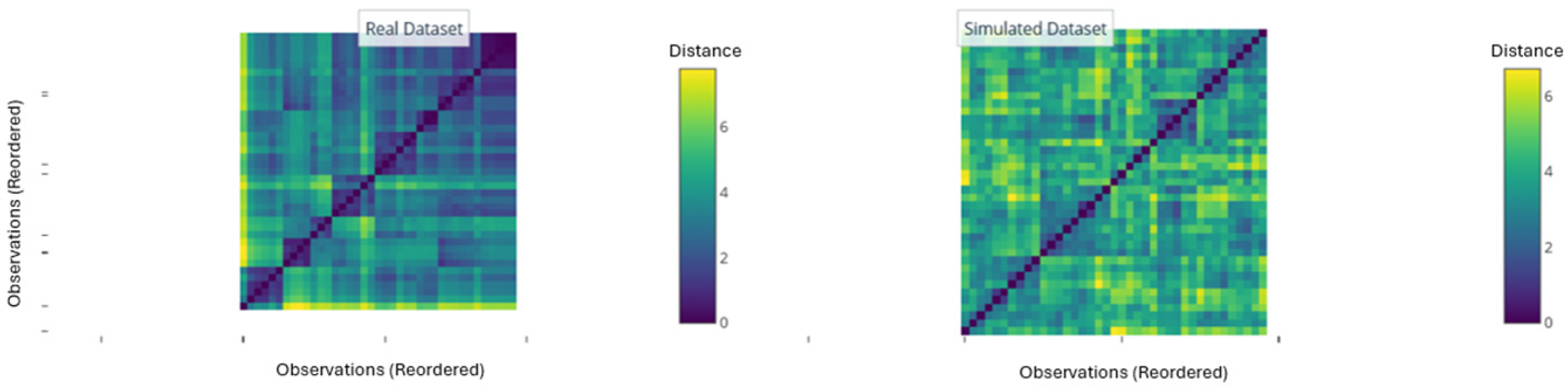
Figure 14.
Evaluation of clustering tendency (VAT). Reordered Euclidean distance matrices for the real dataset (left panel) and a simulated random dataset (right panel). The presence of dark square blocks along the diagonal in the real dataset is a diagnostic pattern indicating the existence of natural, compact clusters. The absence of this pattern in the simulated dataset confirms that the observed structure in the experimental data is not random.
Figure 14.
Evaluation of clustering tendency (VAT). Reordered Euclidean distance matrices for the real dataset (left panel) and a simulated random dataset (right panel). The presence of dark square blocks along the diagonal in the real dataset is a diagnostic pattern indicating the existence of natural, compact clusters. The absence of this pattern in the simulated dataset confirms that the observed structure in the experimental data is not random.
Figure 15.
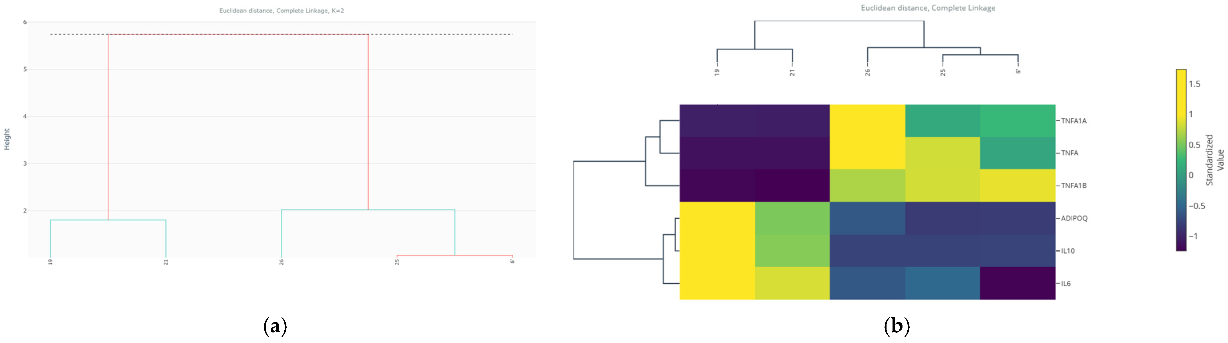
Hierarchical clustering analysis and characterization of cluster sub-phenotypes. (a) Dendrogram of agglomerative hierarchical clustering (Euclidean distance, complete linkage). The red horizontal line indicates the cut to obtain k = 2 clusters. The colored branches correspond to the two identified groups. (b) Coupled heatmap showing the standardized expression profiles (Z-score) of the six markers for the five outlier observations, ordered according to the dendrogram.
Figure 15.
Hierarchical clustering analysis and characterization of cluster sub-phenotypes. (a) Dendrogram of agglomerative hierarchical clustering (Euclidean distance, complete linkage). The red horizontal line indicates the cut to obtain k = 2 clusters. The colored branches correspond to the two identified groups. (b) Coupled heatmap showing the standardized expression profiles (Z-score) of the six markers for the five outlier observations, ordered according to the dendrogram.
Figure 16.
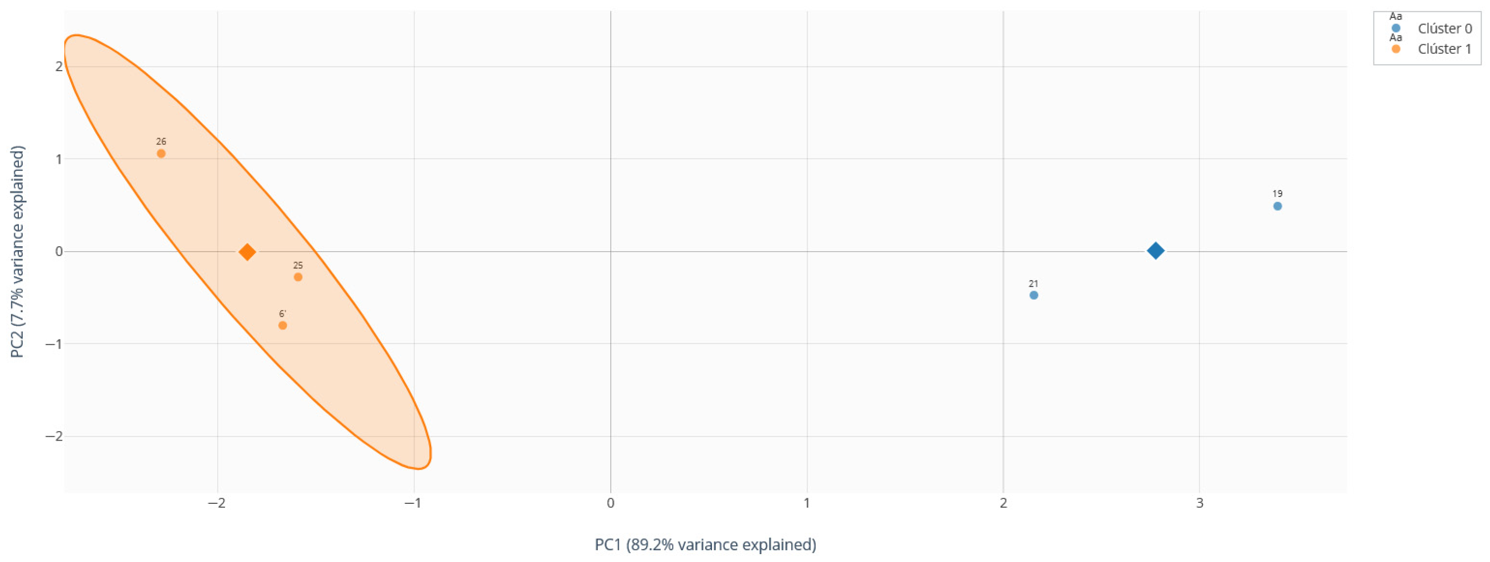
Hierarchical biplot (Euclidean distance, complete linkage method). PCA projection (PC1 and PC2) of observations colored according to their hierarchical cluster assignment (Cluster 0: blue, dark blue diamond symbol represents the cluster centroid; Cluster 1: orange, dark orange diamond symbol represents the cluster centroid). Sample IDs are shown next to the points.
Figure 16.
Hierarchical biplot (Euclidean distance, complete linkage method). PCA projection (PC1 and PC2) of observations colored according to their hierarchical cluster assignment (Cluster 0: blue, dark blue diamond symbol represents the cluster centroid; Cluster 1: orange, dark orange diamond symbol represents the cluster centroid). Sample IDs are shown next to the points.
Table 1.
Distribution of participants by intervention group and assessment time point.
Table 1.
Distribution of participants by intervention group and assessment time point.
| Time Point | Electroacupuncture (n) | Control (n) | Total (n) |
|---|
| Basal | 16 | 15 | 31 |
| ME02 | 16 | 15 | 31 |
| ME03 | 16 | 15 | 31 |
| Total | 48 | 45 | 93 |
Table 2.
Distribution of categorical variables between outliers (n = 44) and normal data (n = 49) groups.
Table 2.
Distribution of categorical variables between outliers (n = 44) and normal data (n = 49) groups.
| Variable | Category | Outliers n (%) | Normal Data n (%) |
|---|
| Group | Intervention | 24 (54.2%) | 21 (42.9%) |
| No intervention | 20 (45.8%) | 28 (57.1%) |
| Time point | Basal | 14 (33.3%) | 17 (33.3%) |
| ME02 | 14 (33.3%) | 17 (33.3%) |
| ME03 | 14 (33.3%) | 17 (33.3%) |
Table 3.
Descriptive statistics of immunological mediator expression (normalized relative units).
Table 3.
Descriptive statistics of immunological mediator expression (normalized relative units).
| Marker | Group | Mean ± SD * | Median (IQR *) | Range (Min–Max) |
|---|
| IL-17 | Outliers | 82.89 ± 292.22 | 3.95 (0.83–29.42) | 0.0018–1944.06 |
| Normal | 4.03 ± 6.20 | 1.95 (0.68–4.61) | 0.0271–25.37 |
| T-bet | Outliers | 44.62 ± 155.57 | 3.22 (0.83–21.30) | 0.0060–1216.8 |
| Normal | 1.32 ± 2.00 | 0.40 (0.12–1.35) | 0.0365–7.94 |
| RORγT | Outliers | 32.31 ± 80.61 | 2.40 (0.85–21.30) | 0.0178–445.68 |
| Normal | 5.45 ± 9.52 | 1.81 (0.26–7.37) | 0.0331–33.64 |
| SOCS3 | Outliers | 220.27± 1619.36 | 3.94 (0.50–18.67) | 0.0088–13,759.52 |
| Normal | 2.59 ± 4.13 | 0.41 (0.10–3.42) | 0.0107–16.34 |
| STAT4 | Outliers | 56.05 ± 213.64 | 3.26 (0.88–32.51) | 0.0022–1422.83 |
| Normal | 2.95 ± 6.72 | 0.60 (0.11–1.74) | 0.0283–28.37 |
| TNF-α | Outliers | 495.63± 1842.28 | 3.50 (0.07–194.54) | 0.0000–11,439.05 |
| Normal | 38.56 ± 74.81 | 2.29 (0.01–17.72) | 0.0000–229.82 |
Table 4.
Association between outlier status and categorical variables.
Table 4.
Association between outlier status and categorical variables.
| Variable | Chi-Square Statistic (χ2) | Degrees of Freedom | p-Value | Effect Size | Significance |
|---|
| Intervention | 0.441 | 1 | 0.507 | φ = 0.069 (small) | Non-significant |
| Time Point | 0.0000 | 2 | 1.000 | V = 0.000 (small) | Non-significant |
Table 5.
Comparison of immunological and metabolic markers between outlier and normal groups using the Mann–Whitney U test.
Table 5.
Comparison of immunological and metabolic markers between outlier and normal groups using the Mann–Whitney U test.
| Variable | U Statistic | p-Value | Effect Size (r) | Significance |
|---|
| T-bet | 1144.0 | 0.00037 *** | 0.37 (medium) | Significant |
| TGFβ | 1106.0 | 0.0013 ** | 0.33 (medium) | Significant |
| SOCS3 | 1051.0 | 0.0068 ** | 0.28 (small–medium) | Significant |
| STAT5 | 1011.5 | 0.019 * | 0.24 (small–medium) | Significant |
| SOCS1 | 1014.0 | 0.018 * | 0.25 (small–medium) | Significant |
| STAT3 | 1003.0 | 0.024 * | 0.24 (small–medium) | Significant |
| STAT4 | 968.0 | 0.052. | 0.20 (small–medium) | Marginal/Borderline |
| STAT6 | 954.0 | 0.070 | 0.19 (small–medium) | Non-Significant |
| IL-17 | 933.0 | 0.17 | 0.17 (small–medium) | Non-Significant |
| RORγT | 865.0 | 0.32 | 0.10 (small) | Non-Significant |
| TNF-α | 820.0 | 0.56 | 0.06 (small) | Non-Significant |
Table 6.
Variance explained by principal components of the immunological profile in diabetic neuropathy.
Table 6.
Variance explained by principal components of the immunological profile in diabetic neuropathy.
| Component | Explained Variance (%) | Cumulative Variance (%) |
|---|
| PC1 | 47.6 | 47.6 |
| PC2 | 10.2 | 57.8 |
| PC3 | 9.5 | 67.3 |
| PC4 | 7.5 | 74.8 |
| PC5 | 6.6 | 81.4 |
Table 7.
Major changes in node centrality between the co-expression network of the outlier and normal groups.
Table 7.
Major changes in node centrality between the co-expression network of the outlier and normal groups.
| Variable | Centrality (Outlier) | Centrality (Normal) | Δ Centrality | Insights |
|---|
| TGFβ | 0.444 | 0.056 | +0.389 | Emerges as a new principal hub in outliers |
| STAT4 | 0.444 | 0.167 | +0.278 | Gains central importance in the atypical network |
| SOCS3 | 0.500 | 0.278 | +0.222 | Increases its connectivity |
| STAT5 | 0.333 | 0.111 | +0.222 | Gains relevance as a connected node |
| T-bet | 0.389 | 0.222 | +0.167 | Increases its connectivity |
| STAT6 | 0.444 | 0.278 | +0.167 | Greater centrality |
| SOCS1 | 0.500 | 0.333 | +0.167 | Remains a hub but gains strength |
| Uric Acid | 0.000 | 0.222 | −0.222 | Loses its hub status completely |
| Glucose | 0.000 | 0.222 | −0.222 | Disconnects from the main network |
Table 8.
Characterization of clusters identified by unsupervised clustering within the outlier subgroup (n = 44).
Table 8.
Characterization of clusters identified by unsupervised clustering within the outlier subgroup (n = 44).
| Cluster | Size (n) | Percentage | Position in PCA (PC1, PC2) | Composition |
|---|
| 0 (Minority) | 3 | 6.8% | (8.291, 0.636) | Extreme outlier subset (IDs: A-GGG-24, A-RJM-11, A-GMG-23 *) |
| 1 (Majority) | 41 | 93.2% | (−0.607, −0.047) | Core outlier subgroup |
Table 9.
Performance metrics of the Random Forest model for predicting the outlier phenotype on the test set.
Table 9.
Performance metrics of the Random Forest model for predicting the outlier phenotype on the test set.
| Metric | Value | Insights |
|---|
| AUC-ROC | 0.783 | Good discriminative ability |
| Accuracy | 0.842 | 84.25 of predictions are correct |
| Positive Predictive Value (Precision) | 0.833 | 83.35 of those predicted as outliers are true outliers |
| Sensitivity (Recall) | 1.000 | 100% detection of true outliers |
| Specificity | 0.714 | Correct classification of 71.4% of normal individuals |
Table 10.
Relative importance of predictor variables in the Random Forest model (Top 10).
Table 10.
Relative importance of predictor variables in the Random Forest model (Top 10).
| Variable | Importance (Gini *) | Percentage (%) | Domain |
|---|
| Creatinine | 0.1063 | 10.63% | Biochemical |
| T-bet | 0.1042 | 10.42% | Immunological |
| Uric Acid | 0.0764 | 7.64% | Biochemical |
| STAT5 | 0.0712 | 7.12% | Immunological |
| SOCS3 | 0.0700 | 7.00% | Immunological |
| SOCS1 | 0.0681 | 6.81% | Immunological |
| TGFβ | 0.0664 | 6.64% | Immunological |
| STAT4 | 0.0584 | 5.84% | Immunological |
| BUN | 0.0535 | 5.35% | Biochemical |
| Glucose | 0.0524 | 5.24% | Metabolic |
Table 11.
Descriptive distribution of outliers according to the experimental conditions of the in vitro study.
Table 11.
Descriptive distribution of outliers according to the experimental conditions of the in vitro study.
| Variable | Category | Outliers (n = 5) | Normal Data (n = 34) | Total Per Category |
|---|
Group | Basal | 3 (60.0%) | 12 (35 | Basal |
| siRNA Tnfrsf1b | 2 (40.0%) | 10 (29.4%) | 12 |
| SiRNA Tnfrsf1a | 0 (0.0%) | 12 (35.3%) | 12 |
Treatment | TNF-α | 2 (40.0%) | 1 (2.9%) | 3 |
| Control | 2 (40.0%) | 7 (20.6%) | 9 |
| TNF-α + Glycine | 1 (20.0%) | 8 (23.5%) | 9 |
| Glycine | 0 (0.0%) | 9 (26.5%) | 9 |
| Glycine + TNF-α | 0 (0.0%) | 9 (26.5%) | 9 |
Table 12.
Association between outlier status and experimental categorical variables.
Table 12.
Association between outlier status and experimental categorical variables.
| Variable | Statistic | Value | Degrees of Freedom | p-Value | Effect Size (Cramer’s V) |
|---|
| Group | χ2 | 2.62 | 2 | 0.796 | 0.26 |
| | χ2 | 11.16 | 4 | 0.152 | 0.54 |
Table 13.
Comparison of gene expression markers between outlier and normal groups in the 3T3-L1 model.
Table 13.
Comparison of gene expression markers between outlier and normal groups in the 3T3-L1 model.
| Variable | Outlier Group Median (IQR) | Normal Group Median (IQR) | U Statistic | p-Value | Effect Size (r) |
|---|
| Il-6 | 6.92 (3.71–15.56) | 0.03 (0.00–0.58) | 159.0 | 0.002 * | 0.50 |
| Tnfrsf1a | 2.82 (0.03–6.60) | 0.07 (0.02–0.32) | 117.0 | 0.186 | 0.22 |
| IL-10 | 0.003 (0.002–1.46) | 1.47 (0.26–7.94) | 45.0 | 0.097 | −0.27 |
| Tnfrsf1b | 0.32 (0.03–0.36) | 0.31 (0.10–0.82) | 56.5 | 0.239 | −0.19 |
| TNF-α | 2.62 (0.00–5.39) | 0.08 (0.01–1.35) | 104.0 | 0.434 | 0.13 |
| ADIPOQ | 0.77 (0.50–3.61) | 1.56 (1.00–2.32) | 72.0 | 0.600 | −0.09 |
Table 14.
Variance explained by the principal components of the gene expression profile in 3T3-L1 adipocytes.
Table 14.
Variance explained by the principal components of the gene expression profile in 3T3-L1 adipocytes.
| Component | Explained Variance (%) | Cumulative Variance (%) |
|---|
| PC1 | 34.9 | 34.9 |
| PC2 | 24.0 | 58.9 |
| PC3 | 16.5 | 75.5 |
| PC4 | 14.0 | 89.5 |
| PC5 | 6.1 | 95.6 |
| PC6 | 4.4 | 100.00 |
Table 15.
Changes in node centrality between the co-expression networks of the normal and outlier groups.
Table 15.
Changes in node centrality between the co-expression networks of the normal and outlier groups.
| Variable | Centrality (Outliers) | Centrality (Normals) | Δ Centrality | Insights |
|---|
| TNF-α | 0.200 | 0.000 | +0.200 | Emerges as a new hub in outliers |
| Tnfrsf1b | 0.000 | 0.200 | −0.200 | Loses its hub status in outliers |
| Other markers | 0.000 | 0.000 | 0.000 | No change in connectivity |
Table 16.
Values of validation indices for determining the optimal number of clusters (k). The optimal value for each index is highlighted in bold. For the Silhouette Coefficient and the Calinski–Harabasz index, higher values indicate a better clustering structure. For the Davies–Bouldin index, a lower value indicates better separation between clusters.
Table 16.
Values of validation indices for determining the optimal number of clusters (k). The optimal value for each index is highlighted in bold. For the Silhouette Coefficient and the Calinski–Harabasz index, higher values indicate a better clustering structure. For the Davies–Bouldin index, a lower value indicates better separation between clusters.
| K | Within-Cluster Sum of Squares (WSS) | Silhouette Coefficient | Calinski–Harabasz Index | Davies–Bouldin Index |
|---|
| 2 | 4.29 | 0.6471 | 17.96 | 0.3928 |
| 3 | 2.82 | 0.4922 | 15.23 | 0.6214 |
| 4 | 2.02 | 0.3645 | 15.07 | 0.8123 |
| 5 | 1.36 | 0.3011 | 16.58 | 0.8701 |
| 6 | 0.94 | 0.2214 | 18.76 | 1.0657 |




 ,
,