Article

Aesthetics and Usability in Digital Art Repositories: Using the iMedius Platform to Collect User Feedback Through Attention Tracking

by
Minas Pergantis
1,*,
Anastasia Katsaounidou
2,
Aristeidis Lamprogeorgos
1 and
Andreas Giannakoulopoulos
1,*
1
Department of Audio and Visual Arts, Ionian University, 49100 Corfu, Greece
2
Department of Digital Media and Communications, Ionian University, 28100 Argostoli, Greece
*
Authors to whom correspondence should be addressed.
Arts 2026, 15(1), 9; https://doi.org/10.3390/arts15010009 (registering DOI)
Submission received: 15 November 2025 / Revised: 25 December 2025 / Accepted: 27 December 2025 / Published: 3 January 2026

Abstract

Digital art repositories strive to disseminate works of art through the World Wide Web and to reach the widest possible global audience. To that end, providing an optimal user experience (UX) is essential. Usability is the cornerstone of UX in all interactions between the visitor and the platform, but at the same time, as virtual places of art and culture, digital art repositories aim to also provide an aesthetically pleasing interface that stimulates the senses. These goals are not always aligned, and how end users perceive the interplay between aesthetics and usability is an important factor in creating a balanced UX. This study presents a streamlined methodology for the collection of visitor insights concerning aesthetics and usability, taking advantage of the attention tracking capabilities of the iMedius platform. The iMedius Form Builder digital research tool allows the collection of both self-reported feedback through survey replies and candid data through gaze and mouse tracking, thus creating a robust dataset that can lead to interesting insights. An interactive questionnaire investigating user reaction to three different digital art repositories is presented, and feedback from higher education students from the fields of digital art and media is presented and analyzed in detail. Through this analysis, interesting insights are derived regarding striking a balance between high usability and memorable aesthetics.

1. Introduction

Over the past two decades, digital art repositories have been transformed into vital infrastructure within the digital format for preserving, conserving, and communicating cultural heritage via electronic mediums. A digital art repository is a web-based platform designed to organize, display, and distribute artworks, both digital and digitized, as well as their context in the form of metadata, in a sustainable and accessible manner (Ghidini 2019). These platforms constitute both technical systems for enduring storage and cultural interfaces for audiences to gain access to, explore, and make sense of artworks (Parry 2007). Digital art repositories differ from existing databases because they are located at the nexus of archival practice, visual communication, and user interactions. They not only manage objects that are digitized but also the interpretive frames these objects take on importance to different publics (Cameron and Kenderdine 2007). In this regard, the repositories’ design and appearance (structure, interface, and aesthetic) directly inform how users will experience and encounter the content.
Digital repositories have made great contributions, such as expanding the possibilities of art objects. Overcoming geographical and institutional barriers, they enable users to engage with artworks that might not have been available before, thus aiding in education, research, and engagement of users across the various groups and stages of literacy and culture that are widely produced and varied audiences (Marty 2007). Access to media online also facilitates new forms of engagement. It lets users browse non-linearly, to zoom in on things, to compare works from one institution to another, and, even more importantly, to encounter a rich body of metadata layers that extend and deepen the format of conventional display (Terras 2011). These affordances place digital art repositories at the very center of the promotion of cultural literacy and the practices of digital humanities as active agents. At the same time, the transition from physical to digital spaces brings new issues. In-person museum experiences depend heavily on spatial cues, curatorial narratives, and embodied interactions, while online spaces are focused on interface design, information architecture, and user experience flows (Hornecker and Ciolfi 2022). Thus, the functionality of digital repositories (navigating efficiently, searching accurately, and ensuring the metadata clarity) must harmonize with the experiential attributes often associated with art spaces (for example, aesthetic beauty, visual coherence, aesthetic quality, and emotional appeal) (Trant 2009).
Consequently, platform design and culture are integrally linked. An interface that is excessively visually confusing or inadequately structured may act as an obstacle in interpreting the visual materials, distorting curatorial motivation, and ultimately, limiting user involvement, though the underlying content is highly valuable (Marty 2011). Previous work from museum informatics shows that the demands of digital art platforms have become layered. Users are no longer just looking for high-end images; they desire engagement that facilitates discovery, relevance to personalized information, and interpretive depth (Marty 2011). To date, adaptive interfaces, contextual information, multimodal experiences, and designs that honor the artistic identity of the works being exhibited fall along this line. The relation of aesthetically appealing design to usability is particularly important in this context, given that aesthetic design affects perception of actual usability as well as trustworthiness and user satisfaction, thereby making it an active part of the experience and not merely an ornamental feature (Tractinsky et al. 2000; Liu and Lan 2021). Briefly, digital art repositories can be viewed not just as things to house but as active cultural arenas in which architectural choices influence and even actively guide how artworks become accessible to people. Their increasing function in cultural communication highlights the necessity to study users’ perception and navigation of more complicated visual environments with an aim to understand how both aesthetic and functional aspects combined contribute to the broader experience.
The present study starts with presenting its goals, research questions, and summary contributions further below in Section 1. It continues with Section 2, which focuses on usability and aesthetics, and how they relate to user experience in digital art repositories, as well as describing the methodological framework used in this study, combining self-report scales with attention tracking techniques. Next, in Section 3, the research design is presented, mixed methods studies are carried out using specialized tools, and the collected data is analyzed. Section 4 describes quantitative, qualitative, and behavioral findings, and the discussion evaluates these results on the basis of the research questions. The paper ends by summing up the key findings and future work considerations.
As user needs evolve and UX design grows ever more complicated, the requirement for theoretical frameworks that can manage to account for the complexity of user experience in art interfaces becomes more explicit. Conventional methods of evaluation (too often based on self-rated perceptions) tend to overlook the cognitive, emotional, and attentional factors that condition users’ experience of digital artworks. Conversely, UX assessment tools present in the fields of art and culture commonly consist of either usability testing or aesthetic judgments and hardly provide an overarching perspective that embraces both dimensions of experience. We conclude here that this gap in knowledge points to a critical need for research materials that are widely available, scalable, and that can provide subjective evaluations in conjunction with objective behavioral measures. To meet this demand, this research proposes a mixed method whereby widely tested UX measurement scales are combined with attention tracking instruments recorded via the iMedius Form Builder platform. Blending academic traditions in UX research design, digital heritage studies, and behavioral tracking, the study aims to provide a broader understanding of how users experience and navigate repositories of art. This integration lets us see not only what users say about their experience but also what the gaze looks like in response to it and how their fixations and trajectories of interaction play out through their real use.
To that end, the study’s research questions (RQs) specify the core issues it addresses, outlining how usability, aesthetics, and user attention are examined across the selected digital art repositories.
RQ1. How do users evaluate the usability and aesthetic dimensions of digital art repositories?
RQ2. Which types of interface elements do users tend to consider: (a) the most useful or (b) the most aesthetically pleasing in digital art repositories?
RQ3. To what extent do attention patterns align with or deviate from users’ self-reported evaluations of the usability and aesthetics of digital art repositories?
These research questions examine how users conceptualize a spectrum of aesthetic/usability balance among the various digital art repositories and whether attention-enhanced UX analysis can highlight patterns that reinforce or subvert self-reported data. This double focus places the research within an attempt to modernize UX evaluation for art repositories and cultural heritage platforms and to test new, open-access tools to facilitate more trustworthy and informed research results.

2. Related Work and Targeted Innovation

2.1. User Experience in Digital Art Repositories

A well-organized UX can make a significant difference in how people interact with any digital system, but as mentioned before, this is even more obvious in environments that deal with art, culture, and interpretation. When UX is excellent, users can focus on what they want to do without being slowed down by confusing layouts or broken interactions (Nielsen 2012). In cultural or educational contexts, this is crucial because people visit these platforms with the intention of understanding, exploring, or discovering something and not solving technical puzzles (Norman 2004). Studies have shown that interfaces that are easy to grasp and visually coherent help users feel more confident and less frustrated as they navigate (Hassenzahl 2010). Likewise, positive UX is often linked with longer engagement and deeper interaction with the content (Shneiderman et al. 2016). On the other hand, when usability issues appear, users tend to give up quickly, even if the material itself is valuable or interesting (Krug 2014).
UX shapes the entire way in which users read, interpret, and move through cultural information in the context of digital heritage (Parry 2007). So, rather than treating UX as a technical add-on, it makes more sense to treat it as a central element of how cultural material is communicated digitally. Aesthetics also play a significant role. The look and feel of an interface influences users’ expectations and often their sense of usability (Tractinsky et al. 2000). In cultural and artistic platforms especially, aesthetics are not just decorative elements but are part of how the content itself is experienced (Cameron and Kenderdine 2007).
Users typically approach digital art repositories with two kinds of goals. They want to navigate smoothly and understand the information. That is the so-called functional side. But at the same time, they come with aesthetic expectations, emotional reactions, and cultural associations (Battarbee 2003; Hassenzahl 2007, 2010). Norman (2004) explains this through the three layers of experience (visceral, behavioral, and reflective), which connect visual design, usability, and cultural meaning. In digital art repositories, these layers overlap constantly. The visual identity of the platform affects not only usability but also how users mentally “frame” the artworks they are looking at. Research in museum informatics also suggests that UX affects the way people connect with the object of art itself (Marty 2007).
In short, UX in art-related platforms combines usability and aesthetics in a way that goes beyond information retrieval. Users are not just browsing, they are experiencing a digital version of art. Building on this point, the next step is to explore how aesthetics and usability interact, since their relationship lies at the heart of how users perceive and engage with digital art platforms.

2.2. Aesthetics and Usability: Theoretical Foundations and Their Interplay

The relationship between aesthetics and usability has been widely discussed, especially because users form impressions of interfaces extremely quickly, sometimes in milliseconds. Many studies show that people do not judge an interface only by how well it works but also by how it looks and how it makes them feel (Norman 2004).
One of the earliest important studies on this topic was by Kurosu and Kashimura (1995), who introduced the idea of inherent usability, “how usable something really is”, versus apparent usability, “how usable it seems”. The researchers found that people’s judgments were influenced more by the aesthetic presentation than by the actual functional quality. Later, Tractinsky et al. (2000) confirmed that visually appealing interfaces are almost always rated as more usable, even after real use. This is known as the aesthetic–usability effect. The halo effect is among the popular explanations for this reasoning, which holds that a favorable quality (i.e., beauty) engenders the expectation of other favorable qualities (i.e., usability) (Dion et al. 1972; Tractinsky et al. 2000). Even in visually rich environments, this change comes about even sooner; in visceral reactions, expectations are shaped before any significant interaction occurs (Norman 2004). Therefore, people assume that beautifully designed interfaces tend to be easier to use, more reliable, or better organized. Hassenzahl’s (2007, 2010, 2018) findings provide a useful point of view for this. The researcher differentiates pragmatic qualities (which support what users want to do) and hedonic qualities (which support how users want to feel or who they want to be). For example, style, novelty, and expressiveness are considered hedonic qualities. They create a positive overall experience and often have an indirect impact on perceived usability.
More recent studies suggest that the aesthetic–usability effect is strongest during first impressions (Moshagen and Thielsch 2010) and that over time, actual functionality tends to matter more (Alharoon and Gillan 2020). However, in contexts related to art and culture, aesthetics tends to remain important throughout the interaction because they form part of the content itself—not just the interface around it.
Thus, the association between aesthetics and usability is not superficial. It is emotional, cognitive, and cultural work. Aspects of this interaction can be pertinent to both the design and assessment of an art platform because visual quality is a crucial aspect of making sense of the work and then implementing intentional user experiences. This complexity highlights the importance of methodological frameworks that invite us to consider both self-reported experience and observable patterns of attention.

2.3. Methodological Frameworks for Measuring User Experience and Attention

Evaluation of UX has developed in order to cover subjective judgments from users as well as actual interaction behaviors. These approaches can vary widely but generally fall under two categories: (1) self-report measures, with subjective evaluations of user experiences that record phenomenological impressions, and (2) behavioral/physiological measures, reflecting implicit or objective aspects of the experience (Rajeshkumar et al. 2013). There are several widely used subjective assessment tools, such as usability and user experience scales, like the System Usability Scale (SUS) (Brooke 1996) and the User Experience Questionnaire (UEQ), which cover both pragmatic and hedonic dimensions, including stimulation and novelty (Laugwitz et al. 2008). The UEQ-S, a shortened and more efficient version of the scale, was further developed, still incorporating the primary pragmatic and hedonic dimensions of the original questionnaire. It has been validated as a reliable alternative for studies where survey length and participant fatigue are considerations (Hinderks 2017). In view of these merits, the UEQ-S is often applied for UX evaluations that demand short-range yet effective measurement (Hinderks 2017). It has been evidenced that the Visual Aesthetics of Websites Inventory (VisAWI), for aesthetic quality assessment, taking into consideration simplicity, variety, and design care, is a reliable instrument (Moshagen and Thielsch 2013). Self-report tools are useful in gaining insight into user perceptions, albeit they are subject to biases associated with conscious judgments and recall bias.
Consequently, current UX research increasingly resorts to objective metrics that account for user engagement and attention in modern digital interactions. Eye tracking, in this line, is one of the most commonly adopted strategies since it includes information on the direction of gaze, length of focus, and navigation patterns (Duchowski 2017; Novák et al. 2024). Meanwhile, attention can be quantified by tracking the mouse movements and monitoring interaction logs, which can stand in for attention, especially in online environments where it is impractical to use specific eye tracking devices (Holmqvist et al. 2011, 2012; Huang et al. 2012; Brockinton et al. 2022).
Collecting subjective and behavioral data at the same time means that we can grasp more nuances of the experience. As Hassenzahl and Sandweg (2004) propose, self-reports are typically a brief, “reflective” version of the experience, while the direct observation of behavior shows processes the user cannot easily articulate. This combination is especially useful in art environments where a user needs a balance between aesthetic pleasure and functional grasp of the subject matter.
In this context, tools like the iMedius Form Builder offer an integrated framework for the collection of both self-report data and behavioral attention metrics and thus provide a more comprehensive approach to UX and interaction analysis. As described by Katsaounidou et al. (2025) and Pergantis et al. (2025b), the iMedius Form Builder allows researchers to make dynamic questionnaires while collecting attention data, such as eye tracking and mouse tracking, in a privacy-preserving way. The mixed method of data collection supports a direct relationship between subjective assessments (e.g., perceived usability, trust, or emotional response) and objective measures of behavior, such as gaze allocation, fixation duration, and navigation patterns. This provides a richer methodology that measures not just what users say but how they really behave, which greatly increases the confidence in the validity of UX findings in digital environments. By consolidating such methods into a standard open-access tool, the iMedius Form Builder minimizes the number of required platforms or specialized hardware and optimizes the methodological credibility of assessments that depend on attention tracking and user-centered evaluation.

3. Methodology

In order to investigate user perception regarding the usability and aesthetics of digital online repositories, a comprehensive survey was designed and implemented. The survey incorporated a series of both ranking questions and open-ended questions for three distinct cases of online repositories, as well as an attention tracking system that monitored the users’ gaze and mouse movement in order to collect candid data. In this section, the research design process is presented, and aspects concerning the implementation and methodology of the data collection process are detailed.

3.1. Research Design

The research was carried out in three distinct stages. Firstly, the comprehensive questionnaire was designed, combining different methods of data collection; then, the data collection process was carried out using specialized digital tools, and finally, the various forms of data were analyzed in order to identify useful findings and draw conclusions.
Formulating the questionnaire was an essential part of the research process. In the field of UX, combining quantitative and qualitative feedback is important. Evaluations based on stakeholders’ ranking their experience through a scale, such as the User Experience Questionnaire (UEQ) (Laugwitz et al. 2008), are established approaches that have led to very important insights in the field. Building on the importance of evaluation-based closed-ended items, a combination with open-ended questions can lead to a deeper understanding of attitudes and behaviors through proper analysis (Hansen and Świderska 2024). Specifically, in the field of UX and the web, combining self-reported survey information with information collected through attention tracking may help form a more comprehensive picture of how users think and react (Țichindelean et al. 2021). In the present study, a mixed methods approach that integrates ranking questions, open-ended questions, and attention tracking is used, taking advantage of established practices in the field.
In order to implement this type of multifaceted data collection in a manner that makes it both practical and efficient, it is important to utilize proper digital tools. Tailor-made tools have an established history of allowing a streamlined workflow for data collection, while at the same time maximizing outreach (Cooper et al. 2006), and more modern implementations allow the integration of more modern technologies, such as gaze tracking (Ebert et al. 2023; Pergantis et al. 2025b). This research was carried out through a digital questionnaire that was readily available on the web and combined all the necessary aspects of data collection mentioned in a singular interface through the iMedius Form Builder (ver 1.0) software.
In terms of data analysis, ranking evaluation instruments, such as the UEQ, have well-established workflows and have demonstrated how they may lead to insightful results (Schrepp et al. 2014). Using this as a basis, in tandem with a combination of qualitative methods and attention tracking, enriches the interpretation with candid behavioral data (Elbabour et al. 2017). The interplay between qualitative and quantitative information, as well as self-reported and objectively tracked data, creates a robust dataset that leads to important insights regarding the relation of usability and aesthetics in digital online art repositories.

3.2. Implementation with the iMedius Form Builder

The iMedius research project is a multi-institutional research endeavor that aims at integrating multidisciplinary media impact assessment instruments in the fields of social and media research. The digital tools implemented during its course allow social research teams to utilize modern technologies to investigate the wider field of media (Katsaounidou et al. 2025). The tailor-made and research-oriented nature of these tools allows them to find use in other adjacent aspects, including the field of human–computer interaction.
Specifically, the iMedius Form Builder empowers the creation of online questionnaires that may include both self-report features and objective data collection technologies, such as attention tracking. Additionally, it generates powerful data visualizations that promote the multilevel analysis of the collected information. Figure 1 presents two screenshots from the user interface of the tool, one from a user engaging with the questionnaire and one from the administration area.

3.3. Questionnaire Design

In order to assess a wider field of cases, more than one online art repository was selected to be part of the survey. While most online portals that accumulate and disseminate artworks have many similarities in terms of the provided UX, it is important to include variety. The similarities stem from the effort to address the needs of potential users, but repositories with different target groups may present varying results, as the essence of what is being offered has been shown to have an important impact in terms of user experience (Santoso and Schrepp 2019). Table 1 presents the repositories included in this iteration of the study alongside a short description of their purpose. These consist of the Behance Creative Network, the Avarts Art Portfolio, and the Artsy Online Marketplace. All of the above are publicly available online and free to browse for the general public without any access requirements.
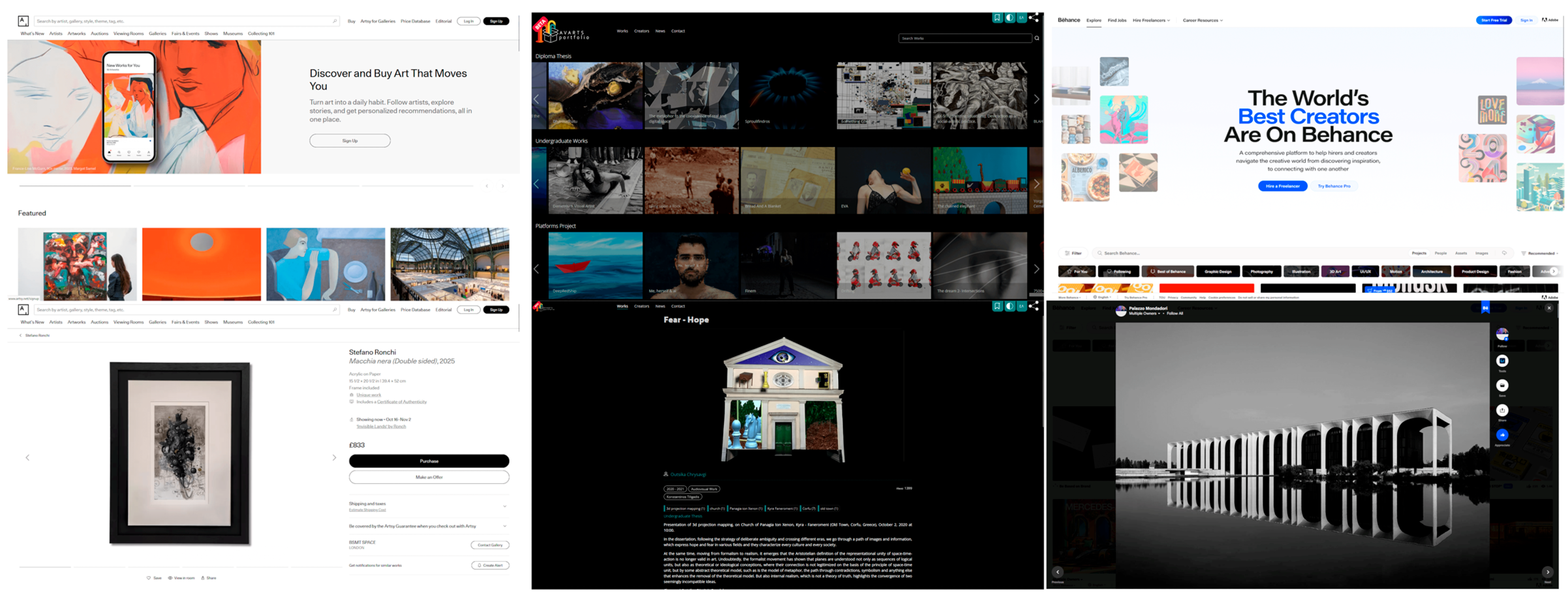
Figure 2 displays a sample of screenshots from the interface of these repositories. The thought process behind selecting these three specific repositories had to do with both functional and aesthetic reasons. Despite all being places of art dissemination, each repository has a distinct goal, with Artsy being in the intersection with e-commerce and operating as a marketplace (Sidorova 2019), Avarts Portfolio focusing on the academic aspect of art dissemination (Pergantis et al. 2025a), and Behance working as a social network platform for freelance artists and designers (Halstead et al. 2015). These differences also lead to distinct aesthetic approaches, with a variation of UI elements and layouts being represented.
With regard to the quantitative ranking aspect of the survey, the short version of the UEQ was selected to be integrated into the questionnaire. The UEQ-S introduced by Hinderks (2017) involves eight items for evaluation, four of which are designated as evaluating a pragmatic quality and have more to do with usability, and four are designated as evaluating a hedonic quality and have more to do with aesthetics. Each item consists of a pair of antithetical terms, and participants were expected to rate each repository from a scale of 1 to 7. The shorter length of the UEQ-S allows the survey to remain efficient while at the same time providing results directly related to the interplay between usability and aesthetics. Since the majority of survey participants were Greek, the terms of each item were also presented to participants in a Greek translation (Melissourgos and Katsanos 2025). Table 2 presents the eight items and their type.
The open-ended questions of the evaluation were simple and aimed at acquiring two short answers for each evaluated repository. Users were asked to identify the “most useful interface element” and the “most aesthetically appealing element” for each repository. The simplicity of the open-ended questions makes the analysis process more efficient, while the participants themselves still get the chance to openly provide feedback. In online questionnaires, this can be a chance to collect meaningful qualitative data (Connor Desai and Reimers 2019), which can also be used in combination with attention data for greater insights (Elbabour et al. 2017).
A very important element for framing the collected data in a meaningful way is the use of gaze tracking. This mechanism, which is based on WebGazer technology (Papoutsaki et al. 2016), allows accurate tracking of the participants’ attention through just the use of their webcam, collecting data that may then be used to generate fixation maps through the iMedius platform (Pergantis et al. 2025b). Ultimately, a singular interface available through the web allowed the collection of UEQ-S data, open-ended answers, and attention tracking information, culminating in a robust dataset of user feedback, both self-reported and candid.

3.4. Data Collection

The main target audience of digital art repositories includes a wide variety of people interested in the arts, such as artists, curators, art historians, teachers and students of the arts, collectors, dilettantes, and more. More often than not, the academic community of art schools contains people who fit one or more of these attributes. Additionally, since the web is first and foremost a tool for communication, people from the field of media are also an important group of stakeholders for such platforms. With that in mind, the mixed method survey implemented in this study was disseminated to the academic communities of the Department of Audio and Visual Arts and the Department of Digital Media and Communications of the Ionian University. Targeting these communities allowed for a more resource-efficient implementation of the methodology, since access to them was immediate. In addition to that, the community of the two departments, although not as diverse in terms of demographics, still presents a vast array of academic and artistic interests, ranging from music composition, animation, interface design, performative arts, editing, cinematography, and more.
A total of forty stakeholders took part in the survey, out of which 62.5% were related to the Department of Digital Media and Communications, and 37.5% were related to the Department of Audio and Visual Arts. Based on the standard deviation of the measurements, this sample size provides at least 0.5 precision and 0.05 error probability for all three repositories, while actually being very close to 0.01 error probability, indicating a solid base for investigating insights. The manageable number of participants also allows for a more thorough qualitative evaluation of tracking maps and open-ended answers. The data collection process took place in the first week of November 2025. A short data collection period ensures that all the investigated repositories are presented in a similar manner to participants without any major changes taking place.

4. Results

As expected by the design of the survey, the results contain a quantitative evaluation of the pragmatic and the hedonic qualities of the three repositories on the basis of the UEQ-S, an analysis of the open-ended questions concerning important interface elements identified by the participants, and an overview of how the participants’ attention varied, as recorded through their gaze and mouse tracking data.

4.1. User Experience Evaluation with the UEQ-S

The data collected from the participants are transformed from the scale of [1, 7] to the scale of [−3, 3]. The means for every item are calculated per participant, and this leads to the overall means of the various items, which may be used to interpret the feedback. Values between −0.8 and 0.8 are considered neutral, everything above 0.8 is considered positive, and everything below −0.8 is considered negative. Since this is the result of the means between many individual participants, with differences in both understanding and answer tendencies, extreme values (e.g., over 2, or below −2) are very unlikely (Laugwitz et al. 2008).
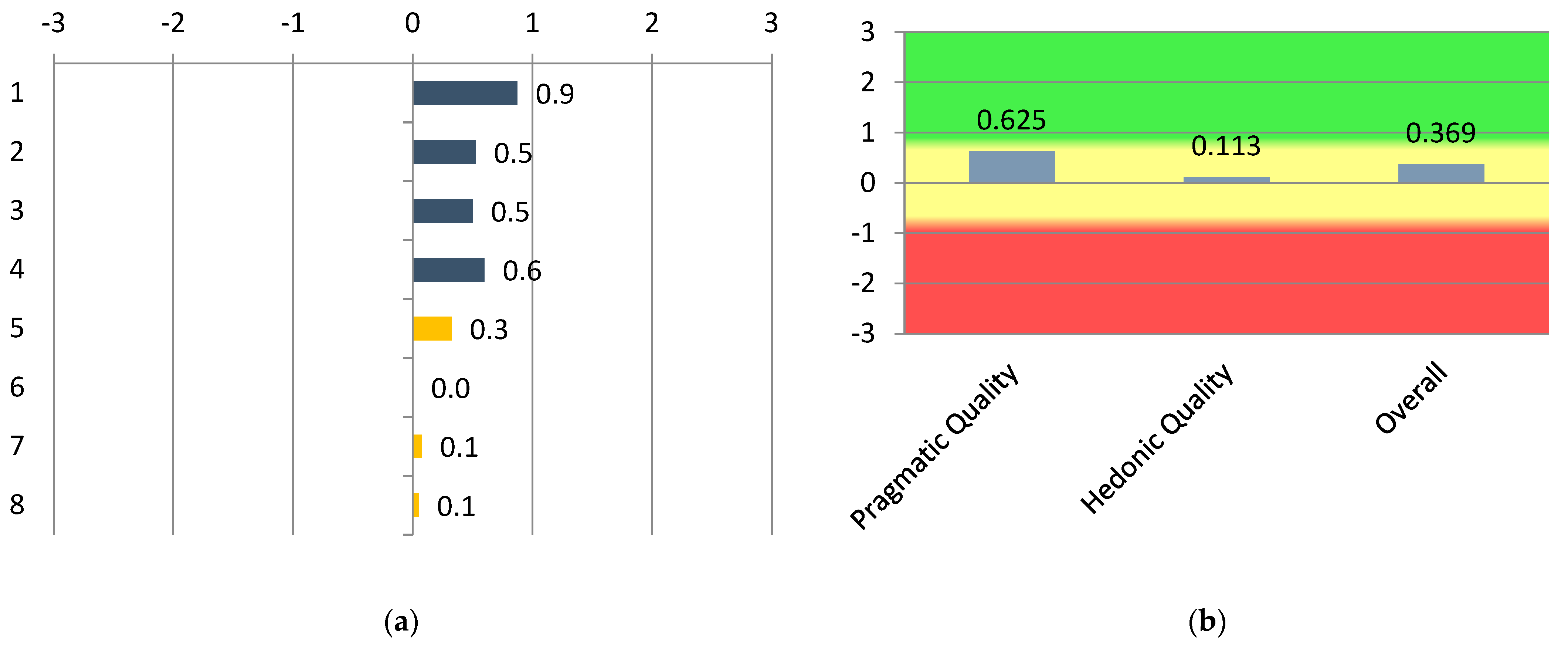
The Behance Creative Network, as presented in Figure 3, displayed neutral results in both pragmatic and hedonic quality, with the pragmatic aspect evaluated somewhat higher than the hedonic. The only item going into the positive evaluation values is for the pair obstructive–supportive, which is 0.9.
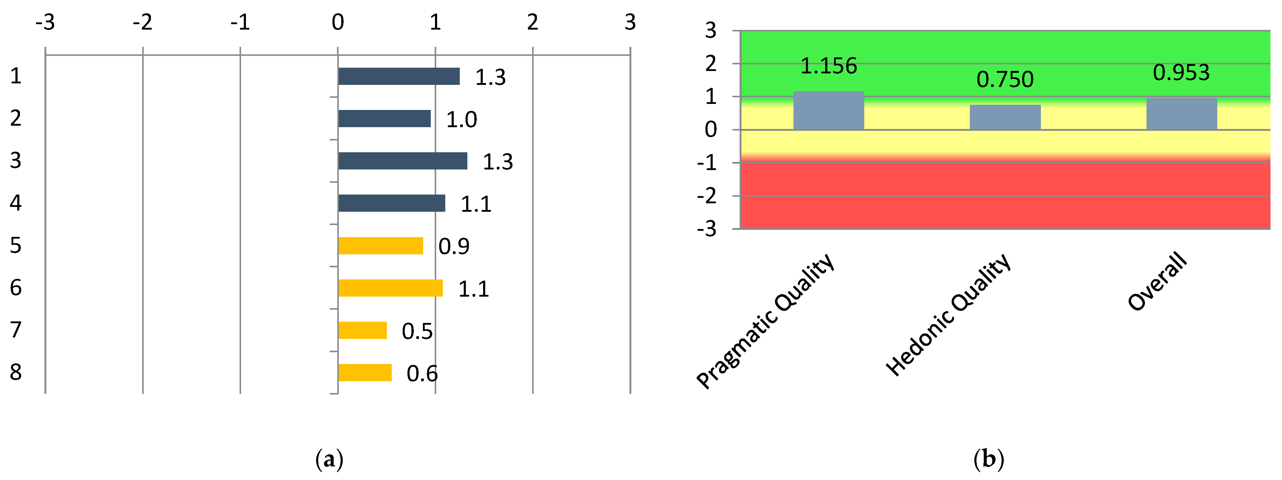
The Avarts Art Portfolio, as presented in Figure 4, displayed positive results in all pragmatic quality items, while hedonic quality items were split between neutral and positive. Six out of a total of eight items were evaluated in a positive manner, with the highest reaching 1.3 and the lowest reaching 0.5. The pragmatic quality was positive overall, while the hedonic was neutral but somewhat towards the positive side. The overall assessment was also positive.
The Artsy Online Marketplace, as presented in Figure 5, displayed positive results in all pragmatic quality items, while hedonic quality items were all neutral. Four out of a total of eight items were evaluated in a positive manner, with the highest reaching 1.1 and the lowest reaching 0.4. The pragmatic quality was positive overall, while the hedonic was neutral. The overall assessment was also neutral.
With regards to scale consistency, the alpha coefficient (Cronbach 1951) was calculated for each repository based on the correlations of items on the same scale. The results, as presented in Table 3, show an alpha value over 0.7 and are thereby considered sufficiently consistent, highlighting their validity.

4.2. Identifying Useful and Pleasing Elements

In order to evaluate the answers to the open-ended questions, a thematic content analysis was carried out (Braun and Clarke 2006). The answers were codified into descriptive labels and grouped into specific categories, leading to the generation of appropriate frequency tables (Miles et al. 2014). Thematic content analysis, with low inference coding, is a well-established methodology for quantifying open-ended answers in a manner that retains their intention. Moreover, this type of analysis is well-suited to the manageable number of participants and the specific open-ended questions regarding identifying useful and pleasing elements that encouraged short answers.
Regarding the open-ended question “What is the most useful interface element of the repository”, four umbrella categories were identified and used for the thematic content analysis, and they are as follows:
  • Search and Filtering, which included elements related to search, filtering, categories, and sorting.
  • Navigation and Structure, which included elements related to menus, layout structure, tabs, and lists.
  • Content Presentation, which included elements related to texts and descriptions and artwork image presentations.
  • Interactivity, which included elements related to buttons, call to actions, popups, sliders, and interactive UI elements.
  • Visual Design, which included elements related to colors, fonts, design choices, and branding.
Table 4 presents how frequently elements of each category appear in the participants’ answers for each repository with regards to usability.
The second open-ended question was “What is the most aesthetically pleasing element of the repository”, and the thematic analysis led to five different umbrella categories, this time more closely related to presentation, and they are as follows:
  • Design Style, which included elements related to colors, contrast, typography, and minimalism.
  • Art Presentation, which included elements related to artwork images and textual information.
  • Layout Aesthetics, which included elements related to structure, grid layouts, spacing, and clarity.
  • Branding and Semiotics, which included elements related to logos, icons, and site identity.
  • Movement and Interaction, which included elements related to motion like sliders, popups, or calls to action, like buttons.
Table 5 presents how frequently elements of each category appear in the participants’ answers for each repository with regards to aesthetics.

4.3. Attention Tracking

Out of the 40 participants, 33, which comprise the vast majority, contributed at least partial gaze tracking data through their webcams, and 34 contributed mouse tracking data. For each repository, a screenshot of the homepage, as well as one of a page detailing an artwork, was used to collect attention tracking information. The gaze and mouse movement patterns recorded displayed a wide variety of results, but through them, some typical patterns emerged. In this section, such representative visualizations reflecting dominant patterns will be presented in the form of fixation maps. Fixation maps depict circles of where user attention was located, with larger circles indicating a longer duration of attention, and arrows and numbers indicating the order in which attention shifted from one location to the next.
While inspecting the screencap of the homepage of the Behance Creative Network, participants often started by showing interest in the repository’s introductory description, which is strategically placed at the forefront of the screen. Their focus also shifted through the comprehensive categories’ filters at the lower end of the screen, as well as the call to action buttons on the top right. On Behance’s artwork presentation page, the imagery representing the work takes center stage, but interface elements, such as the function icons on the right of the image, also draw user focus. The creator’s name, which is presented on the top-left, often became the focus, but not always. The two typical fixation maps presented in Figure 6 are indicative of the participants’ attention.
In the case of the Avarts Art Portfolio, user attention was spread in the wider area of the slider UI element, which presented selected works. The platform’s colorful logo also attracted some attention alongside the functionality buttons and search bar on the top right. On the artwork presentation screen, the use of empty space encouraged the participants to turn their attention to the featured image as well as the work-related metadata that appeared on its bottom right. The textual description and functionality buttons on the top right also attracted some attention. The two typical fixation maps presented in Figure 7 are indicative of the participants’ focus.
Finally, when participants inspected the home screen of the Artsy Online Marketplace, their attention was attracted by the introductory text in the right part of the screen, as well as the sign-up and sign-in call to action buttons. The featured works also drew the attention of some of the participants with their colorful impression. In the artwork presentation page, the main focus in most cases was the artwork image and its metadata presented on the right part of the screen. Focus was placed on the functionality icons just below the main image, and not surprisingly, on the “Purchase” button, which deliberately stands out due to its color scheme. Figure 8 showcases two typical fixation maps of the Artsy repository.

5. Discussion

5.1. RQ1. How Do Users Evaluate the Usability and Aesthetic Dimensions of Digital Art Repositories?

The results of the quantitative evaluation based on the short version of the UEQ indicated that all the investigated repositories received significantly higher scores on items related to pragmatic qualities than on items related to hedonic qualities, as seen in Figure 3, Figure 4 and Figure 5. These findings are supported by earlier conclusions (Hassenzahl 2007, 2010) that indicate that qualities, such as interface efficiency and comprehensibility, are essential in goal-oriented environments. Moreover, this is an indication that modern digital art repositories try to optimize for usability since over time, functionality is ultimately more important, despite aesthetics playing an important role in first impressions (Moshagen and Thielsch 2010; Alharoon and Gillan 2020).
Despite the differences in each repository’s evaluation, in all cases, higher pragmatic quality scores were also accompanied by higher hedonic quality scores, indicating a persistent trend that links usability and aesthetics. None of the platforms indicates a diverging behavior with regard to that connection. This finding is in accordance with the “aesthetic-usability effect” as outlined by Tractinsky et al. (2000), which notes that impressions regarding aesthetics and usability are often correlated since they are both a result of the interface’s overall quality. Users tend to evaluate structure, simplicity, and presentation through the same prism.
It should be noted, though, that this evaluation process may not be able to encompass the role of cultural differences in how users perceive both aesthetics and usability. With the study evaluating Western platforms through a predominantly Western audience, sensibilities from people with significantly different cultural backgrounds were not considered. Chinese audiences have been shown to be more accustomed to higher information density and a greater quantity of both layout and active elements (Li et al. 2022), and as such, could have a different approach to the balance between usability and aesthetics in terms of structure simplicity. In a similar vein, usability evaluations, including Japanese websites, also marked aesthetics and minimalist design as an important differentiator (Doi and Murata 2020). Similar differences may be the result of other factors beyond nationality and may be the focus of future work in the field.

5.2. RQ2. Which Types of Interface Elements Do Users Tend to Consider: (a) the Most Useful or (b) the Most Aesthetically Pleasing in Digital Art Repositories?

Through content thematic analysis of the open-ended questions, trying to identify the most useful interface elements in each repository, a wide variety of factors emerged as being significant. As seen in Table 4, while search and filtering functionality is consistently important, Behance’s more useful elements had to do with interactivity, Avarts’ with navigation and structure, and Artsy’s with content presentation. These differentiations are also reflected in the differences between each repository’s overall scores in their UEQ-S scores. The variety of important factors is supported by previous works identifying, among other things, both structure and effectiveness in presentation as significant elements of perceived usability (Nielsen 2012; Shneiderman et al. 2016).
On the other hand, as seen in Table 5, while identifying aesthetically pleasing elements, participants showed a very strong inclination towards not only design style elements (such as color and a minimalist style) but also elements directly linked with artwork presentation (such as digital images or thumbnails of artworks). The high frequency of art presentation elements considered aesthetically pleasing in the cases of Artsy and Avarts is also accompanied by a somewhat more positive evaluation in the UEQ-S (Table 5 and Figure 4 and Figure 5), in contrast with Behance, which scored lower on the UEQ-S, and its aesthetically important elements were more closely related to its design style (Table 5 and Figure 3). These findings confirm the stance of Cameron and Kenderdine (2007), which indicates that art and culture interfaces should revolve around the artworks themselves. Moreover, visual simplicity and content quality as important factors for user satisfaction are also supported by research in the field of digital museums (Marty 2007, 2011). A design that emphasizes the artworks in tandem with high-quality content presentation can combine to put the works themselves at the forefront.

5.3. RQ3. To What Extent Do Attention Patterns Align with or Deviate from Users’ Self-Reported Evaluations of the Usability and Aesthetics of Digital Art Repositories?

The collected attention tracking data displayed a strong consistency with the findings of the first and second research questions. The majority of participants spent more time focusing on visual elements of high semantic value, such as artwork images and metadata. This identified behavior is consistent with established eye tracking models (Duchowski 2017) and observations regarding user gaze being drawn to semantically essential elements (Holmqvist et al. 2011).
At the same time, navigational elements such as sliders, grids, and category filters also drew a lot of the participants’ attention. Users tend to quickly identify navigational hotspots that allow them faster and more efficient discovery of the desired content (Nielsen 2012; Shneiderman et al. 2016). When the purpose of a navigational element is clear, either by mentioning a thematic category or by presenting an artwork thumbnail, this propels it to the forefront of the users’ attention.
It is important to note here that even though elements of a clear aesthetic nature, such as color, brightness, or the use of empty spaces, were considered important in the related open-ended question, these elements neither appear in the participants’ gaze heatmaps nor directly indicate a differentiation in UEQ-S scores. This confirms the notion that although very important for first impressions (Moshagen and Thielsch 2010), their effect is limited with regard to prolonged user behavior, which emphasizes functionality (Alharoon and Gillan 2020). Users recognize and appreciate design, but their attention shifts quickly to semantically important elements.
All types of data collected through the presented mixed method survey indicate that the users’ interaction with digital art repositories strongly revolves around artwork presentation. The UEQ-S results show higher pragmatic than hedonic quality scores, reinforcing the notion that pragmatic value shapes overall UX (Hassenzahl 2010). Additionally, content thematic analysis of open-ended questions highlights the importance of content and artwork presentation in both the context of usability and aesthetics, essentially placing the artwork at the center of the digital interface (Cameron and Kenderdine 2007). Finally, attention tracking data confirms that users focus candidly on essential art content elements, demonstrating how gaze prioritizes what is semantically important (Duchowski 2017). This convergence of all three data collection paradigms of the survey pinpoints the importance of the artworks themselves in the user experience of digital art repositories, both in terms of usability and in terms of aesthetics.
As both cultural heritage preservation techniques and artistic endeavors move towards the future, the UX offered by digital repositories will play an integral part in the dissemination of both artworks and context throughout the globe. The web itself is now an important medium that allows both the production and dissemination of content (Ghidini 2019), and as such, context-sensitive curatorial and design practices should be implemented while considering the balance between aesthetics and usability. Moreover, cutting-edge immersive technologies, such as extended reality (XR), can increase the hedonic value of UX, making it more attractive for educational purposes, but such experiences might introduce new usability concerns, such as motion sickness and more (Tsita et al. 2023). Advances in artificial intelligence also have a part to play in the field of digital art repositories (Pergantis et al. 2025a), with personalization and recommender systems and virtual curator guides setting the basis for a completely reinvented UX.

6. Conclusions

This study presents a mixed methods interactive survey, implemented through the power of the iMedius Form Builder open-access tool. The survey investigated the interplay between usability and aesthetics in online digital art repositories, collecting data from participants from the fields of digital art and media. Through the combination of quantitative evaluation metrics, thematic analysis of open-ended questions, and attention tracking data, the study led to useful findings. Digital art repository’s focus on pragmatic quality indicates the importance of usability in art content dissemination, while at the same time, aesthetics shift to a supporting role, working to highlight the value of the artworks themselves. Content and artwork presentation are at the forefront, while other elements are valued based on their ability to assist the user in locating semantically essential content. The importance of the artwork itself in both the context of usability and aesthetics is significantly supported by all the different forms of collected data.
The study presented, although comprehensive, still has some limitations. The participants were limited in both quantity and demographics. The 40 participants are enough to draw preliminary conclusions, but in order to propose broader generalizations, a wider sample is required. Moreover, the questionnaire being addressed to the academic community means that other potential target groups of digital arts repositories were not adequately represented. Finally, although the study makes use of objective data acquisition mechanisms, such as attention tracking, a large part of the collected information is still self-reported and, as such, subject to biases.
In order to work towards conclusions that reinforce the findings presented in this study, future work should focus on broadening the field of participants to other, more diverse communities beyond the academic one. Moreover, a wider range of art repositories, including different forms of digital expression (music, sound art, video art, interactive performances, and more), should become the focus of new surveys in order to investigate the role of the digital representation of an artwork when it spans beyond a single visual. In the context of candid data collection, other forms of tracking, such as web activity tracking, may be able to also yield interesting results. Finally, with a larger pool of data, more advanced forms of computational analysis should also be investigated as alternative methods of reaching conclusions.
Understanding how users perceive works of art through digital media and making the user experience an essential part of both art dissemination and cultural preservation is an important step towards optimizing the web as a means for both artists to discover their audience and for audiences to engage with art. As the ultimate form of global communication, the web has an important role to play in making creativity an ever-expanding part of our lives, and this can only be achieved by putting the users at the epicenter of systems design and allowing them to shape the future of the digital art landscape.

Author Contributions

Conceptualization, M.P. and A.G.; Methodology, M.P. and A.K.; Software, M.P. and A.L.; Validation, A.K. and A.L.; Formal analysis, M.P. and A.L.; Investigation, M.P. and A.K.; Resources, A.K. and A.G.; Data curation, A.L.; Writing—original draft, M.P. and A.K.; Writing—review & editing, M.P., A.K. and A.L.; Visualization, A.L.; Supervision, A.G.; Project administration, A.G.; Funding acquisition, A.G. All authors have read and agreed to the published version of the manuscript.

Funding

This research was funded by the Hellenic Foundation for Research and Innovation under the National Recovery and Resilience Plan “Greece 2.0” with funding from the European Union-NextGenerationEU (Project number: 15545. No: 77195-28 December 2023).

Institutional Review Board Statement

The study was conducted in accordance with the Declaration of Helsinki, and approved by the Ethic Committee on Research Ethics and Conduct of the Aristotle University of Thessaloniki (Approval Code: 171808/2024; Approval Date: 16 July 2024).

Informed Consent Statement

Informed consent was obtained from all participants involved in the study.

Data Availability Statement

The data presented in this study are openly available in [ZENODO] at [https://zenodo.org/records/17618614] [10.5281/zenodo.17618614].

Acknowledgments

The authors acknowledge the valuable contribution and collaboration with all the research team members of the iMedius project: Andreas Veglis, Antonis Gardikiotis, Charalampos Dimoulas, Efthimis Kotenidis, Evaggelia Avraam, Evanthia Malinaki, Lazaros Vrysis, Maria Matsola, Marina Stamatiadou, Nikolaos Vryzas, Paris Xylogiannis, Symeon Papadopoulos, Theodora Saridou, Thomai Baltzi and Dimos Plakotaris.

Conflicts of Interest

The authors declare no conflicts of interest.

References

  1. Alharoon, Dahlia, and Douglas J. Gillan. 2020. The relation of the perceptions of aesthetics and usability. Proceedings of the Human Factors and Ergonomics Society Annual Meeting 64: 1876–80. [Google Scholar] [CrossRef]
  2. Battarbee, Katja. 2003. Co-experience: The social user experience. In CHI’03 Extended Abstracts on Human Factors in Computing Systems. New York: Association for Computing Machinery, pp. 730–31. [Google Scholar]
  3. Braun, Virginia, and Victoria Clarke. 2006. Using thematic analysis in psychology. Qualitative Research in Psychology 3: 77–101. [Google Scholar] [CrossRef]
  4. Brockinton, Amanda, Sam Hirst, Ruijie Wang, John McAlaney, and Shelley Thompson. 2022. Utilising online eye-tracking to discern the impacts of cultural backgrounds on fake and real news decision-making. Frontiers in Psychology 13: 999780. [Google Scholar] [CrossRef]
  5. Brooke, John. 1996. SUS: A quick and dirty usability scale. In Usability Evaluation in Industry. Edited by Patrick W. Jordan, Bruce Thomas, Ian Lyall McClelland and Bernard Weerdmeester. Abingdon: Taylor & Francis, pp. 189–94. [Google Scholar]
  6. Cameron, Fiona, and Sarah Kenderdine. 2007. Theorizing Digital Cultural Heritage: A Critical Discourse (Media in Transition). Cambridge: The MIT Press. [Google Scholar]
  7. Connor Desai, Saoirse, and Stian Reimers. 2019. Comparing the use of open and closed questions for Web-based measures of the continued-influence effect. Behavior Research Methods 51: 1426–40. [Google Scholar] [CrossRef]
  8. Cooper, Charles J., Sharon P. Cooper, Deborah J. del Junco, Eva M. Shipp, Ryan Whitworth, and Sara R. Cooper. 2006. Web-based data collection: Detailed methods of a questionnaire and data gathering tool. Epidemiologic Perspectives & Innovations 3: 1. [Google Scholar] [CrossRef]
  9. Cronbach, Lee J. 1951. Coefficient alpha and the internal structure of tests. Psychometrika 16: 297–334. [Google Scholar] [CrossRef]
  10. Dion, Karen, Ellen Berscheid, and Elaine Walster. 1972. What is beautiful is good. Journal of Personality and Social Psychology 24: 285–90. [Google Scholar] [CrossRef]
  11. Doi, Toshihisa, and Atsuo Murata. 2020. Comparative analysis of website usability between United States and Japan. In Advances in Physical, Social & Occupational Ergonomics. Cham: Springer International Publishing. [Google Scholar]
  12. Duchowski, Andrew T. 2017. Eye Tracking Methodology: Theory and Practice, 3rd ed. Cham: Springer. [Google Scholar]
  13. Ebert, Nico, Björn Scheppler, Kurt Ackermann, and Tim Geppert. 2023. QButterfly: Lightweight survey extension for online user interaction studies for non-tech-savvy researchers. Paper presented at 2023 CHI Conference on Human Factors in Computing Systems, Hamburg, Germany, April 23–28. [Google Scholar]
  14. Elbabour, Fatma, Obead Alhadreti, and Pam Mayhew. 2017. Eye tracking in retrospective think-aloud usability testing: Is there added value? Journal of Usability Studies 12: 95–110. [Google Scholar]
  15. Ghidini, Marialaura. 2019. Curating on the web: The evolution of platforms as spaces for producing and disseminating web-based art. Arts 8: 78. [Google Scholar] [CrossRef]
  16. Halstead, Susanne, Daniel H. Serrano, and Scott Proctor. 2015. Finding top ui/ux design talent on adobe behance. Procedia Computer Science 51: 2426–34. [Google Scholar] [CrossRef]
  17. Hansen, Karolina, and Aleksandra Świderska. 2024. Integrating open-and closed-ended questions on attitudes towards outgroups with different methods of text analysis. Behavior Research Methods 56: 4802–22. [Google Scholar] [CrossRef]
  18. Hassenzahl, Marc. 2007. The hedonic/pragmatic model of user experience. Towards a UX Manifesto 10: 2007. [Google Scholar]
  19. Hassenzahl, Marc. 2010. Experience Design: Technology for All the Right Reasons. San Rafael: Morgan & Claypool. [Google Scholar]
  20. Hassenzahl, Marc. 2018. The thing and I: Understanding the relationship between user and product. In Funology 2: From Usability to Enjoyment. Cham: Springer International Publishing, pp. 301–13. [Google Scholar]
  21. Hassenzahl, Marc, and Nina Sandweg. 2004. From mental effort to perceived usability: Transforming experiences into summary assessments. In CHI’04 Extended Abstracts on Human Factors in Computing Systems. New York: Association for Computing Machinery, pp. 1283–86. [Google Scholar]
  22. Hinderks, Andreas. 2017. Design and evaluation of a short version of the user experience questionnaire (UEQ-S). International Journal of Interactive Multimedia and Artificial Intelligence 4: 103–8. [Google Scholar] [CrossRef]
  23. Holmqvist, Kenneth, Marcus Nyström, and Fiona Mulvey. 2012. Eye tracker data quality: What it is and how to measure it. Paper presented at Symposium on Eye Tracking Research and Applications, Santa Barbara, CA, USA, March 28–30; pp. 45–52. [Google Scholar]
  24. Holmqvist, Kenneth, Marcus Nyström, Richard Andersson, Richard Dewhurst, Halszka Jarodzka, and Joost Van de Weijer. 2011. Eye Tracking: A Comprehensive Guide to Methods and Measures. New York: OUP Oxford. [Google Scholar]
  25. Hornecker, Eva, and Luigina Ciolfi. 2022. Human-Computer Interactions in Museums. Cham: Springer Nature. [Google Scholar]
  26. Huang, Jeff, Ryen W. White, and Georg Buscher. 2012. User see, user point: Gaze and cursor alignment in web search. Paper presented at SIGCHI Conference on Human Factors in Computing Systems, Austin, TX, USA, May 5–10; pp. 1341–50. [Google Scholar]
  27. Katsaounidou, Anastasia, Paris Xylogiannis, Thomai Baltzi, Theodora Saridou, Symeon Papadopoulos, and Charalampos Dimoulas. 2025. An AI-Driven News Impact Monitoring Framework Through Attention Tracking. Societies 15: 233. [Google Scholar] [CrossRef]
  28. Krug, Steve. 2014. Don’t Make Me Think, Revisited: A Common Sense Approach to Web Usability, 3rd ed. Indianapolis: New Riders. [Google Scholar]
  29. Kurosu, Masaki, and Kaori Kashimura. 1995. Apparent usability vs. inherent usability: Experimental analysis on the determinants of the apparent usability. Paper presented at Conference Companion on Human Factors in Computing Systems, Denver, CO, USA, May 7–11; pp. 292–93. [Google Scholar]
  30. Laugwitz, Bettina, Theo Held, and Martin Schrepp. 2008. Construction and evaluation of a user experience questionnaire. In HCI and Usability for Education and Work. Berlin and Heidelberg: Springer. [Google Scholar]
  31. Li, Yaxing, Joyce Karreman, and Menno De Jong. 2022. Cultural differences in web design on Chinese and Western websites: A literature review. Paper presented at IEEE International Professional Communication Conference (ProComm), Limerick, Ireland, July 17–20. [Google Scholar]
  32. Liu, Peng, and Lan Lan. 2021. Museum as multisensorial site: Story co-making and the affective interrelationship between museum visitors, heritage space, and digital storytelling. Museum Management and Curatorship 36: 403–26. [Google Scholar] [CrossRef]
  33. Marty, Paul F. 2007. Museum websites and museum visitors: Before and after the museum visit. Museum Management and Curatorship 22: 337–60. [Google Scholar] [CrossRef]
  34. Marty, Paul F. 2011. My lost museum: User expectations and motivations for creating personal digital collections on museum websites. Library & Information Science Research 33: 211–19. [Google Scholar] [CrossRef]
  35. Melissourgos, Georgios, and Christos Katsanos. 2025. UEQ-GR and UEQ-S-GR: Towards a Greek Adaptation of the User Experience Questionnaire and its Short Version. Paper presented at 3rd International Conference of the ACM Greek SIGCHI Chapter, Syros, Greece, September 24–26. [Google Scholar]
  36. Miles, Matthew B., Michael A. Huberman, and Johnny Saldaña. 2014. Qualitative Data Analysis: A Methods Sourcebook. Thousand Oaks: SAGE Publications. [Google Scholar]
  37. Moshagen, Morten, and Meinald T. Thielsch. 2010. Facets of visual aesthetics. International Journal of Human–Computer Studies 68: 689–709. [Google Scholar] [CrossRef]
  38. Moshagen, Morten., and Meinald T. Thielsch. 2013. A short version of the visual aesthetics of websites inventory. Behaviour & Information Technology 32: 1305–11. [Google Scholar] [CrossRef]
  39. Nielsen, Jakob. 2012. Usability 101: Introduction to Usability. Nielsen Norman Group. Available online: https://www.nngroup.com/articles/usability-101-introduction-to-usability/ (accessed on 15 November 2025).
  40. Norman, Donald Arthur. 2004. Emotional Design: Why We Love (or Hate) Everyday Things. New York: Basic Books. [Google Scholar]
  41. Novák, Jakub Štěpán, Jan Masner, Petr Benda, Pavel Šimek, and Vojtěch Merunka. 2024. Eye tracking, usability, and user experience: A systematic review. International Journal of Human–Computer Interaction 40: 4484–500. [Google Scholar] [CrossRef]
  42. Papoutsaki, Alexandra, Patsorn Sangkloy, James Laskey, Nediyana Daskalova, Jeff Huang, and James Hays. 2016. Webgazer: Scalable webcam eye tracking using user interactions. Paper presented at Twenty-Fifth International Joint Conference on Artificial Intelligence (IJCAI’16), New York, NY, USA, July 9–15; pp. 3839–45. [Google Scholar]
  43. Parry, Ross. 2007. Recoding the Museum: Digital Heritage and the Technologies of Change. London: Routledge. [Google Scholar]
  44. Pergantis, Minas, Laida Limniati, Aristeidis Lamprogeorgos, and Andreas Giannakoulopoulos. 2025a. AI powered user experience personalization in academic digital art repositories. In ICERI2025 Proceedings. Valencia: IATED, pp. 6781–89. [Google Scholar]
  45. Pergantis, Minas, Paris Xylogiannis, Nikos Vryzas, Symeon Papadopoulos, Andreas Giannakoulopoulos, and Charalambos Dimoulas. 2025b. UX Evaluation and Best Practices for Social Research Data-Collection Tools: The Case of iMedius FormBuilder: A streamlined methodology for evaluating the user experience of social research digital tools demonstrated through its application to the iMedius FormBuilder platform. Paper presented at 3rd International Conference of the ACM Greek SIGCHI Chapter, Syros, Greece, September 24–26; pp. 165–73. [Google Scholar]
  46. Rajeshkumar, Sugu, Ridha Omar, and Murni Mahmud. 2013. Taxonomies of user experience (UX) evaluation methods. Paper presented at 2013 International Conference on Research and Innovation in Information Systems (ICRIIS), Kuala Lumpur, Malaysia, November 27–28; pp. 533–38. [Google Scholar]
  47. Santoso, Harry B., and Martin Schrepp. 2019. The impact of culture and product on the subjective importance of user experience aspects. Heliyon 5: e02434. [Google Scholar] [CrossRef] [PubMed]
  48. Schrepp, Martin, Andreas Hinderks, and Jörg Thomaschewski. 2014. Applying the user experience questionnaire (UEQ) in different evaluation scenarios. In Design, User Experience, and Usability: Theories, Methods, and Tools for Designing the User Experience. Cham: Springer International Publishing. [Google Scholar]
  49. Shneiderman, Ben, Catherine Plaisant, Maxine Cohen, Steven Jacobs, Niklas Elmqvist, and Nicholas Diakopoulos. 2016. Designing the User Interface: Strategies for Effective Human-Computer Interaction, 6th ed. London: Pearson. [Google Scholar]
  50. Sidorova, Elena. 2019. The Cyber Turn of the Contemporary Art Market. Arts 8: 84. [Google Scholar] [CrossRef]
  51. Terras, Melissa. 2011. The digital wunderkammer: Flickr as a platform for amateur cultural and heritage content. Library Trends 59: 686–706. [Google Scholar] [CrossRef]
  52. Tractinsky, Noam, Adi S. Katz, and Dror Ikar. 2000. What is beautiful is usable. Interacting with Computers 13: 127–45. [Google Scholar] [CrossRef]
  53. Trant, Jennifer. 2009. Emerging convergence? Thoughts on museums, archives, libraries, and professional training. Museum Management and Curatorship 24: 369–87. [Google Scholar] [CrossRef]
  54. Tsita, Christina, Maya Satratzemi, Alexandros Pedefoudas, Charalambos Georgiadis, Maria Zampeti, Evi Papavergou, Syrago Tsiara, Eleni Sismanidou, Petros Kyriakidis, Dionysios Kehagias, and et al. 2023. A virtual reality museum to reinforce the interpretation of contemporary art and increase the educational value of user experience. Heritage 6: 4134–72. [Google Scholar] [CrossRef]
  55. Țichindelean, Mihai, Monica Teodora Țichindelean, Iuliana Cetină, and Gheorghe Orzan. 2021. A Comparative Eye Tracking Study of Usability—Towards Sustainable Web Design. Sustainability 13: 10415. [Google Scholar] [CrossRef]
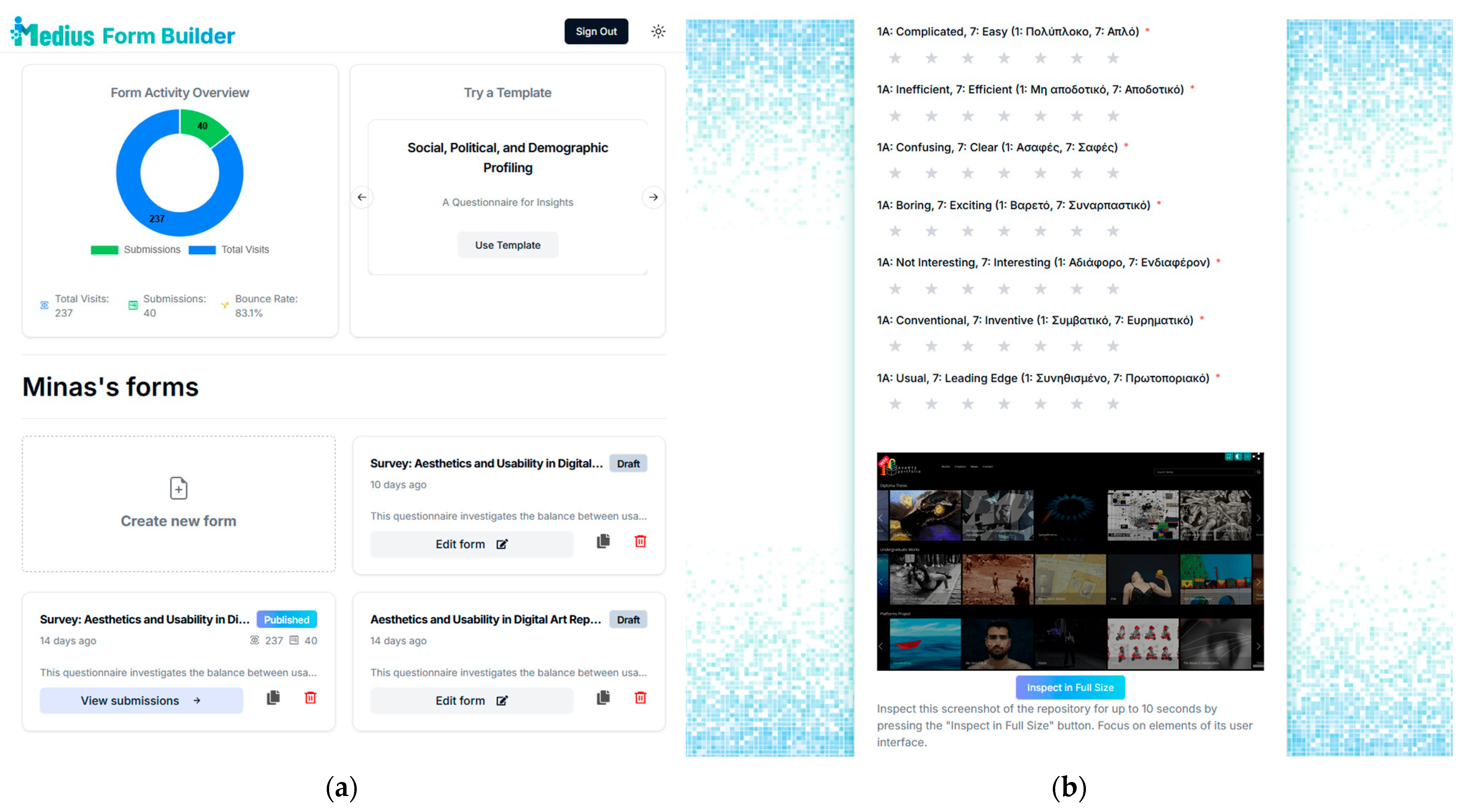
Figure 1. iMedius Form Builder user interface: (a) administration dashboard; (b) user questionnaire.
Arts 15 00009 g001
Figure 2. Screenshots from Artsy, Avarts Portfolio, and Behance UIs.
Arts 15 00009 g002
Figure 3. Behance results from the UEQ-S: (a) means per item; (b) short UEQ scales.
Arts 15 00009 g003
Figure 4. Avarts results from the UEQ-S: (a) means per item; (b) short UEQ scales.
Arts 15 00009 g004
Figure 5. Artsy results from the UEQ-S: (a) means per item; (b) short UEQ scales.
Arts 15 00009 g005
Figure 6. Behance attention tracking typical fixation maps: (a) home screen; (b) artwork.
Arts 15 00009 g006
Figure 7. Avarts typical fixation maps: (a) home screen; (b) artwork.
Arts 15 00009 g007
Figure 8. Artsy typical fixation maps: (a) home screen; (b) artwork.
Arts 15 00009 g008
Table 1. Digital art repositories and descriptions.
NameURLShort Description
Behance Creative Networkhttps://www.behance.net/
(accessed on 15 November 2025)
A community-oriented repository hosting crowd-sourced artworks from people trying to showcase their work
Avarts Art Portfoliohttps://portfolio.avarts.ionio.gr/en/
(accessed on 15 November 2025)
A higher education institution portfolio for students and faculty members hosting works produced through the academic process
Artsy Online Marketplacehttps://www.artsy.net
(accessed on 15 November 2025)/
An online art marketplace hosting professional works from galleries and individual artists for sale or auction
Table 2. UEQ-S items.
#Left Term (1)Right Term (7)Type
1obstructivesupportivePragmatic Quality
2complicatedeasyPragmatic Quality
3inefficientefficientPragmatic Quality
4confusingclearPragmatic Quality
5boringexcitingHedonic Quality
6not interestinginterestingHedonic Quality
7conventionalinventiveHedonic Quality
8usualleading edgeHedonic Quality
Table 3. Interscale correlations and the alpha coefficient.
BehanceAvartsArtsy
PragmaticHedonicPragmaticHedonicPragmaticHedonic
ItemsCorrelationItemsCorrelationItemsCorrelationItemsCorrelationItemsCorrelationItemsCorrelation
1.20.575.60.721.20.455.60.801.20.545.60.85
1.30.705.70.361.30.545.70.721.30.745.70.48
1.40.715.80.491.40.745.80.801.40.535.80.37
2.30.486.70.512.30.486.70.682.30.576.70.57
2.40.676.80.552.40.596.80.722.40.686.80.48
3.40.647.80.813.40.597.80.753.40.737.80.72
Average0.63Average0.57Average0.56Average0.75Average0.63Average0.58
Alpha0.87Alpha0.84Alpha0.84Alpha0.92Alpha0.87Alpha0.85
Table 4. Frequency of elements per category with regard to usability.
RepoSearch and FilteringNavigation and StructureContent
Presentation
InteractivityVisual Design
Behance1075125
Avarts1013934
Artsy841284
Table 5. Frequency of elements per category with regard to aesthetics.
RepoDesign StyleArt
Presentation
Layout
Aesthetics
Branding and
Semiotics
Movement
Interaction
Behance187743
Avarts1012474
Artsy1514314
Disclaimer/Publisher’s Note: The statements, opinions and data contained in all publications are solely those of the individual author(s) and contributor(s) and not of MDPI and/or the editor(s). MDPI and/or the editor(s) disclaim responsibility for any injury to people or property resulting from any ideas, methods, instructions or products referred to in the content.