Abstract
In physical environments and cultural landscapes, we most often deal not with separate colors, but with color combinations. When choosing a color, we usually try to “fit” it into a preexisting color context, making the new color combination harmonious. Yet are the “laws” of color harmony fundamental to our shared cognitive architecture, or are they cultural products that vary from country to country? To answer these questions we conducted an experiment with 599 participants aged 18 to 76 from eight different countries, including Algeria (MA = 26.2 years; SD = 8.8; 49 men, 26 women), Belarus (MA = 19.8 years; SD = 9.1; 19 men, 63 women), Italy (MA = 29.0 years; SD = 12.8; 23 men, 67 women), Mexico (MA = 20.0 years; SD = 7.0; 34 men, 23 women), Nigeria (MA = 34.7 years; SD = 10.5; 29 men, 32 women), Russia (MA = 24.6 years; SD = 6.3; 17 men, 72 women), Saudi Arabia (MA = 24.5 years; SD = 8.6; 28 men, 38 women), and Chile (MA = 34.3 years; SD = 15.1; 35 men, 43 women). To create experimental stimuli, we used 10 color combinations composed by the Russian avant-garde artist Mikhail Matyushin and his disciples for the Reference Book of Color (1932) based on shades that were typical in architectural design—yellow ochre, light umber, light ochre, and burnt umber. We removed the “intermediary” linking color from each of the selected color triads and asked participants to adjust the color of this band according to their liking. Mapping 2995 color choices into CIELAB and CIELCh color space to identify their chromatic characteristics (hue, lightness, and chroma), we demonstrate graphically that color triads in different cultures have a different “geometry” in CIELAB color space and on the color circle. We conclude that the revealed patterns of these relationships reflect cross-cultural “shifts” in human perception of color harmony. The analysis presented in this paper will facilitate opportunities for architects, designers, and other color professionals to create culturally specific harmonic color combinations in urban environments.
1. Introduction
In physical environments and cultural landscapes, we most often see colors that are not isolated from each other, but in combinations of two or more (Beretta and Moroney 2012; Wang et al. 2022). This is especially evident in modern cities’ color palettes, which are composed of an enormous number of colored objects: these include public and residential buildings, utility and technical structures, “green” architecture, and much more (Griber 2021, 2022a). In each case, the totality of these colored objects comprises a work of collective authorship on an unprecedented scale. Although its size is unusual for art, each such work possesses a composition and a special structure, with all color elements subordinate to a certain characteristic idea (Minah 2008).
In art, architecture, and design, each individual shade belongs to a system of relationships: it is adjacent to other colors, and these colors define its boundaries. We perceive urban objects against a background of sky, foliage, and landscape, as well as against a background of buildings and technical structures. Accordingly, color design involves studying the impact not of single shades, but of color combinations including two or more colors, while the aesthetics of urban color theory are based on the concept of “harmony,” widely discussed in a range of scholarly works (see for review O’Connor 2010; Westland et al. 2007).
In today’s world, we often have to choose a color in numerous common contexts. Choosing colors is an important task not only for artists or fashion designers, but also for the overwhelming majority of end users of color products (Szabó et al. 2010). When choosing a color, we usually try to find a “good” color, to intuitively “fit” it into a preexisting color context (Koenderink et al. 2016), making the new color combination harmonious, i.e., the colors go or belong together (Schloss and Palmer 2011) and produce a pleasing affective response (Burchett 2002).
The history of art finds artists, architects, and color theorists devising numerous tools for choosing successful color combinations and creating color harmonies. The most widely known such tools are Itten’s color wheel and Le Corbusier’s architectural color palettes.
The color wheel was invented by Johannes Itten in the 1920s when teaching color theory at the Bauhaus in Weimar, Germany (Itten 1961). It represented a simple graphical scheme in the form of a circle subdivided into 12 equal sectors. Each sector corresponded to a particular hue. The circle included three primary colors (red, blue and yellow), three secondary colors (orange, green and purple), and six tertiary colors between them. With his color wheel, Itten aimed at offering a convenient tool for designing color dyads, triads, and tetrads that combines various elements of color perception (different types of color contrast and color harmony), as well as color mixing (Kirchner 2023).
Le Corbusier created his architectural color palettes for the wallpaper company Salubra in 1932. These palettes went down in art history under the name “Clavier de couleurs”. Le Corbusier carefully selected 43 colors that he considered most appropriate for architecture and arranged them similarly to the distribution of the notes on a piano, in 12 “color keyboards” (Serra et al. 2016, 2021). All shades of the palette could combine without restrictions, since they were natural and based on 17 traditional artistic pigments. Each card (keyboard), on the one hand, showed possible color combinations, and on the other, helped to choose colors corresponding to a certain mood. Employing a chosen combination in a space was intended to evoke a certain feeling of the space for the person in it.
The ideas of Nobel laureate Wilhelm Ostwald also contributed greatly to understanding the mechanisms of color harmony. During most of his lifetime, he was an enthusiastic amateur painter (see also Ball and Ruben 2004). From 1912 until his death in 1932, he devoted himself entirely to working on his own color system. During this time, along with numerous theoretical studies of color, Ostwald created a number of applied tools to improve the practice of color design, including several sets of paints and pigments, which Ostwald called “color organs” (German—Farborgeln) to emphasize the connection between harmony in color and harmony in music. Ostwald’s color organs had different sizes, from small (192 colors, German—die Kleine Farborgel) to large (2340 colors, German—die Grosse Farborgel). The color organs were intended to facilitate the creative, easy, flexible, and accurate creation of harmonious color combinations in different areas of art and life (Die kleine Farborgel 2023).
Another well-known tool for selecting harmonious color combinations is the Russian avant-garde artist Mikhail Matyushin’s system of color tables, presented in A Reference Book of Color: The Laws Governing the Variability of Color Combinations, first published in Leningrad in 1932 and republished in 2007 (Matyushin [1932] 2007). The book contained 34 color tables, divided into four sections. The charts were intended as aids for the practical use of color in interior and exterior architectural design, textile, porcelain, wallpaper, printing, and other industries. They were hand-painted with gouache by a group of Matyushin’s students, young artists Irina Walter, Olga Vaulina, Sofia Vlasyuk, Valida Delacroix, Tatiana Sysoeva, and Elena Khmelevskaya. Like Matyushin’s color science in general, these charts were based on observations and experiments studying the psychophysiological factors of color perception and human color vision processes under different conditions (for more details see Tillberg 2003). The authors viewed the charts as an important tool for “determining the regularity of color relations” (Matyushin [1932] 2007, p. 15) and generating harmonious color combinations.
As the color instruments’ authors themselves noted (see, for example Rüegg 2006; Matyushin [1932] 2007; Ostwald 2013), all the shades included in their palettes were selected foremost based on the authors’ own many years of color-related professional experience, whether through architecture, art, design, or color theory. Moreover, some investigators, after extensive research, conclude that color harmony is too subjective to be captured by physical or mathematical relationships, given that no color harmony model developed so far correlates with the perceived degree of color harmony between color combinations (see, e.g., Schwarz 1999, 2018; Beretta and Moroney 2012). However, modern research shows that all mentioned and similar unique tools developed by artists and architects for the “flexible” and creative selection of harmonious color combinations in art, architecture, and design, have a fairly defined “geometry” in various color systems’ two- and three-dimensional spaces (Lara-Alvarez and Reyes 2019).
For example, studying Le Corbusier’s “keyboard” color combinations in the Natural Color System (NCS) color space reveals that most of them are based on similarity of pigment–hue, on contrast of NCS “warm” and “cold” hues, on minimal contrast in NCS chromaticity, and on light-and-shadow contrasts, with special dominance of color pairs with low blackness (Serra et al. 2016). Similarly, all of Matyushin’s color triads from the Reference Book have a number of interesting correlating “geometric” properties. Plotted in CIELAB color space (Griber 2022b, Tables S1 and S2, Figures 17 and 18), they all have two long sides adjacent to the main color and one short side between the background and the intermediary colors. Most of the triangles are approximately isosceles. The longer triangles also tend to be wider. In all triangles, the angle adjacent to the main color is acute. In all charts, the area of the triangle depends on the lightness of the main, intermediary, and background colors: the darker the colors, the smaller the area of the triangle.
Without a doubt, the history of color design has been enriched by the tools that artists, architects, and color theorists have developed to facilitate the selection of effective color combinations and to create color harmonies. These tools have contributed significantly to the theoretical understanding of color’s role in specific art movements (primarily in purism, Bauhaus, and avant-garde). At the same time, color-selection tools have played an important practical role in the development of color design and principles for creating comfortable, aesthetically calibrated color environments.
However, in analyzing various tools for creating harmonious color combinations (see, for example, Nemcsics 2007; Hu et al. 2014), questions naturally arise. How universal are the rules and models proposed by the tools’ authors? Will color combinations informed by a given set of tools be “understandable” for non-professionals—that is, for “art-naïve” people, most often not authors but spectators of color texts in art, architecture, and design (see also Griber 2021). After all, research clearly demonstrates that professionals and non-professionals differ markedly in the processing of color-related information. They understand the color structure of architectural buildings and works of art differently (Li et al. 2020), perceive the structure of color combinations differently (Griber and Samoilova 2022), and even describe the colors that they see differently (Griber et al. 2018; Paramei and Griber 2019).
Another question: are the “laws” of color harmony fundamental to our shared cognitive architecture, or are they cultural products that vary from country to country? Will color combinations created in one part of the world really resonate in another? Indeed, recently a growing body of experimental data indicates that the search for harmonious color combinations is largely environmentally driven (Griber 2023). Our color preferences depend on our natural environments and are easily affected by the change in seasons (Schloss and Heck 2017). Color choices occur under the pressure of a “principle of habit,” because of which, given a number of similar color sequences, those familiar to the observer seem more harmonious (Josserand et al. 2021).
In the process of selecting optimal shades, preference tends to be given to those where emerging patterns can “fit” into a surrounding natural landscape. Not surprisingly, many documents and theoretical works on color design recommend viewing nature as a kind of “guide to color harmony”: to obtain a good sequence of green shades, observe the play of light and shadow in foliage; to select red and orange shades, choose from the colors of sunset and autumn leaves; and to create subtle, harmonious combinations in black, white, and brown tones, pick shades from a winter landscape or the colors of animals, birds, and insects (Judd and Wyszecki 1975). Color theorists argue that a good acquaintance with nature provides a reliable grounding to this approach to color harmony. After all, we constantly observe such sequences of colors, easily recognize them, and enjoy them (Palmer and Schloss 2010).
Earlier art theory works in this vein have traditionally examined the differences between what might be broadly called the “cheerful colors of the south” and the “pale colors of the north.” Thus, in discussing differences in our “color habits,” G. Semper has emphasized that clear cold air can mute colors and, conversely, enhance whiteness, making it blinding; therefore, northern and southern palettes should differ significantly in the chromatic properties of their constituent shades (Semper 1834, pp. 40–42). In modern color design, the study of local color features of individual geographic regions and areas is widely used to develop unique “color dictionaries,” an idea proposed by the French color theorist J.-Ph. Lenclos (Lenclos and Lenclos 2004).
To survey potential cross-cultural specifics in strategies for building harmonious color combinations, we conducted an online experiment. Our analysis of the resulting data enables assessment of cross-cultural differences in:
- (1)
- The projections of color choices into the CIELCh color circle;
- (2)
- The frequency and predominance of colors with specific attributes (hue angle (h°), chroma (C), and lightness (L*);
- (3)
- The “geometric” properties of the color triads plotted in the CIELAB color space.
2. Methods
2.1. Participants
The experiment involved 599 participants aged 18 to 76 from eight different countries, including Algeria (MA = 26.2 years; SD = 8.8; 49 men, 26 women), Belarus (MA = 19.8 years; SD = 9.1; 19 men, 63 women), Italy (MA = 29.0 years; SD = 12.8; 23 men, 67 women), Mexico (MA = 20.0 years; SD = 7.0; 34 men, 23 women), Nigeria (MA = 34.7 years; SD = 10.5; 29 men, 32 women), Russia (MA = 24.6 years; SD = 6.3; 17 men, 72 women), Saudi Arabia (MA = 24.5 years; SD = 8.6; 28 men, 38 women), and Chile (MA = 34.3 years; SD = 15.1; 35 men, 43 women).
2.2. Experimental Stimuli
To create experimental stimuli, we used 10 color combinations composed by Mikhail Matyushin and his disciples for the Reference Book of Color (Matyushin [1932] 2007) (Figure 1). All the color charts that we selected were published in the book’s final (IV) section (Matyushin [1932] 2007, pp. 25–30). Since the Reference Book was intended primarily for practical use, the authors tried to bring the colors in this section as close as possible to the low-chroma tones they observed as typical in architectural design—yellow ochre (chart 25), light umber (charts 26 and 27), light ochre (charts 28 and 29), and burnt umber (chart 30).

Figure 1.
Charts 25 (a), 26 (b), 27 (c), 28-1 (d), 28-2 (e), 29-1 (f), 29-2 (g), 30-1 (h), 30-2 (i), and 30-3 (j) from Section IV of Matyushin’s Reference Book of Color (Matyushin [1932] 2007, pp. 25–30).
Each of the charts contains a set of three colors (a “color triad” or “color chord”) (Zhadova 2007, p. 10). These colors occupy unequal areas. The top, middle, and bottom color stripes have a height ratio of 3:1:6. Matyushin views the narrow middle stripe, which he calls “intermediary,” as having the most important role in the color chord. Its special function is to link the two other colors, to create and maintain balance between them.
The ten charts contain only five bottom and five top colors (Table 1). The bottom-stripe colors represent different lightnesses (34.47 ≤ L ≤ 86.78) of red-brown shades with low chromaticity (8.93 ≤ C ≤ 36.92), three of which (charts 25, 27 and 28) almost completely coincide in hue (84.28 ≤ h° ≤ 85.39), while two others (charts 26 and 30) fall within the color circle’s 30-degree arc between red and yellow (44.73 ≤ h° ≤ 77.74). Five top-stripe colors are predominantly light (mean L = 69.52) with low chroma (mean C = 10.05). Two of these colors (charts 27 and 30) are located on the color circle between green and yellow (h° = 112.56 and 175.45, respectively), while the other three fall within the 20° arc in the range between blue and green (215.71 ≤ h° ≤ 239.97).

Table 1.
Bottom and top stripe colors of experimental stimuli.
We saved the selected charts in JPEG format with the maximum resolution and then removed the “intermediary” linking color (replacing it with white) from each of the color triads. The top and bottom colors remained unchanged (Figure 2). Since the top and bottom colors were the same in some tables (Figure 2 and Table 1), we obtained five different sets of experimental stimuli.

Figure 2.
Experimental stimuli I–V.
2.3. Procedure
The idea of the experiment was to ask modern respondents from around the world to choose a color for the uncolored middle band of a color chart by Mikhail Matyushin, and then compare the resulting color combination with the corresponding color chart from his Reference Book of Color (similarly to D. I. Braun’s and K. Doerschner’s investigation of how “art-naïve” German and Chinese respondents perceive color and spatial balance in abstract art (Braun and Doerschner 2019).
In Experiment 1, participants had the task of finding the color they would like best for a middle (target) stripe in a chart presented on the computer screen. We showed each participant five color charts in a random order, one at a time, and instructed them as follows: In this experiment, we would like to ask which color combinations you personally like. We will show you five color charts. Each chart consists of three horizontal stripes of different widths. The colors of the top and bottom stripes are fixed and you cannot change them. You will be asked to select a color for the white (uncolored) stripe in the middle. Choose the color you feel makes the whole combination as harmonious as possible.
The video (Video S1) shows an animation of the color adjustment task. The initial color of the middle (target) stripe was white. The experiment’s palette was situated to the right of the color chart that the participant worked with. This palette had two parts. First, moving the color along the circle, the participant chose the shade’s tone. Then, moving the cursor along the inner square, the participant chose the shade’s lightness and chroma. While choosing, the participant could “try on” different shades and assess how the color chart would look if the color palette’s white stripe changed to a corresponding color. When completely satisfied with the choice, the participant was to click the button “Continue” to move to the next page. The chosen color was recorded in the database in the #hex format.
In Experiment 2, we asked participants to compare each of the color charts they generated with the corresponding original—the chart from Matyushin’s Reference Book of Color—and to indicate whether they preferred their version of the color triad or the original. The time for both tasks was not limited.
At the final stage of the study, the participants were asked to fill out a small questionnaire, reporting their age, gender, place of birth, country of permanent residence, native language, art education, and known color vision disorders.
Each participant conducted the experiment at their own pace, taking an estimated 15 to 20 min from start to finish. We did not collect any data on the displays that the participants used when conducting the experiment.
3. Data Analysis
Together, the 599 experiment participants from different countries had to choose a color for the middle band in the triad 2995 times (five times per participant). However, 45 times the color of the middle band remained uncolored. We excluded these responses from the database. Thus, the “clean” dataset comprised 2950 responses. The collected responses were analyzed as follows.
3.1. Projection of Color Choices into the CIELCh Color Circle
First, we converted all colors collected in the database from the HEX format to CIELAB and CIELCh and visually projected them in Python into polar scatter plots (Section 4.1).
The CIELAB color space, defined by the International Commission on Illumination (abbreviated CIE) in 1976, expresses color as three coordinates (Carter et al. 2018). The lightness value (L*) ranges from 0 (black) to 100 (white). Two other coordinates represent the position of the color between magenta and green (axis a*, where negative values indicate green and positive values indicate magenta) and between yellow and blue (axis b*, where negative values indicate blue and positive values indicate yellow).
A cylindrical representation of the CIELCh color space is based on CIELAB. It uses polar coordinates C* (chroma, i.e., cylinder radius) and h° (hue angle, i.e., the angle around the circumference) instead of the Cartesian coordinates a* and b*; whereas the CIELab lightness L* remains unchanged (Figure 3).
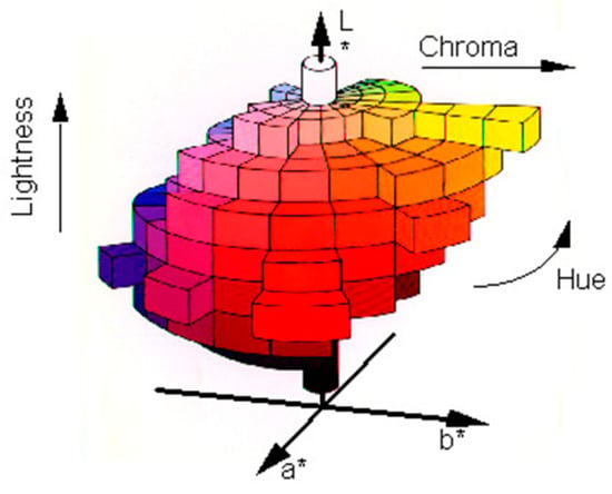
Figure 3.
A cylindrical representation of the CIELCh color space: L is the vertical axis; C is the cylinder radius; h is the angle around the circumference.
3.2. “Geometric” Properties of the Color Triads Plotted in CIELAB
In the next step of the analysis, we considered each of the color choices together with the two colors already present in the color triad. As plotted in CIELAB color space, the two given colors (colors of the top and bottom stripes) and the color chosen by the participant represented the vertices of a triangle.
To analyze the “geometric” properties of the color triads, we calculated the distances between each color pair in a triad in three-dimensional color space using the color difference metric
(see, e.g., Luo 2015; Sharma et al. 2005) and applied these distances as a measurement of length for each side of each triangle.
CIEDE2000 (∆E*00)
To compute the triangles’ angles in CIELAB color space, we employed the cosine Formulas (2)–(4):
where a, b, and c are color distances ∆E*00 between the top, bottom, and middle colors (lengths of triangle sides).
α = arccos (b2 + c2 − a2)/2bc
ꞵ = arccos (a2 + c2 − b2)/2ac
ɣ = arccos (a2 + b2 − c2)/2ab,
Further, using triangle side lengths, we estimated perimeters (5) and areas (6) of all the resulting triangles:
where a, b, and c are color distances ∆E*00 between the top, bottom, and middle colors (lengths of triangle sides) and is the semiperimeter of the triangle.
P = a + b + c
To describe the strength and direction of the linear relationship between quantitative variables, we used the Pearson correlation coefficient (r).
To measure associations between nominal variables we implemented Cramér’s V (7):
where X2 is the Chi-square statistic, n is the total sample size, r is the number of rows, and c is the number of columns (Cramér 1946, p. 282).
Cramer’s V = √(X2/n)/min(c − 1, r − 1),
3.3. Cluster Analysis of the Data
To effectively compare the color triad properties received in different countries, we carried out cluster analysis of the data in three stages. In the first stage, we clustered the “geometric” values (triangles’ side lengths, angles, and areas) of every color triad of each received response plotted in CIELAB using the k-means algorithm (Matlab Statistics and Machine Learning Toolbox, The MathWorks, Inc., Natick, MA, USA) with k = 5 (Hartigan and Wong 1979). In the next step, we constructed a dependency matrix to determine how percentages of respondents from the study’s countries aligned with types of identified clusters. In the final stage, we applied Ward’s hierarchical clustering method (https://scikit-learn.org/, accessed on 20 February 2024) (Ward 1963) to group the subsamples of different countries based on the similarity of the “geometric” properties of the color combinations obtained there.
4. Results
4.1. Projection of Color Choices into the CIELCh Color Circle
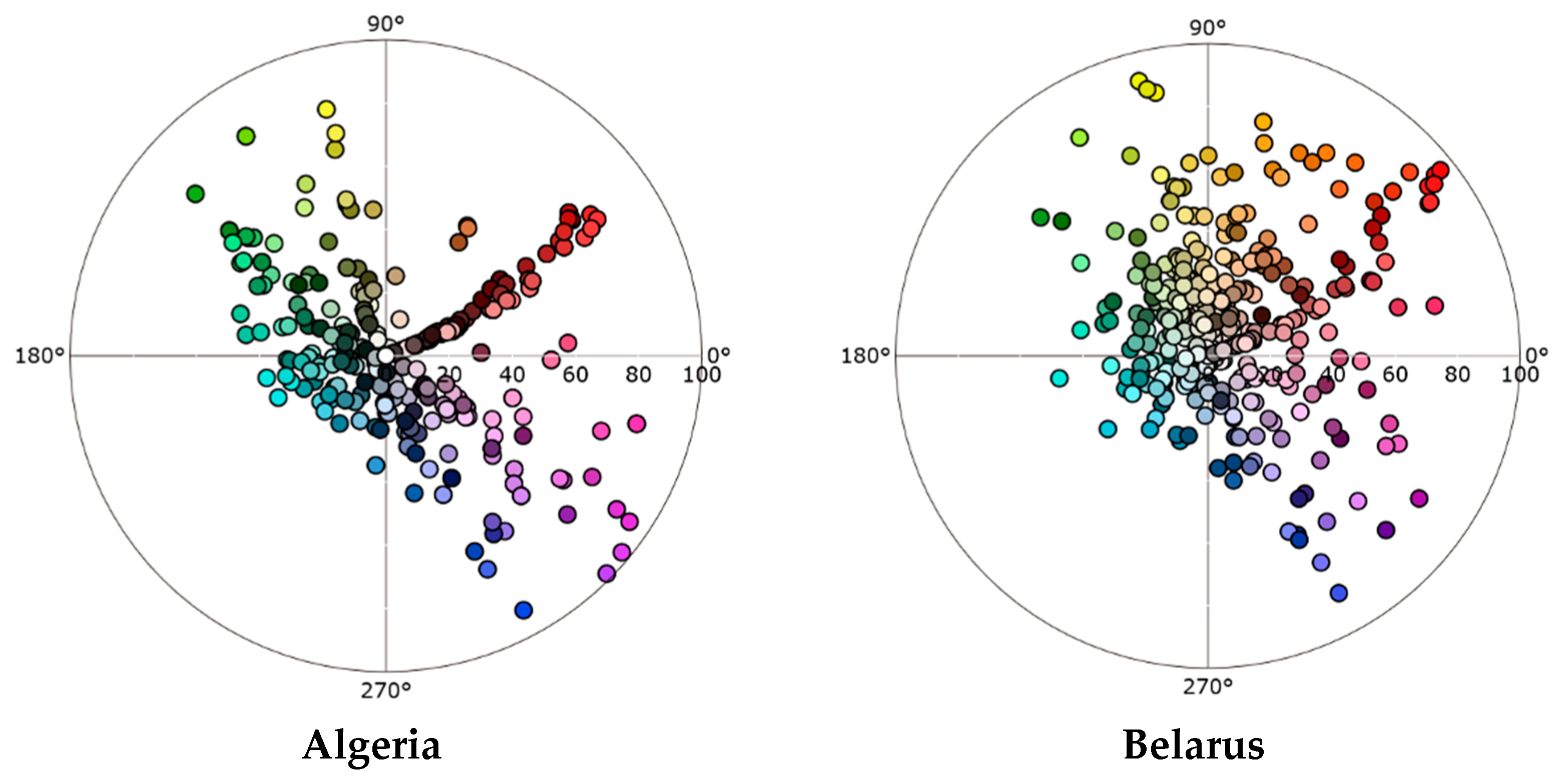
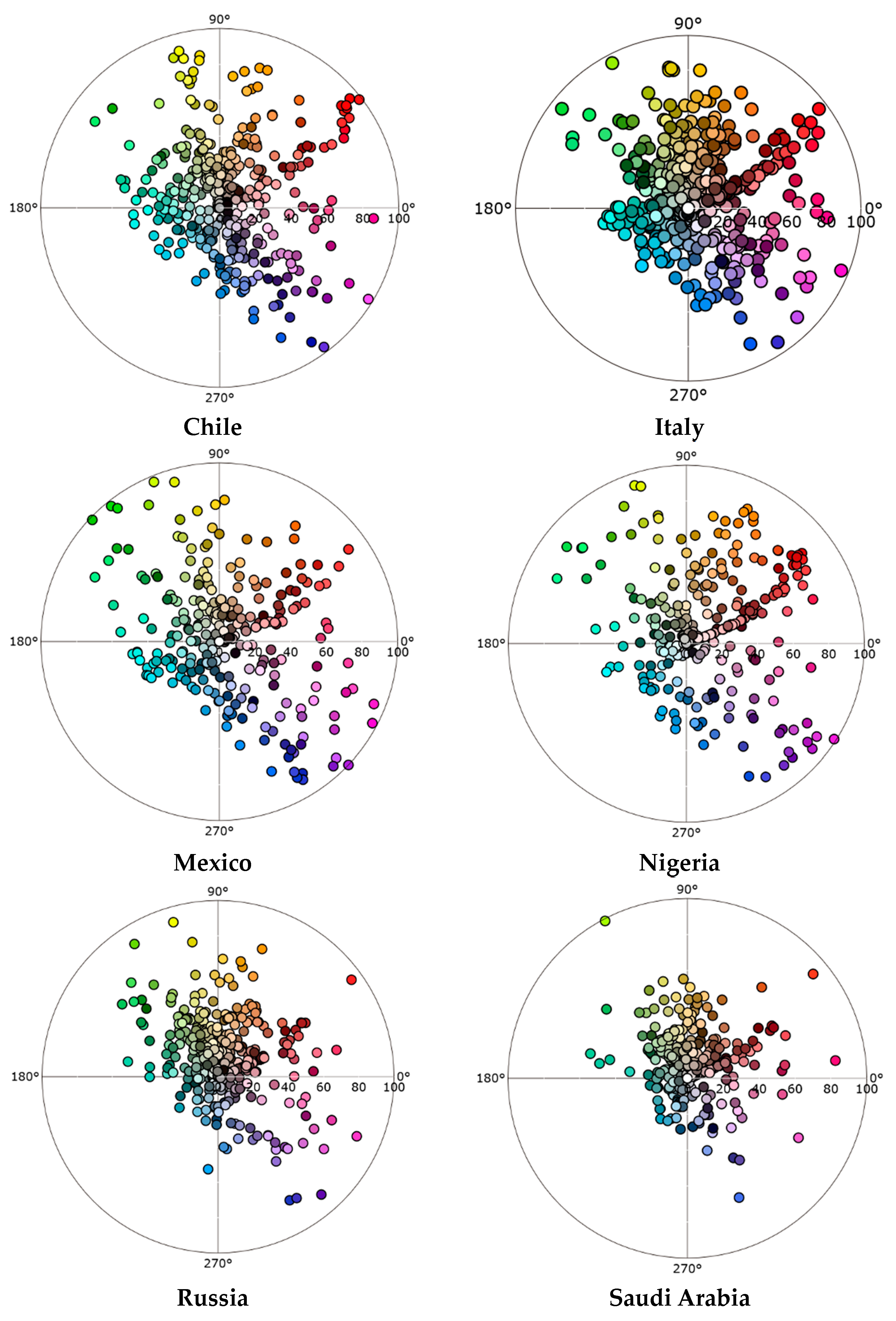
To compare the hue and chroma of color choices that we obtained in different countries, we mapped them into the CIELCh color circle (Figure 4). In addition to the overall analysis, we plotted projections on the CIELCh color circle separately for each of the five charts (for each color combination separately) (Figures S1–S5).
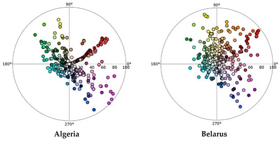
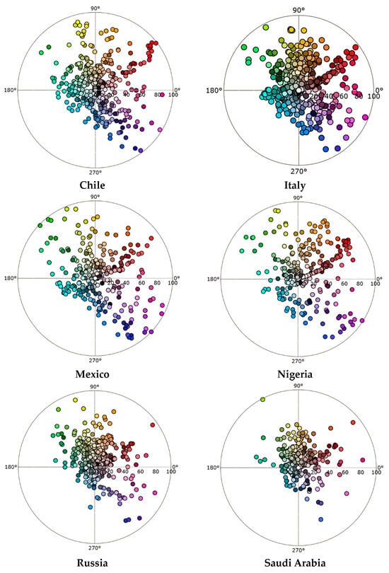
Figure 4.
Hue (h°) and chroma (C) of colors selected in different countries; projection into the CIELCh color circle.
4.2. Chroma–Lightness Patterns
Analysis of chroma–lightness patterns revealed that representatives of different cultures used fundamentally different strategies for building harmonious color combinations. Residents of Mexico, Nigeria, Chile, Italy, and Algeria were more likely to choose colors with higher chroma (31.20 ≤ mean C ≤ 40.77). On the contrary, participants from Saudi Arabia, Russia, and Belarus preferred moderate colors (20.92 ≤ mean C ≤ 28.31) (Figure 5 left).

Figure 5.
Chroma (C) (left) and lightness (L*) (right) of colors selected in different countries. Boxplots represent the interquartile range; horizontal lines indicate medians and whiskers indicate the outliers below the 1st quartile or above the 3rd quartile. Countries are ordered according to the chroma mean value, from lowest (left) to highest (right).
Residents of Russia and Belarus preferred lighter colors than participants from other countries (mean L = 65.94 ± 18.90 and 68.36 ± 21.87, respectively), while residents from Algeria and Mexico more frequently chose darker colors (mean L = 56.80 ± 23.93 and 61.46 ± 21.94, respectively) (Figure 5 right).
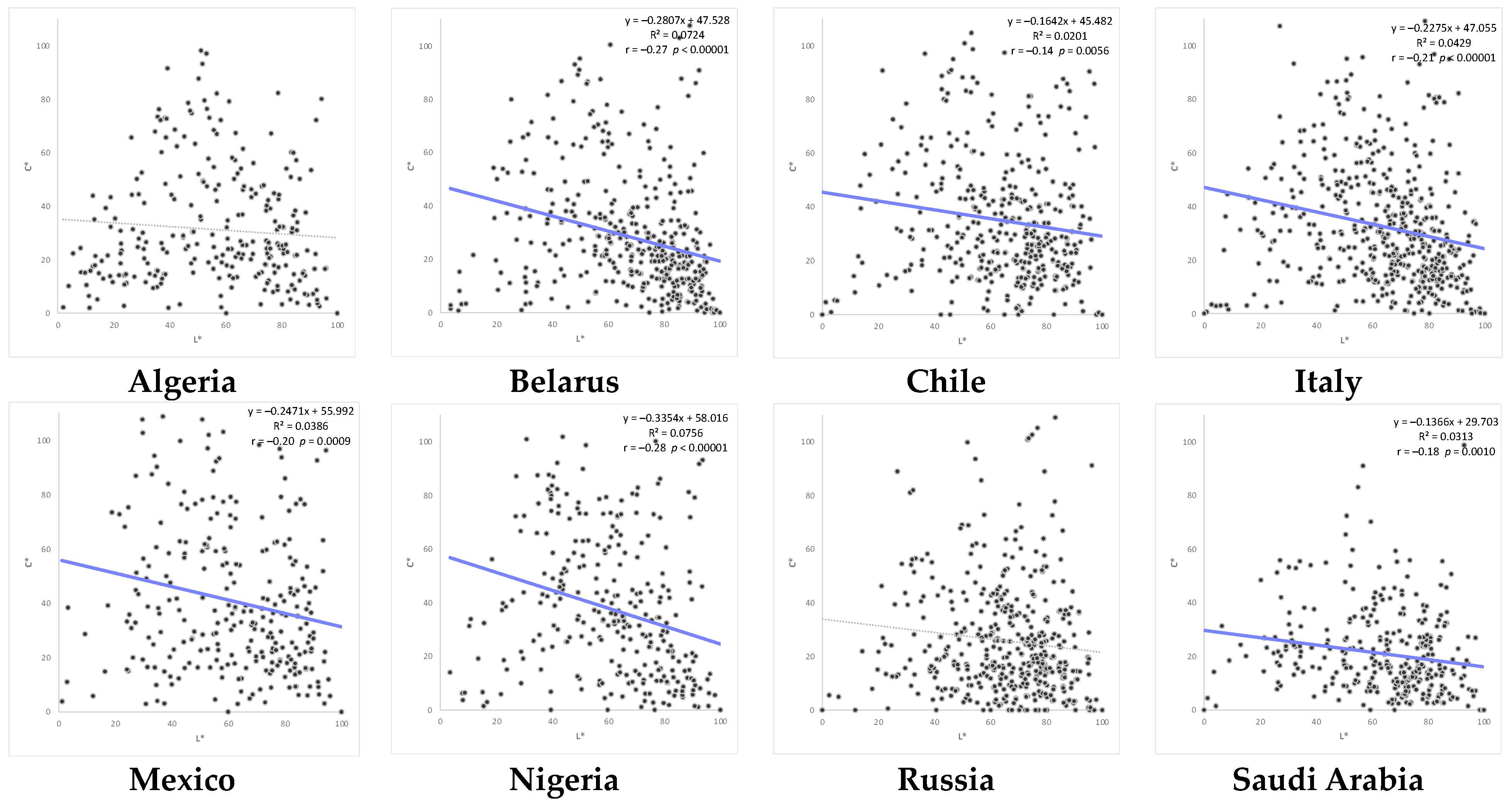
In six of the eight countries, we found a weak negative correlation between lightness (L*) and chroma (C*), i.e., the higher the C-value, the lower the lightness. Such a trend was not observed only in the responses of participants from Algeria and Russia (Figure 6).
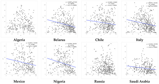
Figure 6.
Correlation between the lightness (L*) and chroma (C*) of the colors chosen in different countries.
4.3. Hue Patterns
To compare hue patterns in different countries, we assigned hue values to six basic color categories based on earlier publications (Lin et al. 2001; Tager et al. 2021; Kirchner and Koken 2022) (Table 2).

Table 2.
Hue boundaries of six basic color categories.
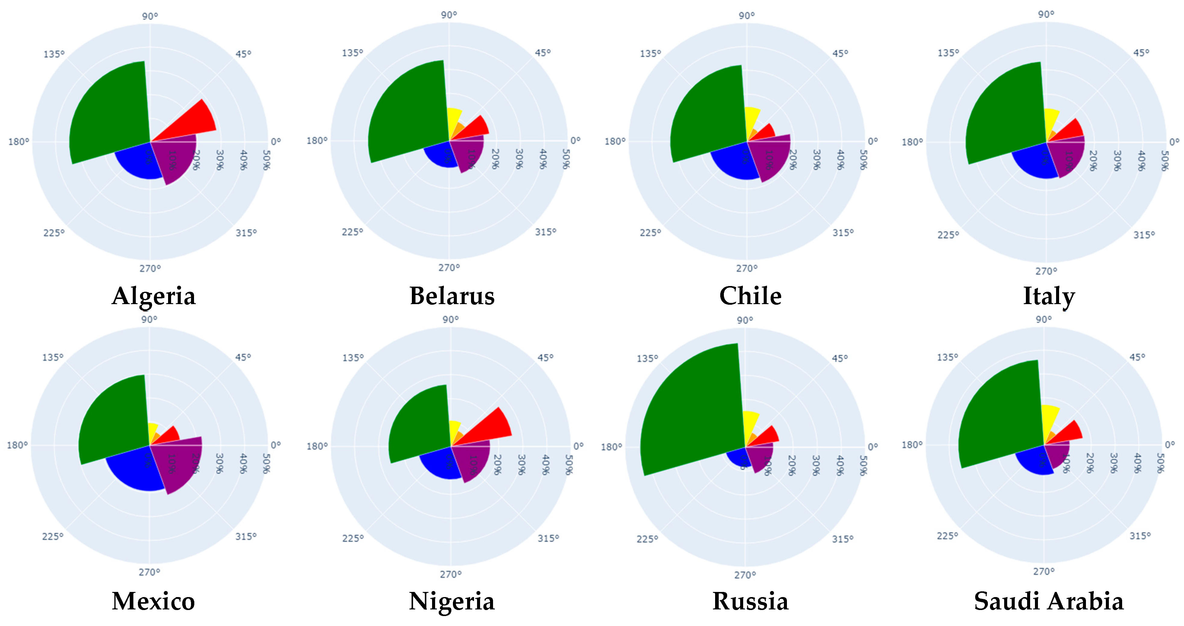
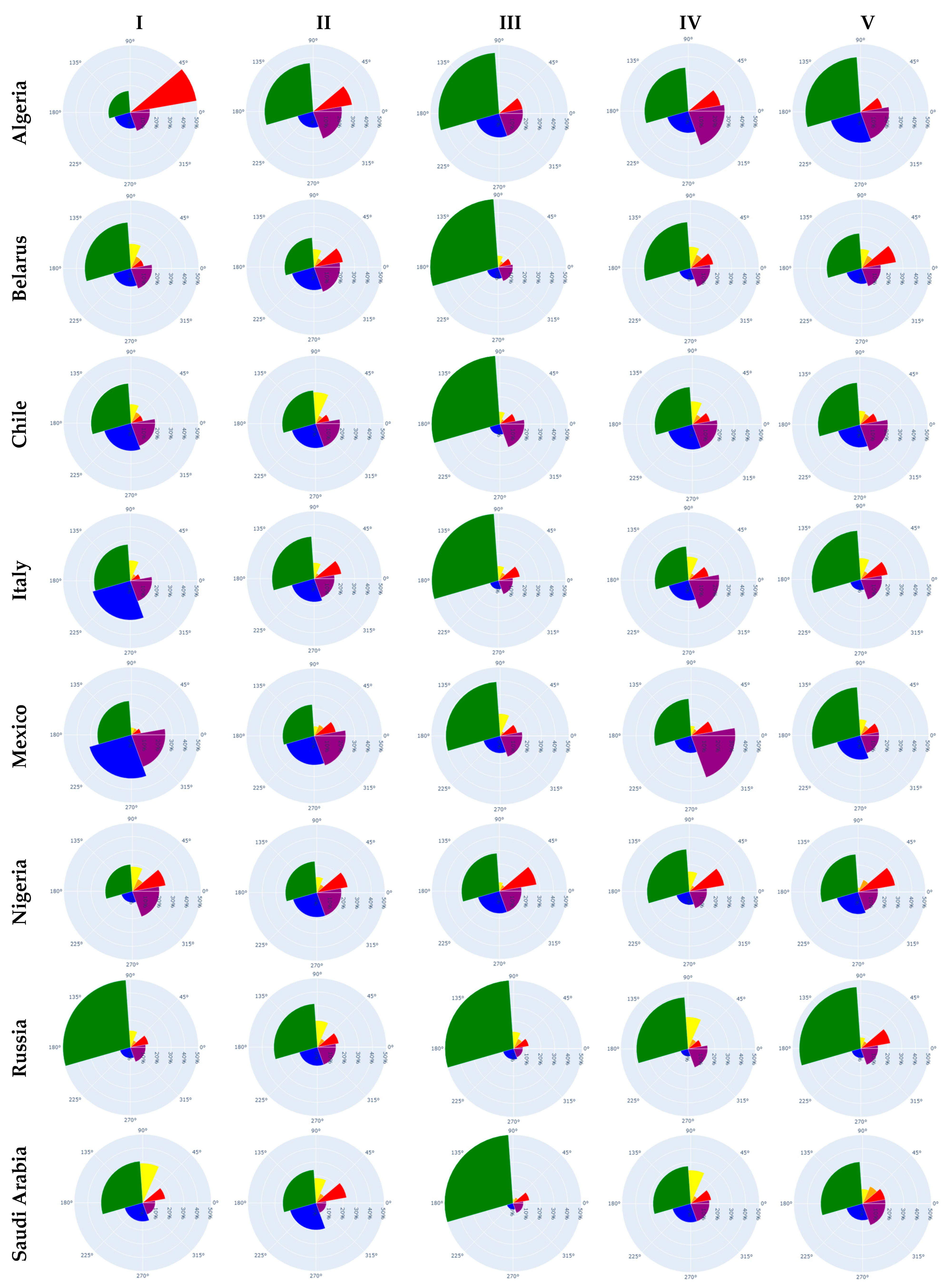
Such analysis revealed that the color selections were unevenly distributed across the basic categories within the color circle (Figure 7). Participants in all eight countries tended to choose “warmer” colors (greens, yellows, reds), while “colder” colors (blue-greens, blues, and purples) were selected much less. In all countries, the most popular color category proved to be green: green shades with different lightness and chroma comprised a third of all the responses received across the various countries. Among the participants across the various countries, the rarest choices for creating color harmony were orange tones. Residents of Algeria almost never selected orange shades: among their responses, we found no more than three such colors (less than 1%). However, Algeria and Nigeria proved to feature more choices of colors from the red category (28% and 26%, respectively) than observed among responses from other countries. In Mexico, Algeria, Chile, and Italy participants more frequently chose blue (selection frequency of 16–19%) and purple colors (selection frequency of 18–22%).
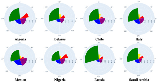
Figure 7.
Polar area diagrams representing red, orange, yellow, green, blue, and purple category sizes in different countries.
The collected color harmony datasets were further tested for hue similarity (Figure 8). To do so, we calculated the ratio of colors representing six main categories (red, orange, yellow, green, blue, and purple) for each of the charts in each country. This analysis showed that participants from different countries tried to match the chosen hue with the existing ones. In most cases, participants chose a color from the same or adjacent category as the hue in the bottom or (less frequently) the top band. In color choice responses for a stimulus with a wide green stripe (stimuli III and V), there was an especially noticeable increase in the number of green shades.
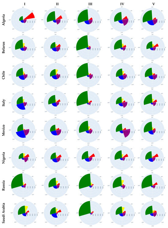
Figure 8.
Red, orange, yellow, green, blue, and purple category sizes calculated for different stimuli (I–V).
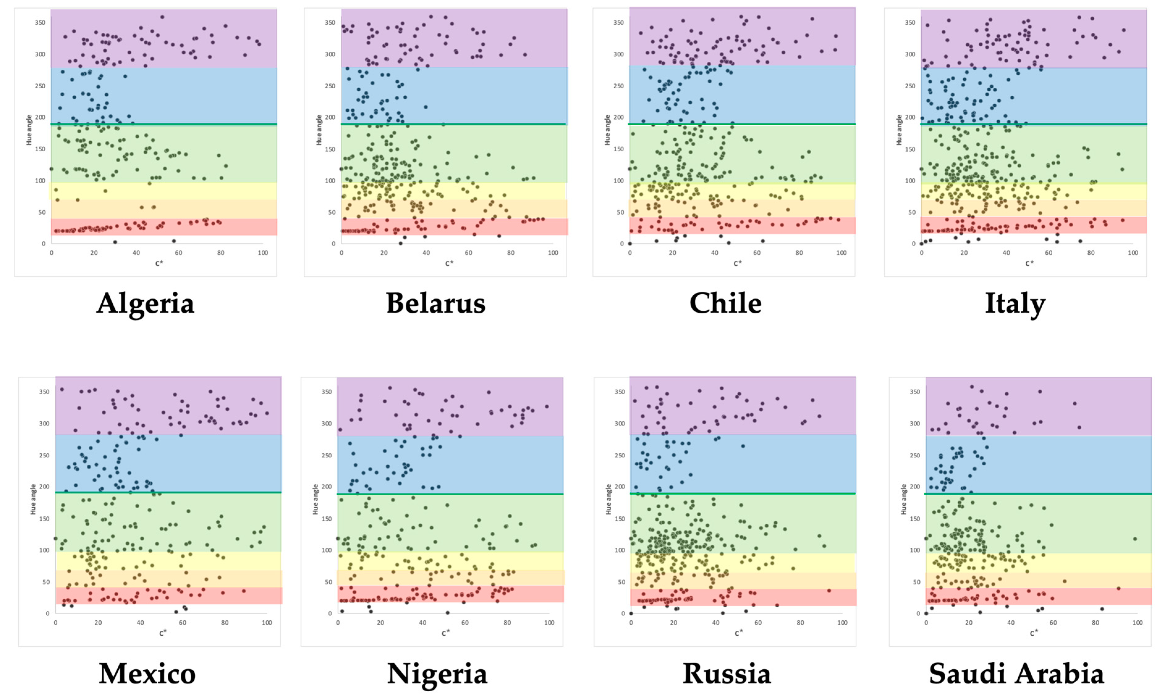
The hue angle (h°) of the chosen colors correlated with the chroma (C). Red and purple colors (290 ≤ h° < 40) had greater chroma than orange, yellow, and green ones (40 ≤ h° < 196). This trend was most pronounced in Chile, Mexico, and Italy. Moreover, in all eight countries, blue colors (196 ≤ h° < 290) had the lowest chroma (Figure 9).
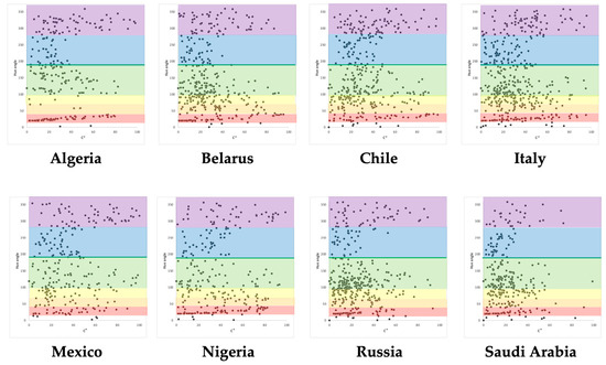
Figure 9.
Correlation between the hue angle (h°) and chroma (C) of the colors chosen in different countries. The horizontal green line marks the conventional boundary between “warm” and “cold” shades (h° = 196). The color fill indicates groups of shades: reds (10 ≤ h° < 40), oranges (40 ≤ h° < 66), yellows (66 ≤ h° < 94), greens (94 ≤ h° < 196), blues (196 ≤ h° < 290), and purples (290 ≤ h° < 10).
4.4. “Geometric” Properties of the Color Triads Plotted in CIELAB
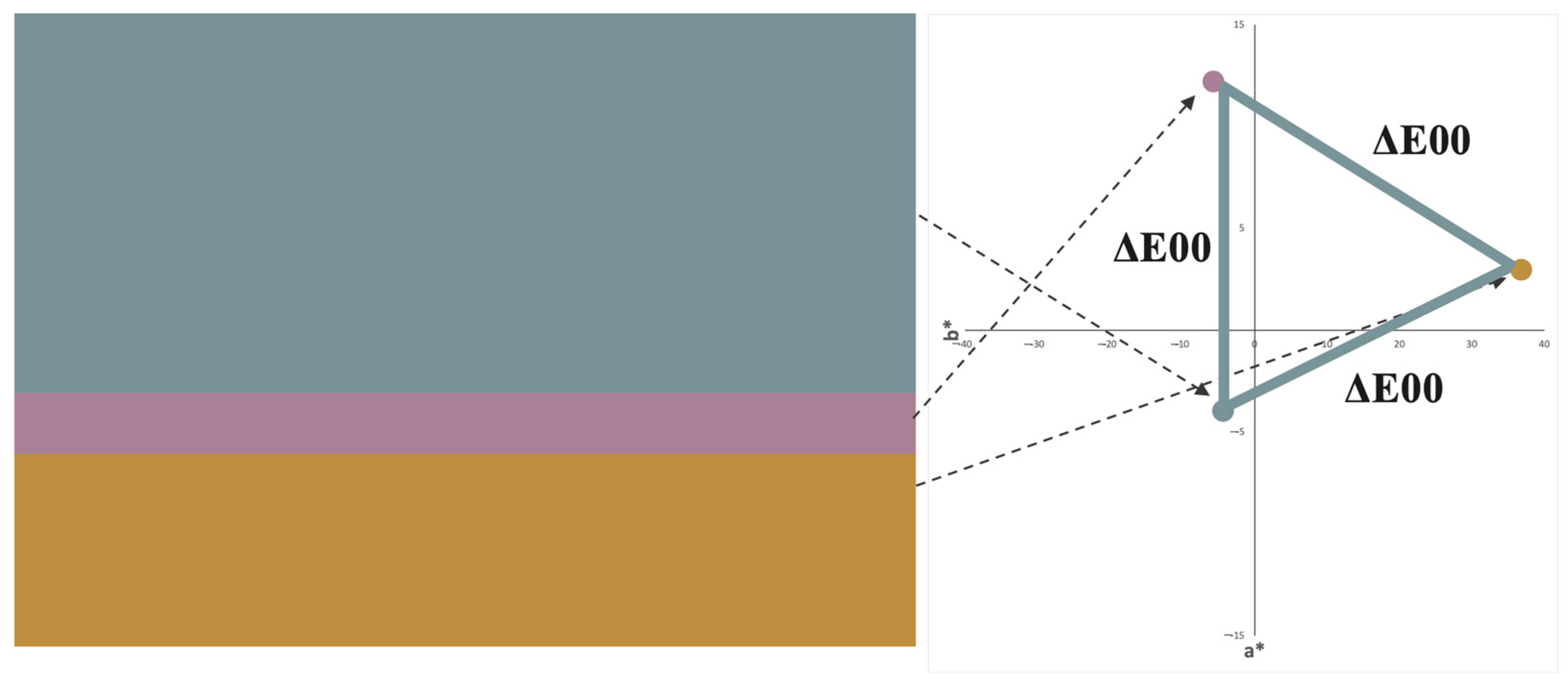
To further analyze “geometric” properties of the color triads plotted in CIELAB color space, we computed the color differences between the vertices of each triangle according to the CIEDE2000 Formula (1) and used them as a measurement of length for each side of the triangles (Figure 10).
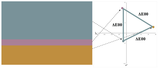
Figure 10.
A color triad in the CIELAB color space.
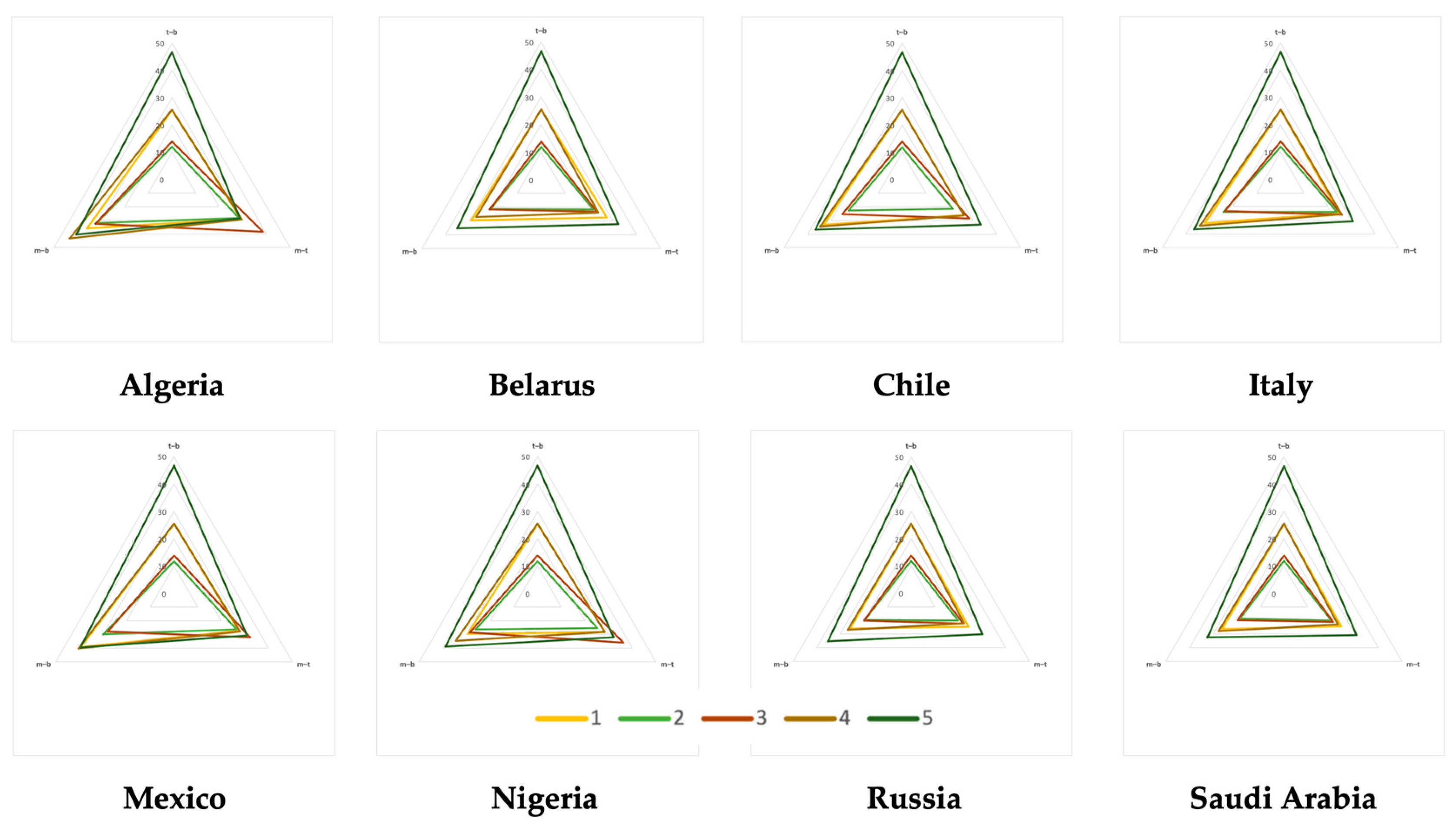
In all eight countries, participants intuitively chose a color approximately equidistant from both given colors in CIELAB space. The longer triangles also tended to be wider (Figure 11 and Figure S6).
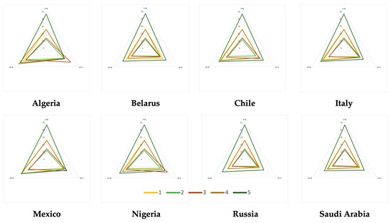
Figure 11.
Mean color differences CIEDE2000 (∆E*00) between the middle (chosen) color and the color of the top stripe (m–t), the middle (chosen) color and the color of the bottom stripe (m–b), and the top and bottom stripe colors (t–b) for five different stimuli in eight countries.
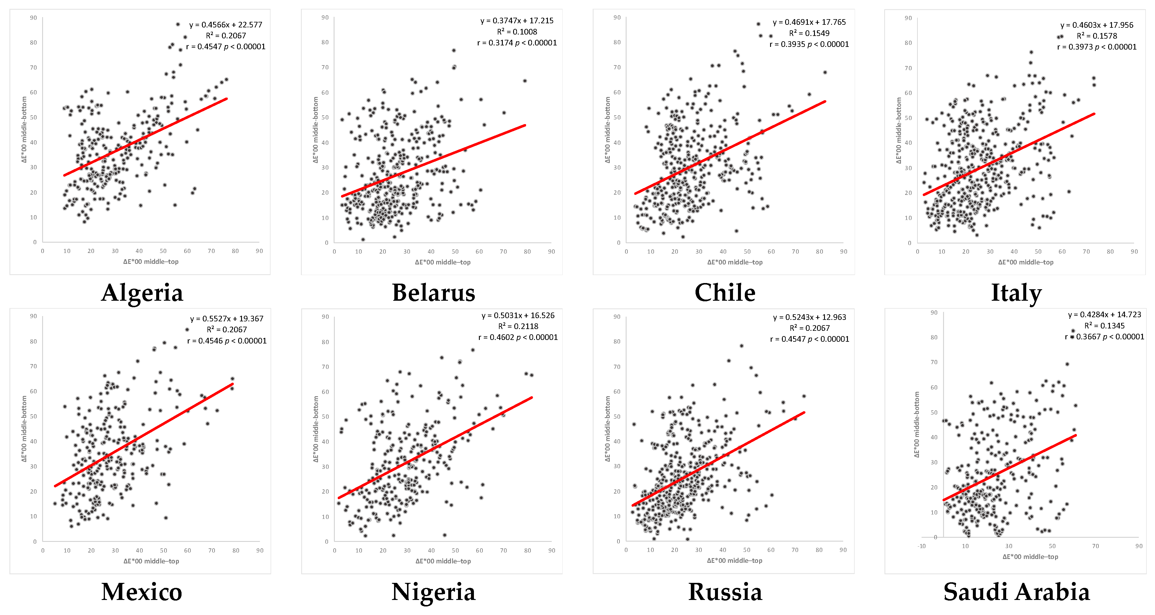
We found a positive correlation between the length of triangle sides adjacent to the vertices formed by the chosen color (Figure 12), with r values ranging from 0.3174 in Belarus to 0.4602 in Nigeria, p < 0.00001. However, both Figure 12 and Figure S6 indicate that the triangles we obtained after transferring responses into CIELAB color space had non-similar proportions.
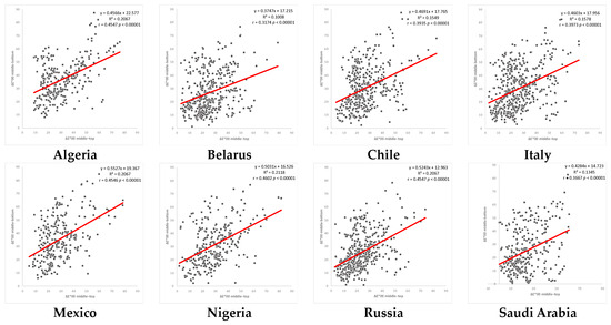
Figure 12.
Color differences CIEDE2000 (∆E*00) between the vertices formed by the middle (chosen) and top colors (x axis) and the middle (chosen) and the bottom colors (y axis).
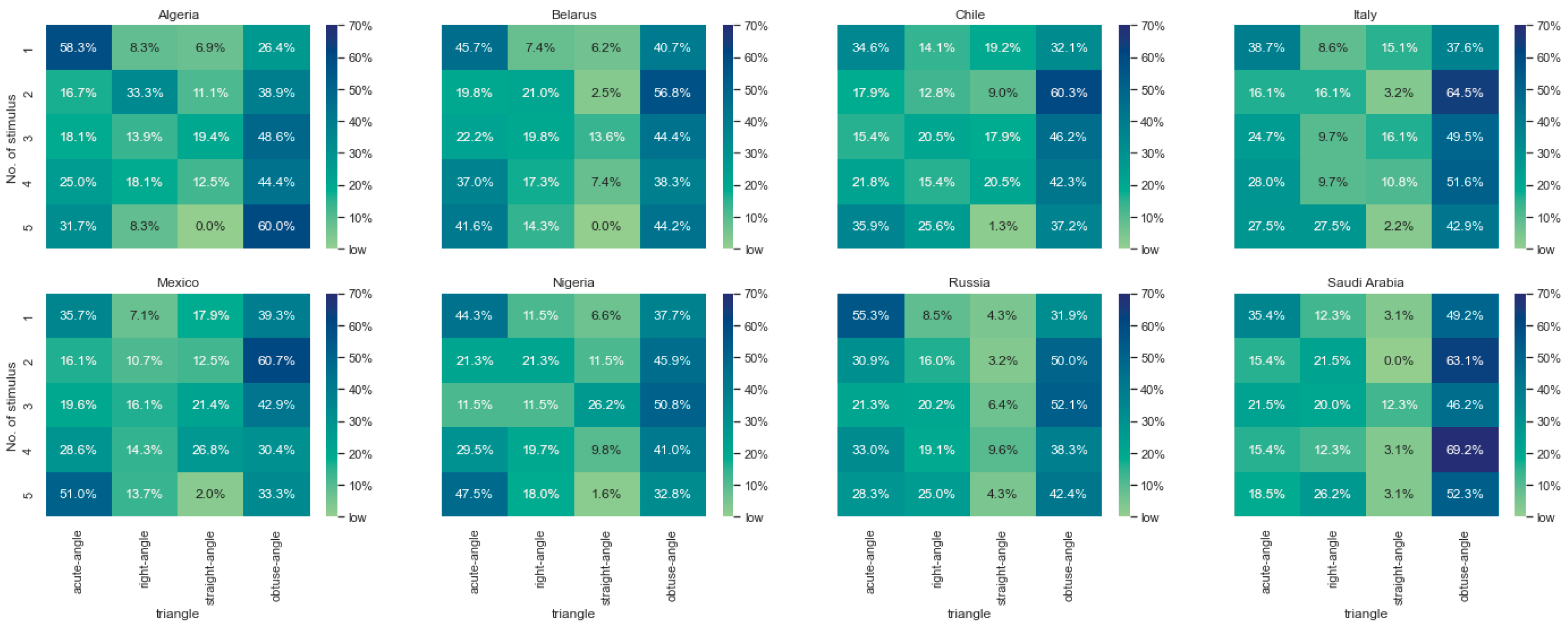
Utilizing the cosine Formulas (2)–(4), we computed internal angle values in each triangle and analyzed the ratio of acute-angled, right-angled, obtuse-angled, and straight-angled triangles constructed from the responses of participants from different countries for each of the five experimental stimuli (Figure 13 and Figure S7). In different countries, for all the stimuli except stimuli 1 and 5, obtuse-angled triangles predominated. In Algeria, Belarus, Nigeria, and Russia, acute-angled triangles were encountered most often; in the rest of the countries, for the same stimuli, acute-angled and obtuse-angled triangles both dominated.
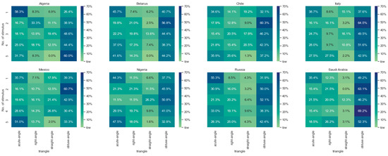
Figure 13.
A heat map reflecting the ratio of acute-angled, right-angled, obtuse-angled, and straight-angled triangles for five experimental stimuli in different countries.
Cramér’s V (7), which we calculated to measure associations between the triangle types and experimental stimuli in different countries, indicates a moderate correlation (>0.17) in Algeria (0.223), Nigeria (0.185), and Mexico (0.169) and a small correlation (>0.06) in all other countries (Table 3).

Table 3.
Cramér’s V between the triangle types and experimental stimuli in different countries; moderate correlation is indicated in green, a weak connection in yellow.
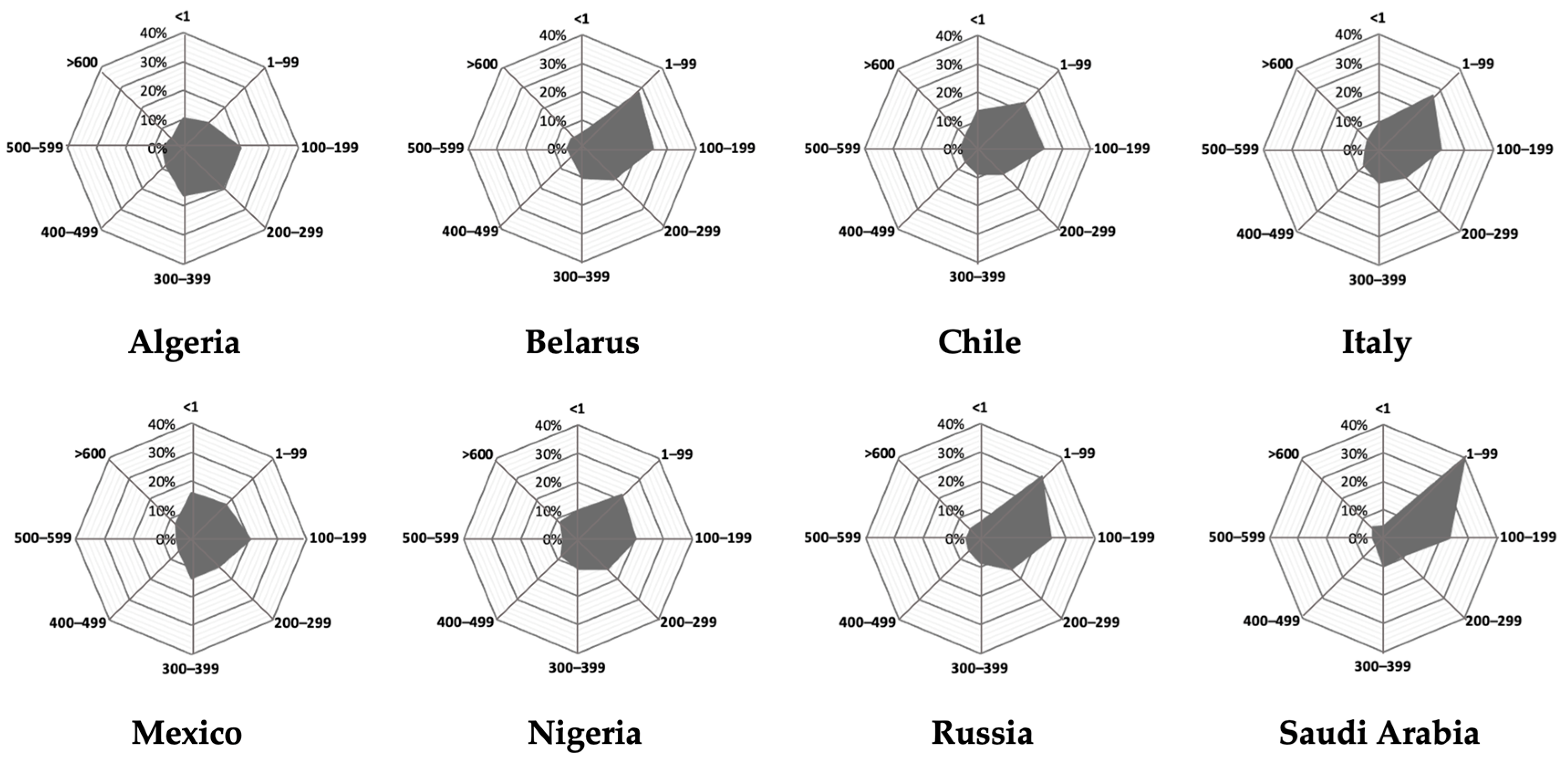
Further, using triangle side lengths (6), we estimated areas of all the resulting triangles. At the same time, as a unit of measurement for area, we used (∆E*00)2 (Figure 10). To compare the findings obtained in different countries, we categorized all the triangles into eight groups based on their areas: those with an area of less than 1 (very small), from 1 to 99 (∆E*00)2 (small), from 100 to 199 (∆E*00)2, and so on, with the last group of triangles having areas of 600 (∆E*00)2 and greater (Figure 14 and Figure S8). This analysis showed that in Saudi Arabia, Russia, Belarus, and Italy the dominant triangles were small, with areas ranging from 1 to 199 (∆E*00)2. In Algeria and Nigeria, Chile, and Mexico, the triangles had greater variance in side lengths and occupied areas ranging from 100 to 300 (∆E*00)2 in CIELAB color space.

Figure 14.
A radar chart showing the proportion of triangles with different areas in eight countries; spokes represent groups of triangles by area from <1 (∆E*00)2 (very small) to >600 (∆E*00)2 (very large); the radial axis shows the percentage of triangles with particular area.
4.5. Cluster Analysis of the Data
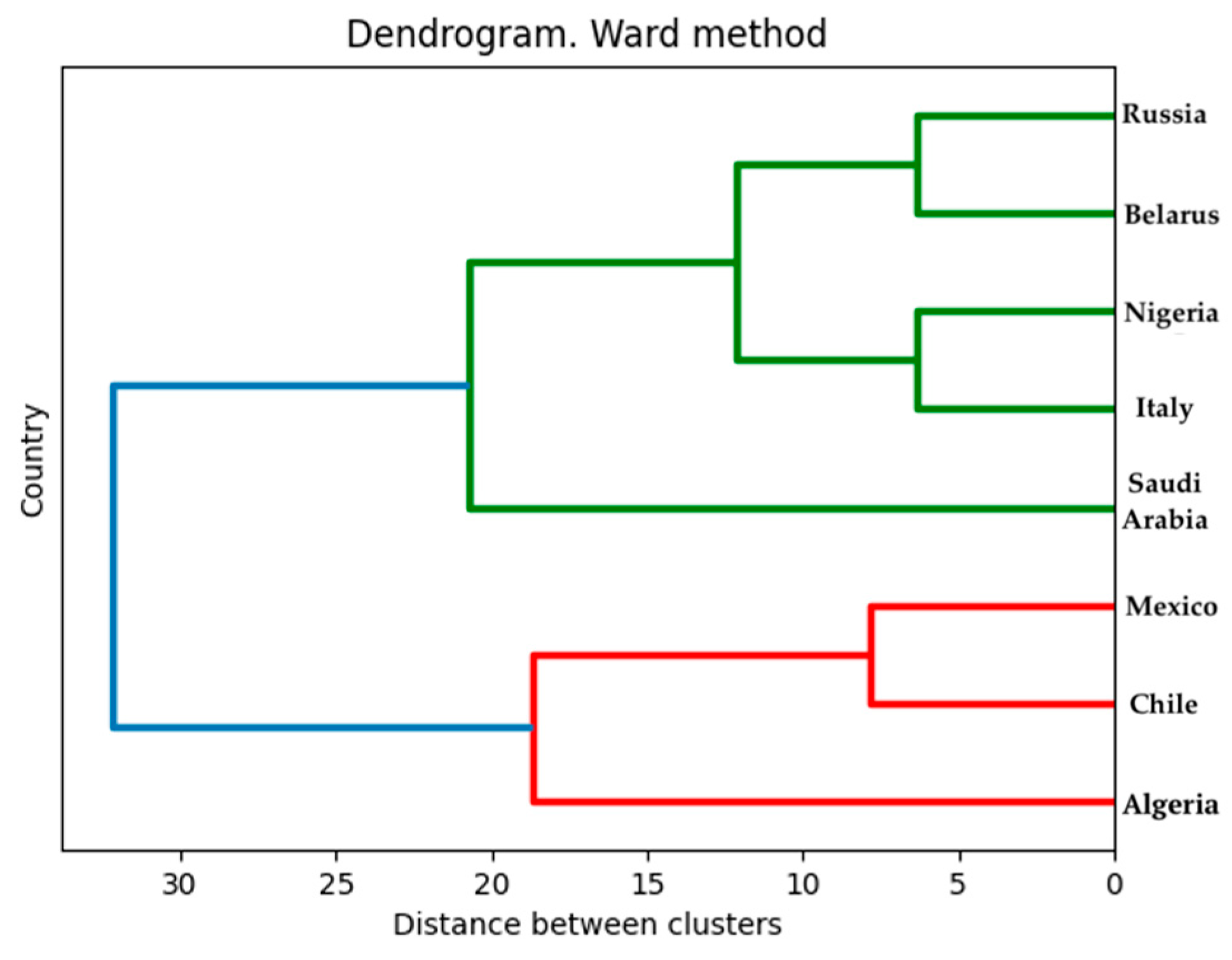
To effectively compare the color triad properties received in different countries, we carried out cluster analysis of the data in three stages. In the first stage, we clustered the angles and areas of every color triad of each received response plotted in CIELAB using the k-means algorithm (Matlab Statistics and Machine Learning Toolbox, The MathWorks, Inc., Natick, MA, USA) with k = 5 (Hartigan and Wong 1979). In the next step, we constructed a dependency matrix to determine how percentages of respondents from the study’s countries aligned with types of identified clusters (Figure S8). Finally, application of Ward’s hierarchical algorithm in the data analysis allowed us to cluster countries by degree of similarity of the “geometry” of harmonious color combinations in the CIELAB color space. We found the closest strategies for building color harmony between the residents of Russia and Belarus, of Mexico and Chile, as well as among those of Nigeria, Italy, and Saudi Arabia (Figure 15).

Figure 15.
Dendrogram representing outcomes of the cluster analysis of countries by the degree of similarity of the “geometry” of harmonious color combinations in the CIELAB color space.
4.6. The “Geometry” of Matyushin’s Color Triads
At the final stage of the analysis, we compared the “geometric” properties of Matyushin’s color combinations with color triads composed by participants from different countries.
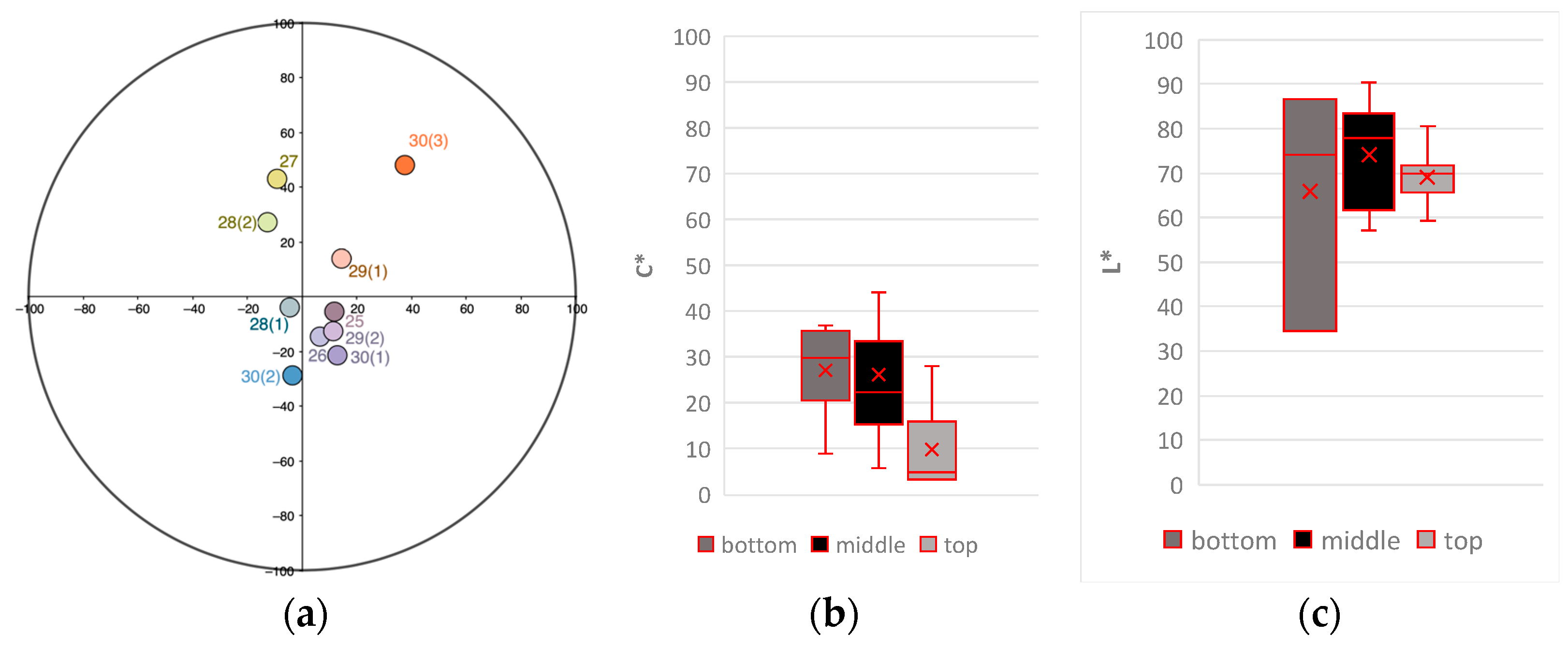
Projection of Matyushin’s middle-stripe colors from the Reference Book of Color into the CIELCh color circle (Figure 16a) revealed that these colors were concentrated in the purple, green, blue, and orange categories (Table 4). Predominantly these were light colors (mean L = 69.22, SD = 5.66) (Table 4 and Figure 16c) with low chroma (mean C = 9.88, SD = 8.57) (Figure 16b).
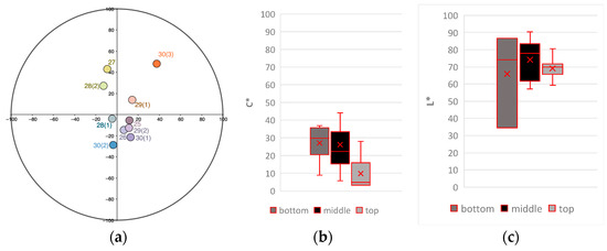
Figure 16.
Colors selected by Matyushin: projection into the CIELCh color circle (a); chroma (C*) (b) and lightness (L*) (c); boxplots represent the interquartile range; horizontal lines indicate medians; and whiskers indicate the outliers below the 1st quartile or above the 3rd quartile.

Table 4.
Matyushin’s middle-stripe colours.
Unlike 9% of the participants in our experiment, when building color combinations, Matyushin himself never used shades that would yield straight-angled triangles in CIELAB color space. His triads most often formed acute-angled and right-angled triangles (Table 5). This strategy was only used by 29% and 16% of participants in our experiment, respectively (see Figure 13).

Table 5.
Geometry of Matyushin’s colour triads in CIELAB color space.
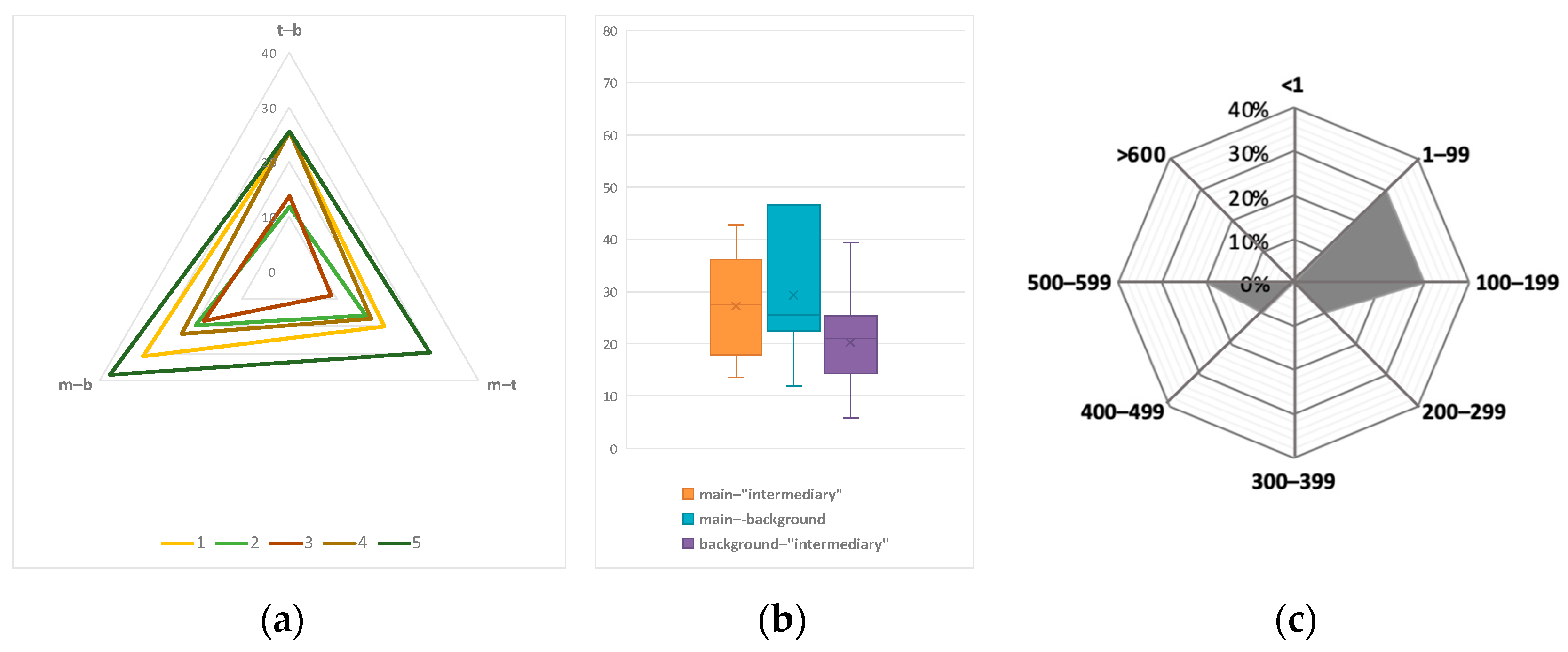
The distance between the background and intermediary (top-stripe and middle-stripe) colors in almost all the Matyushin charts was less than that between the main and intermediary, as well as the main and background colors (Figure 17a,b). Moreover, most of the charts’ three colors were located quite close to each other (Table 5). As a result, the majority of the triangles had a relatively small area, ranging from 59 to 197 (∆E*00)2 (Table 5 and Figure 17c). A similar color selection strategy was used by the numerous participants from Saudi Arabia, Russia, Belarus, and Italy (cf.: Figure 14). Only for one chart (stimulus 5) did Matyushin choose colors at a relatively great distance from each other and which thus acquired large and very large dimensions (with areas ranging from 469 to 581 (∆E*00)2) when rendered as triangles in CIELAB color space.

Figure 17.
Mean color differences CIEDE2000 (∆E*00) between the middle (chosen) color and the color of the top stripe (m–t), the middle (chosen) color and the color of the bottom stripe (m–b), and the top and bottom stripe colors (t–b) for five different stimuli in Matyushin’s color triads (a); the lengths (color differences CIEDE2000) of triangle sides (b); a radar chart showing the proportion of triangles with different areas; spokes represent groups of triangles by area from <1 (∆E*00)2 (very small) to > 600 (∆E*00)2 (very large); the radial axis shows the percentage of triangles with a particular area (c).
4.7. Satisfaction with the Choice Made
Analysis of 5940 valid comparisons proposed by the participants in the experiment showed that in most cases they liked their own color choice more than the choice of Mikhail Matyushin, despite the fact that the choice of the participants in many cases resulted in combinations fundamentally different from those in the artist’s color charts. Across the countries in the study, average satisfaction with color-combination choices ranged from 65% (in Nigeria) to 74% (in Algeria, Mexico, and Russia).
5. Conclusions
This investigation aimed to examine whether the strategies for building harmonious color combinations have cross-cultural specifics. Analysis of responses from online-experiment participants from eight different countries led to a number of important conclusions.
Using an interactive task, we found that the specially devised tools offered by artists, architects, and color theorists to simplify the selection of effective color combinations and create color harmonies can be intuitive and easy to use for non-professionals—that is, for art-naïve people who tend to be spectators rather than authors of color texts in art, architecture, and design.
Most of the participants in our experiment did not know anything about Mikhail Matyushin’s Reference Book of Color and had never seen his color charts before. However, the task of choosing a “right” color to create a harmonious color combination caught the respondents’ interest, and they worked on it enthusiastically and creatively. These observations are consistent with the findings of the authors of other experiments in which participants were asked to choose a color (Braun and Doerschner 2019). Researchers attribute this to the fact that “playing” with color in a colorful context, as in our experiment, appears to have a direct impact on the limbic system and seems to be a pleasant experience (Conway 2012).
By mapping the color choices from the experiment database into CIELAB and CIELCh color space to identify their chromatic characteristics (hue, lightness, and chroma), we revealed universal and culture-specific patterns of color harmony.
The universal principles of color harmony observed in this study are consistent with previously obtained results and are based on hue similarity, chroma similarity, and high lightness (Ou et al. 2018). Our experiment showed that when choosing shades from an almost infinite number of possible options (see also Hård and Sivik 2001), participants from different countries tried to coordinate these choices with the shades already present. Even though they searched for the appropriate color “intuitively” (Koenderink et al. 2016), we found fairly good consistency in their color choices for each of the five tables (Figures S1–S5). Participants turned out to be “sensitive” to the chromatic characteristics of given shades and, when searching, often settled on shades from the same groups.
First of all, the color compositions already present systematically influenced the lightness and chroma of the selections of “suitable” middle-stripe colors (Figure 5 and Figure 6). In all countries, chroma averaged in the same range and were rarely distributed below 10 or above 60. The vast majority of shades were light: the lightness of the chosen shades rarely dropped below 50. While individual observers may have arrived at very different “solutions” for a given color combination, at a group level (considering all observers), higher lightness and chroma in the color combination led to higher values of the corresponding chromatic characteristics in the target colors chosen by observers.
The choice of tone also depended on the tone of the given shades, primarily on the tone of the top stripe (Figure 7 and Figure 8). Observers almost never chose exactly the same colors as Matyushin for a color triad’s middle stripe; however, they often tended to select a hue in the same category as he had. In most cases, participants chose a color from the same or adjacent quartile of the color wheel. In addition, across all eight countries, participants tended to choose “warmer” colors (greens, yellows, oranges, and reds), while “colder” colors (blue-greens, blues, and purples) were selected much less.
Moreover, the chroma (C) of the chosen colors correlated with their lightness (L) and hue angle (h°). The higher the C-value, the lower the lightness. Reddish colors, oranges, and purples had greater chroma than green colors. Blue-green colors had the lowest chroma (Figure 9).
Finally, another universal strategy for constructing harmonious color combinations turned out to be the intuitive choice, among residents of different countries, of a color at approximately the same distance in the color space from the two already given. Thus, in the three-dimensional CIELAB space, the resulting triangles turned out to be isosceles or even equilateral (Figure 13).
Along with universal patterns, we recorded noticeable cross-cultural differences in strategies for constructing harmonious color combinations. We demonstrated visually that color triads in different cultures have a different “geometry” in CIELAB color space and on the CIELCh color circle. The most culturally specific are the ratios of angles and side lengths formed by given and selected shades in the CIELAB color space, as well as the areas and types of triangles determined by the color choices. A comparative analysis of color choices according to these parameters confirms the cultural conditioning of the mechanisms of perception, processing, and multimodal integration of color information.
In general, the most similar responses in terms of strategies for choosing harmonious color combinations came from residents of Russia and Belarus, of Mexico and Chile, and of Nigeria, Italy, and Saudi Arabia (Figure 16). Participants from Russia, and Belarus preferred moderate and light colors (Figure 4) and were less likely to choose blue-greens. Residents from the sunnier countries of Mexico and Chile, Nigeria, Italy, and Algeria more often chose darker colors with higher chroma (Figure 5) and less frequently selected yellows and greens (cf.: Jonauskaite et al. 2020).
We conclude that color harmony should be considered not as a “formulaic” phenomenon, but as a dynamic interface between the subject and object, open to the influence of color-independent factors. In line with a growing number of researchers (see, e.g., Westland et al. 2007; Szabó et al. 2010; Ou et al. 2018; Wang et al. 2022), we have confirmed the existence of a number of shared, common “laws” of color harmony, further modulated by cultural factors. The revealed cross-cultural “shifts” in human understanding of color harmony are contingent on the cultural consequences of the ecology and evolution of human vision (see, e.g., O’Connor 2010). Whether we find a color combination harmonious can depend on “color-independent” factors, such as previous experience, knowledge, education, and social interaction, which tend to differ not only between individuals, but also on a large scale—that is, between societies and cultures.
The results are significant in at least two major respects. The present study surpasses past design limitations by using an unconstrained color-picking method and by involving a great number of participants from different countries.
The analysis presented in this paper will facilitate opportunities for architects, designers, and other color professionals to create culturally specific harmonic color combinations in urban environments. Research should be continued to describe gender and age influence on strategies for building harmonious color combinations in different cultures, as well as to expand the number of participating countries.
Supplementary Materials
The following supporting information can be downloaded at: https://www.mdpi.com/article/10.3390/arts13020053/s1, Figure S1: Hue (h°) and chroma (C) of colors, selected in different countries for the first color combination (chart 25); projection into the CIELCh color circle; Figure S2: Hue (h°) and chroma (C) of colors, selected in different countries for the second color combination (chart 26); projection into the CIELCh color circle; Figure S3: Hue (h°) and chroma (C) of colors, selected in different countries for the third color combination (chart 27); projection into the CIELCh color circle; Figure S4: Hue (h°) and chroma (C) of colors, selected in different countries for the fourth color combination (charts 28 and 29); projection into the CIELCh color circle; Figure S5: Hue (h°) and chroma (C) of colors, selected in different countries for the fifth color combination (chart 30); projection into the CIELCh color circle; Figure S6: The lengths of triangle sides in different countries: color differences CIEDE2000 between the chosen color and the color of the top stripe (green), the chosen color and the color of the bottom stripe (blue), top and bottom stripe colors (yellow); Figure S7: Number of right-angled, obtuse-angled, and acute-angled triangles in different countries; the countries are arranged in order of increasing number of obtuse-angled triangles; Figure S8: Intermediate outcomes of cluster analysis of color choices of experiment participants in the CIELAB color space: boundaries of clusters for different pairs of attributes—area and angle 1 (a), area and angle 2 (b), area and an-gle 3 (c); prevalence of clusters in different countries (d). Video S1. An animation of the color adjustment task.
Author Contributions
Conceptualization, Y.A.G.; Methodology, Y.A.G. and T.S. (Tatyana Samoilova); Software, Y.A.G., T.S. (Tatyana Samoilova) and A.D.; Validation, Y.A.G.; Formal analysis, Y.A.G., T.S. (Tatyana Samoilova) and A.D.; Investigation, A.S.A.-R., V.B., E.C.-J., Y.G., J.M., P.M., J.V.O., G.P. and T.S. (Tatyana Sivova); Resources, Y.A.G.; Data curation, Y.A.G. and T.S. (Tatyana Samoilova); Writing—original draft, Y.A.G.; Writing—review & editing, Y.A.G. and J.M.; Visualization, Y.A.G., T.S. (Tatyana Samoilova) and A.D.; Supervision, Y.A.G.; Project administration, Y.A.G. All authors have read and agreed to the published version of the manuscript.
Funding
This research was funded by the Russian Science Foundation, project No. 22-18-00407; https://rscf.ru/en/project/22-18-00407/ (accessed on 20 February 2024).
Data Availability Statement
The data presented in this study are available on request from the corresponding author.
Acknowledgments
The authors would like to express their gratitude to Karina Tsygankova for her support in data processing. The authors are also grateful to the anonymous reviewers whose detailed and constructive comments on an earlier version of the manuscript were helpful for improving the article.
Conflicts of Interest
The authors declare no conflict of interest.
References
- Ball, Philip, and Mario Ruben. 2004. Color theory in science and art: Ostwald and the Bauhaus. Angewandte Chemie 43: 4842–46. [Google Scholar] [CrossRef] [PubMed]
- Beretta, Giordano B., and Nathan Moroney. 2012. Harmonious colors: From alchemy to science. Proceedings of the SPIE 8292: 82920I. [Google Scholar] [CrossRef]
- Braun, Doris I., and Katja Doerschner. 2019. Kandinsky or me? How free is the eye of the beholder in abstract art? i-Perception 10: 1–29. [Google Scholar] [CrossRef] [PubMed]
- Burchett, Kenneth E. 2002. Color harmony. Color Research and Application 27: 28–31. [Google Scholar] [CrossRef]
- Carter, Ellen C., János D. Schanda, Robert Hirschler, Sophie Jost, Ming R. Luo, Manuel Melgosa, Yoshi Ohno, Michael R. Pointer, Daniel C. Rich, Françoise Viénot, and et al. 2018. CIE 15:2018. Colorimetry, 4th ed. Vienna: International Commission on Illumination, CIE. [Google Scholar] [CrossRef]
- Conway, Bevil R. 2012. Color consilience: Color through the lens of art practice, history, philosophy, and neuroscience. Annals of the New York Academy of Sciences 1251: 77–94. [Google Scholar] [CrossRef]
- Cramér, Harald. 1946. Mathematical Methods of Statistics. Princeton: Princeton University Press. ISBN 0-691-08004-6. [Google Scholar]
- Die kleine Farborgel. 2023. Wilhelm Ostwald Park Museum. Available online: https://www.wilhelm-ostwald-park.de/die-kleine-farborgel (accessed on 22 October 2023).
- Griber, Yulia A. 2021. A livable colour. Project Baikal 18: 82–87. [Google Scholar] [CrossRef]
- Griber, Yulia A. 2022a. Color from within: A new vector in the studies of urban coloristics. Project Baikal 19: 144–49. Available online: https://projectbaikal.com/index.php/pb/article/view/2089 (accessed on 22 October 2023).
- Griber, Yulia A. 2022b. The “geometry” of Matyushin’s color triads: Mapping color combinations from the Reference Book of Color in CIELAB. Arts 11: 125. [Google Scholar] [CrossRef]
- Griber, Yulia A. 2023. Ekologicheskaya motivaciya cveta v gorodskoj koloristike [Ecological motivation of color in urban coloristics]. Project Baikal 4: 38–43. (In Russian). [Google Scholar]
- Griber, Yulia A., and Tatiana A. Samoilova. 2022. Impact of professional art education on harmonious colour combinations. Perspektivy nauki i obrazovania [Perspectives of Science and Education] 59: 89–105. Available online: https://pnojournal.wordpress.com/2022/11/07/griber-2/ (accessed on 22 October 2023). (In Russian).
- Griber, Yulia A., Dimitris Mylonas, and Galina V. Paramei. 2018. Objects as culture-specific referents of color terms in Russian. Color Research and Application 43: 958–75. [Google Scholar] [CrossRef]
- Hård, Anders, and Lars Sivik. 2001. A theory of colors in combination—A descriptive model related to the NCS color-order system. Color Research and Application 26: 4–28. [Google Scholar] [CrossRef]
- Hartigan, John A., and Manchek A. Wong. 1979. Algorithm as 136: A k-means clustering algorithm. Journal of the Royal Statistical Society. Series C (Applied Statistics) 28: 100–8. [Google Scholar] [CrossRef]
- Hu, Guosheng, Zhigeng Pan, Mingmin Zhang, De Chen, Wenzhen Yang, and Jian Chen. 2014. An interactive method for generating harmonious color schemes. Color Research and Application 39: 70–78. [Google Scholar] [CrossRef]
- Itten, Johannes. 1961. The Art of Color: The Subjective Experience and Objective Rationale of Color. New York: Reinhold Publishing Corporation. [Google Scholar]
- Jonauskaite, Domicele, Ahmad Abu-Akel, Nele Dael, Daniel Oberfeld, Ahmed M. Abdel-Khalek, Abdulrahman S. Al-Rasheed, Jean-Philippe Antonietti, Victoria Bogushevskaya, Amer Chamseddine, Eka Chkonia, and et al. 2020. Universal patterns in color-emotion associations are further shaped by linguistic and geographic proximity. Psychological Science 31: 1245–60. [Google Scholar] [CrossRef]
- Josserand, Mathilde, Emma Meeussen, Asifa Majid, and Dan Dediu. 2021. Environment and culture shape both the colour lexicon and the genetics of colour perception. Scientific Reports 11: 19095. [Google Scholar] [CrossRef]
- Judd, Deane, and Gunter Wyszecki. 1975. Color in Business Science, and Industry. Hoboken: John Wiley and Sons. [Google Scholar]
- Kirchner, Eric. 2023. How Itten’s color diagram fails to illustrate color mixing of paints. Optics Express 31: 25191–206. [Google Scholar] [CrossRef]
- Kirchner, Eric, and Phil Koken. 2022. The art of painting rainbows—Between color science and painter’s practice. Color Research and Application 47: 1372–91. [Google Scholar] [CrossRef]
- Koenderink, Jan, van Andrea Doorn, and Vebjørn Ekroll. 2016. Color picking: The initial 20s. ACM Transactions on Applied Perception 13: 1–26. [Google Scholar] [CrossRef]
- Lara-Alvarez, Carlos, and Tania Reyes. 2019. A geometric approach to harmonic color palette design. Color Research and Application 44: 106–14. [Google Scholar] [CrossRef]
- Lenclos, Jean-Philippe, and Dominique Lenclos. 2004. Colors of the World: The Geography of Color. New York: Norton. [Google Scholar]
- Li, Ke-Run, Ya-Qian Yang, and Zhi-Qiang Zheng. 2020. Research on color harmony of building façades. Color Research and Application 45: 105–19. [Google Scholar] [CrossRef]
- Lin, Helen, Ming R. Luo, Lindsay MacDonald, and Arthur W. S. Tarrant. 2001. A cross-cultural colour-naming study. Part III—A colour-naming model. Color Research and Application 26: 270–77. [Google Scholar] [CrossRef]
- Luo, Ming R. 2015. CIEDE2000, history, use, and performance. In Encyclopedia of Color Science and Technology. Edited by Ronnier Luo. Berlin/Heidelberg: Springer. [Google Scholar] [CrossRef]
- Matyushin, Mikhail. 2007. Spravochnik po tsvetu: Zakonomernost’ izmenyayemosti tsvetovykh sochetany [A Reference Book of Color: The Laws Governing Variability of Color Combinations]. Moscow: D. Aronov. First published 1932. Available online: https://monoskop.org/images/a/ac/Matiushin_Mikhail_Spravochnik_po_tsvetu_2007.pdf (accessed on 22 October 2023). (In Russian)
- Minah, Galen. 2008. Colour as idea: The conceptual basis for using colour in architecture and urban design. Colour: Design & Creativity 2: 1–9. Available online: https://www.aic-color.org/resources/Documents/jaic_v2_02.pdf (accessed on 22 October 2023).
- Nemcsics, Antal. 2007. Experimental determination of laws of color harmony. I. Harmony content of different scales with similar hue. Color Research and Application 32: 477–88. [Google Scholar] [CrossRef]
- O’Connor, Zena. 2010. Colour harmony revisited. Color Research and Application 35: 267–73. [Google Scholar] [CrossRef]
- Ostwald, Wilhelm. 2013. Lebenslinien: Eine Selbstbiographie. Berlin: Zenodot Verlagsgesellschaft. [Google Scholar]
- Ou, Li-Chen, Yinqiu Yuan, Tetsuya Sato, Wen-Yuan Lee, Ferenc Szabó, Suchitra Sueeprasan, and Rafael Huertas. 2018. Universal models of colour emotion and colour harmony. Color Research and Application 43: 736–48. [Google Scholar] [CrossRef]
- Palmer, Stephen E., and Karen B. Schloss. 2010. An ecological valence theory of human color preference. Proceedings of the National Academy of Sciences of the United States of America 107: 8877–82. [Google Scholar] [CrossRef] [PubMed]
- Paramei, Galina V., and Yulia A. Griber. 2019. The influence of professional color competence on color lexicon and naming pattern. European Proceedings of Social and Behavioural Sciences 73: 647–63. [Google Scholar] [CrossRef]
- Rüegg, Arthur, ed. 2006. Le Corbusier—Polychromie architecturale: Le Corbusier Farbenklaviaturen von 1931 und 1950 = Le Corbusier’s Color Keyboards from 1931 and 1959 = Les claviers de couleurs de Le Corbusier de 1931 et de 1959, 2nd ed. Basel: Birkhäuser Architecture. [Google Scholar]
- Schloss, Karen B., and Isobel A. Heck. 2017. Seasonal changes in color preferences are linked to variations in environmental colors: A longitudinal study of fall. i-Perception 8: 2041669517742177. [Google Scholar] [CrossRef]
- Schloss, Karen B., and Stephen E. Palmer. 2011. Aesthetic response to color combinations: Preference, harmony, and similarity. Attention, Perception & Psychophysics 73: 551–71. [Google Scholar] [CrossRef]
- Schwarz, Andreas. 1999. Die Lehren von der Farbenharmonie: Eine Enzyklopädie zur Geschichte und Theorie der Farbenharmonielehren. Northeim-Sudheim: Hans Hansen-Schmidt. [Google Scholar]
- Schwarz, Andreas. 2018. Farbtheorie im Kunstunterricht. Eine qualitative empirische Wirkungsforschung zum Umgang mit Farbe. Oberhausen: Athena Verlag. [Google Scholar]
- Semper, Gottfried. 1834. Vorläufige Bemerkungen über bemalte Architektur und Plastik bei den Alten. Altona: J. F. Hammerich. [Google Scholar]
- Serra, Juan, Banu Manav, and Yacine Gouaich. 2021. Assessing architectural color preference after Le Corbusier’s 1931 Salubra keyboards: A cross cultural analysis. Collection of Frontiers of Architectural Research 10: 502–15. [Google Scholar] [CrossRef]
- Serra, Juan, Jorge Llopis, Ana Torres, and Manuel Diego Giménez. 2016. Color combination criteria in Le Corbusier’s Purist architecture based on Salubra claviers from 1931. Color Research and Application 41: 85–100. [Google Scholar] [CrossRef]
- Sharma, Gaurav, Wencheng Wu, and Edul N. Dalal. 2005. The CIEDE2000 color-difference formula: Implementation notes, supplementary test data, and mathematical observations. Color Research and Application 30: 21–30. [Google Scholar] [CrossRef]
- Szabó, Ferenc, Péter Bodrogi, and János Schanda. 2010. Experimental modeling of colour harmony. Color Research and Application 35: 34–49. [Google Scholar] [CrossRef]
- Tager, Allen, Eric Kirchner, and Elena Fedorovskaya. 2021. Computational evidence of first extensive usage of violet in the 1860s. Color Research and Application 46: 961–77. [Google Scholar] [CrossRef]
- Tillberg, Margareta. 2003. Coloured Universe and the Russian Avant-Garde. Matiushin on Colour Vision in Stalin’s Russia, 1932. Stockholm: Stockholm University. [Google Scholar]
- Wang, Shuang, Jingyu Liu, Jian Jiang, Yujian Jiang, and Jing Lan. 2022. Attribute analysis and modeling of color harmony based on multi-color feature extraction in real-life scenes. Frontiers in Psychology 13: 945951. [Google Scholar] [CrossRef] [PubMed]
- Ward, Joe H., Jr. 1963. Hierarchical grouping to optimize an objective function. Journal of the American Statistical Association 58: 236–44. [Google Scholar] [CrossRef]
- Westland, Stephen, Kevin Laycock, Vien Cheung, Phil Henry, and Forough Mahyar. 2007. Colour harmony. Colour: Design & Creativity 1: 1–15. [Google Scholar]
- Zhadova, Larisa. 2007. Cvetovaja sistema Mikhaila Matyushina [Matyushin’s color system]. In Spravochnik po tsvetu: Zakonomernost’ izmenyayemosti tsvetovykh sochetany [A Reference Book of Color: The Laws Governing Variability of Color Combinations]. Moscow: D. Aronov, pp. 5–12. Available online: https://monoskop.org/images/a/ac/Matiushin_Mikhail_Spravochnik_po_tsvetu_2007.pdf (accessed on 22 October 2023). (In Russian)
Disclaimer/Publisher’s Note: The statements, opinions and data contained in all publications are solely those of the individual author(s) and contributor(s) and not of MDPI and/or the editor(s). MDPI and/or the editor(s) disclaim responsibility for any injury to people or property resulting from any ideas, methods, instructions or products referred to in the content. |
© 2024 by the authors. Licensee MDPI, Basel, Switzerland. This article is an open access article distributed under the terms and conditions of the Creative Commons Attribution (CC BY) license (https://creativecommons.org/licenses/by/4.0/).


