Abstract
Textile materials are an essential part of contemporary architecture, the environment, and urban spaces due to their unique appearance and qualities, as it is now possible to achieve both a structural function and an aesthetic quality with textiles. As colour is one of the most important characteristics of textile material, it is also important to understand the relationships between colour and textile material with different surface qualities. In order to explain the complexity of different textile materials and the appearance of colours, which consequently affects the colour properties, this paper analyses this phenomenon. The presented research analyses the dependence of the reproduction quality and colour appearance on fabrics of different construction and structural characteristics, i.e., the texture of the textile material, printed using digital inkjet technology. The aim of this work is to investigate the influence of various structural features of textiles on the colour appearance of digitally printed textile substrates, to monitor the quality of colour reproduction, and to analyse the behaviour of a reactive dye droplet on textile substrates. Printing of a particular shape was performed using a Dimatix Materials Printer DMP-2831 piezoelectric inkjet device (provided by the J. Stefan Institute, Ljubjana, Slovenia; manufactured by Fujifilm Dimatix Inc., 2230 Martin Avenue, Santa Clara, CA, USA). The behaviour of the ink delivered by the needle of the tensiometer DSA20E, Kruess GmbH (provided by the J. Stefan Institute, Ljubjana, Slovenia; manufactured by Kruess Scientific Instruments (Shanghai) Co., Ltd. Futong Dong Dajie 10 Baoneng Center, Tower B, Room 605 Chaoyang District, Beijing 100102, China), on the surface of the fabric was analysed. The samples were digitally printed on a Mimaki digital printer Tx2-1600 (provided by University of Ljubljana Faculty of Natural Science and Engineering, Slovenia EU; manufactured by Mimaki, 2182-3 Shigeno-Otsu, Tomi-city, Nagano, Japan), with reactive dyes, which were first pretreated in a bath with a specific solution. The statistical method of image analysis and microscopic imaging were used to obtain the characteristics of the porosity, texture, and roughness parameters. All results are presented from colouristic analysis based on the objectification of colour and colour differences. The objective values of the parameters of lightness (L*), chroma (C*), and hue (h°) show the significant influence of the structure and properties of the substrate on colour reproduction, and significant changes were obtained, which were confirmed by the evaluation of the colour differences. The results confirm the influence of the substrate structure on colour properties. Furthermore, it is essential to consider this complexity in the context of environmental colour design when utilising (coloured) textile installations/materials in architecture and urban spaces, i.e., in the environment.
1. Introduction
In the context of urban design and the aesthetic shaping of the human environment, the interaction of colours and materials plays a key role. The presence, significance, dominance, and inter-relationships of colours in the environment affect humans emotionally, physically, and psychologically as they are constantly surrounded by and exposed to colour (Minah 2008; Minah and Nemcsics 2015). The material–colour–observer relationship implies the dynamics of the interaction of colour with the observer, colours with surfaces, and surfaces with the observer. In this complex trinity, the relationship between colour and surface and their interaction with light and the observer is the subject of research that analyses in-depth the influence of the surface on the interaction of colour and light and their joint influence on the visual–aesthetic experience of colour by the observer.
Textiles are the dominant material that surrounds humans in all aspects of their private and professional lives, taking on multiple forms and functions. It can be said that textiles are a fundamental part of contemporary architecture, the environment, public urban spaces, and urban design, as it is now possible to use textiles to achieve both a structural function and an aesthetic quality (Premier 2020). As one of the most prominent visual–aesthetic functions of textiles in building and designing the environment is to carry colour and bring it into the material–colour–observer interaction, it is crucial to understand the relationships between colour and surface, i.e., textile material with different structures and surface qualities (Salim et al. 2013; Hansen et al. 2021; Gasparini 2022). The appearance of surfaces and colours and the associations of form and colour materialise as an emotional experience of the actual space (Smith 2008; Minah and Nemcsics 2015). Colour, as a strong structural element in everyday life and the environment, plays a significant role in creating and influencing the viewer’s decision about an object and its surroundings. Colour is not an independent aspect of an object; on the contrary, it is a structural part of the (built) environment. Therefore, numerous studies have been conducted in this area on the influence of colour on how people experience their daily activities and each other and how they understand a place, i.e., how it affects people psychologically (Mankhe 1996; Smith 2008; Becerir 2017; McLellan and Guaralda 2018; Khalili 2019; Karunakaran et al. 2022), but a relatively smaller number of studies have been undertaken on the complex and highly influential interaction of colour with textiles as one of the key elements and materials for building the human environment. In order to explain the complexity of textile material and colour appearance depending on the different structures of textile material and the different textures that consequently affect colour properties, this paper analyses the complexity of the interaction between colour and textiles using digital printing.
Today, with the accelerated growth and development of digital reproduction technologies in the field of textiles, the complexity and problematic nature of textile–colour interaction is particularly emphasised. Namely, with the entry of digital technology into the field of textiles, unlimited artistic freedom was made possible, and the design and patterning of textiles by printing acquired a completely new dimension, but new challenges and problems were also encountered. Digital printing is one of the leading technologies in the field of contemporary textile printing, but the result of the final appearance of a particular product depends on the interaction of several factors, focusing on the specific characteristic of the textile material, three-dimensionality, the variety of surface texture, and the variety of printing and colour ratio depending on the type and surface of the specific textile material. In the field of textile design, the individual surface properties and the influence of the colour of the substrate on the appearance of the product give authenticity to a high-quality textile product. Digital inkjet is a multicolour graphic image reproduction technology originally developed for homogeneous, uniform surface textures such as paper. However, textiles as a unique, heterogeneous, three-dimensional form have their own surface irregularities. Previous research on similar topics has confirmed that the very fundamental mechanisms that determine print quality have not yet been fully elucidated, and the role of textile surface texture has only recently been recognised as one of the fundamental factors in print quality and achieving optimal colour gamut (Park et al. 2001; Bae 2007; Collis and Wilson 2012; Kuriki 2015; Parraman 2017; Gooby 2020; Kumah et al. 2020). Therefore, any study of the influence of the structural characteristics of the surface of textile materials on print quality, the degree of deformation and spread of droplets on the surface of textile materials, and the penetration of printing ink droplets into the structure of textiles contributes to the understanding of these fundamental mechanisms.
Due to their characteristic three-dimensional heterogeneous structure, textiles are coarse and porous compared to paper, resulting in the deformation of droplets and a greater penetration depth of ink droplets (Gorji Kandi et al. 2008). The interaction of dyes and textile materials in digital printing technology is essential for producing high-quality, well-defined images for a specific purpose (Kan and Yuen 2012; Polston et al. 2014). The complexity of the interaction of colour and different media in inkjet technology has been studied by Lavery and Provost. The most important variables in the digital printing system are the printing technology, physics of ink, interaction between dyes and textiles, preparation phase, and finishing. The surface of textile materials has an accentuated, nonuniform texture (Lavery and Provost 1999). Differences in texture are the result of differences in fibres, yarn, structure (weaving or knitting, etc.), and finishing (Tkalec et al. 2019). In a study on the relationship between the visual perception of surface texture and physical fabric properties, such as the geometric structure and optical properties, it was concluded that the direction of the fabric (warp or weft) has a great influence on light reflection and that the colour of the surface of the fabric varies in warp and weft directions (Lee and Sato 1998; Lee and Sato 2001).
Research on the effect of texture on visual colour difference, usually with simulated textures generated on CRT screens, confirms that texture is an important parametric factor, but this influence is different for each texture; therefore, no simple set of parametric factors can be determined for all potential textures in an industrial application (Xin et al. 2005; Huertas et al. 2006).
Furthermore, investigations conducted on both, visual and instrumental evaluations of the influence of the texture of (knit) patterns on colour, discovered significant discrepancies between the two types of evaluation. Moreover, the influence of texture on the colour/intensity effect depends more on the type of structural texture than on the roughness of texture (Shao et al. 2006; Gorji Kandi and Tehran 2010). Texture has a significant effect on the appearance of colour and the changes in reflectance associated with a change in texture, i.e., a transition from one texture to another (comb–yarn–fabric) (Moussa et al. 2008). Texture roughness has a significant influence on image formation during printing. The results related to colour and texture differences show the complexity of the interaction between colour and surface and that the evaluation of the visually perceived texture of the fabric correlates highly with the instrumentally measured values of surface texture (Bae et al. 2014).
The research results found in the literature confirm the significant influence of texture on visual colour perception as well as on instrumental rating results, but the quantity and quality of this effect have not yet been fully investigated. The research presented in this paper analyses the interdependence of the reproduction quality and appearance of colours printed using digital inkjet technology as a function of the construction and structural properties of the textile fabric. Due to the dominant use of colour and textiles in the built environment and the increasing use of digital technologies for design reproduction and implementation, extensive research is being conducted to provide answers to some of the unresolved issues and problems when it comes to the implementation of designs with digital printing technologies on textiles.
The aim of the research is to contribute to the understanding of the basic mechanisms of the interaction between dyes, colour, and textile substrates, as there is a research gap in this particular area.
2. Materials and Methods
Samples of textile fabrics with a raw material composition of 50% cotton and 50% PA were used for this study. The samples were produced by the Croatian manufacturer of fabrics and protective clothing, Čateks Industry, using identical yarns but with different construction characteristics, resulting in fabrics with different structures and textures. Three different constructions are used in weaving: Plain 1/1, Twill 1/2 Z (3-link twill), and Atlas 1/5 (6-link irregular atlas). The structural–mechanical parameters of the fabrics are listed in Table 1, and the schematic representation of the fabric constructions can be seen in Figure 1.

Table 1.
Structural–mechanical parameters of selected fabrics.

Figure 1.
Construction weaves of selected fabrics. Samples (a) Plain weave 1/1; (b) Twill weave ½ Z; (c) Atlas weave 1/5 (6-link irregular Atlas).
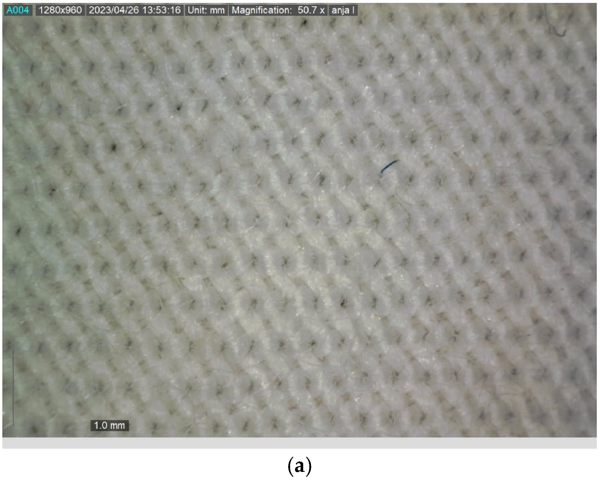
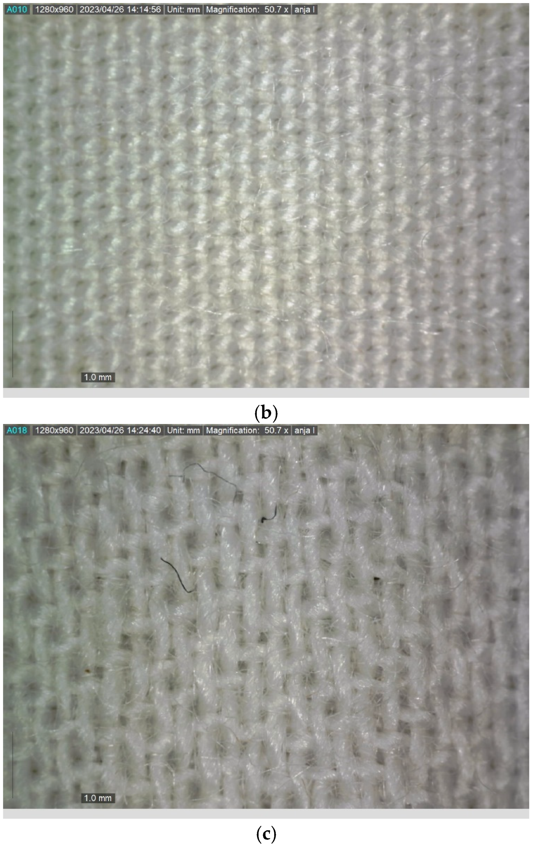
The structure of the specimens is also observed in digital microscope images taken with DinoLite AM7013 (provided by University of Zagreb Faculty of Textile Tcehnology, Croatia EU, manufactured by AnMo Electronics Corporation, 5F-1, No. 76, Sec. 2, Dongada Road, Hsinchu City 300082, Taiwan) The microscopic images are shown in Figure 2.
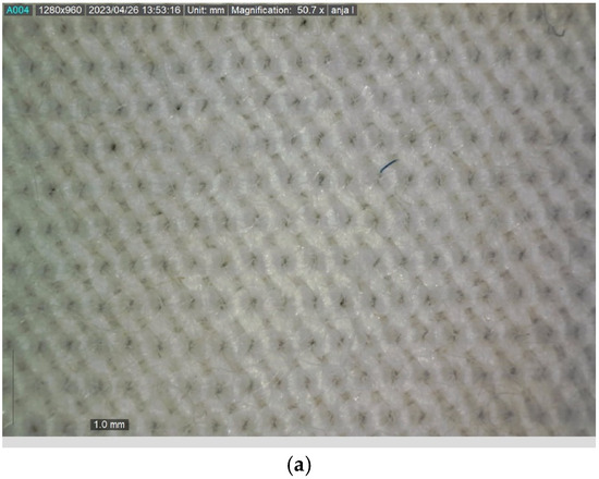
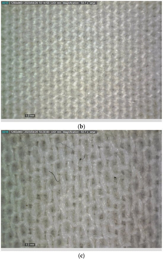
Figure 2.
Microscopic images of samples structure. (a) Sample 1 (Plain weave 1/1). (b) Sample 2 (Twill weave 1/2 Z). (c) Sample 3 (Atlas weave 1/5).
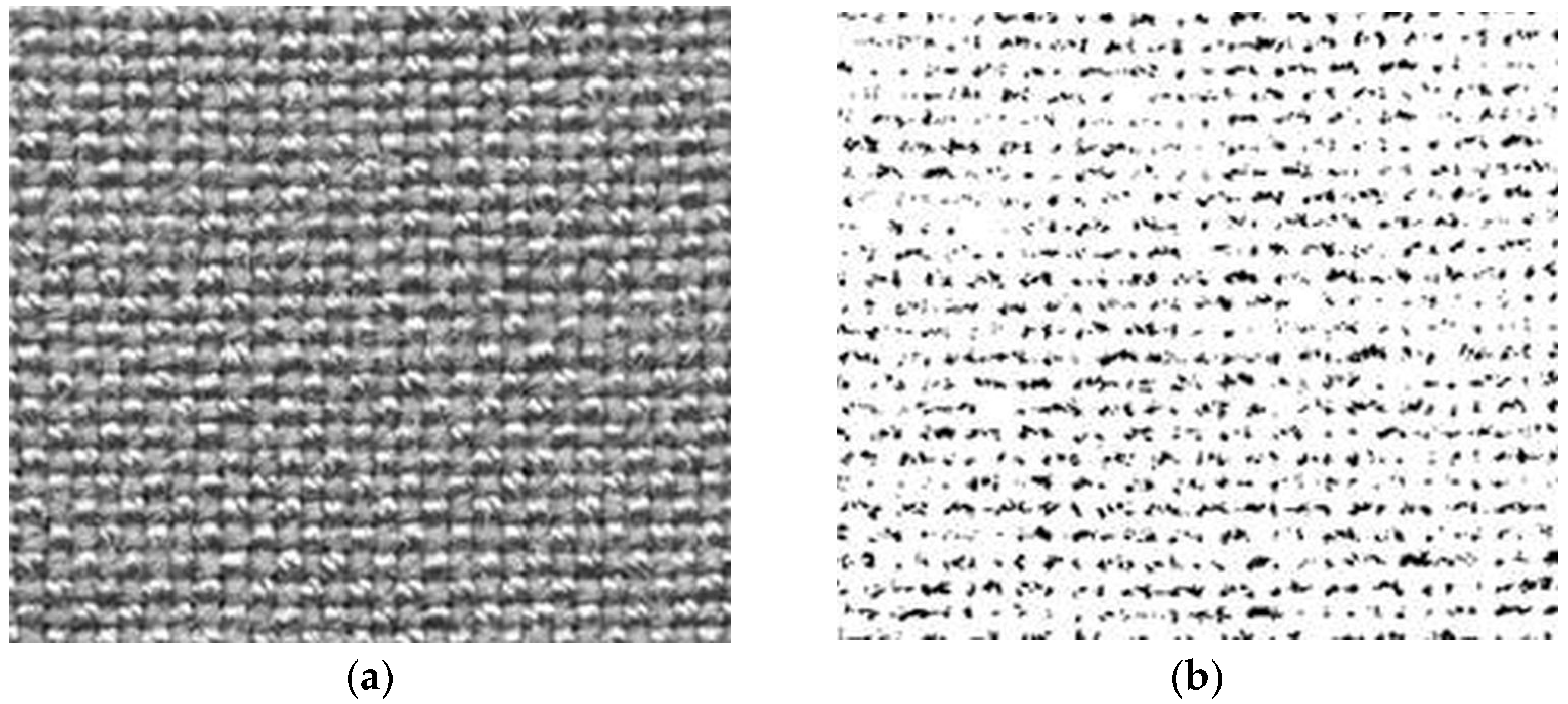
In the next step, the method of image analysis was used to investigate the influence of different weave constructions of the fabric on its surface structure. The methodology involved the simple scanning of selected fabrics, which was performed using a Canon CanoScan LiDE 100 scanner (provided by University of Zagreb Faculty of Textile Technology, Croatia EU; manufactured by Canon Inc., 30-2, Shimomaruko 3-chome, Ohta-ku, Tokyo 146-8501, Japan). In order to obtain the most accurate results on the amount of reflected light exclusively from the actual textile material, a black nonreflective matte surface was used as a cover for the scanner. In this way, it was achieved that the registered reflected light represents only the textile material of the fabric and is seen in the obtained image (Figure 3a) as light (white and grey) areas, while the part of the light that was not reflected is registered as dark (black) fields (Figure 3b).

Figure 3.
Images of reflected and nonreflected part of the scanned fabric. (a) Scanned fabric. (b) Nonreflected part of light.
This method is used to determine the observed segment of the fabric surface as a percentage of light transmission, i.e., the filling of the observed fabric.
In the next step, the ImageJ 1.53t program was used for image analysis, in which GLCM Texture and SurfCharJ 1q plugins were used to obtain data, i.e., parameters describing the texture of fabrics and their surface roughness.
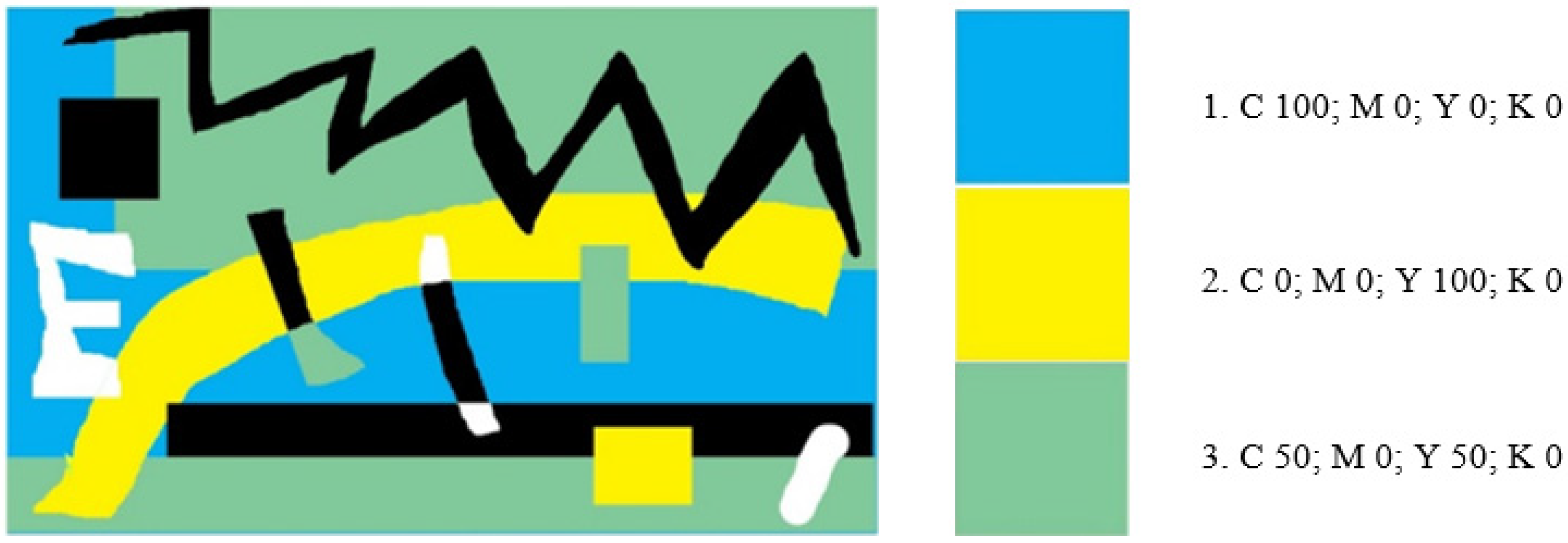
In the following experimental work, inkjet digital printing of the samples was performed. A multicoloured image was created in Photoshop 7.0 software in specific proportions of the primary process colours cyan (C), magenta (M), yellow (Y), and black (K), (Figure 4). The image was printed on all three textile samples using a Mimaki digital printer Tx2-1600 (provided by University of Ljubljana Faculty of Natural Science and Engineering, Slovenia EU; manufactured by Mimaki, Mimaki, 2182-3 Shigeno-Otsu, Tomi-city, Nagano, Japan) with reactive dyes.
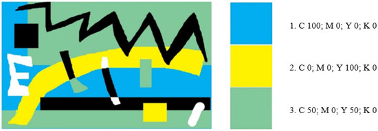
Figure 4.
Image created in Adobe Photoshop; process colour proportion.
Considering the digital printing with inks based on reactive dyes, the samples were pretreated in a bath with the following content: 400 g of alginate thickener (CHT Alginate EHV 3%), 50 g of urea, 10g of Ludigol (BASF oxidising agent), 25 g of NaHCO3 (alkali), and 515 g of water. The samples were impregnated on a two-roller foulard (pressure = 0.6 bar; speed = 0.6 m/s). The squeezing effect was calculated, and the results are shown in Table 2.

Table 2.
Squeeze effect for selected samples in pretreatment procedure.
After inkjet printing with reactive dyes, the samples were dried in air and then fixed by steaming under the conditions of temperature and time (T = 100–102 °C, t = 10 min).
Then, the samples were rinsed with cold water, rinsed with hot water (T = 70 °C), rinsed with boiling water until the capillary spread of the dye stopped, then rinsed again with hot water at a temperature of 70 °C, and finally rinsed with cold water. The samples were dried in a dryer for 3 min at a temperature of 100 °C.
The following analyses were performed on the printed samples: microscopic images taken with a DinoLite AM7013 microscope (provided by University of Zagreb Faculty of Textile Tcehnology, Croatia EU; manufactured by AnMo Electronics Corporation, 5F-1, No. 76, Sec. 2, Dongada Road, Hsinchu City 300082, Taiwan) and spectrophotometric measurement of the colour properties taken with a DataColor 850 reflectance spectrophotometer (provided by University of Zagreb Faculty of Textile technology, Crotia EU; produced by Datacolor USA; purchased by Datacolor representative Miltonia d.o.o., Zagreb, Croatia, EU), with a measurement aperture of 2.5 cm and a measurement geometry of d/8°. The results of colour objectification are presented by classifying the colour printed on the samples into the a*/b* colour space and by comparative graphical representation of the objective values of the colour parameters (lightness (L*), chroma (C*), and hue (h°)).
The colour difference is also calculated according to CMC(l:c), which is accepted by the ISO standard (ISO 2009) for the evaluation of colour differences in textiles.
Furthermore, a microscopic analysis of the behaviour of the printing ink released onto the surface of the fabric from the needle of the tensiometer DSA20E, Krüss GmbH (provided by the J. Stefan Institute, Ljubjana, Slovenia; manufactured by Kruess, Germany EU), was carried out. Fluid and substrate interaction evaluation was then carried out on the piezoelectric inkjet device Dimatix Materials Printer DMP-2831 (provided by the J. Stefan Institute, Ljubjana, Slovenia; manufactured by Fujifilm, USA); an evaluation of the interaction between the fluid (cyan reactive printing ink) and the textile substrates was carried out.
3. Results and Discussion
This paper represents part of a larger research effort being conducted in the area of the influence and interaction between the heterogeneous structure of textile fabrics and the quality of colour reproduction in the context of the colour/substrate/environment connection. Colour is more than aesthetics; colour is communication, and the way it is applied to textiles is an essential element of that communication. Textiles are the predominant material in our environment, colour is the predominant visual feature, and printing is the predominant technology for transferring colour and images to textiles. Therefore, this part of the research analysed the relationship between these three factors. It was intended to investigate the extent to which changes in the substrate to which the colour is applied, even if they are in the realm of microstructures, contribute to changing the interaction of colour and light and thus the interaction of colour and the viewer, and the impact of reproduction technology on these complex relationships.
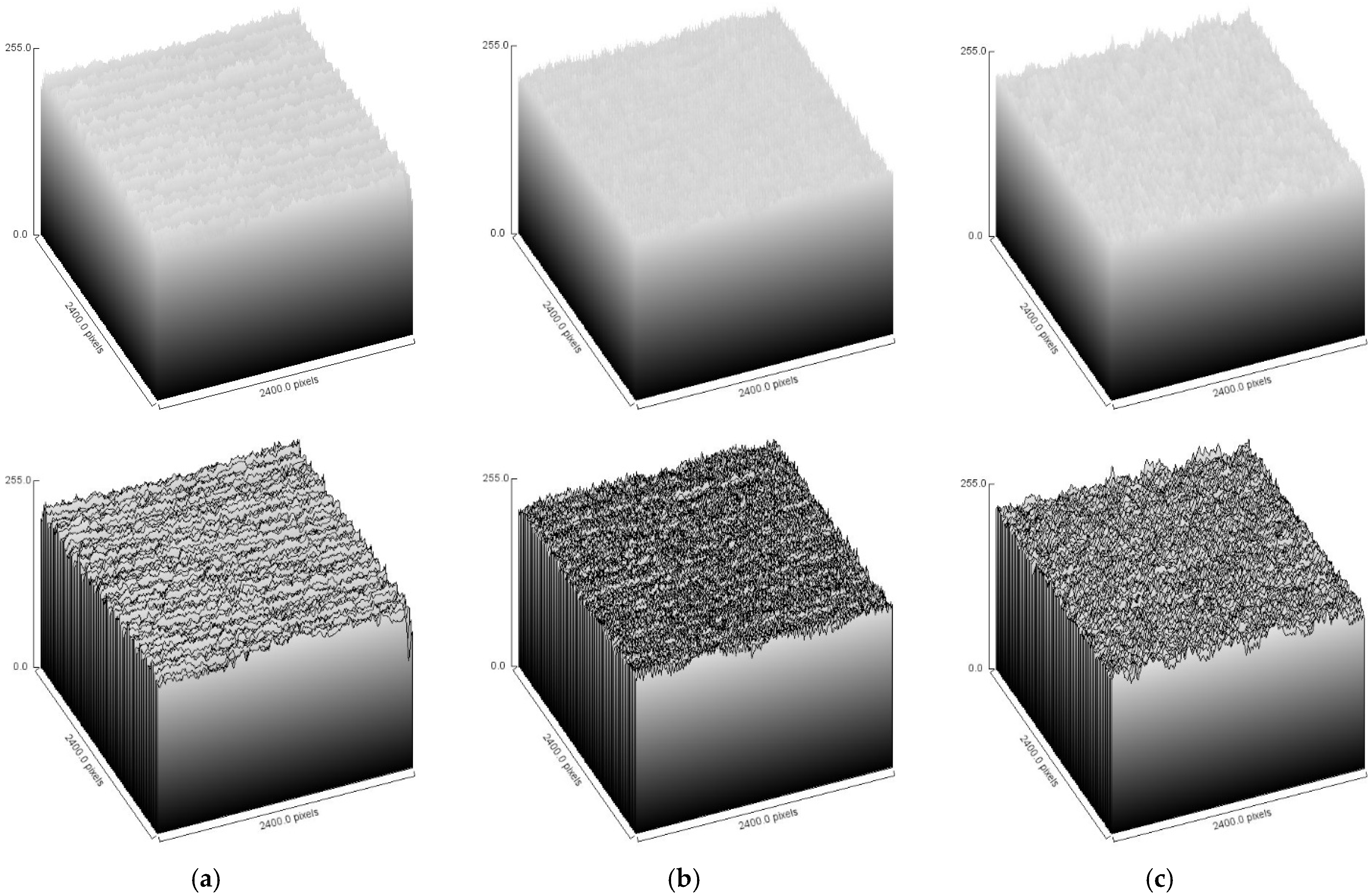
In order to monitor exclusively the influence of the structural surface parameters of the fabric, the samples on which the test was performed were intentionally made from the same yarn in a single weaving process, changing only the structural parameters, i.e., the weave of the fabric, as shown in Table 1 and in Figure 1. Taking into account the different structural features, the ImageJ 1.53t program was used to generate surface diagrams of the fabric samples, which are shown in Figure 5. The surface plot shows a 2D image of a tissue as a 3D plot.

Figure 5.
Surface plot of the fabric samples: (a) Plain weave 1/1; (b) Twill weave 1/2 Z; (c) Atlas weave 1/5 from ImageJ 1.53t program.
By performing image analysis of the selected fabrics, insight was gained into the properties of their porosity, texture, and roughness parameters. The results are presented in Table 3, Table 4 and Table 5.

Table 3.
Results of light transmission measurement.

Table 4.
GLCM texture parameters of greyscale images from ImageJ program.

Table 5.
Roughness parameters of greyscale images from ImageJ program.
Table 3 shows the results of the measurements of light transmission, i.e., the calculation of the percentage of the surface through which the light penetrates (porosity in %) and the percentage of the surface of the yarn. The results show that light transmission does not necessarily increase or decrease with a change in fabric type. From the results, it appears that the porosity of these samples is mainly influenced by the density and less by the weave type. When comparing fabrics of the same density, it can be seen that the porosity is lowest for linen fabrics.
Table 4 shows the results of the texture parameters. According to Osapoetra, “A smoother image gives a lower contrast, while a coarser image gives a higher contrast. Correlation represents the linear correlation between adjacent pixels. Energy measures the uniformity of texture between adjacent pixels, while homogeneity quantifies the occurrence of pixel pairs of different intensity” (Osapoetra et al. 2020). According to Hladnik (Hladnik and Gregor-Svetec 2010), most pixels are identical to their neighbouring pixels if the image does not have high contrast. ASM (angular second moment) or energy provide data on the distribution of grey levels of the image; images with fewer grey levels have greater uniformity. Twill weave 1/2 has the highest contrast, indicating the greatest roughness. The same sample has the lowest value for ASM, correlation, and IDM.
Table 5 shows the values describing the roughness of the samples. Texture patterns can be caused by physical surface properties such as roughness (Hladnik and Gregor-Svetec 2010). Roughness is the quality of texture; it describes the nature of the surface (Djonov and Van Leeuwen 2011). It is quantified by the vertical deviations of the actual surface from its ideal shape. If these deviations are large, the surface is rough; if they are small, the surface is smooth. Ra is the average roughness of the surface. If the value of Ra is large, the surface is rough; if the Ra is small, the surface is smooth. According to the results, Twill weave 1/2 has the roughest surface, while Plain weave 1/1 has the smoothest surface.
As PAs have similar dyeing properties to protein fibres, e.g., wool, and are printed and dyed with dye groups similar to those used for protein fibres, reactive dyes are not the first choice for application to protein fibres, but they are widely used, so their application to PA synthetic fibres is also possible. Printing with inks based on reactive dyes requires pretreatment of the textile material in an alkaline bath, which is necessary to initiate the reaction of the dyes with the fibre. When dyes are used in digital inkjet printing technology, processes of modification and adaptation of the dyes, as well as other components of the inks, are necessary to achieve optimization according to the technical requirements of the digital printing machines, i.e., their print heads. In systems using dye-based inks, the chemicals and auxiliaries necessary for the dye–fibre reaction must not come into contact with the elements of the printhead because of the risk of corrosion or clogging of the nozzles.
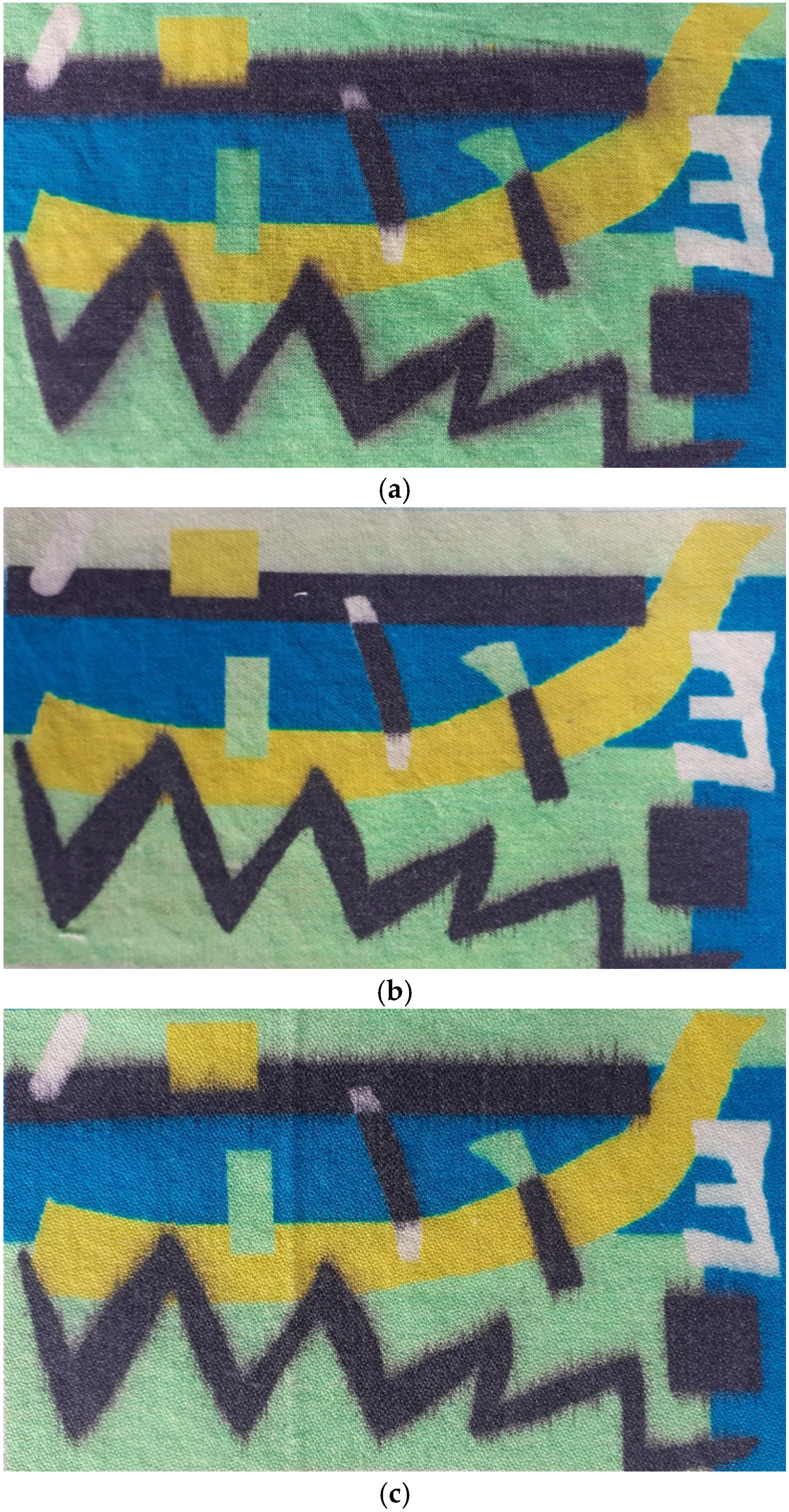
Figure 6 shows the prints on the selected fabrics after fixation by steaming, washing, and drying.
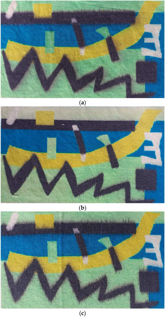
Figure 6.
Digital inkjet prints on selected fabrics. (a) Sample 1 (Plain weave 1/1). (b) Sample 2 (Twill weave ½ Z). (c) Sample 3 (Atlas weave 1/5).
The strong influence of the substrate is immediately apparent, and there are visible differences in the quality of colour and pattern reproduction due to the structure of the substrate. It is also observed that printing ink is spilt and that individual design elements cannot be kept within the specified contours. The reason for this is the presence of PA fibres, which, due to their hydrophobicity, can be dyed with reactive dyes but cannot absorb the amount of water contained in the printing ink at optimum speed. (Printing inks contain a higher proportion of water and are of very low viscosity.)
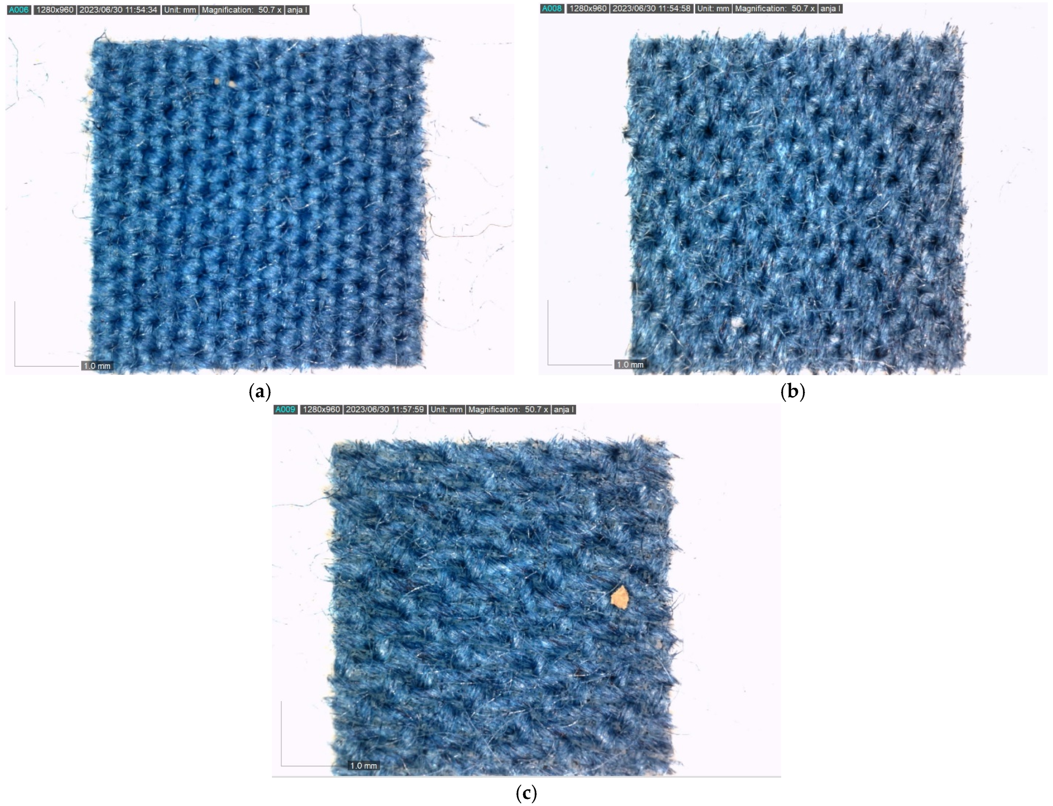
After printing, analysis was performed by taking microscopic images with a DinoLite AM7013 digital microscope (Figure 7).
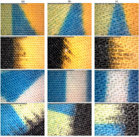
Figure 7.
Microscopic imaging performed by digital microscope Dino-Lite. (a) Sample 1 (Plain weave 1/1). (b) Sample 2 (Twill weave ½ Z). (c) Sample 3 (Atlas weave 1/5).
The interaction between the fabric structure and the colour obtained by printing is visible. Irregularities in the mixing of the process colours are clearly visible, occurring precisely because of the influence of the structure, which prevents correct positioning and, thus, the optimal mixing of the process colours according to the requirements of the image. The influence of the weaving points of the fabric, the places where there was no mixing of the process colours, and the points of the individual components are all clearly visible (for example, in the case of green, the microscopic image clearly shows the places where the mixing of the process colours yellow and cyan did not occur). The characteristics and shape of the capillary overflow of the ink, which is different in all three samples, can be seen, as well as the quality of the reproduction of the contour sharpness.
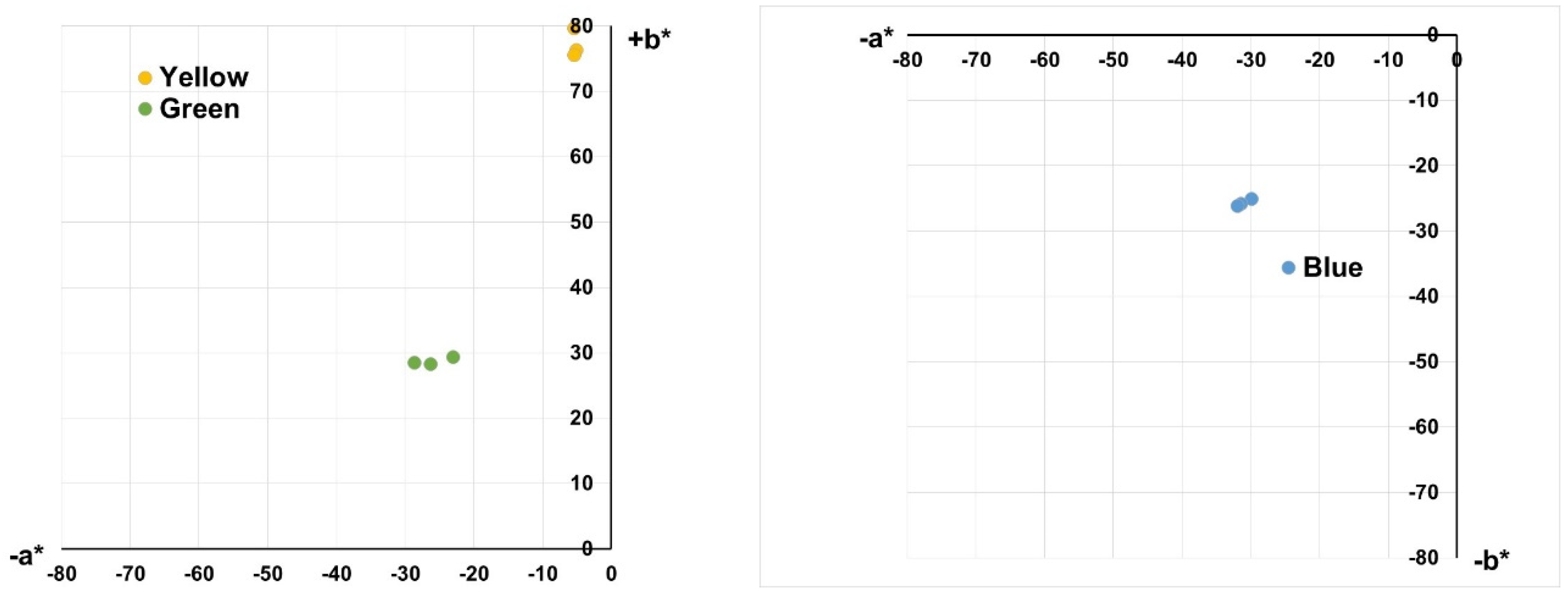
Spectrophotometric measurements of the colour properties are shown in Figure 8 as an arrangement of colours in the a*/b* colour space and in Figure 9 as comparative histograms showing the change in lightness (L*), chroma (C*), and hue (h°) for printed inks due to different substrate structures.
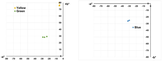
Figure 8.
Results of spectrophotometric measurement: values of the printed samples placed in a*/b* colour space.
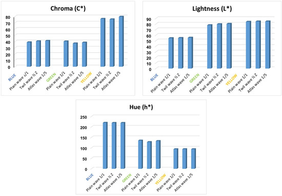
Figure 9.
Results of spectrophotometric measurement: values of parameters of lightness (L*), chroma (C*), and hue (h°).
The presented results of colour placement in the a*/b* colour space and a comparative plot of the chroma (C*), lightness (L*), and hue (h°) values of the analysed colours show the influence of structure and topographical conditions as well as the porosity of the substrate on colour reproduction and appearance. It can be observed that the greatest influence is on the chroma value (C*), which was also to be expected. In fact, the surface texture and the topographical nature of the textile have no influence on the representation of the wavelengths and the dominant wavelength in the reflected part of the incident light, which defines the colour that the viewer sees, i.e., its spectral characteristics. However, it certainly affects the ratio of the reflection, absorption, and scattering of the incident light, which affects the appearance of colour, i.e., the ratio between brightness and chroma. Therefore, under the influence of the surface structure, there are changes in the appearance of colour, which may be associated with the perception of a darker, lighter, or more saturated colour.
The results obtained are also confirmed by the colour differences. A comparison was performed according to the CMC(l:c) system, which is recognised by the ISO standard for the evaluation of colour differences in textiles. The results are presented in Table 6.

Table 6.
Colour difference comparison.
In calculating the colour differences, textile Sample 1 was used as the reference colour sample (standard), with which the same colours on textile Samples 2 and 3 were compared. Although the other values of the total colour difference, with the exception of the green colour, do not exceed the tolerance limits, when considering the individual values of the differences in hue, chroma, or lightness, they confirm the influence of the textile structure on colour rendering and appearance, which will certainly lead to visible differences.
In the final analyses, the behaviour of the ink delivered to the fabric surface by the needle of the DSA20E tensiometer, Kruess GmbH (provided by the J. Stefan Institute, Ljubjana, Slovenia; manufactured by Kruess, Germany EU), was examined, and the evaluation of the interactions between the liquid and the substrate were carried out using a Dimatix Materials Printer DMP-2831 (provided by the J. Stefan Institute, Ljubjana, Slovenia; manufactured by Fujifilm, USA) piezoelectric inkjet device. Analyses were performed for cyan reactive ink.
A microscopic image of reactive dye droplets on the surface of textile samples during measurement using the DSA20E tensiometer, Kruess GmbH (provided by the J. Stefan Institute, Ljubjana, Slovenia; manufactured by Kruess, Germany EU), is shown in Figure 10.
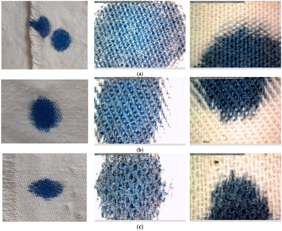
Figure 10.
Printing ink drop on Sample 1, Sample 2, and Sample 3. (a) Sample 1 (Plain weave 1/1). (b) Sample 2 (Twill weave ½ Z). (c) Sample 3 (Atlas weave 1/5).
The following was observed: despite the pretreatment of the surface of the textile material, it is possible to monitor the influence of the texture and structural parameters of the fabric based on the behaviour of the dye droplet. There is a difference in coverage, meaning the accumulation of printing ink in the spaces between the weaving points and weaker coverage on the upper surface points. A clear difference is visible in the form that a droplet of dye solution takes on a particular material, and clear differences between the samples can be observed. The form of capillary spreading of the dye droplet was also monitored.
Furthermore, a fluid and substrate interaction evaluation carried out on the piezoelectric inkjet device Dimatix Materials Printer DMP-2831 and including cyan reactive printing ink is shown in Figure 11.
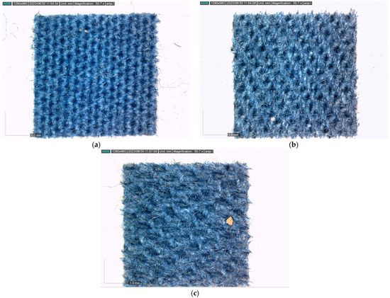
Figure 11.
The images of the printed form on the samples after testing on Dimatix. (a) Sample 1 (Plain weave 1/1). (b) Sample 2 (Twill weave 1/2 Z). (c) Sample 3 (Atlas weave 1/5).
In the final analyses, the behaviour of the ink applied to the fabric surface with the needle of the DSA20E tensiometer, Kruess GmbH, was examined, and the evaluation of the interactions between the liquid and the substrate were performed with the Dimatix Materials Printer DMP-2831 piezoelectric inkjet device. The analyses were performed for cyan reactive ink.
A microscopic image of reactive dye droplets on the surface of textile samples during measurement with the DSA20E tensiometer, Kruess GmbH, is shown in Figure 10.
A printing form is printed on the Dimatix device to contain individual circular elements. The microscopic image shows the printed shape on the surface. The following is observed:
- -
- The dots do not maintain their regular circular shape but spread out in a star shape;
- -
- An accumulation of ink is observed in the spaces between the weaving dots, and the colour characteristics differ from those of the upper surface dots of the fabric.
4. Conclusions
Textile materials are a fundamental part of contemporary architecture, environmental design, and urban spaces due to their unique appearance and qualities, as it is now possible to use textiles to achieve both a structural function and an aesthetic quality. As colour is one of the most important characteristics of a textile material, it is also crucial to understand the relationship between colour and objects, i.e., textile materials with different textures and surface qualities that consequently affect people emotionally, physically, and psychologically and the (built) environment.
The research presented in this paper confirms the complexity of the interaction of colour and the structure of the textile substrate. Looking at the results of the image analysis, when comparing fabrics of the same density, it can be seen that porosity is lowest for the fabric in Plain weave 1/1. In terms of texture parameters, Twill weave 1/2 has the highest contrast, indicating the highest roughness. Moreover, according to the roughness parameter Ra, Twill weave 1/2 has the roughest surface, and Plain weave 1/1 has the smoothest surface. The results of the objective values of the parameters lightness (L*), chroma (C*), and hue (h°) show the significant influence of the structure and properties of the substrate on colour reproduction, and significant changes were obtained, which were confirmed by the evaluation of the colour differences. The results confirm the influence of the substrate structure on colour properties. Furthermore, it is important to consider this complexity in the context of environmental colour design when (coloured) textile installations/materials are used in architecture, urban spaces, and the (built) environment.
In the digital printing process, a deeper understanding of these features is required to allow optimization of the process parameters and the prediction of possible errors and shifts in the colour properties of the print. This will allow better control of colour management in colour reproduction processes as digital technologies further develop and increase their influence on colour aesthetics and their effects.
Author Contributions
Conceptualization, M.G., Ž.P., P.F.T. and D.K.; methodology, M.T., M.G., Ž.P., P.F.T. and D.K.; validation, M.T., M.G. and Ž.P.; formal analysis, M.T. and I.S.; investigation, M.T.; resources, M.G., Ž.P., P.F.T. and D.K.; data curation, M.T.; writing—original draft preparation, M.T. and M.G.; writing—review and editing, M.T. and M.G.; visualization, M.T. and M.G.; supervision, M.G. All authors have read and agreed to the published version of the manuscript.
Funding
This work was supported by the Slovenian Research and Innovation Agency: P2-0105.
Data Availability Statement
The original contributions presented in the study are included in the article, further inquiries can be directed to the corresponding author.
Conflicts of Interest
The authors declare no conflict of interest.
References
- Bae, Jihyun. 2007. Color in Ink-Jet Printing: Influence of Structural Characteristics of Textiles. Ph.D. thesis, Graduate Faculty of North Carolina State University, Raleigh, NC, USA. [Google Scholar]
- Bae, Ji Hyun, Kyunghwa Hong, and Traci Lamar. 2014. Effect of Texture on Color Variation in Inkjet-Printed Woven Textiles. Color Research & Application 40: 297–303. [Google Scholar]
- Becerir, Behcet. 2017. Color concept in Textiles: A review. Journal of Textile Engineering & Fashion Technology 1: 240–44. [Google Scholar] [CrossRef][Green Version]
- Collis, Aileen, and Jacquie Wilson. 2012. Colour Accuracy in Digitally-printed Textiles: What you See is not (Always) what You Get. Journal of the International Colour Association 9: 20–31. [Google Scholar]
- Djonov, Emilia, and Theo Van Leeuwen. 2011. The Semiotic of Texture. Visual Communication 10: 542–64. [Google Scholar] [CrossRef]
- Gasparini, Katia. 2022. Digital hybridisation in Adaptive Textiles for Public Space. Textiles 2: 436–46. [Google Scholar] [CrossRef]
- Gooby, Becky. 2020. The Development of Methodologies for Color Printing in Digital InkJet Textile Printing and the Application of Color Knowledge in the Ways of Making Project. Journal of Textile Design Research and Practice 8: 358–83. [Google Scholar] [CrossRef]
- Gorji Kandi, Saeidah, and Mohamed Amani Tehran. 2010. Investigating the Effect of Texture on the Performance of Color Difference Formulae. Color Research & Application 35: 94–100. [Google Scholar] [CrossRef]
- Gorji Kandi, Saeidah, Mohamed Amani Tehran, and Mohamed Rahmati. 2008. Colour Dependency of Textile Samples on the Surface Texture. Coloration Technology 6: 348–54. [Google Scholar] [CrossRef]
- Hansen, Preben, Vesna Grujoska, and Milica Jovanoska. 2021. Textile as Material in Human Built Environment Interaction. In Rethinking Sustainability Towards a Regenerative Economy. Edited by Maria Beatrice Andreucci, Antonio Marvuglia, Milen Baltov and Preben Hansen. Cham: Springer, vol. 15, pp. 215–25. [Google Scholar] [CrossRef]
- Hladnik, Aleš, and Diana Gregor-Svetec. 2010. Assesment of Paper Surface Topography and Print. Paper presented at the ImageJ User and Developer Conference, Luxembourg, October 27. [Google Scholar]
- Huertas, Rafael, Manuel Melgosa, and Enrique Hita. 2006. Influence of Random-dot Textures on Perception of Suprathreshold Color Differences. Journal of the Optical Society of America A 23: 2067–76. [Google Scholar] [CrossRef] [PubMed]
- ISO 105-J03:2009. 2009, Textiles, Test for Colour Fastness. Part J03: Calculation of Colour Differences. Berlin: Deutsches Institut fur Normung E.V. (DIN).
- Kan, Cathy, and Marcus C. W. Yuen. 2012. Digital InkJet Printing on Textiles. Research Journal of Textile Apparel 16: 1–24. [Google Scholar] [CrossRef]
- Karunakaran, Gea, Aravin Prince Periyasamy, and Jiri Militký. 2022. Color and Design for Textiles. In Fibrous Structures and Their Impact on Textile Design. Edited by Jiry Militký, Mohanapriya Venkataraman and Arvin Prince Periyasamy. Singapore: Springer, pp. 119–48. [Google Scholar] [CrossRef]
- Khalili, Romina. 2019. The Role of Color in Sense of Place. Master’s thesis, Politecnico di Milano Faculty of Architecture and Urban Planinag, Milano, Italy. Available online: https://www.politesi.polimi.it/retrieve/a81cb05d-1955-616b-e053-1605fe0a889a/Romina%20Khalili%20-%20Thesis.pdf (accessed on 23 March 2023).
- Kumah, Charles, Raji Rafiu King, and Pan Ruru. 2020. Review of Printed Fabric Pattern Segmentation Analysis and Application. AUTEX Research Journal 20: 530–38. [Google Scholar] [CrossRef]
- Kuriki, Ichiro. 2015. Effect of Material Perception on Mode of Color Appearance. Journal of Vision 15: 1–13. [Google Scholar] [CrossRef]
- Lavery, Aidan, and John Provost. 1999. Color-Media Interactions in InkJet Printing. In Recent Progress in Ink Technologies II. Edited by Eric Hanson. Springfield: The Society of Imaging Science & Technology, pp. 400–5. [Google Scholar]
- Lee, Wonjoung, and Masako Sato. 1998. Study on the Perception of Texture Using Textile Fabrics. Journal of Physiological Anthropology 3: 27–34. [Google Scholar]
- Lee, Wonjoung, and Masako Sato. 2001. Visual Perception of Texture of Textiles. Color Research & Application 26: 469–77. [Google Scholar]
- Mankhe, Frank H. 1996. Colour, Environment and Human Response. New York: John Willey & Sons, pp. 5–76. [Google Scholar]
- McLellan, Galyna, and Mirko Guaralda. 2018. Exploring environmental colour design in urban contexts. The Journal of Public Space 3: 93–102. [Google Scholar] [CrossRef]
- Minah, Galen. 2008. Colour as Idea: The Conceptual Basis for Using Colour in Architecture and Urban Design. Colour: Design & Creativity 2: 1–9. [Google Scholar]
- Minah, Galen, and Antal Nemcsics. 2015. Environmental Color Design. In Encyclopedia of Color Science and Technology. Edited by Ronnier Luo. Berlin and Heidelberg: Springer, pp. 637–44. [Google Scholar] [CrossRef]
- Moussa, Ali, Daniel Dupont, Daniel Steen, and Xianyi Zeng. 2008. Colour change as a result of textile transformations. Coloration Technology 124: 234–42. [Google Scholar] [CrossRef]
- Osapoetra, Laurentis O., William Chan, William Tran, Michael C. Kolios, and Gregory J. Czarnota. 2020. Comparison of methods for texture analysis of QUS parametric images in the characterization of breast lesions. PLoS ONE 15: e0244965. [Google Scholar] [CrossRef] [PubMed]
- Park, Heungsup, Wallace W. Carr, and Jungyong Zhu. 2001. Interactions of a Single Ink-Jet Droplet with Textile Printing Surfaces. NIP & Digital Fabrication Conference 18: 620–26. [Google Scholar]
- Parraman, Carrina. 2017. Colour Printing Technoques and New Developments in Colour Printing. In Colour Design, 2nd ed. Edited by Janet Best. Manchester: Woodhead Publishing, pp. 589–618. [Google Scholar]
- Polston, Katherine, Lisa Parrillo-Chapman, and Margeurite Moore. 2014. Print-on-demand InkJet Digital Textile Printing Technology: An Initial Understanding of User Types and Skill Levels. International Journal of Fashion Technology and Education 8: 1–10. [Google Scholar] [CrossRef]
- Premier, Alessandro. 2020. Colour design of textile architectural envelopes: An initial study. Cultura e Scienza del Colore—Color Culture and Science 12: 25–31. [Google Scholar] [CrossRef]
- Salim, Flora, Jane Burry, and Jenny Underwood. 2013. Augmenting public spaces with live forms and fabrics—Integrating mechatronics and textiles to provoke social interactions in public spaces. Paper presented at the 18th International Conference on Computer-Aided Architectural Design Research in Asia (CAADRIA 2013), Singapore, May 15–18; Edited by Rudi Stouffs, Patrick Janssen, Stanislav Roudavski and Bige Tunçer. Singapore: Centre for Advanced Studies in Architecture (CASA), Department of Architecture, National University of Singapore, pp. 965–74. [Google Scholar] [CrossRef]
- Shao, SiJie, John H. Xin, Yang G. Zhang, and Liming Zhou. 2006. The Effect of Texture Structure on Instrumental and Visual Color Difference Evaluation. AATCC Review 6: 42–48. [Google Scholar]
- Smith, Dianne. 2008. Color-person-environment relationships. Color Research and Application 33: 312–19. [Google Scholar] [CrossRef]
- Tkalec, Marijana, Martinia Glogar, and Ana Marić. 2019. Interaction of Color and Surface in Decorative Textile Product Design. In Book of Proceedings of the 12th International Scientific—Professional Symposium, Textile Science & Economy, French—Croatian Forum. Edited by Ivan Novak, Ivana Schwarz, Ivana Špelić and Emilija Zdraveva. Zagreb: University of Zagreb Faculty of Textile Technology, pp. 29–41. [Google Scholar]
- Xin, John H., Hui-Liang Shen, and Chuen Chuen Lam. 2005. Investigation of Texture Effect on Visual Colour Difference Evaluation. Color Research and Application 30: 341–47. [Google Scholar] [CrossRef]
Disclaimer/Publisher’s Note: The statements, opinions and data contained in all publications are solely those of the individual author(s) and contributor(s) and not of MDPI and/or the editor(s). MDPI and/or the editor(s) disclaim responsibility for any injury to people or property resulting from any ideas, methods, instructions or products referred to in the content. |
© 2024 by the authors. Licensee MDPI, Basel, Switzerland. This article is an open access article distributed under the terms and conditions of the Creative Commons Attribution (CC BY) license (https://creativecommons.org/licenses/by/4.0/).


