Article

Evolution in Approach to Colour in Tall Buildings’ Architecture on the Isle of Dogs, London, UK

1
Department of Architecture, West Pomeranian University of Technology, Zolnierska 50, 70-310 Szczecin, Poland
2
Institute of Spatial Planning and Socio-Economic Geography, University of Szczecin, 70-453 Szczecin, Poland
3
Department of Health Psychology, Pomeranian Medical University, 71-460 Szczecin, Poland
*
Author to whom correspondence should be addressed.
Submission received: 13 September 2021 / Revised: 13 December 2021 / Accepted: 28 December 2021 / Published: 31 December 2021
(This article belongs to the Special Issue Color in Architecture: Theory and Practice)

Abstract

:
Architects’ approach towards colour in architectural design evolved radically in the recent 50 years, and ranges from a modernist aversion to a vernacular appreciation. These changes were linked to the development of culture, technology and scientific knowledge in different areas connected to human functioning. The authors have examined evolution in design of tall buildings in the Isle of Dogs in London (UK) since the 1980s. The area experienced major growth spurs in the turn of the 20th and 21st centuries, resulting in the greatest concentration of tall buildings in London today. The Island has been a playground for architects who have developed a range of approaches to the design of towers. The authors observed the evolution of architectural style, analyzed application of colour and made connections between scale, beauty and human behaviour. They concluded that colour in tall buildings’ architecture on the Isle of Dogs is predominantly used to disguise their massing. Colour detail facilitates the domestic feel of a public realm. Therefore, alongside decorative quality, and if considerately applied, colour may positively influence the quality of living and working environments.

1. Introduction

Definition of colour in architecture reflects two characteristics of materials: Variation of colour inherent to the material or applied colour (Thadani 2010). As such it is treated in theory of architecture as an intrinsic element of ornamentation, adding beauty, meaning and emphasis (Lewis 2008). In other words—a distinct art feature of buildings. Thadani (Thadani 2010) identifies decorative properties of colour as an element of architecture capable of triggering a human response regarding aesthetics, emotion, identity, memory and communication.
Porter (Porter and Mikellides 2009), however, points out that “People persist in seeking meaning from colour even where no meaning is intended, they find colour attention—catching, they expect colour to carry information and to some extent at least they tend to be emotionally aroused”.
The architecture of C21 tall buildings is predominantly driven by engineering excellence. After C20 searched for appropriate architectural detailing for buildings of rather monotonous basic prism form, new technologies opened gates for parametrical design, testing mega scale structural expressionism or even deconstructive experimentations. The architecture of skyscrapers entered new territories literally as Asian cities dominate in high buildings, and in terms of their aesthetics. Race for height was joined by iconic symbolism and experimentation with form, which Jencks describes as an example of Ground Zero in New York (Jencks 2005).
The objectives of the research are:
  • to review architectural styles of tall buildings on the Isle of Dogs in London from the 1990s of C20 until 2021,
  • to identify the role of colour in their design shaping their appearance, and in creating living and working environments in high density areas,
  • to identify drivers for change in use of hue in architectural expression.
The study covered all completed tall buildings on the Island, which has been an architects’ playground for decades, remaining in the avant-garde of tall buildings’ design in London. There has developed a range of approaches to the design of towers: From monumental inhabited sculptures made of steel and glass to high density living structural conglomerates.
Densification became a necessity worldwide and therefore even Europe embraces hyper-tall residential towers. The research focuses on tall buildings as emblems of contemporary global cities. The global pandemic highlighted relations between health and urban environment; therefore, authors added medical perspective to the analysis of colour in architecture in order to capture the ways tinted detailing could influence the living and working environment.
The article includes the description of methodology for the review of architectural style of buildings on the Isle of Dogs, results of this detailed research can be found in the Appendix A and Appendix B. The results were summarised in two groups referring to the chronologic phases of the development on the Isle, in a form of detailed highlights on examples illustrating major trends. The discussion focuses on aesthetic, psycho-physiologic, architectural and technologic drivers for the registered designs, referencing the current state of knowledge. Conclusions go over the main research findings and outline potential directions for future application of colour in the architecture of tall buildings.

2. Materials and Methods

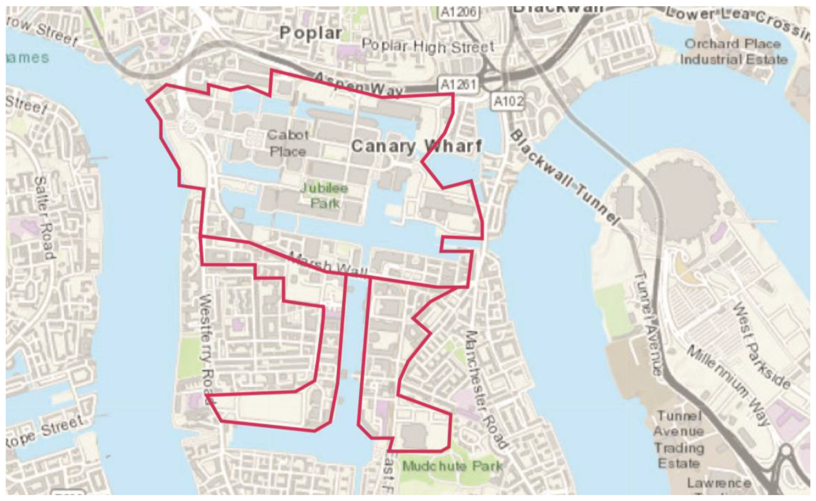
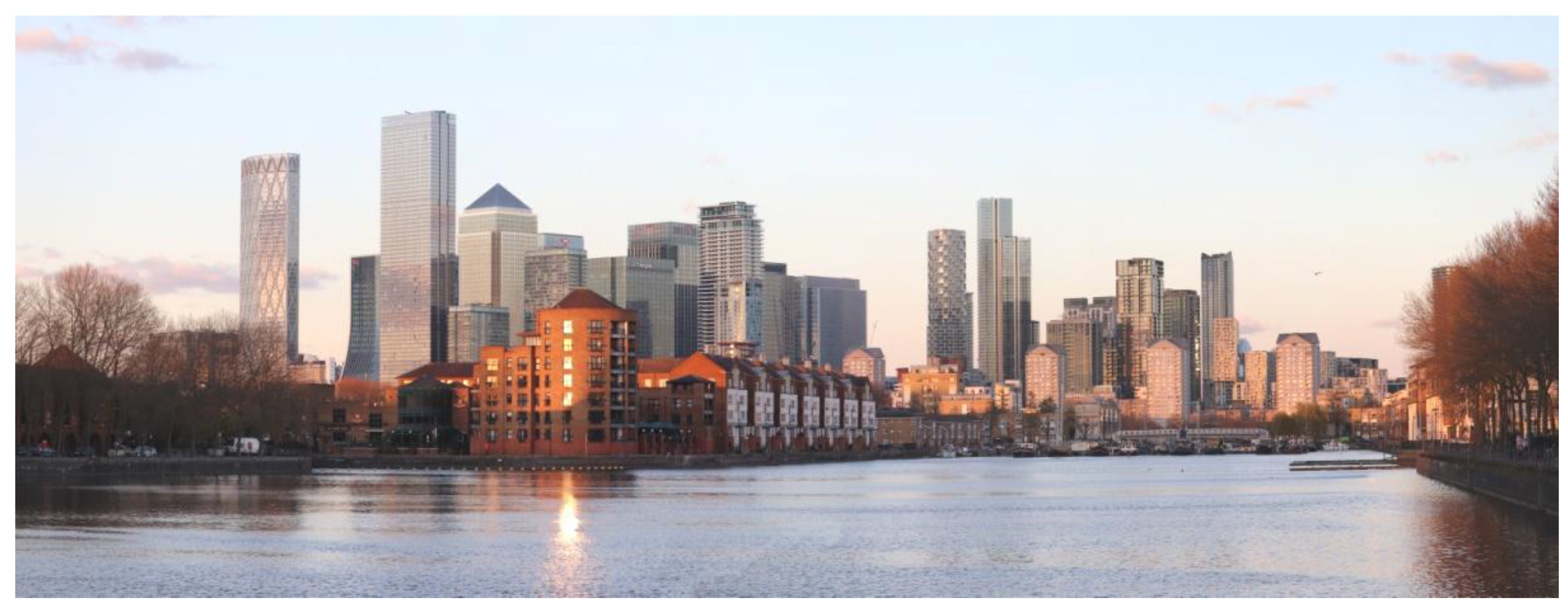
The research focussed on detailed analysis on all tall buildings in the area of tall buildings’ clusters on the Isle of Dogs (Figure 1). The tall buildings’ zones were identified in (London Borough of Tower Hamlets 2020a).
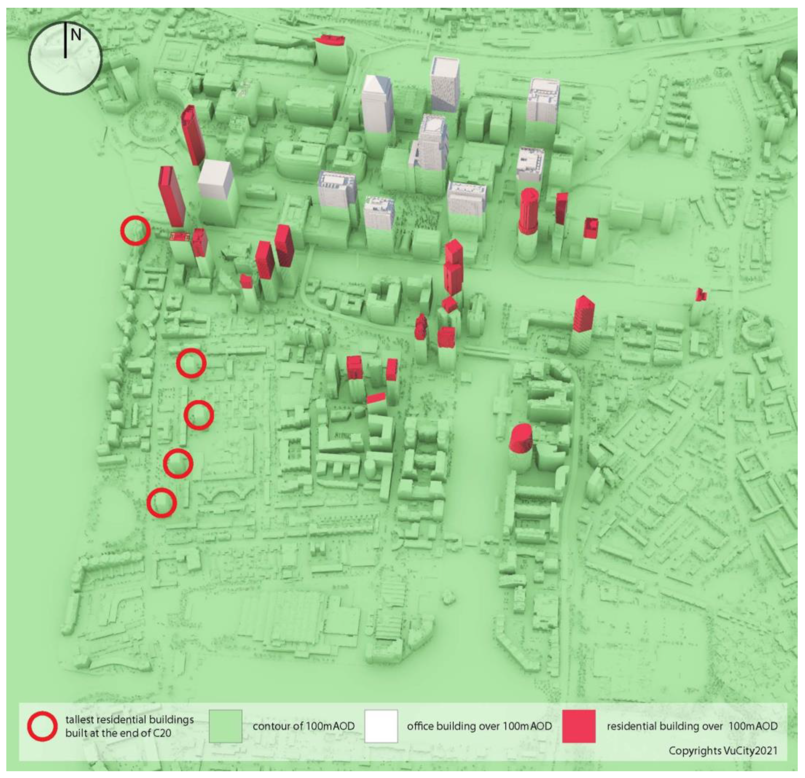
The sample set includes all buildings over 100 m AOD existing in the Isle of Dogs area in London, UK (Figure 2). There are nine office led buildings, eight constructed in C20 and one in C21; and twenty one residential use led buildings, all constructed in C21. Additionally, as a reference for the architecture of residential buildings in C20, the four tallest blocks of flats from that period were selected: Grade II Listed category lists Cascades and three towers in the Barkantine Estate.

2.1. The Criteria for Assessment

In order to assess the role of colour in architectural expression and in shaping high density built environment, the assessment focussed on the following parameters: Use, typology of form, key architectural detailing, applied materials and colour and presumed purpose of applying colour in the building based on observations.

2.1.1. Typology/Form/Composition

The analysis indicated the predominant use of the building.
Typology of tall buildings is based on the classification adopted by the London Borough of Tower Hamlets (London Borough of Tower Hamlets 2020b) which identifies the following types of tall buildings: (a) Stand alone tower, (b) tower on podium, (c) perimeter block with tower, (d) interlinked tower and (e) extruded block.
Descriptions of the form relate to their base geometric form, additional comments refer to variations to their base shape, which can refer to sections of the building or to the whole mass in its entirety.
Composition comments refer to the key large scale elements of the building’s composition. Usually buildings have horizontal structure made of: Base, middle and top. However in the Isle of Dogs there are also buildings composed as one entity, with vertical composition or without definition of the top.
All the above elements of the analysis allow for a formal description of an architectural style, as well as to identify components directly impacting its perception at the ground level and those requiring some distance to be appreciated.

2.1.2. Key Architectural Detailing

The review of architectural detailing focuses on large scale detail such as: Articulation of the key elements of the buildings’ composition, large scale facade decorations and structures, articulation of openings, design of base and top sections.
Type of detailing applied can indicate the key audience for the design. Similarly, as in case of the architectural form and composition, some details are designed to impress or guide at the human level; others look for landmark status with large scale details recognisable from afar.

2.1.3. Material and Colour

The study identifies materials and colours used. Where colour was intrinsic to the material and where it was applied through technological processes was distinguished.
Evolution in applying colour goes hand-in-hand with the introduction of new materials, shaping the image of the building (and their occupiers) in the skyline. A wider range of materials opens up more avenues for artistic expression, including application of colour.

2.1.4. Use of Colour

There were identified apparent objectives for the application of colour in a building’s architecture. There were decorative and utilitarian reasons considered. The assessment was based on the researchers’ observations in the context of earlier inventories of an architectural style’s components in individual buildings. They were assessing how application of colour affects composition of the building as a whole, perception of particular elements, responsiveness to the surroundings, highlighting particular decorations, affecting legibility and wayfinding around the building.

3. Results: Evolution in the Approach to Colour in Tall Buildings’ Architecture on the Isle of Dogs (London)

The Isle of Dogs is an area of East London within the London Borough of Tower Hamlets. It was a part of the industrial drive to success in C19 and at the beginning of C20. Changes in economic environment and technology in the second half of C20 induced regeneration of docklands in London as a whole, with specific attention to creating a new financial centre in Canary Wharf, located in the northern section of the Isle; (Pevsner et al. 1998; Al Naib 1998). The Isle of Dogs remains the largest collection of tall buildings in London, with its skyline recognized as being of strategic importance in the Local Plan 2020 (London Borough of Tower Hamlets 2020a).
The approach to colour in architecture on the Isle of Dogs (London) evolved in two major phases: The docklands’ regeneration at the turn of C20 and C21 and the residential intensification period after 2010. They differ in terms of approach to urban design as well as architecture. The area was in the avant-garde of tall buildings in London during both phases.

3.1. C20 Regeneration of Docklands

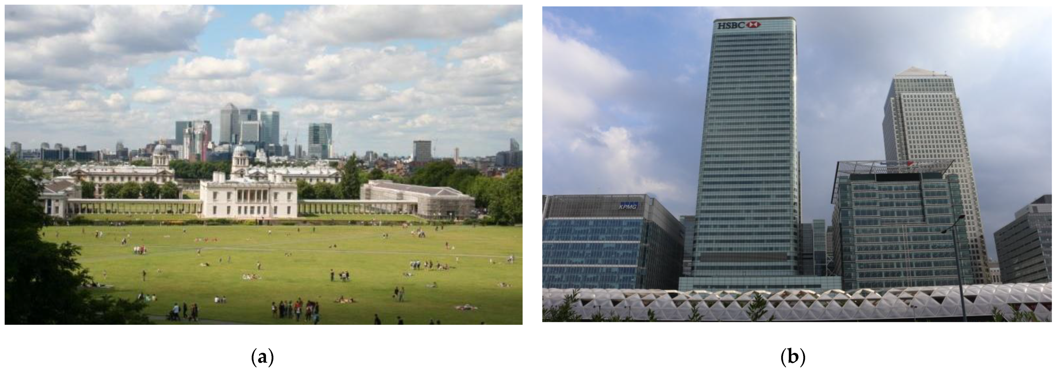
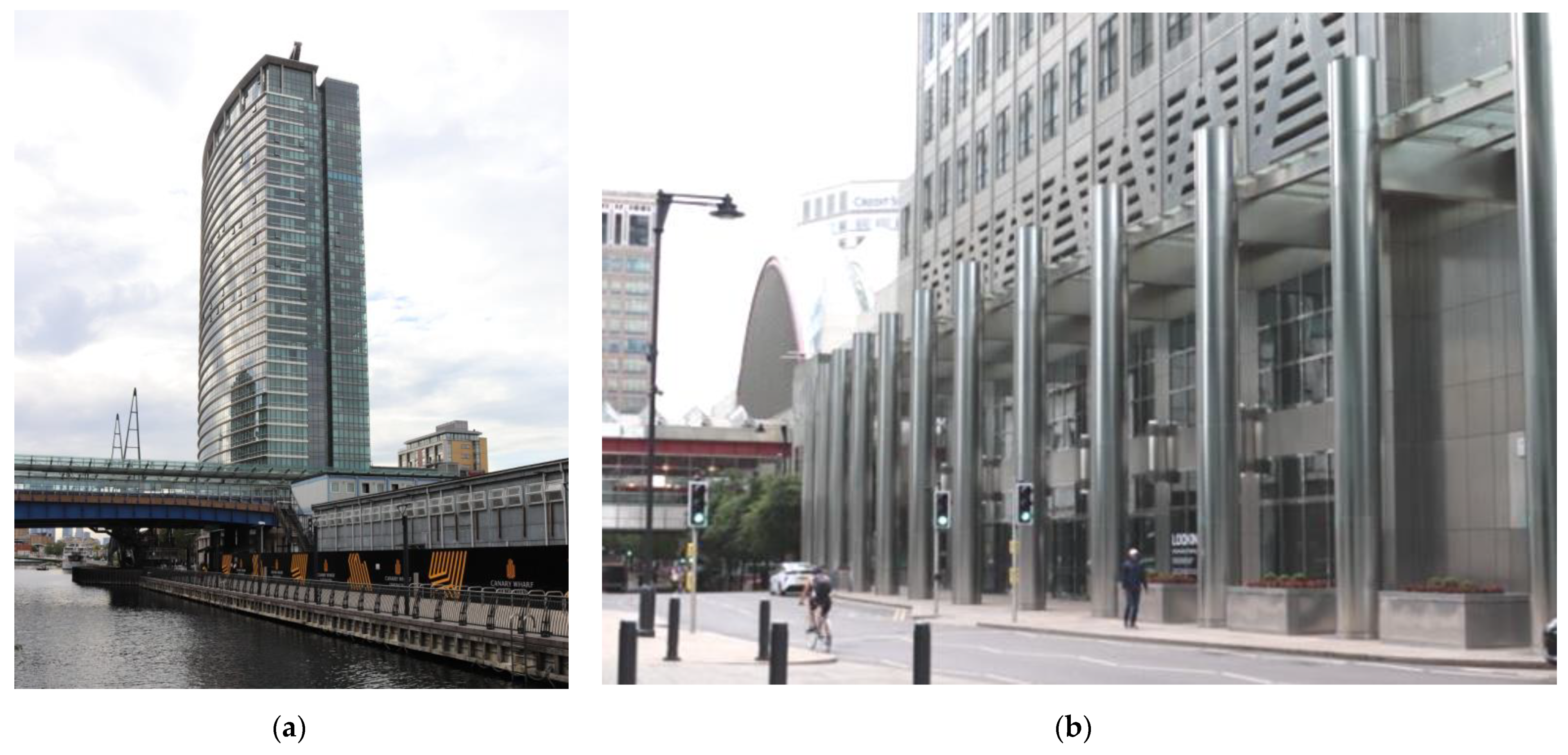
The first big investment spur in the Isle of Dogs was driven by the concept of the new global financial centre in London, reflecting on its ability to expand and modernise. The Enterprise Zone established in 1982 (Al Naib 1994) introduced relaxed planning controls allowing for the expansion of tall buildings, but imposed homogenous, commercial land use. Residential buildings in the south precede the office cluster between the North and South Docks. Office towers were significantly taller than any residential building and dominated the skyline (Figure 3) In this period.
Table A1 of Appendix A provides information about use of colour in tall office buildings from the first phase of the regeneration on the Isle of Dogs. Table A2 includes data regarding use of colour in tall residential buildings from the same period. Those detailed analyses resulted in the conclusion that the approach to colour and material in the architecture of this period differed depending on the use of the buildings:
  • Office buildings’ design was predominantly based on colour inherent to material; reflective properties of glass and steel dominated in the palette (Table A1).
  • Residential buildings were designed with active use of colour applied to the material; the palette was earthy and toned (Table A2).
The architecture of the initial docklands regeneration was driven by post-modern aesthetics—however, with limited use of colour palette. Some examples have been recognised in 2018 by Historic England with the status of Grade II Listed Buildings (Anon 2018a). The list of new designations includes the Cascades which are in the scope of the research. The other post-modern building with the Grade II Listed status is the Isle of Dogs Pumping Station, designated in 2017.
Whilst the Canary Wharf financial centre was built a few years later than flagship examples, post-modern inspirations informed the design of office towers in the area. What is interesting, the post-modern playfulness was delivered using a limited range of material and colour. It was predominantly expressed through the design of architectural detailing. Active exploration of reflective properties of glass and stainless steel results in changes to the buildings’ appearances in the rhythm of sunlight and weather.

3.1.1. Colour-Morphosis of Office Buildings

The creation of the extension to London’s global financial centre outside of the City was driven by aspirations to demonstrate the progressive, daring spirit through architecture monumental in scale and high tech in design. The commercial section of the Isle of Dogs—Canary Wharf—was a home to the very first cluster of tall buildings in London, with the iconic One Canada Square building providing pan-London, formerly even global, legibility of the area. Due to its dominant scale, the building was visible from multiple corners of London, including bridges of the River Thames and Greenwich World Heritage Site.
As presented in Table A1, the office towers were designed as a single slick form of gridded skins with minimum or large scale ornamentation. The majority of buildings from that period are composed along with the horizontal composition: The top–middle–base. Windows are part of the elevations’ skin, without formal recognition through detail. Projecting mullions to curtain facades relate to the whole facades rather than individual openings. Architects employed to design Canary Wharf towers were key global players of that era: Cesar Pelli Associates, KPF Associates and Foster & Partners. They had already been experienced in designing tall buildings in the USA and Asia; therefore, some of their buildings have clear inspirations in an international style, and all of them represent a rather conservative approach to the architecture of skyscrapers. The form of the buildings is predominantly cuboid on rectangular footprint, architectural detailing is of a large scale, the colour palette is highly reflective and includes glass with a variety of shades of blue, silver of stainless steel, earthy tones of natural stone and subtle black metal work.
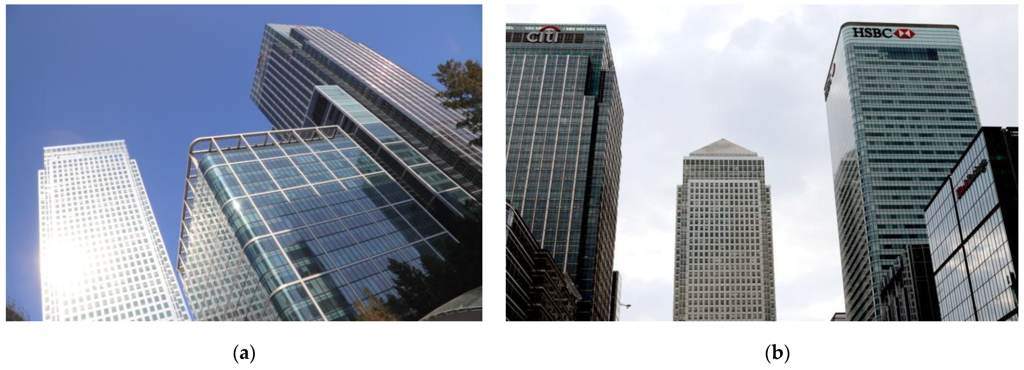
One Canada Square and a stone cladded section of 40 Bank Street buildings are the only two formally outlining window openings. They are bare punctuations in solid facades, free from any additional detailing. In the case of One Canada Square the colour contrast between the flushed metal facade and glass of windows creates a relatively flat pattern. In the case of 40 Bank Street, slight recesses emphasise those punctuations and amplify the illusion of hollow openings in certain lighting conditions. Due to the regular grid of rectangular glazing fit into the, respectively, stainless steel and stone facades, they read more like a wall texture than actual openings (Figure 4).
Colour on the office buildings of the initial period is predominantly inherent to the material and therefore intrinsic to architectural detailing with its three-dimensional nature. The use of glass and stainless steel was promoted to highlight the contemporary nature of the place, but also softened the appearance of those tall buildings through the reflective properties of those materials. Large plates of glass work like mirrors duplicating external environments, changing colour with weather. Tinted glass panels and ascetic steel ornaments are applied to add finer grain and texture to the otherwise monolithic facades. Daylight almost paints steel detailing in contrast to the building’s skin (Figure 5).
Different reflectivity properties of buildings’ skins and architectural detail result in contrasting colour combinations transforming in a daily rhythm of the sunlight, seasonal and impromptu weather variations. Daylight and related shadows also play an important role in the colour transformations of the buildings (Figure 4). Different reflective properties of glass and metal in combination with the diverse geometry of metal detailing create additional interest and colour combinations following daylight pace (Figure 4). A variety of form results in fluidity of colour despite the same material being applied.
The architecture of office towers built during the first phase of Canary Wharf development achieve colour predominantly through the use of different material, rarely through applied colour. Designers actively use large scale details for encouraging play of colour induced by sunlight and weather conditions. Bases of the buildings through the use of transparent glass, recesses securing shadows that reduce their reflectivity create an illusion of seamless connections between the public realm and lobbies. Openings are usually not formally distinguished; there dominate floor-to-ceiling curtain walls. The reflections on the main facades visually reduce massing; however, pronounced tops of buildings, usually finished with non-reflective material, prevent visual blending of the buildings with the sky.

3.1.2. Colour Marked Identity in the Tall Residential Buildings from C20

Residential buildings on the Isle of Dogs were delivered at the beginning of the radical regeneration of London’s docklands. Buildings were predominantly of a low to middle height, and also included terraced and semi-detached houses. There were five large buildings constructed in C20 in this area, four of them were considered in this study (see Table A2 in Appendix A). They represent a modest post-modern aesthetic.
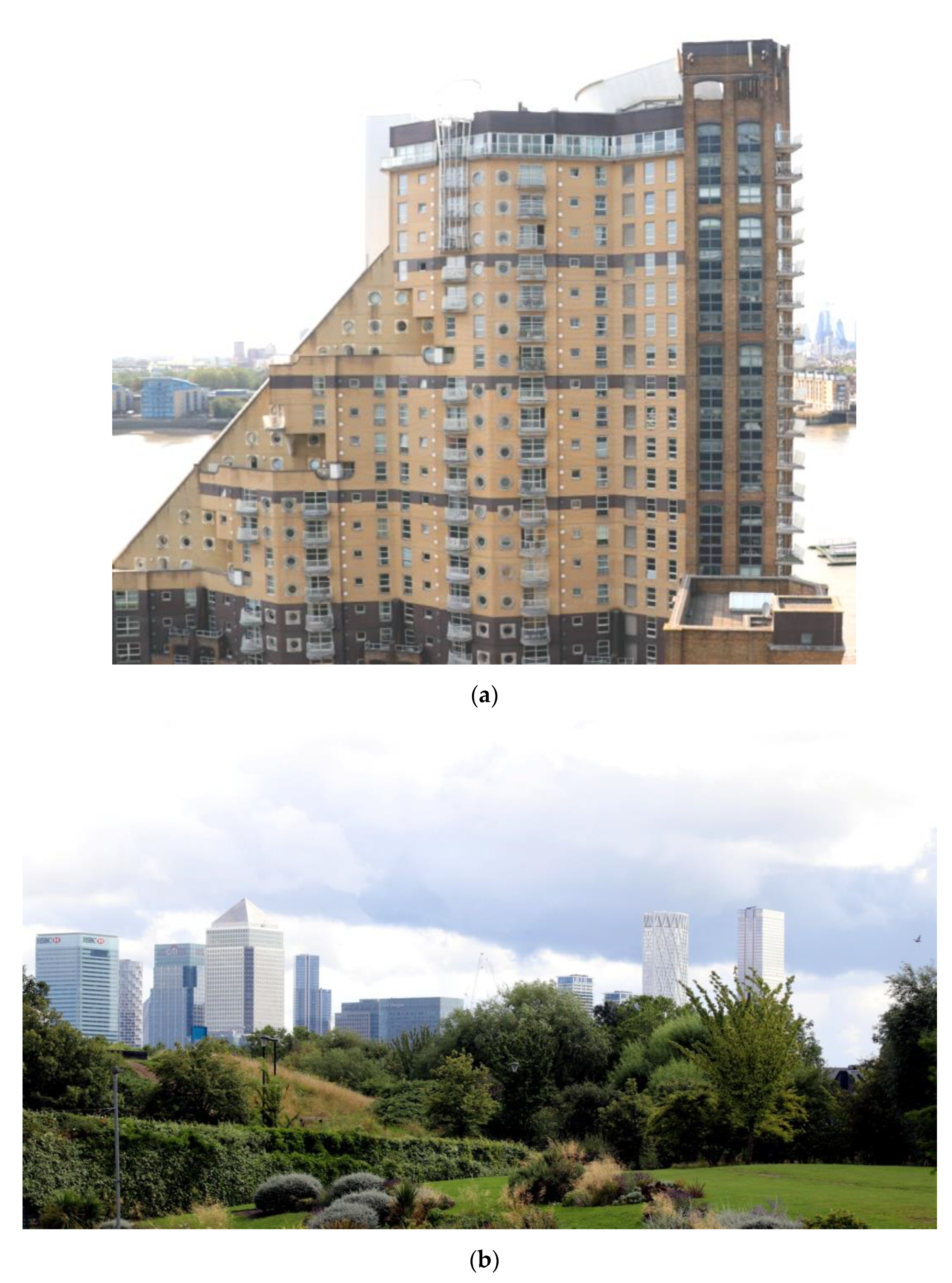
The only tall residential building from that period is the 22 Hertsmere Road (Figure 5a), which operates as serviced apartments. The aesthetics of this building has very strong references to office towers, and the curvature of the southern facade seems to reflect on a different use. There are no other formal indicators that this is a residential building.
The large proportion of housing delivered in the first phase of the docklands’ regeneration was affordable rental homes run by public bodies. London County Council played an active role in delivering housing on the Island. Architecture of those residential estates was predominantly low to medium rise. However there were three tower blocks delivered by London County Council as part of Barkantine Estate in the 1980s (Figure 6b). They are of an identical design, distinguished by different colours of the brick cladded plinths. It was recognised that colour may be very useful in wayfinding and potentially support residents’ sense of belonging. They are characterised by an ascetic articulation of openings, predominantly through slight recesses and white window frames contrasting with darker colour of rendered walls. Ironic crossed pitched roofs reflect on their residential use.
The Cascades is a private residential building designed by CZWG architects. When built, it was the tallest residential building on the Island. The quality and innovation of its post-modern design was recognised by the statutory listing (Historic England 2018). Slightly differently to other post-modern examples, the colours applied are toned town and earthy, with low saturation. The contrast of brightness is the key component of its rich-in-detail architecture. White colour is applied to accentuate subtle details of metalwork and to highlight the top elements: The staircases and slope of the roof light. The dark banding introduces the rhythm and order concerning facades rich in irregular decoration.
Residential buildings of the regeneration’s first phase were designed with different materials, and architects actively used applied colour to emphasise buildings’ hierarchical composition. Openings are well defined and contrasting frames play an integral decorative role.

3.2. C21 Residential Intensification

The London Plan 2005 put the London Borough of Tower Hamlets at the forefront of delivering ambitious housing targets for London. Tower Hamlets’ Local Plan adopted in 2011 recognised opportunities for the construction of residential tall buildings in and around the office cluster of Canary Wharf. By 2021 eighteen residential towers of height over 100 m were completed, providing over 16,000 new homes. In the same period there were only two more office buildings and one hotel of a similar scale constructed.
Table A3 of Appendix B provides information about use of colour in tall non-residential buildings from the second phase of the regeneration on the Isle of Dogs. Table A4 includes data regarding use of colour in tall residential buildings from the same period. Those detailed analyses resulted in the conclusion that the approach to colour and material in the architecture of this period can be characterised by three trends:
  • Use of applied colour on office buildings to highlight key mega features of their elevations, potentially making those elements visually independent from lighting conditions;
  • Adaptation of office buildings’ architectural language to residential towers, reflecting on different use by introduction of more playful interaction with daylight and finer grain of facades;
  • Introduction of applied colour to the large scale and finer grain architectural detail, active use of colour to break down large masses of buildings into smaller, more human scale sections.
The range of architects employed to design residential towers included experienced and tested studios like Foster & Partners, SOM, KPF, but significantly expanded with Stirling Prize laureates like Herzog & de Meuron, Stanton Williams; and British notable teams including RIBA awards laureates such as: Glenn Howells Architects, Simpson Haugh Architects, Squire & Partners, Make Architects; and award-winning multidisciplinary collectives like, BUJ Architects, GRID Architects, Rolfe Judd Architecture. A variety of designers translated into a variety of designs and approaches to architecture of tall buildings. They all wanted to display their individual style and deliver the best quality. The first phase practices such as Fosters & Partners, KPF, were challenged and forced to experiment with form and colour. New types of tall buildings emerged on the Isle of Dogs.
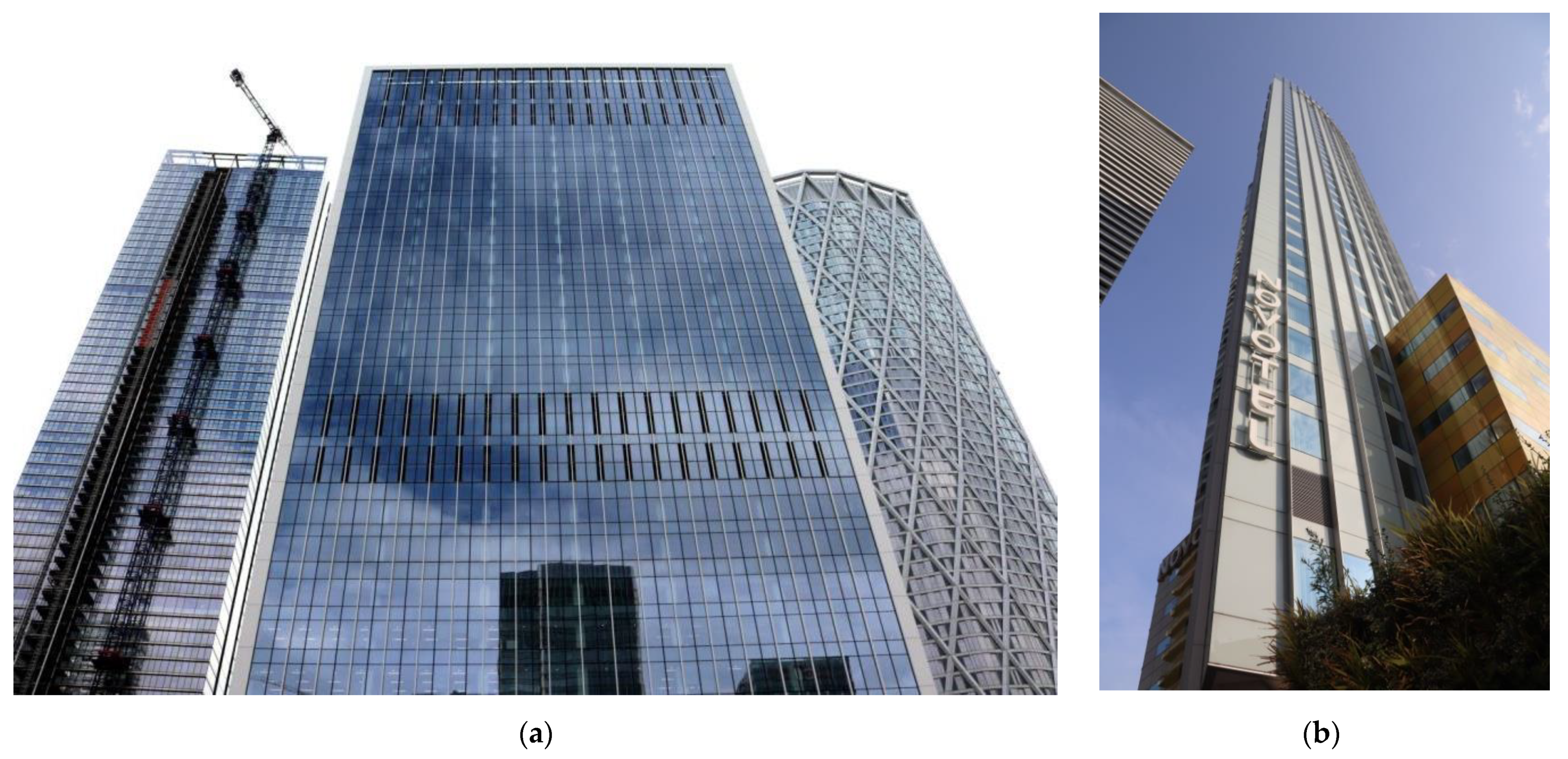
Figure 7 demonstrates similarities in approach to colour between residential towers’ line Landmark Pinnacle, Landmark, Newfoundland and office buildings from the first phase of regeneration. In cloudy weather their mix of reflective glass and metal on elevations seem to blend into the grey sky. Visual definition of their massing, especially when high iron glass is applied, softens and becomes a natural background to buildings with a much stronger colour sharpness such as Cascades or 1 Bank Street.
The inherent colour of glass also matters. Large sheets used to have more green hue. Nowadays many architects and developers decide to invest in low-iron glass which is more neutral in tone and often appears blue in specific natural light conditions. This can be observed most starkly when buildings of 1 Bank Street or Newfoundland are compared with 8 Canada Square and Landmark on Figure 7.

3.2.1. Experimenting with Applied Colour on Non-Residential Tall Buildings

Architects of buildings from the second decade of C21 began experimenting with colour. While there have only been three non-residential towers delivered since 2010, both mark new paths in architectural expression and approach to colour. Paint is actively applied to visually distinguish key elements of the overarching composition (Table A4). Three examples from this group represent different paths of colour try-outs: From highlighting striking forms of the building, through strong interaction with the public realm to visual deception.
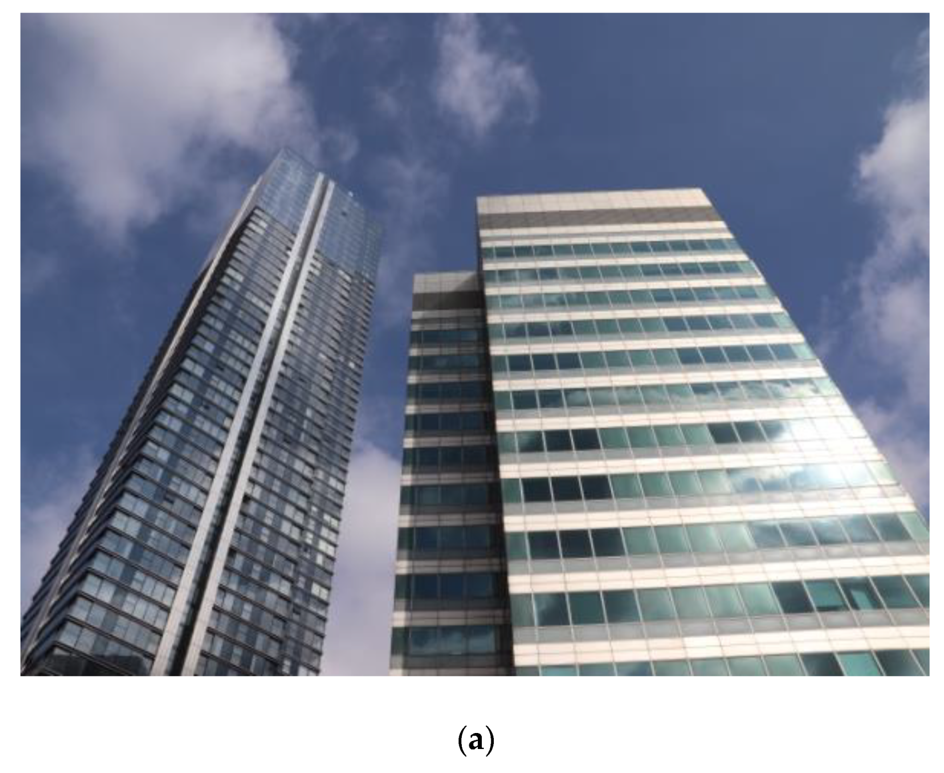
White frame wrapping corners of facades on the Bank Street’s office building by KPF provide visual crispiness to the edges and distinguished palette of blue reflections on the western elevation achieved through natural blue glass properties and shape of the elevation. The reflectivity of a parabolic wall is more varied than of the vertical homogeneous ones as on office towers. (See Figure 7). The rhythms of white short white fins sparsely mark northern and southern facades, delivering playfulness in certain lighting conditions which are missing on the surrounding residential towers of Landmark Pinnacle and Newfoundland (Figure 8a).
Similarly 30 Churchill Place’s design by the same architects actively uses thick white frames wrapping some corners of building facades to emphasize the form of the building. The form appears as an imploded set of facades. Trapezoid shapes distinguished by colour and amplified by shadows of recesses on the corner create a subtle deconstructive impression on the building which is effectively a regular cuboid on a rectangular footprint.
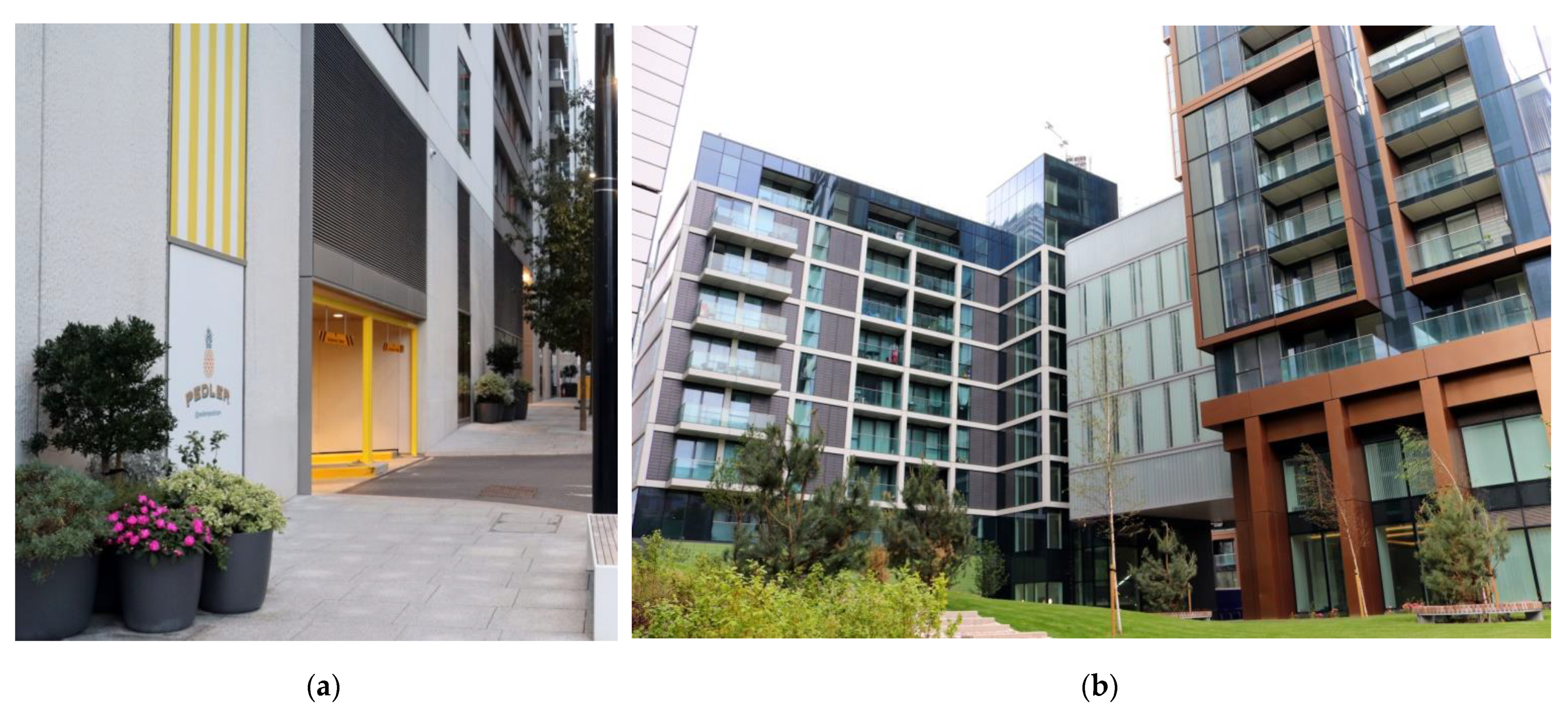
In the case of Novotel at 40 Marsh Wall, formally non-residential use encouraged architects to experiment with the form of the building and colour. Saturated yellow glass panels on the podium (see: Figure 8b) in combination with sculptured columns of the forecourt create a distinctive experience at the human level, with high legibility and sense of arrival. Curtain walls of facades have a significant proportion of white back-painted panels which further distinguish the building in the skyline by its more opaque facades.
The use of colour on non-residential towers built after 2010 is playful, applied colour became an ingredient in architects’ palettes. In general colour is used with careful consideration and white detailing seems to prevail. More daring paint choices were set on podiums, where wayfinding and pedestrian experience plays an important role. Skyline profiles became crispier in every lighting condition (Figure 7).

3.2.2. Glass Sculptures for Living

One of the trends in the design of residential towers post 2010 is an adaptation of office architectural language to domestic buildings, delivering mega sculptures where granulation of individual homes is unrecognizable. There are two trends within this group: One where the homogenous form of the building is wrapped with a glass skin, bare or overlaid with a structural pattern. In this instance, the colour of the facades depends on lighting conditions. The second trend is based on the articulation of balconies as super details, where colour contrast between balustrades and recessed elevations is fixed by the use of opaque material coordinated in colour with glass facades and mullions (Table A3).
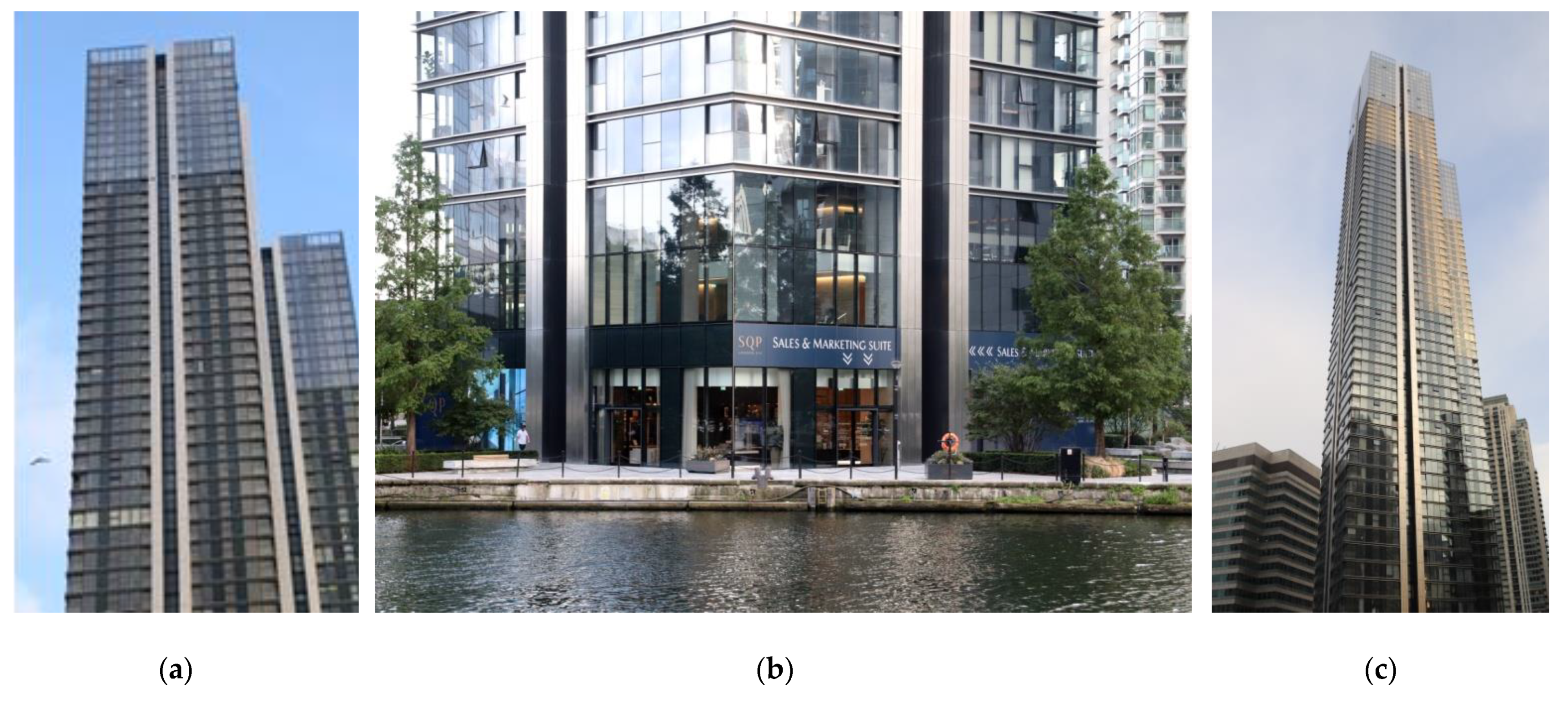
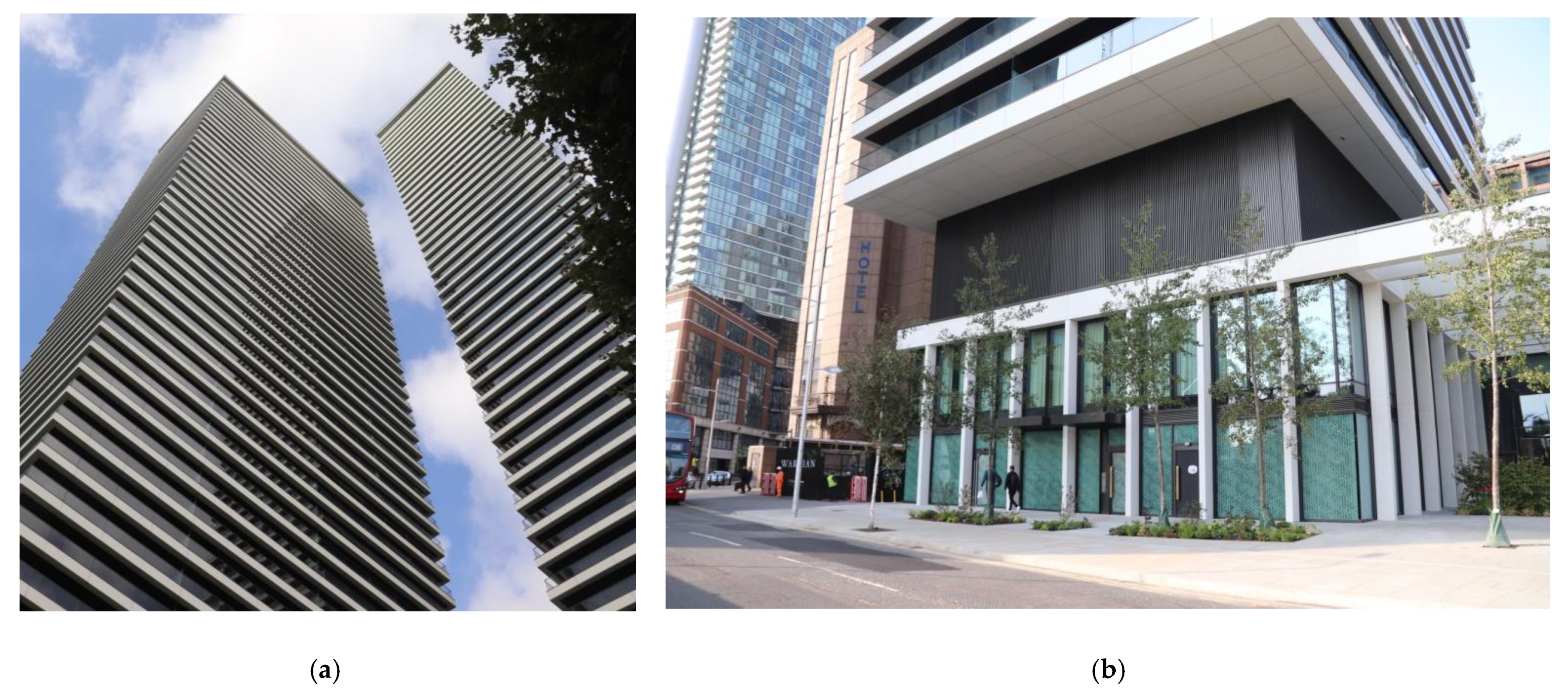
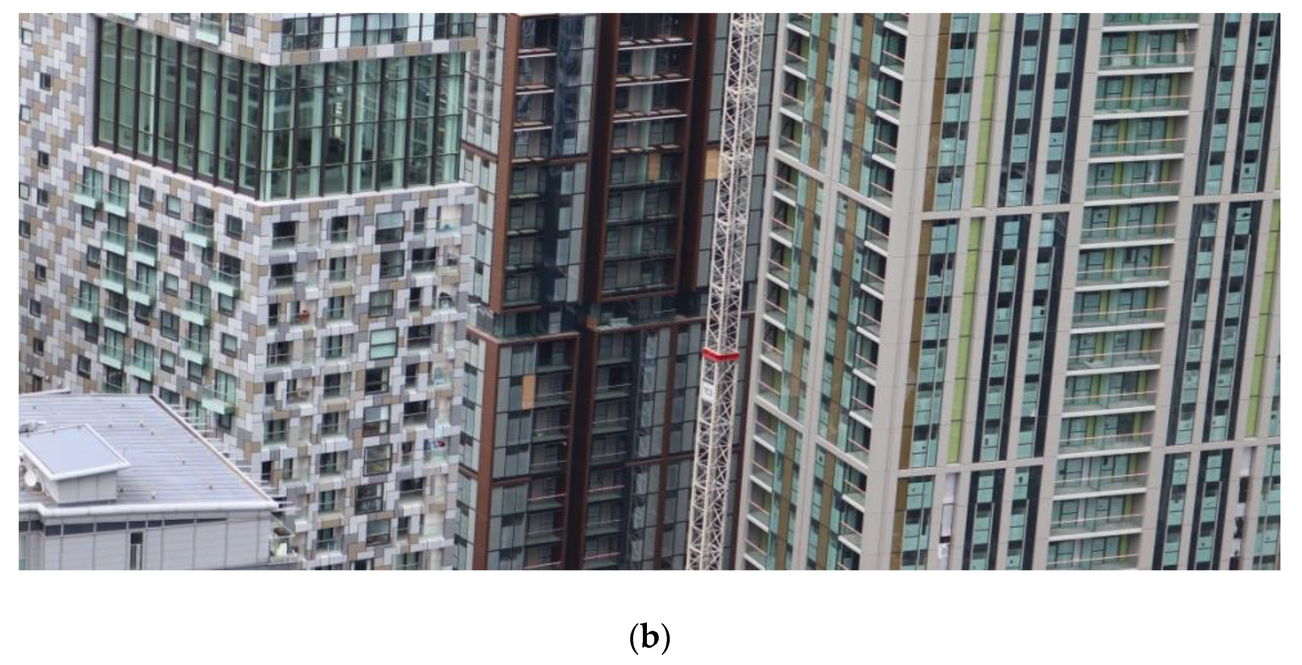
Evolution of glass towers, where sheer glass is the main feature spans from the glass rectangular prisms with minimum detailing such as Landmark Pinnacle (Figure 8a) or South Quay Plaza (Figure 9a) where vertical dilatations are the only decorative elements apart from the pattern of protruding or concealed mullions of curtain walls (Figure 9b). Architects from Foster & Partners strengthened the visual impact of this feature by wrapping the corners of the shadow gap with stainless steel. The colour contrast between glass and metal is supplemented by the always present shadow within the narrow but deep recesses. Winter gardens in lieu of balconies are designed to blend into facades. They are recognisable only if opened, again adding contrasts to the surrounding glass with overshadowed hollow openings appearing randomly on facades.
Glass buildings like Newfoundland by Hudson Cherry Lee Architects or The Madison by Make are additionally wrapped up with the regular pattern of superstructure diaframe (Figure 7 and Figure 8a) and projecting white undulating vertical fins throughout the whole height of the building. Bright colours of those patterns stand out on sunny days in particular.
It is worth highlighting examples of purposefully employing sunshine to define architectural detail on their buildings. In the more conservative design of South Quay Plaza, the crown of the building is outlined by the disappeared texture of cladding (Figure 9a). Smooth surfaces visually disappear in some lighting conditions where strong lines of vertical shadow gap with colour amplified by sunshine come to the foreground (Figure 9c); it appears like they are almost stand-alone features projecting over the mass of the building.
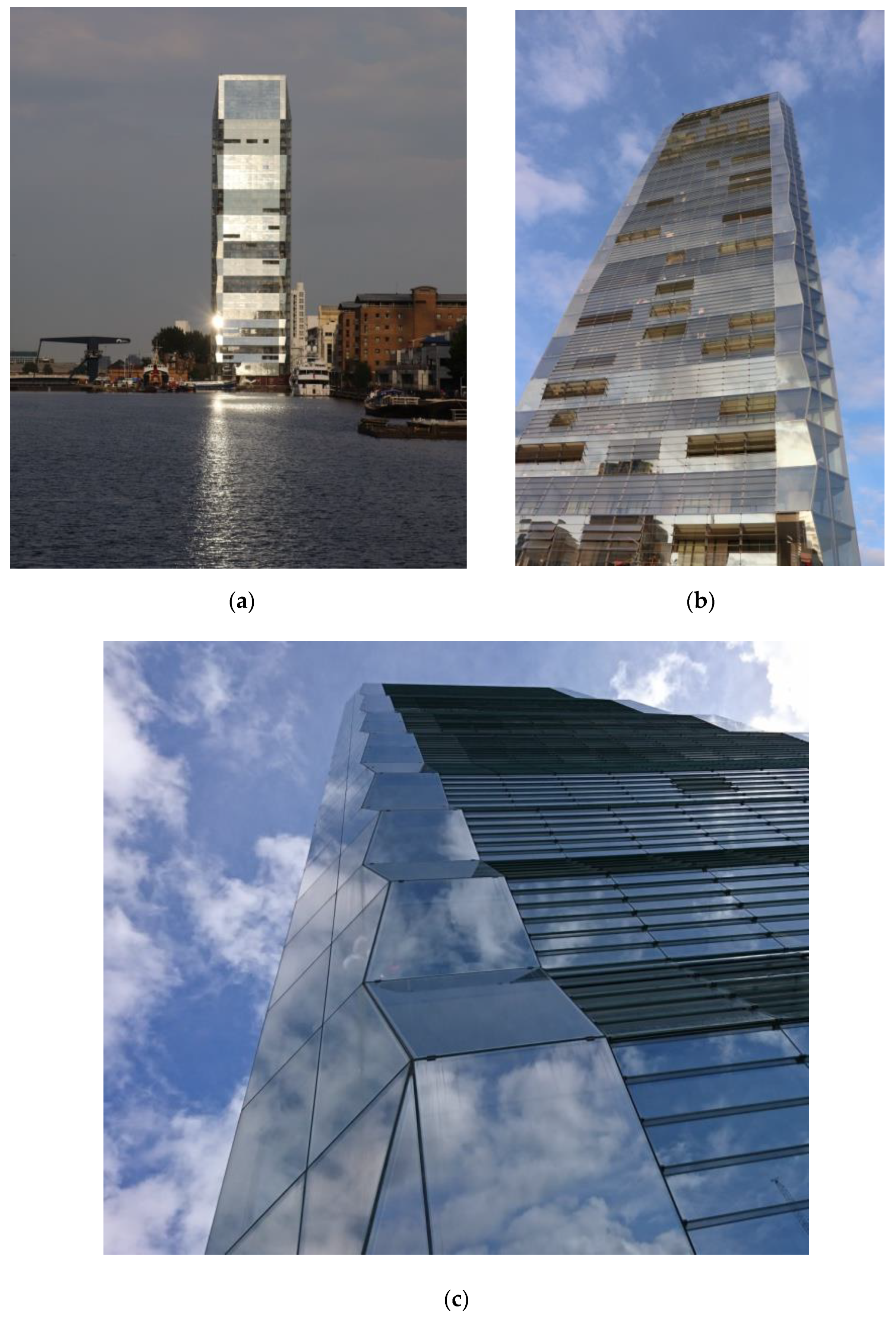
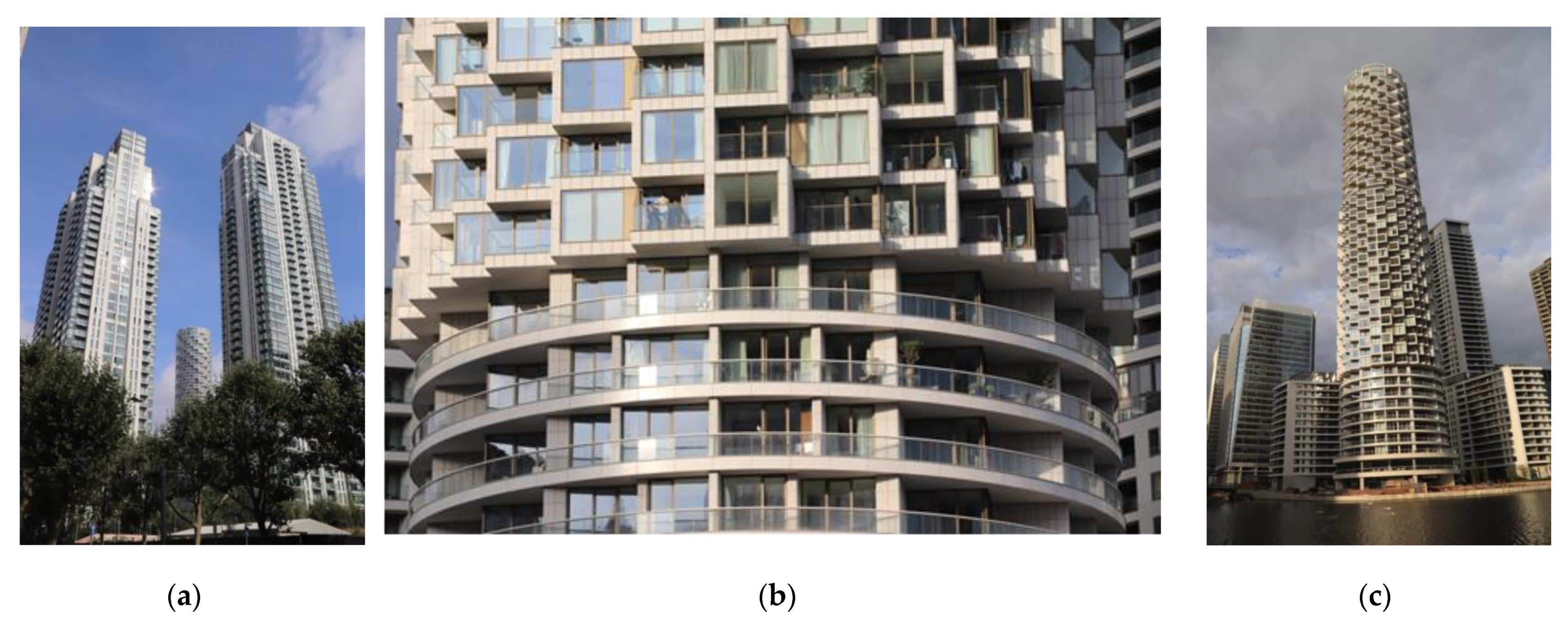
An outstanding example of sunlight-activated architecture is One Dollar Bay by Simpson Haugh Architects (Figure 10c). The building form is sculptured to maximise the benefits of ephemeral sunlight painting. Undulating eastern and western facades reflect light under different angles; randomly opened louvers of winter gardens deliver a pattern of dark rectangles subtly domesticating this One Dollar Bay. With changing the colour of the sun the colour range includes: Shades of white, palettes of gold and grey, variety of blues. Despite the variety of colours applied, expressive buildings like One Dollar Bay and Newfoundland maintain their formal integrity. Colour plays a decorative role as opposed to previous examples where colour is used to create visual illusions and highlights of particular detailing.
The next step on the evolution of glass towers for living is using projecting ribbons or glass curtain walls and balustrades to define the buildings’ homogenous forms. Similarly to previous examples, sunlight is a colouring factor. In the case of Baltimore Wharf by SOM hovering doughnuts of balconies form an organic twisting tower. The depth of those terraces delivers shadow on curtain wall facades. A combination of void between the floor plates and dark grey glass sheets of balustrades, intensified by the light reflections, makes the structure almost appear as it were dancing (Figure 11a). The application of semi-transparent floor panels between beams of the concrete structure adds not only a variety of colour, but also reduce the visual massing of the building (Figure 11b). This lightness can be predominantly appreciated in plain light and close views.
Baltimore Wharf is a single form slightly elevated over the ground by the level zero being recessed whilst of a similar height as any other storey. There is no formal accentuation of the base as such. A different approach was applied by Glen Howells Architects in their interlinked prisms of the Wardian. They delivered a static composition of rectangular plates hovering one above the other and they actively use colour to intensify this illusion (Figure 12a). There is colour contrast between thick plates in slightly glittery cream, colour contrast with dark brown corrugated soffits and overshadowed glass. Whilst the depth of balconies is not as impressive as in the case of Baltimore Wharf, colour assists in the visual detachment of horizontal stripes.
Similarly colour contrast was applied to paint a separation, almost hovering, of the main mass of the building from the podium. The light colour of the podium structure synchronises with public realm surfacing and allows for visual flow between footways and the interior (Figure 12b). Dark vertical louvers of the technical section above the base in combination with recess and colour contrast deliver human scale at the public realm level.

3.2.3. Return of Domestic Detail and Applied Colour in Residential Tall Buildings

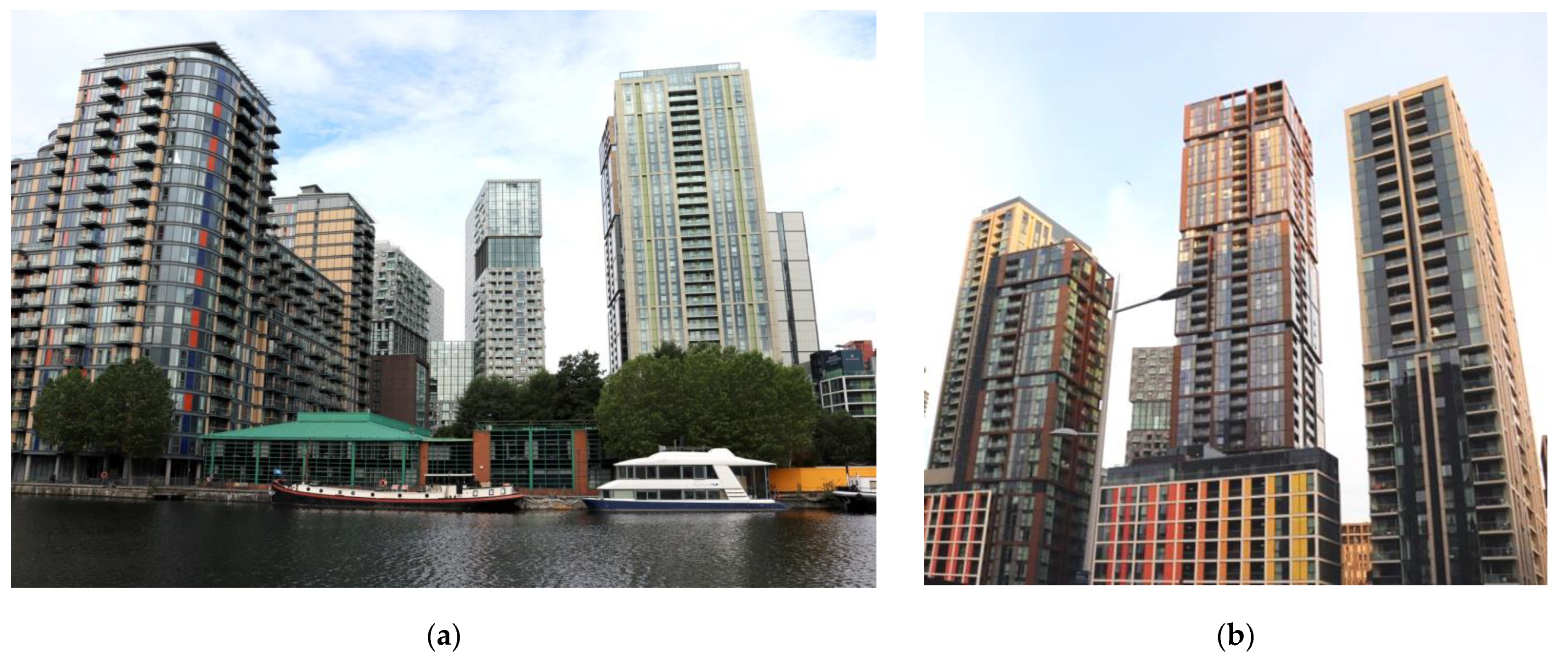
Parallel to the discipline of applying office-inspired aesthetics to residential towers, architects experimented with residential detail such as window openings, individual balconies, articulated winter gardens, communal amenity spaces and applied colour. Whilst predominantly new residential buildings remain monochromatic, with the dominance of contrast between matt light colour cladding and reflective glass, there are few examples of fireworks of colour standing out from their surroundings such as Harbour Central estate including Maine and Sirocco towers by Rolfe Judd Architecture included in the study (Figure 13b) and Franklin Tower by BUJ Architects (Figure 13a).
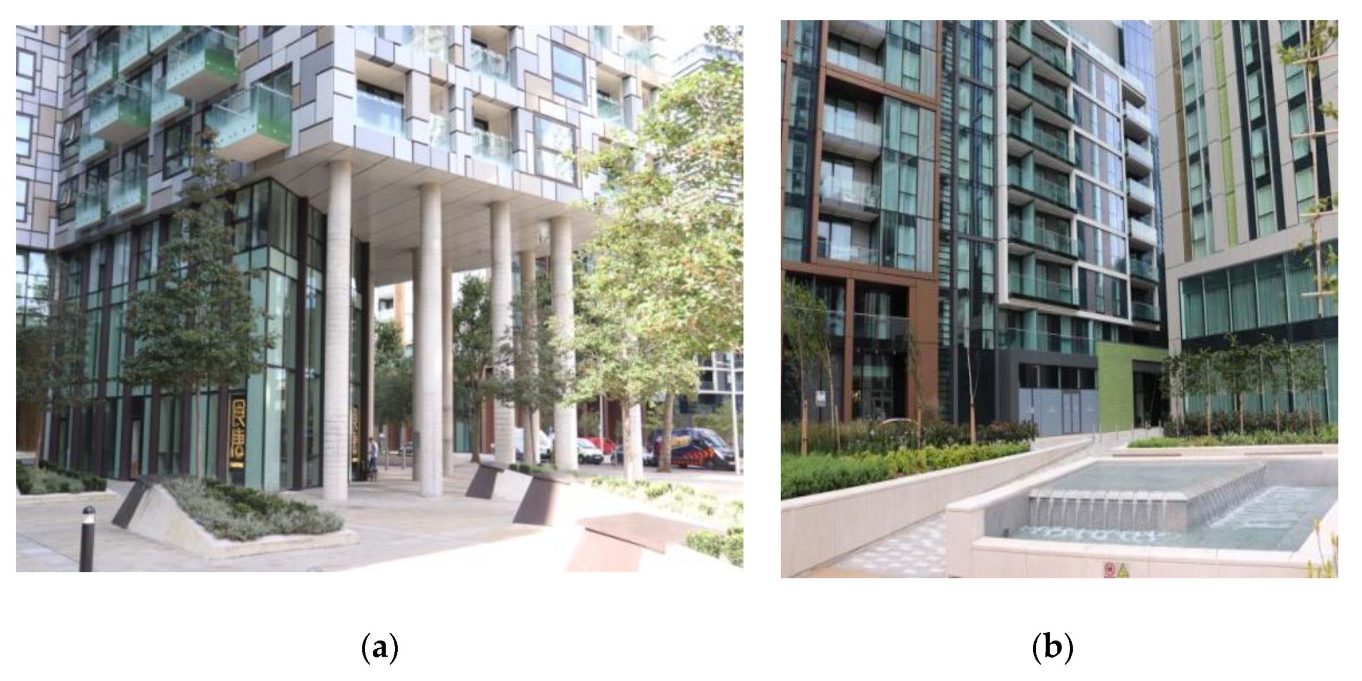
Rolfe Judd in the Harbour Central estate delivered London a vernacular style of architecture applying ceramic tiles and powder-coated metal panels in lieu of bricks which are typical for this style (Figure 13b). Colours and opacity are applied to break down the large mass of the building into smaller sections in the panoramic views, but most of all to mark individual identity to buildings in the public realm.
In general application of domestic detail and colour of elevations lead to pixilation of the building mass, the introduction of strongly articulated composition components. Buildings of Harbour Central (Figure 13b), Lincoln Plaza, which include Franklin Tower by BUJ (Figure 13a), Landmark, Pan Peninsula (Figure 14a) and One Park Drive by Herzog & de Meuron (Figure 14b) all achieve deep texture by the use of smaller structural detailing and colour. Randomisation of composition also assists with softening the appearance of residential towers. They are no longer inhabited sculptures but collections of dwellings. The second group (Figure 14) achieves domestication predominantly through fine grain architectural detailing rather than the colour itself.
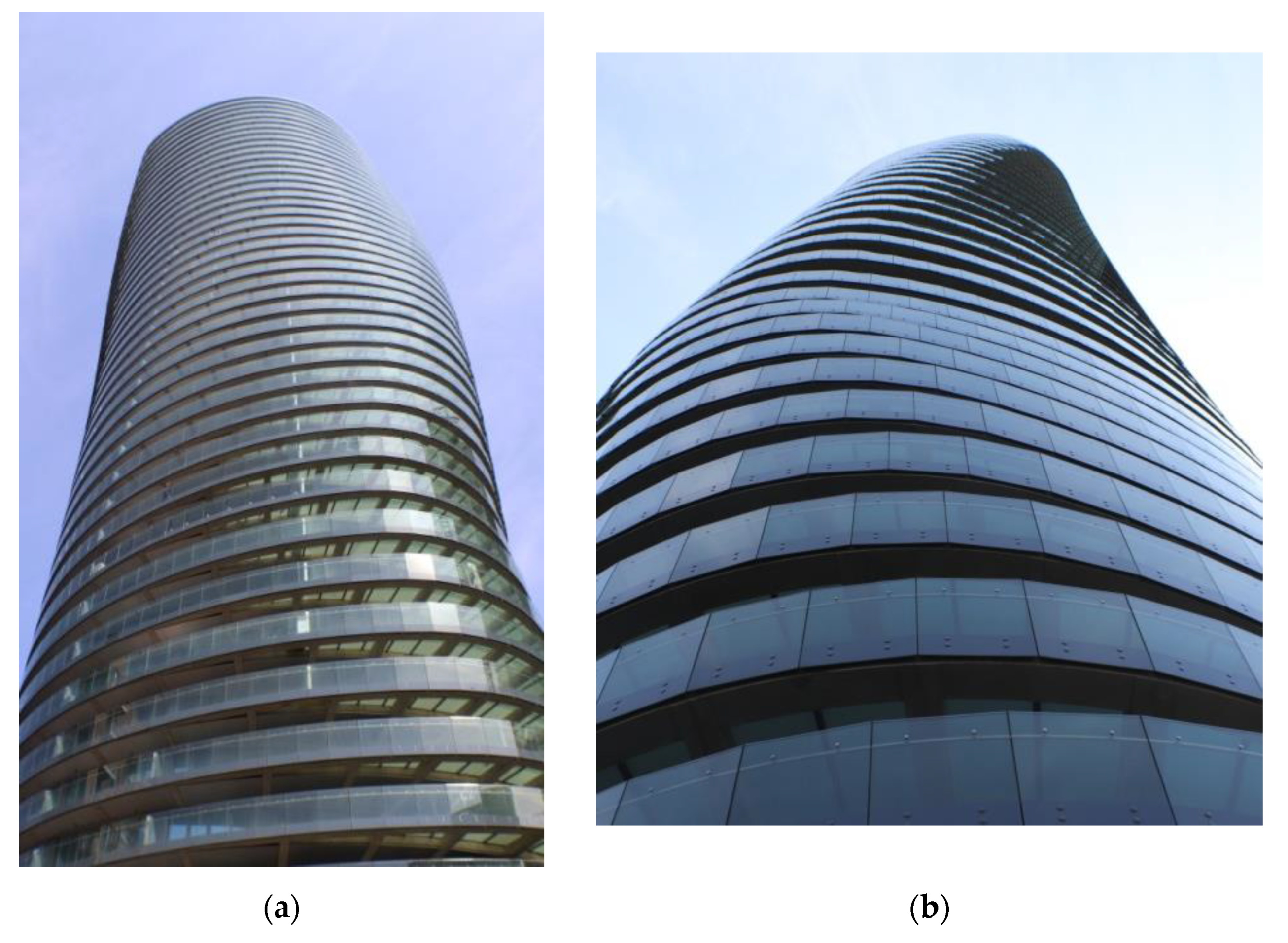
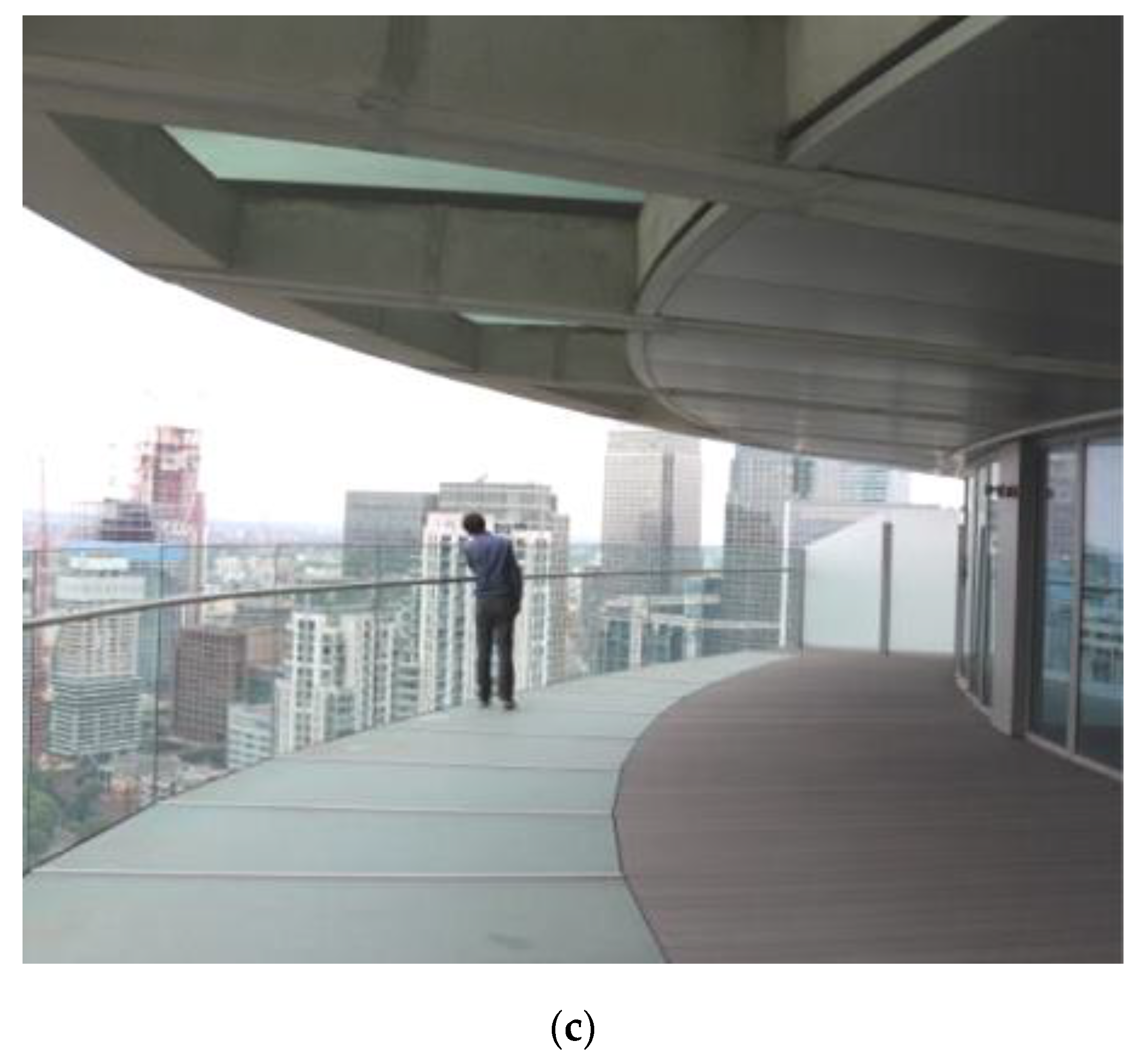
The One Park Drive building (Figure 14b,c) due to its circular form and three-dimensional pixilation of its form gets a range of colours related to angles of key features and material, whilst the fine grain of randomised colour pattern on Franklin Tower (Figure 15a) appears as a uniform very light grey surface with punctuations of windows.
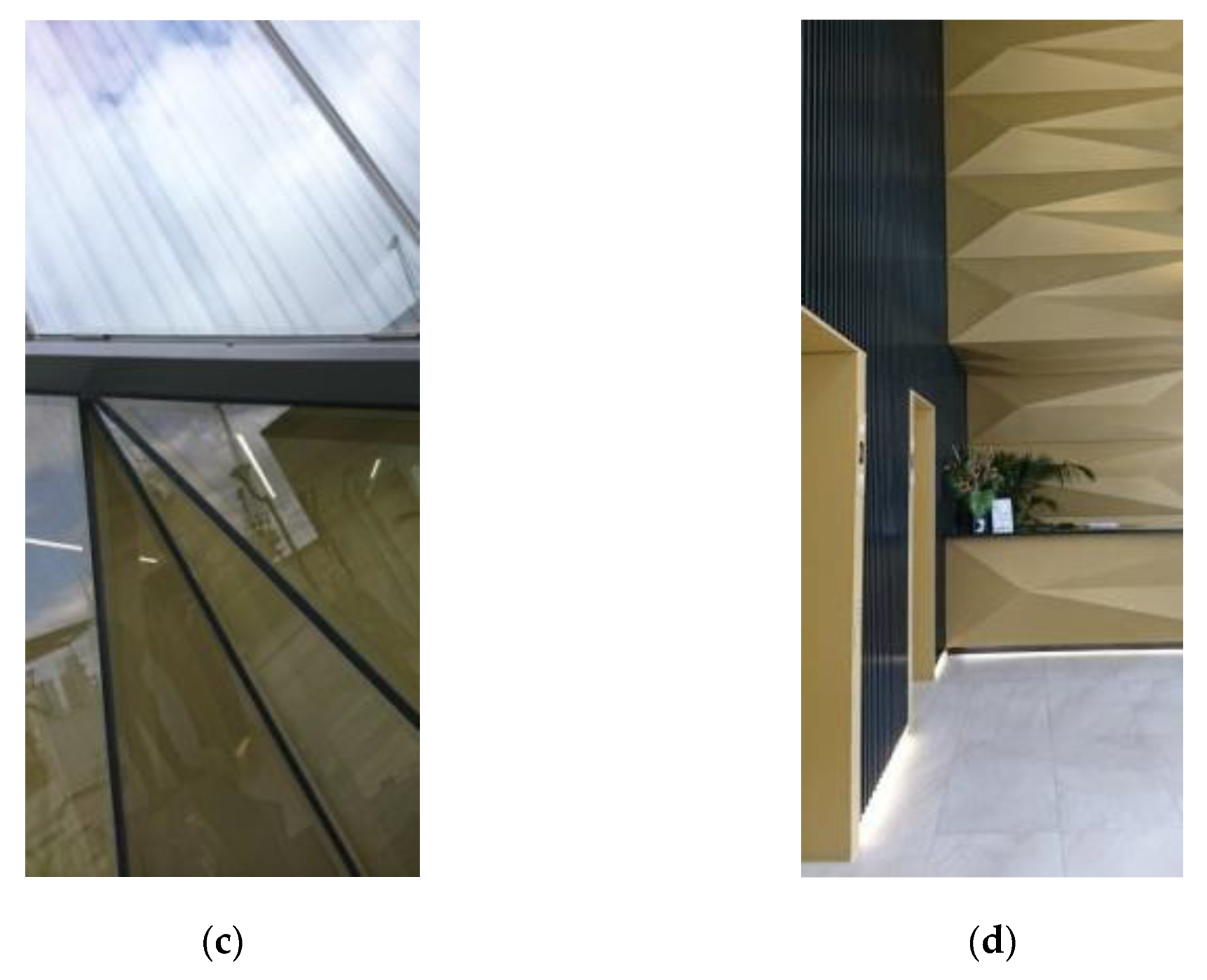
The application of colour in the architecture of tall buildings on Isle of Dogs in London is more inspirational at the human level, on parts of the buildings appreciated at a short distance. Examples such as One Dollar Bay, where the subtle application of colour in the ground floor sections (Figure 15c) flowing to the lobby (Figure 15d) creates an inviting visual unity between lobbies and the public realm. In the case of Harbour Central, buildings’ identities are the most recognisable at the ground/the base level and the colour of structural elements such as columns and beams plays a leading role in embedding the legibility of particular buildings (Figure 15b).

3.3. Summary of Research Findings

In general, tall buildings on the Isle of Dogs have neutral colours, predominantly intrinsic to materials such as glass, steel and stone. Experiments with colour became more apparent in the second phase of the regeneration of the area and refer only to residential towers. Dominating colours are: Reflective stainless steel, white and glass with their reflective properties and tint ranging from light aquamarine to blue. More daring hue can only be observed at base sections of residential buildings.
Colour is often applied to create optical illusions, often driven by the objective of reducing the perception of the building’s mass. This is achieved by pixelation of the skin (as in case of Franklin Tower), use of dark colour or reflective materials to visually separate sections of the buildings. Rainscreen cladding based on aluminium, composites or ceramic became more prevalent on new residential developments. Key drivers, however, seem to be technical and financial rather than artistic.
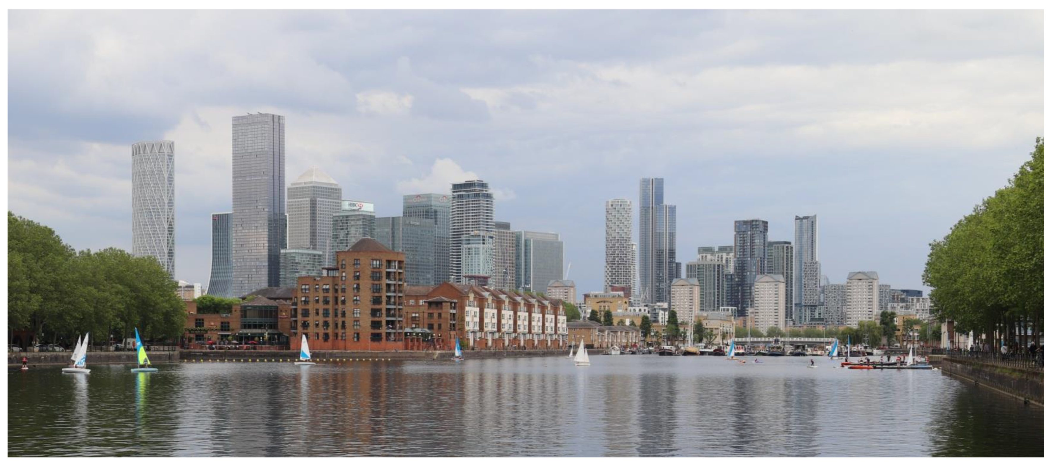
It is interesting that in the case of tall buildings in Isle of Dogs colour variations play a limited role in the architectural expression of the whole building due to the fact that their full silhouettes are observed from afar. Comparison between Figure 16 and Figure 17 demonstrates that the most colourful—Maine Tower—stands out only in flat light conditions; this is due to its darkness rather than colour itself. All other buildings appear in many shades of grey, some with distinguished detail, some with highlighted texture achieved through colour or form. When the sun is shining (Figure 9b) the colour variation is achieved primarily by materiality and geometry of the architectural form.
Introduction of residential towers to the Isle of Dogs is currently the leading driver for application of colour in the architecture of tall buildings. Colour is applied to the large scale elements of the architectural composition in order to introduce finer grain and domestic feel to tall buildings.

4. Discussion

The authors discussed theories of colour in architecture reflected in the research samples, explored the physiology and psychology of colour as an element of living and working environment and finally tried to capture the concept of beauty in relation to the architecture of tall buildings. Those theories were tested on the research sample set of tall buildings on the Isle of Dogs in London.

4.1. Theory of Colour in Architectural Design

The collaboration between French painter Amédée Ozenfant and Le Corbusier is emblematic of the encounters between architecture and painting that characterized the avant-garde of the 1920s. In the early Purist manifestoes, the colour seemed secondary to form, and this could be seen in the careful placing of colour to reinforce discrete architectural elements by Le Corbusier in his work of the mid-1920s. It was then changed by Ozenfant who had refined his ideas about colour and outlined many of these in the six articles on the subject that he wrote for the Architectural Review. Colour was regarded by him as an essential element of architecture; Ozenfant assumed that colour always modifies the form of the building and should receive more careful attention (Braham 2002).
There was a belief that the architecture of the avant-garde of the 1920s was largely white. The explicitly colourful post-modernist reaction of the 1980s largely reinforced myths about the whiteness of this avant-garde and created an essentially nostalgic picture of nineteenth-century polychromatic explorations. Debates about colour are an often small element in these larger encounters, but they help reveal those issues that have been suppressed, allowing architects a more critical insight into their own practices.
As Braham states (Braham 2002): “The examination of modern architectural colour requires an investigation of the ‘morality tale’ that runs through modern architecture, a tale that warns against the dangers of decoration, symbolic representations and the appreciation of colour’s pleasures for their own sake”.
The post-war reconstruction after World War II was driven by social change reflected in modernist urban design and the concept of functional beauty. Porter (Porter and Mikellides 2020) quotes architectural critic Jonathan Glancey: “To many of the immediate post-war generation of architects and planners, such a statement would have been anathema. It stemmed from a misperception of the meaning of harmony. Then, it was equated with orderliness and uniformity. Minimum variation was allowed between buildings within the streetscape in terms of form, materials, storey heights, colour and scale. Variety was suppressed in favour of tedious conformity. What post-war planners failed to realise was that harmony depends upon disequilibrium. Fundamentally it concerns a clash between dissimilar entities within a single logical frame of reference”.
Residential towers of C20 directly followed Corbusier’s ideology of “machines for living” and principles of his urban dream. Mass production, replicability and low cost had driven designs for high density housing of that time. The research identified such examples on the Isle of Dogs. There is a contrast between ascetic use of colour and detail on social housing of Barkantine Estate (Figure 6b), and private high density living in Cascades (Figure 6a and Figure 18a). Application of colour, albeit very toned down, and architectural detailing can be interpreted as a symbol of wealth, differentiating this building from austere housing estate.
Office buildings in the same period reflected the prestige and prosperity of the institutions they were housing; therefore, their designs were tailor made. The use of glass and steel radiated not only with the idea of longevity but most of all the primal image of shining wealth, the blink of silver and gold. On the Isle of Dogs a monochromatic approach to the use of colour has been widely applied to office buildings. Post-modern stylistic was reflected in architectural detail, but not in colour (Figure 5b and Figure 18b).
Whatever standards are required in colour science; such criteria have little relevance to decisions about the use of colour in architecture. Specific colour palettes can be usefully invented and reinvented, and translated to different situations and times. That condition is generally feared among architects as the rule of fashion. The solution seems simple: When you exclude colour, you exclude change and fashion; but of course all buildings have a colour palette, even the whitest, most neutral or natural ones, and they too are subject to the dictates of fashion. The relationships among colour palettes, among today’s innovations and yesterday’s fashions, can only be understood genealogically, as the cycling and recycling of specific values—solidity, authenticity and so on—discovered in and demonstrated through qualities such as colour.
This research provided evidence, that in the C21 residential towers’ use of colour is strongly related to the application of more affordable material than steel or natural stone. The more colourful buildings are the ones with less creative architecture where colour is applied to disguise the functional and cost efficient form—for example, comparisons of the Wardian (Figure 12) and the Baltimore Tower (Figure 11) but also 10 George Street and One Dollar Bay (Figure 14). In the first example the identical idea of architecture made of ribbon balconies needs to be supported by colour to add depth to monotonous horizontal lines of relatively shallow projections. In the case of Baltimore Wharf, the balcony plates dance horizontally; reflectivity and translucency additionally shape the building, which reveals its actual massing only in dispersed lighting conditions, which in London means an average cloudy day.
The second comparison refers to buildings that have similar formal ideas: Two flat facades with full height dilatations and undulations on other two facades made of balconies; as in the case of 10 George Street and of winter gardens of One Dollar Bay. The 10 George Street building has a range of colours within a similar tame hue; One Dollar Bay is uniformly made of glass. The finesse of the minimalist approach provides almost hypnotising morphosis of colour, in constant change and different expression. The colour applied to the other building was supposed to amplify illusions of sculptured form. The building reads as a simple prism with a rhythm of diagonal balconies attached to the eastern and western elevations.

4.2. Perception of Colour—Physiology and Psychology

Effective planning of colour application demands remembering that at the level of a person’s individual experience it is always an effect of perception which is a subjective process consisting of several stages. As Porter says “The apparent orderliness of colour—the sequence of hues in the spectrum and their rules of mixture—offered a compelling example of a fixed arrangement somehow produced by the subjective perceptual structure of the eye and brain” (Porter and Mikellides 2009). Experimental research methods make possible measuring of connections between changes in human physiological features and other variables more precise. Therefore psychological and neurophysiologic research influences of the 20th century enable a deeper understanding of the relationships between colours, human well-being and behaviour (Birven 1978); (Holzman 2010) and they can and maybe should be used more often in the architectural design.
From the neurophysiologic perspective, colour is defined as a set of perceptions that are elicited by the spectral distribution of light which is defined as the totality of the energy falling on the retina (Young 2018). The colour we see depends mostly on the length of light waves reflected by the object’s surface, e.g., light waves between 780–610 nanometres (nm) are perceived as red, and waves between 480–470 nm are perceived as blueish. (Popek 2008). It is assumed that under the theory of colour three relative attributes define it: value which describes how light or dark the colour is, chroma which states how intense it is, and hue naming its similarity to one of defined broad colour groups. (Malacara 2011).
The process of visual perception of colour starts on the retina which is a light-sensitive layer of tissue of the eye and ends in the cortical brain regions. In the retina, there are two main types of photoreceptors: cones responsible for the photopic vision which enables seeing colours in well-lit environments, and rods which are active in low light levels environments and provide black and white vision. Three types of cones differ by pigment and they are sensitive to different wavelengths: S-cones (short-wavelength), M-cones (medium-wavelength), and L-cones (long-wavelength). Cones and rods are activated based on the light wave length and are responsible for the transformation of light signal into a neuronal impulse which is sent through the optic nerve, optic chiasm up to the visual cortex. The visual cortex is located in the occipital lobe. The visual information goes through various areas which are labelled V1 to V6 responsible for the processing of different kinds of visual information. Regarding colour vision region V1 is responsible for calculating colour contrast, V2 is involved in the elaboration of hue, and V4 is for hue calculation (Conway 2009; De Valois and De Valois 1993). At the next stage, information is interpreted in the areas of inter alia knowledge, memory, and evoke emotions which means that the visual area of the brain has connections with other cerebral areas as well as with the limbic system.
There can be many disturbances in the whole process. Some of them appeared already on the retina level. Hence when most people see colours using all three cones types which result in trichromatism some of them, more commonly men due to genetic reasons, can experience some sort of colour blindness. Websters (Webster 2021) lists the main types of this disorder which are: deuteranomaly which is the inability to differentiate between shades of green (deuteranomaly) and red (protanomaly). Protanopia and deuteranopia are more severe versions of deuteranomaly and protanomaly whereas tritanopia results in the inability to differentiate between shades of blues and yellows. Trichromacy means the inability to differentiate between the three primary colours of red, green, and blue. The least common is achromatopsia which makes a person unable to differentiate between any shades of colours and see black and white only.
Architects of tall buildings actively use optical illusion as a means of architectural expression. On the example of two buildings in the South Quay Plaza complex (Figure 19a) it is demonstrated how sheer reflective surfaces of the building’s crown effectively visually dissolve the mass of the building in the sky. Only vertical stripes of steel stand out. The office building cuts clearly from the background due to bright opaque cladding contrasting with the sky.
The second example demonstrates how monochromatic tones blend in, so not only people with colour blindness but also those with normal vision have difficulties appreciating colour detail, especially from the distance (Figure 19b). Only contrast in brightness is readable. Therefore subtleties of coloured detailing could be meaningful at the base of the building; to be recognizable to all the population, they would need to be strengthened with a change of texture. In this way architectural expression becomes accessible for all. This is especially important for the ground level experience, to create an inclusive environment for living and working in the urban environment of an overwhelming scale.

4.2.1. Finding Balance in Using Colours

There is plenty of research work focusing on general associations between psychological functioning and colour (Elliot 2015). They showed particular connections between human functioning and colour exposure, e.g., red was found to be associated with aggression, dominance and awakening, higher food and beverage consumption, and lower cognitive performance; e.g., (Hill and Barton 2005); (Bruno et al. 2013); (Zhang and Han 2014). Together with yellow these colours facilitate positive judgment and are associated with an optimistic attitude and energy (Fink et al. 2006). On the other hand, blue is linked to alertness and taking methodical actions since blue light activates brain structures that are responsible for higher-order attentional processing (Cajochen et al. 2005); (Lockley et al. 2006). The abovementioned findings are only a small fraction of research results that show that people’s reactions to colour are not always intentionally controllable. Some colours and colour connections are energizing which means that in the long run they may lead to overstimulation and be overwhelming for some individuals. That should be taken into account while planning colour implementation in architecture, especially in spaces that are designed for frequent use of particular groups of people.

4.2.2. Individual Reaction to Colour Is Very Subjective

Regarding utility, it has to be noticed that individual reaction to colour application is subjective and dependent on many unpredictable factors. As was mentioned, the visual information from receptors in the retina is interpreted on different levels after rudimental analysis in the visual brain. Interpretation includes naming (“This is a red colour”), behaviour (“Attention! I should stop!”), emotions (“This is not safe, it’s dangerous”), long term memory resources (“I can recall this colour as a warning”), or an autobiographical memory (“I remember this colour warned me once about something”). Different parts of the brain are responsible for these stages of perception and some of these stages are strongly dependent on the earlier individual experiences. Therefore the final interpretation of particular colour stimuli can vary among individuals especially when it comes to the final impression and sensation of beauty. The impression that the particular phenomenon of colour application in architecture is “magnificent” and the other is “horrible” can vary strongly among individuals (Soldat et al. 1997).
The stark example of colour detail recognisable in almost every weather condition and distance is Clover Courts by ALLsop Architects. These mid-height interlinked towers provide comfort to the surrounding public realm through their velvet dark brown brick walls, their fun and their interest through the fluorescent colours of the metal work: Window frames and balcony balustrades (Figure 20a). The selection of colour in this case made this building distinctive not only in short and mid-distance panoramas but also in long-distance views. In comparison, colour applied to towers of Harbour Exchange appears very subtle, with contrast between different elements of the building severely tamed (Figure 20b).
Towers of Clover Courts, despite their modest height, are visible from the Maritime Greenwich UNESCO World Heritage Site. Whilst the Maritime Greenwich Management Plan (Royal Borough of Greenwich 2014) and London Plan recognise the impact of tall buildings on the protected views, the matter of colour has been raised only in supplementary planning guidance on views (Greater London Authority 2012), but not in the context of panoramic views, even specifically in the case of views from Greenwich Park. The document recognises the impact of colour on buildings in the foreground and the middle ground of the view, but not in panoramas. It is likely that in panoramic views very few colours stand out.

4.2.3. Colour in Architecture Can Help Some Groups of People

The ability to recognize and differentiate colours is recognized early in child development and is quite stable even in people with neurodegenerative disorders like dementia. Colour cues were also identified as making a significant difference in short-term memory recall ability in comparison to form cues for patients with Alzheimer’s and other types of dementia, which suggests that adequate use of colour in architecture can help elderly people with memory impairments find their way in the environment (Cernin et al. 2003).
The use of colour is one of the elements that help to humanise architecture, to improve the sense of belonging, e.g., Harbour Central estate (Figure 21). It is clear that they are no longer inhabited sculptures but collections of dwellings. The application of colour in the architecture of tall buildings on the Isle of Dogs in London is more inspirational in the case of lower buildings and at the human level. Colour is also applied in order to highlight entrance areas, the pedestrian and vehicular ones (Figure 21).
However, due to very subjective feelings about colour and different ways of reading colour messages, the colour of the architecture alone is not enough to provide a human-friendly atmosphere. Soft landscaping, either in a form of ground level gardens, green balconies or living wall are intrinsic to creating a good living environment on aesthetic as well as health based bases concerning the phenomena.

4.3. Beauty in High-Density Urban Environments

Tall buildings contribute to the legibility of places, signposting their character to be recognised from afar. In the past, singular towers marked specific places, beginning from church spires enabling navigation to medieval towns. London until today makes attempts to preserve the dominance of the dome of St Paul’s Cathedral in protected view corridors. However recent intensification and rapid growth of tall buildings means that there are already a few clusters of towers scattered across inner and outer London. The Isle of Dogs is the largest one today.
As Porter discusses (Porter and Mikellides 2009): “If there is to be a basis for discussing aesthetic perception in other than a subjective way, it has to have its foundations in deep structure value systems common to humanity. This is dangerous territory since many resent the idea that beauty is anything other than a property of the eye of the beholder. To suggest that our perception of beauty can originate in deep structures of the mind is to violate human individuality. Humans are complex biological systems and the most complex organ in all higher animals is the brain. It is logical to believe that certain ground rules in Nature affect our perceptions and value judgements, including the concept of harmony”.
Ingarden has formulated a concept of “an aesthetic experience” which “begins when, against the background of a perceived or merely imagined real object, a special quality appears (…) which does not allow the experiencing subject to remain ‘cold’, but puts him in a special state of emotion” (Ingarden 1970). The environment of toned colours of prominent tower buildings provides such a background for objects and experiences on the ground. Figure 22 demonstrates how the objects in the public realm build up an aesthetic experience at the human scale. The perception of colour may vary according to weather conditions and time of the day. In the same natural rhythm the architecture of tall buildings on the Isle of Dogs changes. The ephemeral character of experiencing architectural detail in this case is not only an artistic experience, but also a reminder that men created these monumental buildings for humans to live in with joy.
Balanicka explores whether spaces possessing objectively measurable features, corresponding with components of beauty (proportion, harmony, unity, integrity) are subjectively appreciated by its users. She argues that aesthetic categories regulated in the spatial planning processes have a direct effect on the design of the space surrounding humans and thus significantly improve the quality of life (Balanicka 2021). However, for the general public, respondents without a professional background in the built environment, the most important was the quality of greenery in the city, and that the concept of beauty was very often associated with functionality.
In the case of Isle of Dogs, silhouettes of tall buildings are under public scrutiny; they can be observed by millions every day. More challenging is the debate about the beauty of spaces between them. In the UK, London in particular, ground level experience is controlled by a planning system. Environmental Impact Assessments for each high density development looks closely into the quality of the street scene microclimate, including access to sunlight and wind conditions. The framing spaces between buildings have several qualitative indicators to meet. Whilst the palette of colours is applied to the main body of towers and crowns, colour accents can be met in areas meeting the public realm and within the public realm.
The public realm on the Isle of Dogs carries much more colour than tall buildings (Figure 22a). Planting on the ground floor and accentuations of entry points are typical means to domesticate open spaces around massive buildings. Greenery successfully softens the edges and provides serenity essential for relaxation. The presence of open water secures the breadth of space and other opportunities for reflections. Art features in the public realm create more opportunities to experience colour in the Isle of Dogs. In the first phase of regeneration, outdoor sculptures reflected its corporate origins. The last decade brought change in the approach and new installations are very much playful, in saturated colours. Some, such as the butterfly sculpture, allow the audience to experience more colour in the surroundings by looking through transparent tinted wings (Figure 22b).
The night scene is enriched by architectural lighting. LED technology added opportunities for colour illumination, more for morphosis of colours on elevations. Architectural lighting is applied to some buildings at the ground level (Figure 14c) as well as to sketch silhouettes at night and in winter (Figure 22c).
Colour in architecture become more ephemeral, especially due to technological advancement in lighting and landscaping. The modernist colour ascetic becomes the background for constantly evolving colour of light and planting.

4.4. Summary of Discussion

Tall buildings on the Isle of Dogs in London represent an ascetic palette of colours, and form rather than paint plays a major role in their architectural expressions. The perception of beauty is regarded as an area of subjective judgements. Since tall buildings are particularly visible and therefore susceptible to evaluation, it is extremely important to be aware of the social responsibility that their design implies, including the use of colour. At the same time, it is important to have a sense of harmony in finding ways to domesticate public space.
It has to be remembered that from a neurophysiological perspective perception is a subjective process consisting of several stages, starting from the reception of light in the retina up to the interpretation in the visual cerebral cortex. It is linked to many factors and can be disrupted at each of the stages. Experimental research methods enable more and more precise measuring of the human reactions on the aesthetics of surroundings and could be helpful in the designers’ work. Coloured detailing based more on the reality of modern research methods could make buildings more recognizable to all the population to create a more inclusive urban space.
High density urban environments tend to be assessed through their skylines and long-distance views. This means that human eyes can perceive contrast; they are much less perceptive of colour. Senses of beauty and belonging are intrinsic to the human scale and therefore colour plays a much more important role in the design of bases, ground floor and street scene experience. Harmony with nature experienced by the appearance of the buildings changing in the rhythm of daylight, weather and seasons highlights the artistic nature of architecture. Level of unpredictability and surprise when towers expose different sets of feature in different lighting conditions has been achieved on a number of buildings on the Isle of Dogs in London. Elements like vegetation, art in the public realm and night lighting amplify impacts of colour on the art of architecture.

5. Conclusions

The review of architecture of tall buildings on the Isle of Dogs from the 1990s to 2021 identified five main strands of design styles informed by the mix of use and general trends such as post-modernism, expressionist structuralism or London vernacular. They develop linearly throughout time, with some overlap. Initially ascetic post-modernism inspired designs of office and residential buildings were built at the end of C20. The image of the global financial centre at Canary Wharf at the turn of C20 and C21 was dominated by steel and glass inspired by modern and high-tech office architecture, however with rather conservative approach to form and detailing. Rapid development of residential skyscrapers in the C21 was initially dominated by structural expressionism references. Office buildings got more daring forms than a simple prism and residential towers were designed as monolithic sculptures. The second decade of C21 also brought a few examples of very modest references to de-constructivism followed by the strong influx of brick-free London vernacular.

5.1. Role of Colour in the Architecture of Tall Buildings on the Isle of Dogs

The use of colour in the skyscrapers on the Isle of Dogs predominantly represents modern minimalism with the dominance of inherent colours of reflective silver and glass (such as: Office buildings of the Canary Wharf’s early days, listed in Table A1 of Appendix A), supplemented with white tones of reconstituted stone (such as: Pan Peninsula), ceramic tiles (such as: One Park Drive) and powder-coated aluminium (such as: One Bank Street, Newfoundland). The introduction of tall residential towers to the area gradually brought vernacular inspirations with their predominantly earthy hues including varieties of terracotta, natural green and brown. Architects applied colour to soften and visually reduce the imposing scale of those buildings.
The examples of application of colour to the tall buildings on the Isle of Dogs lead to conclusions that whilst colourful detail domesticates space, in the case of tall buildings, longevity of materials and high quality detailing are crucial for the quality and beauty of an urban environment. The colour palette is nature or technology inspired, in both instances having a soothing impact on their human sensitivity.
Particularly interesting is design for ephemeral variations of colour of buildings and perception of form instigated by natural sunlight and artificial lighting. It is symptomatic that the most unique architecture was created when creators made attempts concerning domesticated office-inspired monolithic large-scale building compositions. Architects of One Park Drive or One Dollar Bay actively use sunlight for painting their buildings and to ensure dynamic appearance of their creations.
In the case of tall buildings, decorative properties of colour predominantly stem from the play of contrasts, not hue as such. This contrast is predominantly created by the morphosis in appearance of reflective details and opaque surfaces. The colour often plays the utilitarian role at the human scale: In the public realm and short views capturing the base of the building as an integral element of legibility, sense of belonging and safety.

5.2. Drivers for Change in Use of Colour in Architectural Design of Tall Buildings

The research has demonstrated that multiple factors influence the way colour is used in the architecture of tall buildings. These include: Aesthetic, formal considerations related to style; but also human perception including intentional visual deception or legibility; and value engineering. The examples from the Isle of Dogs in London support an argument that a colour inherent to material usually supports innovative, tailor-made design, while the applied colour becomes a solution for dressing up the common design solutions and cost savings.
Residential use is the strongest driver for use of paint on tall buildings. Sterile white, steel and glass do not seem to deliver domestic architecture people want. It would be worth exploring if this is the matter of genuine views of residents, professional communities or developers. It is apparent that the cost of minimalism is higher than the use of tinted materials. The architecture of residential buildings is governed by a formal expression of individual units, classic formal definition of openings and balconies. Applied colour offers a very easy solution for expression of those details without complicated structural decorations.
Domestic character can also be expressed by randomness of changes of their appearance. This can be achieved by a design depending upon unpredictable factors. Applied colour is static in its nature. Play with shadows, colour of the sunshine, hue of lighting and the seasonal nature of planting deliver such artistic ingredients. The buildings on the Isle of Dogs rely on human and natural interventions to add richness and playfulness to their appearance. Opening windows, changing angles of louvers, sunsets, spring were employed by some architects as means of activating architectural expression.

5.3. Future of Colour in the Design of Tall Buildings

Crook (Crook 2021) outlined future directions for skyscrapers’ design, where notion of colour is only implied by the postulate of using natural materials:
  • need for humanising them
  • looking for sense of craft and texture, trying to avoid glass
  • increase of mixed-use programmes
  • use of sustainable materials, like timber in the construction of future skyscrapers
  • increase of public sky gardens and vertical farming
  • use of sustainable materials in the construction of future skyscrapers.
One of the important directions of further research for architectural solutions is the use of natural greenery, the return to natural materials, as well as taking into account other human senses in the design, such as touch, smell and hearing. In order to create a human-friendly environment it is worth taking into account people’s drive for contact with nature. A greater proportion of natural greenery, water, acoustic comfort solutions or even the use of recorded soundtracks of water murmuring or birds singing can contribute significantly to the quality of life. Nature has always been the best source of inspiration and it still is. To address the real human needs the use of technologies based on research from the area of social and medical science seems to be helpful.
The inhuman scale of skyscrapers should not distract designers from the fact that the good of human beings should be in the centre of any design process. The technology is developing at a rapid pace and there is hope that human comfort and genuine needs, physical and mental, will drive the ambitions of architects. An interesting example of such aspirations is the Bosco Verticale/Vertical Forest building in Milano, Italy, by Boeri Studio. The residential tower wrapped up in greenery changes colour in the rhythm of seasons which in addition to painting by sunshine and night lighting is another way to instigate morphosis of tall buildings’ aesthetics.
The final conclusion is that the use of colour integral to material creates lasting beauty. Morphosis of architectural detail and expression in the melody of changing time, weather and seasons mirrors nature. Colour matters at the ground level, and therefore should be applied where it is possible to interact with users of the public realm. Colour of detail and landscaping not only varies in the seasonal rhythm, but also can be easily replaced. This is the reason why tall buildings need to most of all have good architectural form, high longevity materials and an appropriate exposition zone to reveal their full silhouette.
As Serra Lluch (Serra Lluch 2019) notes: “As far back as the earliest Greek temples, colour has been an integral part of architecture but also one of its least understood elements. Colour theory is rarely taught in architecture schools, leaving architects to puzzle out the hows and whys of which colours to select and how they interact, complement, or clash”. This research is a contribution to the systemising experience of architectural design for contemporary tall buildings.
The Isle of Dogs is an example of the coexistence of various approaches with the use of colour in the architecture of almost forty years. Today designers concentrate more on usability and creating more humanized surroundings. To achieve these goals architecture should turn more to the multidisciplinary approach and draw on other vivid domains of science (especially social and medical sciences) and technology.

Author Contributions

Conceptualization, A.Z., E.B. and A.K.; methodology, A.Z.; formal analysis, A.Z., E.B. and A.K.; investigation A.Z., E.B. and A.K.; data curation, A.Z.; writing—original draft preparation, A.Z., E.B. and A.K.; writing—review and editing, A.Z., E.B. and A.K.; photos, A.Z. All authors have read and agreed to the published version of the manuscript.

Funding

This research received no external funding.

Data Availability Statement

Data supporting reported results can be found in the Appendix A to this article.

Conflicts of Interest

The authors declare no conflict of interest.

Appendix A. Analysis of Use of Colour in Architecture of Tall Buildings on the Isle of Dogs, London, UK; First Phase of Regeneration

Table A1. Use of colour in tall office buildings from the first phase of the regeneration on the Isle of Dogs.
Building/Architect/Date of CompletionType/Form/CompositionKey Architectural DetailingMaterial & ColourUse of Colour
One Canada Square
by Cesar Pelli & Associates
(1991)
Stand alone towerPyramid roof
Skin made of regular grid of windows set in the stainless steel facades
Colour inherent to the materialTo emphasize the compositional order of the regular grid of facades
Cuboid on a square plan with a pyramid topLarge scale shallow projections of the facades delivering shadow complexity on the cornersReflective and transparent frameless glass panelsTo encourage changes in building’s appearance depending on sun light conditions: reflections, colouration and shadows
Recessed base with add-on colonnades, homogenous middle and roofed topAdd-on ground floor colonnadeSilver reflective stainless steel
8 Canada Square
by Foster & Partners
(2001)
Tower on podiumSolid two storey crown of the buildingReflective/transparent glassTo define sections in the building’s composition: from transparent base, through white stripes in the middle to solid colour of the crown
To encourage changes in building’s appearance depending on sun light conditions: reflections, colouration
Cuboid on a square plan with round cornersRecessed section over the two storeys just under the crown
Rounded corners o super smooth reflective skin of facadesWhite back-painted glass resulting with a very light aquamarine colour
Five storey base, homogenous middle, top marked by colour bandingDistinguished five storey base, recessed at S&E, projecting and solid in N and WSubtle black metal grid of glass panels’ connections
25 Canada Square
by Cesar Pelli & Associates
(2001)
Interlinked towerThe recessed crown Predominantly colour inherent to the materialTo visually distinguish the top of the building
Recessed corners of the building
Cuboid on a square planStainless steel projecting mullions: the strong but shallow vertical ones in the middle section and three storey grid n the plinth part; slim horizontal groups of three narrow steel frames between glass panelsReflective/transparent glassTo add texture to facades
High base, homogenous middle, top marked by textured bandingBack painted glass panelsTo encourage changes in building’s appearance depending on sunlight conditions: reflections, colouration and shadows
Stainless steel
10 Upper Bank Street
by Kohn Pedersen Fox Associates
(2003)
Tower interlinked with adjacent lower buildingN & S facades made of projecting dense knit of metal mullions over the glass curtain wallColour inherent to the materialTo define sections in the building’s composition:
Set of three a-symmetrically interlocked cuboids on rectangular plansStrong, wide vertical edges of the uniform grid S & N facadesReflective/transparent glass
Vertical composition of three sections of a different depth and height covered by reflective glass divided/bookended by N&S facades appearing as more solid due to metal detailing.E & W facades made of smooth glass curtain walls with subtly projecting mullions with emphasis on two horizontal strips marking floor plates, and subtly recessed edge windows Glass panels back-painted in greyTo visually disconnect elevations from each other.
To create an illusion of sliced mass
Stainless steel mullions and frames
1 Churchill Place by HOK International
(2005)
Stand alone towerTop of the building marked by two sets of shallow brise-soleils and opaque glass balustrade obscuring roof installationsReflective/transparent glass
Colour inherent to the material
To encourage changes in building’s appearance depending on sunlight conditions: reflections, colouration and shadows
Cuboid on a square plan with a pyramid topN & S facades distinguished by the recessed central smooth glass stripes, surrounded by glass curtain walls with projecting deep vertical mullionsGlass panels back painted in white
Stainless steel mullions
Colour inherent to the material
To emphasize contrast between the smooth sections with textured ones
To add texture and rhythm to the elevations
Uniform composition of the building with recessed central sections on S&N facades.E & W facades as smooth glass curtain walls with subtly projecting grid of mullions, and horizontal sections of back painted glassThe entrance frame made of stainless steel set around recessed wide black painted metal, top section made of vertical metal louvers; stainless steel canopy with glass lightsTo add depth to S&N facades
To highlight the vertical line of symmetry in the composition
Main entrance marked by a five storey high frame with thick counter-levered metal canopy
25 Bank Street
by Cesar Pelli & Associates
(2003)
Interlinked towerTop of the building articulated through the denser grid of vertical mullionsColour inherent to the materialTo emphasize the edges of the building, and the three-section composition
Cuboid on irregular T-shaped planCorners emphasised by solid corner wrapsReflective/transparent glass
Glass panels back-painted in grey
Neo-modern—international style inspiredStrong grid of projecting mullions throughout all facades; horizontal mullions are more subtle and denserStainless steel mullionsTo distinguish base, middle and top of the building
Recessed double storey ground floor emphasized by the projecting structural columns connected by the thick soffitStainless steel corner wraps
Concrete columns and soffits on the plinth
To highlight the inviting character of the podium section in the public realm
40 Bank Street
by Cesar Pelli & Associates
(2001)
Interlinked towerTop section cladded with horizontal metal louversColour inherent to the materialTo emphasize the illusion of two interlocked buildings
Two interlocked cuboids on a rectangular planTaller section finished with glass curtain wall with projecting horizontal steel mullionReflective/transparent glass
Solid base supporting vertically delineated two pieces of the middle, top being part of the taller section Lower section is made of stone panels with a regular grid of punctures, slightly recessed windows. It projects and partially wraps the glazed section.Glass panels back-painted in grey dataTo add depth and texture to facades
Stainless steel mullions and framesTo visually define base of the building
Recessed ground floor accentuated by the rectangular colonnadeBeige granite
Table A2. Use of colour in tall residential buildings from the first phase of the regeneration on the Isle of Dogs.
Building/Architect/Date of CompletionType/Form/CompositionKey Architectural DetailingMaterial & ColourUse of Colour
22 Hertsmere Road
by Squire & Partners/HOK International
(2004)
Serviced apartmentsTop of the building slightly set back, with sparse metal columns over the glass curtain wallColour inherent to the materialTo emphasize the order of facades’ compositions
Tower on podiumStainless steelTo achieve illusion of hovering mass of the building
Two interlocked cuboids on irregular plansStrong horizontal millions/brise-soleils over the curtain glass wall with slightly protruding mullionsReflective/transparent glassTo encourage changes in building’s appearance depending on sunlight conditions: reflections, colouration and shadows
Three horizontal sections to the Southern facade of the building composed of two homogenous vertical pieces
Base made of two storey high concrete colonnade over the recessed curtain wallApplied colour of white concrete colonnade
The Cascades
by CZWG
(1988)
Grade II Listed for its architectural and historic interest
Extruded blockThe top of the building with the high cornice floating over the glazed penthouse storey and with contrasting projecting staircases Applied coloursTo articulate top of the building
Cuboid with southern half of the building diagonally descendingVertically waving E&W facades with a number of irregular protruding or recessed roomsWhite, sandy and maroon renderTo add playfulness and texture to the building
Horizontal composition of base, middle and topThe steep slope (cascade) on the southern side made of a continuous roof light, terraced balconies, and winter gardensWhite metal work of balustrades, window frames including winter gardens and roof lightsTo add rhythm and vertical order to otherwise playful facades
White bay windows (three bottom levels) and delicate white balcony balustrades Dark maroon technical brick cladding on the ground floorTo visually distinguish plinth of the building
Barkantine Estate tower blocks: Topmast Point, Midship Point, Knighthead Point
by London County Council (LCC) Architect’s Department
(1970)
Stand alone towerCross-gabled roofs with shadow gaps underneathInherent colour of metal roof coverTo visually separate the roof structure form the main mass
Cuboids on rectangular footprintsRegular rhythms of openings throughout the whole height of facadesApplied sand colour of render on walls
White window frames
To add depth to the facades
Horizontal composition of: base, middle and topBrick cladded baseBlack, red and yellow brick cladding on the baseTo visually distinguish bases of otherwise identical buildings

Appendix B. Analysis of Use of Colour in Architecture of Tall Buildings on the Isle of Dogs, London, UK; Second Phase of Regeneration

Table A3. Use of colour in tall non-residential buildings from the second phase of the regeneration on the Isle of Dogs.
Building/Architect/Date of CompletionType/Form/CompositionKey Architectural DetailingMaterial & ColourUse of Colour
1 Bank Street
by Kohn Pedersen Fox
(2019)
Tower on podiumThick white edges of the building emphasizing its formColour applied to the material To highlight the original form of the building
To visually detach the podium section from the main building
To encourage changes in building’s appearance depending on sunlight conditions: reflections, colouration and shadows
Rectangular prism with the parabolic recess throughout the western sideThe grid of short vertical brise-soleils on S&N facadesReflective and transparent slightly blue tinted glass
Opaque facade of the quasi-podium (W)Powder coated white metalwork
Two horizontal sections: base and the main mass of the buildingRecessed ground floor creating an ‘floating’ illusionWhite back-painted high iron glass on the western podium
30 Churchill Place
by Kohn Pedersen Fox
(2014)
Stand alone towerLouvered crown of the buildingHighly reflective/transparent glassTo strengthen the illusion of disjointed facades
Cuboid on the rectangular footprint with irregular diagonal recessed cornersTrapezoid facades with the slight projections of the curtain walls over recessed diagonal corners create a deconstructive illusion of detached glass sheets tied by the high plinth columnsColour applied to the materialTo emphasize the hierarchical composition of the building
To create an illusion of the hovering mass of the building
Powder coated white metalwork
Horizontal composition of: base, middle and topRecessed ground floor smooth glass curtain wall with protruding columns and a ribbon of a structural canopyWhite reconstituted stone colonnadeTo encourage changes in building’s appearance depending on sunlight conditions: reflections, colouration and shadows
Novotel
by BUJ Architects
(2018)
Tower on podiumS&E facades (on rectangular footprint) designed as a smooth curtain wall with an irregular pattern of transparent and back-painted glass panels cut by a regular rhythm of recessed metal coursesApplied colour to glass panels: mix of transparent, very light aquamarine, grey, yellow and orange back paint To distinguish podium section from the rest of the building
Composition of three interlocked prisms: 10 storey cuboid podium, two conjoined prism towers on rectangular and circular segment footprintsTo add texture to the physically smooth facades through contrast of reflective opaque panels and hollow transparent ones
N&W facades with projecting vertical fins and regular rhythm of windows and opaque panelsPowder coated white metal work
Horizontal composition of: a base, a middle vertically divided into two sections and a topBright melange of yellow panels cut by horizontally elongated windows some of which wrap the cornersInherent grey colour of structural columns at the ground floor forecourtTo visually connect the entrance area of the building with the surrounding public realm
Sculptured diagonal structural columns under the overhanging circular section of the towerTo add playfulness to S&E facades
Table A4. Use of colour in residential tall buildings, the second phase of the regeneration on the Isle of Dogs.
Building/Architect/Date of CompletionType/Form/CompositionKey Architectural DetailingMaterial & ColourUse of Colour
Newfoundland
by Horden Cherry Lee Architects
(2021)
Urban block made of the detached tower with semi-podiumRecessed opaque top level of the buildingReflective/transparent glass with some opaque panelsTo expose the structural diaframe of the building
Prism on an elongated diamond planProtruding diagrid structural frame over the glass curtain walls throughout the whole buildingColour applied to the materialTo add depth to the relationship between diaframe and curtain walls behind
Horizontal composition of: base, middle and topRecessed ground floor colonnade intersecting diagonal structureMetal elements powder coated with warm silver sparkling colourTo encourage changes in building’s appearance depending on sunlight conditions: reflections, colouration and shadows
Landmark Pinnacle
by Squire & Partners
(2021)
Stand alone towerDouble height glazed top floor cut from the rest of the building by the protruding metal cornice Colour applied to the material To visually dissolve this dominant building in the clouds
Cuboid on the rectangular footprintTwo parallel narrow recesses running through the whole length of the building on S & N sidesHighly reflective/transparent glass of curtain walls and top floor balustradesTo emphasize the hierarchical composition of the building
Horizontal composition of: base and homogenous mass of a middleGlazed curtain wall with regular rhythm of slightly protruding mullions Powder coated black metal work e.g., mullionsTo add texture and playfulness to the building at the human level
Subtly recessed plinth with first floor louvers cladded with perforated metal panelsLight gold reflective colour of metal louversTo strengthen the visual impact of shadows
Landmark
by Squire & Partners
(2010)
Stand alone towerRecessed top storey with opaque glass curtain wall framed by the protruding cornice belowReflective, transparent or grey back-painted glass curtain wallTo add vertical order to facades: back-painted panels form subtle vertical stripes on elevations
Cuboid on the rectangular footprintGlazed curtain wall with regular rhythm of protruding mullions turning the corners and transforming into balcony plates on E&W elevationsTo visually dissolve transparent balustrades
To strengthen the horizontal order of facades by use of contrasting colour of protruding mullions and balcony plates.
Regular rhythms of parallel counter levered balconies creating an illusion of the recessed centre of the facadesColour applied to the materialTo encourage changes in building’s appearance depending on sunlight conditions: reflections, colouration and shadows
Horizontal composition of: base, middle and topRecessed ground floor storeys with a strong rhythm of colonnade connected by the pronounced corniceIvory white reconstituted stoneTo visually strengthen the building’s connection with the ground and create an inviting forecourt
South Quay Plaza
by Fosters & Partners
(2020)
Stand alone towerHigh crown of the building made of smooth glass curtain wallsClear glass of curtain wallsTo emphasize verticality and slenderness of the building
Two interlocked prisms square footprintsMiddle section of the building made of a regular rhythm of projecting horizontal mullions on the glass curtain facadesBack painted black glass panels aligned verticallyTo create an illusion of seamless glass curtain walls
Each facade marked by a deep shadow gap wrapped in steelHorizontal mullions made of C shaped stainless steel
Horizontal composition of: base, middle and topQuadruple height ground floor with pronounced vertical elements continued from upper sections filled with slightly recessed glass wallsStainless steel cladding of shadow-gap cornersTo add depth to mullions and shadow gaps
The Wardian
by Glenn Howells Architects
(2021)
Interlinked towersDouble height recessed top floor framed by projecting metal cornices on the top and bottomColour applied to the materialTo emphasize the hierarchical composition of the building
Cuboids on rectangular footprintsRegular horizontal rhythm of thick full-wrap balcony platesReflective, transparent or black back-painted glass curtain wallTo visually increase depth of balconies by using dark soffits and overshadowed glass
Formally separate podium with a regular rhythm of rectangular colonnadesPowder coated metal wrapped fascias of balcony platesTo visually dissolve transparent balustrades.
Horizontal composition of: base, middle and topShadow gap made of louvers between the podium and overhanging towersComposite dark brown corrugated soffitsTo create an illusion of towers hovering above the podium
White reconstituted stone of the podiumTo create welcoming experience at the ground floor
Pan Peninsula
by Skidmore, Owings & Merill
(2009)
Interlinked towersTwo storey recessed glazed double height units on the topReflective glass floor-to-ceiling windows and balcony balustradesTo add texture, pixelate facades and reduce perception of massing
Each building is a unique variation of the cuboid on rectangular plan with multiple vertical recesses and massing reduction towards the topSymmetrical vertical composition of facades with glass-wrapped corners and multiple vertical subdivisionsWhite reconstituted stone of solid sections of walls To emphasize the verticality of the building
Horizontal composition of: base, middle and topAlternating vertically aligned balconies, windows and opaque sections, some of which are perforated by elongated full height windows Powder coated light grey metal work
Stainless steel handrails to balcony balustrades
To add playfulness and depth to facades
Franklin Tower at Lincoln Plaza
by BUJ Architects
(2018)
Tower on the corner of the perimeter blockSkin of the major mass of the building made of irregular, rectangular and L shaped pattern of panels in four coloursPowder coated metal walls and soffits cladding in: grey, crème, beige and light brown coloursTo pixelate facades and visually reduce the perception of massing
Balconies: fully recessed, counter levered and partially recessed with glass balustradesBalcony balustrades partially opaque in the lower sectionsTo visually articulate the apparent components of the large building
Complex composition of prisms stuck one over the other, interlocked and conjoined
Recessed glass curtain walls with pronounced dark mullions and vertical lines of white back-painted sectionsDark brown metal mullions and frames of individual windows and doorsTo add texture to otherwise overwhelmingly flat cladding material
Horizontal composition of: base and the main mass of the building with irregular large scale recesses Glass panels: transparent, milk white back-painted, and partially opaque with integral transparent sectionsTo introduce playfulness to the facades
Pronounced large scale internal amenity areas with recessed glass curtain walls and projecting vertical mullionsTo amplify the depth of openings
Polished grey concrete colonnade
Maine Tower
by Rolfe Judd
(2020)
Tower on the corner of the perimeter blockSix sections of the building stacked vertically, distinguished by metal mega-frames, corner wraps, soffits of projections and recessesPowder coated brown aluminium panelsTo distinguish the building from others in the neighbourhood
Cuboid on the square footprintTransparent glass curtain walls with minimal mullions, aligned with balustrades of recessed balconiesClear glass of curtain walls and balcony balustradesTo deliver the visual decomposition of the massing into six sections
Ground floor recessed, with dense colonnade connected by thick beamsSome glass panels back-painted in light greyTo create the perception of solid foundations/ground floor of the building
Horizontal composition of: base, middle and topTop section of the building shorter than other sections, with identical designNarrow black metal mullions flushed with glassTo visually hide technical elements such as mullions or superstructure
Sirocco Tower
by Rolfe Judd
(2018)
Stand alone towerSymmetrical facades with recessed strips of balconies in their centresPowder coated warm grey aluminium panelsTo emphasize verticality of the building
Cuboid on the rectangular footprintThe massing subtly divided into six sections, lower top and recessed ground floorClear glass of curtain walls and balcony balustradesTo demarcate horizontal sections of the building
Back painted black glass panels
Horizontal composition of: base and the main massVertical metal cladding stripes on E&W facades alternate with decorative recessed brick, metal, black and clear glass panels on curtain wallsTo add depth to facades
Glazed brick in light green colour
One Dollar Bay
By Simpson Haugh
(2018)
Stand alone towerUndulating E&W facades made of openable glass louversClear reflective glass of louvers and curtain wallsTo provide illusion of material uniformity
Cuboid with undulating horizontally E&W facades and crystal-like recessed top and ground floorVertical shadow gap along full height of sleek S&N frameless facadesSome glass panels are back painted in irregular silver stripes or with laminated golden meshTo introduce welcoming legibility of the building’s external and internal appearance at the ground floor
Slightly folded and therefore recessed top and ground floors
Singular formGround floor partly cladded with reflective metal mesh laminated glassHorizontal mullions made of C shaped stainless steelTo encourage changes in building’s appearance depending on sunlight conditions: reflections, colouration and shadows
Baltimore Wharf
by Skidmore, Owings & Merill
(2018)
Stand alone towerRegular horizontal ribbons of glass balconiesClear reflective glass of balustrades and curtain wallsTo create an illusion of building made of floating class circles
Twisting cylinderIrregular geometry of the building undulating in every viewLight aquamarine opaque floor glass panelsTo articulate welcoming ground floor
Glazed balcony floors on thick concrete structures
Singular formRecessed ground floor with regular slim colonnade of structural columnsLight grey concrete columns, ground floor soffit & structures of balconiesTo visually dematerialise structural elements
Madison
by MAKE
(2020)
Stand alone towerRegular rhythm of vertical fins running through all facadesClear glass of curtain walls and balcony balustradesTo emphasize verticality of the building
Cuboid on the hexagonal kite footprintAlternating vertical stripes of metal panels, transparent and opaque glass panelsPowder coated black metal panels aligned vertically
Projecting white fins
To highlight irregular elements of the composition
Vertical lines of recessed balconies
Singular formDiagonal recessed cuts at the ground floor and in the third of the buildingGrey concrete sculptured columns supporting ground floorTo create welcoming entrance area
One Park Drive
by Herzog & de Meuron
(2021)
Stand alone towerTwo top sections composed of alternate rhythm of floor-to-ceiling projecting windows and recessed balconies.Clear reflective glass of balustrades and windowsTo emphasize texture and structural complexity of the building
White reconstituted stone cladding of walls structural columns, soffits
CylinderTop section is based on circular plan with glass wrapped corners with balcony doorsWhite ceramic cladding with structural vertical corduroy textureTo amplify contrast between walls and windows
Middle section made of rectangular projections with pronounced framesGolden brown powder coated metal window frames and mullions in residential sections.To catch reflections of colour from sunshine
Building composed of four horizontal sections of different mega-texturesBottom residential section with ribbons of balconies wrapping circular footprint, divided by radial structural wallsGolden brown powder coated metal panels marking internal walls perpendicular to facadesTo add depth to the openings
Projecting base on sparse thick radial structural wallsCream colour natural yorkstone cladding and black metal mullions in non- residential ground and first floorTo create soft and welcoming impression of the amenity and entrance floors
10 Park Drive
by Stanton Williams
(2020)
Tower on podiumTop of the building marked by triple height consolidated vertical louversWhite reconstituted stone seamless panellingTo emphasize the anatomy of the building’s composition
Shadow gap between the tower and podium made of glass curtain wallWhite and dark grey metal louvers
Strong irregular vertical lines of opaque panelling on E&N&W facades transforming into horizontal lines of balcony/floor platesClear reflective glass of balustrades and windows
Cuboid on the irregular quadrilateral footprintHorizontal lines wrap up on SE and NW corners, SW and NE ones marked by opaque wrappingBlack metal wraps of recessed sections: soffits, sills and walls To visually deepen recessed section
Horizontal composition of: base, podium, middle and topFrameless windows puncturing the opaque platesBlack powder coated metal mullionsTo highlight verticality of the building
Ribbons of recessed balconies, windows and back-painted glass panels between horizontal bandsDark grey back painted glass panels on ribbon sections
Vertically aligned projecting winter gardens on E facadeLight frameless green glass of winter gardens
10 George Street
by GRID Architects
(2020)
Interlinked towerGlass curtain walls vertically divided into two sections by the central shadow gap on S&N facades Clear reflective glass of balustrades and windowsTo visually separate elevations from each other and from the base
Dark grey back painted glass panels in curtain walls
Cuboid on the square footprintCurtain walls with master grids of recessed panels and projecting mullions Powder coated dark brown metal panels on S&N facades To add texture and regular rhythm to facades
Black mullions of curtain wall glazing
Horizontal composition of: base, middle and topE&W facades made of seven-folded horizontal balcony ribbons set in the wide solid frame over the whole elevationsPowder coated beige metal panels on E&W facades, including balcony plates and soffitsTo add depth to the facades’ composition
Recessed base with window punctuations and wide openings between columnsWhite reconstituted stone panels on the base

References

  1. Al Naib, S. K. 1994. Discover London Docklands. London: Asmead Press. [Google Scholar]
  2. Al Naib, S. K. 1998. London Docklands, 1st ed. Romford: Research Books. [Google Scholar]
  3. Anon. 2018. Historic England. [Online]. Available online: https://historicengland.org.uk/whats-new/news/post-modern-buildings-listed (accessed on 13 September 2021).
  4. Balanicka, Ewa. 2021. In search of beauty in public space—Preliminary results of social research in selected places in Szczecin. In Culture, Education & Technologies, Paper Presented at Human and Technologies the Young Researchers Conference, London, UK, 26 June 2021. Edited by Perzycka Elżbieta and Łukaszewicz-Alcarez Aleksandra. Szczecin: Academy of Arts in Szczecin, vol. 2. [Google Scholar]
  5. Birven, Faber. 1978. Colour Psychology and Color Therapy: Historical Biological, Psychological and Visual Aspects of Colour. New York: Van Reinhold Co. Inc. [Google Scholar]
  6. Braham, William W. 2002. Modern Color/Modern Architecture. Amédée Ozenfant and the Genealogy of Color in Modern Architecture. Cambridge: Cambridge University Press, p. 16. [Google Scholar]
  7. Bruno, Nicola, Margherita Martani, Claudia Corsini, and Claudio Oleari. 2013. The effect of the color red on consuming food does not depend on achromatic (Michelson) contrast and extends to rubbing cream on the skin. Appetite 71: 307–13. [Google Scholar] [CrossRef] [PubMed]
  8. Cajochen, Christian, Mirjam Munch, Szymon Kobialka, Kurt Krauchi, Roland Steiner, Peter Oelhafen, Selim Orgul, and Anna Wirz-Justice. 2005. High sensitivity of human melatonin, alertness, thermoregulation, and heart rate to short wavel length light. The Journal of Clinical Endocrinology & Metabolism 90: 1311–16. [Google Scholar] [CrossRef] [Green Version]
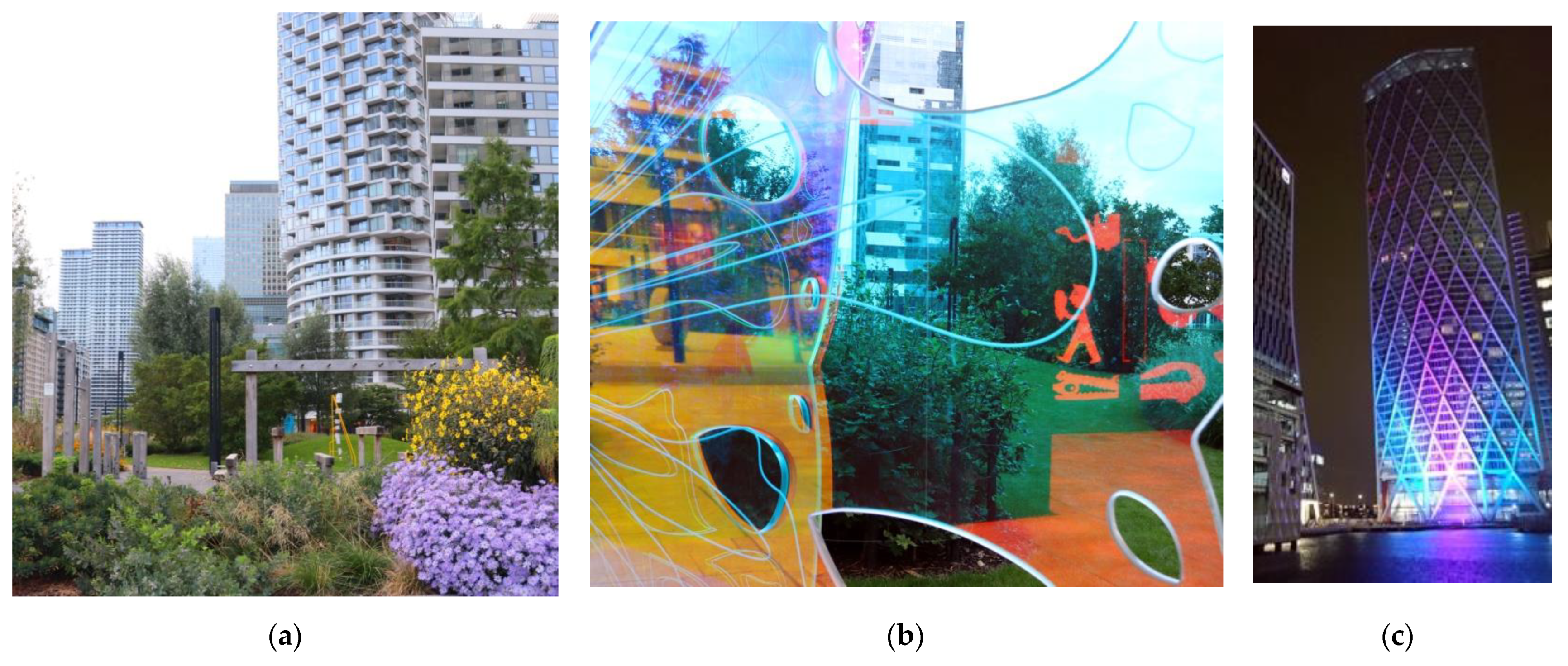
  9. Cernin, Paul A., Brenda K. Keller, and Julie Stoner. 2003. Color vision in Alzheimer’s patients: Can we improve object recognition with color cues? Aging, Neuropsychology, and Cognition 10: 255–67. [Google Scholar] [CrossRef]
  10. Conway, Bevil R. 2009. Color vision, cones, and color-coding in the cortex. Neuroscientist 15: 274–90. [Google Scholar] [CrossRef] [PubMed]
  11. Crook, Lizie. 2021. Climate Change Means “Whole Paradigm Has to Change” for Skyscrapers. Dezeen, September 11. [Google Scholar]
  12. De Valois, Russell L., and Karen K. De Valois. 1993. A multi-stage color model. Vision Research 33: 1053–65. [Google Scholar] [CrossRef]
  13. Elliot, Andrew J. 2015. Color and psychological functioning: A review of theoretical and empirical work. Front Psychology 6: 368. [Google Scholar] [CrossRef] [Green Version]
  14. Fink, Bernhard, Karl Grammer, and Paul J. Matts. 2006. Visible skin color distribution plays a role in the perception of age, attractiveness, and health in female faces. Evolution and Human Behavior 27: 433–42. [Google Scholar] [CrossRef]
  15. Greater London Authority. 2012. London View Management Framework SPG. London: Mayor of London. [Google Scholar]
  16. Hill, Russell A., and Robert A. Barton. 2005. Psychology: Red enhances human performance in contests. Nature 435: 293. [Google Scholar] [CrossRef] [PubMed]
  17. Historic England. 2018. Listing of Cascades, Non Civil Parish—1449530. The Engine House: Historic England. [Google Scholar]
  18. Holzman, David C. 2010. The Role of Colour in Health and Wellbeing of the Built Environ. Built Environ Journal 19: 403–4. [Google Scholar]
  19. Ingarden, Roman. 1970. Studia z estetyki. In Dzieła Filozoficzne, cz.III. Warszawa: PWN, pp. 97–98. [Google Scholar]
  20. Jencks, Charles. 2005. The iconic building the power of Enigma. In The Iconic Building the Power of Enigma. London: Frances Lincoln Ltd., pp. 65–69. [Google Scholar]
  21. Lewis, Miles, ed. 2008. Architectura: Elements of Architectural Style. Australia: Global Book Publishing Pty Ltd., pp. 320–35. [Google Scholar]
  22. Lockley, Steven W., Erin E. Evans, Frank A. J. L. Scheer, George C. Brainard, Charles A. Czeisler, and Daniel Aeschbach. 2006. Short-wavelength sensitivity for the direct effects of light on alertness, vigilance, and the waking electroencephalogram in humans. Sleep 29: 161–68. [Google Scholar] [CrossRef] [PubMed] [Green Version]
  23. London Borough of Tower Hamlets. 2020a. Tower Hamlets Local Plan 2031: Managing Gowth and Sharing Benefits. London: London Borough of Tower Hamlets. [Google Scholar]
  24. London Borough of Tower Hamlets. 2020b. High Density Living Supplementary Planning Document. London: London Borough of Tower Hamlets. [Google Scholar]
  25. Malacara, Daniel. 2011. Color Vision and Colorimetry: Theory and Applications. Bellingham: Spie, pp. 30–38. [Google Scholar]
  26. Pevsner, Nikolaus, Elizabeth Williamson, and Malcolm Tucker. 1998. Modern Docklands. In London Docklands Architectural Guide. London: Penguin Group, pp. 49–68. [Google Scholar]
  27. Popek, S. 2008. Barwy I Psychika. Lublin: Wydawnictwo UMCS, pp. 22–24. [Google Scholar]
  28. Porter, Tom, and Byron Mikellides, eds. 2009. Colour for Architecture Today. Abingdon-on-Thames: Taylor & Francis, pp. 35–55. [Google Scholar]
  29. Porter, Tom, and Byron Mikellides. 2020. Colour for Architecture. Abingdon-on-Thames: Taylor & Francis. [Google Scholar]
  30. Royal Borough of Greenwich. 2014. Maritime Greenwich World Heritage Site, Management Plan. London: Royal Borough of Greenwich. [Google Scholar]
  31. Serra Lluch, J. 2019. Color for Architects. Princeton: Princeton Architectural Press Publication. [Google Scholar]
  32. Soldat, Alexander S., Robert C. Sinclair, and Melvin M. Mark. 1997. Color as an environmental processing cue: External affective cues can directly affect processing strategy without affecting mood. Social Cognition 15: 55–71. [Google Scholar] [CrossRef]
  33. Thadani, Dhiru A. 2010. Colour. In The Language of Towns & Cities. A Visual Dictionary. New York: Rizzoli International Publications Inc., pp. 184–85. [Google Scholar]
  34. Webster, Brian. 2021. Colour vision deficiency: The ‘unseen’ disability. British Journal of Nursing 30: 468–69. [Google Scholar] [CrossRef] [PubMed]
  35. Young, D. 2018. Secularization and Secularism. The International Encyclopedia of Anthropology, I1–6. [Google Scholar] [CrossRef] [Green Version]
  36. Zhang, Tengxiao, and Buxin Han. 2014. Experience reverses the red effect among Chinese stockbrokers. PLoS ONE 24: e89193. [Google Scholar] [CrossRef] [PubMed] [Green Version]
Figure 1. Tall Building Zones on the Isle of Dogs, London, UK (London Borough of Tower Hamlets 2020a).
Arts 11 00009 g001
Figure 2. Research sample: Completed buildings taller than 100 AOD in the Canary Wharf area, London, UK. Source: VuCity 2021, created by AZ.
Arts 11 00009 g002
Figure 3. The historic views of Canary Wharf office towers. (a) Canary Wharf’s skyline viewed from the south, Maritime Greenwich World Heritage Site (2007); (b) Canary Wharf’s skyline viewed from the north, Poplar DLR station (2017).
Arts 11 00009 g003
Figure 4. Change in appearance of the building depending on light conditions. (a) From the left: One Canada Square 25 Canada Square and 33 Canada Square in plain sunshine (2021); (b) From the left: 33 Canada Square, One Canada Square and 8 Canada Square office buildings in cloudy weather (2021).
Arts 11 00009 g004
Figure 5. Different reflectivity properties emphasize architectural detailing (a) design of serviced apartments at 22 Hertsmere Road in the same style as office buildings, steel horizontal banding highlighted in daylight as lighter on eastern and as darker on southern elevation in contrast to glass rainscreen (2020); (b) The Southern frontage of One Canada Square with post-modern steel detailing appearing as different colour from the building walls made from the very same steel (2020).
Arts 11 00009 g005
Figure 6. Residential towers from C20: (a) The Cascades (2021); (b) Towers of Barkantine Estate at the foreground (2021).
Arts 11 00009 g006
Figure 7. Panorama of the tall buildings clusters around Canary Wharf, view from West (2021). Tall buildings in the foreground, from the left: Newfoundland, 1 Bank Street, Landmark Pinnacle, Cascades. In the background from the left: 8 Canada Square, One Canada Square, 25 Canada Square, 1 Churchill Place, Landmark, Novotel, Maine Tower.
Arts 11 00009 g007
Figure 8. (a) Similarities between architectural design of residential and office towers in the Isle of Dogs; from the left: Landmark Pinnacle, 1 Bank Street, Newfoundland (2020); (b) Structurally colourful Novotel (2021).
Arts 11 00009 g008
Figure 9. Simplicity of powerful detail on South Quay Plaza. (a) Subtle detail of the building’s top highlighted by introduction of smooth solid curtain wall over few top floors (2021), (b) Similar approach applied to the base of the building: First three floors of flushed glass (2021). (c) Different lighting conditions add colour but articulation of detail remains the same (2021).
Arts 11 00009 g009
Figure 10. Sunshine as a colouring factor, One Dollar Bay building: (a) Western elevation with glass reflectivity amplified by the sunset light; (b) close-up detail and transparent glass properties induced by daylight conditions (2019); (c) reflectivity visually dissolves the building in the sky (2019).
Arts 11 00009 g010
Figure 11. Sunshine as a deconstructing factor, Baltimore Wharf example. (a) Silhouette of the tower in good lighting conditions (2019), (b) Close up of the tower in poor lighting conditions (2020); (c) Detail of terraces in poor lighting conditions (2019).
Arts 11 00009 g011aArts 11 00009 g011b
Figure 12. Colour applied to create formal illusions, the Wardian. (a) Regular rhythm of elevations with depth of balconies amplified by dark colour soffits (2020); (b) The entrance area visually disjointed from the main mass of the building through the dark colour louvers wrapping the service level (2020).
Arts 11 00009 g012
Figure 13. Examples of colour and domestic detailing in residential towers, (a) pixelated Franklin Tower in the centre, Sirocco Tower to the right and Ability Place (not included in the study) to the left; (b) Harbour Central estate, from left: Sirocco, Ostro, Maine, Salvor towers, Franklin Tower in the background (2021).
Arts 11 00009 g013
Figure 14. Examples of domestic detailing in residential towers, (a) Pan Peninsula; (b) Detail of One Park Drive detailing between the base and the middle section (2021); (c) Silhouette of One Park Drive with horizontal hierarchy of textures.
Arts 11 00009 g014
Figure 15. Colours and visual connections at the human scale: (a) The Franklin Tower flying over the public realm, colour of the support columns and their slenderness visually connect the building with the public realm (2020); (b) Variety of colours at the ground level of Harbour Central buildings: Maine tower to the left and Sirocco Tower to the right (2020). (c) One Dollar Bay: Ground floor folded glass panels with laminated golden mesh; (d) One Dollar Bay: Similarly folded interior cladding of the lobby painted in golden colour.
Arts 11 00009 g015aArts 11 00009 g015b
Figure 16. Panorama of the Isle of Dogs tall buildings’ clusters from the Greenland Dock in typical London grey conditions (2021).
Arts 11 00009 g016
Figure 17. Panorama of the Isle of Dogs tall buildings’ clusters from the Greenland Dock in the sun set (2021).
Arts 11 00009 g017
Figure 18. Ascetic approach to colour in the first decades of docklands’ regeneration. (a) Toned earthy colours of the Grade II Listed post-modern the Cascades (2020); (b) the Isle of Dogs tall building cluster seen from the north demonstrates the ascetic approach to colour in the design of tall buildings, regardless of their use; from the left: 8 Canada Square (office), One Park Drive (residential), 20 Churchill Place (office), One Canada Square (office), South Quay Plaza (residential), Newfoundland (residential), Landmark Pinnacle (residential) (2021).
Arts 11 00009 g018
Figure 19. Optical illusions as means of architectural expression. (a) South Quay Plaza: The residential tower and office building where contrasting tint highlights vertical and horizontal detailing, respectively (2021); (b) Facades of Franklin Tower, Maine Tower and Sirocco Tower with colour detail applied to break down the mass into smaller sections (2020).
Arts 11 00009 g019aArts 11 00009 g019b
Figure 20. Fluorescent, high saturation colours are visible in any weather conditions and at any distance. (a) View of Clover Courts (not included in the study) from the southern bank of the River Thames (2021); (b) Monochromatic panorama of tall buildings cluster in the Isle of Dogs on a cloudy day (2021).
Arts 11 00009 g020
Figure 21. Colour and legibility. (a) Colour highlight of the car entrance in 10 Park Drive building (2021); (b) Colour distinguishing different sections of the Harbour Exchange development (2021).
Arts 11 00009 g021
Figure 22. Colours and visual connections at the human scale; (a) Soft landscaping in the new park on Wood Wharf (2021); (b) Public art on Wood Wharf provides opportunities to experience colourful surroundings (2021); (c) Night time colourful illumination of the Newfoundland building (2021).
Arts 11 00009 g022
Publisher’s Note: MDPI stays neutral with regard to jurisdictional claims in published maps and institutional affiliations.