

The Effect of Color Contrast on the Visual Clarity of Images of Complex Indoor Environments


Abstract
1. Introduction
2. Materials and Methods
2.1. Participants
2.2. Stimuli
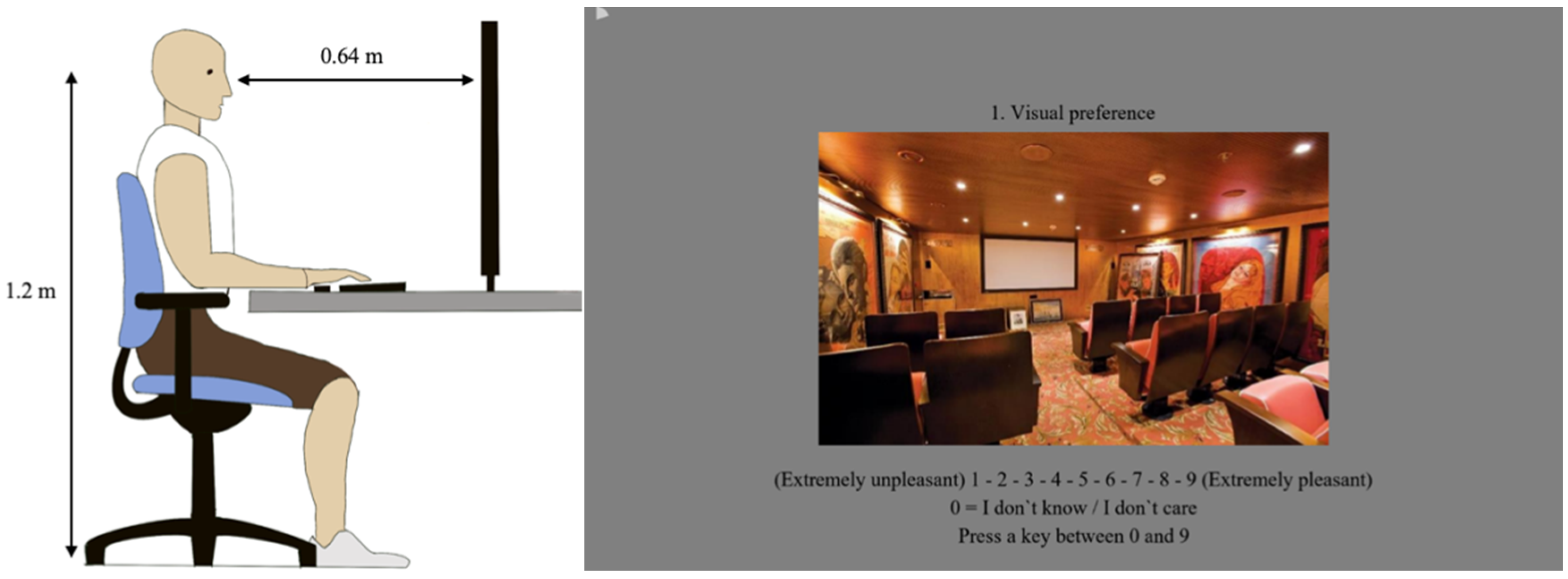
2.3. Procedure
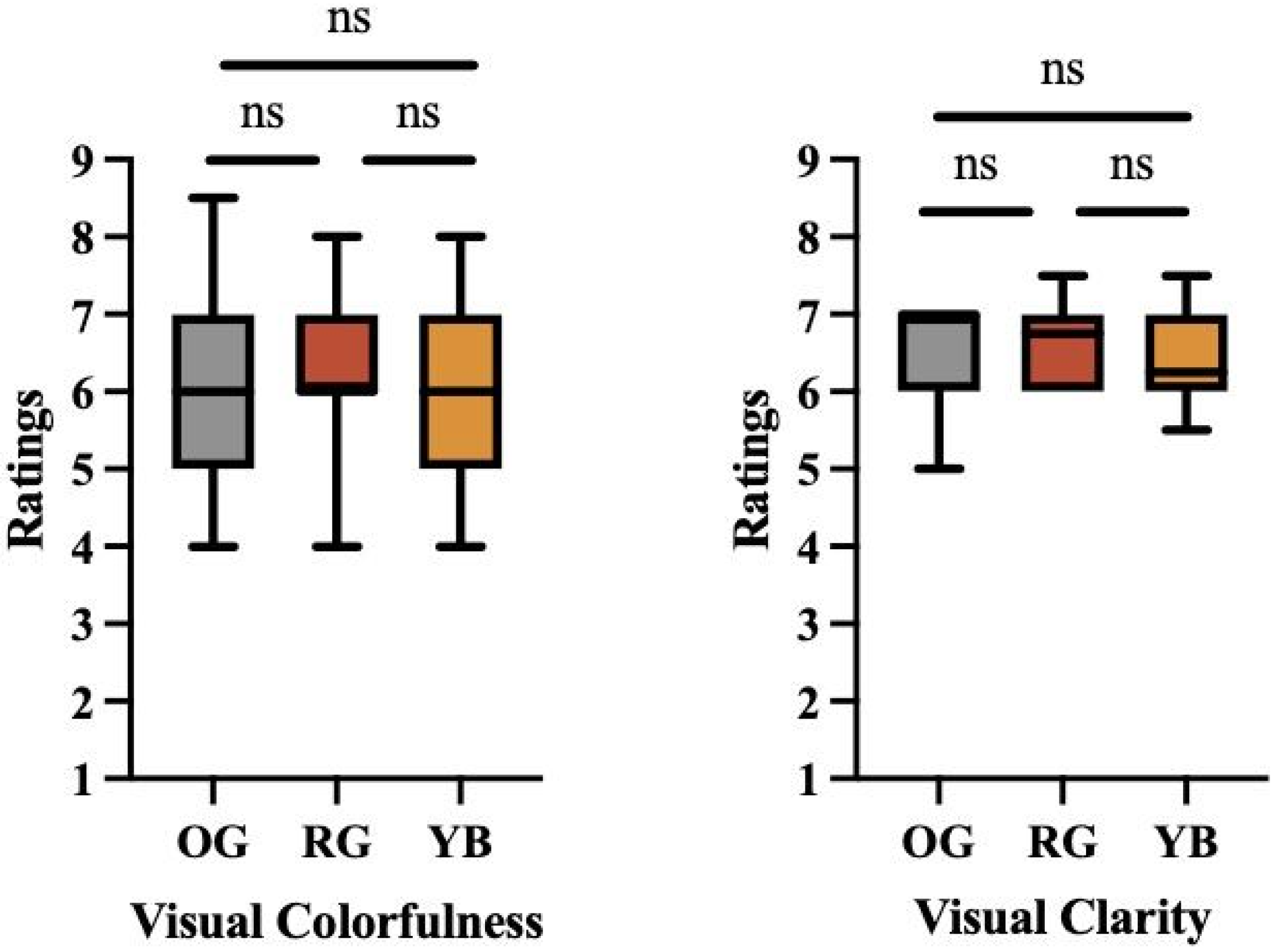
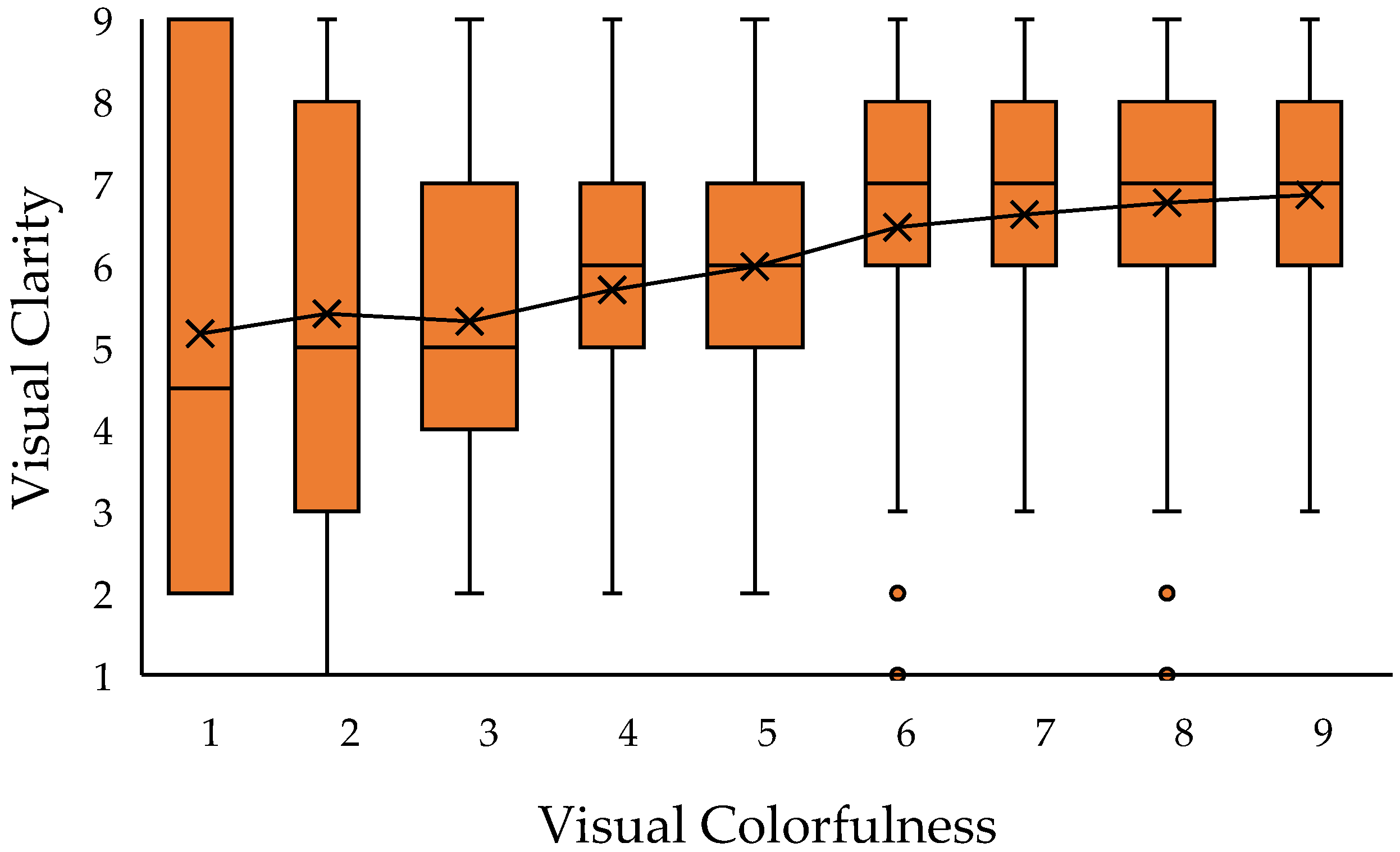
3. Results
4. Discussion
5. Conclusions
Author Contributions
Funding
Institutional Review Board Statement
Informed Consent Statement
Data Availability Statement
Conflicts of Interest
References
- Cho, J.Y.; Suh, J. Spatial Color Efficacy in Perceived Luxury and Preference to Stay: An Eye-Tracking Study of Retail Interior Environment. Front. Psychol. 2020, 11, 296. [Google Scholar] [CrossRef]
- Serra, J.; Gouaich, Y.; Manav, B. Preference for Accent and Background Colors in Interior Architecture in Terms of Similarity/Contrast of Natural Color System Attributes. Color Res. Appl. 2022, 47, 135–151. [Google Scholar] [CrossRef]
- Durmus, D.; Wang, T.; Gonzalez, C.; Kore, R. Role of Lighting and Color in Microeconomics: Preference and Purchase Intent. IOP Conf. Ser. Earth Environ. Sci. 2024, 1320, 012024. [Google Scholar] [CrossRef]
- Geng, Z.; Le, W.; Guo, B.; Yin, H. Analysis of Factors Affecting Visual Comfort in Hotel Lobby. PLoS ONE 2023, 18, e0280398. [Google Scholar] [CrossRef]
- Lewandowska, A.; Olejnik-Krugly, A.; Jankowski, J.; Dziśko, M. Subjective and Objective User Behavior Disparity: Towards Balanced Visual Design and Color Adjustment. Sensors 2021, 21, 8502. [Google Scholar] [CrossRef]
- Leung, M.; Wang, C.; Li, L. Impact of Indoor Visual Environment on Emotional and Behavioral Symptoms of Older People with Dementia. Build. Environ. 2024, 265, 111980. [Google Scholar] [CrossRef]
- Tomassoni, R.; Galetta, G.; Treglia, E. Psychology of Light: How Light Influences the Health and Psyche. PSYCH 2015, 6, 1216–1222. [Google Scholar] [CrossRef]
- Manav, B. Color-emotion Associations, Designing Color Schemes for Urban Environment-architectural Settings. Color Res. Appl. 2017, 42, 631–640. [Google Scholar] [CrossRef]
- Yi, J.H.; Jeon, J. A Study on Color Conspicuity and Color Harmony of Wayfinding Signs According to Outdoor Environment Types. Color Res. Appl. 2022, 47, 1259–1294. [Google Scholar] [CrossRef]
- Zhang, Y.; Yao, Q.; Yang, Z.; Qin, B.; Chen, S.; Xu, W.; Wu, P.; Hao, K.; Shen, Y.; Wang, D.; et al. Spectrum Mapping Technology Based Creation of a Color-Contrast Reading Environment to Reach Comfort and Clarity. Opt. Express 2024, 32, 13208. [Google Scholar] [CrossRef]
- Min, Y.H.; Lee, S. Does Interior Color Contrast Enhance Spatial Memory? Color Res. Appl. 2020, 45, 352–361. [Google Scholar] [CrossRef]
- Thorpert, P.; Englund, J.-E.; Sang, Å.O. Shades of Green for Living Walls—Experiences of Color Contrast and Its Implication for Aesthetic and Psychological Benefits. Nat.-Based Solut. 2023, 3, 100067. [Google Scholar] [CrossRef]
- McLachlan, F.; Leng, X. Colour Here, There, and In-between—Placemaking and Wayfinding in Mental Health Environments. Color Res. Appl. 2021, 46, 125–139. [Google Scholar]
- Güneş, E.; Olguntürk, N. Color-emotion Associations in Interiors. Color Res. Appl. 2020, 45, 129–141. [Google Scholar] [CrossRef]
- Aston, S.M.; Bellchambers, H. Illumination, Colour Rendering and Visual Clarity. Light. Res. Technol. 1969, 1, 259–261. [Google Scholar]
- Chen, T.-L.; Yu, C.-Y. The Relationship between Visual Acuity and Color Contrast in the OSA Uniform Color Space. Color Res. Appl. 1996, 21, 18–25. [Google Scholar]
- Vrabel, P.L.; Bernecker, C.A.; Mistrick, R.G. Visual Performance and Visual Clarity under Electric Light Sources: Part 2—Visual Clarity. J. Illum. Eng. Soc. 1998, 27, 29–41. [Google Scholar] [CrossRef]
- Belichambers, H.; Godby, A. Illumination, Colour Rendering and Visual Clarity. Light. Res. Technol. 1972, 4, 104–106. [Google Scholar]
- Flynn, J.E.; Spencer, T.J.; Martyniuk, O.; Hendrick, C. Interim Study of Procedures for Investigating the Effect of Light on Impression and Behavior. J. Illum. Eng. Soc. 1973, 3, 87–94. [Google Scholar]
- Flynn, J.E.; Spencer, T.J. The Effects of Light Source Color on User Impression and Satisfaction. J. Illum. Eng. Soc. 1977, 6, 167–179. [Google Scholar] [CrossRef]
- Vrabel, P.; Bernecker, C.; Mistrick, R. Visual Performance and Visual Clarity under Electric Light Sources: Part 1—Visual Performance. J. Illum. Eng. Soc. 1995, 24, 69–80. [Google Scholar]
- Hashimoto, K.; Nayatani, Y. Visual Clarity and Feeling of Contrast. Color Res. Appl. 1994, 19, 171–185. [Google Scholar]
- McKeefry, D.J.; Murray, I.J.; Kulikowski, J.J. Red–Green and Blue–Yellow Mechanisms Are Matched in Sensitivity for Temporal and Spatial Modulation. Vis. Vision. Res. 2001, 41, 245–255. [Google Scholar] [CrossRef]
- Tansley, B.W.; Boynton, R.M. A Line, Not a Space, Represents Visual Distinctness of Borders Formed by Different Colors. Science 1976, 191, 954–957. [Google Scholar] [CrossRef]
- Tansley, B.W.; Valberg, A. Chromatic Border Distinctness: Not an Index of Hue or Saturation Differences. J. Opt. Soc. Am. JOSA 1979, 69, 113–118. [Google Scholar] [CrossRef]
- Valberg, A.; Tansley, B.W. Tritanopic Purity-Difference Function to Describe the Properties of Minimally Distinct Borders. J. Opt. Soc. Am. JOSA 1977, 67, 1330–1336. [Google Scholar] [CrossRef]
- Hurvich, L.M.; Jameson, D. An Opponent-Process Theory of Color Vision. Psychol. Rev. 1957, 64, 384. [Google Scholar]
- Hunt, R.W.G.; Pointer, M.R. Measuring Colour; John Wiley & Sons: Hoboken, NJ, USA, 2011; ISBN 1-119-97537-9. [Google Scholar]
- Worthey, J.A. An Analytical Visual Clarity Experiment. J. Illum. Eng. Soc. 1985, 15, 239–251. [Google Scholar]
- Durmus, D.; Davis, W. Blur Perception and Visual Clarity in Light Projection Systems. Opt. Express 2019, 27, A216–A223. [Google Scholar]
- Niu, Y.; Zhang, H.; Guo, W.; Ji, R. Image Quality Assessment for Color Correction Based on Color Contrast Similarity and Color Value Difference. IEEE Trans. Circuits Syst. Video Technol. 2018, 28, 849–862. [Google Scholar] [CrossRef]
- Maule, J.; Skelton, A.E.; Franklin, A. The Development of Color Perception and Cognition. Annu. Rev. Psychol. 2023, 74, 87–111. [Google Scholar] [CrossRef] [PubMed]
- Yu, C.; Wijntjes, M.; Eisemann, E.; Pont, S. Effects of Inter-Reflections on the Correlated Colour Temperature and Colour Rendition of the Light Field. Light. Res. Technol. 2023, 55, 772–793. [Google Scholar] [CrossRef]
- Bellia, L.; Fragliasso, F.; Stefanizzi, E. Effects of Light Source Spectrum and Background Colour on the Perception of Paintings. Light. Res. Technol. 2020, 52, 36–63. [Google Scholar] [CrossRef]
- Charrier, C.; Lebrun, G.; Lezoray, O. A Machine Learning-Based Color Image Quality Metric. Conf. Colour Graph. Imaging Vis. 2006, 3, 251–256. [Google Scholar] [CrossRef]
- Weingerl, P.; Hladnik, A.; Javoršek, D. Development of a Machine Learning Model for Extracting Image Prominent Colors. Color Res. Appl. 2020, 45, 409–426. [Google Scholar] [CrossRef]
- Yu, J.; Egger, R. Color and Engagement in Touristic Instagram Pictures: A Machine Learning Approach. Ann. Tour. Res. 2021, 89, 103204. [Google Scholar] [CrossRef]
- Brady, D.J.; Fang, L.; Ma, Z. Deep Learning for Camera Data Acquisition, Control, and Image Estimation. Adv. Opt. Photon. 2020, 12, 787. [Google Scholar] [CrossRef]
- Nadler, E.O.; Darragh-Ford, E.; Desikan, B.S.; Conaway, C.; Chu, M.; Hull, T.; Guilbeault, D. Divergences in Color Perception between Deep Neural Networks and Humans. Cognition 2023, 241, 105621. [Google Scholar] [CrossRef]
- Jaglarz, A. Perception of Color in Architecture and Urban Space. Buildings 2023, 13, 2000. [Google Scholar] [CrossRef]
- Espinoza-Sanhueza, C.; Hébert, M.; Lalonde, J.-F.; Demers, C. Evaluating Spatial Attributes of Surface Colors Under Daylight and Electrical Lighting in Sustainable Architecture. Sustainability 2025, 17, 1653. [Google Scholar] [CrossRef]
- Li, K.; Zheng, Z.; Wang, P.; Yan, W. Research on the Colour Preference and Harmony of the TWO-COLOUR Combination Buildings. Color Res. Appl. 2022, 47, 980–991. [Google Scholar] [CrossRef]
- Collier, J.M.; Wilkerson, A.; Durmus, D.; Rodriguez-Feo Bermudez, E. Studying Response to Light in Offices: A Literature Review and Pilot Study. Buildings 2023, 13, 471. [Google Scholar] [CrossRef]
- He, Y.; Li, Y.; Xing, L.; Qiu, Z.; Zhang, X. Influence of Text Luminance, Text Colour and Background Luminance of Variable-Message Signs on Legibility in Urban Areas at Night. Light. Res. Technol. 2021, 53, 263–279. [Google Scholar] [CrossRef]
- Faul, F.; Erdfelder, E.; Lang, A.-G.; Buchner, A. G*Power 3: A Flexible Statistical Power Analysis Program for the Social, Behavioral, and Biomedical Sciences. Behav. Res. Methods 2007, 39, 175–191. [Google Scholar] [CrossRef]
- Durmus, D. Correlated Color Temperature: Use and Limitations. Light. Res. Technol. 2022, 54, 363–375. [Google Scholar]
- Zhou, B.; Lapedriza, A.; Khosla, A.; Oliva, A.; Torralba, A. Places: A 10 Million Image Database for Scene Recognition. IEEE Trans. Pattern Anal. Mach. Intell. 2017, 40, 1452–1464. [Google Scholar] [CrossRef]
- ITU-T P.910; Subjective Video Quality Assessment Methods for Multimedia Applications. International Telecommunication Union: Geneva, Switzerland, 2008.
- Durmus, D. Spatial Frequency and the Performance of Image-Based Visual Complexity Metrics. IEEE Access 2020, 8, 100111–100119. [Google Scholar] [CrossRef]
- CIE 015:2018; Colorimetry. Commission Internationale de l’Eclairage: Vienna, Austria, 2018.
- Hasler, D.; Suesstrunk, S.E. Measuring Colorfulness in Natural Images. Int. Soc. Opt. Photonics 2003, 5007, 87–95. [Google Scholar]
- Chou, C.-H.; Hsu, Y.-H. Quality Assessment of Color Images Based on the Measure of Just Noticeable Color Difference. In Proceedings of the Fifth International Conference on Graphic and Image Processing, Hong Kong, China, 10 January 2014; p. 906925. [Google Scholar]
- Wang, Y.; Durmus, D. Image Quality Metrics, Personality Traits, and Subjective Evaluation of Indoor Environment Images. Buildings 2022, 12, 2086. [Google Scholar] [CrossRef]
- Royer, M.; Houser, K.; Durmus, D.; Esposito, T.; Wei, M. Recommended Methods for Conducting Human Factors Experiments on the Subjective Evaluation of Colour Rendition. Light. Res. Technol. 2022, 54, 199–236. [Google Scholar] [CrossRef]
- Shevell, S.K. The Time Course of Chromatic Adaptation. Color Res. Appl. 2001, 26, S170–S173. [Google Scholar]
- Chyung, S.Y.; Roberts, K.; Swanson, I.; Hankinson, A. Evidence-based Survey Design: The Use of a Midpoint on the Likert Scale. Perform. Improv. 2017, 56, 15–23. [Google Scholar]
- Harper, S.; Michailidou, E.; Stevens, R. Toward a Definition of Visual Complexity as an Implicit Measure of Cognitive Load. ACM Trans. Appl. Percept. TAP 2009, 6, 1–18. [Google Scholar]
- Wu, Q.; Tan, Z.; Liu, J. Experimental Study on the Relationship between the Harmony and Cognitive Load of Business Intelligence Dashboard Color Combinations. Color Res. Appl. 2022, 47, 920–941. [Google Scholar]
- Craft, E.; Schutze, H.; Niebur, E.; von der Heydt, R. A Neural Model of Figure–Ground Organization. J. Neurophysiol. 2007, 97, 4310–4326. [Google Scholar]
- Roe, A.W.; Chelazzi, L.; Connor, C.E.; Conway, B.R.; Fujita, I.; Gallant, J.L.; Lu, H.; Vanduffel, W. Toward a Unified Theory of Visual Area V4. Neuron 2012, 74, 12–29. [Google Scholar]
- Wang, Y.; Durmus, D. Variability in Image Quality Assessment Metrics with Different Image Capturing Devices. In Optical Devices and Materials for Solar Energy and Solid-State Lighting; Optica Publishing Group: Washington, DC, USA, 2022; p. PvM3H.5. [Google Scholar]
- Kruger, N.; Janssen, P.; Kalkan, S.; Lappe, M.; Leonardis, A.; Piater, J.; Rodriguez-Sanchez, A.J.; Wiskott, L. Deep Hierarchies in the Primate Visual Cortex: What Can We Learn for Computer Vision? IEEE Trans. Pattern Anal. Mach. Intell. 2012, 35, 1847–1871. [Google Scholar]
- Jobson, D.J.; Rahman, Z.; Woodell, G.A. A Multiscale Retinex for Bridging the Gap between Color Images and the Human Observation of Scenes. IEEE Trans. Image Process. 1997, 6, 965–976. [Google Scholar]
- Richardson, C.; Saunders, D. Acceptable Light Damage—A Preliminary Investigation. Stud. Conserv. 2007, 52, 177–187. [Google Scholar] [CrossRef]
- Kore, R.; Durmus, D. Optimizing Light Source Spectra for Art Conservation: Exploring Basic Color Groups. LEUKOS 2024, 1–13. [Google Scholar] [CrossRef]
- Munafò, M.; Neill, J. Null Is Beautiful: On the Importance of Publishing Null Results. J. Psychopharmacol. 2016, 30, 585. [Google Scholar] [CrossRef] [PubMed]


| Original (OG) | Yellow–Blue (YB) | Red–Green (RG) | |||||||||||
|---|---|---|---|---|---|---|---|---|---|---|---|---|---|
| Category | Metric | Min. | Avg. | Max. | SD | Min. | Avg. | Max. | SD | Min. | Avg. | Max. | SD |
| Visual complexity | Rspt | 114 | 254 | 395 | 91 | 111 | 247 | 395 | 88 | 111 | 241 | 367 | 87 |
| SI | 51 | 70 | 95 | 11 | 50 | 72 | 95 | 11 | 51 | 73 | 95 | 11 | |
| Colorfulness | M | 12 | 45 | 81 | 19 | 12 | 49 | 108 | 21 | 15 | 53 | 108 | 24 |
| Cab* | 12 | 24 | 45 | 10 | 12 | 25 | 53 | 11 | 12 | 26 | 52 | 12 | |
| Brightness | Lpxl | 72 | 113 | 156 | 26 | 70 | 113 | 158 | 27 | 69 | 111 | 157 | 27 |
| Color difference | ΔE*ab | - | - | - | - | 1.1 | 4.4 | 10.4 | 2.7 | 1.3 | 4.3 | 13.2 | 3.0 |
| ΔE00 | - | - | - | - | 0.6 | 2.4 | 4.9 | 1.2 | 0.9 | 2.4 | 6.0 | 1.4 | |
| Key Finding | Original (OG) | Red–Green Enhanced (RG) | Yellow–Blue Enhanced (YB) |
|---|---|---|---|
| Average clarity rating | 6.58 | 6.39 | 6.56 |
| Median clarity rating | 6.00 | 6.00 | 6.00 |
| Average colorfulness rating | 5.12 | 5.14 | 5.17 |
| Median colorfulness rating | 5.00 | 5.00 | 5.00 |
| No significant difference in clarity between conditions | Yes (no statistical difference) | Yes (no statistical difference) | Yes (no statistical difference) |
| Colorfulness shows a slight increase with RG and YB enhancements | No | Yes (slightly higher) | Yes (slightly higher) |
| Trend of increasing clarity with higher colorfulness | No significant change | Yes (linear trend observed) | Yes (linear trend observed) |
| Perceived clarity and colorfulness are generally consistent | Yes | Yes | Yes |
Disclaimer/Publisher’s Note: The statements, opinions and data contained in all publications are solely those of the individual author(s) and contributor(s) and not of MDPI and/or the editor(s). MDPI and/or the editor(s) disclaim responsibility for any injury to people or property resulting from any ideas, methods, instructions or products referred to in the content. |
© 2025 by the authors. Licensee MDPI, Basel, Switzerland. This article is an open access article distributed under the terms and conditions of the Creative Commons Attribution (CC BY) license (https://creativecommons.org/licenses/by/4.0/).
Share and Cite
Wang, Y.; Durmus, D. The Effect of Color Contrast on the Visual Clarity of Images of Complex Indoor Environments. Buildings 2025, 15, 1157. https://doi.org/10.3390/buildings15071157
Wang Y, Durmus D. The Effect of Color Contrast on the Visual Clarity of Images of Complex Indoor Environments. Buildings. 2025; 15(7):1157. https://doi.org/10.3390/buildings15071157
Chicago/Turabian StyleWang, Yuwei, and Dorukalp Durmus. 2025. "The Effect of Color Contrast on the Visual Clarity of Images of Complex Indoor Environments" Buildings 15, no. 7: 1157. https://doi.org/10.3390/buildings15071157
APA StyleWang, Y., & Durmus, D. (2025). The Effect of Color Contrast on the Visual Clarity of Images of Complex Indoor Environments. Buildings, 15(7), 1157. https://doi.org/10.3390/buildings15071157