Article

Predicting Risks of a COVID-19 Outbreak by Using Outdoor Air Pollution Indicators and Population Flow with Queuing Theory

1
Department of Computer Science and Information Engineering, National Taiwan Normal University, Taipei 11677, Taiwan
2
Institute of Information Science, Academia Sinica, Taipei 11529, Taiwan
*
Author to whom correspondence should be addressed.
Atmosphere 2022, 13(10), 1727; https://doi.org/10.3390/atmos13101727
Submission received: 25 August 2022 / Revised: 8 October 2022 / Accepted: 17 October 2022 / Published: 20 October 2022
(This article belongs to the Special Issue Air Quality and Environmental Health: New Findings in COVID-19 Era)

Abstract

:
COVID-19 has been widespread in all countries since it was first discovered in December 2019. The high infectivity of COVID-19 is primarily transmitted between people via respiratory droplets on contact routes, which makes it more difficult to prevent it. Air quality has been considered to be highly correlated with respiratory diseases. In addition, population movement increases contact routes, which increases the risk of COVID-19 outbreaks. For epidemic prevention, the government’s strategies are also one of the factors that affect the risk of outbreaks, including whether it is mandatory to wear masks, stay-at-home orders, or vaccination. Wearing masks can reduce the risk of droplet infection, while stay-at-home orders can reduce contact between people. In this study, the number of COVID-19 confirmed cases and active cases of COVID-19 will be estimated according to the population movement, outdoor air pollution, and vaccination rates. Using the estimated results, the average recovery time will be predicted by Queuing Theory. The predicted average recovery time will be brought into risk analysis to estimate the possible high-risk periods. We compare the estimated high-risk periods with epidemic-prevention measures to provide a reference to evaluate the epidemic prevention plans enforced by relevant government agencies to achieve an improved control measure over the epidemic situation.

1. Introduction

Since the first discovery of the novel coronavirus disease (COVID-19) in December 2019, all countries have been trying to control the outbreak of the epidemic. The high transmissibility of COVID-19 and its high mortality forced governments around the world to enforce different epidemic prevention strategies. However, the characteristics of COVID-19 make it more difficult to predict and prevent. By now, many countries understand how to respond to the outbreak after a difficult period at the beginning of the outbreak.
Epidemic prevention measures are enforced to control and reduce the outbreak, including whether it is mandatory to wear masks, lockdown or stay-at-home orders, or vaccination. The guidelines on when to implement enforcement and when these epidemic prevention measures can be lifted are keys to successfully controlling the outbreak. Currently, many countries have already relaxed the relevant epidemic prevention measures prematurely. The decision is causing the epidemic to break out again in a more serious situation. The risk of the current outbreak and factors that affect the outbreak has become extremely important for the current government to respond to relevant epidemic prevention measures.
According to World Health Organization (WHO) [1], COVID-19 is mainly transmitted via droplets from person to person. Droplets released by activities of the infected person, such as breathing, talking, or coughing, can cause infection relative to surrounding individuals via direct inhalation. Due to the different sizes of droplet particles, the larger-diameter droplets will quickly land on the ground or the surface of the object, while smaller-diameter droplets will be suspended in the air for minutes to hours. When the footprint of the population and the infected person overlap, the risk of infection will be greatly increased. Thus, population movement can be regarded as a major factor affecting the risk of infection.
However, population movement is not the only one that increases the risk of infection. In recent years, the impact of air pollution has given us a better understanding of the relationship between air quality and respiratory diseases. Many researchers confirmed that air pollution increases the risk of respiratory diseases. A study [2] showed that particulate matter (PM) and gaseous pollutants (i.e., ozone, nitrogen dioxide, and sulfur dioxide) have a more significant effect on asthma. Long-term exposure to high levels of air pollutants can affect the development of children’s respiratory systems [3]. For respiratory diseases, particulate matter (PM) in pollutants has been shown to cause respiratory-related diseases [4]. Because of its small particle size, it can enter the human body through breathing and then penetrate the alveoli to circulate in the human body. In addition, air quality and pollutants have certain influence factors on diseases. Fine aerosols may also enter the body with pollutants attached to the particles. These characteristics also allow the COVID-19 virus to attach to the particles and enter the body, causing infection [5]. A study [6] showed that areas with more serious air pollution in most countries will also have a higher risk of COVID-19 outbreaks. Therefore, air pollutants, besides droplets, can also be considered as a route for COVID-19 transmission.
In [7], the authors confirmed that there is a certain correlation between population movement and the increase in finely suspended particulates (PM 2.5 ), which can be suspended in the air for hours. The travel behavior of infected people will make the epidemic spread further, and the virus will spread along the route of these infected people. Taking Wuhan, which was the first infected city, as an example, some studies found that the increase in confirmed cases in other cities is closely related to the population inflow in Wuhan [8]. The correlation between the two further suggests that population movement and air pollutants have a clear impact on COVID-19. In addition, the first vaccine against COVID-19 was developed and administered in December 2020. The emergence of the vaccine effectively reduced the severity of the disease rate after infection, thereby reducing the risk of death [9]. As the result, more patients recovered from COVID-19, and the number of confirmed cases declined. Therefore, we also consider the ratio of vaccine administration as one of the important factors affecting the epidemic in our study.
This study will predict the number of confirmed cases and active cases of COVID-19 in the future via three factors—population movement, outdoor air pollution, and vaccination rates affecting the epidemic situation. Next, we will conduct a theoretical analysis of queuing with the predicted results to obtain the average recovery time. Then, the predicted results will be evaluated with the risk analysis for the future high-risk period of the epidemic. We compare the estimated high-risk periods with epidemic prevention measures to provide a reference to evaluate the epidemic prevention plans enforced by relevant institutions to achieve an improved control measure of the COVID-19 epidemic situation.

2. Materials and Methods

The objective of this study is to predict and analyze the outbreak risk of COVID-19 with population mobility, outdoor air pollutants, and vaccination data. The overview of the proposed method is shown in Figure 1. In Section 2.1, data collected for this research study will be discussed. Next, data preprocessing will be presented in Section 2.2. The next step is the correlation analysis, which will be discussed in Section 2.3. In Section 2.4, the data will be further analyzed for the lagged effect. Before the data prediction (Section 2.6), data need to be portioned and merged according to different prediction methods (i.e., second data preprocessing) in Section 2.5.

2.1. Data

This study uses population mobility, outdoor air pollutants, and vaccination data from California, Florida, New Jersey, and New York between 13 January 2020 and 31 December 2021, for a total of 719 days. This study selected the data from the four states of the United States because the states’ populations are relatively sufficient. Since 2020, the four states have experienced more than one outbreak, which is more suitable for analyzing the differences between each outbreak. We obtained the daily confirmed number and active cases from Worldometer [10] and USAFacts [11].
Air pollution data were obtained from the official website of the United States Environmental Protection Agency [12]. The data obtained for each state are the daily maximum 1 h NO 2 concentration, daily maximum 1 h SO 2 concentration, daily maximum 8 h Ozone concentration, daily average PM 2.5 concentration, and daily maximum 8 h CO concentration.
Population mobility data were obtained from the mobile trend report provided by Apple Maps [13]. The daily traffic volume of each state is the total value of daily driving, walking, and taking public transportation. The traffic volume of Apple Maps is the number of navigation requests made by users relative to Apple Maps. The reason why our study chose Apple Maps data instead of Google Mobility data is that the iOS system accounts for more than half of the US population according to the US mobile phone system statistics provided by the Statista database [14].
The number of people in the US who received two doses of the vaccine was obtained from Our World in Data [15]. The vaccination data set of Our World in Data collected the most recent official numbers from governments and health ministries worldwide. This study selected California, Florida, New Jersey, and New York for our study. The data collection time is 13 January 2020–31 December 2021 for a total of 719 days.

2.2. Data Preprocessing

After data collection is completed, we first deal with the missing values of the air pollution data in two ways. First, if the monitoring station is missing one day’s length of data, the average number of the previous and the next date’s values is used as the missing day value. Second, if data are missing for more than one day, we will remove the data from the monitoring station. We notice that the PM 10 values of most monitoring stations in each state were missing for more than one day. Thus, PM 10 data were excluded from our study. After dealing with missing values, the daily average is calculated to represent the air pollution of each state.
The second data pre-processing step is the Active Case data for COVID-19. The formula of the active medical record data provided by the Worldometer [10] is as follows.
Active   Cases = Total   Cases Total   Deaths Recovered Recovered
Since it comprises cumulative data, this study needs daily active cases. Thus, we calculated the daily active case according to Active Cases(AC) data as follows:
A C t = A C t A C t 1
where A C is the Active Case data set, and A C t is the A C data at time t. After subtracting the A C t data at time t from the A C t 1 data at time t 1 , we can obtain the D a i l y A c t i v i t y C a s e s ( A C t ) at time t.
After data preprocessing, we conducted a correlation analysis on the processed data. First, air pollutant data for each state were analyzed to understand the characteristics of the data.
Table 1 shows the population and the land area of each four states. The population density is from high to low in New Jersey, New York, Florida, and finally California. The population density of New Jersey is four times that of the other three states. All four states have railroad systems. Bus transportation is more common in New Jersey and New York.
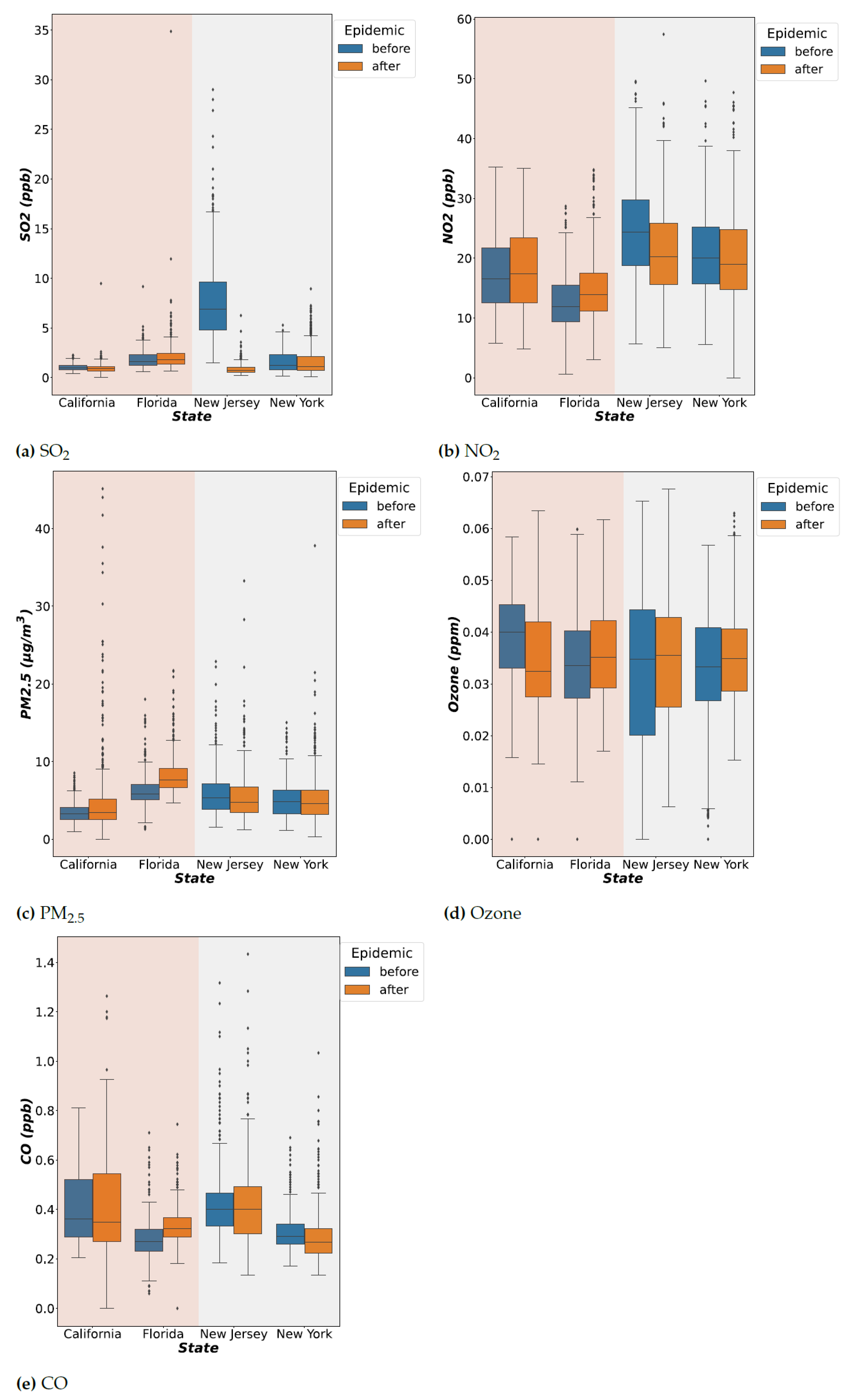
To analyze the data of each state, we first use the average air pollution (i.e., SO 2 , NO 2 , PM 2.5 , Ozone, and CO) of the four states in 2019 to observe the characteristics of each state. Next, we compare the air pollutant data of each state before and after the COVID-19 outbreak to understand changes in air pollution levels in each state.
From Figure 2, for New York and New Jersey, the levels of NO 2 and SO 2 pollutants decreased significantly before and after the epidemic. The sources of NO 2 and SO 2 pollutants were mostly produced by vehicle emissions. However, the average level of PM 2.5 increased in Florida and California. This may be related to the wildfire that produces PM 2.5 . In the case of the Ozone, a significant decrease can be found in California, which had the highest concentration of Ozone before the outbreak. Only Florida had the most significant increase in CO. The five pollutants can be seen to fluctuate before and after the outbreak. With respect to whether this means that they have a certain correlation with the COVID-19 outbreak, more analyses are conducted in the following sections.

2.3. Data Correlation Analysis

In order to understand whether the influencing factors selected for the study are related to COVID-19, this study conducted a correlation analysis on the collected data. First, data are divided according to different epidemic prevention policies, such as the stay-at-home order. We divided the data into three periods. Period 1 includes epidemic prevention measures that have not been implemented. Period 2 is the stay-at-home order enforced. Moreover, Period 3 is when the stay-at-home order is lifted. The stay-at-home order period selected for the study is the state-wide stay-at-home order, and the stay-at-home orders in specific regions are not considered.
After the stay-at-home order was lifted, the state government issued less strict epidemic prevention measures such as wearing masks. In addition, vaccination was started at the end of 2020, so there is no vaccination data for the first two periods. The main reason why the study chooses to divide the data into different periods is that different epidemic prevention policies have a certain impact on air pollutants and population movement. Under these influences, the characteristics selected in the study also have different correlations with the number of confirmed cases and the number of deaths. Therefore, we decided to observe the correlation of the air pollutants and population movement data in different periods according to the time periods listed in Table 2.
We used Pearson’s Correlation [16] to ensure the correlation coefficient. Pearson’s Correlation coefficient is used to measure the degree of relationship between two variables. It is known as the most useful technique for measuring the relationship between the variables of interest because it is based on the covariance method. It provides information about the magnitude and the direction of the association between variables. Pearson’s Correlation formula is as follows:
r = t = 1 n ( x t x ¯ ) ( y t y ¯ ) t 1 n ( x t x ¯ ) 2 t = 1 n ( y t y ¯ ) 2
where r is the correlation coefficient, n is the data set size, x t is the data at time t (i.e., air pollutants/population mobility/vaccination rate), y t is the data on the number of confirmed cases at time t, and x ¯ and y ¯ are the mean averages of the data x t and y t , respectively. The calculated correlation value r should be between −1 and 1, which indicates a negative or a positive correlation, respectively.
Table 3 presented the results of Pearson’s Correlation of the collected data relative to the number of confirmed cases of COVID-19 within different periods. The results are also consistent with the results of the analysis in the previous subsection. New Jersey and New York have similar correlations results due to their similarity in air pollution, population mobility, and confirmed cases in the three periods. Population movement is highly correlated with the number of confirmed cases, which suggested that population movement is a major factor in terms of the spread of the disease when epidemic measures have not been implemented in the early stage of the epidemic.
In Period 2 of the stay-at-home order, the correlation between population mobility and confirmed cases has a downward trend due to restricted population movement. We notice that the level of SO 2 pollutants gradually increased in New Jersey and New York; see Figure 2. We suspected that the stay-at-home order limits the availability of public transportation, which in turn increases the driving behavior and results in producing more SO 2 .
In Period 3, the correlation between air pollutants and population movement with the number of confirmed cases is higher compared with Period 2. When the stay-at-home order was lifted and people returned to normal life, air pollutant levels gradually increased. With the impact of epidemic prevention policies (i.e., Period 2), the correlation of air pollution decreased, but the correlation between driving and walking increased. After the end of the stay-at-home order (i.e., Period 3), the correlation of air pollutants increased again, and the correlation of population movement decreased.
For example, Florida has a relatively higher level of PM 2.5 . Therefore, PM 2.5 has a positive correlation with the number of confirmed cases in Period 1. It is similar to the correlation of population movement. Those correlations disappeared quickly after stay-at-home orders were enforced, but air pollution correlations regained after stay-at-home orders ended.
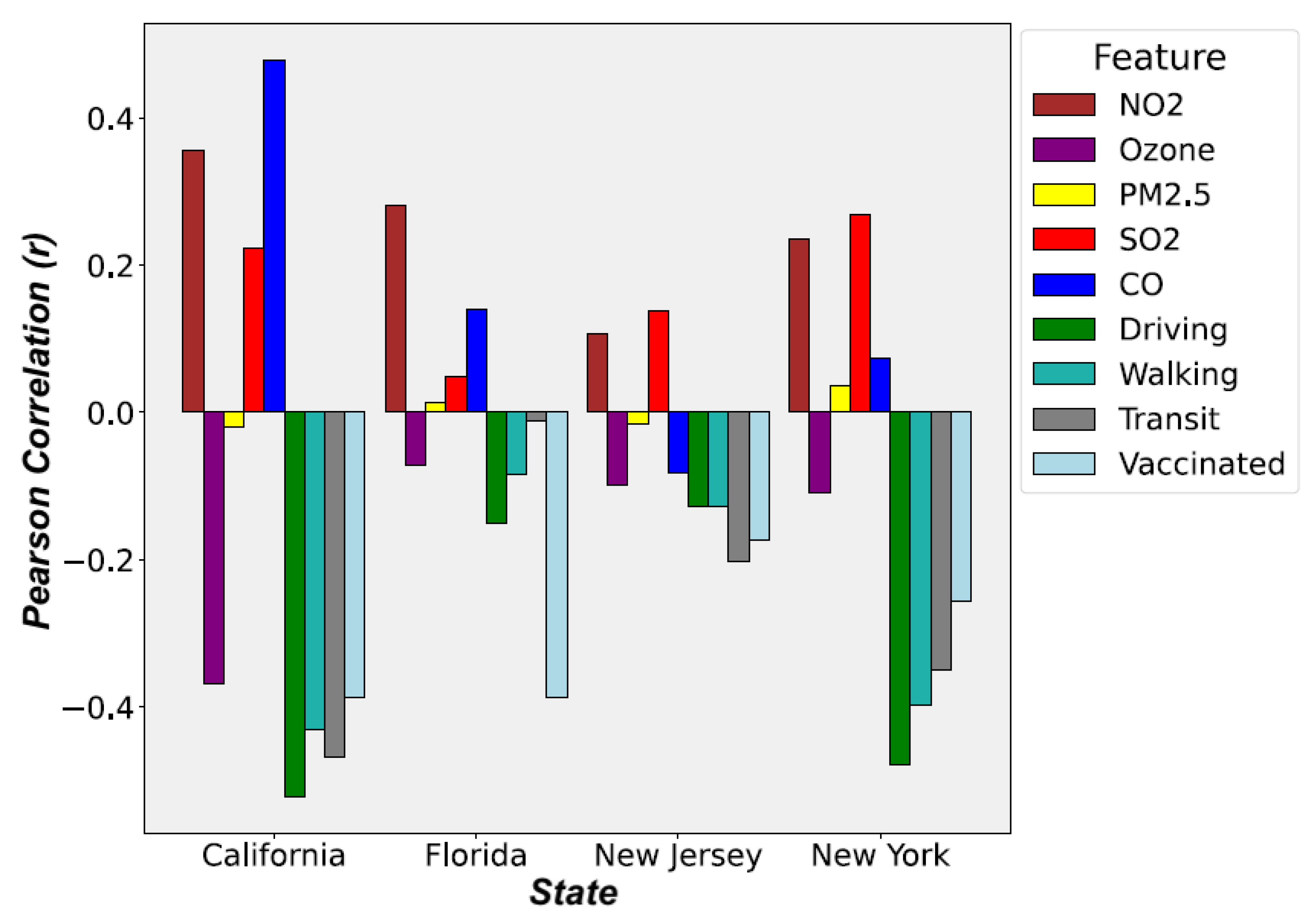
After the correlation analysis, we are able to determine correlations between air pollutants, population movement, and vaccination rates with the number of confirmed cases during the period of different epidemic prevention policies. From Figure 3, NO 2 , Ozone, and SO 2 have a high correlation with the number of confirmed cases. CO has a weaker correlation with the number of confirmed cases in Florida, New Jersey, and New York.
The most unexpected result is that the influence of PM 2.5 is not as high as expected. There are two main reasons. First, the data used in the study are the average values of the entire state, which reduces the correlation. Some cities may indeed have high correlations. Second, PM 2.5 needs to be at a certain concentration level for a long period of time in an environment to have its effect. For example, Florida has a higher average concentration of PM 2.5 , and its impact may not be observed right away. Therefore, we will analyze the effect of delay (i.e., lag) on the impact of the relevance of the data in the next section.

2.4. Hysteresis (Lagged) Effect

Similarly to many other diseases, COVID-19 has a delay that exists between the time of infection and the time of symptoms or death. In addition, there is a lag time between exposure to the airborne virus to infection with the virus. This is called the lagged effect or hysteresis effect. In this section, we analyze the lag days between air pollutants and the number of confirmed cases. The optimal lag days are determined via Pearson’s Correlation as in the previous section. The days with a strong correlation are the lag days selected for this study.
In order to estimate the optimal lag days, this study calculated the mean of the air pollution and the number of confirmed cases based on the assumed lag days (1, 3, 7, 12, and 14). The formula is as follows:
A P t ¯ = t = t t d 1 A P t d = A P t + A P t 1 + + A P t d 1 d
where t is time, d is the lag days (i.e., 1, 3, 7, 12, and 14), A P t is the data of air pollutants at time t, and ( A P t ¯ ) is the air pollutants at time t on d days lag.
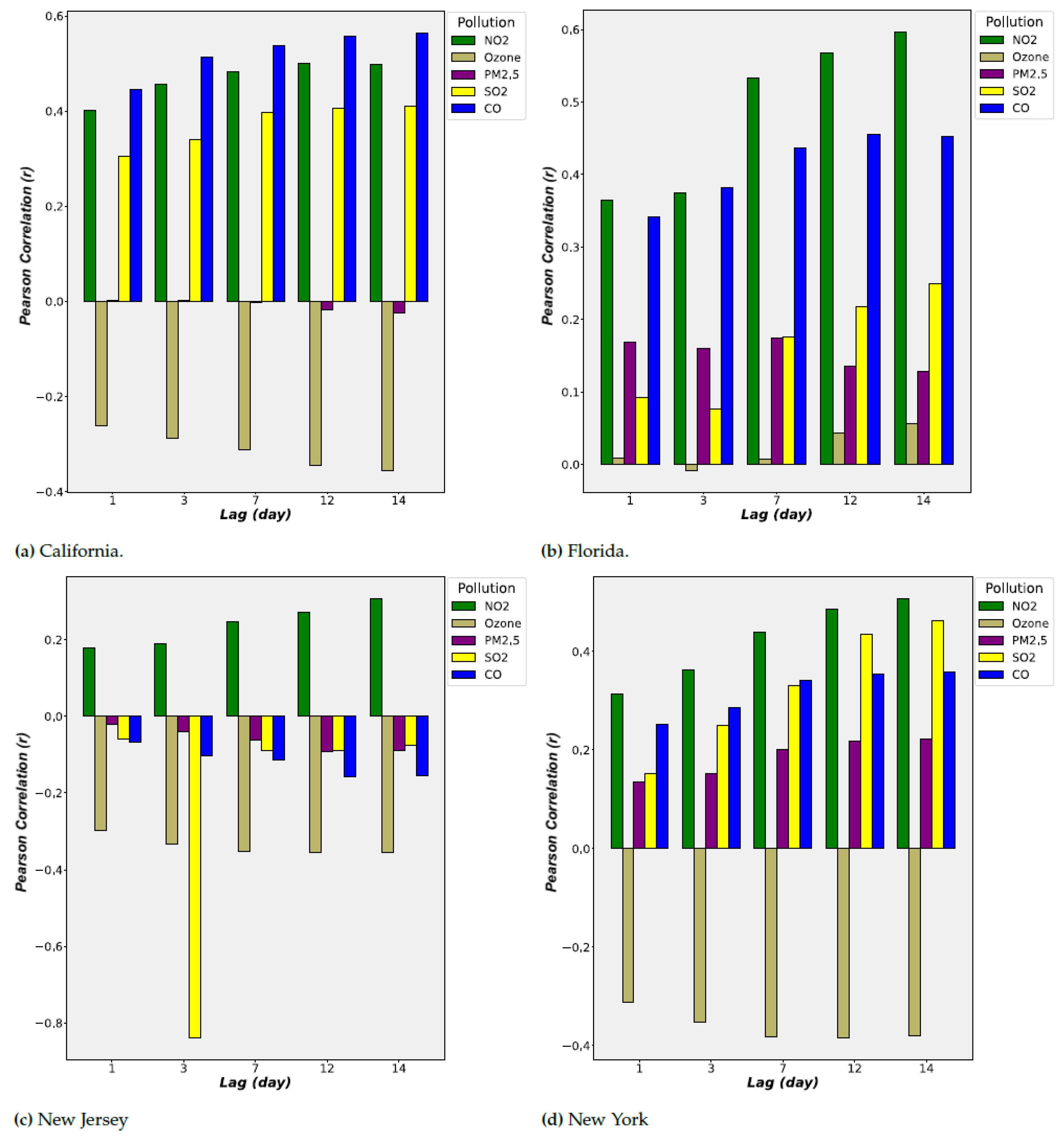
Using Pearson’s Correlation, we calculated the correlation coefficient for different lag days. The days with higher correlation will be the lag days for subsequent research analysis in this study. The results are shown in Figure 4.
In Figure 4, the correlation coefficient improved with the increase in lag days. This confirmed that the lagged effect existed between the time of exposure to the airborne virus to infection with the virus. According to Figure 4, the correlation has a significant increase at the lag of 7 days and peaked at the lag of 12 days and 14 days. Also, the contribution of NO 2 , CO, and Ozone is relatively high. In the result of the previous section, PM 2.5 has a low correlation; its correlation increased significantly after the lagged effect analysis.
In this study, data with a lag of 14 days will be selected for subsequent studies. In addition, correlations of each state are different. A related study [17] proposed that the impact of different places is not the same, and the correlation will also be different. This study addressed this problem by training a model for each state separately. Thus, different correlations will not cause interference with each other and result in improved outcomes.

2.5. Data Partitioning and Merging

After the correlation analysis in Section 2.3, we concluded that the calculated correlation coefficient results have a linear correlation. However, the data may have a nonlinear relation with each other. Therefore, different machine-learning models will be utilized to analyze the data set. The models used for this study are multiple linear regression (MLR), nonlinear polynomial regression (PR), and support vector regression (SVR), which are some of the commonly used algorithms for disease prediction. Because the above regression methods will not consider the time feature of the data, long short-term memory (LSTM), an artificial (recurrent) neural network used in the fields of artificial intelligence and deep learning, is used to analyze the features of the time series data.

2.5.1. Data for Machine Learning Models

Since the machine learning model does not capture time series features, we do not make any adjustments to the time. We first calculated the daily air pollutants (i.e., SO 2 , NO 2 , PM 2.5 , Ozone, and CO) with Equation (4) to obtain the air pollutant data with a lag of 14 days. The obtained data were combined with the daily population movement (Driving, Walking, and Transit) and daily vaccination rate (Vaccinated) data. The combined data set (D) for each state is represented as a matrix of size X R n × 9 , where n is the number of days included in the data with 9 different features (i.e., SO 2 , NO 2 , PM 2.5 , Ozone, CO, Driving, Walking, Transit, and Vaccinated). COVID-19 Daily Confirmed Cases (Cases, C) and Daily Active Cases (Active Cases, A C ) with a lag of 14 days are also represented each as a vector y N n × 1 .
For training the model, the data sets D, C, and A C will be randomly selected to select 0.8 n (i.e., 80%) of the data (n) as the training data set. The remaining 0.2 n (i.e., 20%) will become the verification data set. The training data set and the verification data set for data sets D, C, and AC are denoted as follows: D R _ T r a i n , C R _ T r a i n , A C R _ T r a i n , D R _ V a l i d a t e , C R _ V a l i d a t e , and A C R _ V a l i d a t e .

2.5.2. Data for Long Short-Term Memory (LSTM) Networks

For the LSTM model, we use a many-to-one model structure. The data comprise the original data without the lag effect, which are the air pollutants data (NO 2 , PM 2.5 , SO 2 , Ozone, and CO), daily population movement data (Driving, Walking, and Transit), and daily vaccination rates (Vaccinated). The data are partitioned into groups of 14 days, denoted as D 14 . For example, the original data set of one-day t is denoted as follows: D = [ N O 2 t , S O 2 t , , V a c c i n a t e d t ] . After the data partition, the data set will be D = [ N O 2 t 13 , S O 2 t 13 , , V a c c i n a t e d t 13 ] for a group of 14 days. A set of the previous 14 days of data is used for predictions. Thus, data D are partitioned and transformed into a three-dimensional matrix of data set X R n × 14 × 9 , where n is the number of days included in the data and each partitioned for 14 days with 9 different features (i.e., SO 2 , NO 2 , PM 2.5 , Ozone, CO, Driving, Walking, Transit, and Vaccinated). Similarly to machine learning models, the data set will be divided into the training data sets ( D 14 _ T r a i n , C 14 _ T r a i n , A C 14 _ T r a i n ) and the verification data set ( D 14 _ V a l i d a t e , C 14 _ V a l i d a t e , A C 14 _ V a l i d a t e ) at a ratio of 8:2 according to the time series data.

2.6. Method

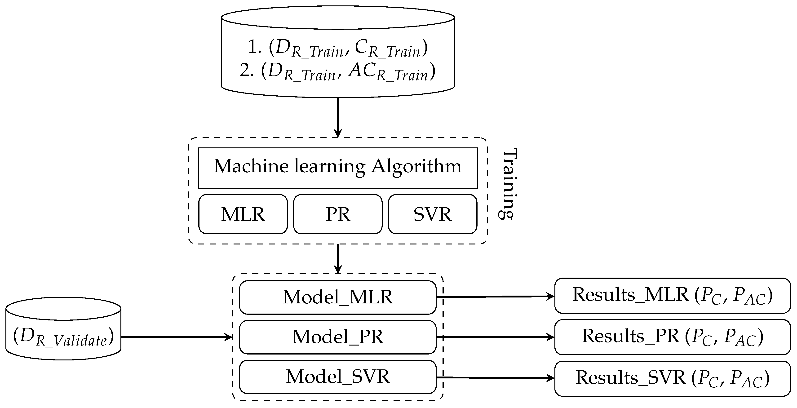
In previous sections, we discussed data collection, data pre-processing, and data analysis. In this section, we will introduce the prediction process for the number of Predicted Cases ( P C ) and Predicted Active Cases ( P A C ) for COVID-19. Each model will be forecasting two outputs. Each model will be trained with the training data set and verified with the verification data set. The process of training and verification of the regression models is shown in Figure 5.

2.6.1. Machine Learning Models

In general, regression models used in machine learning can be divided into a linear regression or nonlinear regression. Multiple Linear Regression (MLR) [18] is one type of linear regression that uses the least squares function of the linear regression equation to model the relationship between multiple independent variables and the dependent variable. MLR has a faster training time due to the low amount of computation. However, outliers can produce errors. In addition, if the data do not have a linear correlation, the nonlinear correlation will be ignored by linear regression.
The nonlinear regression model is used to discover the nonlinear correlation in the data. We used Polynomial Regression (PR) [19] for our study. PR models the relationship between multiple independent variables and the dependent variable as a polynomial of multiple degrees. Although PR can model the nonlinear relationship between the data, it is necessary to understand the characteristics of the data to select a suitable index for fitting. Selecting an index that fits too closely to the training data set can create an overfitting issue.
Since many features are used in this study, Support Vector Regression (SVR) [20] is used, which is also robust to outliers. SVR constructs a hyperplane or set of hyperplanes in a multi-dimensional space by projecting data as a point in the space. The new data are projected into the same space for predictions based on where they fall in the space. In our study, all input features are projected into a multi-dimensional space to find a hyperplane that has the shortest distance from the farthest feature points.
Three (i.e., MLR, PR, and SVR) training models input the training data sets (i.e., D R _ T r a i n , C R _ T r a i n , and A C R _ T r a i n ) to train their regression models; see Section 2.5. The trained models are validated with the verification data set, D R _ V a l i d a t e . Since there are three regression models (MLR, PR, and SVR), each model has its own prediction results of P C and P A C . Figure 6 shows the process of three machine learning models used in this study. However, none of the above three machine learning models take temporal characteristics into account for the prediction model.

2.6.2. Long Short-Term Memory (LSTM) Networks

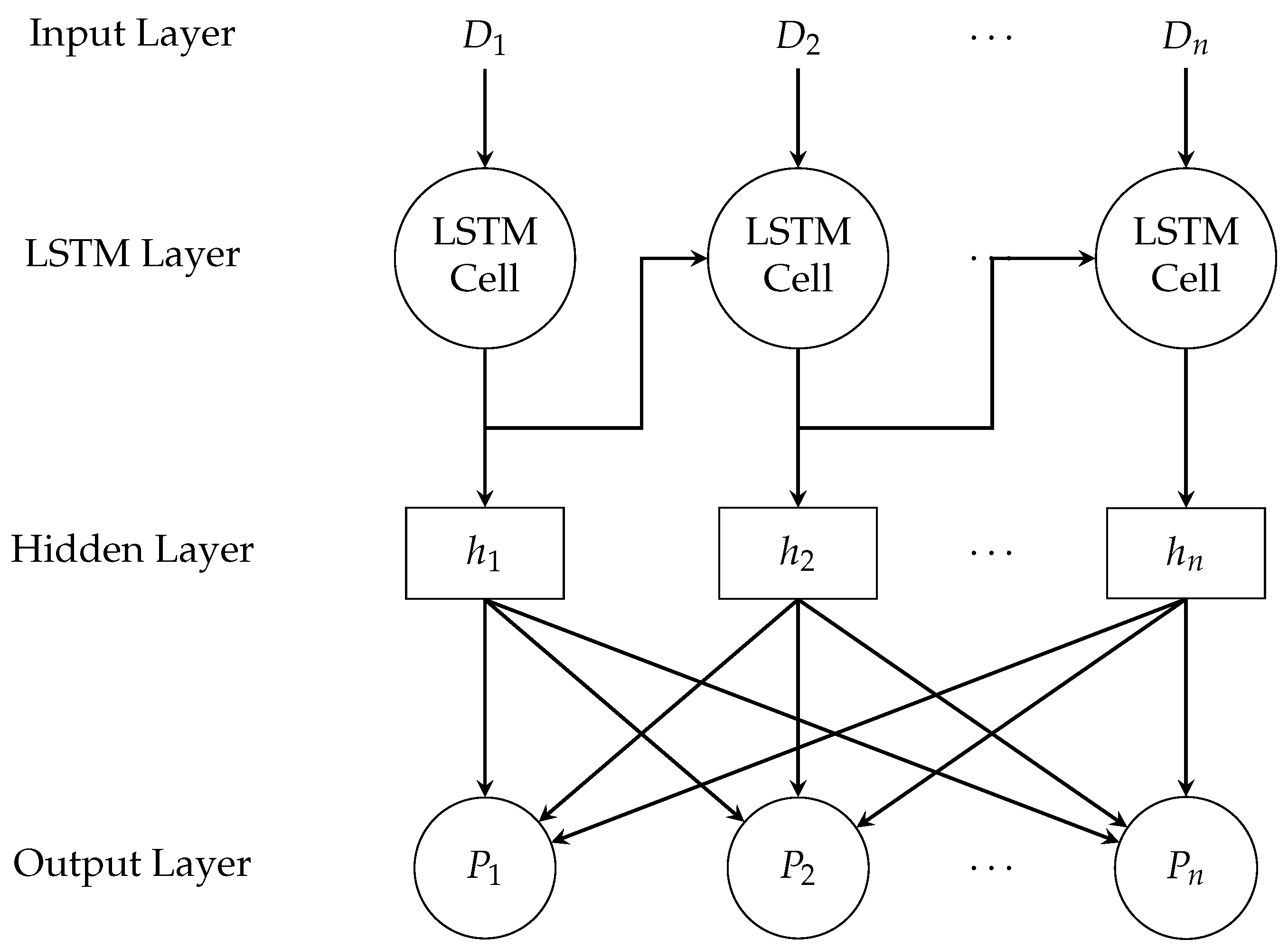
Since there may contain temporal correlations in the data set, Long Short-Term Memory (LSTM) [21] network is used to exploit the temporal feature in the time series data. In order to address the lagged effect mentioned in Section 2.4, the many-to-one LSTM model is selected. The training data sets for LSTM is the three-dimensional matrix, X R n × 14 × 9 , where n is the number of days included in the data and each partitioned for 14 days with 9 different features (i.e., SO 2 , NO 2 , PM 2.5 , Ozone, CO, Driving, Walking, Transit, and Vaccinated) defined in Section 2.5.2.
In Figure 7, the training data D with the length of n are input into LSTM’s Input Layer. The training data sets are the ( D 14 _ T r a i n , C 14 _ T r a i n ) and ( D 14 _ T r a i n , A C 14 _ T r a i n ) for Daily Confirmed Cases (C) and Daily Active Cases ( A C ). The predicted results are input into hidden layers to build the model. The LSTM model is validated with the verification data set ( D 14 _ V a l i d a t e , C 14 _ V a l i d a t e , and A C 14 _ V a l i d a t e ). The output of the LSTM model is predicted confirmed case P C and predicted active case P A C .

2.6.3. Queuing Model

In our previous study [22], we used the queuing model to analyze whether a country is under good control of the pandemic. Queuing theory [23] is a simple mathematical study to predict the lengths and waiting times of queues or waiting lines. The simplest queuing model is Little’s law [24]. In Little’s law, the average number L customers waiting to be severed is equal to the average arrival rate λ multiplied by the average wait time W in the system. The formula for Little’s law is as follows.
L = λ × W
Before applying the Queuing Theory, we first model the state transition of COVID-19 in Figure 8. First, the uninfected public will be in a Susceptible state. If a person is infected, he will enter an Infectious state. An infected person either recovers or is unable to recover from the disease, and he will enter a Recovered state or a Death state. People in the Recovered state will eventually return to the Susceptible state since people may be re-infected with COVID-19.
Combining the state transitions to queuing model, the average arrival rate λ can be regarded as a transition from the Susceptible state to the Infectious state. For Equation (5), average arrival rate λ is the predicted confirmed case P C , which is affected by different features (i.e., SO 2 , NO 2 , PM 2.5 , Ozone, CO, Driving, Walking, Transit, and Vaccinated) described in Section 2.6.1 and Section 2.6.2. The predicted active case P A C is the average number of people L waiting in the queue, which is the cumulative number of confirmed cases in the Infectious state. People will leave the queue once they recover or die; see Figure 9.
Using Equation (5), we are able to derive the average wait time W with λ = P c and L = P A C . The average wait time represents the average recovery time of infected people in our study. The average recovery time can be regarded as a state’s current medical capacity to control the outbreak of disease. When infected patients take a long time to recover, they will stay in the Infectious state for a long time. This means the Little’s law no longer holds due to the cumulative number of confirmed cases in the Infectious state, which means a state’s medical capacity is tight or is facing a period of an outbreak.

2.6.4. Risk Analysis for COVID-19 Outbreak

In this study, we used daily confirmed cases for our risk analysis. We do not use the Basic Reproduction Number ( R 0 ) [25] in epidemiology due to the varying R 0 value of different mutant strains of COVID-19. In different studies, the R 0 value of the Delta strain is 5.1 [26], the Alpha strain is 4 to 5 [27], and the Omicron strain is as high as 7 [28]. Moreover, the R 0 value is different in different regions. The authors of [29] compared the R 0 value of Western Europe with China and observed a lower R 0 value in China. In addition, the R 0 value is only used to calculate the initial stage of an epidemic. When public health interventions begin and population immunity appears, the Effective Reproductive Number ( R t ) [30] is used to estimate the change in the number of infections within a certain period of time. However, both R 0 and R t are difficult to estimate as they have many factors that can affect the estimation.
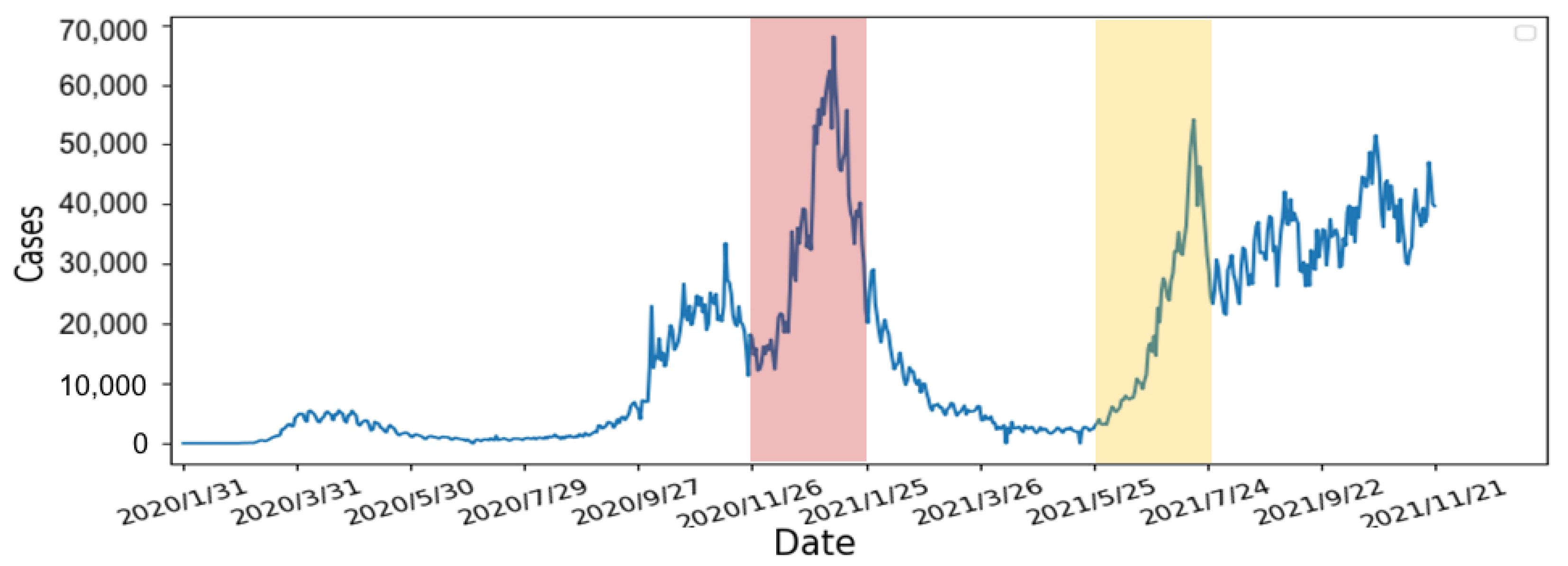
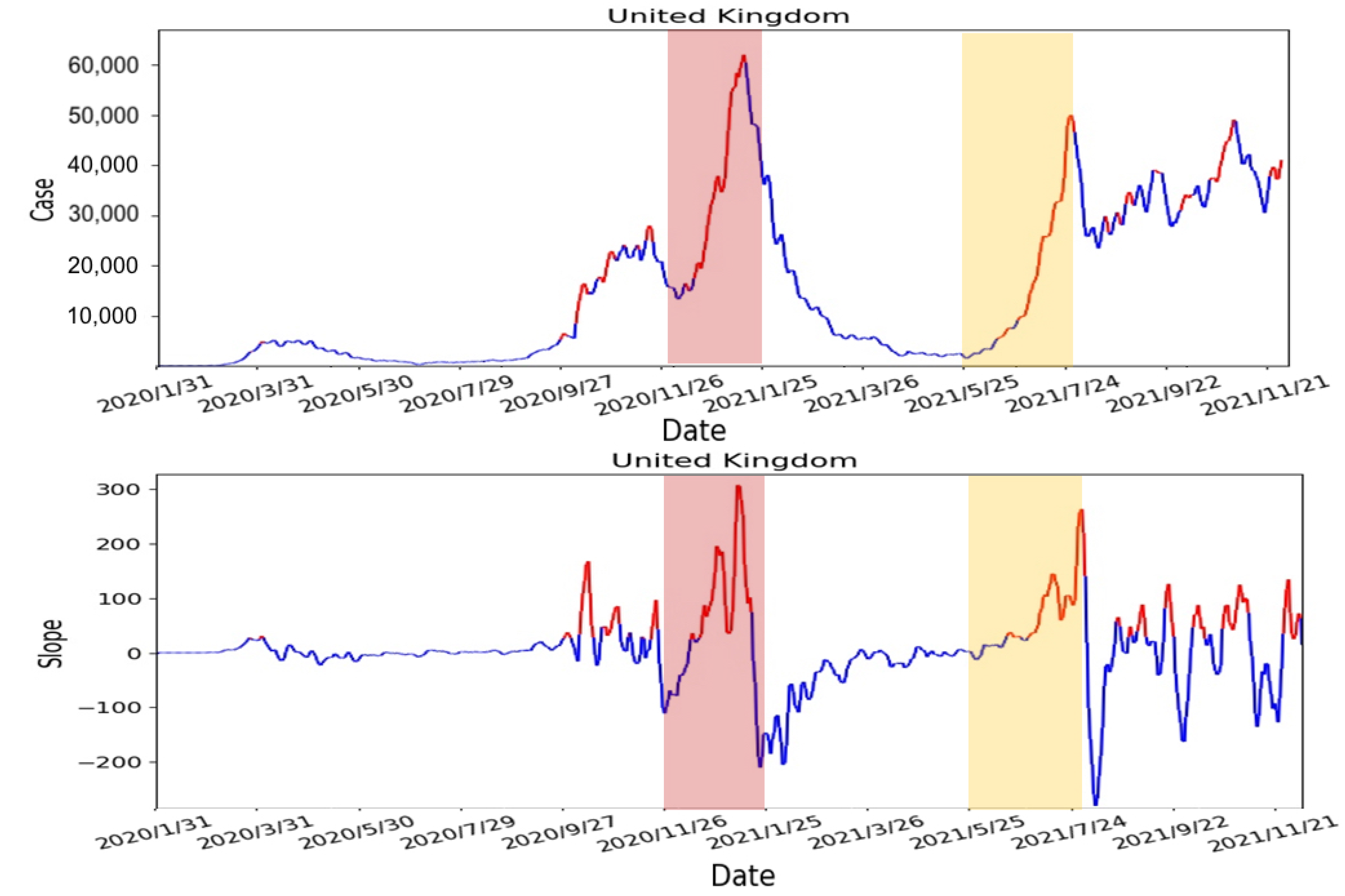
Therefore, we will use the average wait time W predicted by the Queuing theory in the previous section of our risk analysis. To verify the correctness of the proposed risk analysis, we will use the daily confirmed case in the UK, which was obtained from Our World Data [31]. We selected two periods (2020/11/26–2021/01/25 and 2021/05/25–2021/07/24) with an obvious rise and fall in the UK’s daily confirmed cases; see Figure 10. Two selected periods are highlighted in red and yellow in the following figures.
Using the selected two periods, the risk analysis contains the following four steps:
1.
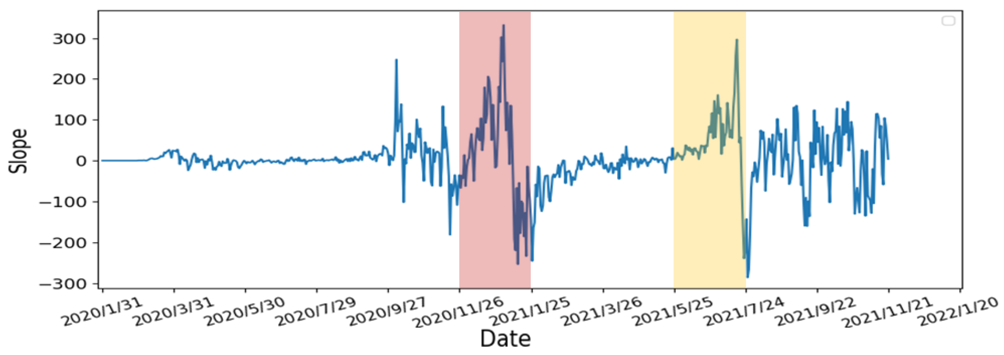
Calculate the slope of the number of confirmed cases: We use 7 days as one unit of the sliding window to calculate the slope of the number of confirmed cases. According to other studies [32,33], people are not willing to undergo screening due to weekends and holidays. Moreover, the screening policy in the United States is different from others. As the result, the number of confirmed cases can fluctuate rapidly. Therefore, we averaged the data over 7 days to avoid fluctuations to obtain a smoother slope. The calculated slope results are shown in Figure 11. From the results, there are rapidly rising and falling slopes in the two selected periods. This indicated that the slope can indeed represent the rise and fall of the number of confirmed cases.
2.
Calculate the number of days the slope continues to grow: In order to determine the number of consecutive days in which the slope continues to increase, we compare each day’s slope with its previous day. When the slope of the current day is greater than the slope of the previous day, a continuous increase in the slope is observed and vice versa. If the number of consecutive days is large, it represented the number of confirmed cases continuing to increase with non-linear growth. From Figure 12, the number of consecutive growing days is 5 days long for the first period (i.e., 26 November 2020–25 January 2021), highlighted in red, and 3 days long for the second period (i.e., 25 May 2021–24 July 2021), highlighted in yellow.
3.
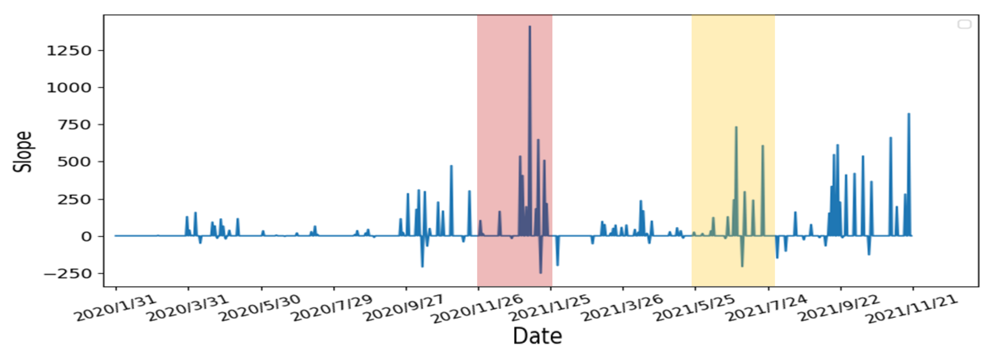
Re-calculate the slope of the starting and ending points of the continuous days: From the previous step, we re-calculate the slope using starting day of the continuous period to capture the continuous growth slope features. The results are shown in Figure 13. Compare to the two periods, the slope’s growth peaks are higher and denser in the first period, which means that the two periods have different numbers of confirmed cases, growth rates, and lengths of days. The continuous growth slope features are useful in the risk analysis.
4.
Average the slope to obtain the threshold: Using the results from Step 3, we calculate the average of the slopes as the threshold for the high-risk period. The result is shown in Figure 14. The risk analysis flags slopes that exceed the threshold as high-risk warnings. In Figure 14, we used red segments to mark the high-risk periods and blue segments for low-risk periods. The results showed that the risk analysis correctly marks the periods with a high growth rate of the number of confirmed cases as high-risk periods. In this study, we will use the average wait time W predicted by the Queuing theory in the previous section of our risk analysis to evaluate whether each of the four states’ prevention measures is appropriate.

3. Results

3.1. Evaluation of Learning Models

To evaluate the four learning models (MLR, PR, SVR, and LSTM), we used mean square error (MSE) [34] and the coefficient of determination (R-square) [35] to compare the results. The formula for MSE and R-square are as follows:
M S E = 1 n i = 1 n C V a l i d a t e _ i C P r e d _ i 2
where n is data length, C V a l i d a t e _ i is the i-th validation data, and C P r e d _ i is the i-th predicted confirmed case P _ C and predicted active case P A C . R-square is calculated as follows:
R s q u a r e = 1 S S r e s S S t o t
where S S t o t and S S r e s are calculated as follows:
S S t o t = i C V a l i d a t e _ i C V a l i d a t e ¯ 2
and
S S r e s = i C V a l i d a t e _ i C P r e d _ i 2
where C V a l i d a t e ¯ is the average of the validation data, which is calculated as follows.
C V a l i d a t e ¯ = 1 n i = 1 n C V a l i d a t e _ i
MSE measures the average of the squares of the errors between the predicted value ( P C and P A C ) and the actual value (i.e., validation data). However, the disadvantage of MSE is that the result can be affected by outliers. By squaring each term, large errors weigh more heavily than small errors. R-square calculates the average change of the actual value in percentages with less impact on outliers, which is more informative in the evaluation of regression analysis.
The evaluation of predicted confirmed case ( P C ) and predicted active case ( P A C ) of four different states (California, Florida, New Jersey, and New York) with four models (PR, MLR, SVR, and LSTM) is shown in Table 4. MSE should be as small as possible and R-square should be closer to 1 to indicate better performance of the model. According to the results, polynomial regression (PR) and support vector regression (SVR) have the best results. Therefore, we will use the prediction results of these two models for further analysis of the queueing model.

3.2. Epidemic Prevention Policies in the USA

We will introduce the US epidemic prevention policies and terms in this section. For the stay-at-home order, residents are required to stay at home except for work. This is suitable for suppressing the development of epidemics. There are four stages of COVID-19 restrictions. Stage 1 is the stay-at-home order. Stage 2 gradually opens up some low-risk workspaces, such as retails with curbside pickup, manufacturers, and offices that cannot be working remotely. Stage 3 opens higher-risk workplaces such as personal care businesses (e.g., hair salons or gyms), entertainment places (e.g., cinemas), and religious services that require face-to-face (e.g., church services or weddings). Stage 4 is the re-opening of workplaces with the highest risk environments (e.g., concert halls, convention centers, or sporting events with live spectators). Curfew is defined as any activities and gatherings that are prohibited between 10 p.m. and 5 a.m., except for work. Reopening means that most COVID-19 restrictions are lifted, but businesses can still require their employees and customers to wear masks.

3.3. Evaluation of Prevention Policies with Our Risk Analysis

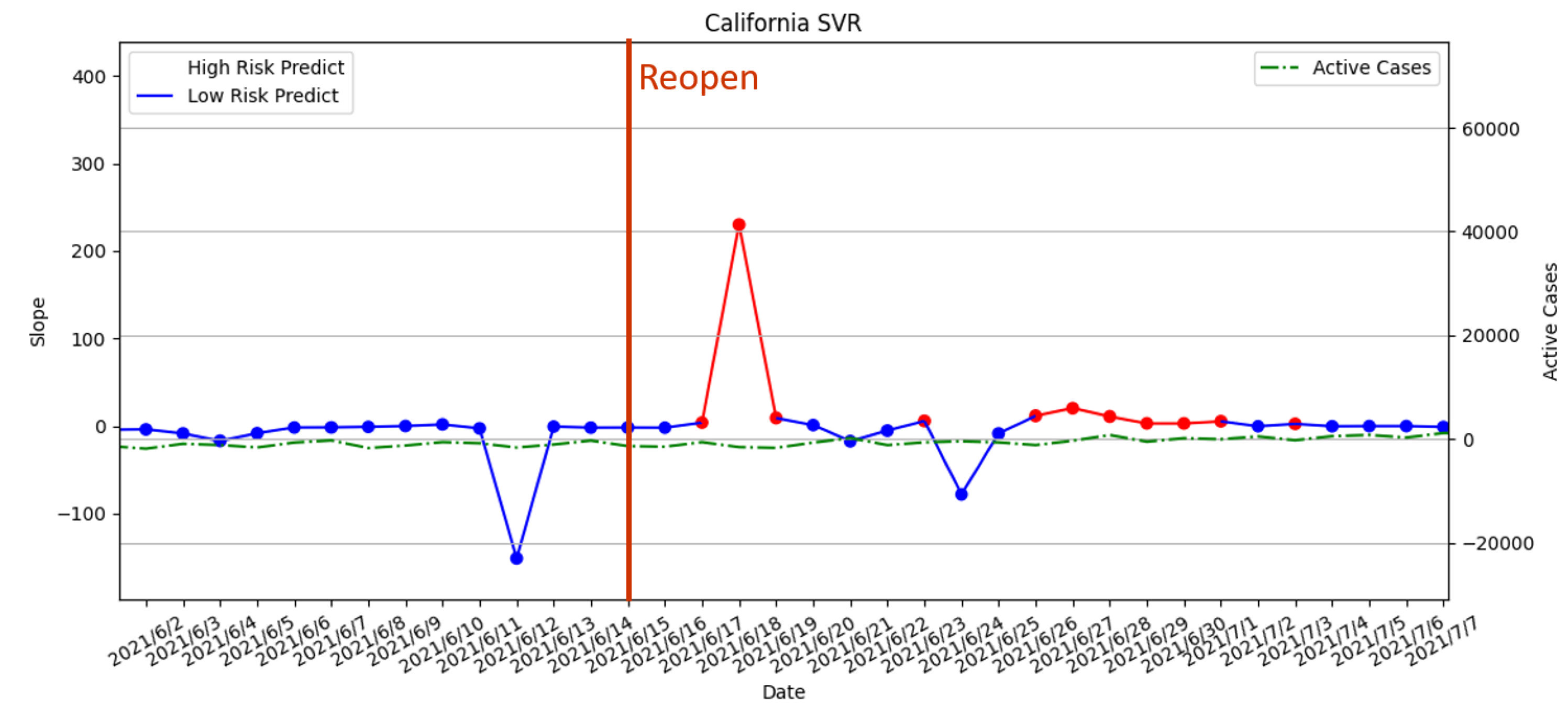
For our risk analysis, we use the results of two prediction models, polynomial regression (PR) and support vector regression (SVR), in the queuing model to predict the confirmed case ( P C ) and predicted active case ( P A C ) to determine high-risk periods. The predicted results are compared with the epidemic prevention policies in California, which were compiled by John Hopkins University [36] and Wikipedia [37]. The daily active cases are used to observe whether the predicted high-risk period is corrected. We evaluated the predicted results from PR and SVR with prevention policies.
We selected six dates and prevention policies enforced in California as follows:
  • 19 March 2020—Statewide stay-at-home order enforced;
  • 7 May 2020—Stage 2 policy executed;
  • 18 May 2020—Stage 3 policy executed;
  • 19 November 2020—Curfew policy enforced;
  • 25 November 2021—Parts of the state’s stay-at-home order lifted;
  • 15 June 2021—Reopening policy executed.
We evaluate each policy with our risk analysis and compare daily active cases to determine whether the enforced policy should be advanced or delayed.

3.3.1. Statewide Stay-at-Home Order Enforced on 19 March 2020

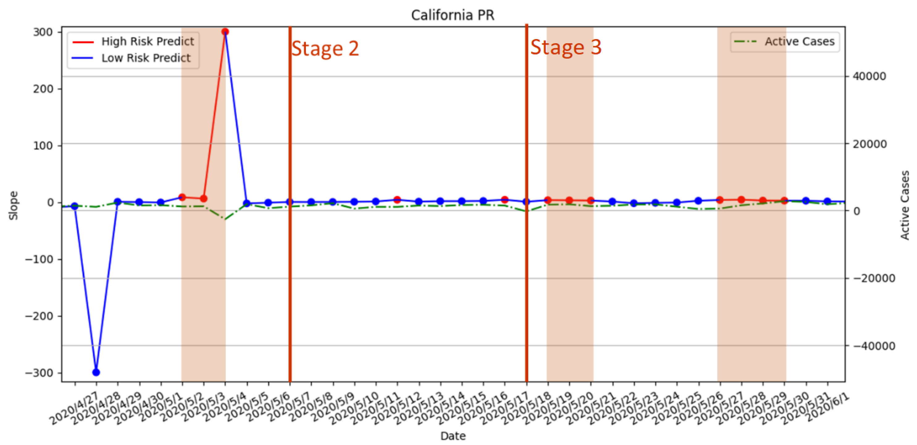
The result of our risk analysis is shown in Figure 15 and Figure 16. The periods highlighted in red are the high-risk periods predicted from our risk analysis. The red straight line indicated the execution date of the statewide stay-at-home policy, which overlapped with the predicted high-risk period from both PR and SVR. Thus, the timing of the policy is appropriate according to our risk analysis. From the number of active cases, which is the green dotted line in the figures, there is a gradual upward trend after the policy implementation, which suggested that stricter enforcement of the policy may be needed. Compared to PR and SVR, SVR did not predict any more high-risk periods after the policy was executed.

3.3.2. Stage 2 and Stage 3 Policies Executed on 7 May 2020 and 18 May 2020

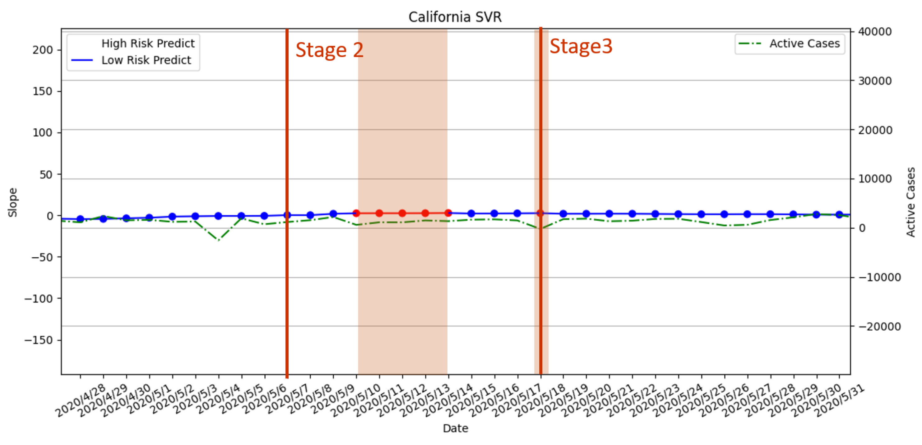
Stage 2 and Stage 3 policies involve slowly lifting the prevention policies by gradually opening different workspaces. According the results in Figure 17, there is no predicted high-risk period during the execution of Stage 2. Moreover, the daily active cases did not increase after Stage 2. Therefore, the timing of Stage 2 is considered by our risk analysis with PR as an appropriate time of execution. However, there is one predicted high-risk period during the execution of Stage 2 in the SVR model, which indicated that it was a premature opening; see Figure 18. The predicted result from SVR is an incorrect forecast according to the number of daily active cases. For Stage 3, the results of PR and SVR indicated that Stage 3’s opening policy may be premature due to predicted high-risk periods, which is also verified by the upward trend of daily active cases.

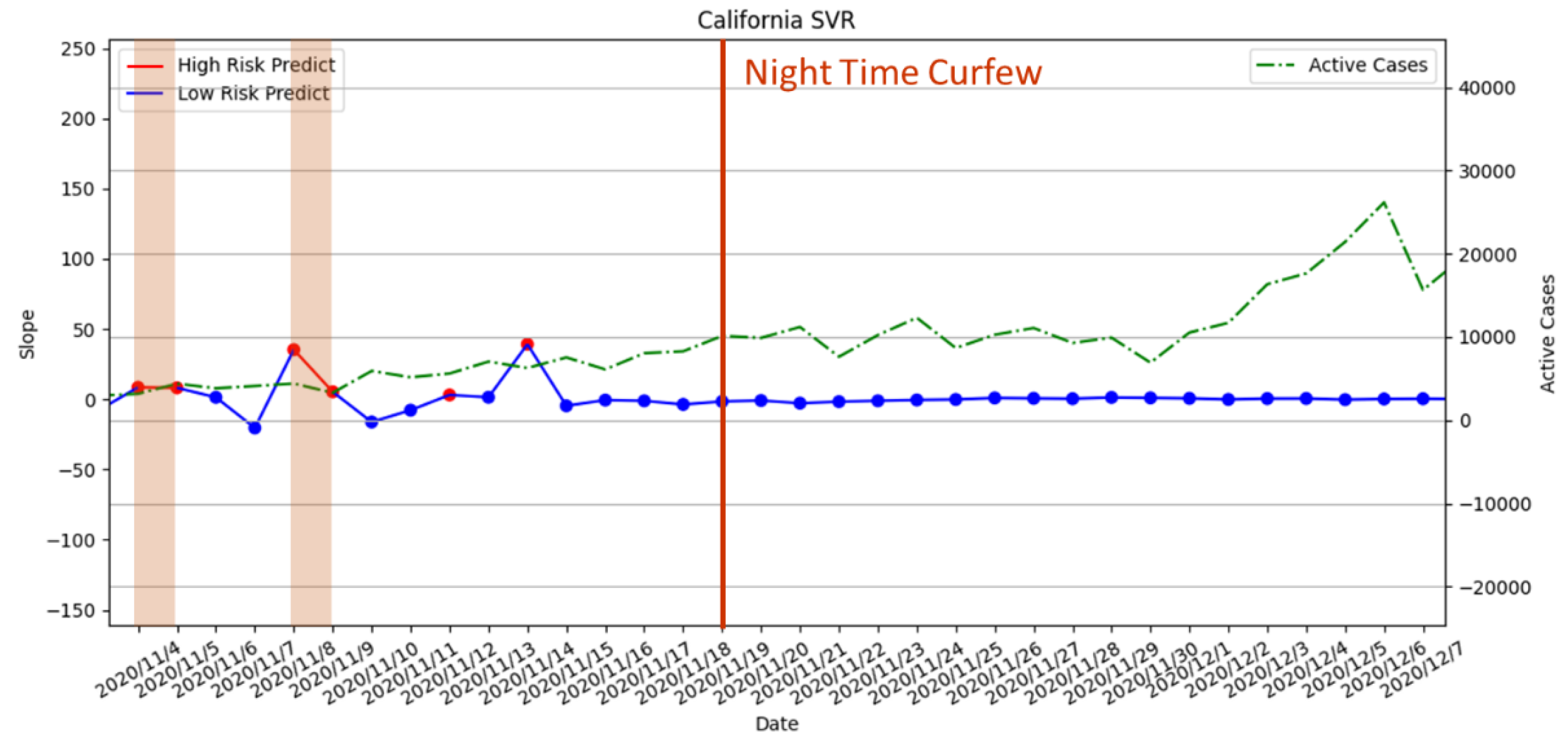
3.3.3. Curfew Policy Enforced on 19 November 2020

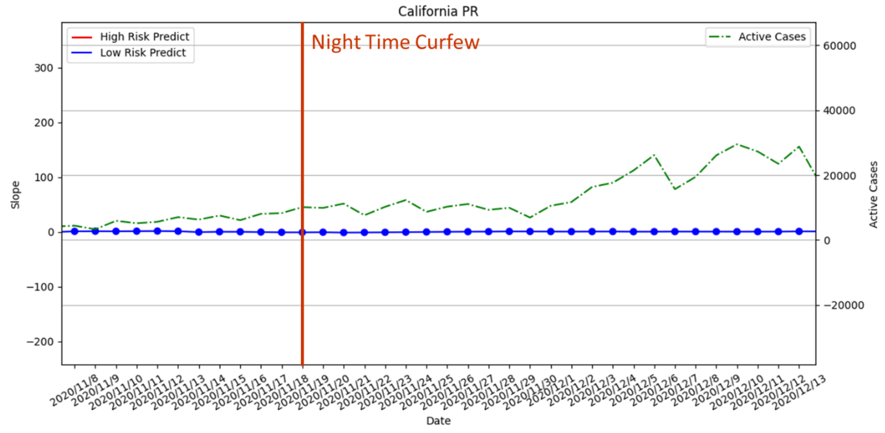
For the mandatory curfew, the risk analysis with PR did not predict any high-risk period; see Figure 19. However, we observed that daily active cases are on the rise in November 2020. For the result with SVR in Figure 20, the risk analysis predicted that the high-risk period did not overlap when the curfew policy was enforced. However, there were two predicted high-risk periods right before the enforced date. This means that the assessment suggested that the curfew should be enforced earlier. From the perspective of the daily active cases, there is a continuous upward trend that indicated that the execution of the policy can be earlier to reduce the number of active cases.

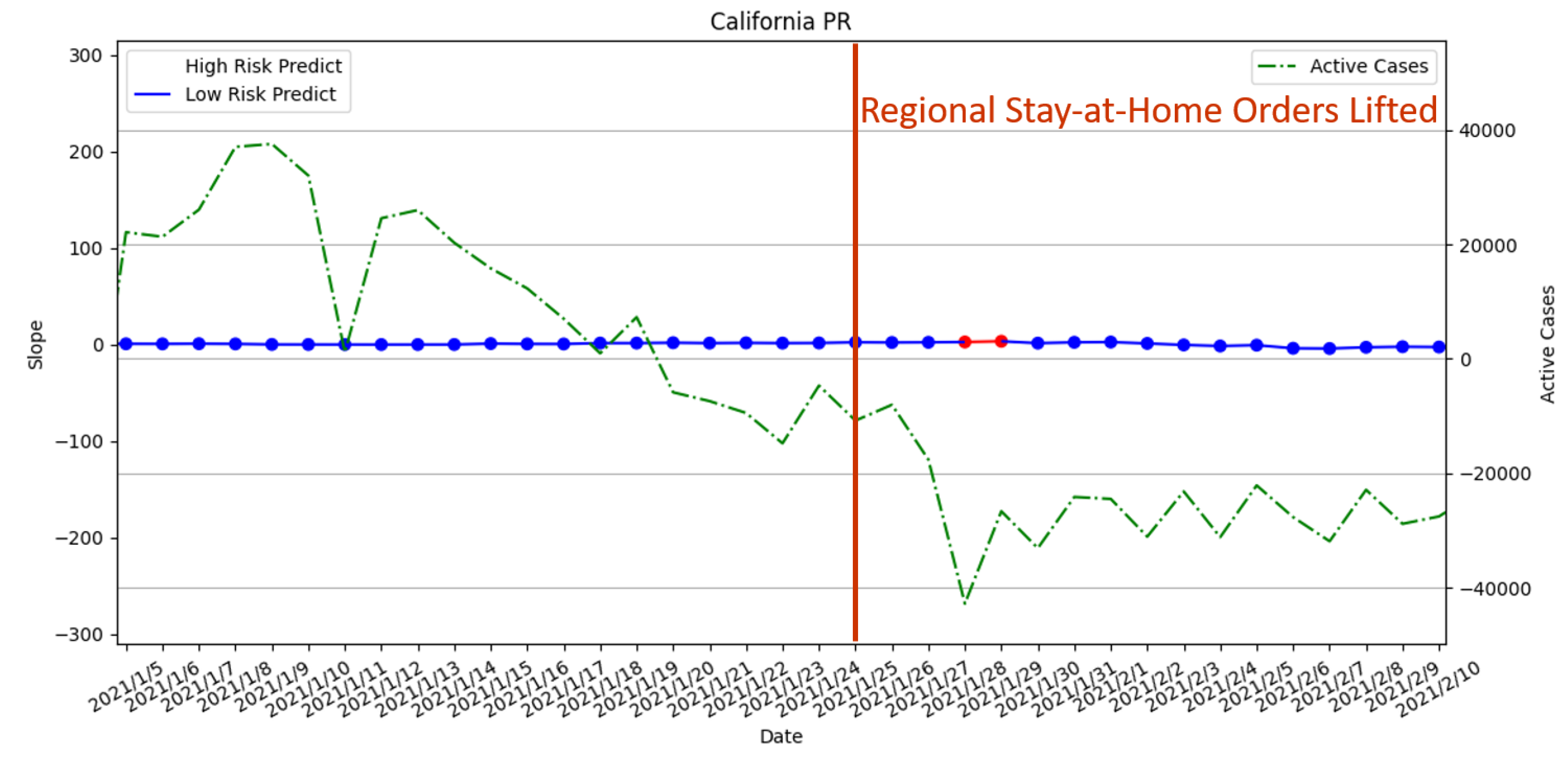
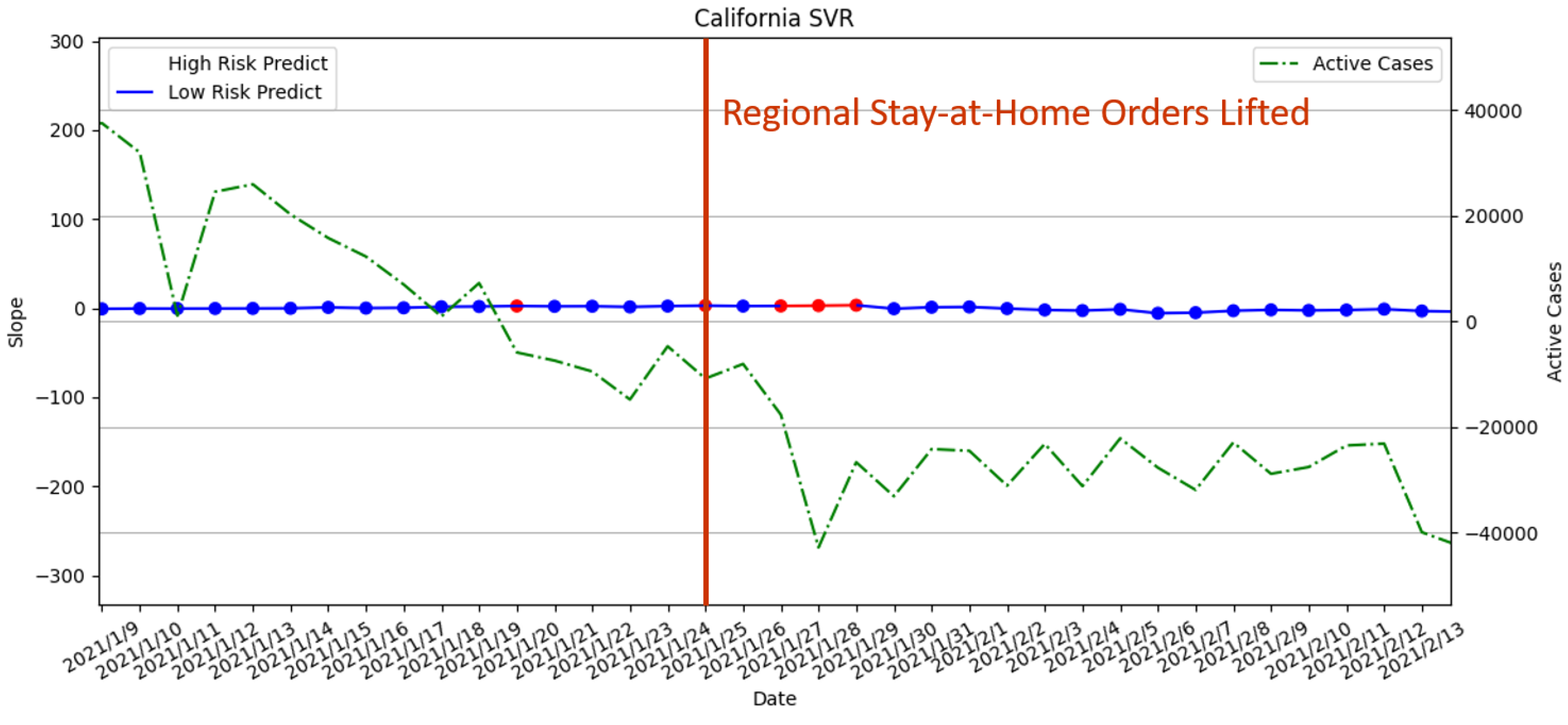
3.3.4. Regional Stay-at-Home Orders Lifted on 25 January 2021

From Figure 21 and Figure 22, it can be seen that there was no high-risk period when the measures were lifted. Due to a high-risk period appearing in the later period, our risk assessment with PR and SVR suggested that the order was lifted prematurely. However, there is a clear downward trend in daily active cases. Therefore, this high-risk period will be considered as a misprediction. SVR is less accurate in terms of the high-risk period. The reason for the misprediction of both PR and SVR is that the marked high-risk period indeed has an increase in active cases. However, the number of active cases in the period is significantly lowered than the previous week.

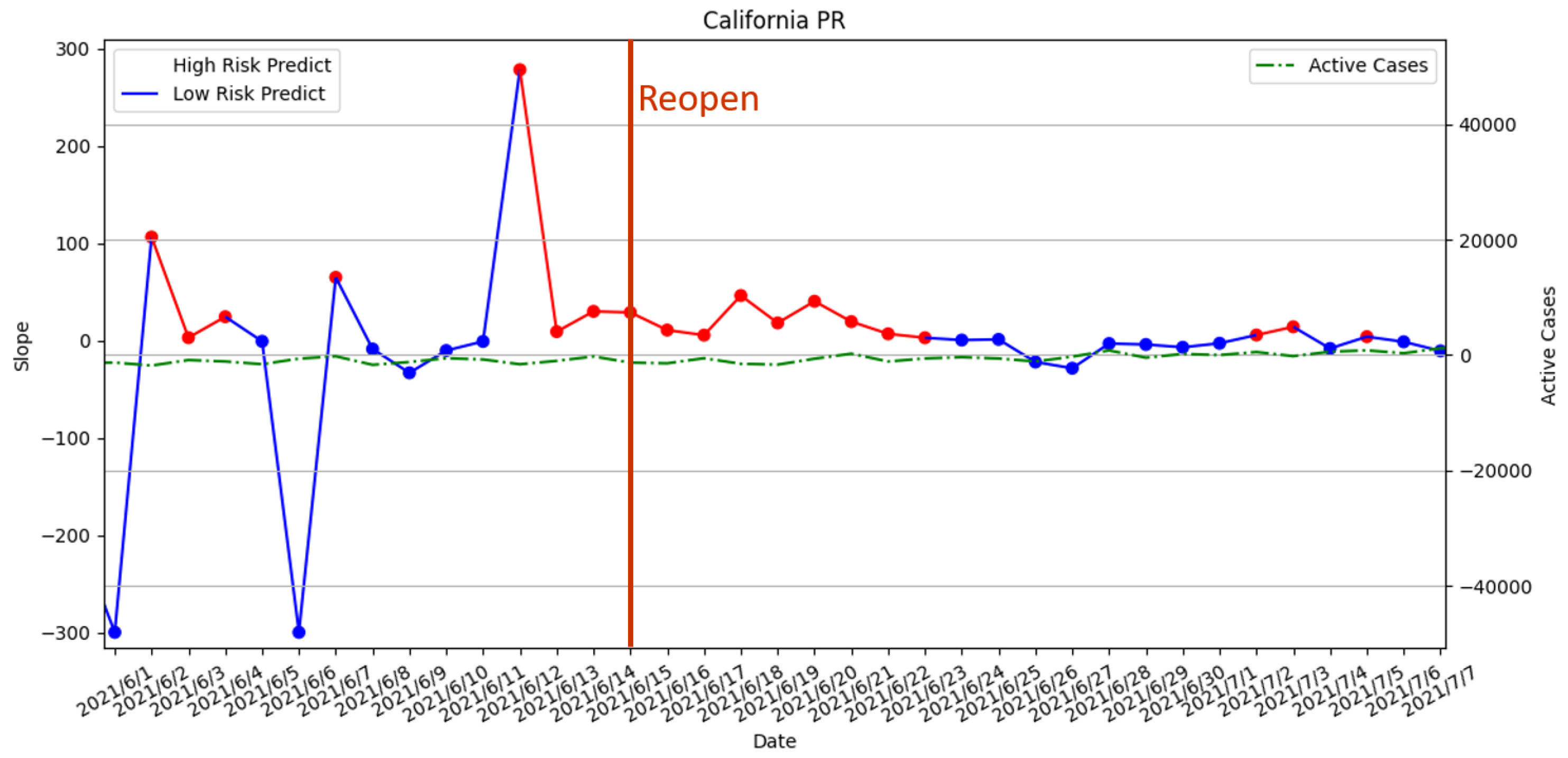
3.3.5. Reopening Policy Executed on 15 June 2021

From Figure 23 and Figure 24, the release time of the measures is during a long-term high-risk period predicted by both our risk assessment with PR and SVR. Therefore, the assessment suggested that the execution of the reopening is premature. Although the SVR risk prediction results indicated there is no high-risk period forecast on the day when the measure is released, it forecasted a long-term high-risk period in the future. The result is verified by the upward trend in daily active cases after the release of the measures.

3.3.6. Risk Assessment with PR of the Four States

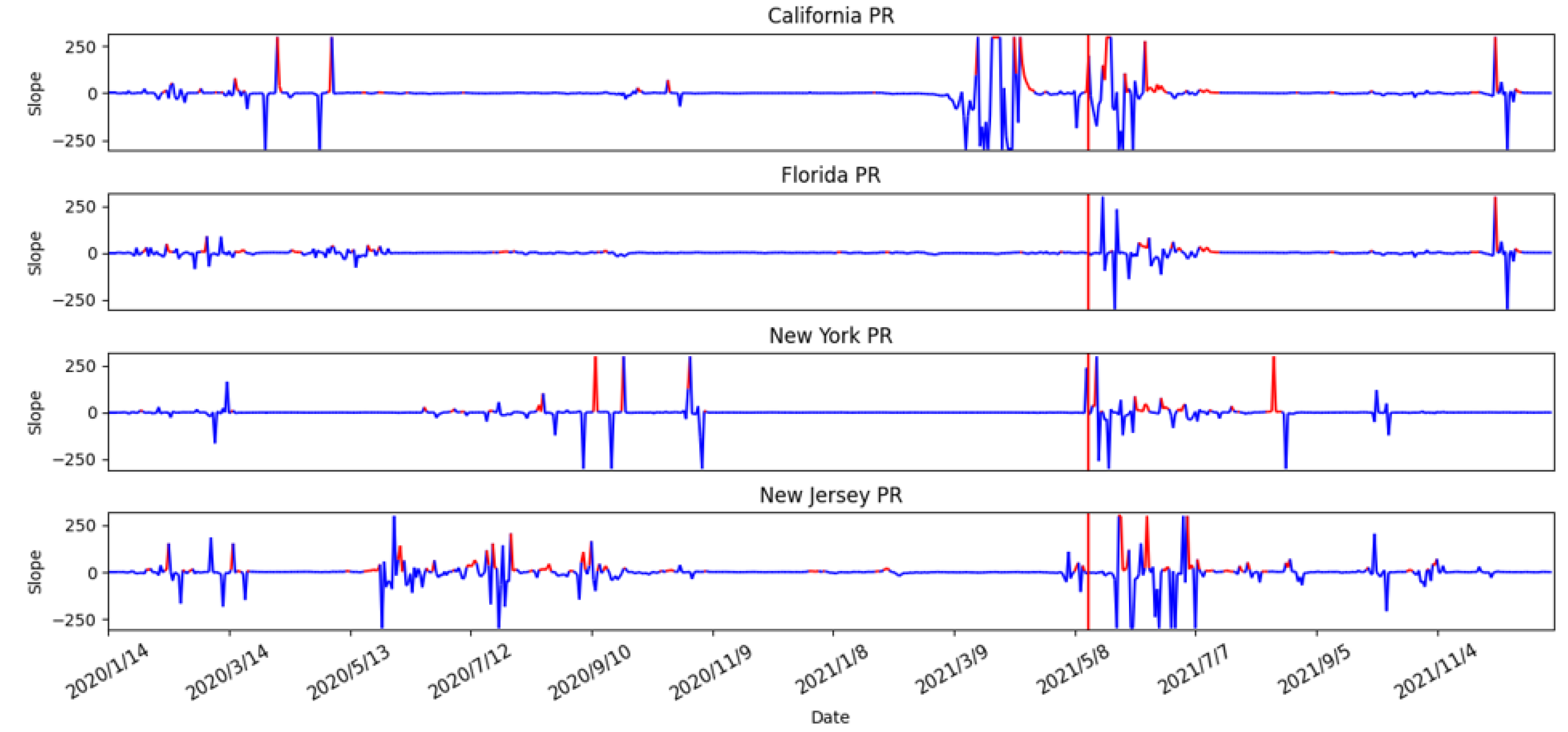
After the evaluations of different epidemic prevention policies in previous sections, the results showed that PR has improved predictions with respect to the high-risk period compared with SVR. Thus, we analyze the PR prediction results of the four states (i.e., California, Florida, New York, and New Jersey) to determine any commonality in this section. In Figure 25, we used red segments to mark the high-risk periods and blue segments for low-risk periods. From the figure, the prediction results showed many high-risk periods with fluctuations of daily active cases during the period from 8 May 2021 to 7 July 2021. Notice that the first six confirmed cases of the Delta-mutated virus were identified in California on 4 December 2021 [38]. The Delta variant is a highly contagious SARS-CoV-2 virus. However, the study found no significant associated effects in the four selected states from mid-April to mid-May. On 13 May 2021, the US government issued a measure that people who have been fully vaccinated with two doses of vaccine do not have to wear masks. According to the results in Figure 24, we suspected that this measure may lead to a subsequent outbreak of the epidemic. According to the data from the CDC in the U.S [38], the Delta virus strain had become the main infection virus, which accounted for 51.7% of new cases of COVID-19 infection in the U.S before 7 July 2021. This matched the predicted results of high-risk periods in all four states. Thus, our risk analysis method provided a valuable reference to the impact of different prevention measures on the epidemic.

4. Discussion and Conclusions

In this paper, we proposed a risk analysis to estimate the possible high-risk periods for the COVID-19 outbreak. The proposed approach first conducted a correlation analysis of population mobility, air pollutants, and vaccination rates with COVID-19 in the United States. Next, the results were used to predict the number of confirmed cases and daily active cases of COVID-19 using polynomial regression (PR) and support vector regression (SVR) methods. The prediction results are brought into the Queuing theory to predict the average recovery time, which can also be regarded as the state’s medical capacity. The prediction results are then brought into the risk analysis method to identify high-risk periods for evaluating epidemic prevention measures.
In the correlation analysis, we first studied changes in air pollutants before and after the epidemic in four states in the United States. We first observed that there were indeed fluctuations in air pollutants before and after the epidemic. Pearson’s correlation coefficient was used for our correlation analysis. We were able to determine the correlations between air pollutants, population movement, and vaccination rates with the number of confirmed cases during the period of different epidemic prevention policies in Florida, New Jersey, and New York. Moreover, the (negative) correlation with vaccination rate was found with the epidemic. After the correlation analysis, the daily number of confirmed cases of COVID-19 and daily active cases were predicted. We found that polynomial regression (PR) and support vector regression (SVR) had the best prediction results. Among them, PR has the best outcome, which can accurately predict high-risk periods.
The predicted results are brought into the risk analysis to obtain the final high-risk period forecast results. Comparing this result with the epidemic prevention measures, we confirmed that our high-risk period forecast can indeed assess whether measures are suitable to be enforced at the time. Among them, PR has the best effect, which can accurately predict high-risk periods and provide measure evaluation. Our risk analysis can provide a better understanding of the outbreaks during the epidemic in the future. Moreover, the impact of epidemic prevention measures can be analyzed. Finally, the forecast results can be used to provide a reference for the evaluation of the measures of the relevant institutions with respect to better controlling the epidemic.

Author Contributions

Conceptualization, Y.-H.H., L.-J.C., Y.-F.C., and K.-U.C.; methodology, Y.-H.H., L.-J.C., Y.-F.C., and K.-U.C.; software, Y.-F.C. and K.-U.C.; validation, Y.-H.H., L.-J.C., Y.-F.C., and K.-U.C.; formal analysis, Y.-H.H., Y.-F.C., and K.-U.C.; investigation, Y.-H.H., L.-J.C., Y.-F.C., and K.-U.C.; resources, Y.-H.H., Y.-F.C., and K.-U.C.; data curation, Y.-H.H., Y.-F.C., and K.-U.C.; writing—original draft preparation, Y.-H.H.; writing—review and editing, Y.-H.H.; visualization, Y.-H.H.; supervision, Y.-H.H. and L.-J.C.; project administration, Y.-H.H.; funding acquisition, Y.-H.H. and L.-J.C. All authors have read and agreed to the published version of the manuscript.

Funding

This research was funded by Taiwan Centers for Disease Control with grant numbers MOHW110-CDC-C-114- 468 133501 and Taiwan Ministry of Science and Technology with grant numbers MOST 110-2221-E-003-001 and MOST 109-2221-E-001-005-MY3.

Institutional Review Board Statement

Not applicable.

Informed Consent Statement

Not applicable.

Data Availability Statement

Publicly available data sets were analyzed in this study. These data can be found as mentioned in the paper with references.

Acknowledgments

The authors are grateful to the Taiwan Centers for Disease Control (CDC) and Yu-Lun Liu.

Conflicts of Interest

The authors declare no conflict of interest.

References

  1. World Health Organization. Modes of Transmission of Virus Causing COVID-19: Implications for IPC Precaution Recommendations—who.int. Available online: https://www.who.int/news-room/commentaries/detail/modes-of-transmission-of-virus-causing-covid-19-implications-for-ipc-precaution-recommendations (accessed on 10 August 2022).
  2. Guarnieri, M.; Balmes, J.R. Outdoor air pollution and asthma. Lancet 2014, 383, 1581–1592. [Google Scholar] [CrossRef] [Green Version]
  3. Goldizen, F.C.; Sly, P.D.; Knibbs, L.D. Respiratory effects of air pollution on children. Pediatr. Pulmonol. 2016, 51, 94–108. [Google Scholar] [CrossRef] [PubMed]
  4. Jiang, X.Q.; Mei, X.D.; Feng, D. Air pollution and chronic airway diseases: What should people know and do? J. Thorac. Dis. 2015, 8, E31. [Google Scholar]
  5. Setti, L.; Passarini, F.; de Gennaro, G.; Di Gil, A.; Palmisani, J.; Buono, P.; Fornari, G.; Perrone, M.G.; Piazzalunga, A.; Barbieri, P.; et al. Evaluation of the potential relationship between Particulate Matter (PM) pollution and COVID-19 infection spread in Italy. Soc. Ital. Med. Ambient. 2020, 1. Available online: https://www.aircentre.org/wp-content/uploads/2020/04/Setti_et_al_2020.pdf (accessed on 16 October 2022).
  6. Gupta, A.; Bherwani, H.; Gautam, S.; Anjum, S.; Musugu, K.; Kumar, N.; Anshul, A.; Kumar, R. Air pollution aggravating COVID-19 lethality? Exploration in Asian cities using statistical models. Environ. Dev. Sustain. 2021, 23, 6408–6417. [Google Scholar] [CrossRef] [PubMed]
  7. Beckerman, B.; Jerrett, M.; Brook, J.R.; Verma, D.K.; Arain, M.A.; Finkelstein, M.M. Correlation of nitrogen dioxide with other traffic pollutants near a major expressway. Atmos. Environ. 2008, 42, 275–290. [Google Scholar] [CrossRef]
  8. Chen, Z.L.; Zhang, Q.; Lu, Y.; Guo, Z.M.; Zhang, X.; Zhang, W.J.; Guo, C.; Liao, C.H.; Li, Q.L.; Han, X.H.; et al. Distribution of the COVID-19 epidemic and correlation with population emigration from Wuhan, China. Chin. Med. J. 2020, 133, 1044–1050. [Google Scholar] [CrossRef] [PubMed]
  9. U.S. Centers for Disease Control and Prevention (CDC). COVID-19 Vaccination Work. Available online: https://www.cdc.gov/coronavirus/2019-ncov/vaccines/effectiveness/work.html (accessed on 8 October 2022).
  10. United States COVID—Coronavirus Statistics—Worldometer—worldometers.info. 2022. Available online: https://www.worldometers.info/coronavirus/country/us/ (accessed on 24 August 2022).
  11. Understanding the COVID-19 Pandemic. 2022. Available online: https://usafacts.org/issues/coronavirus/ (accessed on 24 August 2022).
  12. Download Daily Data | US EPA—epa.gov. Available online: https://www.epa.gov/outdoor-air-quality-data/download-daily-data (accessed on 24 August 2022).
  13. COVID-19—Mobility Trends Reports—Apple—covid19.apple.com. Available online: https://covid19.apple.com/mobility (accessed on 10 January 2022).
  14. Mobile OS share in North America 2018–2021 | Statista—statista.com. Available online: https://www.statista.com/statistics/1045192/share-of-mobile-operating-systems-in-north-america-by-month/ (accessed on 1 July 2022).
  15. Coronavirus (COVID-19) Vaccinations—ourworldindata.org. Available online: https://ourworldindata.org/covid-vaccinations (accessed on 24 August 2022).
  16. Benesty, J.; Chen, J.; Huang, Y.; Cohen, I. Pearson correlation coefficient. In Noise Reduction in Speech Processing; Springer: Berlin/Heidelberg, Germany, 2009; pp. 1–4. [Google Scholar]
  17. Li, X. Association between population mobility reductions and new COVID-19 diagnoses in the United States along the urban–rural gradient, February–April, 2020. Prev. Chronic Dis. 2020, 17, 200241. [Google Scholar] [CrossRef] [PubMed]
  18. Tabachnick, B.G.; Fidell, L.S.; Ullman, J.B. Using Multivariate Statistics; Pearson: Boston, MA, USA, 2007; Volume 5. [Google Scholar]
  19. Draper, N.R.; Smith, H. Applied Regression Analysis; John Wiley & Sons: Hoboken, NJ, USA, 1998; Volume 326. [Google Scholar]
  20. Cortes, C.; Vapnik, V. Support-vector networks. Mach. Learn. 1995, 20, 273–297. [Google Scholar] [CrossRef]
  21. Hochreiter, S.; Schmidhuber, J. Long short-term memory. Neural Comput. 1997, 9, 1735–1780. [Google Scholar] [CrossRef] [PubMed]
  22. Ho, Y.H.; Tai, Y.J.; Chen, L.J. COVID-19 Pandemic Analysis for a Country’s Ability to Control the Outbreak Using Little’s Law: Infodemiology Approach. Sustainability 2021, 13, 5628. [Google Scholar] [CrossRef]
  23. Cooper, R.B. Queueing Theory. In Proceedings of the ACM ’81 Conference, Los Angeles, CA, USA, 9–11 November 1981; Association for Computing Machinery: New York, NY, USA, 1981; pp. 119–122. [Google Scholar] [CrossRef]
  24. Little, J.D. A proof for the queuing formula: L = λ W. Oper. Res. 1961, 9, 383–387. [Google Scholar] [CrossRef]
  25. Heesterbeek, J.A.P. A brief history of R 0 and a recipe for its calculation. Acta Biotheor. 2002, 50, 189–204. [Google Scholar] [CrossRef] [PubMed]
  26. Liu, Y.; Rocklöv, J. The reproductive number of the Delta variant of SARS-CoV-2 is far higher compared to the ancestral SARS-CoV-2 virus. J. Travel Med. 2021, 28, taab124. [Google Scholar] [CrossRef] [PubMed]
  27. Gallagher, J. Covid: Is There a Limit to How Much Worse Variants Can Get? Available online: https://www.bbc.com/news/health-57431420 (accessed on 10 August 2022).
  28. Boarman, A. Omicron is the Dominant COVID Variant for Two Reasons. 2021. Available online: https://vitals.sutterhealth.org/omicron-is-the-us-dominant-covid-variant-for-two-reasons/ (accessed on 10 August 2022).
  29. Locatelli, I.; Trächsel, B.; Rousson, V. Estimating the basic reproduction number for COVID-19 in Western Europe. PLoS ONE 2021, 16, e0248731. [Google Scholar] [CrossRef] [PubMed]
  30. Knight, J.; Mishra, S. Estimating effective reproduction number using generation time versus serial interval, with application to COVID-19 in the Greater Toronto Area, Canada. Infect. Dis. Model. 2020, 5, 889–896. [Google Scholar] [CrossRef] [PubMed]
  31. Coronavirus (COVID-19) Cases—ourworldindata.org. Available online: https://ourworldindata.org/covid-cases (accessed on 24 August 2022).
  32. Simpson, R.B.; Lauren, B.N.; Schipper, K.H.; McCann, J.C.; Tarnas, M.C.; Naumova, E.N. Critical periods, critical time points and day-of-the-week effects in covid-19 surveillance data: An example in Middlesex County, Massachusetts, USA. Int. J. Environ. Res. Public Health 2022, 19, 1321. [Google Scholar] [CrossRef] [PubMed]
  33. Aragão, D.P.; Dos Santos, D.H.; Mondini, A.; Gonçalves, L.M.G. National holidays and social mobility behaviors: Alternatives for forecasting COVID-19 deaths in Brazil. Int. J. Environ. Res. Public Health 2021, 18, 11595. [Google Scholar] [CrossRef] [PubMed]
  34. Bickel, P.J.; Doksum, K.A. Mathematical Statistics: Basic Ideas and Selected Topics, Volumes I-II Package; Chapman and Hall/CRC: Boca Raton, FL, USA, 2015. [Google Scholar]
  35. Steel, R.G.D.; Torrie, J.H. Principles and procedures of statistics. In Principles and Procedures of Statistics; McGraw-Hill Book Company, Inc.: New York, NY, USA; Toronto, ON, Canda; London, UK, 1960. [Google Scholar]
  36. Impact of Opening and Closing Decisions in California, New Cases—Johns Hopkins—coronavirus.jhu.edu. Available online: https://coronavirus.jhu.edu/data/state-timeline/new-confirmed-cases/california (accessed on 24 August 2022).
  37. Wikipedia Contributors. COVID-19 Pandemic in California—Wikipedia, The Free Encyclopedia. 2022. Available online: https://en.wikipedia.org/w/index.php?title=COVID-19_pandemic_in_California&oldid=1100583819 (accessed on 24 August 2022).
  38. Wikipedia Contributors. Timeline of the COVID-19 pandemic in the United States (2021)—Wikipedia, The Free Encyclopedia. 2022. Available online: https://en.wikipedia.org/w/index.php?title=Timeline_of_the_COVID-19_pandemic_in_the_United_States_(2021)&oldid=1072395501 (accessed on 22 August 2022).
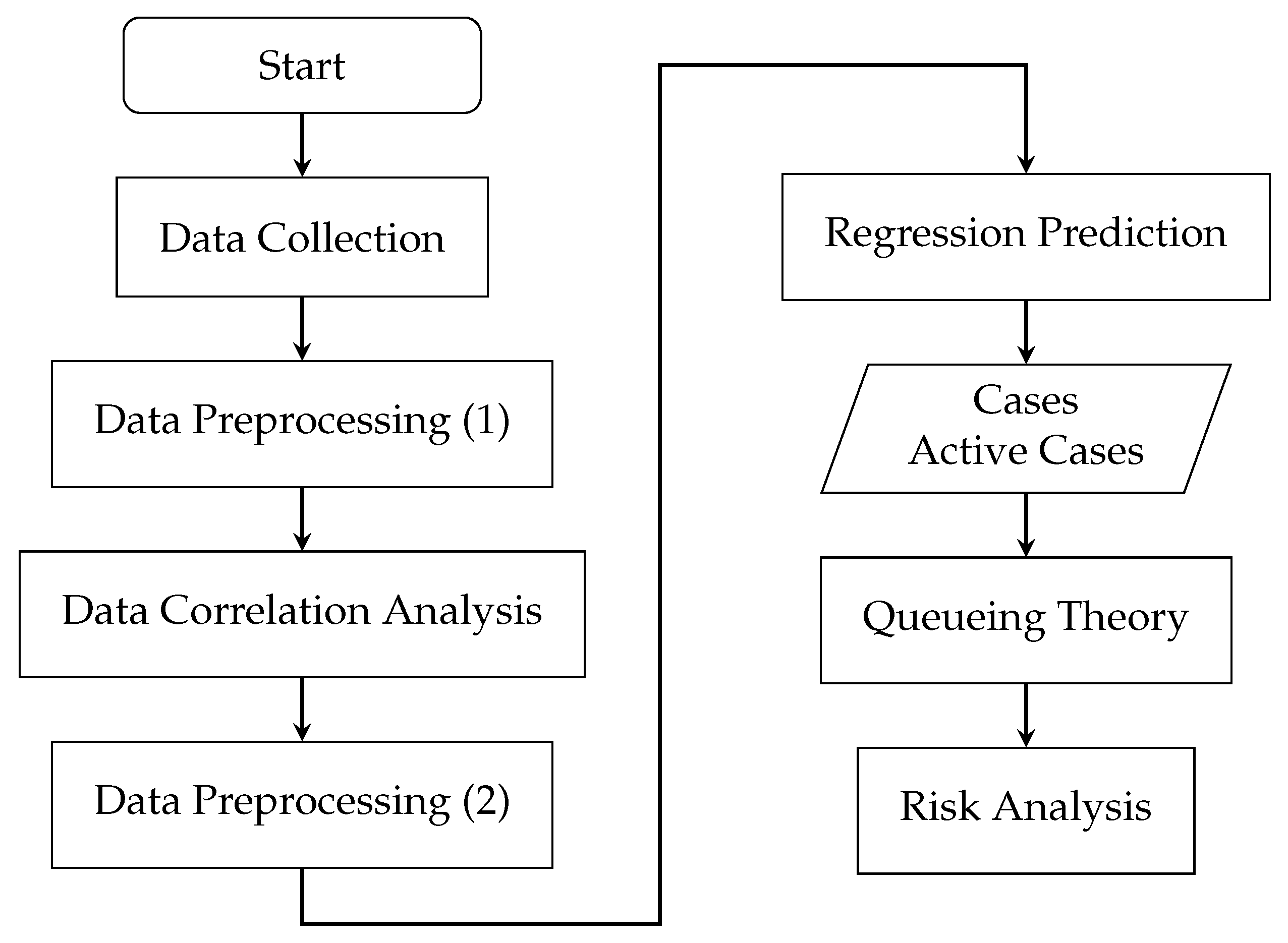
Figure 1. Flow chart of the proposed method.
Atmosphere 13 01727 g001
Figure 2. Air pollutant data (SO 2 , NO 2 , PM 2.5 , Ozone, and CO) of each state before and after the COVID-19 outbreak.
Atmosphere 13 01727 g002
Figure 3. Pearson Correlation (r) results of four states during Period 3.
Atmosphere 13 01727 g003
Figure 4. Pearson Correlation (r) for different lag days of four states.
Atmosphere 13 01727 g004
Figure 5. The process of training and verifying the regression models.
Atmosphere 13 01727 g005
Figure 6. The process of three machine learning models.
Atmosphere 13 01727 g006
Figure 7. Long short-term memory (LSTM) model.
Atmosphere 13 01727 g007
Figure 8. State transition diagrams for COVID-19.
Atmosphere 13 01727 g008
Figure 9. Queuing model for COVID-19.
Atmosphere 13 01727 g009
Figure 10. The number of the UK’s daily confirmed cases between 31 January 2020 and 21 November 2021.
Atmosphere 13 01727 g010
Figure 11. The slope of the UK’s daily confirmed cases between 31 January 2020 and 21 November 2021.
Atmosphere 13 01727 g011
Figure 12. The number of growing days in the UK’s Daily Confirmed Cases between 31 January 2020 and 21 November 2021.
Atmosphere 13 01727 g012
Figure 13. The slope of growing days in the UK’s Daily Confirmed Cases between 31 January 2020 and 21 November 2021.
Atmosphere 13 01727 g013
Figure 14. The result of risk analysis for the UK.
Atmosphere 13 01727 g014
Figure 15. The result of risk analysis with PR for statewide stay-at-home orders in California.
Atmosphere 13 01727 g015
Figure 16. The result of risk analysis with SVR for statewide stay-at-home orders in California.
Atmosphere 13 01727 g016
Figure 17. The result of risk analysis with PR for Stage 2 and Stage 3 policies in California.
Atmosphere 13 01727 g017
Figure 18. The result of risk analysis with SVR for Stage 2 and Stage 3 policies in California.
Atmosphere 13 01727 g018
Figure 19. The result of risk analysis with PR for curfew policy in California.
Atmosphere 13 01727 g019
Figure 20. The result of risk analysis with SVR for curfew policy in California.
Atmosphere 13 01727 g020
Figure 21. The result of risk analysis with PR for lifted regional stay-at-home orders in California.
Atmosphere 13 01727 g021
Figure 22. The result of risk analysis with SVR for lifted regional stay-at-home orders in California.
Atmosphere 13 01727 g022
Figure 23. The result of risk analysis with PR for reopening policy in California.
Atmosphere 13 01727 g023
Figure 24. The result of risk analysis with SVR for reopening policy in California.
Atmosphere 13 01727 g024
Figure 25. The result of risk analysis with PR of four states.
Atmosphere 13 01727 g025
Table 1. The number of the population and land area of 4 states collected by the U.S. Census Bureau in June 2020.
CaliforniaFloridaNew JerseyNew York
Population39,538,22321,538,1879,288,99420,201,249
Land Area (km2)423,970170,30422,588141,299
Density (per km 2 )93.25126.46411.23142.97
Table 2. Periods of different epidemic prevention policies in each state.
CaliforniaFloridaNew JerseyNew York
Period 113 January 2020–18 March 202013 January 2020–31 March 202013 January 2020–20 March 202013 January 2020–20 March 2020
Period 219 March 2020–7 May 20201 April 2020–30 March 202021 March 2020–9 June 202021 March 2020–14 May 2020
Period 38 May 2020–4 November 20211 May 2020–4 November 202110 June 2020–4 November 202115 May 2020–4 November 2021
Table 3. Correlation analysis results of air pollutants, population movement, and vaccination rates.
StatePeriodNO 2 OzonePM 2.5 SO 2 CODrivingWalkingTransitVaccinated
CaliforniaPeriod 1−0.564 **0.130−0.533 **−0.321 **−0.578 **−0.463 **−0.483−0.802 **0
Period 2−0.1480.280 *0.302 *−0.032−0.1510.2110.283 *−0.355 *0
Period 30.356 **−0.369 **−0.0200.224 **0.479 **−0.522 **−0.430 **−0.468 **−0.387 **
FloridaPeriod 1−0.0550.0340.424 **0.462 **−0.022−0.603 **−0.589 **−0.693 **0
Period 20.2600.028−0.086−0.0640.038−0.363 *−0.357−0.3050
Period 30.281 **−0.0710.0140.0490.141 **−0.151 **−0.084−0.011−0.388 **
New JerseyPeriod 1−0.0660.152−0.073−0.074−0.020−0.492 **−0.363 **−0.609 **0
Period 20.1860.167−0.070−0.193−0.103−0.161−0.183−0.270 *0
Period 30.107 *−0.098 *−0.0160.139 **−0.081−0.127 **−0.128 **−0.203 **−0.173 **
New YorkPeriod 1−0.1860.232−0.2300.005−0.182−0.365 **−0.362 **−0.592 **0
Period 2−0.124−0.0600.023−0.043−0.147−0.084−0.167−0.1880
Period 30.235 **−0.108 *0.0360.269 **0.073−0.479 **−0.397 **−0.350 **−0.257 **
* It is significant at the 0.05 level. ** It is significant at the 0.01 level.
Table 4. Evaluation of different predication models.
PRMLRSVRLSTM
StateMSER-SquareMSER-SquareMSER-SquareMSER-Square
P C P AC P C P AC P C P AC P C P AC P C P AC P C P AC P C P AC P C P AC
CA32.44788606545.1137.8123.95160895.548.358.38303.74995.267.659.77356.35708.3
FL145.7586513.93388.9183.871.35601.91866.41011017583.87583.8173.627.15315.12485.7
NJ39.350.26278.74654.967.9713572.12446.762.155.44120.6410971.57398.2−904.5
NY23.835.57527.4491255.557.64234.31753.24246.65644.13320.4109.481.45735.74202.4
Note that the unit in the table is in 1 × 10⁻⁴.
Publisher’s Note: MDPI stays neutral with regard to jurisdictional claims in published maps and institutional affiliations.