1. Introduction
Emissions released into the atmosphere alter its composition and affect air quality, causing significant repercussions in areas such as the environment and health. Air pollution is linked to the presence of substances that reach concentrations higher than their normal environments [
1], causing an ecological imbalance [
2]. These episodes produce potentially harmful problems for human health, animals and vegetation. In urban places, most of the contamination is generated by emissions from automobiles and industries [
1,
3]. These emissions have an environmental impact due to the transport of pollutants, even to great distances from the emission points, due to the action of the wind and other factors such as turbulence [
4,
5], which is why affected sectors are not exclusively industrial [
6]. According to epidemiological studies, one of the main risk factors for the global burden of mortality and morbidity is air pollution [
7]. It is estimated that in the coming decades it could become the largest environmental cause of premature death [
8], for which global mitigation policies have been implemented by deploying devices that control air quality on a daily basis in their territories [
9].
In Latin America (LA) there is a high rate of urbanization, comprising 72% of the population [
8]. The main causes of air pollution in the cities of Latin America and the Caribbean (LAC) are land transportation, electricity generation and industrial production [
10,
11].
During the 2010-2014 period, most of the official air quality monitoring stations in seventeen LAC countries recorded mean annual PM
values significantly higher than the limit of 20
g/m
established in guidelines of the World Health Organization (WHO) [
12]. According to the 2019 World Air Quality Report, nine of the twelve considered LAC countries reported an annual mean of PM
higher than the threshold established by the WHO, with Chile and Peru being the countries with the highest average annual exposure to pollution [
13].
Peru is a highly urban country, reporting a higher density in Lima, considered one of the most polluted cities in LA [
8]. The Department (second-level administrative subdivisions of Peru) of Lima is located on the central coast; it has a humid climate and a geography characterized by the Andes that reach the seashore at high altitudes. Its main source of air pollution is transportation units, as well as stationary sources such as industries, shops, and restaurants [
14,
15,
16]. In some areas the levels of air pollution are very high due to the traffic congestion of public transport, which mostly use diesel fuel, are old and do not have adequate maintenance [
17,
18]. Likewise, it is one of the cities with the highest frequency of asthma in children, caused by particulate matter from emissions from the vehicle fleet [
19].
The minimum values of PM
during the period 2001–2014 were recorded on Sundays, coinciding with the decrease in anthropogenic activities and the flow of vehicular transport that occurs on those days [
20]. In a report by the Japan International Cooperation Agency (JICA), it was stated that, in 2012, the number of trips made per day in motorized vehicles in Lima was 16.9 million [
21]. Over the years, this number has increased, increasing also the vehicle gas emissions [
8]. Several strategies were implemented, such as the elimination of lead, gasoline and the reduction of the sulfur content in diesel, that serve to mitigate this problem [
22]. The permanent monitoring of air quality is done by institutions such as DIGESA, PROTRANSPORTE and SENAMHI [
23].
In this sense, monitoring combined with other objective evaluation techniques helps to fully define and understand the exposure of the population to the environment [
6]. The visual visualization of the data takes a dynamic approach compared to raw data tables, and provides detailed information on data structure [
24], ensuring that the results are directly transmitted to the general public [
9]. This technique can transform data into intuitive graphical images, showing efficient visual analysis of air quality data, thereby determining the location of sources of pollution and assessing which areas are more affected, in order to take necessary actions for improvement [
3]. The air quality display system must handle large amounts of spatial data of the different concentrations. In addition, they must be viewed in an agile way to detect trends, correlations and alterations in air pollution [
25,
26], becoming a solution that allows complex data to be simplified and better understood for timely decision-making [
27].
In Metropolitan Lima, studies such as those by Valdivia [
20] and Silva et al. [
28] have applied air quality data visualization techniques in periods between 2001 to 2014 and 2010 to 2015, respectively. Likewise, studies such as those of Reátegui-Romero et al. [
29] and Sánchez-Ccoyllo et al. [
30] have applied particulate matter estimation techniques in Metropolitan Lima. These modeling techniques allow complementing the application of air quality data visualization.
This article proposes a spatio-temporal visualization approach to explore PM concentration data in the Metropolitan Lima area, through graphs with increasingly specific time periods (year, month, day, hour) according to their relevance and statistical analysis for better interpretation. This will allow to obtain a complete, realistic and detailed visualization of the concentrations and spatio-temporal variations of PM.
2. Methods
The proposed methodology is based on the study developed by Li et al. [
27] for the exploration of air pollution data, and has been adapted to the PM
concentration data in Metropolitan Lima. The workflow includes five steps that start with access to the database, then its preliminary analysis in step 2, from which the hypotheses of step 3 are formulated, which are verified in step 4, with the application and visualization conducted in step 5. In addition, the proposed approach for each of the steps and their work schemes are described in the following subsections.
2.1. Database
The first step of the workflow consists of data access and storage. The data comprises a period of 2 years (from 1 January 2017 to 31 December 2018); and includes time series (year, month, day, hour) of PM
concentration (
g/m
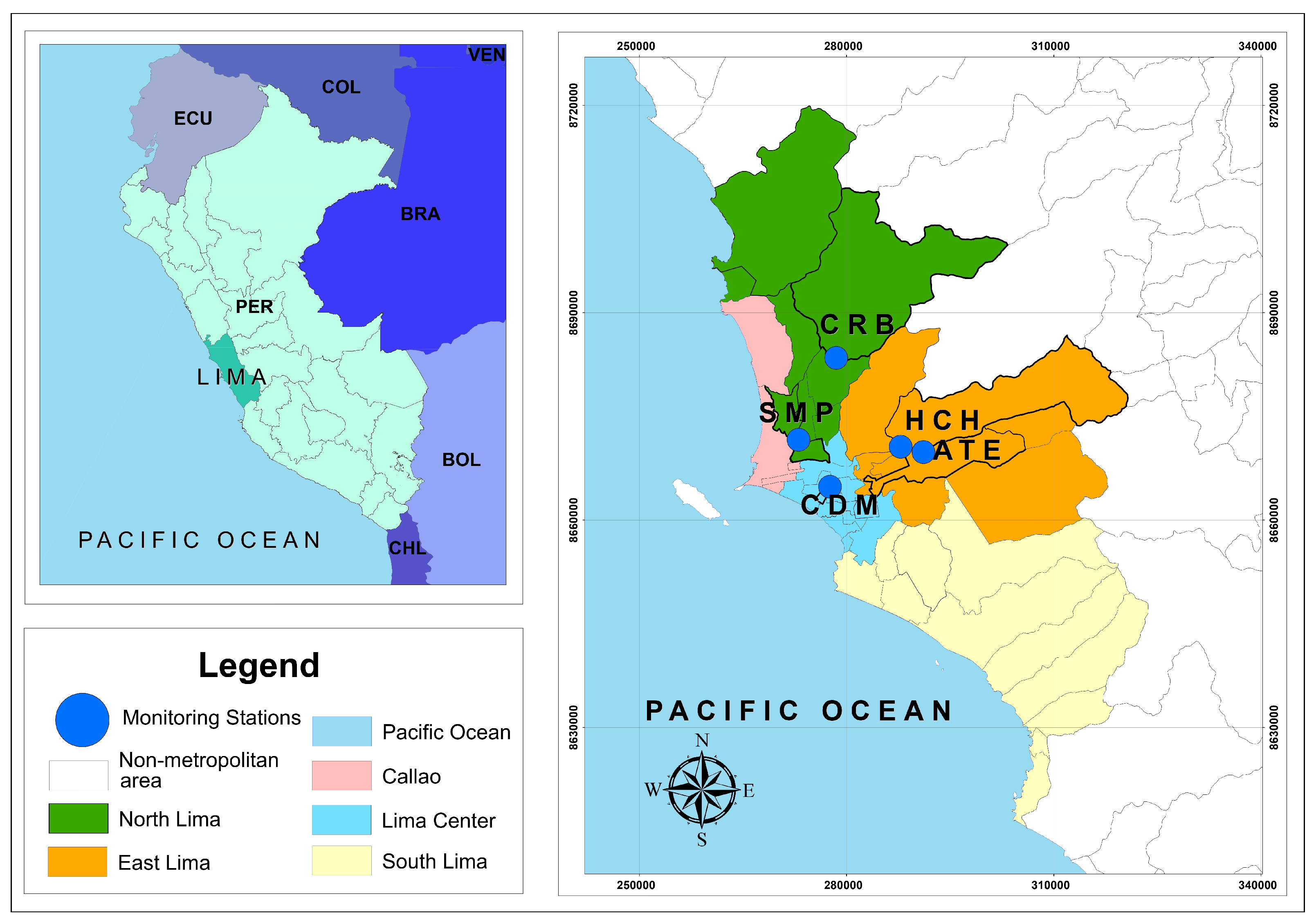
), temperature (ºC), humidity (%), wind speed (m/s) and wind direction; coming from 5 air quality monitoring stations of the “Servicio Nacional de Meteorología e Hidrología” (SENAMHI): Ate (ATE), Jesús María (CDM), Carabayllo (CRB), Huachipa (HCH) and San Martín de Porres (SMP). The geographical distribution of the stations is presented in
Figure 1, being two stations located in North Lima, two stations located in East Lima and one station located in Center Lima.
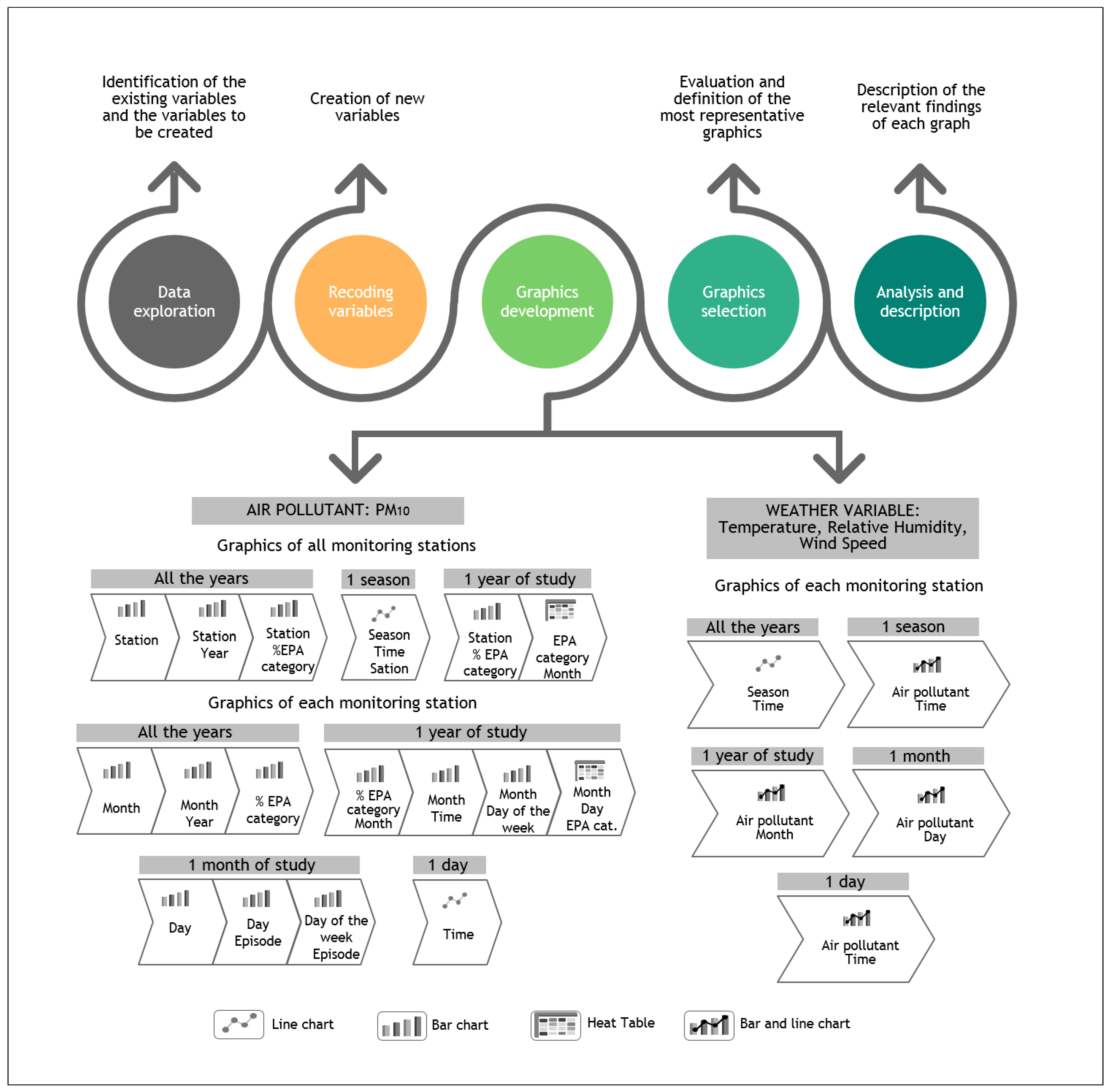
2.2. Preliminary Analysis
The preliminary analysis aimed at performing the cleaning of the data and imputation of missing values, as well as a general report with basic plots such as heat tables, line and bar charts. The main findings of this stage give an important contribution to better understand patterns in the data and to contribute to decision-making.
2.2.1. Data Imputation
The imputation of the missing data was done with the R package MICE, where multiple imputation was considered by using the Fully Conditionally Specification [
31]. The imputation was done for each variable separately and, for the variables under study (PM
, temperature, relative humidity and wind speed), predictive mean matching was used, a semi-parametric and versatile method that focuses on continuous data, which allows the imputed values to coincide with any of the observed values in each variable, that is, it will not produce imputations outside the range of observed data. The percentages of missing data was between 12% and 27%. Other stations with much higher percentages of missing values were not considered.
2.2.2. Preliminary Visualization
Line and bar charts together with heat tables were used for preliminary visualizations to better understand the behavior of the data.
Figure 2 presents the sequence of steps developed for the preliminary visualization of the data. The first step is the data exploration, which consists in the identification of the existing variables of the original data. In the second step, the variables were analysed to decide the types of plots to be generated. In that sense, variables such as: latitude, longitude, day of the week, hour, season of the year and concentration level were added and organized. For this study it was considered that the seasons of the year in Lima are: summer (22 December to 21 March), fall (22 March to 21 June), winter (22 June to 22 September) and spring (23 September to 21 December). In the third step, the charts are designed and obtained from the most general to the most specific. Six types of graphs are presented for all-station PM
concentration data, eleven types of graphs for single-station PM
concentration data, and four types of graphs for data for each meteorological variable per station. For the graphs of meteorological variables, a smaller quantity has been considered, taking into account that their main variations are seasonal and hourly; these graphs also include the behavior of the recorded PM
concentrations, in order to obtain a visualization with respect to the meteorology. This approach proposes several types of graphs and with increasingly specific time periods, to better observe the most critical values at different time-scales. Likewise, this type of approach allows to focus on the highest recorded values and analyze their possible causes and/or consequences. Steps 4 and 5 of
Figure 2 correspond to the selection of graphs, their analysis and interpretation. The selected plots depend on the user and the objective of the analysis.
2.3. Hypothesis
The preliminary analysis describes the important findings obtained from the basic plots. Some of these findings need to be verified, by considering specific hypotheses. Three hypotheses were raised: The first, regarding PM concentrations, proposes that the stations present an optimal coincidence between the time series. The second affirms that the meteorological variables have a causal/correlational relationship with respect to PM concentrations. Finally, the third hypothesis, based on the detailed analysis of the station with the highest concentration of PM: HCH, suggests that there is a positive correlation between temperature and PM concentration at the HCH station.
2.4. Verification
The hypotheses are verified through visual analytics, using scatter charts, boxplots and graphs from statistical analysis using the Dynamic Time Warping (DTW) algorithm. The latter allows to optimally align two time series [
32]. In addition, clustering analysis is useful for detecting similar patterns in the data that comprises multiple time series [
33,
34]. The DTW uses a dynamic programming approach that compresses the two time series to minimize the difference between them as much as possible, thus ensuring that the two time series are ordered through a deformation path [
35].
Geo-located wind roses, considering the direction and speed of the wind, were also generated to complement the results. Finally, geo-visualization charts were used to represent the spatial distribution of the air pollution data.
2.5. Application
The applications of the study are based in a descriptive analysis and visualization. In this last block, the relevant findings of steps 2 and 4 are considered, as well as the subsequent analysis that will complement the study according to the approach. It is important to consider that, for the application, it can be linked with other systems, providing a basis for a comprehensive model of a phenomenon. The proposed methodology has been applied in the spatio-temporal visualization of the air quality data of Metropolitan Lima. Likewise, this approach could also be extrapolated to other large cities.
3. Results and Discussion
Initially, descriptive analysis of the data were carried out, covering the period between 1 January 2017 and 31 December 2018, with five monitoring stations for PM
.
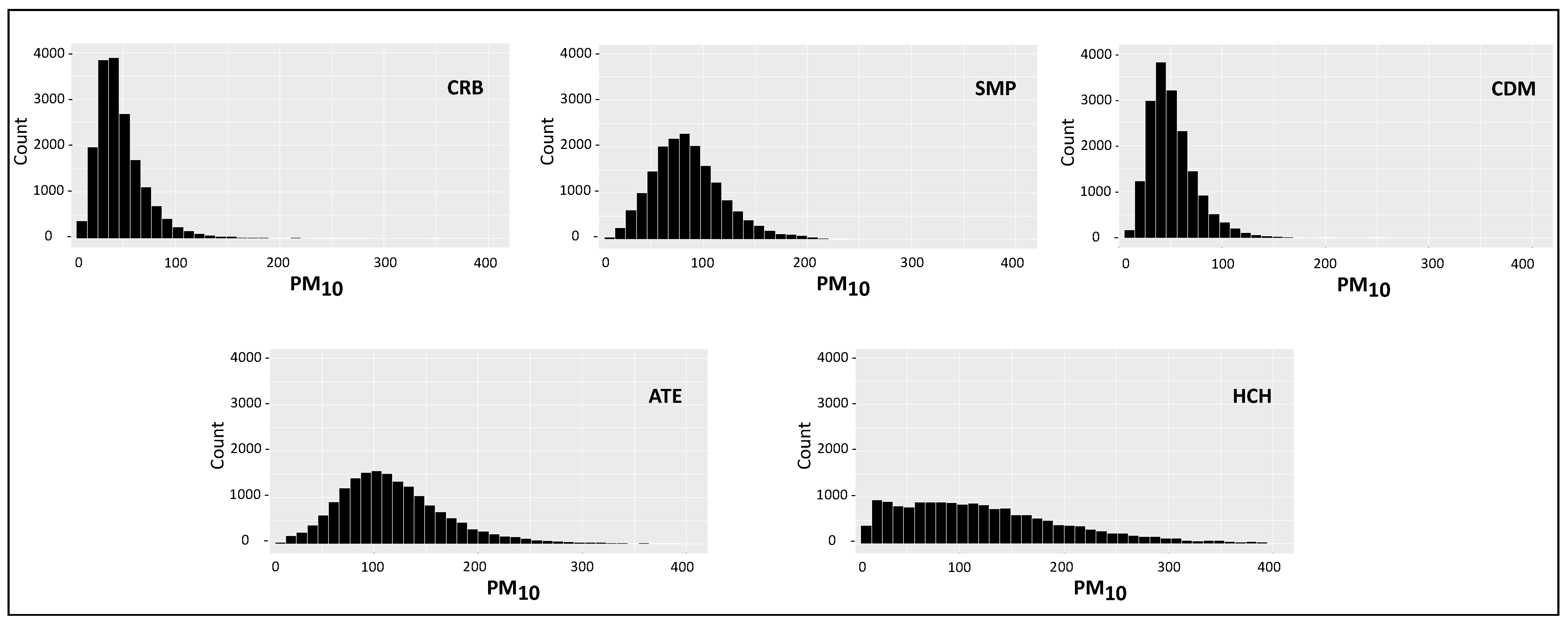
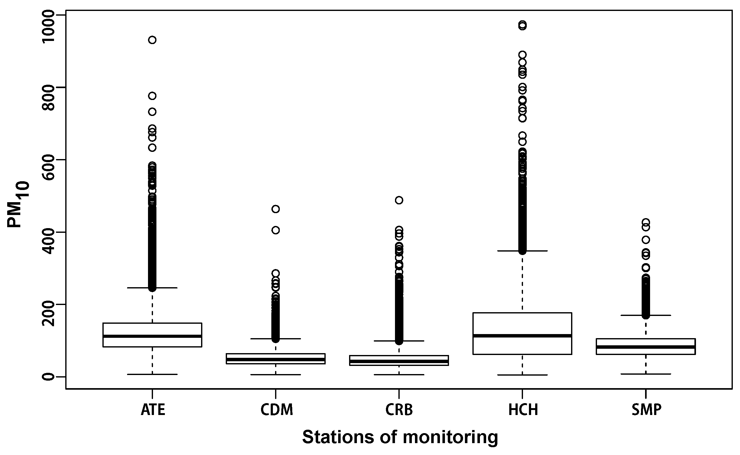
Table 1 shows the descriptive statistics for each station, showing an asymmetry in the data. In this sense, both the histograms and the boxplots, showed in
Figure 3 and
Figure 4, represent the best option for visualizing PM
asymmetry, allowing to evaluate the behavior in each monitoring station. Meanwhile, the PM
pollutant has a heavy-tailed probability distribution (positive asymmetry), which is evidenced by the appearance of high-pollution observations.
3.1. Temporal Variation of PM
Figure 5,
Figure 6 and
Figure 7 show the temporal visualisation of PM
concentration. For a more specific analysis, the cases in which the concentration levels were higher, have been considered.
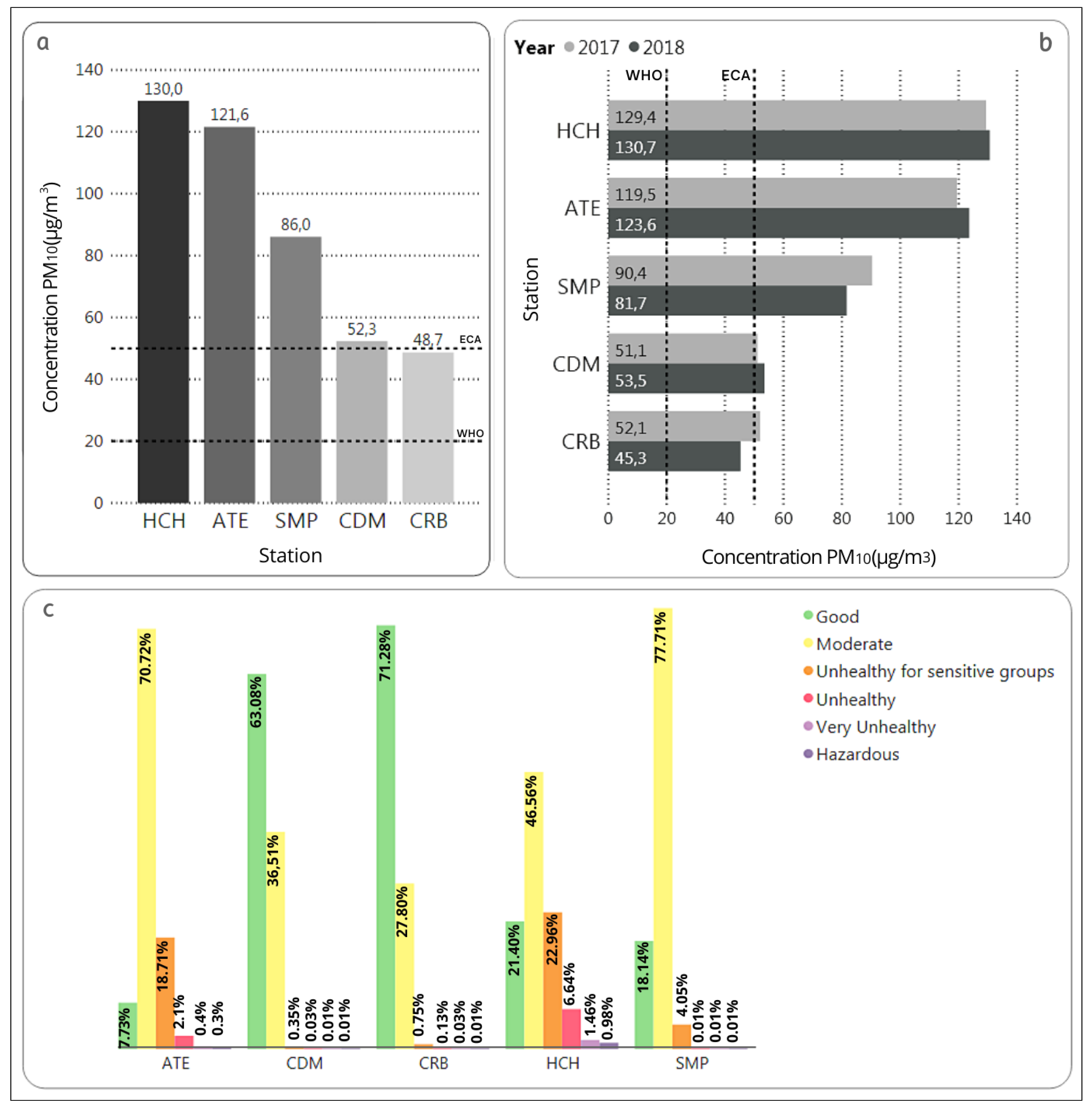
Figure 5, shows the behavior of the data in the five stations.
Figure 5a shows the overall averages of the PM
concentrations (from 1 January 2017 to 31 December 2018). In this period, all the stations exceed the limits proposed by the WHO for the maximum concentrations of PM
in a year. In addition, all stations, except for CRB, exceed the annual arithmetic mean of PM
established in the ECA.
Figure 5b compares the annual averages of PM
for 2017 and 2018 in each station. In this figure it is visible that the difference between the values from one year to another does not exceed 10
g/m
in all stations. However, the annual average of PM
in 2017 from the CRB station exceeds the concentration established in the ECA for annual average compared to that is shown in
Figure 5a. In
Figure 5c, the categories of Air Quality Index (AQI) from
Table 2 were considered, being the percentage of hourly concentrations during the study period shown in the bar chart for each of the categories by station.
The HCH station records the highest percentages of data in the categories: Unhealthy for sensitive people (22.96%), unhealthy (6.64%), very unhealthy (1.46%) and hazardous (0.98%); these percentages are equivalent to 4022, 1164, 255 and 171 observations/hours of PM concentration, respectively, of a total of 17,520 observations.
According to the analysis of the multiannual hourly variation of PM
for the monitoring stations in summer, fall, winter and spring, the highest concentrations of PM
were recorded during the summer. In the summer, HCH and ATE are the stations that recorded the highest PM
concentration values; in the case of HCH, 100% of its values exceed the ECA in a range of 124–203
g/m
. In the period 2010–2015 it was also during the summer that the highest concentrations were recorded in Metropolitan Lima [
28]. During the period 2007–2014, the ATE station was also one of the stations that registered the highest values of PM
in Metropolitan Lima during the summer months; while, for that same period, CDM was one of the stations that recorded the lowest PM
values during all seasons of the year [
20].
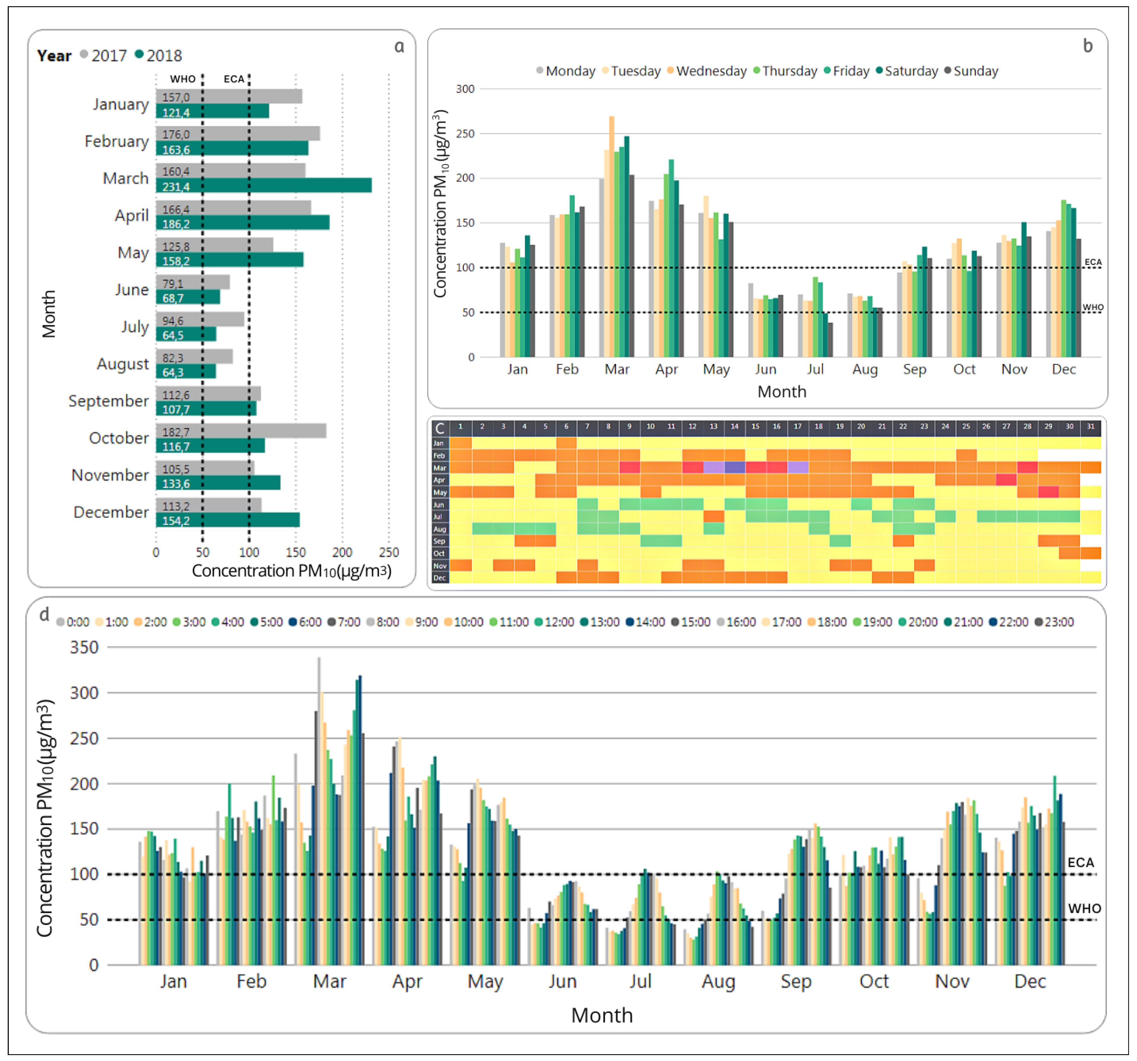
3.2. Detailed Analysis of the Station with the Highest Concentration of PM: HCH
According to the information in
Figure 5, the highest concentrations of PM
are observed at the HCH station. Therefore this station was chosen for a more detailed temporal analysis that is presented in this section. In this sense,
Figure 6 shows the monthly, daily and hourly variation plots of the HCH station.
According to
Figure 6a, the two months with the highest average concentrations during the study period for the HCH station were March and April of the year 2018, while the months of June, July and August in both years reported the lowest concentrations.
Since the highest values were reported in 2018,
Figure 6b–d focus on this year. Based on
Figure 6b it can be seen that the lowest concentrations are recorded on Sundays and Mondays, for most months. These results are comparable to those reported for Cali, Colombia [
37] where PM
concentrations increased from Monday to Saturday and decreased on Sunday when traffic flow in the city also decreased notably.
According to
Figure 6d the hourly concentrations of PM
behave in a varied way in each of the months of 2018. Only in the months of June, July and August a similar behavior can be observed that indicates lower values during the early morning, which rise until reaching a peak between 11:00 and 14:00.
In
Figure 6c it ca be seen that March is the only month in which the concentrations reached values within the EPA categories “very unhealthy” and “hazardous”, highlighting the 14th day, with a mean of 435.2
g/m
. Only 33.15% of the daily concentrations of PM
registered during 2018 in the station HCH correspond to values lower than 100
g/m
, established by the ECA for daily means.
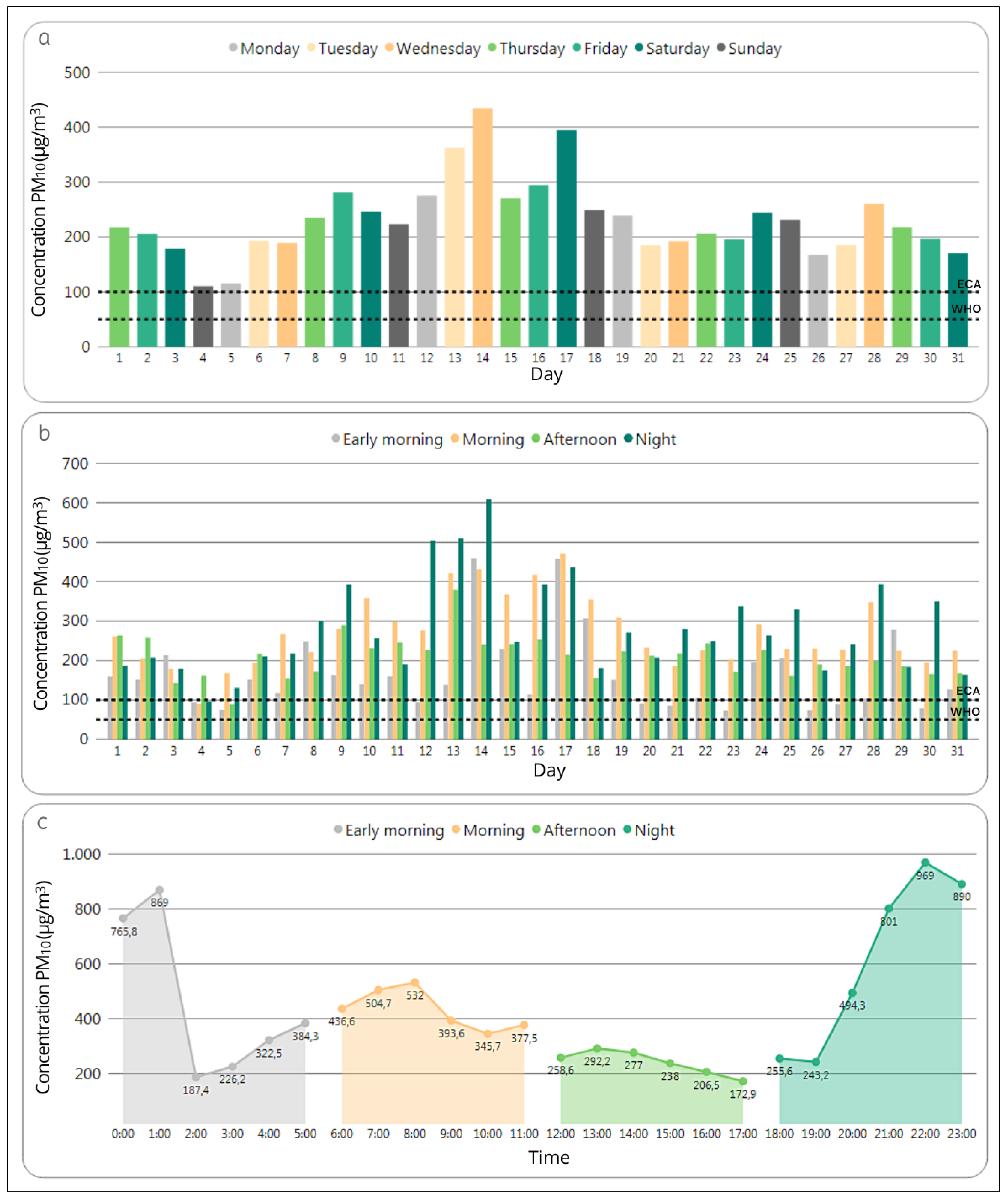
Figure 7 shows the variation of the PM
concentration during the month of March, which, according to
Figure 6 is the month that registered the highest values in 2018.
Figure 7a shows an increase in the concentrations between the 9th and the 17th day of the month, with a maximum peak on the 14th. This may be due to the fact that the beginning of the school year, which represents an increase in traffic, was on March 12th. According to the Instituto Nacional de Estadística e Informática (National Statistical Institute of Peru), the national index of vehicular that flow through toll booths in March 2018 had an increase of 15.5% when compared to March in 2017 [
38].
Figure 7b shows that the highest PM
concentration during March was at night for three consecutive days: March 12th, 13th and 14th. On the other hand, in more than 80% of the days the early morning had the lowest PM
values. Finally,
Figure 7c shows that March 14 begins with very high PM
concentrations between 0:00 and 1:00 in the morning. It should be noted that all hourly concentrations during March 14 exceed 170
g/m
, which indicates that all values are considered by the EPA in the categories unhealthy for sensitive people, unhealthy, very unhealthy or hazardous.
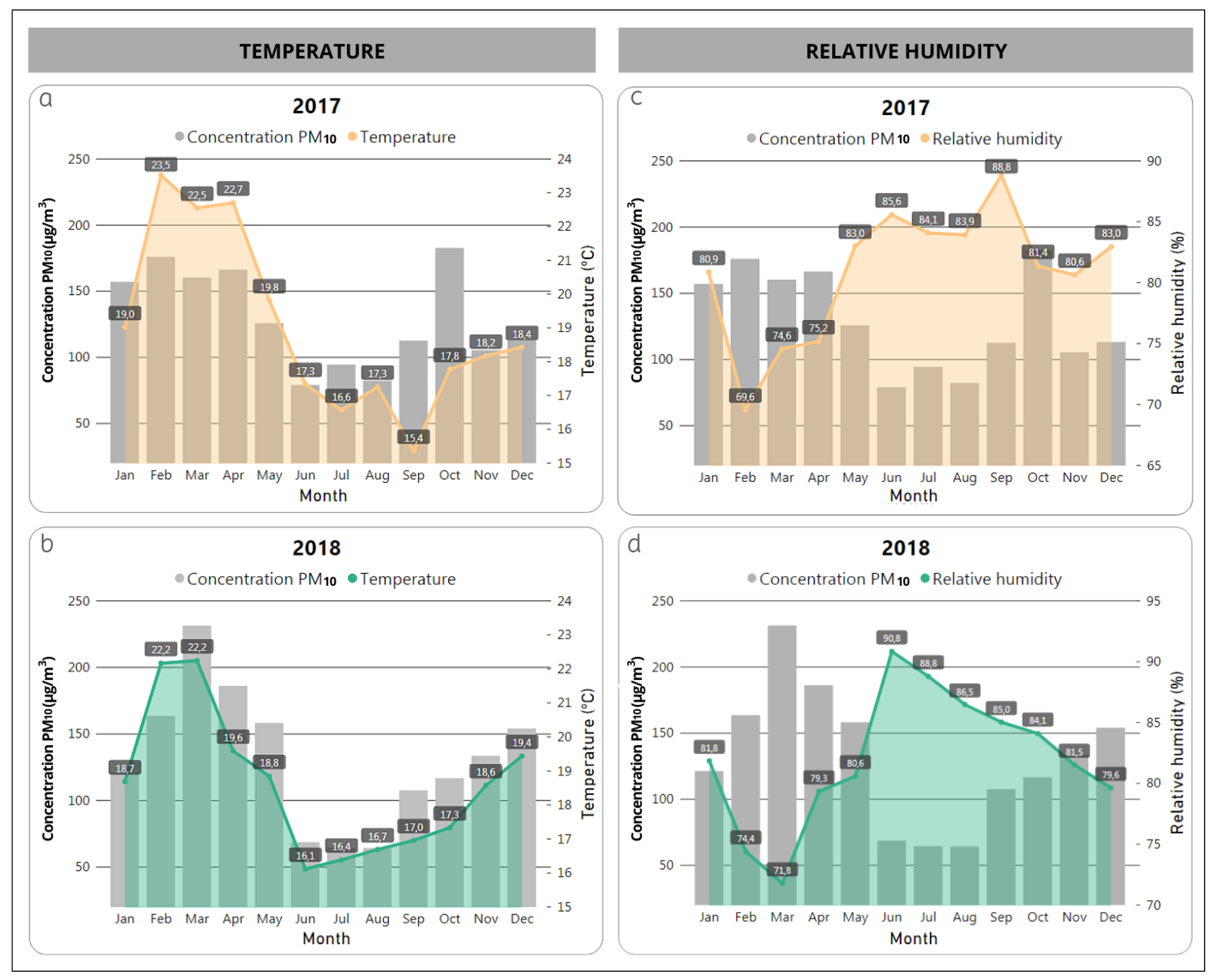
3.2.1. Temperature and Relative Humidity
In the summer of 2018 in the HCH station, the highest concentrations of PM and the highest temperatures were reached during the early morning, a low percentage of relative humidity was also recorded during that same time. Meanwhile, during the afternoon as the temperature decreases, the percentage of relative humidity increases and the levels of particulate matter decrease considerably.
As expected, in 2017 and 2018 the highest monthly temperature averages were recorded during the summer months and the lowest during the winter months.
PM
concentrations could be influenced by the temperature, because higher temperatures increase photochemical activity, consequently, the decomposition of matter and an increase of PM
values [
39]. Also, the high temperatures allow the re-suspension of particulate material for long periods in the atmosphere [
40]. On the other hand, relative humidity influences the sedimentation of particulate matter at ground level, making it more difficult to transport it in the air [
37].
When analyzing the monthly averages of particulate material, it is observed that during the entire study period in the HCH station, concentrations higher than the ECA and WHO for daily averages were recorded.
Figure 8a,b shows that the months with lower temperatures (June to October) favor the increase in relative humidity shown in
Figure 8c,d, which could be related to the decrease in the levels of particulate material in the months under study.
The monthly averages of PM and temperature during 2018 in the HCH station show a strong positive Pearson correlation of 0.9, and a strong negative Pearson correlation between PM and relative humidity of −0.93 with. This does not imply a direct causality between the two meteorological variables and PM concentrations, because the increase in PM is also influenced by urban behavior events (e.g., industries and the automotive fleet).
3.2.2. Wind Speed and Wind Direction
Figure 9 shows the variation of wind speed and direction during the four episodes (parts of the day) in March 2018 for the HCH station. It is observed that the direction and predominant speed of the wind varies during the day: in the early morning it takes the west direction with speeds of up to 6 m/s, and to a lesser percentage the southwest direction with speed up to 6 m/s; in the morning the predominant direction is the southwest, with winds up to 5.1 m/s; at afternoon, the southwest direction also prevails but with wind speeds up to 4.1 m/s. Finally, during the night, the predominant direction is the southwest with speed up to 5.1 m/s.
3.3. Spatial Variation of PM
The intensity of the wind is greater in the fall from dawn until the night, being the lowest speed recorded between night and the next morning. Summer shows ups and downs in terms of wind intensities throughout the day, with a decrease in wind speed more noticeable during the afternoon and showing an increase during the early morning. During the winter, the greatest intensity is registered at noon and goes until sunset, with a decrease at night. Spring presents a similar behavior to the winter, with the greatest intensity being registered from noon until sunset, and when night falls, it diminishes until dawn.
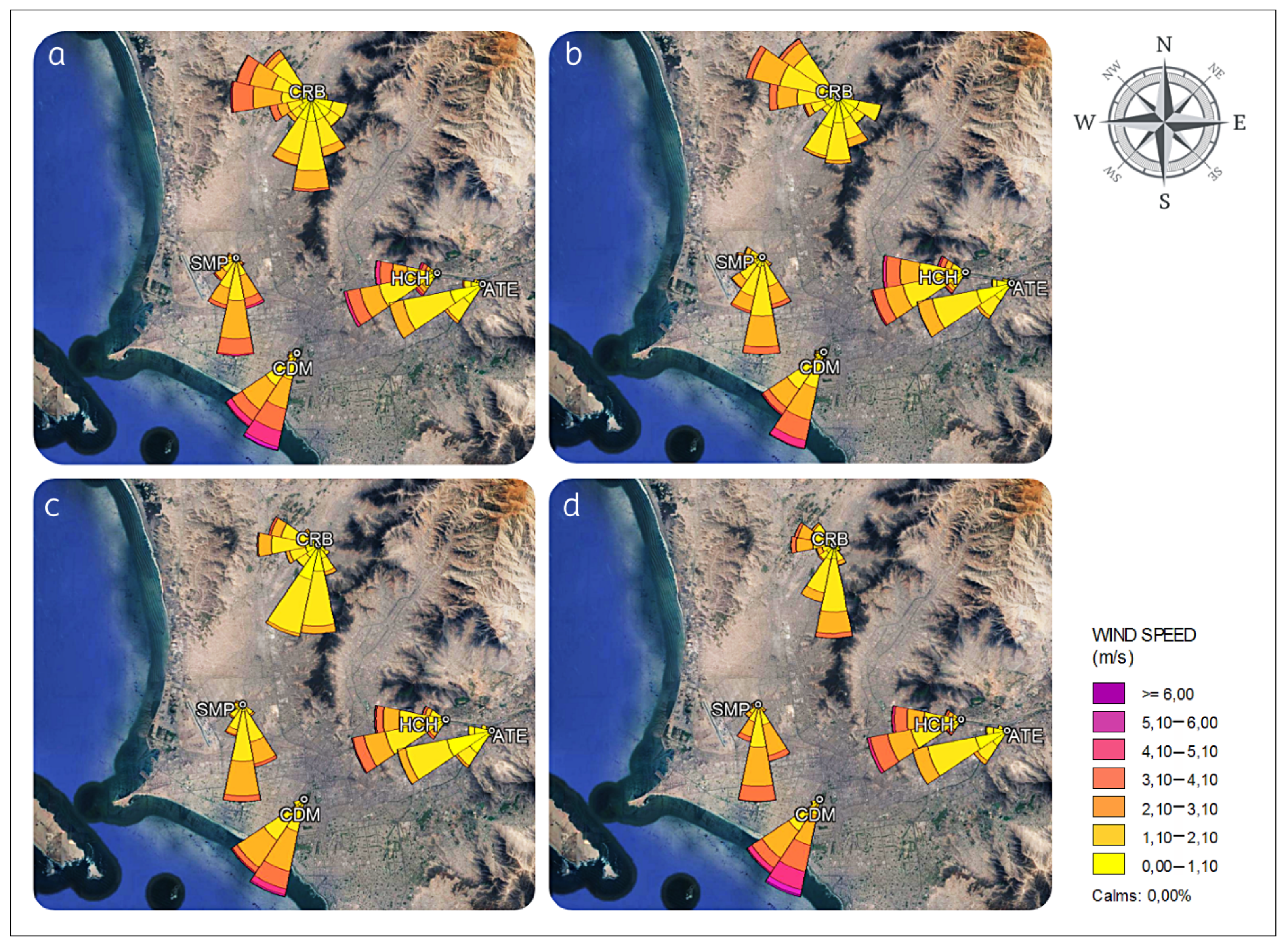
3.3.1. Geolocated Wind Roses
The geolocated wind roses, reported in
Figure 10, show the direction and speed of the wind. These graphs allow to complement the interpretation of the variation of PM
in the Metropolitan Lima stations in 2018. It can be seen that the ATE, CDM, HCH and SMP stations present the same prevailing wind directions throughout the year, as well as similar ranges of wind speed in those directions. In contrast, for the CRB station, during the summer and fall the wind directions are more varied than in winter and spring. The CDM and CRB stations present the lowest concentrations of PM
, with similar values throughout the year; the wind roses show a similar behavior in both stations. In the case of the CDM station, the predominant direction of the wind is the southwest, which carries winds from the Pacific Ocean allowing the dispersion of pollutants in the air. For the CRB station, the highest wind speed is predominantly northwest during the four seasons of the year, which also come from the Pacific Ocean. On the other hand, the stations located east of Metropolitan Lima show the highest concentrations of PM
, which may be related to the fact that both stations present a predominance of southwest winds from the districts located in the center of Metropolitan Lima throughout the year. An important factor to consider is that winds from the Pacific Ocean allow the dispersion of pollutants in the air; and in the case of the CRB station, the winds with the highest speed are predominantly northwest, i.e., from the Pacific Ocean during the whole year.
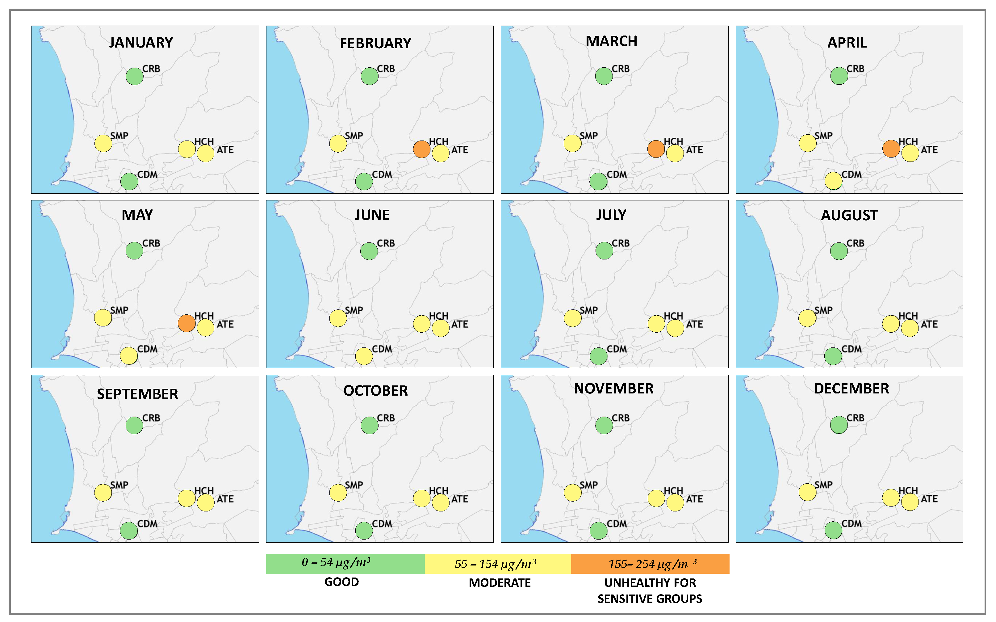
3.3.2. Heat Maps
Figure 11 shows the monthly heat maps for 2018. The stations located east of Metropolitan Lima (HCH and ATE) present the highest concentrations, in contrast, the stations located in the center (CDM) and north (SMP and CRB) have the lowest concentrations. This result coincide with the work of Delgado-Villanueva and Aguirre-Loayza [
41], where the stations located to the east are classified as of very poor quality, while the stations in the center and south are described as of good quality.
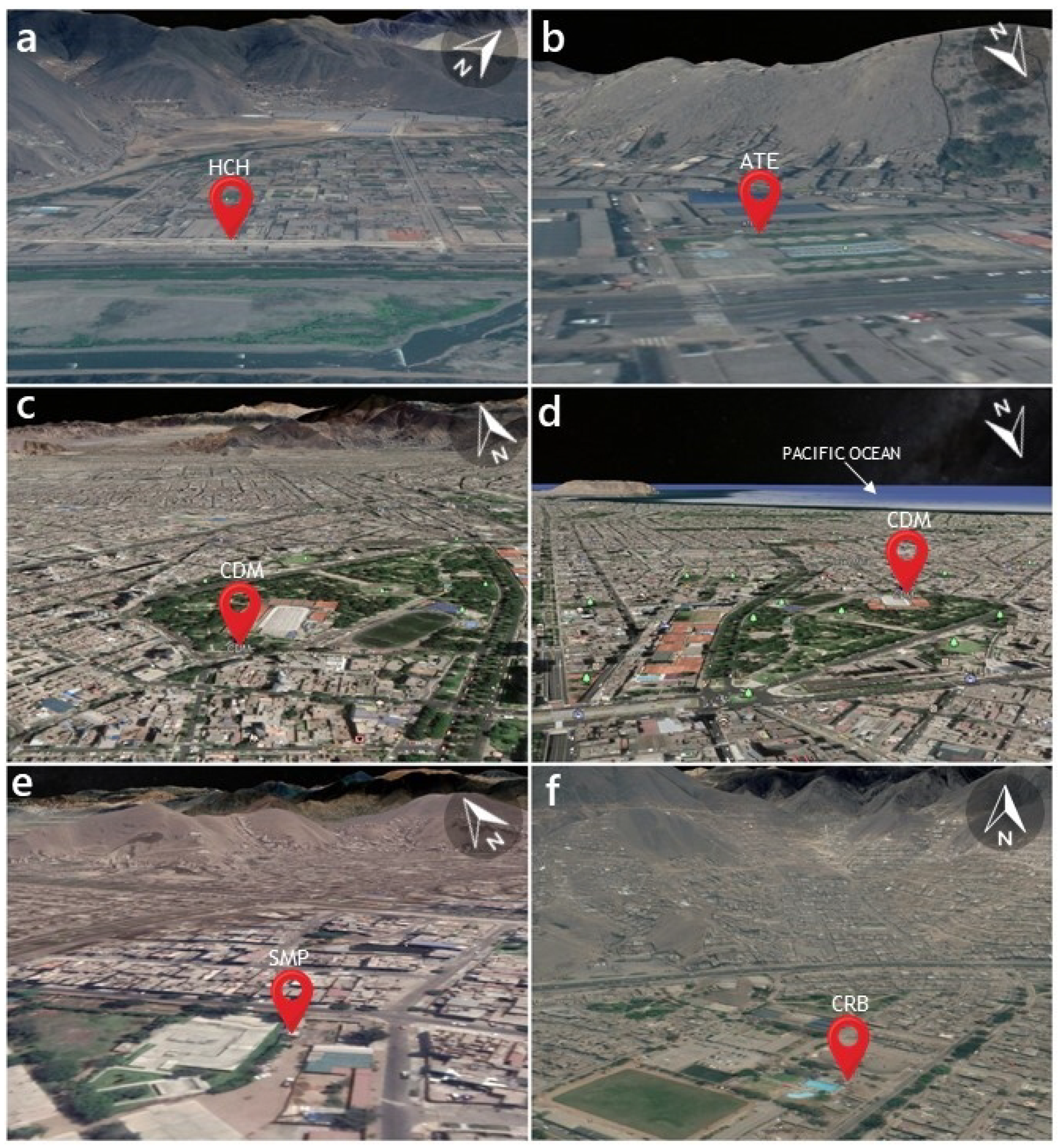
Figure A1 shows that the stations with lower air quality are close to hills and high traffic roads such as the Ramiro Prialé highway, detailed in
Figure A1a and central highway in
Figure A1b. In addition, its surrounding streets are not paved, which influences the increase in the concentration of the levels of particulate matter [
20]. In contrast, the stations in
Figure A1c,d,f are those that register the least pollution and have green areas nearby; these influence the reduction of the temperature, thus increasing the relative humidity [
42].
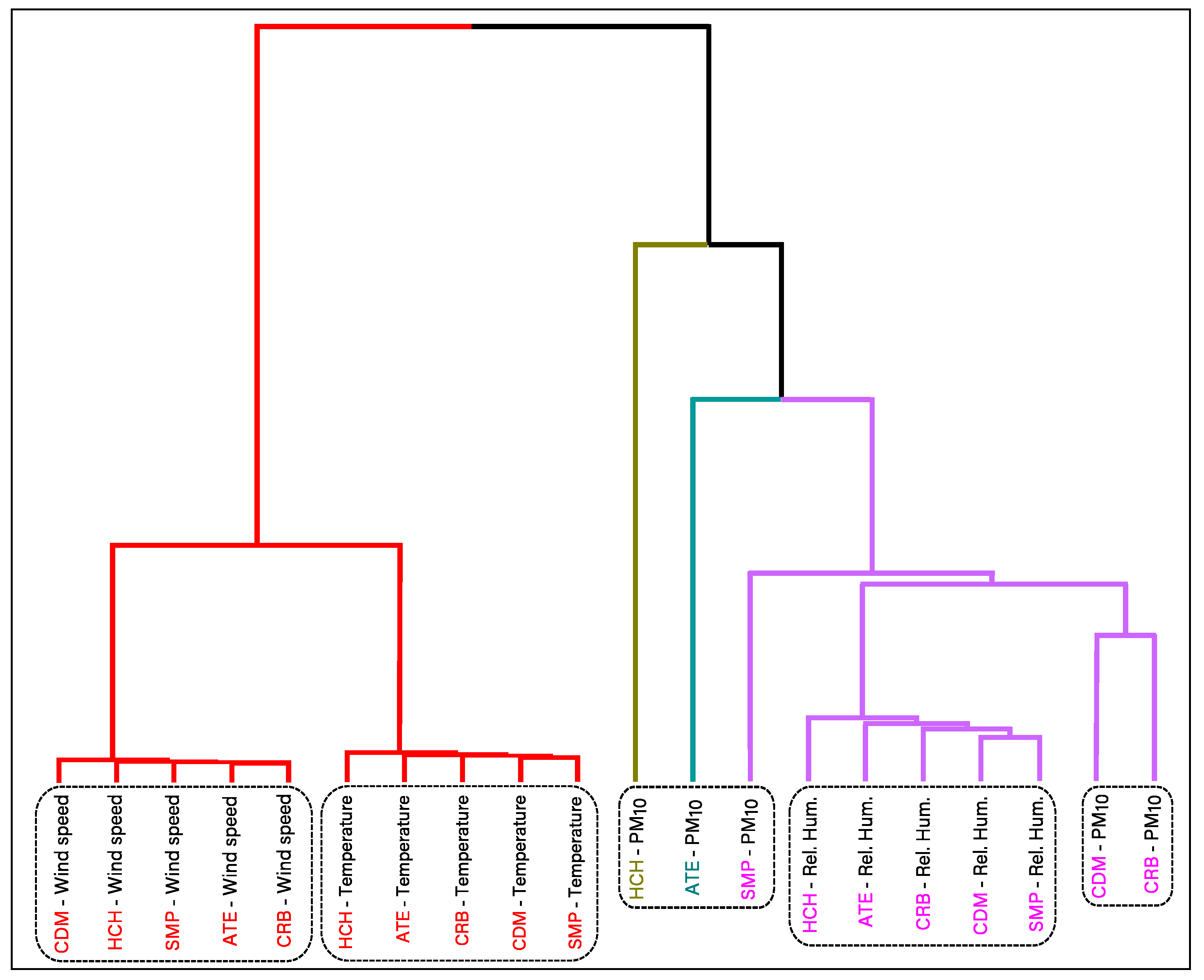
3.4. Hierarchical Clustering
Figure 12 shows the hierarchical tree (dendrogram) considering PM
and the three meteorological variables, temperature, relative humidity and wind speed, for the five monitoring stations. Aiming at clustering time series, instead of data with independent observations and a standard Euclidean distance, we considered distances based on the Dynamic Time Warping (DTW) algorithm, to obtain the dendrogram. In this way, a non-linear optimal alignment between each two time series is considered, instead of a point-by-point distance. This dynamic correlational analysis between the different time series generated differentiable clusters, such as those made up of the same meteorological variable, which indicate that the distance between the meteorological data is minimal in the five stations of Metropolitan Lima. Likewise, it is observed that the wind speed is closer to the temperature than to the relative humidity. The CDM and CRB stations present the least distance in their PM
behaviour in comparison to the other monitoring stations; both register the lowest concentrations of particulate matter, and they have a smaller distance with the relative humidity group than SMP. Finally, the two groups that show the least relationship between their PM
behaviour and the other variables are HCH and ATE, both stations report the highest concentrations of particulate material throughout the study period.
4. Conclusions
The proposed method of a spatial-temporal visualization for the exploration of PM concentration data in Metropolitan Lima offers details in the analysis of the pollutant, allowing to identify the high concentrations registered in the study period. This would not have been possible if we had been used only plots with annual, monthly or seasonal averages.
According to the spatial distribution, the two stations located to the east of Metropolitan Lima (HCH and ATE) and one station located to the north (SMP) registered the highest average concentrations of PM during the study period. In the case of HCH and ATE, both stations are located near hills, high-traffic roads and unpaved streets. While the monitoring station located in the center (CDM) and one of the monitoring stations in the north (CRB) registered lower PM concentrations than the rest of the monitoring stations, both stations also have green areas around and predominant wind directions from the Pacific Ocean.
In relation to the temporal variation, the station with the highest average of biannual and annual PM was HCH. The highest PM concentrations were recorded in 2018, during the summer, highlighting the month of March with daily averages that reached up to 435 g/m. In March 2018, the PM values increased from the 9th to the 17th, with a maximum peak on the 14th, which is likely to be related to the start of the school year on March 12. In 2018 only 33.15% of the daily PM concentrations were lower than the ECA (100 g/m).
In 2018, the HCH station had a high positive correlation between the monthly average of PM and temperature, while the correlation was very low when applied on an hourly scale. This indicates that the relationship between the variables occurs with a time shift.
The closest relationships in the hierarchical cluster analysis occur between the meteorological variables indicating minimum distances between temperature, relative humidity and wind speed of the Metropolitan Lima stations; however, the behavior is different with the variable PM in the five stations. The meteorological variables do not indicate a causal relationship with respect to PM, but the concentrations of particulate matter would be more related to the urban characteristics of each district.
Previous studies about air quality data visualization in Metropolitan Lima [
20,
28] do not present a detailed step-by-step methodology to carry out a spatio-temporal visualization approach. The proposal developed in this paper, in addition to being specific in the approach to visualization, also presents adequate statistical techniques for the analysis of the time series related to environmental pollution. These analysis have a dynamic peculiarity in time, which allows us to better understand the different series in different monitoring stations in different time periods.
In terms of time series modelling and forecasting, further research should be conducted for this data set. Standard time series models such as exponential smoothing [
43], as well as techniques such as the non-parametric singular spectrum analysis [
44,
45], relevant adaptations for non-negative time series (see, for instance, [
46]), and hybrid methods [
47,
48,
49,
50], that have proven its usefulness in other areas and/or other data sets can be used to improve the understanding of this data and to conduct forecasting that can help with decision and policy making.
This approach will open bridges between the agencies in charge of monitoring air quality. Likewise, it will allow proposing policies in favor of caring for the environment, in order to mitigate air pollution. In addition, it opens the gate for future research in this field, extrapolating this proposal to other cities to facilitate analysis and improve decision-making at the local and national level.


 ,
, 


