Article

Applying Spatial Statistical Analysis to Ordinal Data for Soybean Iron Deficiency Chlorosis

1
USDA, Agricultural Research Service, Plant Science Research Unit, 1991 Upper Buford Circle, Saint Paul, MN 55108, USA
2
USDA, Agricultural Research Service, Corn Insects and Crop Genetics Research Unit, 819 Wallace Road, Ames, IA 50011, USA
3
Department of Agronomy, Iowa State University, Ames, IA 50011, USA
*
Author to whom correspondence should be addressed.
Agronomy 2022, 12(9), 2095; https://doi.org/10.3390/agronomy12092095
Submission received: 2 August 2022 / Revised: 25 August 2022 / Accepted: 26 August 2022 / Published: 1 September 2022

Abstract

:
Accounting for field variation patterns plays a crucial role in interpreting phenotype data and, thus, in plant breeding. Several spatial models have been developed to account for field variation. Spatial analyses show that spatial models can successfully increase the quality of phenotype measurements and subsequent selection accuracy for continuous data types such as grain yield and plant height. The phenotypic data for stress traits are usually recorded in ordinal data scores but are traditionally treated as numerical values with normal distribution, such as iron deficiency chlorosis (IDC). The effectiveness of spatial adjustment for ordinal data has not been systematically compared. The research objective described here is to evaluate methods for spatial adjustment of ordinal data, using soybean IDC as an example. Comparisons of adjustment effectiveness for spatial autocorrelation were conducted among eight different models. The models were divided into three groups: Group I, moving average grid adjustment; group II, geospatial autoregressive regression (SAR) models; and Group III, tensor product penalized P-splines. Results from the model comparison show that the effectiveness of the models depends on the severity of field variation, the irregularity of the variation pattern, and the model used. The geospatial SAR models outperform the other models for ordinal IDC data. Prediction accuracy for the lines planted in the IDC high-pressure area is 11.9% higher than those planted in low-IDC-pressure regions. The relative efficiency of the mixed SAR model is 175%, relative to the baseline ordinary least squares model. Even though the geospatial SAR model is the best among all the compared models, the efficiency is not as good for ordinal data types as for numeric data.

1. Introduction

Iron deficiency chlorosis (IDC) in soybeans is caused by the inability of the plant to utilize iron in the soil. Without enough iron, chlorophyll production is hampered, and the plant will suffer and possibly die. IDC is expressed in new leaf tissue, and symptoms typically appear on younger leaves, between the first and third trifoliate growth stages, vegetative stages V1 to V3 [1]. The typical symptoms of IDC are the yellowing of leaves, with interveinal chlorosis, while the veins remain green [2].
Soybean IDC affects yield. Soybeans are the second-most-planted field crop in the United States after corn, with a record high of 90.16 million acres planted in 2016 [3]. IDC has a 20% yield reduction for each unit increase in chlorosis, based on chlorosis scoring on a 1 (no yellowing symptoms) to 5 (severe yellowing of leaves and the plant dies) scale [4]. In the past 30 years, from 1979 to 2017, soybean planting acreage in IDC-prone regions has increased, with a 160% increase in soybean production area in IDC-prone regions with soil pH of 7.2 or greater [5]. This increase in soybean production areas into IDC-prone regions has led to yield losses of 340 million tons, worth an estimated USD 120 million per year [6]. Current IDC trends in soybean production areas are expected to continue. Thus, minimizing or eliminating yield lost due to IDC is critical.
Because soil micro-environmental variation causes testing location heterogeneity, it is difficult to find large and uniform fields of calcareous soil that can be used to evaluate IDC, which results in more experimental error than is desirable for selection among genotypes [7]. Environmental conditions for soybean to develop IDC symptoms are ephemeral, usually existing for a couple of weeks during the V1 to V3 stages of soybean development. Fields chosen for IDC testing are selected based on historical IDC pressure records and the potential for IDC conditions detected at the time of planting. In fields known to exhibit IDC, the exact locations within the fields may change from year to year, depending on rainfall prior to planting and the rate at which soil moisture evaporates in the early growing season. IDC pressure within a testing site usually varies by the range and rows from year to year, leading to different levels and patterns of IDC expression with spatial autocorrelations. To find the exact locations of IDC pressure within a field each year, breeders planted IDC-susceptible varieties in plots throughout the field, augmenting the varieties planted in each incomplete block. Seed companies usually test thousands of lines each year at each location, with at most two replicates; thus, some lines may be planted in high- and some in low-IDC-pressure areas. The ephemeral nature of IDC spatial and temporal variation for high and low IDC pressure cannot be planned for, given the small plot evaluations of early-stage field trials, and thus require spatial models to correct for variation in IDC pressure within fields.
IDC phenotype scores typically range from 1 (the most resistant) to 5 (the most susceptible) in reports by academic field breeders [8], or from 1 to 9 by commercial plant breeding organizations. In both cases, the scores represent ordinal data [9]. While plant breeders attempt to create ordinal data that capture the gradual nature between little to extreme stress, IDC scores nevertheless often change sharply from 1 to 9 in actual fields without continuous transitions. IDC symptoms in Iowa and southern Minnesota often appear to consist of oval-shaped patches (Figure 1) due to the location of soil moisture. In summary, ordinal data such as IDC creates phenotyping and selection challenges for plant breeders due to the genetic complexity of the trait, the scoring of IDC as ordinal data, and the use of small plots with 3 to 8 plants in early-stage evaluations, in fields with ephemeral patches of IDC.
Accurate phenotypic data is the most critical factor for visual-based phenotype selection and marker-assisted selection. High-quality phenotypic data rely on experimental design and precise assessment of the phenotypes. Since IDC phenotypes are opportunistic to some degree, standard IDC resistant and susceptible checks or controls are included in field trials to estimate the overall IDC pressure across the testing site and used as a reference to measure and adjust IDC scores of new lines. Many experimental designs to optimize the number of checks, such as augmented design [10], partial replicated design [11], augmented partially replicated (P-rep) design [12,13,14], and incomplete block alpha-lattice design [15,16], have been developed to account for field trend and variation. At the same time, different statistical models have been developed to account for field variation and phenotype data quality control. Phenotype data quality control removes non-genetic variation caused by environmental noise from the estimated genotype values. Phenotypic data variation and subsequent patterns in the field have been studied for decades, especially in the geostatistics and econometrics fields [17,18,19,20,21]. Spatial models are required because of the autocorrelation among neighboring plots, which violates the identical independent distribution (iid) assumption for ordinary least-squares (OLS) regression, which has been used for the general linear regressions [22]. Various spatial adjustment techniques have been developed to account for spatial autocorrelation and shown to significantly improve the precision and repeatability of quantitative phenotypes. Collectively, these geospatial models can be clustered into three groups of spatial models based on the time of model development and the optimization mechanism used to adjust the spatial variation.
The first group includes the moving grid mean adjustment models [23,24,25,26,27]. The moving mean spatial analysis has become more popular recently because the R package “mvngGrAd” implements the analysis. The package gives users the flexibility to predefine any grid or pattern consisting of neighboring plots. The mean of the plots included in the grid is calculated and used as a covariate to account for the spatial variation [28]. In contrast with the spatial autoregressive (SAR) model, which treats spatial variation as anisotropic along different directions [29], the moving mean average models treat the spatial variation as isotropic, in which the covariates among neighbor plots are simple means of the neighbor plots within a user-defined grid. This approach has been reported to adjust the spatial variation successfully and thus has increased genomic selection accuracy from 0.231 to 0.37 for grain yield and from 0.436 to 0.614 for days to heading in wheat breeding, respectively [30].
The second and most extensively studied type of model is the spatial autoregressive regression (SAR) model, which includes autocorrelation among neighboring plots in the model as a covariate parameter to model the correlation variation among the neighbors. These geospatial models have the following property: the closer the plots, the higher the correlation between them [31]. These geospatial models include spatial lag models, spatial error models, spatial lag plus error mixed models [21,32], first-order autoregressive regression AR(1) or one-dimensional spatial analysis with row, column, or row + column [33], and the extended two-dimensional spatial analysis including the interaction between row and columns [34].
This group of SAR models focuses on optimizing the variance-covariance structure of the residuals among neighboring plots. Evidence from a systematic comparison of covariance structures among experimental, spherical, Gaussian, linear, linear log, anisotropic power, and anisotropic exponential show that AR(1) was generally not an optimal option for spatial analysis, and different covariance structures are needed to account for spatial variation in different trial sites [35], because each trial site has different variation patterns. Within this group of models, field variations were also divided into the local trend or small-scale variation within a block or experiment and global trend or large-scale variation across all the experiments or the entire trial sites [36]. The nearest neighbor analysis model was developed to correct both local and global neighbors for the field variation [37,38]. More complex models with polynomials were also developed to account for additive effects for either row or column and non-additive epistasis interaction between the rows and columns [39]. To remove the local and global field variation effectively, Gilmour et al. proposed a sequential spatial model schema in which the first step is to remove local trend variation by fitting a two-dimensional range by row AR(1); the second step is to remove the global trend variation by fitting one-dimensional polynomials or splines in the direction of rows or columns [40,41]. To select the best model for each trial site, the sequential spatial model will run both model selection and model variable selection manually by applying graphical diagnostic tools to the spatial models. This manual model selection process was further extended with more optional models for comparison and enhanced for model selection efficiency [42]. Overall, SAR models have been improved as to the effectiveness of the spatial variation correction, and SAR analysis is becoming a routine for field data analysis for geostatistics and econometrics [43].
The third group of models to account for spatial variation is “tensor product penalized spline models,” or P-splines. P-splines have been used to account for both local and global spatial variation in tree genetics via the Bayesian mixed model, with the accuracy of breeding values increasing by 66% [44]. This Bayesian mixed model was extended to a two-dimensional smoothed surface in an individual-tree-based model using a tensor product of linear, quadratic, and cubic splines for rows and columns, and the accuracy of breeding values for the offspring increased by 46.03% [45]. Most recently, an advanced P-spline-based model was proposed and developed as the R package spatial analysis of field trials with splines (SpATS) [46]. This model includes both bilinear polynomial and smooth splines components: (1) The bilinear polynomial component consists of three sub-variables: row spatial trend, spatial column trend, and interaction between row and columns; and (2) the smooth spline part contains five smooth additive spatial components. This approach uses a two-dimensional P-spline ANOVA representation of the anisotropic smooth surface formulated in a mixed model via SpATS. SpATS is a better choice than SAR in two aspects: (1) SpATS is a one-step modeling approach to spatial analysis by fitting a general SpATS model to analyze all the trials from different trial sets. The SpATS approach overcomes the sequential spatial model selection for different testing sites and can be used with large-scale, high-throughput, and routine multiple environmental trial (MET) analysis. SpATS can fit both local and global variation, isotropic and anisotropic variation, and one-dimensional and two-dimensional variation into one model and optimize the best parameters to remove the noise from phenotypic data from the true genotypic values without overfitting. With one model fitting all the trials, it minimizes the chance of using different models selected for different trials, which might lead to biases against different genotypes from different locations because of the different model variables selected [47]. SpATS was tested by modeling spatial trends in sorghum breeding fields, and the results show that the improvement in precision and predicted genotypic values from SpATS analysis were equivalent to those obtained using the best SAR sequential model selection for each trial [47].
The above three groups of spatial models to adjust field variation have been mainly applied in econometrics and geostatistics and a few for plant breeding for continuous data, such as crop grain yield and plant height [26,30,47].
In contrast to continuous yield data, the soybean IDC score is a discrete ordinal variable, whereas moving grid, SAR, and P-spline models were developed and applied to continuous variables. In the applications, adjusted continuous trait phenotypes have improved precision and the repeatability of field trials. To our knowledge, applying these methods to adjust for non-genetic spatial patterns in ordinal traits such as IDC is limited to a single publication in which the moving grid was applied to IDC in soybean [26]. Moreover, while most of the published reports about the spatial analysis models have applied a few models, most reports have not systematically compared the effectiveness of models for data obtained from fields with different levels of severity and irregular, discontinuous spatial patterns. The effectiveness of adjustments made by spatial models depends not only on the model parameters but also on the severity of the spatial variation and the irregularity of variation pattern in the experiment field. The objective of the research reported herein is: (1) to apply six different geospatial as well as two OLS models as the baseline to three datasets with different levels of severity of spatial variation, variation patterns, and different experimental designs; and (2) to systematically compare models for spatial adjustment using R2, Akaike information criterion (AIC), residual standard error, Moran’s I index [48], and prediction accuracy.

2. Materials and Methods

2.1. Data Sets

Soybean IDC data were collected from experiments planted in historically “IDC-hot” sites, which were selected to minimize the IDC spatial variation by past years’ IDC records and the current year’s IDC status. Soybean IDC pressures vary from year to year for the same site, and testing sites are not always good enough for testing IDC across years. Before planting the testing lines in the historically “IDC-hot” testing sites in the current year, several IDC-susceptible varieties were planted about 10 days earlier than the typical planting date to assess IDC pressure. These standard IDC controls were then rogued, and new testing lines were planted in these testing sites if the susceptible varieties showed IDC symptoms. Otherwise, these sites were not used as IDC testing sites.
A total of five data sets, four experimental and one simulated data set, with a total of 11,602 testing lines, were used for this study (Table 1). Dataset 1 was simulated to mimic the typical circular IDC spatial variation pattern. The parameters used for the simulation and their variance proportions are summarized in Table 2. Dataset 1 contains 1050 simulated genotypes with a total of 2100 IDC scores. The field layout is 42 ranges by 50 rows, randomized complete block design with two replicates.
In contrast to simulated dataset 1, datasets 2 to 5 are experimental field data collected from a seed company in 2016. They were selected to represent the four different IDC-prone regions in the USA. For each set, the experimental design was a six-by-six alpha-lattice, with 32 testing lines and four checks. These testing materials are in early variety developmental stages, planted with two replicates in one location, and the average number of replicates was 1.84 replicates/line across all the experiments. The reason for less than two replicates per testing line is due to low emergence rates.
IDC score scales from 1 for the most tolerant to 9 for the most susceptible were used for this research. The IDC score criteria are 1 = green leaves (no chlorosis) to 9 = dead plant, following the rating scale presented in Figure 2. The IDC scores are treated as ordinal data.
Among the five data sets, three classes of distinctive spatial variation patterns, the Red River Valley (RRV) pattern, the Iowa and Minnesota (IA/MN) pattern, and the Kansas and Nebraska (KS/NE) pattern, were observed from the heatmap of the IDC raw data (Supplemental Figure S1). The three IDC field spatial patterns are consistent with the three soybean IDC-prone soil types, clustered by principal component analysis (PCA) based on 15 soil character measurements (Figure S1).
Five testing locations from North Dakota and Manitoba regions were clustered as the RRV group, four testing sites from Iowa and Minnesota were clustered together as the IA/MN group, and one testing site from Nebraska composed the NE group (Supplemental Figure S1). KS/NE regions have relatively uniform IDC scores without a noticeable spatial pattern, and no spatial model is needed for the analysis.
The Red River Valley (RRV) IDC data has a column-by-column spatial variation with block effects, which can be corrected by block design and corresponding statistical analysis. In contrast, the IA/MN IDC testing locations show completely different spatial patterns from that of RRV and KS/NE regions. Thus, IDC data from the IA/MN region has spatial autocorrelation and needs spatial autoregressive analysis. Among the five testing sites from the IA/MN region, two locations showed different spatial variation patterns (from data sets 2 and 3) from the other three locations and were selected for this research. All the analyses and results hereafter are based on the three data sets: two data sets (data sets 2 and 3) from the IA/MN region and one simulated data set (data set 1) (Table 1).

2.2. Analytic Methods

Including ordinary linear squares (OLS), a total of eight models were compared (Table 3).

2.2.1. Model 1: Ordinary Least Squares (OLS) without Range and Row Covariates

OLS is a linear least-squares method for estimating the unknown parameters in a linear regression model. OLS chooses the parameters of a linear function representing a set of explanatory variables by the principle of least squares. Traditionally, the regression model does not include parameters for the spatial dependence of experimental units. The general equation for the OLS with p variables can be written as [43]:
Y = α L n + X   β + ε
where Y and ε   are (n × 1) vectors of the values of the response variable and the errors for the various observations, respectively.   L n is a (n × 1) vector of ones associated with the constant term parameter α to be estimated. X is an (n × p) matrix of regressors or the design matrix. β is (1p × 1) vector of the parameters to be estimated.
OLS analysis for model 1 was conducted with the ols() function implemented in the R package “regression modeling strategies (rms)” [49].

2.2.2. Model 2: Ordinary Least Square (OLS) with Range and Row

Model 2 analysis was similar to model 1, except two variables, range and row were added to the model [43,44,45].
Y = α L n + X   β + ROW + RANGE + ε

2.2.3. Model 3: Moving Grid Adjustment

The “moving grid average adjustment” is a spatial method to adjust for environmental variation in field trials. It is most common in field trials with few replicates, such as for early-stage breeding materials. All the raw data were aligned into a row-by-range rectangle layout. A grid is predefined based on the field variation pattern around each cell (=entry), and each observed value was adjusted by the values from the neighbor plots within the predefined grid. The mean of the cells included in the grid is calculated using the equation below [28]:
x i = j p j ,   o b s × I ( p j ,   o b s     G i   ) j I ( p j ,   o b s     G i ) ,   P i ,   o b s = P i ,   o b s b ( x i x ¯ )
where
x i is the moving mean of the ith entry
G i   is the grid of entry i and I(·) is an indicator function that takes the value “1” if the condition is satisfied and “0” if not
P j ,   o b s are the observed phenotypic values of all entries that are included in G i
x ¯ is the mean of all x i
b is the regression coefficient in the linear model
P i ,   o b s are the adjusted phenotypic values of all entries.
The layout of the grid used to adjust the phenotype value is shown below in Figure 3:
The model executed for each data set was:
movingGrid rows = no.of.rows , columns = no.of.range , obsPhe = raw.observed.values , shapeCross = list ( 1 : 2 , 1 : 2 , 1 : 2 , 1 : 2 ) , layers = c ( 1 : 1 ) , excludeCenter = TRUE )
where “shapeCross” is to set up the shape of the moving grid and “excludeCenter” is to define whether the center from each grid is included/excluded to calculate the mean.

2.2.4. Model 4: Spatial Autoregressive Lag Model

When a value in one plot depends on the values of its neighbors, the errors are no longer uncorrelated and may not be independent and identically distributed (iid). Depending on the nature of the spatial dependence, OLS will be either inefficient, with incorrect standard errors, or biased and inconsistent [54]. When IDC scores depend not only on genetics but also on scores from neighboring plants, the spatial lag model is introduced to correct for the autocorrelation [55]. In the spatial lag model, the spatial components were specified on the dependent variable, IDC scores. This setting leads to spatial filtering of the variable, which is averaged over the surrounding neighborhood defined in W, called the spatially lagged variable. The spatial lag model can be specified as:
Y = ρ W Y Y + X β + ε
where ρ is the autoregressive lag coefficient, which tells us how strong the resemblance is, on average, between Yi and its neighbors; if ρ is not significantly different from 0, then the spatial lag model becomes the traditional OLS regression model.
y i is the ith IDC score, and y j is all the neighbors’ IDC scores around ith IDC score. y i   stands for one of n observed IDC scores, and y j stands for more than one IDC scores.
WY is a spatial weight matrix with n × p rows and ranges, describing the spatial correlation structure of the observations.
X is an n × p matrix of regressors or the design matrix; β   is a p × 1 vector of the estimated coefficients.
Analysis of IDC scores with the spatial lag model was conducted via R package “spdep” [50] and “spatilreg” [51].

2.2.5. Model 5: Spatial Autoregressive Error Model

In contrast to the spatial lag model treating autocorrelation as a lag component in the response variable, the spatial error model regards autocorrelation as part of the error term. The spatial error model incorporates a local and a spillover element in the variance-covariance matrix of the error term in a linear regression model [56]. Formally, the model can be written as:
Y = X   β + e   and   e = λ W e + V
where λ is the spatial error coefficient. If the absolute value of λ is not significantly greater than 0, the spatial error model becomes the OLS regression model. We use the weight matrix to adjust the error correlation in the residuals.
Analysis of IDC scores with the spatial error model was conducted via R package “spdep” [50] and “spatilreg” [51].

2.2.6. Model 6: Spatial Durbin Mixed Model

A limitation of the spatial lag or spatial error models is that they can include either an autoregressive lag or a spatial error covariate in the model. In reality, some fields have complex spatial variations with both autocorrelation lag and spatial error. Moreover, the dependencies in the spatial autoregressive relationships do not only occur in the dependent variable but may also be present in the independent variables. The spatial Durbin mixed model was developed to account for a dependent, the autocorrelation lag, spatial error, and independent variables [57,58]. The model can be written as:
Y = ρWY + Xβ + WXθ + ε
where Y, X, ρ, and β are defined as above; WY is the spatially lagged offering IDC scores accounting for various spatial dependencies, with W defined as (n × n) spatial weight matrix; ρWY is the endogenous interaction effect; θ is a (k × 1) vector of unknown parameters; θ WX is the exogenous interaction effect
Implementation of the spatial Durbin model was carried out via the R package “spatilreg” [51].

2.2.7. Model 7: AR1 by AR1 via ASReml-R

The ASReml mixed model is widely used in plant and animal breeding and quantitative genetics. It also provides functions for spatial autoregressive analysis. ASReml-R is the only commercial R package in this study and is used to compare whether it will outperform the free spatial analysis packages. One update in the new ASReml-R version 4 for spatial analysis: ASReml changed the random formula and error (rcov) component “rcov = ar1(range):ar1(row)” to residual = ar1(range):ar1(row) [52,59].
The model used for the analysis is: asreml(fixed = IDC_scores ~1, random = ~LINCD, residual = ~ar1(range): ar1(row), data = IDC.data)

2.2.8. Model 8: P-spline Mixed Model via SpATS

The P-spline approach models field trends using a smooth bivariate function of the range and row f(range, row), represented by 2D P-splines [46,47]. The P-spline technique optimizes the fitted surface by penalizing the spatial effects. The degree of penalization over the fitted spatial variation trend is determined by smoothing parameters. The 2D range by row surface is decomposed into a sum of linear components and univariate and bivariate smooth functions as [47]:
f ( range ,   row ) = X s β s + Z s s
where:
X s β s = β s 1 row + β s 2 range + β s 3 row × range
Z s s = f 1 ( row ) + f 2 ( range ) + h 3 ( row ) × range + h 4 ( range ) × row + f 5 ( row ,   range )
β s 1 row : linear trend by row
β s 2 range : linear trend by range or column
β s 3 row . range: linear interaction trend by row x range
f 1 ( row ) : main smooth trend across rows
f 2 ( range ) : main smooth trends across ranges
h 3 ( row ) × range : interaction trends between linear range by smooth surface row
h 4 ( range ) × row: interaction trends between linear row by smooth surface range
f 5 ( row ,   range ) : smooth-by smooth trends between ranges and rows
The SpATS mixed model can be written as [47]:
Y = X β + X s β s + Z s s + Z u u + Z g g + e
where:
X, β, X s β s , and Z s s are the same as above
Z u u : u is the sub-vector of random row and range effects accounting for discontinuous field variation; Zu = [ Z row | Z range ] is the design matrix
Z g g : g is the vector of random effects of genotypic effects of the testing lines or hybrids; Z g are the design matrix for the genotype effects.
The final SpATS model R scripts used in this study for P-spline are as below:
P-Spline.model =
SpATS(response = “IDC_Scores”, genotype = “LINCD”, genotype.as.random = TRUE,
spatial = ~PSANOVA(row, range, nseg = c(10,10),
degree = 3, nest.div = 2), fixed = NULL,
control = list(tolerance = 1 × 10⁻³, monitoring =1),
data = IDC.data)
The most different term in this model is “spatial,” which is an auxiliary function used for modeling the spatial or environmental effect as a two-dimensional penalized tensor product of marginal B-spline basis functions with anisotropic penalties based on the PSANOVA approach [60,61]. In the spatial model, “nseg” stands for the number of segments in the P-splines; 10 segments each were used for both range and row, respectively. The parameter “degree” stands for the numerical order of the polynomial of the B-spline basis for each marginal. Cubic B-splines of degree 3 was used for the IDC analysis. The parameter “nest.div” is a divisor of the number of segments (nseg) to be used for the construction of the nested B-spline basis for the smooth-by-smooth interaction component. In this case, the nested B-spline basis was constructed assuming a total of nseg/nest.div segments. The value was set to 2 for the IDC analysis.

2.2.9. Performance Metrics to Compare the Models

The following statistical parameters were employed to compare the model’s effectiveness. They are (1) R2; (2) Akaike’s information criterion (AIC); (3) residual standard error (RSE); (4) Moran’s I index; (5) p-value of Moran’s I; (6) prediction accuracy I (whole data set); and (7) prediction accuracy II (cross-prediction accuracy). Not all of the models generate all of these parameters with the same settings automatically. For fairness of comparisons, all the parameters were calculated via the following equations manually [62]:
R 2 :   R 2 = 1 SS residual / SS total
where SS residual   is the sum of squares of the residual from the model, and SS total is the total sum of squares from the data [62].
AIC: AIC = 2k − 2ln(L) = −2(log-likelihood) + 2K
where K is the number of model parameters (the number of variables in the model plus the intercept). Log-likelihood is a measure of model fit. The higher the number, the better the fit. For AIC, the smaller the value, the better the fit of the model.
Residual standard error (RSE) = square.root (MSE)
where MSE is mean square error.
Moran’s I index: The spatial autocorrelation index (Moran’s I) measures spatial autocorrelation based on both feature locations and feature values simultaneously [63]. With a set of features and an associated attribute, Moran’s I index evaluates whether the pattern expressed is clustered, dispersed, or random. Moran’s I test provides a way to check whether there is spatial autocorrelation in the field data and whether residuals from a spatial model are not correlated or randomly distributed with the iid property. Moran’s I test value is between −1 to +1. A value of “−1” indicates that large and small values are interspersed across the field and the data are negatively auto-correlated, while “+1” indicates high IDC scores surrounded by high IDC scores or low IDC scores surrounded by low IDC scores; these scores are positively auto-correlated. If all the residuals from a model are iid, and there is no autocorrelation, then Moran’s I should be close to zero or equal to zero. The formula to calculate Moran’s I index is as follows [64]:
Moran s   I   index = N i j w i , j   i j w i , j ( X i X ¯ ) ( X j X ¯ ) i ( X i X ) ¯ 2
Moran’s I index was calculated via Moran.test from the R package “spdep,” as shown below (order of the data is important using function “moran.test.” The data need to be the same order as the one in the weight matrix of the rectangle):
moran.test (IDC.data/residuals, listw = ds2_weightMatrix, alternative = “two.sided”, na.action = na.omit)
where N is the number of spatial units indexed by i and j; X is the variable of interest; X ¯ is the mean of X; w i , j is the spatial weight matrix. If I is statistically close to 0 or equal to 0 from the residuals, then the spatial adjustment is successful. If the value of I is close to either −1 or +1, with p-values < 0.05, then the spatial adjustment with the testing model does not work well to remove the spatial autocorrelation.
p-value of Moran’s I: The null hypothesis for Moran’s I test in that there is no autocorrelation among the data in the area, and the data collected are randomly distributed. If the p-value from Moran’s I test is not significant, or the p-value > 0.05, the spatial distribution of feature values may be the result of random spatial processes.
Prediction accuracy I (whole data set) is calculated as [65]
r ( observed , fitted ) = i = 1 n ( x i x ¯ ) ( y i y ¯ ) i = 1 n ( x i x ¯ ) 2 i = 1 n ( y i y ¯ ) 2
where
n is the number of data points or sample size
x i   from 1 to n is the observed values
y i   from 1 to n is the fitted values from model
Prediction accuracy II (cross-prediction) is the correlation coefficient between the overserved and predicted testing lines planted in a low-IDC-pressure area. The formula for prediction accuracy II is the same as prediction accuracy I except for using the testing lines planted in the low-IDC-pressure regions.

2.3. Heatmap and Lagrange Multiplier Test

Heatmaps of IDC field layout were made using the python package “seaborn” and the R package “fields” [66]. The Lagrange multiplier test was carried out to select the best model among all the spatial autoregressive (SAR) models via the function “lm.LMtests “from “spdep” package.

2.3.1. Kruskal-Wallis Test and Multiple Comparisons of Models

The Kruskal-Wallis test is a nonparametric equivalent of the analysis of variance [67], and it was used to determine whether or not there is a statistically significant difference among the medians of eight independent models investigated in this study. The multiple comparisons were conducted via Kruskal-Wallis with the alpha parameter by default, 0.05. The post hoc test uses Fisher’s least significant difference (LSD) criterion with Bonferroni correction. The analysis was carried out using R code “kruskal(IDC.score, models, alpha = 0.05, p.adj = c(“bonferroni”), group = TRUE)” from R package “agricolae” [68].

2.3.2. Relative Efficiency (RE)

The mean squares error (MSE) from each analysis was used to estimate the relative efficiency (RE) reference to the MSE of the OLS [69]:
Relative   efficiency = MSE   of   the   OLS MSE   of   each   of   the   eight   model × 100

2.3.3. Effective Dimension (ED)

ED is a measure of the complexity of the spatial regression model. The larger the ED, the more the variables to model the smoothing surface, and the more complex (or less smooth) the model is. ED was calculated by the equation ED = trace( Z k G k Z k t [( I n p x )V( I n p x )]) [70], where Z stands for the partitioned column matrices, k for the number of dimensions, G for the genotype matrix, I n for the identify matrix, and p x = X( X t X)−1. The ED values were estimated with R package “SpATS” [46].

3. Results and Discussion

3.1. Results from the P-spline Model SpATS

Results from data set 1 show a spatial 2D surface trend in the heatmap of “fitted spatial trend,” which indicates that the model correctly identified where the boundary of the pattern is located (Figure 4, bottom left-hand heatmap). From the phenotypic best linear unbiased prediction BLUPs (Figure 4, bottom middle), a circle pattern existed in the heatmap, whereas the genotypes were randomly simulated based on a normal distribution. At the same time, a noticeable circle pattern was left in the residual plot (Figure 4, top right-hand heatmap), showing that the model did not remove the spatial autocorrelation pattern completely. Moran’s I index of the residual plots is 0.0748, with a p-value of 5.21 × 10⁻⁷, which was much smaller than the threshold p-value of 0.05. Comparing Moran’s I index, 0.5152, from the raw IDC data, p-value less than 0.2 × 10¹⁶, the spatial autocorrelation coefficient is dramatically reduced, from 0.5152 to 0.0748, for the SpATS model. However, in terms of goodness-of-fit, SpATS did fit the data well since there is still autocorrelation left in the residual plots. The results from the data set 1 analysis show that the P-spline model works to some degree, but it cannot completely remove the spatial autocorrelation in the plots.
Results from data set 2 indicate that more severe and different spatial patterns exist in field 2 than that from the simulated data set 1. Figure 5 displays the fitted spatial trend by the surface function of range and row, f(row, range), from the P-spline fittings. Note that the heatmap of the fitted trend uses a finer, continuous-type grid than that of the field plots, which was smoothed by 2D P-splines. The spatial surfaces displayed irregular patchy patterns across field 2, and discrepancies in the spatial trends between raw and fitted patterns existed. The heatmap of the residual plots has a very similar spatial pattern as both fitted values, and raw IDC score data, which shows that there is still spatial autocorrelation left among the residual plots.
Comparing the spatial trends from data sets 1 and 2, the SpATS model works the best for data set 3 (Figure 6). The fitted spatial trend matched the raw field pattern very well, and heatmaps of both genotypic BLUPs and residuals look randomly distributed. No clear noticeable spatial pattern exists like that from data sets 1 and 2, even though the absolute value of Moran’s I index is still greater than 0 (p-value < 0.05).
Overall results from the three residual heatmaps obtained from the P-spline model show that there are spatial patterns or autocorrelations left in the residuals. These results are different from the two previous reports in which spatial patterns had effectively been removed by 2D P-spline surfaces, and residuals were true random noise in sorghum [47] and barley [46]. We believe the discrepancy may be because that yield is a continuous numerical variable, and the variation is more continuous in the field, which is different from ordinal IDC scores ranging from 1 to 9 from small hill plots. The IDC score from one plot could be 1 (completely resistant to IDC) and neighboring plots could be 9 (most susceptible) without gradual transitions; this may result in a spatial pattern left in the residuals.

3.2. Spatial Effective Dimension (ED) and Importance of Surface Trend by F(row):F(range)

The spatial effective dimension measures the complexity of the “smooth” model, in which the larger the EDs, the more complex the model [46]. The shapes of evident patchy spatial patterns of the IDC scores were best modeled by the integration of one-dimensional range or row trends (functional trend row or range and surface range or row) and two-dimensional trends (interaction function trend row by range “Row: Range,” surface trend range by linear function trend row “F(Range): Row,” linear functional trend range by surface trend row “Range: F(Row),” and surface trend interaction range by row “F(Range): F(Row)” (Table 4). Overall, one-dimensional surface range trends were more complicated than row trends, in which all the f(range) > f(row) in the three data sets were 3.0 > 2.3 in data set 1, 7.0 > 6.6 in data set 2, and 5.8 > 3.3 in data set 3 (Table 4). From the two-dimension level, 2D surface trend rows by surface trend ranges “f(row):f(range)” are the most significant spatial terms in the model. The percentage of the effective spatial dimensions are 58.42, 44.12, and 53.92% for the data sets 1, 2, and 3, respectively. The results from Table 4 indicate that 2D surfaces generated by P-splines in the spatial model play a major role in correcting autocorrelation in all three data sets. Contributions of the 2D surface “F(Range): F(Row)” are 58.42, 44.12, and 53.92% for the data sets 1, 2, and 3, respectively. Another observation is that the linear trend row plays a big role (13.9 in data set 2), and the linear trend range did not contribute at all (0 in data set 2). Opposite results were obtained from data set 3: 24.6 for the linear trend range and 17.6 for the linear trend row. The differences in linear trend ranges and rows between data sets 2 and 3 indicate the spatial structures of data sets 2 and 3 are different.
Overall results from the three data sets by the spatial effective dimension analysis are that both 1D and 2D trend surfaces from P-splines are major contributions to the fitted spatial trend.

3.3. Variance Components Analysis and Importance of Surface Trend by F(row):F(range)

Results of variance components analysis of the three random variables (LINCD, Range, and Row), five surface variables (f(RANGE), f(ROW), f(RANGE): ROW, RANGE:f(ROW)), and one 2D surface range trend by surface row trend (f(RANGE):f(ROW)) are summarized in Table 5. These show that: (1) three datasets have large differences in the level of spatial variances, with dataset 1 having the smallest total variance of 431.5 (Table 5) and dataset 2 having the largest variance of 6597.2 (15-fold larger than that of dataset 1); (2) the tensor product of P-splines terms, surface range trend by surface row trend f(RANGE):f(ROW), accounts for the majority of the variance in dataset 1 and 2, up to 85.6% and 89.6%, respectively; and (3) dataset 3 has different spatial variation patterns from datasets 1 and 2—which can be inferred from the much smaller variance componence from surface range trend by surface row trend of 15.14%. In contrast, linear range trend by surface row trend, range:f(row), takes up to 78.1% in dataset 3. One observation is that variance components for LINCDs are very small: 0.1%, 0.01%, and 0.05% for datasets 1, 2, and 3, respectively. The overall mean-variance components for LINCDs is only 0.05% across the three data sets. Similar results were observed for the residual variance, in which the mean percentage of variance component is only 0.1% across three datasets (last column in Table 5).
The overall results from the variance components analysis show that spatial variation along the rows are much larger than that from ranges. The mean percentages related to surface row term “f(ROW)” are 5.95% for “f(ROW),” 26.42% for “RANGE:f(ROW),” and 63.44% for “f(RANGE):f(ROW)” with a total of 95.81% (last column in Table 5).

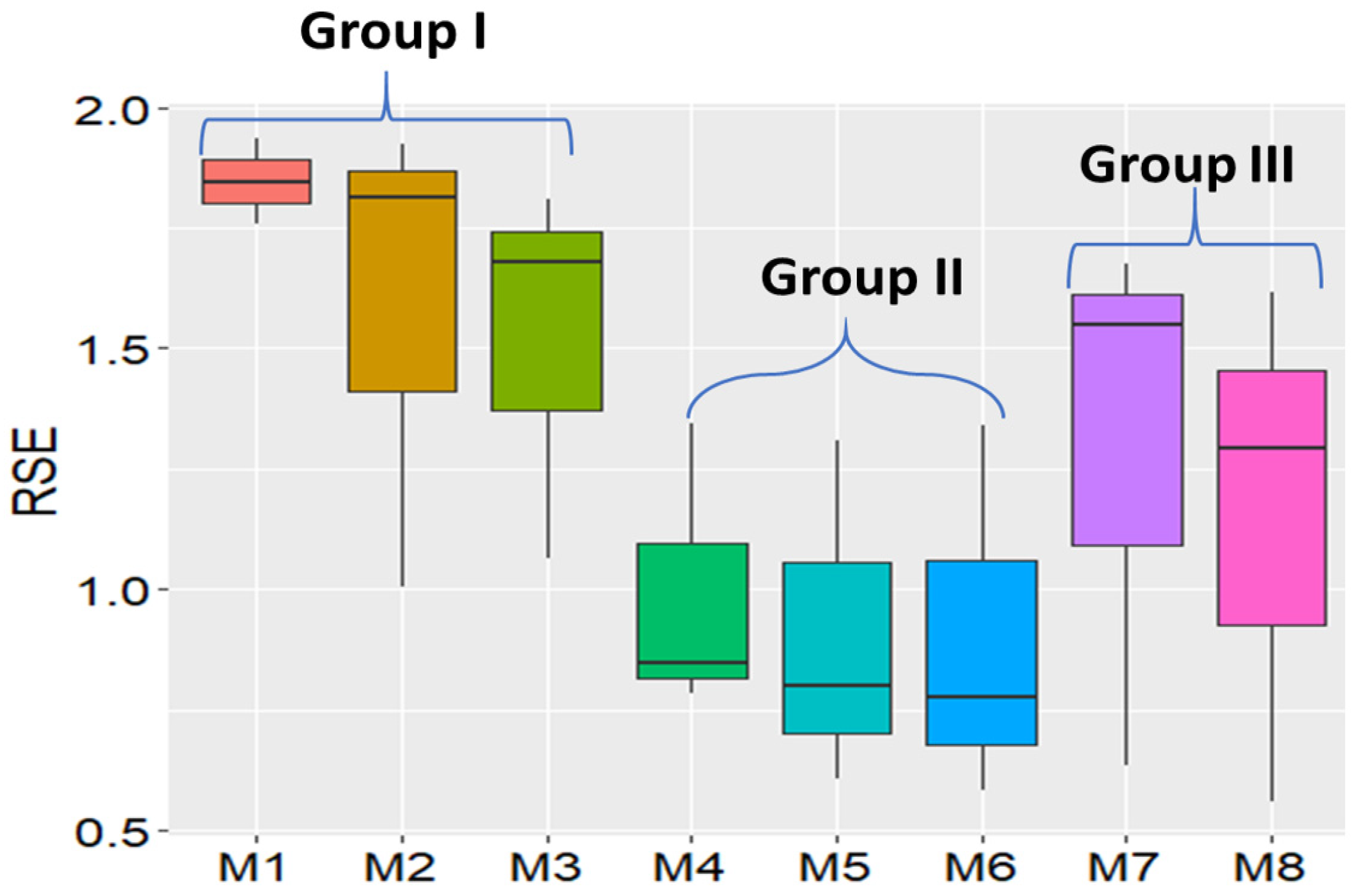
3.4. Comparison Metrics among the Eight Models

Visualization via heatmaps of the “fitted spatial trend” and residuals plots shows us the qualitative effects of the model, specifically whether the spatial model can remove the overall autocorrelation in the data. Results of effective spatial dimension and variance component analysis show us which spatial trend variables are more important than others from only one model via SpATS. Neither gives us the answer regarding which model is the best among all the models tested via the three data sets. A summary of a side-by-side comparison among the eight models analyzed via data set 1 in Table 6 shows that model 8, the P-spline model via SpATS, is the best because it has the largest R2 of 0.8931, the prediction accuracy of 0.9473, and residual standard error of 0.5582.
In contrast, moving grid adjustment is the least desired model because it has the smallest R2 (0.3409), lowest prediction accuracy (0.6246), and largest Moran’s I index (0.9492). From data set 1, model OLS with range and row ranks the second-best based on prediction accuracy (0.9200), which is much higher than that of OLS without range and row in the model. The big difference between the models “OLS + range + row” and OLS without range and row indicated that row and range terms are important for correcting the spatial variation caused by row and range. Another noticeable observation is for ASReml: it has the second-largest R2 (0.7289) and second-smallest residual standard error (0.6364), but prediction accuracy (0.8538) is low and ranked the sixth of eight models in the order from the best to the worst. If Moran’s I index is used to ranking the models, the SAR + mixed model is the best since it has the smallest Moran’s I index (0.0349) and the largest p-value of Moran’s I index (0.02179). Prediction accuracy II from all the eight models is lower than that of prediction accuracy I, which indicated that the testing materials planted in high-IDC-pressure areas have higher prediction accuracy than that planted in low- or no-IDC-pressure areas. The AIC values, which balance the number of parameters in the model and model log-likelihood, are not comparable among the eight models. For example, for the moving grid average, there are only two parameters used in the model to define the grid to calculate the average values. P-spline has more parameters (142.6 parameters for data set 1 and 147.8 for data set 3 in Table 4) to fine-tune the boundary of the spatial trends and thus has a much bigger AIC than the other models. These model superiority rank differences based on different evaluation parameters indicated that each evaluation parameter has advantages and disadvantages in correcting spatial patterns in the IDC data.
The results of the model superiority comparison from Table 6 are generally consistent with the eight heatmaps of the residual plots from data set 1 (Figure 7). The residual heatmap from models 1, 2, 4, 5, and 6 show a “baseball” pattern, which indicates that there is spatial autocorrelation left in the residuals, and these geospatial models did not remove the spatial pattern, whereas 3, 7, and 8 show a circle pattern, which is similar to the raw IDC scores. The heatmap of SpATS has the most random residuals, and its legend bar has the smallest scales (from −2 to 1), whereas the rest of them have scales ranging from −2 to 2 or 3. The residual heatmap from “MovingGrid” is the typical case for positive autocorrelation close to 1, where all the residuals inside the circle are −1 and +3 outside the circle. Moran’s I index of the residual heatmap from the “MovingGrid” model also is the largest and is close to 1.
Combining the results from Table 6 and Figure 7, the best models are the “SAR + mixed” and “P-Spline via SpATS,” and the least desirable model is the “MovingGrid” from the data set 1 analysis. The differences in model effectiveness among the eight models are obviously reflected by the residual standard errors and residual heatmaps.
The comparison of results from data set 2 is summarized in Table 7 and Figure 8. From the values highlighted in Table 7, the group of spatial autoregression with either lag, error, or Durbin mixed model is the best of the eight models. Based on R2, residual standard error (RSE), and Moran’s I index, SAR + error term as a covariate in the model ranks the best. If based on prediction accuracy, the model SAR + mixed is the best since it has the highest prediction values: 0.9486 and 0.8435 for prediction accuracy I and II, respectively. In contrast to the results from data set 1, the model AR1 by AR1 via ASReml ranks the second-worst compared to R2, which is only 0.555, and it is only better than that of the “MovingGrid” model. The biggest result difference between data sets 1 and 2 is P-spline model via SpATS ranked the second-worst model based on prediction accuracy and the third-worst based on R2 in data set 2, whereas the P-spline model ranked the best in data set 1 (Table 6 and Table 7). From the AIC values of the eight models, SpATS has the largest AIC value 50,678. The low prediction accuracy may come from overfitting. Another result is that the models “OLS w/o RR,” “OLS w/RR,” and “SAR + mixed” have very similar prediction accuracies, which are 0.9428, 0.9429, and 0.9486, respectively. The very similar results between the models “OLS w/o RR” and “OLS w/RR” indicated that range and row effects are not as big as those in data set 1. This result is consistent with the total spatial effective dimensions (EDs) in Table 4, in which data set 2 has a total of only 65.5 EDs with a large field of 220 range by 26 rows, whereas data set 1 has an EDs of 142.6 with a small field of 50 ranges by 42 rows.
All the eight residual heatmaps from the eight models show clear spatial variation patterns (Figure 10), which is very similar to the raw IDC score heatmap (Figure 5). Heatmaps also shows why the models ASReml and SpATS rank the second-worst, because there is clear separation between high and low IDC scores, and spatial variation patterns were left in the residual plots, which are the accurate indicators to judge whether a spatial model has removed the pattern. The models “SAR + mixed” and “SAR + error” have the most randomly distributed residuals among the eight heatmaps.
Overall, from the analysis of data set 2 in Table 7 and Figure 8, the winners are “SAR + mixed” and “SAR + error” and the loser is “MovingGrid.”
The results from the eight models from data set 3 are very similar (Table 8) to those from data set 2. The model “SAR + mixed” is best because it has the highest R2 (0.9491) and prediction accuracy (0.9746) and smallest RSE (0.5827) (highlighted numbers in Table 8). However, in contrast to the results from data set 2, the model “SAR + lag” instead of model “SAR + error” ranks the best since it has the smallest Moran’s I index, 0.022, and this value is not significantly different from 0 (p-value = 0.233 > 0.05). The results of the three SAR models, “SAR + lag,” “SAR + error,” and “SAR + mixed,” are very similar to the parameters for model superiority.
The heatmaps of the eight models from data set 3 shown in Figure 9 have the largest contrasts. Models 3 and 7 have almost the same pattern as the heatmap of the raw IDC scores, while models 4, 5, 6, and 8 barely show any spatial patterns in the residual plots. Comparing the legend scales, the models “SAR + error” and “SAR + mixed,” have the smallest residual ranges from −3 to 5, and all the others have residual ranges from −4 to +4 except “MovingGrid,” which has residual ranges from −2 to +4. The most noticeable heatmap is the one from the model “SAR + lag,” in which the residuals are all random noise, with no spatial pattern observed, and Moran’s I is close to 0. The model “SAR + lag” is the clear winner based on its residual heatmap.
Prediction accuracy I is higher than prediction accuracy II. Prediction accuracy I from data sets 2 and 3 is 0.9746 and 0.9486, which is, respectively, 11.34% and 12.46% higher than prediction accuracy II, with an average of 11.90% from the best model, SAR + mixed.
From the analysis of data set 3, summarized in Table 7 and Figure 8, the overall winners are “SAR + mixed” and “SAR + lag,” and the loser is “MovingGrid”.
From the comparisons among the eight models with three data sets, based on the results in Table 6, Table 7 and Table 8 and Figure 7, Figure 8 and Figure 9, it looks like model 6, “SAR + mixed,” works the best for data sets 2 and 3, and model 8, “P-Spline via SpATS,” works the best for data set 1. With the limited knowledge of the distribution of the three RSE data points per model from the three data sets, we chose to conduct a distribution-free nonparametric Kruskal-Wallis test to assess whether there is a significant difference among the eight models. Model 1, “OLS w/o RR,” is the worst, and models 1, 2, and 3 are not significantly different. Similarly, model 6, “SAR + mixed,” is the best (Table 9); models 4, 5, 6, 7, and 8 are not significantly different based on the Kruskal-Wallis test by ranks.
As shown in Figure 10, three groups were observed with models 1, 2, and 3 in Group I, models 4, 5, and 6 in group II, and models 7 and 8 in Group III. Interestingly, these three groups clustered by RSE are consistent with the models’ mathematical and spatial covariate structures. On the basis of the criterion the smaller the RSE, the better the models, models 4, 5, and 6 in Group II rank the best. Pairwise t-tests among the three groups show that Groups I and II are extremely significantly different, with a p-value < 0.001, and Groups II and III show significant differences with a p-value < 0.01. Groups I and III are statistically different at the p-value of 0.1, but not 0.05 (Table 10).
Overall, the Group III models “SAR + mixed”, “SAR + error”, “and “SAR + lag” are the best options for spatial autoregressive analysis for ordinal data types such as IDC.

3.5. Relative Efficiency (RE) of the Spatial Autoregressive (SAR) Analyses

The results in Table 11 summarize the relative efficiencies of the eight models, compared with model 1, ordinary least square (OLS) without range and row (OLS w/o RR), in the second to the last column of Table 11. Model 6, “SAR + mixed,” has the highest relative efficiency of 420.82%, which indicates that four more replicates of the model 1 experimental design are needed in order to reach the same residual error as that of model 6. The relative efficiencies of all the other seven models are larger than 100%, showing that range and row are very important for field spatial variation correction. The last column of Table 11 shows the relative efficiency of the seven models compared with model 2, ordinary least square (OLS) with range and row (OLS w/RR). All the six models with range and row, from model 3 to model 8, have relative efficiencies larger than 100% that vary from 104.23% for model 3 to 175.66% for model 6. The variation of relative efficiency among the six models indicates that the way of modeling “range” and “row” for the spatial autocorrelation results in large differences. The overall analysis of the relative efficiency of the different models shows the importance of applying appropriate spatial autoregressive models to correct field spatial variation.

3.6. Lagrange Multiplier Test (LMT)

Group II models are the best choice for the data tested in this research, but the computation time is much shorter than that of the other two groups of models. For data set 2, it took >10 h to run the “SAR + mixed” model with 5720 data points and a total of ~25 h to run the three data sets via a desktop Windows 10 with 16 Gb RAM and a core i7 CPU, whereas SpATS took less than 15 min to run the three datasets. The Lagrange multiplier test (LMT) run on each data set took less than 1 min and provided an overview of the models (Table 12). LMT reports the estimates of tests among the models for spatial dependence.
From Table 12, the model with the largest dependence estimates should be chosen for SAR analysis. From the dependence estimates, spatial lag and spatial error models have very similar values, and their dependence estimates are 2728.1 and 2730.3, respectively. Tests for the possible presence of lagged variance except for Lmerr, RLMerr, is 108.98. Similarly, tests for the possible presence of error variance (except LMlag, RLMlag) is 106.75. These two values are very similar. The last test is for both the error and lag model, “SAR + mixed”, and its dependence estimate is 2837.1, which is larger than that of any of the two models, as expected. Based on LMT test results, “SAR + mixed” should be selected for data set 1 to correct the autocorrelations.

3.7. Statistical Experimental Design for Spatial Analysis versus Breeding Practice

The basic principles of experimental design are randomization, replication, and local control [71]. For IDC testing, replication and local control with an incomplete alpha-lattice design can be easily implemented. However, the randomization of previously untested lines may be violated. Breeders usually group the lines to be tested by families for easy visual evaluations. For example, a typical breeding program might evaluate 32 recently developed lines per family from 400 families for a total of 12,800 lines. Soybean breeders usually organize IDC evaluations into 400 trials, where the lines are randomized within each trial. However, the 400 trials representing variability among families are usually not randomized across the field site. Rather, the families are arranged by pedigree and relative maturity for purposes of visual comparisons within families and to accommodate operational considerations such as avoiding inter-plot competition between early- and late-maturing lines and avoiding damage to plots from mechanical harvest. The harvest combine and other equipment will begin with plots that are planted with early-maturing families and proceed through the field as the plots mature.
If a family is created by crossing resistant by resistant lines or moderately resistant by moderately susceptible lines, there will be patches of resistant or susceptible lines, and the families will create patterns unrelated to soil IDC. The pattern caused by genotype may confound the spatial variation pattern caused by environmental factors. Under this circumstance, the spatial analysis may lead to biased selections. Randomization of experiments and trials is a prerequisite for the three groups of spatial analyses. In the context of spatial variation, such as is observed with IDC, complete randomization of the testing lines in the testing site is needed in order to minimize biased selections from the confounding factors and to add pedigree information in the spatial model to adjust the effects caused by the breeding practices.

3.8. IDC Hill Plot Size and Spatial Variation

Plot size may affect spatial patterns and, subsequently, the effectiveness of spatial autoregressive models. Soybean IDC testing lines were planted in hill plots, not row plots, and the plot size is very small (Figure 11). Each hill plot contained eight seeds. The hill plots were spaced 15 inches from center to center within ranges and 10 inches from center to center between rows (left-hand image in Figure 11), whereas yield plot sizes are usually much larger than IDC hill plots (right-hand image in Figure 11). There are reports that differences in plot size impact the effectiveness of spatial models. Results from uniformity trials show that large plot sizes are needed to control field heterogeneity and spatial variation [72]. However, contrary to this theory that large plot sizes should be better, evidence from a 28-year case study for optimizing experimental designs shows that the relative efficiency of the experiment design was 240% in an RCBD when the plot size decreased from 5.6 m to 1.4 m in row length [73]. Similar results from a comparison of different spatial models among correlated error, nearest neighbor analysis, and autoregressive regression AR(1) indicate that a smaller plot size is more efficient in capturing spatial variation and thus increases the relative efficiency of the experimental design [74]. Both small plot size and ordinal IDC scores may have caused P-spline via SPATS high residual standard error in this research.

3.9. The Tensor Product Penalized Splines May Perform Better for Continuous Data Type than for Ordinal Data Type

Results using SpATS show that tensor product penalized splines worked very well for hybrid wheat data for both Chilean and Australian wheat field data sets [46], sorghum grain yield, and plant height [47]. However, when this method was applied to soybean IDC data sets, two unexpected results were obtained: (1) from the effectiveness dimension analysis of the decomposed model variables, the genotype or line effectiveness accounts for about 90% of the total effectiveness, while in terms of genotype effectiveness, the tensor product term “f(ROW):f(RANGE)” accounts for less than 10% of the effectiveness. In contrast to the effectiveness dimension component analysis, the variance component analysis shows that the tensor product term “f(ROW):f(RANGE)” accounts for over 90% of the total variance, whereas genotype accounts for only less than 1%. Most likely, the ordinal data type is the reason behind the biased results, supporting the need for a revised version of SPATS with the capacity for analysis of ordinal data.

4. Conclusions

The effectiveness of spatial models depends on many factors, such as soil characteristics, weather conditions and trialing activities, the severity of the spatial variation, and other types of irregular patterns. From the comparison of residual standard error (RSE), R2, prediction accuracy, AIC, and their heatmaps generated for the eight models, none of the models can completely remove the spatial autocorrelation for the ordinal data in the three data sets and get a completely randomly distributed residuals. However, the spatial autoregressive (SAR) approach (with either lag, error, or Durbin mixed as a covariate) generated more random residual plots, and most of the time, it was able to smooth the spatial surface and identify and correct spatial trends in the data sets better than the other two groups of models. The tensor product penalized P-splines method works the best for the simulated data set 1, which has only one spatial pattern (a circle). As to the computation time and user-friendliness, the P-spline via SpATS is the fastest and the easiest to run. The higher RSE and lower R2 from data sets 2 and 3 via SpATS than that from SAR may come from some degree of overfitting the model with large data sets.

Supplementary Materials

The following are available online at https://www.mdpi.com/article/10.3390/agronomy12092095/s1, Figure S1: IDC variation heatmap and patterns. (A) Five IDC variation patterns from the heatmap. One simulated data set with a circle pattern and four testing fields with IDC spatial patterns. (B) The three types of testing locations by soil properties are displayed via two principal components.

Author Contributions

Conceptualization, W.D.B. and Z.X.; methodology, Z.X.; formal analysis and investigation, Z.X.; writing—original draft preparation, Z.X.; writing—review and editing, Z.X., S.B.C. and W.D.B. All authors have read and agreed to the published version of the manuscript.

Funding

This research reported in the manuscript was supported in part by the RF Baker Center for Plant Breeding at Iowa State University and the US Department of Agriculture, Agricultural Research Service, project 5030-21000-069-00D and 5062-12210-004-000D. There was no additional external funding received for this study.

Institutional Review Board Statement

Not applicable to this study.

Informed Consent Statement

Not applicable to this study.

Data Availability Statement

All the data that support the findings of this study are available on request from the corresponding author [[email protected]].

Acknowledgments

We thank Syngenta, Iowa State University, and USDA-ARS for the financial support of this research. This research was supported in part by the US Department of Agriculture, Agricultural Research Service, project 5030-21000-062-00D. Mention of trade names or commercial products in this publication is solely for the purpose of providing specific information and does not imply recommendation or endorsement by the US Department of Agriculture. USDA is an equal opportunity provider and employer.

Conflicts of Interest

The authors declare no conflict of interest.

Abbreviations

AcronymTermDefinition
AICAkaike information criterionA mathematical method for evaluating how well a model fits the data
AR1first-order autoregressiveThe order of an autoregression is the number of immediately preceding values in the series that are used to predict the value at present
AR2second-order autoregressiveThe order of an autoregression is the number of preceding 2 values in the series that are used to predict the value at present
EDseffective dimensionA parameter to measure the complexity of the spatial model. A larger number indicates more variables in the model
IDCiron deficiency chlorosisA nutrient deficiency with yellowing symptoms of the soybean foliage and stunting of the plant
METsmultiple environmental trials (METs) analysisStatistical method to estimate genotypes by environments
mvngGrAdmoving grid adjustmentMvnggrad package allows performing a moving grid adjustment in plant breeding field trials
LMTLagrange multiplier testLMT fits a linear regression model to examine whether the fitted model is significant
OLRordinary least squaresA linear least-squares method for estimating the unknown parameters in a linear regression model
RCBDrandomized complete block designStandard design for agricultural experiments where similar experimental units are grouped into blocks or replicate
RErelative efficiencyIt was used to compare experimental design efficiency
RRVRed River ValleyNorth American region that is drained by the Red River and is soybean IDC-prone
RSEresidual standard errorTo measure how well a regression model fits a dataset
SARgeospatial autoregressive regressionA group of models to adjust geospatial variations
SpATSspatial analysis of field trials with splinesField variation and autocorrelation adjustment model
Spdepspatial dependenceR package to analyze spatial autocorrelation

References

  1. Lin, S.F.; Baumer, J.S.; Ivers, D.; de Cianzio, S.R.; Shoemaker, R.C. Field and nutrient solution tests measure similar mechanisms controlling iron deficiency chlorosis in soybean. Crop Sci. 1998, 38, 254–259. [Google Scholar] [CrossRef]
  2. Goos, R.J.; Johnson, B.E. A comparison of three methods for reducing iron-deficiency chlorosis in soybean. Agron. J. 2000, 92, 1135–1139. [Google Scholar] [CrossRef]
  3. YChart. US Soybeans Acres Planted. Available online: https://ycharts.com/indicators/us_soybeans_acres_planted (accessed on 10 July 2020).
  4. Froehlich, D.M.; Niebur, W.S.; Fehr, W.R. Yield reduction from iron deficiency chlorosis in soybeans. In Agronomy Abstracts; American Society of Agronomy: Madison, WI, USA, 1980; pp. 54–55. [Google Scholar]
  5. Hansen, N.C.; Schmitt, M.A.; Anderson, J.E.; Strock, J.S. Iron deficiency of soybean in the upper midwest and associated soil properties. Agron. J. 2003, 95, 1595–1601. [Google Scholar] [CrossRef]
  6. Hansen, N.C.; Jolley, V.D.; Naeve, S.L.; Goos, R.J. Iron deficiency of soybean in the north central us and associated soil properties. Soil Sci. Plant Nutr. 2004, 50, 983–987. [Google Scholar] [CrossRef]
  7. Niebur, W.S.; Fehr, W.R. Agronomic evaluation of soybean genotypes resistant to iron-deficiency chlorosis. Crop Sci. 1981, 21, 551–554. [Google Scholar] [CrossRef]
  8. Cianzio, S.R.d.; Fehr, W.R.; Anderson, I.C. Genotypic evaluation for iron deficiency chlorosis in soybeans by visual scores and chlorophyll concentration. Crop Sci. 1979, 19, 644–646. [Google Scholar] [CrossRef]
  9. Gaspar, P. Management of Soybeans on Soils Prone to Iron Deficiency Chlorosis. Available online: https://www.pioneer.com/us/agronomy/iron_deficiency_chlorosis.html#IntroductionofIronDeficiencyChlorosis_1 (accessed on 1 September 2019).
  10. Spehar, C.R. Field screening of soya bean (glycine-max (l) merrill) germplasm for aluminum tolerance by the use of augmented design. Euphytica 1994, 76, 203–213. [Google Scholar] [CrossRef]
  11. Clarke, G.P.Y.; Stefanova, K.T. Optimal design for early-generation plant-breeding trials with unreplicated or partially replicated test lines. (report). Aust. N. Z. J. Stat. 2011, 53, 461. [Google Scholar] [CrossRef]
  12. Williams, E.R.; John, J.A.; Whitaker, D. Construction of more flexible and efficient p-rep designs. Aust. N. Z. J. Stat. 2014, 56, 89–96. [Google Scholar] [CrossRef]
  13. Moehring, J.; Williams, E.R.; Piepho, H.P. Efficiency of augmented p-rep designs in multi-environmental trials. Theor. Appl. Genet. 2014, 127, 1049–1060. [Google Scholar] [CrossRef]
  14. Williams, E.; Piepho, H.P.; Whitaker, D. Augmented p-rep designs. Biom. J. 2011, 53, 19–27. [Google Scholar] [CrossRef] [PubMed]
  15. Piepho, H.P.; Buchse, A.; Truberg, B. On the use of multiple lattice designs and alpha-designs in plant breeding trials. Plant Breed. 2006, 125, 523–528. [Google Scholar] [CrossRef]
  16. Yau, S.K. Efficiency of alpha-lattice designs in international variety yield trials of barley and wheat. J. Agric. Sci. 1997, 128, 5–9. [Google Scholar] [CrossRef]
  17. Anselin, L.; Rey, S.J. Perspectives on Spatial Data Analysis; Advances in Spatial Science, The Regional Science Series; Springer: Berlin/Heidelberg, Germany, 2010. [Google Scholar]
  18. Mobley, L.R.; Root, E.; Anselin, L.; Lozano-Gracia, N.; Koschinsky, J. Spatial analysis of elderly access to primary care services. Int. J. Health Geogr. 2006, 5, 19. [Google Scholar] [CrossRef]
  19. Anselin, L. How (not) to lie with spatial statistics. Am. J. Prev. Med. 2006, 30, S3–S6. [Google Scholar] [CrossRef]
  20. Anselin, L.; Florax, R.J.G.M.; Rey, S.J. Advances in Spatial Econometrics: Methodology, Tools and Applications; Springer: Berlin/Heidelberg, Germany, 2004; p. xxii. 513p. [Google Scholar]
  21. Anselin, L. Spatial Econometrics. In A Companion to Theoretical Econometrics; Blackwell Publishing Ltd.: Hoboken, NJ, USA, 2003; p. xvii. 709p. [Google Scholar]
  22. Ugrinowitsch, C.; Fellingam, G.W.; Ricard, M.D. Limitations of ordinary least square models in analyzing repeated measures data. Med. Sci. Sports Exerc. 2004, 36, 2144–2148. [Google Scholar] [CrossRef]
  23. Clarke, F.R.; Baker, R.J.; Depauw, R.M. Moving mean and least-squares smoothing for analysis of grain-yield data. Crop Sci. 1994, 34, 1479–1483. [Google Scholar] [CrossRef]
  24. Rosielle, A.A. Comparison of lattice designs, check plots, and moving means in wheat breeding trials. Euphytica 1980, 29, 129–133. [Google Scholar] [CrossRef]
  25. Townleysmith, T.F.; Hurd, E.A. Use of moving means in wheat yield trials. Can. J. Plant Sci. 1973, 53, 447–450. [Google Scholar] [CrossRef]
  26. Diers, B.W.; Voss, B.K.; Fehr, W.R. Moving-mean analysis of field-tests for iron efficiency of soybean. Crop Sci. 1991, 31, 54–56. [Google Scholar] [CrossRef]
  27. Mak, C.; Harvey, B.L.; Berdahl, J.D. Evaluation of control plots and moving means for error control in barley nurseries. Crop Sci. 1978, 18, 870–873. [Google Scholar] [CrossRef]
  28. Technow, F. R Package mvngGrAd: Moving Grid Adjustment in Plant Breeding Field Trials. R package version 0.1. Available online: https://mran.microsoft.com/snapshot/2016-01-22/web/packages/mvngGrAd/mvngGrAd.pdf (accessed on 20 July 2022).
  29. Dormann, E.; Wokrina, T. Anisotropy and spatial restriction of conduction electron diffusion in perylene radical cation salt. Synth. Met. 1997, 86, 2183–2184. [Google Scholar] [CrossRef]
  30. Lado, B.; Matus, I.; Rodriguez, A.; Inostroza, L.; Poland, J.; Belzile, F.; del Pozo, A.; Quincke, M.; Castro, M.; von Zitzewitz, J. Increased Genomic Prediction Accuracy in Wheat Breeding Through Spatial Adjustment of Field Trial Data. G3-Genes Genomes Genet. 2013, 3, 2105–2114. [Google Scholar] [CrossRef] [PubMed]
  31. Tobler, W.R. Smooth pycnophylactic interpolation for geographical regions. J. Am. Stat. Assoc. 1979, 74, 519–530. [Google Scholar] [CrossRef]
  32. Dormann, C.F. Effects of incorporating spatial autocorrelation into the analysis of species distribution data. Glob. Ecol. Biogeogr. 2007, 16, 129–138. [Google Scholar] [CrossRef]
  33. Gleeson, A.C.; Cullis, B.R. Residual maximum-likelihood (reml) estimation of a neighbor model for field experiments. Biometrics 1987, 43, 277–288. [Google Scholar] [CrossRef]
  34. Cullis, B.R.; Gleeson, A.C. Spatial-analysis of field experiments-an extension to 2 dimensions. Biometrics 1991, 47, 1449–1460. [Google Scholar] [CrossRef]
  35. Hu, X.Y.; Spilke, J. Comparison of various spatial models for the analysis of cultivar trials. N. Z. J. Agric. Res. 2009, 52, 277–287. [Google Scholar] [CrossRef]
  36. Wilkinson, G.N.; Eckert, S.R.; Hancock, T.W.; Mayo, O. Nearest neighbour (NN) analysis of field experiments. J. R. Stat. Soc. Ser. B-Stat. Methodol. 1983, 45, 151–211. [Google Scholar] [CrossRef]
  37. Piepho, H.P.; Richter, C.; Williams, E. Nearest neighbour adjustment and linear variance models in plant breeding trials. Biom. J. 2008, 50, 164–189. [Google Scholar] [CrossRef]
  38. Ainsley, A.E.; Dyke, G.V.; Jenkyn, J.F. Inter-plot interference and nearest-neighbor analysis of field experiments. J. Agric. Sci. 1995, 125, 1–9. [Google Scholar] [CrossRef]
  39. Federer, W.T. Recovery of interblock, intergradient, and intervariety information in incomplete block and lattice rectangle designed experiments. Biometrics 1998, 54, 471–481. [Google Scholar] [CrossRef]
  40. Kempton, R.; Mead, R.; Engel, B.; ter Braak, C.J.F.; Nelder, J.A.; Morton, R.; Green, P.; Molenberghs, G.; Basford, K.; Longford, N.T.; et al. The analysis of designed experiments and longitudinal data by using smoothing splines-Discussion. J. R. Stat. Soc. Ser. C-Appl. Stat. 1999, 48, 300–311. [Google Scholar]
  41. Gilmour, A.R.; Cullis, B.R.; Verbyla, A.P. Accounting for Natural and Extraneous Variation in the Analysis of Field Experiments. J. Agric. Biol. Environ. Stat. 1997, 2, 269–293. [Google Scholar] [CrossRef]
  42. Stefanova, K.T.; Smith, A.B.; Cullis, B.R. Enhanced Diagnostics for the Spatial Analysis of Field Trials. J. Agric. Biol. Environ. Stat. 2009, 14, 392–410. [Google Scholar] [CrossRef]
  43. Dhrymes, P. Introductory Econometrics by Phoebus Dhrymes, 1st ed.; Imprint; Springer International Publishing: Cham, Switzerland, 2017. [Google Scholar]
  44. Cappa, E.P.; Cantet, R.J.C. Bayesian estimation of a surface to account for a spatial trend using penalized splines in an individual-tree mixed model. Can. J. For. Res.-Rev. Can. De Rech. For. 2007, 37, 2677–2688. [Google Scholar] [CrossRef]
  45. Cappa, E.P.; Lstiburek, M.; Yanchuk, A.D.; El-Kassaby, Y.A. Two-dimensional penalized splines via Gibbs sampling to account for spatial variability in forest genetic trials with small amount of information available. Silvae Genet. 2011, 60, 25–35. [Google Scholar] [CrossRef]
  46. Rodríguez-Álvarez, M.X.; Boer, M.P.; van Eeuwijk, F.A.; Eilers, P.H.C. Spatial Models for Field Trials. arXiv 2016, arXiv:1607.08255. [Google Scholar]
  47. Velazco, J.G.; Rodriguez-Alvarez, M.X.; Boer, M.P.; Jordan, D.R.; Eilers, P.H.C.; Malosetti, M.; van Eeuwijk, F.A. Modelling spatial trends in sorghum breeding field trials using a two-dimensional P-spline mixed model. Theor. Appl. Genet. 2017, 130, 1375–1392. [Google Scholar] [CrossRef]
  48. Chen, Y. New approaches for calculating Moran’s index of spatial autocorrelation. PLoS ONE 2013, 8, e68336. [Google Scholar] [CrossRef]
  49. Frank, E.; Harrell, J. Regression Modeling Strategies, 2nd ed.; Springer: Berlin/Heidelberg, Germany, 2015; p. 582. [Google Scholar]
  50. Bivand, R.S. Applied Spatial Data Analysis with R by Roger S. Bivand, Edzer Pebesma, Virgilio Gómez-Rubio, 2nd ed.; Imprint; Springer: New York, NY, USA, 2013. [Google Scholar]
  51. Bivand, R.; Piras, G. Comparing Implementations of Estimation Methods for Spatial Econometrics. J. Stat. Softw. 2015, 63, 1–36. [Google Scholar] [CrossRef]
  52. Butler, D.G.; Cullis, B.R.; Gilmour, A.R.; Gogel, B.G.; Thompson, R. ASReml-R Reference Manual Version 4; VSN International Ltd.: Hemel Hempstead, UK, 2017. [Google Scholar]
  53. Rodríguez-Álvarez, M. Correcting for spatial heterogeneity in plant breeding experiments with P-splines. Spat. Stat. 2018, 23, 52–71. [Google Scholar] [CrossRef] [Green Version]
  54. Bivand, R. Implementing Spatial Data Analysis Software Tools in R. Geogr. Anal. 2006, 38, 23–40. [Google Scholar] [CrossRef]
  55. Baltagi, B.H.; Liu, L. Testing for random effects and spatial lag dependence in panel data models. Stat. Probab. Lett. 2008, 78, 3304–3306. [Google Scholar] [CrossRef]
  56. Anselin, L.; Moreno, R. Properties of tests for spatial error components. Reg. Sci. Urban Econ. 2003, 33, 595–618. [Google Scholar] [CrossRef]
  57. Bekti, R. Sutikno. Spatial Durbin model to identify influential factors of diarrhea. J. Math. Stat. 2012, 8, 396–402. [Google Scholar]
  58. Dormann, C.F.; McPherson, J.M.; Araújo, M.B.; Bivand, R.; Bolliger, J.; Carl, G.; Davies, R.G.; Hirzel, A.; Jetz, W.; Kissling, W.D.; et al. Methods to Account for Spatial Autocorrelation in the Analysis of Species Distributional Data: A Review. Ecography 2007, 30, 609–628. [Google Scholar] [CrossRef]
  59. Butler, D.G.; Cullis, B.R.; Gilmour, A.R.; Gogel, B.J. Mixed Models for S Language Environments ASReml-R Reference Manual; Department of Primary Industries and Fisheries: Brisbane, Australia, 2009.
  60. Lee, D.J.; Durban, M.; Eilers, P. Efficient two-dimensional smoothing with P-spline ANOVA mixed models and nested bases. Comput. Stat. Data Anal. 2013, 61, 22–37. [Google Scholar] [CrossRef]
  61. Ebeling, H.; White, D.A.; Rangarajan, F.V.N. ASMOOTH: A simple and efficient algorithm for adaptive kernel smoothing of two-dimensional imaging data. Mon. Not. R. Astron. Soc. 2006, 368, 65–73. [Google Scholar] [CrossRef]
  62. Gareth, J.; Daniela, W.; Trevor, H.; Robert, T. An Introduction to Statistical Learning with Applications in R, 1st ed.; Imprint; Springer: New York, NY, USA, 2013. [Google Scholar]
  63. Fortin, M.-J.; Dale, M.R.T. Spatial autocorrelation in ecological studies: A legacy of solutions and myths. Geogr. Anal. 2009, 41, 392. [Google Scholar] [CrossRef]
  64. Bivand, R.; Müller, W.G.; Reder, M. Power calculations for global and local Moran’s I. Comput. Stat. Data Anal. 2009, 53, 2859–2872. [Google Scholar] [CrossRef]
  65. Clewer, A.G.; Scarisbrick, D.H. Practical Statistics and Experimental Design for Plant and Crop Science; John Wiley & Sons: Chichester, UK; New York, NY, USA, 2001. [Google Scholar]
  66. Nychka, D. Tools for Spatial Data. 2016. Available online: http://www.image.ucar.edu/fields/ (accessed on 1 August 2022). [CrossRef]
  67. Ostertagova, E.; Ostertag, O.; Kováč, J. Methodology and application of the Kruskal-Wallis test. In Applied Mechanics and Materials; Trans Tech Publications Ltd.: Wollerau, Switzerland, 2014; pp. 115–120. [Google Scholar]
  68. de Mendiburu, F.; de Mendiburu, M.F. Package ‘agricolae’. R Package Version 2019. Available online: https://CRAN.R-project.org/package=agricolae (accessed on 20 July 2022).
  69. Abd El-Mohsen, A.A.; Abo-Hegazy, S.R.E. Comparing the Relative Efficiency of Two Experimental Designs in Wheat Field Trials. Egypt. J. Plant Breed. 2013, 17, 1–17. [Google Scholar] [CrossRef]
  70. Rodríguez-Álvarez, M.X.; Lee, D.-J.; Kneib, T.; Durbán, M.; Eilers, P. Fast smoothing parameter separation in multidimensional generalized P-splines: The SAP algorithm. Stat. Comput. 2015, 25, 941–957. [Google Scholar] [CrossRef]
  71. Mead, R.; Gilmour, S.G.; Mead, A. Statistical Principles for the Design of Experiments. Introduction; Cambridge University Press: Cambridge, UK, 2012; pp. 3–8. [Google Scholar]
  72. Knorzer, H.; Hartung, K.; Piepho, H.P.; Lewandowski, I. Assessment of variability in biomass yield and quality: What is an adequate size of sampling area for miscanthus? Glob. Change Biol. Bioenergy 2013, 5, 572–579. [Google Scholar] [CrossRef]
  73. Casler, M.D. Finding Hidden Treasure: A 28-Year Case Study for Optimizing Experimental Designs. Commun. Biometry Crop Sci. 2013, 8, 23–28. [Google Scholar]
  74. Sripathi, R.; Conaghan, P.; Grogan, D.; Casler, M.D. Spatial Variability Effects on Precision and Power of Forage Yield Estimation. Crop Sci. 2017, 57, 1383–1393. [Google Scholar] [CrossRef]
Figure 1. Spatial variation patterns (severity and irregularity) in soybean IDC in commercial production fields. (A) IDC oval pattern in the lower/ditch area at Madrid, Iowa, in 2016. (B) IDC circle pattern in a farmer’s field at Ames, Iowa, 2016. Field variation patterns are described by variation severity (the degree of autocorrelation in the experiment field) and pattern irregularity (the shape of a spatial pattern).
Agronomy 12 02095 g001
Figure 2. IDC score reference from 1 to 9 as ordinal data. 1 = green leaves (no chlorosis) to 9 = dead plant. Each image was taken from one hill plot with three to eight plants at growth stages V2 to V4. The IDC scores are visual scores by breeders.
Agronomy 12 02095 g002
Figure 3. Layout of the grid used to calculate the mean.
Agronomy 12 02095 g003
Figure 4. Heatmaps and histogram from data set 1 by P-spline via SpATS. The rectangle layout is 42 rows (X-axis) by 50 ranges (Y-axis) with a total of 2100 plots for each of the five heatmaps. Best linear unbiased prediction (BLUP) is the best linear unbiased prediction value or genetic effect for each line tested, which ranges from −2 to +2. Sub-figure variants are indicated by headings—for example, the Residuals sub-figure shows values after application of P-spline to fitted data.
Agronomy 12 02095 g004
Figure 5. Heatmaps and histogram from data set 2. The rectangle layout is 26 rows (X-axis) by 220 ranges (Y-axis) with a total of 5720 plots. The white area on the right side of each heatmap is the plot with missing data. Sub-figures show values either from the raw field image, or as indicated in headings: fitted, or corrected with residuals or genomic BLUP values.
Agronomy 12 02095 g005
Figure 6. Heatmaps and histogram from data set 3. The rectangle layout is 24 rows (X-axis) by 220 ranges (Y-axis) with a total of 5280 plots. The white area on the right side of each heatmap is the plot without data. Sub-figures show values either from the raw field image, or as indicated in headings: fitted, or corrected with residuals or genomic BLUP values.
Agronomy 12 02095 g006
Figure 7. Heatmaps of residuals from data set 1 from the eight models. The eight models, from left to right and up to bottom: OLS w/o RR, OLS w/RR, MovingGrid, SAR + lag, SAR + error, SAR + mixed, ASReml AR1, B/P-Spline. In each figure, the x-axis is the rows from 1 to 50 and the y-axis is the ranges 1 to 42. The numbers under legend bars are the range of residual values, and the numbers above the legend bar in the bottom half of the figure are the row numbers.
Agronomy 12 02095 g007
Figure 8. Heatmaps of residuals from data set 2 derived from the eight models. Each of the images has 220 ranges by 26 rows. The X-axis is the row and the Y-axis is the range. The numbers under the legend bars are the range of residual values, and the numbers above the legend bars in the bottom half of the figure are the row numbers.
Agronomy 12 02095 g008
Figure 9. Heatmaps of the residuals from data set 3 derived from the eight models. Each of the images has filled in ranges by rows. The X-axis is the row, and the Y-axis is the range. The numbers under the legend bars are the range of residual values, and the numbers above the legend bars in the bottom half of the figure are the row numbers.
Agronomy 12 02095 g009
Figure 10. Boxplot of the residual standard error (RSE). The Y-axis is the residual standard error. The first three boxplots from the left belong to Group I, the middle three belong to Group II, and the two from the right belong to Group III.
Agronomy 12 02095 g010
Figure 11. Images of IDC hill plots (A) vs. yield test plots (B). The left image shows the chlorosis phenotype of two susceptible testing lines (top two hill plots) and two resistant testing lines (bottom two hill plots). The right image shows yield test plots with plants in 10 m rows.
Agronomy 12 02095 g011
Table 1. Summary of the five data sets used in the study. RRV for Red River Valley, ranges, rows for columns and horizontal rows of an experiment field, and testing lines for the genotypes under testing to be discarded/advanced for a variety. Dataset 1 is simulated, and datasets 2 to 5 are experimental field data.
Dataset
Name
Exp.
Design
No.
Rows
No.
Range
No.
Entries
Ave No.
Replicates
No.
Plots
Data
Sources
Spatial
correction
Dataset 1RCBD504210502.002100SimulatedCorrected
Dataset 2α-lattice2202627741.835074IowaCorrected
Dataset 3α-lattice2422026521.795280MinnesotaCorrected
Dataset 4α-lattice1105627191.885124RRVNo
Dataset 5α-lattice1006024071.814362NebraskaNo
Total 50440411,6021.8421,401
Table 2. Summary of parameters used for data simulation. The first column is the list of variance components; column 1: the indicated categories for reported variance or standard deviation (SD); columns 2, 3, and 4 are the variance values, the distribution used for the simulation, and the percentage of the variance components, respectively.
Variance ComponentVarianceDistributionPercentage of SD (%)
Location SD1.5Normal14.42
Experiment SD0.5Poisson4.81
Line SD2.1Normal20.19
Range SD0.2Normal1.92
Row SD1.0Normal9.62
Rep SD0.1Normal0.96
Pattern_SD3.8Normal36.54
Residual1.2Normal11.54
Table 3. Summary of the eight models compared in the research. See model descriptions (OLS, SAR etc.) in manuscript, Section 2.2.
Model
Name
Model
No
Spatial
Term
R
Package
Reference
OLS w/o RRM1NoneRMS[49]
OLS w/RRM2NoneRMS[49]
MovingGridM3Mean of gridmvngGrAd[28]
SAR + lagM4Lagspdep[50]
SAR + errorM5Errorspdep[50]
SAR DurbinM6Lag+ Errorspatialreg[51]
ASReml AR1M7AR1(range): AR1(row)ASReml-R[52]
B/P-SplineM8psanova(range, row)SpATS[53]
Table 4. Summary of effective spatial dimension (EDs) of the smooth surface components fitted by the SpATS model and effect dimension from the OLD model (EDm) from the three data sets.
Variables NameData Set 1Data Set 2Data Set 3
EDsEDmEDsEDmEDsEDm
Range10.1420.022024.6221
Row41.15013.92817.624
Row:Range1.011.011.01
F(Range)3.0117.0115.811
F(Row)2.3116.6113.311
F(Range):Row0.0116.5115.811
Range:F(Row)1.8111.61110.011
F(Range):F(Row)83.312128.93679.7121
% F(Range):F(Row)58.4246.9044.1210.9453.9229.44
Total142.625865.5329147.8411
Table 5. Summary of variance component analysis from the tensor product penalized P-splines. Var stands for variance, and type for data type; “R” for random and “S” for surface variable.
VariablesTypeData Set 1Data Set 2Data Set 3Mean
Var% VarVar% VarVar% Var% Var
LINCDR0.430.100.710.010.460.050.05
RangeR0.010.000.000.000.020.000.00
RowR0.070.020.200.000.780.080.03
f(RANGE)S4.971.1539.050.5913.091.391.04
f(ROW)S55.6312.89223.323.3914.921.585.95
f(RANGE):ROWS0.310.07352.165.3432.583.452.95
RANGE:f(ROW)S0.550.1366.261.00737.6878.1326.42
f(RANGE):f(ROW)S369.1585.565912.8389.63142.9715.1463.44
ResidualR0.340.082.610.041.670.180.10
total 431.47100.006597.15100.00944.18100.00100.00
Table 6. Summary of the comparison among different models via R2, residual variance, prediction accuracy, and Moran’s I index from data set 1. The most desirable values in each column are highlighted.
Models
Compared
R2 ValuesAIC
Values
Residual
SE *
Moran’s
I Index
p-Value of
Moran’s I
Prediction
Accuracy I
Prediction Accuracy II
OLS w/o RR0.520089781.75900.51512.2 × 10−160.72000.6882
OLS w/RR0.686266301.00600.51592.2 × 10−160.92000.6192
MovingGrid0.34092611.06310.94922.2 × 10−160.62460.6246
SAR + lag0.658077940.84760.45752.2 × 10−160.88460..4146
SAR + error0.681176580.80170.45992.2 × 10−160.89770.4279
SAR + mixed0.678076460.77710.03490.021790.90520.4422
ASReml AR10.72892325 **0.63640.26812.2 × 10−160.85380.3581
P-Spline0.893110,0650.55820.07485.21 × 10−70.94730.5124
* Residual SE: residual standard error; ** from Asreml: AIC = −2 × asreml.Obj$loglik + 2 × length(asreml.Obj$gammas); prediction accuracy I: correlation coefficient between predicted and the true IDC scores of all the lines; prediction accuracy II: accuracy for the lines not planted in the high-IDC-pressure regions.
Table 7. Summary of the comparison among different models via R2, residual variance, prediction accuracy, and Moran’s I index from data set 2. OLS w/o RR stands for ordinary least square without range and row; OLS w/RR for ordinary least square with range and row. The most desirable values in each column are highlighted.
Models
Compared
R2 ValueAIC
Value
RSE
Value
Moran’s
I Index
P-Value
Moran’s I
Prediction
Accuracy 1
Prediction
Accuracy 2
OLS w/o RR0.66622,6571.9370.21482.2 × 10−160.94280.8295
OLS w/RR0.64822,7931.9230.21312.2 × 10−160.94290.8283
MovingGrid0.38567881.80940.86642.2 × 10−160.58390.7426
SAR + lag0.68522,5211.34580.16552.2 × 10−160.83560.5540
SAR + error0.71522,4791.30800.15182.2 × 10−160.84570.5752
SAR + mixed0.70122,5811.34080.17782.2 × 10−160.94860.8435
ASReml AR10.55514,6891.67650.39622.2 × 10−160.80880.5033
B/P-Spline0.56550,6781.61560.26392.2 × 10−160.76360.4636
Table 8. Summary of the comparison results among the eight models via R2, AIC, residual standard errors, prediction accuracy, and Moran’s I index from data set 3. The most desirable values in each column are highlighted.
Model
Compared
R2 ValueAIC
Value
RSE
Value
Moran’s
I Index
P-Value of
Moran’s I
Prediction
Accuracy 1
Prediction
Accuracy 2
OLS w/o RR0.839020,2981.84400.14562.2 × 10−160.95340.8020
OLS w/RR0.844220,1451.81500.13582.2 × 10−160.95410.8033
MovingGrid0.568552041.67900.93062.2 × 10−160.65690.4049
SAR + lag0.907618,2510.78520.02200.23300.96720.8471
SAR + error0.945017,2830.60590.05684.5 × 10−80.97230.8654
SAR + mixed0.949117,1800.58270.08261.8 × 10−150.97460.8753
ASReml AR10.639912,6031.55030.42332.2 × 10−160.84480.5004
B/P-Spline0.749441,2411.29350.11692.2 × 10−160.86840.5732
Table 9. Results of the Kruskal-Wallis and multiple comparison tests. Letters a to d indicate their difference reaches the least significant distance (LSD) with Fisher’s threshold (significance threshold of p-value < 0.05). Models sharing a letter are not significantly different. For example, Models 1 and 2, with shared letter “a,” have no significant difference. See model descriptions (OLS, SAR etc.) in manuscript, Section 2.2.
Model
Name
Model
Number
RSE
Rank
Least Significant Differences (LSD) Tests
OLS w/o RRM121.67a
OLS w/RRM217.67ab
MovingGridM316.00abc
ASReml AR1M712.00bcd
B/P-SplineM89.33cd
SAR + lagM49.33cd
SAR + errorM57.33d
SAR + mixedM66.67d
Table 10. Results of pairwise t-test of the group mean.
Model Group
Pairs
Mean of
1st Group
Mean of
2nd Group
Mean
Difference
t-Test
Stats
p-Values
Groups I vs. II1.780.661.12−6.33670.00039
Groups I vs. III1.781.420.36−2.01330.08396
Groups II vs. III0.661.42−0.763.50510.00993
Table 11. Summary of relative efficiency (RE) and relative standard error (RSE) of spatial analysis of all models compared to model 1 (ordinary least square (OLS) without range and row) and model 2 (ordinary least square (OLS) with range and row).
Model
Name
Model
Number
Mean
RSE
RE to
Model 1 (%)
RE to
Model 2 (%)
OLS w/o RRM11.8467100.0085.63
OLS w/RRM21.5813136.37100.00
MovingGridM31.5172148.15104.23
ASReml AR1M71.2877205.65122.80
SAR + lagM40.9929345.94159.27
B/P-SplineM81.1558255.29136.82
SAR + errorM50.9052416.19174.69
SAR + mixedM60.9002420.82175.66
Table 12. Comparison among five autoregressive-based models from the Lagrange multiplier test statistics.
Spatial
Models
Variables
Tested
Model
Categories
Dependence
Estimates
SAR + errorError dependenceSpatial error model2730.3
RLMerrLag variance except for LMerrError + possible lag 108.98
SAR + lagLagged variableSpatial lag model2728.1
RLMlagError variance except for LMlagLag + error model106.75
SAR + mixedBoth error and lag modelSpatial Durbin mixed 2837.1
Publisher’s Note: MDPI stays neutral with regard to jurisdictional claims in published maps and institutional affiliations.

