Abstract
The contact center industry represents a large proportion of many country’s economies. For example, 4% of the entire United States and UK’s working population is employed in this sector. As in most modern industries, contact centers generate gigabytes of operational data that require analysis to provide insight and to improve efficiency. Visualization is a valuable approach to data analysis, enabling trends and correlations to be discovered, particularly when using scatterplots. We present a feature-rich application that visualizes large call center data sets using scatterplots that support millions of points. The application features a scatterplot matrix to provide an overview of the call center data attributes, animation of call start and end times, and utilizes both the CPU and GPU acceleration for processing and filtering. We illustrate the use of the Open Computing Language (OpenCL) to utilize a commodity graphics card for the fast filtering of fields with multiple attributes. We demonstrate the use of the application with millions of call events from a month’s worth of real-world data and report domain expert feedback from our industry partner.
1. Introduction and Motivation
This paper represents an extensive reworking and extension to a previously published conference paper [1]. Specific additions to this paper are the inclusion of new features: a scatterplot matrix, to provide an overview of the call center data attributes (Section 4.1), a comparison of CPU vs. GPU filtering performance (Section 4.3), an animation feature that reflects real-time call arrival (Section 4.5), and a customer experience visualization to find the tipping point between pleasant and poor experiences (Section 4.6). Section 5, domain expert feedback, is also extended. Figures 3, 10, and 12–16 are new additions to this extension, while Figures 2, 5, 9 have been updated. The supplementary video has also been updated to include the latest features [2].
In the United States, there are 2.6 million contact center agent positions in 40,750 contact center locations. This represents 4% of the adult working population [3]. A similar proportion of the adult working population in the United Kingdom is also employed by the contact center industry representing 77,000 agent positions across 6200 sites [4]. This is set to increase with a recent survey revealing that 67.8% of contact center operators forecast an uplift in the number of overall interactions [5]. This highlights the impact of the call center industry on the global economy.
The primary way to contact any large customer facing company is through a contact center, usually by telephone. Therefore it is paramount to provide a satisfactory customer experience. Four out of five organizations recognize customer experience as a key differentiator between them and their competitors and over three-quarters of companies rank customer experience as the most strategic performance measure [5]. Better customer experience also has financial benefits with 77% of organizations able to report cost savings from its improvement [5].
Call-centers are a variant of contact centers that focus solely on telephone communications, not other contact methods such as web-chat and email. Call center metrics have traditionally focused on customer service times, queue wait times, call abandonment rate, and other similar metrics [6]. However, customer experience is a multifaceted phenomenon with many influences that span multiple interactions between the organization and the customer. Customer relationship management systems are used to capture and store information related to customer interaction with a given company. The use of these systems can decrease overall call volume [7]. To further improve call center performance, it is important to collect and analyze detailed call records. Data collection is often performed by call center operations systems. However, with several attributes for each call recorded and a high call volume, the amount of data becomes difficult to analyze.
Data visualization and visual analytics provide an effective means of analyzing data and facilitate insight into behavior. In this paper, we present techniques and an application for visualizing a large multi-call center data set. We demonstrate our application with a data set comprising of almost 5,000,000 calls collected over a month, with each call described by over 70 attributes including over 32 million events. Our application design is based on Shneiderman’s visual information-seeking mantra of overview first, zooming and filtering, and details on demand [8]. We present visual designs that enable the linking of calls associated with individual customers to track each customer journey. We also demonstrate the use of CPU vs. GPU-based computation for enabling fast filtering and rendering of large data sets filtered by multiple attributes, and asses the performance. Our contributions are:
- A novel feature-rich interactive scatterplot application that visualizes 5,000,000 calls
- The ability to track customers over multiple calls
- Advanced interactive and hardware accelerated filtering of call and customer parameters with evaluation of performance
- Multiple methods of exploring call variables including animation features
- The reaction and feedback from partner domain experts in the call center industry
An example of an image created by the software can be seen in Figure 1 which shows call time against call date and time, with point size mapped to call duration.

Figure 1.
Scatterplot with call time on the y-axis and call date and time on the x-axis. Point size is mapped to call duration and color to customer feedback score. Data points that represent calls that do not have a feedback score are filtered out. A clear trend is observable: the majority of the longer calls with the largest points are at times before 14:00, with shorter calls in the afternoons and evenings.
The remaining sections of this paper are as follows: Section 2 details work related to this topic, including call center operations management, hardware acceleration, and scatterplot applications. Section 3 details the data set while Section 4 outlines the rich set of features and implementation of the application. Domain expert feedback is presented in Section 5. A conclusion is drawn in Section 6.
2. Related Work
For all related research literature, we first consult a survey of surveys in information visualization by McNabb and Laramee [9] and a survey of information visualization books by Rees and Laramee [10]. Friendly and Denis [11] show that the scatterplot has a history dating back to the 17th century, however there are limitations to the visual design when plotting large volumes of data. Some modifications, by methods such as subsampling, binning, and clustering, have been proposed to overcome the limitations due to large numbers of points. Ellis and Dix survey clutter reduction methods for information visualization [12]. Methods explored include clustering, sampling, filtering, use of opacity, differing point sizes, spatial distortions, and temporal solutions.
Sarikaya and Gleicher also survey scatterplot techniques and identify which design options are best suited to different scatterplot tasks [13]. The paper first outlines analysis tasks performed with scatterplots before examining different data characteristics. A taxonomy of scatterplot designs is presented with reference to suitable tasks and data characteristics. A binning technique to reduce clutter is introduced by Carr et al. [14]. They demonstrate the use of hexagonal bins with the size and color of each bin proportional to the number of points. Keim et al. propose a space distortion technique to minimize overlap of data points [15]. The user is able to control the level of overlap and distortion to view trends in the data. Deng et al. introduce a technique for visualizing overlapping data by stacking elements in a third dimension [16]. To overcome overplotting, Chen et al. use a sampling method to form a cloud that represents multi-class point distributions [17]. Mayorga and Gleicher use a kernel-density estimation of multi-class data to visualize dense regions as contour bounded areas [18]. The technique presented also supports the use of GPU computation to enable interaction with large data sets comprising of up to three million data points.
2.1. Information Visualization and Hardware Acceleration
Elmqvist et al. [19] present a GPU implementation of an adjacency matrix where 500,000 French Wikipedia pages are represented by 6,000,000 links. McDonnel and Elmqvist [20] present a refinement of the traditional information visualization pipeline, to incorporate the use of GPU shaders, enabling the use of parallel computing and interactive plotting of large data sets. The technique is shown to be applicable to many visual designs including treemaps and scatterplots. They postulate that this is due to a gap between the abstract data types requiring visualization and the GPU shader languages that would be used. To remedy this, they present a visual programming environment that generates the required shader code.
Mwalongo et al. discuss web-based visualization applications that utilize GPU-based technologies such as WebGL to render large data sets [21]. Technologies are categorized according to their application domain with categories covering the scientific visualization, geovisualization, and information visualization fields. The survey features three publications that utilize hardware acceleration to process and render scatterplots [22,23,24]. These publications however only feature small data sets or use a pre-processed aggregation to reduce the number of data points, whereas we demonstrate fast filtering and rendering of almost five million data points. These papers rely on web-based technologies such as JavaScript and WebGL, while we concentrate on local GPU computation.
2.2. Call Center Analysis Literature
The operation of a call center is complex with many intricacies. We recommend that readers consult “Call Center Operation: Design, Operation, and maintenance” by Sharp [25] for a comprehensive overview. The demands on a call center can be challenging to predict even with research studying incoming call rate [26,27,28]. This creates a difficult challenge for call center managers who have to balance costs and the staffing levels required to cope with the call demand. Failure to achieve a correct balance can lead to either high staffing costs or dissatisfied customers with long waiting times trying to reach the call center. Due to the complex nature of call center management, a large body of research addresses the challenges that they face. Askin et al. provide a comprehensive survey of the research up to 2007 [6]. The paper is organized into different aspects of call center management surveying traditional call center operations, research into call demand modulation, the effect of technological innovation, human resource issues, and the integration between call center operations and marketing.
A statistical analysis of call center data is presented by Brown et al. [28]. Three service processes are explored: call arrival, customer patience, and service duration. Shi et al. demonstrate the improvement of a telephone response system in a veterans hospital [29]. Roberts et al. present an interactive treemap application for displaying call metrics of calls serviced at a call center over one day [30]. Roberts et al. also use the same data to demonstrate a higher-order brushing technique for parallel co-ordinate plots [31]. Their data set is limited to one day only, while this work can render a complete month’s worth of data.
3. Call Center Data Characteristics
We demonstrate the use of our software with data collated in a database developed by our partner company QPC Ltd. It consists of all calls to one of their client’s call centers during February 2015. All calls have been anonymized. In total there are 4,940,292 calls collected from 43 different sites across Egypt, India, Romania, South Africa, and the UK. The data set consists of four separate CSV files, each file consisting of different attributes linked by a common ‘Connection Identifier’ to link the individual calls.
Each call has over 70 attributes, some are recorded directly such as the call duration, whilst others are derived, such as the cost of each call to the call center. Other attributes are used to identify the customer, the agent(s) involved to and the site where the agent is based. Each call is initially received by an interactive voice response system (IVR). This is an automated menu system that plays a prerecorded message and directs the call guided by the input from the caller.
Two important measures of customer satisfaction are supplied as part of the data set: customer effort score (CES) and net promoter score (NPS). CES is a derived metric that tries to establish how much effort a customer has applied in each call, with a lower score indicating that the call required less effort from the customer. Some factors that contribute to the CES are the call duration, wait duration, the number of agents spoken to, and the number of transfers. The NPS is only supplied for a small percentage of the calls (3.7%), involving a post-call survey sent to the customer, and completed by the customer. The NPS value is a score out of ten of how satisfied the customer was with the call, with ten indicating very satisfied and 0 extremely dissatisfied.
4. Hardware Accelerated Scatterplots
The software is written in C++ using the Qt framework (version 5.9) [32] and OpenGL (version 4.5) [33]. Development was performed on an Ubuntu 18.04 system with an Intel i7-6700k processor, 16GB of RAM, and an Nvidia GTX1070 graphics card. The software was also tested on a Windows system with an Intel i7-6700HQ processor with 8GB of RAM and an Nvidia GTX1060 6GB mobile graphics card. The software must first import and process the data before the graphics can be constructed. Processing the data predominantly involves connecting the calls across different files, and linking calls to customers to facilitate look-up. The default view of the application, once data has been pre-processed, can be seen in Figure 2, displaying over 4.6 million calls. The daily periodicity of call volume is immediately conveyed. The main window of the application shows the scatterplot chart, with a side panel for various interaction and filtering options, based on Shneiderman’s visual information-seeking mantra [8]. These interaction options include:
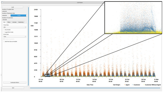
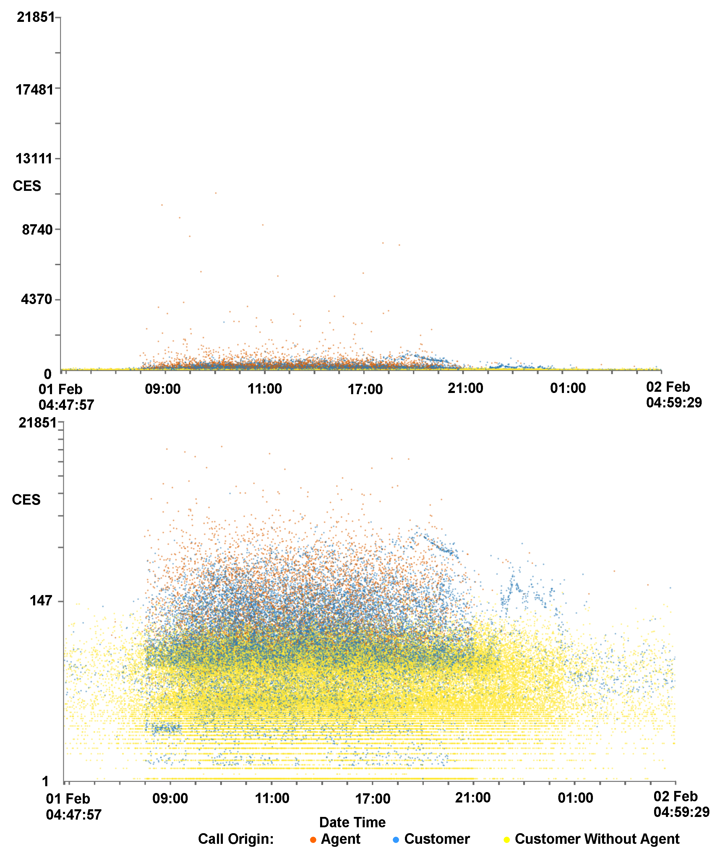
Figure 2.
An overview of the application interface with one month of call data loaded. By default, the customer effort score (CES) is shown on the y-axis and the time of the call on the x-axis. To increase visibility, we added a zoomed in image from one day. Calls are colored by their origin, orange indicates an agent initiated the call, blue that the customer initiated the call, and yellow indicates a customer initiated call with no agent interaction. Immediately we can see the periodic pattern of calls spanning a month where peak times are mid-day every day. Within the zoomed frame, zoomed to approximately one day, an interesting wave pattern can be observed in the data.
- Fully interactive zooming on two independent axes
- User-chosen axis variables (see Table 1)
 Table 1. A table showing available axis variables, along with descriptions, within the software.
 - GPU enhanced filtering of multiple call attributes
- Animation of call arrival
- Brushing data points for details on demand
Due to the large volume of data, these interaction options are important to enable exploration of the data. Filtering is provided for a number of call attributes and is split into two categories, customer-centric filters, for customer-oriented attributes such as accumulated CES, and call-centric filters, for call related filters such as call duration (see Table 2). To garner more information about a particular data point or collection of points, the user is able to brush the point with the mouse which activates a dialog containing details about the call.
Table 2.
A table showing available filters, and the category to which they belong. Customer-centric filters filter groups of calls belonging to one particular customer, whereas call-centric filters filter individual calls.
Figure 2 shows an overview of the call data set. Notable within the figure is the layered nature of the colors representing the call origin. The calls that do not involve a call center agent (yellow—conspicuous in zoomed section), are predominantly at the bottom with the lowest CES, calls initiated by a call center agent (orange) generally have a higher CES, with the customer initiated calls (blue) sandwiched in between. The total number of calls loaded is shown along with the number of calls displayed and a bar displaying the percentage of loaded calls rendered in the top-left corner. The number of customers represented in the scene is also given. Within the scatterplot the call volume distribution can be observed, a peak of calls can be seen each day with troughs at night time. The majority of the data can be seen in the lower areas of the scatterplot space, with proportionately fewer calls in the upper two thirds.
4.1. Scatterplots View
The default view depicts the CES of each call along the left y-axis against the time the call was made along the x-axis, as can be seen in Figure 2. Color is mapped to call origin. Orange indicates an agent initiated the call, blue the customer initiated the call, and yellow indicates a customer initiated call without any agent interaction. An agent interaction might not occur due to the call requirements being served by the IVR or because the customer abandoned the call. The user is able to click on the color key to choose from a selection of other color-maps if required. A drop-down menu is available for each axis, to change the axis variables. Options for the y-axis include CES, call cost, call duration, agent duration, wait duration, IVR duration, hold duration, and time of day of the call. These call attributes are also available for the x-axis, along with additional attributes of date and time of the start of the call, date and time of the end of the call, and a normalized call date and time. The normalized time is based on the time since the first call of each customer in the data set.
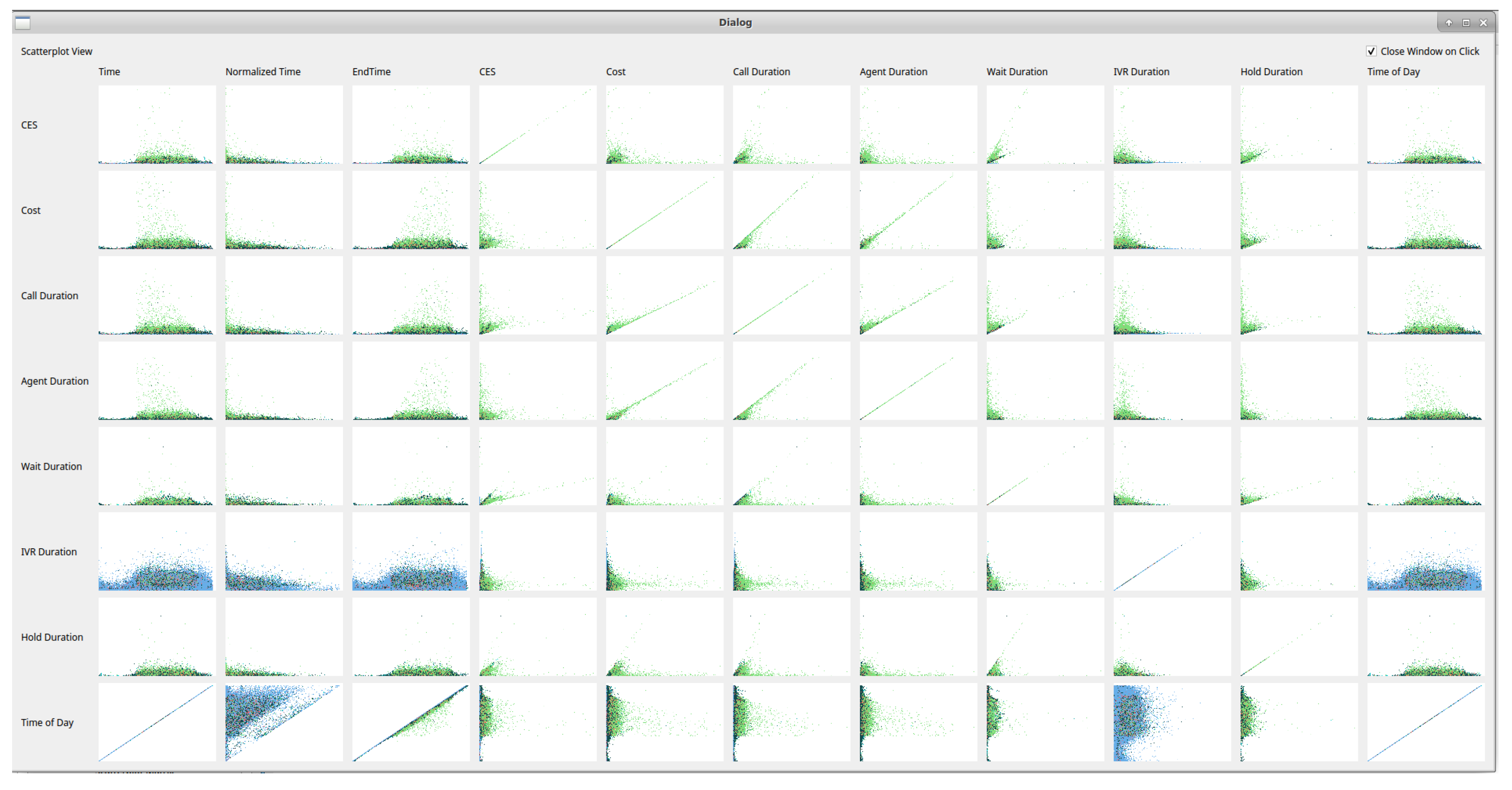
Scatterplot matrix: To provide an overview of all call attribute combinations, the user can choose to view a scatterplot matrix of all available variable choices as in Figure 3. This can guide exploration of the data with interesting features, in any particular combination of axis variables, immediately distinguishable. Users are able to click a scatterplot from the matrix to bring the view up in the main window. Once the user selects the scatterplot matrix option, the software takes a snapshot of each scatterplot combination and presents the images in a matrix. All variables available for the x-axis are drawn horizontally and all variables available for the y-axis drawn vertically. Snapshots of each view are saved internally for quicker display of the scatterplot matrix on subsequent uses. Once an individual scatterplot is chosen, the user has the option of keeping the matrix view open, for ease of exploration, or for the matrix view to close, if screen space is limited.
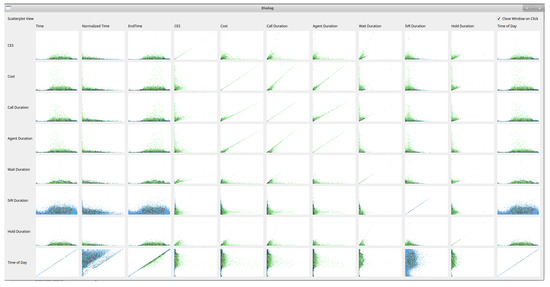
Figure 3.
A scatterplot matrix showing all possible axis variables. Users can click any image of interest to bring the view into the main viewing pane.
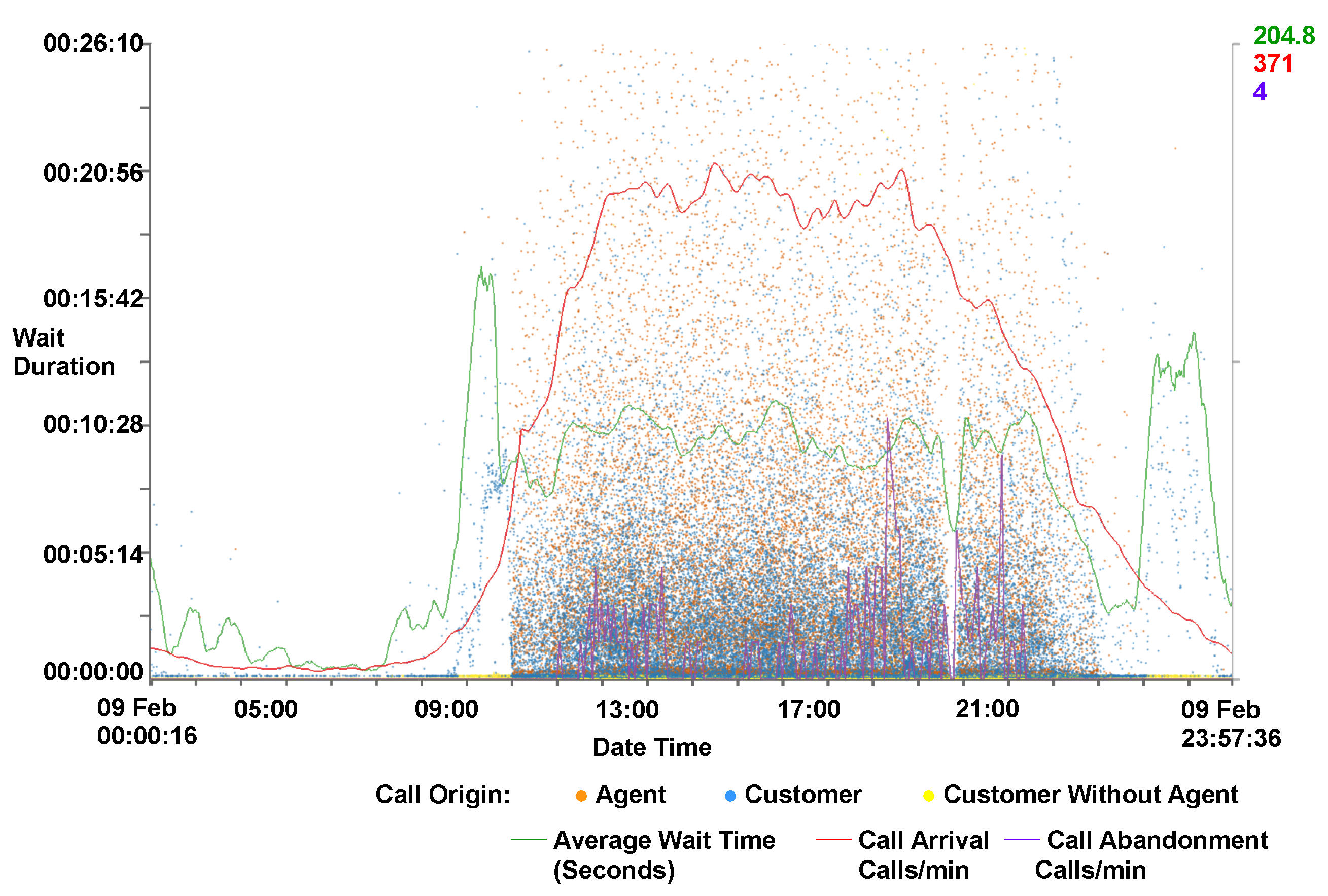
Interaction: The user is able to smoothly zoom in on particular regions of the scatterplot by either using the mouse wheel or sliders at the edge of the plot area. Each axis can be zoomed independently with the mouse wheel zooming in on the x-axis only and the control modifier used in conjunction with the mouse wheel to zoom on the y-axis. Users are able to explore the scatterplot by clicking and dragging the zoomed scene. Figure 4 shows a zoomed scene, with zooming on both the x and y-axes. The x-axis has been zoomed from the full month to a obtain a closer look at single day, meanwhile the wait on duration on the y-axis has been zoomed to a maximum of 26 min. By applying the zoom a void of calls becomes visible between 17:00 and 18:00, indicating a malfunction with either data recording or call center operations.
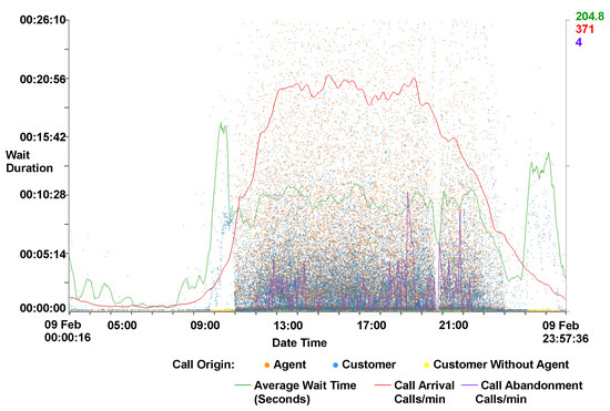
Figure 4.
A close-up view of a scatterplot with supplementary call metric lines. Wait duration is represented on the y-axis against the date and time on the x-axis. The zoom function is used to obtain a closer look at a single day and to a wait duration of below 30 min on the y-axis. Calls are colored by their origin. Call metrics lines are also drawn. The majority of calls can be observed between 08:00 and 21:00, indicating the times where the main call centers are open. A gap can be seen between 17:00 and 18:00, indicating a malfunction with either data recording or call center operations. An increase in the waiting times for customers can be observed between 07:00–08:00.
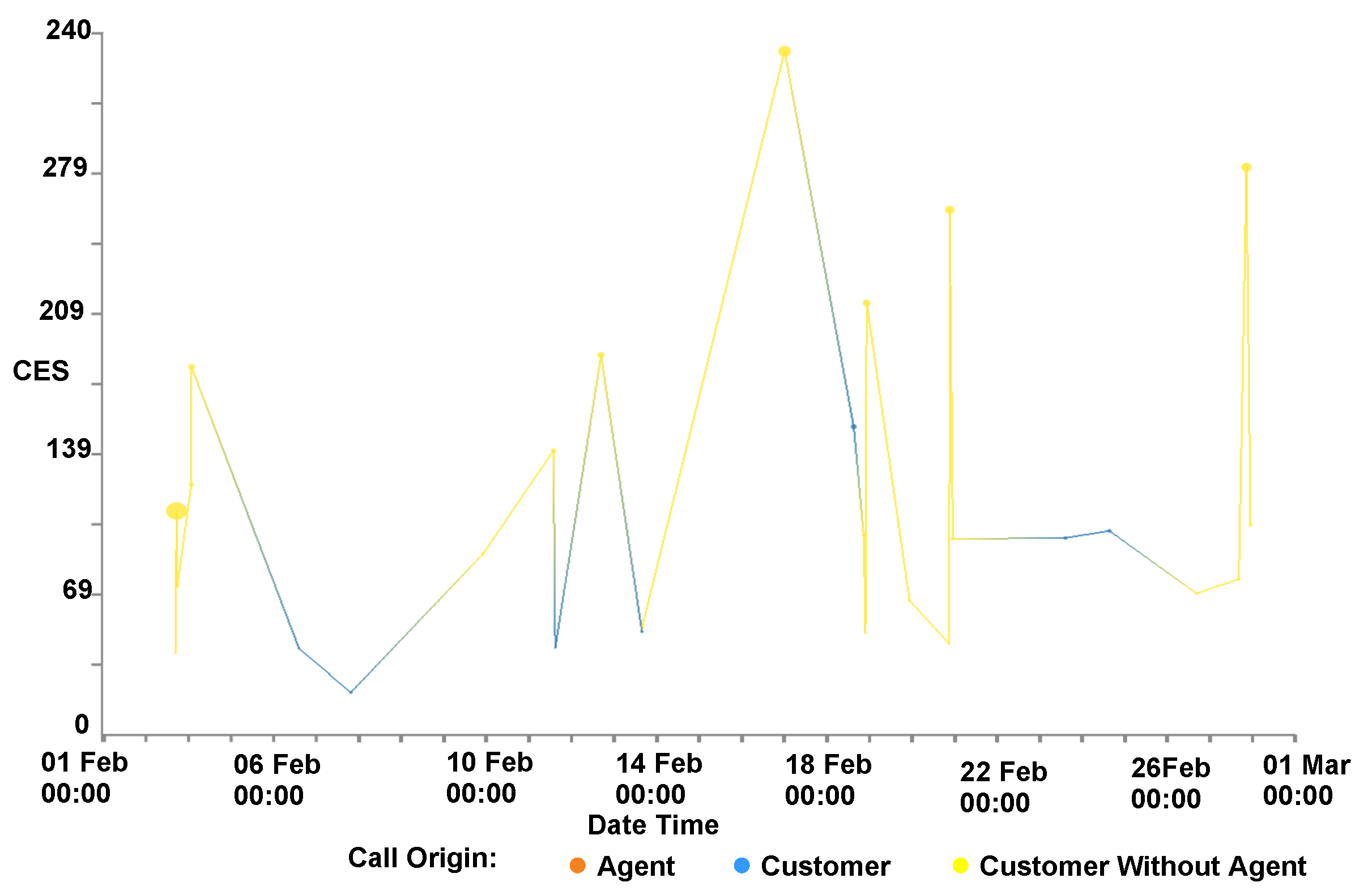
Rendering options: The user also has the option to map the size of the data points to a third call attribute to enable further exploration, as can be seen in Figure 1 and Figure 5. Figure 5 also shows calls connected by a polyline. This polyline is another user option and connects multiple calls that are made from the same customer. To establish a customer’s satisfaction with the service they receive, it is important to consider all interactions that the customer makes with the call center and not treat each call in isolation. To facilitate the exploration of this, we enable the user to accumulate the CES and cost for each customer. This is achieved by ordering all calls from a particular customer chronologically and accumulating the totals for each call.
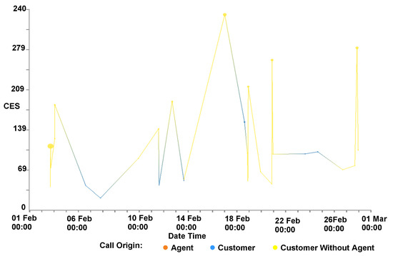
Figure 5.
The CES on the y-axis and the time of the call on the x-axis for all of the calls associated with an individual customer over a month. Point size is proportional to individual call duration. Calls are connected with an edge to indicate all calls are made by the same customer. Calls are colored by their origin. Notable in this figure is that the calls that have the highest CES are the calls without any agent interaction (colored yellow), while calls initiated by the customer and interact with an agent (in blue) are comparatively short.
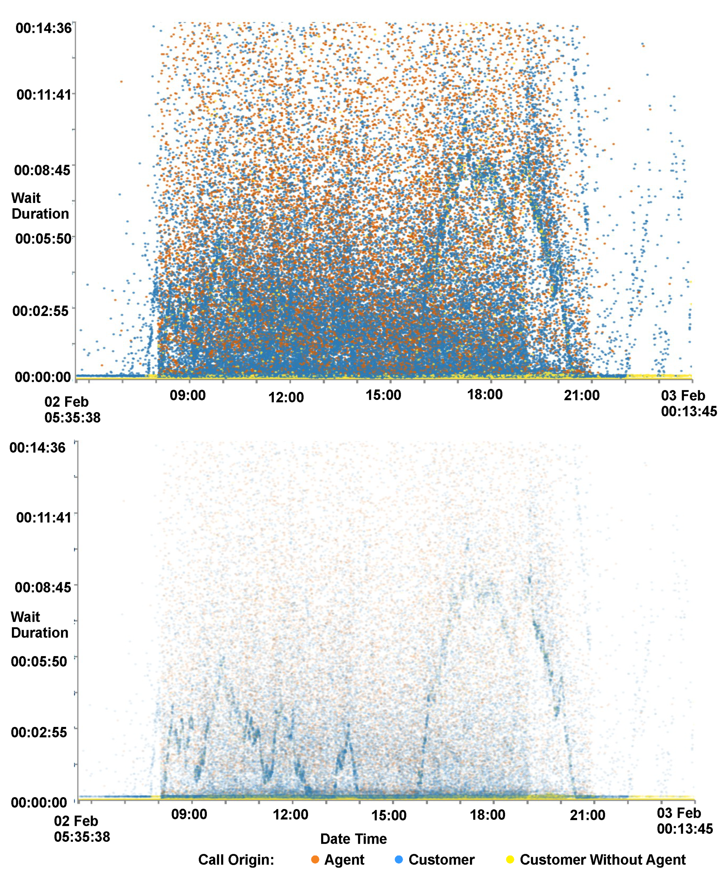
Focus+Context: Users also have the option to adjust the size and opacity of the data points for easier exploration. In sparsely populated scatterplots, larger data points are easier to distinguish, whilst in over-plotted data smaller points prevent clutter. In overplotted areas of data, reducing the opacity of the data points enables discovery within dense data regions. This can be seen in Figure 6, where the reduced opacity image shows a pattern in the data that was previously hidden.
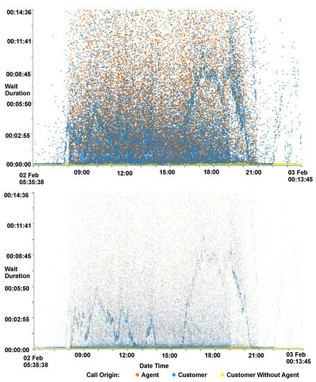
Figure 6.
A comparison of plot opacity for the wait time plotted against date and time of calls. By reducing opacity (bottom), different wave patterns become visible within the data set compared to the patterns seen with high opacity (top).
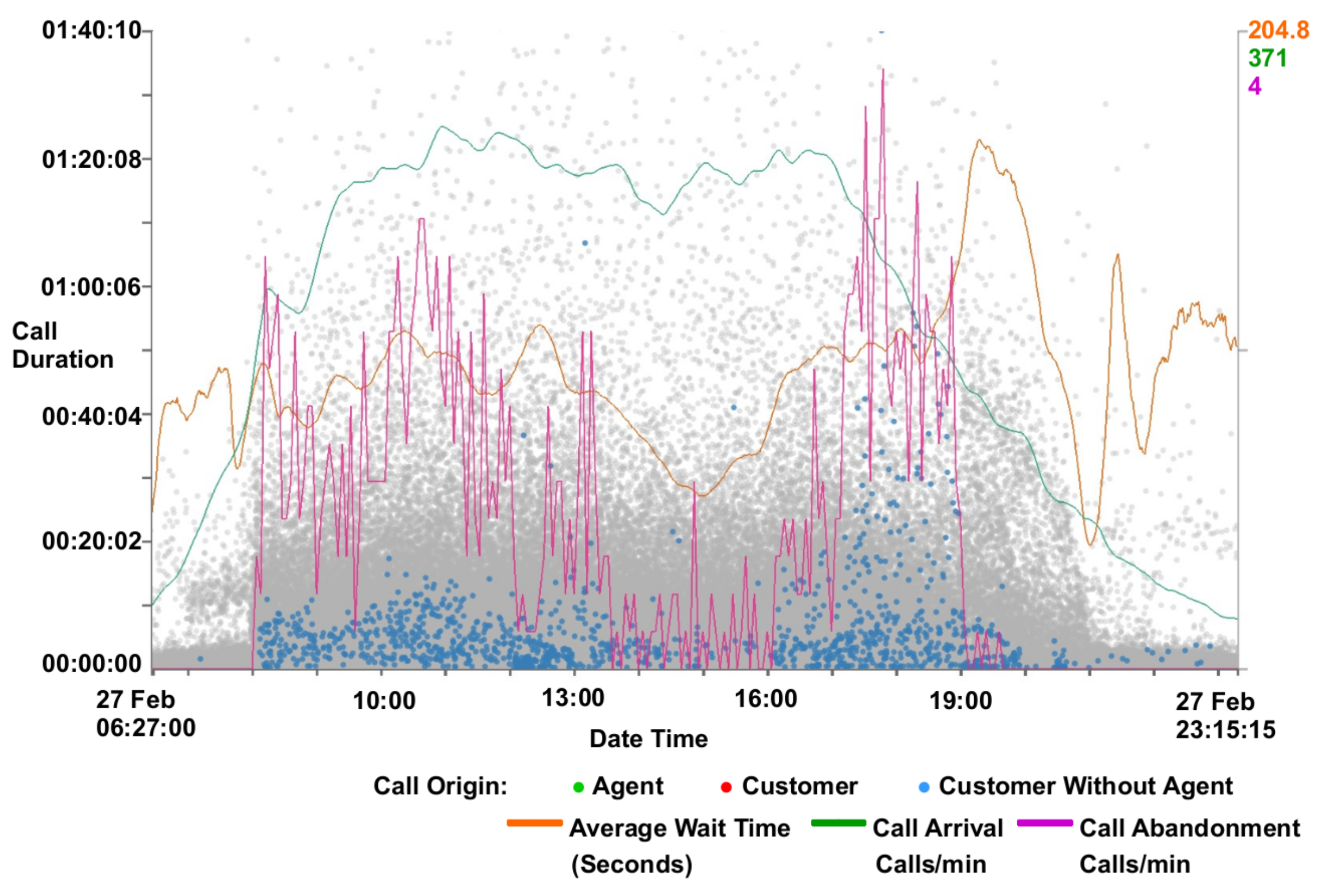
Users also have the ability to adjust opacity for context calls. Calls that have been filtered out are shown in a faded gray to provide context as described by Card et al. [34] For more detail on filtering see Section 4.2. Filtered context call data points are also rendered before focus call data points in a two-pass rendering. The first pass renders only context calls while a second pass renders only focus calls. This enables focus calls to be rendered on top of context calls, as in Figure 7.
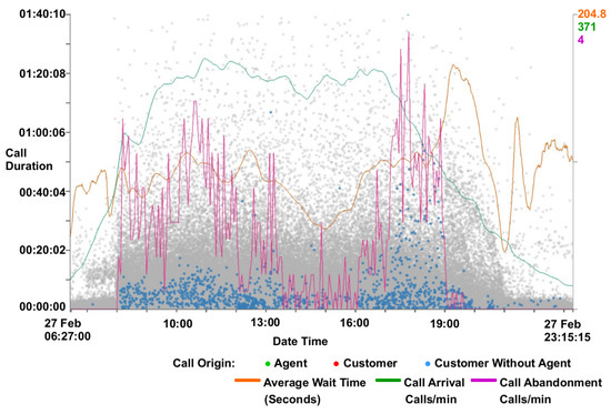
Figure 7.
A filtered scatterplot zoomed to a single day and call duration of less than 1 h 40 min including supplementary call metric lines. Filters are used to exclude calls with agent interaction and with a waiting time of less than ten seconds. Calls excluded from the filter are rendered gray in the background to provide context. An inverse correlation can be seen with the call duration and the call abandoned rate (red line).
It has been found, with initial exploration of the data, that the majority of data points reside in the lower data ranges of CES and cost variables. To enable better exploration of this data we include an option to map to a logarithmic scale, allowing a focus to be put on this data. This is shown in Figure 8, where the points are more evenly distributed revealing layers of call origins. Calls without agent interaction have the lowest CES, whereas calls initiated by an agent tend to have the highest CES.
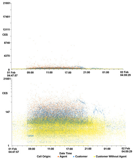
Figure 8.
Two scaterplots showing the same data, one with a standard linear y-axis scale (top) and the other using a logarithmic y-axis (bottom). CES is mapped to the y-axis and the time of the call on the x-axis. The x-axis is focused on a single day and calls are colored by their origin. The three-layered trend seen in Figure 2 is more visible here, with customers who do not interact with an agent predominantly with lower CES, agent initiated calls with the highest CES, and customer initiated calls in between.
Caller line plots: Call center metrics are provided to help identify features discovered in the data set as can be seen in Figure 4. Metrics provided are call arrival rate, call abandonment rate, and average waiting time. Call arrival rate is calculated by summing the number of calls every minute, and this is then smoothed using a non-parametric regression function on a day-by-day basis, as outlined by Brown [35]. Call abandonment is calculated using the same technique. Average wait time is calculated using a tricube function with bandwidths automatically chosen using cross-validation on a day-by-day basis, as described by Brown et al. [28]. To supplement this, a typical day line for the wait time, call arrival rate and abandonment can also be shown. The typical day line is constructed by calculating the average day from a month’s worth of data. Because arrival rate is significantly different over the weekend compared to the weekdays, average arrival rate has been separated into weekday values, Saturday values, and Sunday values. The typical day metrics can be used as a benchmark and compared to given days to establish if they are above or below average. This feature informs the observation that Mondays are typically busier than other weekdays and that Thursdays are generally quieter. This can be seen in the supplementary video [2]. The metric lines can also be used as benchmarks for comparison across different data sets from different companies.
GPU implementation: We utilize OpenGL to provide the graphical element of the software. Encoding data to axis co-ordinates is pre-computed after the data is loaded. This data is loaded into the GPU memory buffer and rendered with the use of OpenGL shaders [36]. Using these techniques and a commodity graphics card, we achieve interactive frame rates with almost 5 million data points. The OpenGL fragment shader code is provided to facilitate reproducibility.
4.2. GPU Enhanced Filtering
To facilitate user-driven selection and exploration of the call data, we have implemented filters for multiple call attributes. Some filtering can be achieved visually using the zoom function, however this is limited in functionality. Two groups of filters are used, customer-based filters and call-based filters. Customer-based filters enable filtering of groups of calls belonging to particular customers using variables collated from all calls for each customer. Call filters are used for filtering individual calls. Available customer filters are shown in Table 2.
An additional filter is available to distinguish between each of the different origins of the calls.
Figure 9 shows the user interface to facilitate filtering, with filters split into customer-based and call-based. The distribution of calls can be seen on the thumbnail previews of histograms, placed on each button, to aid filtering decisions. Filters that have already been applied are highlighted in red as can be seen with the “Time of Call” filter in the left of Figure 9. Clicking a filtering button enables the filtering dialog for that attribute (Figure 9 right shows the filter dialog for wait duration). The filter dialog shows two histogram plots of the attribute, the topmost shows the total distribution whilst the lower shows the distribution with user-adjustable lower and upper range limits set in the controls applied. This allows for focus+context style exploration of unevenly distributed data. A selection box at the bottom of the dialog enables a logarithmic function to be applied to the histogram heights, enabling easier exploration of uneven distributions. Filter limits can be set using three control mechanisms, an input box for the lower limit, an input box for the upper limit, and a range slider enabling adjusting of both lower and upper limits. Controls are connected, with changes in one control reflected in the other controls. Indications of the maximum and minimum filtering values, as well as the current applied filter values, are also provided. A bar is shown at the bottom of the call filter dialogs indicating the percentage of total calls that will be displayed after applying the filter, providing an indication of filter effectiveness.
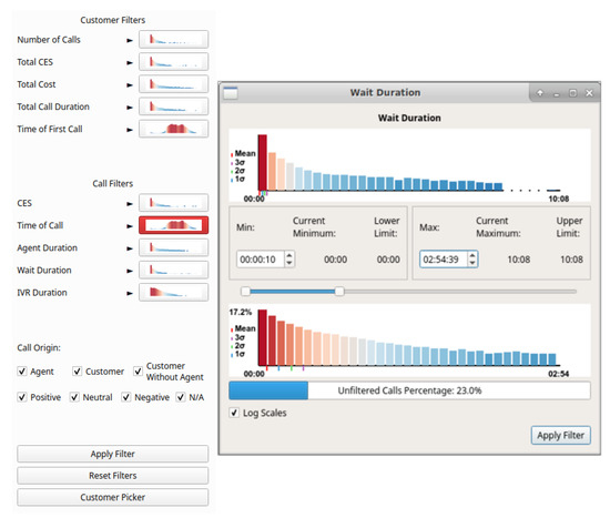
Figure 9.
Filter interface including thumbnail previews with call attribute histograms on buttons (left). Buttons are highlighted with red when filters are applied, as can be seen with Time of Call. Filter dialog for wait duration (right). Two distributions are shown, the top shows the total call distribution and the bottom shows the distribution resulting from the user-applied filters.
Filters can be applied individually by clicking the apply button in the dialog for the appropriate filter, or all open filters can be applied by clicking the apply button in the main interface. A “reset filters” option is available to set all filters to their maximum and minimum values, and a customer picker is available to choose an individual customer for investigation. Figure 7 shows an example of the visualization with filters applied, along with call metrics. A correlation can be seen with the number of abandoned calls metric line and the call duration of the remaining calls. McDonnel and Elmqvist describe the use of GPU for filtering and visualizing using OpenGL shaders [20], however this filtering method fails with calls being grouped by customers and requires image processing to ascertain filtering result metrics. In order to remedy this issue, we utilize the parallel processing benefits of a GPU and the Open Computing Language (OpenCL version 2.0) [37] to quickly filter the number of calls and to return the filtering metrics.
To filter the calls without hardware acceleration requires iterating through each call for each customer, testing if each variable is within filtering limits. With millions of calls, this method can take considerable time to complete. However with the use of parallelism, on the GPU, each call can be tested concurrently. For further guidance and instruction on the use of OpenCL, we recommend the books by Munshi et al. and Scarpino [38,39]. OpenCL functions, known as kernels, are performed on each instance of the data, in this case calls, returning an output. This can be quickly processed to return the number of calls and customers filtered. Our abridged kernel code for filtering follows for reproducibility:
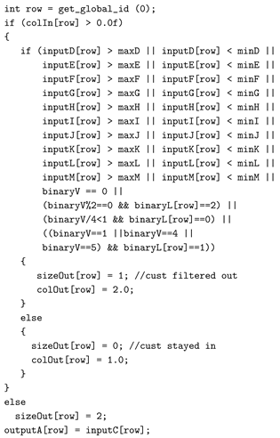
The kernel code tests if each call variable is between the maximum and minimum ranges specified in the filters and outputs the filtered status. Each call is processed with this code, returning a vector of the filtered status of each call. This vector can then be passed to the OpenGL rendering shader so that the data point for the call can be rendered as focus or context. The vector can easily be processed to calculate filtering statistics quickly.
4.3. CPU vs. GPU Filtering Performance Comparison
Due to the large number of calls being processed, CPU-based filtering by iterating through an array of calls with multiple attributes was found to take some time. To mitigate this, the calls can be processed in parallel using the parallel compute ability of a commodity graphics processor using the OpenCL framework. We compare the performance of the OpenCL implementation with a standard C++ implementation for filtering. The OpenCL implementation utilizes the GPU for computing the calls and customers to be filtered whereas the standard implementation utilizes the CPU. Tests were performed on an MSI GE62VR-6RF laptop with an Intel Core i7-6700HQ processor and an NVIDIA GeForce GTX 1060 (6GB version).
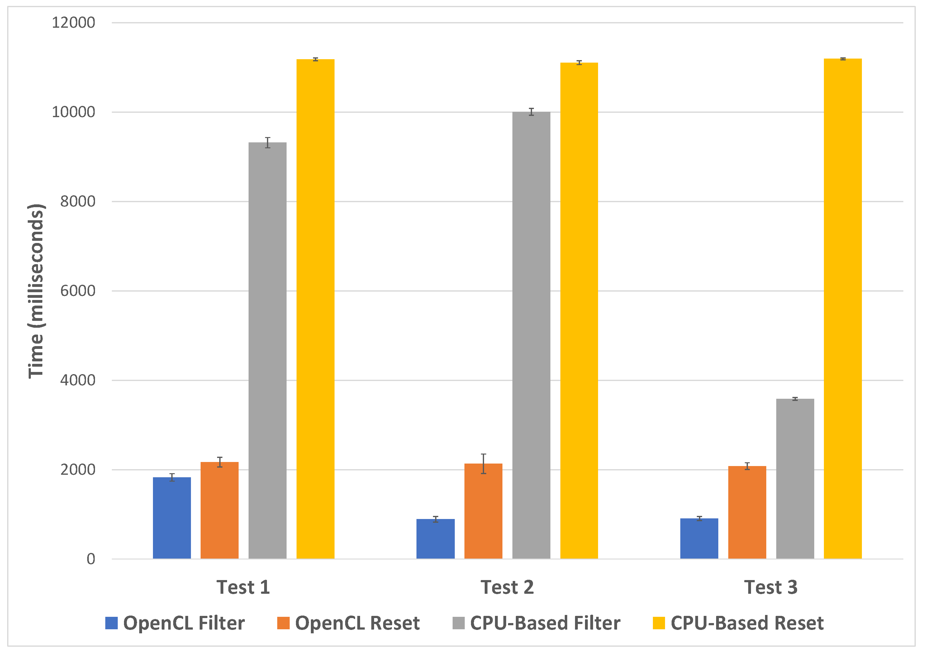
Three tests are performed, one based on a customer-centric filter, time of day, one on a call-centric filter, NPS, and the final test on a combination of filters, call origin, agent duration, and number of calls. The time taken to filter the calls and reset the filter was recorded using the OpenCL implementation and without. Each test was repeated three times and an average time taken for each. The data set for one month is used for the performance testing, after erroneous calls are removed, leaving a total of 4,606,054 calls to filter. The first test focuses on the customer filter, in this case, all customers with their first call before 12:00 on any day are removed. This removes 1,552,011 calls and leaves 3,054,043 calls in focus. The second test focuses on the call filter and filters all calls without an NPS score. This option removes 4,425,529 calls, leaving 180,525. The final test is a combination filter including call filters and customer filters. Calls without an agent interaction are removed along with calls who spend more than an hour speaking to an agent, and customers with less than ten calls or more than 50 calls. This removes 4,275,003 and leaves 331,051 calls. Results can be seen in Figure 10.

Figure 10.
A chart showing average filtering and filter reset performance using OpenCL and without for three separate tests. Error bars indicate 1 standard deviation.
For all tests, the OpenCL filtering is shown to be quicker, with test two showing the most significant difference in performance, where the OpenCL implementation took an average of 889 milliseconds and the standard compute took 10,005 milliseconds (10 × longer). Test three has the smallest difference in performance, with the OpenCL implementation taking an average of 907 milliseconds and the standard compute taking 3585 milliseconds. The time to reset the filters is relatively consistent for each test, taking an average of 2126 milliseconds across all tests for the OpenCL implementation and 11,160 for the standard compute.
From these tests, we can conclude that the OpenCL implementation is between 4–11 times faster to filter, depending on the filter applied. Resetting the filter is five times quicker using the OpenCL implementation.
4.4. Brushing for Details
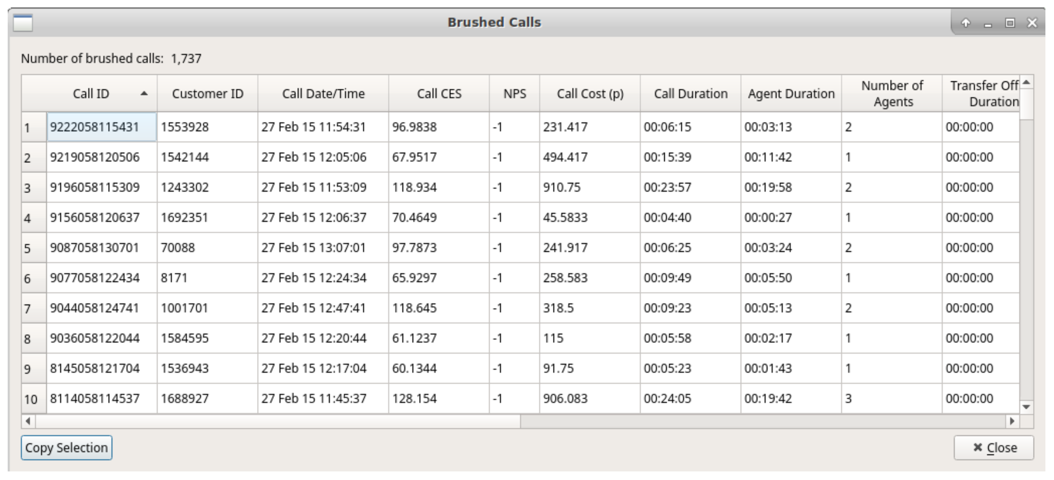
Once particular data points of interest have been identified by the user, they are able to brush the desired region on the scatterplot to bring up a dialog featuring all attributes of the brushed calls. This fulfills the final part of Shneiderman’s visual information-seeking mantra, [8], details on demand. Figure 11 shows an example of the brush dialog. Users are able to copy selected data attributes from the brush dialog for further analysis with other tools. This copy feature was requested by our domain experts to enable further exploration and analysis using different applications.
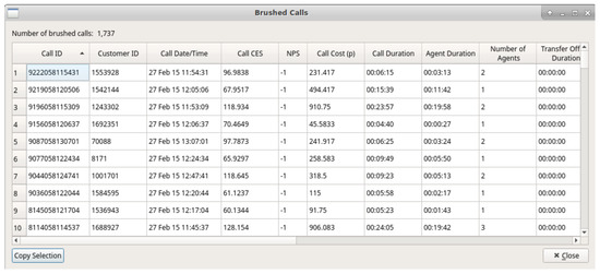
Figure 11.
Brush dialog showing all call attributes for brushed calls in full detail.
4.5. Animation
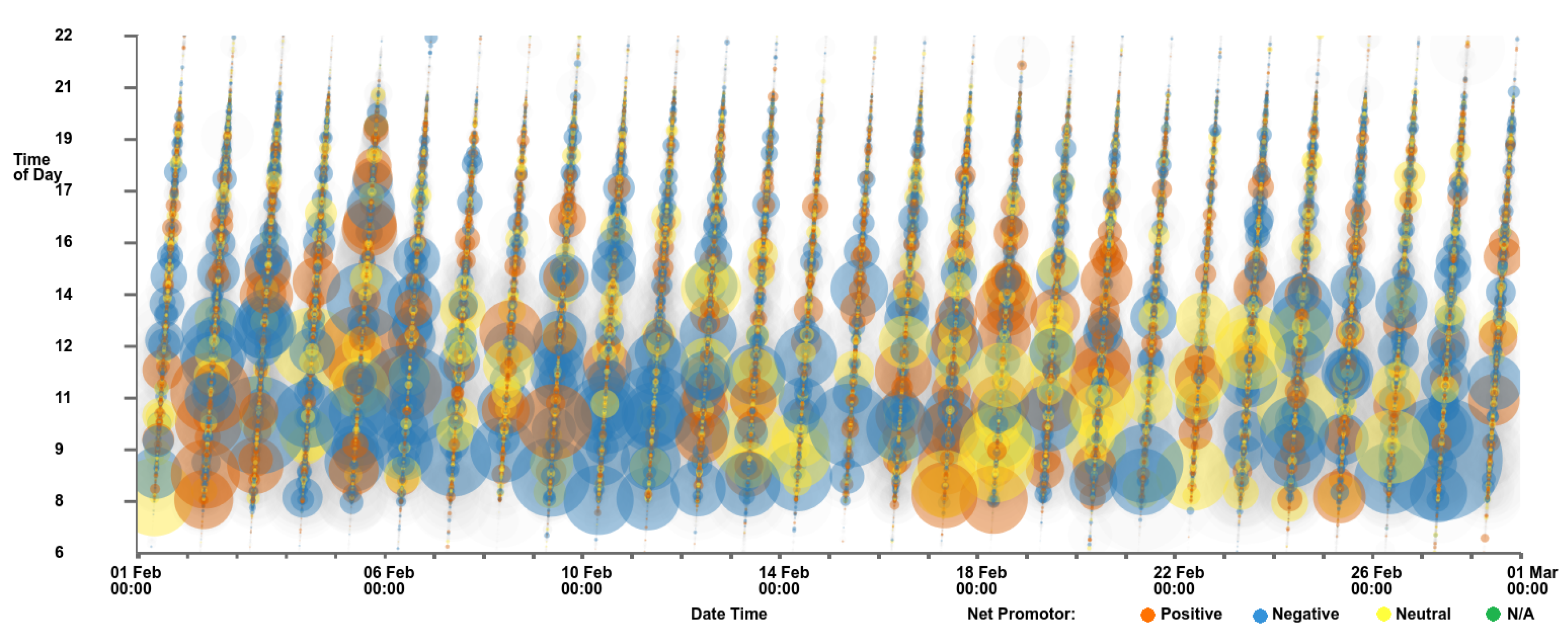
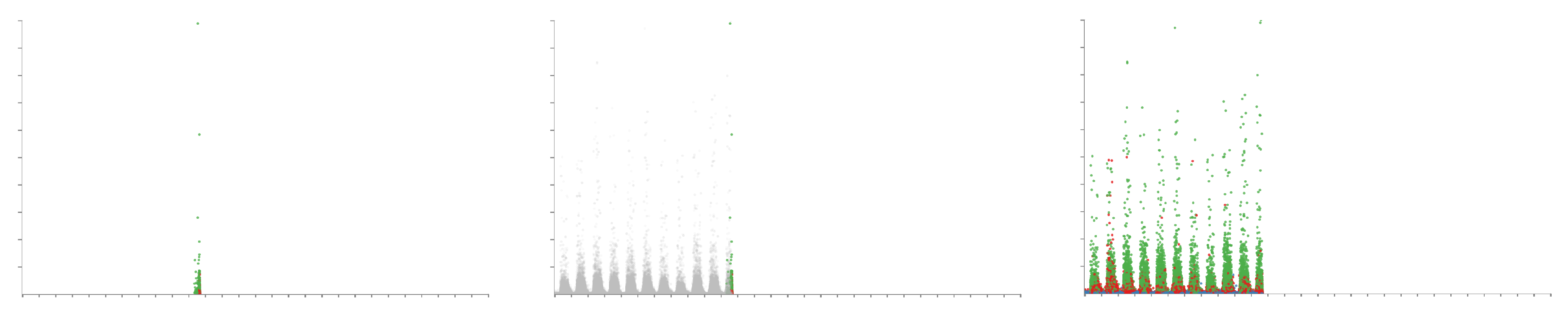
To further aid data exploration, we have implemented an animation feature that enables the user to view calls arriving as if in real-time or an accelerated simulation of time. Users have the option of either discarding calls after they have passed their end time, rendering them in context, or enabling them to be displayed continuously. Figure 12 shows the three options for calls past their end times.
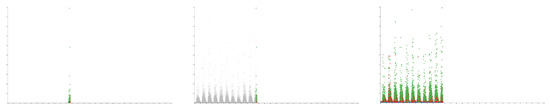
Figure 12.
Three screenshots of the software animation feature, with the y-axis showing the Customer Effort Score and the x-axis showing the date and time of the calls. The left image shows calls removed after their end time has expired, the center image shows calls placed into context after the end time, and the right image shows calls continuously once appeared.
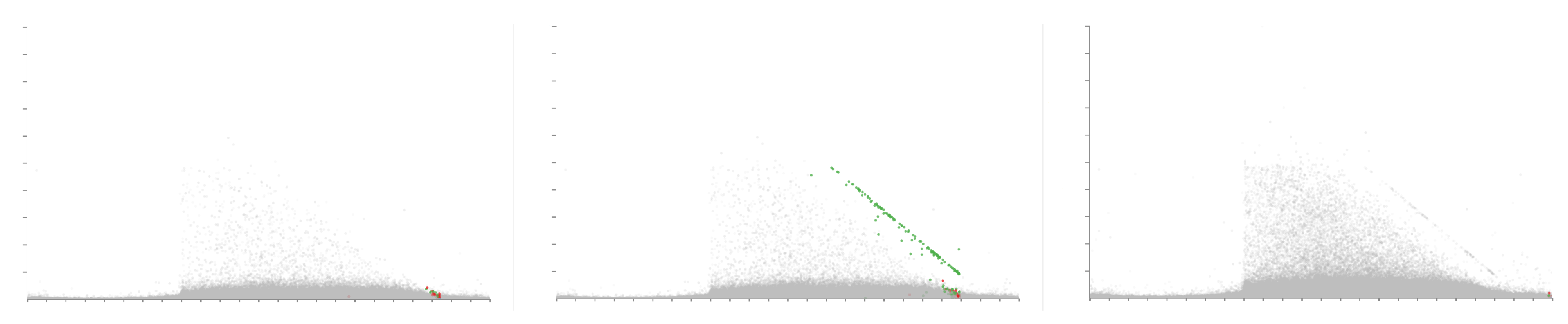
The user also has options to control the speed of the animation by entering a time value for the duration of the animation. The ability to loop the animation such that it restarts after displaying all calls is also available. A progress slider is available to show progression through the animation. Users are able to manually drag the progress slider to advance and rewind the animation and pause the animation. Figure 13 demonstrates a feature within the call center behaviour discovered as a result of the animation feature. The figure shows three images of time of day against agent duration at different time steps of the animation. The left image shows the animation on the fourth day, the middle image during the fifth day, and the right image shows the animation at the end on the 28th day. During the fifth day, a diagonal row of points is seen as highlighted in the middle image of Figure 13. Further investigation shows that these calls end within ten minutes of each other, however, why this pattern is not seen on other days is still unknown. Although this observation is visible through trial-and-error using other axis variables, it is particularly apparent using the animation feature.
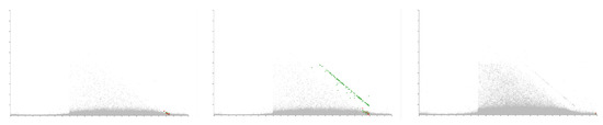
Figure 13.
Three images demonstrating the animation feature, showing different stages of the animation. The x-axis is mapped to the time of day at the start of each call while the y-axis shows the agent duration. A month’s worth of data is loaded (28 days). The left pane shows the animation during the forth day, the middle image shows the animation towards the end of the fifth day, and the right image shows the animation at the end of the final 28th day. Noticeable is the unexpected appearance of a straight diagonal line on the fifth day seen in the middle panel.
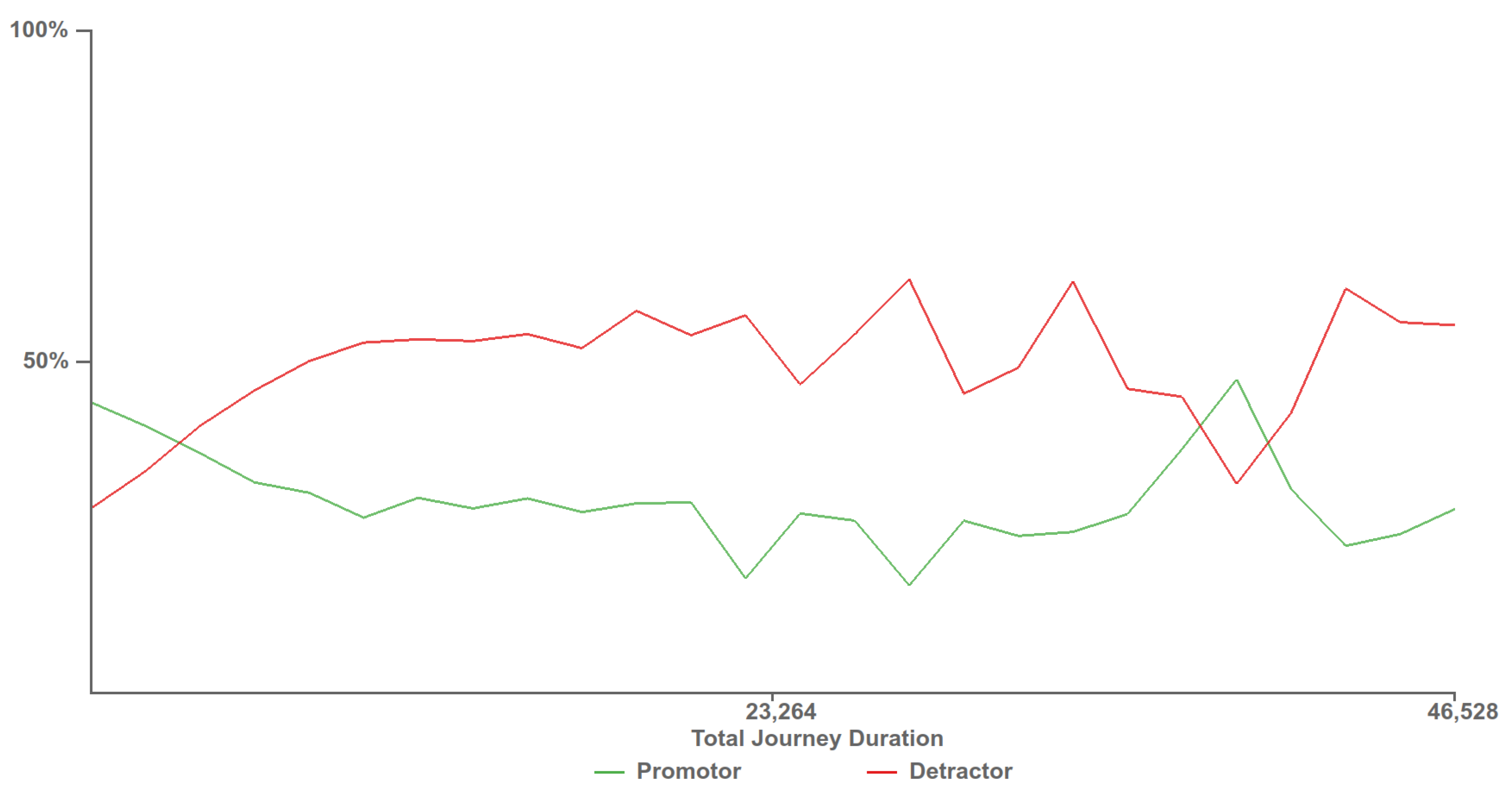
4.6. Customer Experience Tipping Point Chart
At the request of our domain experts, we created a chart depicting customer experience against the total journey time, as can be seen in Figure 14. The chart depicts two lines showing the percentage of calls, who answered a survey, with positive and negative feedback in green and red respectively. Positive feedback scores are those that provide a NPS feedback score of over eight and are considered customers who would promote the company while customers who provide an NPS score of less than five are considered detractors. Along the x-axis is the customer journey time, this is the total amount of time that the customer has spent interacting with the call center, across multiple calls. This chart allows for the discovery the call journey tipping point time, where the promoter score first crosses below the detractor line. Customers who exceed this journey time are more likely to be detractors than promoters, providing a maximum journey duration target for call centers to keep customers happy. As can be seen in Figure 14, the promoter score first crossed below the detractor line at approximately 2900 s.
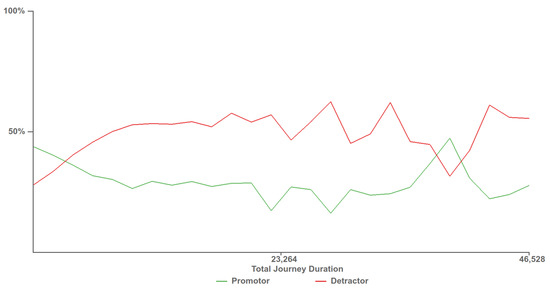
Figure 14.
Customer experience tipping point chart depicting when customers who provide negative feedback surpass the number of customers who provide positive feedback. The time at which the detractor score line first surpasses the promoter score line, 2900 s, provides a benchmark for call centres to try to stay below to keep the most customers satisfied.
Video Demonstration: Please visit https://vimeo.com/305933032 to view an updated demonstration of the application and its features.
5. Domain Expert Feedback
The software was developed in collaboration with our industrial partner QPC Limited, with whom we have been working with since 2014. The development of this application has been driven by discussions with QPC Ltd. and their requirements. Here we present important feedback garnered from guided interviews [40] with three of their experts, see Figure 15.

Figure 15.
An image from one of our feedback sessions with QPC Ltd.
Expert one is a software developer with almost 30 years of experience in the call center industry. Expert two has over 20 years of experience in the contact center industry in a variety of roles, and is currently working in a consultancy role. Expert three is a director of product and marketing with over 15 years experience of the contact center industry. Feedback was garnered over three recorded interview sessions, the first was an hour meeting in person, the second via a one hour video conference, and the third at an hour and a half meeting with all members present. Interviews were conducted using guidance garnered from Hogan et al. [40].
Initially, when shown the software with a month of data loaded, the experts were impressed with the application’s ability to plot a large number of data points. When asked if they had seen a month’s worth of data before, an expert one replied:
“Not at this speed, no. We’ve had to go down the route of pre-aggregating the data to get the speed.”
In fact, this is the first time anyone has seen an entire month’s worth of data simultaneously, in their entire company’s history. Previous commercial products used to explore the data set have been limited in the size of the input data set. After demonstrating the zooming, panning, and data variable choices, the experts saw the value of the application and the exploration potential it provided, expert two stated:
“It’ll be interesting to put a new data set in that we haven’t looked at before, that we haven’t got any knowledge of and to instantly then be able to see something.”
The filtering ability of the software, in particular, was well received, with the thumbnail previews of histograms exalted for their ability to give an initial summary of the different fields and distributions.
“I like the look of that, it looks nice first of all, it’s giving you a good summary of the different fields and distributions.”
The ability to compound the filters and the briskness of the filters were praised by expert two.
“You’ve given the ability to filter the contacts in quite a few different ways and to enable you to focus in on particular areas and for the individual contacts you come down to you can look closer, maybe in a different application.”
Positive feedback was also received from expert three for the metric and the typical day lines:
“Yeah, I think it’s nice, it lets you look at some standard call center metrics.”
The average plot lines were particularly noted for their ability to benchmark call center performance. With this feature, our industry partner can, for the first time, compare call center performance between their customers in addition to different days. The ability to brush for individual call attributes was also welcomed, allowing identification of specifically identified calls.
More general feedback was given with respect to the usefulness of the application to QPC Ltd. and their customers by expert three:
“I think there are two immediate purposes it serves, one is validation, it’ll throw up those outliers we’ve got... and two, from an insight perspective... we’d probably show this to the customer to demonstrate the insight, to show how flexible the data is.”
This was followed up with a statement from expert one which we feel encapsulates the aims of the application:
“It makes the application that you’ve created a stepping stone... because you can look at a large set of data and filter down to a smaller number of calls, this application looks useful for that then potentially you can go and look at some more specific detail with another application or even you just literally go to the database and take those call I.D.’s you’ve listed out there even just go directly to the database.”
Recommendations for improvements were received from the feedback sessions, in particular the ability to include more caller data dimensions was requested.
6. Conclusions and Future Work
We present an application capable of visualizing millions of calls representing a month’s worth of real-world data for the very first time. The application enables fast exploration of a large data set including rapid filtering and brushing for further detail, reflecting Shneiderman’s visual information-seeking mantra [8]. Details of fast filtering using OpenCL are presented. Insights into the data set are presented, and feedback from our expert industrial partner is also provided.
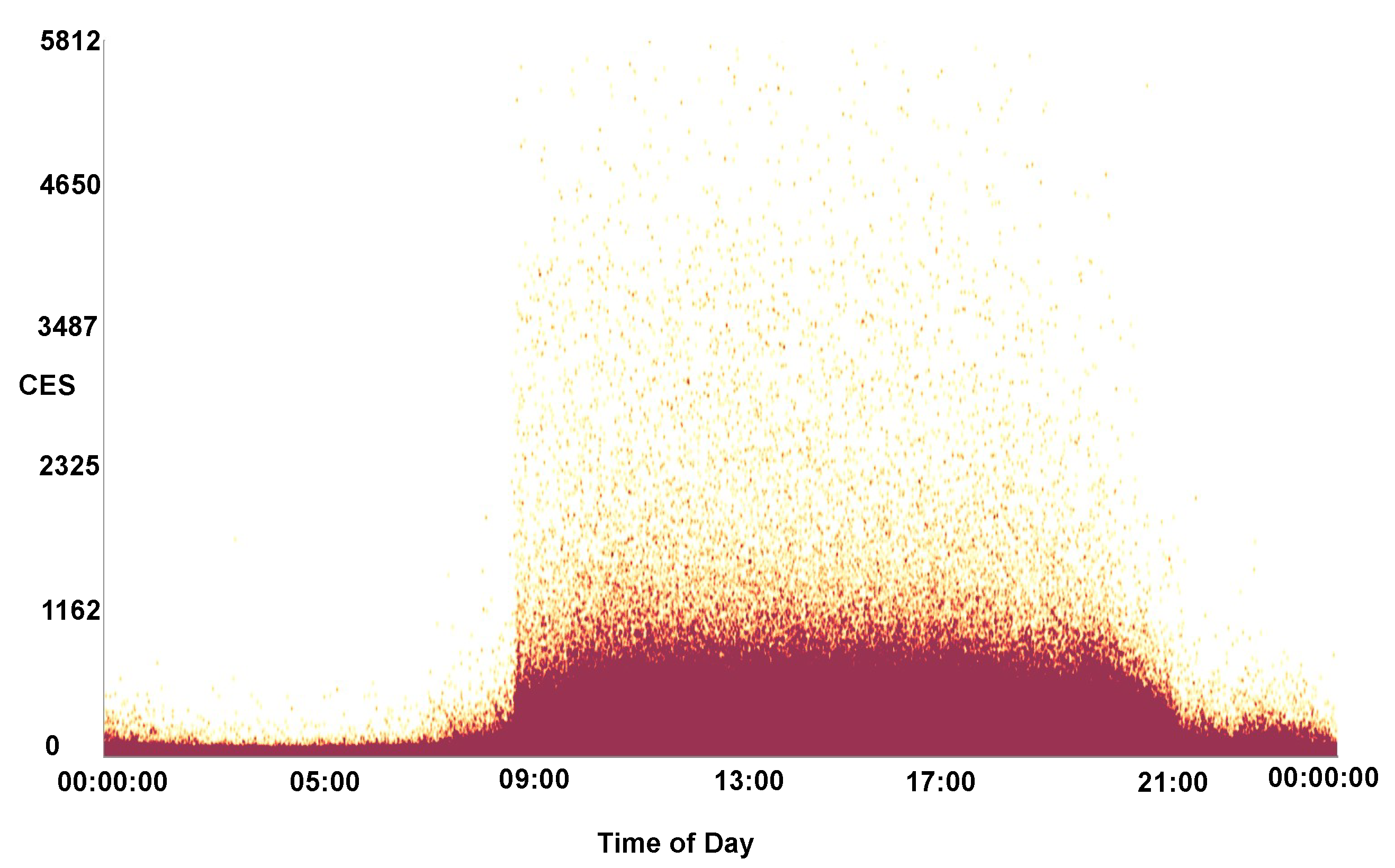
In future, we would like to further explore improvements with the use of general-purpose compute on the GPU. This includes the use of a shared context between OpenCL and OpenGL memory buffers as demonstrated by Alharabi et al. [41] and the use of the Vulkan API [42]. Following feedback from QPC Ltd., we would also like to extend the software to handle more call variables and to utilize dimension reduction techniques to highlight key caller data dimensions and to find co-relation coefficients. Further testing of the software would also be beneficial with data sets from other vocations, and larger data sets. The ability to display other visual designs is also a desirable feature. Over-plotting is a significant issue when plotting a large number of data points, hence in the future we would like to provide an auto-detection feature for over-plotting that adjusts the opacity accordingly. Figure 16 shows a heat-map density plot of CES against the time of day for a month of data, highlighting the areas of over-plotting.

Figure 16.
A heat-map density plot of CES against the time of day for a month of call data. The darker maroon colors indicate areas of over-plotting.
Author Contributions
Conceptualization, D.R., R.C.R., R.S.L., P.B., T.D. and G.A.S.; methodology, D.R. and R.S.L.; software, D.R.; validation, R.S.L., P.B., T.D. and G.A.S.; formal analysis, D.R.; investigation, D.R.; resources, R.S.L.; data curation, D.R. and P.B.; writing—original draft preparation, D.R. and R.S.L.; writing—review and editing, D.R., R.C.R. and R.S.L.; visualization, D.R.; supervision, R.S.L. and G.A.S.; project administration, R.S.L.; funding acquisition, R.S.L. and G.A.S.
Funding
The authors gratefully acknowledge funding from KESS. Knowledge Economy Skills Scholarships (KESS) is a pan-Wales higher level skills initiative led by Bangor University on behalf of the HE sector in Wales. It is part funded by the Welsh Government’s European Social Fund (ESF) convergence programme for West Wales and the Valleys.
Acknowledgments
We would also like to thank Liam McNabb and Beryl Rees for their help.
Conflicts of Interest
The authors declare no conflict of interest. The funders had no role in the design of the study; in the collection, analyses, or interpretation of data; in the writing of the manuscript, or in the decision to publish the results.
References
- Rees, D.; Roberts, R.C.; Laramee, R.S.; Brookes, P.; D’Cruze, T.; Smith, G.A. GPU-Assisted Scatterplots for Millions of Call Events. In Computer Graphics and Visual Computing (CGVC); Tam, G.K.L., Vidal, F., Eds.; The Eurographics Association: Munich, Germany, 2018. [Google Scholar]
- Res, D. Feature-Rich, GPU-Accelerated Scatterplots for Millions of Call Events—Demonstration Video, 2018. Available online: https://vimeo.com/305933032 (accessed on 4 February 2019).
- ContactBabel. US Contact Centres: 2018–2022 The State of the Industry & Technology Penetration; Technical Report; ContactBabel: Newcastle-upon-Tyne, UK, 2018. [Google Scholar]
- ContactBabel. UK Contact Centres: 2018–2022 The State of the Industry & Technology Penetration; Technical Report; ContactBabel: Newcastle-upon-Tyne, UK, 2018. [Google Scholar]
- Dimension Data. Global Contact Centre Benchmarking Report; Technical Report; Dimension Data: Johannesburg, South Africa, 2016. [Google Scholar]
- Aksin, Z.; Armony, M.; Mehrotra, V. The modern call center: A multi-disciplinary perspective on operations management research. Prod. Oper. Manag. 2007, 16, 665–688. [Google Scholar] [CrossRef]
- Mehrotra, V.; Grossman, T. New Processes Enhance Crossfunctional Collaboration and Reduce Call Center Costs; Technical Report, Working Paper; Department of Decision Sciences, San Francisco State University: San Francisco, CA, USA, 2006. [Google Scholar]
- Shneiderman, B. The eyes have it: A task by data type taxonomy for information visualizations. In Proceedings of the 1996 IEEE Symposium on Visual Languages, Boulder, CO, USA, 3–6 September 1996; pp. 336–343. [Google Scholar]
- McNabb, L.; Laramee, R.S. Survey of Surveys (SoS)-Mapping The Landscape of Survey Papers in Information Visualization. In Computer Graphics Forum; Wiley Online Library: Hoboken, NJ, USA, 2017; Volume 36, pp. 589–617. [Google Scholar]
- Rees, D.; Laramee, R.S. A Survey of Information Visualization Books. In Computer Graphics Forum; Wiley Online Library: Hoboken, NJ, USA, 2019; forthcoming. [Google Scholar]
- Friendly, M.; Denis, D. The early origins and development of the scatterplot. J. Hist. Behav. Sci. 2005, 41, 103–130. [Google Scholar] [CrossRef] [PubMed]
- Ellis, G.; Dix, A. A taxonomy of clutter reduction for information visualisation. IEEE Trans. Vis. Comput. Gr. 2007, 13, 1216–1223. [Google Scholar] [CrossRef] [PubMed]
- Sarikaya, A.; Gleicher, M. Scatterplots: Tasks, Data, and Designs. IEEE Trans. Vis. Comput. Gr. 2018, 24, 402–412. [Google Scholar] [CrossRef] [PubMed]
- Carr, D.B.; Littlefield, R.J.; Nicholson, W.; Littlefield, J. Scatterplot matrix techniques for large N. J. Am. Stat. Assoc. 1987, 82, 424–436. [Google Scholar] [CrossRef]
- Keim, D.A.; Hao, M.C.; Dayal, U.; Janetzko, H.; Bak, P. Generalized scatter plots. Inf. Vis. 2010, 9, 301–311. [Google Scholar] [CrossRef]
- Dang, T.N.; Wilkinson, L.; Anand, A. Stacking graphic elements to avoid over-plotting. IEEE Trans. Vis. Comput. Gr. 2010, 16, 1044–1052. [Google Scholar] [CrossRef] [PubMed]
- Chen, H.; Chen, W.; Mei, H.; Liu, Z.; Zhou, K.; Chen, W.; Gu, W.; Ma, K.L. Visual abstraction and exploration of multi-class scatterplots. IEEE Trans. Vis. Comput. Gr. 2014, 20, 1683–1692. [Google Scholar] [CrossRef] [PubMed]
- Mayorga, A.; Gleicher, M. Splatterplots: Overcoming overdraw in scatter plots. IEEE Trans. Vis. Comput. Gr. 2013, 19, 1526–1538. [Google Scholar] [CrossRef] [PubMed]
- Elmqvist, N.; Do, T.N.; Goodell, H.; Henry, N.; Fekete, J.D. ZAME: Interactive large-scale graph visualization. In Proceedings of the IEEE Pacific Visualization Symposium, PacificVIS’08, Kyoto, Japan, 5–7 March 2008; pp. 215–222. [Google Scholar]
- McDonnel, B.; Elmqvist, N. Towards utilizing GPUs in information visualization: A model and implementation of image-space operations. IEEE Trans. Vis. Comput. Gr. 2009, 15, 1105–1112. [Google Scholar] [CrossRef] [PubMed]
- Mwalongo, F.; Krone, M.; Reina, G.; Ertl, T. State-of-the-Art Report in Web-based Visualization. Comput. Gr. Forum 2016, 35, 553–575. [Google Scholar] [CrossRef]
- Liu, Z.; Jiang, B.; Heer, J. imMens: Real-time Visual Querying of Big Data. Comput. Gr. Forum 2013, 32, 421–430. [Google Scholar] [CrossRef]
- Andrews, K.; Wright, B. FluidDiagrams: Web-Based Information Visualisation using JavaScript and WebGL; EuroVis—Short Papers; Elmqvist, N., Hlawitschka, M., Kennedy, J., Eds.; The Eurographics Association: Geneva, Switzerland, 2014. [Google Scholar]
- Sarikaya, A.; Gleicher, M.; Chang, R.; Scheidegger, C.; Fisher, D.; Heer, J. Using webgl as an interactive visualization medium: Our experience developing splatterjs. In Proceedings of the Data Systems for Interactive Analysis Workshop, Chicago, IL, USA; 2015; Volume 15. [Google Scholar]
- Sharp, D. Call Center Operation: Design, Operation, and Maintenance; Elsevier: Amsterdam, The Netherlands, 2003. [Google Scholar]
- Jongbloed, G.; Koole, G. Managing uncertainty in call centres using Poisson mixtures. Appl. Stoch. Models Bus. Ind. 2001, 17, 307–318. [Google Scholar] [CrossRef]
- Weinberg, J.; Brown, L.D.; Stroud, J.R. Bayesian forecasting of an inhomogeneous Poisson process with applications to call center data. J. Am. Stat. Assoc. 2007, 102, 1185–1198. [Google Scholar] [CrossRef]
- Brown, L.; Gans, N.; Mandelbaum, A.; Sakov, A.; Shen, H.; Zeltyn, S.; Zhao, L. Statistical analysis of a telephone call center: A queueing-science perspective. J. Am. Stat. Assoc. 2005, 100, 36–50. [Google Scholar] [CrossRef]
- Shi, J.; Erdem, E.; Peng, Y.; Woodbridge, P.; Masek, C. Performance analysis and improvement of a typical telephone response system of VA hospitals: A discrete event simulation study. Int. J. Oper. Prod. Manag. 2015, 35, 1098–1124. [Google Scholar] [CrossRef]
- Roberts, R.; Tong, C.; Laramee, R.; Smith, G.A.; Brookes, P.; D’Cruze, T. Interactive analytical treemaps for visualisation of call centre data. In Proceedings of the Smart Tools and Applications in Computer Graphics, Genova, Italy, 3–4 October 2016; pp. 109–117. [Google Scholar]
- Roberts, R.; Laramee, R.S.; Smith, G.A.; Brookes, P.; D’Cruze, T. Smart Brushing for Parallel Coordinates. IEEE Trans. Vis. Comput. Gr. 2019, 25, 1575–1590. [Google Scholar] [CrossRef] [PubMed]
- The Qt Company. Qt Application Framework; The Qt Company: Helsinki, Finland, 1995. [Google Scholar]
- The Khronos Group Inc. OpenGL; The Khronos Group Inc.: Beaverton, OR, USA, 1992. [Google Scholar]
- Card, S.K.; Mackinlay, J.D.; Shneiderman, B. Readings in Information Visualization: Using Vision to Think; Morgan Kaufmann: San Francisco, CA, USA, 1999. [Google Scholar]
- Brown, L.D. Empirical Analysis of Call Center Traffic; Presentation for Call Center Forum; Wharton School of the University of Pennsylvania: Philadelphia, PA, USA, 2003. [Google Scholar]
- Kessenich, J.; Sellers, G.; Shreiner, D. OpenGL Programming Guide: The Official Guide to Learning OpenGL, Version 4.5 with SPIR-V; Addison-Wesley Professional: Boston, MA, USA, 2016. [Google Scholar]
- Munshi, A. The opencl specification. In Proceedings of the Hot Chips 21 Symposium (HCS), Stanford, CA, USA, 23–25 August 2009; pp. 1–314. [Google Scholar]
- Munshi, A.; Gaster, B.; Mattson, T.G.; Ginsburg, D. OpenCL Programming Guide; Pearson Education: Boston, MA, USA, 2011. [Google Scholar]
- Scarpino, M. OpenCL in Action: How to Accelerate Graphics and Computations; Manning Publications: New York, NY, USA, 2011. [Google Scholar]
- Hogan, T.; Hinrichs, U.; Hornecker, E. The Elicitation Interview Technique: Capturing People’s Experiences of Data Representations. IEEE Trans. Vis. Comput. Gr. 2016, 22, 2579–2593. [Google Scholar] [CrossRef] [PubMed]
- Alharbi, N.; Chavent, M.; Laramee, R.S. Real-Time Rendering of Molecular Dynamics Simulation Data: A Tutorial. In Computer Graphics and Visual Computing (CGVC); Wan, T.R., Vidal, F., Eds.; The Eurographics Association: Geneva, Switzerland, 2017. [Google Scholar]
- The Khronos Group Inc. Vulkan Overview; The Khronos Group Inc.: Beaverton, OR, USA, 2016. [Google Scholar]


© 2019 by the authors. Licensee MDPI, Basel, Switzerland. This article is an open access article distributed under the terms and conditions of the Creative Commons Attribution (CC BY) license (http://creativecommons.org/licenses/by/4.0/).