Article

One View Is Not Enough: Review of and Encouragement for Multiple and Alternative Representations in 3D and Immersive Visualisation

by
Jonathan C. Roberts
*,
Peter W. S. Butcher
and
Panagiotis D. Ritsos
School of Computer Science and Electronic Engineering, Bangor University, Bangor LL57 2DG, UK
*
Author to whom correspondence should be addressed.
Computers 2022, 11(2), 20; https://doi.org/10.3390/computers11020020
Submission received: 15 December 2021 / Revised: 24 January 2022 / Accepted: 25 January 2022 / Published: 3 February 2022
(This article belongs to the Special Issue Selected Papers from Computer Graphics & Visual Computing (CGVC 2021))

Abstract

:
The opportunities for 3D visualisations are huge. People can be immersed inside their data, interface with it in natural ways, and see it in ways that are not possible on a traditional desktop screen. Indeed, 3D visualisations, especially those that are immersed inside head-mounted displays are becoming popular. Much of this growth is driven by the availability, popularity and falling cost of head-mounted displays and other immersive technologies. However, there are also challenges. For example, data visualisation objects can be obscured, important facets missed (perhaps behind the viewer), and the interfaces may be unfamiliar. Some of these challenges are not unique to 3D immersive technologies. Indeed, developers of traditional 2D exploratory visualisation tools would use alternative views, across a multiple coordinated view (MCV) system. Coordinated view interfaces help users explore the richness of the data. For instance, an alphabetical list of people in one view shows everyone in the database, while a map view depicts where they live. Each view provides a different task or purpose. While it is possible to translate some desktop interface techniques into the 3D immersive world, it is not always clear what equivalences would be. In this paper, using several case studies, we discuss the challenges and opportunities for using multiple views in immersive visualisation. Our aim is to provide a set of concepts that will enable developers to perform critical thinking, creative thinking and push the boundaries of what is possible with 3D and immersive visualisation. In summary developers should consider how to integrate many views, techniques and presentation styles, and one view is not enough when using 3D and immersive visualisations.

Graphical Abstract

1. Introduction

There are many opportunities for displaying data, beyond the traditional desktop interface. Particularly with the increase in popularity of three dimensions (3D) and immersive technologies, there has been a rise in people visualising data in 3D immersed environments, mixing virtual scenes with physical (tangible) objects, and augmenting real scenes with data visualisations. However, there are challenges for how people see, interact and understand the information in these immersive and natural systems. 3D objects can be obscured, people may not know how to interact with it, or what it represents, and so on. Similar challenges are addressed in traditional desktop systems. For instance, developers often create multiple view systems, where different features are linked together. These multiple coordinated view systems enable users to see and interact with information in one view, and observe similar features in another. Adapting how the information is visualised, seeing the information in many ways, helps to clarify information. Different viewpoints can be understood and different tasks performed. For example, a visualisation of human data displayed as an alphabetical list enables people to be found by their surname. However, this task is difficult in a map view which helps to explain where those people live (but it is challenging to find people with a particular surname). By linking data between views, people can discover relationships between these projections. The different presentations signify manifold meanings and afford different tasks. Different visualisation types afford specific tasks, and each has the potential to tell or evoke a different story.
How can this be achieved in 3D and in immersive visualisations? Certainly some of the techniques and strategies employed in traditional desktop interfaces can be readily translated into 3D and immersive environments. For instance, we can use highlighting in 2D multiple coordinated view systems to select and correlate an item in one view with similar data points that are displayed in other aligned views. We can do the same in 3D. However, in other situations, it is not necessarily clear how to translate these ideas. For instance, with augmented reality, we may wish to mix a tangible visualisation with a virtual one. Both of these alternative views (the tangible and the virtual view) have a specific role. The tangible visualisation provides a physical interface, which allows users to naturally interact with the object. The virtual presentation provides detail, hundreds of data points to be displayed, and can be interactive and dynamically change. How can we link these together? How can we link items from the tangible object to the virtual? How does someone interact with one object and see it move on screen, and so on? How can someone change the tangible visualisation? Is it possible to dynamically change that physical visualisation as the virtual changes? There may be other issues. Consider an immersive visualisation showing many bar charts alongside different small multiple map visualisations. How do we display these many views? Do they sit in the same plane, or in a three-dimensional grid of views? How do we interact with each? Do we walk up to one, or zoom into it? Or, how do we move around the world?
Through five use-cases, we discuss and summarise challenges of 3D and immersive visualisations. When developing solutions, we encourage developers to act with imagination and creativity. We want to encourage new ways of thinking, and novel techniques to overcome some of these challenges. Developers need to create 3D visualisations that are clear and understandable, and overcome and address issues in 3D and immersive visualisation. We want to help developers imagine how they can use multiple views and alternative representations in 3D and immersive visualisation.
This article is an extension of our conference paper [1]. We structure this paper in three parts. First, we present a brief history of 3D and describe technological developments (Section 3), present challenges and opportunities for 3D visualisation, and present a vision for high-quality, high-fidelity immersed visualisation work. In addition, we describe and summarise where alternative representations can be created (Section 4). Second, we present opportunities and issues with 3D immersive visualisation, through the five case studies: heritage (Section 5.1), oceanographic data (Section 5.2), immersive analytics (Section 5.3), handheld situated analytics (Section 5.4), and haptic data visualisation (Section 5.5). Third, we present ten lessons learnt for visualisation of multiple views and alternative representations for display beyond the desktop, and within 3D or immersive worlds (Section 6). Finally, we summarise and conclude in Section 7.

2. Background: Understanding 3D, Research Questions and Vision

Understanding 3D worlds relies on humans to perceive depth [2]. Depth perception can be modelled using monocular cues or displayed in a stereo device [3]. When using monocular cues, the image can be displayed on a 2D monitor, or augmented onto a video stream. This is why developers sometimes call these images 21/2D [4]. Users understand that it is a 3D model because of different visual cues, such as occlusion, rotation, shadows, and shading. Stereo devices use two different images that are displayed separately to each eye (e.g., head-mounted display, stereo glasses, or auto-stereoscopic display device). In addition, there is a third option with data visualisation, where different dimensions, different aspects of the data, or pairs of dimensions can be displayed in separate juxtaposed views [5]. For instance, these could be side-by-side views, dual views, or three-view systems [6]. There are different view types that could be used together to help users understand the data. Different visualisations could be lists, table views, matrix plots, SPLOMs, parallel coordinate plots or the dimension reduced using a mathematical dimension reduction algorithm (e.g., principal component analysis, PCA).
In this paper, we lay the foundations of our hypothesis: that when a developer is displaying data in 3D, they should also use other depiction methods alongside. They need to use different strategies that accompany each other to enable people to understand the richness of the data, see it from different viewpoints, and deeply understand complexities within it. A single data visualisation can be used to tell different stories. People can observe maximum or minimum values, averages, compare data points to known values, and so on from one visualisation depiction. However, when several visualisation depictions are used together, people can view the data from different perspectives. Alternative presentations allow people to understand different points of view, see the data in different ways, or fill gaps of knowledge or biases that one view may give.
Our natural world is 3D; but how can we create high-fidelity virtual visualisations? The three-dimensional world we live in presents to us humans a rich tapestry of detail. It implicitly tell us many stories. For instance, walking into a living room, seeing the TV, types of magazines and pictures on the wall tells us much about the occupiers: their occupation, standards of living, taste in design, whether they have kids, and so on. We notice that some books have their spine bent, and have clearly been read many times while others are brand new. In another scenario, we may walk down a corridor and realise that someone has walked there before. We perceive that someone was there before, because we smell their perfume or hear a door close. Perhaps we can judge that they were there only a minute ago. How can we similarly create rich and diverse 3D visualisation presentations? How can we create visualisations that allow people to understand different stories from the data? Now let us imagine that we can create a virtual experience with the same fidelity. Visualisations with similar detail and subtly, where we can understand data, through subtle cues, understand quantities and values from observing different objects, pick them up and judge their weight, interact with them to understand the material they are made with, and so on. We would be truly be immersed in our data.
How can we similarly create rich and diverse 3D visualisation presentations? How can we create visualisations that allow people to understand different stories from the data? In a multivariate 2D visualisation, a developer may coordinate and link many views together to provide exploratory visualisation functionality. How can this be achieved in 3D and in immersive visualisations? Different visualisation types have specific uses, and each has the potential to tell or evoke a different story. In many cases, it may be possible to coordinate the user manipulation of each of the views [5]. Through methods such as linked brushing or linked navigation, the user can then understand how the information in one view is displayed in another view. However, sometimes it is not obvious how to create multiview solutions, or how to link the information from one view to another. For instance, tangible visualisations (printed on a 3D printer) can be used as a user-interface tool, but it may not be clear how to coincidentally display other information or to ‘link’ the manipulation of these objects directly with information in other views.
Since the early days of visualisation research, developers have created three-dimensional visualisations. Users perceive 3D through depth perception [2,7] and understand data through visual cues; visualisation designers map values to attributes of 3D geometry (position, size, shape, colour and so on). Perhaps the data to be examined is multivariate, and maybe one or more of the dimensions are spatial, or it is possible that the developer wants to create an immersive data presentation. Whatever the reason, three-dimensional visualisations can enable users to become immersed in data. 3D visualisations range from medical reconstructions, depictions of fluid flowing over wings, to three-dimensional displays of network diagrams, charts and plots. They can be displayed on a traditional two-dimensional monitor (using computer graphics rendering techniques), augmented onto live video, or stereo hardware to allow users to perceive depth. Data that have a natural spatial dimension may be best presented as a 3D depiction, while other data are more abstract and are better displayed in a series of 2D plots and charts. However, for some datasets, and some applications, it is not always clear if a developer should depict the data using 2D or 3D views. Particularly with recent technological advances, availability and lowering price of 3D technologies, and the invention of several libraries, it is becoming easier to develop 3D solutions. In particular, especially due to the price drop of head-mounted displays (HMD), many researchers have explored how to visualise data beyond the use of a traditional desktop interface [8,9]. Subsequently, many areas are growing, including immersive analytics (IA) [3,10,11], multisensory visualisation [12], haptic data visualisation (HDV) [13], augmented visualisation [14], and olfactory visualisation [15].
Consequently, it is timely to critically think about the design and use of three-dimensional visualisations, and the challenges that surround them. We use a case-study approach, and explain several examples where we have developed data-visualisation tools that incorporate 3D visualisations alongside 2D views and other representation styles. We use these visualisations to present alternative ideas, and allow users to investigate and observe multiple stories from the data. Following the case studies, we discuss the future opportunities for research.

3. Historical and Key Developments

The development and use of three-dimensional imagery have a long history. Indeed, by understanding key technological developments, and how people view 3D, we can frame our work and look to future developments. Subsequently, first, we discuss historical developments of key algorithms and techniques, which allow developers to create 3D visualisations. Second, we present how people perceive 3D, and where it can be formed. Third, we use the dataflow paradigm to help us frame different examples. This model can be used to discover opportunities and challenges for 3D visualisation.

Historical Developments

Even before computers researchers were sketching and drafting three-dimensional pictures, many of the early pioneers, such as Leonardo da Vinci sketched 3D models (c.1500s); these include his famous flying machine, along with hydraulic and lens grinding machines [16]. In the 1800s, researchers created elaborate and beautiful maps and charts. Most of these were two dimensional, such as William Playfair’s pie and circle charts or Charles Joseph Minard’s tableau-graphique (variable width bar chart) [17]. However, some were projected 3D images, such as Luigi Perozzo’s 3D population pyramid (c.1879). Many of these early works helped to inspire modern visualisation developers. However, the advent of computers made it possible to quickly chart data and render three-dimensional images.
The development of several seminal algorithms enabled developers to create general 3D applications. Notably, the Z-buffer rendering algorithm [18,19], rendering equation [20] and the ray tracing algorithms [21] transformed the ease by which 3D images were rendered. In particular, the Z-buffer algorithm transformed the way 3D images were displayed, becoming a ubiquitous and pervasive solution. Other inventions, such as the Marching Cubes isosurface algorithm [22] and volume rendering techniques [23], helped to advance 3D visualisation, especially in the medical field [24]. Other technological developments accelerated the ease by which 3D models could be created. One of these was the development and widespread use of the Module Visualisation Environments (MVEs) of the 1980s and 1990s. Software tools such as IBM Data Explorer, IRIS Explorer and AVS [25] enabled users to select and connect different modules together to create the visualisation output. These tools followed a dataflow paradigm [26], where data are loaded, filtered and enhanced, and mapped into visual variables, which are rendered. With these systems, it was relatively straight forward to create 3D visualisations displayed on a traditional screen, or in a virtual reality setup. For instance, in IBM’s data explorer, developers could use modules, such as the DX-to-CAVE, which would display 3D images into a CAVE setup [27], or DX-to-Renderman to create a high-quality 3D rendered image [28].
In recent decades there have been several advances in software libraries that make it easy for developers to create 3D visualizations. Low-level computer graphics libraries, such as Direct3D (https://docs.microsoft.com/en-us/windows/win32/direct3d, accessed on 3 February 2022), Apple’s Metal (https://developer.apple.com/metal/, accessed on 3 February 2022), OpenGL (https://www.opengl.org/, accessed on 3 February 2022), WebGL and the OpenGl shading language, all enable developers to create 3D applications. The higher-level libraries, such as VTK (https://vtk.org/, accessed on 3 February 2022) [29], D3 (https://d3js.org/, accessed on 3 February 2022) [30], OGRE (https://www.ogre3d.org/, accessed on 3 February 2022) and Processing.org (http://processing.org/, accessed on 3 February 2022), provide developers with tools to help them create 3D applications. However, there has been even more growth in tools to help developers create 2D applications; raphaeljs (http://raphaeljs.com/, accessed on 3 February 2022), Google Charts (https://developers.google.com/chart, accessed on 3 February 2022), Highcharts (https://www.highcharts.com/, accessed on 3 February 2022) and Charts.js (https://www.chartjs.org/, accessed on 3 February 2022) have all helped to further democratize the process of creating 2D visualisations. The popularity of these libraries has been enhanced through the use, reliability and development of Web and Open Standards. Indeed, many systems use JavaScript to help developers create 3D graphics, including CopperLicht (https://www.ambiera.com/copperlicht/, accessed on 3 February 2022) and Three.js (https://threejs.org/, accessed on 3 February 2022). Other toolkits, such as A-Frame (http://aframe.io, accessed on 3 February 2022) and X3DOM (https://www.x3dom.org/, accessed on 3 February 2022) help developers create web-based virtual reality systems, while ARToolkit (http://www.hitl.washington.edu/artoolkit/, accessed on 3 February 2022) helped developers create marker-based augmented reality. Several application tools can also be used to create 3D visualisations and immersive environments, including (Unity https://www.unity.com/, accessed on 3 February 2022), Autodesk’s 3ds Max Design and Maya (https://www.autodesk.co.uk/, accessed on 3 February 2022), Blender (https://www.blender.org/, accessed on 3 February 2022), and the Unreal Engine (https://www.unrealengine.com/, accessed on 3 February 2022).
Finally, there have been several technological advances that have enabled developers to easily create and display 3D virtual objects. One of the most important technological developments has been the mobile phone. Particularly, smart phones have enabled powerful portable devices to be readily available, with high-resolution screens, a camera. Smart phones provide an ideal augmented reality device, have enabled high-quality screens to be placed into head-mounted displays, and helped to drive down the cost of many technologies that use cameras, small computers and small screens [31].
The development of tools, algorithms and techniques helps to make it easier for developers to create 3D visualisations. However, even with these advances, it is often difficult to create 3D worlds that have the fidelity, subtleties and detail that are found naturally in nature and our work environments. There is still some way to go before we can be truly convinced that there is no difference between the virtual world on screen and our reality. We understand the world through cues, perceiving depth, seeing how the light bounces off one object and not another. Through several use-cases, we discuss challenges of 3D visualisation, and present our argument for concurrent and coordinated visualisations of alternative styles, and encourage developers to consider using alternative representations with any 3D view, even if that view is displayed in a virtual, augmented or mixed reality setup.

4. Multiple Views, Dataflow and 2D/3D Views

The first challenge, when faced with a new dataset, is to understand the makeup of the data and ascertain appropriate visual mappings. With many types of data available, some with spatial elements, and several ways to depict these data, we need to understand first how to create multiple views and how to create 3D views.

4.1. Understanding Data and Generating Multiple Views

The dataflow visualisation paradigm [26,32] describes a general model of how to create visualisations. Raw data are processed, filtered and enhanced, and results stored. Data can be mapped into a visual structure, which is rendered for the user to see. Figure 1 shows the pipeline with several examples. This model provides a convenient way to contemplate the creation of different visualisations. For instance, change the data transformation and the visualisation updates with the new selected data (Figure 2i). Change the mapping and a new visual form is presented (Figure 2ii). Merge the data together to display many visual forms in one display (Figure 2iii) or swap the display from a 2D screen to a 3D system to display data across different display devices (Figure 2iv). In this way, it is possible to create many different views of the information [5,6,33]. Many visualisation developers create systems with multiple views; multiple view systems are proliferate, with developers creating (on average) three-view systems, and with others five, ten or more view systems [34,35].
It is possible to iterate through the different possibilities (see Figure 3). Either data can contain spatial elements or not, the data can be projected onto a two-dimensional image, or displayed into a 3D projection. For example, medical scans (from MRI or CT data) are three dimensional in nature, whereas a corpus of fictional books does not contain positional information. Projections of these data can either be displayed on a 2D mono screen, or displayed on a stereo screen. Iterating through the different possibilities provides eight distinct different ways to display the data. Of which, six contain some aspect of three dimensions, as shown in Figure 3. Therefore, there are more possibilities to create visualisations with an aspect of 3D, than without.

4.2. Mapping 3D Data, and Mapping Data to 3D

Mapping data to the visual display is obviously a key aspect to the visualisation design but to create appropriate mappings, the developer needs to understand the data they wish to visualise. Shneiderman [36] describes the common data types of one-, two- and three-dimensional data, temporal and multidimensional data, and tree and network data. There is an explicit difference between the type of visualisations that can be made from each of the types of data. For instance, volumetric data (such as from a medical scan) can be naturally displayed in three dimensions, and it is clear to see the utility of placing the data into a volumentric visualisation style. Multidimensional data, that do not have any spatial coordinates, could be projected into a three-dimensional space as a three-dimensional scatterplot, or displayed in a scatterplot-matrix view in two dimensions. Positional data from geopositional data (such as buildings on a map) could also be projected into three-dimensional space, or located on a two-dimensional map. It is clear that there are benefits to displaying objects in three dimensions—particularly if the data are representing something that is three dimensional in the real world. Shneiderman [37] writes “for some computer-based tasks, pure 3D representations are clearly helpful and have become major industries: medical imagery, architectural drawings”.
There are some areas of interactive entertainment that successfully employ 3D. For instance, games developers have created many popular 3D games, but rather than totally mimicking reality they have compromised, and adapted the fidelity of the world representation [38]. Many 3D games employ a third-person view, with the user being able to see an avatar representation of themselves. Obviously the interaction is different to reality, but the adaption allows the user to view themselves in the game and control the character more easily. There are always different influences that govern and shape the creation of different visualisation designs: the data certainly governs what is possible, but the user’s experience and their own knowledge effects the end design, and also the application area and any traditions or standards that a domain may expect or impose [39].
Sometimes, the visualisation designer may add, or present, data using three- dimensional cues, where the data do not include any spatial value. For instance, it is common to receive an end-of-year report from a company with statistical information displayed in 3D bar charts or 3D pie charts. In this case, the third dimension is used for effect and does not depict any data. While these may look beautiful, the third dimension does not add any value to this information. This third dimension is useless in terms of giving the user an understanding of the data. This becomes chartjunk [40], and is often judged to be bad practice. However, recent work has started to discover that in some situations, there is worth to using chartjunk. For example, Borga et al. [41] explain that embellishments helped users to perform better at memory tasks. Not only have researchers looked at the use of 3D chartjunk, but also the effectiveness of 3D visualisations themselves.
There are situations where three-dimensional presentations are not suitable due to the task that is required to perform [36]. Placing a list of objects (such as file names) on a virtual 3D bookcase may seem attractive and beautiful to the designer, but actually a list of alphabetically ordered names that a user can re-order in their own way would enable the user to better search the data. Consequently, there are many examples of datasets that could be displayed in 3D but would be better to visualise in a 2D plot. For instance, data of two variables, with a category and a value, can be displayed in a bar chart. Data with dates can be displayed on a timeline. Relational data, such as person-to-person transmission in a pandemic, could be displayed in a tree or network visualisation and could be displayed in 3D, but may be better in a 2D projection. In fact, each of these different visual depictions have specific uses and afford specific types of interaction. For example, 2D views are useful to allow the user to select items, whereas 3D views can allow people to perceive information in a location. The purpose of the visualisation can influence whether 3D is suitable. The purpose could be to explore, explain or present data [42,43]. For instance, one of the views in a coordinated and multiple view setup could be 3D. On other occasions, it could be clearer to explain a process in 2D, whereas in another situation a photograph of the 3D object may allow it to be quickly recognised.
Another challenge with 3D is that objects can become occluded. Parts of the visualisation could be contained within other objects or obscured from the observer from a particular viewpoint, or objects could be mapped to the same spatial location. To help overcome these challenges, developers have created several different solution. For example, animation and movement are often used to help users understand 3D datasets. By moving the objects or rotating the view, not only does the viewer understand that it is a 3D object, but problems from viewpoint occlusion can be mitigated. Focus and context or distortion techniques [44] such as used with perspective wall [45] or object separation [46], or worlds within worlds [47] can all help overcome occlusion issues and display many objects in the scene. Finally, 3D can help to overcome field of view issues, which could be useful in immersive contexts. For example, Robertson et al. [48] present advantages of 3D in the context of a small screen real-estate.
It is clear that there are some situations where 3D can help, while in other situations a 2D view would be better. Work by Cockburn and McKenzie [49,50], focusing on a memory task, compared 2D and 3D designs. Users searched for document icons that were arranged in 2D, 21/2D or 3D designs. They found that users were slower in the 3D interfaces than the 2D, and that virtual interfaces provided the slowest times. This certainly fuels the negativity surrounding the use of 3D. However, later on Cockburn and McKenzie [51] follow up their earlier work, by focusing on spatial memory, saying that perspective did not make any difference to how well participants recalled the location of letters or flags. Interestingly, they conclude by saying “it remains unclear whether a perfect computer-based implementation of 3D would produce spatial memory advantages or disadvantages for 3D”. Their research also showed that users seem to prefer the more physical interfaces.

4.3. Display and Interaction Technologies

Traditionally, many interface engineers adopt metaphors to help users navigate the information. Metaphors have long-been used by designers to help users empathise and more easily understand user-interfaces [52]. By using a metaphor that is well known to users, they will be able to implicitly understand how to manipulate and understand the visual interface and thus the presented data. Early work on user-interface design was clearly inspired by the world around us. For instance, everyday, we use the pervasive desktop metaphor, and drag-and-drop files into a virtual trash-can to delete them, or move files into a virtual folder to archive them. Many of these metaphor-based designs are naturally 3D. This approach often creates visualisation designs that are beautiful. Often this ideology works well with high-dimensional data [10]. However, it is not only the natural world that can be inspiration for these different designs; designs can be non-physical, visualisation inspired, human-made or natural (nature inspired) [52]. While many of these designs are implicitly 3D, because they are taken from the natural world (such as ConeTree [53] or hierarchy based visualisation of software [54]), it is clear that the designers do not restrict themselves to keeping a 3D implementation, and inspiration from (say) nature can also be projected into 2D [12].
One of the challenges of using 3D visualisations is that they are still dominated by interfaces that are 2D in nature. Mice, touch screens or pen-based interfaces have influenced the visualisation field, and yet these interaction styles are all predominantly 2D. Virtual reality publications have been considering 3D for some time, for instance Dachselt and Hübner [55] survey 3D menus. Teyseyre and Campo [56], in their review of 3D interfaces for software visualisation, write “once we turn them into post-WIMP interfaces and adopt specialized hardware …3D techniques may have a substantial effect on software visualisation”. Endeavouring to create novel designs is difficult. Inspiration for designs can thus come from different aspects of our lives [57]. We live in a 3D world, and therefore we would assume that many of the interfaces and visualisations that we create would be naturally three dimensional. Maybe because many of our input interface technologies are predominantly 2D (mouse positions and touch screens) and much of our output technologies are also 2D (such as LCD/LED screens and data projectors), we have not seen too many true 3D visualisation capabilities; most immersive (stereo) visualisations still use bar charts, scatterplots, graphs and plots and so on. How does stereo help? Ware and Mitchell [58] demonstrated, when evaluating stereo, kinetic depth and using 3D tubes instead of lines to display links in a 3D graph visualisation, depiction of graphs, that there was a greater benefit for 3D viewing.
Several recent technologies are transformational for visualisation research. These technologies allow developers to move away from relying on WIMP interfaces and explore new styles of interaction [59]. These interfaces move ‘beyond the desktop’ [8,9,60,61], even becoming more natural and fluid [62]. For example, 3D printing technologies have become extremely cheap (Makerbot or Velleman printers are now affordable by hobbyists) and can be used to easily make tangible (3D printed) objects [63]. These tangible objects become props [64] as different input devices, or become conversational pieces around which a discussion with a group of people can take place (as per the 3D printed objects in our heritage case study, in Section 5.1). Haptic devices (such as the Phantom or Omni [13]) enable visualisations now to be dynamically felt. There is a clear move to integrate more senses other than sight [59], sound and touch [65], and modalities such as smell [66] are becoming possible. These will certainly continue to develop and designers will invent many more novel interaction devices. In fact, in our work, we have been using tangible devices to display and manipulate the data. 3D printed objects become tangible interaction devices, and act as data surrogates for the real object. However, while on the one hand there is a move away from the desktop, it is also clear to see that most visualisations use several methods together. For instance, a scatter plot shows the data positioned on x–y coordinates, has an axis to give the information context, and adds text labels to name each object (otherwise the user would not understand what the visualisation is saying). Likewise, we postulate that, even when we are displaying the data using 3D, developers need to add appropriate context information. These could be axes, legends, associated scales, and other reference information to allow people to fully understand the information that is being displayed.

5. Case Studies

In order to highlight some of the challenges of 3D and immersive visualisations, and corresponding opportunities for research and development, we discuss a series of use-cases, developed by the authors, over the course of the past decade. For each use-case, we provide a brief background and the observations on the associated challenges, and solutions that may have been implemented.

5.1. Case Study—Cultural Heritage Data

There are many researchers who wish to gather digital representations of tangible heritage assets. One of the reasons is that many of these heritage sites are deteriorating. Wind, snow, rain and even human intervention can all effect these old sites. Therefore, conservationists wish to survey and scan these sites to create digital representations. Furthermore, these digital assets can then be analysed and investigated further; they can be better compared.
In heritageTogether.org (http://heritageTogether.org, accessed on 3 February 2022), using a citizen science approach, members of the public photograph standing stones, dolmen, burial cairns and so on, which are then changed to 3D models through a photogrammetry server [67,68]. These are naturally three-dimensional models. However, we also store (and therefore can reference) statistical information, historical records of excavation, location data and maps, archival photographs. The challenge for the archaeologist is that not one three-dimensional model tells the full story. A full-rendered picture of the site, certainly gives the user the perception of scale; but it is difficult to observe detail. It is also difficult to understand quantitative data of soil pH levels or carbon dating from samples taken from the site when viewing a single rendered view of the site. What is required is a multiple-view approach [69].
Our approach is to combine alternative visualisation techniques: graphs and line-plots to demonstrate the statistical data and trends, maps to demonstrate positions and give context and to show the same type of site (prehistoric site) over the landscape; 3D printed models to enable discussion; high-quality rendered images to show detail; and 3D rendered models depicted in situ through web-based AR [69]. Each of these models enables the user to create a different perception and understanding of the data. In fact, after sketching different designs [70], we are developing a visualisation tool that integrates renderings, alongside traditional visualisation techniques of line-plots, time-lines, statistical plots, etc., to enable the user to associate the spatial data with statistical data and map data. Figure 4 shows our prototype interface with renderings of Bryn Celli Ddu. This is a neolithic standing stone which is part of the Atlantic Fringe and contains abstract carvings. Using the SUR40 Samsung table-top display users are able to combine 3D views with 2D statistics, with tangible 3D models (several models are shown in Figure 5). Some standing stones have carved patterns. Because of the weathering of the stones and their texturing, the carvings are difficult to observe (either on site, or on the rendered models). However, by removing the texture, or rendering the models under different lighting conditions, the carvings become obvious.

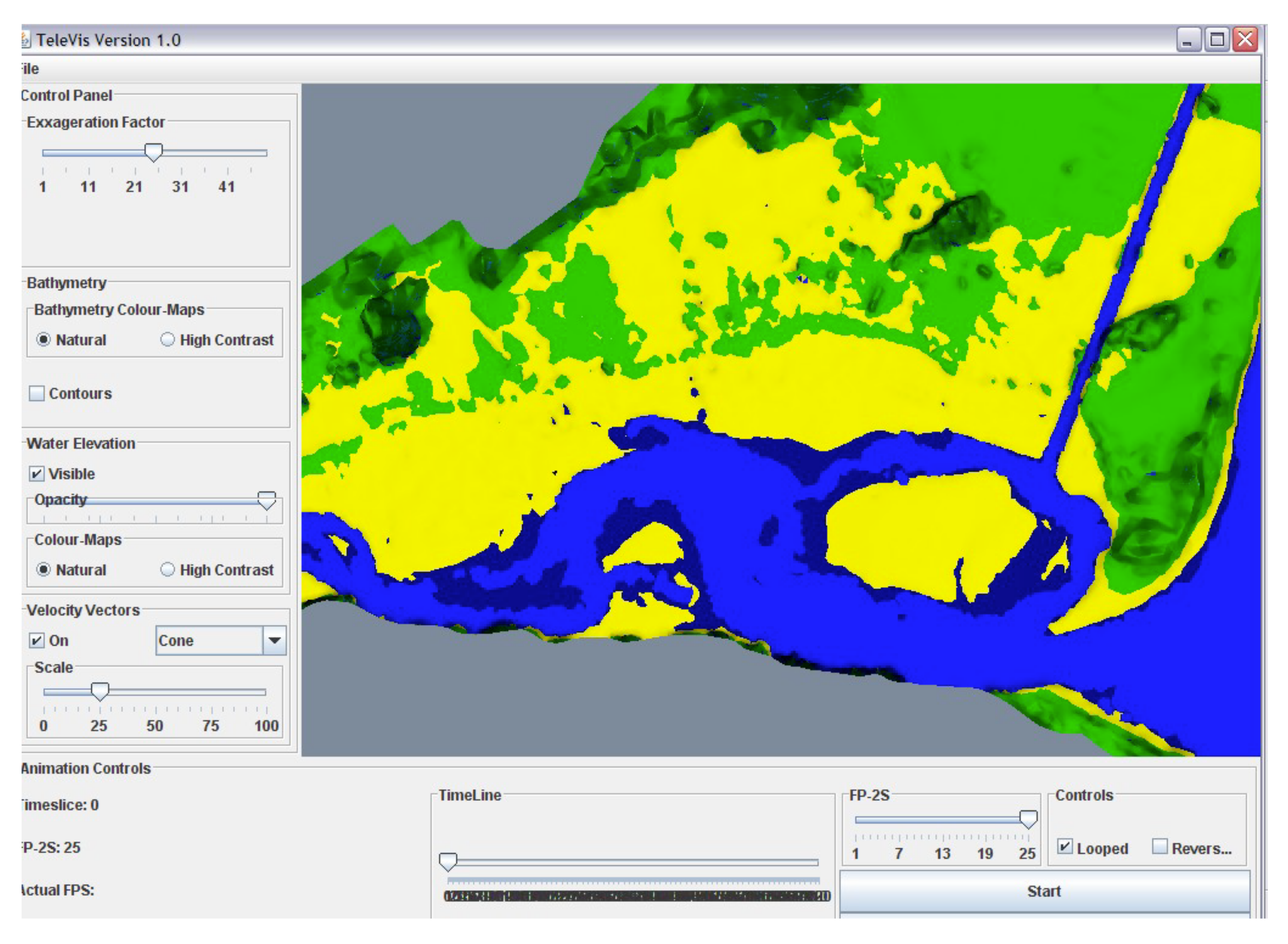
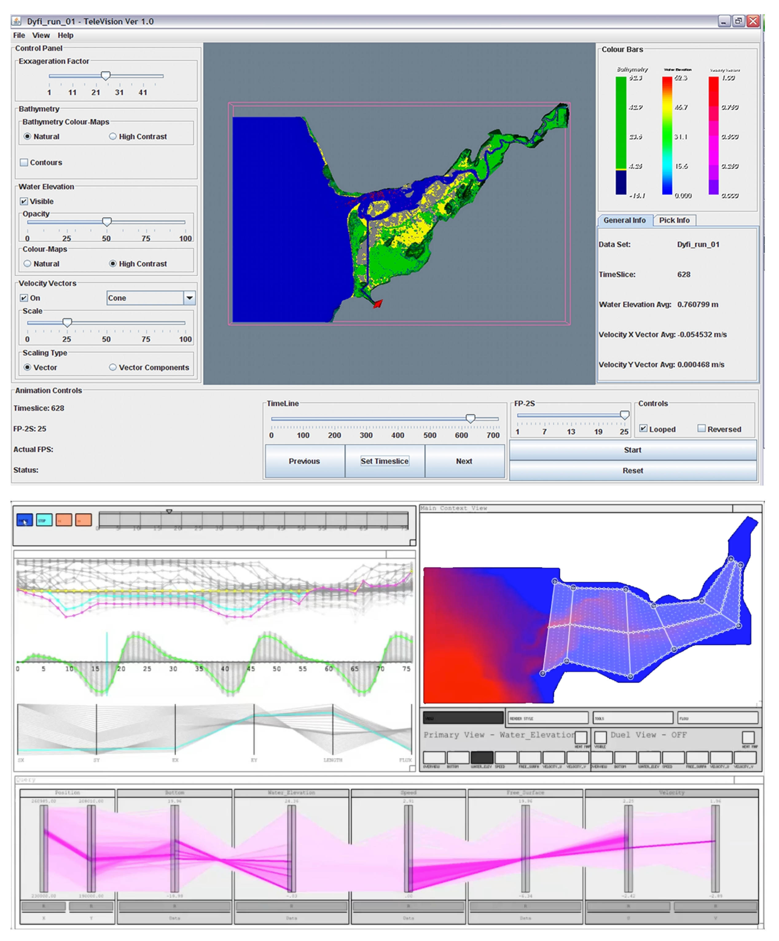
5.2. Case Study—Oceanographic Visualisation

In the second example, we focus on oceanographic data. Scientists wish to understand how sediment transports up an estuary, understand how sediment affects flooding, and over-topping events, where the sea comes over the sea walls and floods the land, is sometimes due to the movement of silt. These data are naturally three dimensional. The data contain positional information and eleven other parameters (including salinity, temperature, and velocity). Real-world samples and measurements are taken that feed into the TELEMAC mathematical models. Our visualisation tool (Vinca [71]), developed in the processing.org library and OpenGL [72], provides a coordinated multiple view approach to the visual exploration.
Figure 6 shows our three prototypes. The top two screenshots show our early prototypes with a single 3D view, with visual information annotated in the 3D space. However, through consultation, the oceanographers wanted to be able to take exact measurements, calculate the flux and quantity of water transported by the currents. The final prototype, therefore, integrated a 3D view coordinated with many other views, including tidal profiles, a parallel coordinate plot of all the data in the system and rose plots. Specific points can be selected and highlighted in x, y, z space, transepts across the estuary can be made in the 3D view to be matched with specific profile plots.

5.3. Case Study—Immersive Analytics

The synergy of visualisation and VR has been explored, for instance by Ware and Mitchel [73], who demonstrate the successful perception of node-link diagrams, of hundreds of nodes in VR, facilitated by stereo-viewing and motion cues. Donalek et al. [74] pinpoint the potential that VR can have in data analysis tasks when using immersive and collaborative data visualizations. Although abstract data are often displayed more effectively in 2D, emerging approaches that utilise novel interaction interfaces to present data-driven information, such as Digital Twins, entice the researchers interest for investigating the potential of visualising abstract, data-driven information in XR. Building upon these research efforts, the domain of immersive analytics (IA) [10] builds on the synergy of contemporary XR interfaces, visualization and data science. IA attempts to immerse users in their data by employing novel display and interface technologies for analytical reasoning and decision making, even with abstract data, with more advanced flavours introducing multi-sensory [66], and collaborative [9] setups.
In our work on VRIA [3,75], a web-based framework that enables the creation of IA experiences using Web technologies, we have observed the importance of 3D depiction for analytical tasks, which are supported by text, axes, filter handlers, etc., and from elements that enable contextualisation, such as visual embodiments of data-related objects [3], models and props. These depictions are broader than the traditional meaning of the term of multiple views, as they include many types of alternative views composited together. They demonstrate how 3D information has to be accompanied by supplementary, context-enhancing information. These elements not only enhance the user experience of participants in the immersive environment, but more importantly facilitate the analytical process, and often provide a degree of data viscerilisation [76]. For example, when depicting the service game of two tennis players (Figure 7, top), the court’s outline provides an indication of service patterns, the quality of the game, etc. However, such supportive elements need to take into account issues such occlusion of other graphical elements, that may be important for the comprehension of the visualisation.

5.4. Case Study—Handheld Situated Analytics

Another form of contextualisation is in the use of situated analytics, which are analytic systems that use mixed and augmented reality (MR/AR). Our approach, similar to VRIA, has focused on building such systems [14,77] with Web technologies, rather than game engines or smartphone-specific ecosystems. The SA experiences are accessible with any browser that supports WebXR, and employ frameworks such as AR.js, a port of the venerable ARTookit in the JavaScript ecosystem. In this scenario, a 3D depiction can be presented within physical space, close proximity to a referent [78], which can be a location (e.g., via GPS) [69], or a marker object or an object tracked via computer vision [77]. In this scenario, the 3D information is evidently not alone, as it is displayed in situ, or close to the referent, which in turn adds context and meaning to the depiction (see Figure 8). The main challenge of this approach is the semantic association to the referent, whether precise registration is needed (for AR, according to Azuma [79]) or not. For example, when the depiction replicates a physical object, such as standing stones on a field [69], it is may be advantageous to use real-time estimation to enhance the realism of said depiction, otherwise the semantic association with the location may diminish, due to its unrealistic appearance.
Much like in the case of IA, text, annotations, and interior projection planes, such as those shown in Figure 8, assist in sense-making process of the situated visualisations. However, in SA scenarios these must take into account issues such as occlusion of physical objects, in addition to computer-generated objects, as in the case of IA. In addition, there are SA challenges that stem from the referent’s physical environment, such as scaling of the visualisation when markers are used for registration, or their colour definition when the background or lighting conditions make the visualization harder to read.

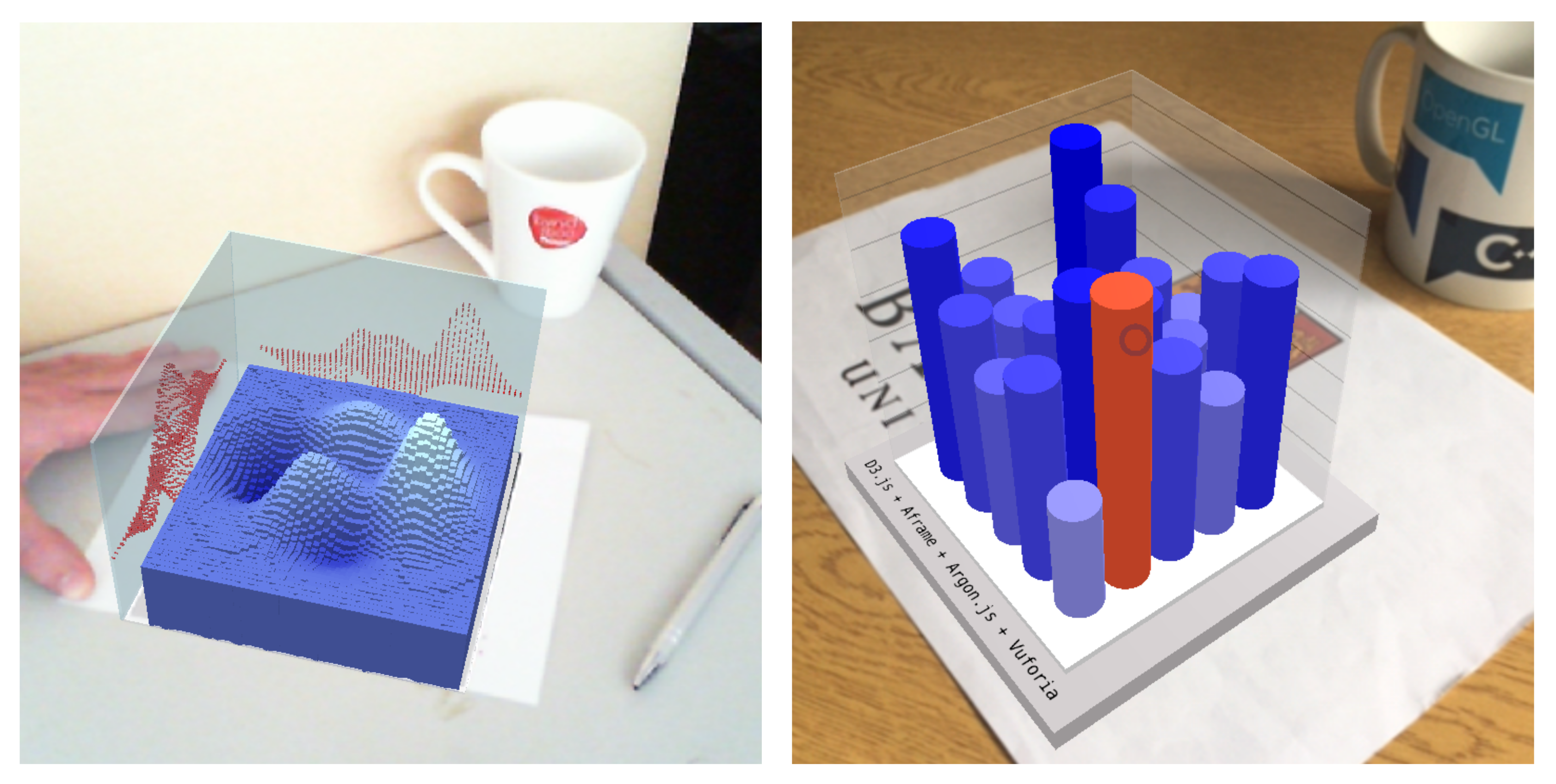
5.5. Case Study—Haptic Data Visualisation

Haptic data visualisation (HDV) has been explored in different scenarios, ranging from extensive use in medical visualisation [13,80], to less explored visualisation of abstract data [81], particularly for users with vision impairments and blindness [65,82]. For example, our HITPROTO [65] toolkit enables 3D HDVs to be prototyped quickly and allows users to interactively explore these three-dimensional space, using a haptic devise such as a Phantom Omni (see Figure 9). More importantly, HDVs can be used alongside other modalities, such as vision or sound, to increase the amount of variables being presented, or to complement some variables and consequently reinforce the presentation [13]. In that regard, HDVs do not highlight the need for complement visual depictions, per se, but demonstrate how effectively this can be done with other senses, beyond vision.

6. Summary and Lessons Learnt

It is evident from our work and the literature that 3D is required and used by many visualisation developers. There is a clear need to display information in a spatial way, which in turn allows us to become ‘immersed’ in data. 3D views provide many benefits over 2D. For instance, 3D views provide location information. Immersed views describe context. 3D models, mimicking reality, enable people to relate quickly to ideas. Tangible views are great to get users discussing about a topic, and can act as a interface device. However, 3D views bring challenges, such as information occlusion, position of the information (such as potentially being behind the user), and navigation. Consequently, there are many open research questions. What is the best way to overcome occlusion in 3D? Is it best to relate information to 2D views, or add windows in 3D? How should labels be included in 3D views (as a 2d screen projection, or in 3D)? What is the best way to add scales, legends, axis and so on in 3D? What is the best way to integrate tangible objects? Many 3D visualisations seem to be extensions of 2D depiction. Perhaps developers are clinging on traditional techniques, such as 2D scatter plots, 2D display devices, 3D volumes. How can we, as developers, think beyond transferring 2D ideas into 3D, and instead create novel immersive 3D environments, that integrate tangible, natural and fluid interaction? How can we create information-rich visualisations in 3D that tell many stories?
To start to help researchers address these questions, we summarise ten lessons learnt, drawing on our experiences and the literature. Within each lesson learnt, we reference literature surveys and models, to put the lessons into context of prior art.
  • Make a plan—perform a design study on your immersive visualisation before implementing it (e.g., through sketching). Developing data visualisation solutions is time consuming: whether they are immersive, contain 3D models or not. Developers need to make sure that their solutions are suitable, and fit for purpose. For any visualisation project, the developer should perform a deep analysis of the data, the purpose of the visualisation, and the way that it will be presented. It is far less time-consuming to sketch ideas, or develop a low-fidelity prototype, than it is to develop the full implementation and realise that it is not fit for purpose. Outline sketches help to confirm ideas, which can be evaluated with real users. We use the Five Design-Sheet (FdS) method that leads developers through early potential ideas, to three possible alternative ideas, and a final realisation concept [39,70]. The FdS has five panels (five areas of the sheet) dedicated to consider the design from five different viewpoints: from a summary of the idea (first panel), what it will look like (sketched in the Big Picture panel), how it operates (discussed in the Components panel), what is the main purpose (in the Parti panel of the FdS sheet), and the pros and cons of the idea (in the final panel).
  • Understand the purpose of the visualisation. All visualisations have a purpose. There is a reason to display the data and present it to the user. Perhaps the visualisation is to explain something, or could be to allow the user to explore the data and gain some new insights. It is imperative that the developer knows the purpose of the visualisation, otherwise they will not create the right solution. Munzner [83] expresses this in terms of “domain problem characterisation”, and the developer needs to ascertain if “the target audience would benefit from visualisation tool support”. Most methods, to understand the purpose, are qualitative. Ethnographic studies, interviews with potential users, can each help to clarify the situation and need. One method to clarify the purpose of the visualisation is to follow the five Ws method: Who, What, Why, When, Where and Wow [1]. Who is it for? What will it show? When will it be used? What is the purpose of the visualisation? What data will it show? Answering these questions is important for deciding how the visualisation solution will address the given problem, fit with the goals of the developers and users, and how it could be created.
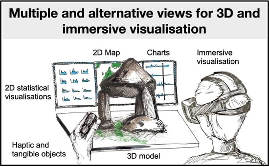
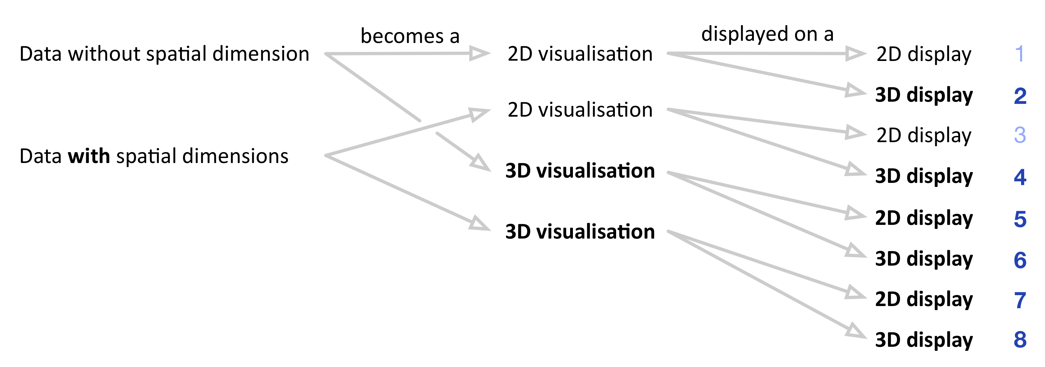
  • Display alternative views concurrently. Alternative views afford different tasks. There is much benefit in displaying different data tables, alternative visualisation types, and so on. This allows the user to see the information from different viewpoints. For example, from the heritage scenario (Section 5.1), we learn that each alternative 3D view helps with multivocality. The real standing stones in the field, or depicted virtually on a map, show the lay of the land. The rendered models show the deterioration of the heritage artifacts, which can be stored and compared with captured models of previous years. The physical models become tangible interfaces, and can be passed around a group to engender discussion. There are many possible approaches for achieving this. For instance, several views can be immersed inside one virtual environment, or different visualisations can be displayed across different devices. Gleicher et al. [33] express this idea in terms of views for comparison, while Roberts et al. [6] explore different meanings of the term ‘multiple views’, including view juxtoposition, side-by-side, and alternative views.
  • Link information (through interaction or visual effects to allow exploration). Although displayed in different views, the information still presents the same information. Therefore, with concurrent alternative views, it is important to link information between these complementary views. Linking can be through highlighting objects when they are selected, or coordinating other interactions between different views (such as scaling objects or concurrently filtering data). Many researchers have proposed different coordination models, for instance, North and Shneiderman [84], Roberts et al. [5] and Weaver [85] explain coordination models of interaction. However, typically, researchers have concentrated on side-by-side view displays; it is more complex to coordinate across display devices, and display modalities. Subsequently, it is much more challenging to coordinate interaction between a tangible object and virtual ones, without means to link them—then at least the view information needs to be consistent; with same colours, styles, appearances, etc. For instance, the Visfer system can transfer visual data across devices [86].
  • Address the view occlusion challenge. One of the challenges with 3D and especially immersive visualisations is when volumetric data are displayed, as it can be difficult to ‘see inside’. With volume visualisations, a 3D gel-like image is created. Transfer functions map different materials to colour and transparency [23]. Similar techniques can be used in immersive visualisation, where transparency could be used to see through objects to others. Alternative strategies could be to separate objects into smaller ones, or separate them from each other [46]. Other solutions include using shadows to help clarify what other viewing angles would look like (such as used by George et al. [53] in their cone trees 3D visualisation of hierarchical data). The survey paper by Elmqvist and Tsigas [87] provides a taxonomy of different design spaces, to mitigate and manage 3D occlusion.
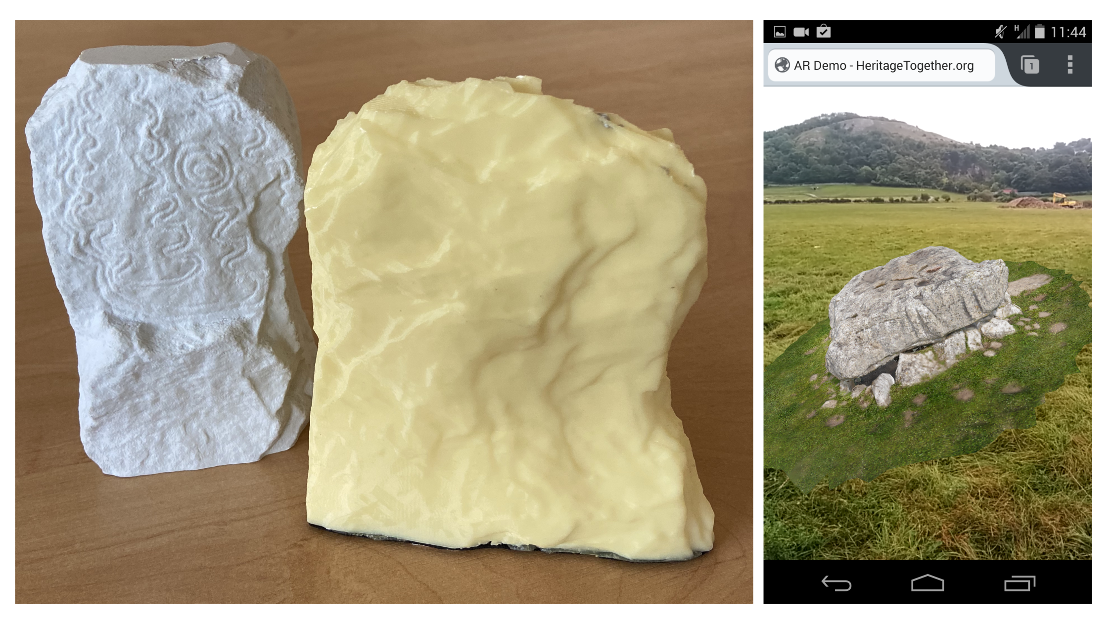
  • Integrate tangibles (for interaction, to elicit different stories, and inclusion). We used tangible visualisations in the oceanographic case study (Section 5.2) in three ways: as an interface device, and to engender conversation and multivocality, and as a way to add inclusion to the visualisation. The 3D printed models of the heritage standing stones became interaction devices that were placed on the tabletop display. By adding QR codes, we were able to present descriptive information about the standing stones. They become a ‘talking stick’, where a person can hold a tangible object, and talk about their experiences. The person with the tangible denotes the speaker, and the object is passed around the group to share interpretations and accrue multivocal stories. Finally, we used haptics and tangibles to visualise the information for blind and partially sighted users [65]. While no single comprehensive model exists, there are several relevant survey papers: Paneels et al. [13] review designs for haptic data visualisation, and Jensen investigates physical and tangible information visualisation [88].
  • Make it is clear where objects are located. Particularly if the user is immersed inside visual information, it is important for them to be able to navigate and see all the information. In this case, make sure the user is aware that some data have been visualised and displayed behind them. This could be achieved through navigation, allowing the user to zoom out to see everything, or allow them to turn around, perhaps add hints or arrows to explain that their is more information to the left or right. Leveraging proprieception, and awareness that the user would have of themselves in the space, users can place and observe visualisation objects that surround them [89], and understand how to select the objects [90].
  • Put the visualisation ‘in context’. If the context of the data is not understood, then the data presentation could be meaningless, or hard to understand. One of the challenges with 3D is that it can be difficult to provide contextual information. For instance, in 3D it not clear where to locate 3D titles, text annotations, photographs that explain the context, and so on. In traditional 2D visualisations, contextual information is achieved by coordinating views. Subsequently, dual view displays are popular; where one view provides the context and the other view provides detail [33]. In this way, the detailed information is shown in context, and the user can use the overview display to help them navigate to a specific location. How do we display context in immersive visualisation? There are potentially many solutions. For instance, floating descriptive text, popup information, audio descriptions, external descriptions presented before someone becomes immersed, or perhaps displaying information on a movable menu attached to their hand (e.g., view on a bat [6]). From the oceanographic case study (Section 5.2), we understand that quantitative information is better in 2D, but 3D is required to give context, positional information and allow users to select specific locations. It is easier to select a transept across the estuary in the 3D map view, than on the alternative visualisations. From our work in immersive analytics (Section 5.3), we understand the power of visual embodiments, to allow people to innately understand the context of the data. If the 3D view is modelled to look like the real-world (that it represents) then users can quickly understand the context of the information. We also learn that without suitable contextual information (or contextual scales, legends and other meta-information) the data presentation can be meaningless. Because of the growth in this area, many phrases are used, including: context aware, situated, in situ, embodied and embedded visualisations. While no single reference model exists, Bressa et al. [91], for instance, classify the different techniques and explain that solutions consider the space they are placed within, often include a temporal variables or are time sensitive, embedded into everyday activities and put emphasis on the community of people who will create or use them.
  • Develop using inter-operable tools and platforms. Developers have been making it easier to create 3D and immersive visualisations (see Section 4) by relying on inter-operable tools, and synthesising capabilities from a wide range of research domains. For example, computer vision-based tools such as AR.js (based on ARTookit [92]) of Vuforia can be used to provide marker/image-based tracking to web-based augmented reality applications [14,77] (Section 5.4), through integration with the HTML DOM. Our HITPROTO toolkit was developed to help people create haptic data visualisations [65], using a combination of standards such as XML, OpenGL and X3D, through the H3DAPI (h3dapi.org). Likewise, our latest immersive analytics prototyping framework, VRIA [3] relies heavily on Web-based standards, being built with WebXR, A-Frame, React and used ’standardised’ features such as a declarative grammar. The use of standards allows developers to combine capabilities, and therefore complement visual depictions with capabilities that enhance the comprehension and use fullness of said depictions.
  • Incorporate multiple senses. With virtual and immersive visualisations, there are many opportunities to incorporate different senses. Different sensory modalities afford different interaction methods, and help the user to understand the information from different viewpoints. In the HITPROTO work Section 5.4, we developed a haptic data visualisation (HDV) system [13], to visualise data through haptics. However, other sensory modalities could be used such as smell/olfaction [15]. While no single reference model exists, several researchers promote a more integrated approach [59], encourage users to think ‘beyond the desktop’ [9,60] and propose an interaction model [8]. By seeing, hearing, touching and smelling within the virtual environment, it is possible to feel more immersed in the experience.

7. Conclusions

The challenge for developers is to consider how to create information-rich visualisations that are clear to understand and navigate. Let us imagine looking through an archive and finding an old black-and-white photograph of an early computer gamer. The image tells many stories. The fact that it is black and white tells us that it was probably taken at a time before modern cameras. The curved cathode-ray-tube screen tells us something about the resolution of computers of the day. The clothes of the operator tells us about their working environment. How can we, as developers, create 3D visualisations that contain such detailed information? How can we create visualisations that include subtle cues to tell the story of the data? How can we use shadows, lights, dust, fog, and models themselves that express detailed stories that implicitly express many alternative stories as the black-and-white photo did?
Developers should think long and hard how to overcome some of the challenges of the third dimension. These include problems of depth perception in 3D, items being occluded, issues of how to relate information between spatial3D views and other views (possibly 2D views), and challenges of displaying quantitative values and including relevant scales and legends. For instance, placing a node-link diagram in 3D allows people to view the spatial nature of the information, but without any labels it is not clear what that information displays. A visualisation of bar charts augmented on a video feed may provide suitable contextual information, but if there are no axes or scales, then values cannot be understood. Indeed, what is clear is that while 3D is used (as one view) within multiple view systems, it is not clear how to add detailed quantitative information to 3D worlds, when the 3D world is the primary view (e.g., with immersive analytics).
In conclusion, there is much importance to showing 3D, but 3D visualisations need to be shown with other types of views. Through these methods, users gain a richer understanding of the information through alternative presentations and multiple views. Visualisation developers should create systems that enable many stories and different viewpoints to naturally be understood from the information presentation. We encourage designers of 3D visualisation systems to think beyond 2D, and rise to the opportunities that 3D displays, immersive environments, and natural interfaces bring to visualisation.

Author Contributions

Conceptualization, J.C.R. and P.D.R.; methodology, J.C.R. and P.D.R.; software, P.W.S.B. and P.D.R.; validation, J.C.R., P.W.S.B. and P.D.R.; formal analysis, J.C.R., P.W.S.B. and P.D.R.; investigation, J.C.R., P.W.S.B. and P.D.R.; resources, J.C.R. and P.D.R.; data curation, J.C.R., P.W.S.B. and P.D.R.; writing—original draft preparation, J.C.R. and P.D.R.; writing—review and editing, J.C.R. and P.D.R.; visualization, J.C.R., P.W.S.B. and P.D.R.; supervision, J.C.R. and P.D.R.; project administration, J.C.R. and P.D.R.; funding acquisition, J.C.R. and P.D.R.; All authors have read and agreed to the published version of the manuscript.

Funding

Different case studies received funding. We acknowledge the UK Arts and Humanities Research Council (AHRC) for funding heritageTogether.org (http://heritageTogether.org) (grant AH/L007916/1 (https://gtr.ukri.org/projects?ref=AH%2FL007916%2F1)). Research for VRIA (Section 5.3) was partly undertaken at Chester University, and in collaboration with Nigel John. HITPROTO was a collaboration between Bangor University and University of Kent, with Sabrina Panëels and Peter Rodgers.

Institutional Review Board Statement

This study was conducted according to the research code of conduct from Bangor University.

Informed Consent Statement

Not applicable.

Data Availability Statement

The data presented in this study are available in article.

Acknowledgments

We acknowledge the reviewers for their comments and suggestions to improve the paper. We acknowledge researchers and collaborators: Joseph Mearman who helped with scanning of heritage artefacts and contributed to earlier discussions of a previously published paper that led to this article. Hayder Al-Maneea for work on multiple view analysis. James Jackson who contributed to the development of the handheld augmented reality prototypes. Collaborators in oceanography, especially Richard George, Peter Robins and Alan Davies. Finally collaborators on the heritagetogether.org team, include Ray Karl, Katharina Möller, Helen C. Miles, Bernard Tiddeman, Fred Labrosse, Emily Trobe-Bateman, Ben Edwards.

Conflicts of Interest

The authors declare no conflict of interest.

Abbreviations

The following abbreviations are used in this manuscript:
3DThree Dimensions
ARAugmented Reality
FdSFive-Design Sheets
IAImmersive Analytics
MRMixed Reality
Multiple Coordinated ViewsMultiple Coordinated Views
VRIAVirtual Reality Immersive Analytics (tool)
XRImmersive Reality, where X = Augmented, Mixed or Virtual

References

  1. Roberts, J.C.; Mearman, J.W.; Butcher, P.W.S.; Al-Maneea, H.M.; Ritsos, P.D. 3D Visualisations Should Not be Displayed Alone—Encouraging a Need for Multivocality in Visualisation. In Computer Graphics and Visual Computing (CGVC); Xu, K., Turner, M., Eds.; The Eurographics Association: Geneve, Switzerland, 2021. [Google Scholar] [CrossRef]
  2. Cutting, J.E.; Vishton, P.M. Perceiving layout and knowing distances: The integration, relative potency, and contextual use of different information about depth. In Perception of Space and Motion; Elsevier: Amsterdam, The Netherlands, 1995; pp. 69–117. [Google Scholar] [CrossRef]
  3. Butcher, P.W.; John, N.W.; Ritsos, P.D. VRIA: A Web-based Framework for Creating Immersive Analytics Experiences. IEEE Trans. Vis. Comput. Graph. 2021, 27, 3213–3225. [Google Scholar] [CrossRef] [PubMed] [Green Version]
  4. Dixon, S.; Fitzhugh, E.; Aleva, D. Human factors guidelines for applications of 3D perspectives: A literature review. In Display Technologies and Applications for Defense, Security, and Avionics III; Thomas, J.T., Desjardins, D.D., Eds.; International Society for Optics and Photonics, SPIE: Bellingham, WA, USA, 2009; Volume 7327, pp. 172–182. [Google Scholar]
  5. Roberts, J.C. State of the Art: Coordinated & Multiple Views in Exploratory Visualization. In Proceedings of the Fifth International Conference on Coordinated and Multiple Views in Exploratory Visualization (CMV 2007), Zurich, Switzerland, 2 July 2007; Andrienko, G., Roberts, J.C., Weaver, C., Eds.; IEEE Computer Society Press: Los Alamitos, CA, USA, 2007; pp. 61–71. [Google Scholar] [CrossRef] [Green Version]
  6. Roberts, J.C.; Al-maneea, H.; Butcher, P.W.S.; Lew, R.; Rees, G.; Sharma, N.; Frankenberg-Garcia, A. Multiple Views: Different meanings and collocated words. Comp. Graph. Forum 2019, 38, 79–93. [Google Scholar] [CrossRef]
  7. Mehrabi, M.; Peek, E.; Wuensche, B.; Lutteroth, C. Making 3D work: A classification of visual depth cues, 3D display technologies and their applications. AUIC2013 2013, 139, 91–100. [Google Scholar]
  8. Jansen, Y.; Dragicevic, P. An Interaction Model for Visualizations Beyond The Desktop. IEEE Trans. Vis. Comp. Graph. 2013, 19, 2396–2405. [Google Scholar] [CrossRef] [PubMed] [Green Version]
  9. Roberts, J.C.; Ritsos, P.D.; Badam, S.K.; Brodbeck, D.; Kennedy, J.; Elmqvist, N. Visualization beyond the Desktop–the Next Big Thing. IEEE Comput. Graph. Appl. 2014, 34, 26–34. [Google Scholar] [CrossRef] [PubMed] [Green Version]
  10. Marriott, K.; Schreiber, F.; Dwyer, T.; Klein, K.; Riche, N.H.; Itoh, T.; Stuerzlinger, W.; Thomas, B.H. Immersive Analytics; Springer: Berlin/Heidelberg, Germany, 2018; Volume 11190. [Google Scholar]
  11. Büschel, W.; Chen, J.; Dachselt, R.; Drucker, S.; Dwyer, T.; Görg, C.; Isenberg, T.; Kerren, A.; North, C.; Stuerzlinger, W. Interaction for immersive analytics. In Immersive Analytics; Springer: Berlin, Germany, 2018; pp. 95–138. [Google Scholar]
  12. McCormack, J.; Roberts, J.C.; Bach, B.; Freitas, C.D.S.; Itoh, T.; Hurter, C.; Marriott, K. Multisensory immersive analytics. In Immersive Analytics; Springer: Berlin/Heidelberg, Germany, 2018; pp. 57–94. [Google Scholar]
  13. Panëels, S.; Roberts, J.C. Review of Designs for Haptic Data Visualization. IEEE Trans. Haptics 2010, 3, 119–137. [Google Scholar] [CrossRef] [Green Version]
  14. Ritsos, P.D.; Jackson, J.; Roberts, J.C. Web-based Immersive Analytics in Handheld Augmented Reality. In Proceedings of the Posters IEEE VIS 2017, Phoenix, AZ, USA, 3 October 2017. [Google Scholar]
  15. Patnaik, B.; Batch, A.; Elmqvist, N. Information Olfactation: Harnessing Scent to Convey Data. IEEE Trans. Vis. Comput. Graph. 2019, 25, 726–736. [Google Scholar] [CrossRef]
  16. Da Vinci, L. Da Vinci Notebooks; Profile Books: London, UK, 2005. [Google Scholar]
  17. Spence, R. Information Visualization, an Introduction; Springer: Berlin/Heidelberg, Germany, 2014. [Google Scholar] [CrossRef] [Green Version]
  18. Straßer, W. Zukünftige Arbeiten. Schnelle Kurven- und Flächendarstellung auf grafischen Sichtgeräten [Fast Curve and Surface Display on Graphic Display Devices]; Technical Report; Technische Universität: Berlin, Germany, 1974. (In German) [Google Scholar]
  19. Catmull, E.E. A subdivision Algorithm for Computer Display of Curved Surfaces; Technical Report; The University of Utah: Salt Lake City, UT, USA, 1974. [Google Scholar]
  20. Kajiya, J.T. The rendering equation. In Proceedings of the 13th Annual Conference on Computer Graphics and Interactive Techniques, Dallas, TX, USA, 18–22 August 1986; pp. 143–150. [Google Scholar]
  21. Glassner, A.S. An Introduction to Ray Tracing; Morgan Kaufmann: Burlington, MA, USA, 1989. [Google Scholar]
  22. Lorensen, W.E.; Cline, H.E. Marching cubes: A high resolution 3D surface construction algorithm. ACM SIGGRAPH Comput. Graph. 1987, 21, 163–169. [Google Scholar] [CrossRef]
  23. Drebin, R.A.; Carpenter, L.; Hanrahan, P. Volume rendering. ACM SIGGRAPH Comput. Graph. 1988, 22, 65–74. [Google Scholar] [CrossRef]
  24. Newman, T.S.; Yi, H. A survey of the marching cubes algorithm. Comput. Graph. 2006, 30, 854–879. [Google Scholar] [CrossRef]
  25. Cameron, G. Modular Visualization Environments: Past, Present, and Future. ACM SIGGRAPH Comput. Graph. 1995, 29, 3–4. [Google Scholar] [CrossRef]
  26. Upson, C.; Faulhaber, T.A.; Kamins, D.; Laidlaw, D.; Schlegel, D.; Vroom, J.; Gurwitz, R.; Van Dam, A. The application visualization system: A computational environment for scientific visualization. IEEE Comput. Graph. Appl. 1989, 9, 30–42. [Google Scholar] [CrossRef]
  27. Cruz-Neira, C.; Sandin, D.J.; DeFanti, T.A.; Kenyon, R.V.; Hart, J.C. The CAVE: Audio Visual Experience Automatic Virtual Environment. Commun. ACM 1992, 35, 64–72. [Google Scholar] [CrossRef]
  28. Gillilan, R.E.; Wood, F. Visualization, Virtual Reality, and Animation within the Data Flow Model of Computing. ACM SIGGRAPH Comput. Graph. 1995, 29, 55–58. [Google Scholar] [CrossRef]
  29. Schroeder, W.J.; Avila, L.S.; Hoffman, W. Visualizing with VTK: A tutorial. IEEE Comput. Graph. Appl. 2000, 20, 20–27. [Google Scholar] [CrossRef] [Green Version]
  30. Bostock, M.; Ogievetsky, V.; Heer, J. D3 Data-Driven Documents. IEEE Trans. Vis. Comput. Graph. 2011, 17, 2301–2309. [Google Scholar] [CrossRef]
  31. Lai, Z.; Hu, Y.C.; Cui, Y.; Sun, L.; Dai, N.; Lee, H.S. Furion: Engineering High-Quality Immersive Virtual Reality on Today’s Mobile Devices. IEEE Trans. Mob. Comput. 2020, 19, 1586–1602. [Google Scholar] [CrossRef]
  32. Haber, R.B.; McNabb, D.A. Visualization idioms: A conceptual model for scientific visualization systems. In Visualization in Scientific Computing; IEEE Computer Society Press: Los Alamitos, CA, USA, 1990; pp. 74–93. [Google Scholar]
  33. Gleicher, M.; Albers, D.; Walker, R.; Jusufi, I.; Hansen, C.D.; Roberts, J.C. Visual Comparison for Information Visualization. Inf. Vis. 2011, 10, 289–309. [Google Scholar] [CrossRef]
  34. Al-maneea, H.M.; Roberts, J.C. Towards quantifying multiple view layouts in visualisation as seen from research publications. In Proceedings of the 2019 IEEE Visualization Conference (VIS), Vancouver, BC, Canada, 20–25 October 2019. [Google Scholar]
  35. Chen, X.; Zeng, W.; Lin, Y.; AI-maneea, H.M.; Roberts, J.; Chang, R. Composition and Configuration Patterns in Multiple-View Visualizations. IEEE Trans. Vis. Comput. Graph. 2021, 27, 1514–1524. [Google Scholar] [CrossRef]
  36. Shneiderman, B. The eyes have it: A task by data type taxonomy for information visualizations. In Proceedings of the 1996 IEEE Symposium on Visual Languages, Boulder, CO, USA, 3–6 September 1996; pp. 336–343. [Google Scholar] [CrossRef] [Green Version]
  37. Shneiderman, B. Why Not Make Interfaces Better Than 3D Reality? IEEE Comput. Graph. Appl. 2003, 23, 12–15. [Google Scholar] [CrossRef] [Green Version]
  38. Williams, B.; Ritsos, P.D.; Headleand, C. Virtual Forestry Generation: Evaluating Models for Tree Placement in Games. Computers 2020, 9, 20. [Google Scholar] [CrossRef] [Green Version]
  39. Roberts, J.C.; Headleand, C.J.; Ritsos, P.D. Five Design-Sheets: Creative Design and Sketching for Computing and Visualisation, 1st ed.; Springer International Publishing AG: Cham, Switzerland, 2017. [Google Scholar]
  40. Tufte, E.R. The Visual Display of Quantitative Information; Graphics Press: Cheshire, CT, USA, 1983; Volume 2. [Google Scholar]
  41. Borgo, R.; Abdul-Rahman, A.; Mohamed, F.; Grant, P.; Reppa, I.; Floridi, L.; Chen, M. An Empirical Study on Using Visual Embellishments in Visualization. IEEE Trans. Vis. Comput. Graph. 2012, 18, 2759–2768. [Google Scholar] [CrossRef] [PubMed]
  42. Roberts, J.C.; Ritsos, P.D.; Jackson, J.R.; Headleand, C. The Explanatory Visualization Framework: An Active Learning Framework for Teaching Creative Computing Using Explanatory Visualizations. IEEE Trans. Vis. Comput. Graph. 2018, 24, 791–801. [Google Scholar] [CrossRef] [PubMed] [Green Version]
  43. Roberts, J.C.; Butcher, P.; Sherlock, A.; Nason, S. Explanatory Journeys: Visualising to Understand and Explain Administrative Justice Paths of Redress. IEEE Trans. Vis. Comput. Graph. 2022, 28, 518–528. [Google Scholar] [CrossRef] [PubMed]
  44. Leung, Y.K.; Apperley, M.D. A Review and Taxonomy of Distortion-Oriented Presentation Techniques. ACM Trans. Comput. Hum. Interact. 1994, 1, 126–160. [Google Scholar] [CrossRef]
  45. Mitchell, K.; Kennedy, J. The perspective tunnel: An inside view on smoothly integrating detail and context. In Proceedings of the Visualization in Scientific Computing ’97: Proceedings of the Eurographics Workshop, Boulogne-sur-Mer, France, 28–30 April 1997; Lefer, W., Grave, M., Eds.; Springer: Berlin/Heidelberg, Germany, 1997. [Google Scholar]
  46. Roberts, J.C. Regular Spatial Separation for Exploratory Visualization. In Visualization and Data Analysis; Erbacher, R., Chen, P., Grohn, M., Roberts, J., Wittenbrink, C., Eds.; Electronic Imaging Symposium; IS&T/SPIE: San Jose, CA, USA, 2002; Volume 4665, pp. 182–196. [Google Scholar] [CrossRef] [Green Version]
  47. Feiner, S.K.; Beshers, C. Worlds within Worlds: Metaphors for Exploring n-Dimensional Virtual Worlds. In Proceedings of the 3rd Annual ACM SIGGRAPH Symposium on User Interface Software and Technology, Snowbird, UT, USA, 3–5 October 1990; Association for Computing Machinery: New York, NY, USA, 1990; pp. 76–83. [Google Scholar] [CrossRef]
  48. Robertson, G.G.; Mackinlay, J.D.; Card, S.K. Information Visualization Using 3D Interactive Animation. In Proceedings of the SIGCHI Conference on Human Factors in Computing Systems, Toronto, ON, Canada, 26 April–1 May 2014; Association for Computing Machinery: New York, NY, USA, 1991; pp. 461–462. [Google Scholar] [CrossRef]
  49. Cockburn, A.; McKenzie, B. 3D or Not 3D?: Evaluating the Effect of the Third Dimension in a Document Management System. In Proceedings of the CHI Conference on Human Factors in Computing Systems (ACM CHI 2001), New York, NY, USA, 31 March–5 April 2001; ACM: New York, NY, USA, 2001; pp. 434–441. [Google Scholar] [CrossRef]
  50. Cockburn, A.; McKenzie, B. Evaluating the Effectiveness of Spatial Memory in 2D and 3D Physical and Virtual Environments. In Proceedings of the CHI Conference on Human Factors in Computing Systems (ACM CHI 2002), Minesotta, MN, USA, 20–25 April 2002; ACM: New York, NY, USA, 2002; pp. 203–210. [Google Scholar] [CrossRef] [Green Version]
  51. Cockburn, A. Revisiting 2D vs 3D Implications on Spatial Memory. In Proc Australasian User Interface—Volume 28; Australian Computer Society, Inc.: Darlinghurst, Australia, 2004; pp. 25–31. [Google Scholar]
  52. Roberts, J.C.; Yang, J.; Kohlbacher, O.; Ward, M.O.; Zhou, M.X. Novel visual metaphors for multivariate networks. In Multivariate Network Visualization; Springer: Berlin/Heidelberg, Germany, 2014; pp. 127–150. [Google Scholar]
  53. Robertson, G.G.; Mackinlay, J.D.; Card, S.K. Cone Trees: Animated 3D Visualizations of Hierarchical Information. In Proceedings of the SIGCHI ’91, New Orleands, LO, USA, 27 April–2 May 1991; ACM: New York, NY, USA, 1991; pp. 189–194. [Google Scholar] [CrossRef]
  54. Balzer, M.; Deussen, O. Hierarchy Based 3D Visualization of Large Software Structures. In Proceedings of the Visualization, Austin, TX, USA, 11–15 October 2004; p. 4. [Google Scholar] [CrossRef] [Green Version]
  55. Dachselt, R.; Hübner, A. Three-dimensional menus: A survey and taxonomy. Comput. Graph. 2007, 31, 53–65. [Google Scholar] [CrossRef]
  56. Teyseyre, A.; Campo, M. An Overview of 3D Software Visualization. IEEE Trans. Vis. Comput. Graph. 2009, 15, 87–105. [Google Scholar] [CrossRef] [PubMed]
  57. Roberts, J.C.; Joseph, W.; Mearman, A.W. Harnessing photogrammetry to create alternative views of Heritage. In Proceedings of the 12th Conference on Culture and Computer Science—Reality and Virtuality, Berlin, Germany, 22–23 May 2014; Culture and Computer Science. Franken-Wendelstorf, R., Lindinger, E., Sieck, J., Eds.; Verlag Werner Hülsbusch: Regensburg, Germany, 2014; pp. 49–62. [Google Scholar]
  58. Ware, C.; Mitchell, P. Reevaluating Stereo and Motion Cues for Visualizing Graphs in Three Dimensions. In Proceedings of the 2nd Symposium on Applied Perception in Graphics and Visualization, New York, NY, USA, 26–28 August 2005; Association for Computing Machinery: New York, NY, USA, 2005; pp. 51–58. [Google Scholar] [CrossRef]
  59. Roberts, J.C.; Walker, R. Using All Our Senses: The need for a Unified Theoretical Approach to Multi-sensory Information Visualization. In Proceedings of the IEEE VisWeek 2010 Workshop: The Role of Theory in Information Visualization, Salt Lake City, UT, USA, 25 October 2010. [Google Scholar]
  60. Fuchs, H. Beyond the Desktop Metaphor: Toward More Effective Display, Interaction, and Telecollaboration in the Office of the Future via a Multitude of Sensors and Displays. In Proceedings of the Advanced Multimedia Content Processing; Springer: London, UK, 1999; pp. 30–43. [Google Scholar]
  61. Lee, B.; Isenberg, P.; Riche, N.; Carpendale, S. Beyond Mouse and Keyboard: Expanding Design Considerations for Information Visualization Interactions. IEEE Trans. Vis. Comput. Graph. 2012, 18, 2689–2698. [Google Scholar] [CrossRef] [Green Version]
  62. Elmqvist, N.; Moere, A.V.; Jetter, H.C.; Cernea, D.; Reiterer, H.; Jankun-Kelly, T. Fluid interaction for information visualization. Inf. Vis. 2011, 10, 327–340. [Google Scholar] [CrossRef]
  63. Spindler, M.; Tominski, C.; Schumann, H.; Dachselt, R. Tangible Views for Information Visualization. In Proceedings of the Interactive Tabletops and Surfaces, Saarbrücken, Germany, 7–10 November 2010; ACM: New York, NY, USA, 2010; pp. 157–166. [Google Scholar] [CrossRef]
  64. Kruszyński, K.; van Liere, R. Tangible props for scientific visualization: Concept, requirements, application. Virtual Real. 2009, 13, 235–244. [Google Scholar] [CrossRef]
  65. Panëels, S.A.; Ritsos, P.D.; Rodgers, P.J.; Roberts, J.C. Special Section on Touching the 3rd Dimension: Prototyping 3D Haptic Data Visualizations. Comput. Graph. 2013, 37, 179–192. [Google Scholar] [CrossRef]
  66. Batch, A.; Patnaik, B.; Akazue, M.; Elmqvist, N. Scents and Sensibility: Evaluating Information Olfactation. In Proceedings of the CHI Conference on Human Factors in Computing Systems (ACM CHI 2020), Honolulu, HI, USA, 25–30 April 2020; Association for Computing Machinery: New York, NY, USA, 2020; pp. 1–14. [Google Scholar] [CrossRef]
  67. Miles, H.C.; Wilson, A.T.; Labrosse, F.; Tiddeman, B.; Roberts, J.C. A Community-Built Virtual Heritage Collection. In Transactions on Computational Science XXVI—Volume 9550; Springer: Berlin/Heidelberg, Germany, 2015; pp. 91–110. [Google Scholar] [CrossRef] [Green Version]
  68. Griffiths, S.; Edwards, B.; Wilson, A.; Labrosse, F.; Miles, H.; Roberts, J.; Tiddeman, B. Crowd-sourcing archaeological research: HeritageTogether digital public archaeology in practice. Internet Archaeol. 2015, 40. [Google Scholar] [CrossRef]
  69. Miles, H.C.; Wilson, A.T.; Labrosse, F.; Tiddeman, B.; Griffiths, S.; Edwards, B.; Ritsos, P.D.; Mearman, J.W.; Möller, K.; Karl, R.; et al. Alternative Representations of 3D-Reconstructed Heritage Data. J. Comput. Cult. Herit. 2015, 9. [Google Scholar] [CrossRef] [Green Version]
  70. Roberts, J.C.; Headleand, C.; Ritsos, P.D. Sketching Designs Using the Five Design-Sheet Methodology. IEEE Trans. Vis. Comput. Graph. 2016, 22, 419–428. [Google Scholar] [CrossRef] [PubMed] [Green Version]
  71. George, R.L.; Robins, P.E.; Davies, A.G.; Ritsos, P.D.; Roberts, J.C. Interactive visual analytics of hydrodynamic flux for the coastal zone. Environ. Earth Sci. 2014, 1–14. [Google Scholar] [CrossRef]
  72. George, R.L.S.F.; Roberts, J.C.; Davies, A.G. Using Processing to Develop iCove: A Tool for Interactive Coastal Oceanographic Visualization. In Theory and Practice of Computer Graphics; Collomosse, J., Grimstead, I., Eds.; The Eurographics Association: Geneve, Switzerland, 2010. [Google Scholar] [CrossRef]
  73. Ware, C.; Mitchell, P. Visualizing Graphs in Three Dimensions. ACM Trans. Appl. Percept. 2008, 5, 1–15. [Google Scholar] [CrossRef] [Green Version]
  74. Donalek, C.; Djorgovski, S.G.; Cioc, A.; Wang, A.; Zhang, J.; Lawler, E.; Yeh, S.; Mahabal, A.; Graham, M.; Drake, A.; et al. Immersive and collaborative data visualization using virtual reality platforms. In Proceedings of the IEEE International Conference on Big Data, Washington, DC, USA, 27–30 October 2014; pp. 609–614. [Google Scholar] [CrossRef] [Green Version]
  75. Butcher, P.W.; John, N.W.; Ritsos, P.D. VRIA—A Framework for Immersive Analytics on the Web. In Proceedings of the Extended Abstracts of the CHI Conference on Human Factors in Computing Systems (ACM CHI 2019), Glasgow, UK, 4–9 May 2019. [Google Scholar] [CrossRef] [Green Version]
  76. Lee, B.; Brown, D.; Lee, B.; Hurter, C.; Drucker, S.; Dwyer, T. Data Visceralization: Enabling Deeper Understanding of Data Using Virtual Reality. IEEE Trans. Vis. Comput. Graph. 2021, 27, 1095–1105. [Google Scholar] [CrossRef]
  77. Ritsos, P.D.; Mearman, J.; Jackson, J.R.; Roberts, J.C. Synthetic Visualizations in Web-based Mixed Reality. In Immersive Analytics: Exploring Future Visualization and Interaction Technologies for Data Analytics Workshop; Bach, B., Cordeil, M., Dwyer, T., Lee, B., Saket, B., Endert, A., Collins, C., Carpendale, S., Eds.; IEEE: Piscataway, NJ, USA, 2017. [Google Scholar]
  78. Willett, W.; Jansen, Y.; Dragicevic, P. Embedded Data Representations. IEEE Trans. Vis. Comput. Graph. 2017, 23, 461–470. [Google Scholar] [CrossRef] [Green Version]
  79. Azuma, R.T. A Survey of Augmented Reality. Presence Teleoper. Virt. Environ. 1997, 6, 355–385. [Google Scholar] [CrossRef]
  80. Coles, T.R.; Meglan, D.; John, N.W. The Role of Haptics in Medical Training Simulators: A Survey of the State of the Art. IEEE Trans. Haptics 2011, 4, 51–66. [Google Scholar] [CrossRef]
  81. Drogemuller, A.; Cunningham, A.; Walsh, J.A.; Baumeister, J.; Smith, R.T.; Thomas, B.H. Haptic and Visual Comprehension of a 2D Graph Layout Through Physicalisation. In Proceedings of the 2021 CHI Conference on Human Factors in Computing Systems, Yokohama, Japan, 8–13 May 2021; Association for Computing Machinery: New York, NY, USA, 2021. [Google Scholar] [CrossRef]
  82. Yu, W.; Ramloll, R.; Brewster, S. Haptic graphs for blind computer users. In Haptic Human-Computer Interaction; Brewster, S., Murray-Smith, R., Eds.; Springer: Berlin/Heidelberg, Germany, 2001; pp. 41–51. [Google Scholar]
  83. Munzner, T. A Nested Process Model for Visualization Design and Validation. IEEE Trans. Vis. Comp. Graph. 2009, 15, 921–928. [Google Scholar] [CrossRef] [PubMed] [Green Version]
  84. North, C.; Shneiderman, B. Snap-Together Visualization: A User Interface for Coordinating Visualizations via Relational Schemata; ACM: New York, NY, USA, 2000; pp. 128–135. [Google Scholar] [CrossRef]
  85. Weaver, C. Cross-Filtered Views for Multidimensional Visual Analysis. IEEE Trans. Vis. Comput. Graph. 2010, 16, 192–204. [Google Scholar] [CrossRef] [PubMed]
  86. Badam, S.K.; Elmqvist, N. Visfer: Camera-based visual data transfer for cross-device visualization. Inf. Vis. 2019, 18, 68–93. [Google Scholar] [CrossRef] [Green Version]
  87. Elmqvist, N.; Tsigas, P. A Taxonomy of 3D Occlusion Management for Visualization. IEEE Trans. Vis. Comput. Graph. 2008, 14, 1095–1109. [Google Scholar] [CrossRef]
  88. Jansen, Y. Physical and Tangible Information Visualization; Technical Report 2014PA112039ff; Université Paris Sud: Paris, France, 2014. [Google Scholar]
  89. Thomas, B.H. Virtual Reality for Information Visualization Might Just Work This Time. Front. Robot. AI 2019, 6. [Google Scholar] [CrossRef] [Green Version]
  90. Steed, A. Towards a General Model for Selection in Virtual Environments. In Proceedings of the 3D User Interfaces (3DUI’06), Alexandria, VA, USA, 25–26 March 2006; pp. 103–110. [Google Scholar] [CrossRef]
  91. Bressa, N.; Korsgaard, H.; Tabard, A.; Houben, S.; Vermeulen, J. What’s the Situation with Situated Visualization? A Survey and Perspectives on Situatedness. IEEE Trans. Vis. Comput. Graph. 2022, 28, 107–117. [Google Scholar] [CrossRef]
  92. Kato, H.; Billinghurst, M. Marker tracking and HMD calibration for a video-based augmented reality conferencing system. In Proceedings of the 2nd IEEE and ACM International Workshop on Augmented Reality (IWAR’99), San Francisco, CA, USA, 20–21 October 1999; pp. 85–94. [Google Scholar] [CrossRef] [Green Version]
Figure 1. Using the visualisation dataflow model, we can understand how three-dimensional data visualisations can be created and viewed. In the visualisation model, data are transformed, mapped and then rendered to create the visual image. For example, an isosurface in MRI data is visualised using the Marching Cubes [22] algorithm, rendered using the z-buffer, and displayed on a 2D monitor as a 3D projection.
Computers 11 00020 g001
Figure 2. Alternative visualisations can be created by adapting different parts of the dataflow; from different data, choices over data processing (i), mapping (ii) to adapting how and where the visualisations are displayed. Many views can be merged, and displayed as multiple views in one display (iii), or displayed on separate devices (iv).
Computers 11 00020 g002
Figure 3. Different options of displaying 2D and 3D data. Data that do (or do not) have any spatial element could become a 2D or 3D projection, which has the option to be displayed on a 2D or 3D display device. Six projection types (2,4–8) contain some aspect of 3D.
Computers 11 00020 g003
Figure 4. Images of the prehistoric standing stone, at the Bryn Celli Ddu North Wales site, displayed on the touch table. Showing three large 3D pictures of the standing stone (fully textured and rendered, line rendered version to enhance the rock carvings, and the plain shaded version), along with smaller alternative depictions. The user is holding the tangible representation of the standing stone.
Computers 11 00020 g004
Figure 5. Several 3D printed models of prehistoric standing stones. The left picture shows two 3D printed models. The stone from the Bryn Celli Ddu site in North Wales, that depicts the rock art, and the Llanfechell Standing Stone. The right picture shows the Carreg Sampson Burial Chamber, superimposed in a specific GPS location (arbitrary, for testing purposes) in handheld AR.
Computers 11 00020 g005
Figure 6. We developed several prototypes. The first two (top and center) use VTK and the primary three-dimensional view dominates the interface, with the final version (Vinca) and shown on the bottom, depicts a projection 3D view with many associated coordinated views alongside [71].
Computers 11 00020 g006aComputers 11 00020 g006b
Figure 7. Example use-cases created with the VRIA framework [3]. The top image depicts a visualisation of the service game of two tennis players, contextualised with the court props. In the bottom image, in addition to axis and legends, the presence and interactivity of collaborators become evident by animating 3D heads, based on viewpoint, and their hands (input from HMD hand controllers).
Computers 11 00020 g007
Figure 8. Situated Analytics prototypes that use Web technologies and can be experienced via standard or mobile browsers [14,77]. The use of perpendicular semi-transparent guide planes facilitate the understanding of value. However, for both depictions, the absence of textual information hinders the precise understanding of said values. Annotations could be used, but when using a handheld device, targeting may be challenging.
Computers 11 00020 g008
Figure 9. Images on the left side show examples of haptic visualisations using wikistix (top) and swell paper (bottom). Images on the right show the Iris data set displayed in a 3D and haptic visualisation, with a stylus used for interaction. The stylus is controlled via the Phantom Omni shown at the bottom right. The haptic behaviour from the dataset is also exerted via the Omni.
Computers 11 00020 g009
Publisher’s Note: MDPI stays neutral with regard to jurisdictional claims in published maps and institutional affiliations.

