Figure 1.
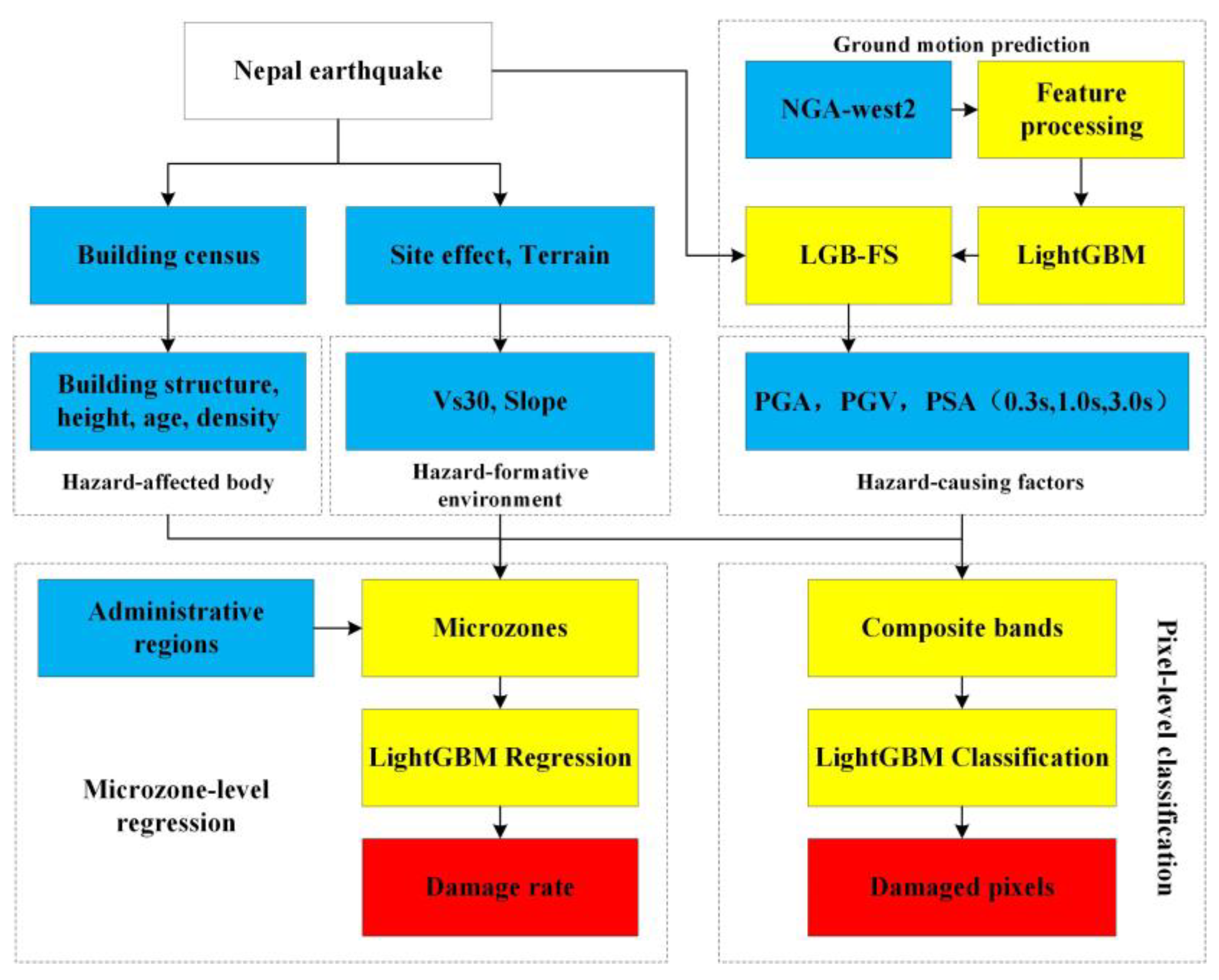
Technical flow chart. The blue rectangles represent data, the yellow rectangles represent method or processing operations, and the red rectangles represent the desired result.
Figure 1.
Technical flow chart. The blue rectangles represent data, the yellow rectangles represent method or processing operations, and the red rectangles represent the desired result.
Figure 2.
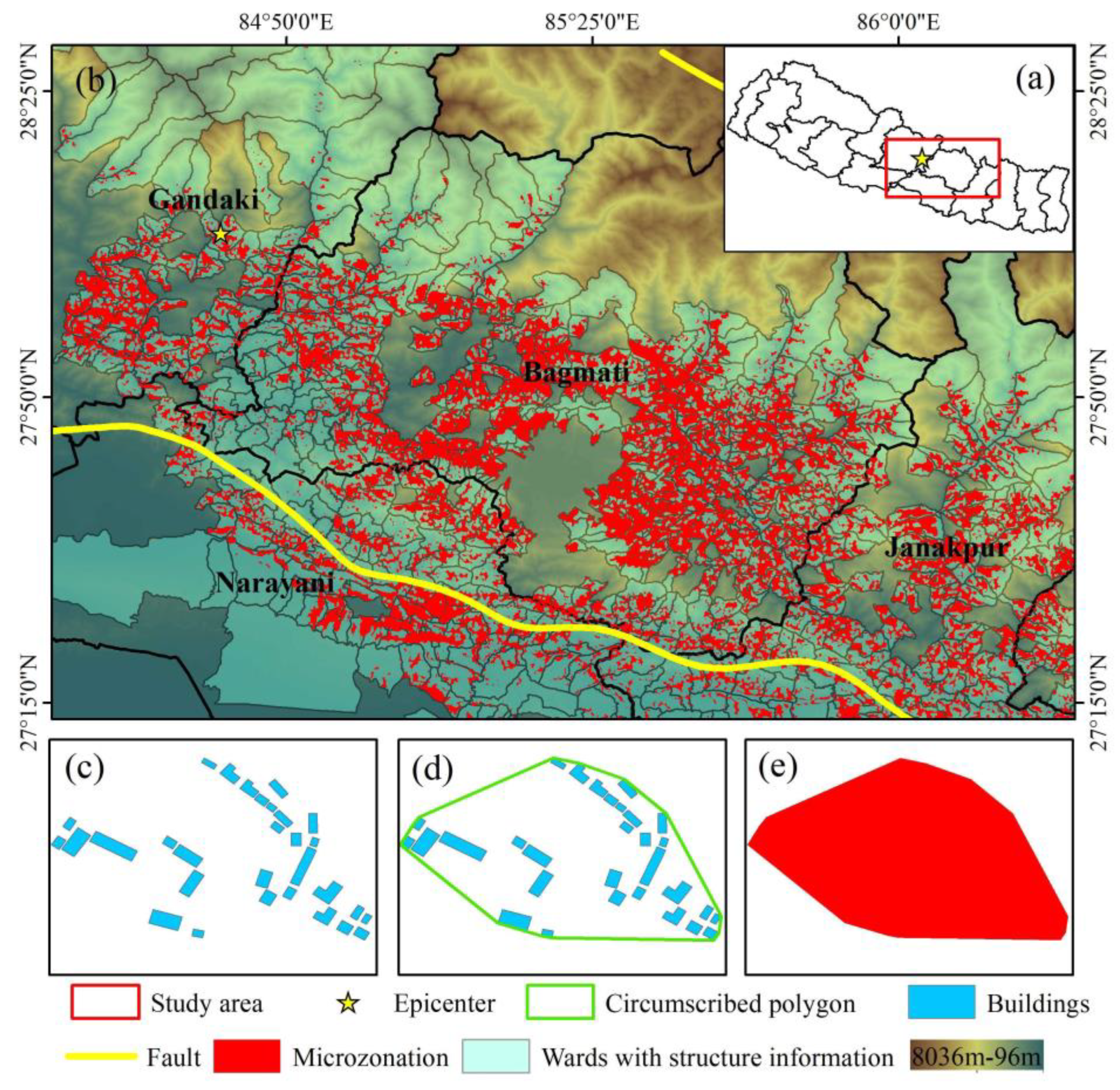
Distribution of building regions with structural information and refined building regions. Subplot (a) shows the geographical location of all microzones. Subplot (b) shows the distribution of all microzones. The background is terrain, and the light green regions are the administrative wards with building structure information. The longer yellow line in subplot b represents the seismogenic fault. Subplots (c–e) show the refinement process of the building regions, transforming the building regions from wards to microzones. The Green wireframe is the circumscribed polygon of blue buildings in subplot (d); the red parts are building regions after refinement named microzones, and the red polygon in subplot (e) is one of the microzones.
Figure 3.
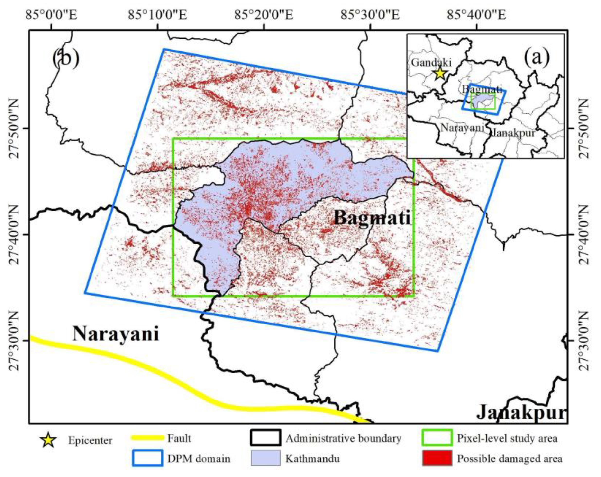
(a,b) Damage proxy map and pixel-level study area. The green box is the analysis area at the pixel level, including Kathmandu. The red position indicates where there may be building damage. The yellow line indicates the seismogenic fault.
Figure 3.
(a,b) Damage proxy map and pixel-level study area. The green box is the analysis area at the pixel level, including Kathmandu. The red position indicates where there may be building damage. The yellow line indicates the seismogenic fault.
Figure 4.
Histogram-based decision tree algorithm. The left part of the figure represents the organization form of the original data, and the middle part of the figure represents the histogram data.
Figure 4.
Histogram-based decision tree algorithm. The left part of the figure represents the organization form of the original data, and the middle part of the figure represents the histogram data.
Figure 5.
A tree of PGA prediction model. Rectangles represent feature segmentation nodes, and ellipses represent leaf nodes.
Figure 5.
A tree of PGA prediction model. Rectangles represent feature segmentation nodes, and ellipses represent leaf nodes.
Figure 6.
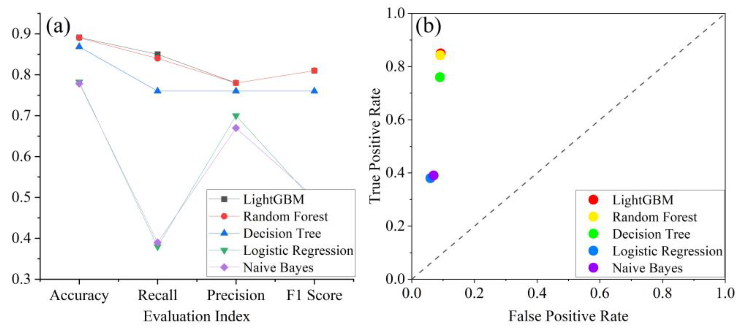
Performance comparison of classification methods. Subplot (a) shows the accuracy, recall, precision, and F1 score of several machine learning methods. Subplot (b) shows the FPR and TPR classified by several methods with a classification threshold of 0.5.
Figure 6.
Performance comparison of classification methods. Subplot (a) shows the accuracy, recall, precision, and F1 score of several machine learning methods. Subplot (b) shows the FPR and TPR classified by several methods with a classification threshold of 0.5.
Figure 7.
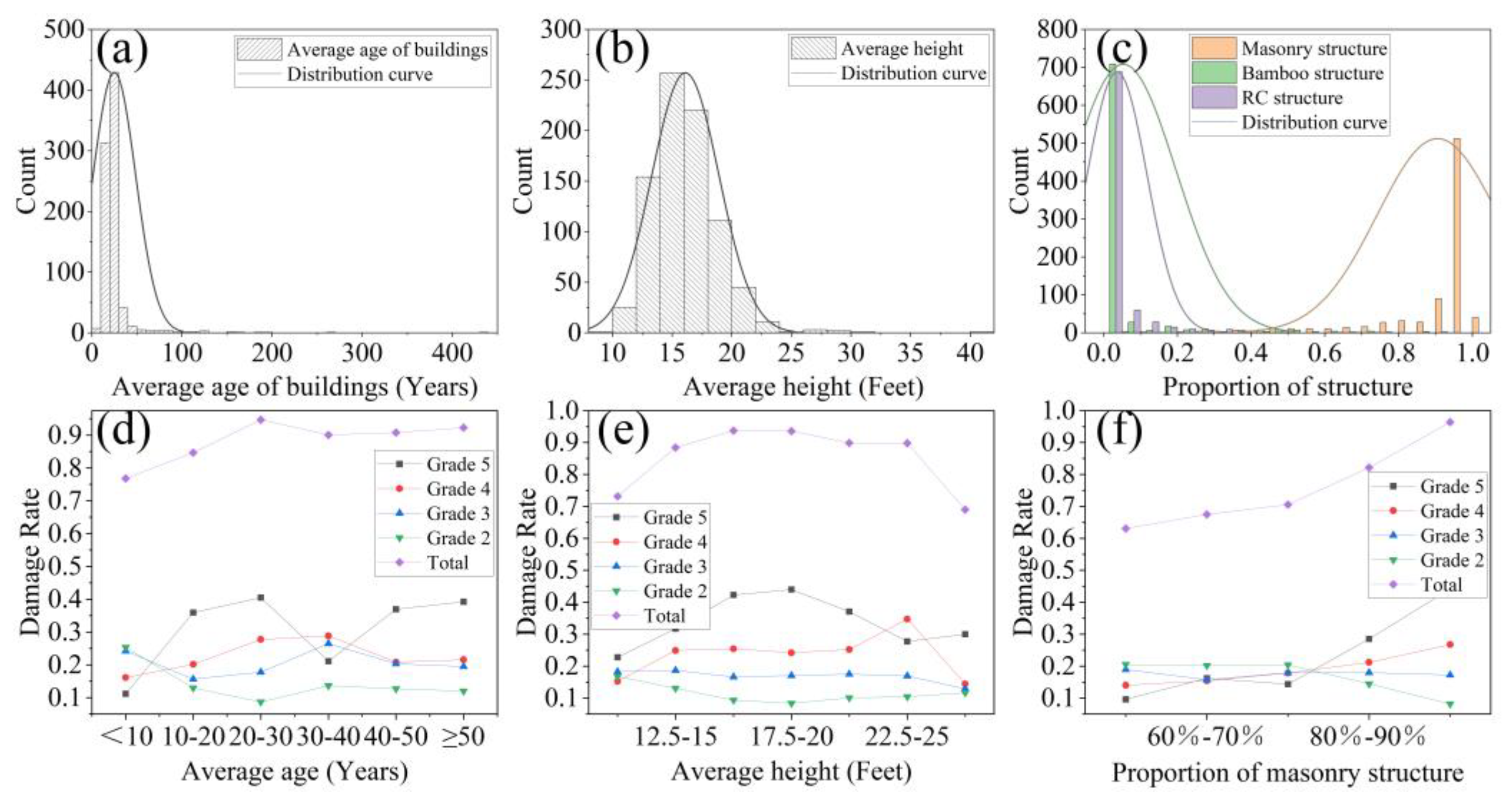
Damage rate curves of different damage levels and distribution of building attributes. Subplot (a), the building age distribution; subplot (d), the damage rate curves of different age; subplot (b), the building height distribution; subplot (e), the damage rate curves of different height; subplot (c), the distribution of different building structures; subplot (f) shows the effect of different stone masonry proportions on the damage rate.
Figure 8.
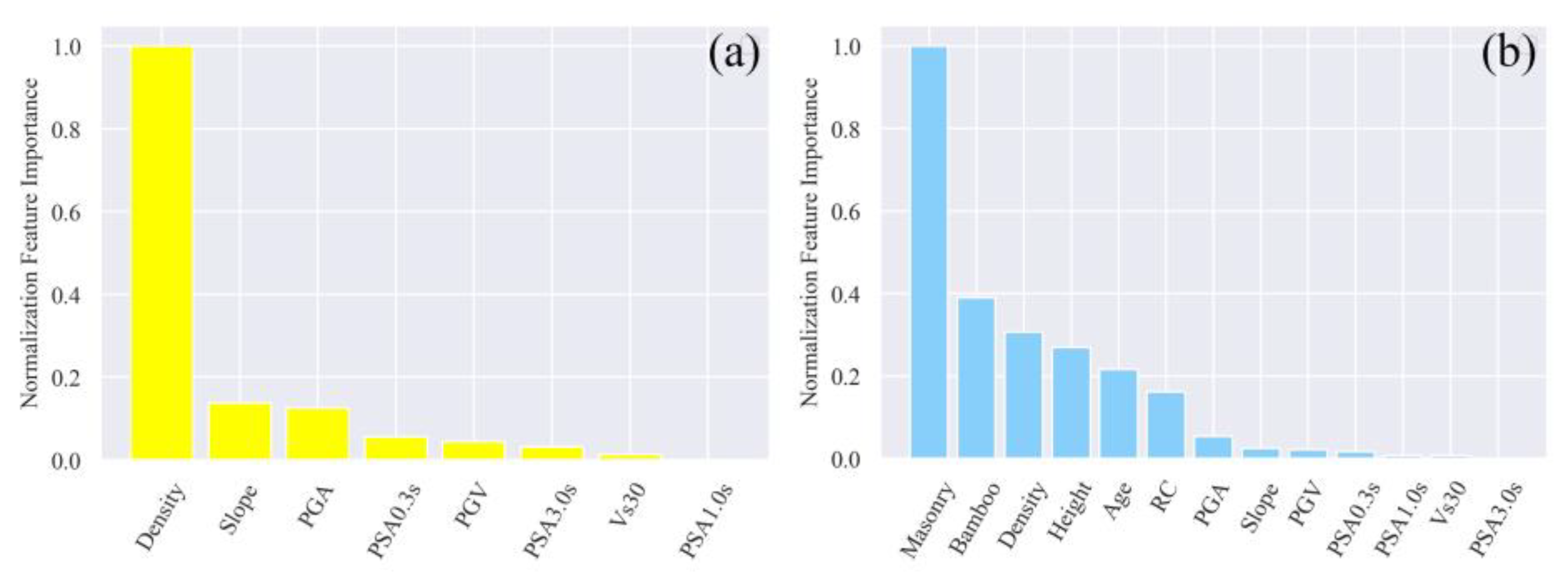
Feature importance of different feature combinations. Subplot (a) represents the EASY mode, and subplot (b) represents the HARD mode.
Figure 8.
Feature importance of different feature combinations. Subplot (a) represents the EASY mode, and subplot (b) represents the HARD mode.
Figure 9.
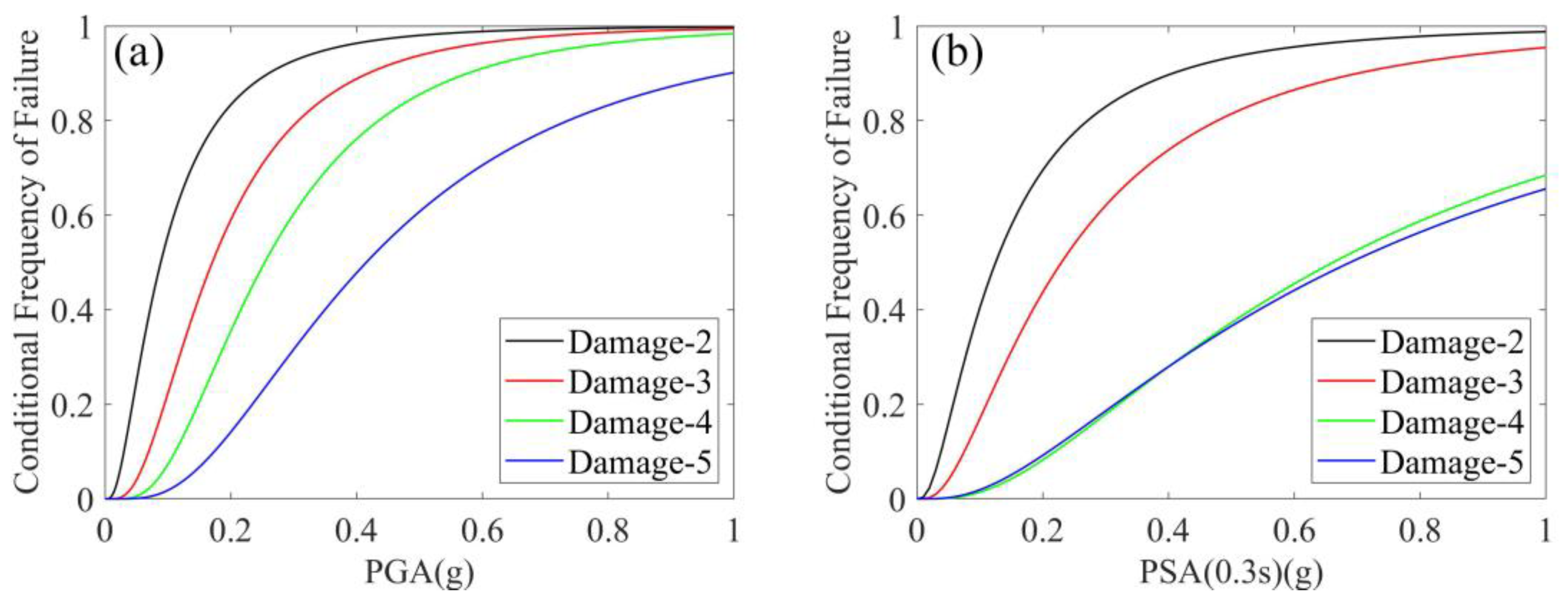
(a,b) Empirical fragility curves for stone masonry buildings in Nepal considering PGA and PSA0.3s as intensity measures.
Figure 9.
(a,b) Empirical fragility curves for stone masonry buildings in Nepal considering PGA and PSA0.3s as intensity measures.
Figure 10.
Evaluation of the assessment results of the best-performing (considering building attributes) regression model for different damage grades on test data. Subplots (a–d) represent evaluation of the best-performing model for damage grades 5-2, respectively.
Figure 10.
Evaluation of the assessment results of the best-performing (considering building attributes) regression model for different damage grades on test data. Subplots (a–d) represent evaluation of the best-performing model for damage grades 5-2, respectively.
Figure 11.
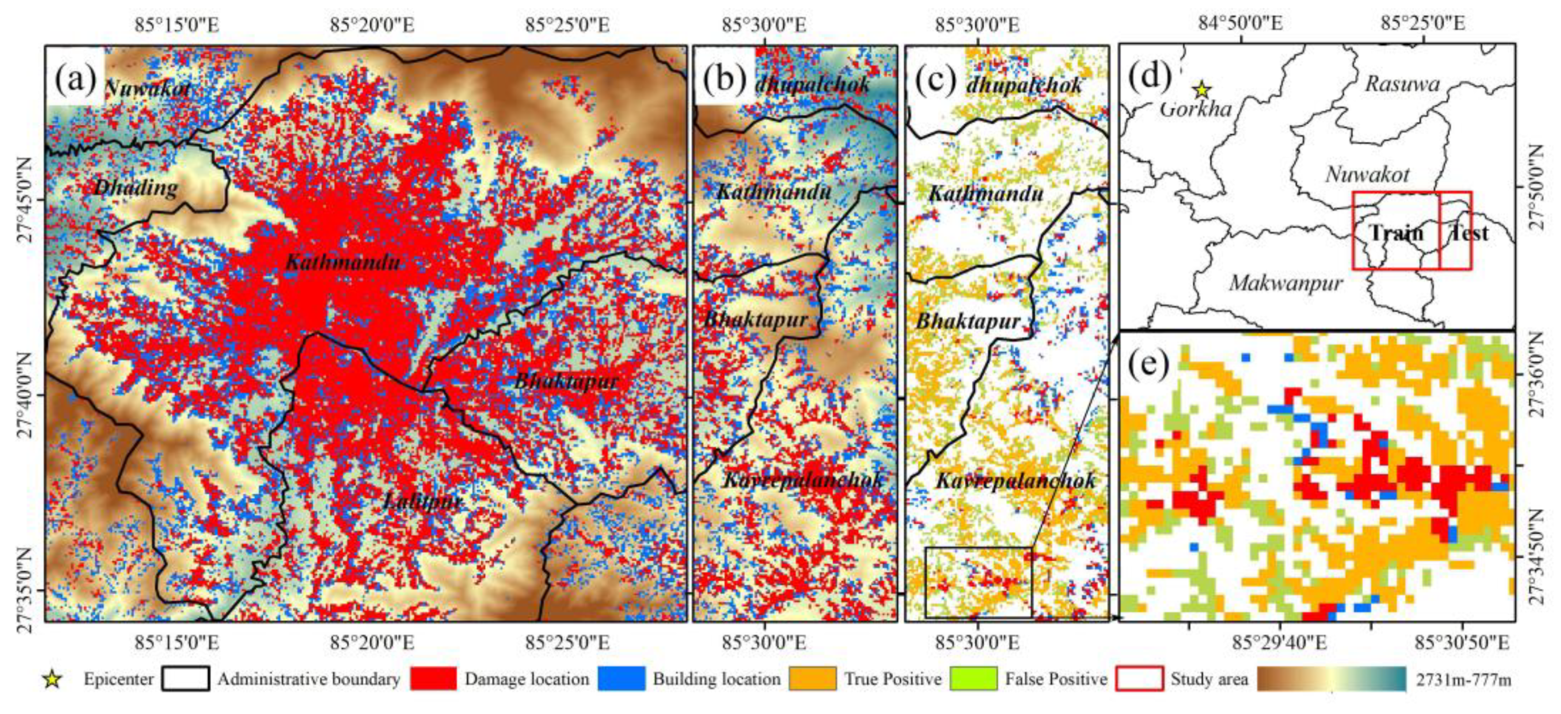
Map of building damage assessment in Kathmandu. Subplot (a), terrain, building, and damage information of the training area; subplot (b), terrain, building, and damage information of the test area; subplot (c), the damage assessment in test area; subplot (d), the epicenter, the training area, and test area; subplot (e), detailed display of the classified result in the black box. Orange pixels represent damaged pixels classified correctly, and green pixels represent damaged pixels classified incorrectly.
Figure 12.
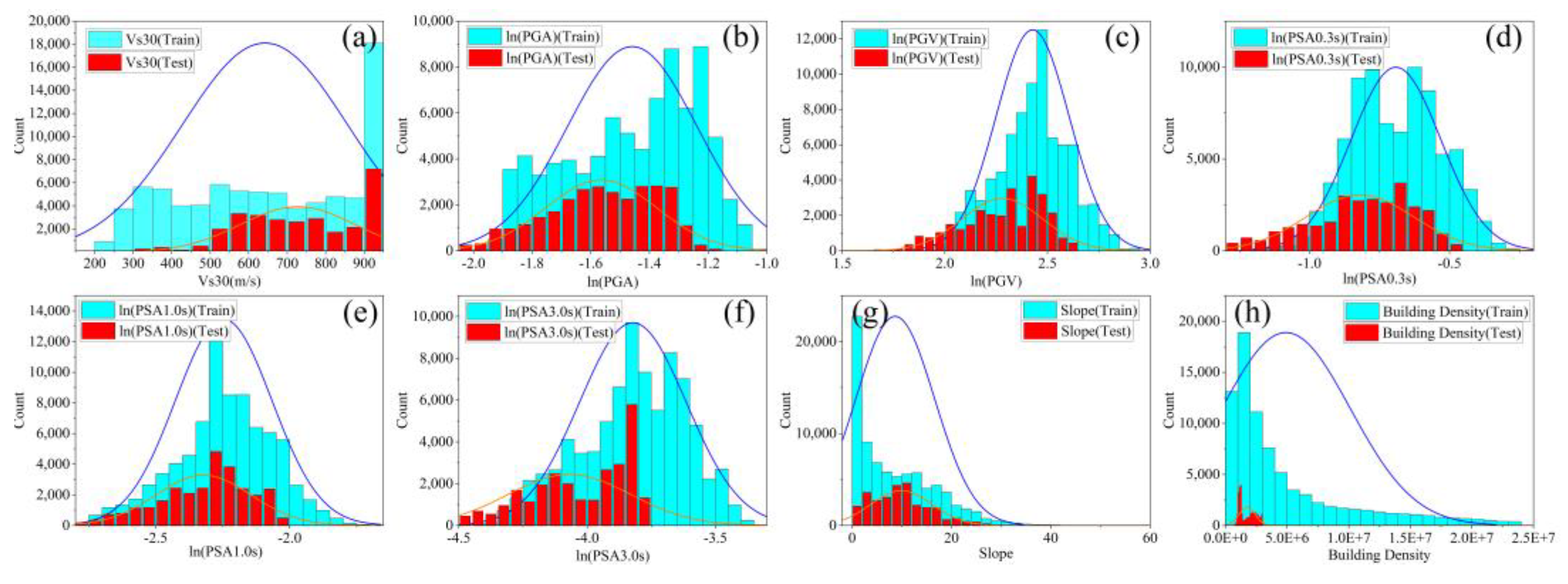
Ranges of influencing factors of Nepal earthquake. Subplots (a–h) represent the value distribution of Vs30, PGA, PGV, PSA0.3s, PSA1.0s, PSA3.0s, slope, building density, and other factors. The blue histogram and curve represent the distribution of values on the training set, and the red histogram and curve represent the distribution of values on the test set.
Figure 13.
Validation of classified results of damaged pixels on remote sensing images. Remote sensing validation data were produced by UNOSAT project of UNITAR. The selected verification pixels are distributed in the blue box of the thumbnail (part of the test area). In subplot (a), the yellow pixels represent the classified damaged pixels, the red pixels represent the damaged locations interpreted from optical image, and the orange pixels represent the correctly classified damaged pixels (true positive). The sampling pixels b to g are marked in subplot (a) in blue font. Subplots (b1,c1) and (b2,c2) are optical images at the positions of red pixels (false negative) before and after earthquake, respectively. Subplots (d1–g1) and (d2–g2) are optical images at the positions of orange pixels (true positive) before and after earthquake, respectively. The red and orange dash boxes indicate the locations of the damaged buildings.
Table 1.
Different categories of data and applied analysis levels.
Table 1.
Different categories of data and applied analysis levels.
| Category | Data | Source | Analysis Level |
|---|
| Hazard-formative environment | DEM | ASTER GDEM | pixel and microzone |
| Vs30 | Heath et al. [31] |
| Hazard-causing factors | PGA | Prediction |
| PGV | Prediction |
| PSA (0.3 s, 1.0 s, 3.0 s) | Prediction |
| Hazard-affected body | Building vector | OSM [33] |
| Building structure | Nepal government | microzone |
| Building height | Nepal government |
| Building age | Nepal government |
Table 2.
Different damage classification systems for Nepal’s buildings.
Table 2.
Different damage classification systems for Nepal’s buildings.
| Pixel-Level | Fragility Curves [8] | NPC (Single Building) | Microzone-Level | Description |
|---|
| intact-0 | DS-0 | Grade 1 | Grade 1 | Negligible to slight damage (no structural damage, slight non-structural damage) |
| DS-1 |
| damaged-1 | DS-2 | Grade 2 | Grade 2 | Moderate damage (slight structural damage, moderate non-structural damage) |
| DS-3 | Grade 3 | Grade 3 | Substantial to heavy damage (moderate structural damage, heavy non-structural damage) |
| DS-4 | Grade 4 | Grade 4 | Very heavy damage (heavy structural damage, very heavy non-structural damage) |
| DS-5 | Grade 5 | Grade 5 | Destruction (very heavy structural damage) |
Table 3.
Performance comparison of the LGB-FS for ground motion prediction with other methods.
Table 3.
Performance comparison of the LGB-FS for ground motion prediction with other methods.
| Methods | PGA | PGV |
|---|
| R2 | MAE | RMSE | R2 | MAE | RMSE |
|---|
| DNN [47] | 0.814 | 0.395 | 0.504 | 0.808 | 0.397 | 0.503 |
| ANN/SA [46] | 0.731 | 0.460 | / | 0.764 | 0.450 | / |
| GP/OLS [45] | 0.593 | 0.488 | 0.637 | 0.661 | 0.506 | 0.637 |
| MEP [51] | 0.696 | 0.697 | 0.624 | 0.686 | 0.726 | 0.671 |
| GP/SA [52] | 0.704 | / | 0.617 | 0.701 | / | 0.648 |
| LGB-FS [48] | 0.882 | 0.284 | 0.374 | 0.889 | 0.287 | 0.389 |
Table 4.
Performance comparison of the LGB-FS for PGA prediction with ShakeMap after Nepal earthquake.
Table 4.
Performance comparison of the LGB-FS for PGA prediction with ShakeMap after Nepal earthquake.
| Station Code | ln(PGA) | LGB-FS | ShakeMap | AE of LGB-FS | AE of ShakeMap |
|---|
| KATNP | −1.808 | −1.841 | −1.003 | 0.033 | 0.805 |
| KTP | −1.347 | −1.638 | −0.800 | 0.291 | 0.547 |
| TVU | −1.452 | −1.748 | −0.787 | 0.295 | 0.665 |
| PTN | −1.871 | −1.690 | −0.777 | 0.180 | 1.094 |
| THM | −1.871 | −1.486 | −1.013 | 0.385 | 0.858 |
| MAE | 0.237 | 0.794 |
Table 5.
Evaluation of microzone-level building damage assessment with different feature combinations.
Table 5.
Evaluation of microzone-level building damage assessment with different feature combinations.
| Data Availability | Data | Damage Grade | MAE | RMSE | R2 |
|---|
| EASY mode | PGA, PGV, PSA (0.3 s, 1.0 s, 3.0 s), building density, slope, Vs30 | 5 | 0.189 | 0.239 | 0.286 |
| 4 | 0.113 | 0.150 | 0.221 |
| 3 | 0.095 | 0.125 | 0.154 |
| 2 | 0.073 | 0.098 | 0.285 |
| 1 | 0.075 | 0.126 | 0.194 |
| HARD mode | EASY mode + building structure (stone masonry, bamboo and wood, RC), age, height | 5 | 0.070 | 0.113 | 0.841 |
| 4 | 0.051 | 0.083 | 0.753 |
| 3 | 0.039 | 0.072 | 0.704 |
| 2 | 0.029 | 0.053 | 0.787 |
| 1 | 0.024 | 0.049 | 0.874 |
Table 6.
Results comparison of fragility curves and assessment model in microzones where the stone masonry is the main building structure (MAE).
Table 6.
Results comparison of fragility curves and assessment model in microzones where the stone masonry is the main building structure (MAE).
| Damage Grade | Fragility Functions | EASY Mode | HARD Mode |
|---|
| 5 | 0.338 | 0.186 | 0.077 |
| 4 | 0.141 | 0.112 | 0.053 |
| 3 | 0.134 | 0.098 | 0.041 |
| 2 | 0.088 | 0.068 | 0.030 |
