Figure 1.
The pipeline of the proposed two-stage registration method. Matching of sub-images (MSI) and estimation of transformation parameters (ETP) in the dotted boxes are the main procedures. is the affine transformation matrix from the source image to the target image. The orange boxes are the selected sub-images from the source image, and the blue boxes represent the sub-images which are searched from the target image to be matched with each source sub-images. represents the similarity between the th sub-image from the source image and the sub-image located at () from the target image. The maximum of indicates the location of best-matched pair. , represent the coordinate of the th pair of sub-images from the source and target sub-images, respectively.
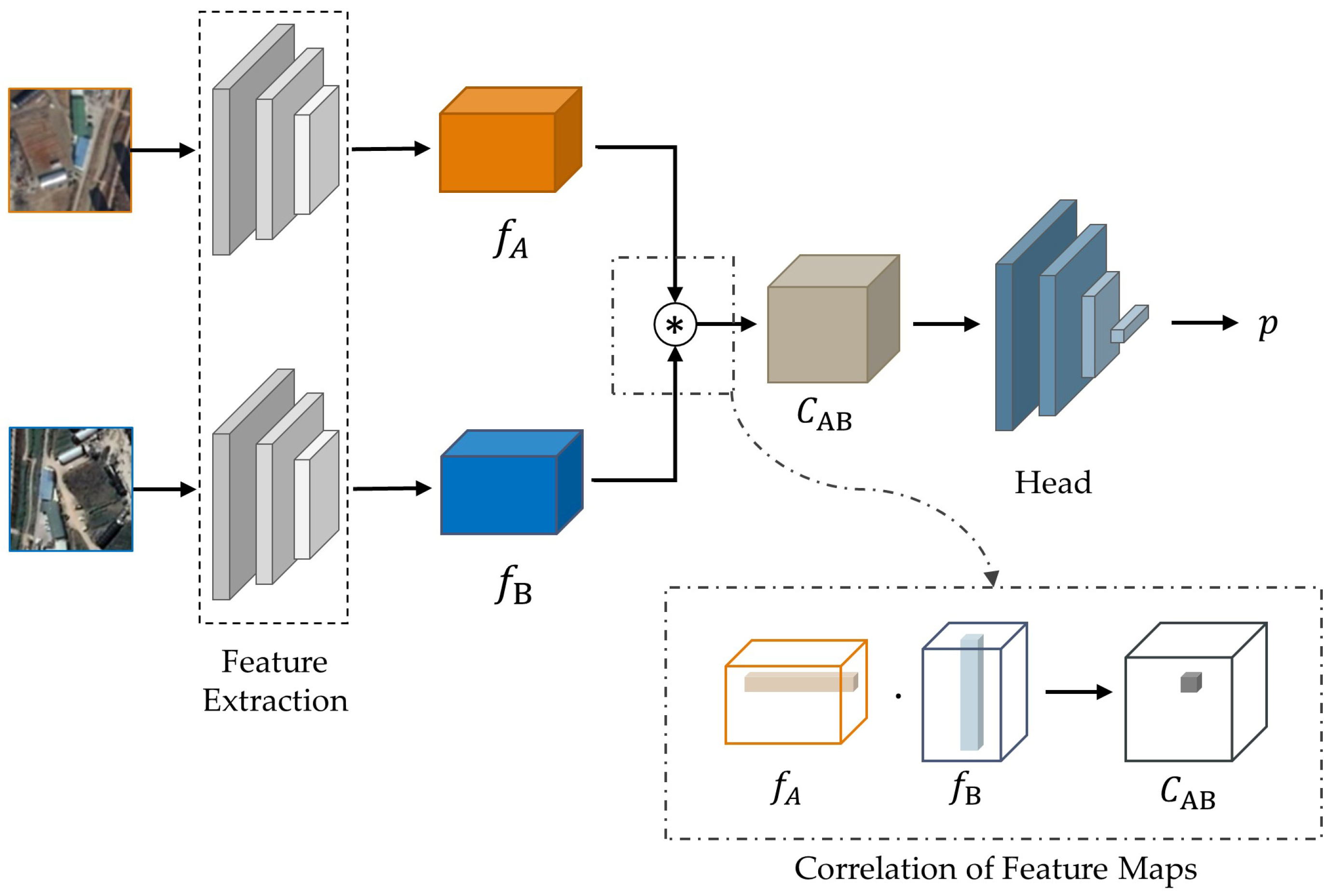
Figure 2.
Architecture of ScoreCNN. represents the scalar product in , where .
Figure 2.
Architecture of ScoreCNN. represents the scalar product in , where .
Figure 3.
Architecture of ScoreCNN’s head. This part takes a correlation map as input and outputs the probability representing matching quality. Conv 3 × 3, 128 denotes a convolutional layer with a kernel of size 3 × 3 and the number of output channels 128.
Figure 3.
Architecture of ScoreCNN’s head. This part takes a correlation map as input and outputs the probability representing matching quality. Conv 3 × 3, 128 denotes a convolutional layer with a kernel of size 3 × 3 and the number of output channels 128.
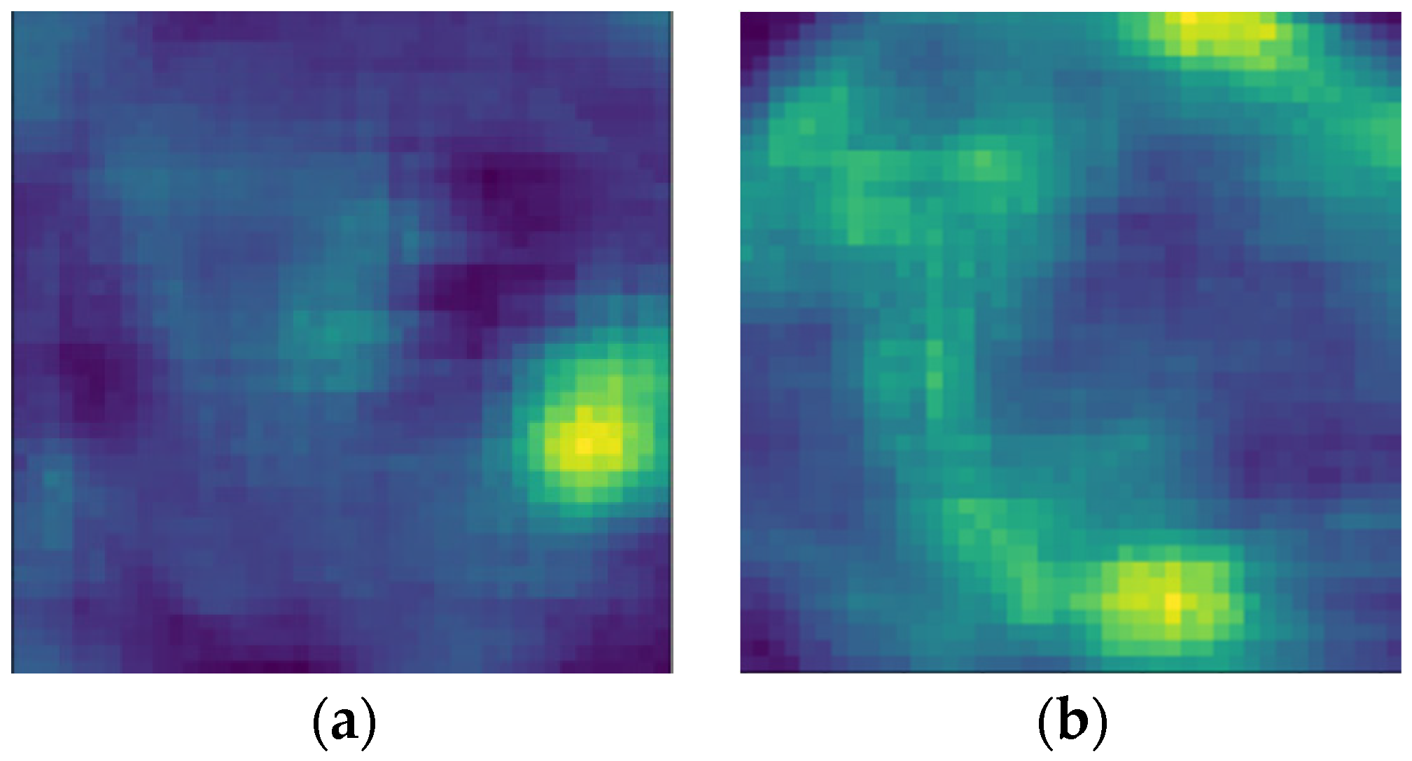
Figure 4.
Heatmaps generated with sliding windows. (a) is an ideal heatmap with a single peak; (b) is a heatmap with multiple peaks.
Figure 4.
Heatmaps generated with sliding windows. (a) is an ideal heatmap with a single peak; (b) is a heatmap with multiple peaks.
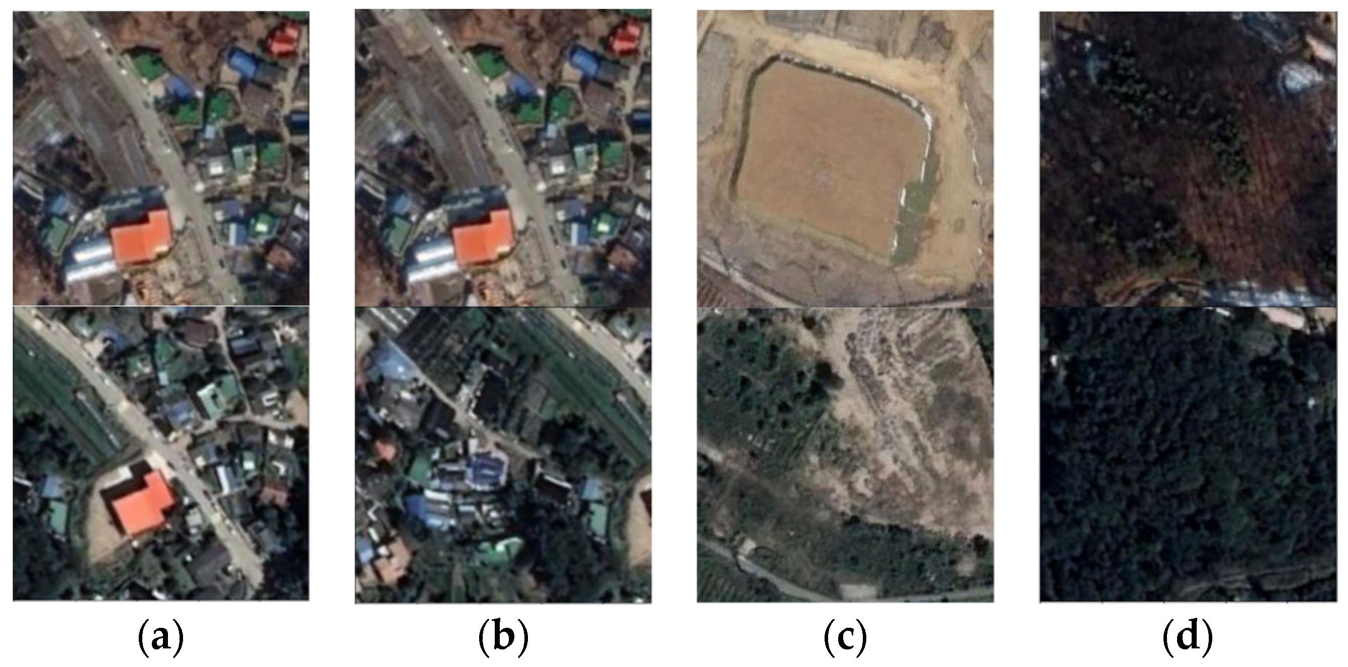
Figure 5.
Examples of sub-images pairs. (a) is a matched pair, (b–d) are unmatched pairs.
Figure 5.
Examples of sub-images pairs. (a) is a matched pair, (b–d) are unmatched pairs.
Figure 6.
Network architecture of ETP. and represent the input source sub-images and the target sub-images, respectively. represents the correlation map from and . and represent the coordinates of the images to which they belong. and denote the 2-D vectors after encoding. , , and are concatenated into feature block . denotes the final transformation matrix.
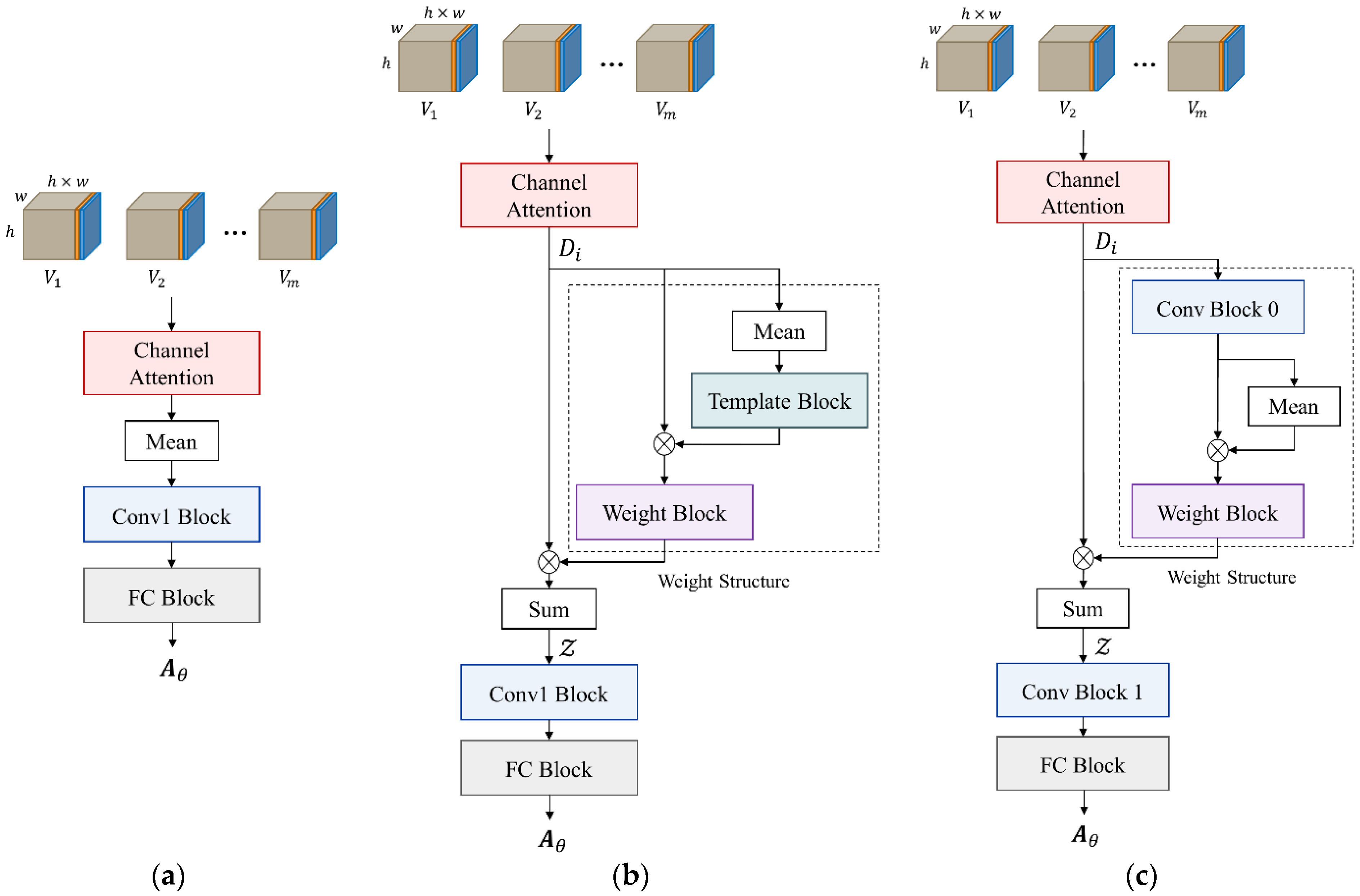
Figure 7.
Architecture of regression head. Inputs are the feature blocks of the sub-image pairs. (a) is the basic architecture, (b) and (c) are the structure A and B respectively. Weight blocks generate the weight distribution for .
Figure 7.
Architecture of regression head. Inputs are the feature blocks of the sub-image pairs. (a) is the basic architecture, (b) and (c) are the structure A and B respectively. Weight blocks generate the weight distribution for .
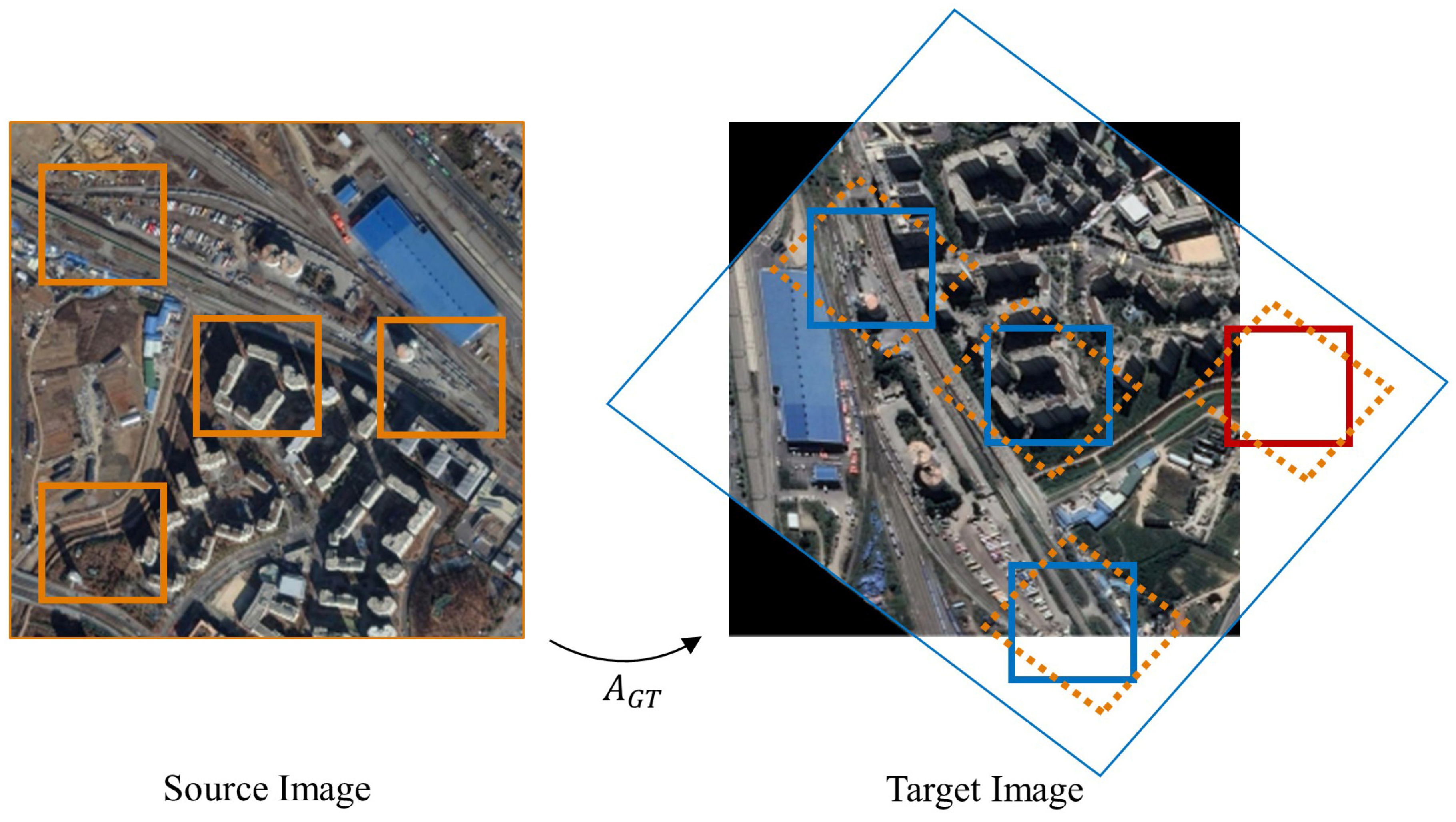
Figure 8.
Example of generating training samples. The orange boxes indicate the cropped sub-images from the source image, the orange dotted boxes indicate the location where the corresponding sub-images lie after transformation, the blue boxes indicate the cropped target sub-images, and the red boxes indicate the sub-images out of boundaries.
Figure 9.
Augmentation of positive training samples. Two conditions of the bounding rectangle in different sizes are shown. The orange boxes indicate the source sub-images after transformation, the blue boxes indicate the corresponding target sub-images and the grey boxes indicate the bounding rectangles of the orange boxes. The red points are the centers of the sub-images, and the black arrows show the scope where the windows of augmented target sub-images can randomly shift.
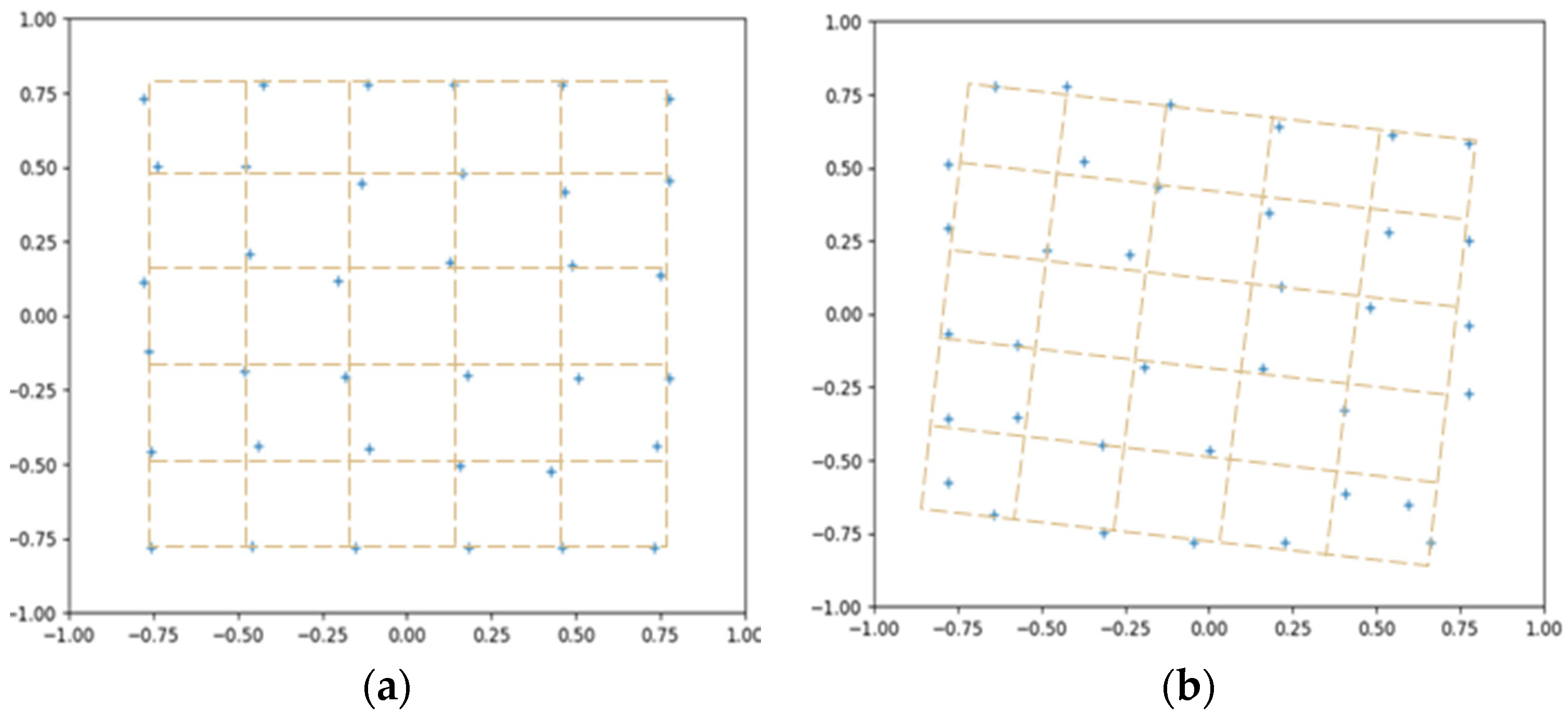
Figure 10.
The example of distribution of sub-images in the original images ( 36), where “+” represents the centers of sub-images. (a) is the source image, (b) is the target image. The coordinates are normalized to [−1, 1], which shows that the distribution is not strictly grid aligned.
Figure 10.
The example of distribution of sub-images in the original images ( 36), where “+” represents the centers of sub-images. (a) is the source image, (b) is the target image. The coordinates are normalized to [−1, 1], which shows that the distribution is not strictly grid aligned.
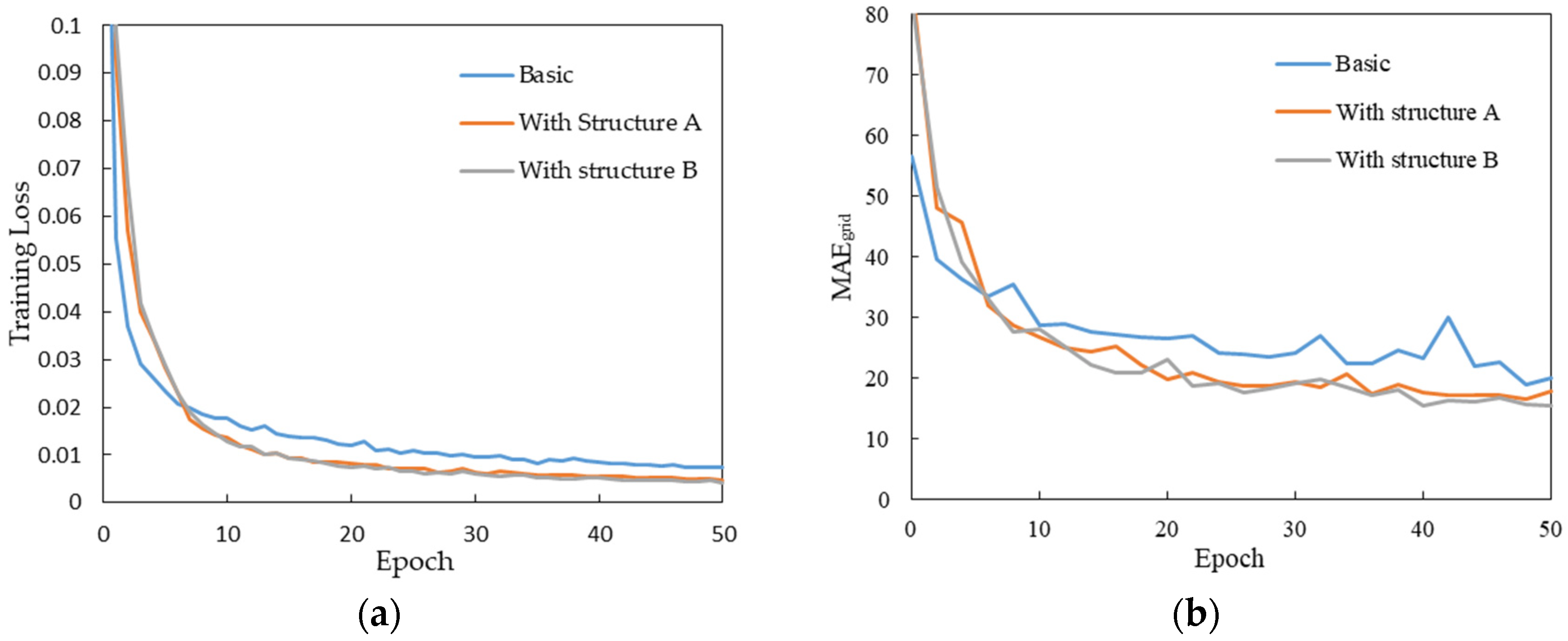
Figure 11.
Comparison of different architectures. (a) shows the trends of training loss and (b) shows the trends of with the training process.
Figure 11.
Comparison of different architectures. (a) shows the trends of training loss and (b) shows the trends of with the training process.
Figure 12.
Examples of the weight assignment to the sub-images. (a–d) are the partial pairs in the same source image and target image, and (e) shows the comparison of the weights.
Figure 12.
Examples of the weight assignment to the sub-images. (a–d) are the partial pairs in the same source image and target image, and (e) shows the comparison of the weights.
Figure 13.
AMR and AMP of at different .
Figure 13.
AMR and AMP of at different .
Figure 14.
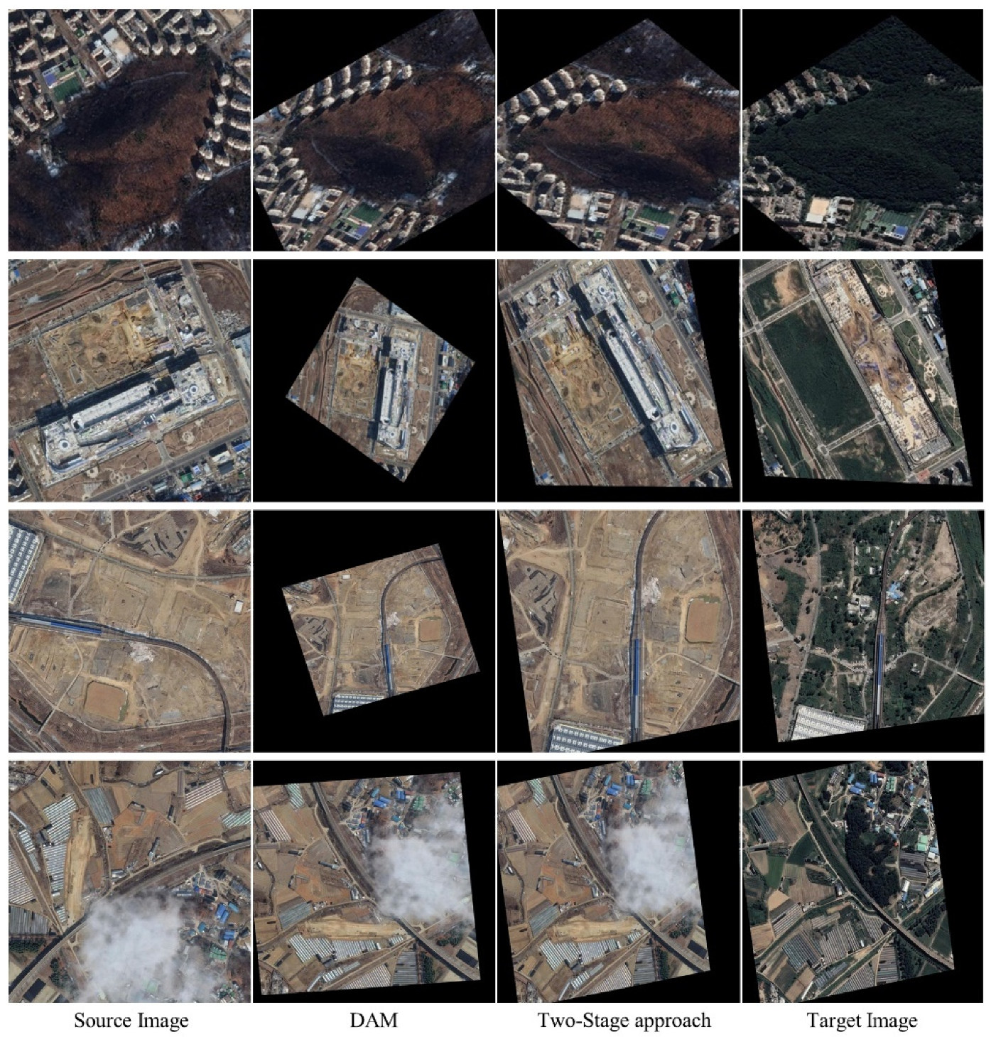
Comparison of qualitative registration results. Rows are pair 1–4 respectively. The alignment results are displayed in the form of checkerboard overlays. Significant local details are marked with red boxes and yellow boxes in the results of other methods and ours, respectively.
Figure 14.
Comparison of qualitative registration results. Rows are pair 1–4 respectively. The alignment results are displayed in the form of checkerboard overlays. Significant local details are marked with red boxes and yellow boxes in the results of other methods and ours, respectively.
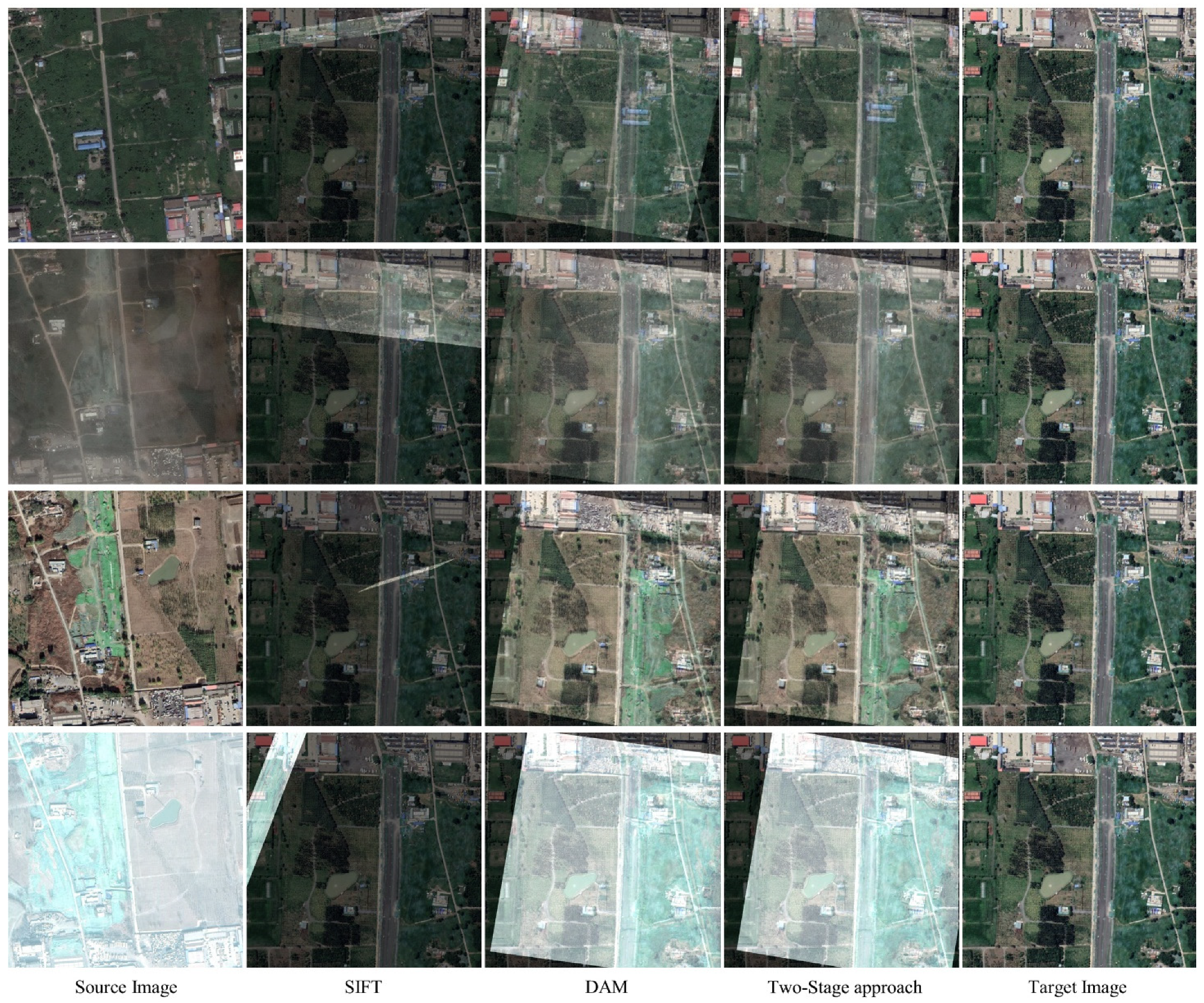
Figure 15.
Registration of a group of multi-temporal remote sensing images from other times and region. Rows are each as follows: (1) the source images, (2–4) overlays of the target image and the result warped by SIFT, DAM, and ours, respectively, (5) the identical target images taken in 2020.
Figure 15.
Registration of a group of multi-temporal remote sensing images from other times and region. Rows are each as follows: (1) the source images, (2–4) overlays of the target image and the result warped by SIFT, DAM, and ours, respectively, (5) the identical target images taken in 2020.
Figure 16.
The registration results of images with massive changes.
Figure 16.
The registration results of images with massive changes.
Figure 17.
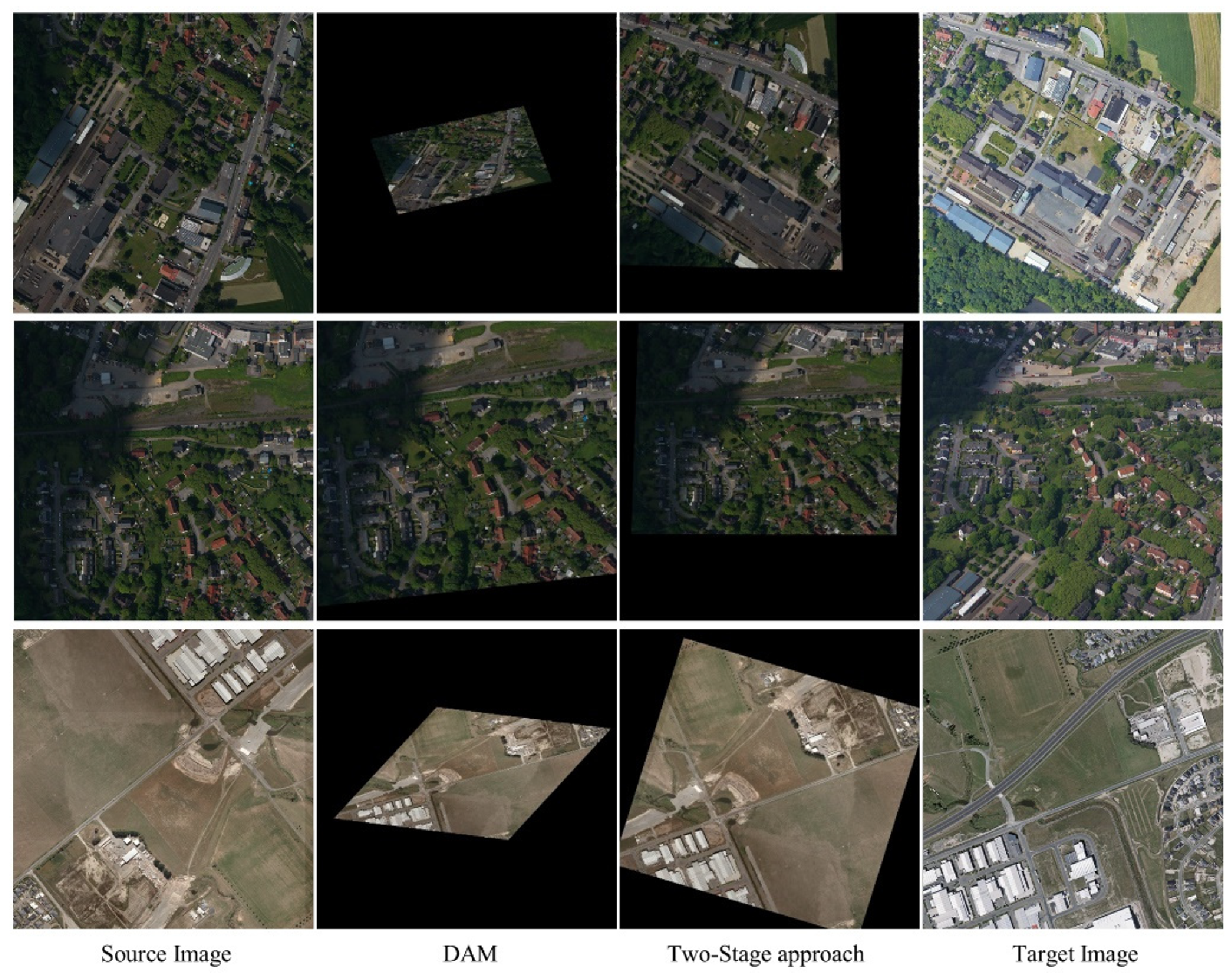
The registration results of images in ISPRS [
51] (
Row 1 and
2) and WHU [
52] (
Row 3).
Figure 17.
The registration results of images in ISPRS [
51] (
Row 1 and
2) and WHU [
52] (
Row 3).
Figure 18.
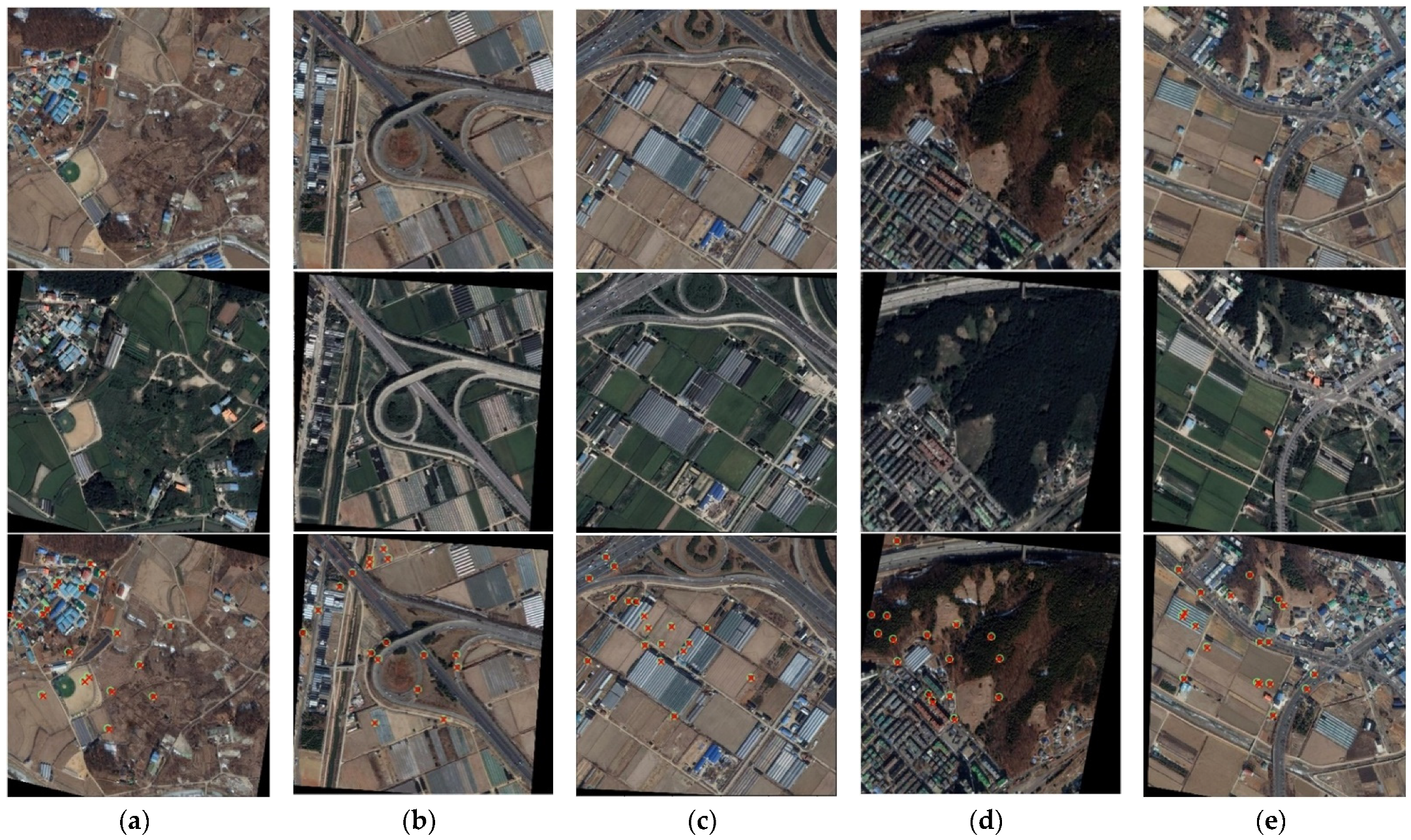
The results of registration on images with slight changes. (a–e) are different image pairs from the testing dataset. Rows are the source images, the target images and warped results by our method from top to bottom. “o” and “x” denote the keypoints in the source images and target images, respectively.
Figure 19.
The failure case on the images with large resolution variance. The original resolution of the source image is 412 × 412, and 1260 × 1260 of the target image.
Figure 19.
The failure case on the images with large resolution variance. The original resolution of the source image is 412 × 412, and 1260 × 1260 of the target image.
Table 1.
Comparison of different backbones of ScoreCNN. Acc represents the accuracy. F1 represents the harmonic average of precision and recall. FPR95 represents the false positive rate at the true positive rate of 95%. Param and FLOPs represent the number of parameters and floating-point operations of the models, respectively.
| Backbone | VGG-16 | ResNet-18 |
|---|
| Acc | 88.8% | 88.6% |
| F1 | 0.88 | 0.88 |
| AUC | 0.960 | 0.957 |
| FPR95 | 0.23 | 0.25 |
| Param | 7.97 M | 3.11 M |
| FLOPs | 16.11 G | 1.66 G |
Table 2.
The layers in each block of regression head. Each row denotes a convolutional layer (size, kernels) with a default stride of 1 and padding of 0, followed by rectified linear units (ReLU).
Table 2.
The layers in each block of regression head. Each row denotes a convolutional layer (size, kernels) with a default stride of 1 and padding of 0, followed by rectified linear units (ReLU).
| Block | Output | Setting |
|---|
| Channel Attention | 15 × 15 | 14-d fc,
227-d fc, |
| Conv0 | 5 × 5 | . |
| Template | 15 × 15 | |
| Wght | 1 × 1 | global average pool,
,
softmax, |
| Conv1 | 3 × 3 | |
| FC | 1 × 1 | 128-d fc,
6-d fc |
Table 3.
Percentage of images per category and per subset.
Table 3.
Percentage of images per category and per subset.
| Dataset | Urban Landscapes | Countryside | Vegetation | Waters |
|---|
| Training | 37.3% | 34.0% | 20.5% | 8.2% |
| Validation | 45.6% | 30.0% | 14.9% | 9.5% |
| Testing | 34.9% | 34.7% | 26.3% | 6.1% |
Table 4.
The experimental parameter settings.
Table 4.
The experimental parameter settings.
| Notation | Parameter | Default Value |
|---|
| Number of cropped source sub-images | 36 |
| Threshold of filtering weak-texture images | 0.3 |
| Radius of the neighborhood in Algorithm 1 | 5 |
| Difference between the first and second peak in Algorithm 1 | 1 |
| Lower limit of the maximum in Algorithm 1 | 0.5 |
| Minimum of sub-image pairs | 1 |
| Threshold of similarity scores in ETP | 2 |
| Interval of candidate sub-images in target images | 20 |
Table 5.
Comparative results of different architectures and inference procedures on validation set. “S→T” and “T→S” indicate the predicted transformations in two inference directions of the same trained model. “Bidirection” refers to the two-stream model trained bidirectionally and as an ensemble.
Table 5.
Comparative results of different architectures and inference procedures on validation set. “S→T” and “T→S” indicate the predicted transformations in two inference directions of the same trained model. “Bidirection” refers to the two-stream model trained bidirectionally and as an ensemble.
| Architecture | Grid Loss | |
|---|
| Basic | S→T | 0.009 | 14.87 |
| Basic | T→S | 0.009 | 14.92 |
| Basic | Bidirection | 0.032 | 18.45 |
| Struct. A | S→T | 0.005 | 13.13 |
| Struct. A | T→S | 0.005 | 13.18 |
| Struct. A | Bidirection | 0.015 | 14.45 |
| Struct. B | S→T | 0.004 | 11.59 |
| Struct. B | T→S | 0.004 | 11.62 |
| Struct. B | Bidirection | 0.018 | 13.60 |
Table 6.
Effects of the augmentation on ScoreCNN.
Table 6.
Effects of the augmentation on ScoreCNN.
| Model | Accuracy | F1 | AUC | FPR95 |
|---|
| ScoreCNN (without Aug.) | 93.8% | 0.92 | 0.982 | 0.085 |
| ScoreCNN (with Aug.) | 94.5% | 0.93 | 0.984 | 0.067 |
Table 7.
Effects of the augmentation on ETP.
Table 7.
Effects of the augmentation on ETP.
| Model | Grid Loss | |
|---|
| ETP (without Aug.) | 0.005 | 12.35 |
| ETP (with Aug.) | 0.004 | 11.59 |
Table 8.
Comparison of probability of correct keypoints (PCK) for registration with different methods on testing set. The whole registration stream for SIFT is SIFT + Random Sampling and Consensus (RANSAC) [
48]. ‘Int. Aug.’ + ‘Bi-En.’ represents the best one in [
45]. The scores marked with “†” were brought from [
45] and evaluated on the same dataset. The models in the two-stage approach we proposed are in single-stream architecture, and
denotes the number of cropped source sub-images.
| Methods | PCK (%) |
|---|
| | |
|---|
| SIFT [54] | 51.2 † | 45.9 † | 33.7 † |
| DAM (Int. Aug. + Bi-En.) [45] | 97.1 † | 91.1 † | 48.0 † |
| Two-Stage approach (Basic, ) | 98.3 † | 91.9 † | 49.5 † |
| Two-Stage approach (Struct. A, ) | 99.1 † | 95.3 † | 51.2 † |
| Two-Stage approach (Struct. B, ) | 99.3 † | 96.5 † | 58.9 † |
| Two-Stage approach (Struct. B,) | 99.2 | 97.4 | 64.8 |
Table 9.
Comparison of quantitative results. Columns 1~4 represent the errors of registration for pair 1–4 in
Figure 14 respectively. “\” represents the failure of registration. MAE: Mean absolute error.
Table 9.
Comparison of quantitative results. Columns 1~4 represent the errors of registration for pair 1–4 in
Figure 14 respectively. “\” represents the failure of registration. MAE: Mean absolute error.
| Method | MAE (Pixels) |
|---|
| 1 | 2 | 3 | 4 |
|---|
| SIFT | \ | \ | 122.43 | \ |
| DAM (Int. Aug. + Bi-En.) | 18.70 | 16.80 | 56.94 | 93.48 |
| Two-Stage approach (Struct. B,5) | 2.83 | 5.31 | 6.91 | 9.62 |
Table 10.
Comparison of registration results on the images displayed in
Figure 18.
Table 10.
Comparison of registration results on the images displayed in
Figure 18.
| Method | MAE (Pixels) |
|---|
| a | b | c | d | e |
|---|
| SIFT | 1.77 | 8.63 | 0.42 | 2.44 | 1.41 |
| DAM (Int. Aug. + Bi-En.) | 8.52 | 12.64 | 3.83 | 12.85 | 2.53 |
| Two-Stage approach (Struct. B,5) | 2.78 | 2.98 | 2.39 | 2.81 | 2.11 |

