1. Introduction
Machine learning (ML) is an automated technique that facilitates the development of multiple predictive models [
1]. Machine learning is a widely used technique for generation, prediction, and detection. A subset of a larger collection of machine learning algorithms to combine representation learning and artificial neural networks is called deep learning [
2]. The estimation of aboveground biomass plays an important role in estimating the carbon level present in the air [
3,
4,
5]. The amount of carbon which has been absorbed by the trees is measured so that the level of carbon can be found. In that way, the amount of carbon can be found, and the hazardous effects of the carbon can also be controlled by taking further steps like planting more trees and reducing the reasons for carbon emissions [
6,
7].
A Region of Interest [
8] is a sample within a data collection that has been designated for a specific purpose. The Region of Interest is used to take a particular area in the image, and the image is analyzed to clean all the noises and enhance the image in such a way that it is perfect to conduct further estimations. After enhancing, the image is processed to separate the green area, which is the essential part when it comes to estimating the carbon level. With the help of a histogram, the image can be represented in terms of a graph. The graph is drawn based on the RGB (red, green, blue) values in the image. The green, blue, or red value is represented separately in order to separate different shades of green. In the segmentation process, both K-means clustering and binary classification are used to analyze the cluster different elements in the image. With the help of a CNN (Convolution Neural Network), the level of carbon present in the atmosphere will be estimated. Finally, using empirical formulae based on the height and width of the tree, the amount of carbon trapped in the tree will be calculated. Direct library calls from MATLAB 9.14 can be made to Perl, Java, ActiveX, and .NET libraries. Many MATLAB libraries are created as wrappers for Java or ActiveX libraries [
9].
OpenCV (Open-Source Computer Vision) is an open-source library that provides tools and algorithms for computer vision [
10]. Companies, research teams, and government organizations frequently use the library. OpenCV includes a template interface that is simple to use with STL containers and is natively built in C++. TensorFlow is a free and open-source software library for data flow and specialized coding for various tasks [
11]. This symbolic math library is also utilized by neural networks and other machine learning programs. The second iteration of the Google Brain system is called TensorFlow. TensorFlow can run on a variety of CPUs and GPUs.
The Keras API was developed with people in mind, not machines [
12]. The Keras framework includes a variety of widely used building blocks for neural networks, including layers, objectives, triggers, and optimizers. The introduction of machine learning and deep learning techniques, along with the estimation of aboveground biomass, has been discussed [
13]. The Random Forest and co-kriging method were combined, and the result was that the RMSE of the AGB ranges from 15.62 to 53.78 t-ha
−1. The saturation effect was lessened with the use of PALSAR data. With the aid of the RFCK model, the AGB mapping for subtropical forests with complicated terrain offers optimum results [
14].
However, the GAM model’s spatial variability accurately reproduced the data more than the RF model. This study included the Random Forest, Forward Feature Selection (FFS), and Leave-Location-Out Cross-Validation (LLO-CV) strategies to train the model [
15]. Effective methods for enhancing model performance and decreasing spatial overfitting include FFS and LLO-CV to increase the model’s capacity in order to forecast values in uncertain scenarios. This study examines the feasibility of combining spaceborne radar and LiDAR remote sensing data to estimate aboveground biomass [
16].
Using standard kriging, the ICESat-2 vegetation height product was interpolated into a 2D surface. For the development of linear regression models for aboveground biomass estimation, L-band ALOS-2/PALSAR-2 data with interpolated forest surface height and terrain corrected backscatter were employed. With a relative RMSE, a model that included HV backscatter and ICESat-2 interpolated height-based regression fared better. A precise estimate of the quantity of carbon stored was obtained by applying the Carnegie–Ames Stanford Approach (CASA), and a plant mortality model to compute AGB is mentioned in this work. The sentinel-1 and sentinel-2 data were subjected to the Random Forest regression technique, which produced an RMSE value of 60 t/ha and validation values of 100–200 t/ha at the level of the forest stand. According to the estimation, the saturation impact is about 200 t/ha. This model tends to exaggerate tiny AGB values and understate high biomass values (more than 250 t/ha) [
17].
Using L-band SAR and LiDAR data, a model created using the Random Forest method produces an R
2 of 0.78 and an RMSE of 21.36 Mg/ha. Combining HH and HV L-band SAR data revealed in the study a strong sensitivity to forest biomass. The accuracy obtained is high, with R
2 = 0.52. In order to fill this vacuum, our work examines the relationship between space-borne radar data and AGB at scales of 10 tons per hectare. Based on the theory that it provides data that are complimentary to the microwave backscatter of the active sensors, we also integrate passive brightness temperature as a further covariate for biomass calculation. Our findings demonstrate that high-accuracy large-scale estimates of AGB can be made for grasslands and savannas (R
2 up to 0.52). In addition, in some circumstances, the incorporation of passive radar can improve the accuracy of AGB estimates in terms of explained variation. This article examines the coppice forest of Persian oak in Western Iran in order to determine the usefulness of Sentinel-2 data in the calculation of AGB [
18]. Eighty square plots are collected as data for the estimation. Five-fold cross-validation was then used to determine which model was most successful.
To determine the AGB in tropical closed evergreen forest areas from satellite data, tree-based algorithms, a linear regression model, and a deep neural network (CNN) were utilized; these models produced accuracies of between 80 and 85% [
19]. This study uses remote sensing data to map the forest in Mexico. The national forest inventory (NFI) and airborne light detection and ranging (LiDAR) scenarios were used as the reference data for the machine model [
20]. The NFI and LiDAR findings were compared, and the combination of the two exhibited better fit statistics, such as R
2 and RMSE, than the independent validation. When distinct spatial patterns in tropical dense forest were found, more uncertainties were discovered. Optical remote sensing techniques are mostly utilized in maize canopies to find AGB; however, they have poor accuracy [
21]. To fix this, stem leaf separation techniques are applied with unmanned aerial vehicles.
To estimate AGB in maize, LiDAR and multispectral imaging data are used. Here, partial least square regression is used to the SVI, which is produced from multispectral data, and the LSP, which is derived from LiDAR. Partial least squares regression (PLSR) is more accurate in this situation than multivariable linear regression (MLR), which yields RMSE values of 79.80 g/m
2 and 72.28 g/m
2. In this paper, AGB is estimated using PALSAR-2 and ALOS-2 satellite data, and a map of the reserve’s biomass is also created. Regression techniques with one variable and those with multiple variables are both employed in this paper [
22]. HV polarization was highly related to biomass with the linear model of R
2 = 0.74, RMSE = 28.16, exponential model R
2 = 0.69, RMSE = 28.73, and polynomial model (R
2 = 0.76; RMSE = 28.03), but HH polarization did not give much results, although the HV variable and eight texture variables combination provided good results with R
2 = 0.81 and RMSE = 27.76; this result explains the 81% variation in forest biomass. The findings indicate that integrating machine learning regression techniques with UAV-mounted LiDAR technology offers a reliable means to predict aboveground biomass (AGB) swiftly and precisely in crop fields. This method enables real-time AGB estimation at a fine resolution, presenting a valuable approach for mapping the biochemical makeup of these fields [
23]. Meanwhile, the RF and XGBoost models significantly outperformed the LR model. The Landsat 8 image performed better than Sentinel-1A in estimating AGB. Combining the two images improved the accuracy of the estimation [
24]. The innovative application areas include algorithm development and implementation, accuracy assessment, scaling issues (local–regional–global biomass mapping), and the integration of microwaves (i.e., LiDAR), along with optical sensors, forest biomass mapping, rangeland productivity and abundance (grass biomass, density, cover), bush encroachment biomass, and seasonal and long-term biomass monitoring [
25]. When the average AGB is less than 150 Mg/ha, the optical dataset and its combination with SAR outperformed other methods for forest AGB estimation. The AGB projections from the GEDI L4A AGB product, which served as a reference, underperformed across all forest types and study sites. However, GEDI can be used as a ground truth data source for forest AGB estimation with a certain level of accuracy [
26]. As a result, the airborne LiDAR technology, along with field inventory data, has significant promise for properly monitoring AGB levels in forests [
27]. The GAM model was assessed using an independent dataset indicating its potential to predict AGB in temperate forest ecosystems [
28]. The AGB estimation model can provide effective support for more accurate forest AGB and carbon stock inventory and monitoring [
29]. The experimental results show that combining regression ensembles and active learning reduces the amount of field sampling while providing aboveground biomass estimates comparable to those obtained using techniques in the literature, which require larger training sets to build reliable predictions [
30]. This research introduces a new method for estimating AGB as well as an approach for evaluating and utilizing urban vegetation space [
31]. The suggested method is highly generalizable and independent of tree species, indicating a high potential for future forest AGB inversion across larger regions with varied forest kinds [
32]. The combination of spectral and picture textures can significantly increase the accuracy of the AGB estimate, particularly during the post-seedling stage [
33]. The AGB maps are required to evaluate carbon sequestration capacity [
34].
The proposed work mainly explains the aboveground biomass estimation in the specific Region of Interest, using deep learning algorithms. In the context of AGB, sustainability is managing forests, agricultural areas, and ecosystems in a way that preserves or improves AGB while avoiding negative environmental consequences.
2. Materials and Methods
The proposed system uses a Region of Interest (ROI) to particularly select an area and find out the carbon absorbed by the trees in that area.
Figure 1 represents the architecture diagram for the proposed work. The system uses the RGB color gradient to effectively differentiate the parts of the tree to give accurate results about the amount of carbon absorbed by the parts of the tree present above the soil. From the 667 aerial images available in the Deep Globe dataset, if one is selected, then the data pre-processing step is performed, where we increase the resolution of the picture. Once it is completed, a histogram graph is plotted where we use the pixels and the grayscale in the image. An RGB mean is computed before and after enhancing the picture, which tells us that the image is corrected from all the distortions. Once the processing step is complete, the segmentation process takes place, where we will only take the green value in RGB to actively estimate the carbon level absorbed by the tree. In the segmentation process, using CNN, a model is built where we will find the amount of carbon trapped inside the tree present in that area.
2.1. Data Collection
The dataset is publicly available for research analysis in Deep Globe. In general, it contains a training dataset with 4000 images which is fed into the model by iteration. At each iteration, it takes 100 dataset images to check whether these images are suitable to make further estimations. And in the test dataset, 300 aerial images are found suitable to proceed with our calculations.
2.2. Data Pre-Processing
The satellite images undergo several pre-processing steps to enhance their quality and prepare them for training the deep learning model. These steps include the following:
Normalization: This process scales the pixel intensity values in the images to a common range (e.g., 0 to 1 or −1 to 1). Normalization is used to improve the training stability and convergence of the deep learning model.
Resizing: The images are resized to a uniform size to ensure consistency during model training. This simplifies computations and allows the model to focus on learning relevant features for segmentation.
Random Rotation (augmentation): The images are randomly rotated by a small angle (e.g., maximum 30 degrees) to artificially increase the dataset size and improve the model’s generalization ability. By introducing these variations, the model learns to be robust to slight rotations in the imagery, which may occur in real-world satellite data.
2.3. Data Cleaning Process
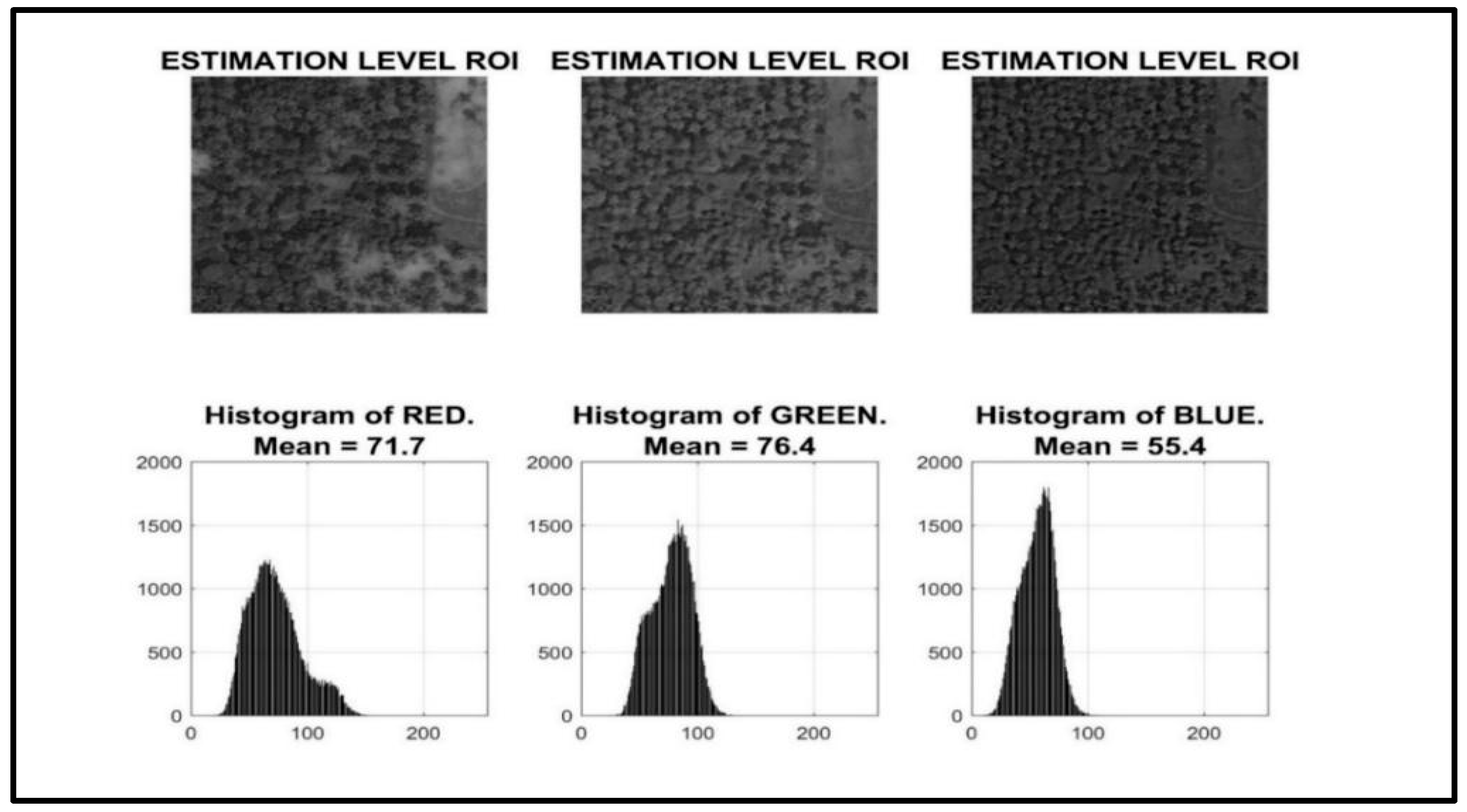
This section describes the data cleaning process employed in this work, specifically focusing on the utilization of histograms in the image pre-processing stage.
A histogram is a graphical representation that depicts the distribution of values within a dataset. In this context, the histogram is used to analyze the distribution of color intensities (red, green, and blue) within the image [
35]. The processing steps are as follows:
Histogram Generation: The first step involves generating a histogram for the image. This histogram will display three separate curves, one for each color channel (red, green, and blue). Each curve represents the frequency of each intensity level within that color channel.
Color Distribution Analysis: By examining the histogram, we can visualize the amount (frequency) of each color present in the image. Areas with high peaks on the histogram indicate a high concentration of pixels with that specific color intensity. Conversely, areas with low peaks or dips suggest a scarcity of pixels with that intensity level.
Mean Calculation: The process further computes the mean value for each color channel (red, green, and blue). The mean represents the average intensity level for each color within the entire image. Mathematically, it provides a quantitative measure of how much red, green, and blue is present on average across the image.
In
Figure 2, the visual color distribution of the images is shown. The histogram levels for the various colors are shown in the image. A notable difference in the mean value of a particular color between the datasets is used in concluding that there is an issue with augmentation or the data consistency process. Understanding the distribution of color will help to identify all the potential issues initially happening in the system, ensuring that the model is trained on a consistent and representative dataset. The histogram can help us, as it is a visual reference, to understand the distribution of color intensities within the image. In the case of AGB estimation, the distribution of colors in the images is essential. By employing histograms in the data pre-processing stage, we gain a deeper understanding of the color distribution within the image. This information can be instrumental in cleaning the data and preparing it for further analysis or processing tasks. The histogram can reveal potential outliers in the data, such as pixels with unusually high or low color intensities. These outliers may be indicative of noise or errors in the image and can be addressed through further data cleaning techniques. Analyzing the histogram provides valuable insights into the overall color balance and dominance within the image [
36]. This information can be crucial for subsequent image processing tasks, such as segmentation or color correction.
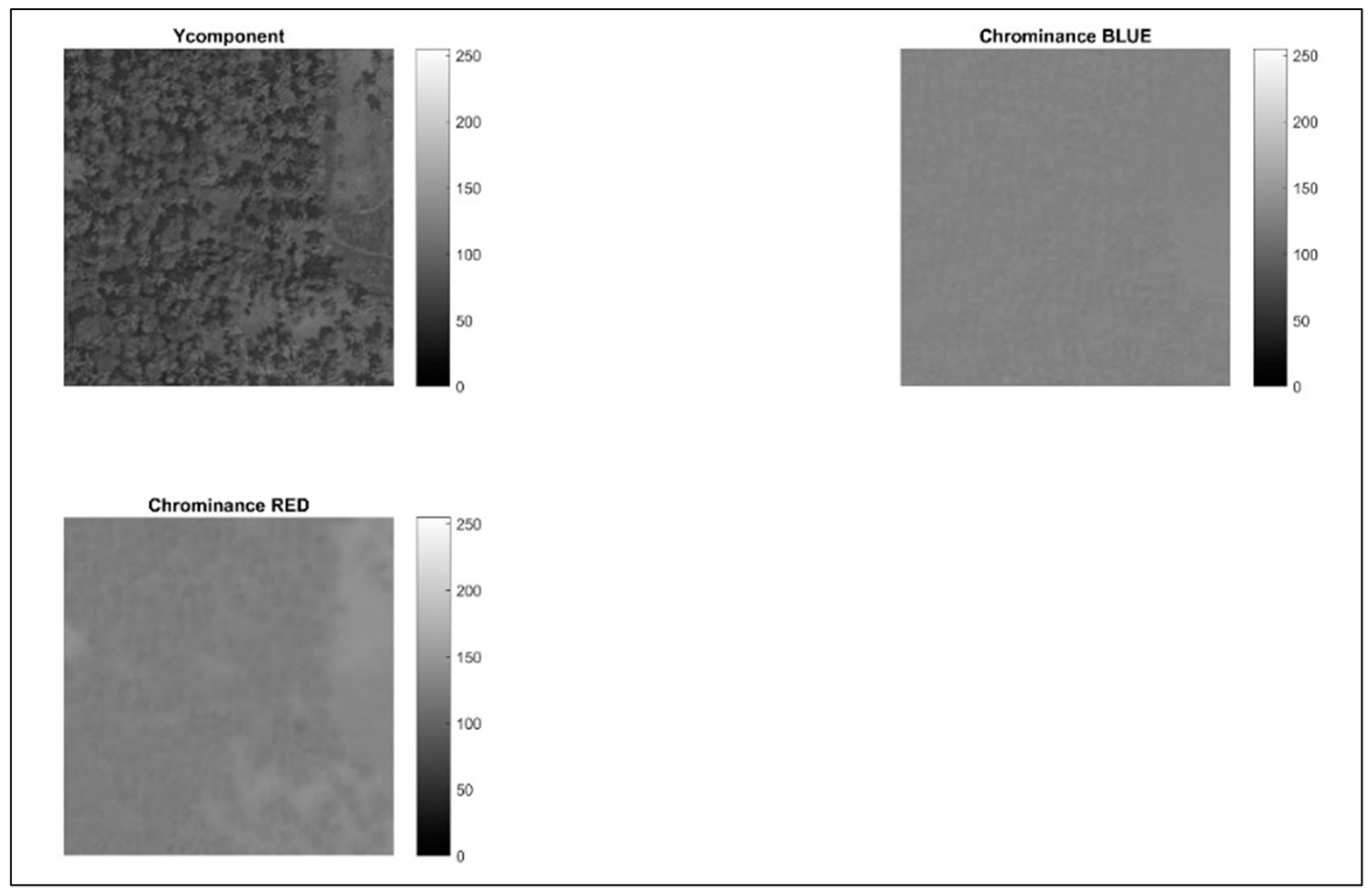
Following the data cleaning process using histograms, this step focuses on applying chrominance, as mentioned in
Figure 3, to isolate and distinguish various shades of green within the image. This is crucial because variations in green hues often represent different vegetation types or tree cover densities. Chrominance refers to color information independent of luminance (brightness). It essentially conveys the color details without considering the overall intensity of the light. In image processing, chrominance is often separated into two components: hue and saturation. By emphasizing hue information, this step facilitates the identification of subtle variations in green shades within the image. This is crucial for accurately segmenting areas with different tree cover densities. Distinguishing various green hues can be instrumental for subsequent image analysis tasks. For example, it can be used to classify different vegetation types or estimate the health of trees based on their green color intensity.
Figure 3 depicts the image after incorporating hue information and showcases the enhanced separation between various green tones within the image.
Hue represents the actual color itself, such as red, green, blue, etc. It is measured in degrees on a color wheel, where green falls around the 120-degree mark. Hue information is deliberately added to the image. This process likely involves converting the image from the RGB (red, green, blue) color space to a color space that explicitly represents hue, such as HSV (hue, saturation, value) or HSL (hue, saturation, lightness). By emphasizing the hue component, the different shades of green become more distinguishable from each other. By introducing additional blue and red hues, the aim is to further accentuate the subtle variations between green colors. This can be achieved by manipulating the hue values within a specific range around the green hue (120 degrees). The process might also involve a decrease in the image’s overall brightness. This can be achieved by adjusting the value or lightness component in the chosen color space (HSV or HSL). Reducing brightness can sometimes improve the contrast between different green hues, making them easier to distinguish visually.
2.4. Segmentation
Following the process of separating green shades using chrominance, this section details the image segmentation techniques employed to isolate areas with trees [
37]. Segmentation is a crucial step in image analysis as it allows us to partition the image into meaningful regions based on specific criteria. Here, the focus is on identifying regions with high green values, which likely represent areas covered by trees. The process utilizes Region of Interest (ROI) to define a specific area within the image for further analysis. This allows us to concentrate on a particular section of interest, potentially containing trees, and disregard irrelevant background information.
2.5. Segmentation Techniques
Building upon the pre-processing step where RGB mean values were obtained, this stage likely involves extracting only the green channel information from the image. Since green pixels are indicative of vegetation, focusing solely on the green channel enhances the segmentation process for identifying potential tree cover. Using the defined ROI, the segmentation process aims to separate areas with high green values (likely trees) from the remaining pixels within the ROI. This can be achieved through various techniques, such as thresholding or more sophisticated algorithms like k-means clustering. A simple approach might involve applying a threshold to the green channel values within the ROI. Pixels exceeding a certain green intensity threshold would be classified as “tree” pixels, while those falling below the threshold would be classified as “non-tree” pixels.
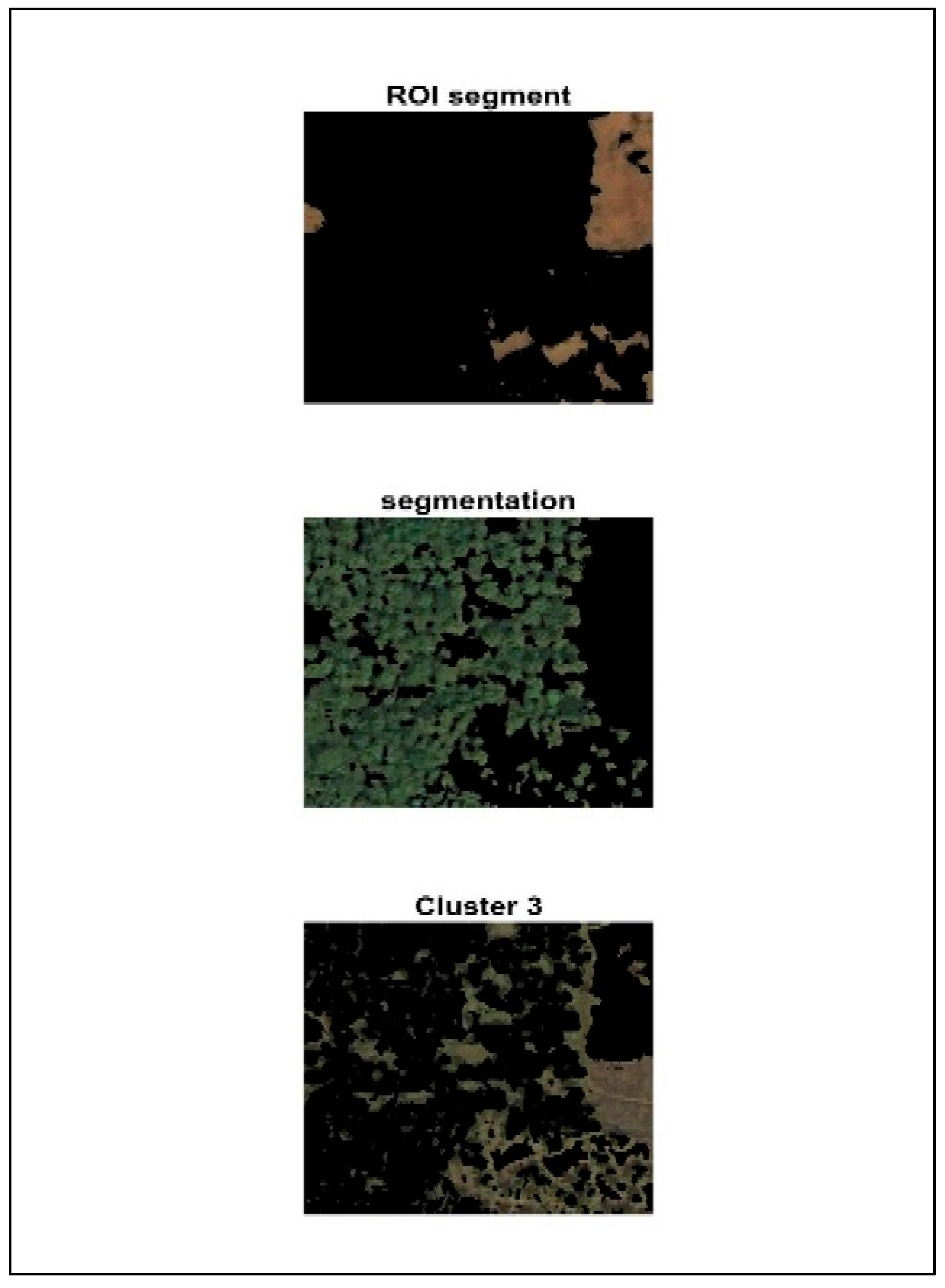
As shown in
Figure 4, the segmentation process includes k-means and binary classification. Using the Region of Interest, we consider a particular area and separate the green area from the image. K-means clustering is used to group similar objects in the image. Here, in our work, trees and water bodies are all grouped according to their own characteristics. The segmentation process will provide accurate results by taking only the green value from the RGB mean value that is found in the pre-processing step. The Region of Interest (ROI) takes in a certain portion of an image where further estimation can be performed. In this work, an ROI is used to separate and analyze the areas where the green value is high, denoting that it has trees present in that area. In the ROI segment, the area without trees (areas other than green) is represented, and in the segmentation image, the area with tress (areas that are green) is represented. Then, clusters of both images are represented finally.
Green Area Detection: For green area detection, a Region of Interest is used [
38]. The objective was to design and implement a model in MATLAB that will detect the green area in an image similar to the training image. The green area is detected to find the area filled with trees so that it will be easy to implement the model to find the amount of carbon present in the area. The carbon can be only found with the help of the height and width of the tree. The image is analyzed to find the amount of red, green, and blue (RGB) in the image. The RGB value in the image is found using the mean value. Our goal is to train a custom deep learning model to detect the trees in the image. The RGB is found to take into account only the green color, which represents the area filled with green where we will make further estimations.
2.6. K-Means Clustering
K-Means Clustering for Refined Green Area Analysis
Following the green area’s detection using deep learning, this section discusses the application of K-means clustering for potentially refining the analysis of green areas within the image [
39].
It is particularly useful when the data lack predefined labels or categories. In this work, K-means clustering is employed to further analyze the data points within the green areas (potentially identified by the deep learning model).
Application in Green Area Analysis:
Data Points: Here, the data points likely represent individual pixels within the green areas identified earlier. Each pixel has an associated RGB value representing its red, green, and blue intensity.
Clustering Based on RGB Values: K-means clustering is applied to group these pixels based on their similarity in terms of RGB values. The number of clusters (k) needs to be predefined. In the context of green area analysis, an appropriate choice of k could be as follows:
- ○
k = 2: This would create two clusters: one containing pixels with high green values (likely representing healthy, dense tree cover) and another containing pixels with lower green values (potentially representing sparse tree cover, other vegetation, or shadows).
- ○
k > 2: With a higher number of clusters, the analysis becomes more granular. Additional clusters could represent variations in tree health, different vegetation types within the green area, or even background elements that were not entirely filtered out during the green area detection process.
Refined Analysis: By analyzing the distribution of pixels across the different clusters, we can gain further insights into the characteristics of the green area. This could include the following:
- ○
Tree Cover Density: The proportion of pixels within the “high green” cluster can provide an indication of the density of tree cover within the identified green area.
- ○
Vegetation Variations: The presence of additional clusters might suggest the presence of different vegetation types within the green area, requiring further investigation.
- ○
Background Noise: Clusters containing pixels with colors deviating significantly from green might indicate the presence of background noise or elements not entirely filtered out during green area detection.
The benefits of K-Means clustering are as follows:
Enhanced Understanding: K-means clustering provides a deeper understanding of the variations and characteristics within the green areas identified earlier.
Improved Accuracy: By differentiating between different types of green pixels, K-means clustering can potentially improve the accuracy of subsequent analysis tasks, such as tree cover density estimation. This effective method of K-mean clustering can improve the accuracy of the model.
After obtaining the green value present in the data by segmentation, they are classified, and biomass is estimated. Using empirical formulae, the exact amount of carbon trapped inside the tree or that particular area is found by taking into account only the height and width of the tree by computing the dry weight. Half of the dry weight will give the green weight, and half of that will give the value of carbon.
Convolutional Neural Network: Deep learning algorithms like Convolutional Neural Network (CNN) are extremely effective in processing and recognizing images. In our work, CNN is used to train a type of model to actively recognize the trees in the image in such a way that its height and diameter can be computed to know the amount of carbon trapped.
Calculating Green Weight (GW): The estimation of the mass of the tree when it is mortal is known as the green weight. This covers the entire amount of wood and any moisture the tree may have. This makes it possible to determine a tree’s aboveground green weight depending on its height and diameter. The measured values for diameter (centimeters) and height (meters) are inserted into the appropriate calculation to determine the green weight, and then the dry weight and carbon storage are calculated based on the given formulas. The green weight is calculated by substituting the values in the equation, and the results are obtained as kilograms [
40].
For trees with diameter < 28 cm: GW = 0.0577 × d2 × h.
For trees with diameter > 28 cm: GW = 0.0346 × d2 × h.
Calculating dry weight (DW): Dry weight represents the mass of the wood in the tree when dried in an oven, so the moisture is removed. To find the dry weight, the green weight is multiplied by 50 percent.
Calculating carbon storage (C): The amount of carbon stored in a tree’s wood is referred to as carbon storage. This represents the entire quantity of carbon that the tree sequesters in addition to the amount of carbon that is taken in from the atmosphere during photosynthesis. Carbon storage is calculated by multiplying the dry weight by 50%.
3. Results and Discussion
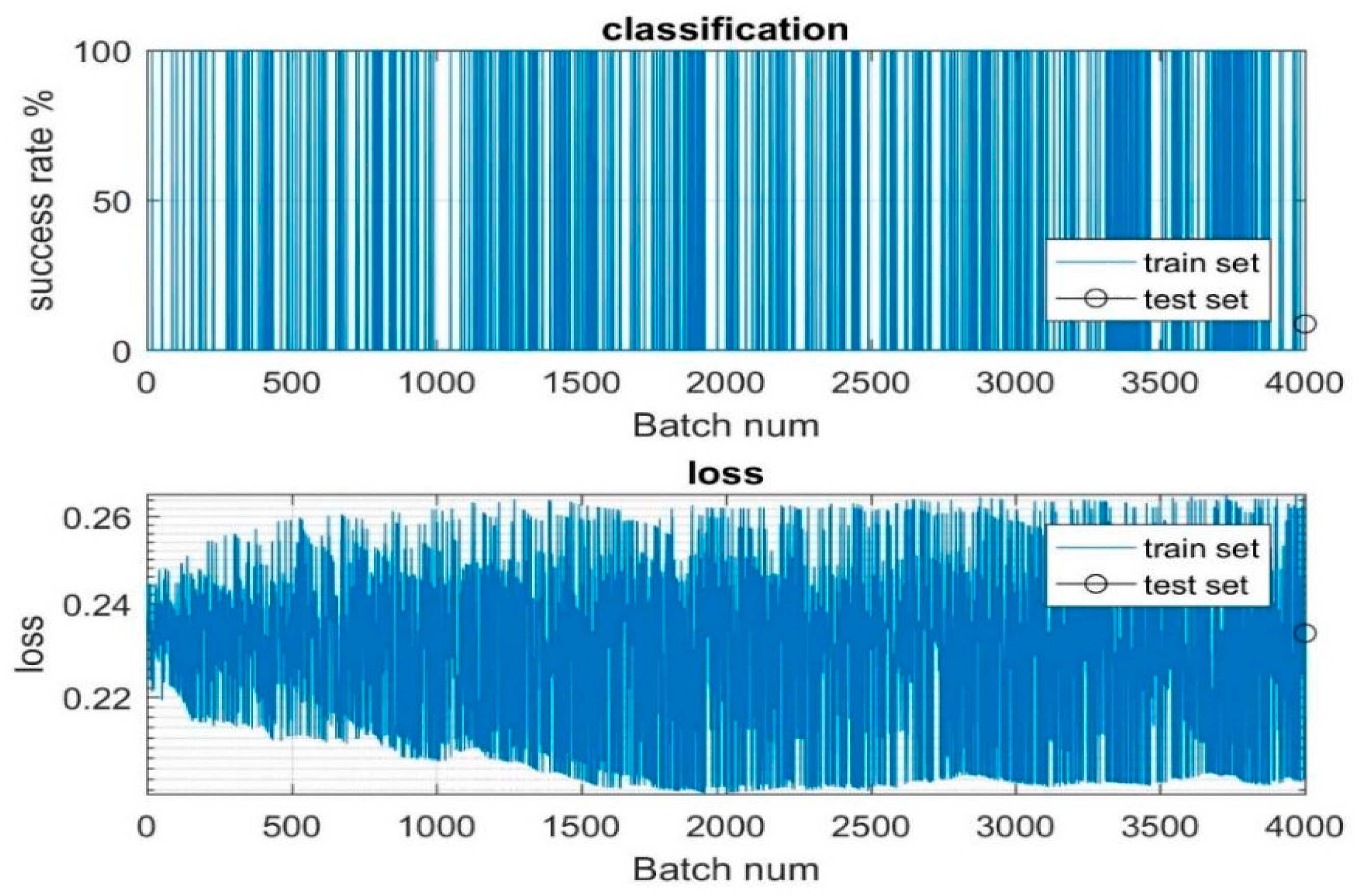
The dataset containing 4000 aerial and landscape images is given as the input to the model for training and testing.
Figure 5 is plotted with the batch number, which is nothing but the samples that are used to train and test the model in the
X axis, and the success and loss rate is represented in the
Y axis. In
Figure 5, the horizontal axis depicts the batch numbers, representing the samples used for training and testing iterations. Meanwhile, the vertical axis showcases the success and loss rates, crucial metrics for evaluating model performance. During the training phase, the model thoroughly processes the 4000 images to discern their relevance and suitability for subsequent estimation tasks, particularly in determining carbon values. This process involves extensive analysis and learning from the provided dataset to ensure robust performance. Upon the completion of training, the model undergoes testing, where it is assessed on a subset of 300 images. This evaluation stage aims to validate the model’s effectiveness in accurately estimating carbon values and to ascertain its generalization capabilities beyond the training dataset. The success and loss rates plotted in
Figure 5 serve as key indicators of the model’s performance across different batches of training and testing data. These rates offer insights into the model’s ability to learn from the dataset and make reliable estimations. Overall, the iterative process of training and testing on the dataset of 4000 images enables the model to refine its understanding and improve its predictive capabilities, ultimately enhancing its utility in estimating carbon values from aerial and landscape imagery.
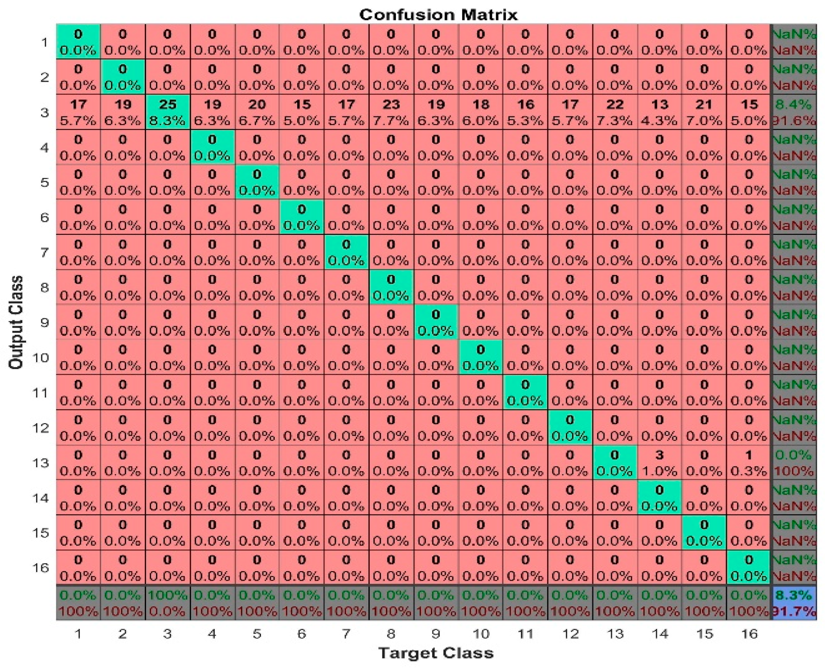
The confusion matrix allows us to measure recall and precision, which, along with accuracy, are the metrics used to measure the performance of machine learning models [
41]. The confusion matrix is a crucial component of evaluating machine learning models, providing a comprehensive breakdown of their predictions against actual class labels. From this matrix, crucial performance metrics such as accuracy, precision, and recall emerge [
42,
43]. Accuracy provides a holistic view of overall correctness, while precision and recall provide nuanced insights into the model’s behavior, particularly in situations with imbalanced classes or varying costs of misclassification. Precision focuses on minimizing false positives, particularly when the cost of incorrect positive predictions is high, while recall emphasizes minimizing false negatives, particularly when missing positive instances have significant consequences. Together, these metrics form a comprehensive evaluation toolkit, guiding model optimization and ensuring alignment with task-specific objectives and dataset characteristics. In our model, we are training images which are mainly in the form of the matrix given by
Figure 6. This matrix consists of the categorical vector of image labels. The N by M matrix is used, where N represents the number of classes and M represents the number of observations present in the images. The confusion matrix is mainly used to compare the results of true labels of trained data and predicted labels. The
X axis denotes the target class, which is the true test label. The
Y axis denotes the predicted class, i.e., the output class. These two are represented in rows and columns. Rows are the predicted class and columns are the true test class. Each cell gives information about the number of observations and percentage of total number of observations for that particular cell. The right end column species denote the precision values of the model, and the bottom row species denote the recall values of the model. The diagonal cells give information about correctly classified observations. The other cells provide details of incorrectly classified observations of the class. Even though the underlying classes do not provide any observations, they display the results with zero percentages. The output and target class must have the same number of elements. The bottom right cell gives the percentage of overall accuracy by comparing the test values with the predicted values. We obtained over 91.7% accuracy in our model.
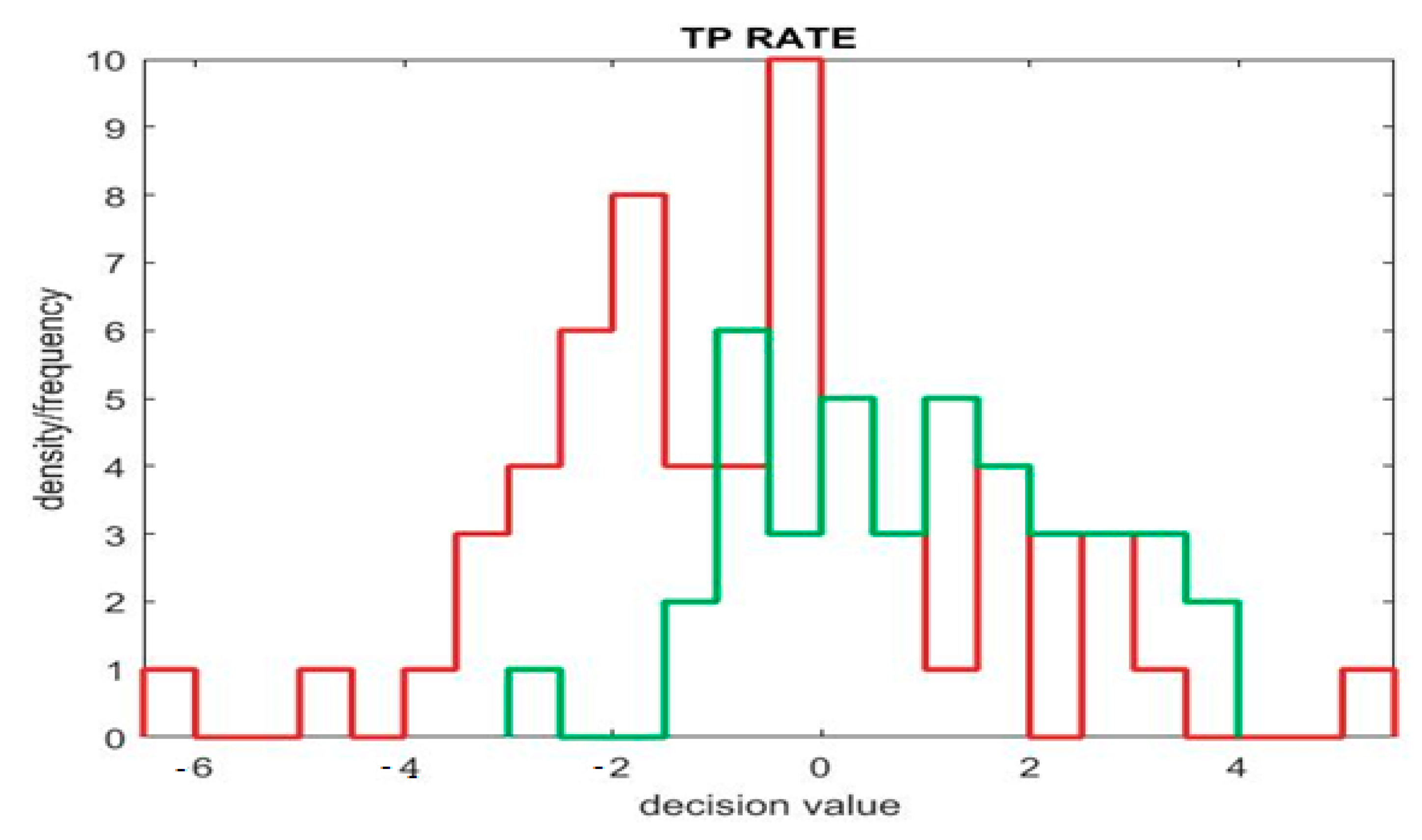
Figure 7 represents the TP rate (true positive) of the model. Where the
X axis denotes the predicting values, which are positive or negative, the
Y axis denotes the actual values, which show whether the predicting values are true or false. By combining actual and predicted values, we get to know about the TP (true positive), FP (false positive), TN (true negative), and FN (false negative) rates. This graph compares the abovementioned four fields for measuring the performance of the classification models. The green color line in the positive area gives the TP rate, where the negative area gives the TN rate. Likewise, the red color line in the positive area gives the FP rate, where the negative area gives the FN rate.
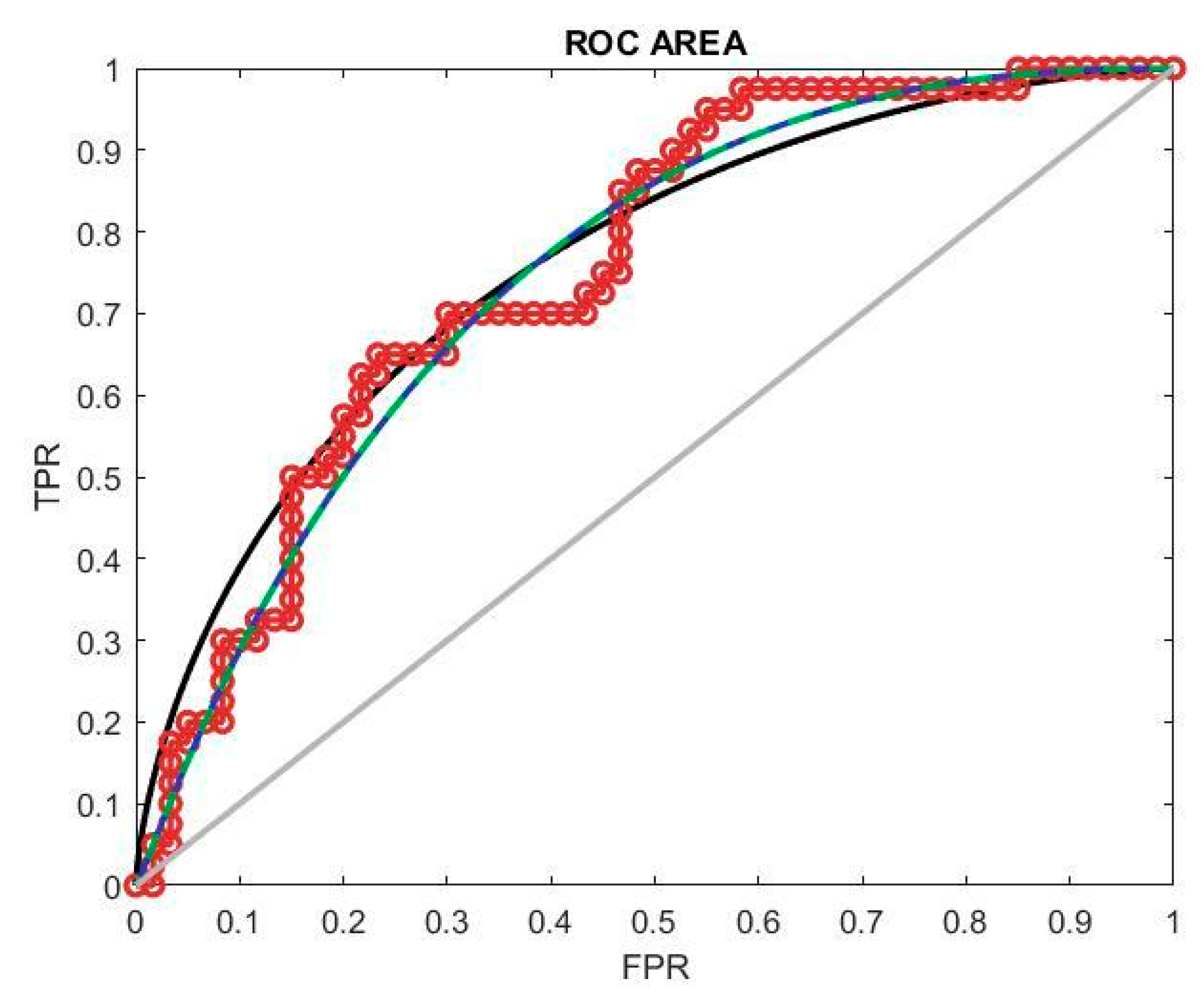
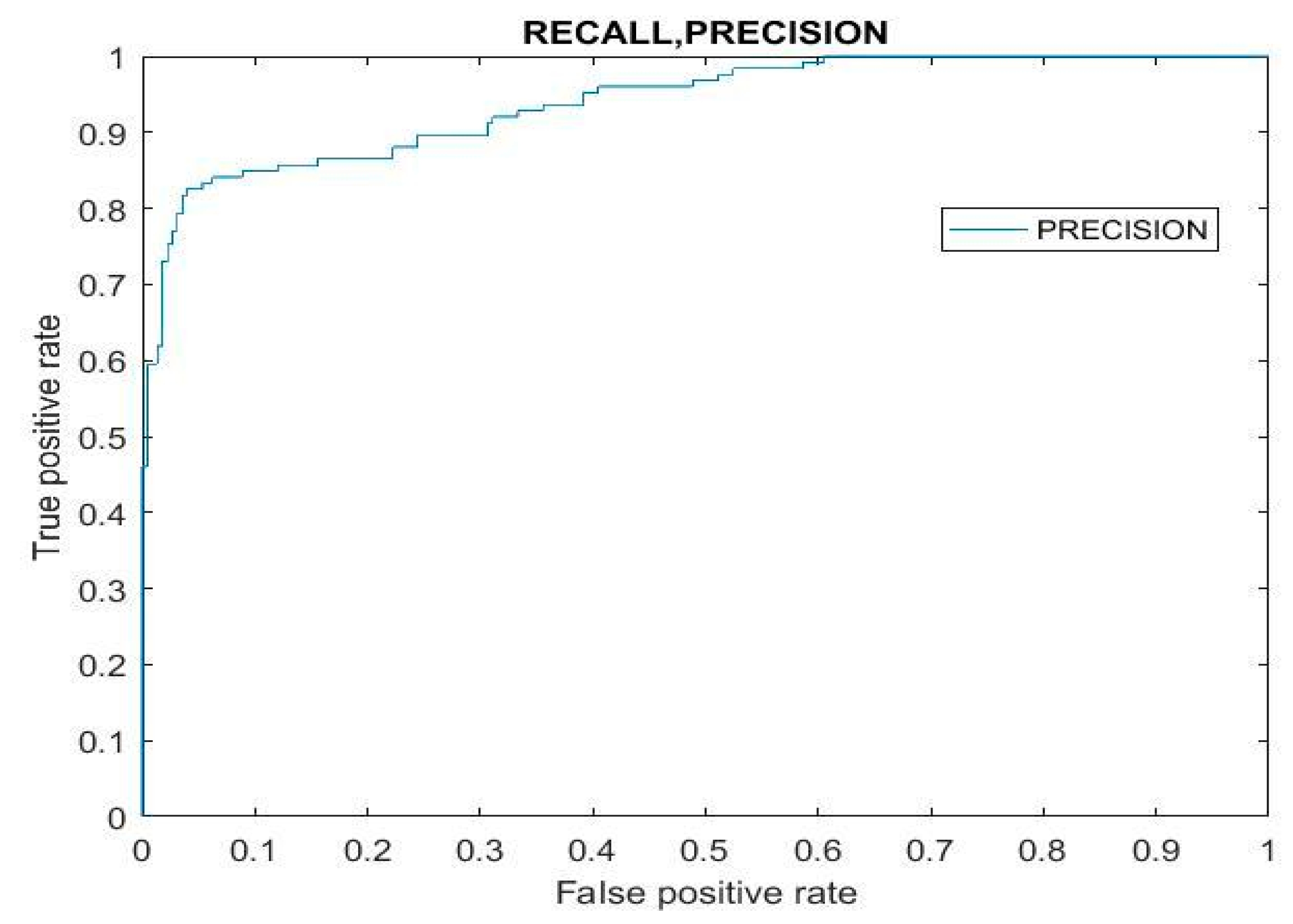
The classification model’s performance is evaluated using the ROC curve, depicted in
Figure 8, which stands for the receiver operating characteristic curve of the receiver. This curve illustrates the model’s performance across various thresholds by plotting the true positive rate (TPR) against the false positive rate (FPR). In assessing model performance, precision is a crucial factor, necessitating higher threshold values for optimal performance. A successful classification model exhibits an ROC curve that approaches the top left corner of the plot. This position implies a high TPR and low FPR, indicating the model’s ability to accurately classify positive and negative samples. The ROC curve provides a visual representation of the trade-off between the TPR and FPR at different classification thresholds, guiding the selection of an appropriate threshold for maximizing model performance in terms of precision and overall classification accuracy.
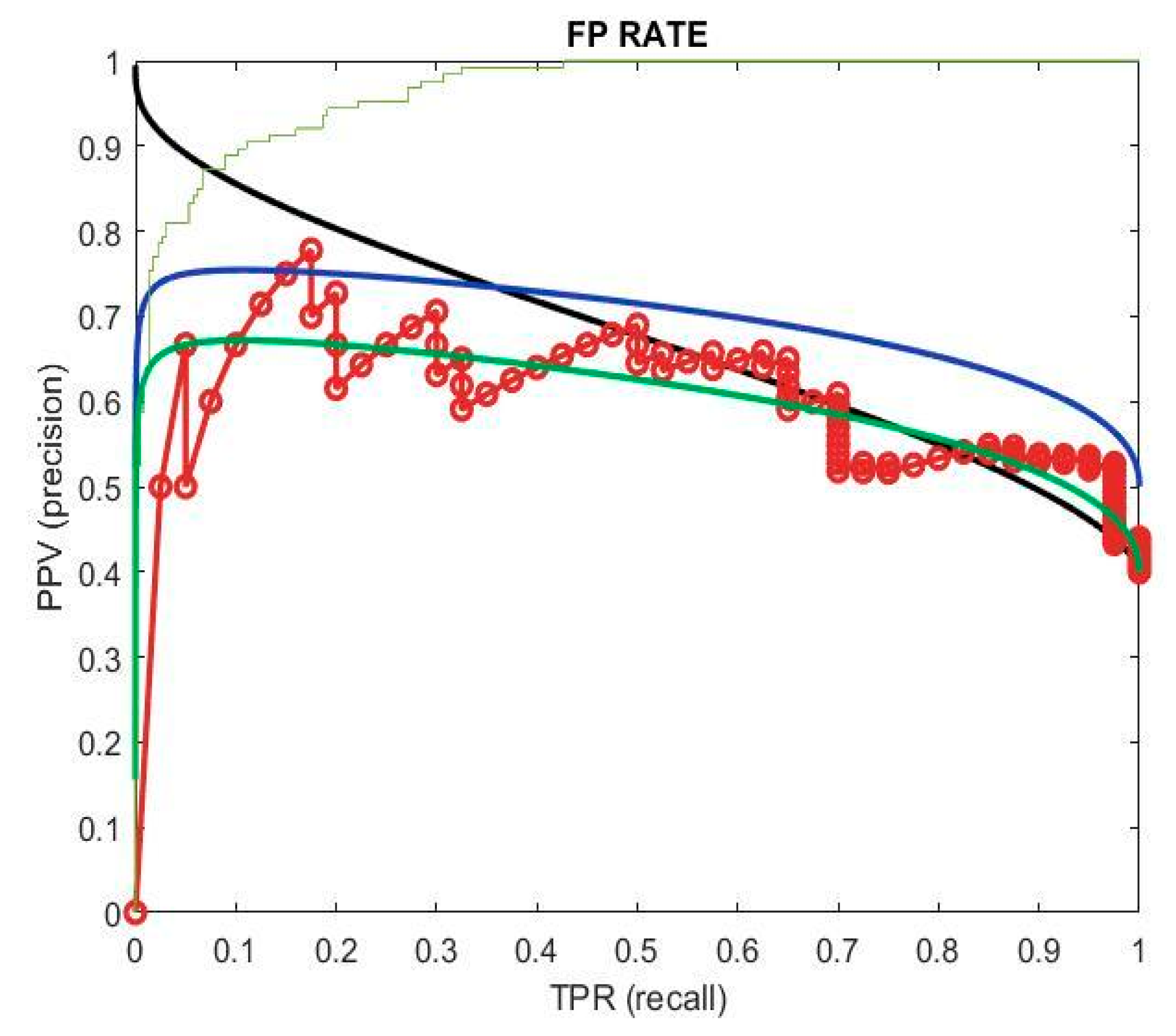
The false positive rate (FPR) quantifies the proportion of incorrect predictions labeled as positive out of all the actual negative instances. It is derived from precision and recall, with recall indicating the true positive rate (TPR) and precision indicating the positive predictive value (PPV). Precision signifies the correctly classified positive samples divided by all the positive predictions. In evaluating model effectiveness, both positive and negative outcomes contribute to accuracy, necessitating consideration of both classes. This holistic assessment is depicted in
Figure 9, where precision and recall possess high values. This indicates the model’s effectiveness across multiple thresholds, as it achieves high precision in accurately identifying positive instances while maintaining high recall by capturing a large portion of actual positive samples. The model demonstrates effectiveness in accurately identifying instances across different threshold settings.
In machine learning, recall and precision are essential evaluation metrics. Precision is the proportion of predicted positive cases that are truly positive, while recall indicates the percentage of actual positive cases correctly identified as positive. In
Figure 10, the graph illustrates the interplay between projected and actual values, revealing patterns in the classifier’s performance. This graph also reveals the relationship between the false positive rate (FPR) and true positive rate (TPR), providing valuable insights into the model’s behavior across different thresholds. Understanding this relationship is crucial in establishing a robust categorization system as it allows for fine-tuning to take place, achieving optimal trade-offs between false positives and true positives. By utilizing these insights, practitioners can create classification systems that effectively balance precision and recall, ensuring the accurate identification of positive cases while minimizing misclassifications.
F1 Score and RMSE
The F1 score is a commonly used metric for evaluating the performance of binary classification models, such as those used in machine learning and data mining [
44]. Regression models predict continuous values, and RMSE measures the average deviation of the predicted values from the actual values. The accuracy for the images that are chosen as the input to conduct the estimation in the segmentation and classification step accounts for providing an accuracy of 92%.
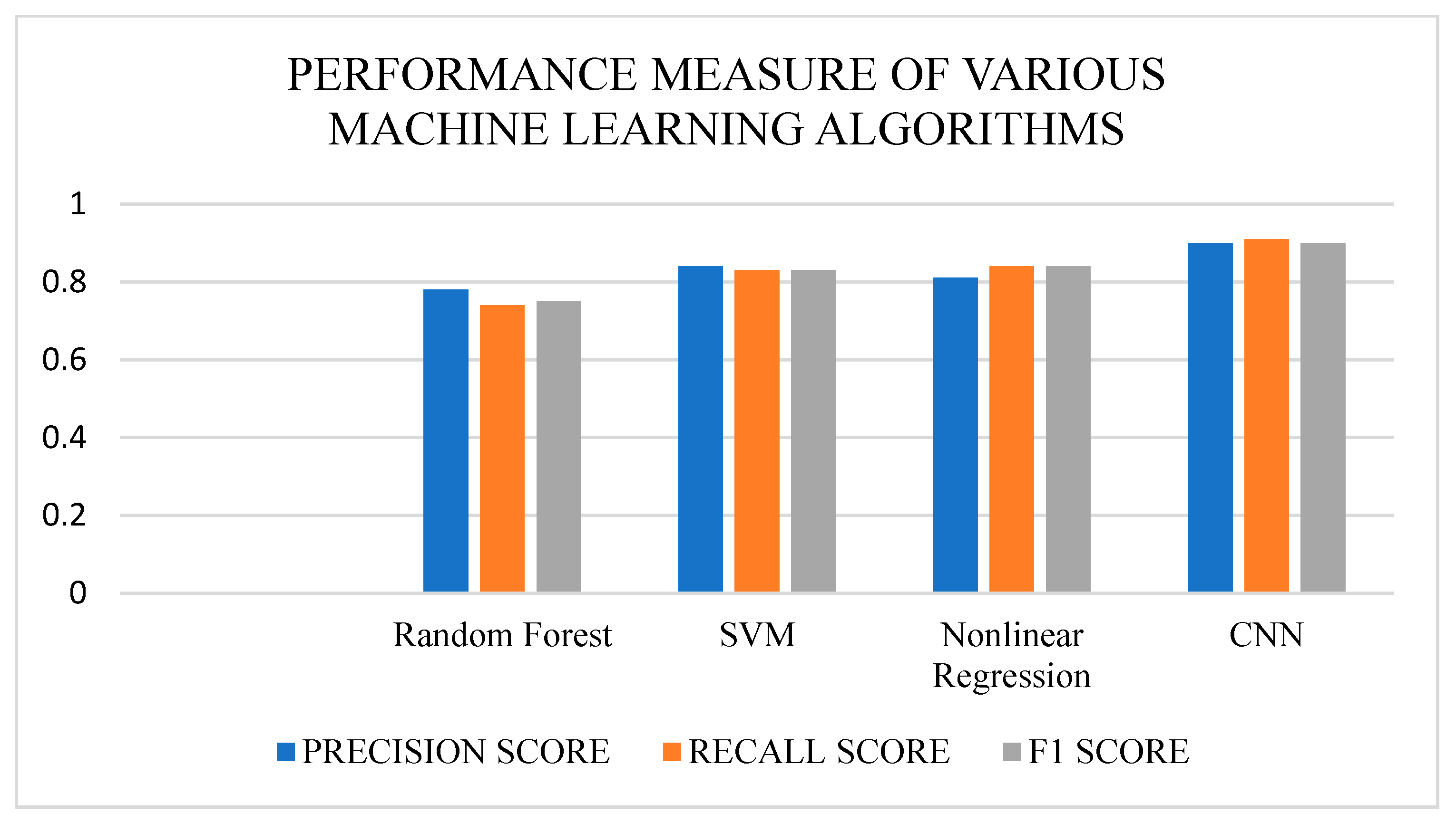
Table 1 and
Figure 11 show the comparison of various machine learning algorithms.
The performance measures, such as precision score, recall score, and F1 score, of the various machine learning algorithms, such as Random Forest, SVM, Nonlinear Regression, and CNN, were compared. The algorithm performed well compared to previous work [
3]. These metrics provide insights into the algorithms’ ability to accurately categorize positive cases, capture all relevant positive instances, and balance between precision and recall. The comparison aimed to evaluate the algorithms’ effectiveness across multiple tasks and datasets, highlighting their strengths and weaknesses. Using rigorous evaluation and comparison, practitioners can determine the best algorithm for specific applications, ensuring optimal performance and reliable classification results. In the comparative analysis of machine learning algorithms such as Random Forest, SVM, Nonlinear Regression, and CNN, precision score, recall score, and F1 score were crucial metrics for assessment. These measures provide valuable insights into the algorithms’ ability to accurately classify positive instances, identify all relevant positive examples, and strike a balance between precision and recall rates. The objective of this comparison was to accurately evaluate the effectiveness of these algorithms across various tasks and datasets, thereby determining their respective strengths and weaknesses. Through rigorous evaluation and comparison, practitioners acquire a deeper understanding of algorithmic performance nuances, enabling informed decisions regarding algorithm selection for specific applications. This ensures the implementation of the most suitable algorithm which provides optimal performance and consistent classification outcomes, thus enhancing the reliability and effectiveness of machine learning systems in real-world scenarios.
4. Conclusions
Satellite sensor data are used to estimate CO2 exchange on a regional or global scale. With the help of the data that we obtained from the Deep Globe dataset, the amount of carbon trapped inside the trees in a particular area, which will help in reducing the amount of carbon in the atmosphere and maintain a balanced proportion of carbon in the atmosphere, is estimated. The Region of Interest, along with CNN, is used to implement the model. The Region of Interest is used to take in a particular area of the image to perform further calculations, and CNN is used to extract the features of the image to detect the level of carbon present in that area. The estimation is mainly based on the RGB values of the image, which will provide a better way to differentiate the different shades of green and find the area which contains the greatest number of trees. The ROI, with the help of the CNN model, is used to estimate both the level of carbon and also the exact amount of carbon present in that particular area by using aerial images. This proposed work helps to estimate the AGB in the specified Region of Interest, and this calculation helps to improve the ecosystem by planting more trees. Carbon sequestration is improved in the environment as a result of the planting of more trees. By making the model in this way, more people can work on and know about the effects of carbon, and this encourages people to work for the environment, so it is easy to find the dataset as it will contain images taken from a normal camera or drone image. This will help the environmentalist to make changes to the environment in the long run.
In future work, a model can also be built to estimate the number of trees to be planted to reduce air pollution. A profound plan for estimating the amount of carbon, along with any sort of image and not just an aerial image or LIDAR images, will be proposed, as aerial images can be accessed only with permission to access the satellite data from the original source.
Statements and Declarations: Compliance with Ethical Standards.


 and
and 
