1. Introduction
In many urban areas around the world, transport is at the center of many economic and social development challenges. In its 2016 report, the United Nations Secretary General’s High-level Advisory Group defined sustainable transport as “the provision of services and infrastructure for the mobility of people and goods—advancing economic and social development to benefit today’s and future generations—in a manner that is safe, affordable, accessible, efficient, and resilient, while minimizing carbon and other emissions and environmental impacts” [
1]. There is an extensive field of research showing the importance of public transport from a sustainable perspective and to the different dimensions of sustainability [
2]. Among available modes of transport, commonly accepted sustainable transport includes public transportation, such as electric buses, trains and BRT systems, that can carry people far more efficiently than cars [
3]. Public transport provides an essential service for sustainable future. Many cities across the world have realized that a transport system reliant mostly on personalized modes is not sustainable.
New York City (NYC) has a highly multi-modal urban transportation system. Various transportation services such as fixed route public transit systems, on demand taxi and personal bike sharing are available. However, service and availability of modes differ between regions and neighborhoods. Among these modes of transport, the transit system plays an important role as it is the large transportation system which provides mobility in a sustainable manner for residents, commuters and visitors in the city. Therefore, it is very important for the city’s administrators to provide transit services that continue to retain and attract riders and consequently remove some vehicles off the congested roadways. Despite the expansion of electrification of vehicles also being considered as a positive way to achieve sustainability in the transport systems, private electric vehicles pollute less, but they do not reduce congestion as they still “require roads and parking spaces, and are susceptible to crashes, and therefore contribute to a dispersed and unhealthy landscape” [
4]. In the New York City metropolitan area, people frequently use public transport, and common challenges (such as improving customer experience and increasing efficiency) can be frustrating for both commuters and transit providers. With advanced technology devices well integrated into people’s lives, today’s transit customers expect more convenience, more comfort and more personalization of services. Public transport must adapt to meet the needs of their customers. For example, to attract customers, transit operators must develop some key metrics to measure the performance of their service and improve the quality of service. By using smartphones and other technology to collect data, transport companies will be able to efficiently organize their services. One of the principal metrics reported by transit companies are transit users’ perceptions of the provided services. Therefore, understanding customers’ sentiments towards the transit service could help in capturing their perceptions. It is also important to understand the different factors and history that distinguish and define transit systems across the world: how these factors relate to the transit riders’ customer experiences and can influence and support a region-specific study. The Metropolitan Transportation Authority (MTA) in New York had to face many challenges specific to New York, including financial deficits and natural disasters (i.e., 2017–2018 NYC transit financial crisis and Hurricane Sandy), and has a vast history of overhauling customer service to accommodate for newer circumstances (i.e., MTA “Fast Forward” and Sandy Recovery and Resilience Program). Since the system is comprised of the original IRT, BMT and IND railroads, transfers are often necessary, making timeliness and frequency among the highest concern to customers.
The goal of this study is to propose a methodology that utilizes sentiment analysis to explore and extract mobility patterns using both openly available mobility data in New York City and users’ posts on social media. Using data from several modes of travel in NYC, such as public transit (subway), bicycle sharing system and taxis, the travel patterns of different demographic characteristics will be analyzed. Several factors that affect these travel patterns will be inferred. Appropriate planning and operational aspects for enhancing mobility will be proposed.
To ensure service is kept up to par with the expectations of a transit agency, extensive information pertinent to the quality of service is collected and tracked throughout its transit systems. With the ever-growing accessibility to the Internet, it is now easier than ever for transit agencies from cities across the world to be more transparent with their customers about service performance by releasing their datasets to the public and researchers. As an example, in New York City, the current dashboard (created by the Metropolitan Transportation Authority (MTA)) allows for better communication to customers on the status of service. Most of this information is provided using the MetroCard entry data (MetroCard is the fare card used for transit in New York City). The data are available for train capacities, wait times, travel times and station environment, among many other metrics [
5,
6]. While transit agencies set their own expectations about the performance of their system, the users have their own series of expectations and opinions when riding the transit system. The users’ expectations have been collected by surveys and, more recently, on a greater scale on social media. Surveys and social media allow customers to express their own sentiment regarding service and allow insights on factors that satisfy or frustrate customers of transit.
Surveys have always been a useful and conventional way of collecting customer experiences and opinions, especially those involving feedback about their transit experience. However, given the requirement of voluntary participation and the time it takes to administer surveys, transit surveys often generate scant turnout and usually do not accurately represent the target customer population. Therefore, it is important to seek other sources that could generate customer sentiment on a scale closer to that of the area’s actual population. With over 145 million daily users worldwide, Twitter has proven to be an easy-to-use and accessible social media option where users can instantly upload their thoughts and opinions to the Internet from anywhere in the world. Public transit is an integral part of everyday life for hundreds of millions of people. Public transit operators could partner with Twitter Inc. (San Francisco, CA, USA) to utilize their expansive user base data and create metropolitan-scale potential for text and sentiment analysis of customer’s perceptions. This study explores the benefits of text and sentiment analysis of Twitter data, as well as the applications of such analysis towards understanding customer sentiment, transit performance and the relationship between the two.
To accomplish the objectives of this study, this paper is structured in five sections. Following this introduction, the authors performed a literature review on sentiment analysis of transit users to understand the state of the research in this area and results from prior studies on users’ perceptions regarding transit services. This review of literature is followed by sections on the methodology and the results of the analyses performed with social media data and reported metrics by MTA. Lastly, a section on key findings of the study concludes this article.
2. Literature Review
Understanding the key findings of studies on both Twitter data and surveys is important for planning and conducting customer sentiment analysis using transit-related tweets. A handful of techniques are used across various studies and fields in order to define transit riders’ experiences through customer feedback and social media use. Text and sentiment analysis is a key component of analyzing Twitter data. A Twitter data mining study [
7] on transit in the Toronto metropolitan area used a transit dictionary and thesaurus to find relevant terms on the topic at hand, such as travel time or safety. The top factors that customers expressed in this study, in order of importance, are location of service, timeliness, information, seating availability, travel time, personnel/quality of service, safety and security, and vehicle maintenance/upkeep. A study on sentiment analysis of Los Angeles Metro feedback found that the Blue and Green lines had a relatively negative sentiment from customers, while the LAX, Expo, Purple, Gold, and Red lines had received a neutral to positive sentiment from customers. Specific lines have a varying level of sentiment throughout the week. For instance, the Blue line had a positive sentiment on Mondays, while receiving negative sentiment on weekends. The notable keywords carrying sentiment included “delay, disable, dies, fatal, and beating” [
8]. A similar study utilized the same approach to sentiment analysis using text, while also finding words that may boost or reduce sentiment, such as “not, won’t, couldn’t, shouldn’t, wouldn’t”. Emoticons were also included in sentiment calculation [
9]. Another study looked at the Twitter usernames of major airlines and specifically included emoticons and a custom sentiment dictionary in their research [
10]. In India’s capital region, Delhi, the uniquely implemented odd/even traffic policy was subject to mixed criticism on the Internet from motorists. Negatively connotated sentiment used words such as “gimmick, failure, dangerous, vile, choking, jam”. Positive sentiment was received as well, with words such as “smooth, support, good” [
11].
Generally, sentiment analysis studies, both survey-oriented and social media-oriented, provided very similar results while differing vastly in the context of either urban transit or suburban transit [
12]. For urban analysis, people generally criticize wait times, cleanliness, safety and comfort, and fare costs. There was not much difference in sentiment between the two areas of transit; however, both areas generally received more negative sentiment than positive. Younger generations were less satisfied with transit usage, although they comprise the majority of customers [
13]. Customer sentiment of safety on transit is predictable by the sentiment of safety in the customers’ home neighborhoods [
14]. People also cared whether public transit served their neighborhood and cared about the distance from the nearest access to transit from their home [
15]. In urban environments, when customers generally have a positive transit experience, not only does ridership increase, but so does the satisfaction on the general quality of life of the rider [
16]. For suburban transit, the top expected criteria include accuracy of the itinerary, system safety, cleanliness, passenger comfort, servicing and passenger information (in that order) [
17]. Date and time analysis may reveal when the most tweets are generated, indicating lapses in service, increases in ridership or traffic disruptions [
18]. A Chicago-based study that delves into micro-events found that positive sentiment was highest around 7–8 a.m. and 6 p.m., while negative sentiment was highest around 8 a.m. and 6 p.m. as well. The proportion of positive sentiment was highest at 4 p.m. and 12 a.m., with the most tweets generated around rush hours [
19]. Raczyncki et al. studied daily social media posts and comments on public transit events in Poland [
20]. The authors developed a typology of transit information and a database of transit stop names in Poland. These data have been used by them to assess sentiment resulting from various public transit incidents. El-Diraby et al. used data over an 11-month period from the TransLink’s (Vancouver transit agency in Canada) Twitter account and developed a network analysis of social media users who interact with the account and compared them to similar data from two other Canadian cities. In so doing, they contrasted the results in days with disruptions versus days with normal operations [
7].
As social media data are constantly expanding at an exponentially rate, the effect that social media has on customer sentiment has also been studied. Studying the psychology of social media may aid in the understanding of how the public perception of customers on transit services may be biased based on trends and what they read on social media. A Facebook study looks into this phenomenon by correlating sentiment with likes and shares on a post. In a study on natural disasters, groupthink is described as a psychological phenomenon used by influential social media users, celebrities or other spokespersons, where they may use their platform to alter the public’s perception and sentiment towards a specific issue [
21]. Similarly, the more likes or shares a post has, the more reputable it becomes. Ex-NYCTA President, Andy Byford, was an example of this phenomenon in New York when he made a positive impact on the New York City Transit (NYCT) image and its customers through his sociable persona, transparency and community outreach during his two-year term at the helm of the agency. An MTA study conducted research on a “reach and match” algorithm used to observe headways and calculate wait times for their station’s countdown clocks [
22]. Similarly, another New York study focused on the relationship between additional passenger wait times and headway timeliness in order to represent the customer perspective of added travel times [
23]. These data were collected using MetroCard data from linked trips (subway to subway/bus). The study expresses interest in implementing these metrics during weekend service when service is affected by track maintenance [
23].
Some researchers have proposed methods to capture transit users’ perceptions on transit services. Using some discrete choice logit models, a study published in 2008 proposed a methodology for capturing transit passengers’ perceptions and expectations on the overall service quality by using both rating and choice options [
16]. This methodology is useful for transit operators for measuring service quality and for effectively improving transit services [
24]. Also, proposing a logit model with a non-parametric distribution to investigate the transit users’ perceptions of quality of transit services, another study concluded that users’ perceptions of transit services are heterogeneous [
25]. In a later study, Eboli and Mazzulla proposed a methodology based on both the use of passenger perceptions about the transit service and the use of transit agency performance measures for measuring transit service quality [
26]. By combining these two types of service quality measurements, this methodology may provide a reliable and more objective measurement tool of transit performance [
26]. By performing a qualitative study of public transport users and car users to explore perceptions of public transport service quality, a study found that transit service should be designed in a way that accommodates the levels of service required by customers to increase public transport usage [
27]. This study demonstrated that the choice of transport is influenced by several factors, such as individual characteristics and lifestyle, the type of journey, the perceived service performance of each transport mode and situational variables [
27]. Friman and Gärling conducted a stated preference study to investigate users’ satisfaction with public transport services [
28]. The results show that overall satisfaction is related to factors that include the reliability of service and the simplicity of information. Their study also shows that the total frequency of negative critical incidents affected overall satisfaction, whereas the frequency of different types of negative critical incidents selectively affected attribute-specific satisfaction [
28]. Performing a survey of transit users at transit stops, other researchers found that the most important determinant of user satisfaction with a transit stop or station is the personal safety of users and the frequency and reliability of service, and that it has little to do with the physical characteristics of the facility [
29]. Taking a case from Ahmedabad City in India, a study published in 2020 analyzed users’ perceptions about service quality in city bus and rapid bus transit systems by identifying service attributes from the literature and asking users to rate service quality attributes on a Likert Scale from 1 to 5, in terms of their importance and performance perception [
30]. The results illustrate that passenger expectations are linked to existing service quality levels and as service quality improves, user perceptibility widens to a larger set of service parameters [
30]. Morton et al. employed factor analysis to identify attitudes towards perceived quality of bus services and provided a detailed examination of a quality-of-service indicator utilized by the Scottish Government to assess the opinions of passengers towards bus transport [
31]. Results of the analysis suggest that attitudes regarding the quality of bus service vary significantly across passenger groups and that improvements to service frequency, availability, reliability and stability will likely increase the perceived satisfaction among existing passengers [
31]. Using a descriptive sampling technique of data collected through a structured questionnaire and published records, a study was conducted to understand customers’ attitudes toward choosing public transport [
32]. The authors of this study concluded that the majority of people prefer public transport over personal vehicles; it also found that dissatisfaction of public users decreases the attraction towards public transport [
32].
Throughout all these studies, there is a clear overlap between the factors that affect customer satisfaction. All metrics across the studied transit agencies similarly illustrate differing levels of positive and negative customer sentiments. However, the magnitude of sentiments depends on the type and quality of transportation services available in a specific city, neighborhood or region, as well as other existing infrastructure, and transportation systems associated with the region. An entire study on safety showed that perceptions of safety within one’s own home or neighborhood affected their perception of safety when riding a public mode of transit. Opinions on what mode of transit was useful as well as expectations of customer service also changed depending on the transit agency involved.
3. Methodology
Before analysis could be planned and executed, the necessary data needed to be prepared so that the analysis could be engineered around the format of the harvested datasets. First, an application programming interface (API) for Twitter was used to collect a series of tweets, using keywords and tags associated with transit (train, delay, and #MTA, #subway, etc.). The authors used the API for Twitter to collect tweets from June 2015 to May 2016. This collected dataset was purchased from Twitter Inc. The data file obtained from the API contains extensive information on individual user tweets geocoded for the New York Metropolitan area, including exact time, date, location, username and the text body of the tweet. These individual specifications for each tweet allow for a variety of possible methods of analysis, as well as easy customization of what can be used and excluded. Second, the MTA performance data were extracted from a New York State government database containing information on measured metrics, including the type of metric, how many times a metric is reported in a month, the magnitude of the metric and the subsidiary agency of the MTA for which the metric applies.
To arrange Twitter data into a more manageable format, tidy text tools and analyses within R Studio were used to extrapolate each tweet as a separate entity, with further extrapolation of each word from each tweet as a separate entity, and then lastly stemming each word to its base. Each of these stemmed words are summed across the entire dataset; thus, the term frequency can be studied. For example, three tweets that use the words “delay”, “delays” and “delayed”, respectively, will yield the word “delay” when stemmed. Therefore, the three tweets will yield a term frequency of three for the word “delay”. This narrows down the results closer to one specific metric and makes analysis easier to digest. A “stop_words” function allows for further removal of unnecessary and non-words, such as “the” or “http”, and other similar terms. Additional keywords pertaining to news sources and Twitter pages unrelated to customer experience were also removed. Assigning months to the data and grouping them will allow for a direct comparison with the MTA performance indicator data.
In order to conduct the sentiment analysis, an ordinary dictionary could not be used. A sentiment specific dictionary was imported to measure user sentiment across tweets. Two prominent dictionaries used in this research were the “BING” and “NRC” dictionaries. While both carry many of the same words, the applications to sentiment analysis varies greatly between the two. The BING dictionary assigns a word in its dataset either a positive or negative sentiment with an attached weight to that sentiment. The BING dictionary provides a straight contrast between the sentiment of words and allows for a clear comparison of negatively and positively charged tweets (
Figure 1).
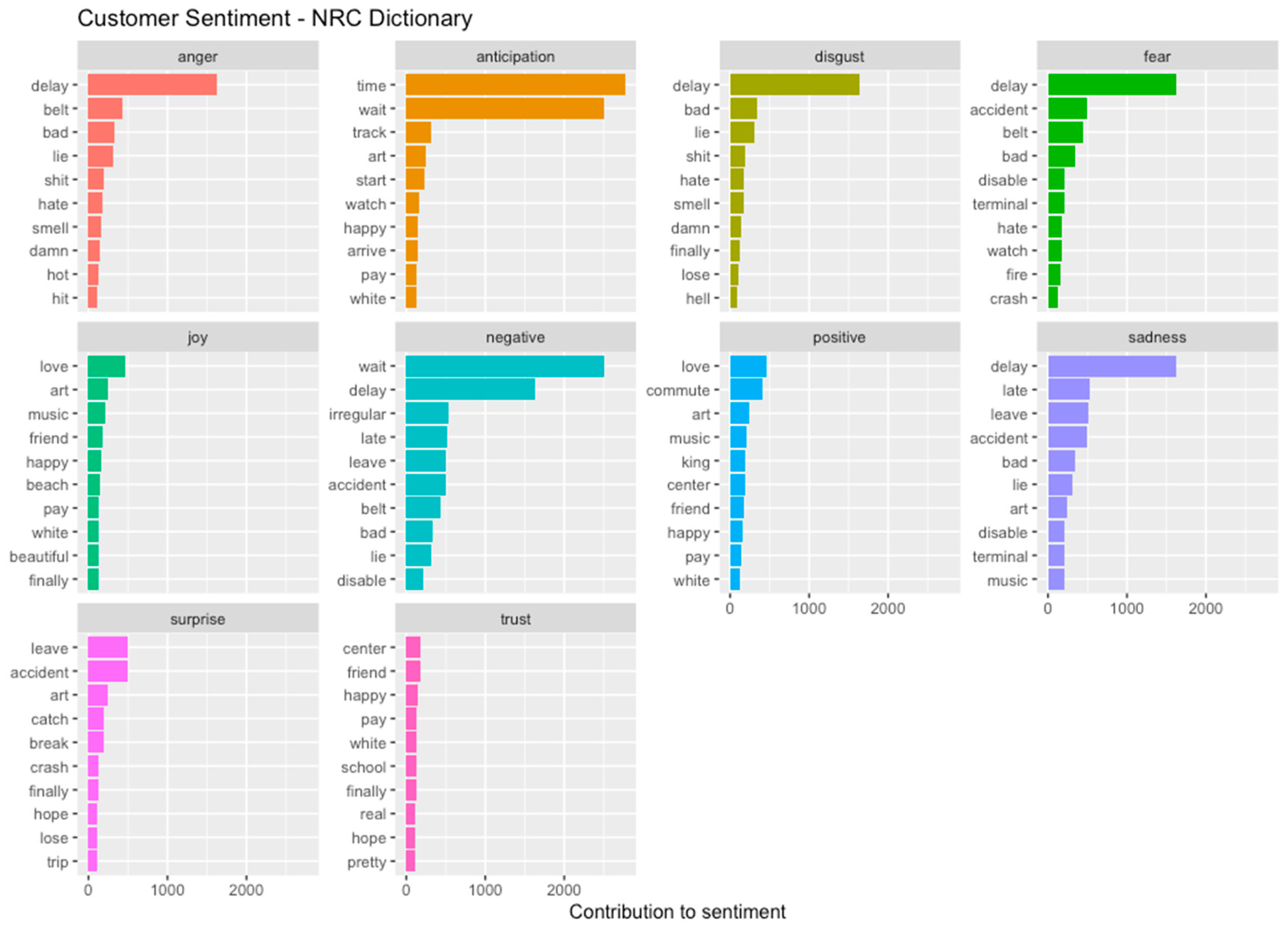
The NRC dictionary carries less words than BING. However, NRC assigns a word to one or more of ten emotions, including anger, anticipation, disgust, fear, joy, negative, positive, sadness, surprise and trust. Most words overlap with two or more emotions; for instance, “delay” is categorized as anger, anticipation, disgust, negative and sadness. Although not immediately important to this study, the NRC dictionary provides some valuable insights on the spectrum of emotions that the Twitter users experience when they post about their transit experience (
Figure 2).
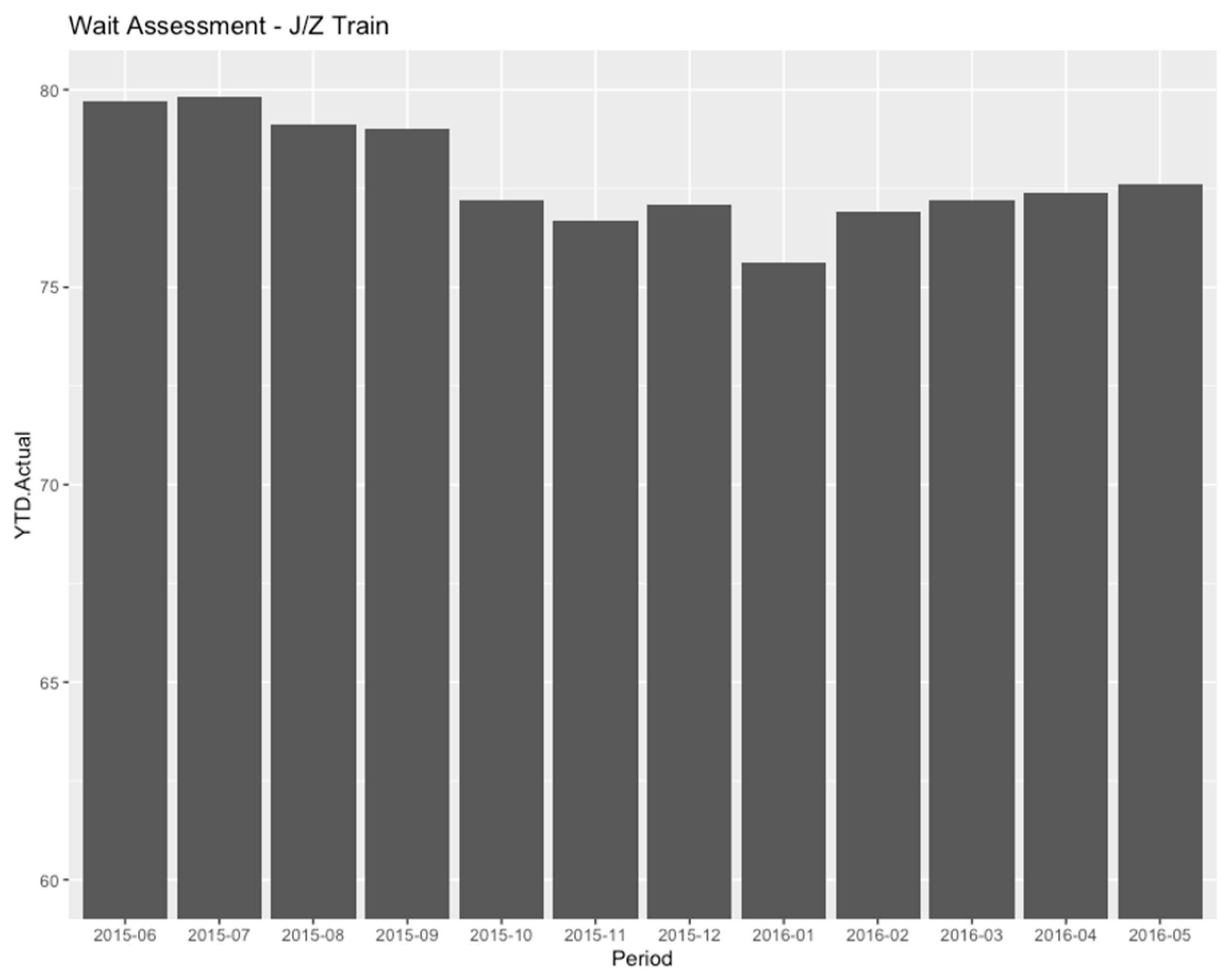
The data provided from the MTA on the New York State government database holds a similar format to that of the data retrieved from the Twitter API; therefore, it is easily organizable and yields informative data. The performance data are only available in the month-by-month format; thus, both the Twitter and MTA analyses will be conducted from a monthly viewpoint. Using grouping, individual metrics can be organized by agency, heavy rail vs. commuter rail vs. bus, and by the individual subway and commuter lines. There are dozens of options when compiling data from the MTA dataset. For example, the percentages of listed wait times for the trains of the J/Z lines are shown in
Figure 3.
Using a flow chart,
Figure 4 illustrates the summary of the steps of the methodology performed by the researchers to extract users’ perceptions and performance metrics.
4. Results
The results of this study are split into two sections: MTA performance analysis data and Twitter sentiment analysis data. Both are crucial to this study and are jointly analyzed in the Key Findings section. Through manipulation of both the MTA and Twitter data, plots and figures make use of the processed, filtered and stemmed data. As illustrated in
Figure 5, an application of tidy text tools depicts words organized in a word cloud with positively weighted words at the bottom, negatively weighted words towards the top and the term frequency represented by the size of the word itself. The implementation of the customized transit-oriented dictionary creates a different word cloud with all irrelevant words excluded (
Figure 6).
One should note that many words found in
Figure 5 may not be directly related to service, but rather to the overall experience while riding public transit, including unrelated events.
Figure 6 is a visual representation of the words that were selected for the customized transit-oriented dictionary. Words were selected using a term frequency function to count the total amount of times a word was used throughout the Twitter dataset. Only top words related to transit were hand-picked from the function and placed into the separate customized dictionary. Notice the drastic decrease in non-transit related terms in the new word cloud (
Figure 5 and
Figure 6).
4.1. Twitter Sentiment Analysis during 2015–2016
This portion of analysis represents the nature of the customers’ opinions and responses to their transit experiences. It may not accurately reflect the performance provided by MTA nor the performance indicators reported in the public dataset. It is important to remember that the data used in this analysis are from June 2015 to May 2016 and may also not represent customers’ experiences and responses from other years or samples. These data also do not account for periods of time with unpredictable variables that may have affected users’ experiences, such as union strikes, inclement weather, natural disasters or pandemics.
The terms from the customized transit dictionary are grouped by sentiment and each term is counted. The greater the term frequency for a word, the more the word contributes to an either positive or negative sentiment (
Figure 7). The sentiment of the average Twitter user was mostly negative, with a smaller percentage of tweets representing a positive sentiment of transit experience (
Figure 1 and
Figure 7). The specific metrics being mentioned can be found through metric-specific terms such as “wait”, “delay” and “late” with regard to the timeliness of service. These terms take up a vast majority of the transit-related terms used by Twitter users, which shows that customers mostly tweet about service timeliness. On the positive side, people notice the good things about service, such as system aesthetics, train speeds, station cleanliness and safety (in that order).
The issues reported by Twitter users may change throughout the year in response to the changes in the weather seasons and respective changes to service, as well as reasons for using transit. Some words see no difference in term frequency from month to month, such as time-related words. Other words see no instances at all during certain months such as “irregular”, which shows up only nine out of the twelve months, and “accident”, which shows up only during four out of the twelve months (
Figure 8). Overall, there is no clear change in different metrics taking priority for Twitter users; however, additional studies with more terms may be useful for future research.
The term frequency can also be grouped by the performance metric that each word is related to. Again, Twitter data contributes the greatest to time-related customer feedback. Following far behind, as second, are the tweets that mention traffic and bus-related incidents. The metrics that are most important to customers based on this data are wait times, service quality, crowdedness of trains, safety in stations and trains, appearance and personnel behavior.
Visualizing the metric distribution of tweets may provide more insights into the overall customers’ Twitter behaviors. Although the exact context of each tweet cannot be determined through what normal tidy text analysis is used for, separating the data into metrics can allow for an easy organization of tweets as they can be sorted by contextualization. The usage of each individual term can be tracked by month and compared to other metric-related words. Similarly, in relation to the overall term frequency, words related to service timeliness are used much more frequently than words related to other performance metrics. While the term frequency jumps around a lot throughout the year, the trend seems to follow the same path for all terms. This could be due because the numbers of ridership as well as active Twitter users during each month are inconsistent and therefore may not reflect any noticeable periods of time where certain issues are more prevalent to customers.
Since the time-related terms are abundant in comparison to terms related to other metrics, those other words are compared separately. Again, a similar trend is observed across all terms listed, but the issues customers are experiencing can be listed in order from most important to least important. These issues pertain to station environment, crowdedness of trains and stations, cleanliness, train speed and, lastly, fare cost.
4.2. MTA Performance Analysis
The selected MTA data are also obtained from June 2015 to May 2016 in order to maintain consistency with Twitter data and reflect actual service performance. Performance metric ratings are available for MTA Bridges and Tunnels, New York City Subway, Long Island Rail Road (LIRR), Metro-North Railroad (MNR) and MTA/NYCT Bus. This analysis is cross-examined with Twitter data analysis in order to find similar or contradicting trends. Since traffic-related tweets were left out of the Twitter analysis, Bridges and Tunnels data was also excluded from the analysis of the MTA data. Also, all rail and bus metrics are generally shared among the agencies.
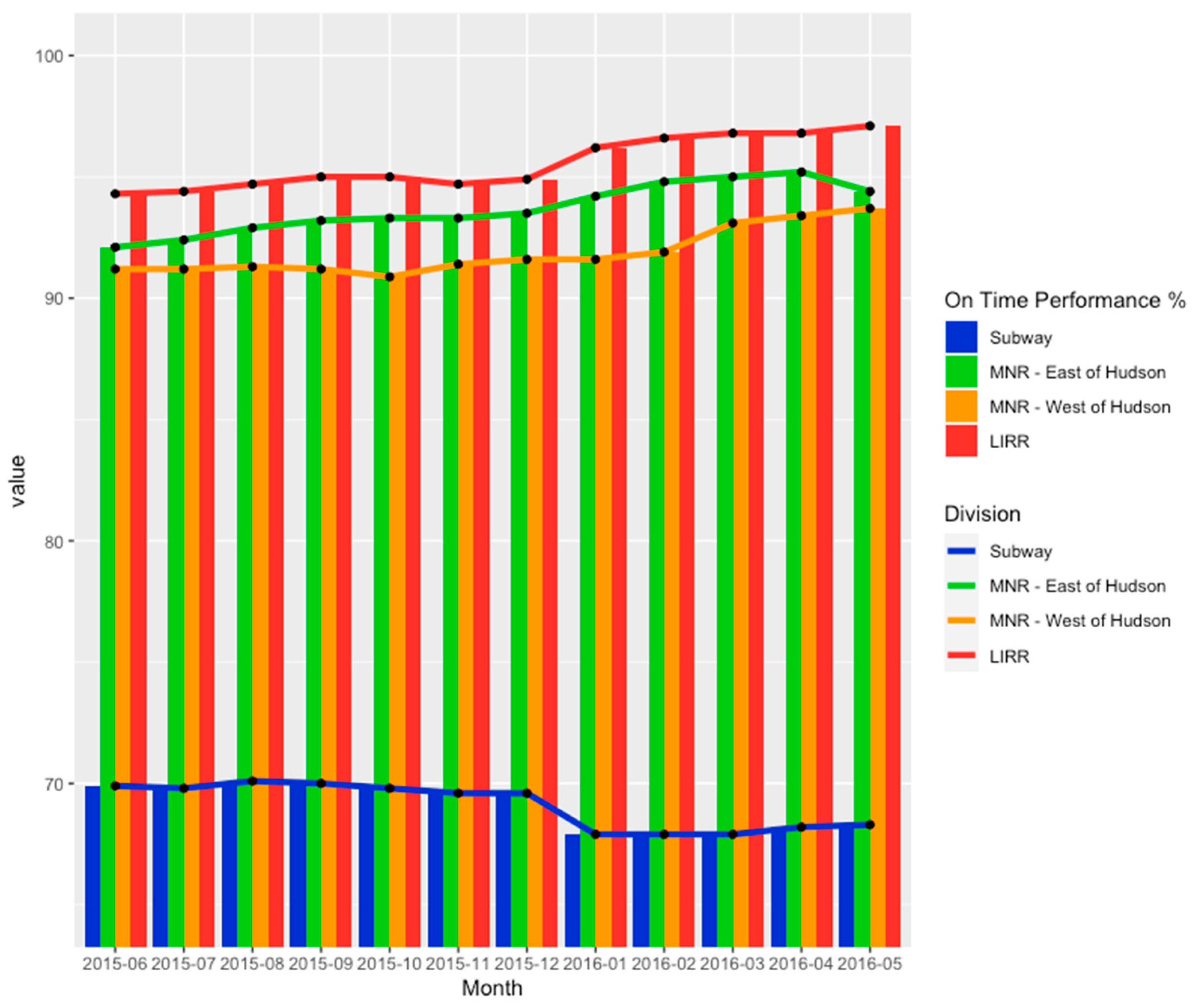
As revealed in the Twitter analysis, wait times and itinerary accuracy are of the highest importance to New York City transit customers. Therefore, reviewing the on-time performance of each of the agencies across the MTA provides insights into the reasons for customers’ behaviors on social media. The on-time performance is much higher on commuter rail lines than on subway lines (
Figure 9). An inverse relationship between customer complaints and quality of service is found when compared to tweets. Below the acceptable performance of 70%, subway lines were mentioned more on Twitter, compared to over the 90% acceptable performance by commuter rail lines, which generated less mentions in Twitter data.
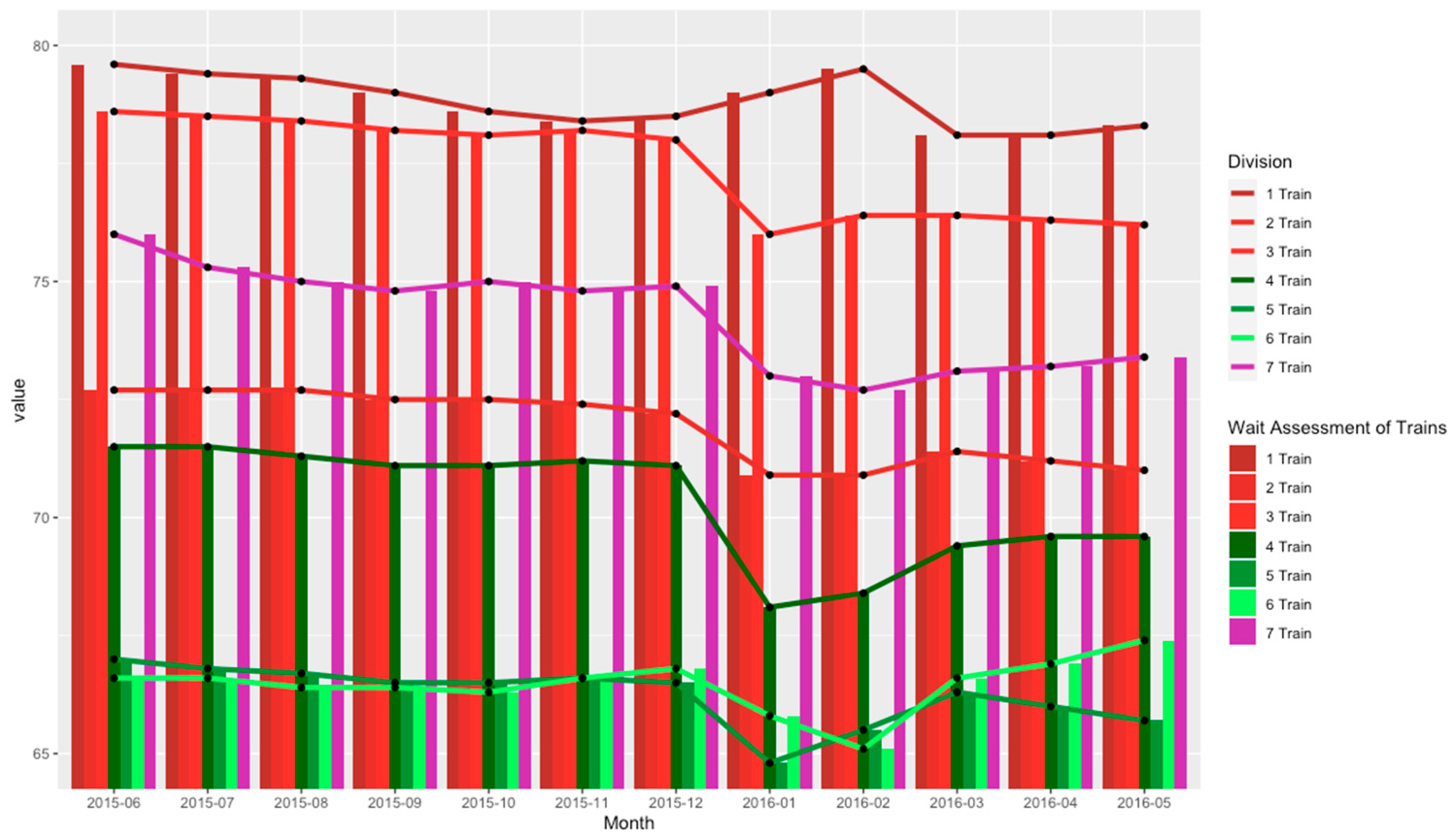
The wait time assessments of the subway allow for a comparison of how service differs between individual lines of the New York City Subway.
Figure 9 depicts the numbered lines of the subway and the percentage of trains that arrived on schedule for that month. All but the No. 1 train shared a similar trendline path as the year progressed. Throughout the year, the percentage of on-time trains gradually decreased and then dropped a noticeable amount during the holidays, while the No. 1 train reported a higher on-time percentage from January 2016 throughout the first quarter. When compared to the term frequency of the words “wait”, “delay” and “late”, their highest term frequency occurred during and after the holiday (
Figure 10). Similarly, the wait time assessment obtained its minimum value in September, which slightly increased before the holidays and is reflected in the increase in term frequency for the same time-related terms for the month of September. Interestingly, the top three train lines mentioned in Twitter data are the first, third and fourth best performing train lines based on the wait time assessment.
The mean distance between failure of train cars and buses provides insights on the reliance customers can have when riding on the MTA system and how the quality of their fleet fluctuates throughout the year. As the year progresses, the condition of the fleet improves for buses and commuter rails but declines for subways. These increases and decreases in fleet conditions are not reflected in Twitter data, which suggests there may be more reliable metrics, such as ridership, for determining how often metric-specific issues are encountered and reported each month.
Although safety is not a highly criticized MTA performance metric, it is equally as important as the accuracy of the itinerary that public transit is safe. Assuring customers that the safety practices are in place may encourage people to use public transit in the future [
9]. As the year progresses, the injury rate stays about the same across all agencies until the holidays, when a jump is seen in injury rates and eases into a decline throughout the year. Interestingly, the decline starts in different months across all the MTA agencies. Metro-North Railroad sees a decline in injury rates as early as December into January, while New York City Subway and MTA/NYCT Bus see a decline from January to February. Long Island Rail Road does not see a decline on injury rates until late March, shortly making a huge dip in the injury rate before soaring back up in April. Further research into what caused these injuries, how they can be correlated with the month in which they occurred, and if these issues are those mentioned by Twitter users can help to incorporate a broader application of sentiment analysis for improving system safety.
The ridership data illustrates the crests and troughs of service usage during a year and provides a deeper understanding on how other metrics perform throughout various months. Generally, all agencies experienced similar rises and falls in ridership over time, indicating that ridership is dependent on the time of year. The ridership slowly decreased as the summer ended before increasing during the fall, likely due to the end of the summer break and the increase in activity. The ridership seems to decrease during the winter with a small increase during December.
By normalizing the term frequency with the ridership data, the variations in Twitter usage may be visualized. Term frequency is calculated per million subway riders for each month. Certain customer issues are reflected as a function of the time of year, rather than as a function of ridership. For time-related words, the term frequency appears to rise throughout the fall, drops as the holidays approach and rises again after the holidays. This indicates that more people may be actively using Twitter upon the end of the summer break and again once riders return after the holidays. Perhaps the busiest time of the year in New York, as the year comes to an end, may leave riders with less desire to post about their transit experience on Twitter, whether it is due to large crowds or colder temperatures.
For the station environment-related words, there is a direct correlation to the time of year in which these issues may occur. Tweets regarding smelliness of stations and trains have a higher frequency during warmer months, where perception of smell is greater than in colder months. Similarly, tweets related to the cold become more frequent from the beginning of fall to the end of the year and decrease from the start of the new year. Tweets related to crowdedness tend to increase during the summer and the holiday months. Tweets related to train speed increase during the holiday months when inclement weather may affect service. The frequency of tweets related to the cost of fare as well as the visual cleanliness of stations and trains remains relatively constant throughout the year; therefore, these issues may be independent of the time of year.
4.3. Transit Sentiment Analysis before/during COVID-19
The data in this portion of the analysis is longitudinally obtained from both the 2015−2016 period previously studied as well as from April 2020 to December 2020, during the COVID-19 pandemic. Although the data for years 2017 through 2019 were considered to be collected for the pre-COVID period, they were not used as they would have required laborious processing for analyses. Sentiment analysis and tweet frequency from both time periods are studied in order to find differences in trends between the two time periods. The contributing factor to this study is the introduction of an international pandemic and its effects on public transit customers’ social media behaviors. Since COVID data are obtained from April to December, the 2015–2016 data have been cleaned to represent this same time interval. All sentiment and tweet frequency data have been aggregated based on the time of day and time of the year in order to obtain a broad understanding of how the dynamics of customer behavior changes based on time.
Before discussing sentiment analysis, it is important to understand exactly how COVID-19 shaped the most important factors of customers’ concerns. As the COVID-19 pandemic unfolded, there was much uncertainty with how the virus spread and what measures were going to be implemented to limit transmission of the virus as much as possible. Cleanliness procedures were deployed all across the country, with New York City implementing a mask mandate almost immediately to reduce the transmission of the COVID-19 virus. By analyzing individual term frequency of tweets from customers during 2015/2016 and during the COVID-19 pandemic, it is evident that some customers’ concerns maintained their rank, while other concerns increased/decreased in their rankings depending on their relevance to the pandemic. For instance, looking at both 2015/2016 and during the pandemic: wait times were still the number one concern of public transit customers (
Figure 11 and
Figure 12). Irregular train service, crowdedness and station environment were all outranked by cleanliness of trains and stations during the COVID pandemic as more customers tweeted about their frustrations regarding the health and safety issues of riding public transit during the pandemic.
Additionally, it is important to look at how tweet frequency changes throughout the course of a day and a year. First, we will focus on weekdays as both public transit and work schedules are most affected by the COVID pandemic during these five days. Twitter posts of transit customers show a dramatic change in tweet frequency between pre-COVID and during COVID, especially during the mid-day hours. This is reflected with an increase in tweets during the mid-day during the pandemic, while there was a decrease in tweets during the mid-day before the pandemic (
Figure 13). This could be due to the increase in hybrid/remote work that leaves more time for people to freely tweet during their work days. Additionally, the near-90% drop in public transit ridership during the pandemic may also contribute to customers feeling safer or more comfortable to take out their smart devices to tweet while riding on public transit. Looking ahead to how tweet frequency differs throughout the year between the two time periods during weekdays, both periods follow very similar trends. However, it appears that tweets related to transit were more common prior to the pandemic as opposed to during the pandemic. This makes a lot of sense as Twitter users grew in numbers from 2015 to 2020, and transit ridership was still on a great decline during the same period.
4.4. Event Data Analysis
The event data based on MTA’s alerts have been analyzed for both pre-COVID and COVID pandemic periods. During these months, construction was the major event category. Additionally, there were more special event alerts during the COVID pandemic. The reduced service during COVID provided an opportunity for the MTA to address some maintenance issues. This is evidenced by a higher number of track work events, particularly during June 2020. When comparing the pre-COVID to the COVID period, there were higher levels of operational activities and police activities. The content of police activity-related events was also analyzed and compared before and during the pandemic, as shown in
Figure 14. It can be observed that there is more service-change related content during the pandemic, with phrases such as “service to … from …”, “to… from… skipped”, “to… from… bypassed” and “will start… end” occurring prominently. The increase of events in operational and police activities is mainly due to the alerts from the pandemic-related issues. The relative increase in pandemic-related and service-related topics can also be observed in transit-related tweets, as noted in the previous section.
There are higher numbers of construction events in the a.m. peak period during COVID-19 (as seen in
Figure 14). This is largely due to the reduced demand and reduced service, which allowed the transit agencies to schedule more maintenance work during this period. A similar increase in operational activities, including alerts related to the pandemic during the peak period, was also observed in comparison to the pre-pandemic period.
5. Key Findings and Conclusions
After the analysis of Twitter data, it is clear that customers are most likely to tweet about the train delays and wait times of trains. Due to the nature of the New York City Subway system, many trips often require at least one transfer. Therefore, time is essential to the average New York commuter as a delay in one train can further delay their subsequent arrival time. From the data collected between June 2015 and May 2016, the metrics that customers expressed their concerns on Twitter comprised the accuracy of the itinerary, timeliness of trains, station environment, traffic-related service, crowdedness of trains and stations, cleanliness, train speeds and, lastly, the cost of fares. Negative sentiment outweighed positive sentiment by a vast margin, with only a small percentage of tweets posted pertaining to positive experience when riding transit. It was also revealed that tweets related to subway lines were nearly four to five times more common than those related to commuter rail lines. The No. 1, 2 and 7 train lines were the most frequently tweeted about, while the MNR’s Hudson and Harlem lines, followed by the LIRR’s Port Washington line, were the top commuter rail lines mentioned on Twitter.
When analyzing transit customer posts on Twitter during the pre-COVID and pandemic periods, it appears that tweets related to transit were more common prior to the pandemic as opposed to during the pandemic. During the pandemic, transit users were most concerned with the cleanliness of the system, as they expressed concerns regarding the health and safety issues of the transit system. At the beginning of the pandemic, there was a drastic change in the list and order of metrics which customers expressed some concerns about on Twitter. The cleanliness became the top concern behind the timeliness of trains. The crowdedness of trains also ranked higher than the station environment due to the uncertainty of the transmission of the virus throughout the first year of the pandemic. On weekdays, the sentiment during the pandemic was generally higher than during the pre-pandemic period, but lower during the weekends. This change in sentiment may have happened as a result of the change in service dynamics implemented by the MTA, the reduction in ridership and the increase in improvement projects during off-peak hours and weekends. A similar pattern on the increase in service and operation-related events was also observed from the transit event-related data which were publicly released by the transit agencies. Additionally, changes in work culture may have also played a role in how often customers tweeted about service or their ability and willingness to tweet throughout the day when riding transit.
When compared with the performance metrics calculated by the MTA, it was clear that the difference in metrics mentioned on Twitter may be due to the discrepancy of on-time performance percentages between subways (<70% accuracy) and commuter rails (90%+ accuracy). There was no correlation between the performance of service and the term frequency of words throughout the year, as all the words maintained the same upsurges and decreases in term frequency during each month. The rankings of metrics also maintained a similar distribution throughout the year, with minimal deviations. Although the No. 1, 2 and 7 train lines were the most mentioned train lines, they were also the first, third and fourth highest performing lines, respectively, based on wait assessment percentages. The mean distance between mechanical failures and injury rates among the separate MTA agencies were studied, but no correlation could be attributed to Twitter activity. The numbers of tweets regarding safety and mechanical failure were too scarce to make any concrete conclusions on the effects of performance within these metrics on customer feedback. When compared to other metrics, there was no clear explanation for the variation in customer tweet frequency reported during any particular month. Specifically, ridership revealed a mixed correlation when it was compared to the changes in tweet frequency. This suggests that customers’ behaviors on Twitter may be affected by the time of year. Different social, weather and service patterns may also directly impact customers’ desires to share their transit experiences on social media. Specifically, it is important to note that customer sentiments and tweet frequencies were at all-time lows and coincided with the highs in the MTA’s disrupted service reports during the same time intervals.
5.1. Future Research
This study has explored the use of Twitter data as an alternative to surveys in conducting a transit analysis. While a variety of methods were implemented in this research, Twitter data contains additional information that was not able to be fully investigated in this paper. Emoji and emoticon analysis is to be immediately researched next, as emojis act as the bridge between the users’ emotions and their tweets. Emojis have a growing prevalence on Twitter and social media culture and are just as vital to sentiment analysis as words that carry sentiment. Separating data by its context can allow researchers to see which sector of transit users are most frequently mentioning, similarly to the monthly metric analysis. In addition to month-by-month analysis, it would be beneficial to explore week-by-week, day-by-day and even hour-by-hour analysis to see how customer sentiment fluctuates throughout the week and day. It could also be essential to study how Twitter activity and customer expectations differ in the wake of New York’s specific natural disasters, pandemics and other unpredictable events. The most recent example where this study could be useful is in situations similar to the COVID-19 pandemic, with customers and transit agencies generally holding a higher standard of cleanliness over frequent service than usual. In general, non-linear programming (NLP) analysis of non-transit-related tweets from the pre-pandemic period and during the pandemic could be useful for understanding the changes in linguistics from these two time periods, how that may play a role in how linguistics is used by public transit customers and how that could further affect customer sentiment levels. Location analysis would be useful in helping to understand which neighborhoods, towns or cities exhibit the most tweets and require the most attention. Overall, expanding the representation of customers is a key objective of future research moving forward, along with tidy text sentiment analysis. This will ensure a more accurate and fair assessment of customer sentiment levels across the New York metropolitan area and transit systems worldwide.
5.2. Policy Implications
This study has proposed a methodology that utilizes text and sentiment analysis of social media data to determine performance metrics that customers frequently mentioned when riding the New York Transit system and how they compare to those reported by the agency. Mining data from social media could provide additional insights to customer perceptions about the quality of service of transit operators. Although the data from social media are readily available, it requires the data to be mined to enable the proposed analysis to be engineered around the format of the harvested datasets. Going forward, transit operators will not need to develop surveys to collect users’ perceptions as obtaining statistically representative responses from surveys can be very challenging and usually requires tremendous resources. As a policy implication of this study, the integration of public transport with technology is highly recommended as it allows us to easily collect data and organize services with more efficiency. Analyzing social media data can uncover key information to allow transit agencies to make appropriate plans to improve their services and to create and populate apps that inform commuters of the status of these services.


