1. Introduction
Transport hubs play an important role in passengers’ concentration and distribution [
1]. In Beijing, there were nine large transport hubs with a passenger capacity of more than 429 million in the year 2021.
As travel demand keeps growing, the space for transport hubs becomes larger, with their building structure becoming increasingly complex. Thus, it creates confusion when passengers are trying to find their way. A study conducted by O’Neill analyzed the correlation between floor plan complexity and how difficult it was for people to find their way in a series of buildings [
2]. The results showed that as complexity increased, it became more difficult for people to find their destinations. Nichols, Canete and Tuladhar also found that the complexity of transportation centers and their number of choice points were the primary factors determining the difficulty of wayfinding [
3]. Their studies also indicated a positive relationship between the complexity of building structures and the difficulty of getting to their destinations.
Higher building structure complexity brings more difficulties to passengers looking for their destinations. During the search process, signage is commonly employed to compensate for complex floor layouts. Signage, as an environmental factor, plays an important role in passengers’ wayfinding processes due to its representation of explicit information on the overall building configuration and structure [
4]. People’s demand for signage increases following an increase in the environment’s complexity, especially for people who are unfamiliar with the environment [
5]. Cliburn and Rilea conducted a comparative experiment with three groups of participants on their wayfinding for destinations in a virtual building. Group 1 consisted of pedestrians having no aids; group 2 included those with a dynamic electronic map; the remaining ones who used signage formed group 3. The results indicated that group 3 was significantly faster than the other two groups in finding destinations [
6]. These studies fully support the fact that signage plays a positive role in helping people’s wayfinding.
Based on its functions, signage could be divided into direction signage, location signage, and integration information signage in China based on the standard of DB11/T657-2014 [
7]. As a supplement to direction signage and location signage, integration information signage provides information about directional maps, transfer stations and available services in the forms of pictures and texts. In addition, integration information signage has the advantages of more abundant guiding information and flexible settings. Although some standards guide the design of direction signage and location signage, such as GB/T-20501-2013 [
8], no standards have been developed for the design of integration information signage. Unfortunately, this absence leads to unreasonable and inconsistent designs. For example, the signage cannot be closely coordinated, and the signage is set in inappropriate positions with incoherent information, resulting in inefficient wayfinding for passengers. Even during emergencies, badly designed signage can be a potential danger for people in extremely stressful situations [
9]. On the contrary, comprehensive integration information signage can ensure that people get clear spatial identification and orientation in unfamiliar urban transport hubs, which can not only ensure that people’s activities are in order but also facilitate the safe evacuation of personnel in the cases of disasters. A place with well-established signage brings people safety and, more importantly, gives them a wonderful journey experience that will stimulate them to visit the place again [
10]. Therefore, effective signage is necessary to guide passengers in finding their destinations. To standardize and unify integration information signage, it is indispensable to conduct research on the methods of its optimization and evaluation.
At present, a lot of research has focused on human factors in designing the content, layout and location of direction signage. Using the Yokohama station in Japan as a research case, Ichiro analyzed in detail the setting of its direction signages, summarized the problems existing in the contents of those signages, and proposed relevant suggestions on their content and standardization [
11]. Based on the spatial layout of airports and the visual cognitive characteristics of passengers, Thompson has studied direction signage and proposed more reasonable layout solutions for signage in airports, such as placing them at the intersection of spaces and places where more passengers pass [
12]. Lei et al. collected the microscopic behavior characteristics of pedestrians at different locations in subway stations through pedestrian tracking experiments and obtained optimal setting locations for direction signage in different areas and periods [
13]. Therefore, from the perspective of human behavior, evaluating and optimizing the design of integration signage is of great value for improving the efficiency of wayfinding and ensuring safety under emergency evacuation.
In this study, a virtual reality environment of transport hubs was established based on BIM and VR technologies to conduct a wayfinding experiment. Meanwhile, the indicators of wayfinding time, wrong turns and stopping and looking were collected to analyze the participants’ wayfinding performance under different designs of integration information signage. Participants’ satisfaction with these designs was also investigated. In addition, the research proposed a method to evaluate the guiding efficiency of signage in an indoor environment. The objectives of this research are: (1) to optimize the design of signage used for passenger transport; (2) to evaluate the guiding efficiency of old and new signage alternatives; and (3) to propose a method to optimize and evaluate signage in indoor spaces. The research could evaluate and optimize signage based on passengers’ perceptions and wayfinding performance and support the formulation of integration information-signage standards.
The following content is mainly composed of four parts: literature review, methodology, results and discussion, and conclusion. The literature review mainly discusses the application of the current evaluation methods of signages, building information modeling (BIM) and virtual reality (VR) technologies in different studies. In the methodology section, an approach to signage evaluation is proposed. Then, the process of the experiment utilizing BIM and VR technologies is introduced. In the results section, both participants’ satisfaction and wayfinding performance are analyzed. In the final part of the discussion and conclusion, the design and guiding efficiency of the different signages are discussed.
3. Methodology
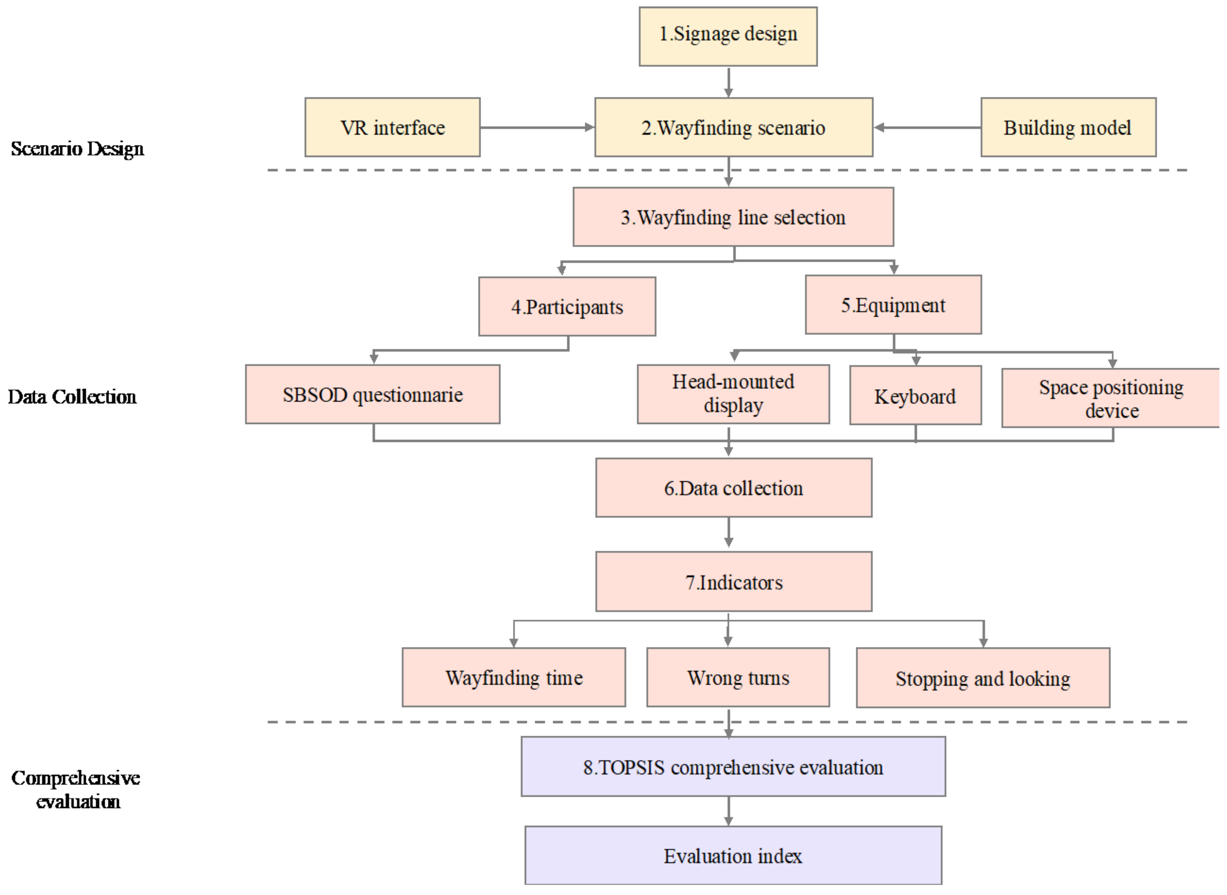
The technologies of BIM and VR were utilized to establish the building model and the virtual reality environment in this study. A method of signage evaluation was proposed to assess the signage’s guiding efficiency.
Figure 1 illustrates the flow of the proposed method. The major steps involved are as follows:
3.1. Signage Design
This step is shown as step 1 in
Figure 1. Due to the absence of standards, there are several problems in the design of the current integration information signage, such as unreasonable placement and low recognition. Therefore, considering the practical applications and suggestions of relevant experts, the current integration information signage was viewed as the old version in this research, while a new version was designed and formed based on passenger demand, user interviews and aesthetic design principles. The integration information signage was optimized from three perspectives: contents, exterior and placement.
As for the contents, the new integration information signage was composed of an electronic screen, a light box, directional information and location confirmation information. Design principles follow a national standard of the People’s Republic of China—GB/T 20501.1-2013 Public information guidance systems. During the design process, the following principles were followed:
- i.
The content of signage on the electronic screen should contain general information, such as weather, date, bus line details and public service video.
- ii.
Information on the light box should contain maps of the transport hub and its spatial structure, the direction of the surrounding blocks and the subway lines. These maps differ as to the placement of the integration information signage change.
- iii.
Directional information should be systematic and should include all the traffic platforms on the floors of the transport hub. In addition, toilets and transfer stairs should be guided in the signage to be a user-friendly design. In this way, passengers can find a traffic platform by reading the signage.
As for exterior signage, the following design principles were considered for the new integration information signage:
- i.
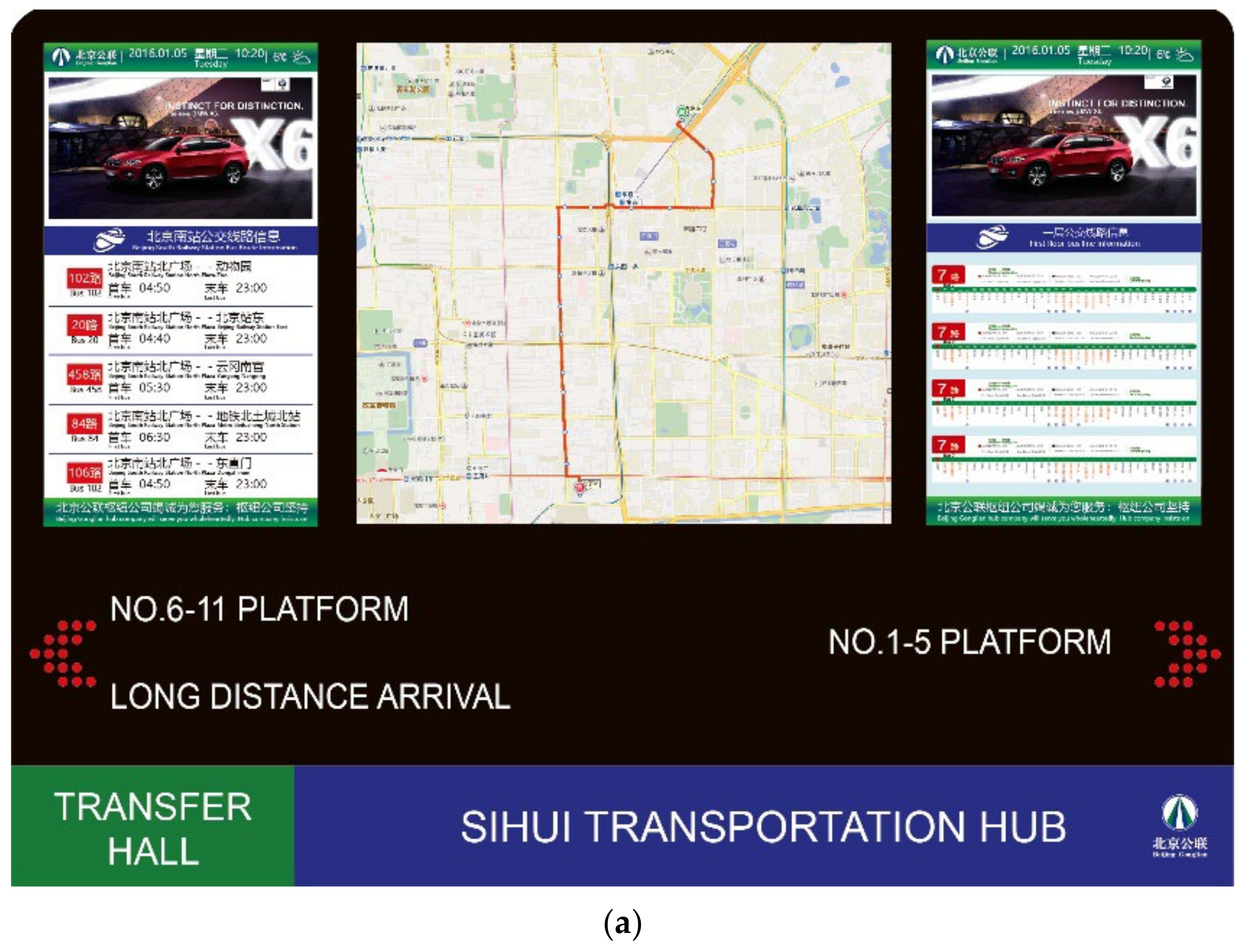
In terms of colors, the new integration information signage should be designed with a combination of blue and white so that it can be consistent with the direction signage and location signage. The old and new integration information signage are shown in
Figure 2.
- ii.
It is suggested to use Micro Yahei font in Chinese and Arial font in English for directional information.
With regard to signage placement, the old one is placed by construction workers based on their own experience. As the placement of signage relates to passengers’ wayfinding performance in public spaces, proper arrangements need to be ensured. Furthermore, a place with well-planned signage can guide passengers through the most efficient route and thus leave them with a good impression, which will encourage them to visit the place again later. The new integration information signage’s placement complied with the following principles:
- i.
In the center of the transfer hall, the entrance, and the exit, signage should be placed.
- ii.
In the fork of paths and stairs, signage should be placed.
- iii.
On traffic platforms, integration information signage should be placed.
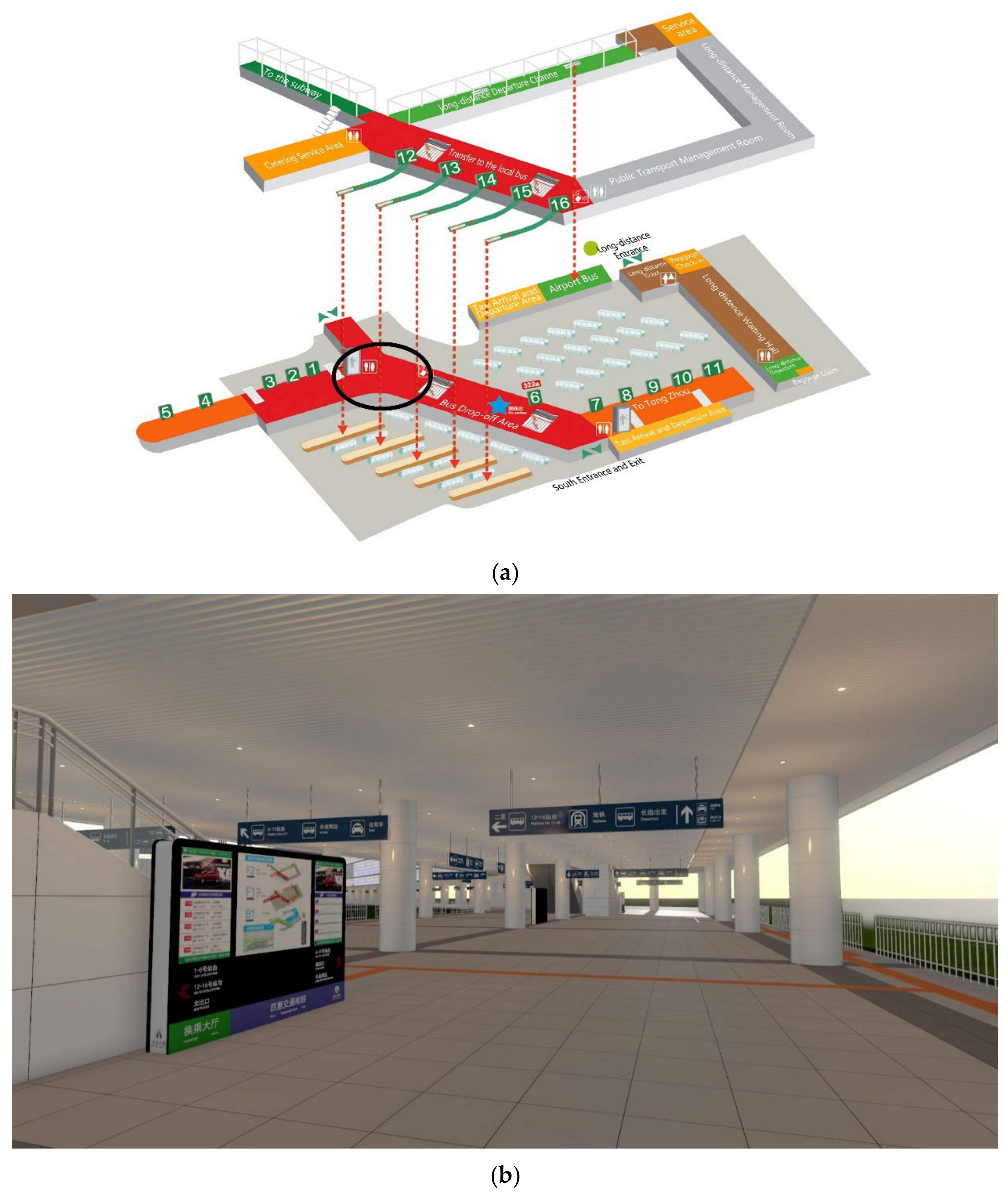
The placement of the old and new integration information signage is shown in
Figure 3 (the white points refer to the placement of signage).
3.2. Wayfinding Scenario
This step is shown as step 2 in
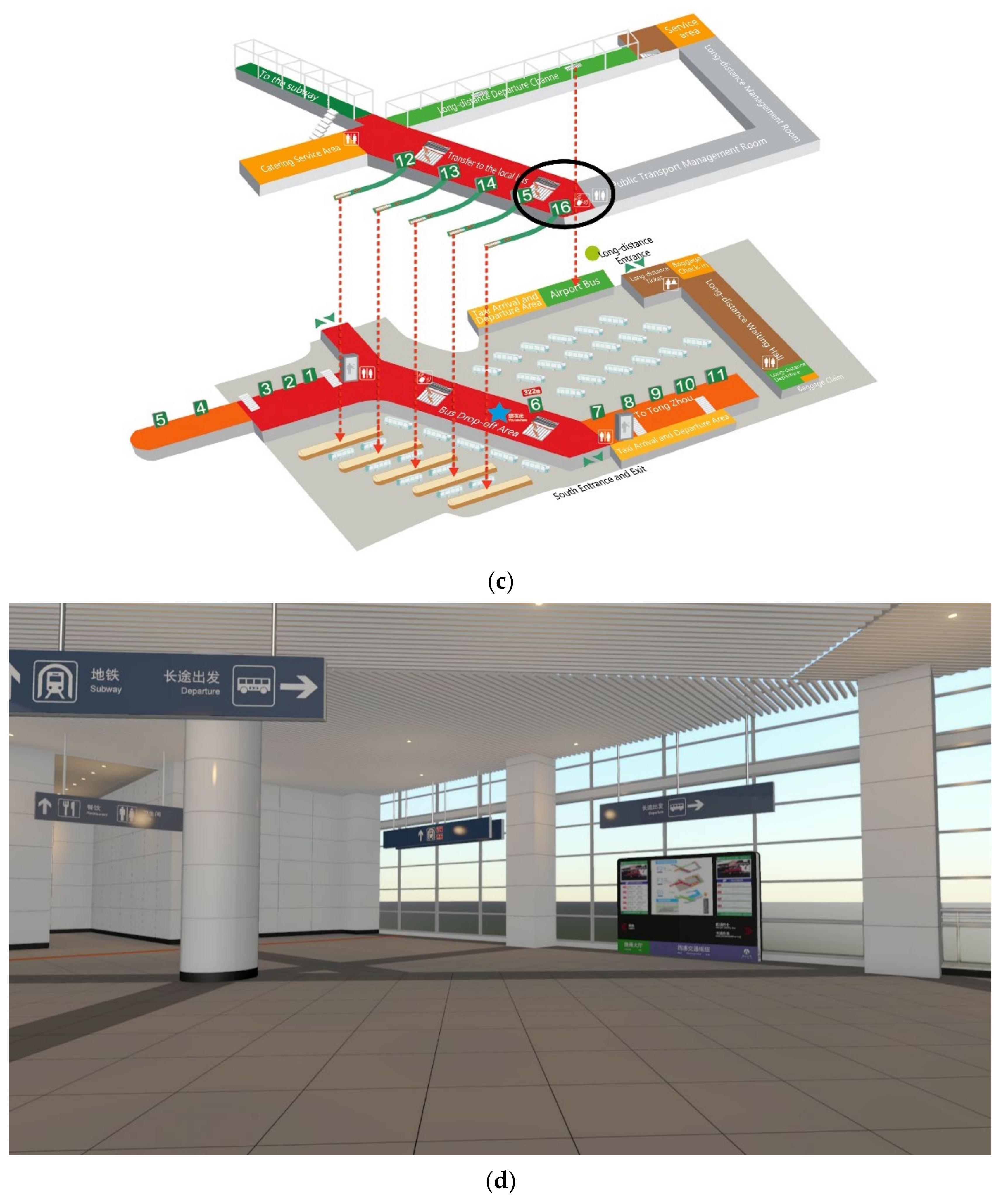
Figure 1. In the experiment, a BIM model of the Beijing SIHUI Transport Hub was established by employing Autodesk Revit software. In the virtual environment, the hub was 36.7 thousand square meters in size, which was the same as the hub in the actual environment. Additionally, the direction signage (signage hung on the ceiling), column, stairs and ground of the virtual hub were the same as those of the actual one. Then, both the old and the new integration information signage were created and put into the BIM model of the transport hub to create two experimental scenarios. There was no difference between the two scenarios except for the integration information signage. The virtual reality environment was created using FUZOR 3D software so that participants could see the environment of the transport hub and move into the model. The examples of the scenario in a virtual reality environment are shown in
Figure 4.
Figure 4b shows the A Area, which is located in the black circle area in
Figure 4a,d shows the B Area which is located in the black circle area in
Figure 4c.
3.3. Wayfinding Line Selection
This step is shown as step 3 in
Figure 1. Because of the large number of wayfinding lines in a transport hub, three principles were followed for the selection of wayfinding lines to be evaluated to ensure evaluation efficiency and representativeness:
- i.
Lines with their starting points and ending points located on the same floor should be selected; meanwhile, lines with their starting points and ending points located on different floors should also be selected.
- ii.
The longest line should be selected.
- iii.
Overlaps should be avoided among the different lines.
In this study, according to the above selection principles, two lines were selected to conduct the wayfinding experiment. The lines are shown in
Figure 3. Line 1 (as shown in black) started from the NO.5 bus platform (“S1” point) and ended at the inter-city bus arrival platform (“E1” point), passing through the NO.5-1 bus platform, north exit, transfer hall, south exit, and NO.7-11 bus platform. Line 2 (as shown in blue) started from the taxi platform (“S2” point) and ended at the NO.16 bus platform (“E1” point), passing through the NO 8-7 bus platform, south exit, some stairs, and the NO14-16 bus platform. In addition, both the starting and ending points of line 1 were located on the first floor, while the starting and ending points of line 2 were located on floors one and two, respectively.
3.4. Participants
This step is shown as step 4 in
Figure 1. A total of 46 postgraduates (23 females and 23 males) were recruited from Beijing University of Technology to participate in the research. Their average age was 23.3 years (standard deviation = 1.43), ranging from 22 to 26 years old. All participants were young adults with normal mobility, perception and judgment ability. Therefore, their understanding and psychological acceptance of the experiment are better than other age groups, which will largely reduce the interference of other factors in the experiment. All participants were confirmed to be in good health conditions with good sight and were screened to make sure they had not been to the SIHUI Transport Hub before. It was also confirmed that these participants had never been in any similar wayfinding experiments before and this was their first time entering a laboratory to participate in an experiment. In addition, to avoid interference of personal wayfinding ability, the Santa Barbara Sense of Direction Scale (SBSOD) questionnaire was used to evaluate their abilities. SBSOD is a self-evaluation questionnaire used to assess personal sense of direction and wayfinding. A higher score represents a stronger spatial perception ability based on self-evaluation. According to this evaluation, participants were divided into two groups by reasonable distribution (group A and group B), so that the average wayfinding ability of the two groups was equal.
3.5. Equipment
This step is shown as step 5 in
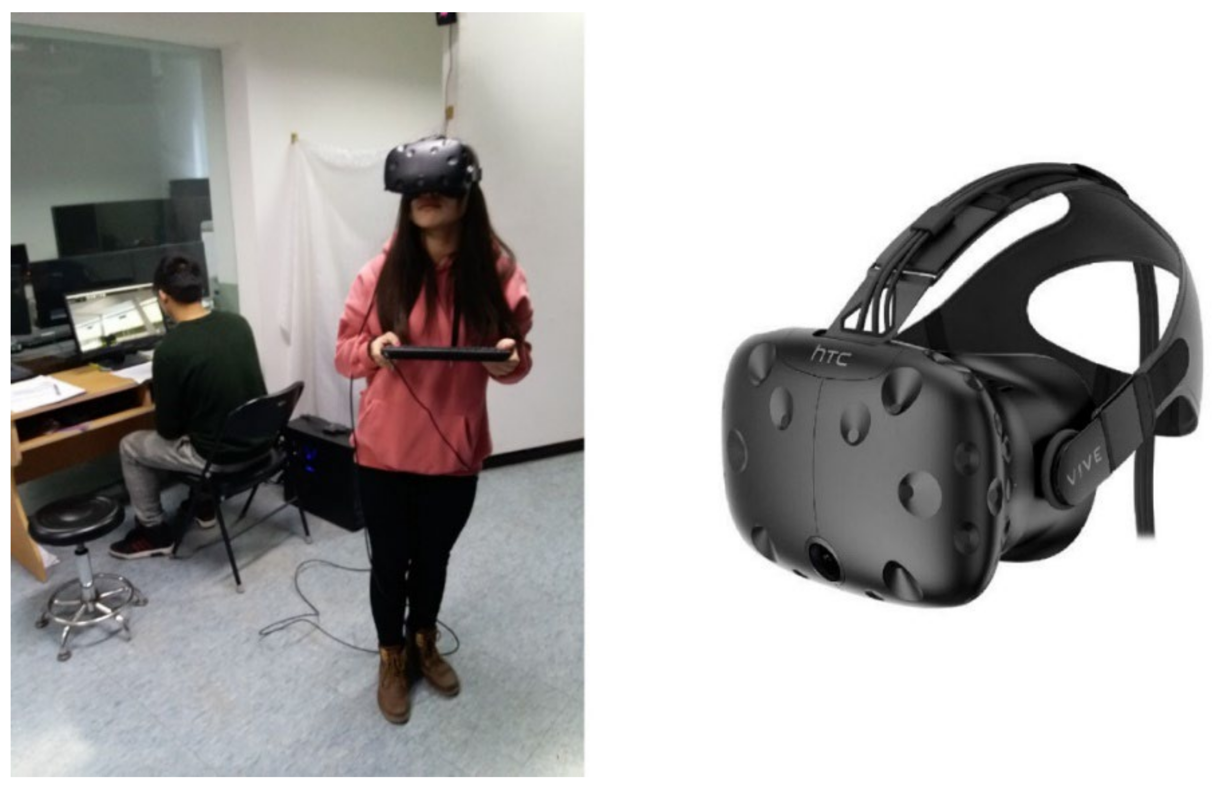
Figure 1. To describe participants’ wayfinding behavior, excluding other interference factors, the virtual reality equipment of HTC VIVE (see
Figure 5) was used in the experiment. The virtual reality equipment included a headset with virtual reality glasses, a keyboard, and space-positioning devices. The resolution ratio of the virtual reality glass, which employed a Steam VR tracking technology, was 2160 × 1200 pixels, and the fresh frequency was 90 Hz, with the visual angle being 110°. In the virtual reality environment, participants could move by controlling the arrow keys on the keyboard, which employed Steam VR tracking technology. During the experiment, stopwatches and counters were used to record the data.
3.6. Data Collection
This step is shown as step 6 in
Figure 1. In the wayfinding experiment, the speed of participants in a virtual environment is set to 1.21 m/s, according to SHI’s research [
31].
The procedures for the wayfinding experiment in a virtual reality environment were as follows:
- i.
The experiment assistant provided participants with guidance and reminded them of things that they need to be careful about, such as the use of the equipment and accident handling.
- ii.
A training session was provided. Participants put on the virtual reality equipment and used the keyboard to steer themselves and move in the virtual reality environment under training. If no uncomfortable reaction occurred to the participants, the experiment would continue.
- iii.
The assistant recorded the fundamental information (age, gender, etc.) of the participants.
- iv.
Participants carried out the wayfinding experiment on lines 1 and 2 in random order. In addition, participants in group A completed their wayfinding experiment in the scenario using the old integration information signage, while participants in group B did the same in the scenario with the new signage. However, before the experiment, they did not know whether the signage was new or old. Each participant’s experiment lasted for about an hour. If participants did not take the ideal line, his/her data would be counted as error wayfinding.
- v.
After the experiment, participants were required to complete a questionnaire about their feelings and an evaluation of the virtual reality environment. Each item in the questionnaire was rated by respondents on a 5-point unipolar scale ranging from 1 to 5.
The participants’ wayfinding processes and VR glass are shown in
Figure 5.
The participants’ individual behavior data were obtained by involving them in wayfinding experiments in virtual scenarios, mainly including the time spent and the number of wrong turns. Meanwhile, subjective assessment data from the participants on the direction-signage system were also obtained by making them fill in the subjective questionnaires. These data will be used in later analyses.
3.7. Indicators
This step is shown as step 7 in
Figure 1. To analyze participants’ satisfaction with the old and the new integration information signage, a questionnaire about its design was prepared for the participants. The questionnaire included questions about participants’ attitudes to the content, visibility, beauty, color and placement of the signage. Based on their feelings about the wayfinding process, they evaluated the design of signage by giving scores between 1 and 7 (“1” stands for extreme dissatisfaction and “7” stands for extreme satisfaction).
At the same time, to describe participants’ wayfinding behaviors in a virtual reality environment, the indicators proposed by [
32] were selected to analyze the wayfinding behavior. The indicators included wayfinding time, wrong turns and stopping and looking. Their definitions and calculations are as follows:
Wayfinding time covers the period from the beginning of the participants’ wayfinding to their final arrival at the destination. This reflects the guiding efficiency of integration information signage. The less the wayfinding time, the higher the guiding efficiency of the signage. During the experiment, the experiment assistant recorded the wayfinding time using a stopwatch. The wayfinding time can be calculated as follows:
where
Twf: wayfinding time;
Te: time of arriving at the destination;
Ts: time of starting to find the destination.
- (2)
Wrong turns (Ewf)
Wrong turns refer to the frequency with which participants take the wrong turns during their wayfinding. It reflects whether the content and exterior of the integration information signage are suitable. They can be proved more suitable when participants make fewer wrong turns. During the experiment, the experiment assistant recorded these indicators with a counter.
where
Ewf: the total frequency of wrong turns;
Ei: participants taking a wrong turn.
- (3)
Stopping and looking (Swf)
Stopping and looking refers to the frequency with which participants stop moving and restart looking for the destination during their wayfinding. This reflects whether the placement of the integration information signage is suitable. As stopping and looking frequency decrease, the suitability of the placement increases.
where
Swf: the total frequency of stopping and looking;
Si: participants stopping and looking.
3.8. TOPSIS Evaluation Method
TOPSIS is a commonly used intra-group comprehensive evaluation method. Based on the normalized original data matrix, it can identify the best solution and the worst one using the cosine method. Then, the distance between the evaluated solution and the best solution and the distance between the evaluated solution and the worst solution will be calculated separately to obtain their relative proximity to the ideal solution. In light of its simplicity and efficiency, this method has appealed to many researchers when it comes to classic multi-criteria decision-making problems [
33]. Specific application of TOPSIS is expounded in
Section 4.
4. Results
4.1. Satisfaction of Participants
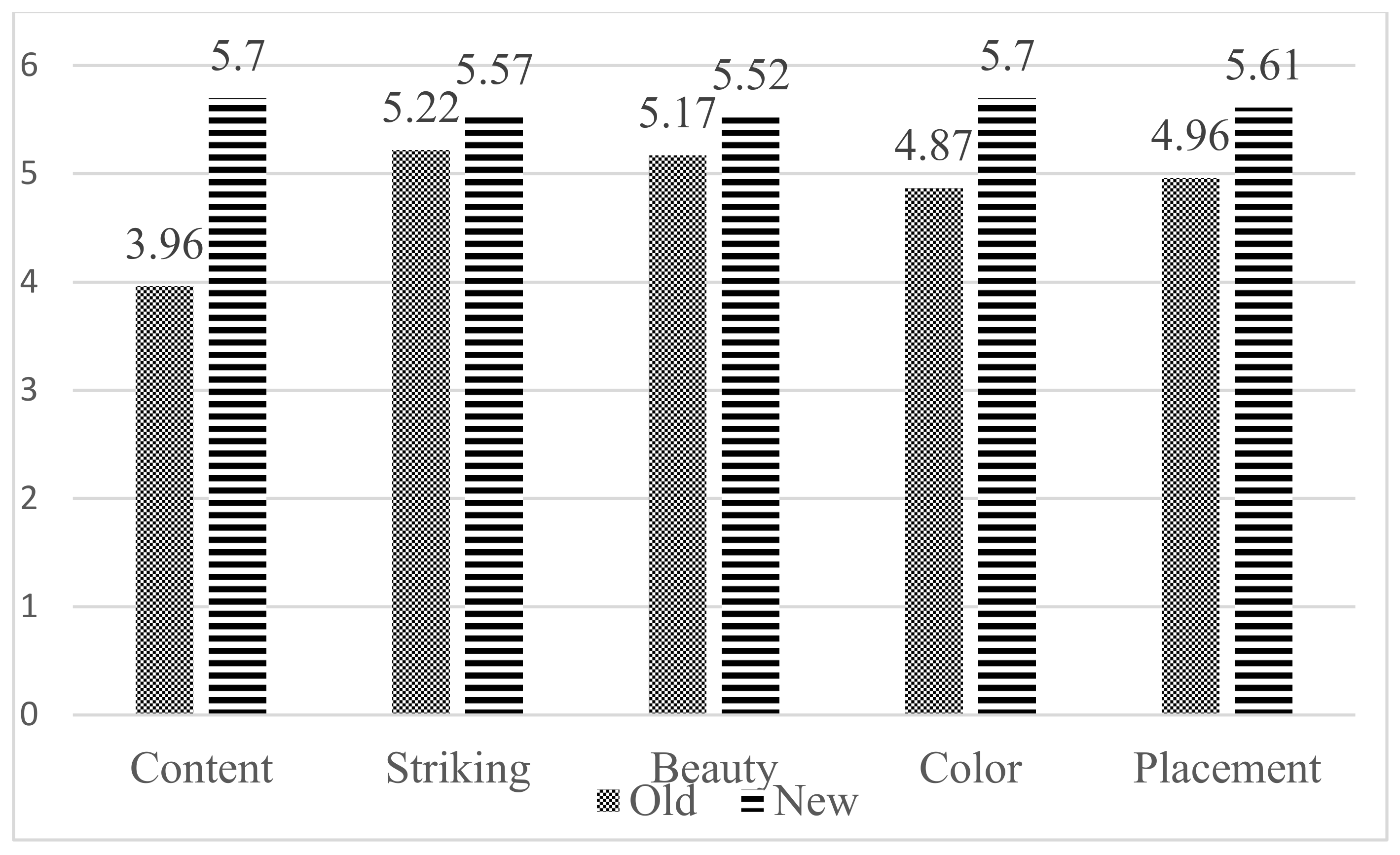
All participants took the ideal line during the experiment. They were required to score both the old and new integration information signage.
Figure 6 shows the mean score of participants’ satisfaction with the design of the old and new integration information signage.
The scores given by the participants reflected the popularity of the old and the new signage. As shown in
Figure 6, the score of the new integration information signage was higher than that of the old one in terms of content, the exterior (visibility, beauty and color) and placement. The content of general information, the different maps and the design of directional information were popular with participants. The combination of blue and white colors was also more popular than the single color of black in the old design. Moreover, participants affirmed the placement principles of the new signage.
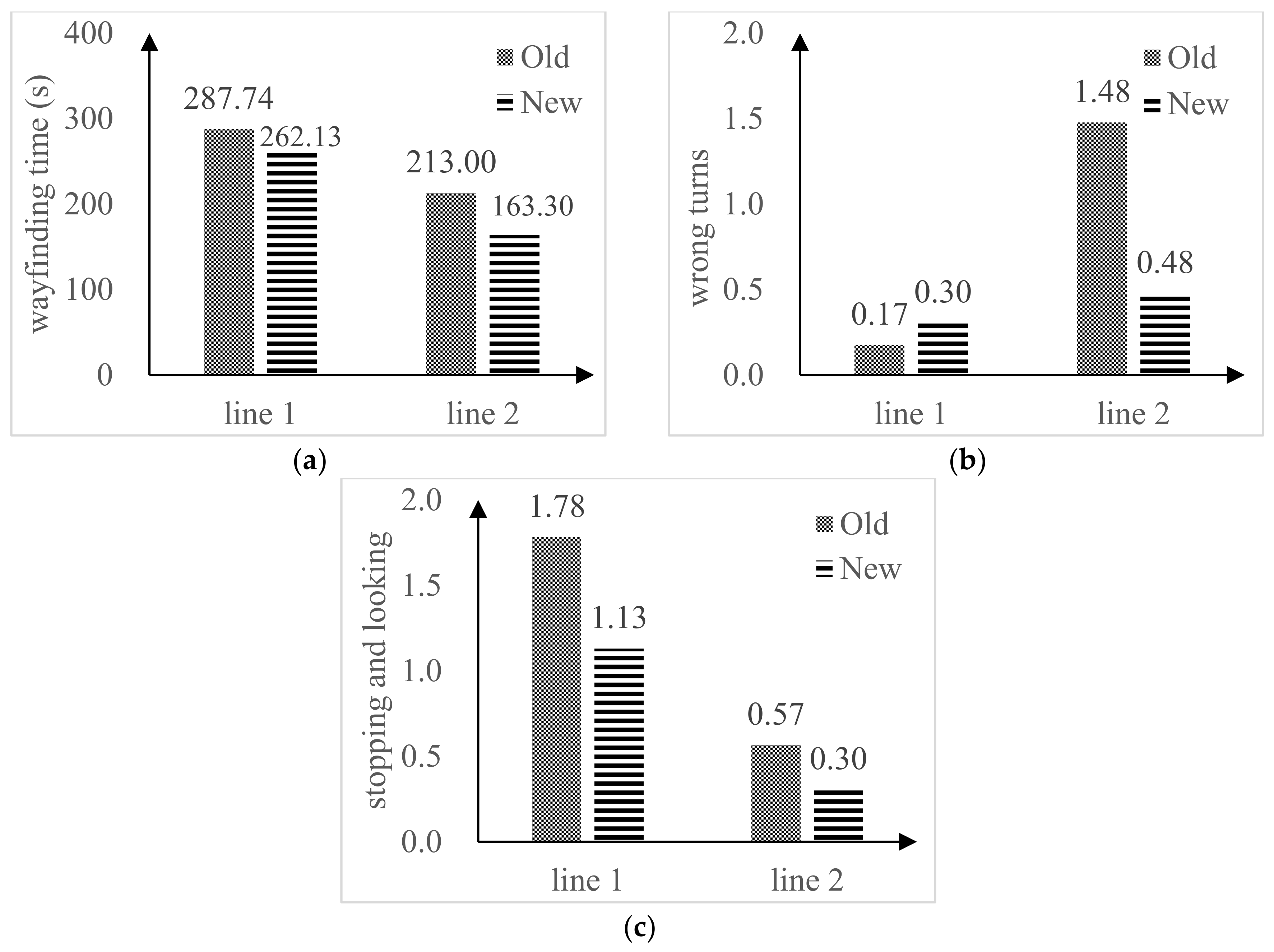
Table 1 and
Figure 7 show the statistics of participants’ wayfinding time, wrong turns, and stopping and looking in lines 1 and 2.
4.2. Analysis of Indicators
Wayfinding time (
Twf1 and
Twf2) stands for the guiding efficiency of the integration information signage. A normal distribution was found in the wayfinding time. Therefore, an independent sample
i-test was used to analyze the data. The results are shown in
Table 1. In the wayfinding experiment of line 1, the average wayfinding time of participants in the scenario with the new signage was less than that in the scenario with the old one (
p = 0.019). A similar result was found in the wayfinding experiment in line 2 (
p = 0.021). The results suggested that the guiding efficiency of the new integration information signage was better than that of the old one.
The number of wrong turns (Ewf1, Ewf2) represents the appropriate degree of content and exterior of the signage. If passengers take longer distances than it is supposed, this indicates that the content and exterior of the signage are not appropriate enough. As the data of wrong turns did not present a normal distribution, a Mann–Whitney U test was used for analysis. The results indicated that there was no difference (U = 243.5, p = 0.43) between the participants’ wrong turns in the new signage solution and those in the old signage scenario in line 1. However, a significant difference was found in line 2 (U = 113.5, p ≤ 0.001). The difference between the two lines was that the beginning and the ending points of line 1 were located on the same floor (floor 1), while these two points of line 2 were located on different floors (the beginning and ending points were located on floors 1 and 2, respectively). Therefore, the reason for the difference in the results might be that the wayfinding route in line 1 had fewer decision points. The result of the wrong turns suggested that the design of the new integration information signage resulted in better performance than the old one.
Stopping and looking describe the appropriate degree of signage placement. Similar to the wrong turns, the data for stopping and looking were not normally distributed. Thus, a Mann–Whitney U test was used to analyze the data. The result of line 1 suggested that the frequency of participants’ stopping and looking in the new signage solution was lower than that in the old one (U = 165.5, p = 0.023). This suggests that the appropriateness of the signage placement in the new solution was higher than that in the old one. However, the result of line 2 showed that there was no significant difference in the frequency of stopping and looking between the new and old signage solutions (U = 227.5, p = 0.333). The reason might be that the wayfinding route in line 2 was too short to present the differences in stopping and looking.
4.3. TOPSIS Comprehensive Evaluation
Indicators of Wayfinding time (
Twf), Wrong turns (
Ewf), and Stopping and looking (
Swf) in the environment of the old and the new signage alternatives and the routes of line 1 and line 2 were analyzed. The indicators in lines 1 and 2 under the same signage showed differences. Meanwhile, the indicators in the old and new signage alternatives under the same line also reflected different performances. To evaluate the guiding efficiency of different signage more scientifically, it was necessary to adopt a more comprehensive evaluation method. Therefore, the method of the Technique for Order Preference by Similarity to an Ideal Solution (TOPSIS) was used in this paper to analyze the wayfinding performances, which are shown in step 8 in
Figure 1. TOPSIS is one of the robust approaches to analyzing multi-criteria decision-making. It is employed to select an optimal alternative from several potential choices. The result of the TOPSIS comprehensive evaluation is the relative closeness to the ideal solution. This relative closeness stands for the evaluation index of the signage’s guiding efficiency. The larger the evaluation index, the higher the guiding efficiency of the signage. The means of the indicators are shown in
Table 1.
TOPSIS can be summarized in the following steps:
According to the original data, the new integration information signage could be denoted as m. Meanwhile, the indicators of wayfinding time, wrong turn, and stopping and looking in lines 1 and 2 could be denoted as n.
The wayfinding performance matrix can be presented as follows:
where denotes the distance between the
ith alternative and the positive ideal solution; denotes the distance between the ith alternative and the negative ideal solution; and = max (
i = 1, 2, …,
m) and = min (
i = 1, 2, …,
m).
where
Ci denotes the relative closeness to the ideal solution. The larger the
Ci, the higher the signage’s efficiency. The ideal solution mainly refers to the shortest wayfinding time, the least frequency of stopping and looking and the fewest of wrong turns.
Put the values of wayfinding time, wrong turn, and stopping and looking in line 1 and line 2 into Equation (1), and the wayfinding performance matrix is as follows:
Due to the different measurements of the indicators, a normalization of the wayfinding performance was conducted. The normalized matrix is as follows:
Then, the distances of the new and the old signage alternatives to the positive ideal solution and the negative ideal solution were calculated using Equations (3) and (4).
The relative closeness of the new and old signage alternatives to the ideal solution could be calculated by Equation (5). The results of Equations (3)–(5) are shown in
Table 2.
The relative closeness stands for the evaluation index of integration information signage alternatives. As shown in
Table 2, the evaluation indexes of the old and new integration information signage were 0.2839 and 0.7161, respectively. Therefore, the new integration information signage alternative had a larger evaluation index and higher guiding efficiency than the old one did.
5. Discussion
This research investigated a method that integrated BIM and VR technologies to analyze the guiding efficiency of integration information signage. In addition, an optimization and evaluation method for the guiding efficiency of signage using BIM and VR was also established.
This section will be further expounded through the following subsections.
5.1. Design Optimization of Signage
Participants were more satisfied with the content design of the new signage because it had more abundant, systematic and user-friendly directional information and suitable lightbox information. What’s more, participants were also more satisfied with the new signage for its visibility, beauty and color.
General information, such as weather and date, was included, which made it popular in the transport hub.
It was indicated that the color combination of blue and white was more welcomed among participants. In addition, the placement of the new integration information signage was also spoken highly of by the participants.
They were more in support of the scientific placement principles of the new solution. Therefore, signage positions should be decided based on scientific principles instead of personal experience to make them work better.
In summary, the design of signage should meet the requirements of being visible, aesthetic, user friendly and scientific to achieve higher guiding efficiency.
5.2. Application of VR Technology
Considering the wayfinding performance, it is obvious that the new signage of integration information plays an important role in the participants’ wayfinding progress. In the environment of the new signage, participants spent less time finding the destination in lines 1 and 2. At the same time, the frequency of wrong turns in line 2 and stopping and looking in line 1 in the new signage scenario was lower than that in the old one. Moreover, there was no difference between the new and old integration information signage in the frequency of wrong turns in line 1 and stopping and looking in line 2.
Therefore, considering the route complexity of line 1 and the distance of line 2, it was supposed that the simple route could not present the differences in wrong turns in different signage scenarios. Also, the short route could not present the differences in stopping and looking in different signage scenarios either.
Moreover, some interference and uncontrollable factors exist when finding ways in the actual environment. Therefore, the wayfinding data were compared in a virtual environment to determine the guiding efficiency of the old and new integration information signage. Many scholars have used VR technologies to carry out research on direction signage. Scholars such as Kubota studied the impact of the type and position of emergency signage on passengers under evacuation conditions through virtual experiments. The results showed that passengers presented higher confidence when arrows pointed to the center of the route [
34]. Scholars such as Vilar established a subway station scenario through BIM and VR to study the influence of horizontally and vertically arranged direction signage on passengers’ wayfinding behavior. It found that horizontal layout of direction signage was better than vertical layout after analyzing indicators such as passengers’ travel distance, time spent, the number of stops, average speed and success rate [
29]. Therefore, it was obvious that the application of VR technologies is effective in such wayfinding experiments. However, previous research has only focused on the analysis of the efficiency of existing signage and compared their different design alternatives. A systematic evaluation method for signage has not yet been developed.
5.3. Evaluation Methods of Signage
A large number of previous studies have identified objective evaluation indicators for wayfinding behavior, including the time spent, the number of wrong turns and the number of stopping and looking [
32]. Based on these objective indicators, this study adopts a new idea by combining BIM and VR technologies to obtain an evaluation of integration information signage.
In fact, in previous studies of passengers’ cognitive behavior induced by signage systems based on wayfinding theory, the method of post-evaluation was mostly used. Post-evaluation refers to the evaluation of signage after it has been designed and put into use. For example, Tang established a comprehensive evaluation method based on interval numbers that were targeted at aspects such as the color of signage, graphics and texts, layout, the amount of information and signage continuity. Then, based on the evaluation results, the extent of modification needed and a corresponding action plan will be further determined. The conclusions obtained by Tang’s research were for the evaluation of existing signages, and he also summarized optimization solutions, such as enhancing the coordination of colors, adjusting signage with too much information, and optimizing the position of signage, which were similar to the optimization solutions defined in this study. However, Tang did not evaluate the signage once more after their optimization [
35]. Cao established a signage layout evaluation model based on a fuzzy comprehensive evaluation method using indicators such as spacing, quantity, setting method, and visibility. He also used a multi-level fuzzy comprehensive evaluation method to evaluate the optimized signage layout. Cao’s evaluation method is mainly based on the calculation of evaluation factors, evaluation grades and weights, and these research processes were not supported by objective data related to wayfinding behavior [
36]. Unlike previous studies, this study can obtain objective data on wayfinding behavior through experimental testing and use the TOPSIS comprehensive evaluation method to analyze the indicators before and after optimization, transforming “post evaluation” into “advance evaluation”. This can effectively predict the guiding efficiency of new signage and prevent unreasonable issues arising from its application.
The TOPSIS method was utilized to evaluate the guiding efficiency of the integration information signage in a transport hub, mainly considering that it can make full use of the original data, with its analysis results accurately reflecting the gaps between the evaluated signages. Although this method was not the only choice, it was adopted in this research as it was the most robust evaluation approach based on weight. Moreover, there is no severe restriction on indicators, such as data distribution and sample size, and the evaluation results can be clearly compared through ranking.
Furthermore, other methods, such as the nearly optimal gray solution, could also be utilized to complete the evaluation. The results of research using other evaluation methods will be elaborated upon in future reports.


