Article

Color Place Marketing—The Role of Atmospheric Colors on Place Product Association and Consumer Choices in Luoyang, China

Department of International Business, National Taiwan University, No. 85, Sec. 4, Roosevelt Road, Taipei 106, Taiwan
*
Author to whom correspondence should be addressed.
Sustainability 2020, 12(23), 9902; https://doi.org/10.3390/su12239902
Submission received: 4 October 2020 / Revised: 6 November 2020 / Accepted: 13 November 2020 / Published: 26 November 2020
(This article belongs to the Section Tourism, Culture, and Heritage)

Abstract

:
Place branding has become a fast-growing area of research in recent years due to the proliferation of technology and services facilitating travel. However, place-branding research has primarily focused on place promotion and image orchestration. The main purpose of this paper is to address the lack of place–product combination research and introduce a novel approach to extract and commercialize distinctive place elements such as colors. We examine the extent to which place atmospheric colors influence consumer decisions through priming. In addition, we look into the moderating role of a consumer characteristic, productivity orientation (PO), on atmospheric color to consumer decisions. Four studies are conducted in Luoyang, China, with 408 samples in pretest, 83 samples in Study 2, and 2361 samples in Study 3 and 4, to examine our hypotheses. The results support the hypothesis of atmospheric color priming: people are more likely to favor products that display colors similar to their surrounding environment. We also find that PO consumers are more likely to favor products that display color patterns similar to the surrounding environment than consumers under social influence. Drawing from a dynamic view of place branding, we provide a unique approach for scholars and practitioners to grasp the concepts of place marketing.

1. Introduction

The concepts of marketing, promoting, or branding a place are not new ideas but have become some of the most popular topics in both academic research and practice. The popularity of the field is reflected in the growing number of place-branding studies [1] and consultancies. With increasing numbers of studies aiming to address these topics, confusion about their meanings and implications begins to grow. Consequently, Boisen et al. [2] presented a framework to help distinguish among place promotion, place marketing, and place branding. However, since most theoretical frameworks in the field are translated from corporate-branding strategies for products or companies, they predominantly focus on place-branding strategies [2] and neglect place-marketing strategies.
Place marketing is the coordinated use of marketing tools to create, communicate, and deliver values for the place’s customers or community at large [3]. It is a demand-driven method that is positioned to influence the product–market combinations. Yet, there are few, or close to zero, studies that address place marketing strategies, not to mention the influence of place on product–market combinations.
To address this gap, this research explores how practitioners and relevant stakeholders can leverage distinctive elements of a place to create product–market synergies that stimulate both economic and reputational benefits. We examine one of the most significant elements of a place, atmospheric color, and its influence on purchase intention and place–brand association. We argue that a specific or representative set of colors exists for each place and that this specific set of colors is subconsciously recognized by consumers, priming their perceptions toward a place or even consumption behaviors. In addition, the degree to which consumers are influenced by priming can vary significantly given their level of exposure to the priming stimulus [4]. We propose that productivity oriented (PO) consumers, i.e., consumers who tend to use time efficiently, are more likely to be primed by atmospheric colors than consumers who are spontaneously oriented.
This research is organized as follows. First, we perform a literature review and present our hypotheses with respect to the gaps we attempt to address. Four studies are conducted to demystify the influences of atmospheric colors. Study 1 reveals the process by which atmospheric colors are identified and examines the correlation between atmospheric colors and place association. The next two studies, Study 2 and Study 3, examine the possible influences of atmospheric colors on priming consumer behaviors, with Study 2 taking a lab experiment approach and Study 3 taking a field experiment approach. Study 4 examines moderating variables, focusing on the consumer characteristics that could lead to differences in the results. The last section discusses the implications of the results along with the contributions of this research.

2. Theoretical Background

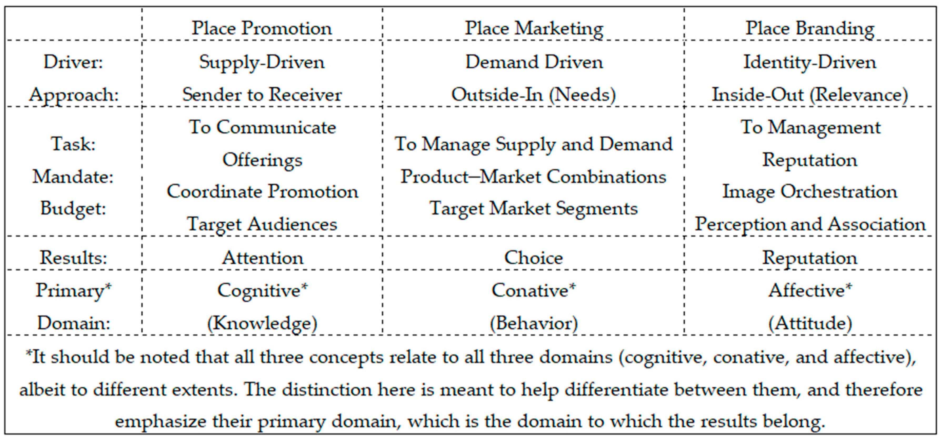
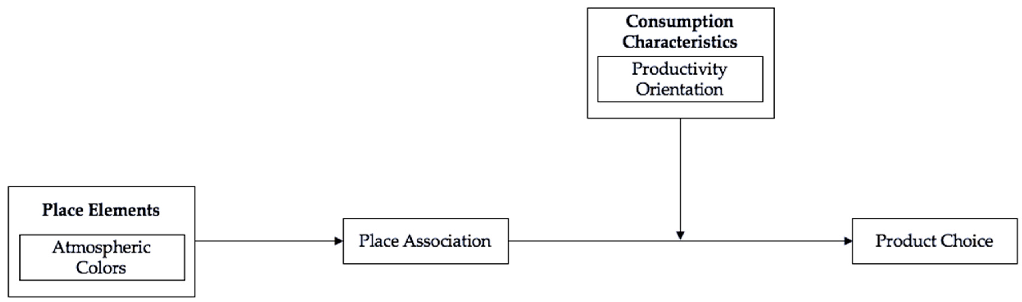
2.1. Place Marketing and Atmospheric Colors

Over the last decade, cities and places have confronted a series of challenges that have stimulated the development of urban and organizational policies to strengthen their competitiveness [5]. The attempts to address these challenges have led to a tremendous increase in place studies from a wide range of perspectives. The domain has also shifted from a location promotion focus to location branding focus [6]. However, despite the popularity of these concepts, research remains predominantly practitioner-led [7]. Most developed conceptual and theoretical frameworks are based on corporate strategies for products, services, or companies and not actual policies of place [2]. As a result, the scientific and academic communities have yet to develop shared definitions of place branding.
In general, the concepts of place branding can be divided into three categories based on the purposes they serve: place promotion, place marketing, and place branding [5]. Place promotion involves conveying messages that increase knowledge of what a place can offer to target audiences. It is a supply-driven process with goals that are set to catch the attention of the chosen audiences and therefore is less involved in the actual development of a place. Therefore, place promotion more closely resembles the traditional sender-to-receiver approach of marketing communication [2] (see Figure 1). Place marketing, on the other hand, requires significant involvement in the actual development of a place. The goal of place marketing is to drive the product development of a place [8] or the place in its entirety [9,10]. In other words, place marketing is demand-driven, with a strong influence over relevant products that are strategically tuned to fit the chosen target groups. Consequently, the results of place marketing are often measured within the conative domain of behavior [2].
Among place promotion, place marketing, and place branding, place branding is the most misunderstood concept. The idea of a brand is to create an image and redirect consumers from observable reality to the world of perception [11]. Numerous place-branding studies have attempted to define the concept for practical and theoretical purposes, see [1,6,11,12,13,14,15]. However, some scholars view place branding as part of place marketing, whereas others view place marketing as part of place branding. Despite these differences in opinion, there is consensus that identity and image are the central concepts of place branding. As noted by Boisen, Terlouw, Groote, and Couwenberg [2]:
“The place brand strategy could be a framework of core values, emphasizing the identity of the place. Such a framework should then work as a set of guiding principles against which all other strategies and policies should be judged to the extent to which they are on-brand or off-brand and to the extent to which their contribution to the place brand is positive, negative or neutral.”
The goal of place branding is to create a competitive identity with emphasis on influencing both place promotion and place marketing [16]. Similar to the corporate meaning of brand, place branding is achieved when target audiences or people in general are able to recognize and hold favorable impressions of the place over a long period of time. As a result, place branding should be measured within the affective domain of attitude (see Figure 1).
The need for further theoretical and empirical work is greater for place marketing than for place promotion and place branding. A meta-analysis conducted by Lucarelli and Olof Berg [17] found numerous studies emphasizing place marketing and place branding. By contrast, most place marketing studies seem to be concerned with place promotion rather than place–product combinations [18,19]. Few if any place marketing studies have addressed the place–product relationship. Since place marketing is the creation or use of marketing tools that are positioned to influence the product–market combinations of the place [20,21], the elements that a place can offer in the process of product development are pivotal to success in place marketing. In this study, we aim to examine atmospheric colors and their influence on place–product combinations in a place-marketing framework.
Colors are capable of exerting influences on consumer behavior with visual stimuli through attention getting, message creation, and affect creation, and they carry inherent meanings that are central to a consumer’s perceptions [22,23]. As aesthetic stimuli, colors can convey referential and embodied meaning to stimulate or shape consumer preference. Therefore, colors often play a pivotal role for marketers to communicate embedded meanings to selected target audiences [24]. For instance, hue and saturation are constantly being applied to products and services to influence taste or quality perception [25], and we will often see marketers attempt to add green to mint-flavored food to signal environmental friendly consumption [26]. On a psychological level, colors with longer wavelengths (e.g., red), are found to be more arousing than colors with shorter wavelengths (e.g., blue). Chebat and Morrin [27] explored the effect of mall decor on product quality perceptions and discovered that French-Canadian shoppers had higher product quality perception in an environment with colors with longer wavelength. These researches suggest that the right strategic stimuli, such as colors, can better communicate values and enable consumers to identify a brand [28,29], and this concept can also be applied to a place context.
Atmospheric color is one of the key elements reflecting consumer perceptions of the environment through visual interactions [30,31]. For instance, when visiting Beijing, China, the color red could resemble the Forbidden Palace and gray the Great Wall, while white and pink can be associated with the Old Summer Palace. Together, these colors provide a sense of Beijing and form a unique pattern of colors associated with it. Such a pattern explains the identification of belongingness and attachment to collectives by individuals [32], where consumers tend to imprint colors on their mind and collect them as experiences [33]. Therefore, it is important for marketing practitioners to understand how consumers align colors with place perception and how other consumption behaviors follow this perception. Consequently, we propose that there exists a set of colors within the atmosphere of a place and that this set of colors is picked up by consumers in shaping and creating associations with the identification of the place.
Hypothesis 1.
Atmospheric color patterns of a place exist and are picked up by consumers in shaping and creating association with the identification of a place.

2.2. Place–Product Associations

In marketing applications, primes abound, and marketers today are constantly attempting to manipulate colors to prime consumer behaviors [34]. Colors are known to produce systematic physiological reactions [35], and have therefore become favored priming stimuli among scholars [36,37]. Priming involving colors can often be seen through referential meaning, where learned associations play a critical role in the pattern in which priming is activated within the information network of a consumer. For instance, a red dress at a party can trigger a sense of excitement, and a red street sign can create outcomes of avoidance and danger. Red acts as a stimulus input that determines and activates the feelings within. This notion is supported by numerous empirical studies [38,39]. The learning of color associations enables consumers to recognize the identity of a place or brand. Therefore, colors help communicate brand identity concepts and trigger cultural beliefs regarding the perception of a place [40,41].
Following the above logic, we argue that consumers are cognitively primed by the atmospheric colors of a place, with consumer preferences changing based on the presence of a prime [42]. Both psychology and marketing studies have accumulated a multitude of evidence showing that atmospherics or colors exert substantial influences on consumer behavior [23,38,43]. When purchasing and evaluating goods and services, consumers face a certain amount of ambiguity, and they turn to contextual cues in the environment to help reduce this ambiguity before reaching a decision [44,45]. In such instances, the contextual cues surrounding consumers or cues that were subconsciously picked up by them, such as colors, become priming stimuli that manipulate their decisions, which is referred to as contextual priming [45]. Research has found that (in the case of promoting a psychology study) individuals are primed by the conversations surrounding them, which leads to higher participation (in this case, participating in a future study) [46]. Berger and Fitzsimons [47] designed an experiment to test two groups of participants with the exposure of a priming slogan; after 10 days, the participants who were exposed to the slogan exhibited higher product evaluations. These studies have shown that rich cues in the context are capable of altering preferences in product evaluation. In this regard, an atmosphere with rich color cues can also alter consumer preferences, as such cues are subconsciously picked up by consumers as they tour. When searching for an identity-based product that best represents the experience of a visit, these color cues can act as stimuli that change the evaluation of products or services for consumers to shape their desired experiences. Therefore, we propose that consumers are primed by the atmospheric colors of a place, where the constant exposure of certain colors within the environment leads to a higher evaluation of identity-based products that share congruent colors.
Hypothesis 2.
Atmospheric color patterns are capable of altering consumer preferences for products or services that exhibit color cues that are congruent with the atmosphere.

2.3. Productivity Orientation and Consumption Choices

Efficiency and productivity are major concerns in contemporary urban life [48]. The thirst for higher performance in this economy has led individuals to perceive time as a scarce resource [49,50,51]. The technological progress and diverse cultural trends have offered more options for consumers to pursue, leaving them with less time to achieve their desired goals and dreams. As a result, consumers are more aware of becoming productive and are trying to accomplish more in less time. This concept is referred to as productivity orientation (PO) [52]. The tendency toward PO is evident in the proliferation of time-saving products and services, such as the rise of the Internet of Things (IoT) and multitasking products. For instance, Uber, a transportation network company, reduces the waiting period of standing in line for public transportation or self-driving. The act of becoming productive serves as an important consequence for individual self-worth [53]. In the context of tourism, more than 68% of people have visited more than 10 countries, which is twice the level of 10 years ago [54]. The psychological benefits gained from being productive explain why consumers strive to visit any and all attractions possible within a timeframe and create bucket lists of goals that need to be met before the end of life [55].
Statistics have shown that the number of countries that consumers visited has grown over the years. However, the motivations that lead to travel may create disparities in exposure to the surrounding atmospheric cues. Some consumers may enjoy sightseeing experiences more than others and therefore travel to as many places as possible to fulfill their goals. Due to time constraints, the desire to accomplish more in less time has prompted consumers to adopt a PO and to pay more attention to surrounding details. PO consumers are constantly evaluating their self-accomplishments and are driven to seek a sense of progress and accomplishment by experiencing everything possible to build up their experiential CV [52,56]. Following this logic, we expect atmospheric priming effects to exert greater influence on PO consumers. In addition, Figure 2 presents the conceptual model we aim to examine for this study.
Hypothesis 3.
Productivity orientation positively moderates the relationship between atmospheric color priming and consumer behaviors.

3. Research Design and Empirical Results

This study aims to extract distinctive place elements, such as place atmospheric colors, and align these elements with the perception of the place. Nevertheless, the identification of atmospheric colors with a place is a long and complex process. Chorography, the art of mapping, was first employed to study urban local branding and marketing activities [57]. Chorography is regarded as a means of representing the distinctive and unique characteristics of a place, which resonates with the core concept of branding but is often subjective in regard to the selection of unique characteristics [5]. It was not until the introduction of geographic information systems (GISs) that the actual colors and characteristics of a place could be shown through precise images [58]. Nevertheless, both chorography and GISs adopt a top-down viewing perspective to identify relevant objects to describe a place, leading to concerns regarding consumers’ actual viewing perspective of a place. Almost all individuals take a standing view when touring a place, which means the view contains far more contextual information than that available from a top-down perspective. This research aims to identify atmospheric cues by adopting the standing view perspective of a consumer and to examine the relationship between atmospheric cues and consumer behaviors through four different studies.

3.1. Study 1: Target Area of Study, Determinants of Atmospheric Colors and Consumer

3.1.1. Experimental Design

This research targets Luoyang, China, as the area of study. Luoyang is situated in the middle of China and is well known for its rich culture and history spanning more than 3000 years. Luoyang was the capital of 13 dynasties, and as a result of the remains of the legacy of these past dynasties, Luoyang has become one of the most favored tourism and pilgrimage spots. Figure 3 shows a typical picture of Luoyang, demonstrating the view of the city after 30 years of industrialization and internationalization.
Before examining the contextual color cues of a place or city, it is important to consider the structural ranking of elements that could be used in association with the place or city. To determine the ranking of elements, nine experts were gathered for a consensus meeting to rank all relevant elements in Luoyang. Ten categories were identified as significant foundations representing the city, and six distinctive place elements were proposed using the ten categories as promotional tools to market Luoyang: Empress Wu Zetian, the Silk Road, Wangcheng Park (WP), the Luoyang Museum (LM), the Longmen Grottoes (LG), and local specialties.

3.1.2. Developing an Atmospheric Color Database

As noted earlier, utilizing a top-down view approach with GISs to capture colors can raise concerns about the true view perspective. As a result, to capture the true consumer scenic views, we photographed each of the six distinctive place elements, adopting Kodak Q-13 color adjustment tools to avoid color bias during analysis. Each photo was converted to 640 × 480 pixels, where exposure and white balance were adjusted using Adobe Photoshop. The photos were then analyzed using the k-means clustering method in R to identify the color clusters within a photo. Given that the colors in each pixel of a photo are composed of red (R), green (G) and blue (B), a photo can then be represented by a large array of pixels with RGB dimensions. Utilizing the k-means clustering method can partition the set of color vectors into k ( n ) set C = { C 1 , C 2 , C 3 , , C k } to minimize the cluster sum of squares. The model is as follows:
C = i = 1 k X S i X μ i 2
where μ i is the mean of C. The k-means clustering method is utilized to optimize color segmentations and is suitable for identifying the similarities between color vectors [59]. Following the color geography theory of Lenclos and Lenclos [60], the colors extracted are categorized into dominant, auxiliary and contingent. This categorization presents the colors in the atmosphere most perceived by consumers when entering a place. As this study aims to examine the role of atmospheric priming in consumer behaviors, it is important to identify the colors that consumers are most exposed to. Figure 4 shows a sample of the image analysis.

3.1.3. Atmospheric Color Applications

By photographing each aspect and view of a theme and analyzing the color distributions of a theme, we were able to construct a unique database of colors. To reflect these colors in commercial terms as priming stimuli, the colors were applied to consumer products by collaborating with designers to design six unique postcards highlighting the colors extracted from the database. Postcards are one of the most popular products bought while traveling; they are one of the few collectible products that serve as proof of a visit, and they are also nostalgic [61]. Knowing that images or shapes can interfere with color representation, the designers were specifically instructed to use only colors to design the postcards. Figure 5 shows a sample postcard created for the WP theme. The colors used in the postcards are specific atmospheric colors that consumers experience while walking through the park.
Although the postcards were designed in accordance with the atmospheric colors of the specific place, this aspect was not sufficient to show whether the postcards could be associated with the places where the colors are used. To examine how atmospheric colors are associated with place identification, we made a board consisting of the postcards for each theme and presented it at the theme attractions for participants to identify the correct postcard representing the attraction. A total of 408 samples were gathered at four different attractions in Luoyang in accordance with the theme, and approximately 100 responses were collected at each attraction. Only four of the six themes were selected due to the issues with feasibility of distribution. The two themes not covered were the Silk Road and local specialties, because they involve large-coverage areas and exposure to colors cannot be traced or analyzed. The LG, WP, Empress Wu Zetian, and LM are four distinct globally known themes that each possess unique color elements. The LG are a UNESCO World Heritage Site that contains some of the best examples of Buddhist art. WP is one of the largest Peony Festival parks in China, and it is also a heritage site that was built on the site of the Eastern Zhou Imperial City. Both the LG and WP are outdoor sites that contain different color themes. The LG have an earthy touch, while WP contains a variety of floral colors. The LM and Empress Wu Zetian, on the other hand, are two indoor sites with different color themes. The LM is one of China’s national first-grade museums, and its collections are considered unique, covering 13 dynasties spanning more than 3000 years of history. For Empress Wu Zetian, the MSP was selected as the site to examine the color influences of Empress Wu Zetian. The MSP was built based on the image of the Heavenly Palace of the Sui Dynasty and was the capital of China for three dynasties. The participants were selected at random, and each participant was asked to select a postcard that best described the current attraction. The results of the analyses of the questionnaire are presented in Table 1 below.
Table 1 shows the likelihood that the postcards selected by the participants matched the attraction that they had visited. Each participant was presented with six postcards and was asked to identify the postcard corresponding to the attraction they had visited. Since the participants were provided six postcards from which to select, there was a one-in-six probability that the postcard selected would correspond to the participant’s current place. The averages of corresponding postcard selection are above 16% (one of six) for three of four places, and the overall average is 0.24, indicating that there is likely an association between the colors of the postcard and the atmosphere. The results support H1, as the color patterns extracted from an attraction are linked to the identification of a place. Consequently, practitioners can leverage the color association of a place as a marketing tool in developing and designing products or services.

3.2. Study 2: Controlled Study of Atmospheric Color Priming

Study 2 begins by exploring how atmospheric colors influence consumer behaviors. Focusing on the reactions of consumers in different atmospheric settings, Study 2 aims to identify whether atmospheric color cues alter consumer behaviors. A controlled lab experiment was conducted to identify atmospheric color priming effects.
Method: The target subjects were 83 volunteers who were randomly assigned to one of two rooms. The walls in Room 1 were decorated with colors extracted from the WP theme, and the colors were exposed in accordance with the order of dominant, auxiliary, and contingent colors as extracted in Study 1. Room 2 had no decorations and contained only plain walls and office supplies. The participants in each room were typically separated into two groups, and all the participants were asked to complete a questionnaire at different times of the experiment, as suggested by Solomon [62]: Group 1 on arrival and the last day and Group 2 on the last day. The questionnaire contained a series of questions on attitudes toward colors, and the scales were adopted from Gil et al. [63] and Baker and Churchill Jr. [64]. Group 1 participants were asked to select a postcard on the first day, and their choices were recorded. Nevertheless, the postcards were not given to the Group 1 participants to avoid future selection bias as a result of choosing previously owned items. After completing the questionnaire, all participants were asked to perform different tasks in each room for seven days. The Room 1 participants were asked to conduct thorough research and to take photographs of WP, while the Room 2 participants were asked to perform tasks not relevant to the themes. All the participants were asked to complete the same questionnaire after seven days, at which point the postcards were then given to observe the participants’ choices after color exposures.
Results: The results in Table 2 show the test statistics for the participants in each group. The averages of matching postcard selection for the controlled groups are considerably higher than those of the uncontrolled groups, indicating that the choices of the participants could be biased toward favoring the matching postcard. Nevertheless, the averages for the controlled groups are also considerably higher than those for the uncontrolled groups. As a result, we test for between-sample differences to observe whether the participants were primed by atmospheric colors, ultimately leading to biased choices. Without the priming influence, the participants in the controlled environment are expected to have a probability of selecting postcards with colors matching the atmosphere similar to the participants in the uncontrolled environment. The results reveal that the choices of participants significantly varied for P1 to P3 and for P2 to P4, and that P3 and P4 demonstrated a higher likelihood of selecting the matching postcards. This is the result of contextual priming where participants drew on past and surrounding color cues to aid their decisions when facing ambiguity in selecting a postcard. Although lab experiments provide a well-controlled environment that can offer reliable measures and results, the settings are artificial and difficult to apply in practice. To determine whether the findings are applicable in practice, the next study uses a field setting to understand how participants could be primed by atmospheric colors.

3.3. Study 3: A Walk in the Park Field Study

The results of the previous study showed a connection between atmospheric colors and selections within a controlled environment. To continue, Study 3 explores the field influences of atmospheric colors on participants visiting a destination representing a selected theme. Different from the two previous studies, atmospheric stimuli could not be controlled, and the participants are presumably exposed to all colors. However, within each theme destination, dominant colors can still be identified, and we are able to perceive what participants are mostly exposed to while touring through the theme destinations. To determine whether the participants are influenced by atmospheric colors, we look for signs of biased behaviors when making decisions in selecting a product or service.
Method: The stimuli in Study 3 involved the entire views of the four attractions in the previous study. Similar to the previous study, a more detailed questionnaire addressing the participants’ attitudes toward colors, the purpose of their visit, their willingness to return, and other background information was designed and distributed at the four attractions. The questionnaire was distributed by teams of three to five trained specialists, with each team being stationed at a designated attraction, and they were given instructions to distribute the questionnaires to participants arriving at and departing from the attraction. The study participants were tourists who were visiting the selected destination, and all participants were selected randomly. The participants were asked to take their time and complete a questionnaire for a chance to receive the designed postcard of their choice. The large flow of tourists made it difficult to track whether the participants had previously completed the questionnaire. Therefore, the participants were asked whether they had just arrived or were departing from the attraction. Over 2500 responses were collected from the participants, of which 2361 were valid responses after excluding missing and incomplete data.
Results. The results in Figure 6 show obvious differences in the percentages of participants choosing the postcard that corresponds to their current place. Three of the four places exhibit a higher percentage of participants choosing the corresponding postcard after exposure to the stimuli for both individual and paired data. A z-test reveals that participants were more likely to choose the postcard that matched the atmospheric colors of their experiences. For the individual samples, WP shows 24% vs. 11%, z= −2.737, p < 0.01; the LM shows 53% vs. 18%, z = −7.307, p < 0.01; and the MSP shows 41% vs. 22%, z = −3.877, p < 0.01. In addition, the paired samples reveal similar results, with 26% vs. 15%, z = −3.548, p < 0.01; 46% vs. 18%, z = −6.110, p < 0.01; and 38% vs. 13%, z = −5.77, p < 0.01, for WP, the LM, and the MSP, respectively. These results provide evidence supporting our predictions regarding the effect of atmospheric color priming on consumer decisions, thus supporting Hypothesis 2.
To reach a conclusion regarding the existence of an effect of atmospheric color priming, the above results are based on all available data; however, there is a possibility that the participants’ choices did not change during the process. This lack of change may lead to bias in the results, as the participants may have already chosen the corresponding postcard and stayed with their choice even upon leaving the attraction. Therefore, we exclude data from the participants who chose the corresponding postcards before entering the site and examine whether our arguments would still hold. In other words, we investigated the existence of atmospheric color priming under the condition of participants not selecting the corresponding postcard before entry. Figure 7 shows the percentage of participants choosing the postcard corresponding to their current place, provided that it was not their choice before exposure to the stimuli. As predicted, the measures for WP (t = 2.942, p < 0.01), the LM (t = 6.331, p < 0.01), and the MSP (t = 4.804, p < 0.01) were significant under an independent t-test for probabilities greater than 16%.
The results for the LG are not significant in any of the analyses in Study 3. One explanation could be the nature of its scenic views. Many of the views at the LG consist of Buddhist rock sculptures, and the grayish nature of the views is less noticeable in the eyes of consumers [65]. As a result, study participants visiting the LG were unaffected by atmospheric colors even after exposure to the surrounding stimuli, with 15% vs. 12%, p > 0.10 for the independent samples and 12% vs. 17%, p > 0.10 for the paired samples. Overall, Study 3 demonstrates that there is a high possibility that consumer choices are primed by atmospheric colors. Participants at three out of four attractions exhibited influences from exposure to atmospheric colors. The next study involves identifying the characteristics of participants who are likely to be primed by atmospheric colors.

3.4. Study 4: Productivity Orientation

For consumers, the purposes of visits may vary depending on the type of utility they seek, thus leading to differences in exposure to the surrounding details. With time being a scarce resource in the modern age, consumers are constantly seeking to maximize their experience by being productive and efficient, which is known as productivity orientation. This drive provides consumers with the incentive to see and experience more while traveling, leading to higher exposure to atmospheric color stimuli and influencing consumption choices. Therefore, Study 4 seeks to examine the moderating role of productivity orientation between atmospheric colors and consumption choices.
Method: We began by developing a questionnaire to measure productivity orientation. The scale for productivity was adopted from Keinan and Kivetz [52], with questions concerning how participants prepare before traveling to and arriving at an attraction. Logistic regression analysis was performed on the participants’ choices (entering, leaving, paired, and adjusted samples with participants who did not initially select the matching postcard) with the following variables: productivity orientation and other dummy variables such as age, gender, whether the participant was traveling in a group, the number of people in the group, and distance to the place. Age and gender are straightforward dummy variables for investigating whether differences in age or gender will affect the outcomes of the study. With regard to whether the participant was traveling in a group and the size of the group, these two variables are input to measure the extent to which peer influence influences participant decisions. Typically, the number of people in a group is likely to affect the outcomes of individual decisions, with the side with more people being favored [66]. Therefore, the dummy variable for traveling in a group takes a value of 1 for participants traveling in groups and 0 otherwise, and the dummy variable for group size takes a value of 1 for participants traveling with more than 10 group members and 0 otherwise. Distance to the place refers to the amount of time it took the participants to travel to reach the attraction. When the distance to the attraction is longer, consumers will require a longer period of planning for travel, which could influence their decisions and result in more careful choices of the products or services that they are willing to make to maximize their experience due to the possibility that there will not be a second visit. A total of four regression analyses were performed to examine the outcomes of the study, with the differences among the analyses being the dependent variables: (a) the participants’ choices before entering the attraction, (b) the participants’ choices after visiting the attraction, (c) paired choices, and (d) adjusted samples with participants who did not choose the postcard with the matching colors before entry (Models 1, 2, 3, and 4, respectively).
Results. As predicted, the results in Table 3 demonstrate that PO participants have a higher likelihood of selecting the postcard with colors matching the surrounding environment. The coefficient for productivity orientation is positive and significant for all models with the exception of Model 1: B = 0.215, Wald = 6.434, p < 0.5; B = 0.304, Wald = 16.081, p < 0.01; and B = 0.321, Wald = 14.272, p < 0.01, for Models 2, 3, and 4, respectively. These results show that there is a higher likelihood for PO participants to be primed by atmospheric colors when selecting postcards with matching colors. The coefficients for participants traveling in a group support our prediction, with negative and significant results for all models. Nevertheless, the results for the size of the group appear to be inconsistent, and one possible explanation would be that there is an optimal size of a group. Given that some consumers travel in a group of 50 or more (e.g., a tour group), it is less likely and desirable for all 50+ members of a group to travel together at the same time. Larger groups tend to break down into smaller groups, which could affect the level of peer pressure influencing consumers’ mindset. Overall, the study supports our claims regarding the effect of productivity orientation on atmospheric color priming. PO consumers are more likely draw on contextual stimuli, such as colors in this study, to make relevant consumption decisions.

4. General Discussion and Theoretical Contributions

This research addresses the underlying issue within the current place-branding domain that most theoretical frameworks in the place-branding field are translated from corporate-branding strategies for products or companies [2] and neglect the influence of place on product–market combinations, also known as place marketing. This research presents two concepts that capture recent trends in place marketing and consumer preference. We first introduced the concept of atmospheric color priming—the process of reaching decisions by drawing contextual cues from the surrounding environment when facing ambiguity—and argued that preferences and consumption choices are influenced by the surrounding atmospheric color cues. We then examined the characteristics of consumers and proposed that consumers with productivity orientation are more likely to be primed by atmospheric colors.
The results of a series of laboratory and field studies demonstrated a causal relationship between atmospheric colors and consumption choices in regard to a variety of contexts and domains, spatial decomposition, and real consumer preferences and choices. This research introduced unique methods of extracting atmospheric color elements through place images or photography. We then examined the context of colors in priming and demonstrated that consumption choices are influenced by contextual stimuli, such as atmospheric colors. Furthermore, we examined the characteristics of consumers to explain the behavioral differences that are likely to lead to dissimilarities in the results. Next, we discuss how our findings relate and contribute to the place-branding literature.
A place is built based on its identity claims and promotional tactics. Building an image, identifying specific commercial elements, and promoting those elements to target audiences requires official, intentional, and coordinated communications from relevant stakeholders [67,68]. Consequently, Boisen, Terlouw, Grootem and Couwenberg [2] conceptualized place branding into three domains based on the purposes they serve, such as place branding for place identity building, place promotion for creating awareness, and place marketing for place—product combinations. Yet, the majority of the place-branding literature is premised on supply-driven features that tend to focus on communicating coordinated promotions to the target audience and identity-driven tactics for image orchestration [69]. In this research, we address the significance of the place—product combination and demonstrate how place colors can be leveraged to influence consumption behavior. In Study 1, we explained the process of color extraction from photo images of different places and examined the perception of atmospheric colors in the eyes of consumers. The results demonstrate that the majority of consumers are able to associate colors with their correct place, which supports the notion that colors can trigger an experiential impression of a place once consumers have visited the place. Following the results of Study 1, Study 2 conducted lab experiments and considered the time-specific influence of atmospheric colors with actual products designed using atmospheric colors. Study 2 shows evidence of atmospheric color priming with consumers exposed to atmospheric color stimuli favoring the postcard designed using atmospheric colors, while consumers in a normal room exhibited no signs of a change in behavior. Our pilot studies and Study 3 further demonstrate that consumers favor products with colors that are identified with a place even in a field setting, and Study 4 shows how productivity orientation can moderate the degree of influence of atmospheric colors on consumers.
Building on previous efforts in the place-branding domain, this research is the one of the first studies to discuss the significance of place marketing and introduces a unique methodology for developing place—product strategies by extracting place elements. In the traditional marketing literature, the alignment of corporate image and product strategies is often deemed essential as a growth indicator [70]. However, in the place context, this alignment is often ignored. One could argue that souvenirs are representations of place—product combinations, but in reality, most souvenirs are simply products with printed place images without much innovation or embedded meanings. Within the cultural and creative or design thinking literature, it is well-established that the process of product design should consider symbolic and distinctive traits that can align or form consumer perceptions of a place [71,72]. Consequently, in addition to applying distinctive color traits to place products, this research serves as a call for cross-disciplinary studies between the place marketing and culture and creative domains. The next section will address how this research can also benefit practitioners in place marketing.

5. Marketing Implications

Traditional place-branding research has focused on urban development and promotion. In recent years, however, there has been growing interest in the design of consumption experiences [67,73,74]. Practitioners and scholars have actively searched for and designed a personality of a place to help the place increase its brand equity [75]. Nevertheless, there are currently no systematic ways to create a product that would generate a unique experience and become associated with its memory when visiting a place. This research provides a method of extracting distinctive place elements, such as colors, and commercializing these elements in consumer products that are capable of shaping new place experiences. Given how easy it is to search for travel experiences, more than 300 cities worldwide compete to be the most attractive to draw jobs, investment, and talent [12]. To address this challenge, officials and practitioners should leverage the method of atmospheric color extraction described in this study for urban planning, place promotion, or even image orchestration.
Finally, our findings suggest that practitioners should target consumers who are more PO than consumers who travel in large groups. Consumers who are concerned with being productive are more likely to be affected by the priming stimuli in their surrounding environment. Consequently, practitioners offering products or services utilizing place-specific colors should focus their efforts on promoting their products or services to smaller consumer groups with self-organized plans rather than consumers following a tour guide. Typically, local tour guides already have a prepared list of vendors for their groups to purchase from, which can cloud the judgment of these consumers. In summary, this research offers new insights for both color marketing and place branding studies. We find the development and utilization of inclusive and organic place entities to be best for practitioners to shape the perception of a place rather than imposing a place brand.

6. Conclusions and Further Research

Building on the work of Labrecque, Patrick, and Milne [41] and Kavaratzis, Warnaby, and Ashworth [14], our research points to a path of cross-disciplinary studies between the color marketing and place branding domains. We believe that the study of color place marketing can be divided into three stages: first, identifying, collecting, and extracting colors from essential place elements; second, tangibilizing and commercializing colors into place-specific products or services; and third, preserving and sharing experiences. This research only utilizes color as an element for product design, but other place-specific elements can also be considered for commercialization, such as scenic views or culture. In addition, future research can explore the role of color memory management and influence in different populations or demographic groups. For instance, consumers from different countries may have a stronger impression of certain colors due to cultural influences. As pointed out by consumer population and culture research [76], consumer culture is becoming increasingly important in explaining consumption differences and brand preferences. Future research can investigate the role of different cultures in the influence of colors on consumption experiences.
Relatedly, it would also be interesting to further examine the synergy between colors and other distinctive elements of a place and the influence of this synergy on place-related products and services. Given that consumers are motivated to travel to collect memorable experiences [52], relevant studies that address the role of colors and the unique elements of a place in influencing consumer mindset have yet to appear.
Studies in place branding have also suggested that applying classic marketing concepts to a place can be difficult [77,78]. There have been debates regarding whether a place should be marketed as a product itself or through ingredient branding [79]. In this research, we examined specific elements of a city and associated its atmospheric colors with consumer behaviors. Future research can investigate the influence of the colors of a city altogether rather than individually. The image of a city greatly depends on its primary communication to its relevant stakeholders, which includes landscape, structure, infrastructure, and behavior [80]. A unified symbolic image can enhance the overall impressions communicated to a city’s target audience. However, some scholars find that treating a place as a brand in a totalizing manner through toponymic commodification can patronize place sloganizing and result in a confused perception of a place [79]. One solution to this issue would be to examine how a place emerges from its stakeholder groups such as its residents, businesses, and officials.
While this research presents the important point that atmospheric colors influences consumption choices, it also has some limitations. First, our findings and conclusions are only drawn from the atmospheric colors of Luoyang, China. The influence of atmospheric colors can be tested in other places for consistency. In addition, culture plays an important role in shaping and branding place identity [81], and culture may play a moderating role in terms of altering the relationship between atmospheric colors and consumption choices. Finally, the world today is experiencing a fast digital transformation, and virtual reality platforms are becoming increasingly popular in the context of tradeshows, exhibitions, seminars, and even tourism [82]. When shifted to an online virtual context, the role of atmospheric colors may be limited due to narrowing of vision on a flat panel screen. It would be interesting to examine whether colors will still play a dominant role in altering consumer choices. Ultimately, this research serves as a starting point for cross-disciplinary studies on colors and place branding. More studies concerning colors and place branding can provide a more solid theoretical foundation for managerial and urban applications.

Author Contributions

Conceptualization, W.H. and L.J.; methodology, W.H. and L.J.; validation, W.H.; formal analysis, W.H.; investigation, W.H.; resources, W.H.; data curation, W.H.; writing—original draft preparation, W.H.; writing—review and editing, W.H.; visualization, W.H.; supervision, L.J.; project administration, L.J.; funding acquisition, W.H. All authors have read and agreed to the published version of the manuscript.

Funding

This article was subsidized by Ministry of Science and Technology and National Taiwan University (NTU), Taiwan.

Conflicts of Interest

The authors declare no conflict of interest.

References

  1. Govers, R.; Go, F. Place Branding: Glocal, Virtual and Physical Identities, Constructed, Imagined and Experienced; Springer: Berlin/Heidelberg, Germany, 2016. [Google Scholar]
  2. Boisen, M.; Terlouw, K.; Groote, P.; Couwenberg, O. Reframing place promotion, place marketing, and place branding-moving beyond conceptual confusion. Cities 2018, 80, 4–11. [Google Scholar] [CrossRef] [Green Version]
  3. Braun, E. City Marketing: Towards an Integrated Approach; Erasmus University Rotterdam, Erasmus Research Institute of Management: Rotterdam, The Netherlands, 2008. [Google Scholar]
  4. De Luca, R.; Botelho, D. Olfactory priming on consumer categorization, recall, and choice. Psychol. Mark. 2020. [Google Scholar] [CrossRef]
  5. Kavaratzis, M.; Ashworth, G. Place marketing: How did we get here and where are we going? J. Place Manag. Dev. 2008, 1, 150–165. [Google Scholar] [CrossRef]
  6. Ma, W.; Schraven, D.; de Bruijne, M.; De Jong, M.; Lu, H. Tracing the origins of place branding research: A bibliometric study of concepts in use (1980–2018). Sustainability 2019, 11, 2999. [Google Scholar] [CrossRef] [Green Version]
  7. Therkelsen, A.; Halkier, H.; Jensen, O.B. Branding aalborg: Building community or selling place. In Towards Effective Place Brand Management; Edward Elgar Publishing: Cheltenham, UK, 2010; pp. 136–155. [Google Scholar]
  8. Donner, M.; Horlings, L.; Fort, F.; Vellema, S. Place branding, embeddedness and endogenous rural development: Four European cases. Place Branding Public Dipl. 2017, 13, 273–292. [Google Scholar] [CrossRef]
  9. Ashworth, G.J.; Voogd, H. Selling the City: Marketing Approaches in Public Sector Urban Planning; Belhaven Press: London, UK, 1990. [Google Scholar]
  10. Cleave, E.; Arku, G.; Sadler, R.; Gilliland, J. Is it sound policy or fast policy? Practitioners’ perspectives on the role of place branding in local economic development. Urban Geogr. 2017, 38, 1133–1157. [Google Scholar] [CrossRef]
  11. Anholt, S. Definitions of Place Branding—Working Towards a Resolution; Springer: Berlin/Heidelberg, Germany, 2010. [Google Scholar]
  12. Moilanen, T.; Rainisto, S.K. How to Brand Nations, Cities and Destinations: A Planning Book for Place Branding; Palgrave Macmillan: London, UK, 2009. [Google Scholar]
  13. Dinnie, K. City Branding: Theory and Cases; Springer: Berlin/Heidelberg, Germany, 2010. [Google Scholar]
  14. Kavaratzis, M.; Warnaby, G.; Ashworth, G. Rethinking Place Branding: Comprehensive Brand Development for Cities and Regions; Springer: Berlin/Heidelberg, Germany, 2014. [Google Scholar]
  15. Ebrahimi, P.; Hajmohammadi, A.; Khajeheian, D. Place Branding and Moderating Role of Social Media. Curr. Issues Tour. 2020, 23, 1723–1731. [Google Scholar] [CrossRef]
  16. Anholt, S. What is competitive identity? In Competitive Identity; Springer: Berlin/Heidelberg, Germany, 2007; pp. 1–23. [Google Scholar]
  17. Lucarelli, A.; Olof Berg, P. City branding: A state-of-the-art review of the research domain. J. Place Manag. Dev. 2011, 4, 9–27. [Google Scholar] [CrossRef]
  18. de San Eugenio, J.; Ginesta, X.; Compte-Pujol, M.; Frigola-Reig, J. Building a place brand on local assets: The case of the Pla De L’estany district and its rebranding. Sustainability 2019, 11, 3218. [Google Scholar] [CrossRef] [Green Version]
  19. Rebelo, C.; Mehmood, A.; Marsden, T. Co-created visual narratives and inclusive place branding: A socially responsible approach to residents’ participation and engagement. Sustain. Sci. 2020, 15, 423–435. [Google Scholar] [CrossRef] [Green Version]
  20. Ritchie, J.; Ritchie, J. The Branding of Tourism Destinations. In Proceedings of the Annual Congress of the International Association of Scientific Experts in Tourism, Marrakech, Morocco, 22 June 1998; AIEST, ESV-Verlag: Berlin, Germany, 1998; pp. 1–31. [Google Scholar]
  21. Radosavljević, U.; Kuletin Ćulafić, I. Use of cultural heritage for place branding in educational projects: The case of Smederevo and Golubac fortresses on the Danube. Sustainability 2019, 11, 5234. [Google Scholar] [CrossRef] [Green Version]
  22. Simonson, A.; Schmitt, B.H. Marketing Aesthetics: The Strategic Management of Brands, Identity, and Image; Simon and Schuster: New York, NY, USA, 1997. [Google Scholar]
  23. Kotler, P. Atmospherics as a marketing tool. J. Retail. 1973, 49, 48–64. [Google Scholar]
  24. Jin, C.; Yoon, M.; Lee, J. The influence of brand color identity on brand association and loyalty. J. Prod. Brand Manag. 2019, 28, 50–62. [Google Scholar] [CrossRef]
  25. Hoegg, J.; Alba, J.W. Taste perception: More than meets the tongue. J. Consum. Res. 2007, 33, 490–498. [Google Scholar] [CrossRef]
  26. Acuti, D.; Grazzini, L.; Mazzoli, V.; Aiello, G. Stakeholder engagement in green place branding: A focus on user-generated content. Corp. Soc. Responsib. Environ. Manag. 2019, 26, 492–501. [Google Scholar] [CrossRef]
  27. Chebat, J.-C.; Morrin, M. Colors and cultures: Exploring the effects of mall décor on consumer perceptions. J. Bus. Res. 2007, 60, 189–196. [Google Scholar] [CrossRef]
  28. Kim, Y.J. The influence of color on brand extension: Mediation role of processing style. Jpn. Psychol. Res. 2020, 62, 268–278. [Google Scholar] [CrossRef] [Green Version]
  29. Keller, K.L.; Brexendorf, T.O. Measuring brand equity. In Handbuch Markenführung; Springer: Berlin/Heidelberg, Germany, 2019; pp. 1409–1439. [Google Scholar]
  30. Ingold, T.; Kurttila, T. Perceiving the environment in Finnish Lapland. Body Soc. 2000, 6, 183–196. [Google Scholar] [CrossRef]
  31. Ingold, T. The Perception of the Environment: Essays on Livelihood, Dwelling and Skill; Routledge: Abingdon, UK, 2002. [Google Scholar]
  32. Scott, C.R.; Corman, S.R.; Cheney, G. Development of a structurational model of identification in the organization. Commun. Theory 1998, 8, 298–336. [Google Scholar] [CrossRef]
  33. Pearce, P.L. Mental souvenirs: A study of tourists and their city maps. Aust. J. Psychol. 1977, 29, 203–210. [Google Scholar] [CrossRef]
  34. Musch, J.; Klauer, K.C. Psychological experimenting on the World Wide Web: Investigating content effects in syllogistic reasoning. Online Soc. Sci. 2002, 1, 181–212. [Google Scholar]
  35. Wilms, L.; Oberfeld, D. Color and emotion: Effects of hue, saturation, and brightness. Psychol. Res. 2018, 82, 896–914. [Google Scholar] [CrossRef]
  36. Baxter, S.M.; Ilicic, J.; Kulczynski, A. Roses are red, violets are blue, sophisticated brands have a Tiffany Hue: The effect of iconic brand color priming on brand personality judgments. J. Brand Manag. 2018, 25, 384–394. [Google Scholar] [CrossRef]
  37. Kareklas, I.; Muehling, D.D.; King, S. The effect of color and self-view priming in persuasive communications. J. Bus. Res. 2019, 98, 33–49. [Google Scholar] [CrossRef]
  38. Elliot, A.J.; Maier, M.A. Color and psychological functioning. Curr. Dir. Psychol. Sci. 2007, 16, 250–254. [Google Scholar] [CrossRef]
  39. Tantanatewin, W.; Inkarojrit, V. Effects of color and lighting on retail impression and identity. J. Environ. Psychol. 2016, 46, 197–205. [Google Scholar] [CrossRef]
  40. Block, L.; Kramer, T. The effect of superstitious beliefs on performance expectations. J. Acad. Mark. Sci. 2009, 37, 161–169. [Google Scholar] [CrossRef]
  41. Labrecque, L.I.; Patrick, V.M.; Milne, G.R. The marketers’ prismatic palette: A review of color research and future directions. Psychol. Mark. 2013, 30, 187–202. [Google Scholar] [CrossRef]
  42. Myers, A.; Hansen, C.H. Experimental Psychology; Cengage Learning: Boston, MA, USA, 2011. [Google Scholar]
  43. Garber, L.L., Jr.; Burke, R.; Jones, J. The role of package appearance in consumer purchase consideration and choice. In Marketing Science Institute Working Paper Series; Marketing Science Institute: Boston, MA, USA, 2000. [Google Scholar]
  44. Yi, Y. The effects of contextual priming in print advertisements. J. Consum. Res. 1990, 17, 215–222. [Google Scholar] [CrossRef]
  45. Yi, Y. Contextual priming effects in print advertisements: The moderating role of prior knowledge. J. Advert. 1993, 22, 1–10. [Google Scholar] [CrossRef]
  46. Snyder, M.; Kendzierski, D. Choosing social situations: Investigating the origins of correspondence between attitudes and behavior. J. Personal. 1982, 50, 280–295. [Google Scholar] [CrossRef]
  47. Berger, J.; Fitzsimons, G. Dogs on the street, pumas on your feet: How cues in the environment influence product evaluation and choice. J. Mark. Res. 2008, 45, 1–14. [Google Scholar] [CrossRef]
  48. Silva, E.; Stefanou, S.E.; Lansink, A.O. Dynamic Efficiency and Productivity Measurement; Oxford University Press: Oxford, UK, 2020. [Google Scholar]
  49. Liu, W.; Aaker, J. The happiness of giving: The time-ask effect. J. Consum. Res. 2008, 35, 543–557. [Google Scholar] [CrossRef] [Green Version]
  50. Monga, A.; May, F.; Bagchi, R. Eliciting time versus money: Time scarcity underlies asymmetric wage rates. J. Consum. Res. 2017, 44, 833–852. [Google Scholar] [CrossRef]
  51. Goldsmith, K.; Griskevicius, V.; Hamilton, R. Scarcity and consumer decision making: Is scarcity a mindset, a threat, a reference point, or a journey? J. Assoc. Consum. Res. 2020, 5, 358–364. [Google Scholar] [CrossRef]
  52. Keinan, A.; Kivetz, R. Productivity orientation and the consumption of collectable experiences. J. Consum. Res. 2010, 37, 935–950. [Google Scholar] [CrossRef]
  53. Johari, S.; Jha, K.N. Impact of work motivation on construction labor productivity. J. Manag. Eng. 2020, 36, 04020052. [Google Scholar] [CrossRef]
  54. Agoda Newsroom. 68% Have Visited Up to 10 Countries: Agoda.com Study. 2020. Available online: https://www.agoda.com/press/well-traveled-survey-2019?cid=1844104 (accessed on 22 May 2020).
  55. Thurnell-Read, T. ‘What’s on your bucket list?’: Tourism, Identity and Imperative Experiential Discourse. Ann. Tour. Res. 2017, 67, 58–66. [Google Scholar] [CrossRef] [Green Version]
  56. Hong, J.; Desai, K.K. Variety-seeking behavior and information processing in choosing a vacation destination. J. Travel Res. 2020, 59, 850–863. [Google Scholar] [CrossRef]
  57. Frangenberg, T. Chorographies of florence the use of city views and city plans in the sixteenth century. Imago Mundi 1994, 46, 41–64. [Google Scholar] [CrossRef]
  58. Li, M.; Xu, J.; Zhang, X. Spatial-sensitivity analysis for urban color planning: Study of Luoyang City, China. J. Urban Plan. Dev. 2016, 143, 05016014. [Google Scholar] [CrossRef]
  59. Chen, T.-W.; Chen, Y.-L.; Chien, S.-Y. Fast Image Segmentation Based on K-Means Clustering with Histograms in Hsv Color Space. In Proceedings of the 2008 IEEE 10th Workshop on Multimedia Signal Processing, Cairns, Qld, Australia, 8–10 October 2008; IEEE: New York, NY, USA, 2008; pp. 322–325. [Google Scholar]
  60. Lenclos, J.-P.; Lenclos, D. Colors of the World: The Geography of Color; WW Norton & Company: New York, NY, USA, 2004. [Google Scholar]
  61. Markwick, M. Postcards from Malta: Image, consumption, context. Ann. Tour. Res. 2001, 28, 417–438. [Google Scholar] [CrossRef]
  62. Solomon, R.L. An extension of control group design. Psychol. Bull. 1949, 46, 137. [Google Scholar] [CrossRef] [PubMed]
  63. Gil, J.M.; Gracia, A.; Sanchez, M. Market segmentation and willingness to pay for organic products in Spain. Int. Food Agribus. Manag. Rev. 2000, 3, 207–226. [Google Scholar] [CrossRef]
  64. Baker, M.J.; Churchill, G.A., Jr. The impact of physically attractive models on advertising evaluations. J. Mark. Res. 1977, 14, 538–555. [Google Scholar] [CrossRef]
  65. Kumar, J.S. The psychology of colour influences consumers’ buying behaviour—A diagnostic study. Ushus J. Bus. Manag. 2017, 16, 1–13. [Google Scholar] [CrossRef]
  66. Jansson, A. Rethinking post-tourism in the age of social media. Ann. Tour. Res. 2018, 69, 101–110. [Google Scholar] [CrossRef]
  67. Ashworth, G.J.; Kavaratzis, M.; Warnaby, G. The need to rethink place branding. In Rethinking Place Branding; Springer: Berlin/Heidelberg, Germany, 2015; pp. 1–11. [Google Scholar]
  68. Vuignier, R. Place branding & place marketing 1976–2016: A multidisciplinary literature review. Int. Rev. Public Nonprofit Mark. 2017, 14, 447–473. [Google Scholar]
  69. Byrom, J.; Delpy-Neirotti, L.; Medway, D.; Parker, C.; Pasquinelli, C.; Zenker, S. Place Branding: Are We Wasting Our Time? In Proceedings of the AMA Summer Marketing Educators’ Conference, San Francisco, CA, USA, 1–3 August 2014; American Marketing Association: Chicago, IL, USA, 2014. [Google Scholar]
  70. Berens, G.; Van Riel, C.B.; Van Bruggen, G.H. Corporate associations and consumer product responses: The moderating role of corporate brand dominance. J. Mark. 2005, 69, 35–48. [Google Scholar] [CrossRef] [Green Version]
  71. Galloway, S.; Dunlop, S. A critique of definitions of the cultural and creative industries in public policy. Int. J. Cult. Policy 2007, 13, 17–31. [Google Scholar] [CrossRef]
  72. Lewrick, M.; Link, P.; Leifer, L. The Design Thinking Playbook: Mindful Digital Transformation of Teams, Products, Services, Businesses and Ecosystems; John Wiley & Sons: Hoboken, NJ, USA, 2018. [Google Scholar]
  73. Hankinson, G. Rethinking the place branding construct. In Rethinking Place Branding; Springer: Berlin/Heidelberg, Germany, 2015; pp. 13–31. [Google Scholar]
  74. Kavaratzis, M.; Hatch, M. The dynamics of place brands: An identity-based approach to place branding theory. Mark. Theory 2013, 13, 69–86. [Google Scholar] [CrossRef]
  75. Kumar, V.; Nayak, J. The measurement & conceptualization of destination personality. Tour. Manag. Perspect. 2014, 12, 88–93. [Google Scholar]
  76. De Mooij, M. Consumer Behavior and Culture: Consequences for Global Marketing and Advertising; SAGE Publications Limited: Thousand Oaks, CA, USA, 2019. [Google Scholar]
  77. Ashworth, G. Marketing of places: What are we doing? J. Int. Consum. Mark. 1994, 6, 5–19. [Google Scholar] [CrossRef]
  78. Anholt, S. Places: Identity, Image and Reputation; Springer: Berlin/Heidelberg, Germany, 2016. [Google Scholar]
  79. Medway, D.; Swanson, K.; Delpy Neirotti, L.; Pasquinelli, C.; Zenker, S. Place branding: Are we wasting our time? Report of an ama special session. J. Place Manag. Dev. 2015, 8, 63–68. [Google Scholar] [CrossRef]
  80. Kavaratzis, M. From city marketing to city branding: Towards a theoretical framework for developing city brands. Place Brand. 2004, 1, 58–73. [Google Scholar] [CrossRef]
  81. Pedeliento, G.; Kavaratzis, M. Bridging the gap between culture, identity and image: A structurationist conceptualization of place brands and place branding. J. Prod. Brand Manag. 2019, 28, 348–363. [Google Scholar] [CrossRef] [Green Version]
  82. Briciu, V.-A.; Rezeanu, C.-I.; Briciu, A. Online place branding: Is geography ‘destiny’ in a ‘space of flows’ world? Sustainability 2020, 12, 4073. [Google Scholar] [CrossRef]
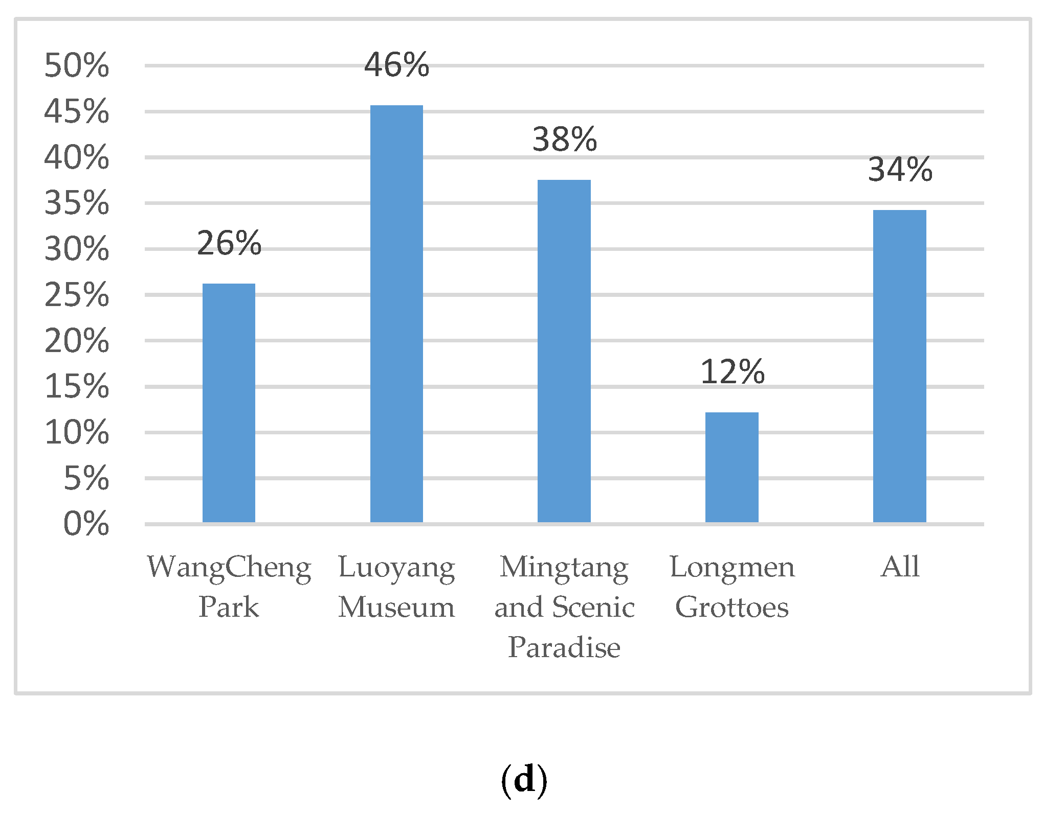
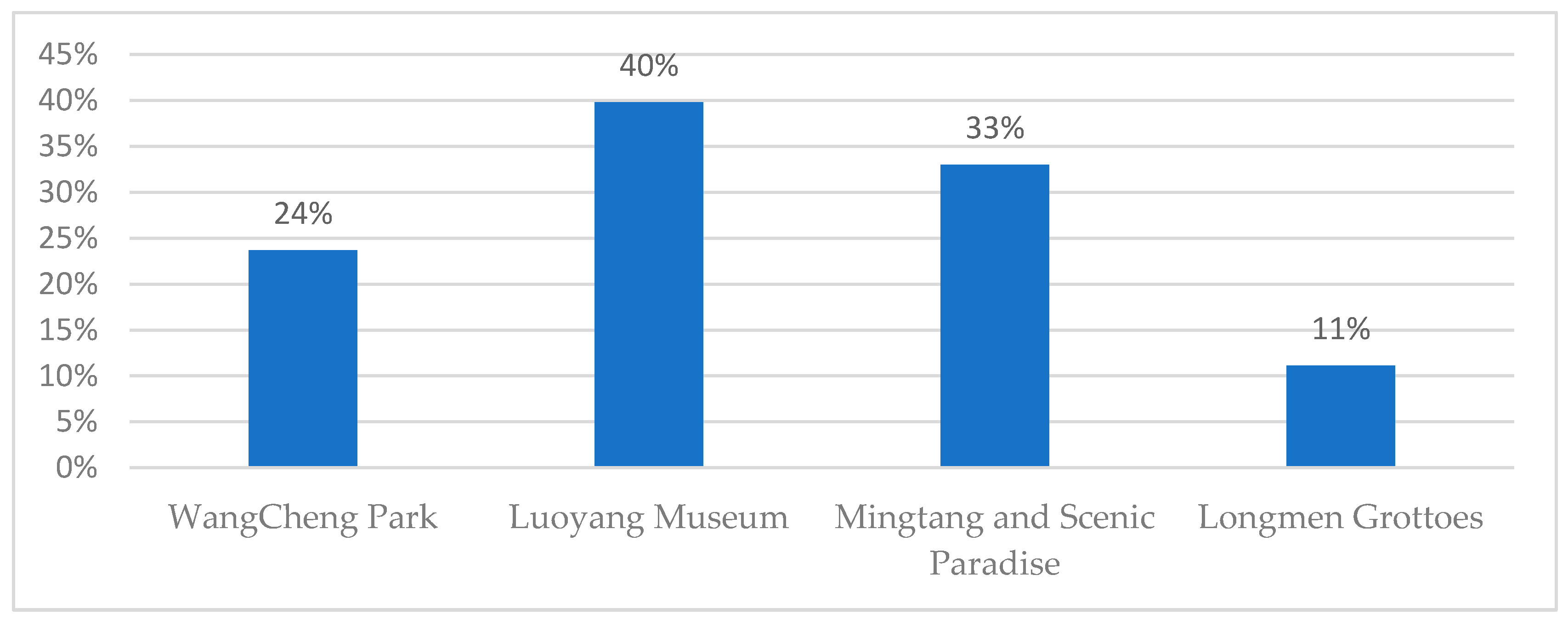
Figure 1. Conceptual differences among place marketing, place promotion, and place branding [2].
Sustainability 12 09902 g001
Figure 2. Place–product association model (own model).
Sustainability 12 09902 g002
Figure 3. Typical Image of Luoyang (Photographed by Li Gengwei).
Sustainability 12 09902 g003
Figure 4. Sample of image color extraction from the Mingtang and Scenic Paradise in Luoyang, China.
Sustainability 12 09902 g004
Figure 5. Postcard with Atmospheric Colors Designed for the Wangcheng Park Theme in Luoyang, China.
Sustainability 12 09902 g005
Figure 6. Observational measures for the walk in the park in Luoyang, China (Study 3). (a) Percentage of participants choosing the postcard corresponding to the participants’ current place (entering); (b) Percentage of participants choosing the postcard corresponding to the participants’ current place (leaving); (c) Percentage of participants choosing the postcard corresponding to the participants’ current place (entering, paired); (d) Percentage of participants choosing the postcard corresponding to the participants’ current place after (leaving, paired).
Sustainability 12 09902 g006aSustainability 12 09902 g006b
Figure 7. Measures of participant postcard choices corresponding to the place.
Sustainability 12 09902 g007
Table 1. Colors and place association.
NAvg.Std.
Place
Wangcheng Park1010.310.464
Luoyang Museum1020.330.474
Longmen Grottoes1000.190.394
Mingtang and Scenic Paradise1050.140.352
Total4080.240.429
Avg. is the ratio of postcard selections with colors corresponding to the participants’ current place.
Table 2. Results of postcard selection in Study 2.
Independent T-TestNAvg.Std.(t)
P1190.1580.375−0.024
P2220.0910.294−1.101
P3190.4210.5072.240***
P4230.3480.4871.850***
Overall830.3980.4924.396***
Hypothesis Testing Avg.Std.(z)
P1 < P3 0.2900.147−1.787**
P2 < P4 0.2220.124−2.073**
P1: uncontrolled participants at the end of the experiments; P2: uncontrolled participants prior to and after the experiments; P3: controlled participants at the end of the experiments; P4: controlled participants prior to and after the experiments. ** p ≤ 0.05, and *** p ≤ 0.01.
Table 3. Logistic regression of the effect of productivity orientation on atmospheric color priming.
Model 1Model 2Model 3Model 4
BWald BWald BWald BWald
Travel in a Group−0.83117.171***−0.93031.722***−0.3525.629**−0.3003.254*
Size of the Group0.4875.497*−1.04610.776***0.3682.723*0.3141.583
Distance0.3596.401**−0.2434.534**0.1664.250**0.1382.339
Gender−0.2751.940 0.1320.629 0.1801.481 0.1550.880
Age0.1090.309 −0.0870.282 0.0510.176 0.0520.143
Productivity Orientation0.1572.613 0.2156.434**0.30416.081***0.32114.272***
Intercept−1.54243.729***0.2731.863 −1.12736.921***−1.24436.465***
N742701928785
Hosmer–Lemeshow test0.564***0.934***0.900***0.900***
* p < 0.10, ** p < 0.05, *** p < 0.01.
Publisher’s Note: MDPI stays neutral with regard to jurisdictional claims in published maps and institutional affiliations.

