1. Introduction
Needless to say that the cities we live on are increasingly becoming Smart Cities [
1]. Smart city refers to a type of urban development based on sustainability [
2] that is capable of adequately responding to the basic needs of institutions, companies, and the inhabitants themselves, both economically and in operational, social and environmental aspects. Thus, in order to achieve such sustainability, Smart Cities need what has been called the 21st century’s oil [
3], namely data.
Data can be collected through different methods [
4], for instance, cameras and sensors distributed throughout the city, communication between devices, or the interaction of human with machines. It can be generated by meteorological observatories, financial markets or social networks. Even Internet traffic of a Smart City can be analyzed. A large volume of data is generated continuously and it increases sharply as time passes. Therefore, a Smart City packed with inhabitants and devices can be considered as a very vast source of data from which we can extract valuable knowledge [
5,
6].
The extraction of knowledge from data can improve many sectors. Indeed, economists in [
7] estimate that the global Gross domestic product (GDP) will be up to 14% higher in 2030 as a result of the accelerating development and take-up of Artificial Intelligence (AI) [
8], the equivalent of an additional
$15.7 trillion. This scenario represents a significant boost for the world economy with potential to raise a new industry and generate numerous business opportunities. Despite the fact that cities occupy only 2% of the planet’s territory, they represent between 60% and 80% of world energy consumption and generate 70% of greenhouse gas emissions [
9]. Therefore, in order to foster sustainability and reduce energy consumption and greenhouse gas emissions, we require to improve the efficiency of cities and transform them into Smart Cities through data analysis. Hence, Big Data will play a fundamental role for the management of resources and the provision of important services.
Analyzing all dataflows coming from Smart Cities represents a big challenge, partially addressed by the Big Data paradigm [
10]. Their characteristics match Big Data V’s, providing large amounts of data (Volume), the data comes from different sources, some of them are unstructured (Variety), coming from reliable and unreliable sources (Veracity), some of them are generated and have to be processed in real-time (Velocity), there is knowledge that the data provides value (Value), it is possible to process and analyze the captured data (Viability) and represent it in an understandable way to the final users (Visualization).
The Big Data paradigm enables us to gather all this data and process it in order to extract value from the data sources and represent the information in a visual and attractive manner for the users. It also helps to obtain behavior patterns that will enable us to design solutions and modify different processes of cities to make them more sustainable.
Ref. [
11,
12] list the different areas and propose examples in which initiatives could be applied to convert a city into a Smart City.
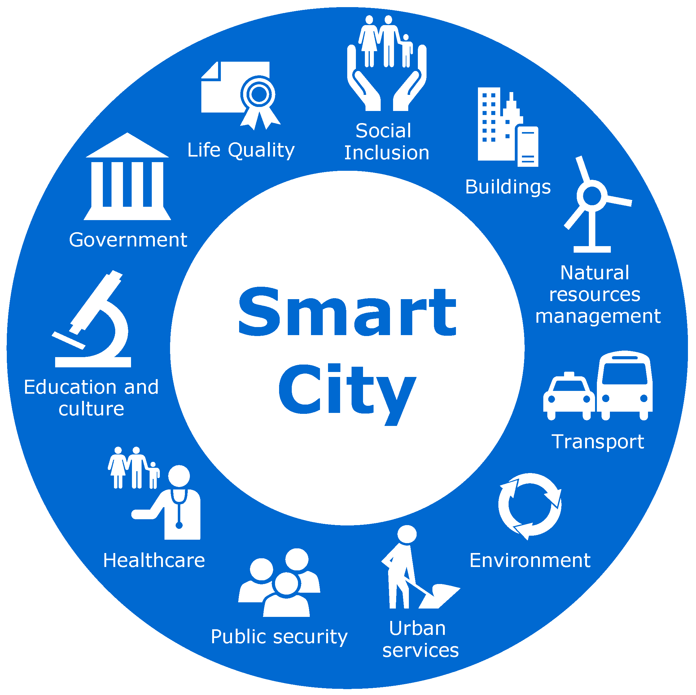
Figure 1 represents this areas graphically. Such areas are explained in the following:
Social Inclusion: Underlining the importance of creativity, social integration, education and tolerance, with the aim of bring the people and society inside to create a participatory and innovative environment.
Buildings: Intelligent systems in buildings could control the electrical and mechanical equipment. It will reduce the maintenance costs and will improve their safety.
Natural resources management: Sensors could automatically control the quality of resources, as well as locate possible leaks (water, gas, oil and so on) or incidents.
Transport: By analyzing data from cameras and sensors distributed throughout the city, it is possible to reduce traffic jams or act on them efficiently. It will be possible to interact with the network of traffic lights to make traffic more fluid. Also, citizens could also be informed of the traffic situation and indicate the optimal alternative routes.
Environment: Better energy management will save money and improve the environment. It will also be possible to use different types of devices to analyze the emissions of greenhouse gases and control them.
Urban services: Through social networks, call centers and other systems, it will be possible to know the opinion of citizens and tourists about the city’s services in real-time. Therefore, it will be possible to know what services are needed and in which locations.
Public security: Data could be collected and monitored to prevent crime through the correlation of the information collected by the different systems installed in the city.
Healthcare: Studying and analyzing clinical data will improve the decision-making in medical treatments. Also, the digitization of hospital management, will make it more efficient.
Education and culture: A better planning for each student can be offered by personalizing their curriculum and analyzing their progression in order to detect situations of risk and reduce the dropout rates.
Government: Digitization of the public administration in order to optimize the services and to be able to offer them through Internet.
Life Quality: Solutions to provide information about the places of interest of a city and cultural activities in order to facilitate the dissemination of information and motivate people to get involved in them.
As described above, there are many areas in which initiatives could be applied in order to aid in the conversion of a city into a Smart City. Unfortunately, this conversion is not automatic, it must be done guided by conscious decisions city representatives. As such, data and AI outputs themselves can be worthless if they are not represented in a proper manner. Indeed, to enable Smart Cities representatives to take actions toward the correct development on such cities, it is necessary to provide such data as comprehensive and straightforwardly possible, ideally in the form of key visualizations that drive change. This can be cumbersome due to the complexity and volume of the data generated by the Smart City’s devices. Furthermore, as [
10] discuss, one of the main issues in Smart City development is to transform the great amount of data streams into knowledge and finally, into strategic and tactical decisions. Hence, using the correct visualizations is very important.
Therefore, in this paper we focus on the area of Smart Cities, with the aim of highlighting the value that can be extracted from the data generated in them. Like any Big Data project, it is necessary to capture, store, process and analyze large amounts of data from different sources in order to transform them into useful knowledge. The main goal of our work is to provide a methodology that helps Smart City representatives to make smart decisions aided by visualizations, leading the city towards a more sustainable growth.
In previous works [
13,
14] we have defined a methodology that helps users to define and achieve their goals. It extracts in a semi-automatically manner characteristics of the data sources and derives automatically the best type of visualizations according to the defined context.
In this paper, we have significantly improved our previous works as follows. First of all, (i) we show how our proposal can be applied to the context of Smart Cities, exploiting existing datasets in combination with Artificial Intelligence to provide city representatives with evidences to make decisions that improve sustainability through city development and resource management. The Artificial Intelligence approach is a novel issue introduced in this paper for the first time in our overall and wider methodology. In addition, we (ii) improve our previous works by incorporating the required steps and solutions to process data in real-time, and (iii) facilitate context information to users, helping them better understand the output of (iv) an Artificial Intelligence algorithm we trained for this particular case study.
Therefore, to the best of our knowledge, this is the first work presenting a complete methodology, based on visualization techniques for non-experts, to cover all the data value chain from its generation, through its gathering and processing and finally, offering an easy visualization technique (including AI) to facilitate the decision making in the context of Smart Cities.
In order to put into practice the proposed methodology, we have used a case study based on the service calls management from the fire department of San Francisco. The objective of this city is to improve the sustainability of their processes by analyzing the responses of the emergency services. A complete dashboard will help them to reorganize the services as needed and to be ready for the action. It will lead to the reduction of the number and severity of serious fires in the city.
Furthermore, in order to evaluate the impact of our proposal, we have performed an experiment, with 12 non-expert users in data visualization. Each user was tasked with filling a questionnaire with two exercises. In the first exercise, a dataset was provided to users with the aim that they to made an analysis on them. Besides, in the second exercise, users were tasked with do different analysis by following our proposed methodology. The results obtained from the experiment have been analyzed.
The advantages of our proposal are that (i) it helps users to define their goals and achieve them through decision making supported by the most adequate historical and real-time visualizations in the context of Smart Cities, (ii) it provides a rationale for dashboard design, (iii) it helps to visually understand the output of Artificial Intelligence algorithms (iv) it enables users to gather evidence for making strategic and tactical decisions. Without the benefits introduced by our proposal, it would be hard for the users to understand the state in which their processes are, and to be able to make the best decisions in relation to them.
The rest of the paper is structured as follows.
Section 2 presents the related work in this area.
Section 3 describes our proposed methodology to fostering sustainability through visualizations.
Section 4 shows our approach applied in a Smart City case study.
Section 5 presents a evaluation of our approach. Finally,
Section 6 summarizes the conclusions and our future work.
2. Related Work
During the last few decades, sustainability and sustainable development have become popular topics not only for scholars in the fields of environmental economics, technology and science, urban planning, development and management. It has also become popular for urban policy makers and professional practitioners [
15].
In a city context, a city may be called smart when investments in human, social capital and ICT, foster sustainable economic growth and a high quality of life, as well as wise management of natural resources, through participatory government [
16].
Regarding Internet of Things (IoT) for Smart Cities, significant research effort and technological development have been devoted. The main reason is the exponential growth of devices/smart objects that can participate in an IoT infrastructure [
17].
According to [
18], the typical challenges raised by the application of the IoT on Smart Cities are: Security and Privacy (the system can be subjected to attacks), Heterogeneity (each system component is knitted to the particular application context), Reliability (the communication between smart devices may not reliable enough), Large Scale (the large scale of information requires suitable storage and computational capability), Legal and Social Aspects (when the service is based on user-provided information), Big Data (it is certainly necessary to pay attention to transferring, storing and recalling and also analyzing such a huge amount of data produced by smart devices) and Sensor Networks (process the large-scale data of the sensors in terms of energy and network limits and various uncertainties).
Some researchers propose approaches to provide solutions to interconnect IoT elements. In [
19] is proposed an Artificial Intelligence-based semantic IoT hybrid service architecture which enables flexible connections among heterogeneous IoT devices. In [
20] is proposed an IoT-based platform for the development of cyber–physical systems suitable for Smart Cities services and applications. The authors provide a set of abstractions suitable to hide the heterogeneity of the physical sensor/actuator devices embedded in the system. Besides, in [
21] authors are focused in locating and optimizing the traffic in cities through a swarm-based architecture that interconnect their elements.
In [
22] is introduced a Machine Learning approach to automate and help crime analysts to identify the connected entities and events. They collect, integrate and analyze diverse data sources to generate alerts and predictions.
Besides, several works have focused in how to visualize IoT data coming from Smart Cities. Ref. [
23] highlights the challenge of real-time data stream visualization in the fields of Smart Cities as traffic, pollution, social media activity, citizens dynamics, etc. They apply different types of glyphs for showing real-time stream evolution of data gathered in the city. In [
24], they propose a Service Oriented Architecture software platform aimed to providing Smart City services on top of 3D urban city models. In [
25] a solution is proposed for enhancing the visualization of IoT information. This study proposes a framework to integrate IoT data into an environment based on Augmented Reality (AR). Finally, Ref. [
26] shows a use case scenario, where live air quality data that is visualized and monitored via sensors installed on top of mobile post vans, driving around in the City of Antwerp.
However, none of these approaches take into account the users’ goals. As [
10] argue, one of the main issues in Smart City development is to transform the great amount of data streams into knowledge and finally, into strategic and tactical decisions. Hence, using the correct visualization is very important. The manner people perceive and interact with a visualization tool can strongly influence their data understanding as well as the system’s usefulness [
27].
Therefore, we propose a process that helps users to define their goals and derive automatically the best type of visualization in the context of Smart Cities. Moreover, we provide visual techniques to easily understand the output of Artificial Intelligence algorithms. It will enable users of Smart Cities to make strategic and tactical decisions in order to improve the sustainability of their processes.
3. Process to Fostering Sustainability through Historical Visualizations and Instant Analysis
In this section we will describe our proposed process.
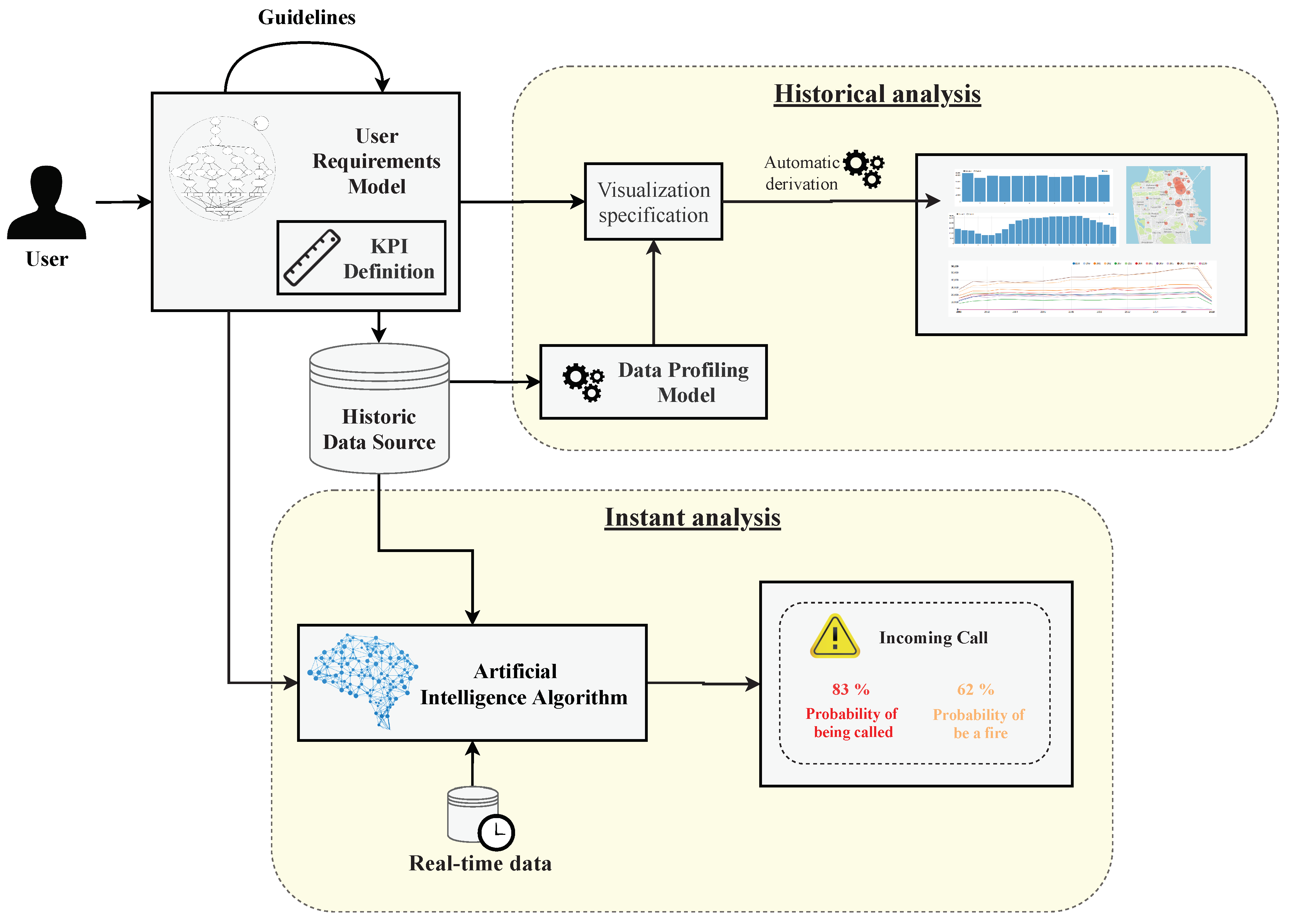
Figure 2 summarizes the process followed in our proposal. By following this process, users will be able to communicate their analytical needs and to obtain automatically the set of visualizations most suitable to achieve their goals. These visualizations will be grouped in a powerful dashboard that will help them to make strategic and tactical decisions in order to help to improve the evidence-gathering process by assisting users in visualising data.
Firstly, users define through a series of guidelines the User Requirements Model presented in [
13]. They will also define a set of Key Performance Indicators (KPIs) in order to measure the degree of achievement of the goals.
Once the requirements have been defined, we differentiate 2 types of analysis. On the one hand, a study to analyze the historical data that will enable users to have an image of the current situation of the process. On the other hand, an instant analysis, where the incoming data will be processed at the moment it arrives with the aim of anticipating to the events, as it will be explained later (
Section 3.3).
Therefore, our process provides a set of visualization techniques to understand the current situation of a process, thus enabling users to visually represent the output of Artificial Intelligence Algorithms. In the following, we describe in detail the elements that compose our process (
Figure 2).
3.1. Definition of Requirements and KPIs
The first element that in our process is the User Requirements Model. This element will help users to define their data analysis objectives and to achieve it through the visualizations that best suit them. We can find an example of the application of this model into a real case of study in
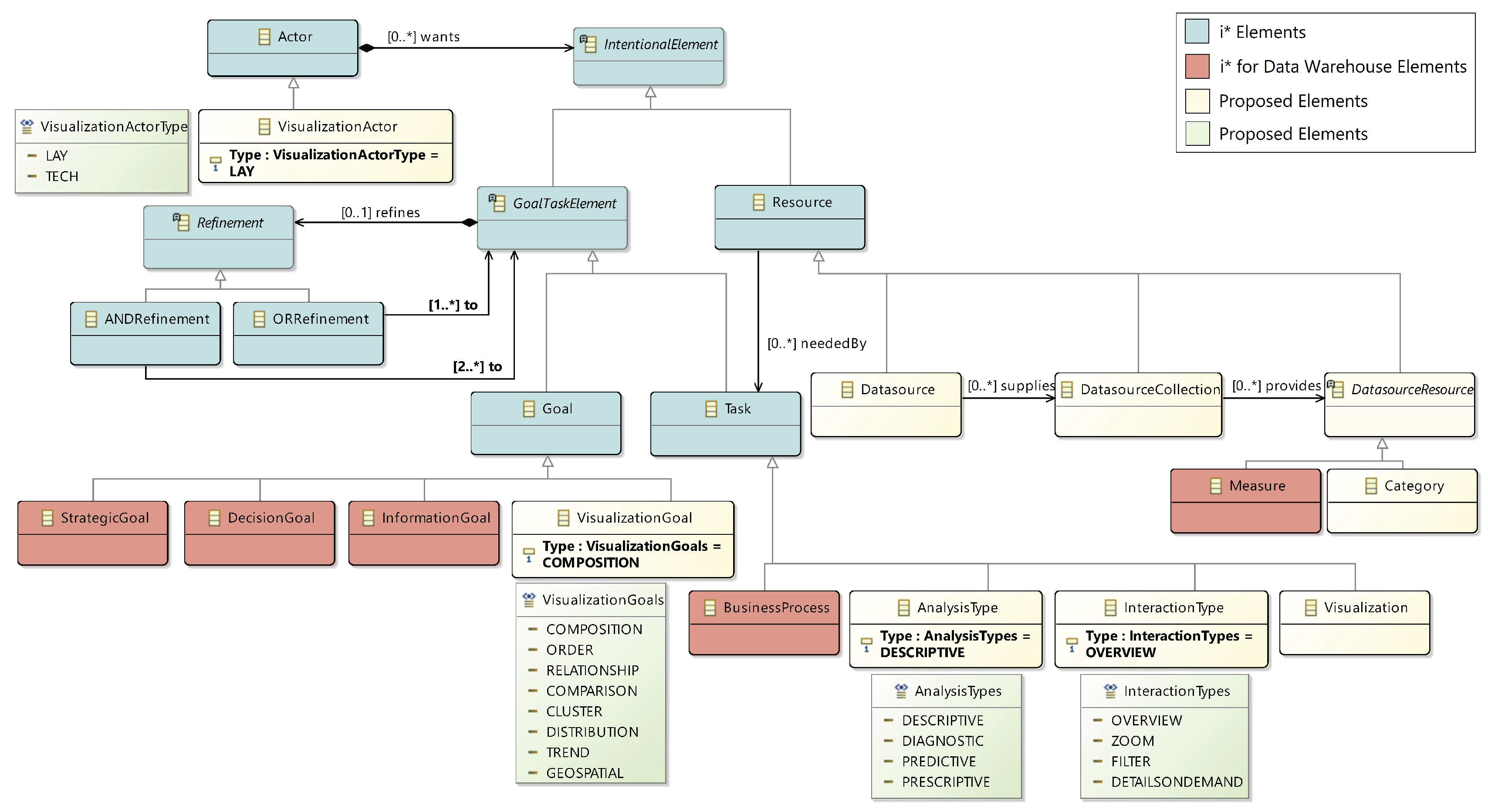
Section 4. In order to formally define our model, in [
13] we proposed this metamodel that we can see in
Figure 3).
The proposed metamodel is an extension of the one used for social and business intelligence modeling [
28], namely i* [
29] and the
i* for Data Warehouses extension [
30]. i* elements are represented in blue, and i* for Data Warehouses elements are represented in red. The elements added by us are represented in light yellow and green. In the following, we will describe the elements that compose the metamodel.
The Visualization Actor refers to the user of the system. There are two types of Visualization Actors: Lay, if the user has no knowledge of complex visualizations, or Tech, if she has experience. The next element is the Business Process on which users will focus their analysis. The business process will serve as the guideline for the definition of Goals. A goal represents a desired state of affairs with reference to the business process at hand. Goals can be divided into Strategic, Decision, Information, and Visualization.
The
Analysis Type enables users to express which kind of analysis they wish to perform. The type of analysis can be determined by selecting which question from the following ones [
31] is to be answered: How to act? (Prescriptive), Why has it happened? (Diagnostic), What is going to happen? (Predictive) or What to do to make it happen? (Descriptive).
A
Visualization represents a specific visualization type that will be implemented to satisfy one or more
Visualization Goals. Each
Visualization Goal describes an aspect of the data that the visualization should reflect. These goals can be Composition, Order, Relationship, Comparison, Cluster, Distribution, Trend, or Geospatial, as considered in [
32]. Along with
Visualization Goals,
Visualizations have one or more
Interaction Types, that capture how the user will interact with the visualization. The different kinds of interaction are Overview, Zoom, Filter, or Details on Demand as [
32] consider. Finally, a
Visualization will make use of one or more
Data Source Resource elements which will feed the data to the visualization.
As argued in [
32], inexperienced users may find it difficult to properly give values to these elements. Consequently, in [
13], we proposed a series of guidelines to assist non-expert users in definition of the model elements.
In order to improve the definition and measure the degree of achievement of the goals defined in the User Requirements Model, users may define a set of Key Performance Indicators (KPIs). To do this, users will use a table like the one shown in
Table 1. This table represents an example of the goals defined in the User Requirements Model that require extra information. For each goal, users may define a KPI to measure it and a threshold to identify its possible states of the KPI.
Once all the requirements have been defined, we differentiate 2 types of analysis as we see in the following.
3.2. Historical Analysis
The Historical Analysis is aimed to make a summary of the current situation of the process. The visualizations derived in this analysis will help users to understand which are the critical areas of their processes and to be able to make right decisions about them.
3.2.1. Data Profiling Model
In order to derive the types of visualizations that will fit best in the Historical Analysis, we use the Data Profiling Model to capture the characteristics of the data that are relevant for the visualizations. The Dimensionality, Cardinality, and Dependent/Independent Data Type will be extracted in a semi-automatic manner as explained below.
Cardinality represents the cardinality of the data, it depends of he numbers of items to represent. It can be:
- -
Low from a few items to a few dozens of items.
- -
High if there are some dozens of items or more.
Dimensionality represent the number of variables to be visualized. It can be:
- -
1-dimensional when the data to represent is a single numerical value or string.
- -
2-dimensional if one variable depends on other.
- -
n-dimensional when a data object is a point in an n-dimensional space.
- -
Tree when a collection of items have a link to one other parent item.
- -
Graph provided a collection of items are linked to arbitrary number of other items.
Type of Data: is used to declare the type of each variable. It can be:
- -
Nominal when each variable is assigned to one category.
- -
Ordinal when it is qualitative and categories can be sorted.
- -
Interval if it is quantitative and equality of intervals can be determined.
- -
Ratio provided it is quantitative with a unique and non-arbitrary zero point.
3.2.2. Derivation of Visualizations
Once the Data Profiling Model is completed, this information will be combined with the information coming from the User Requirements Model and it will result in the Visualization specification. This Visualization specification will enable us to derive the best type of visualization for each specification following the guidelines proposed in [
32]. Furthermore, [
14] explains how to transform the Visualization specification into a visualization following a Model Driven Architecture (MDA) standard. This approach also introduces a Data Visualization Model in order to facilitate the selection of the right visual analytics to non-expert users.
Therefore, at the end of this analysis, users will get a set of visualizations that will form a dashboard. This dashboard will enable non-expert users to understand the current status of their processes. Furthermore, by following our approach, the visualizations that make up this dashboard will be the most appropriate for each case and users will able to extract knowledge from them properly.
3.3. Instant Analysis
On the other hand, compared to historic analysis we have the type of analysis focused on a specific moment, usually when an event has occurred. The Instant analysis will process the data as soon it arrives with the aim of be anticipated to the incidents. Hence, we propose to use an Artificial Intelligence (AI) algorithm to enable users to make predictions in real-time.
Firstly, the AI algorithm is trained with the Historic Data Source, this action will enable the algorithm to learn about the correlation between the data source variables. Then, once the algorithm has been trained, when new data come into the process, the algorithm will be able to automatically and instantly predict what is going to happen.
Depending on the user’s goals, one type of algorithm or another will be chosen. In the next section, we apply our approach into an illustrative case of study. In this case, we have applied a Deep Neural Network, which is able to predict attributes of data that are unknown at that time and generates additional information that can be interpreted in combination with the information facilitated through the historical analysis. This way, users have more information and better understanding of the context, allowing them to better to interpret the data for making decisions.
4. Case Study: Fire Department Calls for Service
In this section, we will apply our approach into a real case of study. The aim of this case of study is to demonstrate how a city that collects and offers its data can improve the sustainability of their processes thanks to the evidence gathered by means of Big Data techniques and visualizations.
The data provisioning process can be done from many different sources. In this case we have used Open Data Portals. The way to operate with Open Data is the same as with any other data source, with the advantage that there are no limits of use or publication. Open Data is defined as “that content that can be freely used, modified, and shared by anyone for any purpose” [
33]. For this reason, we have taken as input the open dataset of San Francisco city [
34]. More specifically, we took the Fire Department Calls for Service dataset [
35]. This dataset contained 5.27 millions of rows and 34 columns by April 2020. Each row corresponds to a call to fire units. In order to improve sustainability, this city would require a set of visualizations to analyze their data in order to improve the response of their emergency services. We assume the role of a user that is trying to reduce the severity and number of serious fires in the city.
As is shown below, we will apply our approach to this case study by following our proposed process (
Figure 2).
4.1. User Requirements Model and KPI Definition
Following our proposed process (
Figure 2), the first element is the
User Requirements Model.
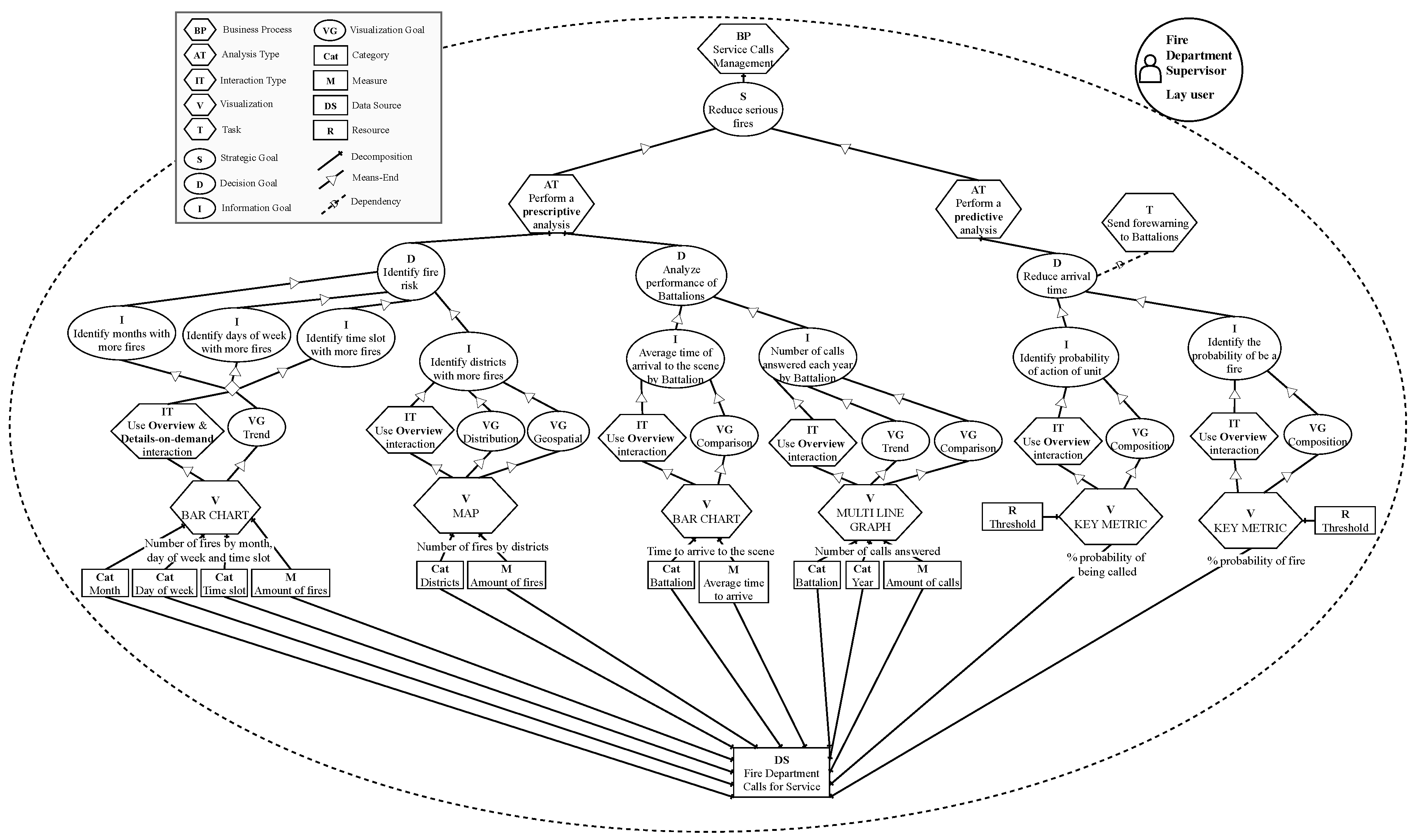
Figure 4 shows the result of its application. In this case, the user is the Fire Department Supervisor of the city of San Francisco. However, such user is not a specialist in visualization of Data Analytics. Therefore, the user is defined as
“Lay user”. In this case, the user has decided to perform the analysis about the
“Service Calls Managment” process. It helps to determine the scope of the analysis and what kind of goals will be pursued. Following the process, the strategic goal is defined as
“Reduce serious fires”. Strategic goals are achieved by means of analyses that support the decision-making process.
Next, in this case study, the user has decided to create two types of analysis. One “Prescriptive analysis” in order to make an historical analysis and discover how to turn the city into a more sustainable Smart City. Furthermore, the user also decides to create a “Predictive analysis” with the aim of predicting what is going to happen in order to be able to act more efficiently.
Each type of analysis is decomposed into decision goals. A decision goal aims to take appropriate actions to fulfill a strategic goal and it explains how it can be achieved. In the case of the Prescriptive analysis, the user defines “Identify fire risk” and “Analyze the performance of Battalions” as a decision goals. For each decision goal the user also specify one or more information goals to provide more detailed information, the information goals represent the lowest level of goal abstraction. To achieve the decision goal “Identify fire risk”, the user defines the information goals: “Identify month with more fires”, “Identify days of week with more fires”, “Identify time slot with more fires” and “Identify districts with more fires”. Besides, in order to achieve the decision goal “Analyze the performance of Battalions” the information goals defined by the user are “Average time of arrival to the scene by Battalion” and “Number of calls answered each year by Battalion”.
Otherwise, in order to make the Predictive analysis, the user defines “Reduce arrival time’ as a decision goal, which is specified in detail by the information goals “ Identify probability of action of unit” and “Identify the probability of be a fire”.
For each information goal a visualization will be automatically derived in order to achieve it (the visualizations used to achieve the information goals
“Identify month with more fires”,
“Identify days of week with more fires” and
“Identify time slot with more fires” follow the same needs, for that reason they have been grouped in the model). A visualization is characterized by one or more visualization goals and kinds of interaction. The visualization goals describe which aspects of the data the visualization is trying to reflect and the interaction type describes how users would like to interact with the visualization. Users may use the guidelines that are published in [
13] in order to define these elements. In this case the user has selected
“Trend”,
“Distribution”,
“Geospatial”,
“Comparison” and
“Composition” as visualization goals. And
“Overview” and
“Details-on-demand” as interaction types.
Finally, the user specifies the data source where the analysis will be performed over and selects the Categories and Measures that will populate the visualizations.
Once the User Requirements Model is done, users will define the KPIs through a table like
Table 2. In this table the KPIs to measure the degree of achievement of the goals (for the goals which needs KPIs) are defined. Furthermore, it is necessary to identify the thresholds of each KPI in order to define its possible states and be able to decide whether the KPI is succeeding or failing.
In this case, the user has defined the number of serious fires as KPI in order to measure the strategic goal “Reduce serious fires”. For the information goal “Identify action probability of unit” a percentage to measure the probability that the unit will be called is proposed. The thresholds to define the states that this variable can take have been defined as High probability when there is a probability of action higher than 70%, Medium probability when the probability of action is between 70% and 40%, and finally, Low probability, when the probability of action is lower than 40%. For the case of the information goal “Identify the probability of be a fire” a percentage to measure it is also proposed. In this case, the threshold is defined as High when there is a probability of fire higher than 70%, Medium when the probability is between 70% and 40%, and Low when the probability is lower than the 40%.
4.2. Historical Analysis (Prescriptive)
Following our approach, in order to perform the historical analysis, the next step is to apply our
Data Profiling Model (
Section 3.2.1) to determine the Dimensionality, Cardinality and Data Type of the selected data source.
For example, the visualization
“Identify districts with more fires” (from the model shown in
Figure 4) requires information about the category
“Districts” and the measurement
“Amount of fires”.
Firstly, using the data profiling tool (
Section 3.2.1), the independent variable
“Districts” is classified as
Nominal and the dependent variable
“Amount of fires” as
Ratio. Dimensionality is set to
2-dimensional, because the user has defined 2 variables to visualize. Finally, the Cardinality is defined as
High Cardinality because the data contains many items to represent.
Overall, the visualization specification obtained through User Requirements Model and Data Profiling Model is:
Visualization Goal: Distribution
Visualization Goal: Geospatial
Interaction: Overview
User: Lay
Dimensionality: 2-dimensional
Cardinality: High
Independent Type: Nominal
Dependent Type: Ratio
With this visualization specification we are able to derive it into the most suitable visualization type following the approach proposed in [
32]. As we specify in
Section 3.2.2, the explanation of how to do this process in an automatic manner is covered in [
14]. In this case, the visualization type that better fits this specification is a
“MAP”. This whole process is repeated with the rest of the visualizations that compose the model shown
Figure 4 in order to derive the most suitable visualization type for each specification.
4.3. Predictive Analysis
However, not all the necessary information can be extracted from historical analysis. In order to perform the
Predictive analysis, we will face a real-time scenario, where the user wants to predict in real-time the
“Probability of action of unit” and
“Probability of be a fire”, as it is specified in
Figure 4.
In order to predict events, an AI algorithm will be integrated into the system. This algorithm will analyze each incoming call and will make a prediction before be answer with the aim of send a forewarning to the Battalions when they have a high probability of action.
The AI algorithm will be trained with the Historic Data Source. This algorithm will learn about which are the variables in the data source that determine the type of call and the probability of action of the Battalions. The reason why we use the complete data source is because, in the User Requirements Model (
Figure 4), the user has selected the entire data source to feed the visualizations of the Predictive Analysis.
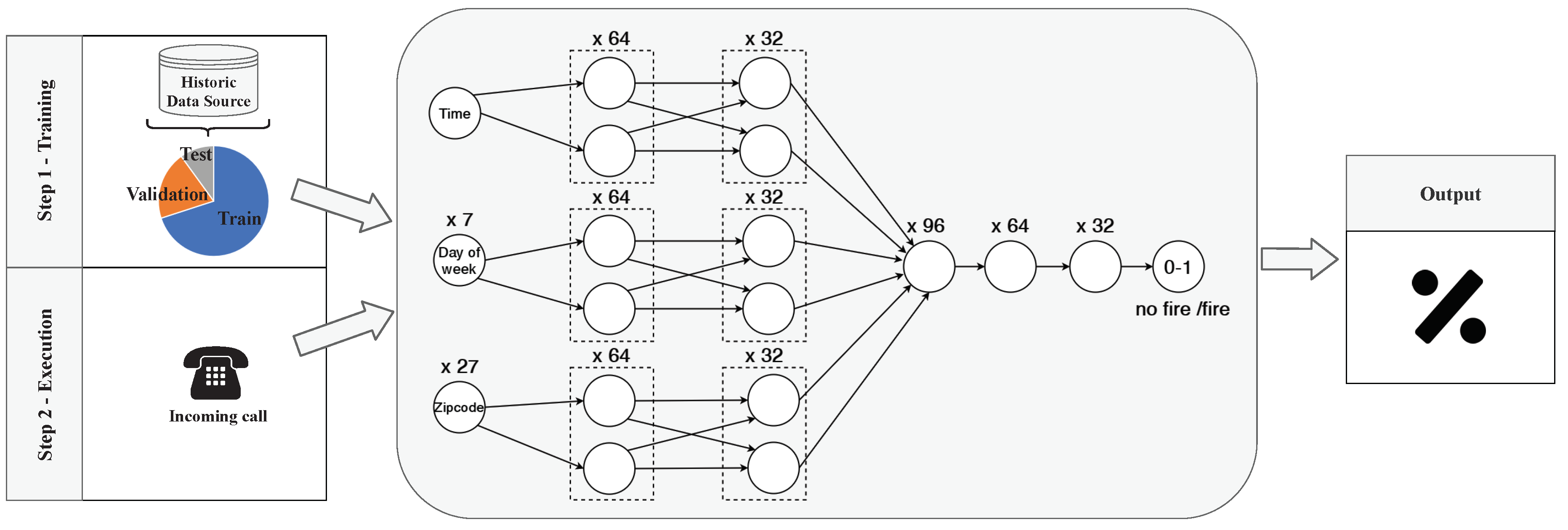
In this case, as is shown in
Figure 5, we have used a dense Deep Neural Network (DNN) with 6 layers and (input, output and 4 hidden ones). In order to avoid the problems that data bias brings, as we explain in [
36], first step is to shuffle the whole dataset and separate it into Train, Validation and Test data. In this case 70% of the data is used to train the algorithm, 20% to validate it and the 10% to test it. The train and validation data will form the input of the algorithm, these data will be used by the algorithm to learn how to classify. Then, test data will be use to check the learning result.
In this case, as
Figure 5 shows, the algorithm input will be formed by the variables
“Time”,
“Day of week” and
“Zipcode”. Each variable will have a set neurons to represent each of its types of attributes. More specifically, the Zipcode will be represented by using a one-hot [
37] encoding into 27 input neurons. In the same sense, the Day of Week will codified into 7 neuron. Besides, since the Time is not categorical, it will be represented by using one neuron.
Then, a layer with 64 neurons by each variable will be launched. Following, these neurons will be mixed with a layer of 32 neurons by variable. Finally, all these neurons will be grouped into a 96 neurons, them will be reduced to 64 neurons, to 32 neurons, and the output will be a binary neuron. This is the most complex task and the one that will need more computational capacity.
Once the algorithm has been trained and tested, when new data come into the process, as a new call, the algorithm will be able to automatically and instantly predict information about the process. The output of this algorithm will be a number between 0 and 1, where a number close to 0 will means that there is no fire risk and a number close to 1 will mean that there is high fire risk. This information will be represented in a Key Metric visualization as
Figure 4) indicates. These visualizations are composed by resources that specify the threshold values. These thresholds has been previously defined in
Table 2. Therefore, these visualizations will be created by taking into account these specific thresholds and will enable users to visually understand the algorithms output.
Moreover, beside to visually represent the probability of action, in order to achieve the decision goal “Reduce arrival time”, the task “Send forewarning to Battalions” will be executed. Therefore, those Battalions with a higher probability to be called will be forewarned. As a result, they will be able to be ready for the action and in this way, the reduction of the arrival time will consecutively reduce the impact of the fire.
Therefore, by applying this AI algorithm, when a call comes in, users will know automatically extra information that has not yet been received and the probability of this information to be true. Furthermore, our approach provides visual techniques to easily understand the algorithm output and allows users to define thresholds in order to distinguish when the result of the algorithm is relevant to them. These visualizations will be grouped into a dashboard that will be updated with each call, thus always offering the most up-to-date information.
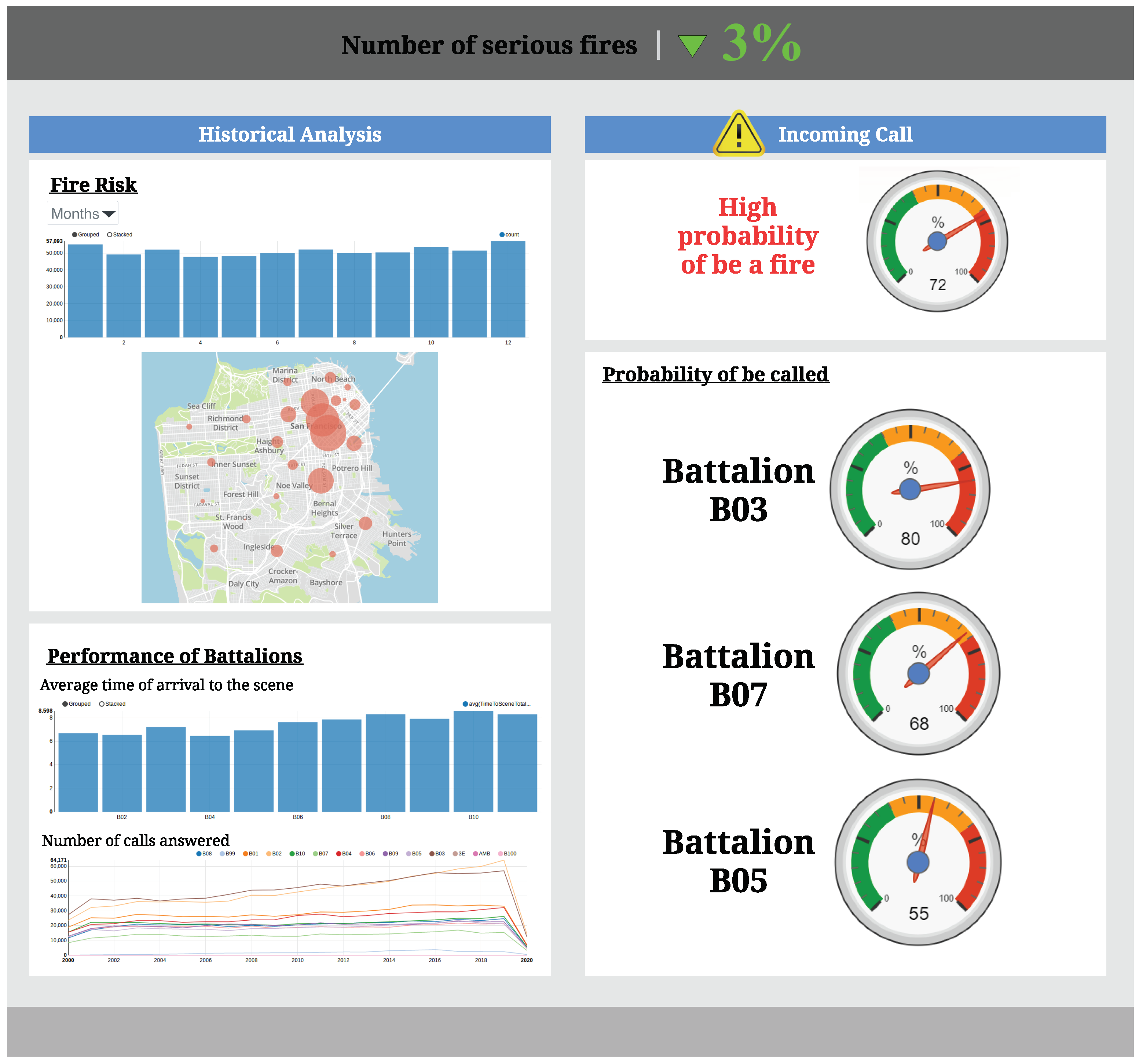
4.4. Final Dashboard
Once all visualizations have been developed following the recommended visualization types proposed in
Figure 4, a dashboard like the one shown in
Figure 6 will be generated. The dashboard will combine all the generated visualizations aimed at satisfying the analytic requirements of our fire department supervisor user. The visualizations that make up the dashboard are grouped following the types of analysis defined in the User Requirements Model (
Figure 4).
This dashboard represents the overall analysis of the Service Calls Management process. On the left side, the historical analysis is represented. Here the user is able to identify the fire risk at a certain moment as well as the fires distribution through the different districts. Furthermore, the user may also analyze the performance of the Battalions thought the average time to arrival to a scene and the number of calls answered by each Battalion.
On the other hand, on the right side, it will be represented the key metrics that will made possible to analyze each incoming call before answering it. These visualizations will be updated for each incoming call and they will represent the probability for the call to be a fire, as well as the probability for the Battalions to be called for action. Moreover, as is defined in
Figure 4, an automatic forewarning will be send to the Battalion with the highest probability of action, in order to enable them to be ready for action, thus reducing the arrival time to the scenarios.
Finally, at the top of the dashboard there is a key metric that measures the strategic goal “Reduce serious fires”. This KPI will enable users to follow the impact of their decisions and check whether the measures in place are really improving the sustainability of the city.
5. Evaluation
In order to evaluate the impact of our proposal, we have performed an experiment, with non-expert users in data visualization. The experiment consisted in filling a questionnaire with two exercises. On each exercise, a dataset was presented to users and they were asked to define a series of visualizations to perform one type of analysis.
In the first exercise, users were asked to define a set of visualizations to perform an Historical Analysis without following any methodology. While, in the second exercise, users were tasked to perform an Instant Analysis by following our proposed methodology. The tasks posed were interchanged between two questionnaire models, and distributed equally among the participants as is shown in
Table 3.
Once both exercises were finished, they were asked more concrete questions that had to be answered by using the created visualizations.
We took as non-expert users in data visualization software developers and non-IT users from a company with experience in joint projects with public institutions from Alicante (Spain) who performed the experimental task from home. A total of 12 non-expert participants filled the questionnaires. Since we were unable to perform a fully controlled experiment due the COVID-19 measures, we used a video conference tool to have direct contact with the participants. During the session, there were no dropouts.
Table 4 shows some statistics about the experimental sessions.
According to the results obtained, the set of visualizations proposed without following any methodology were able to answer the 23% of the specific questions posed, whereas this number rose to 39% coverage when following our proposed methodology.
A T-test of the results showed statistical significance for the results obtained, confirming the impact of the method proposed.
Threats to the Validity
In this section, we summarize the main limitations we envision for our approach.
The subjects were randomly assigned within the groups to cancel out fatigue effects. However, the experiment could not be fully controlled due to the COVID-19 measures. Nevertheless, we tried to overcome this shortcoming by using a real-time remote meeting tool.
The lack of a CASE tool forces users to be accompanied by a data analyst in order to follow the proposed method, making it necessary to implement a user-friendly CASE tool to overcome this limitation.
The methodology increases the capability to answer questions, however, domain expertise can still be considered a significant factor to define a more complete set of visualizations.
In principle, our proposal is context-independent. However, since we have not yet tested the proposal in a comprehensive enough set of contexts, it may be the case that some specific user profiles have not yet been identified.
6. Conclusions and Future Work
Nowadays, the cities we live on are transforming into Smart Cities, incorporating sensors and other devices that generate large volumes of IoT data. The different nature of these data makes it complex to process, combining a variety of sources at different speeds that require the application of Big Data techniques. With the aim of solving these difficulties, a technological revolution emerges, with potential to boost a new industry and to generate numerous business opportunities and helping to improve the sustainability of our cities by improving their efficiency and resource management.
However, resource optimization cannot be achieved unless decision makers -city representatives- obtain a clear view of the information processed, in turn having the necessary evidence to make the correct decisions.
In this paper, we have proposed an approach that improves the evidence-gathering process in the decision making through visualization techniques for Big Data in the context of Smart Cities. We have combined our methodology to help users define their goals and derive the best type of visualization with the possibility of including real-time data in the context of Smart Cities. These visualizations represent incoming real-time data from IoT sensors in order to enable users to gather the necessary evidence to make strategic and tactical decisions.In addition, they help understand the output of AI algorithms, providing the necessary context to generate trust regarding the output. The set of visualizations created takes into account the expertise of users, facilitating their understanding and their translation into actions through decision making. Without the holistic view about the process and its outputs provided by our proposal, it would be hard for the users to understand the state in which their processes are, and therefore there would not be enough evidence for making the correct decision.
In order to assess the suitability of our proposal, we presented a case study based on fire department’s call service, where data coming from IoT devices and incoming calls are analyzed. In this particular case, our findings are applied to data coming from citizen calls. Thus, the results of this work contribute to the optimization of resources by facilitating evidence for the decision making process. Namely, fire extinguishing battalions will be better suited to respond when a call is received.
Our proposal has been evaluated through an experiment with 12 users without expertise in data visualization. The results show that the visualizations obtained by our proposal are considered better by users than the ones they created on-demand and, in fact, support better their information needs.
As part of our future work, we are working on extending the case study by applying it in other Smart City processes with the aim of helping Smart Cities to improve the sustainability in all their processes. Moreover, we plan to perform an evaluation of the understandability of the models created with our methodology, similar to the one presented in [
38]. Finally, we intend to develop a CASE tool in order to ease the usage of our methodology. This this aim, we will follow the guidelines established in [
39].


