Article

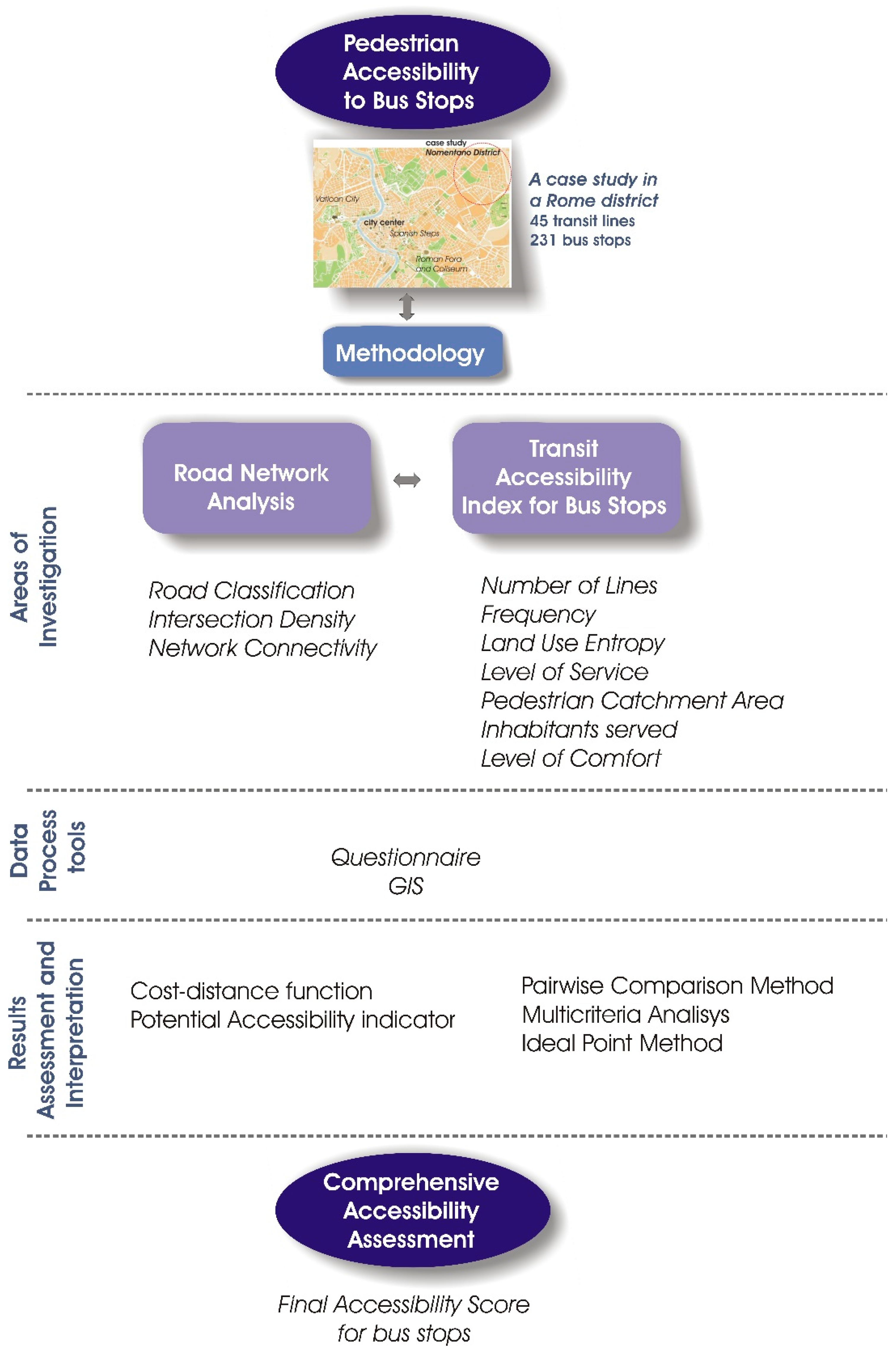
A Methodology to Evaluate Accessibility to Bus Stops as a Contribution to Improve Sustainability in Urban Mobility

by
Maria Vittoria Corazza
* and
Nicola Favaretto
Department of Civil, Construction and Environmental Engineering, Sapienza University of Rome, 00184 Rome, Italy
*
Author to whom correspondence should be addressed.
Sustainability 2019, 11(3), 803; https://doi.org/10.3390/su11030803
Submission received: 28 December 2018 / Revised: 26 January 2019 / Accepted: 30 January 2019 / Published: 3 February 2019
(This article belongs to the Section Sustainable Transportation)

Abstract

:
Walking and transit are the backbone of sustainable mobility. Bus stops not only represent the connection between the two, but are also central in dictating the attractiveness of the latter. Accessibility of bus stops becomes, then, pivotal in increasing both attractiveness and sustainability of public transport. The paper describes a multi-step methodology to evaluate bus stops’ accessibility starting from a cluster of seven indicators describing objective and subjective features influencing passengers’ choice toward a given bus stop. The indicators are weighed by a questionnaire submitted to experts. Finally, a multicriteria analysis is developed to obtain a final score describing univocally the accessibility of each stop. Outcomes are mapped and a case study in Rome is reported as an example, with 231 bus and tram stops assessed accordingly. Results shows the relevance of the urban network and environment in evaluating the accessibility and in promoting more sustainable mobility patterns. Research innovation relies on the possibility to merge data from different fields into a specific GIS map and easily highlight for each bus stop the relationships between built environment, passengers’ comfort, and accessibility, with the concluding goal to provide advanced knowledge for further applications.

1. Introduction

Walking and transit are the backbone of sustainable mobility, as repeatedly stressed in scientific literature [1,2,3,4] and corroborated by case studies worldwide, provided that accessibility requirements are met. Bus stops and vehicles design are central to ensuring full accessibility to public transport. However, while for vehicles meeting ergonomic requirements and improving travel comfort and safety conditions are consolidated practice for quality on-board operations, the same cannot be said for bus stops.
“Bus stops are often dreary because they are set down independently, with very little thought given to the experience of waiting there, to the relationships between the bus stop and its surroundings” [5] (p. 452) is a statement which implies that accessibility of bus stops is affected by many additional factors [6], two of which are pivotal in increasing both attractiveness and sustainability of public transport: (i) the quality of the urban environment these facilities are located in; (ii) the type of functions and operations associated with them, which dictate their “status”, from simple bus marker to bus shelter, to transit hub. This also explains why it is difficult to find a comprehensive definition for bus stops’ accessibility.
The paper moves from this assumption, further elaborated, to describe an innovative methodology (Section 2) to assess accessibility for bus stops. The methodology merges a cluster of seven quantitative indicators, qualitatively weighed by transit experts, all regular users. A multicriteria analysis is then developed to obtain a final score describing univocally the accessibility of each stop (a detailed description is provided to enable its replication elsewhere).
Bus facilities located in a residential district in Rome, Italy, serve as a case study to validate the methodology (Section 3), then outcomes are presented (Section 4) and further elaborated (Section 5 and Section 6), with the final goal to provide advanced knowledge for further applications.

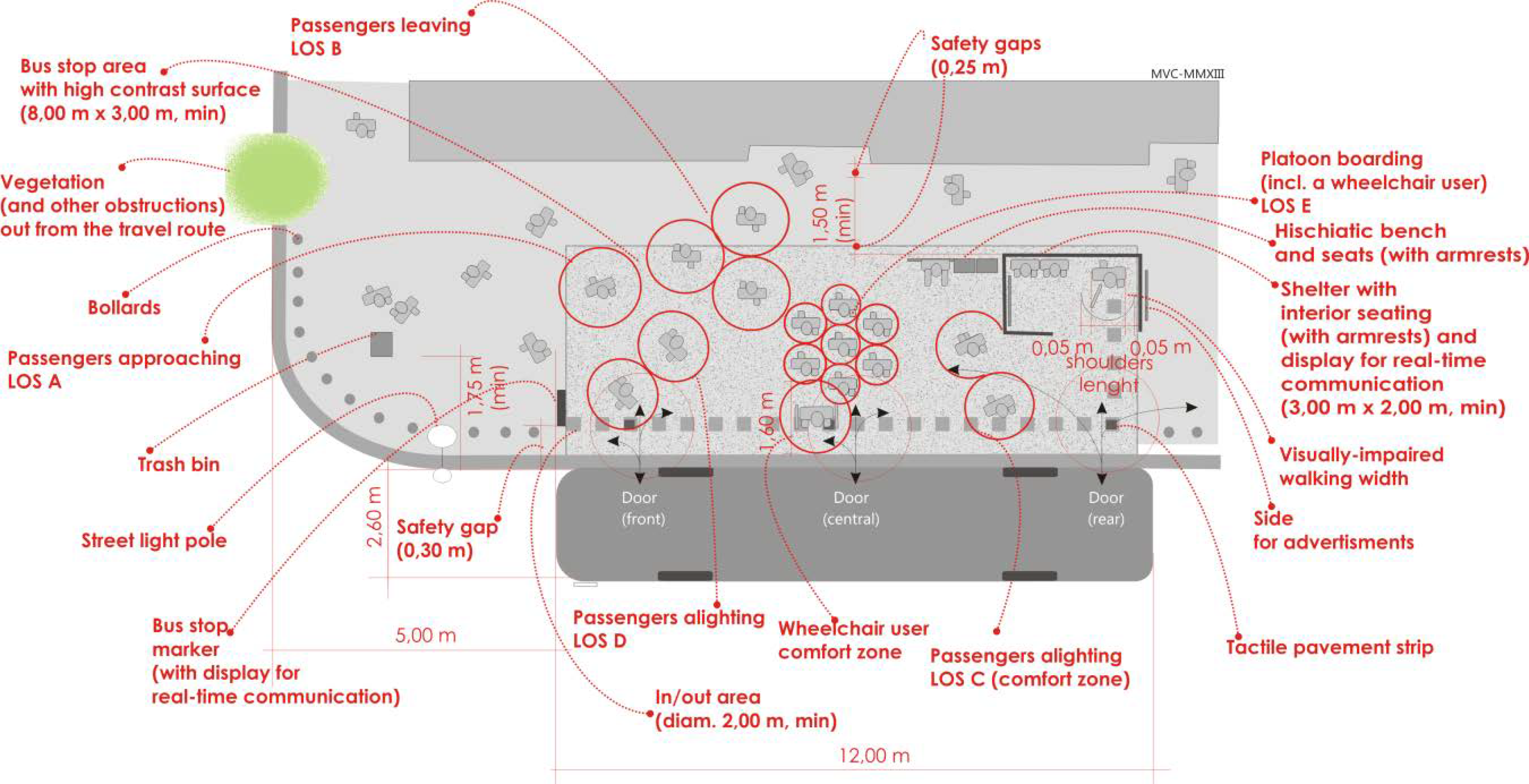
Accessibility: a Multiscope Concept to Shape Bus Stops

Scientific literature on accessibility abounds and provides a plethora of definitions and interpretations of the concept, all appropriate but each associated to specific issues.
For example, accessibility can be broadly defined as the ability to travel between different activities [7]; it can be linked to convenience, as the ability to reach goods, services, destinations [4], or the ease to do so [8]. This is close to another interpretation by Engwicht, “the ease with which exchange opportunities can be accessed” [9] (p. 167). Also Lynch stressed the importance of ease through the concept of immediacy, since accessibility is defined as “the general proximity in terms of time of all points … to a given kind of activity or facility” [10] (p. 49). He also identifies three sub-dimensions of accessibility: diversity (of things to be accessed), equity (of access for the different social groups), and control (over the access systems) [11]. For Grava [12] accessibility is also a measure of the quality and operational effectiveness of a community. Therefore, the acknowledgment that transit has to serve all leads to the concept of fully accessible transit [13]. Hence, it is not uncommon to assess the accessibility of a given transit facility according to the level of ease by which one can reach it, typically by location-based criteria, or more generally short distances. For example, Banister observes that transport’s “primary aim is to maintain a high level of accessibility with trip lengths being as short as possible” [2] (p. 10). This shifts the focus on how to measure accessibility in general [14,15]. Accessibility can also be associated with terms such as “within walking distance” or “walkable”. Linking transit accessibility with walking can be, on the one hand, a way to emphasize the (supposed) modest physical efforts required to reach a given destination, and on the other a way of underestimating the efforts of those who are not able to autonomously walk. This might also imply that spatial accessibility is equal to temporal accessibility, but efforts spent to reach a given destination may differ according to the travelers’ physical and perceptive conditions. For examples, the “walking distance” to a bus stop can be less challenging for an elderly person than the time spent standing in line, waiting for boarding, with no possibility to rest.
Accessibility can be also linked to perception. Hanson pioneered this concept by defining accessibility as the “intensity of possibility of interaction” [16], and even in more recent studies where accessibility to bus stops is modeled, a mix of all of the above (comfort, convenience, safety, etc.) is considered [17,18,19], but little emphasis is placed on the stops’ environments. Ropoport observed that: “people react to environments in term of the meanings the environments have for them” [20] (p.13). A bus stop and its surroundings can become the weakest link in the journey chain if they provide users with negative meanings (too distant, uncomfortable, unsafe, etc.). Coherently, outcomes from the 3iBS European-funded project led to a conclusive definition: “a Public Transport system is accessible to people who are able to use it” [21]. The emphasis is placed on the ability of a given transit system to provide appropriate meanings or, in other words, equal conditions of exchange by meeting the requirements of all, rather than on the specific abilities of the users. If a transit system (its ground facilities included) is not, or poorly, accessible this means that a number of factors prevent passengers from using it, not the passengers themselves. Preventing factors may result from inappropriate design criteria for vehicles, infrastructures, and communications, and are extensively analyzed within [21]. They occur because they fail to meet users’ physical and/or cognitive requirements.
However, appropriate design requires effort, since a bus stop environment concentrates multiple functions, requirements, performance levels, and planning and design criteria. Figure 1 is an example: different levels of service, requirements from different types of passengers, and recurring urban furniture are designed according to universal design criteria. The resulting layout of this theoretical bus stop, although appropriate, is difficult to transfer to real environments, especially in consolidated or historic urban areas due to the lack of space; therefore, solutions to meet requirements from all can only result in a kind of “relative optimum” for a majority of passengers and some urban areas.
Under the operational point of view, the problem is multifaceted. Since a majority of the different phases of a journey may take place at the bus stop, its design must provide different solutions to meet a number of common requirements and functions (walkability; comfort while waiting or boarding/alighting; ability to autonomously perform other travel functions as purchasing tickets, getting information, resting; reading and comprehending signs and directions; feeling of inclusiveness, etc.). The travel experience may occur under different circumstances (good vs. adverse weather, daytime vs. nighttime, peak vs. off-peak times, frequent vs. novice travelers, solo travelling vs. accompanied, beginning vs. end-leg of a journey, etc.), and take place in different environments (outdoor vs. indoor, secluded vs. frequented, friendly vs. hostile—perceived, etc.). Therefore, it is relevant to conceive the bus stop as a system in which the main activity, i.e., boarding/alighting, is strictly interrelated with additional or associated activities occurring in the surroundings. Each activity has its own meaning for the users, which makes them perceive the bus stop as a specific environment and react differently to it. Coherently with that and according to all the definitions on accessibility above reported, bus stops are accessible only when designed to be walkable by all.

2. Materials and Methods to Assess Bus Stops Accessibility

Coherently with this approach, a bus stop can be considered as a multi-requirement environment and the measurement of its accessibility has to include both quantitative and qualitative indicators. Thus far, in the case studies associated with the scientific literature reported in Section 1, emphasis has been placed in considering just a few of the former to assess accessibility to a given transit facility and possibly corroborating results with the latter. This approach, although appropriate, may be not sufficient when the goal is to assess a high number of stops within a bus network (as for the 231 stops of the case study, the Nomentano district in Rome, Italy, further described), located in different built environments, and with different levels of operations. In this case, a univocal comprehensive parameter to compare the accessibility level of each stop can be more appropriate, clustering together outcomes of different indicators, further validated via transit experts’ assessment, all also public transport regular users. Therefore, for the case in hand, the methodology (Figure 2) develops a series of acknowledged scientifically-sound indicators in the fields of walkability, urban environment, and transit service, and combines them to make an innovative, overall complete evaluation of the accessibility of the bus stops analyzed, i.e., the Transit Accessibility Index for Bus Stops.
The overall evaluation is then developed through a multi-criteria analysis and the indicators are weighed using a Pairwise Comparison Model, fed by a questionnaire provided to 41 experts in transportation engineering (academicians, experts, master and PhD students). The final result is a single parameter, the so-called Final Accessibility Score, describing the accessibility of each stop, according to its characteristics and those of its surrounding environment, synthesized by the indicators constituting the global Transit Accessibility Index.
Data and results are processed by a full-featured GIS software, which also enables the cost–distance function and the potential accessibility indicator to be estimated, to provide further practical examples of the potential outcomes of the data used.

2.1. Building the Transit Accessibility Index for Bus Stops

The selection of indicators to describe accessibility to bus stops addresses three different evaluation areas, coherently with the definition of the bus stop as a multi-requirement environment. These are (i) Transit Service; (ii) Built Environment; and (iii) Bus Stop Quality and each includes some indicators largely described in scientific literature, simple to calculate, able to describe different performance levels, with the goal to create a comprehensive index, flexible to different situations. More specifically, the indicators are Number of Lines and Frequency, associated to the transit service area of evaluation; Land Use Entropy, LUE, Pedestrian Catchment Area, PCA, and Number of Inhabitants Served by each stop, included in the Built Environment; and Level of Service, LoS, and Level of Comfort to assess the Bus Stop Quality. As said, all are well-known in scientific literature, but in this case they have been reformulated in light of the specific requirements of bus stops highlighted in Section 1.
To improve accuracy, along with the indicators, three additional parameters have been included in the description of the urban context: Road Classification, to determine the function of each link; Intersection Density and Network Connectivity, to determine the distribution of nodes and links, respectively. Such additional parameters, clustered into the so-called “Road Network Analysis” were also used to determine the above-mentioned cost–distance function and the potential accessibility indicator (Figure 2).
Complementarity of each indicator is enhanced by its possibility to highlight more features at a time, and have a multi-objective assessment. For example, if one goal is to assess the bus stop accessibility by meeting the requirements of passengers with special needs, LoS and Level of Comfort are especially appropriate, but the quality of Network Connectivity and Intersection Density are no less important, as they can describe the built environment physical conditions which may hinder or support walkability.
The study of the context parameters started first and its methodological approach is described in Section 2.1.1; likewise, the methodology for the indicators associated to the three evaluation areas is reported in Section 2.1.2.

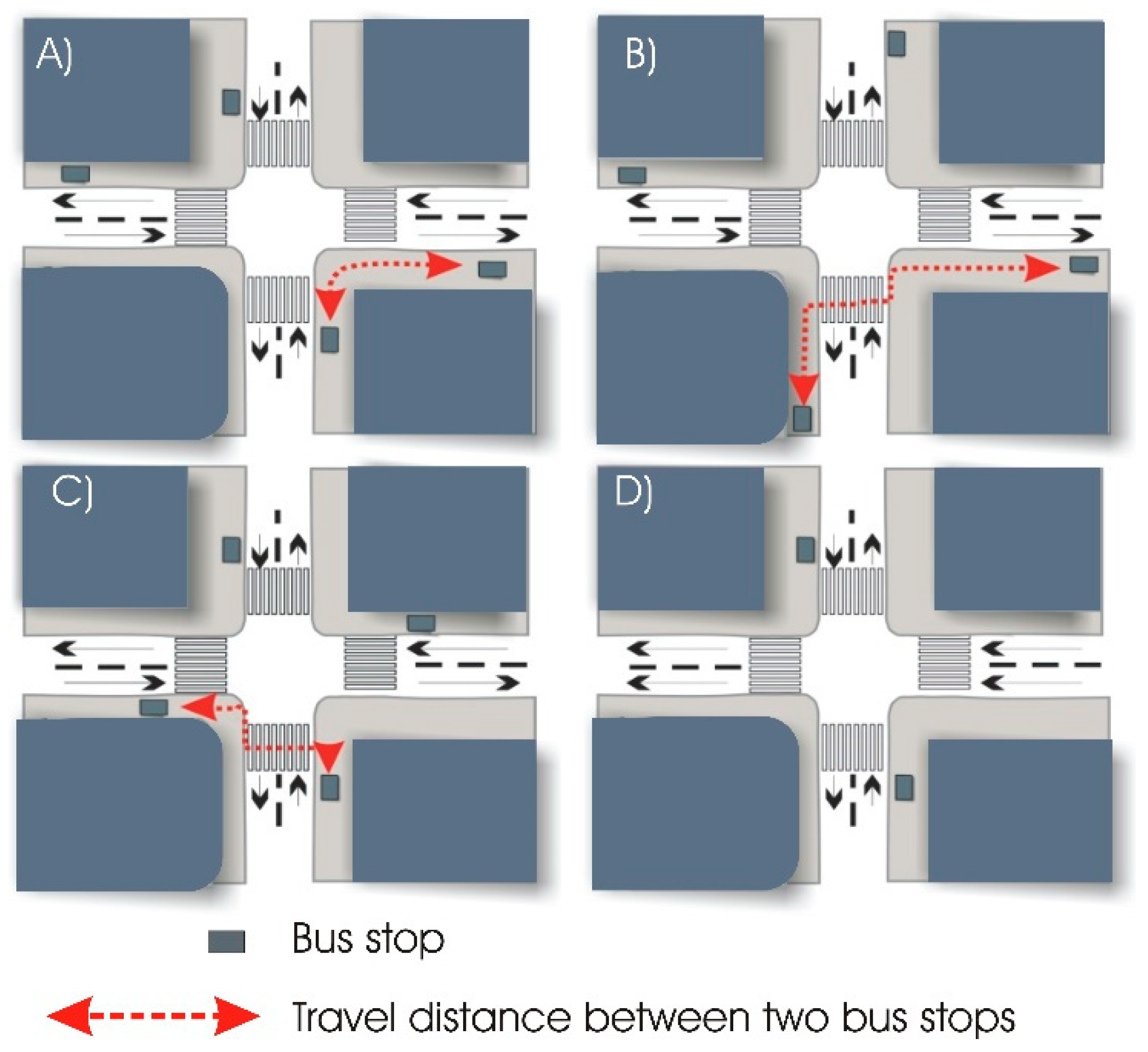
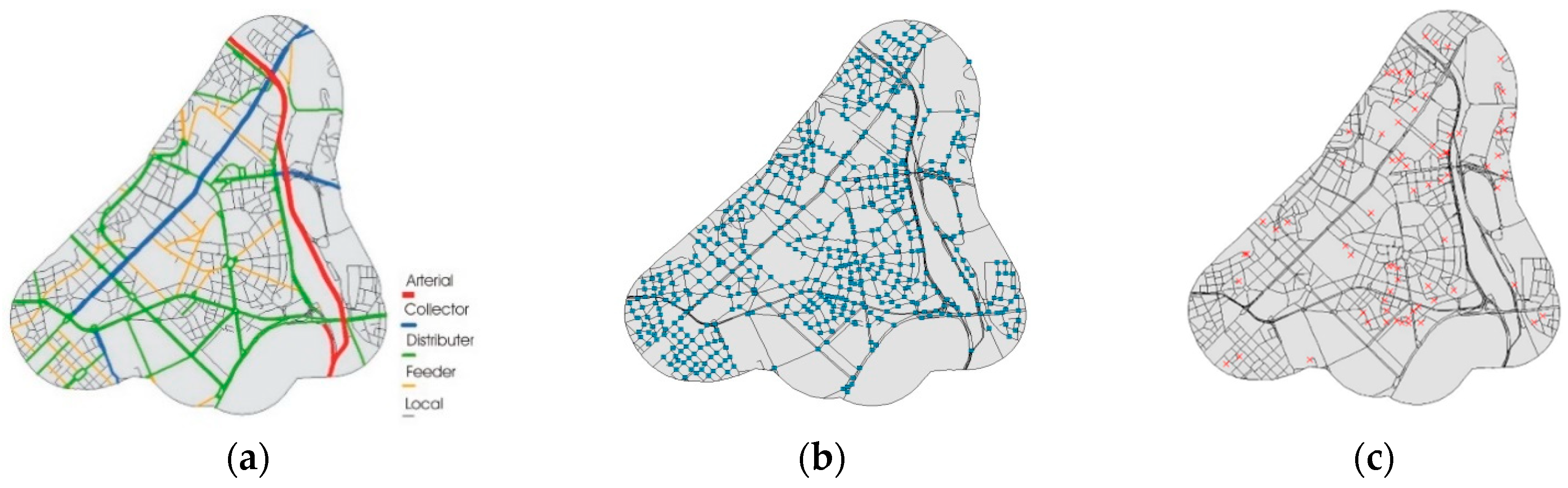
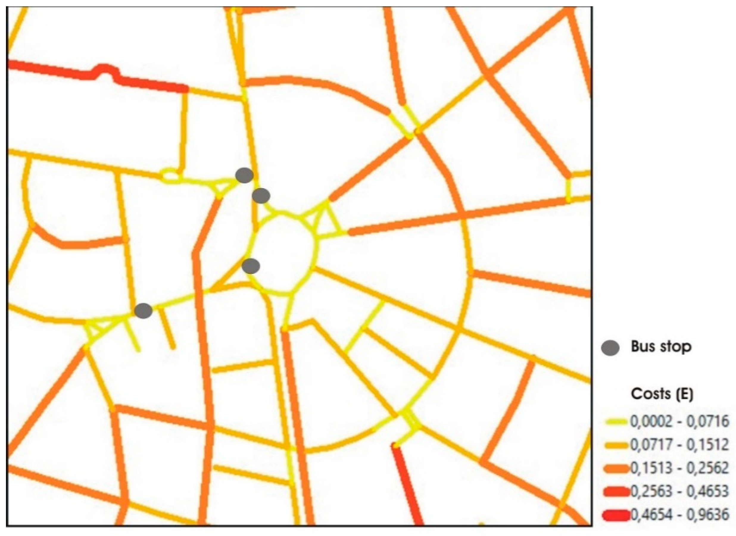
2.1.1. The Road Network Analysis

The need to consider the road network relies on the awareness of its role as frame of the urban form, giving rise to a variety of opportunities (from sidewalks, to off-street paths, to pedestrianized areas) to increase walking desirability and/or attractiveness. Therefore, the three context parameters, i.e., Road Classification, Intersection Density, and Network Connectivity, are considered to have a preliminary assessment of the pedestrian-friendliness of an area according to its physical structure and regulatory organization.
For what concerns the Road Classification, levels of traffic flows associated to the types of roads are, per se, already sensible indicators of the walking-friendliness of a street. It is intuitive that principal or minor arterials can be not or less attractive for pedestrians than collectors or distributors, and these in turn less than locals. However, in consolidated areas, local roads with mixed land use, buildings featuring bustling storefronts and residential units above, and on-street parking availability are common, and they can be attractors or generators of traffic flows equals to those of distributors’ or collectors’. As such, they can also accommodate bus routes and stop facilities, even though not originally designed for this function. Needless to say, in such cases, traffic and land use requirements can be detrimental to bus stops’ full accessibility.
Nodes or intersections can be interpreted in many ways: decision points during pedestrian wayfinding [22]; strategic spots thus managing and directing motorized and non-motorized flows, concentrating functions and meanings, and acting as junctions and/or concentration points, but unmistakably “related to the concept of path, ……, events on the journey” [23] (p.41). They can be eventually considered symbols of the citizens’ “droit à la ville“, described by Henri Lefebvre in 1916, i.e., places where citizens can participate in the community life [24] (p. 477). Therefore, the Intersection Density as amount of nodes per unit of area (e.g., units per sqmi) can be highly indicative of the quality of paths for pedestrians, and values in the range from 100 to 150 intersections per sqmi qualify areas as highly walkable [25]. To complement the density assessment, the calculation of link density (e.g., units per sqmi) follows the same procedure.
Intersection Density might be also associated with the appropriate location of bus stops, as it is long acknowledged in literature that siting more bus stops close to intersections enables passengers to minimize travel times and distances while changing lines from one stop to another [26,27], as in Figure 3.
Network Connectivity, eventually, allows the incorporation of urban form indicators into transportation analyses [28,29], and can be calculated through two indexes, α and γ [28], which enable the assessment of the accessibility to each bus stop location, as follows:
α = ( n ° l i n k s     n ° n o d e s   + 1 ) [ 2 ( n ° n o d e s ) 5 ]
γ = n ° l i n k s [ 3 ( n ° n o d e s ) 2 ]
On the basis of a given radius area, for each location, α and γ indexes assess whether the amount of links and nodes (and hence intersections) may favor pedestrian accessibility. In this case, each intersection represents a possible choice each pedestrian makes to optimize the O/D trip; on the contrary, large and long blocks (and hence a low intersection density) compel pedestrians to plan longer routes, having fewer choices. Both indexes may vary from 0 to 1, and the highest values correspond to the best achievable connectivity.

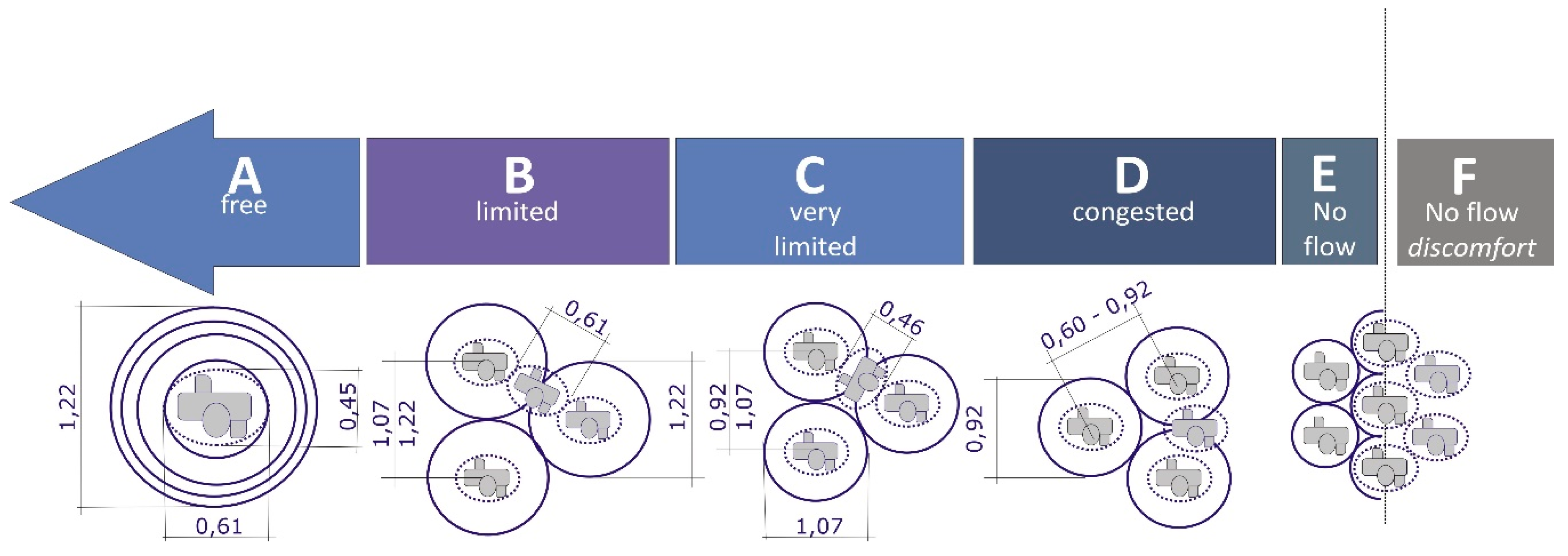
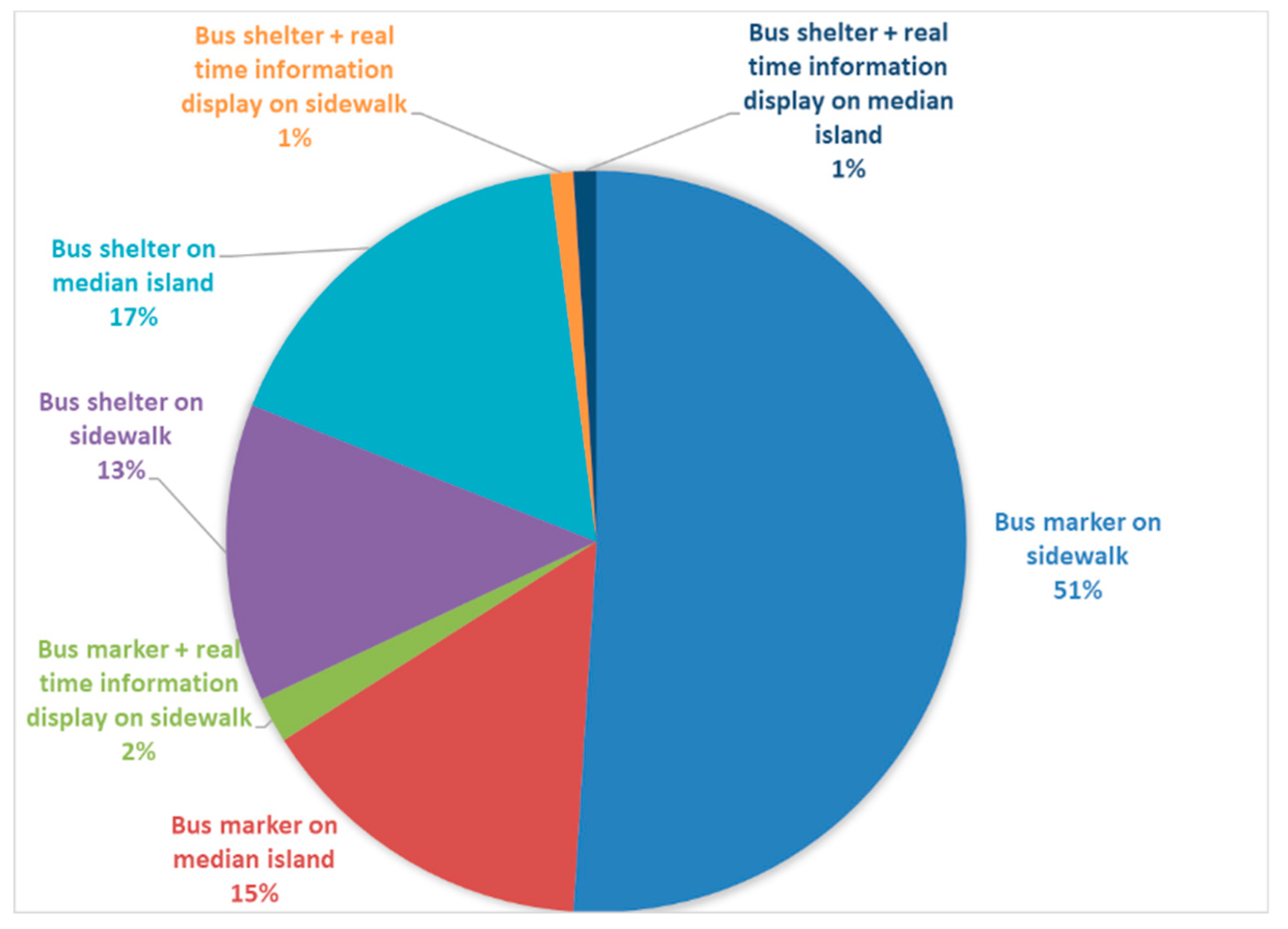
2.1.2. Specific indicators for the Transit Accessibility Index

As anticipated in 2.1, the following indicators constitute the Transit Accessibility Index: Number of Lines, Frequency, LUE, PCA, Number of Inhabitants Served by each stop, LoS and Level of Comfort.
Some of them are well-known and univocally defined, as Number of lines, i.e., the total amount of lines serving daily each stop, and Frequency, i.e., the hourly amount of arriving vehicles serving each stop. Both are essential to evaluate the efficiency and the quality of the bus stop and the higher the value of each, the more attractive the facility.
The other indicators have manifold definitions and applications in scientific and grey literature, and therefore the study focused on those more appropriate to the case in hand, described as follows.
LUE measures the land use diversity and defines the degree to which different land uses within a given buffer area are balanced. According to its seminal definition [30], and the several further developments (e.g., [31,32]), LUE was calculated starting from the percentage Pij of i land use category in the j - study area as follows:
LUE = i = 1 n [ ( P ij × ln ( P ij ) ] ln ( N j )
where the following Nj land use categories considered in the j – study area were residential, commercial, industrial, and public. The about 140,000 data to develop LUE were opensource, as was any other data to develop all the indicators (freely collected partly from the Municipality official dataset, partly from the public transport operators’ and integrated by information coming from web maps, when needed), and GIS processed.
LUE values ranges from 0 (homogeneity, only one single type of land use available in the study area) and 1 (heterogeneity, all land use categories equally distributed). More specifically, for the case study, each land use category was characterized according to the amount of buildings associated with that function. An example of such characterization is reported in Figure 4, where all the buildings located along the study area of bus line 309 are reported, according to their dominant function.
As land use mix is fundamental to attract (and generate) whatever types of traffic and demand, this implies that, for bus services, the higher the value of LUE in a given area, the more attractive the lines operating there can become. It should be noted that for the case study LUE was specifically calculated for each line serving the area, and the LUE value associated to each stop is the average of each line’s serving that given stop.
Bus stops’ pedestrian proximity was based on a well-known indicator (e.g., in [28]), the PCA, i.e., a service area as the ratio between the actual walkable area by a pedestrian (AP) and the influence areas (IA) of each location calculated as a circumference, or Euclidean (straight-line) buffers. However, since Euclidean buffers may overlap, thus overestimating the service area of a given stop [33], network buffers have been used instead. More specifically, network-distance based service areas were calculated according to polygons encompassing any edge within a 400-meter distance from the bus stop, by a specific GIS application (the so-called service area solver). The same distance was used to calculate the amount of nodes and links in (1) and (2). Such length is the same validated by two previous studies on the Romans’ walking habits to bus stops [34] and paratransit [35], and by the recent opening of the new lines in Florence, as well [36]. The PCA GIS application [37] provides useful visual information in assessing whether a given location may be a pedestrian-friendly or hostile environment, the latter assessed as such, in the case study, when PCA value is ≤ 0.30 on a range between 0 and 1, coherently with what was already observed elsewhere in Rome [35].
The Number of Inhabitants Served indicator complements PCA data on the assessment of the potential as generator or attractor of a given stop. The same service areas are associated, this time, to inhabitants according to census blocks data. Figure 5 describes the distribution of population on each building, whereas examples of inhabitants associated to a network-distance based service area from a given stop will be reported in Section 4.1.
If the above-mentioned indicators mostly provide quantitative information, those on LoS and Level of Comfort include qualitative and subjective considerations.
LoS for pedestrian facilities was conceived in the early 1970s [38,39] and then continuously (re)developed in scientific literature. For the case study in hand, two specific issues had to be addressed in the estimation of bus stops: (i) passengers demand and (ii) size, to associate each facility to the requested level.
For what concerns the demand, direct surveys took place at several stops thus collecting data on the number of passengers boarding, alighting or simply waiting, both at peak and off-peak times, and calculating average amounts accordingly.
Size and then LoS categories were estimated according to the availability of personal space in the bus stop area, considering both the total available area A O C C T o t , and the total occupied area A L o s x T o t The former is represented by the total ground area available for the bus stop, as a polygon. Since sometimes the size of such areas is not clearly defined (e.g., in the case of simple bus markers), length classes ranging between 15 m and 40 m were estimated, according to the number of lines and vehicles serving the stops. Likewise, classes of width were assumed, subtracting an average 0.25 m clearance on each side of the polygon (the so-called “safety gap” in Figure 1). Additional surveys on all the bus stops validated the assumptions on length and width. The A L o s x T o t is the total space occupied by the passengers waiting for the bus, calculated as the personal space occupied by an individual (also known as body buffer zone) multiplied by the number of passengers. Personal space is assumed according to standard criteria largely available in scientific and grey literature (e.g., [12,27]) and associated to the usual LoS classes as in Figure 6.
To associate each stop to a specific LoS, requirements to be met were: (i) A O C C T o t > A L o s x T o t ; (ii) LoSx to be associated to the highest possible rank (for example, if level of service B met the dimensioning requirement for (i), and so did levels C, D and F, the bus stop was considered as associated to LoSB). More specifically, once all these data were processed, it was possible to calculate the ratio R for each bus stop as
R = A L o s x T o t A O C C T o t
If R < 1, the level of service chosen was appropriate, if R ≥ 1 then a lower level was considered as more suitable.
The Level of Comfort was an indicator specifically designed to describe the quality of the bus stops according to the availability of equipment, furniture, and location, with the goal to objectively report the level of ease and safety. This enables facilities to be associated to seven different categories:
  • Bus marker, on sidewalk
  • Bus marker, on median island
  • Bus marker + real time information display, on sidewalk
  • Bus shelter, on sidewalk
  • Bus shelter, on median island
  • Bus shelter + real time information display, on sidewalk
  • Bus shelter + real time information display, on median island.
Bus shelters are all equipped with seats, whereas bus markers are not. It has been observed that types 2, 5, and 7 are usually located at mid-block arterials or intersections.
A comprehensive description of all the indicators results is reported in Section 4.

2.2. Methodology for Results Assessment
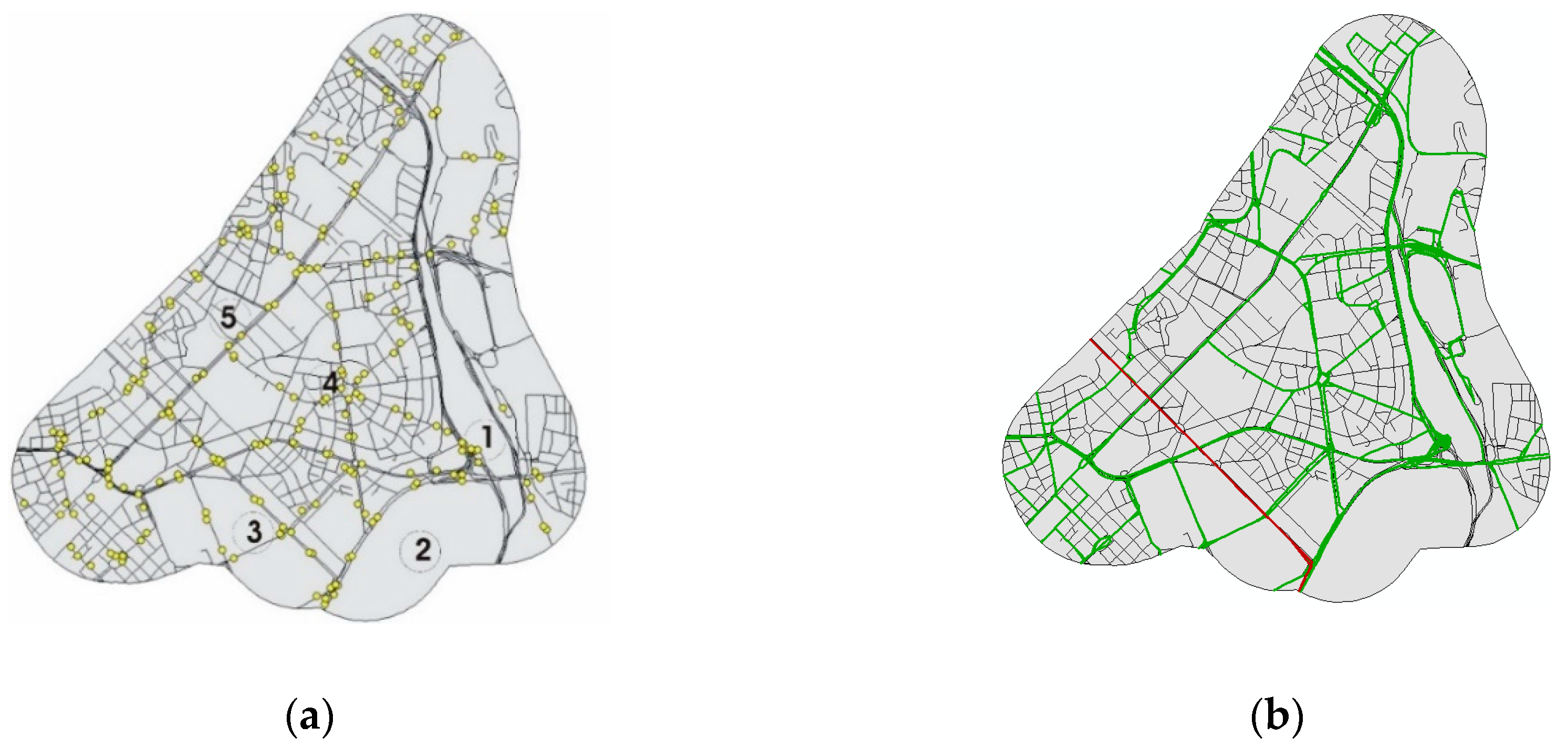
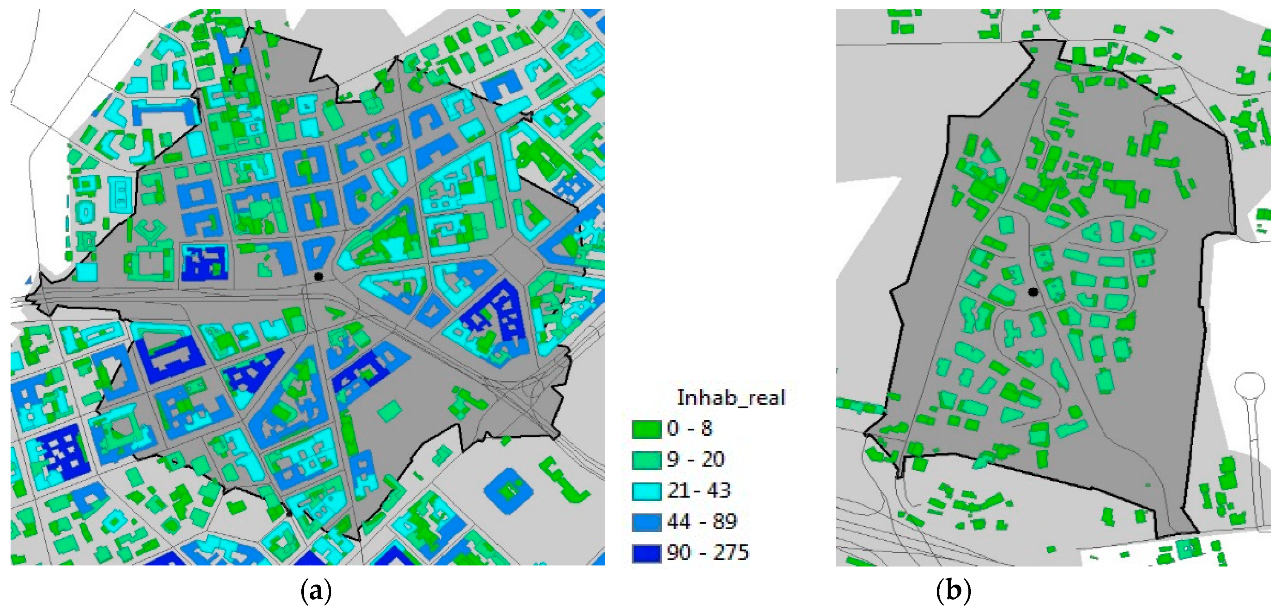
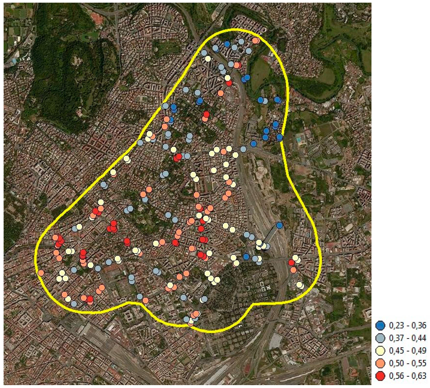
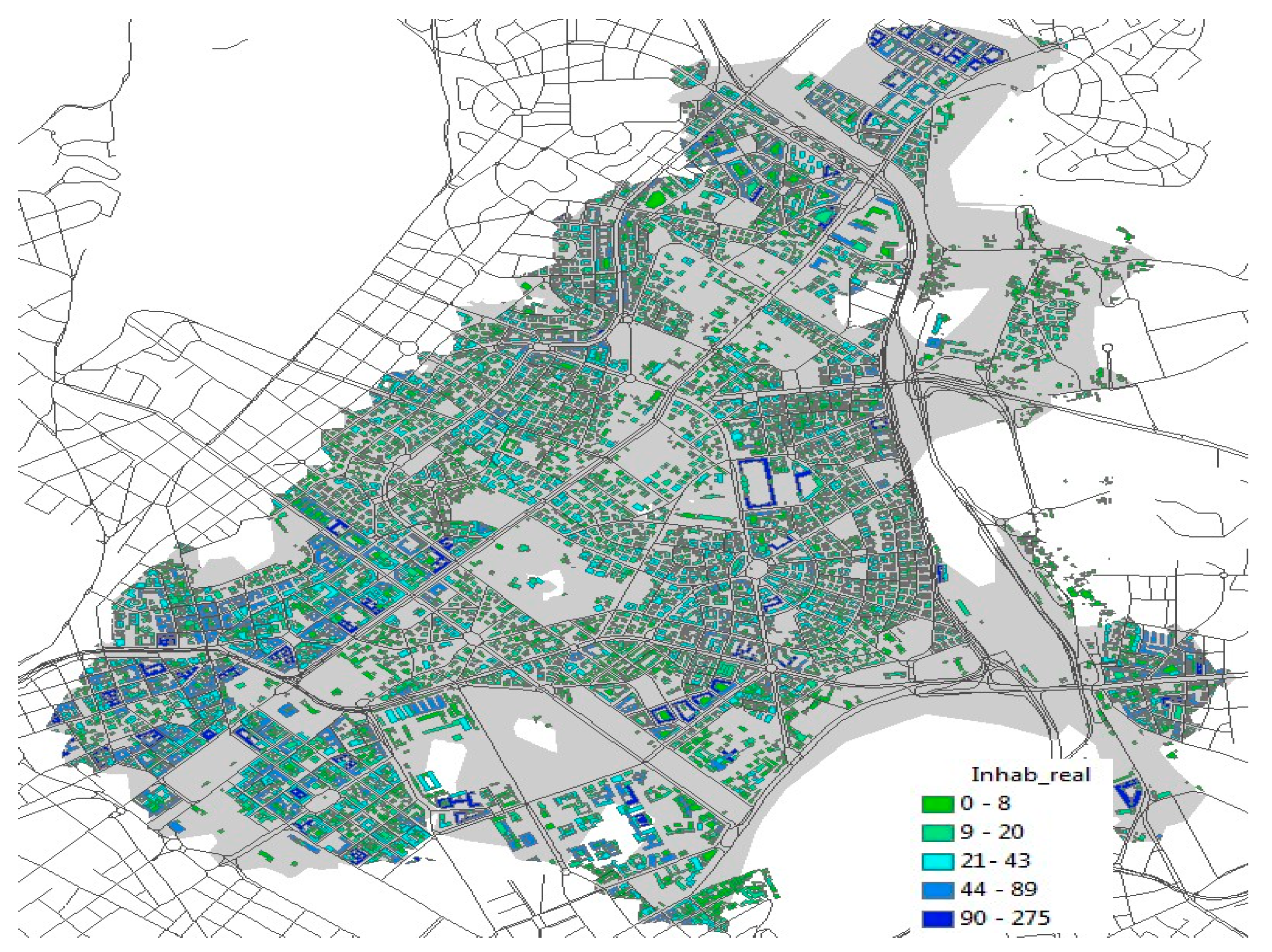
Once collected data on the test field (described in Section 3), a multi-criteria procedure was developed to find a final score that could describe the accessibility of each stop, by merging the contributions of the seven indicators.
As data were GIS-referenced, the Ideal Point Method—IPM—seemed a suitable tool to perform a multi-criteria analysis, as this is one of the most used technique combining GIS functions to processes for choosing alternatives to find the best solution, according to a number of criteria. Moreover, IPM can be coupled with several weighing methods, in this case the Pairwise Comparison Method—PCM—for comparing and evaluating performance levels and alternatives. IPM is fully described and long applied in scientific literature on a very diverse number of issues and fields, e.g., [40,41,42], with the method’s multiple applications synthesized in [43], and so is PCM, detailed especially in [44,45,46], in the Analytic Hierarchy Process applications. PCM was adopted since the indicators applied in the Rome case are strongly interrelated and mutually affecting each other, and a simple prioritization was not sufficient to weigh their relevance.
For the Rome case study, the IPM calculation procedure strictly followed [42] (pp. 223–225), whereas the PCM was based on the following steps: (i) the generation of the pairwise comparison matrix, (ii) the weights computation, (iii) the consistency ratio estimation. A 1 to 5 Likert scale was used to rate preferences for each couple of criteria considered, with 1 = equal importance and 5 = extremely higher importance.
PCM results were calculated according to the well-known procedure described in [44,45,46], and specifically to [47] (pp. 12–15) for the consistency ratio calculation. To make the weighing criteria as much objective as possible [48], a questionnaire was submitted to a panel of 41 students, experts, and academicians in the field of transportation studies (it should be noted that the prerequisite for participating in the weight assessment was respondents’ status as regular transit users). Each respondent was asked to fill in the questionnaire by comparing each couple of indicators and stating preferences according to the 1 to 5 scale. For the seven indicators, and the matrix being positive and reciprocal, a total of 21 comparisons was eventually available (as n criteria enable n(n-1)/2 comparisons).
As for the description of the indicators, results from the assessment procedure are reported in Section 4.

3. The Case Study

The decision to assess the bus stops’ accessibility in Rome is rooted in the relevance of this mode in the local everyday mobility patterns. Unlike many European metropolitan areas, transit in Rome relies mostly on buses. They serve a 1840 km network which covers the city and has average stop spacings of around 400 m. The rail network, consisting of three metro and six tramway lines, has a length of less than 100 km; thus although efficient, it is far from competing with the rubber-tired supply in terms of capillarity and number of bus stops (6446 facilities, the majority of which simple bus markers). Some successful initiatives to foster bus services were launched during the first decade of the 2000s [49], but without comprehensive transportation policies, the city went through a long period of deteriorating transit conditions. Consequently, in only the last 12 months, the 1,159,200 daily passengers have seen the supply decreased by 1.4 million rides [50]. Likewise, ground facilities, from bus terminals to basic mid-block stops, underwent the same deteriorating process, even worsened by the general poor maintenance of sidewalks [51]. This contributes to make boarding and alighting operations a slow, uncomfortable process, with buses prolonging idle times at stops and service delays along the routes.
The Nomentano district serves as a case in point: this central area, with a population of around 40,000 inhabitants, is a typical Roman medium-to-high income, high density neighborhood built mostly from the 1920s to the 1960s, where residential and business activities prevail. The quality of the built environment is high, with medium to low-rise buildings, planted strips and plenty of vegetation, full provision of sidewalks which, in spite of the long surveyed poor maintenance levels [51], make them potentially ideal for walking (the walking share in the local modal split is higher than the Rome average, whereas transit share accounts for 29%). In general, the local type of urban fabric is quite homogeneous, the area being developed over a relatively short period, on a flat area, and according to modern planning criteria aimed at compactness, uniformity of the building stock (volumes, materials, architectural features), street network regularity, and vegetation continuity. This results in a strong visual and spatial continuity, few urban voids (mostly public commons), reiteration of architectural language and built elements. Moreover, location of bus stops has no specific features, this being either along the kerbs of sidewalks or median strips, or close to intersections.
The area is served by 43 bus and 2 tram lines, plus marginally by a metro station, for a total of 231 bus stops, described in Figure 7.
Urban-relevance attractors in the district are the Tiburtina railway station (the second-ranked facility in term of rail operations in Rome), the monumental cemetery, the main university campus, and a popular square (1 to 4 respectively, in Figure 7a); the main arterial (5 in Figure 7a) connects the district to the nearby central areas.
As from Figure 7, distribution of bus stops is uneven across the area, with major clusters at intersections and many of those mid-block with spacings way below the average. Accessibility requirements play a minor role in such an arrangement, which is, on the contrary, dictated by subsequent operational adjustments. Irregularity is due to the changes in the supply, especially where routes no longer operate or detour: in the former case, bus stops are removed or “downgraded” (fewer lines serving the same facility, especially after the introduction of express lines, which skip several stops); in the latter, stops are simply added where traffic schemes allow for accommodating them. Coherently with that, on-the-spot surveys also stressed how some bus stops are neglected by passengers, who favor others (local land use, number of serving lines, and headways being equal). These, in turn, when packed, generate longer dwell times for buses, higher fuel consumption, additional pollutant emissions, and eventually increase passengers’ perception of uncomfortable travel conditions. Travelers’ behavior at bus stops (activities, positions, clustering, etc.) corroborated that, passengers being recurrently observed standing and waiting directly on the traffic lane, whenever the bus stop area on the sidewalk becomes too crowded.
The relocation of some bus stops would be beneficial to attract more demand and improve the quality of the local transit supply, with accessibility as the leading criterion. The experimental application of the Transit Accessibility Index to the bus stops in the Nomentano district is therefore an attempt to provide directions for a more accessible network of bus stops, with the expectation that improved accessibility might also lead to a more regular distribution of the demand, and to smoother, thus more sustainable, operations.

4. Results

The calculation of all the indicators described in Section 3 provides a detailed “snapshot” of the Nomentano district features associated to accessibility which will be summed up in Section 4.1, whereas the data interpretation, according to the assessment methodology will be described in Section 4.2.

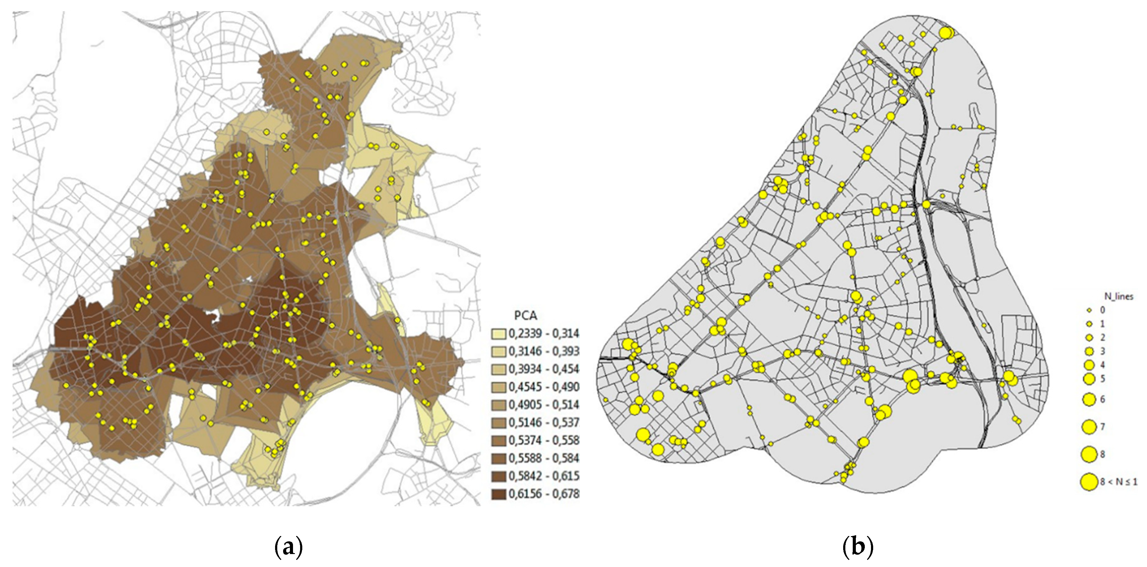
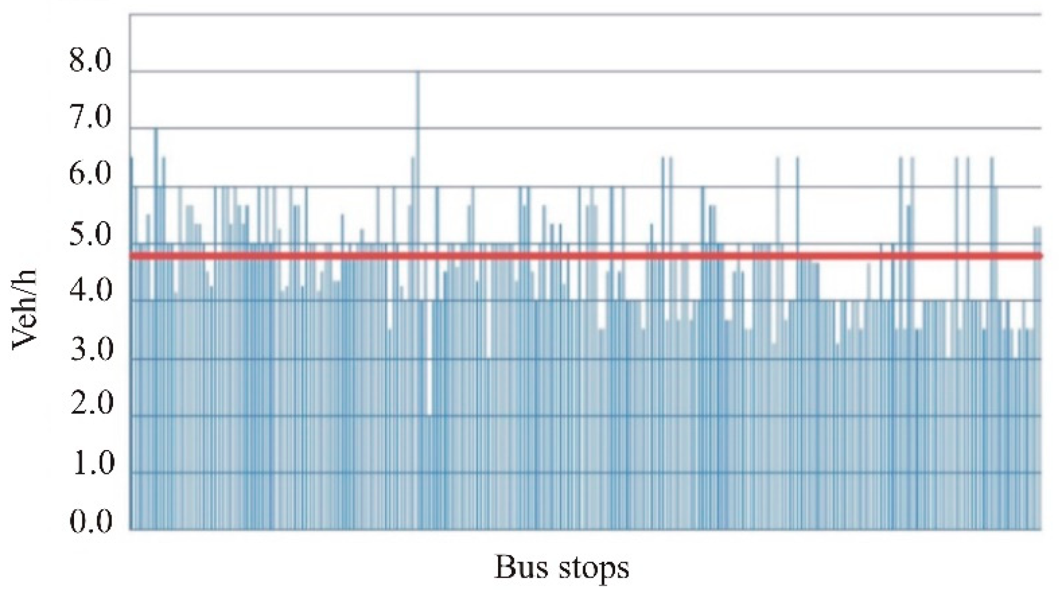
4.1. Accessibility of Bus Stops in the Case Study: Resulting Facts and Figures from the Data Process

If the indicators for the Road Network Analysis are considered (Figure 8), physical and functional features (majority of local roads, even distribution of intersections and small amount of dead-ends,) suggest an overall pedestrian-friendly environment, with good connectivity levels for the city standards [35], as the intersection density ranges between 100 to 150 nodes/sqkm, and α and γ indexes are both above 0.5 in average. It should be noted that this is the first application of Equations (1) and (2) to bus stops in Rome (in former studies [35], they were used for local car sharing stations). Prior to that accessibility was measured only according to “from bus stop to building entrance” distances as in [34], manually calculated.
The calculation of the PCA, by the GIS based network analysis tool, for each of the 231 facilities is based on the assumption that pedestrians can walk as they wish (detours allowed) within the 400m-distance polygon area associated to each bus stop. The resulting average value of PCA is 0.4923. Figure 9a, describes the different proximity levels and clearly indicates higher values in the most central areas of the district (continuity of darker areas with PCA > 0.5), where the major square and commercial facilities are located, although the dominant land use is residential. Clearer areas in the lower part of the graphic highlight poor proximity levels around a cluster of stops located between the Tiburtina railway station, the city main university campus, and the main cemetery. Residential function is markedly scarcer in that part of the district and bus stops are located just to provide direct access to the railway station and the campus. To be noted that, however, this cluster of stops is the result of repeated displacement of lines and detours which occurred in the last decade when the station underwent a massive rehabilitation program.
This is also highlighted by the second indicator considered, i.e., the Number of Lines serving each stop (Figure 9b), with the bus stops in this cluster being served by 1 or 2 lines maximum.
However, this is not far from the district majority, since 90% of the stops are served by a number of lines between 1 and 4. Higher supply is concentrated in the lower parts of the graphic, where the stops closest to the above-mentioned Tiburtina station, and others in the proximity of the main railway station (1 km, thus walking distance, outside the district) are located. To be noted for both PCA and Number of Lines indicators, lower levels are in the upper parts of the district, where land use is mono-functional (virtually pure residential).
Frequency also markedly differs from stop to stop, depending on the types of services supplied (express lines, with longest routes planned to have closer headways than regular lines, but traffic congestion and delays very often level off the performance). Higher frequency rates are around 8 veh/hour for express lines operating along the main district arterial, whereas for routes operating across the above mentioned residential areas, frequency lowest rate account for just 2 veh/hour, for an average, rounded-up value of 5 veh/hour for the whole set of bus stops serving the district (Figure 10).
LUE for each bus stop was calculated as the average of the LUE associated to each line serving the facility (as in Figure 11, where LUE 400m-based polygons for the two tram lines serving the area is reported as an example). Average LUE value is 0.5675, within a range between 0.663 and 0.568, the latter as the worst case. The range compactness is due to the dominance of just residential or commercial functions in the district.
Actually, if the local building stock is considered, for its majority the virtually-only function for upper stories is residential, therefore the knowledge of the population distribution can tell a lot about the attractiveness of a given bus stop in this district, and the amount of users who can access it within the 400m walking distance. Figure 5 already described how the most populated area is located in the south-western part of the district, the least populated one in the north, and that an even distribution can be found around the central square. To be noted that, with the exception of this area where a medium-rise (seven or eight stories) apartment buildings cluster is located, building heights across the district seldom exceed five stories, being this a standard of the local building stock. The difference in population is therefore given by the apartments’ size, progressively decreasing towards the most central areas of the district. However, the 400m-walking distance criterion processed by the GIS software to create the service area polygons around each stop highlights very different situations, ranging from 14 to 5840 inhabitants per single service area, with an average population of 2571 inhabitants per bus stop. Figure 12 describes two examples: a mixed land use zone on the western limit of the district and one of the last-developed, with pure residential function and low-rise buildings.
The last two indicators, i.e. LoS and Level of Comfort, to assess the accessibility in terms of supplied bus stop quality, show that the majority of bus stops are properly located, but with basic comfort levels. If LoS is considered, the survey results stress how only 4% of the total amount of bus stop is below Level C (Figure 13).
Availability of large sidewalks, however, does not prevent the problem of not having the bus stops appropriately furnished, to increase comfort especially during waiting times. The indicator Level of Comfort (Figure 14) shows that the majority of stops are equipped with just a marker and that shelters, thus the provision of seats, account only for less than one third of the total supply. Median island facilities are mostly located along the two tram arterial lanes.
The complete list of the indicators values for each stop is available in Supplementary Material.

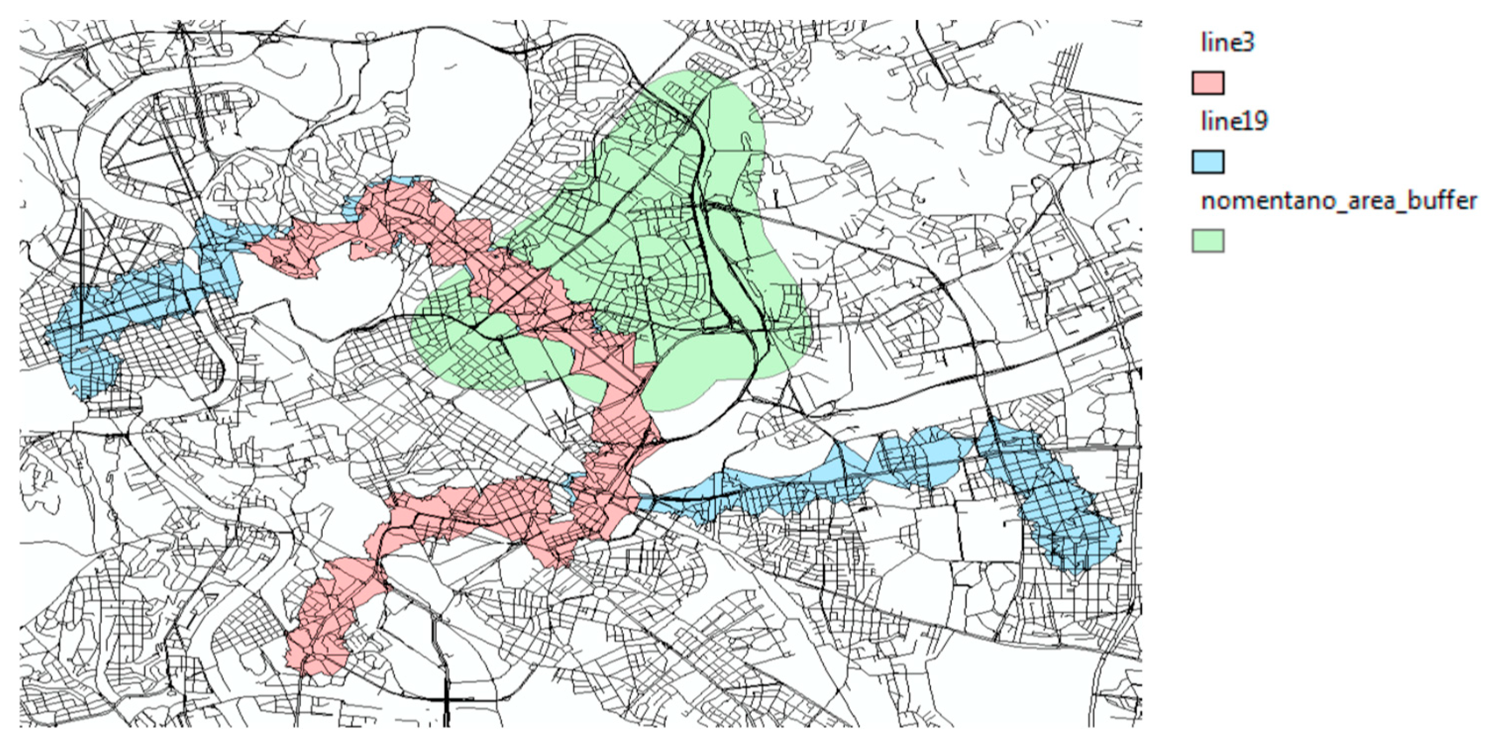
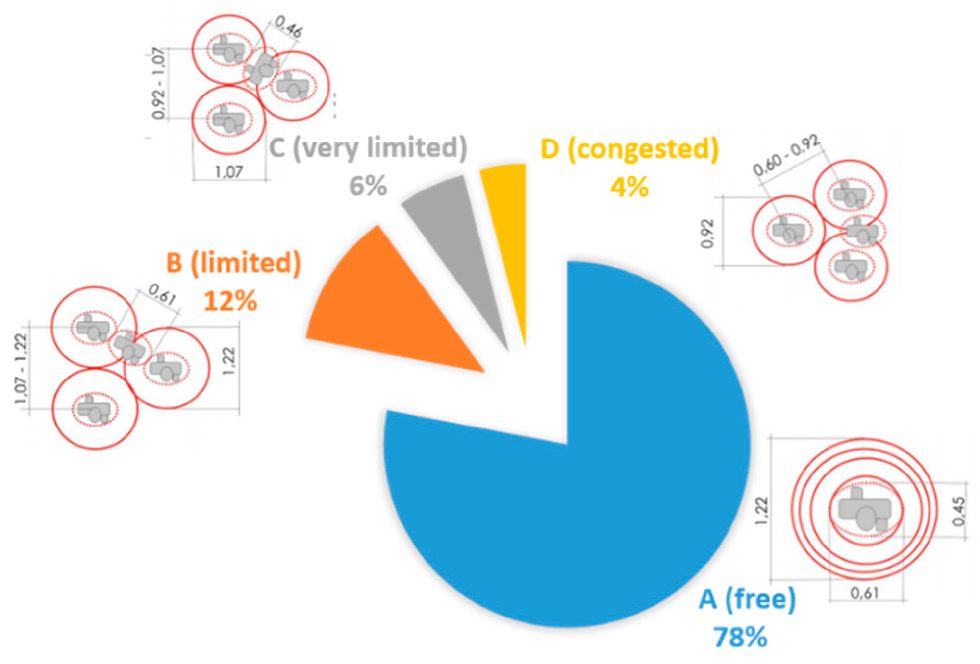
4.2. The Assessment of the Accessibility Levels

The study progressed with the weighting (synthesized in Section 4.2.1), by submitting the questionnaire to the selected respondents. In this way it was possible to develop the PCM, whose results are presented in Section 4.2.2; eventually the multi-criteria analysis outcomes are described in Section 4.2.3. The interpretation of the achieved results is reported in Section 5.

4.2.1. Evidence from the Pairwise Comparison Method

The goal of the PCM survey was to collect the preferences from the panel of the 41 interviewees and develop the indicators weighting process accordingly. Respondents were asked to fill in the questionnaire by expressing the preferences over a set of 21 comparisons, each including a pair of the seven indicators. As already introduced in Section 2.2, preferences for each pair of indicators had to be stated according to a 1 to 5 Likert scale, with 1 stating equal (no) preference, and 5 stating a marked preference for one term of comparison over the other.
Generally speaking, from the pair comparison no common trends or stronger preferences seem to be stated (Table 1), with two exceptions. On the one hand, the majority of respondents attached highest importance to Frequency, as this parameter is usually associated with efficiency of bus services; on the other, Level of Comfort is never preferred over any of the other indicators.
To summarize, the indicators ranked according to the weights are reported in Table 2. The top three indicators, i.e., Frequency, Number of Inhabitants Served, and Number of Lines, again stress the relevance of efficiency and productivity as Number of Inhabitants Served can be interpreted not only as a result of the features of the built environment (demand generated according to density and land use), but also as potential to attract customers. Poor attention paid to quality is again evidenced by the two indicators, LoS and Level of Comfort, both at the bottom of the rank.
Eventually, results consistency was checked (Table 3); the resulting consistency ratio is considerably lower than 0.10, thus evidencing the reasonable level of reliability achieved in the pairwise comparison. These weights feed the multi-criteria analysis described in the next section.

4.2.2. Findings from the Multi-criteria Analysis

The IPM-based multi-criteria analysis was developed according to the methodology elaborated in [43], which is assumed as a reference for this application. Coherently, two assumptions for the calculation were made. The first one was to select for the Power Parameter p (i.e. the parameter which determines how a distance is measured) the value equal to 2, which corresponds to Euclidean distance in criteria space. This assumption is dictated by the rule for which as p increases, so do the relevance of small differences. The second assumption concerns the selection of the ideal point itself, that is the most desirable weighed standardized levels of each parameter (i.e., each indicator) among those under consideration. Therefore, in the Nomentano District case, the ideal situation is constituted by the best available result for each indicator, among the set of the 231 stops considered. This creates a sort of “Ideal Bus Stop”, with the best performance levels among all the facilities in the district, and comprehensively representing its urban network and features. As such, it constitutes a reliable term of comparison. Likewise, an “Unideal Bus Stop” has been created, considering the worst result for each indicator. Values for both cases are summarized in Table 4.
Values had to be converted into values vi in a 0 to 1 scale according to:
v i = x i   x m i n x m a x   x m i n
where x represents the value of i—indicator in its original units of measurement. As such, “Ideal Bus Stop” values always correspond to 1, whereas those of the “Unideal” to 0. The methodology in [43] also enables the calculation of the relative closeness ci+ of each bus stop to the ideal one by a single value. Table 5 reports such final calculation for the Ideal Stop, the real “best available” (identified by the code 71359) and “worst available” (identified by the code 74169, in Figure 12b) ones. It should be noted that values contributing to make Stop 71359 closer to the Ideal one are those of PCA (virtually coincident), LUE, and Number of Inhabitants Served (both slightly smaller), all associated to the Built Environment evaluation category.

4.2.3. The Overall Accessibility Assessment

The procedure for calculating the best and worst available stops was reiterated for all the bus facilities in the district, leading to the overall assessment synthesized in Figure 15, where five performance categories are reported, according to their closeness to the Ideal Bus Stop, and the Final Accessibility Score of each is described.
Bus stops associated to the categories highlighted in red (totally accessible), orange (accessible), and yellow (to be improved) are those for which no or very light interventions are required; those in grey (to be redesigned) and blue (to be relocated) are in need of massive reconsideration because of the poor performance levels in all the evaluation categories.
Red category bus stops are not far from the Alexander’s epitome of bus stops as: “easy to recognize, and pleasant, with enough activity around them to make people comfortable” [5] (p. 453). They are located along the district distributors or arterials or at relevant nodes, with mixed land use, PCA level close to the Ideal Bus Stop’s, LoS A or B, and often equipped with shelters. Orange or yellow category bus stops are affected by a more modest Level of Comfort (virtually all just equipped only with bus markers), less favorable location (usually on midblock arterials), and with lower PCA performance. On the contrary, blue and grey category bus stops are simply not suitably located, with poor accessibility dictated by monofunctional land use and low density (corresponding to pure residential functions, as for example for the cluster of blue dots on the right part of Figure 15), limited operations (1 or 2 lines), and low PCA with walkable areas far below the IAs.

5. Discussion

Results evidenced the full applicability of the innovative Transit Accessibility Index and the related assessment methodology to the set of 231 bus stops in the Nomentano district in Rome. The application to the case study enabled the highlighting of which facilities are more accessible, and which are less or not, thus in need of adjustments or re-examination. The latter are all located in lesser populated areas, with poor connectivity level, often inadequately equipped, served by just one bus line and with no appropriate LoS.
The indicators associated with the Built Environment evaluation category (PCA, LUE, and Number of Inhabitants Served) stresses how a balanced mix of different land uses and good connectivity contributes to characterize the most accessible bus stops in the district. The relevance of such factors is in line with the literature directions reviewed in Section 1, but the case study raises the issue of whether to relocate those bus stops which do not meet such requirements, when sited in some specific urban environments. The worst available bus stop in the Nomentano district serves as a case in point. This is located in the most recently developed, low-density residential zone of the district. With others featuring similar Transit Accessibility Index values, it creates a cluster of blue category (not accessible) bus stops, easily recognizable on the right upper side of Figure 15. All serve the only line, departing from the area every 20 minutes. The local built environment is homogeneous and the demand is low. Thus, relocating in the area any of the local blue-category stops would simply not change its scarce accessibility level. Probably the only solution is to develop more appealing conditions (upgrade from bus markers to shelters), increase the line frequency, and improve further the Transit Service by adding more lines. The solution relies, then, in the synergy between improved accessibility and sustainability conditions: improving the transit supply can attract more customers, and more comfortable, accessible bus stops can be the catalysts in this process. Leaving unaltered the status quo can only result into a decrease in the transit share, in favor of passenger cars.
More findings pave the way for further discussion and advances in the field of the relationships between accessibility and sustainability.
LoS C observed for just 6% of bus stops in the district can be considered a threshold ahead of discomfort. Several complementary factors contribute to the Level C condition and consequently to the happenstance of packed situations: long headways, modest average amount of lines serving each stop, small spacing between two consecutive stops, large sidewalks. If the latter is a physical feature of the built environment, the former three are strictly related to bus operations: one more confirmation of the quality of supply as a key issue affecting not only sustainability but also accessibility.
This is also evidenced by the analysis of the Bus Stop Quality evaluation category. If the outcomes in this category are considered, a debating aspect concerns the preference stated by the experts (to be reminded, all regular transit users) in the PCM survey in favor of criteria associated to operational productivity of the bus service (especially Frequency), and their poor appreciation of the Level of Comfort (being this indicator never preferred over any of the others). One interpretation could be that the relevance of the former and the negligibility of the latter reveal the priority role played by efficiency when assessing transit service, and its potential to cast a shadow on issues not (apparently) related to the productivity of operations, such as travel comfort.
On the one hand, this is not surprising given the long observed emphasis placed by the transit stakeholders, in general, on the economic side of operations rather than customer satisfaction or environmental benefits [52]. On the other hand, tests evidenced that improving the comfort of bus stops reduces dwell times and contributes to save energy: for example, smooth boarding and alighting operations reduces the vehicle idle times and prevents unnecessary periods with opened doors, which affect the overall thermal comfort levels on-board, both causing excessive energy consumption [52]. This means that improved comfort quality, in the long run, contributes to more sustainable travel patterns. At the same time, increased awareness of the sustainable potential of more comfortable bus stops could steer the transit stakeholders’ assessment towards more comprehensive assessments.
But the operators’ concern about operational costs suggests including the economic issue in the accessibility analysis of the Nomentano district. To this aim, the least-accumulative cost distance for each origin (the entrance of each building) to a set of destinations (the 231 bus stops) was calculated. The GIS-based calculation is a function of the minimum distance between given origin and destination [53] on a road network, in this case that of the district. Each link of the network corresponds to a travel time according to a 4 km/h walking speed [54]. Costs are measured in time units, and to each link a cost is associated according to its length. Costs references were provided by a preliminary study on the promotion of sustainable transit measures for the city of Rome, developed during a project funded by the European Commission [55], corresponding to 6 €/h for the time spent walking in an urban environment and to 2 €/h for that spent waiting at a bus stop. Waiting times at each stop are calculated as average. In Figure 16 an example of average costs around the district main square (n. 4 in Figure 7a).
Figure 16 highlights how costs are rather modest, and this could be a worthy motive to shift modal share towards transit, especially if compared to time spent driving solo or as a passenger, and the related additional expenditures due to fuel or parking fees. Also in this case, the provision of appropriately-designed bus stops could be the catalyst to foster the transition towards more sustainable travel habits.

6. Conclusions

The cost–distance function analysis is the starting point of the future research progress. Next to investigate is how to weigh the travel time according to the population to serve. To this aim, a new parameter, the Potential Accessibility Indicator, PAI [56], is currently under study.
PAI is described as
C j = i ( T i j P i ) i P i
where Cj is the weighed cost to access the j stop, Tij is the impedance factor (travel time by the minimal route through the network between the entrance i of the given building and the stop j), and Pi is the population within the service area of the j stop. PAI has been first calculated for the five most accessible stops in the district, and then for the least five. Results for the former show very similar values, in a close range between 237 to 274, whereas those for the latter do not. To be noted that the bus stop with the best PAI value is the one with the most favorable PCA. Calculation extended to the whole set of stops will provide more consolidated results.
As noted in Section 3, an additional problem in the Nomentano district is the overall poor maintenance of sidewalks, a worsening factor in the assessment of the accessibility. A study on a methodology to assess sidewalks quality to promote comfortable walking conditions was successfully tested in the area [51], and the indicators developed to this aim will be included in the set of the global Transit Accessibility Index, in the next phase of the study. The added value, in this case, relies on the possibility to collect information from passengers to validate the methodology process. It will be possible, then, to include results from direct surveys to passengers and improve the assessment with information on the passengers’ perception of the local accessibility levels to bus stops. Needless to say, surveys involving passengers are, per se, always welcomed. Especially in this case, along with the possibility to compare the experts’ indicators ranking with what passengers prioritize, surveys outcomes can certainly represent a useful resource during decision making processes.
Moreover, the study leaves one more interesting avenue to explore, that of how types and quality of the urban fabric and the built environment may affect comfort or, more generally, accessibility of the bus stops. The Nomentano district, given its uniformity cannot be a case in point in this regard. But should the assessment be focused on not homogenous areas (in terms of morphology, construction periods, density, architectural language, building stock, distribution of vegetation or road network patterns), then analyses of spatial and visual continuity and of elements of the urban fabric according to directions provided by [5,10,11,26,57], would be of the utmost importance to highlight how they might affect the quality of the surrounding space of the bus stops.
To conclude, it is also worth mentioning that this methodology can be easily applied to other transit modes and facilities, provided to adjust reference parameters to each mode/facility capacity and specific features (for example, for subway station, PCA is usually much larger than that of bus stops, LoS slightly vary, and includes requirements for stairways, escalators, etc.), thus becoming a unique tool to assess accessibility of different transit options.

Supplementary Materials

The supplementary materials are available online at https://www.mdpi.com/2071-1050/11/3/803/s1.

Author Contributions

Conceptualization, methodology, validation and writing—original draft preparation M.C. and N.F.; software and data curation, N.F.; formal analysis, writing—review and editing M.C.

Funding

This research received no external funding.

Conflicts of Interest

The authors declare no conflict of interest.

References

  1. Cervero, R.; Guerra, E.; Al, S. Beyond Mobility: Planning Cities for People and Places; Island Press: Washington, DC, USA, 2017; pp. 109–117. [Google Scholar]
  2. Banister, D. Unsustainable Transport; Routledge: London, UK, 2005; pp. 124–128. [Google Scholar]
  3. Ewing, R. Pedestrian- and Transit-Friendly Design: A Primer for Smart Growth; Smart Growth Network: Washington, DC, USA, 1996.
  4. Littman, T. Transit Oriented Development: Using Public Transit to Create More Accessible and Livable Neighborhoods. In TDM Encyclopedia; Victoria Transport Policy Institute: Victoria, BC, USA, 2017. [Google Scholar]
  5. Alexander, C.; Ishikawa, S.; Silverstein, M. A Pattern Language; Oxford University Press: New York, NY, USA, 1977. [Google Scholar]
  6. Karlsson, M.A.; Corazza, M.V.; Musso, A. Understanding barriers to the diffusion of innovations for accessible and safe bus systems. In Proceedings of the 14th International Conference on Mobility and Transport for Elderly and Disabled Persons—Transed 2015, Lisbon, Portugal, 25 June 2015; Macario, R., Ed.; IST: Lisbon, Portugal, 2015; pp. 211–226. [Google Scholar]
  7. Vuchic, V.R. Transportation for Livable Cities; CUPR: New Brunswick, NJ, USA, 1999; pp. 198–201. [Google Scholar]
  8. Sinha, K.C.; Labi, S. Transportation Decision Making; Wiley and Sons: Hoboken, NJ, USA, 2007; pp. 23–27. [Google Scholar]
  9. Engwicht, D. Reclaiming Our Cities and Town; New Society Publishers: Philadelphia, PA, USA, 1992; p. 167. [Google Scholar]
  10. Lynch, K. City Sense and City Design; MIT Press: Cambridge, MA, USA, 1995; pp. 49–50. [Google Scholar]
  11. Lynch, K. A Theory of Good City Form; MIT Press: Cambridge, MA, USA, 1981; pp. 201–204. [Google Scholar]
  12. Grava, S. Urban Transportation Systems. Choices for Communities; McGraw-Hill: New York, NY, USA, 2003; pp. 1–12. [Google Scholar]
  13. Vuchic, V.R. Urban Transit. Operations, Planning and Economics; Wiley and Sons: Hoboken, NJ, USA, 2005; pp. 340–349. [Google Scholar]
  14. Handy, S.L.; Niemeier, D.A. Measuring accessibility: An exploration of issues and alternatives. Environ. Plan. A 1997, 29, 1175–1194. [Google Scholar] [CrossRef]
  15. Geurs, K.T.; van Eck, J.R. Accessibility Measures: Review and Applications; RIVM Report 408505 006; National Institute of Public Health and the Environment: Bilthoven, The Netherlands, 2001; pp. 21–27.
  16. Hansen, W. How accessibility shapes land use. J. Am. Inst. Plan. 1959, 15, 73–76. [Google Scholar] [CrossRef]
  17. Han, Y.; Li, W.; Wei, S.; Zhang, T. Research on Passenger’s Travel Mode Choice Behavior Waiting at Bus Station Based on SEM-Logit Integration Model. Sustainability 2008, 10, 1996. [Google Scholar] [CrossRef]
  18. Ardeshiri, A.; Willis, K.; Ardeshiri, M. Exploring preference homogeneity and heterogeneity for proximity to urban public services. Cities 2018, 81, 190–202. [Google Scholar] [CrossRef]
  19. Ding, J.; Yi, Z.; Li, L. Accessibility measure of bus transit networks. IET Intell. Transp. Syst. 2018, 12, 682–688. [Google Scholar] [CrossRef]
  20. Ropoport, A. The Meaning of the Built Environment; The University of Arizona Press: Tucson, AZ, USA, 1982; pp. 10–15. [Google Scholar]
  21. Corazza, M.V.; Musso, A.; Karlsson, M.A. More accessible bus stops: Results from the 3iBS research project. In Transport Infrastructure and Systems; Dell’Acqua, G., Wegman, F., Eds.; CRC Press/Taylor & Francis Group: London, UK, 2017; pp. 641–650. [Google Scholar]
  22. Brunyé, T.T.; Gardony, A.L.; Holmes, A.; Taylor, H.A. Spatial decision dynamics during wayfinding: Intersections prompt the decision-making process. Cogn. Res. 2018, 3, 1–9. [Google Scholar] [CrossRef]
  23. Lynch, K. The Image of a City; MIT Press: Cambridge, MA, USA, 1959; p. 41. [Google Scholar]
  24. Lefebvre, A. Lefebvre, A. Le droit à la ville. In Penser la Ville; Ansay, P., Schoonbrodt, R., Eds.; AAM Editions: Bruxelles, Belgium, 1999; pp. 477–479. [Google Scholar]
  25. Schlossberg, M. From TIGER to Audit Instruments: Using GIS-Based Street Data to Measure Neighborhood Walkability. Transp. Res. Rec. 2006, 1982, 48–56. [Google Scholar]
  26. Hounsell, N.B. Bus Stop Siting at Road Junctions; Transport Research Laboratory: Crowthorne, UK, 1988; pp. 3–9. [Google Scholar]
  27. Corazza, M.V.; Musso, A. La fermata nel trasporto pubblico urbano: Criteri per il dimensionamento, l’assetto funzionale e l’accessibilità. In Trasporto Pubblico Locale, Risorse, Pianificazione, Esercizio; Corona, G., Festa, C.D., Eds.; Egaf: Forlì, Italy, 2015; pp. 375–418. [Google Scholar]
  28. Zhang, M.; Kukadia, N. Metrics of Urban Form and the Modifiable Areal Unit Problem. Transp. Res. Rec. 2005, 1902, 71–79. [Google Scholar] [CrossRef]
  29. Dill, J. Measuring Network Connectivity for Bicycling and Walking. In Proceedings of the Compendium of Papers of the 2004 TRB Annual Meeting, Washington, DC, USA, 11–15 January 2004. [Google Scholar]
  30. Cervero, R.; Kockelman, K. Travel demand and the 3Ds: Density, diversity, and design. Transp. Res. D Transp. Environ. 1997, 2, 199–219. [Google Scholar] [CrossRef]
  31. Bordoloi, R.; Mote, A.; Sarkar, P.P.; Mallikarjuna, C. Quantification of Land Use diversity in the context of mixed land use. Procedia—Soc. Behav. Sci. 2013, 104, 563–572. [Google Scholar] [CrossRef]
  32. Manaug, K.; Kreider, T. What is mixed use? Presenting an interaction method for measuring land use mix. J. Transp. Land Use 2013, 6, 63–72. [Google Scholar] [CrossRef]
  33. Gutierrez, J.; Garcia-Palomares, J.C. Distance-measure impacts on the calculation of transport service areas using GIS. Environ. Plan. Part B 2008, 35, 480–503. [Google Scholar] [CrossRef]
  34. Ufficio Programmazione. Lunghezza dei Percorsi Pedonali Accettati Dall’utenza; Report n. 01463; ATAC: Rome, Italy, 1964; (internal report). [Google Scholar]
  35. Musso, A.; Corazza, M.V.; Tozzi, M. Car Sharing in Rome: A Case Study to Support Sustainable Mobility. Procedia Soc. Behav. Sci. 2012, 48, 3482–3491. [Google Scholar] [CrossRef]
  36. Moretti, L.; Moretti, M.; Ricci, S. Upgrading of Florence public transport to incorporate new tramlines. Ing. Ferrov. 2017, 72, 569–584. [Google Scholar]
  37. Schlossberg, M.; Brown, N. Comparing Transit-Oriented Development Sites by Walkability Indicators. Transp. Res. Rec. 2004, 1887, 34–42. [Google Scholar] [CrossRef]
  38. Fruin, J.J. Pedestrian Planning and Design; Metropolitan Association of Urban Designers and Environmental Planners: New York, NY, USA, 1971. [Google Scholar]
  39. Pushkarev, B.S.; Zupan, J.M. Urban Space for Pedestrians; The MIT Press: Cambridge, MA, USA, 1975. [Google Scholar]
  40. Wang, Y.; Zhao, N.; Jing, H.; Meng, B.; Yin, X. A Novel Model of the Ideal Point Method Coupled with Objective and Subjective Weighting Method for Evaluation of Surrounding Rock Stability. Math. Probl. Eng. 2016, 2016, 1–9. [Google Scholar] [CrossRef]
  41. Ma, J.; Ma, W.; Xu, D.; Qiu, Y.; Wang, Z. A power restoration strategy for the distribution network based on the weighted ideal point method. Int. J. Electr. Power 2014, 63, 1030–1038. [Google Scholar] [CrossRef]
  42. Malczewski, J. GIS and Multicriteria Decision Analysis; John Wiley and Sons: New York, NY, USA, 1999; pp. 197–254. [Google Scholar]
  43. Malczewski, J.; Rinner, C. Multicriteria Decision Analysis in Geographic Information Science; Springer: New York, NY, USA, 2015; pp. 99–110. [Google Scholar]
  44. Saaty, T.L. Decision Making for Leaders: The Analytic Hierarchy Process for Decisions in a Complex World; RWS Publications: Pittsburgh, PA, USA, 1999; pp. 75–80. [Google Scholar]
  45. Saaty, T.L. Relative Measurement and its Generalization in Decision Making: Why Pairwise Comparisons are Central in Mathematics for the Measurement of Intangible Factors—The Analytic Hierarchy/Network Process. Rev. R. Acad. Exact Phys. Nat. Sci. Ser. A Math. 2008, 102, 251–318. [Google Scholar] [CrossRef]
  46. Saaty, T.L. A scaling method for priorities in hierarchical structures. J. Math. Psychol. 1977, 15, 234–281. [Google Scholar] [CrossRef]
  47. Mu, E.; Pereyra-Rojas, M. Practical Decision Making Using Super Decisions; Springer Operations Research: Cham, Switzerland, 2017; pp. 7–22. [Google Scholar]
  48. Moretti, L.; Di Mascio, P.; Bellagamba, S. Environmental, human health and socio-economic effects of cement powders: The multicriteria analysis as decisional methodology. Int. J. Environ. Res. Public Health 2017, 14, 645. [Google Scholar] [CrossRef]
  49. Musso, A.; Corazza, M.V. Improving Urban Mobility Management: The Rome Case. Transp. Res. Rec. 2006, 1956, 52–59. [Google Scholar] [CrossRef]
  50. D’Albergo, L. L’anno nero di ATAC, bus vecchi e guasti. Available online: https://roma.repubblica.it/cronaca/2018/12/03/news/roma_l_anno_nero_di_atac_bus_vecchi_e_guasti_persi_1_4_mln_di_corse-213275316/ (accessed on 3 December 2018).
  51. Corazza, M.V.; Moretti, L.; Di Mascio, P. Management of sidewalk maintenance to improve walking comfort for senior citizens. WIT Trans. Built Environ. 2017, 176, 195–206. [Google Scholar]
  52. Corazza, M.V.; Guida, U.; Musso, A.; Tozzi, M. From EBSF to EBSF_2: A compelling agenda for the bus of the future: A decade of research for more attractive and sustainable buses. In Proceedings of the 2016 IEEE 16th International Conference on Environment and Electrical Engineering (EEEIC), Florence, Italy, 7–10 June 2016; pp. 1–6. [Google Scholar]
  53. Ortega, E.; Martín, B.; Nuñez, E.; Ezquerra, A. Urban fragmentation map of the Chamberí district in Madrid. J. Maps 2015, 11, 788–797. [Google Scholar] [CrossRef]
  54. Gates, T.; Noyce, D.; Bill, A.; Van Ee, N. Recommended walking speeds for pedestrian clearance timing based on pedestrian characteristics. Transp. Res. Rec. 2006, 1982, 38–47. [Google Scholar] [CrossRef]
  55. Musso, A.; Corazza, M.V. MIRACLES—Working Note on the Ex Ante Evaluation; MIRACLES Multi Initiatives for Rationalised Accessibility and Clean, Liveable Environments Research Project, EC-V Framework Programme Growth, CIVITAS Initiative, Internal Report; 2005; (unpublished). [Google Scholar]
  56. Lopez Suarez, E.; Gutierrez, J.; Gomez, G. Measuring regional cohesion effects of large-scale transport infrastructure investments: An accessibility approach. J. Eur. Plan. Stud. 2008, 16, 277–301. [Google Scholar] [CrossRef]
  57. Ching, D.K. Architecture Form, Space and Order; Wiley and Sons: Hoboken, NJ, USA, 2014; pp. 110–120. [Google Scholar]
Figure 1. The bus stop for all, adapted from [21].
Sustainability 11 00803 g001
Figure 2. The methodology adopted in the study.
Sustainability 11 00803 g002
Figure 3. Selected examples of bus stops’ favorable location at intersections.
Sustainability 11 00803 g003
Figure 4. Buildings location along bus line 309, as an example, associated to the land use categories: public (yellow), residential (green), commercial (blue), industrial (red).
Sustainability 11 00803 g004
Figure 5. Buildings according to classes of inhabitants in the case study.
Sustainability 11 00803 g005
Figure 6. Levels of Service according to individual personal space.
Sustainability 11 00803 g006
Figure 7. Distribution of bus and tram stops, and landmarks (a). Bus (green) and tram (red) lines in the study area (b).
Sustainability 11 00803 g007
Figure 8. Road classification (a), intersections (b), and dead-end location (c).
Sustainability 11 00803 g008
Figure 9. Pedestrian Catchment Area (PCA) classes (a) and number of lines serving each bus stop in the study area (b).
Sustainability 11 00803 g009
Figure 10. Frequency of buses at the Nomentano district bus stops.
Sustainability 11 00803 g010
Figure 11. Land Use Entropy (LUE) polygons for the two overlapping tram lines (red) serving the Nomentano district, as an example.
Sustainability 11 00803 g011
Figure 12. Differences in population served by a single bus stop, in mixed land use (a) and residential (b) areas.
Sustainability 11 00803 g012
Figure 13. Levels of service of the bus stops.
Sustainability 11 00803 g013
Figure 14. Levels of comfort of the bus stops.
Sustainability 11 00803 g014
Figure 15. Accessibility of the bus stops in the Nomentano district.
Sustainability 11 00803 g015
Figure 16. An example of cost–distance function associated to links around the district main square.
Sustainability 11 00803 g016
Table 1. Weight determination of the seven indicators, pairwise comparison (normalized values).
Number of LinesFrequencyLUELoSPCANumber of Inhabitants ServedLevel of Comfort
Number of Lines10.451.631.270.910.681.78
Frequency2.2212.152.441.851.442.71
LUE0.610.4711.050.840.721.39
LoS0.790.410.9511.220.871.37
PCA1.100.541.200.8210.821.59
Number of Inhabitants Served1.460.691.391.151.2211.49
Level of Comfort0.560.370.720.730.630.671
Table 2. Final ranking for indicators, according to the weights.
RankEvaluation CategoryIndicatorWeight
1Transit ServiceFrequency0.25
2Built EnvironmentNumber of Inhabitants Served0.16
3Transit ServiceNumber of Lines0.14
4Built EnvironmentPCA0.13
5Bus Stop QualityLoS0.12
6Built EnvironmentLUE0.11
7Bus Stop QualityLevel of Comfort0.09
Table 3. Consistency ratio calculation.
IndicatorWeighted SumConsistency VectorλConsistency IndexConsistency Ratio
Frequency0.97017.06787.06080.01010.0077
Number of Inhabitants Served1.79967.0778
Number of Lines0.78537.0471
PCA0.85617.0491
LoS0.91897.0620
LUE1.11857.0739
Level of Comfort0.61587.0482
Frequency0.97017.0678
Table 4. Minimum and maximum values for the seven indicators.
Number of LinesFrequencyLUELoSPCANumber of Inhabitants ServedLevel of Comfort
Min10.030.5220.23141
Max110.130.6650.6858407
Table 5. Ideal, best, and worst possible bus stops in the Nomentano district.
IndicatorStop #74169Stop #71359Ideal Stop
Frequency0.00010.01370.1373
Number of Inhabitants Served0.08480.19070.2543
Number of Lines0.01840.05640.1114
PCA0.00000.12140.1214
LoS0.03730.10290.1301
LUE0.02040.14070.1581
Level of Comfort0.00000.01460.0874
Total score0.16090.64041

