1. Introduction
In the past century, demographers focused on the total size of the population and fertility rate. However, today, according to John F. May’s book “World Population Policies” [
1], their main concern is the composition of the population, namely age groups and their interrelations. Examining the shape of the population pyramid helps to clarify the current demographic situation, excavate past events, and forecast future trends [
2]. Moreover, advances made in Compositional Data Analysis (CoDA) [
3,
4,
5] enable a comprehensive examination of population structure without focusing on a particular age group or the total size.
When considering international policies and global visions, an analysis at the aggregate level is necessary. As such, it is important to consider the world population structure as a decisive and highly influential element in global progress. A holistic vision of how the world population will shift over the decades will give a hint towards the dominant demographic trend in different periods, and thus provide a roadmap by which international organizations and world leaders can design international policies and set sustainable development goals.
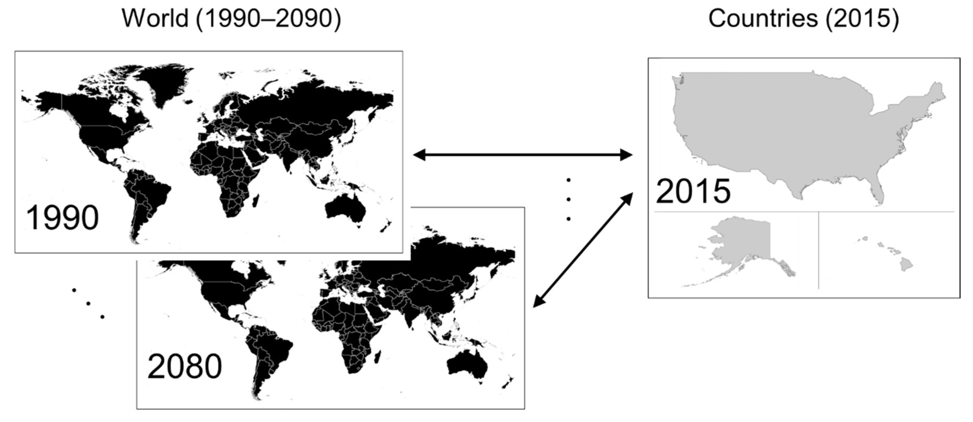
The main goal of this study is to create maps that show the countries that epitomize the world population through time, illustrating how the world population structure has changed since 1990 and how it will transition in the next half century. Rather than examining each age group separately, this study focuses on population composition ratios and the relative transition of age groups. To achieve this goal, the study researches looked for an epitome of the world by investigating the similarity of population structures between countries in 2015 and the world in different years (
Figure 1). This paper first presents the data and methodology used in this study. Then, based on the analysis, the paper shows the countries that epitomize the world population structure from 1990 to 2080 and their characteristics. Next, the results using a cluster analysis of the population on an international level are summarized and discussed. Finally, the paper discusses how this study can be relevant to labor, immigration and tax policies, industries such as healthcare and urban planning.
3. Results and Discussion
The purpose of this study was to identify the epitome of the world population over the years from the recent past (1990) to the distant future (2080) based on population composition ratios with a view to studying the characteristics of the global population and its transition. The Aitchison distance was employed to examine the differences in the entire demographic structures.
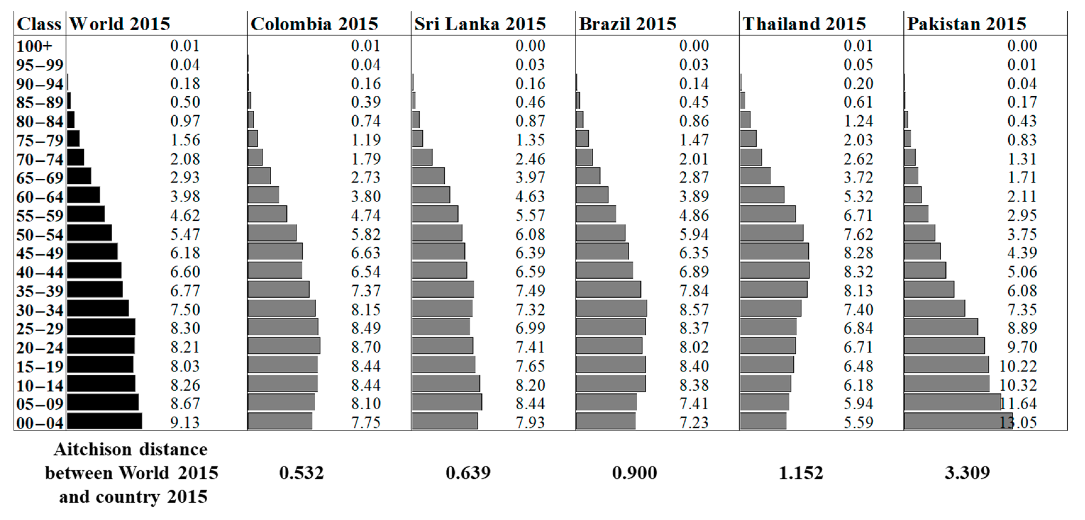
Figure 2 shows an example of the similarity based on Aitchison distance which compares the world in 2015 with Colombia 2015, Sri Lanka 2015, Brazil 2015, Thailand 2015, and Pakistan 2015. This study focuses only on the medium-fertility variant, which is regarded as the most likely compared to extreme low and high variants.
Table 1 only mention countries with a distance smaller than one, and includes those beyond one starting with 2060 to highlight countries similar today to the world of the distant future.
Figure 3 depicts the similarity of the world population to each country every ten years using the world map, and
Figure 4 shows the population pyramids of the world at each period and the most similar country in 2015.
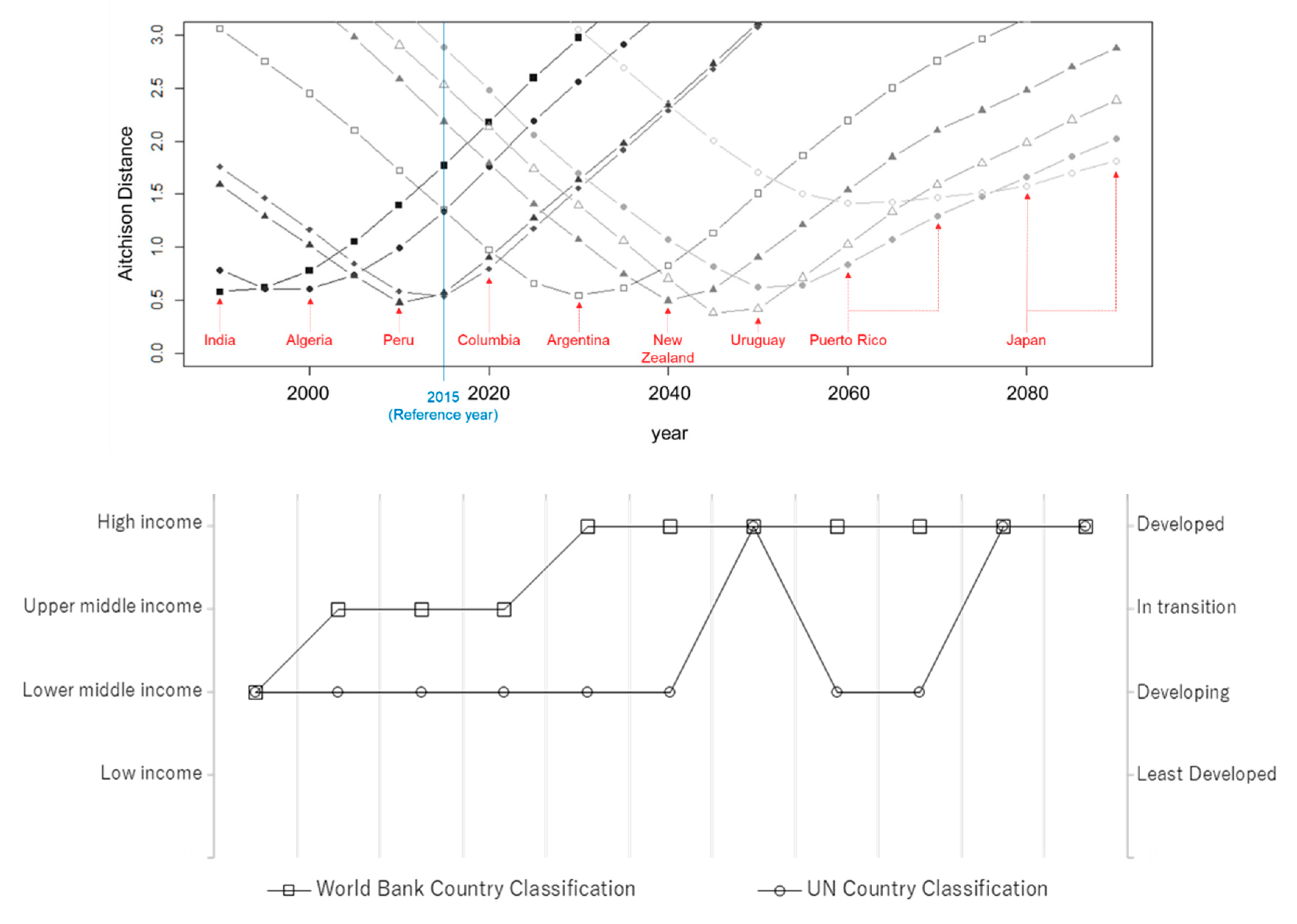
Figure 5 shows the transition of the Aitchison distance for countries most similar to the world throughout the years. At each point where the Aitchison distance is the smallest, the corresponding country depicts the population composition ratio of the world at that point in time. The same figure is accompanied with a simple depiction of the countries’ classification by income and degree of development by World Bank and the United Nations [
15]. Next, each period and the countries and regions that epitomize the world are examined and the results are elaborated.
3.1. The Epitome of 1990 and 2000
India epitomizes the world population structure in 1990 and Algeria in 2000. A total of 71% of the population in Southern Asia lives in India, making its population structure the most dominant and yielding the results included in
Table 1. Next is Pakistan with 10% and Bangladesh with 8% [
14]. Bangladesh appears in the similarity table for 2000, although Pakistan does not, because its population structure is dissimilar to the world population of the 1990s.
Egypt and Algeria rank second and third respectively in the similarity table. The demographics of North Africa indicate that as a young region similar to Southern Asia, it enjoys the benefit of the demographic dividend and the old age dependency ratio is very low (8.4 in 2015; 14.8 in the United States).
3.2. The Epitome of 2010, 2015, 2020, and 2030
Countries most similar to the world in 2010 and 2015 are all Latin American countries except Sri Lanka and Algeria. In terms of development and income, the similarity improved to match upper middle-income countries and less developed regions, excluding the least developed regions, indicating a slight improvement in the dominant economic situation in the world starting in 2010.
In terms of the population structure in Latin America, the young population, which increased over the past century, is expected to decrease in the next 50 years. The adult population increased in the first period, and is expected to continue increasing in the next period. However, the older population is rapidly increasing, and is expected to quadruple between 2005 and 2050, when it will outnumber the young population by 2050 [
16]. For 2030, Argentina is the most similar country. Compared to most of South America, Argentina reached stage four of the demographic transition (birth rate and death rate are both low) earlier. This is due to a strong economy and social mobility combined with technological and medical advances. Moreover, Argentina has moved to the rank of high-income countries in 2019—making it the second country to reach that level in the Latin America region after Uruguay—hinting to the relationship of the demographic transition on a country’s income level.
3.3. The Epitome of 2040
In this period, New Zealand, the United States, and Australia are the most similar countries. As a developed country, New Zealand has a relatively high fertility rate of 2.05 for the 2010–2015 period. New Zealand, similar to other developed countries, underwent demographic transition, but has not experienced as drastic natural decrease, thanks to the Māori contributing to the population growth. On the other hand, though migration has recently contributed to the growth of the population, it is unstable (a negative net migration rate in 1970–2000 with only 1% contribution to the population growth between 1970 and 2010 against 20% from 2010 to 2014), and can only contribute to sustained growth when migrants settle and remain permanently [
17].
Since 2005, net migration has been the main driver of population growth in Australia, rather than a natural increase. The non-working age population (mainly those aged more than 65 years old) has been growing faster than the working age population over the past 20 years. In the last five years, the growth rate of the former is 2.3%, whereas the latter only grew 1.2% [
18].
The United States has doubled in size since 1950, while its industrialized counterparts have experienced slow growth during the same period (Germany: 16%, Italy: 28%). In addition to societal adaptations such as better access to child care and more involvement of males in the household, this is due to the differential fertility rates for ethnic and racial groups (Hispanic: 2.9, non-Hispanic white: 2.0 in 2008). Another major factor in population growth is net migration, projected to remain positive for the full 1950–2050 period [
19].
3.4. The Epitome of 2050
Fully 24% of Europe’s population is aged more than 60 years, making it the oldest region in the world currently [
14]. Based on this, the epitome of the world in 2050 is likely a developed country, especially one in Europe. Indeed, six similar countries are in Europe, Northern America, and Oceania. More developed regions also made the list as an epitome of the world in 2050. However, at the top of the list are Uruguay and Puerto Rico, which belong to the Latin American and the Caribbean region, respectively, and are classified as less-developed countries.
Since New Zealand, the United States and Australia are the epitomes of the world in 2040, the less developed Uruguay and Puerto Rico do not seem to be an appropriate fit as epitomes of the world in 2050. However, their population structure indicates that immigration issues and history can explain their similarity to the world of 2050.
The demographic structure and growth of Uruguay is distinct from its Latin American context, and similar to that of Western Europe. One reason is the cultural influence of the early intense European immigration on the scattered population, which marked an early adaptation of the European social model (in 1950, the total fertility rate of Europe and Uruguay was 2.7, and 5.9 in Latin America and the Caribbean). Furthermore, intense urbanization prevented the development of rural areas where reproduction levels would be high. Adding to the latter, an authoritarian regime that ended in 1984 followed by slow democratic reform resulted in an intense emigration movement. Age-selective emigration and emigration in blocks (emigration of the entire family) have decreased the juvenile and working population. Coupled with the low fertility rate and high life expectancy, the aging population has become a significant issue for policy makers in Uruguay. In addition, Uruguay has held the position of being the only high-income country in the Latin America region until 2019 when Argentina also joined the list of high-income countries.
Similarly, Puerto Rico’s population is shrinking. The natural decrease in population is one reason for this loss. The birth rate has been declining, and an aging population has increased the death rate, leading to a negative natural population increase over the past four decades. Granting the people of Puerto Rico U.S. citizenship in 1917 and the introduction of low-cost flights have improved the freedom of movement between the island and the U.S. mainland, making emigration mainly of those aged 16–30 years a major driver of the sharp decline in population, and of the acceleration of the aging process of the population.
“Although the populations of all countries are expected to age over the foreseeable future, the population will remain relatively young, at least in the short term, in countries where fertility is still high” [
14]. This is a combination of the characteristics of developed regions and developing regions, making Uruguay a pertinent result as the epitome of the world in 2015 as they are high-income developing country following a European demographic model.
3.5. The Epitome of 2060 and Beyond
Beyond 2060, the number of similar countries declines again, and Puerto Rico remains in the lead. However, from 2080, Japan takes the lead followed by Italy, the two countries that today suffer most from shrinking populations and rapidly expanding aging populations. The population aged 60 years and more is the fastest growing and expected to increase to 3.1 billion by 2100 [
14]. However, when considering changes in life expectancy, the speed of aging—likely to accelerate in the upcoming decades—will decelerate by 2050 [
20]. Forecasting the distant future is a challenging task yielding mostly uncertain results, since it requires a preliminary forecast of the near future, which is also pending.
The countries that epitomize the world throughout the years are all developing except in 2040 (New Zealand) and the distant future (Japan). From 2030, the epitome jumps to high-income countries. The income classification is based on the per capita income and the development classification is based on the human development indicator which accounts for education and life expectancy in addition to income. Following the results discussed above, in terms of development and income, from a demographic perspective, the world will achieve high economic growth but not necessarily a high life expectancy and high level of education. Based on the stages of the demographic transition model at which each country is in 2015, the representative stages are fluctuating over the first quarter of the century, becoming stable at the fourth stage starting in 2030. The future population of the world is estimated based on the current demographic structure, which is why eventually the future population would converge to the final stage of the demographic transition model. However, as is the case for the past decades, the representative stage might fluctuate depending on how the populations evolve in each country.
3.6. A Comprehensive Epitome: Cluster Analysis
This study conducted a cluster analysis to summarize the findings. The Ward method, based on the calculation algorithm, was employed [
21].
Figure 6 shows the clusters of countries and regions in 2015 based on the similarity of their population composition ratios. The distribution of the lower value of the Aitchison distance indicates the group of countries and regions that are similar, and helps link each cluster to a specific period: past, present, near future, and distant future.
From the generated cluster map, the results identified seven types of clusters. Clusters 1, 2, and 3 have a population structure with a pyramid shape, characterized by both high birth and mortality rates. This is characteristic of Sub-Saharan Africa, the Middle East, South-Eastern Asia, and a few countries in southern Asia including Afghanistan and Pakistan. It represents the trend that was most dominant of the world population structure in the past (before 1990). Cluster 1 was identified as a sub-cluster of Cluster 2, with a relatively low population. These clusters have long suffered a high mortality rate in the past decades, but also have a large productive population (high fertility rate), which has resulted in a large juvenile population [
14]. Life expectancy is slightly higher for Cluster 3 which can hint to the second stage of the demographic transition model and explain the rapid growth of the population. Cluster 1 specifically has a concave curve; life expectancy is low and can be said to be at the first stage of the demographic transition model which could explain the low growth of the population.
Regarding the population structure of Cluster 4, it is characterized by low birth and mortality rates and a declining population. Representative areas are China, North Africa, Southern Asia, Brazil, India, Central Asia, and South Africa. This cluster represents the world in the present and the near future.
Regarding Cluster 5, it is characterized by a declining juvenile population and growing aging population, a low birth rate, and a stagnant population. Representative areas are Latin America and Israel. These countries are not yet in the phase where the aging population is dominant; however, the trend cautions for that risk. This cluster represents the world at the beginning of the century.
The main difference between Clusters 4 and 5 is the ratio of the juvenile population, which is relatively larger for Cluster 5. Countries in these clusters have reached the third stage of the demographic transition model.
Regarding Cluster 6, it is characterized by a moderate size of the juvenile population, a large-working population, and a relatively high life expectancy. Representative areas are Russia and Western Europe. Furthermore, this cluster does not represent the world at any period, and represents a recessive population structure with a stable or decelerating growth of the population. Most countries in the cluster are classified by the UN as economies in transition, which hints at relationships between the population structure and economic development.
The population structure of Cluster 7 has a coffin shape. It is characterized by drastically declining birth and population rates, and extreme growth of the aging population. Representative areas are Japan, Europe, North America, and Oceania. The world is heading towards this structure in the distant future. Countries in these cluster have reached the final stage of the demographic transition model; growth is declining in some countries while others maintain a certain degree of stability thanks to migration.
4. Policy Implications
Identifying the country that epitomizes the world population in the future can help forecast and deal with the fiscal implications of aging at the global level from the cost of healthcare and long-term care (LTC) to the pension system, the planning implications pertaining to transportation, delivery services, living spaces and overall public services, the economic and industrial implications regarding a shrinking workforce and the activation of the silver population, and the social implications concerning family policies, childcare services, and housing policies. Hereafter are a few examples of these implications.
The increase of the share of those aged over 80 in a society has a direct impact on the need for LTC. Identifying the epitome of the world can thus help project the demand and cost for LTC and the various measures that can be taken to decrease it. In addition, the labor and budget allocated to LTC across countries needs to be forecast to allow for policies that attract foreign workers to the healthcare industry, increase subsidies for artificial intelligence research aimed at improving caregiving and healthcare in general, and re-examine the retirement age. Japan, the epitome of the world in the distant future and the country with currently the highest share of elderly population in the world, is experimenting with various policies to tackle the growing expenditures of healthcare and LTC. An incremental increase in the consumption tax (5% to 8% in 2014 and 8% to 10% in 2019) is aimed, among others, at financing said growing costs. Japan has also introduced the “Community-based Integrated Care System”. It is a system that integrates healthcare, LTC, social assistance and housing services, and aims to build healthy and resilient social environments that can help reduce the need for institutional care [
22]. The effectiveness of such policies still needs to be evaluated over time but provides valuable lessons for the world population in the distant future. Therefore, keeping an eye on the effect of those policies is essential to direct future population policies at the global level.
In the urban context, the key issues posed by aging are the growing cost of housing, the urgent need of a universal design, and an overall review of the urban structure. Providing an epitome of the future world population can help motivate the adoption of urban schemes already in motion in countries with an aging population or avoid urban forms that have proven to be unsustainable in said countries. In addition to social and affordable housing, finding ways to combine housing and care and creating legal frameworks for alternative tenure arrangements are measures that countries such as Japan and Canada are already experimenting with. A more accessible urban environment proves to be indispensable in countries at the advanced stages of aging, and as a means to achieve that, developers are financially incentivized to improve accessibility [
23]. In Japan’s “New Town”, a large portion of the elderly is found in residential suburbs that were developed in the 1960s–1970s to provide housing for the young population at the time, with limited urban functions such as accessible transportation and healthcare facilities [
24]. Such urban structures, attractive for only a span of a generation, have proven to be unsustainable and must be avoided in the future and replaced by compact city concepts, high functionality, and accommodation of a diverse society.
The other facet of the aging population is a shrinking population, the productive group in particular. Japan, being the epitome of the world in the distant future, is already experiencing the repercussions of both an aging society and a shrinking labor force. It has since established many reforms, such as the New Economic Package in December 2017 which aims to boost productivity by reducing educational costs and supporting small enterprises, among other reforms [
22].
For the pension system, lessons can be learned from Argentina and Uruguay being the epitomes of the world in 2030 and 2050, respectively, and the countries with the largest share of aging in Latin America. The indexing of pension coverage should rely on inflation instead of the procyclical public revenue to preserve retiree’s purchasing power [
25]. A reform that Argentina performed in 2017 when it changed its pension benefits formula to be 70% based on inflation and only 30% based on wages has improved the sustainability of the pension system in Argentina [
26,
27]. In Uruguay, the data shows that incentives pertaining to the pension system, such as a mixed system of a pay-as-you-go component and an individually funded component that favored retirees and pensioners with lower incomes (low-income workers have the choice to contribute to only the pay-as-you-go component while high-income workers are required to contribute to both components) [
28] have encouraged workers to delay their retirement [
29], a step that can only be expected if workers can sustain good health and that the work environment remain attractive to all generations. In addition, Argentina and Uruguay are also considered “pro-aging” countries as pension systems are generous and alleviate the poverty of the senior population (aged 65 and older) when compared to the rest of Latin America. However, the low rate of poverty among the elderly is countered by high rates of poverty among the young (aged 15 and younger) which hints to unbalanced expenditures and the need to review the needs of the young. Moreover, if pensions were to be removed, the poverty rate among the elderly would increase from 5% to 35% in Argentina and from 1% to 24% in Uruguay, showing the indispensability of the pension system and the need for contingency scenarios [
30]. It is also worth noting that about half of the elderly in Argentina and Uruguay live on their own while more than 60% of the aging live in multigenerational households in their Latin American counterparts. This points out the risk of social exclusion among the elderly in societies where aging is relatively advanced, something that Japan, for example, is experiencing drastically [
30]. Therefore, promoting a resilient social environment ahead of the final stages of the demographic transition is recommended.
Following the effect of mentioned policies in countries that epitomize the future world population can help international organizations such as the World Bank or the OECD timely forecast the sustainable policy recommendations to be given in the future at the global and regional level, such as recommending optimal policies that can guaranty a universal coverage of the elderly, promote the silver economy, optimize immigration programs to overcome labor shortage, and encourage the private sector to give early incentives to research that can pave the way for innovations regarding transportation, healthcare, delivery systems, etc. that can meet the needs of the population in the near and distant future.
5. Concluding Remarks
Focusing on the total size of the population or on one particular age group is not sufficient to comprehensively forecast demographic changes. At the same time, studying all age groups simultaneously through multiple periods is a challenging task. Therefore, this study considers the advantage of CoDA to examine the transition of the world population as a structure from 1990 to the end of the 21st century by comparing the world population structure of each period to that of countries and regions in 2015. This study found that in 1990, the world was most similar to India, Algeria and Egypt, which clarifies that the demographic characteristics of the world at that time were a relatively high fertility rate, small aging population, and large juvenile and working population. The world has not yet achieved demographic transition. In the present period and near future (2015–2030), the world is most similar to Latin American and the Caribbean countries, where the young population is still relatively high, although the trend is converging towards an aging population. In 2040, the world will be most similar to developed countries (New Zealand, the United States, and Australia), where the population is still growing because of a natural increase and net migration, and where the aging population is relatively high, but not as high as in Japan or Italy. In 2050, something interesting occurs. Where developed countries were expected to appear, especially those in aging Europe, the most similar country and territory were Uruguay and Puerto Rico. In Uruguay and Puerto Rico, the population is shrinking and aging, not because of a natural decrease, but because of intensive age-selective migration, and the strong early European influence in the case of Uruguay. In 2060 and beyond, the similarity of the world to other countries becomes difficult to ascertain, as the dissimilarity of the shapes of the pyramids is remarkable when the Aitchison distance is higher than one. However, in order of similarity, Japan and Italy emerge at the top of the list, confirming the forecast of a stagnating or shrinking world population in the distant future, with an all-time high rate of the aging population.
In this study, based on the characteristics of population composition ratio data, an analysis was conducted using the Aitchison distance, a basic distance index in CoDA. However, analysts select the distance indicator based on what they intend to emphasize according to the subject at hand [
11]. At present, in population research and regional analysis, application examples of the Aitchison distance are limited, and further discussion about the suitability of its application is necessary. As concrete future steps of this study, it is important to consider not only compositional population age structure but also population size in order to guide more intuitive understanding, since population size is as important as population age structure of the characteristic of population issues. It is also important to detect spatial relationships in population age compositional data by expolanatory spatial data analysis approaches [
2,
31].
Additionally, this paper can be of potential value as a means to demonstrate the usefulness of applying geographic information sciences (GISc) methodology to derive interesting and potentially meaningful findings about population age structure. Researches related with sustainability on population issues should be connected to GISc approaches to understand not only time-series relationships but also regional natures. By using these approaches, people implementing sustainable population policies and guiding population studies could know the spatial characteristic of population structure changes of the world.


