An EUD environment fostering natural language interaction has been developed to allow the target users of the case study to easily create their data visualizations. The final goal was to observe their behaviors during the interaction with the prototype and collect their opinions and expectations to explore the role that such an EUD environment could play in a real organization where decision making is often supported by data analysis and visualization.
4.1. The AI-Supported Data Visualization Prototype
The design probe is a prototype web application that follows the client–server paradigm. Specifically, PostgreSQL is employed as the database management system. To leverage its LLM capabilities, the API provided by OpenAI is used, exploiting one of the most advanced models currently available, i.e., GPT-4o. The LLM is responsible for (i) generating the extraction SQL query based on the user’s intent, and (ii) recommending the most suitable visualization for the requested data and user profile.
To instantiate the model, a dynamic prompt engineering approach was adopted to ensure adaptability to individual users. The prompt structure consists of a fixed part that provides general system instructions about the task (i.e., “generate a SQL query and provide a suggested data visualization type”). At the same time, user-specific information is dynamically injected at runtime based on the logged user. These adaptive elements include user preferences, such as commonly used visualization types and interaction patterns, as well as the schema of the database relevant to the user’s daily activity.
After the SQL query generation, the system undergoes a formal syntax validation to confirm adherence to SQL standards. Additionally, this validation ensures that the query is limited to data retrieval operations (SELECT statements) and does not include modification or deletion commands (UPDATE or DELETE statements), thereby mitigating potential security risks. To ensure response consistency, minimizing the model temperature parameter, which controls response variability, is crucial. A lower temperature setting enhances determinism, ensuring that identical inputs yield consistent outputs. For this case study, a temperature equal to 0.2 has been chosen.
The proposed solution enhances users’ data management by leveraging an end-to-end workflow that integrates query generation (Text-to-SQL) and visualization suggestions (Text-to-Vis). The main objective is to simplify user interaction, ensuring that individuals without programming expertise can easily retrieve and analyze data related to their work practices.
In particular, the user initiates an interaction by submitting a natural language request. The user request, the model initialization instructions, the history of the previous messages in the same conversation, the user profile, and the database structure are processed and forwarded to the LLM. Having been instructed with contextual information about the database structure and application domain, the model generates the SQL query to extract the requested data and a suggested visualization format. After its validation, the SQL query is executed and the relevant data is extracted. It is important to note that it is not the LLM that executes the query but the backend of our web-based prototype, thus avoiding privacy and security issues regarding data dissemination. Without a specified user preference for data representation, the model autonomously selects the most appropriate visualization based on the requested data and the user profile. If the user needs to refine the request further, adjust the visualization format, or explore additional insights, they can, enabling an iterative and dynamic data analysis experience.
The user profiles described in the previous section have been employed to personalize the interaction with the application. The primary factors considered in this personalization include the type of chart generated, any additional explanations provided in the chat, and potential suggestions for alternative visualizations suitable for the requested data and the user profile.
For the
basic profile (see
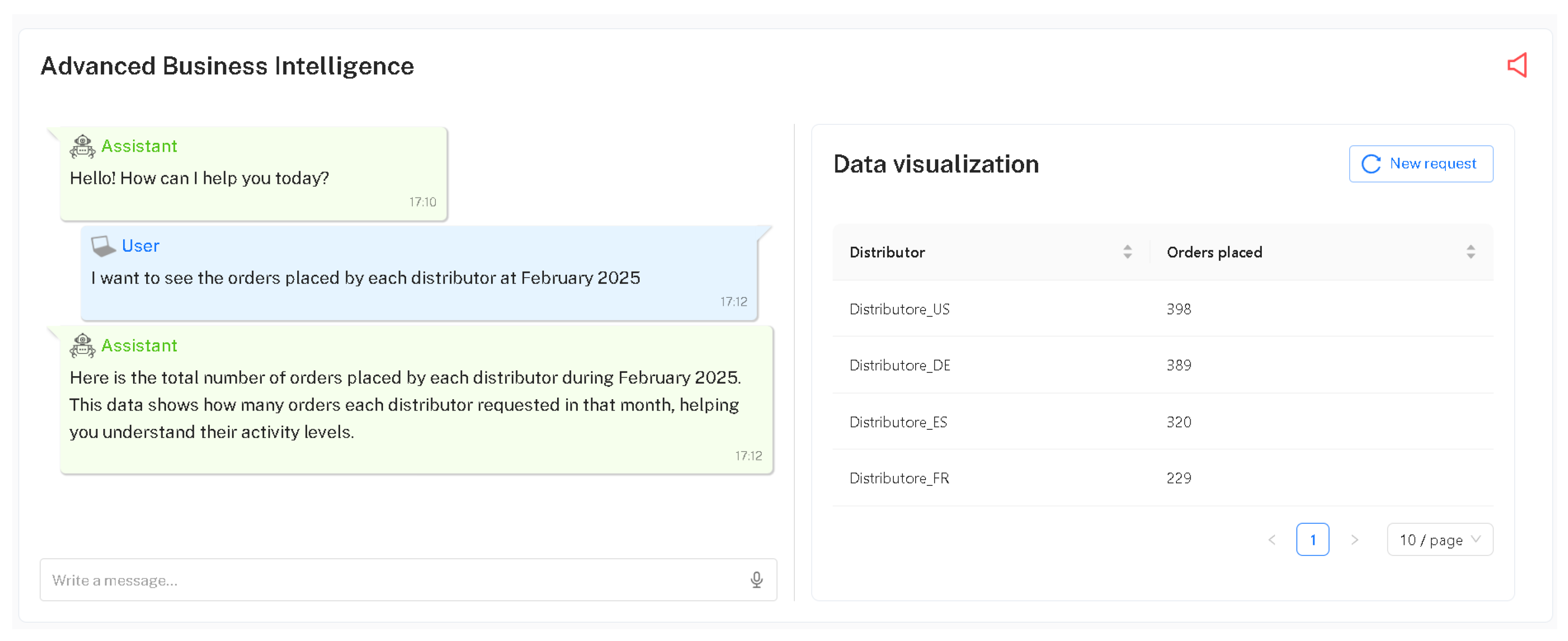
Section 3.3.1), the preference for simple chart types is respected, and explanatory messages in the chat can be particularly useful. An example of interaction with the system is presented in
Figure 3, where the simplest visualization type is displayed (i.e., a table), along with an additional explanation of it in the chat. No suggestions for more advanced visualizations are offered, as this profile targets users with limited data visualization experience.
In the case of the
intermediate profile (see
Section 3.3.2),
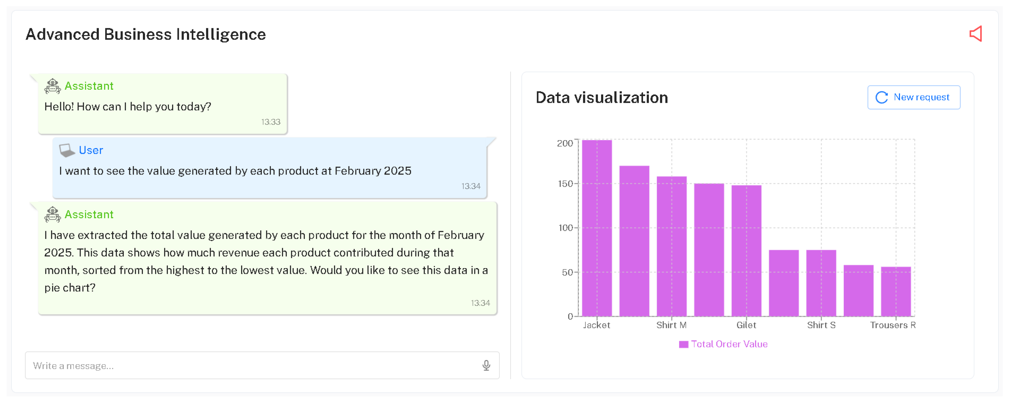
Figure 4 illustrates a slightly more complex visualization type (i.e., a bar chart), along with an explanatory message. Additionally, the system presented the user with a suggestion to view the data through an alternative representation (i.e., a pie chart).
Lastly, the
advanced profile (see
Section 3.3.3) is provided with more complex visualizations and no or limited explanations in the chat. For example,
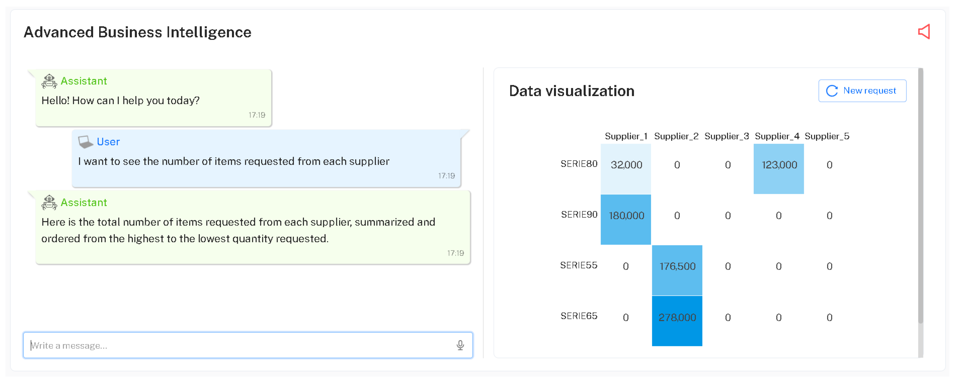
Figure 5 shows a heatmap visualization of the data requested by the user. In this case, no explanations are provided in the chat, reflecting the assumption that advanced users are already familiar with the visual representation. Similarly, no alternative suggestions are offered, as these users are expected to know what type of chart they require and may request the one they consider most appropriate for their needs.
In addition to the profile-based personalization just described, users always have the option to further refine their requests in a dynamic and interactive way. Any user may request a refinement of the type of visualization; for instance, by asking to view the requested data in an alternative chart. They may also request a refinement of the data itself, such as specifying a particular time interval or applying specific filters. Furthermore, users can request a refinement of the chat response, asking for more detailed explanations of the extracted data, including details on how to better understand the provided visualization. The objective of this refinement process is to allow users to tailor the interaction based on their individual goals and familiarity with the data. By adjusting the type of visualization, selecting specific subsets of data, or requesting further clarification through the chat, users can gradually adapt both the content and the form of the output to better suit their needs.
4.2. The Interaction Experiment
The experimental interaction with the design probe consisted of an interactive session with the above prototype application. Three out of the eight key informants participated in the experiment as representatives of the three key profiles. It is important to underline that the interaction experiment did not aim at evaluating the usability of the application, but at collecting further information to answer RQ2, and subsequently the overarching question of this research activity. Therefore, the experiment exploited qualitative methods to gain insights about the behaviors and expectations of different types of knowledge workers accomplishing their decision-making goals through a visualization tool enhanced with EUD and LLMs.
Based on the key profiles identified, the experiment was divided into a common part and a profile-based part. The common part consisted of an explanation to the participants of the types of visualization that the AI-based prototype was capable of providing: numeric or percentage KPIs, tables, line graphs, bar charts, area charts, pie charts, heatmaps, and scatter plots. Participants were encouraged to use natural language to request data visualizations and to receive explanations of the generated data visualizations, fostering an environment where they could talk aloud and execute tasks that were similar to their routine tasks. Participants should have to interact with the system in written natural language: on the right panel (see, for example,
Figure 3), they were able to see the generated data viz, while on the left panel, the chat was at their disposal to continuously interact.
In the profile-based part, each experimental task script diverged based on the users’ profile domain of expertise, data viz literacy, and on the complexity of interactions that form their visual analytics routine. For example, a task could be as easy as generating a KPI and a basic data viz, e.g., requesting a table of distributor orders, identifying top distributors by order quantity in a specific month, and observing order variations over time. A task could be more complex, such as requesting a comparative analysis of temporal changes in the data, e.g., compare product demands by customers, visualize sales volume changes over time, and assess market dynamics through pie charts or a breakdown view of active countries in e-commerce. More advanced tasks might include an in-depth analysis of supply chain data and vendors’ performances, e.g., to evaluate supply chain efficiencies, understand product line order trends, and explore the impact of a supplier’s performance on delivery delays through a series of cascaded visual analyses.
The four tasks assigned to the participants and customized to the three user profiles are reported in
Table 4,
Table 5 and
Table 6.
A final questionnaire was administered to the users, where each answer was an open-ended one. As each user profile had different tasks to accomplish, there was no standard evaluation test that could be uniform across different users’ profiles. Hence, we preferred to investigate the qualitative opinions of users after using the system. The questionnaire items are reported in
Table 7 (some of its questions are inspired by the Bot Usability Scale presented in [
33]).
The experiment aimed at testing what behaviors and expectations emerge from key users based on the ability of the system to drive them through (i) the exploration of a dataset based on their specific needs and expertise; and (ii) the flow of interaction with a data viz generated by the system, which they contribute to designing for visual analytics purposes.
During the experiment, users could receive some suggestions on the tasks that could be executed with the system, but were essentially left free to express themselves to require a specific data viz, to refine their request, or to obtain an explanation of the results. For privacy reasons, the system did not have any knowledge of the database, but only of its schema. Based on the dataset schema, an SQL query to the dataset was executed by the system, and a data viz based on the user’s request was created and proposed in the right panel of the prototype.
Each individual session was carried out remotely through Microsoft Teams. The entire session, including audio, video, and automatic transcription, was recorded for later analysis. One researcher played the role of facilitator, introducing the project, explaining the nature of the experimental activity, and sharing a document with the assigned four tasks. The facilitator also took notes of the user’s behaviors and comments and at the end proposed the questions of the final questionnaire, annotating the received responses. Another researcher managed the technical aspects of the experiment, selecting the correct system version and database for that specific user. Each user session lasted about 30 min.
4.3. Results
The assigned tasks were completed successfully by all three users, who obtained the desired visualization for their data. Only the basic user encountered some difficulties during the interaction with the prototype, especially at the beginning of the experimental session; this required the intervention of the facilitator, who provided suggestions about the possible natural language requests accepted by the system. This problem and other significant aspects are discussed in the following subsections.
Recordings, direct observation, and note-taking were adopted to collect qualitative data during the interaction with the system by the key users. Transcripts and notes were then integrated with the answers to the open-ended questions of the post-questionnaire. A thematic analysis was then performed by two researchers on the collected material, following a deductive and semantic approach. The extracted codes were discussed in a meeting, which also served to identify the emerging themes. These themes are reported in the following, distinguishing them based on the user profile and reporting participants’ quotes when considered useful.
4.3.1. Findings for the Basic User
The following main themes emerged for the basic user profile.
Prompting requires training. During interaction with the system, the basic user often asked us for confirmation before proceeding with the task at hand; this happened in particular when task 1 started, as there were some hesitations in formulating the natural language requests to the prototype. Crafting prompts may be difficult for users who rarely use LLMs, leading to complex queries that should be refined at each new iteration. Despite these initial difficulties, the user found that interacting was beneficial, mainly when a new data viz was exploited for the first time, i.e., a heatmap. In fact, the user observed: “Unlike searching on the Internet, here I was working with data I’m already familiar with, so asking for an example based on that made learning much faster. As soon as I saw the table, I understood how it worked and thought that this was nice and useful, I could actually use it in the future”.
Problem-solving based on trial and error. Task execution was characterized by a trial-and-error style. For example, when the system generated a line chart instead of the intended bar chart for analyzing suppliers and their service level, the user successfully identified the issue and solved it. Likewise, some attempts to incorporate multiple categories in a bar chart were unsuccessful, requiring continuous adjustments and many prompts. In synthesis, the prompting activity often required iterative refinement to yield the desired result. Nonetheless, the user seemed to acknowledge and appreciate the tool capability of providing data viz and data manipulation, recognizing some advantages over human error for some tasks (“Yes, it definitely makes fewer mistakes than I do when I manually copy formulas over and over. Once the data and databases are loaded into the system, there’s significantly less room for human error”).
Expectations about how LLMs work. Managing dates within the system proved to be another dull activity, and the expected handling was not always clear (“I cannot really read the dates…Oh, right. You can hover over the line to see specific values. But I asked for data from December, and it only shows February. Is it just me not reading it correctly?”). The user also showed a strong wish for accuracy by frequently checking interpretations and emphasizing proper wording, having little confidence and trust in the LLM.
Difficulties in feature discovery. Some functionalities, like sorting data, did not initially come to mind but were successfully used after our suggestions. In the same vein, there was a lack of familiarity with many types of available data viz, but once reminded of available options, the user actively explored new data visualizations (such as the heatmap mentioned above) and extended this understanding to other tasks. The basic user often expressed challenges in interpreting data visualizations, sometimes unaware of interactive features like the mouseover functionality. Another remark was on the importance of precisely entering dataset column names (“Oh, I think it’s because I didn’t write it correctly…I was supposed to use a capital letter. I made a mistake”). A key request was the possibility to place different data visualizations side by side for easier comparison.
Ease of natural language interaction. The basic user found it easy to interact with the system for expressing their needs and making requests (“In our work, we usually start from a dataset, then it’s all about pivoting, filtering, searching, …That’s why I think this could be extremely convenient: you just use a single sentence instead”). It was especially appreciated how the system accumulates knowledge about the interaction and the fact that there was no need to formulate the previous requests again.
Quality of the output. Mostly, the system responded in an understandable way, especially with some basic visualization, i.e., table, and advanced data viz requests, i.e., heatmaps. The responses of the system were considered satisfactory and accurate (“The output matched my expectations, it showed exactly what I was looking for”).
Usefulness and effectiveness of the tool. Regarding the extent to which the system could improve daily work, the opinion was positive. It was found convenient to use a tool of this kind, rather than searching for help online (“It’s definitely more convenient than searching online; since the system already works with data I’m familiar with, learning is much faster”). The platform already had information available and had already made examples on available data. Compared to a human being, the system was perceived as making fewer mistakes.
4.3.2. Findings for the Intermediate User
Different themes emerged for the intermediate user.
Prompting encourages exploration of the system’s capabilities. The intermediate user was quicker in grasping how the system worked, readily trying different types of requests to better understand what the output was. Since the beginning, this user intuitively knew what to write and how to format the inputs to enter the desired measures. Engagement in trial and error was the main attitude to assess the capabilities of the system and to experiment with various request formats. Data viz choices included bar charts, line charts, pie charts, tables, and scatter plots. However, when attempting to design a scatter plot, the initial result was not the one intended, and the user soon realized that two measures were required (“I asked for a scatter plot to show the correlation between sales and number of orders, but then I realized I needed to define two separate measures, one for each axis”). After this attempt, the user proceeded with an alternative data viz.
Proactive management of the system’s limitations. Some frustration arose when the system failed to display expected data, such as a KPI. However, the user seemed to stick to the given tasks, trying to improve data viz independently, e.g., by modifying the granularity of the data, transforming monthly orders into weekly orders, and the like. This user proactively refined the analyses by introducing new measures and modifying requests as some insights developed during the interaction; for instance, after thinking aloud “Hmm, okay, but what if I wanted to ask, for example, to include the percentage variation?”, the user successfully obtained the output update.
Dealing with complex data visualization requests. There were moments when the system did not immediately respond as expected. For example, when trying to design a heatmap but a bar chart was returned instead, and upon specifically asking, the user obtained the correct data viz. A second example was when a complex request was also attempted, highlighting both the difficulty in making the system become responsive in this respect and realizing how challenging it could become to articulate complex analytical needs. In general, when dealing with complex data visualizations, difficulties in fully expressing analytical intentions were expressed (“There’s also a human limitation, obviously, when it comes to explaining things. I’m one of those people who knows exactly what I want in my head, but explaining it…”). Furthermore, there was uncertainty regarding the system’s capabilities and limitations, leading to a continuous process of request exploration and subsequent refinement.
Misunderstandings addressed easily. On the one hand, when faced with misunderstanding from the system, the user independently refined or rewrote prompts, adjusting the approach accordingly. On the other hand, when occasional input errors occurred, the user noticed that the system accurately interpreted their intent (“Oh, but it even corrected the name I mistyped. Nice, I got it”). In general, the response of the system was found to be clear, also because there was feedback even when the system was unable to perform the request.
Trust in the system. The system was found to be adequate from the satisfaction and accuracy perspectives, but further refinements to the prototype were perceived as necessary. Therefore, trust in the system could be gained provided that further improvements in the interaction modalities are made (“I imagine these systems still need to be refined and trained, but the beginning looks promising. After a proper testing phase, yes, I could trust it”). Despite this, the tool was evaluated as substantially improving daily work.
4.3.3. Findings for the Advanced User
Finally, additional themes associated with the advanced user were identified.
Effectiveness and efficiency of human–AI interaction. During the interaction with the system, the advanced user always yielded precise and detailed results, often testing the system capability to interpret datasets accurately and demanding greater transparency in data representation. The focus of the interaction soon extended beyond basic interactions, aiming to optimize a workflow through advanced data viz requests for correlation analysis. When requesting correlations between measures, the system sometimes generated an incorrect scatter plot, leading the user to make request formulations more intricate to try to yield the expected result. The system efficiency was appreciated in its capacity for reducing the time spent on manual Excel processing, recognizing its potential for streamlining data analysis and decision making (“I’d normally spend half an hour doing this in Excel, but here I can see it instantly”). Using the system was found to be a notable improvement in daily work, especially in saving time (“It saves me a lot of time, especially when I need to perform monthly comparisons. This also spares me from building pivot tables every single time”).
Retaining human control over the AI-based system. With good skills in prompt engineering, this user emphasized that the system’s effectiveness was heavily influenced by how well requests were formulated (“I need to be careful with how I phrase the request, otherwise it gives me something different”). Prompts tended to be lengthy and complex, reflecting a desire for full control over data viz and system outputs. There was also a need to go beyond data viz and understand how trustworthy the system was in terms of checking the data at the source from the table.
Strengths and weaknesses of LLM-based interaction. The system was found to be able to express needs and answer requests adequately, as seamlessly as interacting with a common chatbot (“The experience is like chatting: I talk to it as if it were a person. There’s no need to use strange commands”). The clarity and understandability were judged quite well, despite the fact that the system did not understand when it had made a mistake, and it was not easy to try to communicate the mistake. Expectations went beyond the system’s capabilities, showing a wish to exploit this kind of system for complex analytical needs, which are, however, still difficult to support with this technology.
Trustworthiness and transparency of the system. After thorough testing, the user expressed trust in using the system for work-related tasks, provided that a proper verification of the dataset was conducted before a full reliance on the system could be admitted. While SQL query visibility was initially valued, this user acknowledged that, once trust is established, such transparency may become unnecessary (“As long as the results are consistent, I do not feel the need to verify the code every time”).


