Article

Accessible IoT Dashboard Design with AI-Enhanced Descriptions for Visually Impaired Users

by
George Alex Stelea
1,*,
Livia Sangeorzan
2 and
Nicoleta Enache-David
2,*
1
Department of Electronics and Computers, Transilvania University of Brașov, 500036 Brașov, Romania
2
Department of Mathematics and Informatics, Transilvania University of Brașov, 500036 Brașov, Romania
*
Authors to whom correspondence should be addressed.
Future Internet 2025, 17(7), 274; https://doi.org/10.3390/fi17070274 (registering DOI)
Submission received: 16 May 2025 / Revised: 12 June 2025 / Accepted: 19 June 2025 / Published: 21 June 2025
(This article belongs to the Special Issue Human-Centered Artificial Intelligence)

Abstract

:
The proliferation of the Internet of Things (IoT) has led to an abundance of data streams and real-time dashboards in domains such as smart cities, healthcare, manufacturing, and agriculture. However, many current IoT dashboards emphasize complex visualizations with minimal textual cues, posing significant barriers to users with visual impairments who rely on screen readers or other assistive technologies. This paper presents AccessiDashboard, a web-based IoT dashboard platform that prioritizes accessible design from the ground up. The system uses semantic HTML5 and WAI-ARIA compliance to ensure that screen readers can accurately interpret and navigate the interface. In addition to standard chart presentations, AccessiDashboard automatically generates long descriptions of graphs and visual elements, offering a text-first alternative interface for non-visual data exploration. The platform supports multi-modal data consumption (visual charts, bullet lists, tables, and narrative descriptions) and leverages Large Language Models (LLMs) to produce context-aware textual representations of sensor data. A privacy-by-design approach is adopted for the AI integration to address ethical and regulatory concerns. Early evaluation suggests that AccessiDashboard reduces cognitive and navigational load for users with vision disabilities, demonstrating its potential as a blueprint for future inclusive IoT monitoring solutions.

1. Introduction

The explosion of the Internet of Things (IoT) has led to an abundance of data streams that organizations use to make rapid, data-driven decisions. Whether managing energy consumption in a smart building, monitoring patient vitals in telehealth, or tracking metrics on a factory floor, dashboards have emerged as vital interfaces for visualizing and analyzing large volumes of sensor data in real time [1]. However, most of these IoT dashboards are designed with primarily visual paradigms (color-coded charts, graphs, and interactive graphical controls) often with minimal textual description. This design bias leaves behind a substantial user base that relies on screen readers and other assistive mechanisms for digital access [2]. According to the World Health Organization, more than 2.2 billion people globally experience some form of near- or distance-vision impairment [3]. Supporting this, WebAIM’s 2024 screen-reader survey found that 68% of blind respondents interact with dashboards at least once per week [4]. Yet, a recent audit of 87 public COVID-19 dashboards revealed that fewer than 20% provided even basic text alternatives such as alt-text or downloadable tables [5], highlighting a persistent accessibility gap in data-rich IoT interfaces. As a result, visually impaired users continue to face major obstacles in interpreting real-time sensor data when it is presented solely through charts or images without meaningful textual equivalents.
These accessibility shortfalls are not merely minor usability issues; they translate into critical gaps in equal access. In many jurisdictions, web accessibility for digital services is a legal requirement. For instance, in the U.S., Section 508 of the Rehabilitation Act mandates that federal electronic and information technology be accessible to people with disabilities [6], and in the EU, the EN 301 549 standard [7] outlines similar requirements for ICT products and services. Despite these regulations, most IoT dashboards remain only superficially compliant. Simply providing a short text alternative (alt text) for an image or chart is often insufficient to convey the complex, dynamic information in real-time data streams. A static alt tag like “Line chart of sensor data” does not enable a blind user to understand trends, compare values, or detect anomalies from the data. As a result, critical information related to quality of life, workplace safety, or medical outcomes may not be fully accessible to those who need it.
At the same time, recent developments in artificial intelligence, particularly Large Language Models (LLMs) [8], have opened new possibilities for enhancing accessibility. LLMs can generate context-aware, extended textual descriptions or summaries of data that go beyond what a human might write manually for an alt text [9]. Merging these AI capabilities with a rigorous adherence to web accessibility standards is a promising yet underexplored approach in the context of IoT dashboards.

1.1. Background and Motivation

Current IoT dashboard solutions often treat accessibility as an afterthought, if they address it at all. Many dashboards comply only with minimal requirements, offering, for example, a generic alt text for a chart or a basic high-contrast mode, while ignoring deeper issues of navigability and interpretability for screen reader users. This has resulted in a patchwork of incomplete solutions, so-called “checklist accessibility” where a few boxes are ticked without delivering a truly usable experience. A visually impaired user might technically be able to access a dashboard’s HTML, yet still gain little insight from it due to the lack of descriptive content and proper structuring.
The imperative to improve this situation is both ethical and practical. Ensuring equal access to IoT data is increasingly important as such data directly affect critical decisions and daily life. For example, if an environmental sensor dashboard indicates poor air quality or a machine dashboard signals an equipment failure, all stakeholders, including those with visual disabilities, should be able to perceive and act on that information. The motivation for our work stems from this need for inclusive design [10] in IoT monitoring tools. Rather than retrofit accessibility features onto an inherently visual dashboard, we advocate designing the dashboard from the ground up with accessibility in mind. This means employing semantic HTML5 [11] elements, ARIA roles [12], and descriptive text as first-class components of the user interface, not as secondary add-ons.

1.2. Proposed Solution and Contributions

In this paper, we introduce AccessiDashboard, an IoT dashboard platform that integrates a modern web application framework with robust accessibility fundamentals and AI-driven data descriptions. The main contributions of this work are as follows:
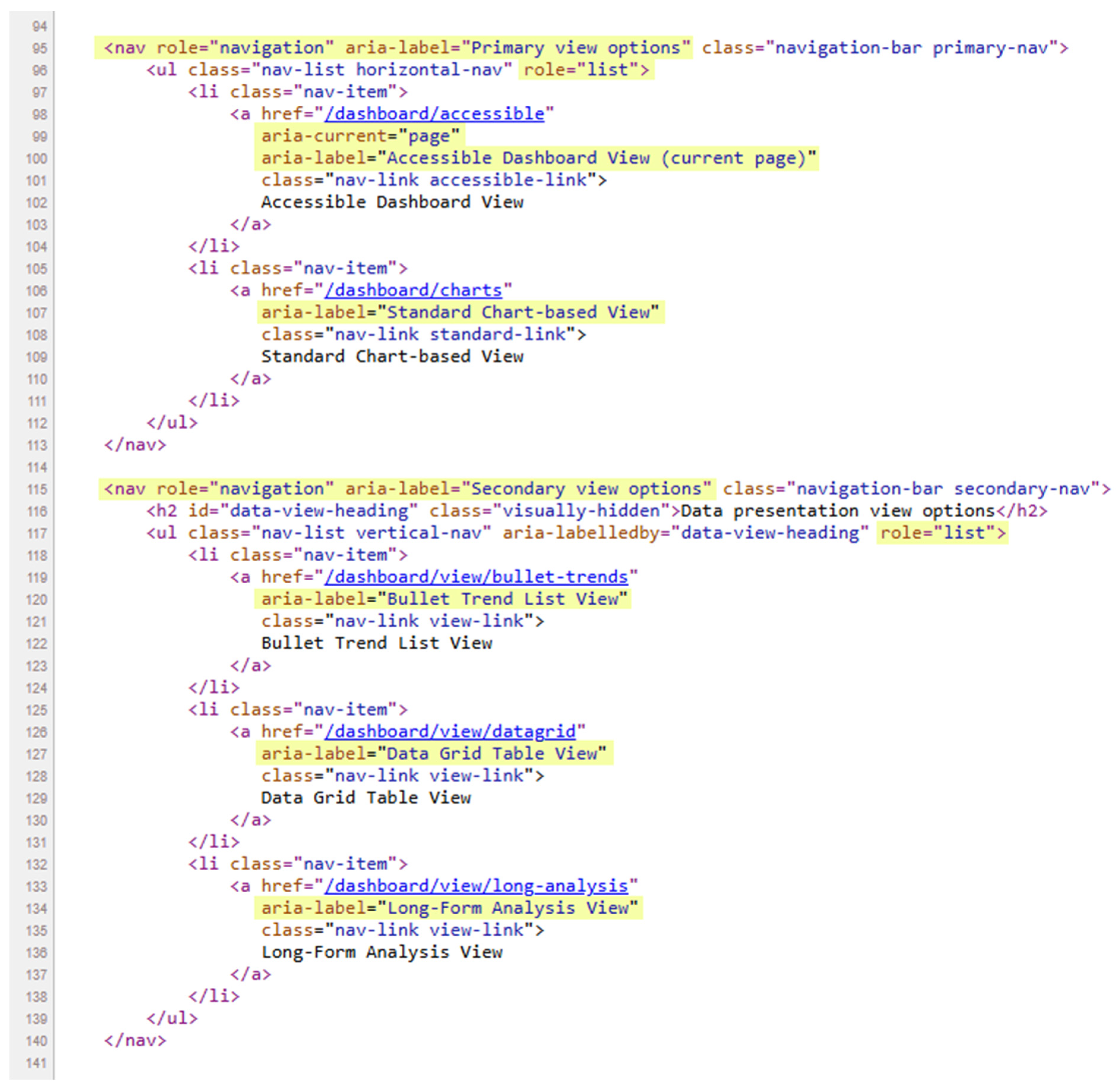
  • Accessibility-First Semantic Design: AccessiDashboard uses semantic HTML5 markup and WAI-ARIA (Web Accessibility Initiative—Accessible Rich Internet Applications) [13] attributes to ensure that screen readers can interpret the page structure and content intuitively. The front-end interface is organized with landmarks (e.g., <header>, <main>, <section> regions), headings, and labels for real-time sensor elements. This structure provides a meaningful reading order and enables efficient keyboard navigation for users who cannot rely on visual cues.
  • AI-Generated Long Descriptions: Moving beyond simple alt text, the system leverages an LLM to produce extended textual descriptions of charts and complex graphics. These long descriptions detail trends, anomalies, and key numerical insights that would otherwise be conveyed only visually. The AI-generated narratives serve as an alternative interface modality, catering to users who cannot interpret the visuals. Importantly, these descriptions are context-aware and can include relevant domain knowledge (e.g., noting that a temperature reading is within normal range for a given context).
  • Multi-Modal Data Representation: AccessiDashboard provides multiple synchronized representations of the sensor data. In addition to the conventional chart-based view, it offers a text-first interface comprising structured data tables, bullet-point summaries of sensor status, and AI-generated analytical paragraphs. Users can switch between these modes to suit their preferences or assistive technology needs. This multi-modal approach benefits not only blind users but also those who may prefer textual data (for example, users of screen magnifiers or braille displays, or situations where visual attention is limited).
  • Scalable Architecture with Ethical AI Integration: The platform’s back-end is built with the Laravel PHP framework [14] following an MVC (Model-View-Controller) [15] design, which allows clean separation of data, logic, and presentation. The system integrates with external IoT data sources through APIs (Application Programming Interfaces) [16] for device data ingestion, and uses a database to store sensor readings and corresponding AI-generated descriptions. A privacy-by-design [17] paradigm is adopted for the AI components: user data is handled in compliance with GDPR guidelines [18], with controls to prevent sensitive information from being sent to external AI services and logs to audit the AI’s outputs. The design also considers scalability (able to handle many sensors and frequent updates) and security (secure transmission of data and user authentication).
To validate our approach, we conducted an initial evaluation through manual testing and the use of automated tools to verify that the dashboard meets or exceeds WCAG 2.1 AA accessibility criteria [19]. We also compare AccessiDashboard qualitatively against conventional IoT dashboards to highlight improvements. The remainder of this paper is organized as follows: Section 2 reviews related work in accessible dashboards and AI-driven accessibility. Section 3 describes the system design and architecture of AccessiDashboard, including its core components and data flow. Section 4 details the implementation, demonstrating how the platform realizes accessible UI and AI-enhanced descriptions (with illustrative examples). Section 5 discusses the implications of our design, evaluation findings, and how AccessiDashboard fits into broader trends, as well as limitations. Finally, Section 6 concludes the paper and outlines directions for future work.

2. Related Work

2.1. Accessibility in IoT Dashboards

IoT dashboards typically rely on rich visualizations like line graphs, scatter plots, or heat maps to convey sensor readings and alerts in real time [20]. While these graphical representations are effective for sighted users, they can be nearly unusable for individuals with visual impairments if robust textual alternatives are not provided. The Web Content Accessibility Guidelines (WCAG) 2.1 [21] specify that images and charts should have meaningful alternative text so that users of assistive technologies can perceive the content. In practice, however, many IoT solutions ignore this guideline or implement it in a minimal way. It is not uncommon to find a complex chart with an alt attribute that says only, for example, “Line chart of sensor data”—a description too vague to support any interpretation or data analysis task by the user. Without more detailed context (such as what variables are plotted, what the trends are, and any noteworthy values), a blind user is effectively excluded from the information that the chart is meant to convey.
Some modern web dashboard frameworks and UI toolkits offer partial accessibility features. These may include keyboard navigation support, focus management, or high-contrast color schemes to assist low-vision users. While such features are helpful, they seldom address the core challenge of non-visual data representation. A screen reader can tab through a dashboard’s interactive elements or announce the presence of a chart, but unless the chart is accompanied by a textual description or an alternative format (like a data table), the user gains little insight. Prior studies on the accessibility of data visualizations during events like the COVID-19 pandemic have noted that, even when alt text or simple data tables are provided, they often lack the depth needed for thorough understanding [5].
Recognizing these gaps, researchers have started to explore ways to make dashboards more accessible. For example, Srinivasan et al. [22] developed Azimuth, a system that automatically generates screen-reader-friendly dashboards from existing visual dashboard specifications. Azimuth uses a combination of co-design with blind users and algorithmic generation of textual summaries for charts. In user studies, their generated dashboards—which included structured headings, concise summaries, and interactive filtering through text—enabled blind users to navigate and analyze data more effectively than standard dashboards. This and similar efforts underscore that making dashboards accessible is feasible and can greatly enhance the user experience for blind or low-vision users. However, most prior solutions either require authors to manually write long descriptions or focus on static datasets rather than live IoT data streams. AccessiDashboard builds on insights from these works, pushing further into real time, dynamic data accessibility with the help of AI-generated content.

2.2. AI in Accessibility and Multi-Modal Interfaces

Emerging research on AI-driven accessibility suggests that LLMs can play a key role in translating visual or numeric data into descriptive text. For instance, recent studies have shown that LLMs can automatically annotate images or textualize data patterns with remarkable depth [23]. In the context of educational technology, Murtaza et al. [24] demonstrated that AI systems can produce simplified, domain-appropriate explanations of complex learning materials, helping to make content more accessible to learners. Such capabilities are highly relevant to IoT dashboards: the complex sensor data might be analogous to complex educational content, where an LLM can generate explanations or summaries to aid understanding.
Another relevant thread of work is on multi-modal interfaces, where information is presented through multiple synchronized channels such as visual, auditory, and textual modalities. Multi-modal design has been found beneficial not only for users with disabilities but also for users operating in constrained environments, such as technicians listening to a dashboard readout while repairing a machine or users who cannot look at a screen [25]. Research in human–computer interaction has explored voice-interactive charts and haptic feedback as complements to visual data, expanding the ways users can experience and interact with information [26]. In the web and data visualization contexts, providing both graphical and textual forms of data, as well as enabling natural language querying of visualizations, has been shown to cater to different user preferences and needs, enhancing accessibility and usability [27].
Despite these advances, the synergy between real-time IoT data streams and AI-driven textual representation remains relatively unexplored. Most AI captioning and description systems are primarily designed to work with static images or pre-defined datasets, not with continuously updating sensor data that may change every few seconds [28]. This dynamic aspect introduces significant challenges for AI systems: descriptions must be updated or regenerated as new data arrives while maintaining coherence over time. Furthermore, traditional AI frameworks often lack native support for continuous data streams, as they are typically built for static, batch-processed datasets rather than live environments. There is a clear need for frameworks that can integrate live sensor data processing with intelligent, on-the-fly description generation.

2.3. Identified Research Gap

While there have been notable steps toward accessible data visualization and AI-assisted interfaces, we find that fully accessible IoT dashboards that integrate long-form AI-generated descriptions, real-time sensor updates, and strict compliance with accessibility standards (like WAI-ARIA) are still rare. Few existing solutions offer both a typical visual interface for sighted users and a thorough alternative textual interface that can keep pace with frequent data changes. Moreover, the ethical and privacy implications of using AI in such interfaces are seldom addressed, as most works focus on the technical feasibility of generating descriptions but not on issues like user consent, data protection, or potential biases in AI-generated content.
This lack of integration between accessibility, real-time data, and ethical AI points to a broader need for systems that are not only technically robust but also human-centered by design. As IoT ecosystems expand, users increasingly rely on timely, meaningful data—especially those with visual impairments who benefit from non-visual channels. However, designing systems that provide consistent, accessible, and context-aware descriptions in real-time poses unique challenges. These include maintaining responsiveness without overwhelming users, ensuring that AI-generated content is both accurate and explainable, and embedding accessibility as a core principle rather than an afterthought. Addressing these intersecting challenges requires rethinking both system architecture and content delivery strategies, paving the way for more inclusive and ethically grounded platforms.
AccessiDashboard differentiates itself by addressing these relatively underexplored areas. It offers a comprehensive platform that integrates best practices in web accessibility (such as proper semantics, ARIA roles, and keyboard navigation), real-time data processing for IoT streams, and AI-driven text generation for enhanced descriptive content. Additionally, it incorporates privacy-by-design measures for AI usage, acknowledging regulations such as the GDPR [29]. By bridging these aspects, AccessiDashboard serves as a comprehensive platform to investigate how AI and accessibility can jointly improve the usability of IoT dashboards for visually impaired users. In the following sections, we detail the design, implementation, and evaluation of this platform.

3. System Design and Architecture

3.1. System Overview

AccessiDashboard is designed as a web-based platform that can be deployed on a typical server or cloud environment to monitor IoT sensor data in real-time.
At a high level, the system comprises three layers: (1) IoT data sources (sensors and devices), (2) the server-side application (divided into four services: Data-Ingestion API, Storage, Business Logic, and the AI Description Generator), and (3) the client-side user interface (accessible dashboard frontend), as shown in Figure 1.
Sensors in the field (e.g., temperature sensors, air quality monitors, energy meters) transmit data at regular intervals. The data are sent in a structured format (such as JSON [30]) to the AccessiDashboard server via a RESTful API [31] endpoint. The server, implemented using Laravel, receives the data and forwards them to the back-end ingestion module (Although Laravel was selected for this implementation, other frameworks such as Django (Python) [32] could have been employed as well). In this module, the data is pre-processed and aggregated as needed (for example, smoothing a time series or combining readings from multiple sources). Each incoming sensor reading is saved into the database for persistence and analysis. The data model has a representation for sensors (with metadata like sensor type, units, location) and for sensor readings (timestamped values).
A key part of the server-side logic is the AI description generator. When significant new data are accumulated or when a user requests the accessible view of the dashboard, the system compiles a prompt and transmits it to an external LLM service, specifically utilizing the OpenAI API [33] in our implementation. The prompt includes a selection of recent data points, statistical highlights (min, max, average), and context (what the sensor measures, any normal ranges), and asks the LLM to produce a descriptive summary. The returned description is then stored in the database (in a LongDescription table linked to the sensor or visualization) and is made available to the front-end. Caching is used to avoid repetitive calls: if the data has not changed significantly since the last description, the previous description can be reused to avoid unnecessary AI requests.
On the client side, the AccessiDashboard front-end is implemented as a single-page web interface that can render in two primary modes: a standard visual dashboard and an accessible textual dashboard. The user can toggle between these modes using a switch in the interface (or a preference can be saved for default). Both modes draw from the same underlying data via the back-end API but present it differently. The standard view shows interactive charts (using a charting library) and minimal textual info, whereas the accessible view emphasizes text and semantic markup.
Crucially, the front-end is built with web accessibility best practices in mind. All interactive components (buttons, dropdowns, panels) have proper ARIA labels or roles, focus order is managed logically, and content is organized under headings and regions for screen reader navigation. The interface is responsive and tested to work with screen readers like NVDA [34] and VoiceOver [35].
Overall, the system architecture allows multiple clients to monitor the same data simultaneously, each choosing a preferred mode of presentation. The use of a robust back-end framework (Laravel) ensures that the solution can be extended or integrated with existing IoT infrastructures (for example, adding authentication for different user roles, or connecting to IoT message queues). The modular nature of the description generation (encapsulated in one service) means the AI component could be improved or replaced without affecting the rest of the system. Scalability considerations, such as deploying the application in a load-balanced setup and using caching layers (Redis [36] for session or description caching) and optimizing database indices, have been incorporated to handle potentially high-frequency data streams.

3.2. Core Components

3.2.1. Semantic HTML5 and WAI-ARIA Front-End

The AccessiDashboard front-end is developed with semantic HTML5 markup to maximize native accessibility. Instead of relying on generic <div> elements for layout, it uses appropriate elements such as <header>, <nav>, <main>, <section>, and <footer> to define the page structure. For example, the main content region containing the sensor data visualizations is within a <main role=“main”> container, and each distinct panel of information (each sensor or each data widget) is enclosed in a <section> or <article> element with an appropriate heading.
Data tables (when used to display numeric readings) are marked up with <table> along with <thead> and <tbody> to separate headers and data rows, and <th scope=“col”> or <th scope=“row”> to properly associate headers with cells. This ensures that screen reader software can read out the row and column headers when a cell is focused, conveying the context of each data point. Additional ARIA attributes like aria-labelledby or aria-describedby link the chart to more detailed descriptions.
Each sensor “widget” on the dashboard is identified with a heading (e.g., an <h2> with the sensor name or type) and contained in a region with an ARIA label. For instance, a section for temperature data is coded as <section role=“region” aria-label=“Temperature Sensor Data”> wrapping the temperature chart or text. This way, screen reader users can quickly navigate by regions and find the section they are interested in. Interactive controls, such as buttons or selectors for changing views, include aria-label or visible labels. If a button’s purpose is not clear from text alone, an aria-label is added (e.g., the button that switches to the accessible view has aria-label=“Switch to accessible dashboard view”).
Frequent data updates are handled carefully to not disrupt screen reader users. Because the HTML structure remains consistent (only values or textual descriptions are updated within existing elements), a screen reader can maintain its place. Where dynamic updates occur (like a live-updating status), ARIA live region roles (e.g., role = “status”) are used so the screen reader announces changes without losing focus. The site avoids auto-focusing or DOM (Document Object Model) [37] reordering during updates, which could disorient users relying on assistive tech.
Overall, by using semantic elements and ARIA roles, the dashboard makes the implicit structure explicit. This approach lays the groundwork such that, even if the AI description features were not present, the dashboard would already meet a high standard of accessibility compliance, enabling straightforward navigation and content recognition via screen readers.

3.2.2. Laravel Back-End (MVC Architecture)

The back end of AccessiDashboard is implemented in Laravel (PHP), following a traditional Model-View-Controller pattern. This separation of concerns allows the system to manage data and business logic independently from presentation, which is important for serving different front-end modalities (standard vs. accessible views).
Key data models include, for example:
  • Sensor—representing an IoT sensor or data source. A Sensor record holds metadata such as a unique ID, a human-readable name or label, the type of measurement (e.g., temperature, humidity, air quality index, etc.).
  • SensorReading—representing a single data point from a sensor. Each reading has a timestamp, a value (or multiple values if the sensor outputs a complex object), and a foreign key linking it to a Sensor. This model might also include derived fields (like whether this reading triggered an alert, or a categorization of the value such as “moderate” or “high”).
  • LongDescription—representing an AI-generated descriptive text for a visual element or set of readings. It stores the text of the description, the time it was generated, the context (which sensor it corresponds to), and metadata like which model generated it or who (if an admin edited it).
Controllers in Laravel handle requests from the client side. For instance, a “DashboardController” has methods to handle loading the main dashboard page, which pulls recent “SensorReading” data for each sensor and passes it to the view. The view is a Blade template [38] that loops through sensors and displays each either as a chart or text depending on the mode. We implemented two sets of Blade templates: one for the visual layout (with charts and minimal text, arranged in a grid layout), and one for the accessible layout (with extensive text, data tables, and so on). The appropriate view is rendered based on the user’s selection or a query parameter. The back end also integrates with external services. The most notable is the AI service for generating descriptions (discussed in the next subsection).
Another aspect is user management and security. Although our demonstrator is focused on the accessibility feature, it also includes user accounts, login sessions, and role-based access control (administrators have the rights to configure and test sensors, while other users are limited to viewing them). Laravel provides middleware for authentication which we utilize. All communication is over HTTPS [39] to secure data in transit. In cases where IoT data might be sensitive (e.g., health data), we ensure that personal identifiers are not included with sensor data, or we provide anonymization if needed.
Overall, the Laravel back-end provides a robust foundation to support the accessible front-end. It manages real-time data updates, orchestrates AI calls, and ensures that content delivered to the user is appropriate for their chosen mode while enforcing data privacy and security standards.

3.2.3. AI Integration for Generating Long Descriptions

A core innovation of AccessiDashboard is the automated generation of long descriptions for charts and complex data using an LLM. The integration is designed to produce useful descriptions without human intervention, though with the option for human review.
The process of generating a description is as follows:
  • Data and Context Gathering: When a new sensor visualization is created or updated, the system compiles the relevant data points. This includes recent readings (e.g., the last N data points or last T minutes of data), summary statistics (min, max, average, current value), and contextual metadata (sensor name, units, any threshold definitions such as what constitutes “high” or “low”). If a short caption or alt text exists, that might be included to guide the AI.
  • Prompt Construction: The system constructs a prompt to send to the LLM. The prompt is written in natural language, instructing the model to act as an explainer. For example: “The following are recent readings from a sensor measuring temperature (in °C). Provide a detailed yet concise description of the trend and any significant changes. Data: 14:00—22.5 °C, 14:10—23.0 °C, 14:20—24.5 °C, 14:30—26.0 °C, 14:40—25.5 °C. The sensor is indoors; normal range is 20–25 °C.”. This prompt encourages the AI to note the trend (rising then slightly falling temperature), relate to normal range, etc.
  • AI Generation: The LLM processes the prompt and returns a generated description. The output is expected to be a structured text—typically a few sentences or a short paragraph. We encourage the model to mention the overall trend (e.g., increasing, decreasing, stable), highlight any anomalies or out-of-range values, and possibly contextualize what those values mean (if it has the info, like “this is within normal range” or “this is unusually high”).
  • Post-processing and Storage: The returned text is checked (basic validations like ensuring it is not empty and does not contain obviously wrong units, etc.). Then, it is stored in the LongDescription model associated with that sensor. If the AI output contains any phrasing that might be misleading or require tweaking (perhaps the AI used an uncommon term for something), an administrator interface allows for editing the description before it is shown to end-users. In the current demonstrator, we log the AI’s raw output for auditing but display it directly to the user if no human edits are made.
By generating multi-sentence narratives, these long descriptions give visually impaired users a much richer understanding of the data. For example, instead of just knowing a chart’s title and current value, the user might hear: “The temperature increased from 22 °C to 28 °C between 9:00 and 12:00, then dropped back to 22 °C by 15:00, indicating a midday peak. This pattern is typical for the day’s weather. A brief spike around 13:00 reached 28 °C, which is slightly above the usual range, possibly due to direct sunlight.” Such a description conveys the shape of the data (increase then decrease), specific key values, and context about normalcy. It may even offer a hypothesis (like the sunlight) which, while not certain, gives additional insight.
Figure 2 shows the pseudocode that describes how AccessiDashboard automatically generates narrative descriptions from incoming sensor data. When new readings arrive, the system compiles relevant statistics and contextual metadata, then formulates a structured prompt for the OpenAI model. The AI returns a textual description summarizing trends, anomalies, and expected values. The output is then validated—checking for completeness and correct units—before being saved to the database and optionally flagged for human review. This integration enables near real-time, human-readable summaries of IoT data without manual authoring, supporting accessibility by transforming visual sensor trends into descriptive language.
It is important to note that the AI is used as an assistant. We mitigate risks of erroneous information by carefully crafting prompts and limiting the scope: the model is asked to focus on the given data and not introduce external facts unless relevant. Additionally, by keeping the human-in-the-loop option (admins can review outputs), the system can ensure accuracy for mission-critical deployments.
Each new data source is initially reviewed by a designated administrator, who compares the system-generated narrative with the corresponding live data visualization. If factual accuracy remains within an acceptable threshold, the source is considered verified and subsequently monitored through periodic spot-checks. Discrepancies, such as factual inaccuracies, omitted anomalies, or unit mismatches, are documented and categorized. This lightweight validation process provides an early assessment of practical reliability and will be replicated with independent reviewers during the full user study.

3.2.4. Multi-Modal Data Representation

AccessiDashboard’s user interface supports multiple modes of data representation to accommodate different user needs and preferences, all within the same platform.
The main modes include:
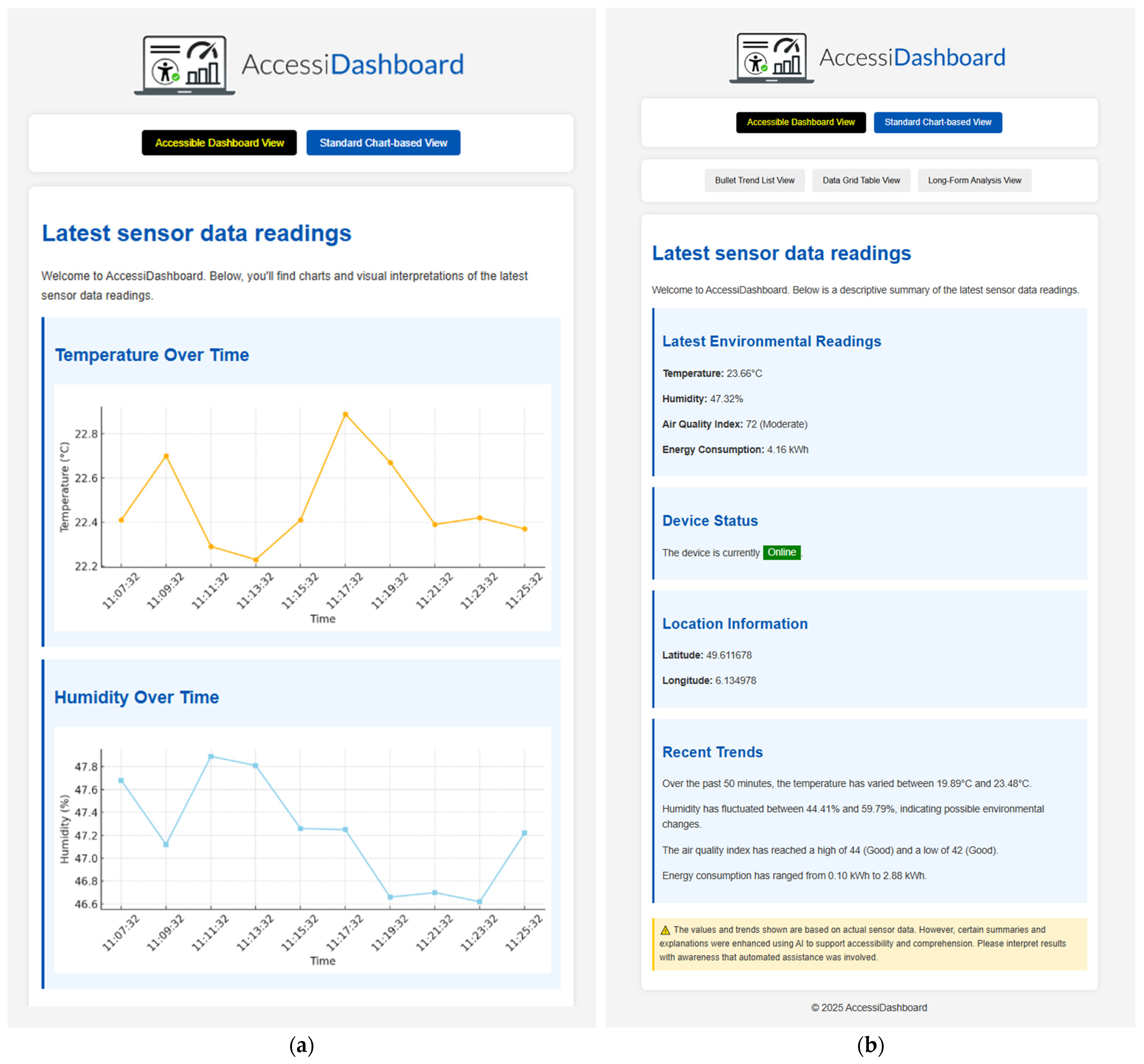
  • Visual Chart Mode: The traditional dashboard view with charts, graphs, and minimal text. This mode is similar to conventional dashboards and is primarily intended for sighted users or those who prefer graphical representation. Each chart includes alt text and a caption, but the interface assumes the user can perceive the visual elements. This is the only mode that does not rely on AI generation.
  • Bullet Trend List Mode: In this AI-generated textual mode, the latest sensor readings or summarized trends are presented as bullet points. For example, instead of a graph showing the last 10 readings, the dashboard might display a list of items such as: “Temperature: 22.4 °C—moderate level detected; Humidity: 48.1%—comfortable range; Air Quality Index: 94—moderate air quality.” Each bullet provides a concise, plain-language summary of a parameter. This format is accessible for screen reader users and presents clearly separated data points in a linear sequence, enabling efficient comprehension.
  • Data Grid Table Mode: Also AI-generated, this mode presents data in a tabular format similar to a spreadsheet. It may list the last N readings for each sensor in a table with columns like Timestamp, Temperature, Humidity, etc. This structured layout enables users to navigate cell by cell and compare values across time or across sensors. It leverages semantic HTML table markup, ensuring relationships between headers and data remain accessible and clear to assistive technologies.
  • Detailed Analysis Mode: This mode provides a narrative, paragraph-based summary where the AI generates long-form textual descriptions of data trends and contextual insights. Instead of displaying raw values, the user receives a coherent and context-rich interpretation of the data—similar to an automated report or commentary powered by a large language model.
All these modes are kept in sync with the underlying data. If a new sensor value arrives, the visual chart updates, the bullet list updates, the table updates, and even the narrative could be refreshed if needed. The user can switch between modes using a simple control in the UI (a dropdown or set of buttons to select the view type).
Providing multiple modes addresses different cognitive styles [40] and situations. A blind user might primarily use the bullet or analysis modes, but a low-vision user might still glance at charts while also having the bullet list available for exact numbers. A sighted user might generally use the visual mode but occasionally read the detailed analysis for insights that might not be immediately obvious from the raw graph.
By designing these modes within one system, we also ensure that adding a new sensor or data source automatically makes that data available in all formats. There is no separate maintenance for an “accessible version” versus the “regular version”—they are one unified system, just different views. This is a key aspect of inclusive design: one platform that adapts to the user, rather than parallel platforms.

3.2.5. Security and Privacy Considerations

Because AccessiDashboard could deal with data that might be sensitive (especially in domains like healthcare [41] or smart home IoT [42]) and integrates with external AI services, security and privacy are paramount in the system design.
On the security side, user authentication and role-based access control [43] are implemented via Laravel’s built-in mechanisms. All user interactions with the dashboard (beyond public data viewing, if any) require a login. Sessions are managed securely, and we use Laravel’s CSRF [44] protection for forms and state-changing requests to prevent cross-site request forgery. All communications are over SSL/TLS [45] to prevent eavesdropping on the data streams. We also log access to data such that any unauthorized access attempts can be detected.
For privacy, particularly with respect to the AI integration, we follow a “privacy by design” approach. When the system sends data to the LLM service to generate a description, we ensure that no personally identifiable information (PII) [46] is included in the prompt. Since most sensor data are numeric and generic, this mainly involves stripping out or abstracting any labels that might contain names or specific locations. We also include in the user agreement or system documentation what kind of data might be sent to third-party AI services, to be transparent.
Moreover, AccessiDashboard provides an audit log for AI usage. Every time a prompt is sent and a response received, it can be recorded (and shown to an admin if needed) to track what the AI was asked and what it replied. This is important for trust and verification. If an AI-generated description ever provided an incorrect or inappropriate statement, the maintainers can review the log and adjust the system (either by refining the prompt or correcting the output manually, and in some cases reporting issues to the AI service if needed).
In compliance with regulations like GDPR, users have control over their data. In a scenario where users might input personal data (not the case for simple sensor dashboards, but if it extended to user-generated content), the system would allow them to delete or export their data. The AI-generated content, being derived from sensor data, is treated as part of the user’s data stream and thus accorded the same protections.
AccessiDashboard applies the key principles of the GDPR throughout its life-cycle, adopting “privacy-by-design” controls at both the software-architecture and organizational levels. Below, we summarize how each relevant principle is operationalized:
  • Lawfulness, Fairness, and Consent: Before using sensor data, organizations agree to a data-processing policy based on legitimate interest. If personal metadata is included (e.g., names in alerts), explicit opt-in is required. Users are clearly informed about what data is shared and why, supporting transparency.
  • Purpose Limitation and Data Minimization: Only essential fields, like timestamp, sensor ID, and readings, are used for AI processing. Any labels that could reveal identity or location are removed or generalized before being sent.
  • Anonymization and Pseudonymization: Identifiers are securely hashed, data is encrypted at rest, and AI-generated outputs are linked to anonymized keys for added protection.
  • Storage Limitation and Security: Sensor data is stored for up to 30 days, and AI outputs for up to 90 days before anonymization. All communications are encrypted, and access is logged to ensure accountability.
  • User Rights and Data Control: A “My Data” section allows users to view, export, or delete their data at any time, with deletions applied to both original records and related AI outputs.
  • Model Flexibility and Data Sovereignty: The system can switch between cloud-based and self-hosted AI models, allowing organizations to keep data processing within their jurisdiction.
The system strives to be not only accessible and intelligent but also secure and respectful of user privacy. These considerations ensure that an inclusive solution like AccessiDashboard can be adopted in practice within organizations that have strict IT and data governance policies.

4. Implementation Details

To demonstrate the practical viability of AccessiDashboard, we developed a functional prototype that realizes the design principles described above. This section describes some key implementation aspects, including how the user interface toggles between modes, how charts and data are annotated with text, and how the integration with an AI API is accomplished. We include illustrative examples from the prototype’s code and interface.
Figure 3 shows a simplified snippet of the HTML structure used in the dashboard. In this navigation section, two links are provided: one for the “Accessible Dashboard View” and one for the “Standard Chart-based View”. The code uses a <nav role=“navigation” aria-label=“Primary view options”> to group these controls, and applies the aria-current=“page” attribute to the active link to indicate which view is currently selected. This allows screen readers to announce the context (that these are view options) and clearly identify the active view, supporting user orientation.
A secondary navigation section presents a clear, vertical list of links, each directing the user to a specific data presentation format—“Bullet Trend List View”, “Data Grid Table View”, and “Long-Form Analysis View”. These links are enhanced with descriptive aria-label attributes to ensure their purpose is immediately clear to screen reader users. The entire list is semantically grouped under a visually hidden heading, referenced by aria-labelledby, which provides screen reader users with meaningful context. This approach improves accessibility by using standard HTML elements in a way that supports both keyboard navigation and assistive technologies, without relying on JavaScript or complex interactive widgets.
On the server side, each view (bullet list, data grid, analysis) is a separate route that returns the appropriate Blade template. For example, selecting “Data Grid View” might navigate to accessible-view-with-datagrid.blade.php which renders the table of recent readings. Laravel’s controller will supply that view with the data (e.g., the latest 10 readings from each sensor). In the accessible summary view (the default accessible view), the template shows the most current readings and some summary text.
To illustrate the interface outcomes, we include several screenshots of the prototype.
Figure 4a displays the standard chart-based IoT dashboard with two line charts on a light background, along with a header containing the AccessiDashboard logo and toggle buttons.
Figure 4b shows the accessible dashboard view (summary mode). Here, instead of graphs, the interface presents information in textual panels. The “Latest Environmental Readings” section lists the current values of multiple sensors in a bullet-style list (for example, Temperature: 23.66 °C, Humidity: 47.32%, Air Quality Index (AQI) [47]: 72 (Moderate), Energy Consumption: 4.16 kWh). These values are accompanied by simple descriptors (like “Moderate” for the AQI category). Below that, a “Device Status” section indicates whether the sensor device is Online or Offline, and a “Location Information” section provides coordinates (if relevant). Finally, a “Recent Trends” section contains a sentence or two summarizing what happened recently (e.g., “Over the past 50 min, the temperature varied between 19.89 °C and 23.48 °C. Humidity fluctuated between 44.1% and 59.79%, indicating possible environmental changes.”). This summary is generated by analyzing the recent data and could be further enhanced by AI. In this view, everything is designed to be easily read by a screen reader in a logical order. A user can arrow through the text or jump by headings to each section.
Importantly, as shown at the bottom of the figure, the dashboard includes a clear notice informing users that “The values and trends shown are based on actual sensor data. However, certain summaries and explanations were enhanced using AI to support accessibility and comprehension. Please interpret results with awareness that automated assistance was involved.” This message is essential to ensure transparency and to remind users to be mindful of potential AI-generated biases or misinterpretations.
Additionally, the figure clearly demonstrates the use of inclusive design principles to enhance accessibility for a broad range of users, including individuals who are blind, partially sighted, or elderly. The interface features generous margins and padding to reduce visual clutter and improve readability. High color contrast between text and background—such as dark blue headers on a light background, and a bright green status label on a pale blue card—ensures that content remains legible even for users with visual impairments or color blindness. Font sizes are sufficiently large and consistent, and the layout follows a clear vertical hierarchy that supports linear screen reader navigation. Buttons are visually distinct and adequately spaced, making them easy to activate with assistive technologies or by users with motor limitations. These visual and structural choices reflect a commitment to accessibility and universal design, ensuring that the dashboard remains usable and comprehensible for all users, regardless of ability.
Within the accessible view, the user can further choose how to dive into the data. The summary gives an overview, but more detailed modes are available via the secondary navigation.
Figure 5a shows the Bullet Trend List View. In this view, the latest 10 sensor readings (or a certain timeframe) are displayed as a series of “Trend Summary” blocks, each timestamped. Under each timestamp, key sensor metrics are listed as bullets with a brief interpretation. For example, the first entry read as follows:
  • Temperature: 22.41 °C—Moderate level detected.
  • Humidity: 52.68%—Comfortable environment.
  • Air Quality Index: 90—Moderate air quality.
  • Energy Consumption: 1.18 kWh—Normal usage.
  • Device Status: Idle.
The use of plain-language phrases (“Moderate level detected”, “Comfortable environment”, etc.) comes from simple rules or AI assistance that categorize raw values. This view allows users to scroll through a textual history of the data. It is especially useful for screen reader users because it breaks down the data into bite-sized, timestamped chunks that can be read line by line. In implementation, this page is generated by querying the last 10 readings from each sensor and pairing each reading with a phrase.
In developing the Bullet Trend List View, special attention was paid to creating a semantically structured layout that works seamlessly with assistive technologies such as screen readers. Each “Trend Summary” block is wrapped in accessible HTML5 “<section>” elements with proper “aria-labelledby” references to ensure clear navigation landmarks. This design enables users to jump from one timestamped entry to another without losing contextual meaning, enhancing the experience for users with visual impairments who rely on quick and logical content segmentation.
To address performance and scalability, especially in deployments involving multiple sensors or frequent updates, the system was designed to leverage modular components and microservices principles. The AI description engine functions independently and fetches raw sensor data via RESTful APIs. This decoupled design means that enhancements to AI processing or front-end display logic can occur without disrupting the rest of the system, supporting scalability and long-term extensibility. Caching strategies and database indexing were applied to ensure that, even as data volumes increase, the rendering of the last 10 entries remains performant and responsive across devices.
We also append a note at the bottom (as seen in the screenshot) clarifying that these bullet points are generated from real data and that AI was used to improve readability, cautioning that, while accuracy is aimed for, the AI-generated descriptions may simplify or slightly interpret the data.
Figure 5b presents the Data Grid View. Here, the interface is a table titled “Sensor Data Grid (Latest 10 Readings)”. Each row is a timestamp (e.g., “2025-04-26 09:25:36”) followed by the readings at that time for temperature, humidity, AQI, energy, status, and location coordinates.
In constructing the Data Grid View, we followed web accessibility best practices by employing semantic HTML elements (<table>, <thead>, <tbody>, <th>, and <td>) and incorporating ARIA roles where necessary. Column headers are linked with their respective data cells using scope attributes and accessible labels to ensure coherence when the table is navigated with assistive tools. This design enables users to either explore the data row by row or use screen reader shortcuts to scan vertically through a particular metric, such as air quality trends over time.
We took care to ensure this table is scrollable on smaller screens and is marked up accessibly (with <th> for each column like “Temperature (°C)”, etc.). For a screen reader, reading this table cell by cell is possible, or the user can use table navigation commands to move vertically down a column (to hear all temperature values, for instance). The inclusion of latitude and longitude in this example is for completeness; not all use cases would include location per reading, but we show it to demonstrate multi-dimensional data. A warning note below the table informs that the data is directly from sensors and that, while formatting was performed for accessibility, automated tools might affect ordering or emphasis (this is to hint that, for example, sorting might not be applied or that the display is static for now).
Given the increased volume and density of information in this view, we optimized for both responsiveness and legibility. The table structure supports horizontal scrolling for smaller viewports, maintaining accessibility without requiring horizontal zoom or loss of readability. The Data Grid view implementation involved formatting data values consistently (e.g., to two decimal places for temperature) and possibly highlighting out-of-range values. In our prototype, we kept it simple, but one could imagine adding CSS classes to cells that are unusually high or low and then using ARIA annotations to indicate an “alert” on those cells.
To support scalability, the Data Grid module operates independently of the visualization logic and connects to a microservice responsible for aggregating and delivering structured datasets. This separation of concerns makes it easy to plug in alternate data sources or scale to larger grids for enterprise scenarios without altering the core user interface. Future iterations could include contextual tooltips, conditional ARIA alerts on threshold violations, or dynamic column hiding to personalize the view further—all of which are facilitated by the modular backend and standards-compliant frontend design.
Figure 6 illustrates the Detailed Analysis View. This is where the full power of the AI-generated long descriptions is utilized. Each entry corresponds to an analysis at a certain timestamp (or for a certain period). The screenshot shows two analysis blocks for two recent timestamps. In the first block, for example, the narrative might read: “At 2025-04-26 09:25:06, the environment recorded a moderate temperature of 23.66 °C, combined with moderate humidity at 47.32%. These conditions may suggest a transition in weather patterns or indoor ventilation states depending on context. The air quality was evaluated at an AQI of 72, which falls under the category ‘Moderate’. This suggests that the air was suitable for all populations at the time. Energy consumption was recorded at 4.16 kWh, indicating notably high energy consumption. The device status was reported as ‘Online’, meaning the sensor unit was operational and able to record environmental data. Overall, the data presents stable environmental conditions. Continuous monitoring is advised to assess trends and detect significant anomalies that might affect human comfort or energy efficiency”.
This kind of rich description is generated by the LLM based on the data. It identifies that temperature and humidity are “moderate”, the Air Quality Index is moderate (with a suggestion it is generally acceptable), the energy consumption is high (compared to some baseline, perhaps an average usage), and notes the device was online. It then gives an overall statement. The goal is to mimic what an expert analyst might say when looking at those readings.
Implementing this involved calling the OpenAI API. For the prototype, we manually triggered the generation for demonstration, but it could be automated to update, say, every hour or whenever a significant change is detected. To maintain system continuity in the event of AI service unavailability or failure, a fallback mechanism has been implemented. In such cases, the dashboard responds with alternative outputs, such as informative messages or simplified, rule-based descriptions. The fallback model is intentionally limited in functionality: rather than generating full responses, it informs the user that the request could not be processed and prompts them to try again.
The language generation component is deployed as a microservice with a RESTful API, accepting and returning JSON. While a commercial LLM currently serves as the default backend, the architecture includes an abstraction layer that supports interchangeable models, including self-hosted open source alternatives compatible with the OpenAI API standard. A monitoring process can be configured to perform regular health checks on the primary model. If multiple consecutive failures are detected, the system (1) switches to the fallback model and (2) alerts the system administrator.
This layered design improves system robustness and helps ensure a consistent user experience, particularly in real-world scenarios where service interruptions may occur.
One challenge we considered is the potential verbosity of AI-generated descriptions, as noted in prior work [48]. While detailed narratives can be valuable, excessive information may overwhelm users or obscure key insights. To mitigate this, the prompt design was carefully tuned to prioritize conciseness and relevance, ensuring the generated content remains informative without becoming unnecessarily long. This was achieved through prompt engineering techniques that emphasize summary-level insights, reduce redundancy, and filter out less critical details, helping to maintain clarity and focus on the generated output. For example, rather than repeating full sensor values with detailed qualifiers in every paragraph, prompts were optimized to group-related observations (e.g., temperature, humidity, and air quality) into concise summaries while omitting unnecessary restatements—particularly when readings remain stable across time steps. In future iterations, an interactive analysis view could allow users to explore the data more deeply by posing follow-up questions to the AI, similar to research prototypes that support conversational interaction with charts. For the current version, however, the system provides static but content-rich descriptions designed to strike a balance between detail and clarity.
To ensure the long-term scalability and extensibility of the platform, the system architecture was designed following modern software engineering principles, particularly emphasizing modularity and separation of concerns. The backend adopts the Laravel Model-View-Controller framework, which encourages clean code organization and facilitates future enhancements with minimal impact on existing components.
In addition to MVC best practices, the system leverages a microservices-inspired structure that separates key functions—such as sensor data ingestion, AI-based description generation, and user management—into loosely coupled modules. This allows each component to be developed, deployed, and scaled independently, avoiding the limitations of a traditional monolithic design. For example, the AI microservice can be hosted separately and scaled according to the computational demand without affecting the core platform’s stability.
This architectural approach enhances both maintainability and performance under increasing load, enabling the platform to serve diverse user needs in real time. Although formal load testing and performance benchmarks are planned as part of future validation efforts, the use of stateless controllers, Redis-based caching, and asynchronous task queues lays a strong foundation for high-concurrency operation and horizontal scaling.
Finally, from a development standpoint, ensuring all these views remained consistent was a matter of careful templating. We reused components as much as possible. For example, the heading and navigation bars remain the same across modes (so users do not get a completely different page when switching, avoiding confusion). We leveraged Laravel’s Blade includes to keep the code DRY (Don’t Repeat Yourself) [49]. Styling was unified through a shared CSS file, providing a clean and accessible layout across views, characterized by appropriate spacing, readable font sizes, high-contrast color schemes (e.g., dark text on a light background), and clearly defined section separators. To ensure responsiveness and compatibility with smartphones and other mobile devices, we utilized custom CSS media queries. Although this approach was tailored to the project’s needs, a responsive framework such as Bootstrap [50] could have been employed as an alternative.
AccessiDashboard incorporates an administrator workflow and accessibility validation strategy that enables administrative users—responsible for connecting new IoT sensors and configuring dashboard views—to maintain accessibility compliance without requiring specialized expertise. The system’s accessible foundation, including semantic HTML5, ARIA roles, and appropriate structural markup, is automatically integrated into all newly added sensor widgets. Moreover, when AI-generated views are introduced, administrators serve as a critical human-in-the-loop component, testing not only the accessibility of the content but also verifying it for potential biases or inappropriate outputs. These administrators are not required to be accessibility experts; rather, they are supported by a lightweight validation workflow that includes the use of tools such as the WAVE Accessibility Evaluation Tool [51] (browser plugin). A simple scan with WAVE can reveal missing labels, incorrect heading hierarchies, or color contrast issues, enabling timely correction, as shown in Figure 7.
To further support accessibility, the layout of each dashboard page, developed with embedded ARIA and semantic accessibility features, is transmitted to the AI model as a structural blueprint. This blueprint guides the AI in generating content that adheres to the predefined accessible layout, resulting in pages that are both semantically correct and fully accessible when rendered in the browser. This approach not only reduces the risk of non-compliant output but also ensures consistency and usability across both human- and AI-generated content.
In summary, the implementation shows that an IoT dashboard can be made accessible without sacrificing functionality. By toggling content and using AI to supplement data visualization with data narration, AccessiDashboard provides a versatile interface.
Below is a detailed comparison of AccessiDashboard, Azimuth, and Grafana [52], focusing on key accessibility features for IoT dashboards. Table 1 illustrates how the proposed solution, AccessiDashboard, improves upon conventional systems in several critical areas, including support for real-time accessible data, AI-generated descriptions, WCAG compliance, multimodal output, and human-in-the-loop validation. Unlike traditional dashboards, AccessiDashboard offers comprehensive text descriptions and adheres to accessible design paradigms. Its integration of AI-generated content is a novel feature that enables timely, detailed descriptions without requiring constant manual input. This comparative overview highlights AccessiDashboard’s potential to serve as a more inclusive and effective tool for IoT data monitoring.
To complement expert analysis, we are planning a mixed-methods usability study involving participants who are blind or have low vision, recruited through local disability organizations. Participants will complete a set of goal-oriented tasks (e.g., identifying environmental trends) using screen-reader software. Key metrics, such as task completion time, success rate, error frequency, and perceived cognitive load will be recorded by the system and validated through session recordings.
The evaluation will include several key usability and comprehension indicators: (i) task success rate (percentage of tasks completed independently), (ii) average time to complete tasks, (iii) error rate (distinguishing between critical and non-critical issues, based on established usability frameworks), and (iv) comprehension score, assessed through brief scenario-based quizzes. Preliminary success thresholds are defined as at least 90% task completion and no more than 15% critical errors. These metrics align with those commonly used in prior accessibility studies, supporting meaningful comparison with existing research.

5. Discussion

Following the implementation of AccessiDashboard, we reflected on its effectiveness, the value of AI-generated descriptions, and the practical implications of deploying an inclusive IoT dashboard at scale. Our contribution advances the state of the art by introducing a dedicated, accessibility-first platform—AccessiDashboard—purpose-built to support real-time, inclusive IoT data exploration. In contrast to existing solutions such as Azimuth, which generates rule-based textual summaries from static dashboard specifications, and Grafana, which requires manual effort to meet even basic accessibility standards, AccessiDashboard integrates accessibility as a core design principle rather than a supplemental feature. It dynamically connects each live sensor feed to a Large Language Model (LLM), producing WCAG-compliant, context-aware textual narratives that evolve with the data in real time. Crucially, a human-in-the-loop validation mechanism enables administrators to review and refine AI-generated outputs, ensuring both reliability and editorial oversight. This architecture—combining automation with ethical safeguards—streamlines inclusive design workflows and reduces the maintenance burden typically associated with accessibility. The result is a scalable and sustainable dashboarding solution that delivers timely, rich insights to blind or visually impaired users, fully aligned with the experience provided to sighted users.
While AccessiDashboard leverages AI to enhance the accessibility of environmental and device data, especially for users with visual impairments, we acknowledge the potential risks associated with automated outputs. In particular, AI-generated textual summaries—though designed to be informative and screen-reader friendly—may introduce bias, overgeneralizations, or contextual inaccuracies that could have consequences in high-stakes environments.
To address these concerns, the platform includes several built-in safeguards. First, all AI-generated interpretations are accompanied by explicit disclaimers that inform users of the automated nature of the content. For instance, a visual and screen-reader-accessible prompt states: “The detailed environmental analyses below are based on real IoT sensor inputs. The text descriptions were automatically generated by AI to enhance clarity and accessibility. These interpretations are meant to assist human understanding, but they may not capture all scientific nuances and should not replace expert judgment.” This ensures transparency and helps users interpret AI-enhanced content as assistive rather than definitive.
Additionally, AccessiDashboard employs prompt-engineering strategies to limit the scope of AI outputs. Descriptions are generated based strictly on bounded, factual sensor data—such as temperature, humidity, AQI, or energy use—without speculative forecasting or diagnostic assertions. This constraint reduces the risk of erroneous interpretations while preserving the utility of the generated narratives.
Where data sensitivity is higher (e.g., smart healthcare or safety-critical monitoring), a human-in-the-loop model is recommended. This allows organizations to preview and validate AI-generated content before display. Furthermore, fallback mechanisms are implemented to either suppress uncertain outputs or revert to structured templates when necessary.
Overall, we position the AI-enhanced layer of AccessiDashboard as a supportive tool in the broader accessibility pipeline—not a replacement for expert interpretation or critical alerts. Its aim is to reduce informational barriers for users with visual or cognitive impairments, but with careful design, transparency, and ethical safeguards in place. Future research should continue to refine these methods and explore how trust, explainability, and inclusivity can be balanced in adaptive, intelligent systems.
A preliminary audit of AccessiDashboard combined expert screen-reader walkthroughs with automated tools such as Lighthouse [55] and WAVE, confirming that the current prototype satisfies WCAG 2.1 AA criteria. Key accessibility features were validated, including logically ordered headings, semantically meaningful landmarks, and full keyboard navigability. Despite these encouraging results, the current evaluation has limitations. The initial testing relied on a small sample of accessibility experts and focused predominantly on English-language screen reader environments. Broader linguistic and cultural accessibility aspects remain to be explored.
Automated accessibility tools were valuable in detecting structural issues such as contrast errors or ARIA misconfigurations, and they helped guide iterative improvements. However, we agree with the common observation that such tools—though useful—are not substitutes for direct feedback from users with disabilities. They cannot assess contextual comprehension, navigational intuitiveness, or cognitive load. As such, the current demonstrator should be seen as a strong technical foundation rather than a complete solution.
The integration of a large language model proved central to reducing cognitive load [56]. Instead of forcing users to infer patterns from raw tables, the system now offers concise stories of what the data are doing, thereby turning numeric trends into immediately understandable insights. By closely aligning with real sensor data, the system reduces the likelihood of generating inaccurate or misleading information. Because descriptions are generated automatically, expanding the dashboard to dozens or hundreds of sensors no longer multiplies authoring effort, making accessibility a built-in property rather than an afterthought.
Real-world scenarios make the benefits tangible. In a smart-building context a facilities manager can understand energy trends without sight; in an industrial plant a supervisor detects abnormal vibration early and schedules maintenance; in remote healthcare a physician reviewing wearable data hears a clear synthesis of heart-rate patterns; and in a smart-city air-quality program environmental officers track pollution shifts across districts. In each setting, inclusive access means that professionals who rely on assistive technologies can act on time-critical information as independently and confidently as their sighted peers.
These outcomes align with broader movements toward AI for social good, forthcoming accessibility regulations such as the European Accessibility Act, and an emerging design paradigm that emphasizes multi-modal, keyboard-accessible interfaces. Stateless Laravel services, Redis queues, and effective caching ensure that real-time scale-out is feasible, while privacy-by-design safeguards and audit logs maintain transparency and compliance in AI usage. Overall, the project demonstrates that an IoT dashboard can be both sophisticated and accessible, turning inclusive practice into a catalyst for better, more universally usable data experiences.

6. Conclusions and Future Work

This paper presented AccessiDashboard, a novel IoT dashboard platform that integrates accessible design principles with AI-generated descriptions to support visually impaired users. We demonstrated that, through semantic HTML5, WAI-ARIA annotations, and multiple modes of data representation, an IoT dashboard can be made perceivable and navigable to screen reader users without compromising functionality for others. The incorporation of LLM-based long descriptions provides an on-demand “narrative layer” to the typically visual domain of sensor data, offering insights that were previously hard to attain non-visually.
Our comparative analysis indicates that AccessiDashboard could serve as a blueprint for inclusive dashboard design. By addressing both the technical aspects (real-time data handling, AI integration) and the user experience aspects (clear structure, meaningful text alternatives), we move toward closing the accessibility gap in IoT applications. Early evaluations suggest that the approach is effective in making complex data more understandable to blind users, although further user testing is required to quantify the benefits.
For practitioners and researchers, this work underscores the feasibility of combining AI and accessibility: LLMs can indeed enhance user interfaces when guided appropriately. It also highlights the importance of going beyond compliance; true accessibility is achieved not just by meeting guidelines, but by ensuring the content delivered is as informative and usable as what sighted users get from a visual interface. We demonstrated an approach to achieving equivalent access by providing users with visual impairments a “data storyteller” that works alongside the data to enhance accessibility.
Future work on AccessiDashboard explores several promising directions to enhance accessibility and generalizability. We plan to conduct comprehensive user studies involving individuals with visual impairments as well as sighted users, measuring performance metrics such as task completion time, data comprehension accuracy, cognitive load, and user satisfaction. To further support real-time interaction, we aim to implement audio and haptic alerts for critical sensor events, enhancing multimodal feedback. Integration with voice assistants is also under consideration, enabling users to access dashboard summaries via spoken commands.
Building on this, we aim to adopt a more participatory design methodology. Future work will include both formative and summative user testing sessions with participants from diverse accessibility backgrounds, including individuals who are blind or neurodiverse. These studies will yield critical insights into real-world usability, enabling us to identify potential shortcomings and refine AccessiDashboard to ensure it serves a broader and more equitable user base.
In conclusion, AccessiDashboard demonstrates that accessible IoT dashboards augmented with AI are not only possible but highly practical. By ensuring that no user is left behind in the rush toward data-driven smart environments, we contribute to a more inclusive future for the Internet of Things. We hope this work inspires further innovations at the intersection of AI, accessibility, and user interface design, ultimately leading to technology that serves all users equitably.

Author Contributions

Conceptualization, G.A.S. and L.S.; methodology, L.S. and N.E.-D.; resources, L.S.; writing—original draft preparation, G.A.S., L.S., and N.E.-D.; writing—review and editing, G.A.S., L.S., and N.E.-D.; supervision, G.A.S. and L.S.; funding acquisition, L.S. and N.E.-D. All authors have read and agreed to the published version of the manuscript.

Funding

The study was carried out with the support of Transilvania University of Brașov through its institutional research resources; no dedicated grant or project number applies.

Data Availability Statement

No new data were created or analyzed in this study.

Conflicts of Interest

The authors declare no conflicts of interest.

References

  1. Alenizi, A.S.; Al-Karawi, K.A. Internet of Things (IoT) Adoption: Challenges and Barriers. In Proceedings of the Seventh International Congress on Information and Communication Technology; Yang, X.S., Sherratt, S., Dey, N., Joshi, A., Eds.; Springer: Singapore, 2023; Lecture Notes in Networks and Systems, 464; pp. 259–273. [Google Scholar] [CrossRef]
  2. Zong, J.; Lee, C.; Lundgard, A.; Jang, J.; Hajas, D.; Satyanarayan, A. Rich Screen Reader Experiences for Accessible Data Visualization. Comput. Graph. Forum 2022, 41, 15–27. [Google Scholar] [CrossRef]
  3. World Health Organization. Blindness and Vision Impairment. Available online: https://www.who.int/news-room/fact-sheets/detail/blindness-and-visual-impairment (accessed on 8 June 2025).
  4. WebAIM. Screen Reader User Survey #10 Results. Available online: https://webaim.org/projects/screenreadersurvey10/ (accessed on 8 June 2025).
  5. Fan, D.; Siu, A.F.; Rao, H.; Kim, G.S.-H.; Vazquez, X.; Greco, L.; O’Modhrain, S.; Follmer, S. The accessibility of data visualizations on the web for screen reader users: Practices and experiences during COVID-19. ACM Trans. Access. Comput. 2023, 16, 4. [Google Scholar] [CrossRef]
  6. U.S. General Services Administration. Section 508 of the Rehabilitation Act (29 U.S.C. §794d). Available online: https://www.section508.gov/ (accessed on 2 April 2025).
  7. EN 301 549 V3.2.1 (2021-03); European Telecommunications Standards Institute (ETSI). Accessibility Requirements for ICT Products and Services. ETSI Standard. ETSI: Sophia-Antipolis, France, 2021.
  8. Patil, R.; Gudivada, V. A Review of Current Trends, Techniques, and Challenges in Large Language Models (LLMs). Appl. Sci. 2024, 14, 2074. [Google Scholar] [CrossRef]
  9. Othman, A.; Dhouib, A.; Al Jabor, A.N. Fostering Websites Accessibility: A Case Study on the Use of the Large Language Models ChatGPT for Automatic Remediation. In Proceedings of the 16th International Conference on Pervasive Technologies Related to Assistive Environments (PETRA ’23), Corfu, Greece, 5–7 July 2023; Association for Computing Machinery: New York, NY, USA, 2023; pp. 707–713. [Google Scholar] [CrossRef]
  10. Sin, J.; Franz, R.L.; Munteanu, C.; Barbosa Neves, B. Digital Design Marginalization: New Perspectives on Designing Inclusive Interfaces. In Proceedings of the 2021 CHI Conference on Human Factors in Computing Systems (CHI ’21), Yokohama, Japan, 8–13 May 2021; ACM: New York, NY, USA, 2021. Article 380. pp. 1–11. [Google Scholar] [CrossRef]
  11. Cheng, D. Research on HTML5 Responsive Web Front-End Development Based on Bootstrap Framework. In Proceedings of the 2024 7th International Conference on Computer Information Science and Application Technology (CISAT), Hangzhou, China, 15–17 March 2024; IEEE: Piscataway, NJ, USA, 2024; pp. 711–718. [Google Scholar] [CrossRef]
  12. World Wide Web Consortium (W3C). WAI-ARIA Authoring Practices 1.2 – Structural Roles. Available online: https://www.w3.org/WAI/ARIA/apg/practices/structural-roles/ (accessed on 5 April 2025).
  13. World Wide Web Consortium (W3C). Accessible Rich Internet Applications (WAI-ARIA) 1.2. W3C Recommendation, 21 December 2021. Available online: https://www.w3.org/TR/wai-aria-1.2/ (accessed on 10 April 2025).
  14. Laravel. Laravel PHP Framework–Home Page. Available online: https://laravel.com/ (accessed on 12 March 2025).
  15. Guamán, D.; Delgado, S.; Pérez, J. Classifying Model-View-Controller Software Applications Using Self-Organizing Maps. IEEE Access 2021, 9, 45201–45229. [Google Scholar] [CrossRef]
  16. Raatikainen, M.; Kettunen, E.; Salonen, A.; Komssi, M.; Mikkonen, T.; Lehtonen, T. State of the Practice in Application Programming Interfaces (APIs): A Case Study. In Software Architecture (ECSA 2021); Biffl, S., Navarro, E., Löwe, W., Sirjani, M., Mirandola, R., Weyns, D., Eds.; Springer: Cham, Switzerland, 2021; Lecture Notes in Computer Science, 12857; pp. 225–241. [Google Scholar] [CrossRef]
  17. Andrade, V.C.; Gomes, R.D.; Reinehr, S.; de Almendra Freitas, C.O.; Malucelli, A. Privacy by Design and Software Engineering: A Systematic Literature Review. In Proceedings of the XXI Brazilian Symposium on Software Quality (SBQS ’22), Maceió, Brazil, 22–24 August 2022; ACM: New York, NY, USA, 2023. Article 18. pp. 1–10. [Google Scholar] [CrossRef]
  18. European Union. Regulation (EU) 2016/679 of the European Parliament and of the Council of 27 April 2016 (General Data Protection Regulation). Off. J. Eur. Union 2016, L119, 1–88. [Google Scholar]
  19. AccessibleWeb. WCAG Conformance Rating: Level AA. Available online: https://accessibleweb.com/rating/aa/ (accessed on 23 February 2025).
  20. Svalina, A.; Pibernik, J.; Dolić, J.; Mandić, L. Data Visualizations for the Internet of Things Operational Dashboard. In Proceedings of the 2021 International Symposium ELMAR, Zadar, Croatia, 13–15 September 2021; IEEE: Piscataway, NJ, USA, 2021; pp. 91–96. [Google Scholar] [CrossRef]
  21. World Wide Web Consortium (W3C). Web Content Accessibility Guidelines (WCAG) 2.1. W3C Recommendation, 5 June 2018. Available online: https://www.w3.org/TR/WCAG21/ (accessed on 5 December 2024).
  22. Srinivasan, A.; Harshbarger, T.; Hilliker, D.; Mankoff, J. Azimuth: Designing Accessible Dashboards for Screen Reader Users. In Proceedings of the 25th International ACM SIGACCESS Conference on Computers and Accessibility (ASSETS ’23), New York, NY, USA, 22–25 October 2023; ACM: New York, NY, USA, 2023. Article 49. pp. 1–16. [Google Scholar] [CrossRef]
  23. Schicchi, D.; Taibi, D. AI-Driven Inclusion: Exploring Automatic Text Simplification and Complexity Evaluation for Enhanced Educational Accessibility. In Higher Education Learning Methodologies and Technologies Online (HELMeTO 2023); Communications in Computer and Information Science, 2076; Springer: Cham, Switzerland, 2024; pp. 359–371. [Google Scholar]
  24. Murtaza, M.; Ahmed, Y.; Shamsi, J.A.; Sherwani, F.; Usman, M. AI-Based Personalized E-Learning Systems: Issues, Challenges, and Solutions. IEEE Access 2022, 10, 81323–81342. [Google Scholar] [CrossRef]
  25. Pradhan, A.; Mehta, K.; Findlater, L. “Accessibility Came by Accident”: Use of Voice-Controlled Intelligent Personal Assistants by People with Disabilities. In Proceedings of the 2018 CHI Conference on Human Factors in Computing Systems (CHI ’18), Montreal, QC, Canada, 21–26 April 2018; ACM: New York, NY, USA, 2018. Paper 459. pp. 1–13. [Google Scholar] [CrossRef]
  26. Jain, D.; Findlater, L.; Gilkeson, J.; Holland, B.; Duraiswami, R.; Zotkin, D.; Vogler, C.; Froehlich, J.E. Head-Mounted Display Visualizations to Support Sound Awareness for the Deaf and Hard of Hearing. In Proceedings of the 33rd Annual ACM Conference on Human Factors in Computing Systems (CHI ’15), Seoul, Republic of Korea, 18–23 April 2015; ACM: New York, NY, USA, 2015; pp. 241–250. [Google Scholar] [CrossRef]
  27. Setlur, V.; Battersby, S.E.; Tory, M.; Gossweiler, R.; Chang, A.X. Eviza: A Natural Language Interface for Visual Analysis. In Proceedings of the 29th Annual Symposium on User Interface Software and Technology (UIST ’16), Tokyo, Japan, 16–19 October 2016; ACM: New York, NY, USA, 2016; pp. 365–377. [Google Scholar] [CrossRef]
  28. Thobhani, A.; Zou, B.; Kui, X.; Abdussalam, A.; Asim, M.; Shah, S.; ELAffendi, M. A Survey on Enhancing Image Captioning with Advanced Strategies and Techniques. CMES—Comput. Model. Eng. Sci. 2025, 142, 2247–2280. [Google Scholar] [CrossRef]
  29. European Parliament and Council. Directive (EU) 2019/882 of 17 April 2019 on the Accessibility Requirements for Products and Services (European Accessibility Act). Off. J. Eur. Union 2019, L151, 70–115. [Google Scholar]
  30. JSON.org. Introducing JavaScript Object Notation (JSON). Available online: https://www.json.org/json-en.html (accessed on 17 January 2025).
  31. Ehsan, A.; Abuhaliqa, M.A.M.E.; Catal, C.; Mishra, D. RESTful API Testing Methodologies: Rationale, Challenges, and Solution Directions. Appl. Sci. 2022, 12, 4369. [Google Scholar] [CrossRef]
  32. Django Software Foundation. Django Web Framework—Home Page. Available online: https://www.djangoproject.com/ (accessed on 15 November 2024).
  33. OpenAI. OpenAI Platform Documentation. Available online: https://platform.openai.com/ (accessed on 22 March 2025).
  34. NV Access. NVDA Screen Reader—Download Page. Available online: https://www.nvaccess.org/download/ (accessed on 1 May 2025).
  35. Apple Inc. VoiceOver for macOS—User Guide. Available online: https://support.apple.com/en-gb/guide/voiceover/welcome/mac (accessed on 27 April 2025).
  36. Redis. Redis In-Memory Data Store—Home Page. Available online: https://redis.io/ (accessed on 14 December 2024).
  37. Mozilla Developer Network (MDN). Document Object Model (DOM) API Reference. Available online: https://developer.mozilla.org/en-US/docs/Web/API/Document_Object_Model (accessed on 21 March 2025).
  38. Laravel. Blade Templating Engine—Documentation (v12.x). Available online: https://laravel.com/docs/12.x/blade (accessed on 13 April 2025).
  39. Hu, Q.; Asghar, M.R.; Brownlee, N. A Large-Scale Analysis of HTTPS Deployments: Challenges, Solutions, and Recommendations. J. Comput. Secur. 2020, 29, 25–50. [Google Scholar] [CrossRef]
  40. Wu, C.H.; Tang, K.D.; Peng, K.L.; Huang, Y.M.; Liu, C.H. The Effects of Matching/Mismatching Cognitive Styles in E-Learning. Educ. Psychol. 2024, 44, 1048–1072. [Google Scholar] [CrossRef]
  41. Kumar, M.; Kumar, A.; Verma, S.; Bhattacharya, P.; Ghimire, D.; Kim, S.-h.; Hosen, A.S.M.S. Healthcare Internet of Things (H-IoT): Current Trends, Future Prospects, Applications, Challenges, and Security Issues. Electronics 2023, 12, 2050. [Google Scholar] [CrossRef]
  42. Choi, W.; Kim, J.; Lee, S.; Park, E. Smart Home and Internet of Things: A Bibliometric Study. J. Clean. Prod. 2021, 301, 126908. [Google Scholar] [CrossRef]
  43. Khan, J.A. Role-Based Access Control (RBAC) and Attribute-Based Access Control (ABAC). In Improving Security, Privacy, and Trust in Cloud Computing; Goel, P.K., Pandey, H.M., Singhal, A., Agarwal, S., Eds.; IGI Global: Hershey, PA, USA, 2024; pp. 113–126. [Google Scholar] [CrossRef]
  44. Laravel. Cross-Site Request Forgery (CSRF) Protection—Documentation (v12.x). Available online: https://laravel.com/docs/12.x/csrf (accessed on 24 March 2025).
  45. Kumar, D.D.; Mukharzee, J.D.; Reddy, C.V.D.; Rajagopal, S.M. Safe and Secure Communication Using SSL/TLS. In Proceedings of the 2024 International Conference on Emerging Smart Computing and Informatics (ESCI), Pune, India, 5–7 January 2024; IEEE: Piscataway, NJ, USA, 2024; pp. 1–6. [Google Scholar] [CrossRef]
  46. Kolevski, D.; Michael, K.; Abbas, R.; Freeman, M. Cloud Data Breach Disclosures: The Consumer and Their Personally Identifiable Information (PII)? In Proceedings of the IEEE Conference on Norbert Wiener in the 21st Century (21CW), Chennai, India, 22–25 July 2021; IEEE: Piscataway, NJ, USA, 2021; pp. 1–9. [Google Scholar] [CrossRef]
  47. Horn, S.A.; Dasgupta, P.K. The Air Quality Index (AQI) in Historical and Analytical Perspective: A Tutorial Review. Talanta 2024, 267, 125260. [Google Scholar] [CrossRef] [PubMed]
  48. Huang, L.; Yu, W.; Ma, W.; Zhong, W.; Feng, Z.; Wang, H.; Chen, Q.; Peng, W.; Feng, X.; Qin, B.; et al. A Survey on Hallucination in Large Language Models: Principles, Taxonomy, Challenges, and Open Questions. arXiv 2023, arXiv:2311.05232. [Google Scholar] [CrossRef]
  49. Verhoeff, T. Staying DRY with OO and FP. Olymp. Inform. 2024, 18, 113–128. [Google Scholar] [CrossRef]
  50. Bootstrap. Bootstrap 5 Front-End Toolkit—Home Page. Available online: https://getbootstrap.com/ (accessed on 18 January 2025).
  51. WebAIM. WAVE Web Accessibility Evaluation Tool. Available online: https://wave.webaim.org/ (accessed on 1 May 2025).
  52. Grafana Labs. Grafana: The Open and Composable Observability Platform. Available online: https://grafana.com/ (accessed on 9 June 2025).
  53. Uptrace. Top 11 Grafana Alternatives [comparison 2025]. Available online: https://uptrace.dev/comparisons/grafana-alternatives (accessed on 10 June 2025).
  54. Grafana Labs. Accessibility. Available online: https://grafana.com/accessibility/ (accessed on 9 June 2025).
  55. Google LLC. Lighthouse–Automated Website Performance and Accessibility Testing. Available online: https://developer.chrome.com/docs/lighthouse (accessed on 6 February 2025).
  56. Skulmowski, A.; Xu, K.M. Understanding Cognitive Load in Digital and Online Learning: A New Perspective on Extraneous Cognitive Load. Educ. Psychol. Rev. 2022, 34, 171–196. [Google Scholar] [CrossRef]
Figure 1. System architecture data flow diagram for AccessiDashboard, illustrating IoT sensors sending data to the server, data processing, and storage in the Laravel back-end (including the AI description generator), and delivery of both visual and textual content to the user’s web browser.
Futureinternet 17 00274 g001
Figure 2. Pseudocode for OpenAI-based long description generation. This routine gathers sensor data, constructs a natural language prompt, calls the OpenAI API for interpretation, validates the output, and stores it for use in the accessible dashboard interface.
Futureinternet 17 00274 g002
Figure 3. Excerpt of the HTML code for AccessiDashboard’s view toggle, showing highlighted semantic markup and ARIA attributes for accessibility.
Futureinternet 17 00274 g003
Figure 4. (a) AccessiDashboard standard chart-based view, showing a typical IoT dashboard with graphs. The screenshot depicts two line charts (Temperature over time in orange, and Humidity over time in blue) on a light background. A header with the AccessiDashboard logo and toggle buttons is visible, with the Standard view active; (b) AccessiDashboard accessible summary view, presenting key sensor readings and status in text form. The screenshot shows labeled sections for Latest Environmental Readings (with current Temperature, Humidity, Air Quality Index, Energy Consumption values), Device Status (Online), Location Information (latitude and longitude), and Recent Trends (a paragraph summarizing changes over the past hour).
Futureinternet 17 00274 g004
Figure 5. (a) Bullet trend list view in AccessiDashboard, listing recent sensor readings as bullet points. Each entry (with timestamp) shows values like Temperature, Humidity, AQI, Energy, and Device Status in a concise textual form with descriptive adjectives; (b) Data Grid View in AccessiDashboard, presenting a table of the latest sensor readings. Columns include Timestamp, Temperature (°C), Humidity (%), Air Quality (AQI), Energy Consumption (kWh), Device Status, GPS Latitude, GPS Longitude. A note below the table mentions automated formatting and potential effects on data display.
Futureinternet 17 00274 g005
Figure 6. Detailed analysis view in AccessiDashboard, showing AI-generated narrative descriptions. Each block (titled “Sensor Analysis” with a timestamp) contains a few paragraphs describing conditions (temperature, humidity, etc.) and notable events or advice.
Futureinternet 17 00274 g006
Figure 7. Screenshot showing a dashboard page scanned with the WAVE plugin, highlighting accessibility structure and issues.
Futureinternet 17 00274 g007
Table 1. Comparison between AccessiDashboard, Azimuth, and Grafana.
FeatureAccessiDashboard
(AI-Enhanced IoT Dashboard)
Azimuth
(Accessible Dashboard Prototype)
Grafana
(General Dashboard Platform)
Real-Time
Accessible IoT
Dashboards
Yes. Designed for real-time IoT sensor monitoring with accessibility in mind. It delivers live updates to screen reader users by generating dynamic textual summaries as data streams in, ensuring blind users get insights in real time. The system uses ARIA live regions so that changes (e.g., new sensor readings) are announced.Yes (dynamic updates supported). Azimuth generates dashboards that can be actively explored and updated.
This allows users to monitor changes or apply filters in a dashboard and be informed of updates without visual cues. However, Azimuth was demonstrated with user-driven data updates (like filters) rather than autonomous IoT sensor streams.
Partial. Grafana excels at real-time visualization of metrics (widely used for live IoT data dashboards [53]), but accessible real-time feedback is limited [54]. Screen readers do not automatically announce new data points on a chart. Grafana has plans to improve this, but as of now, any real-time accessible output (like a textual update) would require manual configuration.
AI-Enhanced Descriptions for Visually Impaired
Users
Yes—LLM-generated descriptions. A core feature of AccessiDashboard is its use of AI to produce rich textual descriptions of data in real time. Each incoming sensor feed is connected to a Large Language Model, which generates context-aware narratives (trends, anomalies, comparisons) as alternative text for charts. These AI-driven descriptions go well beyond static alt text and are updated as data changes.No (auto-generated text, but not AI/LLM). Azimuth provides automatically generated textual descriptions of dashboards, but it does not employ machine learning or LLMs for this. Instead, it uses rule-based templates and data analysis to create descriptions. These complementary descriptions are generated algorithmically (using the provided data JSON), so while they offer useful insights (like “Category X has the highest value Y”), they lack the more nuanced narrative that an AI might provide.No. Grafana does not include any AI-driven description capability. It provides no native feature to automatically generate alt text or summaries for charts. Any descriptive text for a panel must be written and added manually by the dashboard creator. Essentially, visually impaired users only get whatever labels or captions a human has provided—Grafana itself does not produce explanatory narratives about the data.
WCAG
Compliance
(Accessibility Standards)
High—Built to meet WCAG 2.1 AA. Accessibility is a foundational design goal for AccessiDashboard. It uses semantic HTML5, proper ARIA roles, and keyboard navigation. Headings are in logical order, regions/landmarks are properly labeled, every interactive element is keyboard-accessible, and color contrast is checked automatically. In short, it aims to exceed WCAG 2.1 AA guidelines, not just minimally comply.High (best-practice adherence). While the Azimuth paper does not explicitly claim a WCAG conformance level, the system was designed with accessibility guidelines in mind. The dashboard generated by Azimuth is structured similar to an accessible website: a consistent heading hierarchy and regions make navigation logical, and standard HTML controls are used for all interactive elements.Moderate (partial compliance). Grafana is partially conformant with WCAG 2.1 Level AA as of 2023 [54]. This means some parts of Grafana meet the guidelines, but others do not. Keyboard accessibility is another known gap—some controls or panels cannot be fully used via keyboard alone, though work is underway to fix these (adding skip-to-content links, fixing focus traps, etc.).
Multimodal Support
(Text, Tables, Charts,
Narratives)
Yes—rich multimodal output. AccessiDashboard presents data through multiple synchronized modalities. Alongside the usual visual charts/graphs, it provides text-first alternatives: structured data tables, bullet-list summaries of sensor readings, and narrative descriptions generated by AI. This multimodal design means sighted users and visually impaired users have parallel access to the information—charts for those who can see them, and text/tables/narratives for those using screen readers.Yes—visual and textual views. Azimuth dashboards are designed to be perceivable in multiple ways. Visually, it renders the original charts. For non-visual access, it generates a textual dashboard description which includes an overview, a list of “data facts”, and a layout summary. Azimuth supports charts, structured text, and underlying tables, covering multiple modalities. One thing it does not provide is AI narrative—the text is formulaic—but it still ensures that the information conveyed by visuals is also available in textual form.Partial. Grafana supports multiple data presentation formats (it has panel types for graphs, tables, single-value stats, text markdown, etc.), but it does not automatically produce synchronized narrative descriptions. Dashboard designers can include a text panel to describe a chart or show a table alongside a graph, but this is a manual process. There is no built-in narrative summary of data or automatic text alternative for charts in Grafana.
Human-in-the-Loop
Validation
(for
Accessibility)
Yes. AccessiDashboard includes a human oversight mechanism for its AI-generated content. Administrators can review the long descriptions produced by the AI and adjust or approve them before they reach end-users. This “human-in-the-loop” approach ensures that any errors or awkward phrasing from the AI can be corrected, and it provides accountability—important since the narratives are automatically generated.No (fully automated). Azimuth’s model is to generate accessible dashboards automatically from a specification. There is not a dedicated step for human validation of the generated textual descriptions. The descriptions are generated by deterministic templates and logic, and a “review” step was not built into the pipeline. If changes are needed, it would require modifying the code or template rather than a simple admin edit on the fly.No. Grafana does not have any concept of human-in-the-loop accessibility verification built into the platform. Ensuring a Grafana dashboard is accessible is entirely up to the humans building it—for example, they must manually check color contrasts, add descriptive text, and test with screen readers. Grafana’s workflow does not include any AI generation that would need oversight, nor any specialized review interface for accessibility.
Disclaimer/Publisher’s Note: The statements, opinions and data contained in all publications are solely those of the individual author(s) and contributor(s) and not of MDPI and/or the editor(s). MDPI and/or the editor(s) disclaim responsibility for any injury to people or property resulting from any ideas, methods, instructions or products referred to in the content.

