Abstract
Smart cities are urban areas that use contemporary technology to improve citizens’ overall quality of life. These modern digital civil hubs aim to manage environmental conditions, traffic flow, and infrastructure through interconnected and data-driven decision-making systems. Today, many applications employ intelligent sensors for real-time data acquisition, leveraging visualization to derive actionable insights. However, despite the proliferation of such platforms, challenges like high data volume, noise, and incompleteness continue to hinder practical visual analysis. As missing data is a frequent issue in visualizing those urban sensing systems, our approach prioritizes their correction as a fundamental step. We deploy a hybrid imputation strategy combining SARIMAX, k-nearest neighbors, and random forest regression to address this. Building on this foundation, we propose an interactive web-based pipeline that processes, analyzes, and presents the sensor data provided by Basel’s “Smarte Strasse”. Our platform receives and projects environmental measurements, i.e., NO2, O3, PM2.5, and traffic noise, as well as mobility indicators such as vehicle speed and type, parking occupancy, and electric vehicle charging behavior. By resolving gaps in the data, we provide a solid foundation for high-fidelity and quality visual analytics. Built on the Flask web framework, the platform incorporates performance optimizations through Flask-Caching. Concerning the user’s dashboard, it supports interactive exploration via dynamic charts and spatial maps. This way, we demonstrate how future internet technologies permit the accessibility of complex urban sensor data for research, planning, and public engagement. Lastly, our open-source web-based application keeps reproducible, privacy-aware urban analytics.
1. Introduction
Urbanization is rapidly reshaping the global demographic landscape, with of the world’s population living in metropolitan areas; this number is projected to increase to by 2050 [1]. As this transition has given rise to environmental pressures, demand for efficient mobility solutions, and a growing need to improve citizens’ quality of life and health, the adoption of digital technologies in upcoming smart cities is accelerated [2]. At present, many modern civil hubs gather real-time data from various urban domains through interconnected intelligent sensors [3], aiming to achieve environmental monitoring and traffic control of public infrastructure [4]. These sensors predominantly measure air quality [5], traffic volume [6], sound pollution [7], parking occupancy [8], and electric vehicle (EV) charging behavior [9], facilitating the development of data analytics pipelines that support informed decision-making [10]. These data streams hold immense potential for enhancing operational efficiency and urban responsiveness [11]. Therefore, complexity increases with the volume of data, while various challenges arise, such as missing data [12], calibration inconsistencies [13], and privacy concerns [14], hindering accessibility and meaningful interpretation [15]. As a result, practical representation tools are introduced, which serve as a key enabler for transforming complex, raw data into actionable insights that are accessible and noteworthy to a wide range of stakeholders [16].
Towards this goal, this article presents a web-based data analysis and visualization approach tailored for smart city sensor networks. Central to the proposed application is a reliable imputation process that addresses the frequent occurrence of missing values in urban sensing data, ensuring data integrity for downstream analysis. The system combines interactive charts, heatmaps, and sensor overlays, permitting users to detect temporal trends, spatial anomalies, and cross-variable correlations. Beyond its technical contributions, our strategy embraces ethical urban sensing principles and incorporates privacy-aware design decisions. Additionally, it addresses sustainability considerations through its modular and efficient architecture. Thus, this work outlines the method’s design, implementation, and potential use cases, offering a helpful tool reflecting on the broader implications of data-centric smart city infrastructure. The main contributions are as follows:
- A web-based application for thoughtful city data analysis and interactive visualization, combining a Python Flask backend and a JavaScript frontend via Plotly (v 1.58.5) and Leaflet (v 1.7.1).
- The integration of hybrid imputation methods, i.e., SARIMAX and k-NN, and random forest regression to ensure temporal consistency and cross-variable accuracy.
- An interactive map-based visualization component that supports spatial-temporal analysis through statistical aggregation, integrating privacy-aware design aligned with ethical data practices.
- Open-source (https://github.com/PanagiotisKara/Web-Based-Data-Analysis-and-Visualization, accessed on 20 April 2025) and flexible code to facilitate use by future researchers.
The rest of this article is organized as follows. The subsequent section presents relevant smart city infrastructures and interactive data visualization approaches, while Section 3 introduces the architecture of the proposed strategy. Section 4 provides the experimental protocol, including a description of the dataset and its backend and frontend implementations. Our results are presented in Section 5. Finally, Section 6 concludes this work.
2. Related Work
Initially, smart cities were defined through telecommunications and information technologies [17]. However, most recently, newer interconnected devices and their extensive applications in urban environments have shaped the current digital city form [18]. Such modules collect different types of data (see Table 1), each associated with specific outputs [19] and urban application areas, reflecting the multifunctional part these technologies play in modern civil hubs [20]. These include air quality [5], traffic and mobility [6], noise [7], parking and EV infrastructure [8], as well as environmental conditions [9]. Overall, they encompass a diverse array of connected devices [21] from environmental sensors [22] to surveillance nodes [23] that provide insights into urban dynamics [24] and collectively establish a comprehensive data foundation supporting real-time decision-making [25], cross-domain analytics [26], and responsive urban management [27].
Preliminary research addressed the technical and architectural aspects of digital-enabled urban systems, focusing on the challenges of context-aware data acquisition [28], sensor interoperability [29], and distributed computing [30].

Table 1.
Common sensor types, data outputs, and applications in smart cities.
Table 1.
Common sensor types, data outputs, and applications in smart cities.
| Sensor Type | Data Output | Primary Applications |
|---|---|---|
| Air Quality Sensors | NO2, O3, CO, PM2.5, PM10 concentrations ( g/m3) | Pollution monitoring, emissions tracking, health risk alerts, environmental policy [5] |
| Traffic and Mobility Sensors | Vehicle counts, speed, occupancy, pedestrian flow | Traffic optimization, congestion management, safety enforcement, flow analysis [6] |
| Noise Sensors | Sound level (dB), frequency spectrum | Noise mapping, zoning compliance, quality-of-life assessment, urban planning [7] |
| Parking and EV Sensors | Availability status, occupancy, energy transferred (kWh) | Optimizing parking space utilization and monitoring EV charging infrastructure [8] |
| Weather Sensors | Temperature, humidity, wind, rainfall, UV index | Microclimate modeling, disaster preparedness, energy forecasting, agriculture support [9] |
| Structural and Utility Sensors | Vibration, tilt, pressure, current/voltage, flow rates | Infrastructure health monitoring, predictive maintenance, utility management [11] |
Newer studies have shifted toward developing advanced data analytics and visualization platforms, particularly emphasizing improving accessibility and usability for both expert and non-expert users [31]. These platforms commonly integrate sensor outputs into interactive dashboards [32], enabling real-time monitoring [33], visual analysis [34], and triggering automated responses through smart city control systems [10]. Such responses are supported by the evolution of internet-of-things infrastructures [35] and improved by machine learning and cross-domain integration frameworks [27].
Visualization is not merely a presentation layer but a functional core of these platforms. Web-based interfaces and built-in visualization tools [36], i.e., charts, heatmaps, and spatial layers are increasingly adopted to translate raw, multidimensional sensor streams into real-time visuals with a responsive interaction point [37]. This approach is particularly relevant in citizen-oriented strategies that promote transparency and community participation [38]. Since most computations occur on the client side, users can zoom in, hover over data points, and apply filters in real time without increasing backend processing demands [39]. Technologies like Plotly (v 1.58.5) and Leaflet (v 1.7.1) enable client-side rendering of rich, interactive visual content, reducing server load while improving responsiveness and user engagement [40].
In contrast to desktop-based software, web applications eliminate installation barriers [41], ensure cross-platform compatibility [42], and facilitate seamless updates via asynchronous data loading (AJAX) [43]. These features enable scalable, device-agnostic analytics [44] while accommodating frequent data updates without requiring a reload of the control panel [45]. These developments highlight a broader transition toward modular, open-source platforms that support data exploration [46], cross-domain integration [47], and reproducible analysis [48]. Consequently, modern urban environments increasingly rely on the seamless integration of digital technologies, such as artificial intelligence (AI) [49], and cloud computing [50], to enhance service delivery [50], streamline infrastructure [51], and support decision-making with robust data insights [52].
Regarding missing data, their imputation is a long-standing challenge. Broadly, in the context of data analysis, two main strategies try to address missing data. The first is to ignore or remove the missing values. The second is to apply imputation techniques in order to estimate them [53,54]. In [32], the authors deleted all missing entries, arguing that the dataset was sufficiently large and that imputation would incur unnecessary computational cost. Conversely, other studies have embraced imputation strategies [55], while others adopted more advanced machine learning techniques [56]. Beyond analytical accuracy, it is clear that missing or imputed values when represented visually can significantly affect the user’s perception, interpretability, and the quality of decision-making. As presented in [57,58] the visual treatment of missing data plays a decisive role in the exploration process. Therefore, imputation quality directly affects both the statistical validity of the data and the interpretability of its visual representation, making it an essential component of any platform that supports interactive, sensor-based analytics. In alignment with these developments, our platform adopts a web-based visualization-centered approach that transforms heterogeneous sensor data streams into interactive, interpretable visual outputs designed to support both expert analysis and public engagement.
3. Methodology: System Architecture and Design
This section outlines the methodological approach followed for implementing the proposed web-based application, detailing its design principles, applied technologies, and the overall architecture. Since we aim for a modular full-stack system, its architecture is designed to support efficient processing, analysis, and visualization of heterogeneous data provided by smart cities (see Figure 1). Our approach handles multiple categories of sensor input, including environmental indicators as air quality and sound levels, mobility data like vehicle counts and speeds, and infrastructure usage such as parking availability and EV charging activity. The crucial step of data preprocessing involves SARIMAX, k-NN, and random forest regression to address the issue of missing values, thereby enhancing the quality and reliability of the analysis, providing a more reliable view of the city. In the final stage, the processed insights are delivered through an intuitive, browser-based interface that features interactive charts, maps, and statistical summaries. This way, the system enables users to explore spatial and temporal patterns using the different sensor types mentioned above, offering a unified platform for understanding complex urban dynamics from historical datasets.
3.1. Data Preprocessing
Following data collection, each sensor’s information is subjected to a comprehensive preprocessing pipeline to ensure its quality, consistency, readiness for analysis, and structural integrity [59]. Subsequently, the collected files are read using flexible parsing configurations to accommodate delimiter variations and handle irregularities. Column headers are standardized by removing extraneous whitespace and harmonizing naming patterns, including converting special or locale-specific characters. Similarly, temporal fields, such as timestamps and time intervals, are converted into structured datetime formats to enable temporal alignment, grouping, and resampling. Numerical columns are validated and cast into appropriate types, and any irregular entries are marked as missing for subsequent treatment. Handling missing or inconsistent data constitutes an essential process throughout our approach. Imputation techniques can be broadly categorized into three main approaches: statistical, intelligent, and hybrid [60]. While recent studies emphasize the growing role of deep neural networks in intelligent imputation, traditional machine learning techniques and statistical methods remain widely used due to their simplicity and reliable performance [61]. In this context, missing values are temporarily replaced with null-equivalent representations compatible with web data formats, providing seamless frontend integration. On the contrary, rows lacking essential values, e.g., invalid or missing timestamps, are removed to maintain data integrity. Likewise, incomplete but non-critical entries are handled via a hybrid imputation strategy that simultaneously applies SARIMAX (Seasonal AutoRegressive Integrated Moving Average with eXogenous regressors) to capture seasonal and temporal dependencies [62], k-nearest neighbors to exploit local feature similarity [63], and multi-output random forest regression to predict multiple sensor variables at once [64]. Ensemble regressors are also employed to simultaneously predict missing entries across multiple variables [65], leveraging relationships between them to enhance accuracy. This combination preserves both temporal continuity and cross-variable relationships when estimating missing observations. It is worth noting that the imputed values are constrained within the range of observed data to avoid producing unrealistic or out-of-distribution results. To ensure data schema compliance, each dataset is cross-checked against an expected set of required fields. To enrich them, additional attributes are derived, such as calendar-based features (e.g., day of the week or time of day), lagged observations, and time-based grouping identifiers. These engineered features support identifying trends, seasonality, and behavioral patterns across the urban environment. Finally, the processed data are cached at the server level to enhance system efficiency and reduce redundant computations during repeated queries. The data are prepared for web-based delivery by transforming internal representations into standardized primitive types. Before being served to the client, this guarantees full compatibility with JSON serialization protocols and frontend visualization tools.
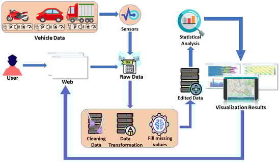
Figure 1.
The proposed overall architecture. Various types of urban sensors generate raw data, i.e., air quality sensors, traffic counters, speed detectors, noise recorders, and sensors for electric vehicle charging stations. When a user loads the proposed dashboard, our application automatically retrieves the corresponding datasets. These undergo a comprehensive preprocessing step that cleans and organizes the data, detects incomplete observations, and employs a hybrid imputation strategy that leverages SARIMAX to handle time-dependence and seasonal effects [62], k-nearest neighbors to infer missing values from nearby points in feature space [63], and multi-output random forest models to predict multiple interrelated sensor variables jointly [64]. Thus, the final dataset is made internally consistent and readily consumable by subsequent analytical modules, preserving both temporal continuity and cross-variable relationships. Next, the processed data are subjected to statistical and correlational analyses, which extract temporal patterns, spatial anomalies, and cross-variable relationships. Finally, the resulting insights are visualized as interactive charts and maps, enabling intuitive, real-time exploration of urban conditions.
3.2. Data Analysis
After preprocessing, the cleaned and structured datasets are analyzed through statistical aggregation and advanced visualization techniques. The system’s analytical layer summarizes sensor data at different temporal resolutions, allowing users to explore patterns and fluctuations over time. This involves grouping the data by relevant time intervals, such as hours or days, and computing key statistical descriptors including minimum, maximum, average, median, and standard deviation. These summaries supported both exploratory data analysis and the development of time-aware visual outputs. Afterwards, moving averages are applied to highlight temporal trends and reduce noise in highly granular datasets, helping to reveal underlying behavioral patterns that short-term fluctuations might otherwise obscure. When data density is too high for efficient rendering, downsampling strategies are utilized to retain trend integrity while optimizing for readability and performance, particularly in browser-based visualization environments.
3.3. Data Visualization
The visualization layer is built by leveraging Leaflet [66] for interactive maps and Plotly [67] for dynamic, responsive charts. Time-series plots are rendered using smoothed lines and scatter formats to depict trends over time, with visual cues. Standard and stacked bar charts effectively visualize categorical variables, such as vehicle types or sensor zones, to communicate proportional distributions. Box plots are introduced to represent statistical ranges and highlight variability across sensor categories, while histograms illustrate frequency distributions. Correlation heatmaps are also generated to show the interrelationships between sensor variables, providing insights into how environmental and infrastructural parameters interact within urban zones. Every plot is customized with readable labels, intuitive legends, and responsive hover interactions to ensure accessibility and clarity for non-expert users (see Figure 2).

Figure 2.
The interactive Plotly toolbar offers users various controls for refining their chart views and interactions [67]. From left to right, these icons enable features such as screenshot capture, zooming, panning, selecting data points (using a box or lasso), autoscaling, resetting the chart view, and toggling specific chart modes.
These visualizations are integrated into the web application’s front end, where JavaScript modules handle dynamic data fetching, real-time updates, and the interactive rendering of charts and maps, thus ensuring seamless synchronization between client-side elements and the processed datasets. This setup allows charts and interface components to refresh as new or updated data becomes available. Moreover, temporal values are transformed into browser-compatible date objects to ensure accurate rendering on time-based charts. Meanwhile, multiple visual elements are presented simultaneously on the interface, allowing users to cross-reference trends, distributions, and statistical summaries in a single, cohesive view. As a result, this multi-layered visualization approach enables intuitive, on-demand exploration of historical smart city datasets, offering valuable insights into urban dynamics without relying on real-time data streams.
4. Experimental Protocol: System Implementation
This section outlines the implementation of the proposed system. It begins with a detailed description of how the used datasets are managed. Subsequently, it presents the backend architecture, highlighting the technologies employed and the core functionalities implemented. Finally, it gives the frontend interface and user experience (UX) design, focusing on usability, accessibility, and the application’s overall visual and interactive aspects.
4.1. Dataset Management and Description
The data streams employed in this study are from publicly available open repositories maintained by the city of Basel, Switzerland (https://data.bs.ch/explore/?refine.tags=smarte+strasse, accessed on 25 August 2023). These comprise CSV-format files containing information on air quality, traffic flow, noise levels, parking occupancy, and EV charging infrastructure. For the proposed pipeline, the datasets were preferred to be stored locally for comprehensive analysis. The reasons behind this decision are related to several practical and research-driven factors. First, all involved sensors (see Figure 3), except those monitoring EV charging stations, have been taken out of active operation, making real-time data collection no longer feasible. Beyond this necessity, local data storage ensures comprehensive control over data integrity and availability, allowing consistent preprocessing and repeatable experimentation without dependence on external service uptime or network stability. Moreover, it avoids issues such as API rate limits and schema changes which may introduce inconsistencies into longitudinal studies. From a research perspective, maintaining locally stored datasets enhances reproducibility, a key principle in empirical machine learning and scientific research [35,59]. Lastly, this strategy supports a controlled and sandboxed environment ideal for testing, development, and iterative model tuning without the unpredictability of live data streams.
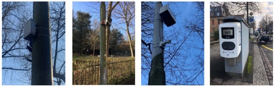
Figure 3.
Overview of the sensors used in the Basel Smart Road project [68]: from left to right, an air quality sensor, a noise sensor, a traffic monitoring camera, and an electric vehicle charging station.
4.1.1. Air Quality Metrics
Air pollution is recorded via multiple parameters to evaluate its spatial and temporal behavior:
- NO2 (Nitrogen dioxide), a major traffic-related pollutant emitted primarily by combustion engines. Tracking NO2 permits quantifying the vehicular impact on urban air quality.
- O3 (Ozone), a secondary pollutant formed through photochemical reactions. Monitoring ozone concentrations is vital in assessing smog formation and respiratory risk, particularly during warm seasons.
- PM2.5 (particulate matter) comprises fine airborne particles less than 2.5 microns in diameter, often linked to adverse health effects. Their measurement helps identify pollution peaks and assess long-term exposure patterns.
4.1.2. Traffic and Vehicle Data
Transportation-related sensors enable analysis of mobility patterns and congestion:
- Vehicle counts register the number of vehicles passing through monitored zones, frequently broken down by type, e.g., cars, trucks, motorcycles.
- Speed measurements capture average and peak vehicle speeds, supporting traffic jam analysis and evaluating traffic control policies.
4.1.3. Sound Levels
Acoustic data helps characterize environmental noise pollution, a growing concern in urban planning. In the proposed system, filtering techniques are applied to the input to isolate traffic-related noise from other ambient sources such as wind, voices, or construction activity. This enhanced the sensor’s ability to detect noise patterns directly associated with road activity [69]. The filtered audio input accurately represents traffic noise intensity in the monitored zone:
- Decibel levels (dB) measure overall ambient sound intensity, typically sampled over time.
- Frequency bands advanced acoustic sensors break down noise by frequency to distinguish between sources such as traffic, construction, or natural elements.
4.1.4. Parking Data
Parking sensors monitoring of spot usage provides insight into urban space demand and utilization:
- Occupancy and turnover incoming data determine how many parking spots are occupied and how long vehicles remain parked, enabling analysis of space turnover and availability trends. The monitored parking layout is illustrated in Figure 4, where the system tracks specific spaces using fixed camera coverage.
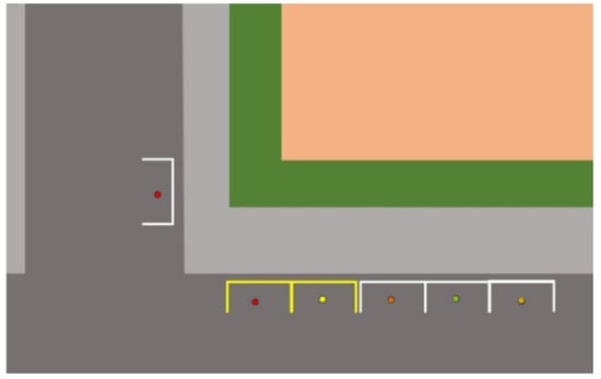 Figure 4. Visual layout of the monitored parking area. These specific spots are covered by the fixed-position camera used for detecting occupancy [68].
 - Utilization patterns help detect peak usage periods and inform better management of limited parking infrastructure based on demand over time.
4.1.5. Electric Vehicle Charging Stations
EV infrastructure sensors collect operational and usage metrics that support sustainability goals:
- Charging session duration tracks the time each vehicle remains connected, which helps estimate availability and user behavior.
- Energy consumption (kWh) records energy transferred during each session, informing capacity planning and infrastructure scaling.
4.2. Data Layer
Our system’s backend is developed in Python using the Flask web framework, which serves static HTML pages and dynamic API endpoints for handling data ingestion, transformation, and delivery. At the same time, its modular structure, with clear boundaries between data logic and visualization endpoints, separates data processing from content rendering, ensuring a maintainable and scalable architecture. This facilitates long-term maintenance and enables future extensions, such as including new sensor data types or integration with real-time sources. We focus on robust preprocessing, hybrid imputation, and scalable caching mechanisms to ensure a reliable data delivery pipeline for the interactive web-based frontend.
Our backend, in particular, defines individual routes for different types of sensor data. HTML templates are rendered through Flask’s built-in engine, which organizes user-facing pages and backend services. Dedicated endpoints are responsible for processing specific types of data. Missing data are imputed using the proposed hybrid strategy. Once imputation is completed, the backend aggregates the sensor data. It computes descriptive statistics, which are subsequently returned as structured JSON responses. Another endpoint generates a correlation matrix across variables from different sensor types, supporting multidimensional exploratory analysis of urban dynamics. It is worth noting that to improve responsiveness, we integrate Flask-Caching and cache computation-heavy endpoints, such as those performing imputation or correlation analysis, to prevent redundant processing and reduce latency. A custom logging utility is employed to reduce the execution time of each route, facilitating runtime diagnostics and performance tuning. Our implementation uses a suite of scientific libraries, including Pandas and NumPy, for efficient data manipulation and numerical analysis. Scikit-learn is employed for k-NN-based imputation; Statsmodels is used for time-series forecasting via SARIMAX; and Flask-Caching manages the temporary storage of processed results to improve API responsiveness.
4.3. Frontend Interface and UX Design
The system’s client side is purposefully formulated to enable users to interact with complex environmental and mobility data through a clear, intuitive, and accessible interface. The design framework prioritizes usability, consistency, and interactivity to accommodate exploratory and task-oriented user goals. At the same time, the adaptive frontend design ensures that all charts, maps, and interface components seamlessly adjust to different screen sizes. This allows users to explore, manipulate, and interpret environmental and traffic data on various devices without sacrificing clarity or functionality.
Initially, the interface features a modular and consistent layout across all views. A fixed header with persistent navigation elements allows users to switch seamlessly between different sections, i.e., air quality, vehicle counts, traffic speed, sound levels, parking availability, and electric charging, while maintaining spatial awareness within the platform. This information is presented with a clear visual hierarchy to help you interpret complex datasets. The content is arranged in a progressive manner, from high-level summaries to granular statistics, presented through charts, tables, and interactive maps. One dedicated interface page presents an interactive geographic map of Basel, featuring labeled, color-coded markers for sensor locations. Users can filter visible categories using checkboxes and receive automatic zoom adjustments based on selections. Design features such as typographic variation, spacing, and color contrast are used to distinguish between sensor types and emphasize key insights (see Figure 5). Additionally, we employ responsive layout techniques to ensure accessibility across different devices and screen sizes. The interface dynamically adjusts to preserve readability and interaction quality, whether viewed on desktop monitors, tablets, or smartphones. This aims to support inclusivity and maximize user reach across diverse usage contexts. Using specialized web-based visualization frameworks, raw datasets are transformed into interactive charts and maps, enabling detailed exploration of spatial sensor distributions. Users can refine their analysis through zooming, hover-tooltips, and filtering features, allowing for more intuitive and direct manipulation of the data representations. However, to ensure responsiveness, the interface adopts asynchronous data communication techniques. Specifically, AJAX-based data retrieval for real-time updates without page reloads, ensuring uninterrupted navigation and consistent performance. At the same time, a centralized style sheet governs the application’s visual identity. Consistent use of fonts, color schemes, and UI components fosters a professional and cohesive aesthetic. These design elements reinforce platform trustworthiness and enhance visual clarity. Finally, its interface adheres to principles of accessible structure by incorporating clear labeling, intuitive controls, and simplified interaction patterns. Layouts are intentionally uncluttered, and familiar navigation conventions are applied to ensure usability across a broad audience, including those with varying levels of digital literacy.
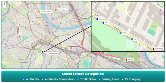
Figure 5.
Interactive map view of the application, visualizing multiple urban sensor categories. Color-coded markers with permanent labels identify air quality stations (G107, G125, G131), comparative air quality reference points, traffic noise sensors, electric vehicle charging stations, and individual parking spots, which are denoted by small blue and yellow dots. Users can toggle sensor categories using checkboxes, which dynamically adjust the map view to focus on selected features. Integrating zoom-level control, real-time filtering, and semantic labeling enables fast and intuitive exploration of key urban infrastructure data.
5. Results
This section presents the system’s results, focusing on its interactive visualization capabilities, real-world use cases, and insights derived from the underlying data. Initially, it highlights the key visualization features that enhance user interaction and facilitate the exploration of complex datasets. This is followed by a presentation of selected use cases, demonstrating the system’s practical value and the types of data-driven insights it can reveal. Finally, a discussion is provided to interpret the findings and address potential limitations.
5.1. Interactive Visualization Features
Our platform features several advanced interactive elements that support flexible data analysis and personalized user experiences. These elements are designed to help users draw insights by allowing them to toggle specific data series within charts to isolate the variables or sensor stations they are most interested in (see Figure 6 and Figure 7). This functionality reduces visual clutter and simplifies comparing selected metrics (see Figure 8). Moreover, this kind of user-driven filtering improves visual clarity and interpretability. Similarly, several dashboards allow users to reorganize, resize, or minimize data panels based on their preferences. This personalization enables more efficient workflows by allowing users to prioritize content that aligns with their interests, such as temporal trends, spatial distributions, or statistical summaries. In Figure 9, time-series plots from various sensor locations visualize pollutant levels over time, with embedded median lines offering a clear baseline for detecting deviations. A correlation heatmap is also provided to reveal interrelationships among pollutants and sensors (see Figure 10). These visuals demonstrate how the interface supports interactive exploration of complex environmental data in an accessible and comparative format.
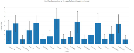
Figure 6.
Bar plot illustrating average pollutant levels (NO2, O3, PM2.5) captured across various sensor locations. Error bars denote standard deviation, reflecting measurement variability. Comparative assessment supports spatial analysis of air quality across the urban network.
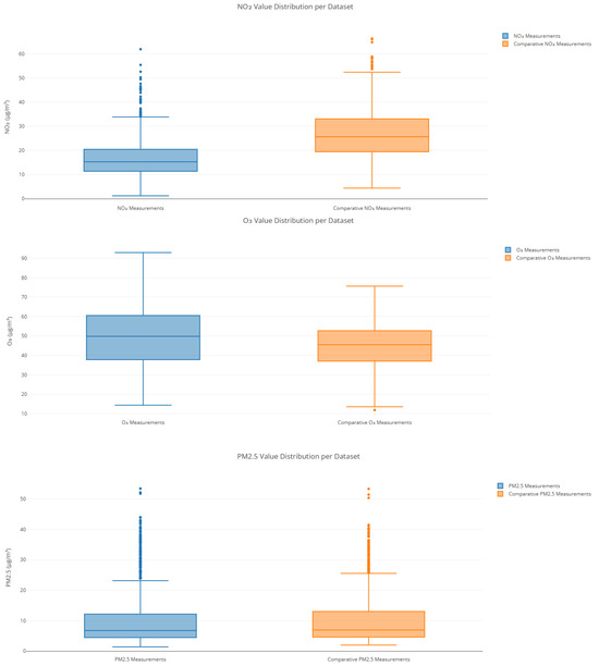
Figure 7.
Comparative distribution of air quality pollutants (O3, PM2.5, and NO2) between sensor datasets. Boxplots compare the value distributions of three major air pollutants—ozone (O3), particulate matter (PM2.5), and nitrogen dioxide (NO2)—across two datasets: one collected from the primary urban sensor network (blue) and the other from comparative reference stations (orange). The O3 measurements show a wider range and higher upper whisker in the primary dataset, indicating sporadically elevated ozone concentrations. PM2.5 distributions are relatively similar in median values, but the comparative dataset exhibits greater variability and more outliers. For NO2, the reference data show a significantly higher median and broader distribution, suggesting denser traffic exposure or local emission sources.
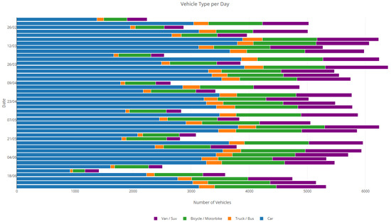
Figure 8.
Daily distribution of vehicle types. This horizontal stacked bar chart illustrates the composition of different vehicle categories recorded on selected days. Each bar represents the total number of vehicles detected per day, categorized into four types: cars (blue), trucks or buses (orange), bicycles or motorbikes (green), and vans or SUVs (purple). The figure highlights the predominance of standard cars in daily traffic volumes, while also capturing the recurring contribution of heavy vehicles, two-wheelers, and light commercial vehicles. This breakdown facilitates analysis of modal share trends, enabling transportation planners to assess usage diversity and evaluate infrastructure demand for each vehicle class.
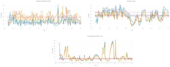
Figure 9.
Time-series visualizations from three air quality sensors (e.g., G107, G125, G131) used in the Basel Smart Road project. Each chart displays pollutant levels (e.g., NO2, O3, PM2.5). The X-axis represents timestamps, and the Y-axis shows g/m3 concentrations. Median reference lines highlight central tendencies, helping to identify trends, spikes, and deviations across different monitoring locations.
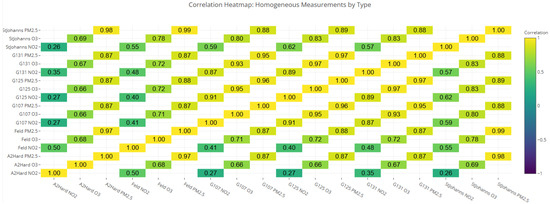
Figure 10.
This heatmap visualizes the degree of correlation between different sensors and pollutants (O3, NO2, PM2.5). The color scale on the side reflects correlation values ranging from −1 to +1, with cooler tones (e.g., purple) indicating weaker or negative correlations and warmer tones (yellow) signifying strong positive correlations. Each cell represents the relationship between two specific measurements of the same type (e.g., “G107 NO2”, and “StJohanns NO2”). Strong intra-pollutant clustering often reflects shared atmospheric behavior or familiar emission sources. Weak or negative correlations indicate local environmental differences or independent dynamics of pollutants. Overall, the heatmap provides a quick visual summary of which pollutant measurements tend to rise and fall together, highlighting meaningful relationships in urban air quality patterns.
5.2. Use Cases and Data-Driven Insights
The system’s outputs support data-driven use cases relevant to urban management, mobility planning, and environmental monitoring. These applications are directly derived from aggregated statistics, time-series visualizations (see Figure 11), and the integration of spatial data. In the context of air quality, daily pollutant concentrations enable analysts to monitor localized pollution levels, detect peak periods, and compare sensor behavior across the city. Correlation analysis further helps identify consistent trends or anomalies between locations, while traffic and noise data provide insight into urban mobility and its environmental impacts (see Figure 12). By examining patterns in vehicle counts and decibel levels over time, officials identify congestion hotspots and areas exposed to noise (see Figure 13). Parking and EV charging logs reveal fluctuations in demand over time and space (see Figure 14), which helps optimize infrastructure, apply dynamic pricing, and plan expansions in response to the growing electric mobility. Likewise, the visual outputs also facilitate public engagement and transparency. The system encourages citizen awareness and informed participation in sustainability efforts by exposing pollution trends, parking usage, and environmental conditions through charts and maps.
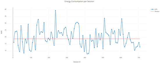
Figure 11.
Time-series representation of energy consumption per electric vehicle charging session. Each point corresponds to the unique sessions’ energy usage in kWh, with the red dashed line denoting the median value. Peaks and fluctuations illustrate diverse charging behaviors among users.
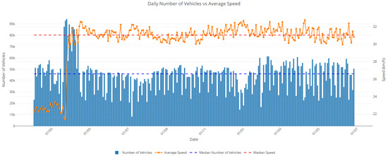
Figure 12.
Daily number of vehicles vs. average speed. This plot displays the daily vehicle count (blue bars, left axis) in conjunction with the average vehicle speed (orange line, right axis). Dashed horizontal lines indicate median values. Although vehicle volume remains relatively stable throughout the period, fluctuations in speed are observed, particularly during peak periods of congestion or reduced flow. The visualization aids in understanding traffic dynamics High vehicle counts correspond to lower average speeds, indicating potential congestion or the effects of traffic regulation.
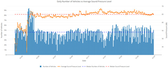
Figure 13.
Daily number of vehicles vs. average sound pressure level. This plot illustrates the relationship between the daily number of vehicles (blue bars, left axis) and the average sound pressure level (orange line, right axis) recorded at a monitoring location. Horizontal dashed lines represent the median values of each respective dataset. A strong alignment between peaks in vehicle count and elevated noise levels suggests a correlation between traffic intensity and urban sound pollution. The dual-axis chart effectively highlights how increased traffic volumes tend to coincide with higher average decibel levels over time.
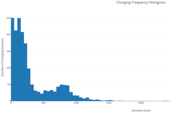
Figure 14.
Histogram showing the distribution of electric vehicle charging session durations. The data indicate that most sessions are relatively short, with a high frequency of charges under 200 min. Longer sessions occur less frequently, exhibiting a heavy right-tail characteristic of usage skew.
5.3. Evaluation
The evaluation of the system is twofold: one aspect focuses on the accuracy of the imputation process, while the other addresses performance in terms of execution time and memory usage.
To assess the accuracy of the imputation methods, we employed two widely used error metrics: root mean squared error (RMSE) and mean absolute error (MAE) per sensor data.
where N represents the sample size, is the original data value, and is the corresponding imputed value. Low RMSE and MAE values suggest high fidelity between imputed and original observations. Table 2 summarizes the per-sensor error metrics for NO2, O3, and PM2.5. The results show consistent imputation performance across sensor locations, with RMSE values ranging from approximately 2.30 to 8.05, depending on the pollutant and sensor variability. PM2.5 exhibited the lowest average error, whereas NO2 showed higher error variance across sites, likely due to greater fluctuation and sensor-specific noise. Although the overall performance of the imputation model is satisfactory, some error values, particularly in NO2 estimates, are relatively higher. This can be attributed to several factors. First, the imputation process was applied directly to the continuous data without categorizing values into ranges, viz., low, medium, and high pollution levels, which may have limited the model’s ability to adapt to different data regimes. Second, no outlier removal was performed before imputation, which could have introduced noise, especially in sensors exposed to irregular patterns or anomalies. Additionally, pollutants such as NO2 often exhibit high temporal variability and sensitivity to localized conditions (e.g., traffic bursts, wind), making accurate estimation more difficult. Sensor-level noise, hardware inconsistencies, and unmeasured external influences, such as weather and topography, may also contribute to the observed discrepancies. Despite these challenges, the method demonstrated consistent accuracy across most sensors and pollutants, particularly for PM2.5, validating its robustness in real-world environmental data scenarios.
Table 2.
Imputation accuracy per sensor and pollutant (air quality).
To evaluate system responsiveness and resource usage, we measured the execution time and memory consumption of key endpoints under typical usage. As shown in Table 3, the response times range from 0.01 s (e.g., static metadata) to 8.67 s (e.g., high-resolution audio frequency data). The corresponding memory usage ranged from as low as 2.4 MB to over 400 MB, depending on data complexity and processing requirements. These results indicate that caching and data downsampling contribute significantly to maintaining low latency and acceptable memory footprint across diverse data sources. Moreover, while no formal usability testing was performed, internal evaluations confirmed consistent functionality and responsiveness across various devices, reflecting the system’s design focus on accessibility and multi-stakeholder usability.
Table 3.
Performance evaluation of selected API endpoints.
5.4. Discussion
As innovative city systems increasingly rely on sensor networks and data-driven applications, it is vital to acknowledge the limitations and responsibilities of this technological evolution. While the presented application demonstrates the analytical and practical value of visualizing urban sensor data, several underlying challenges warrant further attention, including data quality, and ethical safeguards, as well as sustainable implementation.
One of the most pressing concerns is data inconsistency. Real-world sensor deployments are subject to calibration errors, environmental interference, and device degradation over time. In our datasets, discrepancies have been documented, e.g., speed sensors are found to overestimate vehicle velocities by an average of 11.8 km/h due to poor calibration [68]. Similar discrepancies are observed in counting sensors, which recorded approximately 15% fewer vehicles than validated traffic counting stations, often misclassifying passenger vehicles as vans. These issues highlight well-documented challenges in real-world sensor deployments, including device drift, environmental interference, and variation between low-cost and reference-grade instruments. Such inconsistencies underscore the importance of regular calibration, cross-validation with certified instruments, and transparent reporting of sensor limitations in smart city infrastructures. Likewise, uneven sensor distribution may cause specific neighborhoods or conditions to be overrepresented in policy decisions, while others remain under-monitored. Moreover, data gaps due to power interruptions or connectivity issues require imputation, which can never fully substitute for original observations. Under environmental conditions, such as humidity or temperature fluctuations, sensor accuracy can be further distorted. Lastly, ethical considerations are equally vital [70]. While the data used in this system are primarily aggregated and anonymized, the increasing deployment of high-resolution sensors, such as surveillance cameras or license plate readers, raises significant concerns around privacy and potential misuse [71]. In this article, privacy was a central design priority, as the parking monitoring system relied on a deliberately low-resolution camera incapable of capturing personally identifiable features, i.e., faces or license plates. This aligns with the European Data Protection Board guidance [72], which emphasizes data minimization and purpose limitation in the context of urban surveillance. As illustrated in Figure 15, the output retains enough detail to detect parking occupancy while effectively protecting the privacy of pedestrians and vehicle owners. Despite the limited resolution, the system could still accurately detect parking spot occupancy, demonstrating that privacy-preserving sensing can coexist with effective urban monitoring. Securing that no personally identifiable information is collected or inferred is a foundational principle. Additionally, transparency in data governance remains crucial: stakeholders must communicate what data are being collected, for what purpose, and who can access it. Particularly when sensor data influences urban planning or regulatory outcomes.
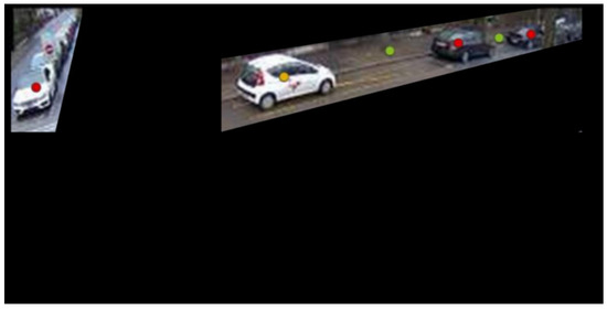
Figure 15.
Sample output from the privacy-aware low-resolution camera used in the project. Despite limited fidelity, parking occupancy detection remained effective while protecting individual identities. The entire field of view, except for the parking spots, is blacked out to ensure no surrounding personal or identifiable information is visible [68].
6. Conclusions and Future Work
This article proposes a modular, web-based platform for analyzing and visualizing urban sensor input streams, developed using datasets provided by the Basel Smarte Strasse project. Our application unifies diverse data streams, including air quality, traffic noise, vehicle counts, parking occupancy, and EV charging, to provide a comprehensive view of environmental and infrastructural conditions in urban areas. Based on SARIMAX, k-NN imputation, and random forest regressors, the platform’s backend processes heterogeneous data effectively, addressing missing values and improving data reliability. On the contrary, its frontend combines interactive maps, time-series plots, and correlation heatmaps. Visualization is an efficient and intuitive tool for representing urban data and enabling users to explore trends and relationships across space and time, enhancing decision-making. In addition, for experts, these visual tools offer actionable insights into infrastructure optimization and environmental interventions. At the same time, our web-based platform emphasizes usability and adaptability through a responsive interface, while integrated caching strategies ensure smooth performance during repeated and data-intensive exploration tasks.
Future plans include extending the pipeline to support real-time sensor data, enabling live dashboards, and triggering alerts for environmental and traffic monitoring purposes. Integrating more advanced predictive models could also support the casting of pollutant concentrations, noise levels, or traffic flows, thereby assisting in proactive urban planning. Furthermore, linking the platform with public transport APIs, weather data, or health records could enable cross-domain insights, e.g., analyzing the relationship between pollution spikes and respiratory health indicators.
Author Contributions
Conceptualization, P.K. and K.A.T.; methodology, P.K.; software, P.K.; validation, P.K., D.I., and K.A.T.; formal analysis, D.I. and P.C.; investigation, K.A.T.; resources, P.K.; data curation, P.K.; writing—original draft preparation, P.K.; writing—review and editing, D.I., P.C., and K.A.T.; visualization, P.K.; supervision, K.A.T.; project administration, K.A.T.; funding acquisition, K.A.T. All authors have read and agreed to the published version of the manuscript.
Funding
This research received no external funding.
Data Availability Statement
The dataset used is available online at https://data.bs.ch/explore/?refine.tags=smarte+strasse (accessed on 3 February 2025) and the source code of the developed system can be found at https://github.com/PanagiotisKara/Web-Based-Data-Analysis-and-Visualization (accessed on 21 April 2025).
Acknowledgments
This work was conducted as part of the COST Action (Grant CA20120), Intelligence-Enabling Radio Communications for Seamless Inclusive Interactions (INTERACT).
Conflicts of Interest
The authors declare no conflicts of interest.
References
- Statista. Urbanization by Continent 2025. Available online: https://www.statista.com/statistics/270860/urbanization-by-continent/ (accessed on 15 April 2025).
- Huda, N.U.; Ahmed, I.; Adnan, M.; Ali, M.; Naeem, F. Experts and intelligent systems for smart homes’ Transformation to Sustainable Smart Cities: A comprehensive review. Expert Syst. Appl. 2024, 238, 122380. [Google Scholar] [CrossRef]
- Albino, V.; Berardi, U.; Dangelico, R.M. Smart cities: Definitions, dimensions, performance, and initiatives. J. Urban Technol. 2015, 22, 3–21. [Google Scholar] [CrossRef]
- Caragliu, A.; Del Bo, C.; Nijkamp, P. Smart cities in Europe. J. Urban Technol. 2011, 18, 65–82. [Google Scholar] [CrossRef]
- Gangwar, A.; Singh, S.; Mishra, R.; Prakash, S. The state-of-the-art in air pollution monitoring and forecasting systems using IoT, big data, and machine learning. Wirel. Pers. Commun. 2023, 130, 1699–1729. [Google Scholar] [CrossRef]
- Dmitrieva, E.; Pathani, A.; Pushkarna, G.; Acharya, P.; Rana, M.; Surekha, P. Real-Time Traffic Management in Smart Cities: Insights from the Traffic Management Simulation and Impact Analysis. BIO Web Conf. 2024, 86, 01098. [Google Scholar] [CrossRef]
- Aiello, L.M.; Schifanella, R.; Quercia, D.; Aletta, F. Chatty maps: Constructing sound maps of urban areas from social media data. R. Soc. Open Sci. 2016, 3, 150690. [Google Scholar] [CrossRef]
- Zheng, Y.; Capra, L.; Wolfson, O.; Yang, H. Urban computing: Concepts, methodologies, and applications. ACM Trans. Intell. Syst. Technol. (TIST) 2014, 5, 1–55. [Google Scholar] [CrossRef]
- Mahmud, M.; Ali, M. Air quality monitoring using IoT and big data: A review. MDPI Electron. 2020, 9, 1453. [Google Scholar]
- Khare, S.; Singh, P.K. Smart city data analytics: A comprehensive review and future directions. Sensors 2022, 22, 1013. [Google Scholar]
- Atzori, L.; Iera, A.; Morabito, G. The internet of things: A survey. Comput. Netw. 2010, 54, 2787–2805. [Google Scholar] [CrossRef]
- Okafor, N.U.; Delaney, D.T. Missing data imputation on IoT sensor networks: Implications for on-site sensor calibration. IEEE Sensors J. 2021, 21, 22833–22845. [Google Scholar] [CrossRef]
- You, Y. Intelligent System Designs: Data-Driven Sensor Calibration & Smart Meter Privacy. Ph.D. Thesis, KTH Royal Institute of Technology, Stockholm, Sweden, 2022. [Google Scholar]
- Tonsager, L.; Ponder, J. Privacy Frameworks for Smart Cities. J. Law Mobil. 2022, 1. [Google Scholar]
- Fabrègue, B.F.; Bogoni, A. Privacy and security concerns in the smart city. Smart Cities 2023, 6, 586–613. [Google Scholar] [CrossRef]
- Kharakhash. Data visualization: Transforming complex data into actionable insights. Autom. Technol. Bus. Process. 2023, 15, 4–12. [Google Scholar]
- Washburn, D.; Sindhu, U.; Balaouras, S.; Dines, R.A.; Hayes, N.; Nelson, L.E. Helping CIOs understand “smart city” initiatives. Growth 2009, 17, 1–17. [Google Scholar]
- Singh, T.; Solanki, A.; Sharma, S.K.; Nayyar, A.; Paul, A. A decade review on smart cities: Paradigms, challenges and opportunities. IEEE Access 2022, 10, 68319–68364. [Google Scholar] [CrossRef]
- Zanella, A.; Bui, N.; Castellani, A.; Vangelista, L.; Zorzi, M. Internet of Things for Smart Cities. IEEE Internet Things J. 2014, 1, 22–32. [Google Scholar] [CrossRef]
- Kim, T.h.; Ramos, C.; Mohammed, S. Smart city and IoT. Future Gener. Comput. Syst. 2017, 76, 159–162. [Google Scholar] [CrossRef]
- Aslam, S.; Ullah, H.S. A comprehensive review of smart cities components, applications, and technologies based on internet of things. arXiv 2020, arXiv:2002.01716. [Google Scholar]
- Jo, J.H.; Jo, B.; Kim, J.H.; Choi, I. Implementation of iot-based air quality monitoring system for investigating particulate matter (Pm10) in subway tunnels. Int. J. Environ. Res. Public Health 2020, 17, 5429. [Google Scholar] [CrossRef]
- Myagmar-Ochir, Y.; Kim, W. A survey of video surveillance systems in smart city. Electronics 2023, 12, 3567. [Google Scholar] [CrossRef]
- Shamsuzzoha, A.; Nieminen, J.; Piya, S.; Rutledge, K. Smart city for sustainable environment: A comparison of participatory strategies from Helsinki, Singapore and London. Cities 2021, 114, 103194. [Google Scholar] [CrossRef]
- Batty, M.; Axhausen, K.W.; Giannotti, F.; Pozdnoukhov, A.; Bazzani, A.; Wachowicz, M.; Ouzounis, G.; Portugali, Y. Smart cities of the future. Eur. Phys. J. Spec. Top. 2012, 214, 481–518. [Google Scholar] [CrossRef]
- Perera, C.; Zaslavsky, A.; Christen, P.; Georgakopoulos, D. Context aware computing for the Internet of Things: A survey. Comput. Commun. 2016, 83, 1–22. [Google Scholar] [CrossRef]
- Ullah, A.; Anwar, S.M.; Li, J.; Nadeem, L.; Mahmood, T.; Rehman, A.; Saba, T. Smart cities: The role of Internet of Things and machine learning in realizing a data-centric smart environment. Complex Intell. Syst. 2024, 10, 1607–1637. [Google Scholar] [CrossRef]
- Wang, J.; Wu, J.; Wang, Z.; Gao, F.; Xiong, Z. Understanding Urban Dynamics via Context-Aware Tensor Factorization with Neighboring Regularization. IEEE Trans. Knowl. Data Eng. 2020, 32, 2269–2283. [Google Scholar] [CrossRef]
- Pargoo, N.S.; Ghasemi, M.; Xia, S.; Turkcan, M.K.; Ehsan, T.; Zang, C.; Sun, Y.; Ghaderi, J.; Zussman, G.; Kostic, Z.; et al. The Streetscape Application Services Stack (SASS): Towards a Distributed Sensing Architecture for Urban Applications. arXiv 2024, arXiv:2411.19714. [Google Scholar]
- Gaur, A.; Scotney, B.; Parr, G.; McClean, S. Smart city architecture and its applications based on IoT. Procedia Comput. Sci. 2015, 52, 1089–1094. [Google Scholar] [CrossRef]
- Elavsky, F.; Nadolskis, L.; Moritz, D. Data navigator: An accessibility-centered data navigation toolkit. IEEE Trans. Vis. Comput. Graph. 2023, 30, 803–813. [Google Scholar] [CrossRef]
- Islam, M.A.; Sufian, M.A. Data analytics on key indicators for the city’s urban services and dashboards for leadership and decision-making. arXiv 2023, arXiv:2212.03081. [Google Scholar]
- Ma, M.; Bartocci, E.; Lifland, E.; Stankovic, J.A.; Feng, L. A Novel Spatial–Temporal Specification-Based Monitoring System for Smart Cities. IEEE Internet Things J. 2021, 8, 11793–11806. [Google Scholar] [CrossRef]
- Bellini, P.; Fanfani, M.; Nesi, P.; Pantaleo, G. Snap4City dashboard manager: A tool for creating and distributing complex and interactive dashboards with no or low coding. SoftwareX 2024, 26, 101729. [Google Scholar] [CrossRef]
- Atzori, L.; Iera, A.; Morabito, G. The evolution of the Internet of Things towards the Future Internet of Things. MDPI Future Internet 2017, 9, 41. [Google Scholar]
- Zheng, Y.; Wu, W.; Chen, Y.; Qu, H.; Ni, L. Visual Analytics in Urban Computing: An Overview. IEEE Trans. Big Data 2016, 2, 276–296. [Google Scholar] [CrossRef]
- Lindström, J.; Bosch, J. A review of the use of visualisation techniques in smart city applications. Technol. Forecast. Soc. Change 2021, 166, 120597. [Google Scholar]
- Graham, T. Barcelona is leading the fightback against smart city surveillance. Wired UK. 18 May 2018. Available online: https://www.wired.com/story/barcelona-decidim-ada-colau-francesca-bria-decode/ (accessed on 15 April 2025).
- Ordonez-Ante, L.; Van Seghbroeck, G.; Wauters, T.; Volckaert, B.; De Turck, F. Explora: Interactive Querying of Multidimensional Data in the Context of Smart Cities. Sensors 2020, 20, 2737. [Google Scholar] [CrossRef]
- Sievert, C. Interactive Web-Based Data Visualization with R, Plotly, and Shiny; Chapman and Hall/CRC: Boca Raton, FL, USA, 2020. [Google Scholar]
- Nagy, M.; Kärkkäinen, T.; Kurnikov, A.; Ott, J. Bringing Modern Web Applications to Disconnected Networks. arXiv 2015, arXiv:1506.03108. [Google Scholar]
- Blanco, J.Z.; Lucrédio, D. A holistic approach for cross-platform software development. J. Syst. Softw. 2021, 179, 110985. [Google Scholar] [CrossRef]
- Bozdag, E.; Mesbah, A.; Van Deursen, A. A comparison of push and pull techniques for Ajax. In Proceedings of the 2007 9th IEEE International Workshop on Web Site Evolution, Paris, France, 5–6 October 2007; IEEE: Piscataway, NJ, USA, 2007; pp. 15–22. [Google Scholar] [CrossRef]
- Khasnabish, S.; Burns, Z.; Couch, M.; Mullin, M.; Newmark, R.; Dykes, P.C. Best practices for data visualization: Creating and evaluating a report for an evidence-based fall prevention program. J. Am. Med. Informatics Assoc. 2020, 27, 308–314. [Google Scholar] [CrossRef]
- Fernandes, P.; Amaral, V. Web Application Architecture for Responsive and Scalable Interfaces. Sensors 2020, 20, 2520. [Google Scholar]
- Del Esposte, A.d.M.; Santana, E.F.; Kanashiro, L.; Costa, F.M.; Braghetto, K.R.; Lago, N.; Kon, F. Design and evaluation of a scalable smart city software platform with large-scale simulations. Future Gener. Comput. Syst. 2019, 93, 427–441. [Google Scholar] [CrossRef]
- Cirillo, F.; Solmaz, G.; Berz, E.L.; Bauer, M.; Cheng, B.; Kovacs, E. A Standard-Based Open Source IoT Platform: FIWARE. IEEE Internet Things Mag. 2019, 2, 12–18. [Google Scholar] [CrossRef]
- Kyle, C.; Niall, G.; Mihael, H.; Kacper, K.; Bertram, L.; Timothy, M.; Jarek, N.; Victoria, S.; Ian, T.; Thomas, T.; et al. Toward enabling reproducibility for data-intensive research using the Whole Tale platform. In Parallel Computing: Technology Trends; Aldinucci, M., Ed.; IOS Press: Amsterdam, The Netherlands, 2020. [Google Scholar] [CrossRef]
- Alam, M.; Khan, I.R. Application of AI in smart cities. In Industrial Transformation; Choudhury, B., Ed.; CRC Press: Boca Raton, FL, USA, 2022; pp. 61–86. [Google Scholar]
- Alam, T. Cloud-Based IoT Applications and Their Roles in Smart Cities. Smart Cities 2021, 4, 1196–1219. [Google Scholar] [CrossRef]
- PlanRadar. The Impact of Cloud Technology on the Future of Smart Cities. 2023. Available online: https://www.planradar.com/sa-en/how-cloud-technology-is-transforming-smart-cities/ (accessed on 10 April 2025).
- S & P Global. The Rise of AI-Powered Smart Cities. 2024. Available online: https://www.spglobal.com/en/research-insights/special-reports/ai-smart-cities (accessed on 18 April 2025).
- Han, J.; Pei, J.; Tong, H. Data Mining: Concepts and Techniques; Morgan Kaufmann: Burlington, MA, USA, 2022. [Google Scholar]
- Jadhav, A.; Pramod, D.; Ramanathan, K. Comparison of performance of data imputation methods for numeric dataset. Appl. Artif. Intell. 2019, 33, 913–933. [Google Scholar] [CrossRef]
- Van Zoest, V.; Liu, X.; Ngai, E. Data quality evaluation, outlier detection and missing data imputation methods for IoT in smart cities. In Machine Intelligence and Data Analytics for Sustainable Future Smart Cities; Huang, G., Xu, H., Eds.; Springer: Cham, Switzerland, 2021; pp. 1–18. [Google Scholar]
- Agbo, B.; Al-Aqrabi, H.; Hill, R.; Alsboui, T. Missing data imputation in the Internet of Things sensor networks. Future Internet 2022, 14, 143. [Google Scholar] [CrossRef]
- Song, H.; Fu, Y.; Saket, B.; Stasko, J. Understanding the effects of visualizing missing values on visual data exploration. In Proceedings of the 2021 IEEE Visualization Conference (VIS 2021), New Orleans, LA, USA, 24–29 October 2021; pp. 161–165. [Google Scholar]
- Eid, M.M.; ElDahshan, K.; Abouali, A.H. Missing data in smart cities: An imputation algorithm based on sine/cosine optimization algorithm. In Proceedings of the 2024 International Conference on Computer and Applications (ICCA 2024), Cairo, Egypt, 17–19 December 2024; pp. 1–6. [Google Scholar]
- McKinney, W. Data structures for statistical computing in Python. In Proceedings of the 9th Python in Science Conference, Austin, TX, USA, 28 June–3 July 2010; pp. 51–56. [Google Scholar]
- Adhikari, D.; Jiang, W.; Zhan, J.; He, Z.; Rawat, D.B.; Aickelin, U.; Khorshidi, H.A. A comprehensive survey on imputation of missing data in internet of things. ACM Comput. Surv. 2022, 55, 1–38. [Google Scholar] [CrossRef]
- Papastefanopoulos, V.; Linardatos, P.; Panagiotakopoulos, T.; Kotsiantis, S. Multivariate time-series forecasting: A review of deep learning methods in internet of things applications to smart cities. Smart Cities 2023, 6, 2519–2552. [Google Scholar] [CrossRef]
- Alharbi, F.R.; Csala, D. A seasonal autoregressive integrated moving average with exogenous factors (SARIMAX) forecasting model-based time series approach. Inventions 2022, 7, 94. [Google Scholar] [CrossRef]
- Batista, G.E.; Monard, M.C. A study of K-nearest neighbour as an imputation method. His 2002, 87, 48. [Google Scholar]
- Stekhoven, D.J.; Bühlmann, P. MissForest—Non-parametric missing value imputation for mixed-type data. Bioinformatics 2011, 28, 112–118. [Google Scholar] [CrossRef]
- Aleryani, A.; Wang, W.; De La Iglesia, B. Multiple imputation ensembles (MIE) for dealing with missing data. SN Comput. Sci. 2020, 1, 134. [Google Scholar] [CrossRef]
- Crickard, P. III. Leaflet.js Essentials; Packt Publishing Ltd.: Birmingham, UK, 2014. [Google Scholar]
- Plotly Technologies Inc. Plotly.js—A JavaScript Graphing Library. 2025. Available online: https://plotly.com/javascript/ (accessed on 19 April 2025).
- Smart Strasse Basel Project Team. Kanton Basel-Stadt, “Smarte Strasse: Pilot Project for Smart Technologies in Traffic Management," Swiss Smart City Compass. 2023. Available online: https://www.swiss-smart-city-compass.com/en/use-cases/use-case/smarte-strasse.html (accessed on 15 March 2025).
- Smarte Strasse: AI-Based Noise Classification. Available online: https://data.bs.ch/explore/dataset/100170/information/?sort=timestamp (accessed on 25 August 2023).
- Ismagilova, E.; Hughes, L.; Rana, N.P.; Dwivedi, Y.K. Security, privacy and risks within smart cities: Literature review and development of a smart city interaction framework. Inf. Syst. Front. 2022, 24, 393–414. [Google Scholar] [CrossRef] [PubMed]
- Pereira, V.; Ferreira, H.; Silva, N.; Pinto, R. Privacy-Preserving Smart Cities: A Review of Enabling Technologies and Policies. Sensors 2021, 21, 2308. [Google Scholar]
- European Data Protection Board. Guidelines 3/2019 on Processing of Personal Data Through Video Devices—Version 2.0. 2021. Available online: https://edpb.europa.eu/our-work-tools/our-documents/guidelines/guidelines-32019-processing-personal-data-through-video_en (accessed on 15 April 2025).
Disclaimer/Publisher’s Note: The statements, opinions and data contained in all publications are solely those of the individual author(s) and contributor(s) and not of MDPI and/or the editor(s). MDPI and/or the editor(s) disclaim responsibility for any injury to people or property resulting from any ideas, methods, instructions or products referred to in the content. |
© 2025 by the authors. Licensee MDPI, Basel, Switzerland. This article is an open access article distributed under the terms and conditions of the Creative Commons Attribution (CC BY) license (https://creativecommons.org/licenses/by/4.0/).