Building Energy Simulation and Monitoring: A Review of Graphical Data Representation
Abstract
1. Introduction
2. Method
2.1. Review
- Types: Articles and conference papers;
- Period: published in the last 5 years (from 2017);
- Language: English;
- Keywords: (“energy efficiency” OR “energy consumption” OR “energy performance” OR “energy metrics”) AND (building OR construction) AND “simul*” OR “monitor*” AND (“data visualization” OR “data display” OR “dashboard” OR “graphical representation” OR “data representation” OR “visual analytics”).
2.2. Types of Graphical Representation of Energy Data
2.3. Goals of the Energy Report Analysis
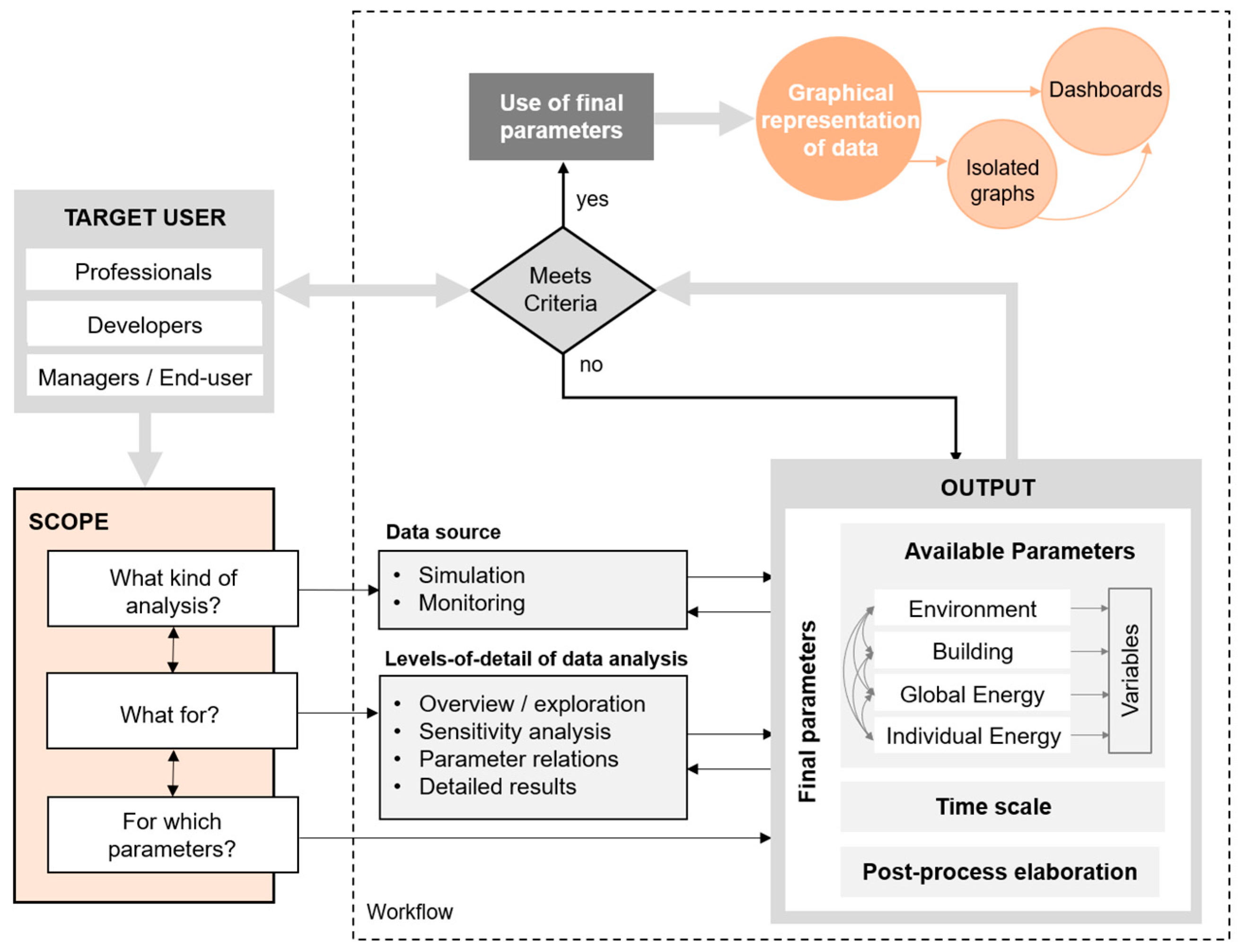
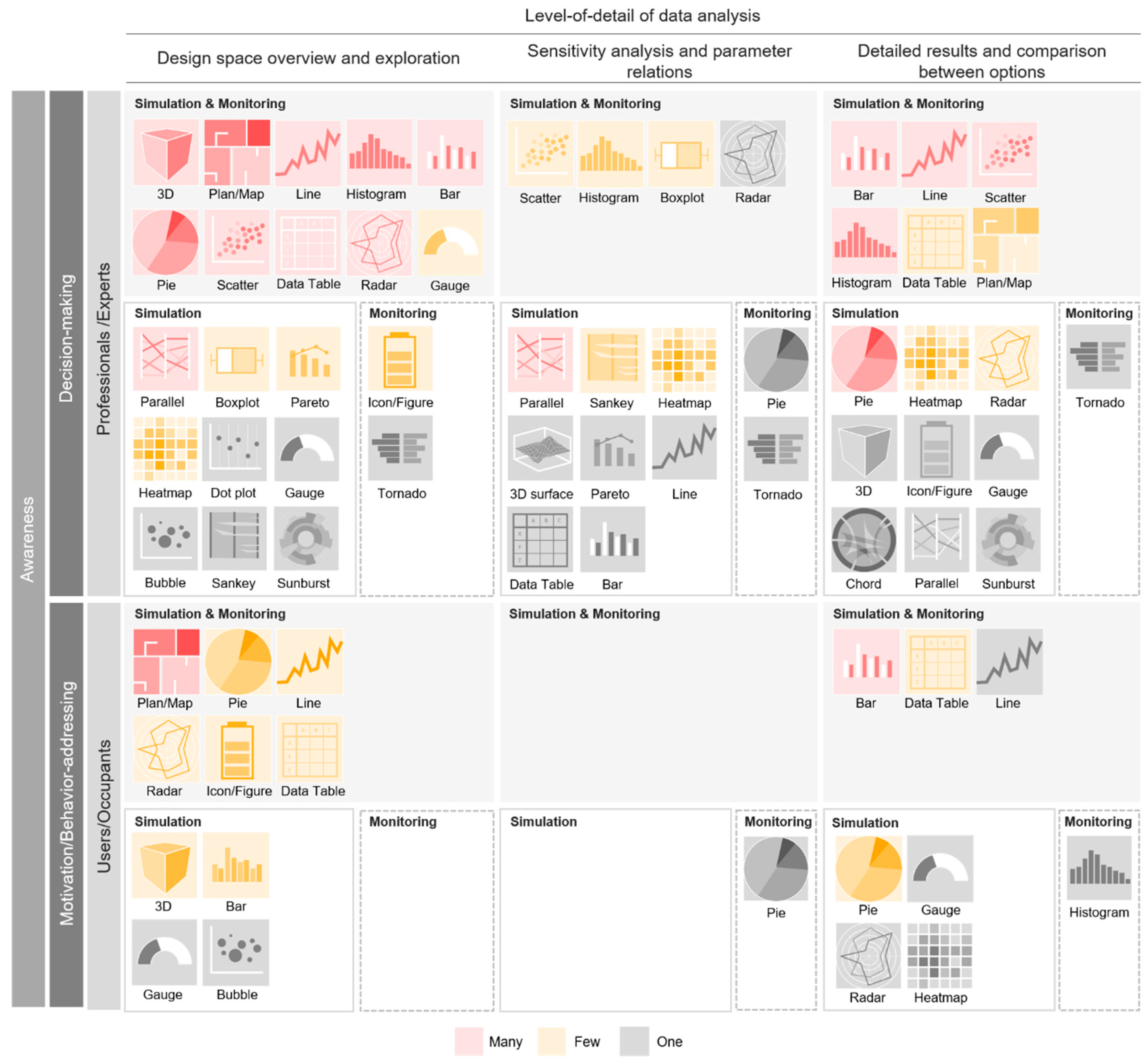
- Decision making. The visualization technique used to display data, as well as the choice of metrics, can affect and influence decision-making processes [10,29,30]. These graphs must be able to communicate information clearly and effectively. In this situation, visualization should help in identifying key metrics, hotspots, risks, and trends in order to optimize operations. Two levels of decision making are identified in this category: operational and strategic. The visualization techniques used in the operational field are quantitative and informative, describe the current and recent situation and enable the execution of short-term processes. On the other hand, strategic decisions are qualitative and proactive, and have a broader time vision. In this case, metrics of different levels of detail are combined, thus allowing long-term decisions with global consequences to be made. For this goal, it is recommended to use at-a-glance graphics where the most important and critical information is prioritized and prominently displayed, as well as to use alerts or benchmarks to identify trends and insights [29]. Users interested in achieving this goal are expert professionals in the field, such as architects, engineers, operators, developers, and building managers, among others.
- Awareness. Being aware of the information behind data and of the importance of metrics is of great interest when making decisions, whether for expert users or occupants without prior knowledge. For this goal, graphics are usually static and display short-term information in operational dashboards [29].
- Motivation and behavior-addressing. User’s behavior drastically influences the energy consumption of a building [32,33,34]. As a result, the identification of the most efficient method to visualize energy performance, which helps in motivating and educating users, has become a recurring research topic [35,36,37]. For this goal, narrative becomes essential, and the logical and temporal order must be maintained.
2.4. Levels of Detail (LOD) of Data Analysis
- Design space overview and exploration. In this first level, a general exploration of the largest number of available parameters is proposed, among which it is possible to choose and filter the information according to objectives, giving to the user the control of their data [40]. Additionally, a 3D space visualization and/or floor plans of the building should be shown to contextualize the information.
- Sensitivity analysis and parameter relations. At this LOD, it is recommended to select and analyze the relationship between two or more variables in order to obtain specific information relevant to the user. Here, the graphical representation of multidimensional data is necessary, being easier to understand when performing correlations [12].
- Detailed results and comparison between options. The last level should present the detailed data of the chosen parameters and should enable the comparison between performance optimization alternatives (i.e., two or more design options of energy consumption due to the choice of one material instead of another, of a specific Heating, Ventilation, and Air-Conditioning (HVAC) system, etc.).
2.5. Types of Building Energy Analysis
- Simulating the performance. One of the main objectives of building energy analysis is to be able to optimize performance. In order to improve the process, it is necessary to understand its operation and quantify relevant aspects [41]. BES tools, by modeling the project and incorporating the necessary inputs, provide the possibility to simulate realistic behavior and to compare design alternatives [42].
- Monitoring the performance. Data can be collected and stored through sensors, IoT devices and smart meters in existing buildings. An optimal visualization of data from real-time monitoring may allow the facility manager to quickly identify problems and provide corrections.
3. Results and Discussion
3.1. Scientific Literature
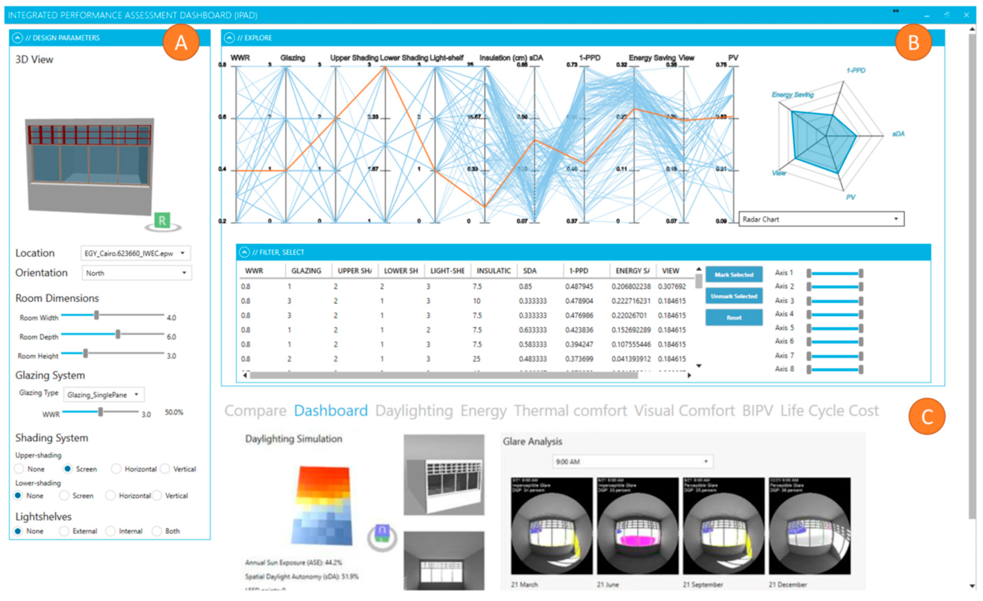
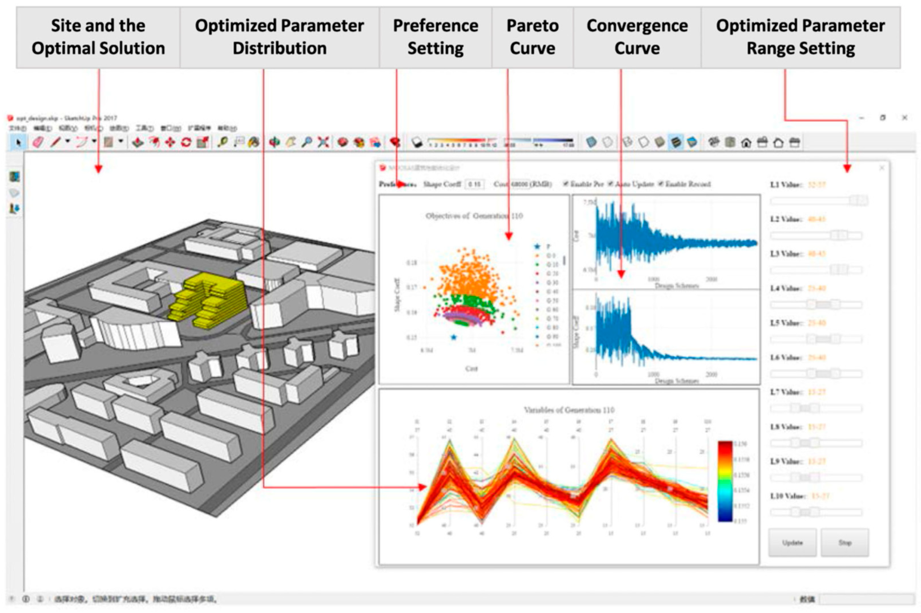
- Visualization technique. More than half of the tools (53%) present energy results in isolated and unrelated visualizations, while the other half (47%) have designed a dashboard-like interface that allows for exploring data in an organized way, contextualizing the information and hierarchizing graphics. In the latter case, the interface allows the user to interact with the information [44,45,46,47,48,49,50], choose parameters [10,33,51,52,53,54,55,56,57], and analyze the context through 3D visualizations [10,50,51,52,56,57,58] or floor plans of the building [10,44,53,56,58]. It is also noted that the dynamic capacity of data visualization is an underutilized feature in the tools. This attribute is aimed at expert users and is related to other parameters within dashboards [10,47,51,54,58].
- LOD of data analysis. The information may be explored through different levels of detail, thus presenting the possibility to choose comparable parameters. A fundamental need to initially show global consumption values is observed in most of the tools. This possibility allows users to have an overview of the variables and parameters that influence the performance of the building. At the next LOD, 36% of the tools enable the analysis and comparison of variables according to the user’s objective (i.e., subdivide the building’s energy use by categories and/or areas to identify the error in the performance if one is present or study the frequency of particular events), even comparing design alternatives in search of performance optimization strategies [10,51,59]. Regarding the third LOD of data analysis, 40% of the tools allow the user to delve into the specific value and, through interactions such as clicks, identify the variables that influence the metrics according to time periods [2,53,59,60]. Moreover, they allow the association of these variables with consumption ranges [1,55,59,61], presenting data divided by zones or environments [33,53,58] and parameters or categories [44,45,46,49]. Likewise, at this same level, it is possible to compare metrics to a performance time-scale [47,48,51,55,59,61,62], showing values by seasons, months, days, hours, and sub-hours.
- Tool testing, either using data from a real case or testing the tool with users through interviews or focus groups. Most of the tools (95%) have validated the data presented in the graphs since they are derived from real case studies of buildings whose performance has been simulated or monitored for a certain period of time. The only exceptions found respond to a purely graphic exploration of data [49] and to a presentation focused on the BIM-GIS integration systems where only the display mechanisms are explained [50]. By contrast, only 33% of tools have been validated with their target user; this is a problem that many authors indicated as a limitation and a future research topic [2,10,44,46,50,52,63,64].
- Guiding system. Having a system that guides the reading of graphs could help users with poor analytical literacy to comprehend the information displayed [15,21,29,62]. Even so, in this review, only five tools have guidelines, and this is only due to the use of interviews or focus groups that require them [16,35,45,54,65].
| Levels of Detail (LOD) of Data Analysis | |||||||||||
|---|---|---|---|---|---|---|---|---|---|---|---|
| Dashboard | Design Space Overview and Exploration | Sensitivity Analysis and Parameter Relations | Detailed Results Comparison between Options | Tool Testing | |||||||
| Reference to Paper | Visual Interface | Dynamic | Interactive: Click (c), Pan (p), Zoom (z), Rotate (r), Export (e) | Context (C) and Parameters (P) | Exploration | Variable-Objective Analysis | Comparison between Options | Detailed Results | Building Data | Users | Guiding System |
| [10] | √ | √ | c, p, z | C, P (*) | √ (*) | √ (*) | √ (*) | √ (*) | √ | ||
| [1] | √ | C (*) | √ | √ (*) | √ | √ | |||||
| [62] | √ | √ | √ | √ | |||||||
| [66] | √ | √ | √ | ||||||||
| [35] | c | C, P | √ | √ | √ | √ | |||||
| [67] | C, P | √ | |||||||||
| [44] | √ | c | P | √ | √ | √ | |||||
| [63] | c | √ (*) | √ | √ | |||||||
| [16] | √ | √ | √ | √ | |||||||
| [68] | √ | √ | √ | ||||||||
| [69] | √ | c, p, z | √ | √ | √ | ||||||
| [38] | √ | √ | √ | ||||||||
| [45] | √ | c | √ | √ | √ | √ | √ | ||||
| [33] | √ | c | C, P | √ | √ | √ | √ | √ | |||
| [34] | c, p, z | C, P | √ | √ | √ | √ | |||||
| [58] | √ | √ | C, P | √ | √ | √ | √ | ||||
| [60] | C | √ | √ | √ | |||||||
| [46] | √ | c | C | √ | √ | √ | √ | ||||
| [47] | √ | √ | c, p, r | √ (*) | √ | √ | √ | ||||
| [48] | √ | c | √ (*) | √ | √ | √ | |||||
| [70] | √ | √ | √ | √ | √ | ||||||
| [51] | √ | √ | c, r | C, P | √ | √ | √ | √ | |||
| [71] | c, z, p | √ | √ | √ | |||||||
| [52] | √ | c | C, P | √ | √ | √ | |||||
| [64] | √ | c, p, z, r | √ | √ | √ | ||||||
| [72] | √ | √ | √ | √ | √ | ||||||
| [61] | C | √ | √ | √ | √ | √ | |||||
| [49] | √ | c, p, z | √ (*) | √ (*) | √ (*) | √ (*) | |||||
| [53] | √ | c, p, z | C, P | √ | √ | √ (*) | √ | ||||
| [2] | c, p, z, r, e | √ | √ | √ | √ | √ | |||||
| [59] | c, p, z, r, e | √ | √ | √ | √ | √ | |||||
| [50] | √ | c | C | √ | |||||||
| [73] | √ | √ | c, p, z, r, e | C, P | √ | √ | √ | √ | √ | ||
| [54] | √ | √ | c | P | √ | √ | √ | √ | √ | √ | |
| [65] | √ | √ | √ | √ | √ | ||||||
| [74] | C | √ | √ | √ | |||||||
| [75] | √ | √ | √ | ||||||||
| [76] | √ | √ | √ | √ | √ | ||||||
| [37] | √ | c, p | P | √ | √ | √ | √ | √ | |||
| [77] | √ | √ | √ | √ | √ | ||||||
| [55] | √ | P (*) | √ | √ | √ (*) | √ | |||||
| [56] | √ | c, p, z, e | P (*) | √ | √ | ||||||
| [78] | c | √ | √ | √ | |||||||
| [42] | C | √ | √ | √ | √ | ||||||
| [57] | √ | c, p, z, e | C, P | √ | √ | ||||||
| [79] | √ | √ | c, p, z, e | P | √ | √ | √ | √ | |||
| [80] | √ | √ | |||||||||
| [81] | C, P | √ | √ | √ | √ | ||||||
3.1.1. Types of Visualization Used in Relation to the Goal of the Analysis
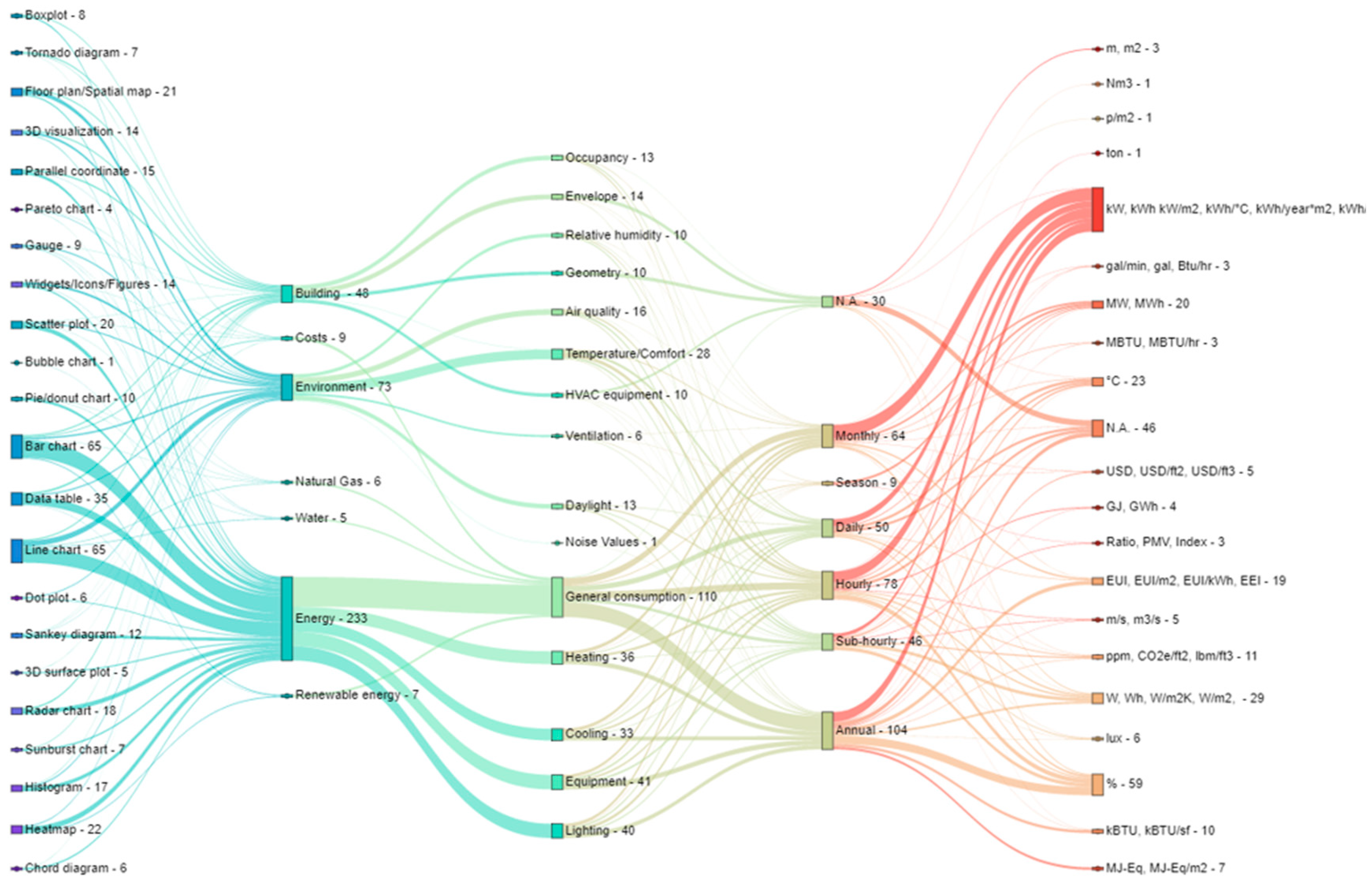
3.1.2. Types of Visualization Used in Relation to Performance Indicators
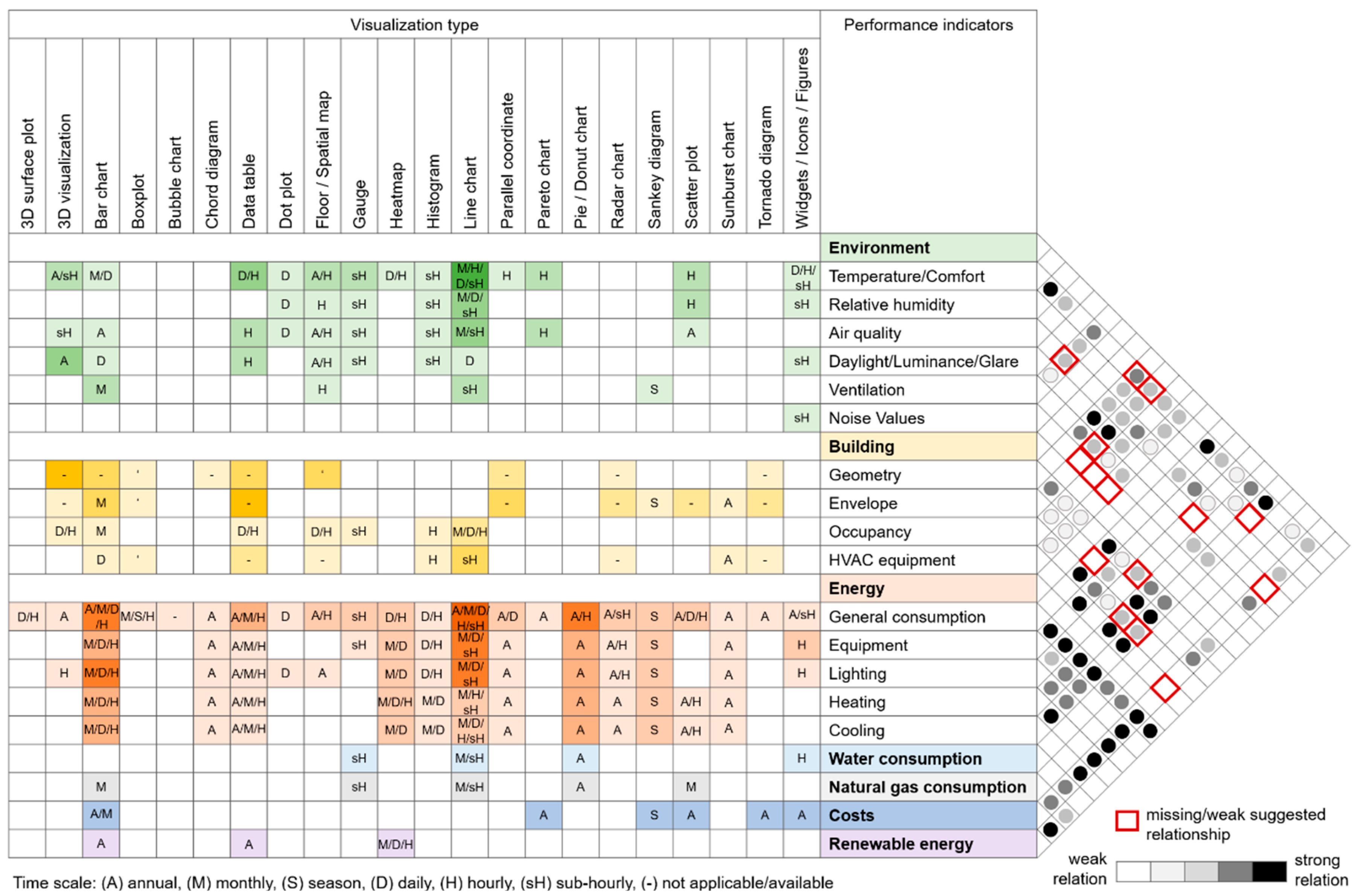
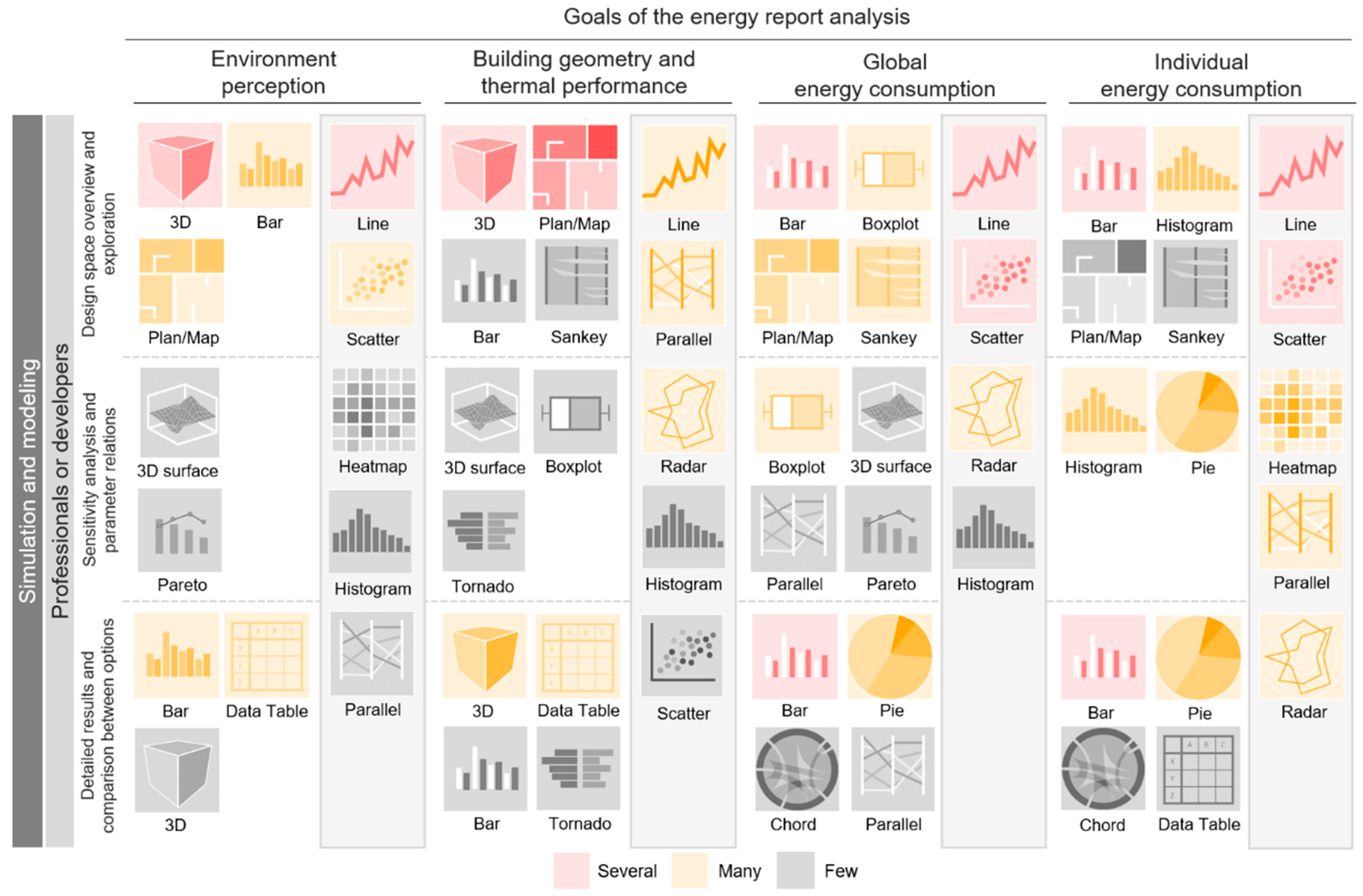
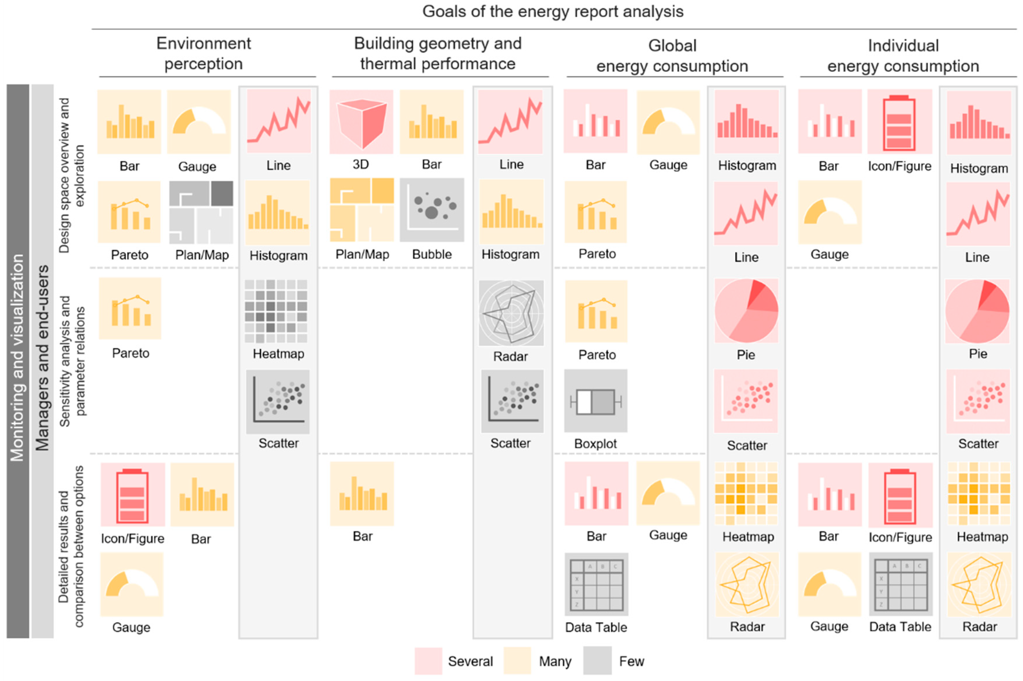
- Environment perception. Temperature/comfort and relative humidity are the most recurrent variables and generally presented in a single graph. When the data source is a simulation, the time-scale is predominantly monthly and daily; when it comes to monitoring data, the main scales are hourly and sub-hourly. Generally, the graph chosen in these cases is a line chart.In relation to daylight/luminance/glare, a trend towards its relationship with geometry variable is observed. This is presented by means of 3D visualizations and/or floor plans at an annual time-scale, when the analysis is simulated, and sub-hourly when it is monitored.Although air quality and ventilation are closely related variables, a weak relationship has been observed in the analyzed graphs. Ventilation is usually associated with temperature/comfort and presented as a line graph on an hourly scale.
- Building geometry and thermal performance. Geometric data are usually shown through 3D visualizations and floor plans, often accompanied by a data table that deepens the information displayed. Although the geometry and envelope variables play an important role in the internal temperature/comfort of the building, no strong relationship has been observed between these parameters. When the geometry and envelope of the building are associated, bar charts, parallel coordinates, radar charts, and tornado diagrams are regularly used.When analyzing building occupancy through simulations, line and bar charts with daily and hourly time-scales are preferred; when monitoring, 3D visualizations, floor plans, and gauges are additionally used. Some graphs have been prevalently used to represent air quality in relation to occupancy, but in no case has occupancy been associated with noise values. This may be due to the fact that this review focuses on the energy domain rather than comfort.
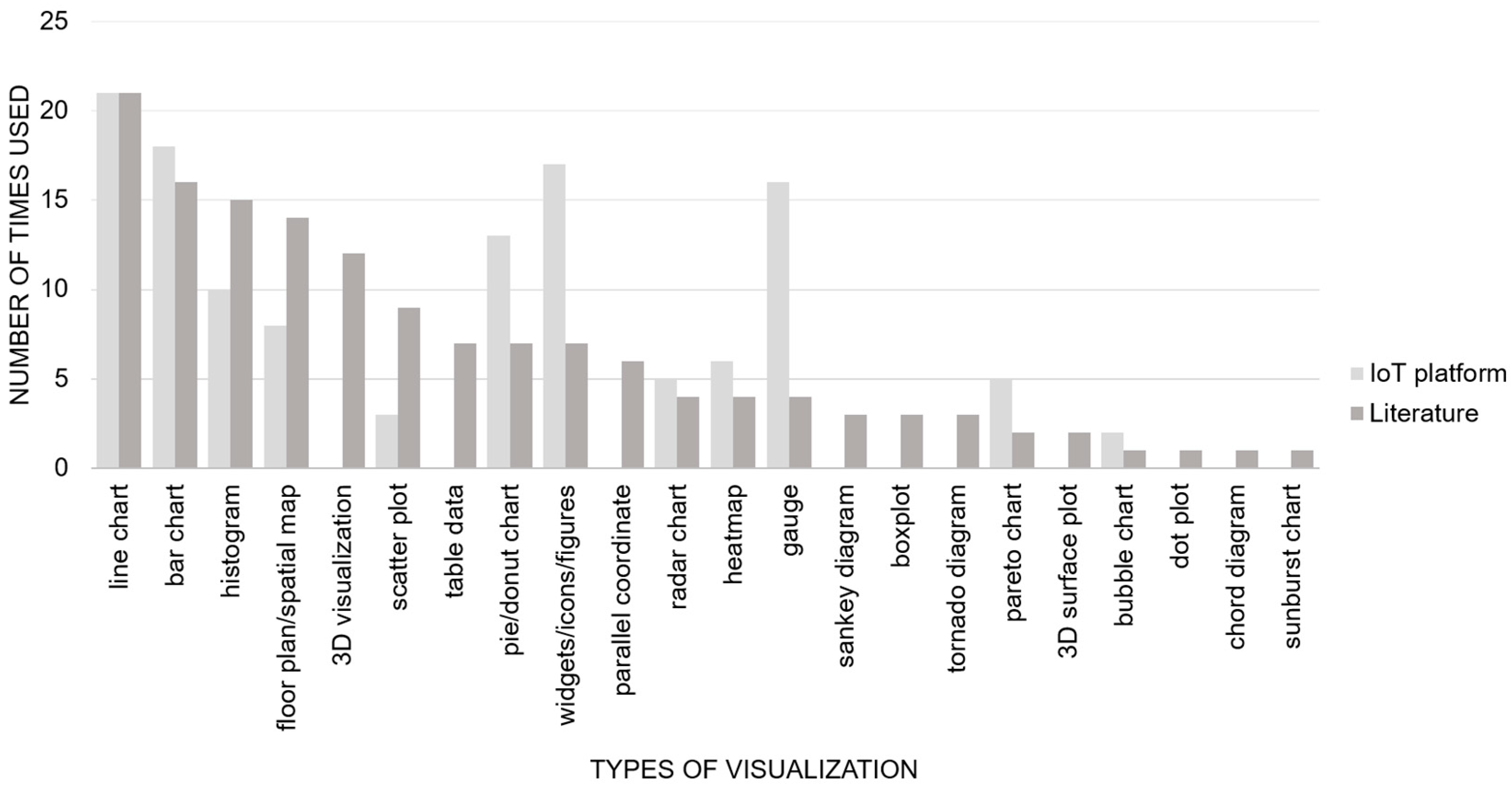
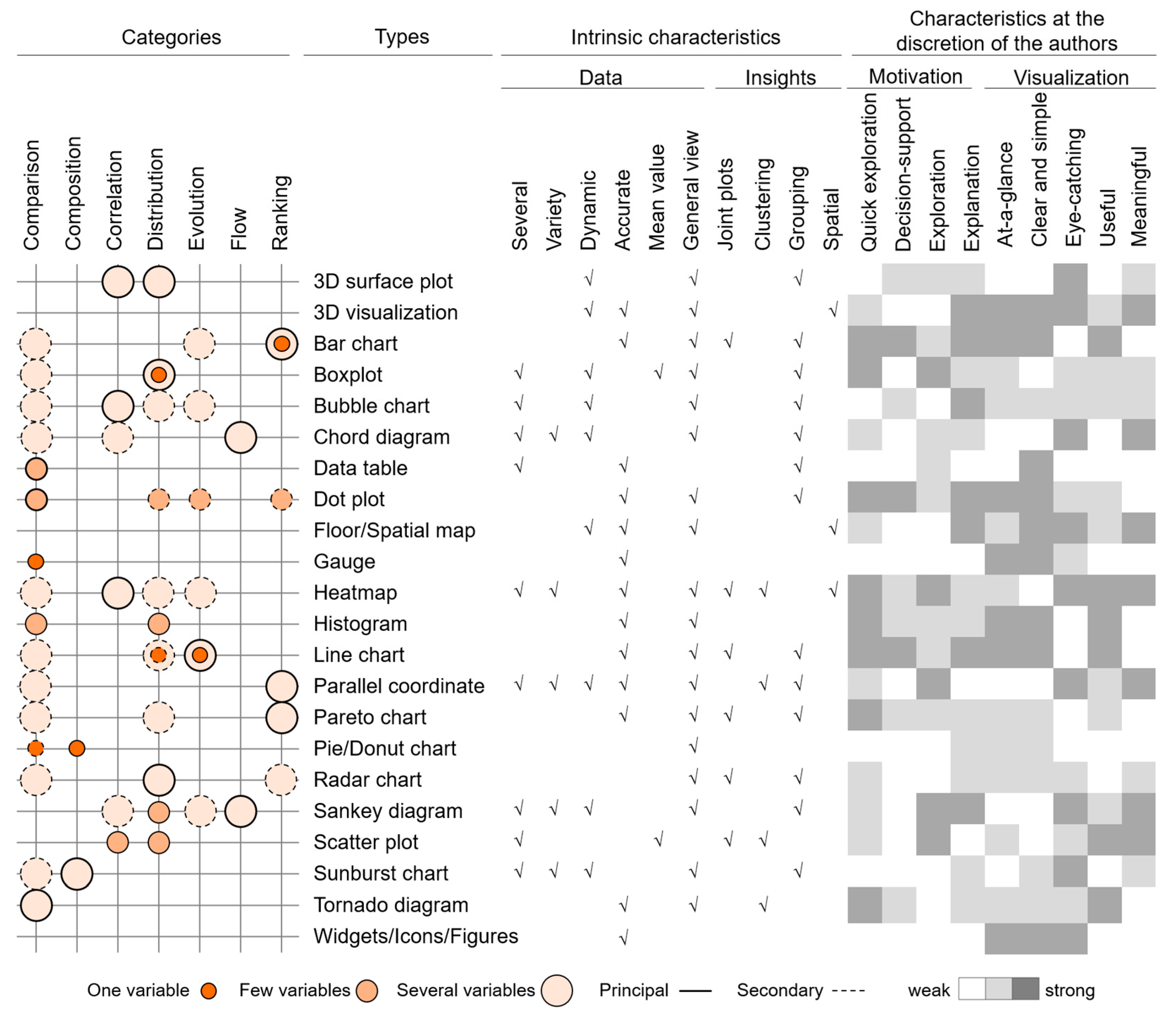
- General energy consumption. There are several types of visualization used in the field of energy consumption. Among the most representative, line, bar, pie/donut, and radar charts have been notably used to show general consumption in simulations with annual, daily, and hourly time-scales. In relation to monitoring, in addition to those already mentioned, gauges and widgets/icons/figures were identified when at-a-glance and eye-catching visualizations are needed. Heatmaps have been used to visualize average demands over a given time [77,78] and compare performance between individual consumption patterns [73]. However, this graph gains even more relevance when data are visualized spatially with the support of 3D visualizations or floor plans [29,40,53,64,67]. Likewise, the use of Sankey diagrams to visualize energy flows [61,74] and associate them with costs [62], using colors to compare values and differentiate flow levels, has been identified as useful for professional/expert users. In the latter case, the author specified that such information does not necessarily facilitate the identification of problematic operations and that inexperienced users could have difficulty considering the values as efficient or not.Tornado diagrams and radar charts are used when energy performance is simulated and display information on an annual scale. The first one is used to visualize the influence of design variables in relation to its performance [2], load factors [59], and costs [54], while the second is used to compare design alternatives in relation to energy savings [10], as well as multiple variables and key performance indicators [46,53].
- Individual energy consumption. Line, bar, and histogram charts are chosen to display monthly, daily and hourly lighting consumption, while pie/donut charts show just annual data. No relation is observed between lighting and daylight/luminance/glare parameters, despite the fact that their association often derives from cause–consequence analysis. Furthermore, it is noted that the lighting–geometry relation is not as strong as expected. Although papers focus on the final energy consumption rather than analyzing the underlying causes, it would be useful to show data of both variables in a single graph to study the correlation.Regarding heating and cooling consumption—the most studied parameters in the field—sunburst charts, parallel coordinates, and chord diagrams are the common visualization types chosen to present annual data as an overview, while bar and line charts, heatmaps, histograms, and scatter plots are preferred when the aim is to understand behavior over shorter periods of time.Parallel coordinates, in most cases, show interrelated design variables and attributes [10,52,71], allowing one to identify the impact generated by the design alternatives in general consumption and achieve a “direct reading key” between input and output [63]. Furthermore, the use of the pie/donut chart and its variations is observed in the following cases: when showing the total consumption and its subdivisions by category, e.g., heating, cooling, lighting, and hot water [51]; when comparing consumption between spaces [1] and equipment [45]; and when monitoring [48,50] and predicting [61] minimum and maximum consumption, with the help of color differentiation.In addition to the typical line and bar charts, which seem to have the ability to adapt to all parameters and purposes, scatter plots and histograms are the most versatile visualizations. Scatter plots are used when different variables must be related to one or more objectives [2,10,55]. It offers the possibility to identify patterns [78] or separate clusters [71] in search of anomalies and allows for the analysis of design performance according to different alternatives [54]. Histograms have proven useful when comparing hourly and daily consumption [55,62,64], as well as weekly and monthly variations [44,47,60,61]. Historical performance and design variables can also be plotted using this graph [38,54].
- Water and natural gas consumption. For the study of these parameters, line and bar charts associated with widgets/icons/figures, data tables, or gauges were identified when data monitoring activities are being displayed. Scatter plots are used in simulations on a monthly scale, mainly due to the availability of water and gas bills.
- Costs and renewable energy. Costs related to consumption are represented annually by means of bars, scatter plots, Pareto charts, and tornado diagrams. Likewise, presentations of renewable energy use are always related to cost and general consumption and thus use bar charts and heatmaps. It is noted that this information is not commonly displayed and is not related to other parameters.
3.1.3. Synthesis of Visualizations According to the Type of Building Energy Analysis
- When an expert wants to simulate energy performance, the 3D visualization used in the modeling phase is still useful in the exploratory and overview phases. Such visualization makes it possible to understand the building in its entirety—its orientation, geometry, and thermal performance due to materials, as well as having a spatial perception of the interior and exterior environment. Then, to delve into the energy analysis of specific sectors or areas of study, floor plans, line and bar charts, and scatter plots are included to display trends of custom variables, as well as understand flows in greater detail through Sankey diagrams. At the next LOD, experts tend to carry out a sensitivity analysis, studying changes generated in one or more variables when certain variations are introduced in the original model in order to understand the limitations and scopes of any decision made in this regard. In this context, boxplots, parallel coordinates, heatmaps, and histograms are identified as the most used graphs for this purpose, being subsequently associated with radar and pie/donut charts as summary displays. When a rigorous analysis of the results is necessary, it is observed that data tables are used to review data in depth, while bar charts are usually used to compare possible options/scenarios. Likewise, the trend/need to prioritize interactions in graphic visualizations is observed as it allows for magnifying, hiding, showing, and isolating metrics to deepen a specific analysis.
- By contrast, a user who needs to visualize and monitor the building’s energy performance in real-time, in addition to the typical line and bar charts, requires dynamic, at-a-glance, and eye-catching visualizations. Under this scenario, it can be inferred that gauges, widgets/icons/figures, pie/donut charts, and radar charts gain unexpected relevance as a result. In this specific type of analysis, 3D visualizations and floor plans are useful to contextualize the information, but not as exploratory means. The need to display graphs that are not only interactive but dynamic, with automatic updates, flexible interfaces, and the ability to use and prioritize different graphs in the same display, is observed almost exclusively in this type of analysis. Hence, there is a tendency to create dashboards through visualization software (Table 3) or use pre-established templates on IoT platforms (Table 4).
3.1.4. Interactive Dashboards as a Supporting Strategy for Decision Making
3.2. Data Visualization Tools and Platforms
3.2.1. Software Development Tools
| Software Tools | Source | Free Version | Dashboard | Dynamic | Interactive | Customizable | Historical Analytics | Predictive Analytics | Data Alert | Chart Types |
|---|---|---|---|---|---|---|---|---|---|---|
| Bokeh [87] | open | available | √ | √ | √ | √ | - | - | - | M |
| ChartBlocks [88] | open | available | √ | n/a | √ | √ | n/a | n/a | F | |
| Chartist.js [89] | open | available | √ | √ | n/a | √ | - | - | - | F |
| Charts.js [90] | open | available | √ | √ | √ | √ | - | - | - | F |
| D3.js [91] | open | available | √ | √ | √ | √ | - | - | - | M |
| DataHero [92] | n/a | √ | n/a | n/a | √ | n/a | n/a | n/a | F | |
| Datapine [93] | closed | √ | √ | √ | √ | √ | √ | √ | S | |
| Dundas BI [94] | n/a | √ | √ | √ | √ | √ | √ | √ | S | |
| Dygraphs [95] | open | available | √ | √ | √ | √ | - | - | - | M |
| FusionCharts [96] | open | √ | √ | √ | √ | - | - | - | M | |
| Google Charts [97] | open | available | √ | √ | √ | √ | n/a | S | ||
| Grafana [98] | open | available | √ | √ | √ | √ | √ | M | ||
| Infogram [99] | n/a | available | √ | √ | √ | √ | n/a | S | ||
| Klipfolio [100] | n/a | available | √ | √ | √ | √ | n/a | n/a | n/a | S |
| Looker [101] | n/a | √ | √ | √ | √ | √ | √ | √ | S | |
| Matplotlib [102] | open | available | - | √ | √ | √ | - | - | - | M |
| Plotly [103] | open | available | √ | √ | √ | √ | - | - | - | S |
| Power BI [104] | closed | available | √ | √ | √ | √ | √ | √ | S | |
| Qlikview [105] | closed | available | √ | √ | √ | √ | √ | √ | √ | S |
| Sisense [106] | open | √ | √ | √ | √ | √ | √ | √ | F | |
| Tableau [107] | open | available | √ | √ | √ | √ | √ | √ | √ | M |
| Zoho Analytics [108] | open | available | √ | √ | √ | √ | n/a | √ | √ | S |
3.2.2. IoT Platforms
| IoT Platform | Source | Scale | Thermal | Energy | Water | Gas | Visualization | Customizable | Historical Analysis | Chart Types |
|---|---|---|---|---|---|---|---|---|---|---|
| Adafruit IO [110] | open | all | - | - | - | - | √ | √ | F | |
| Al Faruque and Vatanparvar [27] | open | home | √ | √ | √ | F | ||||
| Ali-Ali et al. [8] | closed | home | √ | √ | √ | √ | F | |||
| Arduino IoT [111] | open | all | - | - | - | - | √ | √ | √ | F |
| Azure IoT [112] | closed | all | √ | √ | √ | √ | F | |||
| Blynk [113] | open | all | - | - | - | - | √ | √ | √ | F |
| Cayenne [114] | open | all | - | - | - | - | √ | √ | √ | F |
| CREST [115] | closed | home | √ | √ | S | |||||
| Device Hive [116] | open | all | √ | √ | √ | √ | M | |||
| Empower [117] | closed | home | √ | √ | √ | √ | S | |||
| GridPoint [118] | closed | all | √ | √ | √ | √ | √ | S | ||
| HEMS [119] | closed | home | √ | √ | F | |||||
| Honeywell [120] | closed | all | √ | √ | √ | n/a | n/a | S | ||
| Initial state [121] | open | all | - | - | - | - | √ | √ | √ | S |
| Kaa IoT [122] | open | all | √ | √ | √ | √ | √ | √ | √ | F |
| LoBEMS [48] | closed | all | √ | √ | √ | n/a | S | |||
| Open Remote [123] | open | all | - | - | - | - | √ | √ | √ | F |
| Sisense [106] | open | all | - | - | - | - | √ | √ | √ | S |
| Tera4Buildings [124] | closed | all | √ | √ | √ | √ | √ | F | ||
| Thethings [125] | open | all | - | - | - | - | √ | √ | √ | F |
| Thinger [126] | open | all | - | - | - | - | √ | √ | √ | S |
| Thingsboard [127] | open | all | - | - | - | - | √ | √ | √ | F |
| ThingSpeak [128] | open | all | - | - | - | - | √ | √ | √ | S |
| Ubidots [129] | open | all | - | - | - | - | √ | √ | √ | M |
| WattsOn [130] | closed | home | √ | √ | F | |||||
| Wibeee [131] | closed | home & business | √ | √ | √ | √ | S | |||
| WSo2 [132] | open | all | - | - | - | - | √ | √ | √ | M |
| SEM [133] | closed | home | √ | √ | √ | F |
4. Conclusions
Author Contributions
Funding
Conflicts of Interest
References
- Ruiz, L.G.B.; Pegalajar, M.C.; Molina-Solana, M.; Guo, Y.K. A case study on understanding energy consumption through prediction and visualization (VIMOEN). J. Build. Eng. 2020, 30, 101315. [Google Scholar] [CrossRef]
- Jia, H.; Chong, A. Eplusr: A framework for integrating building energy simulation and data-driven analytics. Energy Build. 2021, 237, 110757. [Google Scholar] [CrossRef]
- Forouzandeh, N.; Tahsildoost, M.; Zomorodian, Z.S. A review of web-based building energy analysis applications. J. Clean. Prod. 2021, 306, 127251. [Google Scholar] [CrossRef]
- Karlsson, F.; Rohdin, P.; Persson, M.L. Measured and predicted energy demand of a low energy building: Important aspects when using Building Energy Simulation. Build. Serv. Eng. Res. Technol. 2016, 28, 223–235. [Google Scholar] [CrossRef]
- Mahdavi, A.; Taheri, M. An ontology for building monitoring. J. Build. Perform. Simul. 2016, 10, 499–508. [Google Scholar] [CrossRef]
- Project Stasio. Available online: https://projectstasio.com/mission/ (accessed on 22 April 2022).
- What Are Data, Information, and Knowledge? Available online: https://internetofwater.org/valuing-data/what-are-data-information-and-knowledge/ (accessed on 12 August 2022).
- Al-Ali, A.R.; Zualkernan, I.A.; Rashid, M.; Gupta, R.; Alikarar, M. A smart home energy management system using IoT and big data analytics approach. IEEE Trans. Consum. Electron. 2017, 63, 426–434. [Google Scholar] [CrossRef]
- Chen, X.; Chen, X. Data visualization in smart grid and low-carbon energy systems: A review. Int. Trans. Electr. Energy Syst. 2021, 31, e12889. [Google Scholar] [CrossRef]
- Gadelhak, M.; Lang, W.; Petzold, F. A Visualization Dashboard and Decision Support Tool for Building Integrated Performance Optimization. 2017, p. 10. Available online: http://papers.cumincad.org/data/works/att/ecaade2017_029.pdf (accessed on 3 March 2022).
- Ergasheva, S.; Ivanov, V.; Khomyakov, I.; Kruglov, A.; Strugar, D.; Succi, G. InnoMetrics Dashboard: The Design, and Implementation of the Adaptable Dashboard for Energy-Efficient Applications Using Open Source Tools. IFIP Adv. Inf. Commun. Technol. 2020, 582, 163–176. [Google Scholar] [CrossRef]
- Srivastav, S.; Lannon, S.; Alexander, D.K.; Jones, P. A Review and Comparison of Data Visualization Techniques Used in Building Design and in Building Simulation. 2009. Available online: https://www.aivc.org/sites/default/files/BS09_1942_1949.pdf (accessed on 24 February 2022).
- Murugesan, L.K.; Hoda, R.; Salcic, Z. Design criteria for visualization of energy consumption: A systematic literature review. Sustain. Cities Soc. 2015, 18, 1–12. [Google Scholar] [CrossRef]
- Alhamadi, M. Challenges, strategies and adaptations on interactive dashboards. In Proceedings of the 28th ACM Conference on User Modeling, Adaptation and Personalization, Genoa, Italy, 14–17 July 2020; pp. 368–371. [Google Scholar] [CrossRef]
- Sedrakyan, G.; Mannens, E.; Verbert, K. Guiding the choice of learning dashboard visualizations: Linking dashboard design and data visualization concepts. J. Comput. Lang. 2019, 50, 19–38. [Google Scholar] [CrossRef]
- Herrmann, M.R.; Brumby, D.P.; Oreszczyn, T.; Gilbert, X.M.P. Does data visualization affect users’ understanding of electricity consumption. Build. Res. Inf. 2017, 46, 238–250. [Google Scholar] [CrossRef]
- Tufte, E. The Visual Display of Quantitative Information, 2nd ed.; Graphics Press LLC: Cheshire, CT, USA, 2001. [Google Scholar]
- Camoes, J. Excel Charts. Available online: https://excelcharts.com/author/jorge-camoes/ (accessed on 10 October 2022).
- Few, S. Show Me the Numbers: Designing Tables and Graphs to Enlighten, 1st ed.; Analytics Press: Berkeley, CA, USA, 2004. [Google Scholar]
- Few, S. Eenie, Meenie, Minie, Moe: Selecting the Right Graph for Your Message. Intell. Enterp. 2004, 7, 14–35. Available online: https://www.perceptualedge.com/articles/ie/the_right_graph.pdf (accessed on 10 October 2022).
- Allen Hillery. The Evolution of Data Visualization. 19 November 2020. Available online: https://chartio.com/blog/the-evolution-of-data-visualization/ (accessed on 24 February 2022).
- Traboulsi, S.; Knauth, S. Towards implementation of an IoT analysis system for buildings environmental data and workplace well-being with an IoT open software. Procedia Comput. Sci. 2020, 170, 341–346. [Google Scholar] [CrossRef]
- Khajenasiri, I.; Estebsari, A.; Verhelst, M.; Gielen, G. A Review on Internet of Things Solutions for Intelligent Energy Control in Buildings for Smart City Applications. Energy Procedia 2017, 111, 770–779. [Google Scholar] [CrossRef]
- Wang, J.; Lim, M.K.; Wang, C.; Tseng, M.L. The evolution of the Internet of Things (IoT) over the past 20 years. Comput. Ind. Eng. 2021, 155, 107174. [Google Scholar] [CrossRef]
- Bedi, G.; Venayagamoorthy, G.K.; Singh, R.; Brooks, R.R.; Wang, K.C. Review of Internet of Things (IoT) in Electric Power and Energy Systems. IEEE Internet Things J. 2018, 5, 847–870. [Google Scholar] [CrossRef]
- Lawal, K.; Rafsanjani, H.N. Trends, benefits, risks, and challenges of IoT implementation in residential and commercial buildings. Energy Built Environ. 2021, 3, 251–266. [Google Scholar] [CrossRef]
- Al Faruque, M.A.; Vatanparvar, K. Energy Management-as-a-Service over Fog Computing Platform. IEEE Internet Things J. 2016, 3, 161–169. [Google Scholar] [CrossRef]
- Gavrilović, N.; Mishra, A. Software architecture of the internet of things (IoT) for smart city, healthcare and agriculture: Analysis and improvement directions. J. Ambient Intell. Humaniz. Comput. 2020, 12, 1315–1336. [Google Scholar] [CrossRef]
- Sarikaya, A.; Correll, M.; Bartram, L.; Tory, M.; Fisher, D. What do we talk about when we talk about dashboards. IEEE Trans. Vis. Comput. Graph. 2019, 25, 682–692. [Google Scholar] [CrossRef]
- Hollberg, A.; Kiss, B.; Röck, M.; Soust-Verdaguer, B.; Wiberg, A.H.; Lasvaux, S.; Galimshina, A.; Habert, G. Review of visualising LCA results in the design process of buildings. Build. Environ. 2021, 190, 107530. [Google Scholar] [CrossRef]
- Few, S. Information Dashboard Design: The Effective Visual Communication of Data, 1st ed.; O’Reilly: Cambridge, MA, USA, 2006. [Google Scholar]
- Timm, S.N.; Deal, B.M. Effective or ephemeral? The role of energy information dashboards in changing occupant energy behaviors. Energy Res. Soc. Sci. 2016, 19, 11–20. [Google Scholar] [CrossRef]
- Salmon, K.; Morejohn, J.; Sanguinetti, A.; Pritoni, M. How to design an energy dashboard that helps people drive their buildings. UC Davis 2016. Available online: https://escholarship.org/uc/item/0s8254kp (accessed on 15 March 2022).
- Rist, T.; Masoodian, M. Promoting Sustainable Energy Consumption Behavior through Interactive Data Visualizations. Multimodal Technol. Interact. 2019, 3, 56. [Google Scholar] [CrossRef]
- Francisco, A.; Truong, H.; Khosrowpour, A.; Taylor, J.E.; Mohammadi, N. Occupant perceptions of building information model-based energy visualizations in eco-feedback systems. Appl. Energy 2018, 221, 220–228. [Google Scholar] [CrossRef]
- Lehrer, D.; Vasudev, J. Visualizing information to improve building performance: A study of expert users. UC Berkeley Cent. Built Environ. 2010, 10. Available online: https://escholarship.org/uc/item/4n08r2q2 (accessed on 26 January 2022).
- Masoodian, M.; Lugrin, B.; Buhling, R.; Andre, E. Visualization support for comparing energy consumption data. In Proceedings of the 2015 19th International Conference on Information Visualisation, Barcelona, Spain, 22–24 July 2015; pp. 28–34. [Google Scholar] [CrossRef]
- Gerrish, T.; Ruikar, K.; Cook, M.; Johnson, M.; Phillip, M.; Lowry, C. BIM application to building energy performance visualisation and management: Challenges and potential. Energy Build. 2017, 144, 218–228. [Google Scholar] [CrossRef]
- Danovaro, E.; De Floriani, L.; Magillo, P.; Puppo, E.; Sobrero, D. Level-of-detail for data analysis and exploration: A historical overview and some new perspectives. Comput. Graph. 2006, 30, 334–344. [Google Scholar] [CrossRef]
- Shneiderman, B. The eyes have it: A task by data type taxonomy for information visualizations. In Proceedings of the IEEE Symposium on Visual Languages, Boulder, CO, USA, 3–6 September 1996; pp. 336–343. [Google Scholar] [CrossRef]
- de Wilde, P. Building Performance Analysis; John Wiley & Sons, Ltd.: Hoboken, NJ, USA, 2018. [Google Scholar]
- Martin-Escudero, K.; Atxalandabaso, G.; Erkoreka, A.; Uriarte, A.; Porta, M. Comparison between Energy Simulation and Monitoring Data in an Office Building. Energies 2021, 15, 239. [Google Scholar] [CrossRef]
- Bruha, I. Pre-and post-processing in machine learning and data mining. Lect. Notes Comput. Sci. 2001, 2049, 258–266. [Google Scholar] [CrossRef]
- Itoh, T.; Kawano, M.; Kutsuna, S.; Watanabe, T. A visualization tool for building energy management system. Proc. Int. Conf. Inf. Vis. 2015, 2015, 15–20. [Google Scholar] [CrossRef]
- Nimbarte, A.D.; Smith, N.; Gopalakrishnan, B. Human Factors Evaluation of Energy Visualization Dashboards. Ergon. Des. 2021. [Google Scholar] [CrossRef]
- Cerquitelli, T.; Di Corso, E.; Proto, S.; Bethaz, P.; Mazzarelli, D.; Capozzoli, A.; Baralis, E.; Mellia, M.; Casagrande, S.; Tamburini, M. A Data-Driven Energy Platform: From Energy Performance Certificates to Human-Readable Knowledge through Dynamic High-Resolution Geospatial Maps. Electronics 2020, 9, 2132. [Google Scholar] [CrossRef]
- Ali, A.S.; Coté, C.; Heidarinejad, M.; Stephens, B. Elemental: An Open-Source Wireless Hardware and Software Platform for Building Energy and Indoor Environmental Monitoring and Control. Sensors 2019, 19, 4017. [Google Scholar] [CrossRef] [PubMed]
- Mataloto, B.; Ferreira, J.C.; Cruz, N. LoBEMS—IoT for Building and Energy Management Systems. Electronics 2019, 8, 763. [Google Scholar] [CrossRef]
- Li, J.K.; Ma, K.L. P4: Portable Parallel Processing Pipelines for Interactive Information Visualization. IEEE Trans. Vis. Comput. Graph. 2020, 26, 1548–1561. [Google Scholar] [CrossRef]
- Niu, S.; Pan, W.; Zhao, Y. A BIM-GIS Integrated Web-based Visualization System for Low Energy Building Design. Procedia Eng. 2015, 121, 2184–2192. [Google Scholar] [CrossRef]
- Oh, T.K.; Lee, D.; Park, M.; Cha, G.; Park, S. Three-Dimensional Visualization Solution to Building-Energy Diagnosis for Energy Feedback. Energies 2018, 11, 1736. [Google Scholar] [CrossRef]
- Lin, B.; Chen, H.; Liu, Y.; He, Q.; Li, Z. A preference-based multi-objective building performance optimization method for early design stage. Build. Simul. 2020, 14, 477–494. [Google Scholar] [CrossRef]
- Stavropoulos, G.; Krinidis, S.; Ioannidis, D.; Moustakas, K.; Tzovaras, D. A building performance evaluation & visualization system. In Proceedings of the 2014 IEEE International Conference on Big Data (Big Data), Washington, DC, USA, 27–30 October 2014; pp. 1077–1085. [Google Scholar] [CrossRef]
- Basbagill, J.P.; Flager, F.; Lepech, M. Measuring the impact of dynamic life cycle performance feedback on conceptual building design. J. Clean. Prod. 2017, 164, 726–735. [Google Scholar] [CrossRef]
- Jradi, M.; Arendt, K.; Sangogboye, F.C.; Mattera, C.G.; Markoska, E.; Kjærgaard, M.B.; Veje, C.T.; Jørgensen, B.N. ObepME: An online building energy performance monitoring and evaluation tool to reduce energy performance gaps. Energy Build. 2018, 166, 196–209. [Google Scholar] [CrossRef]
- Nagy, G.; Ashraf, F. HBIM platform & smart sensing as a tool for monitoring and visualizing energy performance of heritage buildings. Dev. Built Environ. 2021, 8, 100056. [Google Scholar] [CrossRef]
- Lee, D.; Cha, G.; Park, S. A study on data visualization of embedded sensors for building energy monitoring using BIM. Int. J. Precis. Eng. Manuf. 2016, 17, 807–814. [Google Scholar] [CrossRef]
- Chen, Y.; Liang, X.; Hong, T.; Luo, X. Simulation and visualization of energy-related occupant behavior in office buildings. Build. Simul. 2017, 10, 785–798. [Google Scholar] [CrossRef]
- Brown, N.; Ubbelohde, M.S.; Loisos, G.; Philip, S. Quick Design Analysis for Improving Building Energy Performance. Energy Procedia 2014, 57, 1868–1877. [Google Scholar] [CrossRef][Green Version]
- Desogus, G.; Quaquero, E.; Rubiu, G.; Gatto, G.; Perra, C. BIM and IoT Sensors Integration: A Framework for Consumption and Indoor Conditions Data Monitoring of Existing Buildings. Sustainability 2021, 13, 4496. [Google Scholar] [CrossRef]
- Piscitelli, M.S.; Brandi, S.; Capozzoli, A.; Xiao, F. A data analytics-based tool for the detection and diagnosis of anomalous daily energy patterns in buildings. Build. Simul. 2020, 14, 131–147. [Google Scholar] [CrossRef]
- Abdelalim, A.; O’Brien, W.; Shi, Z. Data visualization and analysis of energy flow on a multi-zone building scale. Autom. Constr. 2017, 84, 258–273. [Google Scholar] [CrossRef]
- Elbeltagi, E.; Wefki, H.; Abdrabou, S.; Dawood, M.; Ramzy, A. Visualized strategy for predicting buildings energy consumption during early design stage using parametric analysis. J. Build. Eng. 2017, 13, 127–136. [Google Scholar] [CrossRef]
- Shen, J.; Krietemeyer, B.; Bartosh, A.; Gao, Z.; Zhang, J. Green Design Studio: A modular-based approach for high-performance building design. Build. Simul. 2020, 14, 241–268. [Google Scholar] [CrossRef]
- Herrmann, M.R.; Brumby, D.P.; Cheng, L.; Gilbert, X.M.P.; Oreszczyn, T. An empirical investigation of domestic energy data visualizations. Int. J. Hum. Comput. Stud. 2021, 152, 102660. [Google Scholar] [CrossRef]
- Yarbrough, I.; Sun, Q.; Reeves, D.C.; Hackman, K.; Bennett, R.; Henshel, D.S. Visualizing building energy demand for building peak energy analysis. Energy Build. 2015, 91, 10–15. [Google Scholar] [CrossRef]
- Jakubiec, J.A.; Doelling, M.C.; Heckmann, O.; Thambiraj, R.; Jathar, V. Dynamic Building Environment Dashboard: Spatial Simulation Data Visualization in Sustainable Design. Technol. Archit. Des. 2017, 1, 27–40. [Google Scholar] [CrossRef]
- Häeb, K.; Schweitzer, S.; Prieto, D.F.; Hagen, E.; Engel, D.; Böttinger, M.; Scheler, I. Visualization of building performance simulation results: State-of-The-Art and future directions. In Proceedings of the 2014 IEEE Pacific Visualization Symposium, Yokohama, Japan, 4–7 March 2014; pp. 311–315. [Google Scholar] [CrossRef]
- Ward, S.; Msimango, N.; Lunga, D. Interactive energy consumption visualization. RobMech/PRASA/AfLaT symposium. November 2014. Available online: https://researchspace.csir.co.za/dspace/handle/10204/8273 (accessed on 10 October 2022).
- Charvátová, H.; Procházka, A.; Zálešák, M. Computer Simulation of Temperature Distribution during Cooling of the Thermally Insulated Room. Energies 2018, 11, 3205. [Google Scholar] [CrossRef]
- Cottafava, D.; Sonetti, G.; Gambino, P.; Tartaglino, A. Explorative Multidimensional Analysis for Energy Efficiency: DataViz versus Clustering Algorithms. Energies 2018, 11, 1312. [Google Scholar] [CrossRef]
- Kalogeras, G.; Rastegarpour, S.; Koulamas, C.; Kalogeras, A.P.; Casillas, J.; Ferrarini, L. Predictive capability testing and sensitivity analysis of a model for building energy efficiency. Build. Simul. 2019, 13, 33–50. [Google Scholar] [CrossRef]
- Manfren, M.; Aste, N.; Leonforte, F.; Del Pero, C.; Buzzetti, M.; Adhikari, R.S.; Zhixing, L. Parametric energy performance analysis and monitoring of buildings—HEART project platform case study. Sustain. Cities Soc. 2020, 61, 102296. [Google Scholar] [CrossRef]
- Azaza, M.; Eskilsson, A.; Wallin, F. An open-source visualization platform for energy flows mapping and enhanced decision making. Energy Procedia 2019, 158, 3208–3214. [Google Scholar] [CrossRef]
- Kiss, B.; Szalay, Z. A Visual Method for Detailed Analysis of Building Life Cycle Assessment Results. Appl. Mech. Mater. 2019, 887, 319–326. [Google Scholar] [CrossRef]
- Costa, A.; Keane, M.M.; Torrens, J.I.; Corry, E. Building operation and energy performance: Monitoring, analysis and optimisation toolkit. Appl. Energy 2013, 101, 310–316. [Google Scholar] [CrossRef]
- Li, Y.; Gao, W.; Ruan, Y.; Ushifusa, Y. Grid Load Shifting and Performance Assessments of Residential Efficient Energy Technologies, a Case Study in Japan. Sustainability 2018, 10, 2117. [Google Scholar] [CrossRef]
- Xiao, C.; Khayatian, F.; Dall’O’, G. Unsupervised learning for feature projection: Extracting patterns from multidimensional building measurements. Energy Build. 2020, 224, 110228. [Google Scholar] [CrossRef]
- O’Neill, Z.; Pang, X.; Shashanka, M.; Haves, P.; Bailey, T. Model-based real-time whole building energy performance monitoring and diagnostics. J. Build. Perform. Simul. 2013, 7, 83–99. [Google Scholar] [CrossRef]
- Bottaccioli, L.; Aliberti, A.; Ugliotti, F.; Patti, E.; Osello, A.; Macii, E.; Acquaviva, A. Building energy modelling and monitoring by integration of IoT devices and building information models. In Proceedings of the 2017 IEEE 41st Annual Computer Software and Applications Conference (COMPSAC), Turin, Italy, 4–8 July 2017; Volume 1, pp. 914–922. [Google Scholar] [CrossRef]
- Abualdenien, J.; Borrmann, A. Vagueness visualization in building models across different design stages. Adv. Eng. Inform. 2020, 45, 101107. [Google Scholar] [CrossRef]
- ACCA Software|Programmi per Edilizia, Architettura e Ingegneria. Available online: https://www.acca.it/ (accessed on 22 April 2022).
- Krackov, A. Dashboards Are Not Data Stories. 9 November 2021. Available online: https://nightingaledvs.com/dashboards-are-not-data-stories/ (accessed on 25 March 2022).
- Bartosh, A.; Krietemeyer, B. Virtual Environment for Design and Analysis (VEDA): Interactive and Immersive Energy Data Visualizations for Architectural Design. Technol. Archit. Des. 2017, 1, 50–60. [Google Scholar] [CrossRef]
- Niu, S.; Pan, W.; Zhao, Y. A virtual reality integrated design approach to improving occupancy information integrity for closing the building energy performance gap. Sustain. Cities Soc. 2016, 27, 275–286. [Google Scholar] [CrossRef]
- de Klerk, R.; Duarte, A.M.; Medeiros, D.P.; Duarte, J.P.; Jorge, J.; Lopes, D.S. Usability studies on building early stage architectural models in virtual reality. Autom. Constr. 2019, 103, 104–116. [Google Scholar] [CrossRef]
- Bokeh. Available online: https://bokeh.org/ (accessed on 3 May 2022).
- ChartBlocks. Online Chart Builder. Available online: https://www.chartblocks.com/en (accessed on 18 February 2022).
- Chartist—Simple Responsive Charts. Available online: https://gionkunz.github.io/chartist-js/ (accessed on 18 February 2022).
- Chart.js|Open Source HTML5 Charts for Your Website. Available online: https://www.chartjs.org/ (accessed on 18 February 2022).
- D3.js—Data-Driven Documents. Available online: https://d3js.org/ (accessed on 18 February 2022).
- DataHero: Data Visualization & Data Dashboard Software. Available online: https://datahero.com/ (accessed on 18 February 2022).
- Datapine|Modern Business Intelligence & Dashboard Platform. Available online: https://www.datapine.com/ (accessed on 18 February 2022).
- Dundas BI Data Visualization. Available online: https://www.dundas.com/dundas-bi/features (accessed on 18 February 2022).
- Dygraphs Charting Library. Available online: https://dygraphs.com/ (accessed on 18 February 2022).
- FusionCharts. JavaScript Charts for Web & Mobile. Available online: https://www.fusioncharts.com/ (accessed on 18 February 2022).
- Charts|Google Developers. Available online: https://developers.google.com/chart (accessed on 18 February 2022).
- Grafana: The Open Observability Platform|Grafana Labs. Available online: https://grafana.com/ (accessed on 18 February 2022).
- Infogram. Create Infographics, Reports and Maps. Available online: https://infogram.com/ (accessed on 18 February 2022).
- Klipfolio|Business Dashboard & Analytics Software. Available online: https://www.klipfolio.com/ (accessed on 18 February 2022).
- Looker. Business Intelligence (BI) & Data Analytics Platform. Available online: https://looker.com/#exit-popup (accessed on 18 February 2022).
- Matplotlib—Visualization with Python. Available online: https://matplotlib.org/ (accessed on 18 February 2022).
- Plotly: The Front End for ML and Data Science Models. Available online: https://plotly.com/ (accessed on 18 February 2022).
- Microsoft Power BI|Visualización de Datos. Available online: https://powerbi.microsoft.com/es-es/ (accessed on 18 February 2022).
- Qlik Dashboard Reporting. Available online: https://www.qlik.com/us/dashboard-examples/dashboard-reporting (accessed on 18 February 2022).
- Sisense. Available online: https://www.sisense.com/ (accessed on 10 February 2022).
- Tableau. Business Intelligence and Analytics Software. Available online: https://www.tableau.com/ (accessed on 18 February 2022).
- Zoho Analytics. Self-Service BI & Analytics Software. Available online: https://www.zoho.com/analytics/ (accessed on 18 February 2022).
- Imran; Iqbal, N.; Kim, D.H. IoT Task Management Mechanism Based on Predictive Optimization for Efficient Energy Consumption in Smart Residential Buildings. Energy Build. 2022, 257, 111762. [Google Scholar] [CrossRef]
- Welcome to Adafruit IO. Available online: https://io.adafruit.com/ (accessed on 10 February 2022).
- Arduino Cloud IoT. Available online: https://docs.arduino.cc/cloud/iot-cloud (accessed on 10 February 2022).
- IoT for Energy|Microsoft Azure. Available online: https://azure.microsoft.com/en-us/overview/iot/industry/energy/#overview (accessed on 10 February 2022).
- Blynk IoT Platform. Available online: https://blynk.io/ (accessed on 10 February 2022).
- Cayenne. Available online: https://developers.mydevices.com/cayenne/features/ (accessed on 10 February 2022).
- Raiker, G.A.; Loganathan, U.; Agrawal, S.; Thakur, A.S.; Ashwin, K.; Barton, J.P.; Thomson, M. Energy Disaggregation Using Energy Demand Model and IoT-Based Control. IEEE Trans. Ind. Appl. 2021, 57, 1746–1754. [Google Scholar] [CrossRef]
- DeviceHive—Open Source IoT Data. Available online: https://devicehive.com/#home (accessed on 10 February 2022).
- iOT Home Energy Management. Available online: https://www.jodeecherney.com/iot-home-energy-management (accessed on 10 February 2022).
- GridPoint, Inc. Available online: https://www.gridpoint.com/ (accessed on 10 February 2022).
- Kokolanski, Z.; Shuminoski, T.; Gavrovski, C. Architectures and challenges for the household energy management systems. In Proceedings of the 2018 IEEE XXVII International Scientific Conference Electronics—ET., Sozopol, Bulgaria, 13–15 September 2018. [Google Scholar] [CrossRef]
- Honeywell Building Technologies. Available online: https://buildings.honeywell.com/us/en/home (accessed on 10 February 2022).
- Initial State—IoT Platform for Data Visualizations. Available online: https://www.initialstate.com/ (accessed on 10 February 2022).
- IoT Applications for Smart Metering|Kaa. Available online: https://www.kaaiot.com/iot-dashboards/building-management-system (accessed on 10 February 2022).
- OpenRemote IoT Platform. Available online: https://openremote.io/energy-management/ (accessed on 10 February 2022).
- Smart Building: IoT per L’efficienza Energetica Degli Edifici. Available online: https://www.terasrl.it/en/smart-building/ (accessed on 10 February 2022).
- Thethings IoT Platform. Available online: https://thethings.io/ (accessed on 10 February 2022).
- Thinger.io—Open Source IoT Platform. Available online: https://thinger.io/ (accessed on 10 February 2022).
- ThingsBoard—Open-Source IoT Platform. Available online: https://thingsboard.io/ (accessed on 10 February 2022).
- IoT Analytics—ThingSpeak Internet of Things. Available online: https://thingspeak.com/ (accessed on 10 February 2022).
- Ubidots—Building Automations and Construction. Available online: https://ubidots.com/building-automations-construction/ (accessed on 10 February 2022).
- Fulk, C.; Hobar, G.; Olsen, K.; El-Tawab, S.; Rahman, F.; Ghazizadeh, P. Cloud-based low-cost energy monitoring system through internet of things. In Proceedings of the 2019 IEEE International Conference on Pervasive Computing and Communications Workshops (PerCom Workshops), Kyoto, Japan, 11–15 March 2019; pp. 322–327. [Google Scholar] [CrossRef]
- Wibeee. Available online: https://wibeee.com/en/ (accessed on 10 February 2022).
- WSo2 API Manager—On-Premise and in the Cloud. Available online: https://wso2.com/api-manager/ (accessed on 10 February 2022).
- Yaghmaee, M.H.; Hejazi, H. Design and implementation of an internet of things based smart energy metering. In Proceedings of the 2018 IEEE International Conference on Smart Energy Grid Engineering (SEGE), Oshawa, ON, Canada, 12–15 August 2018; pp. 191–194. [Google Scholar] [CrossRef]


| Line Chart | Bar Chart | Floor Plan/Maps | 3D Visualization | Histogram | Scatter plot | Data Table | Pie/Donut Chart | Parallel Coordinate | Widgets/Icons/Figures | Radar Chart | Heatmap | Tornado Diagram | Gauge | Sankey Diagram | Boxplot | Pareto Chart | 3D Surface Plot | Dot Plot | Chord Diagram | Bubble Chart | Sunburst Chart | ||
|---|---|---|---|---|---|---|---|---|---|---|---|---|---|---|---|---|---|---|---|---|---|---|---|
| Result goal | Decision making | 18 | 15 | 13 | 11 | 14 | 9 | 7 | 6 | 6 | 4 | 4 | 4 | 3 | 3 | 3 | 3 | 2 | 2 | 1 | 1 | 1 | 1 |
| Awareness | 9 | 6 | 6 | 5 | 6 | 0 | 2 | 4 | 1 | 5 | 2 | 1 | 0 | 3 | 0 | 1 | 0 | 0 | 0 | 0 | 1 | 0 | |
|
Addressing Motivation/ Behavior | 3 | 2 | 3 | 1 | 2 | 0 | 0 | 1 | 0 | 3 | 1 | 0 | 0 | 1 | 0 | 1 | 0 | 0 | 0 | 0 | 0 | 0 | |
| User | Pro/Expert | 18 | 15 | 13 | 11 | 14 | 9 | 7 | 6 | 6 | 4 | 4 | 4 | 3 | 3 | 3 | 3 | 2 | 2 | 1 | 1 | 1 | 1 |
| Occupant | 5 | 4 | 4 | 2 | 3 | 0 | 2 | 3 | 0 | 4 | 2 | 1 | 0 | 2 | 0 | 1 | 0 | 0 | 0 | 0 | 1 | 0 | |
| Analysis | Simulation | 13 | 12 | 12 | 8 | 11 | 7 | 5 | 6 | 6 | 4 | 4 | 4 | 2 | 3 | 3 | 3 | 2 | 2 | 1 | 1 | 1 | 1 |
| Monitoring | 11 | 4 | 5 | 4 | 8 | 2 | 3 | 2 | 0 | 5 | 1 | 0 | 1 | 2 | 0 | 1 | 0 | 0 | 0 | 0 | 0 | 0 |
Disclaimer/Publisher’s Note: The statements, opinions and data contained in all publications are solely those of the individual author(s) and contributor(s) and not of MDPI and/or the editor(s). MDPI and/or the editor(s) disclaim responsibility for any injury to people or property resulting from any ideas, methods, instructions or products referred to in the content. |
© 2022 by the authors. Licensee MDPI, Basel, Switzerland. This article is an open access article distributed under the terms and conditions of the Creative Commons Attribution (CC BY) license (https://creativecommons.org/licenses/by/4.0/).
Share and Cite
Vera-Piazzini, O.; Scarpa, M.; Peron, F. Building Energy Simulation and Monitoring: A Review of Graphical Data Representation. Energies 2023, 16, 390. https://doi.org/10.3390/en16010390
Vera-Piazzini O, Scarpa M, Peron F. Building Energy Simulation and Monitoring: A Review of Graphical Data Representation. Energies. 2023; 16(1):390. https://doi.org/10.3390/en16010390
Chicago/Turabian StyleVera-Piazzini, Ofelia, Massimiliano Scarpa, and Fabio Peron. 2023. "Building Energy Simulation and Monitoring: A Review of Graphical Data Representation" Energies 16, no. 1: 390. https://doi.org/10.3390/en16010390
APA StyleVera-Piazzini, O., Scarpa, M., & Peron, F. (2023). Building Energy Simulation and Monitoring: A Review of Graphical Data Representation. Energies, 16(1), 390. https://doi.org/10.3390/en16010390


