Impact of the COVID-19 Lockdown on the Electricity System of Great Britain: A Study on Energy Demand, Generation, Pricing and Grid Stability


Abstract
1. Introduction
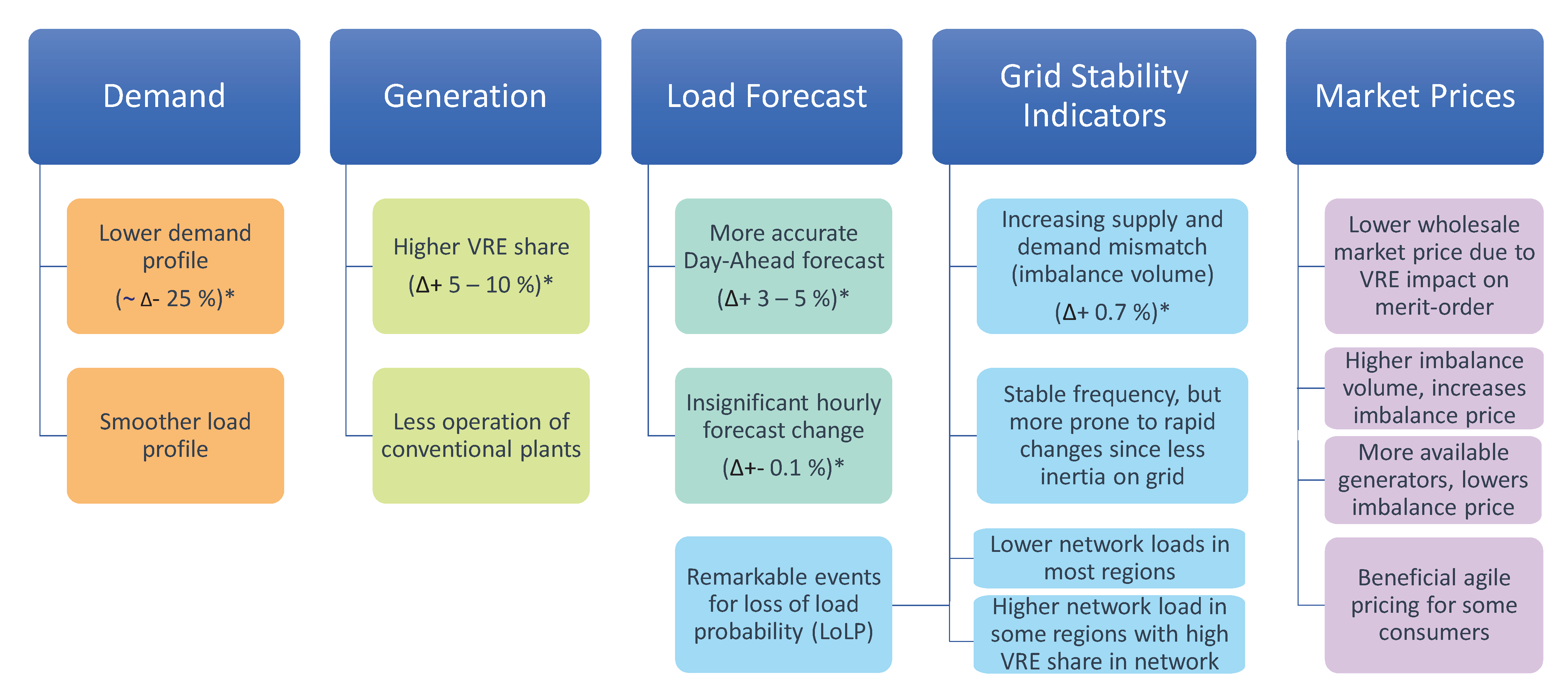
- This analysis characterises the changes in aggregate demand magnitude and profile due to the lockdown with various quantitative markers such as load duration curve, statistical distribution analysis and others.
- The ripple effects on the generation portfolio, system frequency, forecasting accuracy and imbalance pricing are also evaluated.
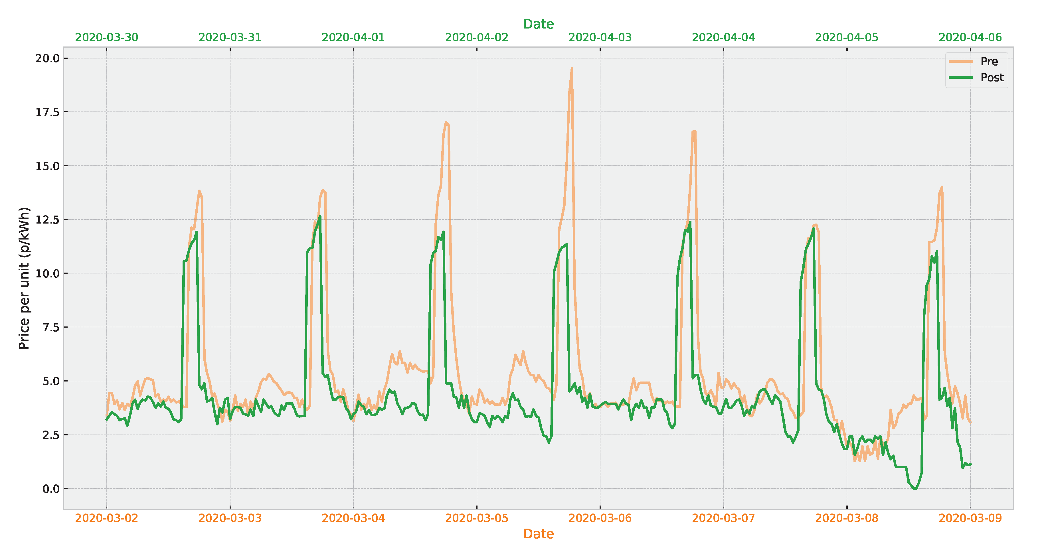
- The effect of the lockdown on domestic consumers on a variable energy tariff is identified and over 70 occurrences of negative pricing were detected.
- The implications of the lockdown are discussed for different stakeholders including generators, industrial and commercial consumers, domestic consumers on both fixed and variable tariffs, aggregators and demand-side response providers.
- The possibility of the lockdown data being an outlook for the future electricity system in terms of flatter demand profile and increased contribution from the variable renewable generators is discussed.
- The electricity data extraction and pre-processing pipeline that can be used in a variety of similar studies is presented.
2. Methodology
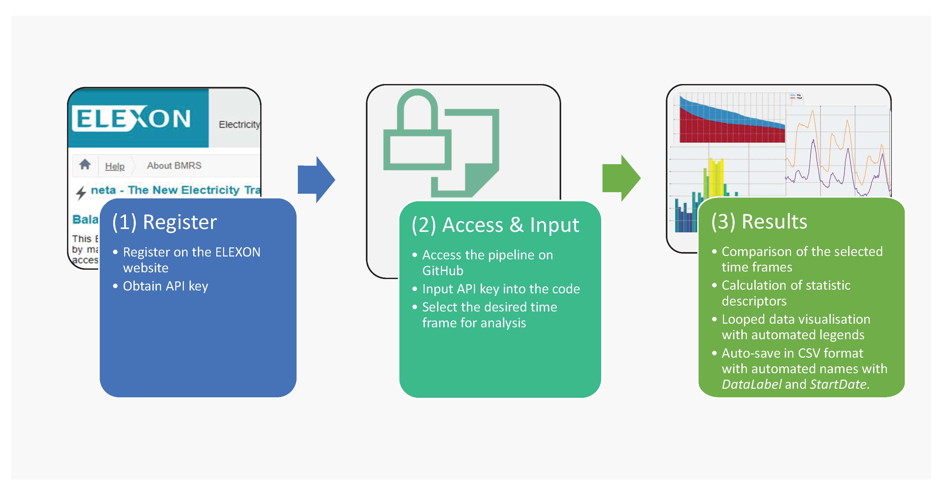
2.1. Function of the Data Pipeline Code
- Import the data from the source webpage using the API user key.
- Identify the keywords and group the data.
- Create weekly data frames (according to the Monday-to-Sunday convention (i.e., ISO 8601)).
- Check for zeros, invalid or duplicate data.
- Label and discard the columns that are not of interest.
- Adjust the date and time format (e.g., change from half-hourly settlement period convention (where 01:00 is denoted by 2) to time).
- Save the adjusted data in CSV format with an automated title(_Week_starting_.csv).
- Calculate statistical and other quantitative descriptors such as mean, peak-to-mean ratio, etc.
- Produce comparative visualisations of the data.
2.2. Other Uses of the Data Pipeline
3. Results
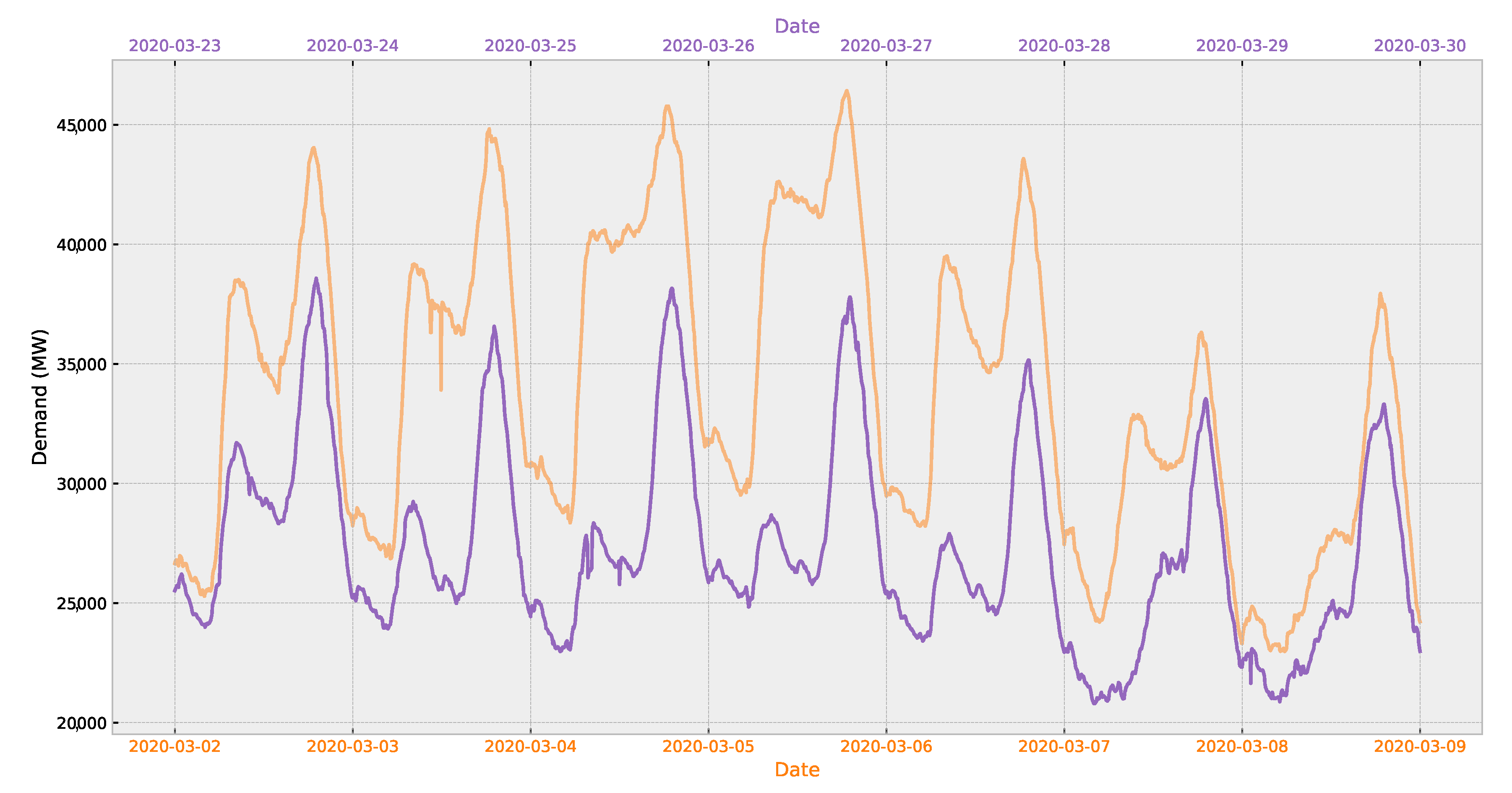
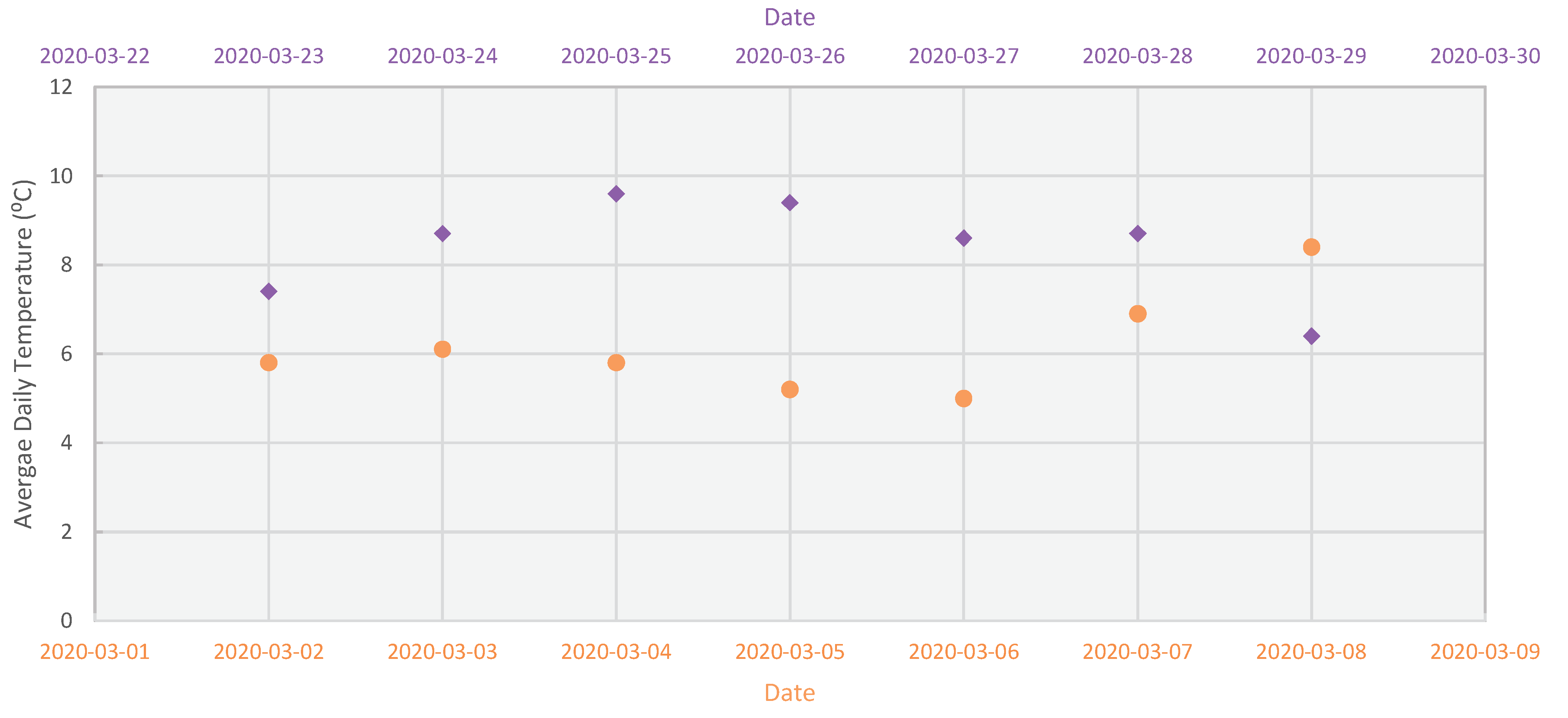
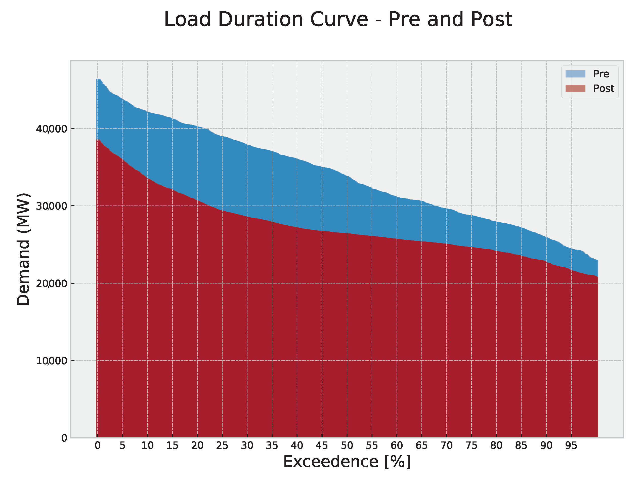
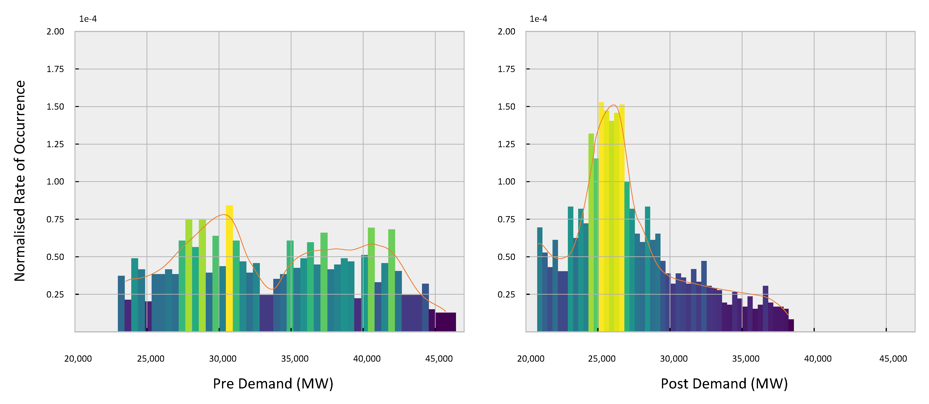
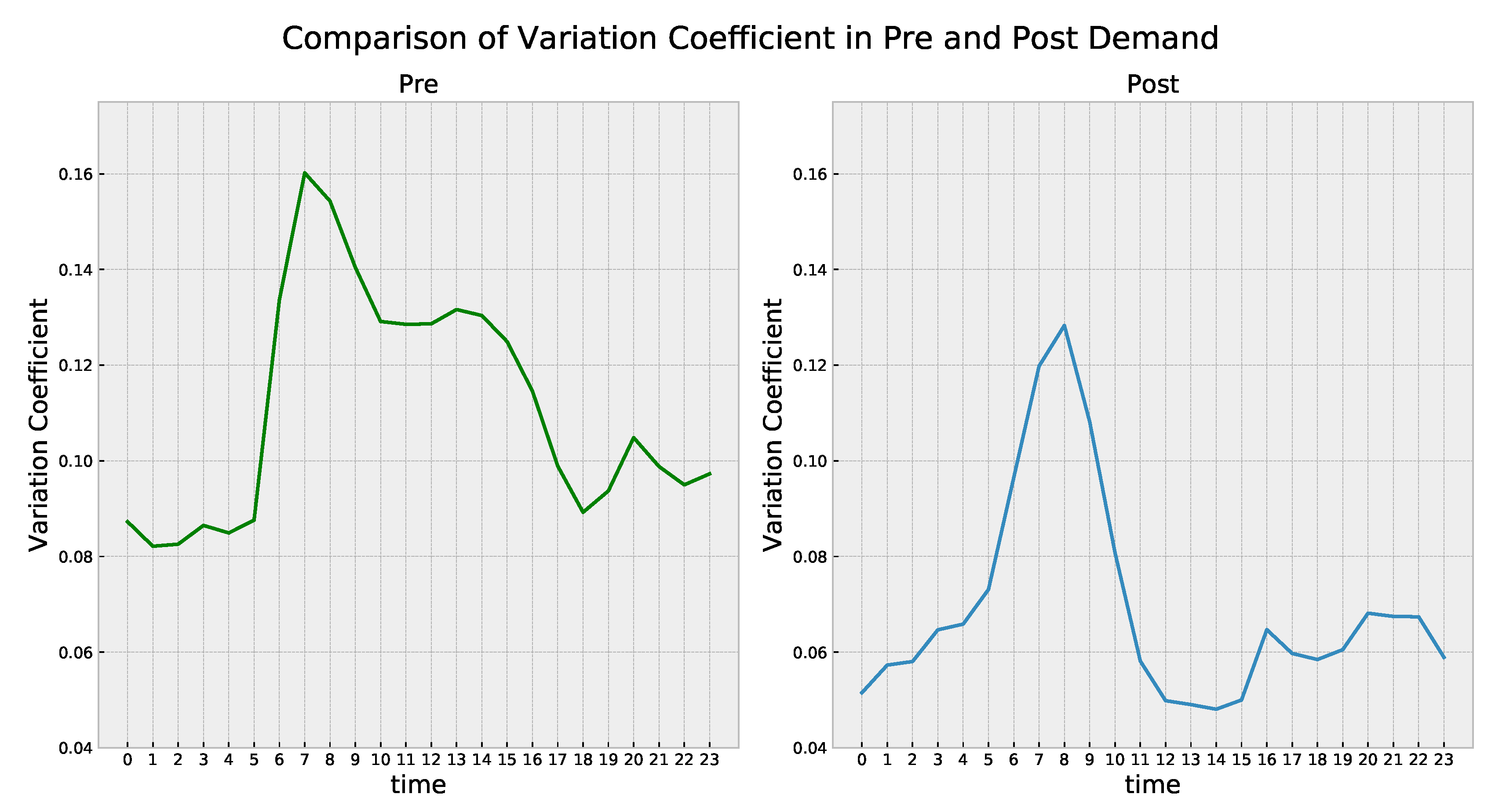
3.1. Demand Profile
3.2. Generation Portfolio
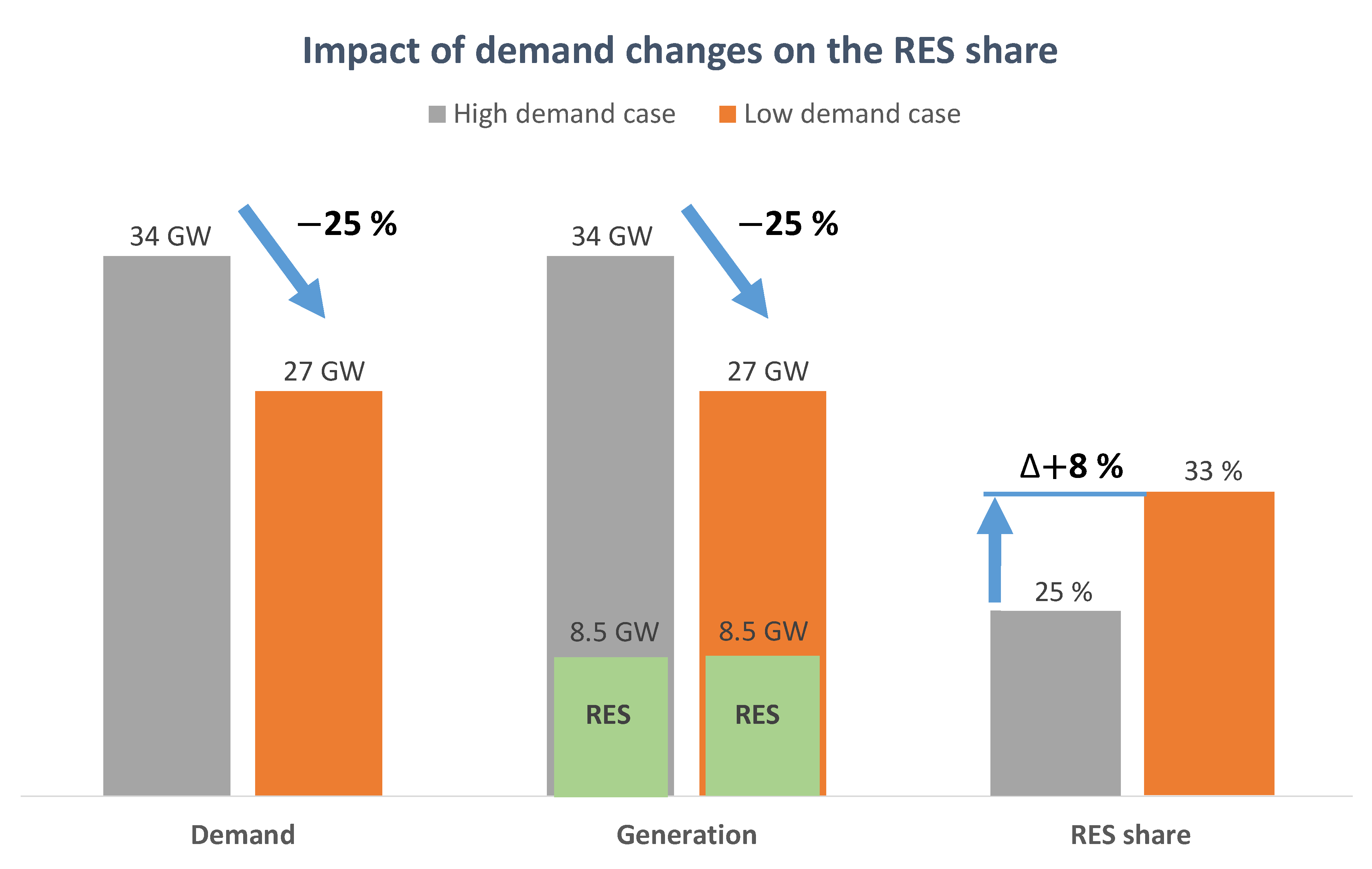
3.2.1. Renewable Energy Contribution
3.2.2. Impact on the Conventional Generation Portfolio
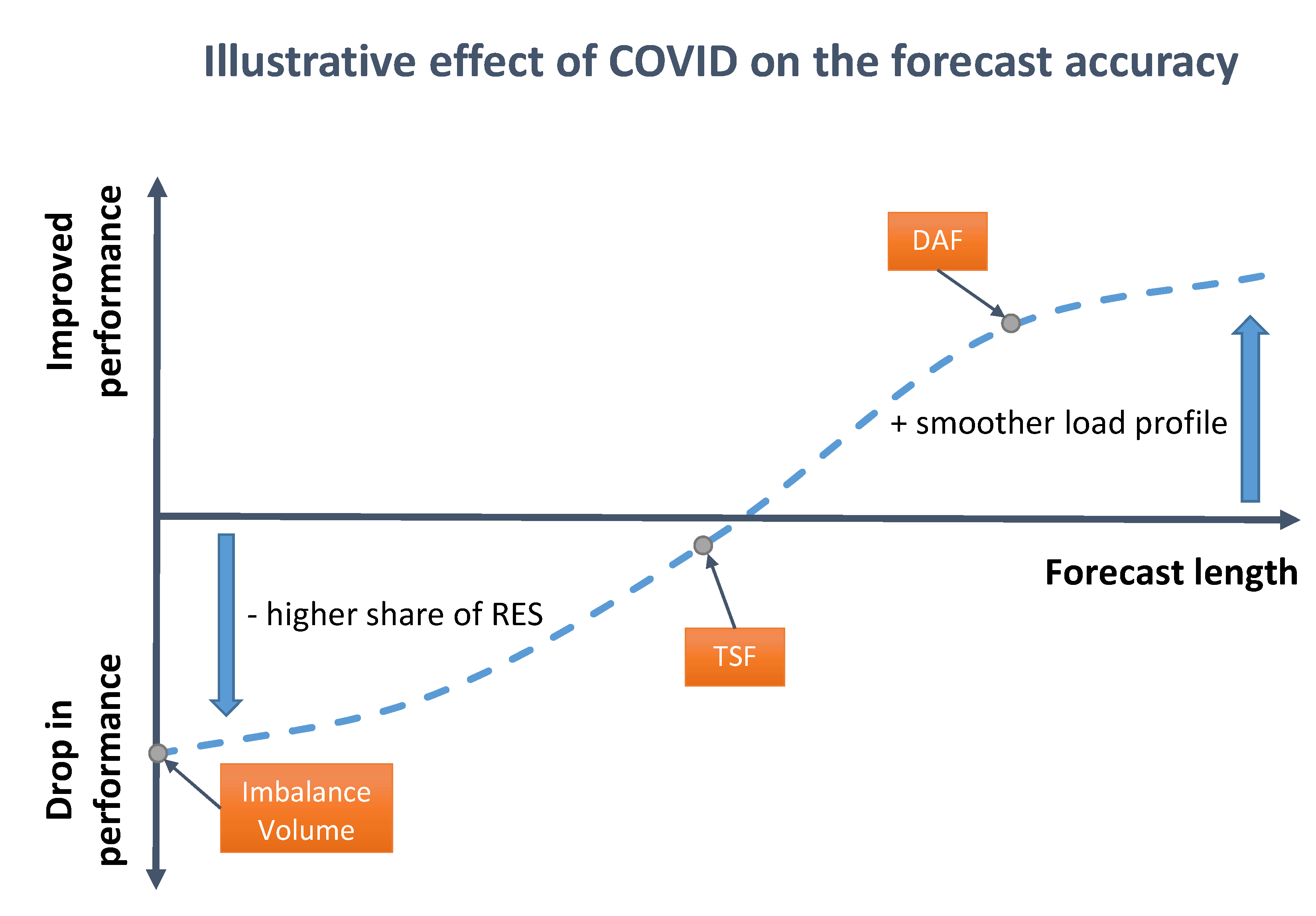
3.3. Forecasting and Grid Stability
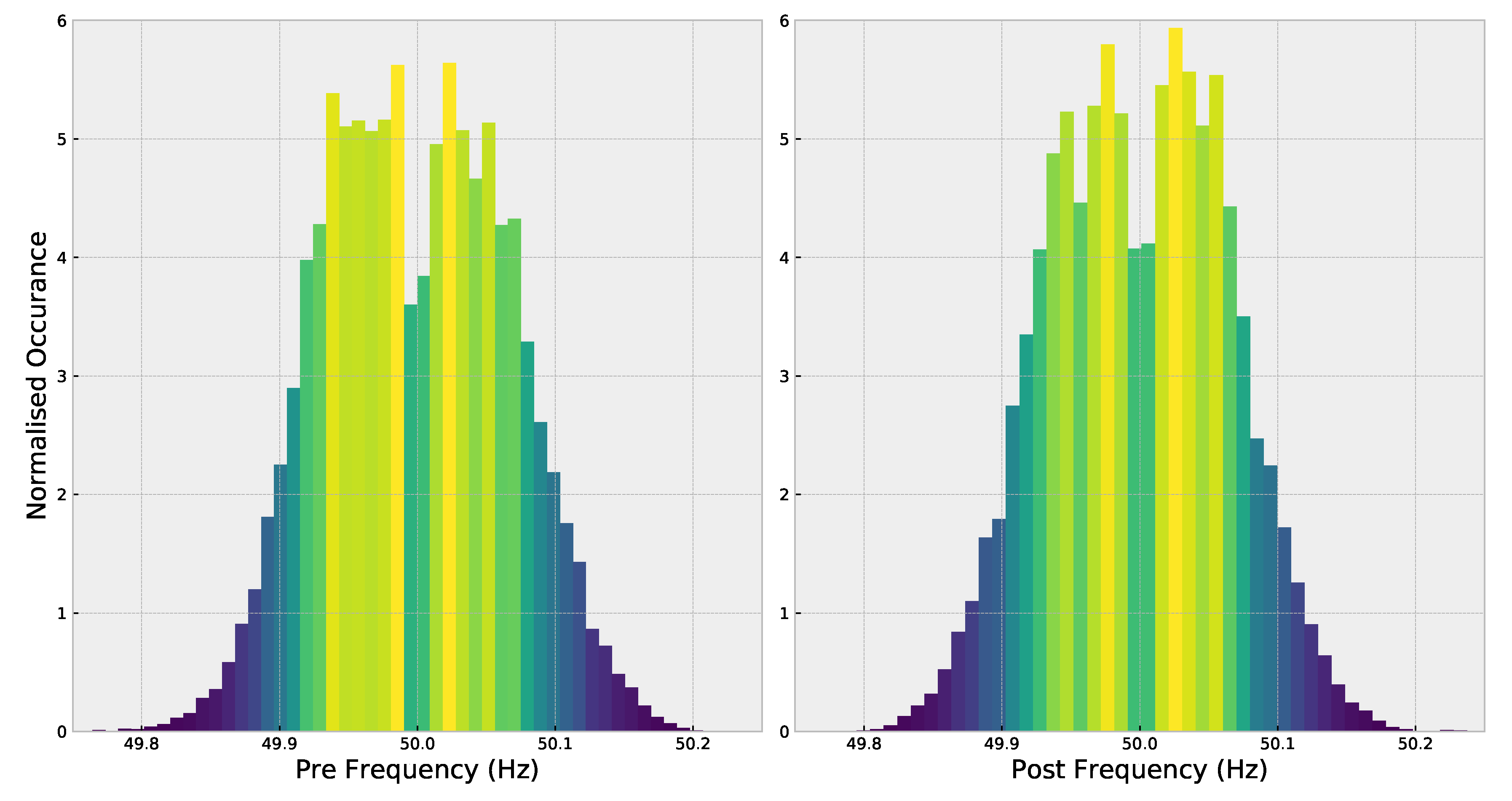
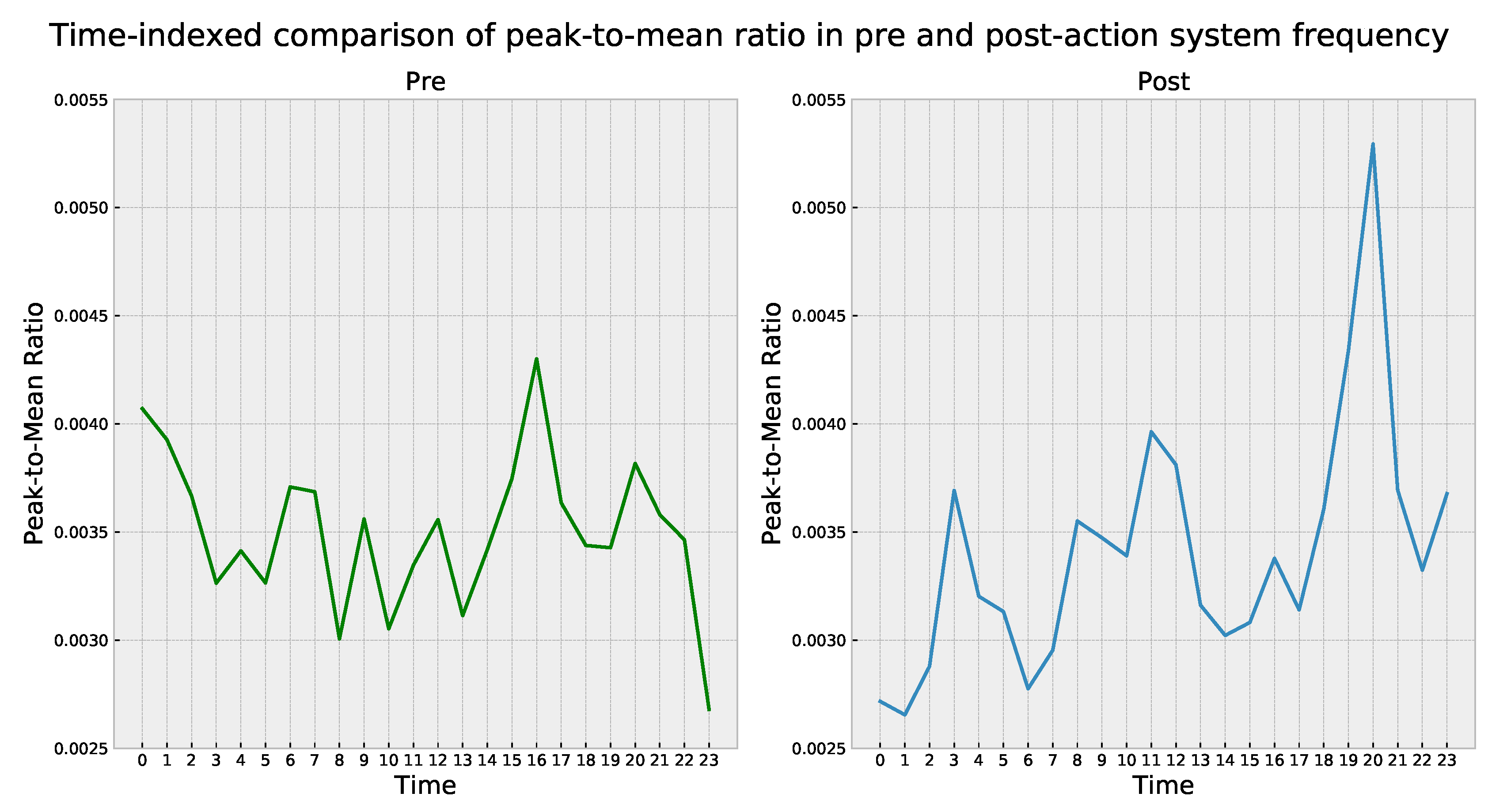
3.3.1. Deviations in System Frequency
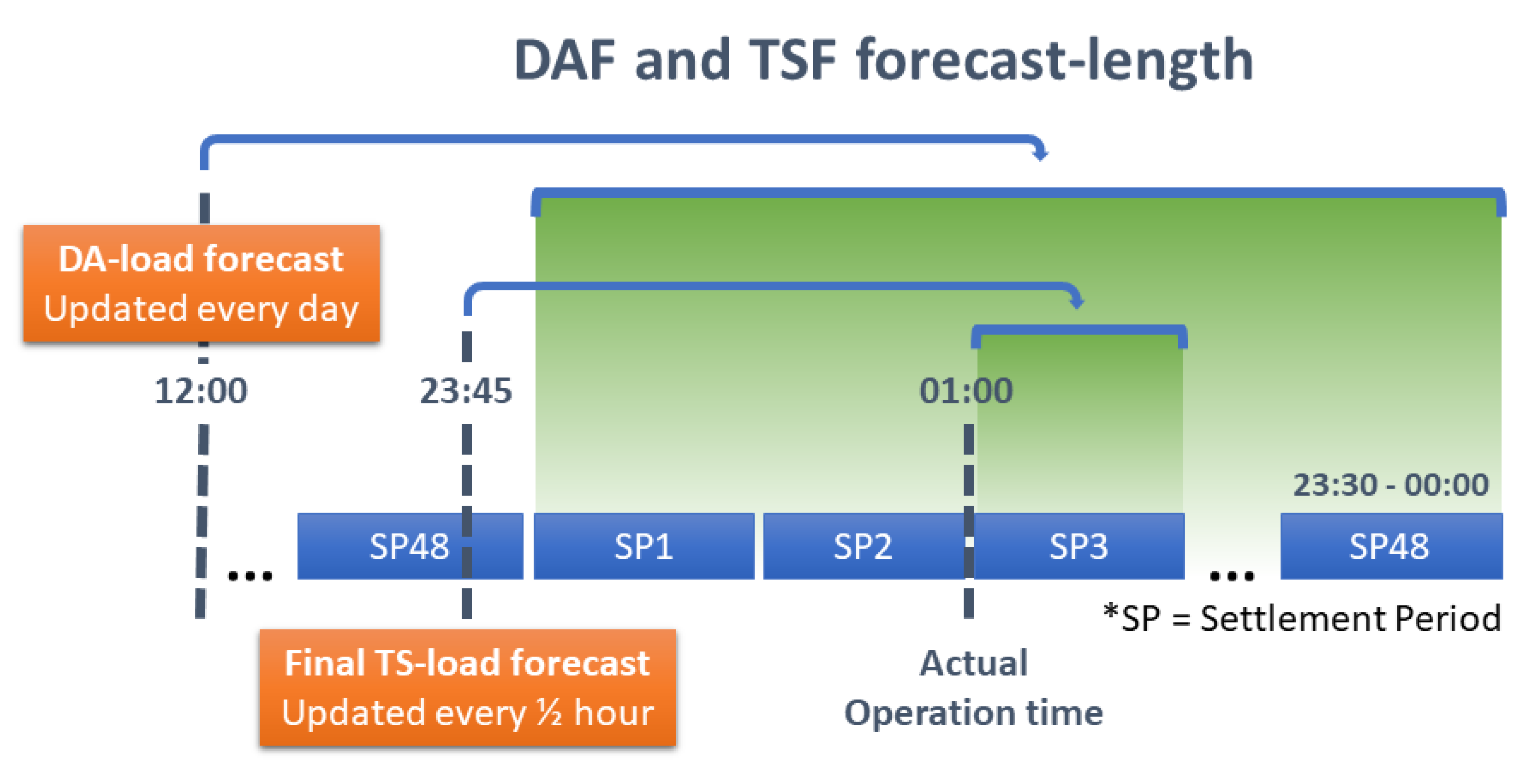
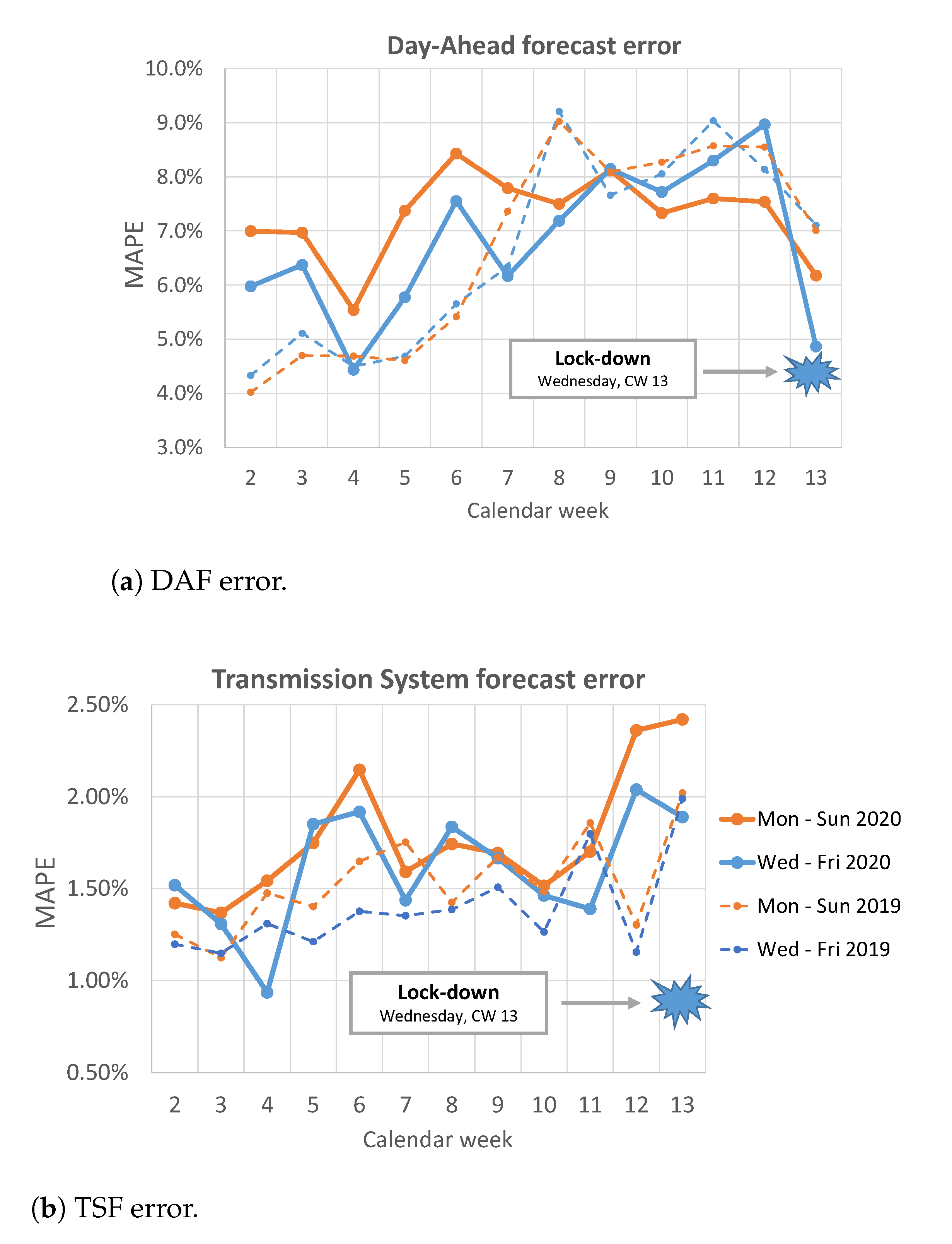
3.3.2. Load Forecast Error
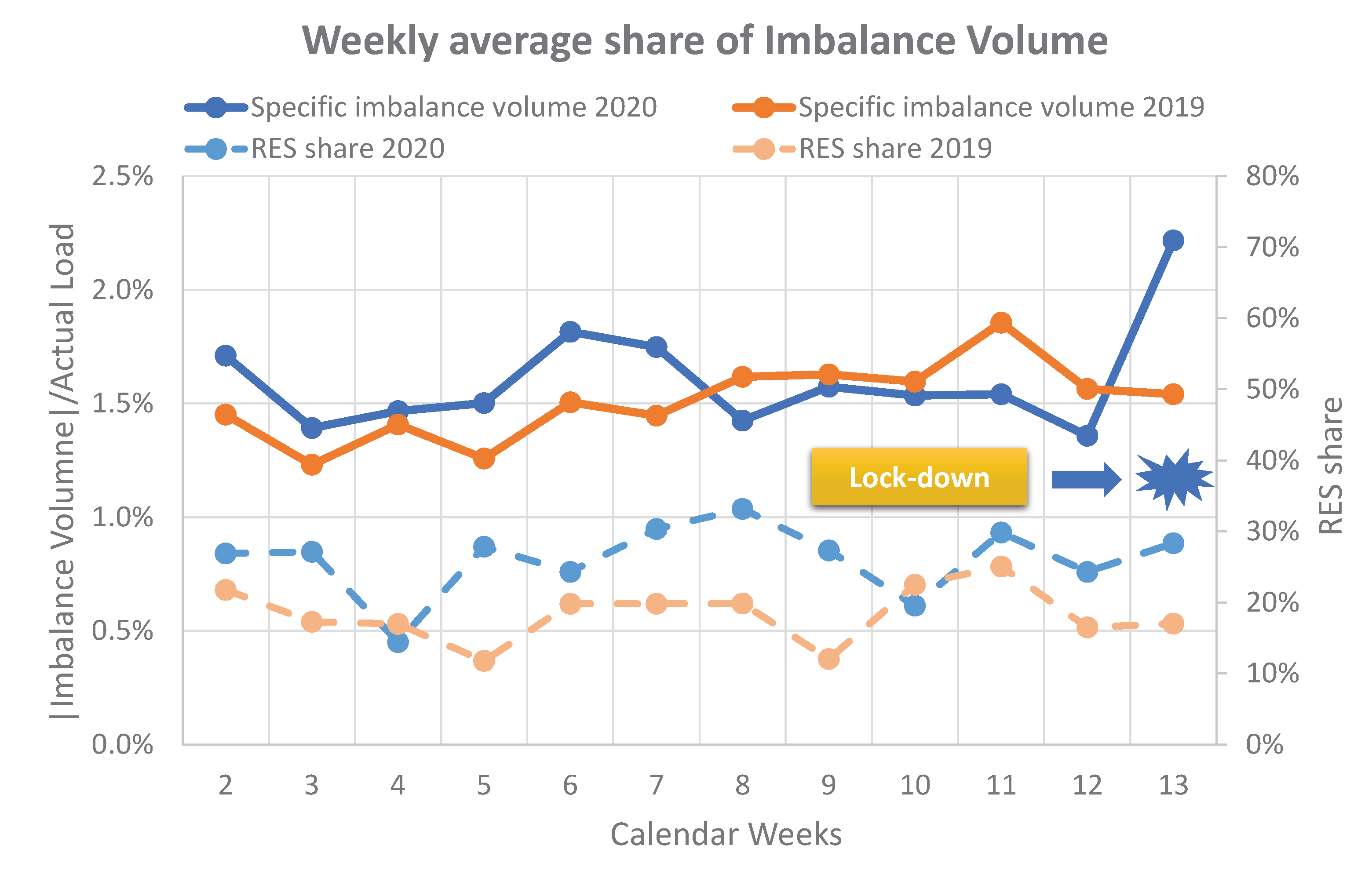
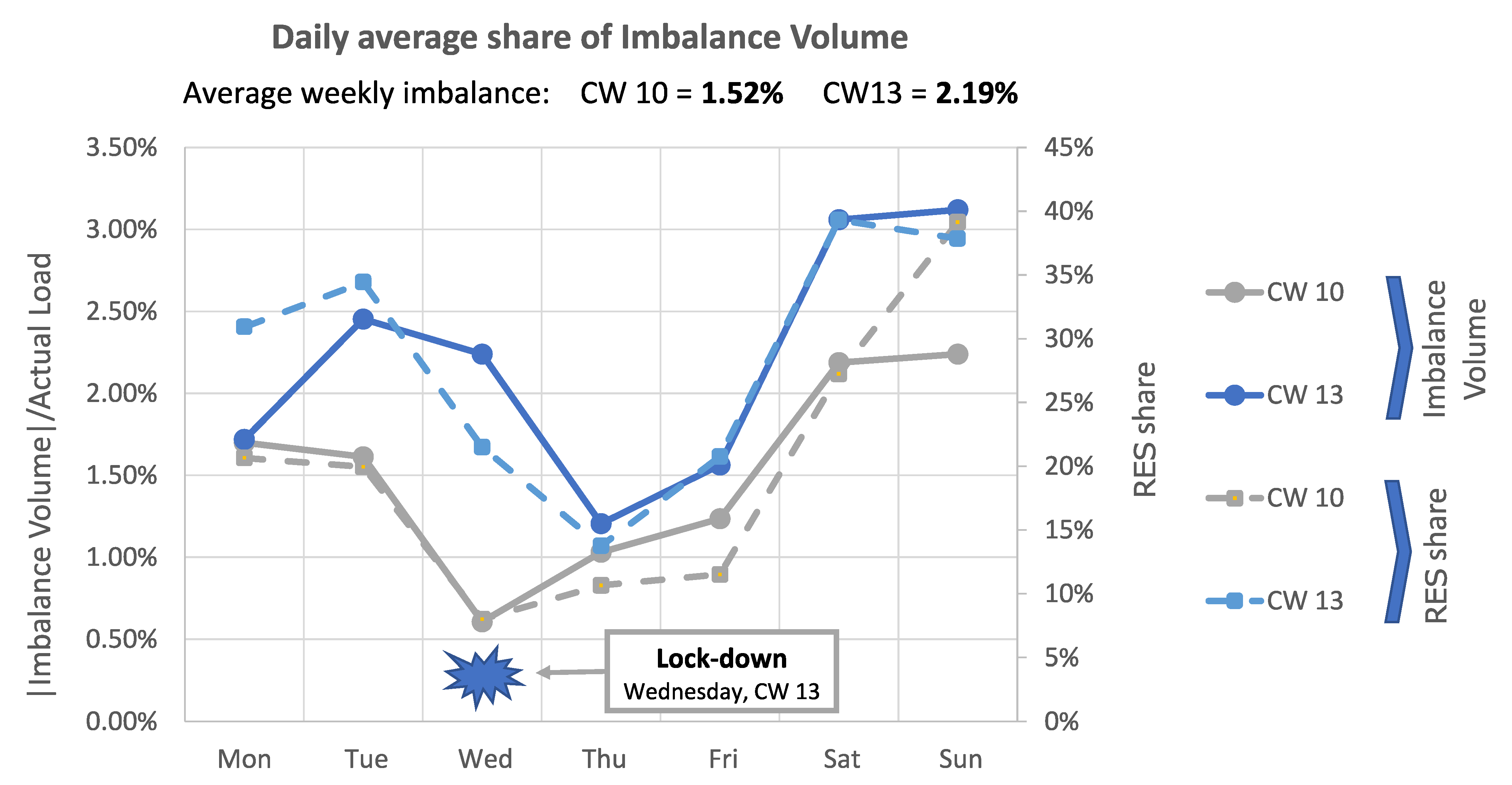
3.3.3. Imbalance Volume
- Demand prediction errors by suppliers.
- Generation prediction errors by generators (i.e., not able to tightly control the operation of intermittent units).
- Problems in transmission lines.
- Balance must exist at every instant, but market trades in half-hour. settlement periods.
3.3.4. Loss of Load Probability
3.4. The Effects on Market Price
3.4.1. Day-Ahead Wholesale Market Price
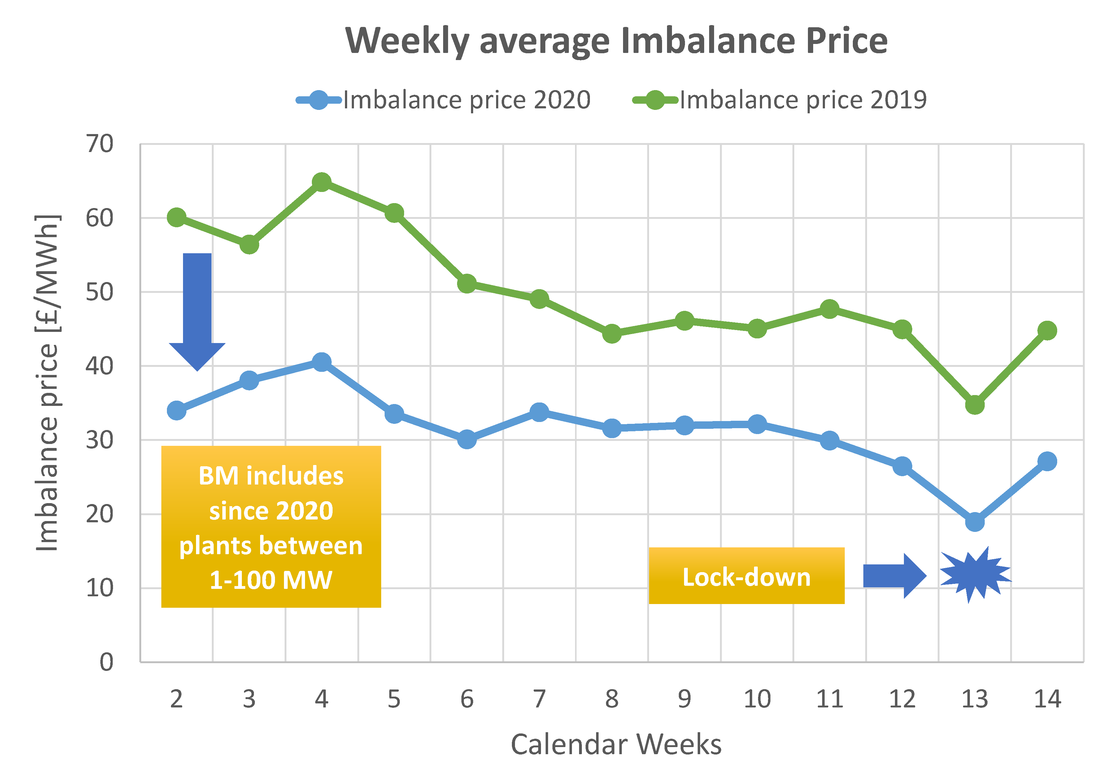
3.4.2. System Imbalance Price
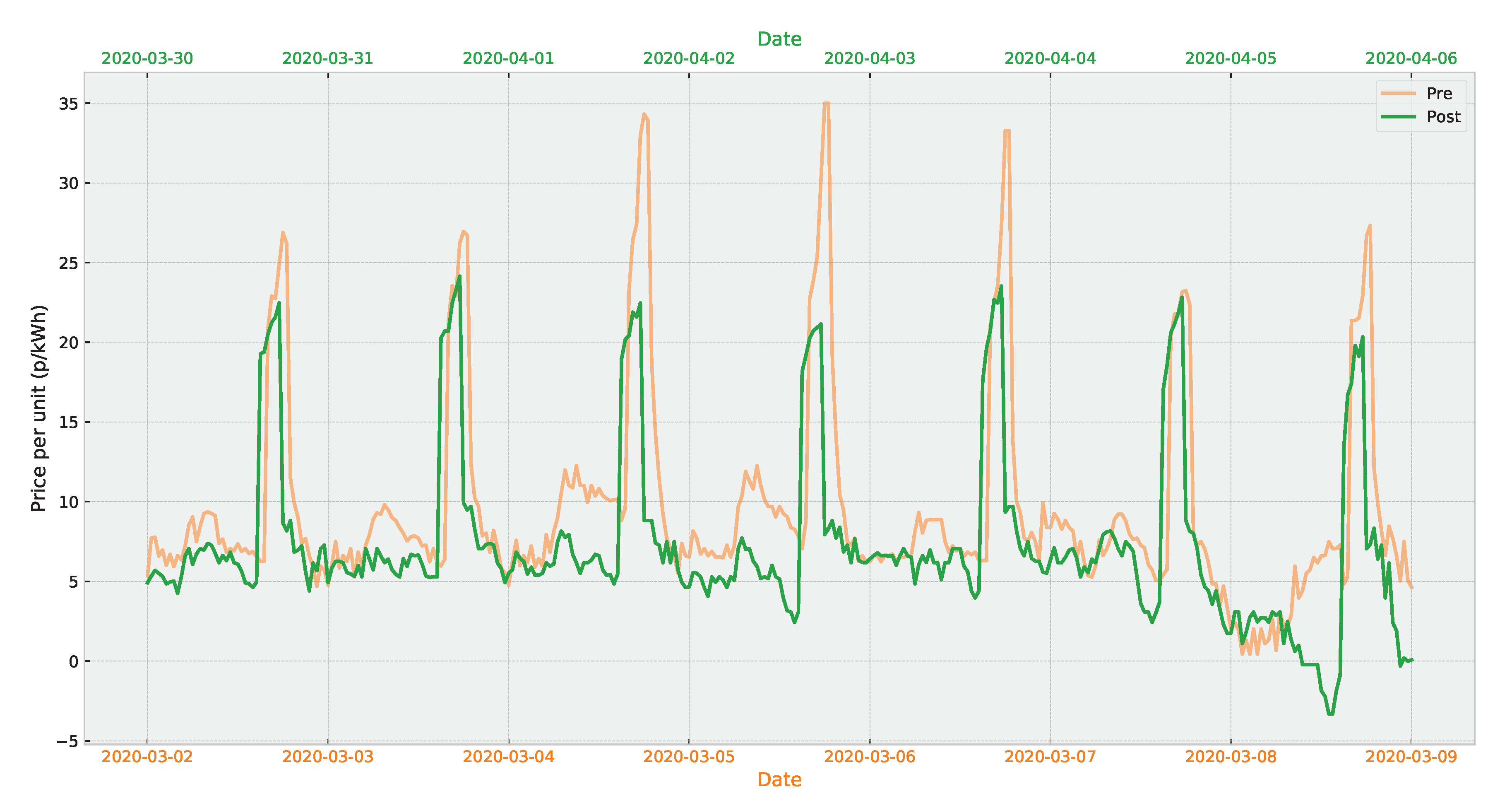
3.4.3. Variable Pricing for Domestic Consumers
4. Discussion
4.1. Implications for Stakeholders
4.1.1. Implications for Future Systems
4.2. Outlook and Future Work
5. Conclusions
Author Contributions
Funding
Institutional Review Board Statement
Informed Consent Statement
Data Availability Statement
Acknowledgments
Conflicts of Interest
References
- British Foreign Policy Group. COVID-19 Timeline. Available online: https://bfpg.co.uk/2020/04/covid-19-timeline/ (accessed on 11 November 2020).
- Winchester, L. Lights Out. Energy Firms Warn of Blackouts Plunging Coronavirus Lockdown Brits into Darkness. Sun. 31 March 2020. Available online: https://www.thesun.co.uk/money/11292200/coronavirus-energy-electricity-blackout/ (accessed on 20 January 2021).
- Panteli, M.; Pickering, C.; Wilkinson, S.; Dawson, R.; Mancarella, P. Power System Resilience to Extreme Weather: Fragility Modeling, Probabilistic Impact Assessment, and Adaptation Measures. IEEE Trans. Power Syst. 2017, 32, 3747–3757. [Google Scholar] [CrossRef]
- Electrical Power Research Institute (EPRI). COVID-19 Bulk System Impacts Demand Impacts and Operational and Control Center Practices. In Technical Report; Electrical Power Research Institute: Palo Alto, CA, USA, 2020; Available online: http://mydocs.epri.com/docs/public/covid19/3002018602R2.pdf (accessed on 11 November 2020).
- National Grid ESO. The ‘Lockdown Effect’ on TV Viewing Habits and the Electricity Grid. Available online: https://www.nationalgrideso.com/news/lockdown-effect-tv-viewing-habits-and-electricity-grid (accessed on 20 January 2021).
- Aurora Energy Research. Impact of Coronavirus on European energy markets. In Technical Report; Aurora Energy Research: Oxford, UK, 2020; Available online: https://www.auroraer.com/wp-content/uploads/2020/04/Aurora-COVID-19-weekly-impact-tracker-150420-FINAL.pdf (accessed on 11 November 2020).
- Elexon. Highest System Price Since 19 Years; Technical Report; Elexon: London, UK, 2020; Available online: https://www.elexon.co.uk/article/elexon-insight-highest-system-price-in-... (accessed on 11 November 2020).
- Kirli, D. Electricity Data Pipeline. Available online: https://github.com/desenk/Electricity-Data-Pipeline (accessed on 11 November 2020).
- Kirli, D.; Parzen, M.; Kiprakis, A. Dataset: Impact of the COVID-19 Lockdown on the Electricity System of Great Britain: A Study on Energy Demand, Generation, Pricing and Grid Stability, 2019–2020 [Dataset]. University of Edinburgh. School of Engineering. Institute for Energy Systems. Available online: https://doi.org/10.7488/ds/2979. (accessed on 26 January 2020).
- Elexon. BMRS API and Data Push User Guide. 2019. Available online: https://www.elexon.co.uk/documents/training-guidance/bsc-guidance-notes/bmrs-api-and-data-push-user-guide-2/ (accessed on 11 November 2020).
- Elexon. Balancing Market Reporting Service. 2020. Available online: https://www.bmreports.com/bmrs/?q=eds/main (accessed on 11 November 2020).
- Government Agrees Measures with Energy Industry to Support Vulnerable People through COVID-19—GOV.UK. Available online: https://www.gov.uk/government/news/government-agrees-measures-with-energy-industry-to-support-vulnerable-people-through-covid-19 (accessed on 11 November 2020).
- Elexon. BMRS: Temperature Data. Available online: https://www.bmreports.com/bmrs/?q=generation/tempraturedata (accessed on 20 January 2021).
- Thornton, H.E.; Hoskins, B.J.; Scaife, A.A. The role of temperature in the variability and extremes of electricity and gas demand in Great Britain. Environ. Res. Lett. 2016, 11, 114015. [Google Scholar] [CrossRef]
- Hirth, L. The Economics of Wind and Solar Variability. In Technical Report; Technical University Berlin: Berlin, Germany, 2014; Available online: https://neon.energy/Hirth-2014-Economics-Wind-Solar-Variability-Value-Deployment-Costs.pdf (accessed on 11 November 2020).
- International Energy Agency. Re-Powering Markets. Market Design and Regulation during the Transition to Low-Carbon Power Systems; Technical Report; IEA: Paris, France, 2016. [Google Scholar]
- Cochran, J. Market Evolution: Wholesale Electricity Market Design for 21st Century Power Systems; Technical Report; NREL: Golden, CO, USA, 2013. Available online: https://www.nrel.gov/docs/fy14osti/57477.pdf (accessed on 11 November 2020).
- Ela, E.; Milligan, M.; Kirby, B. Operating Reserves and Variable Generation: A Comprehensive Review of Current Strategies, Studies, and Fundamental Research on the Impact that Increased Penetration of Variable Renewable Generation has on Power System Operating Reserves; Technical Report; NREL: Golden, CO, USA, 2011. Available online: https://www.nrel.gov/docs/fy11osti/51978.pdf (accessed on 11 November 2020).
- National Grid. Balancing Services Adjustment Data Methodology Statement. 2018. Available online: https://www.nationalgrideso.com/document/94856/download (accessed on 11 November 2020).
- Hansen, A.D.; Altin, M.; Margaris, I.D.; Iov, F.; Tarnowski, G.C. Analysis of the short-term overproduction capability of variable speed wind turbines. Renew. Energy 2014, 68, 326–336. [Google Scholar] [CrossRef]
- Zeni, L.; Rudolph, A.J.; Münster-Swendsen, J.; Margaris, I.; Hansen, A.D.; Sørensen, P. Virtual inertia for variable speed wind turbines. Wind Energy 2013, 16, 1225–1239. [Google Scholar] [CrossRef]
- Liu, J.; Yang, D.; Yao, W.; Fang, R.; Zhao, H.; Wang, B. PV-based virtual synchronous generator with variable inertia to enhance power system transient stability utilizing the energy storage system. Prot. Control Mod. Power Syst. 2017, 2, 39. [Google Scholar] [CrossRef]
- Sahay, K.B.; Tripathi, M.M. Day ahead hourly load forecast of PJM electricity market and iso new england market by using artificial neural network. In Innovative Smart Grid Technologies; IEEE: Washington, DC, USA, 2014; pp. 1–5. [Google Scholar] [CrossRef]
- Khuntia, S.R.; Rueda, J.L.; van der Meijden, M.A. Forecasting the load of electrical power systems in mid- and long-term horizons: A review. IET Gener. Transm. Distrib. 2016, 10, 3971–3977. [Google Scholar] [CrossRef]
- He, F.; Zhou, J.; Mo, L.; Feng, K.; Liu, G.; He, Z. Day-ahead short-term load probability density forecasting method with a decomposition-based quantile regression forest. Appl. Energy 2020, 262. [Google Scholar] [CrossRef]
- Tofallis, C. A better measure of relative prediction accuracy for model selection and model estimation. J. Oper. Res. Soc. 2015, 66, 1352–1362. [Google Scholar] [CrossRef]
- National Grid ESO. Quarterly Forecasting Report—March 18. 2018. Available online: https://www.nationalgrideso.com/sites/eso/files/documents/Quarterly%20Forecasting%20Report%20-%20March18.pdf (accessed on 11 November 2020).
- National Grid ESO. Energy Forecasting Strategic Project Roadmap; Technical Report; National Grid ESO: Warwick, UK, 2019; Available online: https://demandforecast.nationalgrid.com/efs_demand_forecast/downloadfile?filename=Energy%20Forecasting%20Strategic%20Project%20Roadmap_1561466731012.pdf (accessed on 11 November 2020).
- Elexon. Guidance Imbalance Pricing Guidance in Great Britain. 2019. Available online: https://www.elexon.co.uk/documents/training-guidance/bsc-guidance-notes/imbalance-pricing/ (accessed on 11 November 2020).
- Elexon. Loss of Load Probability Calculation Statement. 2019. Available online: https://www.elexon.co.uk/documents/bsc-codes/lolp/loss-of-load-probability-calculation-statement/ (accessed on 11 November 2020).
- Maekawa, J.; Hai, B.H.; Shinkuma, S.; Shimada, K. The effect of renewable energy generation on the electric power spot price of the Japan electric power exchange. Energies 2018, 11, 2215. [Google Scholar] [CrossRef]
- National Grid. Procurement Guidelines SO. 2017. Available online: http://www2.nationalgrid.com/UK/Industry-information (accessed on 11 November 2020).
- National Grid. Wider Access to Balancing Mechanism Roadmap; Technical Report; National Grid: Warwick, UK, 2018; Available online: https://www.nationalgrid.com/sites/default/files/documents/Wider20BM20Access20Roadmap_FINAL.pdf (accessed on 24 November 2020).
- National Grid. Wider Access to the GB Balancing Mechanism and TERRE—Review and Update; Technical Report; National Grid: Warwick, UK, 2020. [Google Scholar]
- Campillo, J.; Dahlquist, E.; Wallin, F.; Vassileva, I. Is real-time electricity pricing suitable for residential users without demand-side management? Energy 2016, 109, 310–325. [Google Scholar] [CrossRef]
- Octopus Energy. Agile Pricing. Available online: https://octopus.energy/blog/agile-pricing-explained/ (accessed on 11 November 2020).
- Zarch. Energy Stats UK. Available online: https://www.energy-stats.uk/ (accessed on 11 November 2020).
- Igor Todorović. Birol: COVID-19 shock shows renewables’ importance for power balance. Balkan Green Energy News. 2020. Available online: https://balkangreenenergynews.com/birol-covid-19-shock-shows-renewables-importance-for-power-balance/ (accessed on 11 November 2020).
- Staffell, I.; Pfenninger, S. The increasing impact of weather on electricity supply and demand. Energy 2018, 145, 65–78. [Google Scholar] [CrossRef]
- Mukherjee, J.C.; Gupta, A. A Review of Charge Scheduling of Electric Vehicles in Smart Grid. IEEE Syst. J. 2015, 9, 1541–1553. [Google Scholar] [CrossRef]
- Kirli, D.; Kiprakis, A. Techno-economic potential of battery energy storage systems in frequency response and balancing mechanism actions. J. Eng. 2020, 2020, 774–782. [Google Scholar] [CrossRef]
- Snow, S.; Bean, R.; Glencross, M.; Horrocks, N. Drivers behind Residential Electricity Demand Fluctuations Due to COVID-19 Restrictions. Energies 2020, 13, 5738. [Google Scholar] [CrossRef]
- Ghiani, E.; Galici, M.; Mureddu, M.; Pilo, F. Impact on Electricity Consumption and Market Pricing of Energy and Ancillary Services during Pandemic of COVID-19 in Italy. Energies 2020, 13, 3357. [Google Scholar] [CrossRef]


| Profile | Peak Load (MW) | % | Mean Load (MW) | % | Base Load (MW) | % |
|---|---|---|---|---|---|---|
| Pre | 46,425 | 33,868 | 22,982 | |||
| Post | 38,585 | −20.31% | 27,294 | −24.08% | 20,795 | −9.5% |
| Data | Mean | Min | Max |
|---|---|---|---|
| Pre (Hz) | 49.998804 | 49.736000 | 50.207000 |
| Post (Hz) | 49.998657 | 49.775000 | 50.267000 |
| Data | Mean | Min | Max | Dates Corresponding to Max Values |
|---|---|---|---|---|
| Pre (p/kWh) | −1.62 | −0.07 | −4.85 | 9 December 2019 |
| Post (p/kWh) | −1.36 | −0.02 | −3.99 | 20 April 2020 |
| Overall (p/kWh) | −1.44 | −0.02 | −4.85 | 9 December 2019 |
Publisher’s Note: MDPI stays neutral with regard to jurisdictional claims in published maps and institutional affiliations. |
© 2021 by the authors. Licensee MDPI, Basel, Switzerland. This article is an open access article distributed under the terms and conditions of the Creative Commons Attribution (CC BY) license (http://creativecommons.org/licenses/by/4.0/).
Share and Cite
Kirli, D.; Parzen, M.; Kiprakis, A. Impact of the COVID-19 Lockdown on the Electricity System of Great Britain: A Study on Energy Demand, Generation, Pricing and Grid Stability. Energies 2021, 14, 635. https://doi.org/10.3390/en14030635
Kirli D, Parzen M, Kiprakis A. Impact of the COVID-19 Lockdown on the Electricity System of Great Britain: A Study on Energy Demand, Generation, Pricing and Grid Stability. Energies. 2021; 14(3):635. https://doi.org/10.3390/en14030635
Chicago/Turabian StyleKirli, Desen, Maximilian Parzen, and Aristides Kiprakis. 2021. "Impact of the COVID-19 Lockdown on the Electricity System of Great Britain: A Study on Energy Demand, Generation, Pricing and Grid Stability" Energies 14, no. 3: 635. https://doi.org/10.3390/en14030635
APA StyleKirli, D., Parzen, M., & Kiprakis, A. (2021). Impact of the COVID-19 Lockdown on the Electricity System of Great Britain: A Study on Energy Demand, Generation, Pricing and Grid Stability. Energies, 14(3), 635. https://doi.org/10.3390/en14030635