
Designing Multimodal Interactive Dashboard of Disaster Management Systems


Abstract
:1. Introduction
1.1. Disaster Management Systems
1.2. The Objectives of Developing Multimodal Interactive Dashboards of Disaster Management Systems
- To explore the multimodal (text, image, audio, and video) data requirements for developing interactive dashboards for displaying disaster-related information.
- To research ways to integrate text, image, audio, and video information to create multimodal interactive disaster dashboards.
- To design and prototype the interactive disaster dashboards using the user-centered design approach.
- To evaluate the prototypes of disaster-related interactive dashboards using usability evaluation techniques.
2. Related Work
3. Disaster Management Framework and Need for Information Visualization
4. Materials and Methods
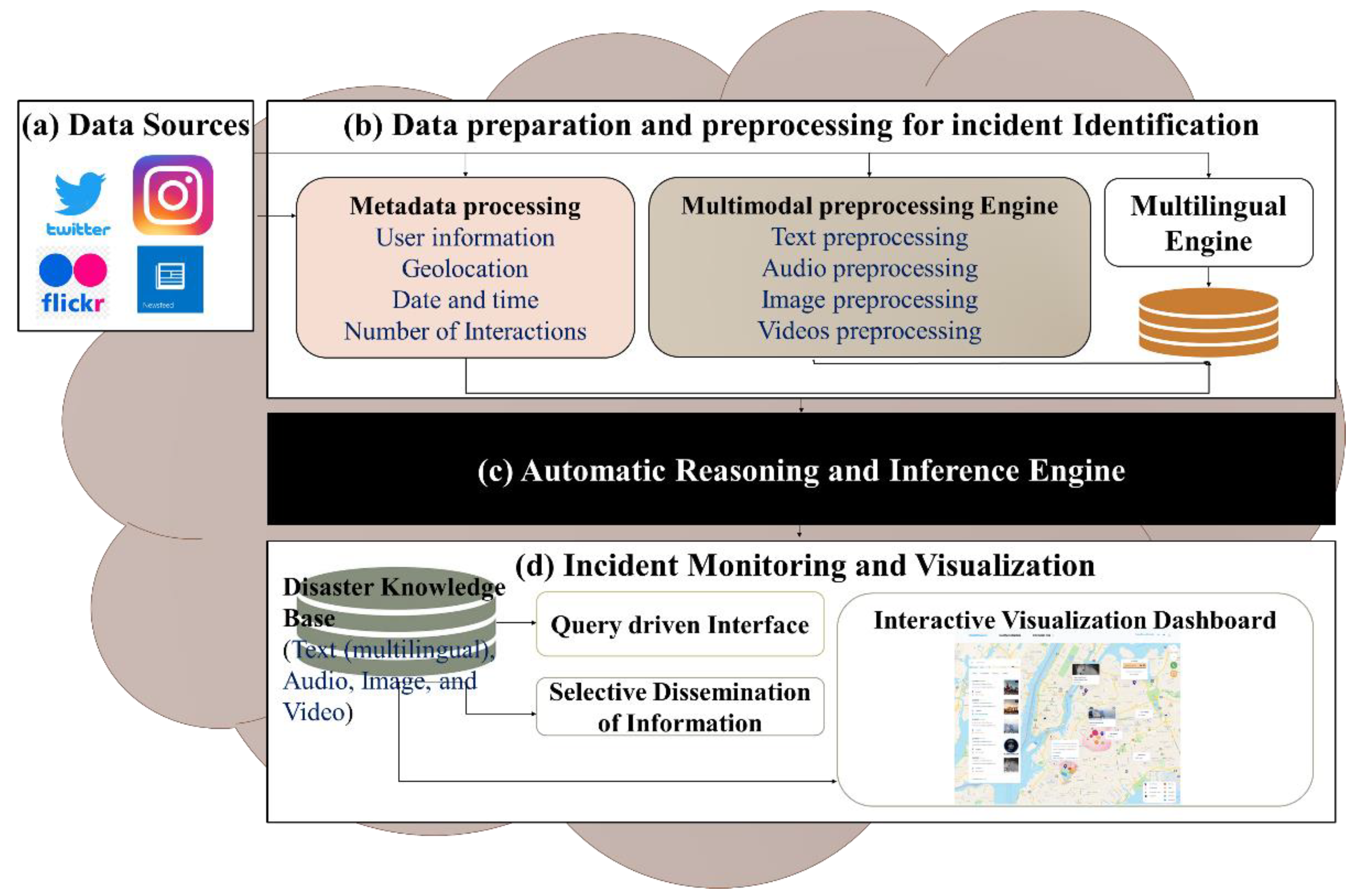
4.1. Data Collection
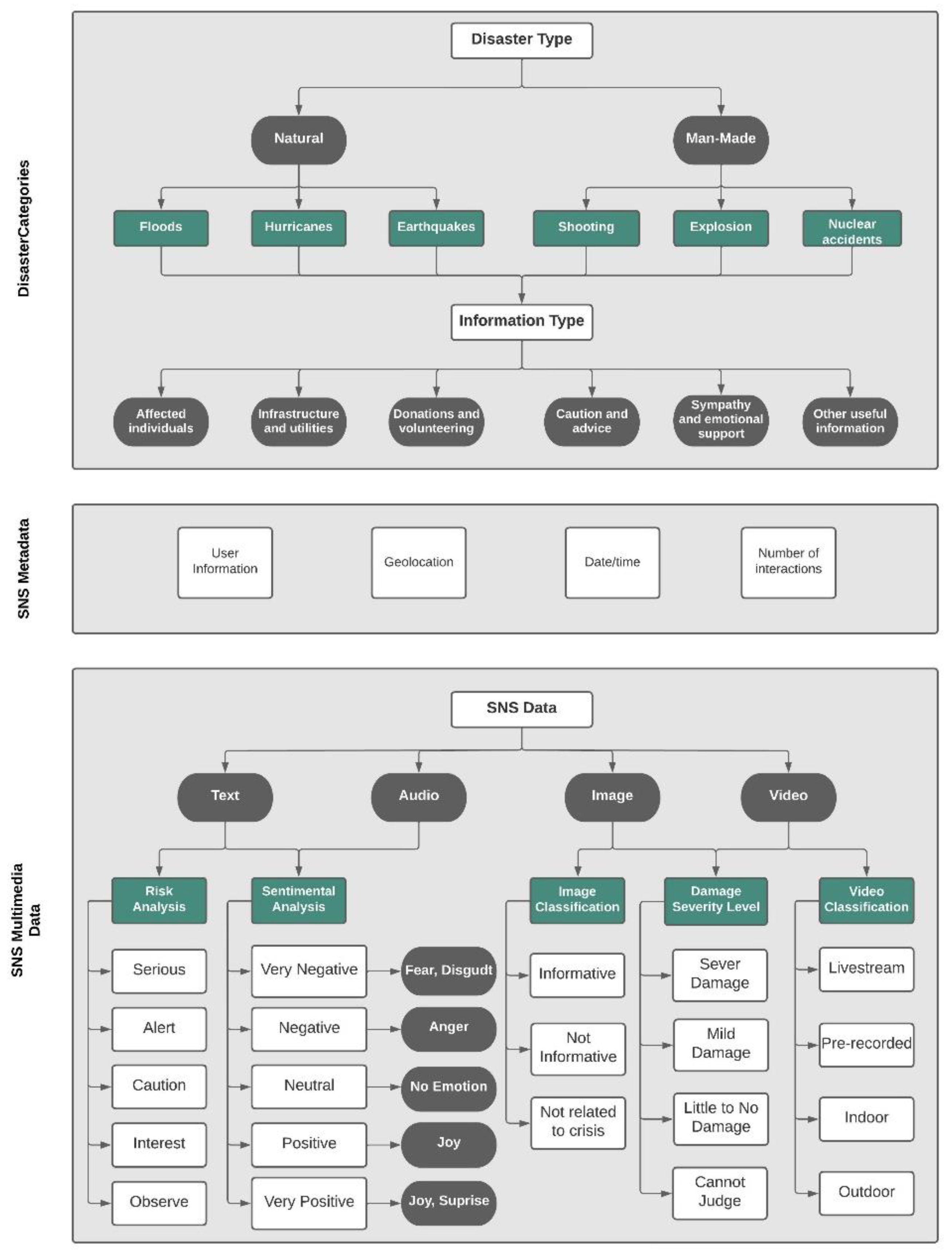
4.1.1. Disaster Categories
- a.
- Disaster types:
- Natural disaster: Disasters caused by a major and sudden adverse event from natural causes such as, floods, earthquakes, and hurricanes.
- Man-made disaster: Disasters caused by human negligence, error, or harmful intent, such as, shootings, explosions, and nuclear disasters.
- b.
- Information types:
- Affected individuals: deaths, injuries, missing, found, or displaced people, and/or personal updates.
- Infrastructure and utilities: buildings, roads, and utilities/services that are damaged, interrupted, restored, or operational.
- Donations and volunteering: needs, requests, or offers of money, blood, shelter, supplies, and/or services by volunteers or professionals.
- Caution and advice: warnings issued or lifted, as well as guidance and tips.
- Sympathy and emotional support: thoughts, prayers, gratitude, sadness, and support.
- Other useful information: information not covered by any of the above categories, such as flood level, weather, wind, and visibility.
4.1.2. SNS Metadata
- User information: user handle, display picture, number of followers/following, and number of posts.
- Geolocation: profile location, tagger location, mentioned location, geocodes, and geotags.
- Date and time: post date and time.
- Number of Interactions: Number of replies/comments, retweets and quote-retweets, likes, and views.
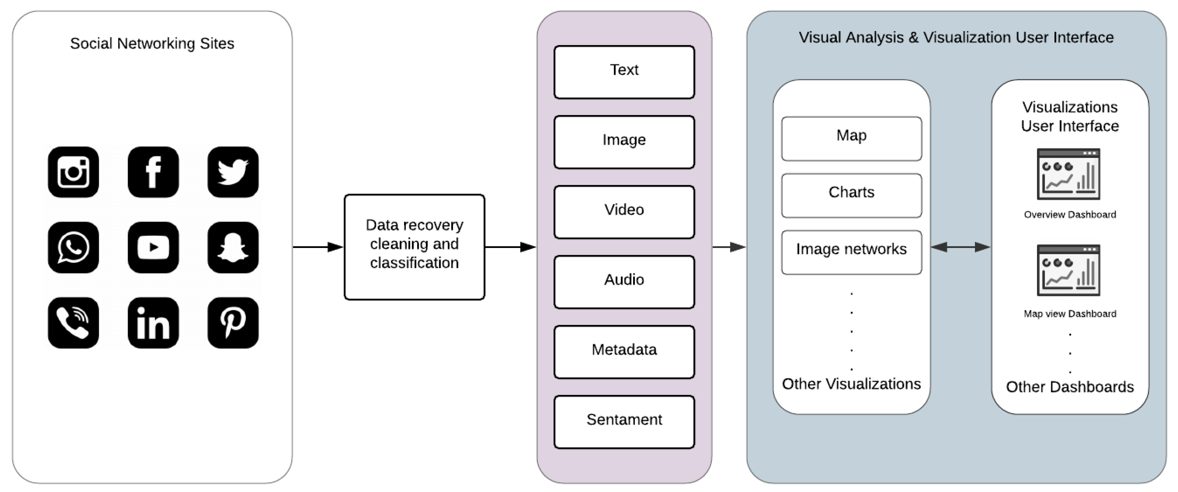
4.1.3. SNS Multimodal Data
Text
- a.
- Sentimental Analysis
- b.
- Risk Analysis
Audio
Images
- a.
- Images Classification
- ○
- Informative: If the image is useful to emergency responders, where it is related to the crisis, shows the affected area, and helps them understand the situation. For example, images of floods, fire, and hurt people.
- ○
- Not Informative: If the image is related to the crisis but not too useful to emergency responders in terms of helping them understand the situation. For example, images that are trolling and off-topic, or based on rumors, and humor.
- ○
- Not related to crisis: Posts that include advertisements or memes.
- b.
- Damage Severity Level
- ○
- Severe damage: Includes images that show considerable destruction of a foundation. For example, damaged roads, non-crossable bridges, or big clouds of smoke.
- ○
- ○
- Little to no damage: Images of damage-free foundations or ones that have very little damage. For example, wall cracks in building due to age.
- ○
- Cannot judge: Includes images that are of low quality.
Videos
- a.
- Videos Classification
- ○
- Livestream: Livestream videos are videos recorded and broadcasted in real-time, and they are built for engagement. When a person starts a livestream, there are other people commenting live on the video, and within the comments, there may be helpful information.
- ○
- Pre-recorded: Videos that are recorded in advance and then shared in SNS.
- ○
- Indoor: Includes videos that are taken indoors, such as offices, houses, or stores.
- ○
- Outdoor: Includes videos that are taken outdoors in open areas, such as streets, gardens, or open markets.
4.2. Requirments Gathering and Analysis for Multimodal Dashboard of Crisis Information
4.2.1. Technical Requirements
4.2.2. User Requirements
4.3. Interface Design Process
5. Interactive Dashboard
6. Discussion and Conclusions
Author Contributions
Funding
Institutional Review Board Statement
Informed Consent Statement
Data Availability Statement
Acknowledgments
Conflicts of Interest
References
- Blanchard, B.W. Guide to Emergency Management and Related Terms, Definitions, Concepts, Acronyms, Organizations, Programs, Guidance, Executive Orders & Legislation: A Tutorial on Emergency Management, Broadly Defined, Past and Present; Homeland Security and Digital Library; The United States. Federal Emergency Management Agency: Washington, DC, USA, 2008.
- Zhou, L.; Wu, X.; Xu, Z.; Fujita, H. Emergency decision making for natural disasters: An overview. Int. J. Disaster Risk Reduct. 2018, 27, 567–576. [Google Scholar] [CrossRef]
- Kaku, K. Satellite remote sensing for disaster management support: A holistic and staged approach based on case studies in Sentinel Asia. Int. J. Disaster Risk Reduct. 2019, 33, 417–432. [Google Scholar] [CrossRef]
- Palen, L.; Hughes, A.L. Social media in disaster communication. In Handbook of Disaster Research; Springer: Berlin/Heidelberg, Germany, 2018; pp. 497–518. [Google Scholar]
- Tuech, J.-J.; Gangloff, A.; Schwarz, L. Our challenge is to adapt the organization of our system to the six stages of the epidemic to go beyond the COVID-19 crisis. Br. J. Surgery 2020, 107, e189. [Google Scholar] [CrossRef] [PubMed]
- Essam, N.; Moussa, A.M.; Elsayed, K.M.; Abdou, S.; Rashwan, M.; Khatoon, S.; Hasan, M.; Asif, A.; Alshamari, M.A. Location Analysis for Arabic COVID-19 Twitter Data Using Enhanced Dialect Identification Models. Appl. Sci. 2021, 11, 11328. [Google Scholar] [CrossRef]
- Imran, M.; Elbassuoni, S.; Castillo, C.; Diaz, F.; Meier, P. Extracting information nuggets from disaster-Related messages in social media. Iscram 2013, 201, 791–801. [Google Scholar]
- Khatoon, S.; Asif, A.; Hasan, M.M.; Alshamari, M. Social Media-Based Intelligence for Disaster Response and Management in Smart Cities. In Artificial Intelligence, Machine Learning, and Optimization Tools for Smart Cities; Springer: Berlin/Heidelberg, Germany, 2022; pp. 211–235. [Google Scholar]
- Khatoon, S.; Alshamari, M.-A.; Asif, A.; Hasan, M.-M.; Abdou, S.; Elsayed, K.-M.; Rashwan, M. Development of Social Media Analytics System for Emergency Event Detection and Crisis Management. Comput. Mater. Contin. 2021, 68, 3079–3100. [Google Scholar] [CrossRef]
- Imran, M.; Mitra, P.; Srivastava, J. Cross-language domain adaptation for classifying crisis-related short messages. arXiv 2016, arXiv:1602.05388. [Google Scholar]
- Alam, F.; Imran, M.; Ofli, F. Image4act: Online social media image processing for disaster response. In Proceedings of the 2017 IEEE/ACM International Conference on Advances in Social Networks Analysis and Mining, Online, 31 July 2017; pp. 601–604. [Google Scholar]
- Alam, F.; Ofli, F.; Imran, M. Processing social media images by combining human and machine computing during crises. Int. J. Human Comput. Interact. 2018, 34, 311–327. [Google Scholar] [CrossRef]
- Asif, A.; Khatoon, S.; Hasan, M.M.; Alshamari, M.A.; Abdou, S.; Elsayed, K.M.; Rashwan, M. Automatic analysis of social media images to identify disaster type and infer appropriate emergency response. J. Big Data 2021, 8, 1–28. [Google Scholar] [CrossRef]
- Chae, J.; Thom, D.; Jang, Y.; Kim, S.; Ertl, T.; Ebert, D.S. Public behavior response analysis in disaster events utilizing visual analytics of microblog data. Comput. Graph. 2014, 38, 51–60. [Google Scholar] [CrossRef]
- Kwon, H.Y.; Kang, Y.O. Risk analysis and visualization for detecting signs of flood disaster in Twitter. Spat. Inf. Res. 2016, 24, 127–139. [Google Scholar] [CrossRef]
- Onorati, T.; Díaz, P.; Carrion, B. From social networks to emergency operation centers: A semantic visualization approach. Future Gener. Comput. Syst. 2019, 95, 829–840. [Google Scholar] [CrossRef]
- Bhargava, R.; Bishop, C.; Zuckerman, E. Mapping and Visualizing News Images for Media Research. Available online: https://cpb-us-w2.wpmucdn.com/sites.northeastern.edu/dist/d/53/files/2020/02/CJ_2020_paper_39.pdf (accessed on 2 April 2022).
- Wu, Y.; Cao, N.; Gotz, D.; Tan, Y.-P.; Keim, D.A. A survey on visual analytics of social media data. IEEE Trans. Multimed. 2016, 18, 2135–2148. [Google Scholar] [CrossRef]
- Musen, M.A. The protégé project: A look back and a look forward. AI Matters 2015, 1, 4–12. [Google Scholar] [CrossRef]
- O’Halloran, K.L.; Pal, G.; Jin, M. Multimodal approach to analysing big social and news media data. Discourse Context Media 2021, 40, 100467. [Google Scholar] [CrossRef]
- Sarlan, A.; Nadam, C.; Basri, S. Twitter sentiment analysis. In Proceedings of the 6th International Conference on Information Technology and Multimedia, Malang, Indonesia, 18–20 November 2014; pp. 212–216. [Google Scholar]
- Quiñones, D.; Rusu, C. How to develop usability heuristics: A systematic literature review. Comput. Stand. Interfaces 2017, 53, 89–122. [Google Scholar] [CrossRef]
- Asif, A.; AlFrraj, D.; Alshamari, M.A. A Comprehensive Approach of Exploring Usability Problems in Enterprise Resource Planning Systems. Appl. Sci. 2022, 12, 2293. [Google Scholar] [CrossRef]
- Okolloh, O. Ushahidi, or ‘testimony’: Web 2.0 tools for crowdsourcing crisis information. Particip. Learn. Action 2009, 59, 65–70. [Google Scholar]
- Borkin, M.A.; Yeh, C.S.; Boyd, M.; Macko, P.; Gajos, K.Z.; Seltzer, M.; Pfister, H. Evaluation of filesystem provenance visualization tools. IEEE Trans. Vis. Comput. Graph. 2013, 19, 2476–2485. [Google Scholar] [CrossRef] [Green Version]
- Semikina, S. Stress Data Visualization. 2014. Available online: https://research.tue.nl/en/studentTheses/stress-data-visualization (accessed on 2 April 2022).
- Shaluf, I.M. Disaster types. Disaster Prev. Manag. Int. J. 2007, 16, 704–717. [Google Scholar] [CrossRef]
- Olteanu, A.; Vieweg, S.; Castillo, C. What to expect when the unexpected happens: Social media communications across crises. In Proceedings of the 18th ACM Conference on Computer Supported Cooperative Work & Social Computing, Vancouver, BC, Canada, 14–18 March 2015; pp. 994–1009. [Google Scholar]
- MacEachren, A.M.; Jaiswal, A.; Robinson, A.C.; Pezanowski, S.; Savelyev, A.; Mitra, P.; Zhang, X.; Blanford, J. Senseplace2: Geotwitter analytics support for situational awareness. In Proceedings of the IEEE Conference on Visual Analytics Science and Technology (VAST), Providence, RI, USA, 23–28 October 2011; pp. 181–190. [Google Scholar]
- Hughes, A.L.; Palen, L. Twitter adoption and use in mass convergence and emergency events. Int. J. Emerg. Manag. 2009, 6, 248–260. [Google Scholar] [CrossRef] [Green Version]
- Turner, B.A.; Pidgeon, N.F. Man-Made Disasters; Butterworth-Heinemann: Oxford, UK, 1997. [Google Scholar]
- World Health Organization. Emergency and Humanitarian Action: Natural Disaster Profile. 2003. Available online: https://www.humanitarianlibrary.org/sites/default/files/2014/02/emergency_humanitarian_bhutan.pdf (accessed on 2 April 2022).
- Kumar, S.; Barbier, G.; Abbasi, M.; Liu, H. Tweettracker: An analysis tool for humanitarian and disaster relief. In Proceedings of the International AAAI Conference on Weblogs and Social Media, Barcelona, Catalonia, Spain, 17–21 July 2011; pp. 661–662. [Google Scholar]
- Meier, P. Digital Humanitarians: How Big Data is Changing the Face of Humanitarian Response; Crc Press: Boca Raton, FL, USA, 2015. [Google Scholar]
- Öztürk, N.; Ayvaz, S. Sentiment analysis on Twitter: A text mining approach to the Syrian refugee crisis. Telemat. Inform. 2018, 35, 136–147. [Google Scholar] [CrossRef]
- Torkildson, M.K.; Starbird, K.; Aragon, C. Analysis and visualization of sentiment and emotion on crisis tweets. In Proceedings of the International Conference on Cooperative Design, Visualization and Engineering, Seattle, WA, USA, 14–27 September 2014; pp. 64–67. [Google Scholar]
- Poria, S.; Cambria, E.; Howard, N.; Huang, G.-B.; Hussain, A. Fusing audio, visual and textual clues for sentiment analysis from multimodal content. Neurocomputing 2016, 174, 50–59. [Google Scholar] [CrossRef]
- Scherer, K.R. Adding the affective dimension: A new look in speech analysis and synthesis. In Proceedings of the ICSLP, Philadelphia, PA, USA, 3–6 October 1996. [Google Scholar]
- Caridakis, G.; Castellano, G.; Kessous, L.; Raouzaiou, A.; Malatesta, L.; Asteriadis, S.; Karpouzis, K. Multimodal emotion recognition from expressive faces, body gestures and speech. In Proceedings of the IFIP International Conference on Artificial Intelligence Applications and Innovations, Athens, Greece, 19–21 September 2007; pp. 375–388. [Google Scholar]
- Daly, S.; Thom, J.A. Mining and Classifying Image Posts on Social Media to Analyse Fires. In Proceedings of the ISCRAM, Rio de Janeiro, Brazil, 22–25 May 2016; pp. 1–14. [Google Scholar]
- Alam, F.; Ofli, F.; Imran, M. Crisismmd: Multimodal twitter datasets from natural disasters. In Proceedings of the Twelfth International AAAI Conference on Web and Social Media, Stanford, CA, USA, 25–25 June 2018. [Google Scholar]
- Peters, R.; de Albuquerque, J.P. Investigating images as indicators for relevant social media messages in disaster management. In Proceedings of the ISCRAM, Kristiansand, Norway, 24–27 May 2015. [Google Scholar]
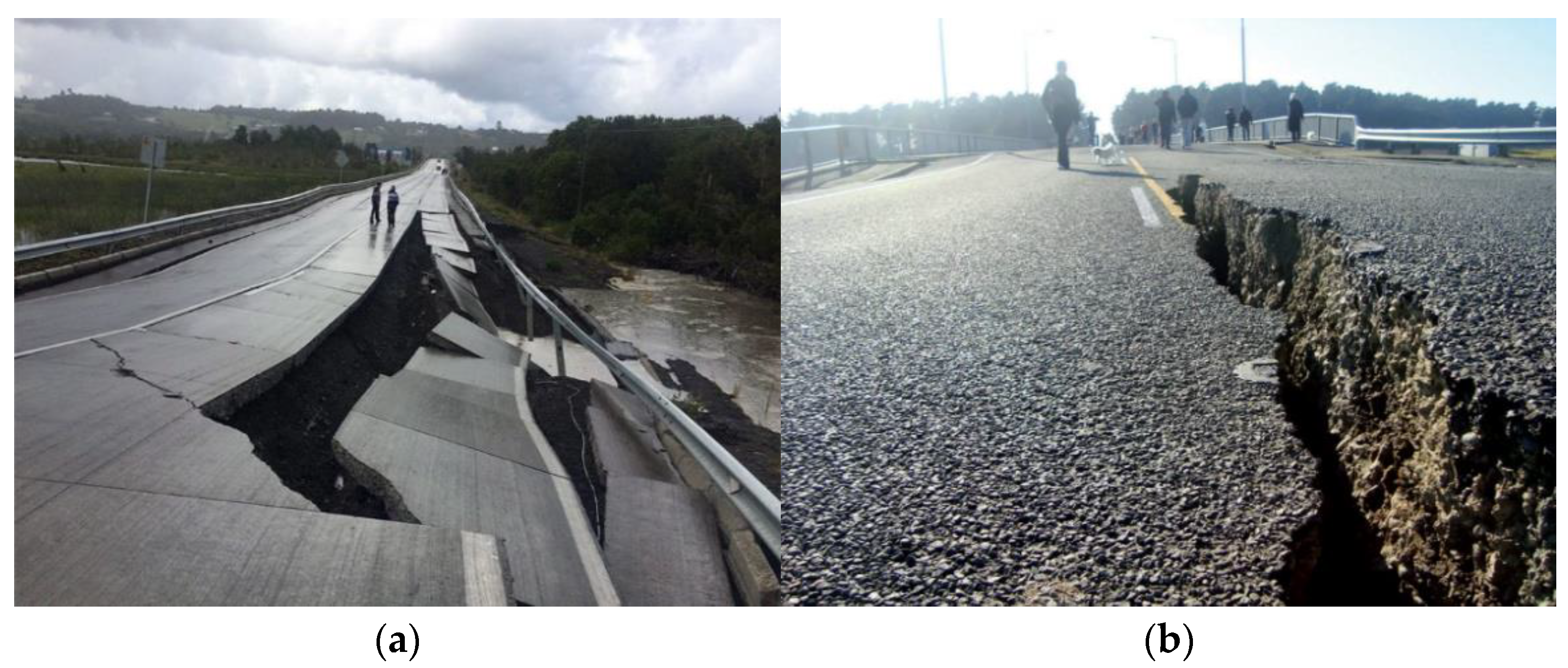
- New Zealand’s Bridges Survive Earthquake. Available online: https://www.worldhighways.com/wh10/feature/new-zealands-bridges-survive-earthquake (accessed on 2 April 2021).
- Najibi, M.; Rastegari, M.; Davis, L.S. G-cnn: An iterative grid based object detector. In Proceedings of the IEEE Conference on Computer Vision and Pattern Recognition, Las Vegas, NV, USA, 26 June–1 July 2016; pp. 2369–2377. [Google Scholar]
- Verma, J.P.; Agrawal, S.; Patel, B.; Patel, A. Big data analytics: Challenges and applications for text, audio, video, and social media data. Int. J. Soft Comput. Artif. Intell. Appl. 2016, 5, 41–51. [Google Scholar] [CrossRef]
- Shullani, D.; Fontani, M.; Iuliani, M.; Al Shaya, O.; Piva, A. VISION: A video and image dataset for source identification. EURASIP J. Inf. Secur. 2017, 2017, 1–16. [Google Scholar] [CrossRef]
- D’Agostino, M.; Gabbay, D.M.; Hähnle, R.; Posegga, J. Handbook of Tableau Methods; Springer Science & Business Media: Berlin/Heidelberg, Germany, 2013. [Google Scholar]
- Becker, L.T.; Gould, E.M. Microsoft power BI: Extending excel to manipulate, analyze, and visualize diverse data. Ser. Rev. 2019, 45, 184–188. [Google Scholar] [CrossRef]
- Axure, O.S. Getting Started with Axure RP. Available online: https://www.axure.com/ (accessed on 26 April 2022).
- Sketch, O.S. Available online: https://www.sketch.com/design/ (accessed on 26 April 2022).
- InVision, O.S. Available online: https://www.invisionapp.com/ (accessed on 26 April 2022).
- Figma, O.S. Available online: https://www.figma.com/prototyping/ (accessed on 26 April 2022).
- Huddleston, R. Introduction to Adobe Experience Design. In Beginning Adobe Experience Design; Springer: Berlin/Heidelberg, Germany, 2017; pp. 7–21. [Google Scholar]
- Limousin, P.; Azzabi, R.; Bergé, L.-P.; Dubois, H.; Truptil, S.; Le Gall, L. How to build dashboards for collecting and sharing relevant informations to the strategic level of crisis management: An industrial use case. In Proceedings of the 2019 International Conference on Information and Communication Technologies for Disaster Management (ICT-DM), Paris, France, 18–20 December 2019; pp. 1–8. [Google Scholar]
- Katmada, A.; Kalpakis, G.; Tsikrika, T.; Andreadis, S.; Vrochidis, S.; Kompatsiaris, I. An Extensible Framework for Interactive Real-Time Visualizations of Large-Scale Heterogeneous Multimedia Information from Online Sources. In Proceedings of the International Conference on Multimedia Modeling, Daejeon, Korea, 5–8 January 2020; pp. 424–435. [Google Scholar]
- Shneiderman, B. The eyes have it: A task by data type taxonomy for information visualizations. In The Craft of Information Visualization; Elsevier: Amsterdam, The Netherlands, 2003; pp. 364–371. [Google Scholar]
- Unsplash. License. Available online: https://unsplash.com/license (accessed on 29 April 2022).
- Karoulis, A.; Pombortsis, A. The heuristic evaluation of web-sites concerning the evaluators’ expertise and the appropriate criteria list. Inform. Educ. 2004, 3, 55. [Google Scholar] [CrossRef]
- Nielsen, J. How to conduct a heuristic evaluation. Nielsen Norman Group 1995, 1, 1–8. [Google Scholar]
- Alam, F.; Sajjad, H.; Imran, M.; Ofli, F. CrisisBench: Benchmarking crisis-related social media datasets for humanitarian information processing. arXiv 2020, arXiv:2004.06774. [Google Scholar]
- Rambha, T.; Nozick, L.K.; Davidson, R.; Yi, W.; Yang, K. A stochastic optimization model for staged hospital evacuation during hurricanes. Transp. Res. Part E Logist. Transp. Rev. 2021, 151, 102321. [Google Scholar] [CrossRef]
- Sahebi, A.; Jahangiri, K.; Alibabaei, A.; Khorasani-Zavareh, D. Factors influencing hospital emergency evacuation during fire: A systematic literature review. Int. J. Prev. Med. 2021, 12, 147. [Google Scholar] [CrossRef] [PubMed]
- Yazdani, M.; Mojtahedi, M.; Loosemore, M.; Sanderson, D.; Dixit, V. Hospital evacuation modelling: A critical literature review on current knowledge and research gaps. Int. J. Disaster Risk Reduct. 2021, 66, 102627. [Google Scholar] [CrossRef]
- Cleland, B.; Wallace, J.; Bond, R.; Muuraiskangas, S.; Pajula, J.; Epelde, G.; Arrúe, M.; Álvarez, R.; Black, M.; Mulvenna, M.D. Usability evaluation of a co-created big data analytics platform for health policy-making. In Proceedings of the International Conference on Human-Computer Interaction, Orlando, FL, USA, 26–31 July 2019; pp. 194–207. [Google Scholar]


| SN | Tweet Text | Sentiment Label | Emotion Label |
|---|---|---|---|
| 1. | Coolant oil spill, leak from CNC machine #Oil #Oilleak #Oilspill #Coolantoil #CoolantOilbecomeyellowcolor | Neutral. | No emotion. |
| 2. | Cheering myself up by listening to a podcast about the Exxon Valdez #oilspill that ruined the pristine waters of Alaska. 😕 #environment | Negative. | Disgust. |
| 3. | Great to work with Dr Colin Wood and Caleb Karmelich to promote their #OilSpill response technology. By quickly removing oil from seawater (even at low concentrations), their tech could make the clean-up process faster, cheaper, and more efficient. [URL] | Positive. | Supportive. |
| 4. | Humanity needs to rethink its relationship with fossil fuel. #sustainability #BP #oilspill | Negative. | Accusation. |
| 5. | #Trumo administration unravels offshore #safety regs. 11 men perished in the #BP #DeepwaterHorizon #oilspill disaster and the administration | Negative. | Fear. |
| Requirements | Description |
|---|---|
| (R1)—User friendly interface [54,55] | The visualization user interface is easy to learn and use. |
| (R2)—Interactive visualization [54,55] | The visualization gives the user the option to tailor the interface to their needs and to control how information is visually represented. |
| (R3)—Real-time visualization [54] | The visualization presents information in real-time for immediate or future actions. The information needed to carry out actions and plan strategies must be presented clearly and precisely. |
| (R4)—Visualization of multimodal data | The visualization includes four main data types (text, image, video, and audio), along with the metadata (i.e., time, date, location). |
| (R5)—Visualization of geographical data [16,55] | The visualization includes and interactive map to show where the social activities were posted from. |
| (R6)—Visualization of sentimental data | The visualization shows the sentiments associated with the collected posts. |
| (R6)—Topic identification [16] | The visualization highlights the most discussed topics according to the number of interactions. |
| (R7)—Topic search [16] | The visualization allows the user to search for messages that were posted about a specific event. |
| (R8)—Collaboration [54] | The visualization enables collaboration and communication between users. |
| Visual Analytics Element | Figure | Purpose | |
|---|---|---|---|
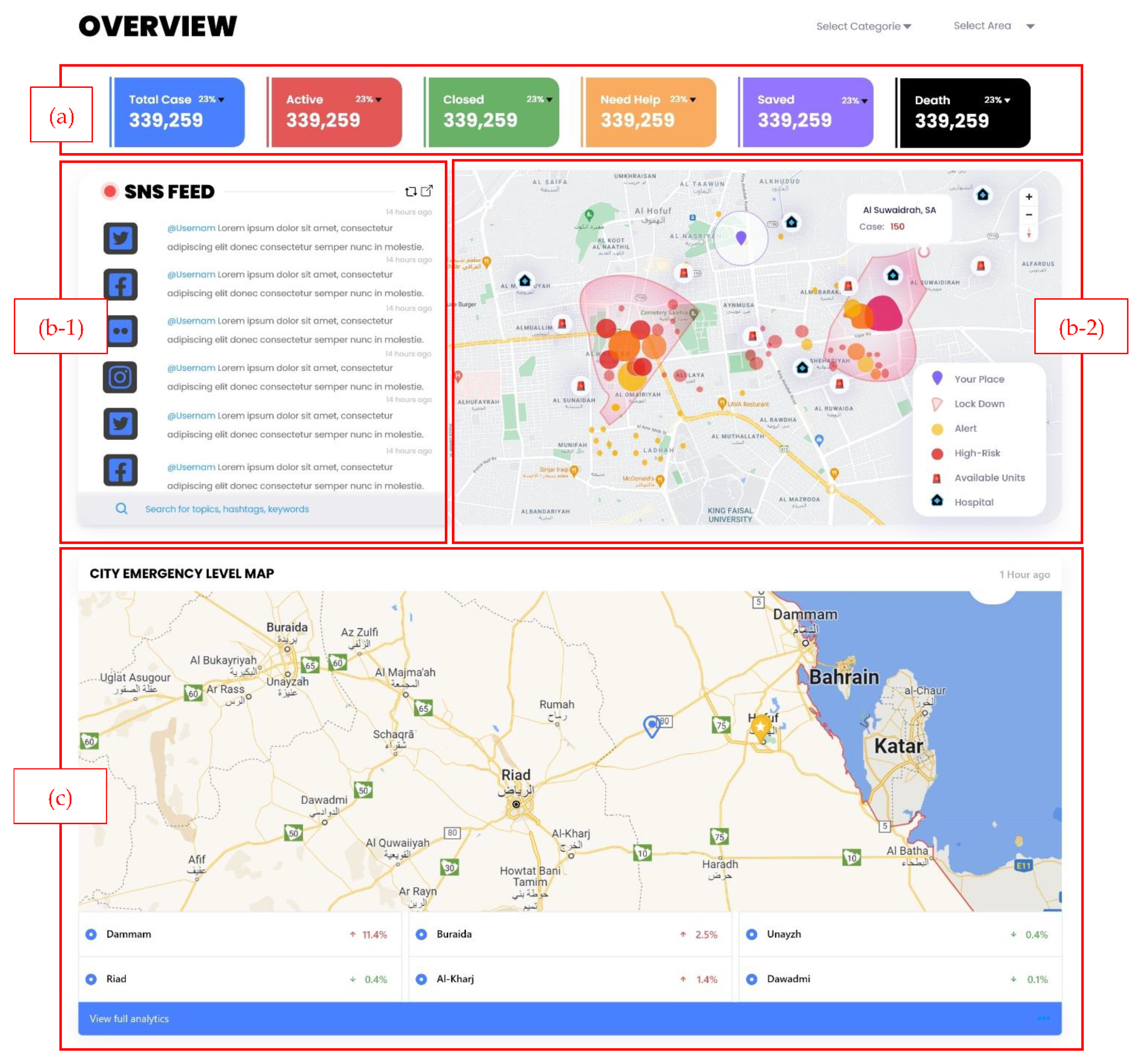
| 1 | Total case statistics | Figure 6a | To give the user a full view of total cases and how many are still active, closed, need help, saved, and dead. |
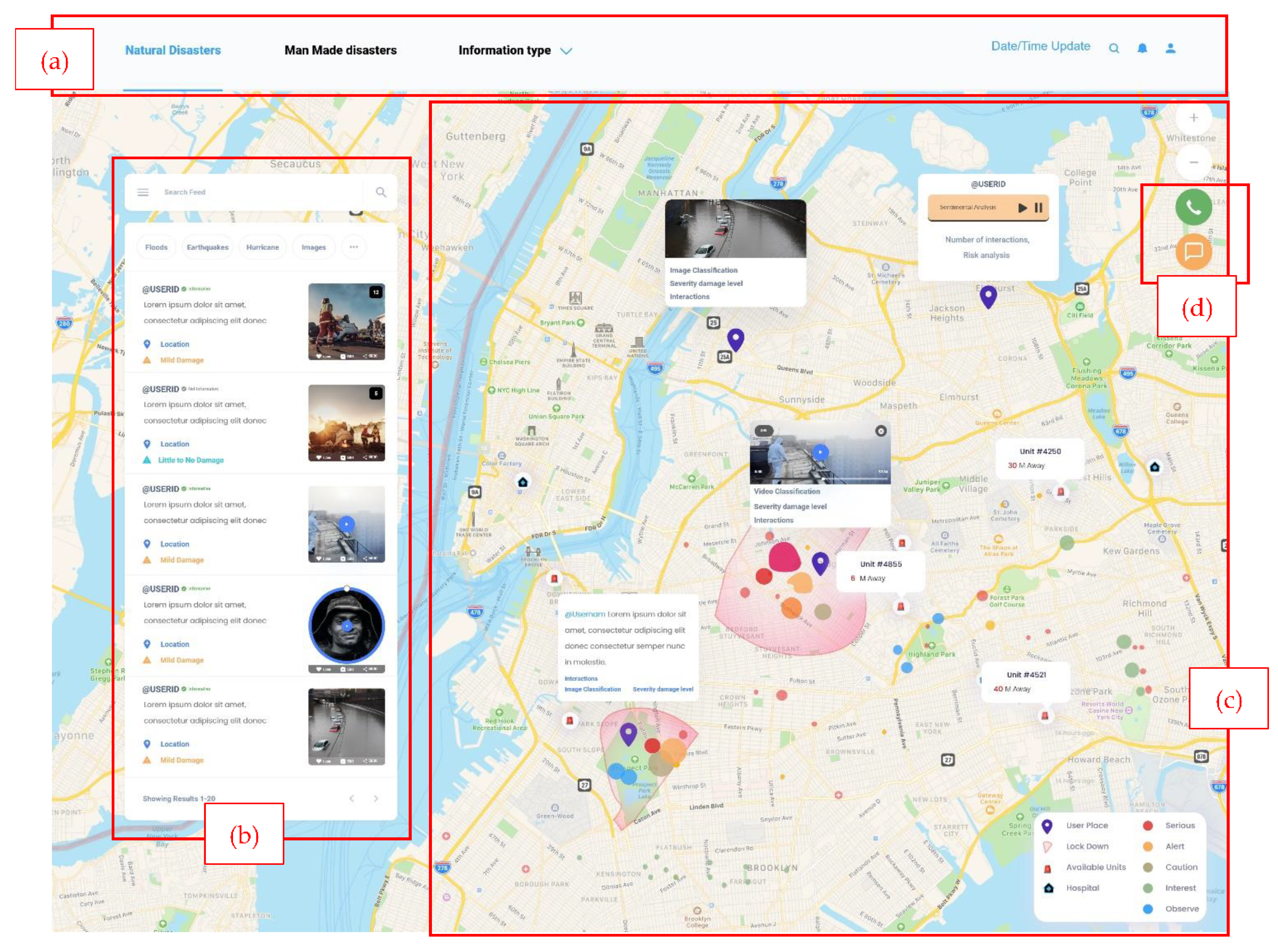
| 2 | Live SNS feed | Figure 6b-1 | The SNS live feed will show messages from different SNS platforms and include the most recent/ most interacted messages. The user can search for a specific topic, hashtag, or keyword. Additionally, the user can filter based on category. Moreover, when the user clicks on one of the messages in the feed, the location from which that message has been posted will be highlighted on the map. |
| 3 | Heatmap | Figure 6b-2 | The heatmap will display the message locations, lockdown areas, and areas that are high risk or on alert. Moreover, the available units will be shown on the map. |
| 3 | City emergency level map | Figure 6c | The risk level for main cities will be shown, and it will indicate the increase or decrease of risk level in each city. Moreover, the user can zoom in/zoom out on the map and select a specific city to show its risk level. |
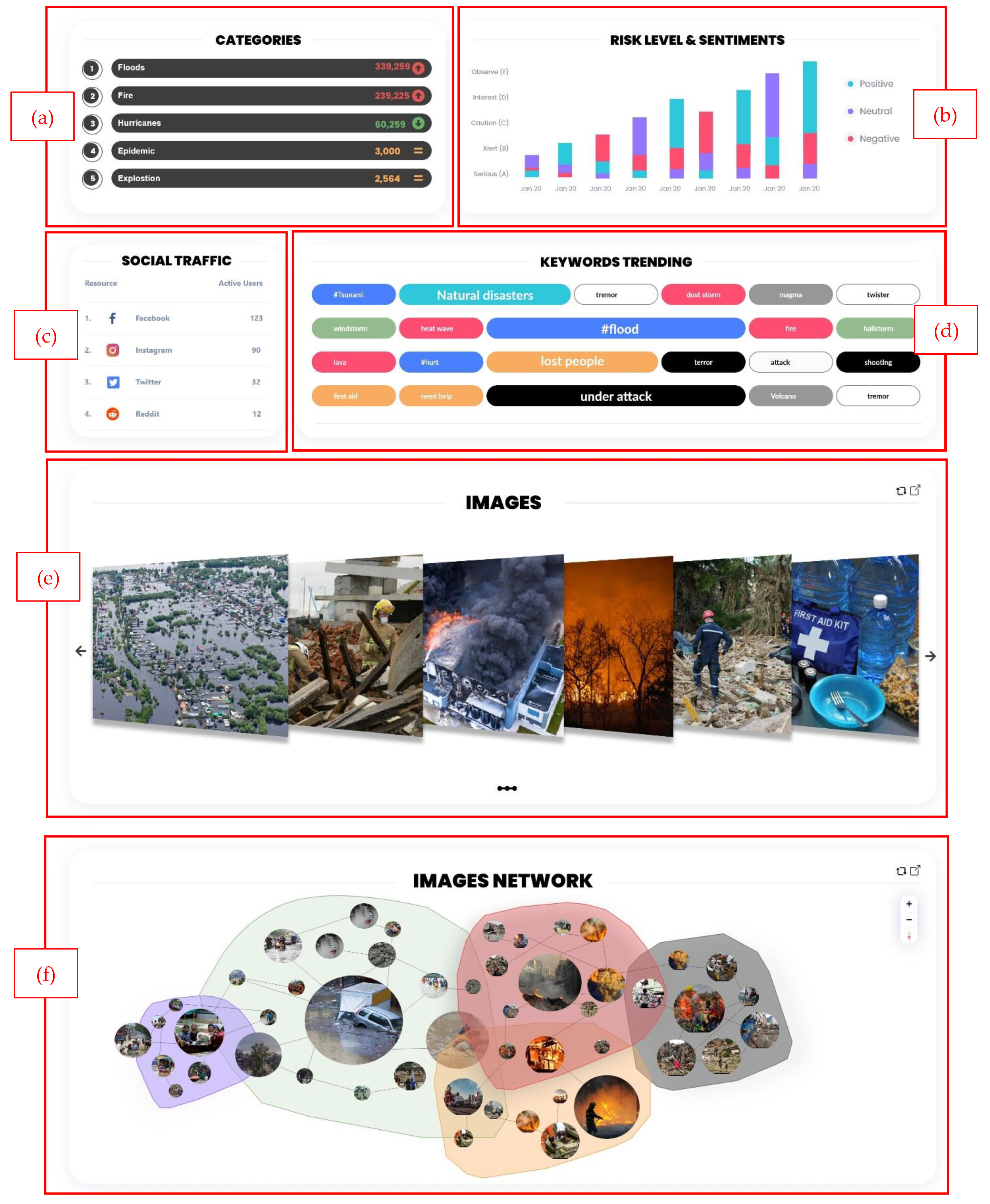
| 4 | Crisis categories ranking | Figure 7a | The ranking of the crisis categories is based on their occurrence. The element will show whether there are increased, decreased, or no changes in crisis occurrence. The user can filter by day, week, month, or year. |
| 5 | Risk and sentiments levels bar chart | Figure 7b | The bar chart y-axis shows the risk level (A), (B), (C), (D), (E), and the x-axis shows the dates of crisis occurrence. The color of the bars indicates the percentage of positive, neutral, and negative sentiments. The user can filter by date and risk level. |
| 6 | SNS traffic ranking | Figure 7c | This element will show which SNS is most used during a crisis and how many active users are posting at that time. |
| 7 | Keywords word cloud | Figure 7d | The frequency of each keyword/hashtag/topic is represented by a proportional font size, and related words are illustrated with the same color. |
| 8 | Image gallery | Figure 7e | This element illustrates a group of images that have a spike in the number of interactions and will be displayed in the order from highest to lowest, and the images can be filtered by category and date. |
| 9 | Image Network | Figure 7f | Network visualization examines the relationships between entities. In our proposed image network, we group the images based on the sentiment gathered from each image or the text associated with it. The importance of an image is represented by its size. Additionally, the lines between images represent the relation of one photo to another. For example, if a user tweeted a photo and then added another photo to the thread, these two images would be connected in the visual. |
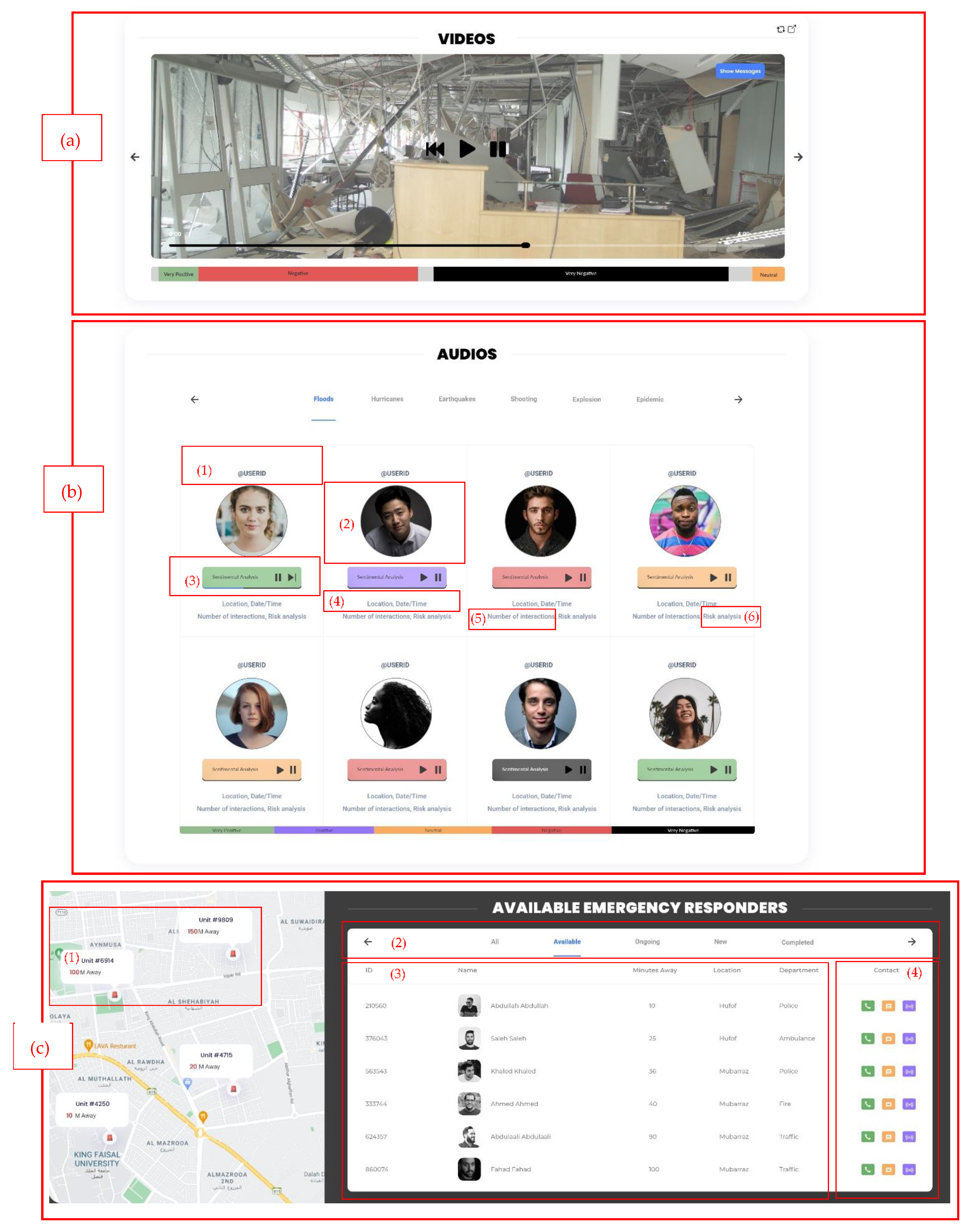
| 10 | Video sentiment analysis | Figure 8a | Similar to the image gallery, the video would include a sentimental analysis while watching the video. In addition, the message and metadata associated with the video can be displayed when enabled. |
| 11 | Audio map | Figure 8b | This can be viewed as being similar to a treemap. First, the audio data are divided into categories. Second, each audio file will include: (1) username; (2) user display picture (the photos included in the design are obtained from Unsplash websites that provides copyright free stock photos [57]); (3) audio player (colored according to the sentiment analysis of that audio); (4) metadata (location/time/date); (5) number of interactions, which will be how the audio files are arranged; and (6) the risk analysis of the audio. |
| 12 | Collaboration board | Figure 8c | This element shows: (1) a map of emergency unit locations; (2) the board where the users can be categorized based on their availability, in terms of ongoing (already on a case), and completed cases; (3) the ID, name, location, distance from the crisis location, and department are listed; and (4) the user can contact, message, or alert other users. |
| Heuristics | Severity Rating | Violation | Recommendations |
|---|---|---|---|
| Visibility of system status | 2 | No return button to the home page from the contact page. | Add a BACK button to the home page. |
| Match between the real world and system | 0 | No violations found. | No improvements are needed. |
| User customizing, control, and freedom | 1 | No page path is clear to the user that shows previously visited pages. | The project is still in the prototype phase. In the future, the URL will show the page path. |
| Consistency and standards | 0 | No violations found. | No improvements are needed. |
| Error prevention | 1 | Missing confirmation message for some actions. | There should be a confirmation message on the contact page after pressing call or message icons to ask users if they are sure to complete the process. |
| Minimizing user memory load | 0 | No violations found. | No improvements are needed. |
| Flexibility and efficiency of use | 0 | No violations found. | No improvements are needed. |
| Information representation mode | 0 | No violations found. | Adding an information symbol on each visualization to clearly explain the purpose of each section. |
| Help users recognize, diagnose, and recover from the error | 0 | No violations found. | No improvements are needed. |
| Spatial organization and perspective | 0 | No violations found. | No improvements are needed. |
| Data reduction and manipulation | 0 | No violations found. | No improvements are needed. |
| Control the published content | 0 | No violations found. | No improvements are needed. |
Publisher’s Note: MDPI stays neutral with regard to jurisdictional claims in published maps and institutional affiliations. |
© 2022 by the authors. Licensee MDPI, Basel, Switzerland. This article is an open access article distributed under the terms and conditions of the Creative Commons Attribution (CC BY) license (https://creativecommons.org/licenses/by/4.0/).
Share and Cite
AlAbdulaali, A.; Asif, A.; Khatoon, S.; Alshamari, M. Designing Multimodal Interactive Dashboard of Disaster Management Systems. Sensors 2022, 22, 4292. https://doi.org/10.3390/s22114292
AlAbdulaali A, Asif A, Khatoon S, Alshamari M. Designing Multimodal Interactive Dashboard of Disaster Management Systems. Sensors. 2022; 22(11):4292. https://doi.org/10.3390/s22114292
Chicago/Turabian StyleAlAbdulaali, Abeer, Amna Asif, Shaheen Khatoon, and Majed Alshamari. 2022. "Designing Multimodal Interactive Dashboard of Disaster Management Systems" Sensors 22, no. 11: 4292. https://doi.org/10.3390/s22114292
APA StyleAlAbdulaali, A., Asif, A., Khatoon, S., & Alshamari, M. (2022). Designing Multimodal Interactive Dashboard of Disaster Management Systems. Sensors, 22(11), 4292. https://doi.org/10.3390/s22114292