
Vayu: An Open-Source Toolbox for Visualization and Analysis of Crowd-Sourced Sensor Data


Abstract
:1. Introduction
2. Methods
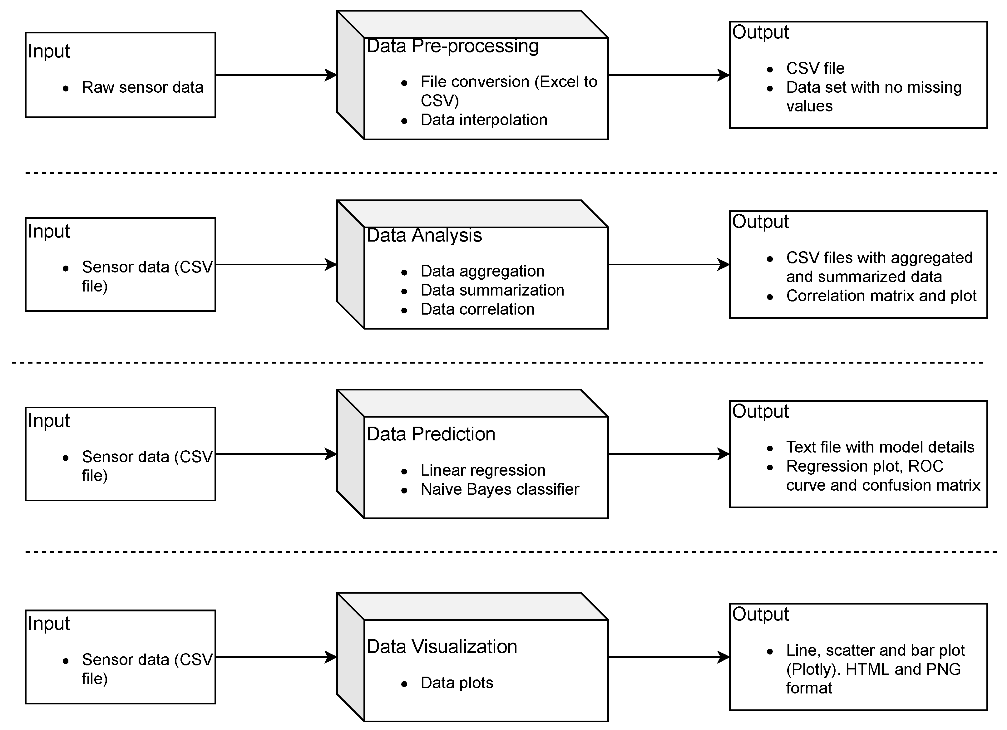
2.1. Toolbox Design
2.2. Reporting, Maintenance and Community-Driven Development
2.3. Example Data
3. Results and Discussion
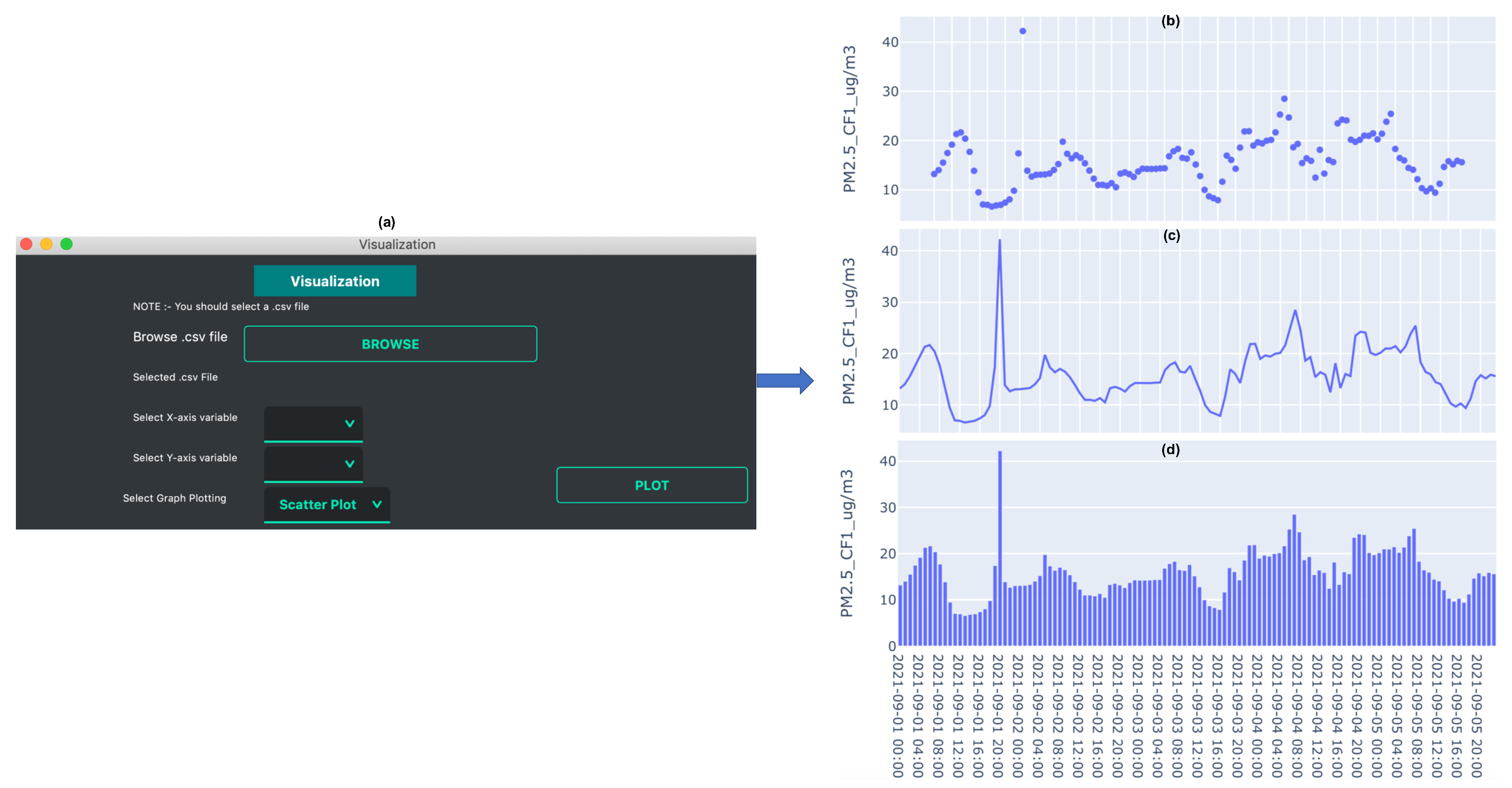
3.1. Data Organization and Plotting
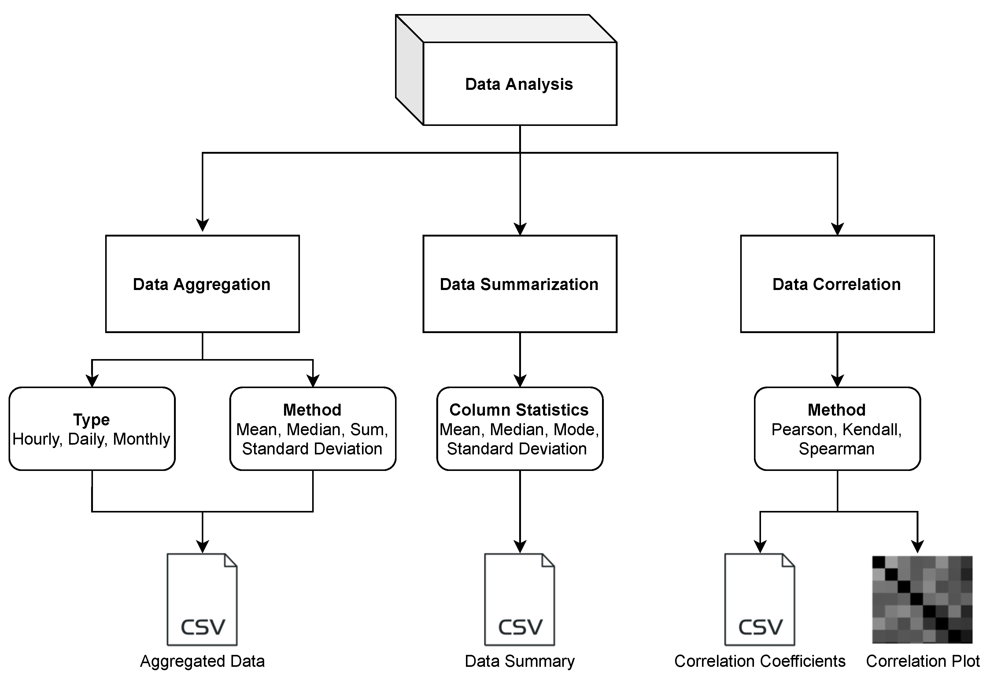
3.2. Data Analysis
- Data Aggregation: Different sensors record measurements at different sampling frequencies. In many cases, either the data is too granular or not granular enough. Having an imbalanced time-series is a common problem and it often needs resampling solutions [30]. In scenarios such as comparing data sets from different sensors or comparing the data with regulatory monitors that have a different sampling frequency, the sensor data needs to be resampled. Also, in the case of doing a forecast at a different frequency, resampling may be required. Most of the widely used sensors have a sampling frequency in minutes [22,31]. In such cases, it is important to downsample the frequency, such as from minutes to hours, days, or months. The data aggregation function allows the user to downsample the data to hourly, daily, or monthly data. It uses the Pandas library to resample the data. A key requirement of using this function is that the data should have a DateTime type index. The users can use different methods like mean, median, sum, and standard deviation to perform data aggregation. The aggregated data is saved as a CSV file.
- Data Summarization: Data summarization is often needed to simplify the data interpretation and to understand the distribution of a variable within a data set. Some of the common ways to understand the data distribution are to look at the mean, mode, and median. These values are typically used to understand where the central part of the data is located. Another method is to look at the standard deviation, which acts as an index of variability. If the sensor data are widely scattered, the standard deviation would be larger, and if the data are clustered together, the standard deviation would be smaller. The data summarization function of the toolbox allows the user to look at the column statistics and download the result as a CSV file.
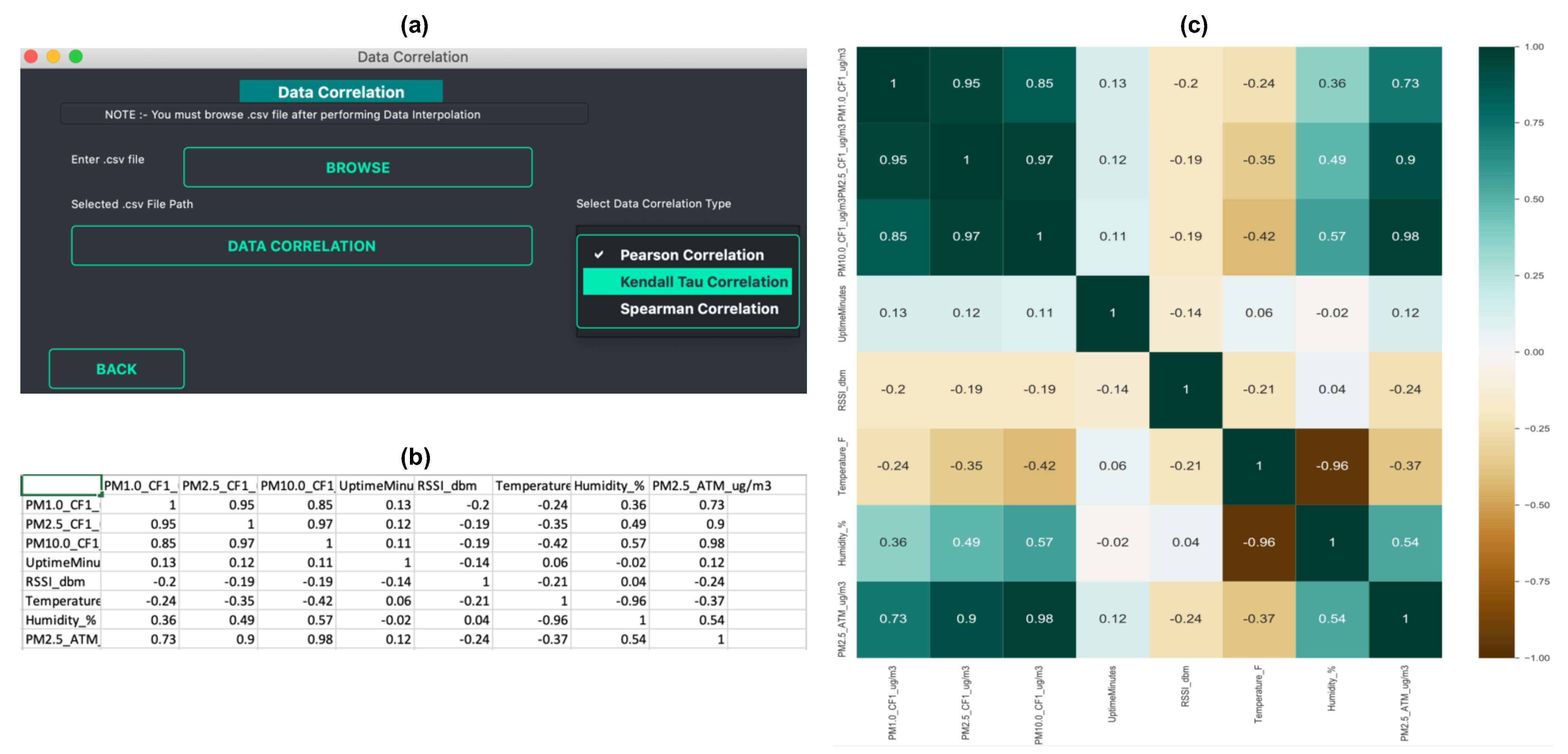
- Data Correlation: Looking at the correlation is an effective way to understand the relationship between different variables within a data set. For air quality data, it has been often observed that there is a correlation between air pollution concentration and meteorological factors. Air pollution is negatively correlated with humidity, wind speed, and precipitation, and positively correlated with atmospheric pressure [32]. Correlation allows the user to understand the strength of a relationship between two variables. Such information is useful when building models for calibration [33] or forecasting [34]. The data correlation function allows the user to perform data correlation. Vayu allows a user to calculate different correlation coefficients that are widely used in air quality research [35,36,37,38]: Pearson’s correlation, Kendall Tau’s Correlation, and Spearman correlation. Figure 4 shows the output of the data correlation function. The data from “Tutorial_PurpleAir.csv” is used to find the correlation coefficient. The output is a CSV file with correlation coefficients (Figure 4b) and a correlation heatmap (Figure 4c).
3.3. Data Prediction
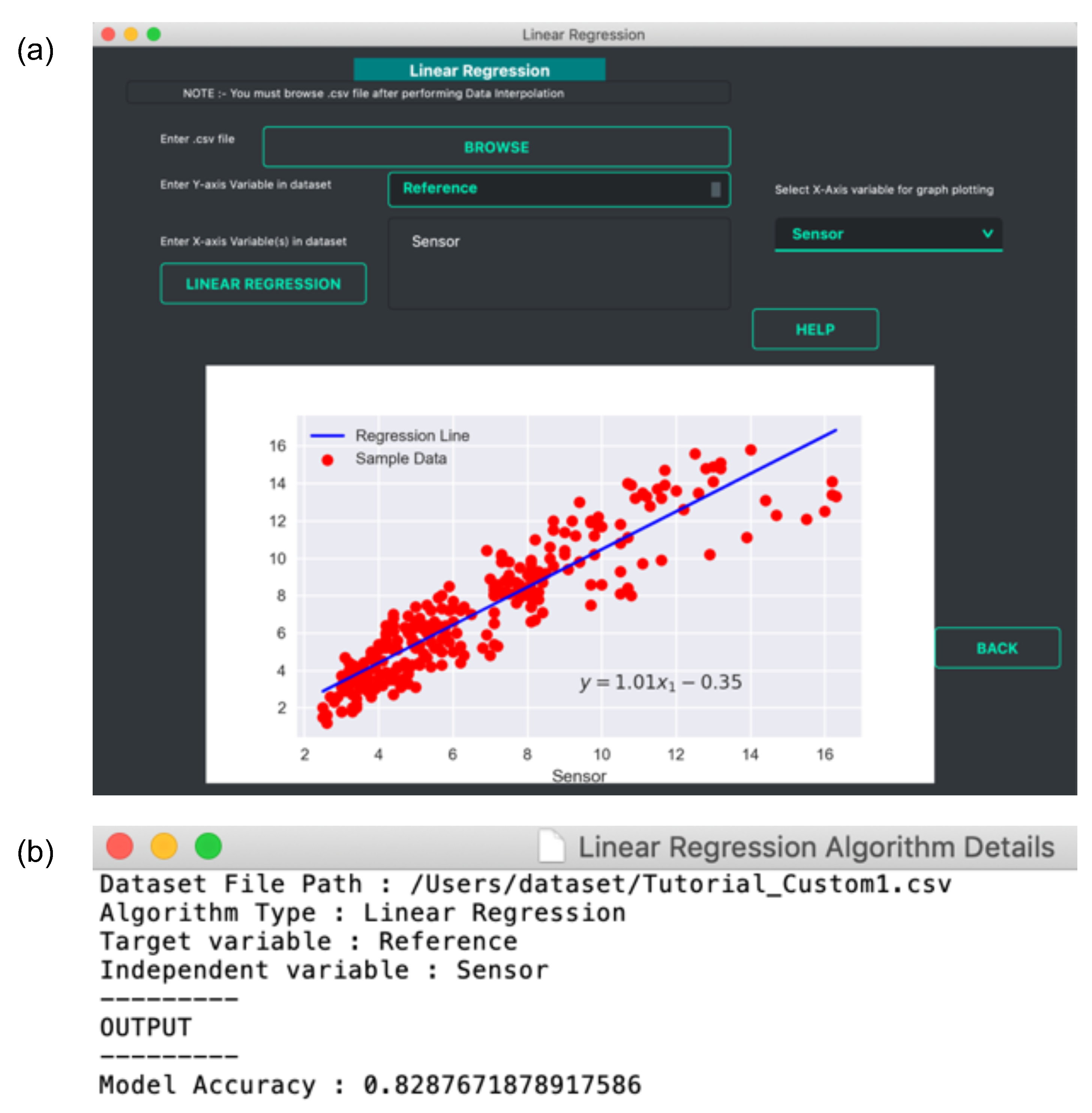
- Linear Regression: The data prediction workflow allows the user to perform linear regression. A linear regression model finds the relationship between the independent and dependent variables. It is a relatively simple method but has been widely used for calibration studies [40] as well as for prediction tasks [41,42]. Vayu allows a user to use the linear regression function to build a model. It can be useful for citizen scientists as well as researchers who want to start with simple models to perform predictive analysis. Figure 5 shows an example of how the output of linear regression function looks. The data from “Tutorial_Custom1.csv” is used to build a regression model. This example data set contains two variables: data from a reference station, and data from a sensor. A linear regression model is developed to find the correction factor for the sensor. The GUI (as shown in Figure 5a) allows the user to upload the data, and select the dependent and independent variable. The output is a regression plot that shows the relationship between the independent and dependent variables. The plot is also saved as a .png file. A text file (as shown in Figure 5b) is also generated that shows the algorithm details and the model accuracy.
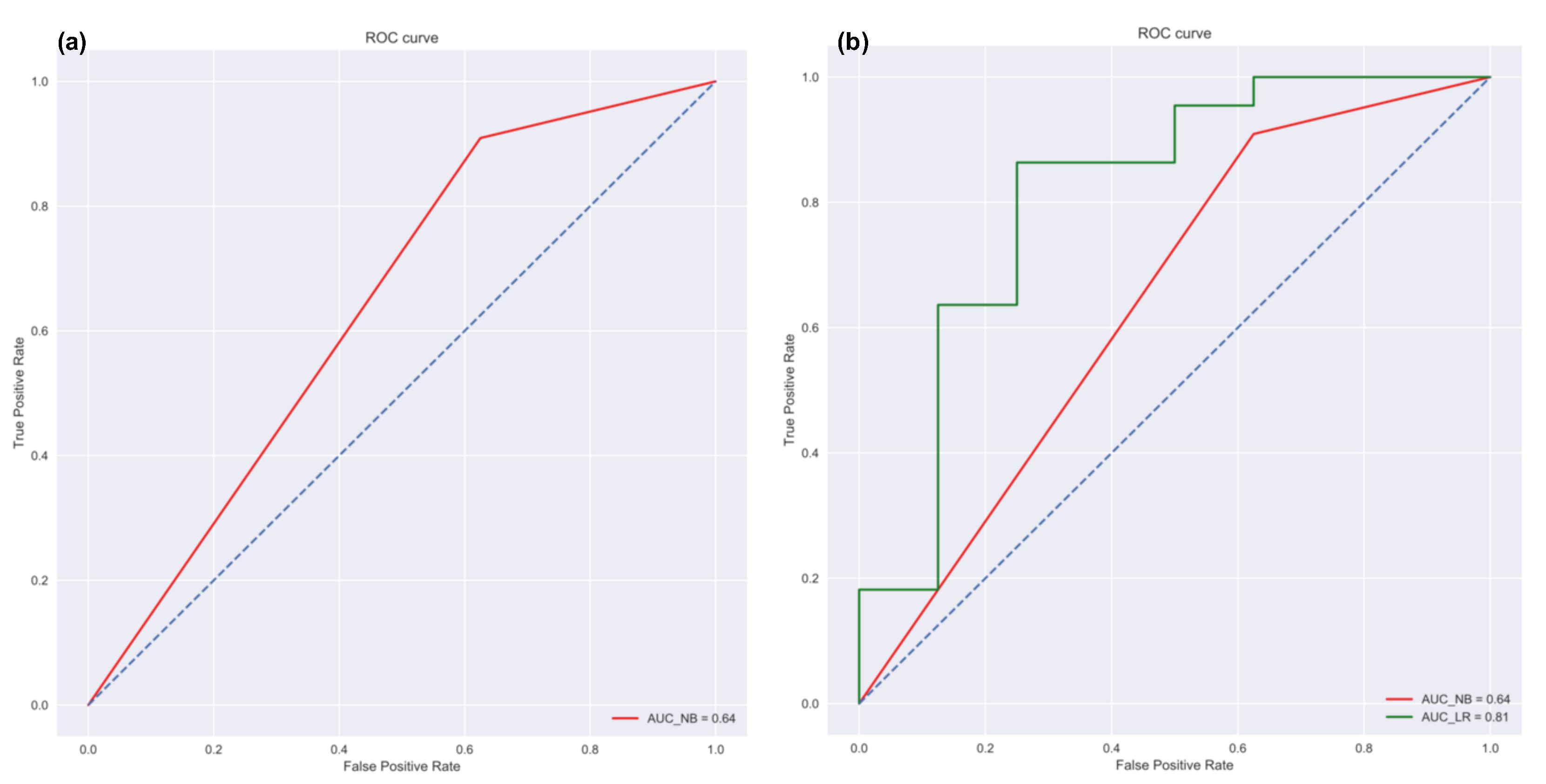
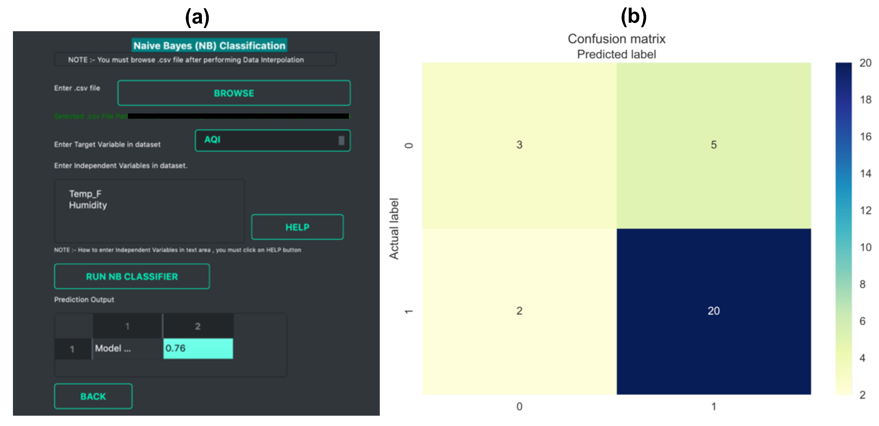
- Naïve Bayes Classifier: Methods like linear regression are efficient and useful when we are dealing with numeric data. But in some cases, the problem can be categorized as a classification problem. For example, a user wants to predict whether the Air Quality Index (AQI) would be “High” or “Low” based on different features. In such a case, a classification algorithm would have to be applied. Vayu toolbox allows the users to implement the Naive Bayes (NB) Classification algorithm to perform the classification tasks. NB is one of the most straightforward and fast classification algorithms [43], and is often used for air quality prediction [44]. NB is a supervised learning algorithm based on Bayes Theorem [45]. In simple words, generating a model using NB classifier includes creating the NB classifier, fitting the data set on the classifier, and performing prediction. The data prediction function allows the users to perform NB classification with binary labels. NB classification has several types and in the case of Vayu, Gaussian NB [46] is used. “Tutorial_Custom2.csv” has been used to test the method, and the results are shown in Figure 6 and Figure 7. The user can use the GUI to select the target variable and the independent variables (as shown in Figure 6a). The data is split between train and test set. The default setting has to be kept to 75% of data for training and the remaining 25% data for testing. This is followed by generating a model. The model is then evaluated by checking the accuracy of the model. The results are in the form of model accuracy, confusion matrix (Figure 6), and a receiver operating characteristic (ROC) curve (Figure 7). The confusion matrix summarizes the performance of the classification model on the test data. The ROC curve is created by plotting the true positive rate against the false-positive rate. The ROC curve shows the area under the curve (AUC) that provides an aggregate measure of performance. The output also includes an ROC curve (Figure 7b) that compares the performance of Gaussian NB to Logistic Regression [47]. This provides a user with an additional way of understanding the performance of different models. The ROC curves and the confusion matrix are saved as .png files, and the algorithm details are saved as a text file.
3.4. Comparison with Existing Tools
4. Conclusions and Future Directions
Funding
Institutional Review Board Statement
Informed Consent Statement
Data Availability Statement
Acknowledgments
Conflicts of Interest
References
- Chen, L.J.; Ho, Y.H.; Hsieh, H.H.; Huang, S.T.; Lee, H.C.; Mahajan, S. ADF: An anomaly detection framework for large-scale PM2.5 sensing systems. IEEE Internet Things J. 2017, 5, 559–570. [Google Scholar] [CrossRef]
- Commodore, A.; Wilson, S.; Muhammad, O.; Svendsen, E.; Pearce, J. Community-based participatory research for the study of air pollution: A review of motivations, approaches, and outcomes. Environ. Monit. Assess. 2017, 189, 378. [Google Scholar] [CrossRef] [PubMed]
- Mahajan, S. Internet of environmental things: A human centered approach. In Proceedings of the 2018 Workshop on MobiSys 2018 Ph. D. Forum, Munich, Germany, 10–15 June 2018; pp. 11–12. [Google Scholar]
- Irwin, A. No PhDs needed: How citizen science is transforming research. Nature 2018, 562, 480–483. [Google Scholar] [CrossRef]
- Mahajan, S.; Luo, C.H.; Wu, D.Y.; Chen, L.J. From Do-It-Yourself (DIY) to Do-It-Together (DIT): Reflections on designing a citizen-driven air quality monitoring framework in Taiwan. Sustain. Cities Soc. 2021, 66, 102628. [Google Scholar] [CrossRef]
- Kaufman, A.; Williams, R.; Barzyk, T.; Greenberg, M.; O’Shea, M.; Sheridan, P.; Hoang, A.; Ash, C.; Teitz, A.; Mustafa, M.; et al. A citizen science and government collaboration: Developing tools to facilitate community air monitoring. Environ. Justice 2017, 10, 51–61. [Google Scholar] [CrossRef]
- Nie, N.H.; Bent, D.H.; Hull, C.H. SPSS: Statistical Package for the Social Sciences; McGraw-Hill: New York, NY, USA, 1975; Volume 227. [Google Scholar]
- STATISTICA (Data Analysis Software System), Version 6; StatSoft Inc.: Tulsa, OK, USA, 2001; pp. 91–94.
- Allaire, J. RStudio: Integrated Development Environment for R; RStudio: Boston, MA, USA, 2012; Volume 770, p. 394. [Google Scholar]
- Feenstra, B.; Collier-Oxandale, A.; Papapostolou, V.; Cocker, D.; Polidori, A. The AirSensor open-source R-package and DataViewer web application for interpreting community data collected by low-cost sensor networks. Environ. Model. Softw. 2020, 134, 104832. [Google Scholar] [CrossRef]
- Mahajan, S.; Wu, W.L.; Tsai, T.C.; Chen, L.J. Design and implementation of IoT-enabled personal air quality assistant on instant messenger. In Proceedings of the 10th International Conference on Management of Digital EcoSystems, Tokyo, Japan, 25–28 September 2018; pp. 165–170. [Google Scholar]
- Hamm, A. Particles Matter: A Case Study on How Civic IoT Can Contribute to Sustainable Communities. In Proceedings of the 7th International Conference on ICT for Sustainability, Bristol, UK, 21–26 June 2020; pp. 305–313. [Google Scholar]
- H, M.; Lim, C.C. AirBeam2 Technical Specifications, Operation & Performance. Available online: https://www.habitatmap.org/blog/airbeam2-technical-specifications-operation-performance (accessed on 7 October 2021).
- Carslaw, D.C.; Ropkins, K. Openair—An R package for air quality data analysis. Environ. Model. Softw. 2012, 27, 52–61. [Google Scholar] [CrossRef]
- Callahan, J.; Martin, H.; Pease, S.; Miller, H.; Dingels, Z.; Aras, R.; Hagg, J.; Kim, J.; Thompson, R.; Yang, A. PWFSLSmoke: Utilities for Working with Air Quality Monitoring Data. R Packag. Version 2019, 1, 111. [Google Scholar]
- Mahajan, S.; Martinez, J. Water, water, but not everywhere: Analysis of shrinking water bodies using open access satellite data. Int. J. Sustain. Dev. World Ecol. 2021, 28, 326–338. [Google Scholar] [CrossRef]
- Summerfield, M. Rapid GUI Programming with Python and Qt: The Definitive Guide to PyQt Programming (Paperback); Pearson Education: London, UK, 2007. [Google Scholar]
- McKinney, W. Data structures for statistical computing in python. In Proceedings of the 9th Python in Science Conference, Austin, TX, USA, 9–15 July 2010; Volume 445, pp. 51–56. [Google Scholar]
- Pedregosa, F.; Varoquaux, G.; Gramfort, A.; Michel, V.; Thirion, B.; Grisel, O.; Blondel, M.; Prettenhofer, P.; Weiss, R.; Dubourg, V.; et al. Scikit-learn: Machine learning in Python. J. Mach. Learn. Res. 2011, 12, 2825–2830. [Google Scholar]
- Hunter, J.D. Matplotlib: A 2D graphics environment. IEEE Ann. Hist. Comput. 2007, 9, 90–95. [Google Scholar] [CrossRef]
- Sachit. Vayu Github Repository. Available online: https://github.com/sachit27/VAYU (accessed on 16 October 2021).
- CleanAirCarolina. Purple Air Monitor. Available online: https://cleanaircarolina.org/purpleair/ (accessed on 3 October 2021).
- LASS. PM2.5 Open Data Portal. Available online: https://pm25.lass-net.org/ (accessed on 3 October 2021).
- Luftdaten. Luftdaten Website. Available online: https://luftdaten.info/ (accessed on 11 October 2021).
- Miskell, G.; Salmond, J.; Williams, D.E. Low-cost sensors and crowd-sourced data: Observations of siting impacts on a network of air-quality instruments. Sci. Total Environ. 2017, 575, 1119–1129. [Google Scholar] [CrossRef]
- Heimann, I.; Bright, V.; McLeod, M.; Mead, M.; Popoola, O.; Stewart, G.; Jones, R. Source attribution of air pollution by spatial scale separation using high spatial density networks of low cost air quality sensors. Atmos. Environ. 2015, 113, 10–19. [Google Scholar] [CrossRef] [Green Version]
- Junninen, H.; Niska, H.; Tuppurainen, K.; Ruuskanen, J.; Kolehmainen, M. Methods for imputation of missing values in air quality data sets. Atmos. Environ. 2004, 38, 2895–2907. [Google Scholar] [CrossRef]
- Chen, J.; Brager, G.S.; Augenbroe, G.; Song, X. Impact of outdoor air quality on the natural ventilation usage of commercial buildings in the US. Appl. Energy 2019, 235, 673–684. [Google Scholar] [CrossRef]
- Plotly. Available online: https://plotly.com/ (accessed on 11 October 2021).
- Moniz, N.; Branco, P.; Torgo, L. Resampling strategies for imbalanced time series forecasting. Int. J. Data Sci. Anal. 2017, 3, 161–181. [Google Scholar] [CrossRef]
- Luo, C.H.; Yang, H.; Huang, L.P.; Mahajan, S.; Chen, L.J. A fast PM2.5 forecast approach based on time-series data analysis, regression and regularization. In Proceedings of the 2018 Conference on Technologies and Applications of Artificial Intelligence (TAAI), Taichung, Taiwan, 3 November–2 December 2018; pp. 78–81. [Google Scholar]
- Liu, Y.; Zhou, Y.; Lu, J. Exploring the relationship between air pollution and meteorological conditions in China under environmental governance. Sci. Rep. 2020, 10, 14518. [Google Scholar] [CrossRef]
- Lee, C.H.; Wang, Y.B.; Yu, H.L. An efficient spatiotemporal data calibration approach for the low-cost PM2.5 sensing network: A case study in Taiwan. Environ. Int. 2019, 130, 104838. [Google Scholar] [CrossRef]
- Liou, N.C.; Luo, C.H.; Mahajan, S.; Chen, L.J. Why Is Short-Time PM2.5 Forecast Difficult? The Effects of Sudden Events. IEEE Access 2019, 8, 12662–12674. [Google Scholar] [CrossRef]
- Yoon, C.; Lee, K.; Park, D. Indoor air quality differences between urban and rural preschools in Korea. Environ. Sci. Pollut. Res. 2011, 18, 333–345. [Google Scholar] [CrossRef]
- Han, L.; Zhou, W.; Li, W.; Li, L. Impact of urbanization level on urban air quality: A case of fine particles (PM2.5) in Chinese cities. Environ. Pollut. 2014, 194, 163–170. [Google Scholar] [CrossRef] [PubMed]
- Mahajan, S.; Gabrys, J.; Armitage, J. AirKit: A Citizen-Sensing Toolkit for Monitoring Air Quality. Sensors 2021, 21, 4044. [Google Scholar] [CrossRef]
- Balram, D.; Lian, K.Y.; Sebastian, N. Air quality warning system based on a localized PM2.5 soft sensor using a novel approach of Bayesian regularized neural network via forward feature selection. Ecotoxicol. Environ. Saf. 2019, 182, 109386. [Google Scholar] [CrossRef] [PubMed]
- Hastie, T.; Tibshirani, R.; Friedman, J. Overview of supervised learning. In The Elements of Statistical Learning; Springer: Berlin/Heidelberg, Germany, 2009; pp. 9–41. [Google Scholar]
- Spinelle, L.; Gerboles, M.; Villani, M.G.; Aleixandre, M.; Bonavitacola, F. Field calibration of a cluster of low-cost available sensors for air quality monitoring. Part A: Ozone and nitrogen dioxide. Sens. Actuators B Chem. 2015, 215, 249–257. [Google Scholar] [CrossRef]
- Zheng, Y.; Yi, X.; Li, M.; Li, R.; Shan, Z.; Chang, E.; Li, T. Forecasting fine-grained air quality based on big data. In Proceedings of the 21th ACM SIGKDD International Conference on Knowledge Discovery and Data Mining, Sydney, Australia, 10–13 August 2015; pp. 2267–2276. [Google Scholar]
- Lin, K.; Lin, Q.; Zhou, C.; Yao, J. Time series prediction based on linear regression and SVR. In Proceedings of the Third International Conference on Natural Computation (ICNC 2007), Haikou, China, 24–27 August 2007; Volume 1, pp. 688–691. [Google Scholar]
- John, G.; Langley, P. Estimating Continuous Distributions in Bayesian Classifiers. In Proceedings of the Eleventh Conference on Uncertainty in Artificial Intelligence, Montreal, QU, Canada, 18–20 August 1995. [Google Scholar]
- Corani, G.; Scanagatta, M. Air pollution prediction via multi-label classification. Environ. Model. Softw. 2016, 80, 259–264. [Google Scholar] [CrossRef] [Green Version]
- Berrar, D. Bayes’ theorem and naive Bayes classifier. In Encyclopedia of Bioinformatics and Computational Biology: ABC of Bioinformatics; Elsevier Scientific Publishing: Amsterdam, The Netherlands, 2018; pp. 403–412. [Google Scholar]
- Jahromi, A.H.; Taheri, M. A non-parametric mixture of Gaussian naive Bayes classifiers based on local independent features. In Proceedings of the 2017 Artificial Intelligence and Signal Processing Conference (AISP), Shiraz, Iran, 25–27 October 2017; pp. 209–212. [Google Scholar]
- Kurt, I.; Ture, M.; Kurum, A.T. Comparing performances of logistic regression, classification and regression tree, and neural networks for predicting coronary artery disease. Expert Syst. Appl. 2008, 34, 366–374. [Google Scholar] [CrossRef]


Publisher’s Note: MDPI stays neutral with regard to jurisdictional claims in published maps and institutional affiliations. |
© 2021 by the author. Licensee MDPI, Basel, Switzerland. This article is an open access article distributed under the terms and conditions of the Creative Commons Attribution (CC BY) license (https://creativecommons.org/licenses/by/4.0/).
Share and Cite
Mahajan, S. Vayu: An Open-Source Toolbox for Visualization and Analysis of Crowd-Sourced Sensor Data. Sensors 2021, 21, 7726. https://doi.org/10.3390/s21227726
Mahajan S. Vayu: An Open-Source Toolbox for Visualization and Analysis of Crowd-Sourced Sensor Data. Sensors. 2021; 21(22):7726. https://doi.org/10.3390/s21227726
Chicago/Turabian StyleMahajan, Sachit. 2021. "Vayu: An Open-Source Toolbox for Visualization and Analysis of Crowd-Sourced Sensor Data" Sensors 21, no. 22: 7726. https://doi.org/10.3390/s21227726
APA StyleMahajan, S. (2021). Vayu: An Open-Source Toolbox for Visualization and Analysis of Crowd-Sourced Sensor Data. Sensors, 21(22), 7726. https://doi.org/10.3390/s21227726