Smelling Nano Aerial Vehicle for Gas Source Localization and Mapping


Abstract
1. Introduction
1.1. Related Work on Gas-Sensitive Nanodrones
1.2. Experimental Evaluation of Gas-Sensitive Nanodrones
1.3. Gas Source Localization
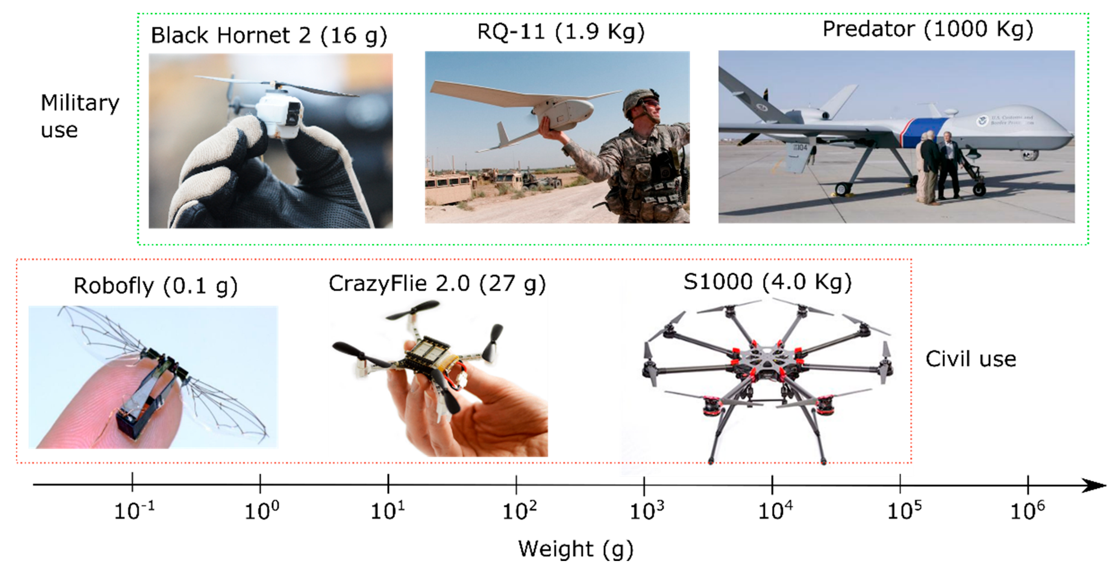
1.4. Proposed Smelling Nano Aerial Vehicle (SNAV)
2. Materials and Methods
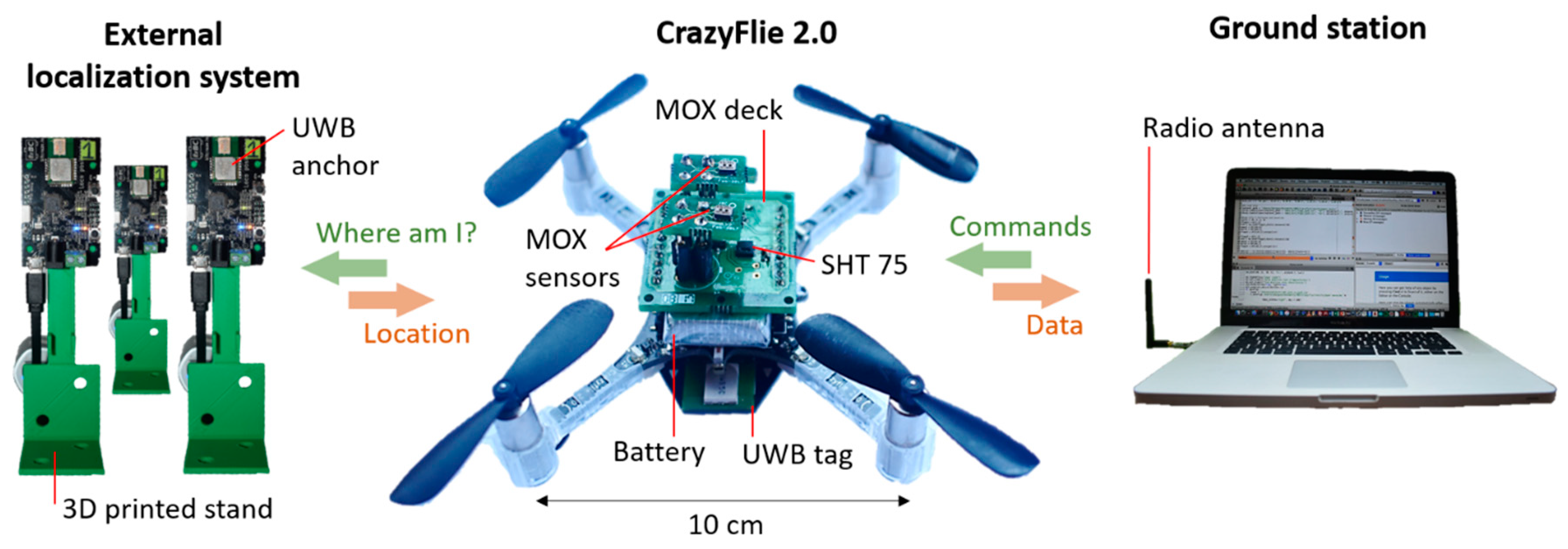
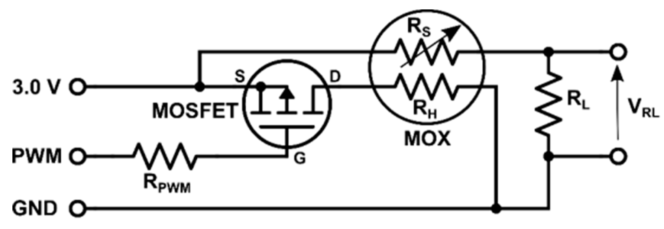
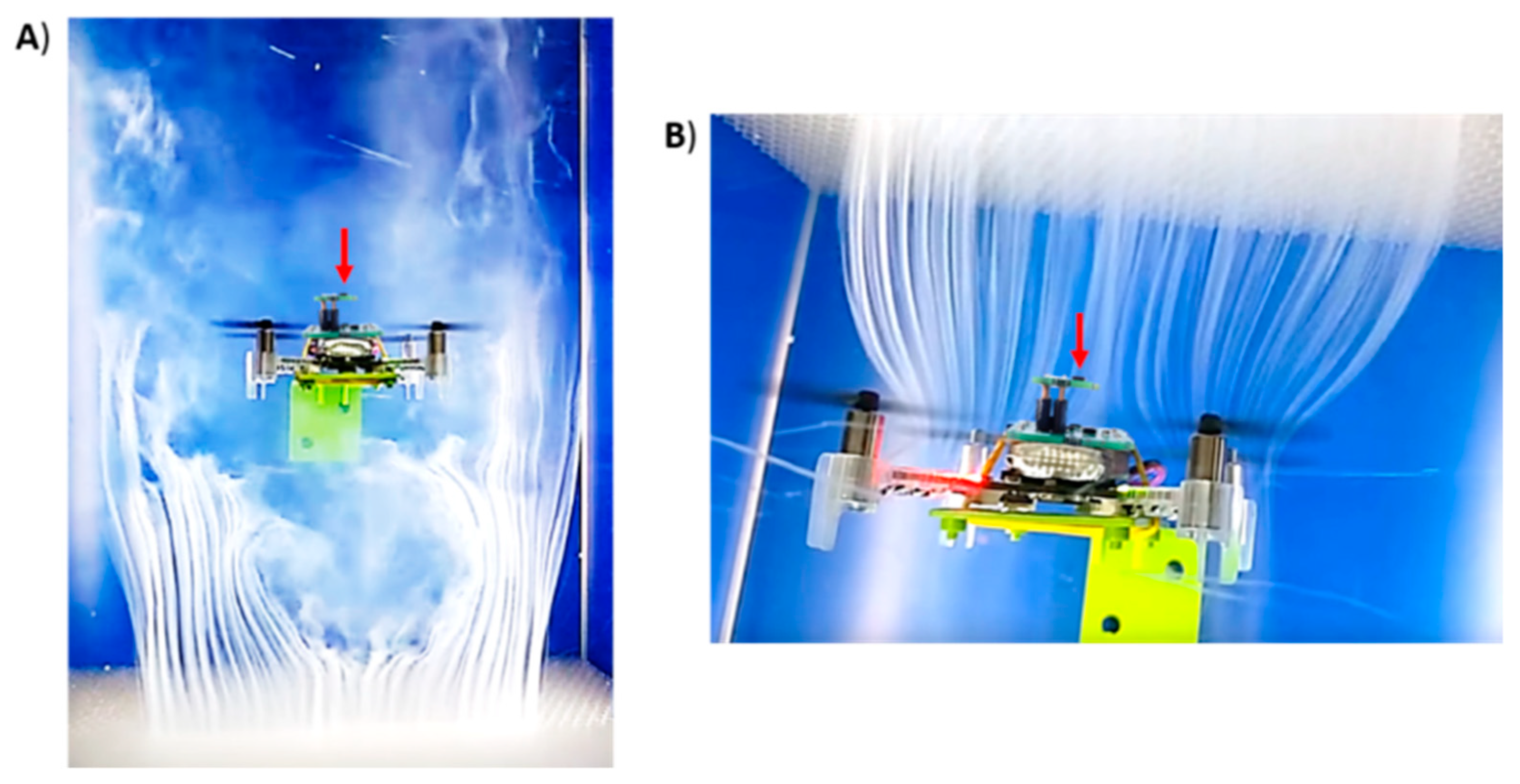
2.1. Nano-Drone and Gas Sensors
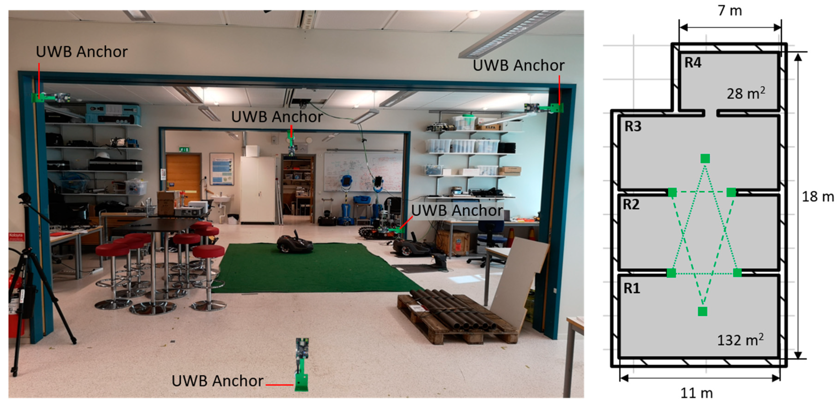
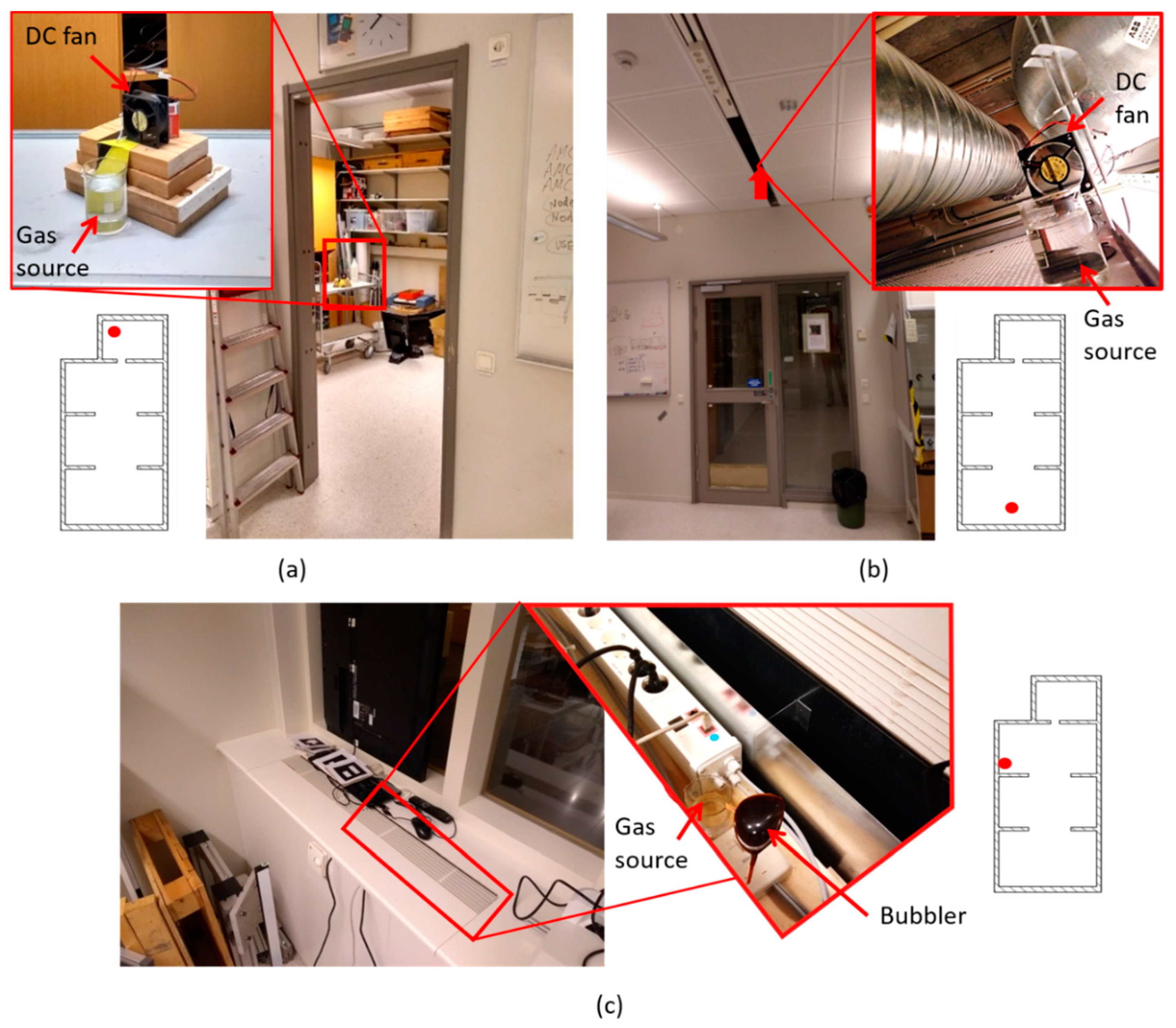
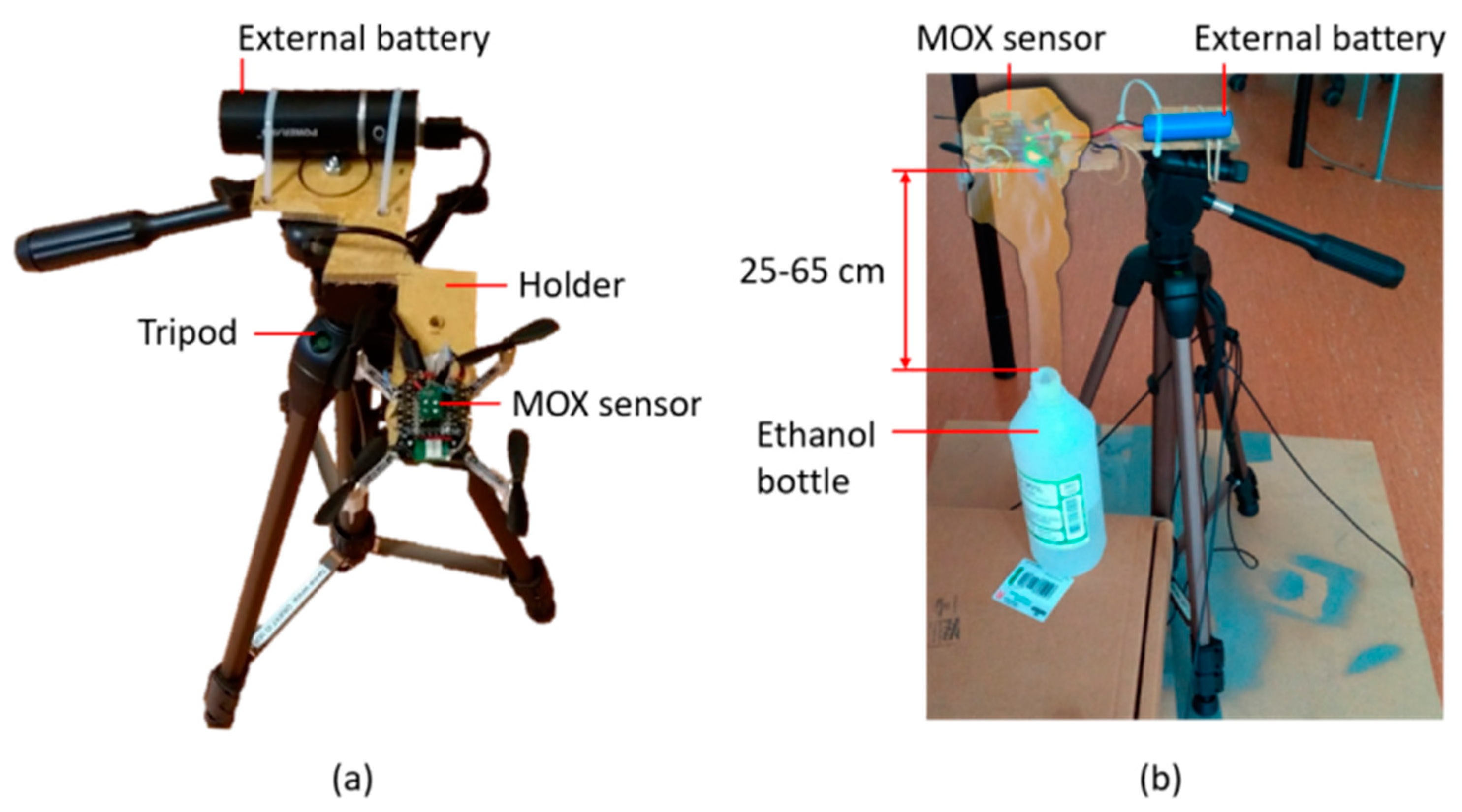
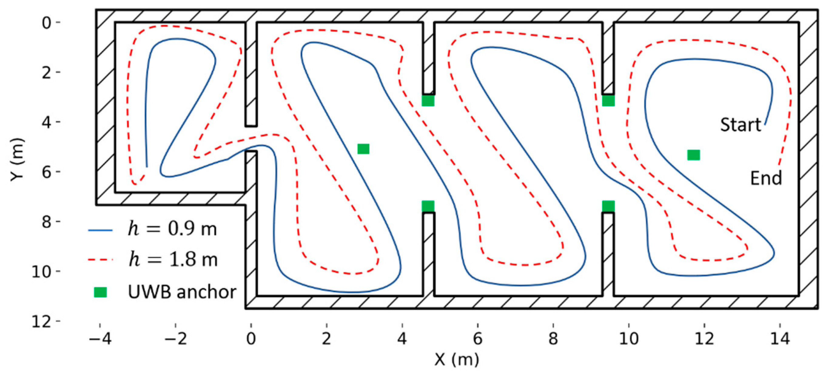
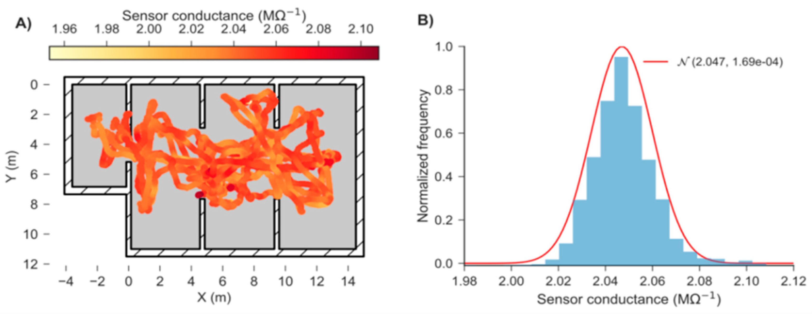
2.2. Experimental Arena, Gas Source and External Localization System
2.3. Gas Sensor Calibration and Limit of Detection (LOD) Estimation
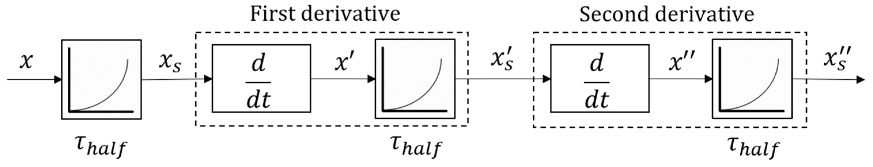
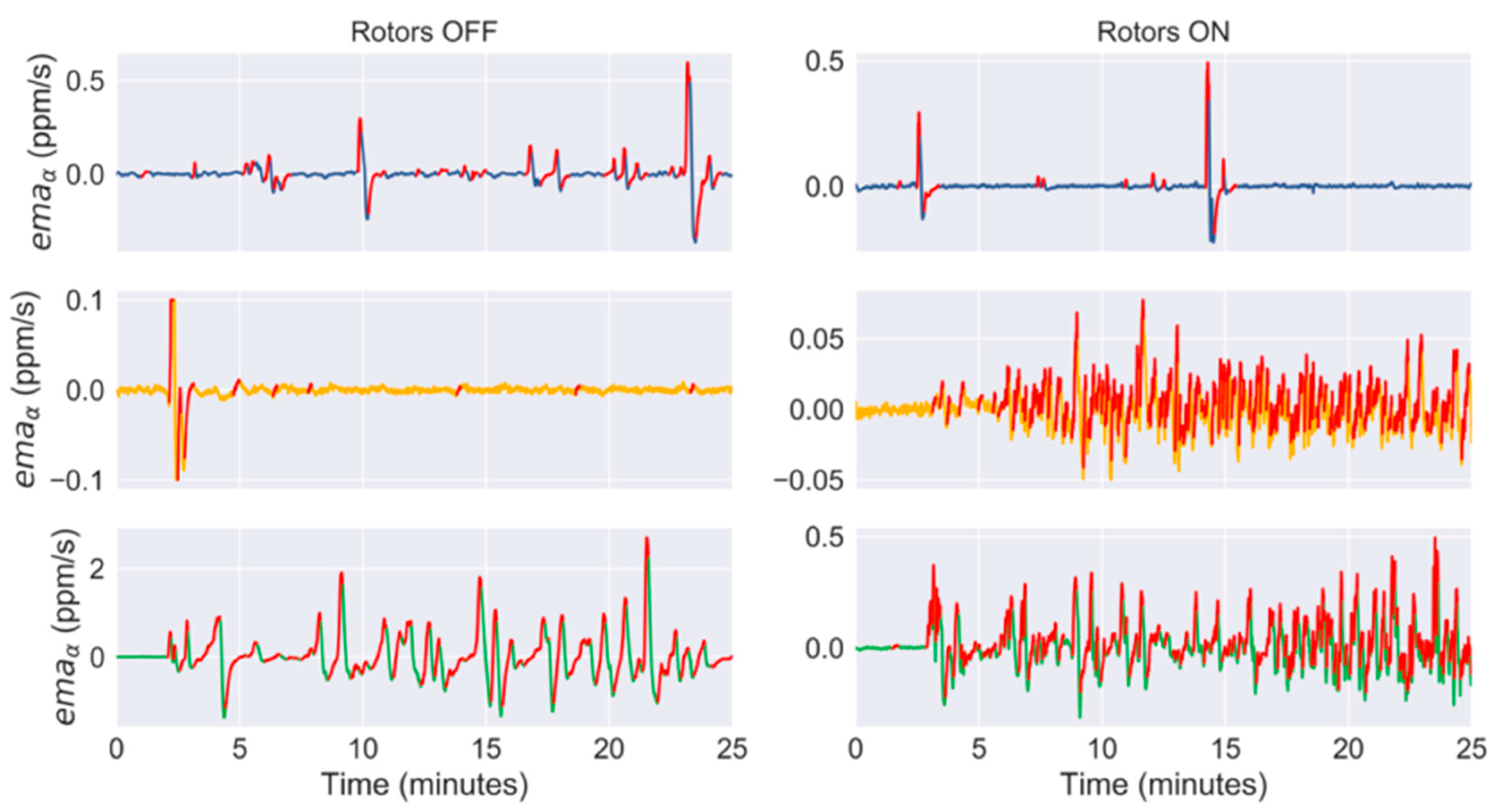
2.4. Detection of ‘Bouts’
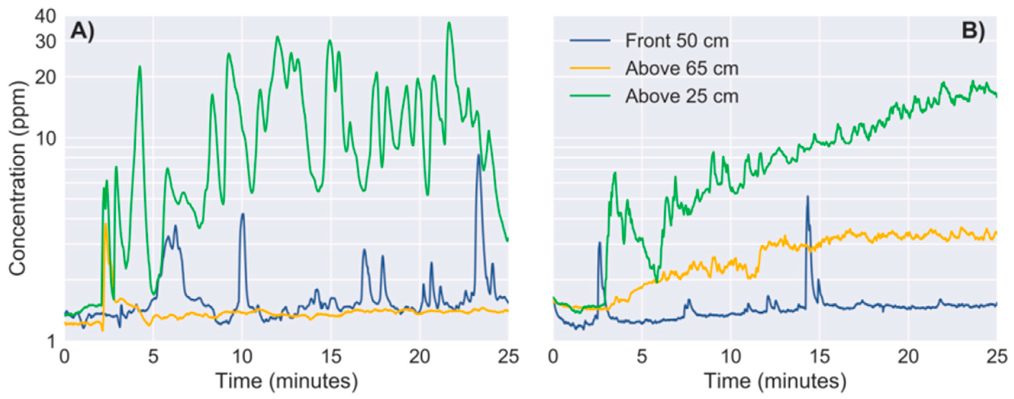
2.5. Effect of Rotors on MOX Sensor Signals
2.6. Gas Source Localization Strategies
3. Results
3.1. Calibration, LOD and Optimum Parameters for Bout Detection
3.2. Effect of Propulsion on MOX Signals
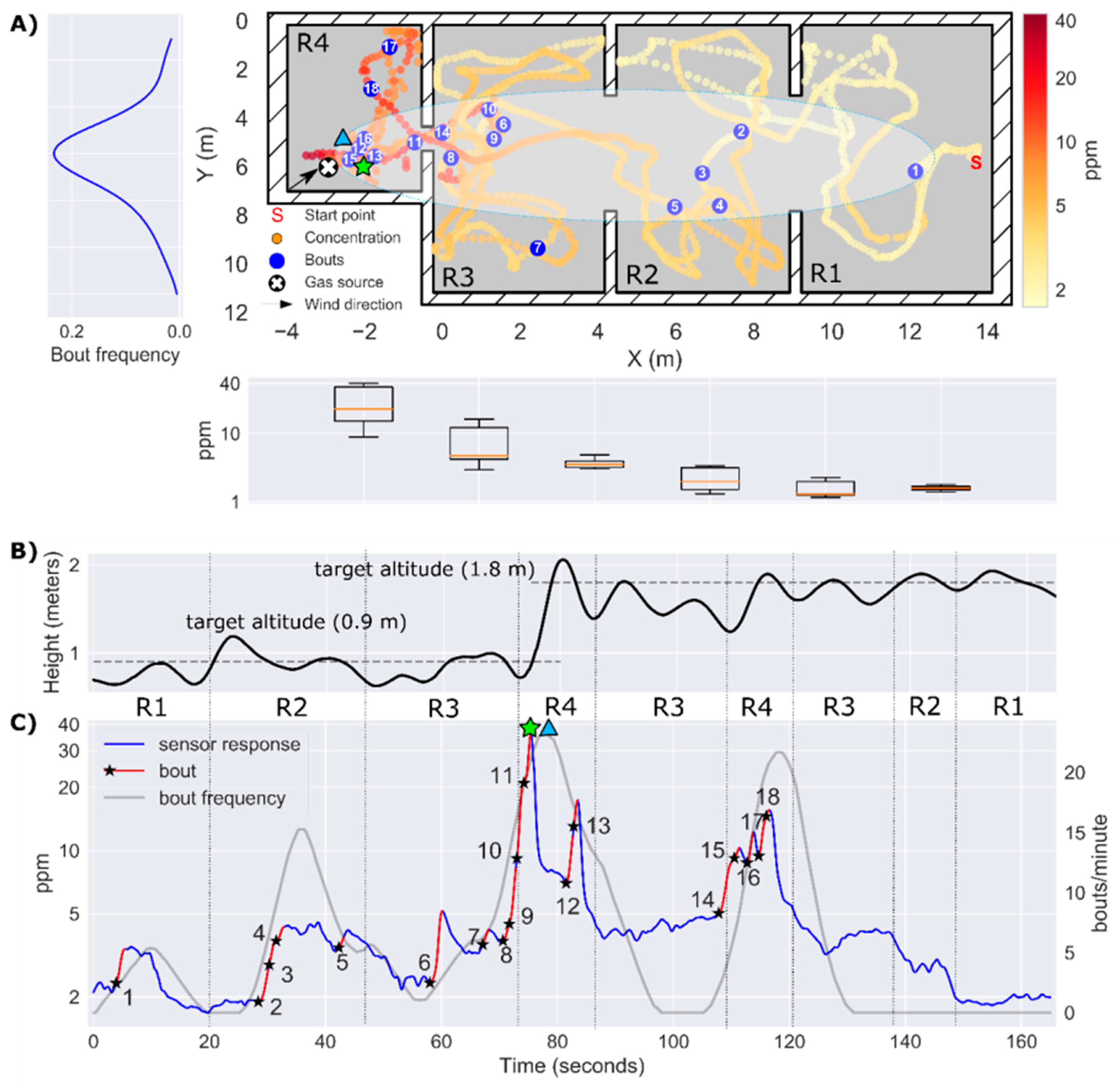
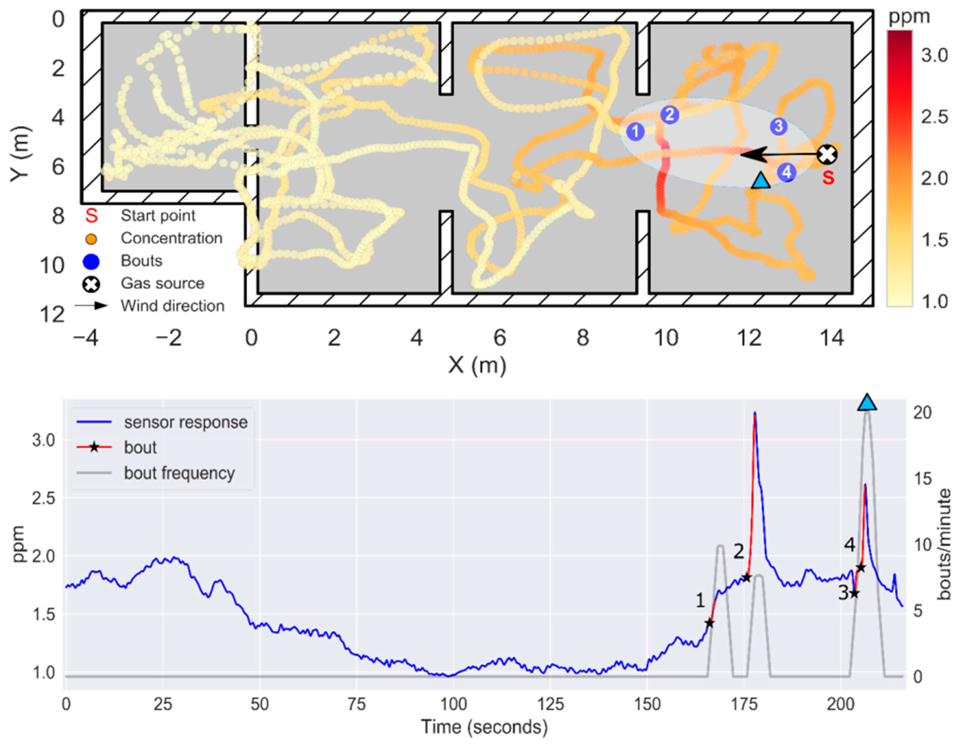
3.3. Experiment 1: Localization of a Source 17 m Away from the Starting Point
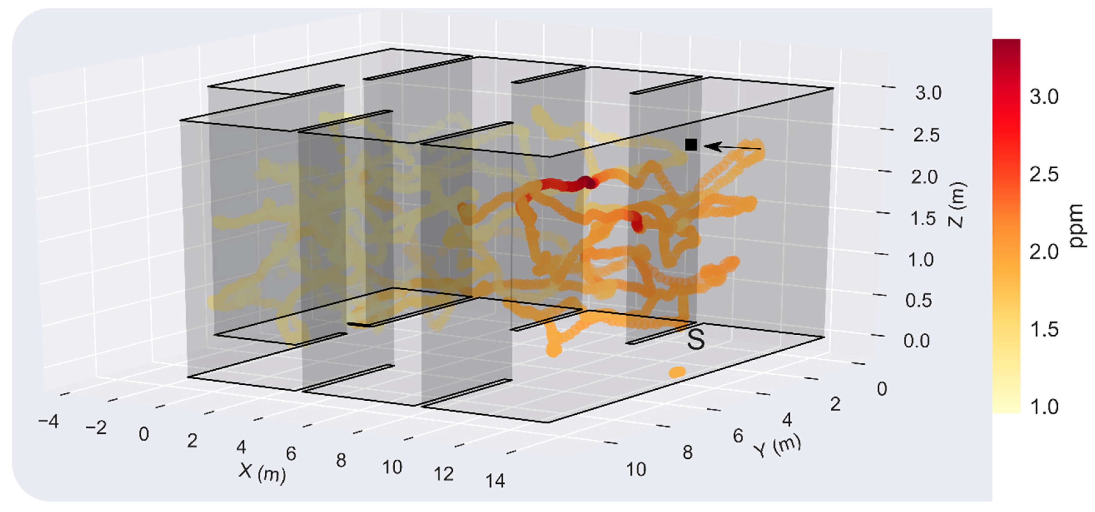
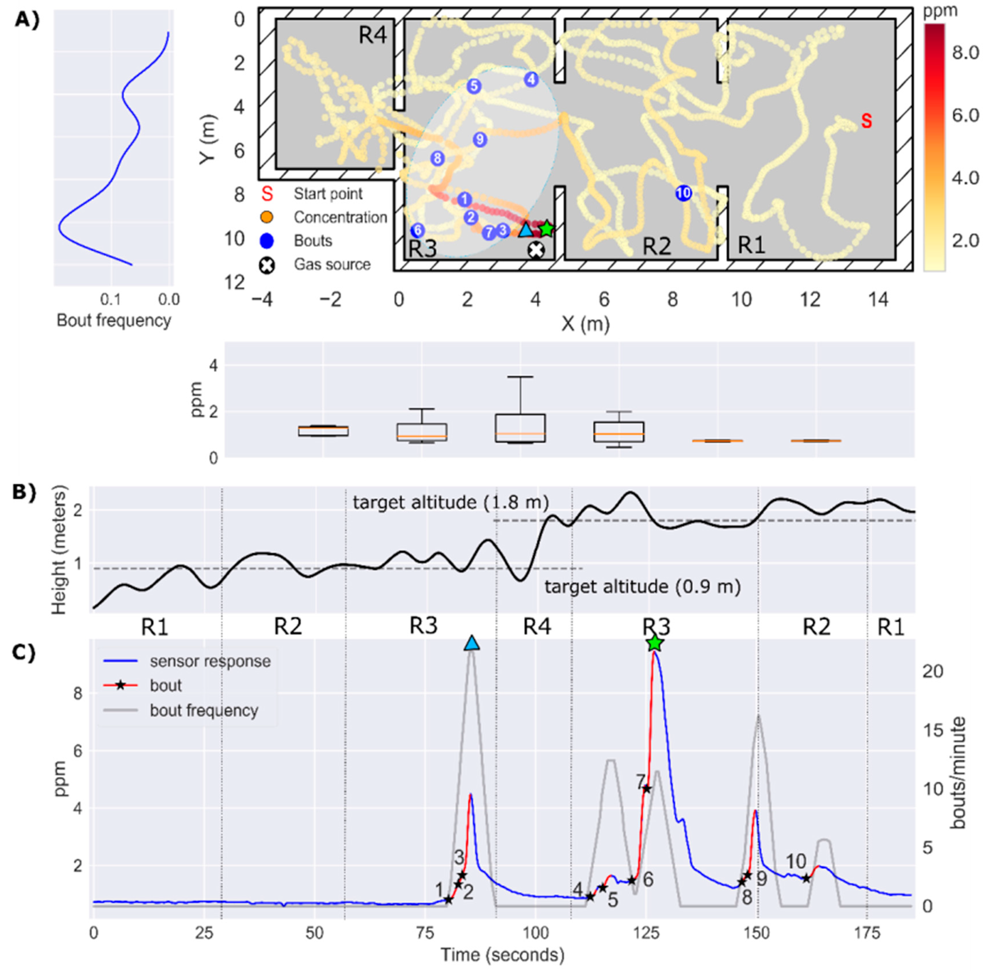
3.4. Experiment 2: Localization of a Source Hidden in the Suspended Ceiling (h = 2.7 m)
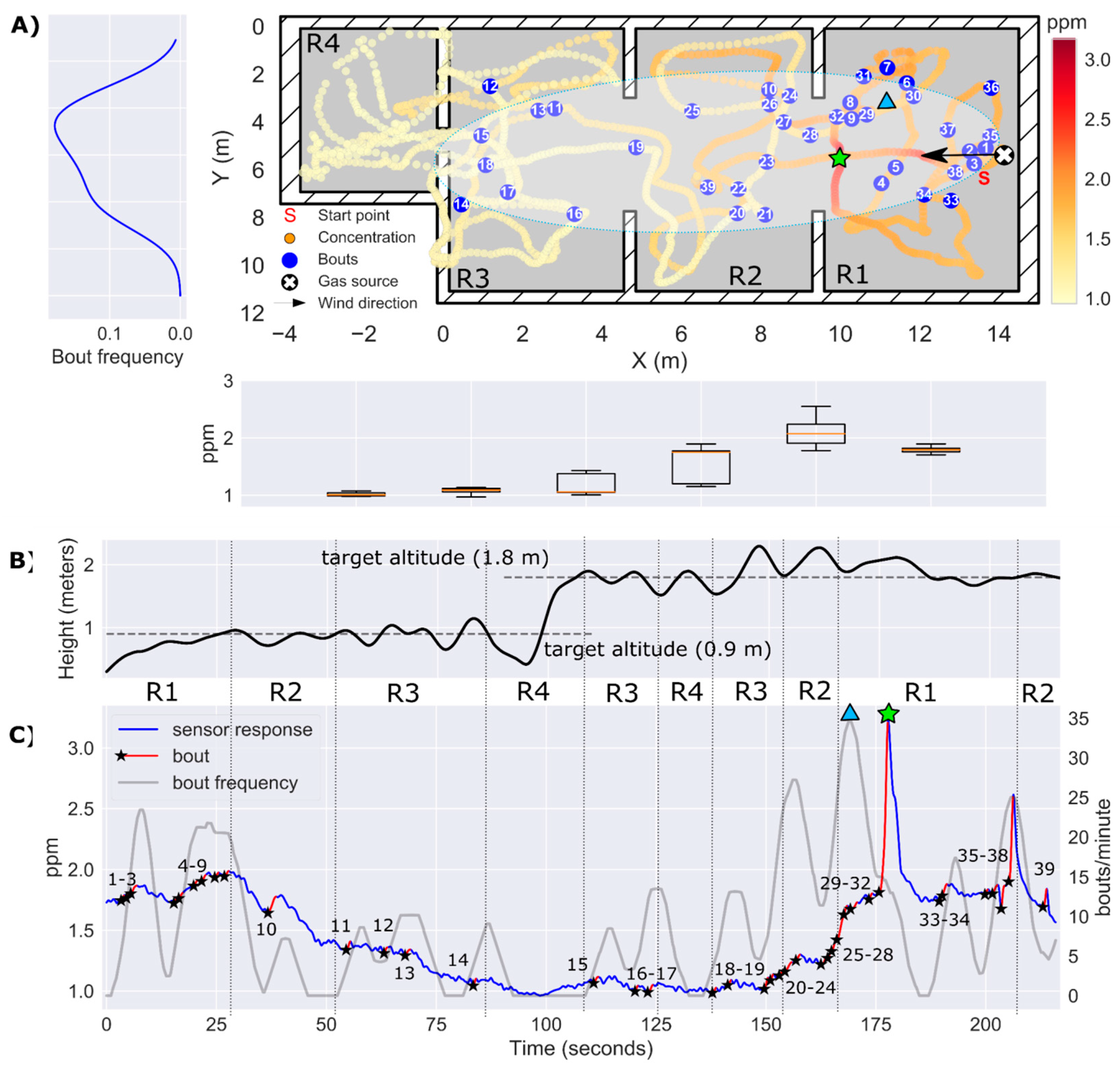
3.5. Experiment 3: Localization of a Source Hidden Inside a Power Outlet Box (h = 0.9 m)
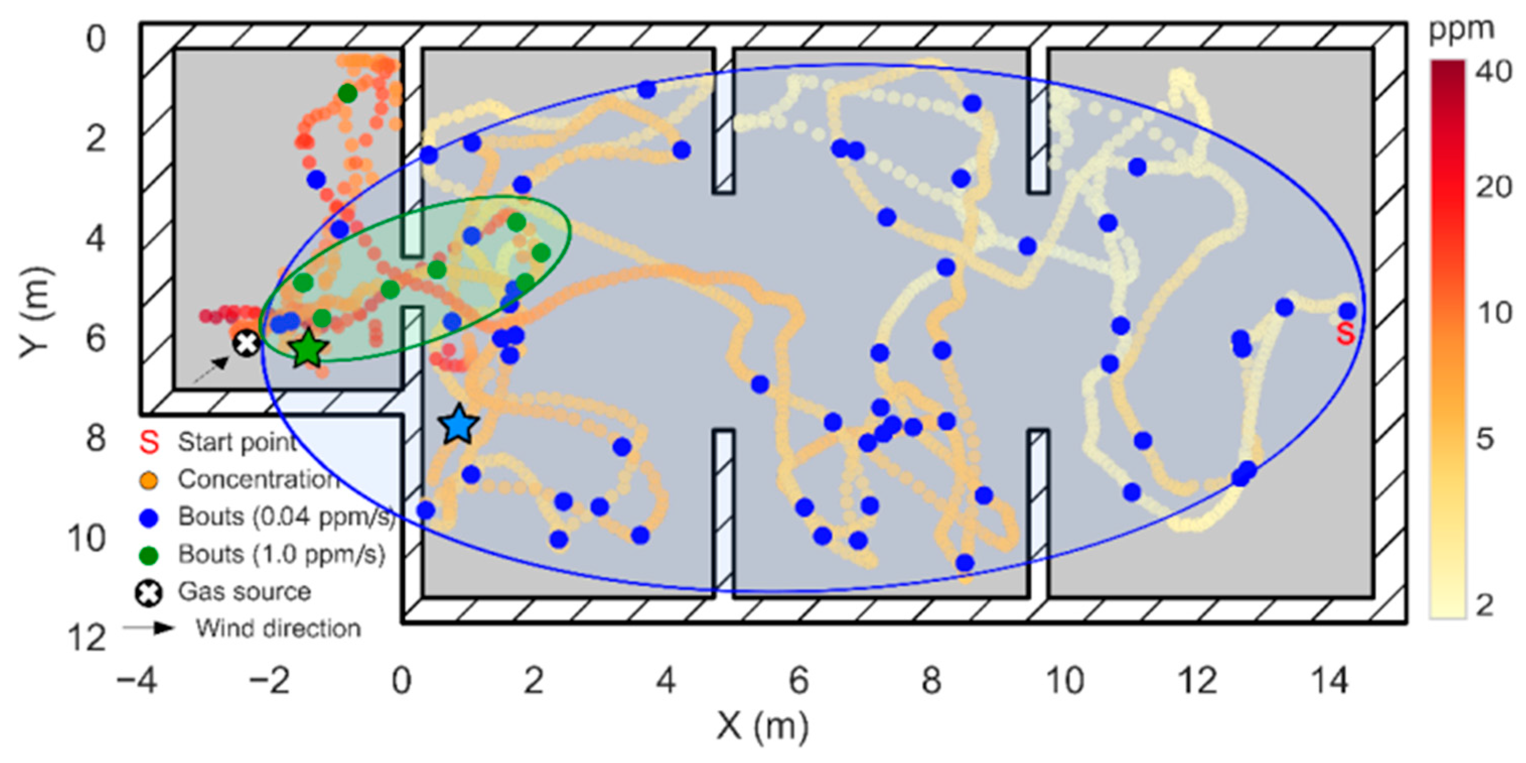
3.6. Overall Localization Results
4. Discussion
Author Contributions
Funding
Acknowledgments
Conflicts of Interest
References
- Ma, K.Y.; Chirarattananon, P.; Fuller, S.B.; Wood, R.J. Controlled flight of a biologically inspired, insect-scale robot. Science 2013, 340, 603–607. [Google Scholar] [CrossRef]
- Hassanalian, M.; Abdelkefi, A. Classifications, applications, and design challenges of drones: A review. Prog. Aerosp. Sci. 2017, 91, 99–131. [Google Scholar] [CrossRef]
- Everaerts, J. The use of unmanned aerial vehicles (uavs) for remote sensing and mapping. Int. Arch. Photogramm. Remote Sens. Spat. Inf. Sci. 2008, 37, 1187–1192. [Google Scholar]
- Khan, A.; Schaefer, D.; Tao, L.; Miller, D.J.; Sun, K.; Zondlo, M.A.; Harrison, W.A.; Roscoe, B.; Lary, D.J. Low power greenhouse gas sensors for unmanned aerial vehicles. Remote Sens. 2012, 4, 1355–1368. [Google Scholar] [CrossRef]
- Berman, E.S.F.; Fladeland, M.; Liem, J.; Kolyer, R.; Gupta, M. Greenhouse gas analyzer for measurements of carbon dioxide, methane, and water vapor aboard an unmanned aerial vehicle. Sens. Actuators B Chem. 2012, 169, 128–135. [Google Scholar] [CrossRef]
- Carrozzo, M.; De Vito, S.; Esposito, E.; Salvato, M.; Formisano, F.; Massera, E.; Di Francia, G.; Veneri, P.D.; Iadaresta, M.; Mennella, A. UAV Intelligent Chemical Multisensor Payload for Networked and Impromptu Gas Monitoring Tasks. In Proceedings of the 2018 5th IEEE International Workshop on Metrology for AeroSpace (MetroAeroSpace), Rome, Italy, 20–22 June 2018; pp. 112–116. [Google Scholar]
- Chang, C.C.Y.; Wang, J.L.; Chang, C.C.Y.; Liang, M.C.; Lin, M.R. Development of a multicopter-carried whole air sampling apparatus and its applications in environmental studies. Chemosphere 2016, 144, 484–492. [Google Scholar] [CrossRef]
- Xie, T.; Liu, R.; Hai, R.T.; Hu, Q.H.; Lu, Q. UAV platform based atmospheric environmental emergency monitoring system design. J. Appl. Sci. 2013, 13, 1289–1296. [Google Scholar] [CrossRef]
- Rossi, M.; Brunelli, D. Autonomous Gas Detection and Mapping With Unmanned Aerial Vehicles. IEEE Trans. Instrum. Meas. 2016, 65, 765–775. [Google Scholar] [CrossRef]
- McGonigle, A.J.S.; Aiuppa, A.; Giudice, G.; Tamburello, G.; Hodson, A.J.; Gurrieri, S. Unmanned aerial vehicle measurements of volcanic carbon dioxide fluxes. Geophys. Res. Lett. 2008, 35. [Google Scholar] [CrossRef]
- Shinohara, H. Composition of volcanic gases emitted during repeating Vulcanian eruption stage of Shinmoedake, Kirishima volcano, Japan. Earth Planets Space 2013, 65, 667–675. [Google Scholar] [CrossRef]
- Rüdiger, J.; Tirpitz, J.L.; de Moor, J.M.; Bobrowski, N.; Gutmann, A.; Liuzzo, M.; Ibarra, M.; Hoffmann, T. Implementation of electrochemical, optical and denuder-based sensors and sampling techniques on UAV for volcanic gas measurements: Examples from Masaya, Turrialba and Stromboli volcanoes. Atmos. Meas. Tech. 2018, 11, 2441–2457. [Google Scholar] [CrossRef]
- Mori, T.; Hashimoto, T.; Terada, A.; Yoshimoto, M.; Kazahaya, R.; Shinohara, H.; Tanaka, R. Volcanic plume measurements using a UAV for the 2014 Mt. Ontake eruption the Phreatic Eruption of Mt. Ontake Volcano in 2014 5. Volcanology. Earth Planets Space 2016, 68. [Google Scholar] [CrossRef]
- Astuti, G.; Giudice, G.; Longo, D.; Melita, C.D.; Muscato, G.; Orlando, A. An overview of the “volcan project”: An UAS for exploration of volcanic environments. J. Intell. Robot. Syst. Theory Appl. 2009. [Google Scholar] [CrossRef]
- Neumann, P.P.; Kohlhoff, H.; Hüllmann, D.; Lilienthal, A.J.; Kluge, M. Bringing Mobile Robot Olfaction to the next dimension—UAV-based remote sensing of gas clouds and source localization. In Proceedings of the 2017 IEEE International Conference on Robotics and Automation (ICRA), Singapore, 29 May–3 June 2017; pp. 3910–3916. [Google Scholar]
- Golston, L.M.; Aubut, N.F.; Frish, M.B.; Yang, S.; Talbot, R.W.; Gretencord, C.; McSpiritt, J.; Zondlo, M.A. Natural gas fugitive leak detection using an unmanned aerial vehicle: Localization and quantification of emission rate. Atmosphere 2018, 9, 333. [Google Scholar] [CrossRef]
- Krüll, W.; Tobera, R.; Willms, I.; Essen, H.; Von Wahl, N. Early forest fire detection and verification using optical smoke, gas and microwave sensors. Procedia Eng. 2012, 45, 584–594. [Google Scholar] [CrossRef]
- Merino, L.; Caballero, F.; Martínez-de Dios, J.R.; Ferruz, J.; Ollero, A. A cooperative perception system for multiple UAVs: Application to automatic detection of forest fires. J. F. Robot. 2006, 23, 165–184. [Google Scholar] [CrossRef]
- Pfeifer, J.; Khanna, R.; Constantin, D.; Popovic, M.; Galceran, E.; Walter, A.; Siegwart, R.; Liebisch, F. Towards automatic UAV data interpretation. In Proceedings of the International Conference of Agricultural Engineering 2016, At Aahus, Denmark, 26–29 June 2016. [Google Scholar]
- Roldán, J.J.; Joossen, G.; Sanz, D.; del Cerro, J.; Barrientos, A. Mini-UAV based sensory system for measuring environmental variables in greenhouses. Sensors 2015, 15, 3334–3350. [Google Scholar] [CrossRef]
- Pobkrut, T.; Eamsa-Ard, T.; Kerdcharoen, T. Sensor drone for aerial odor mapping for agriculture and security services. In Proceedings of the 2016 13th International Conference on Electrical Engineering/Electronics, Computer, Telecommunications and Information Technology (ECTI-CON), Chiang Mai, Thailand, 28 June–1 July 2016. [Google Scholar] [CrossRef]
- Lega, M.; Napoli, R.M.A. A new approach to solid waste landfills aerial monitoring. WIT Trans. Ecol. Environ. 2008, 109, 193–199. [Google Scholar] [CrossRef]
- Allen, G.; Hollingsworth, P.; Kabbabe, K.; Pitt, J.R.; Mead, M.I.; Illingworth, S.; Roberts, G.; Bourn, M.; Shallcross, D.E.; Percival, C.J. The development and trial of an unmanned aerial system for the measurement of methane flux from landfill and greenhouse gas emission hotspots. Waste Manag. 2018. [Google Scholar] [CrossRef]
- Emran, B.J.; Tannant, D.D.; Najjaran, H. Low-altitude aerial methane concentration mapping. Remote Sens. 2017, 9, 823. [Google Scholar] [CrossRef]
- Daniel, K.; Dusza, B.; Lewandowski, A.; Wietfeld, C. Airshield: A system-of-systems muav remote sensing architecture for disaster response. In Proceedings of the 2009 3rd Annual IEEE Systems Conference, Vancouver, BC, Canada, 23–26 March 2009; pp. 196–200. [Google Scholar] [CrossRef]
- Alvarado, M.; Gonzalez, F.; Fletcher, A.; Doshi, A. Towards the development of a low cost airborne sensing system to monitor dust particles after blasting at open-pit mine sites. Sensors 2015, 15, 19667–19687. [Google Scholar] [CrossRef] [PubMed]
- Villa, T.; Gonzalez, F.; Miljievic, B.; Ristovski, Z.; Morawska, L. An Overview of Small Unmanned Aerial Vehicles for Air Quality Measurements: Present Applications and Future Prospectives. Sensors 2016, 16, 1072. [Google Scholar] [CrossRef] [PubMed]
- Pajares, G. Overview and Current Status of Remote Sensing Applications Based on Unmanned Aerial Vehicles (UAVs). Photogramm. Eng. Remote Sens. 2015, 81, 281–330. [Google Scholar] [CrossRef]
- Rossi, M.; Brunelli, D. Gas Sensing on Unmanned Vehicles: Challenges and Opportunities. In Proceedings of the 2017 New Generation of CAS (NGCAS), Genova, Italy, 6–9 September 2017; pp. 117–120. [Google Scholar]
- Fahad, H.M.; Shiraki, H.; Amani, M.; Zhang, C.; Hebbar, V.S.; Gao, W.; Ota, H.; Hettick, M.; Kiriya, D.; Chen, Y.; et al. Room temperature multiplexed gas sensing using chemical-sensitive 3. 5-nm-thin silicon transistors. Sci. Adv. 2017, 3, 1–9. [Google Scholar] [CrossRef] [PubMed]
- Dunkley, O.; Engel, J.; Sturm, J.; Cremers, D. Visual-Inertial Navigation for a Camera-Equipped 25 g Nano-Quadrotor. In Proceedings of the IROS Aerial Open Source Robotics Workshop, Chicago, IL, USA, 14–18 September 2014; pp. 4–5. [Google Scholar]
- Preiss, J.A.; Honig, W.; Sukhatme, G.S.; Ayanian, N. Crazyswarm: A large nano-quadcopter swarm. In Proceedings of the 2017 IEEE International Conference on Robotics and Automation (ICRA), Singapore, 29 May–3 June 2017; pp. 3299–3304. [Google Scholar]
- Farid, Z.; Nordin, R.; Ismail, M. Recent advances in wireless indoor localization techniques and system. J. Comput. Networks Commun. 2013, 2013, 185138. [Google Scholar] [CrossRef]
- Monroy, J.G.; González-Jiménez, J.; Blanco, J.L. Overcoming the slow recovery of MOX gas sensors through a system modeling approach. Sensors 2012, 12, 13664–13680. [Google Scholar] [CrossRef]
- Lilienthal, A.; Duckett, T. Building gas concentration gridmaps with a mobile robot. Rob. Auton. Syst. 2004, 48, 3–16. [Google Scholar] [CrossRef]
- Kowadlo, G.; Russell, R.A. Robot odor localization: A taxonomy and survey. Int. J. Rob. Res. 2008, 27, 869–894. [Google Scholar] [CrossRef]
- Lochmatter, T. Bio-Inspired and Probabilistic Algorithms for Distributed Odor Source Localization using Mobile Robots; École polytechnique fédérale de Lausanne (EPFL): Lausanne, Switzerland, 2010; Volume 4628. [Google Scholar]
- Hernandez Bennetts, V.; Lilienthal, A.J.; Neumann, P.P.; Trincavelli, M. Mobile Robots for Localizing Gas Emission Sources on Landfill Sites: Is Bio-Inspiration the Way to Go? Front. Neuroeng. 2012, 4. [Google Scholar] [CrossRef]
- Lilienthal, A.; Duckett, T. Experimental analysis of gas-sensitive Braitenberg vehicles. Adv. Robot. 2004, 18, 817–834. [Google Scholar] [CrossRef]
- Ishida, H.; Nakamoto, T.; Moriizumi, T. Remote sensing of gas/odor source location and concentration distribution using mobile system. Sens. Actuators B Chem. 1998, 49, 52–57. [Google Scholar] [CrossRef]
- Pang, S.; Farrell, J.A. Chemical plume source localization. IEEE Trans. Syst. Man Cybern. Part B Cybern. 2006, 36, 1068–1080. [Google Scholar] [CrossRef]
- Vergassola, M.; Villermaux, E.; Shraiman, B.I. “Infotaxis” as a strategy for searching without gradients. Nature 2007, 445, 406–409. [Google Scholar] [CrossRef] [PubMed]
- Pomareda, V.; Magrans, R.; Jiménez-Soto, J.M.; Martínez, D.; Tresánchez, M.; Burgués, J.; Palacín, J.; Marco, S. Chemical source localization fusing concentration information in the presence of chemical background noise. Sensors 2017, 17, 904. [Google Scholar] [CrossRef] [PubMed]
- Turner, D.B. Workbook of Atmospheric Dispersion Estimates: An Introduction to Dispersion Modeling; CRC Press: Boca Raton, FL, USA, 1994. [Google Scholar]
- Farrell, J.A.; Murlis, J.; Long, X.; Li, W.; Cardé, R.T. Filament-based atmospheric dispersion model to achieve short time-scale structure of odor plumes. Environ. Fluid Mech. 2002, 2, 143–169. [Google Scholar] [CrossRef]
- Thomson, D.J. Criteria for the selection of stochastic models of particle trajectories in turbulent flows. J. Fluid Mech. 1987, 180, 529–556. [Google Scholar] [CrossRef]
- Falkovich, G.; Gawȩdzki, K.; Vergassola, M. Particles and fields in fluid turbulence. Rev. Mod. Phys. 2001, 73, 913–975. [Google Scholar] [CrossRef]
- Sutton, O.G. The problem of diffusion in the lower atmosphere. Q. J. R. Meteorol. Soc. 1947, 73, 257–281. [Google Scholar] [CrossRef]
- Bakkum, E.A.; Duijm, N.J. Vapour Cloud Dispersion; CPR E: London, UK, 1997; Volume 14. [Google Scholar]
- Luo, B.; Meng, Q.H.; Wang, J.Y.; Sun, B.; Wang, Y. Three-dimensional gas distribution mapping with a micro-drone. In Proceedings of the 2015 34th Chinese Control Conference (CCC), Hangzhou, China, 28–30 July 2015; pp. 6011–6015. [Google Scholar] [CrossRef]
- Lilienthal, A.J.; Reggente, M.; Trinca, M.; Blanco, J.L.; Gonzalez, J. A statistical approach to gas distribution modelling with mobile robots—The Kernel DM+V algorithm. In Proceedings of the 2009 IEEE/RSJ International Conference on Intelligent Robots and Systems (IROS), St. Louis, MO, USA, 10–15 October 2009; pp. 570–576. [Google Scholar]
- Hayes, A.T.; Martinoli, A.; Goodman, R.M. Distributed odor source localization. IEEE Sens. J. 2002, 2, 260–271. [Google Scholar] [CrossRef]
- Neumann, P.P.; Asadi, S.; Lilienthal, A.J.; Bartholmai, M.; Schiller, J.H. Autonomous gas-sensitive microdrone: Wind vector estimation and gas distribution mapping. IEEE Robot. Autom. Mag. 2012, 19, 50–61. [Google Scholar] [CrossRef]
- Burgués, J.; Marco, S. Low power operation of temperature-modulated metal oxide semiconductor gas sensors. Sensors 2018, 18, 339. [Google Scholar] [CrossRef] [PubMed]
- Lilienthal, A.; Zell, A.; Wandel, M.; Weimar, U. Sensing odour sources in indoor environments without a constant airflow by a mobile robot. In Proceedings of the 2001 IEEE International Conference on Robotics and Automation (ICRA), Seoul, Korea, 21–26 May 2001; Volume 4, pp. 1–6. [Google Scholar]
- Atema, J. Chemical signals in the marine environment: Dispersal, detection, and temporal signal analysis. Proc. Natl. Acad. Sci. USA 1995, 92, 62–66. [Google Scholar] [CrossRef] [PubMed]
- Farah, A.; Duckett, T. Reactive Localisation of an Odour Source by a learning Mobile Robot. In Proceedings of the Second Swedish Workshop on Autonomous Robotics, Stockholm, Sweden, 11–12 October 2002; pp. 29–38. [Google Scholar]
- Weissburg, M.J.; Dusenbery, D.B.; Ishida, H.; Janata, J.; Keller, T.; Roberts, P.J.W.; Webster, D.R. A multidisciplinary study of spatial and temporal scales containing information in turbulent chemical plume tracking. Environ. Fluid Mech. 2002, 2, 65–94. [Google Scholar] [CrossRef]
- Webster, D.R.; Weissburg, M.J. Chemosensory guidance cues in a turbulent chemical odor plume. Limnol. Oceanogr. 2001, 46, 1034–1047. [Google Scholar] [CrossRef]
- Gonzalez-Jimenez, J.; Monroy, J.G.; Blanco, J.L. The multi-chamber electronic nose-an improved olfaction sensor for mobile robotics. Sensors 2011, 11, 6145–6164. [Google Scholar] [CrossRef] [PubMed]
- Batog, P.; Wołczowski, A. Odor markers detection system for mobile robot navigation. Procedia Eng. 2012, 47, 1442–1445. [Google Scholar] [CrossRef]
- Marco, S.; Pardo, A.; Davide, F.A.M.; Di Natale, C.; D’Amico, A.; Hierlemann, A.; Mitrovics, J.; Schweizer, M.; Weimar, U.; Göpel, W. Different strategies for the identification of gas sensing systems. Sens. Actuators B Chem. 1996, 34, 213–223. [Google Scholar] [CrossRef]
- Pardo, A.; Marco, S.; Samitier, J.; Davide, F.A.M.; Di Natale, C.; D’Amico, A. Dynamic measurements with chemical sensor arrays based on inverse modelling. In Proceedings of the IEEE Instrumentation and Measurement Technology Conference, Brussels, Belgium, 4–6 June 1996; Volume 1. [Google Scholar]
- Fonollosa, J.; Sheik, S.; Huerta, R.; Marco, S. Reservoir computing compensates slow response of chemosensor arrays exposed to fast varying gas concentrations in continuous monitoring. Sens. Actuators B Chem. 2015, 215, 618–629. [Google Scholar]
- Schmuker, M.; Bahr, V.; Huerta, R. Exploiting plume structure to decode gas source distance using metal-oxide gas sensors. Sens. Actuators B Chem. 2016, 235, 636–646. [Google Scholar] [CrossRef]
- Bitcraze, A.B. Getting Started with the Loco Positioning System. Available online: https://www.bitcraze.io/getting-started-with-the-loco-positioning-system/ (accessed on 7 July 2018).
- DecaWave DWM1000 Datasheet; DecaWave: Dublin, Ireland, 2016.
- Nelson, G. Gas Mixtures: Preparation and Control; CRC Press: Boca Raton, FL, USA, 1992. [Google Scholar]
- Currie, L.A. Nomenclature in evaluation of analytical methods including detection and quantification capabilities (IUPAC Recommendations 1995). Pure Appl. Chem. 1995, 67, 1699–1723. [Google Scholar] [CrossRef]
- Burgués, J.; Jimenez-Soto, J.M.; Marco, S. Estimation of the limit of detection in semiconductor gas sensors through linearized calibration models. Anal. Chim. Acta 2018, 1013, 13–25. [Google Scholar] [CrossRef] [PubMed]
- Pashami, S.; Lilienthal, A.J.; Trincavelli, M. Detecting changes of a distant gas source with an array of MOX gas sensors. Sensors 2012, 12, 16404–16419. [Google Scholar] [CrossRef] [PubMed]
- Burgués, J.; Marco, S. Multivariate estimation of the limit of detection by orthogonal partial least squares in temperature-modulated MOX sensors. Anal. Chim. Acta 2018, 1019, 49–64. [Google Scholar] [CrossRef] [PubMed]
- Shakaff, A.; Yeon, A.; Kamarudin, K.; Visvanathan, R. Gas Source Localization via Behaviour Based Mobile Robot and Weighted Arithmetic Mean Gas Source Localization via Behaviour Based Mobile Robot and Weighted Arithmetic Mean. IOP Conf. Ser. Mater. Sci. Eng. 2018, 318, 012049. [Google Scholar] [CrossRef]
- Li, J.G.; Sun, B.; Zeng, F.L.; Liu, J.; Yang, J.; Yang, L. Experimental study on multiple odor sources mapping by a mobile robot in time-varying airflow environment. In Proceedings of the Chinese Control Conference (CCC), Chengdu, China, 27–29 July 2016; pp. 6032–6037. [Google Scholar]
- Kowadlo, G.; Russell, R.A. Using naïve physics for odor localization in a cluttered indoor environment. Auton. Robots 2006, 20, 215–230. [Google Scholar] [CrossRef]
- Lilienthal, A.J.; Loutfi, A.; Duckett, T. Airborne chemical sensing with mobile robots. Sensors 2006, 6, 1616–1678. [Google Scholar] [CrossRef]
- Reggente, M.; Lilienthal, A.J. Three-dimensional statistical gas distribution mapping in an uncontrolled indoor environment. AIP Conf. Proc. 2009, 1137, 109–112. [Google Scholar]
- Pashami, S.; Lilienthal, A.J.; Schaffernicht, E.; Trincavelli, M. TREFEX: Trend estimation and change detection in the response of MOX gas sensors. Sensors 2013, 13, 7323–7344. [Google Scholar] [CrossRef]
- Loutfi, A.; Coradeschi, S.; Lilienthal, A.J.; Gonzalez, J. Gas distribution mapping of multiple odour sources using a mobile robot. Robotica 2009, 27, 311–319. [Google Scholar] [CrossRef]
- Lilienthal, A.; Reimann, D.; Zell, A. Gas Source Tracing with a Mobile Robot Using an Adapted Moth Strategy. Auton. Mob. Syst. 2003, 150–160. [Google Scholar] [CrossRef]
- Lilienthal, A.; Trincavelli, M.; Schaffernicht, E. It’s always smelly around here! Modeling the Spatial Distribution of Gas Detection Events with BASED Grid Maps. In Proceedings of the 15th International Symposium on Olfaction and Electronic Nose (ISOEN 2013), Daegu, Korea, 2–5 July 2013; Volume 27. [Google Scholar]
- Schaffernicht, E.; Trincavelli, M.; Lilienthal, A.J. Bayesian Spatial Event Distribution Grid Maps for Modeling the Spatial Distribution of Gas Detection Events. Sens. Lett. 2014, 12, 1142–1146. [Google Scholar] [CrossRef]


| Distance | Propellers | Mean (ppm) | Variance (ppm2) | Bout Frequency (Bouts/min) | Bout Amplitude (ppm/s) |
|---|---|---|---|---|---|
| Above 25 cm | OFF | 10.05 | 60.46 | 3.52 | 0.39 |
| ON | 9.22 | 29.97 | 7.69 | 0.084 | |
| Above 65 cm | OFF | 1.39 | 0.053 | 0.48 | 0.027 |
| ON | 2.67 | 0.53 | 7.74 | 0.015 | |
| Front 50 cm | OFF | 1.68 | 0.59 | 1.13 | 0.10 |
| ON | 1.45 | 0.12 | 0.47 | 0.10 |
| Experiment | Instantaneous Concentration | Bout Frequency | Bout Frequency (Optimum Threshold) |
|---|---|---|---|
| 1 | 0.94 | 4.32 | 1.16 |
| 2 | 4.0 | 3.31 | 2.22 |
| 3 | 1.22 | 5.07 | 0.77 |
| Mean | 2.05 | 4.23 | 1.38 |
© 2019 by the authors. Licensee MDPI, Basel, Switzerland. This article is an open access article distributed under the terms and conditions of the Creative Commons Attribution (CC BY) license (http://creativecommons.org/licenses/by/4.0/).
Share and Cite
Burgués, J.; Hernández, V.; Lilienthal, A.J.; Marco, S. Smelling Nano Aerial Vehicle for Gas Source Localization and Mapping. Sensors 2019, 19, 478. https://doi.org/10.3390/s19030478
Burgués J, Hernández V, Lilienthal AJ, Marco S. Smelling Nano Aerial Vehicle for Gas Source Localization and Mapping. Sensors. 2019; 19(3):478. https://doi.org/10.3390/s19030478
Chicago/Turabian StyleBurgués, Javier, Victor Hernández, Achim J. Lilienthal, and Santiago Marco. 2019. "Smelling Nano Aerial Vehicle for Gas Source Localization and Mapping" Sensors 19, no. 3: 478. https://doi.org/10.3390/s19030478
APA StyleBurgués, J., Hernández, V., Lilienthal, A. J., & Marco, S. (2019). Smelling Nano Aerial Vehicle for Gas Source Localization and Mapping. Sensors, 19(3), 478. https://doi.org/10.3390/s19030478