
An ACOR-Based Multi-Objective WSN Deployment Example for Lunar Surveying

Abstract
:1. Introduction
- (1)
- The proposed deployment model considers coordinates as continuous variables.
- (2)
- We explore the novel use of the metaheuristic in a deployment problem and a multi-objective optimization problem. The literature on deployment problems in relation to ACO is limited, and we are faced thus with an open area of research. In addition, our work is the first ACO-related research to use preferential sensing coverage.
- (3)
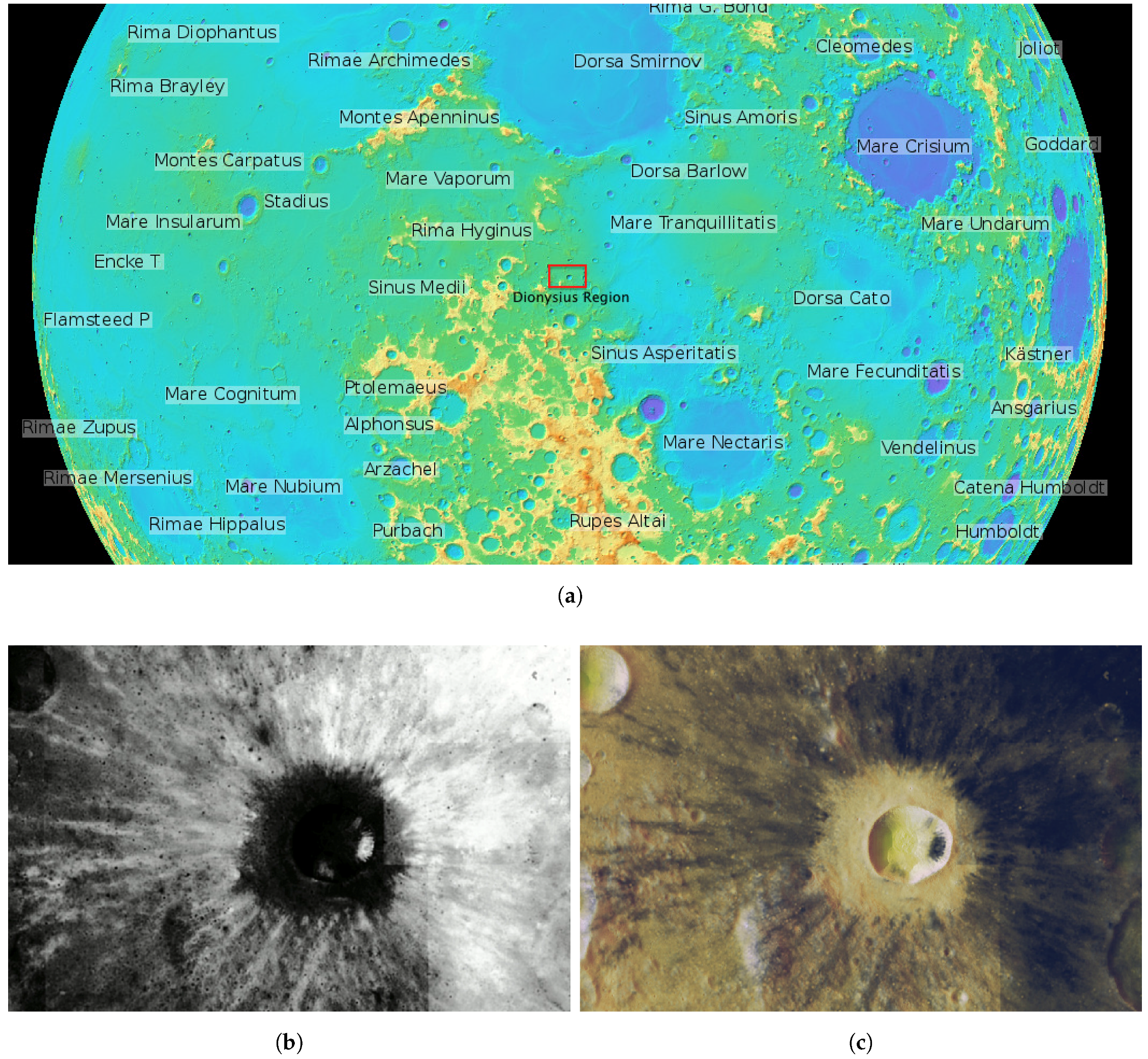
- We present an original application scenario. Multi-objective deployment problems to date have mostly been applied to small-gridded, artificially-developed scenarios (see Section 2). We, by contrast, test our approach on a large extension of the Moon surface containing traces of He: the Dionysius region.
- (4)
- We have adjusted parameters of the algorithm to the deployment problem. This procedure and the resulting optimization model could be extended to other target scenarios and optimization objectives.
- (5)
- We evaluated the proposed deployment methodology by comparing to a simple heuristic in terms of coverage. A tradeoff between joint-coverage and energy cost is also computed, which could be useful when planning a lunar exploration mission.
2. Related Works
3. WSN Deployment Model
- The hardware of the nodes is homogeneous, i.e., it is of the same type and has the same communication/sensing capabilities.
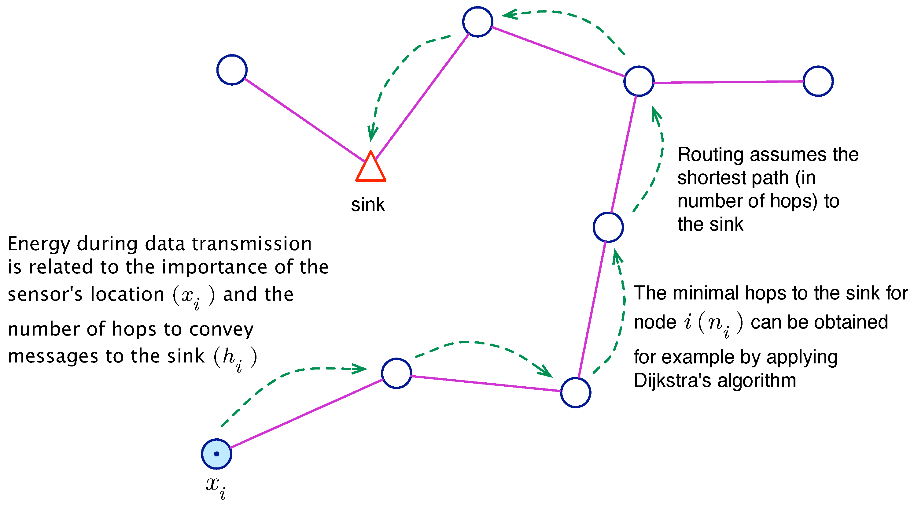
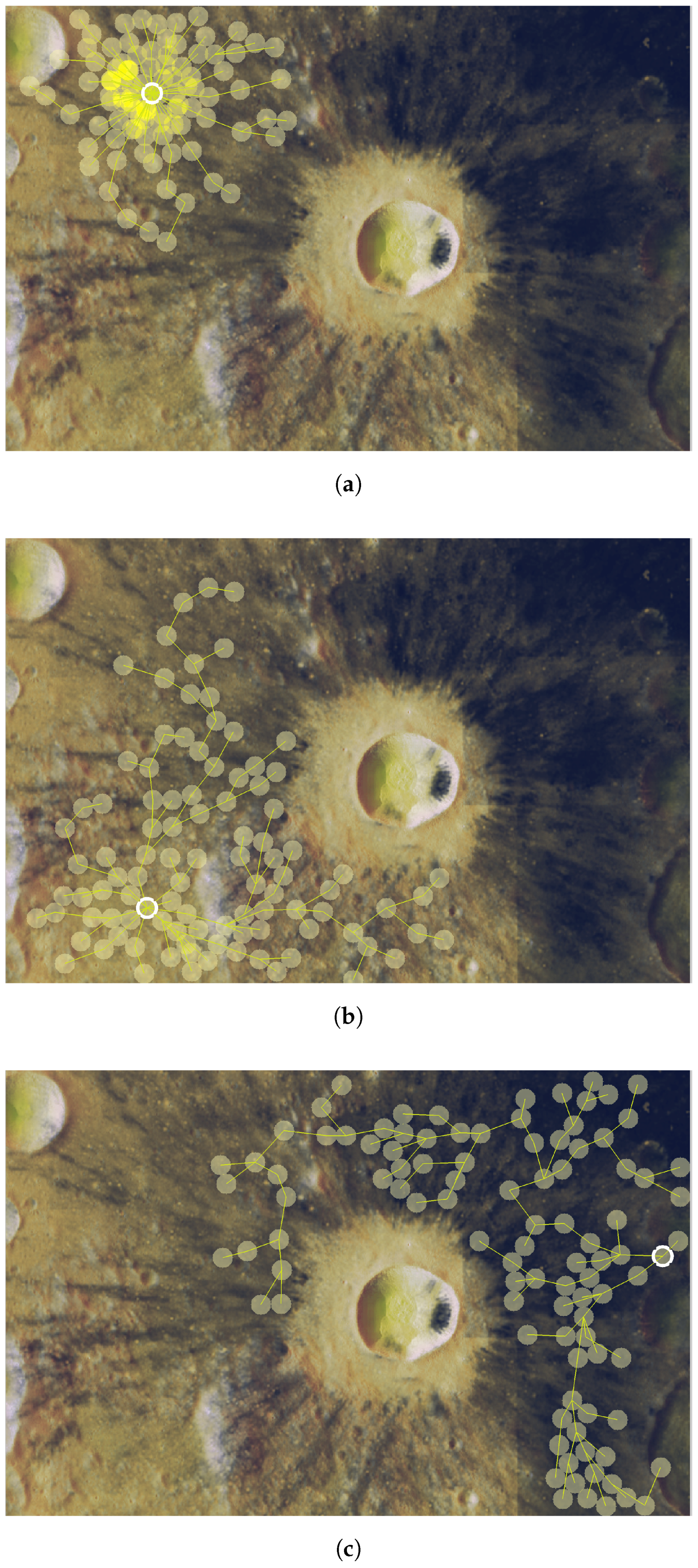
- The sink node can be any of the N sensor nodes. Without loss of generality, we assume that it is Node 1 and is therefore positioned at .
- The dimension of our problem is , since a solution is composed of positions of N nodes in an space.
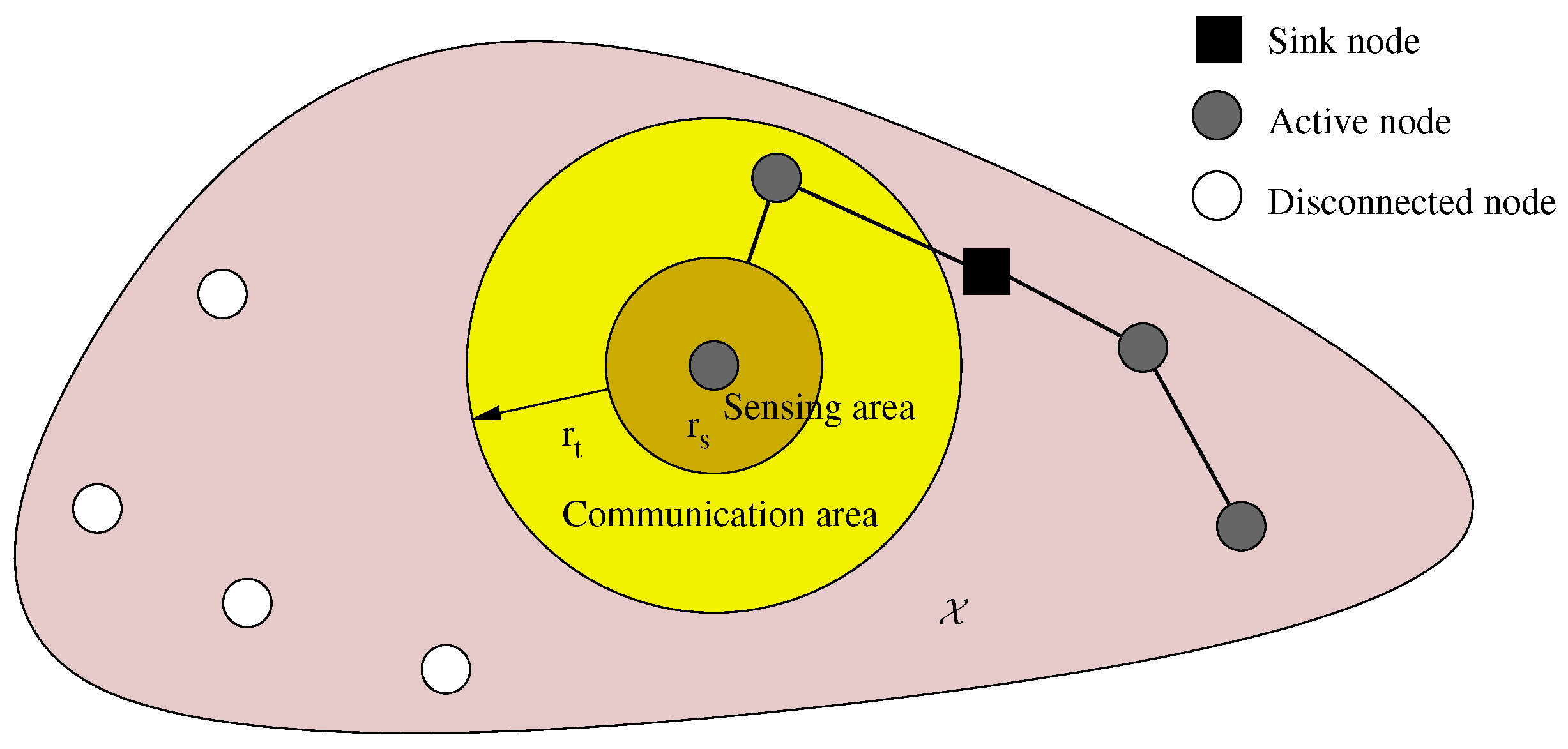
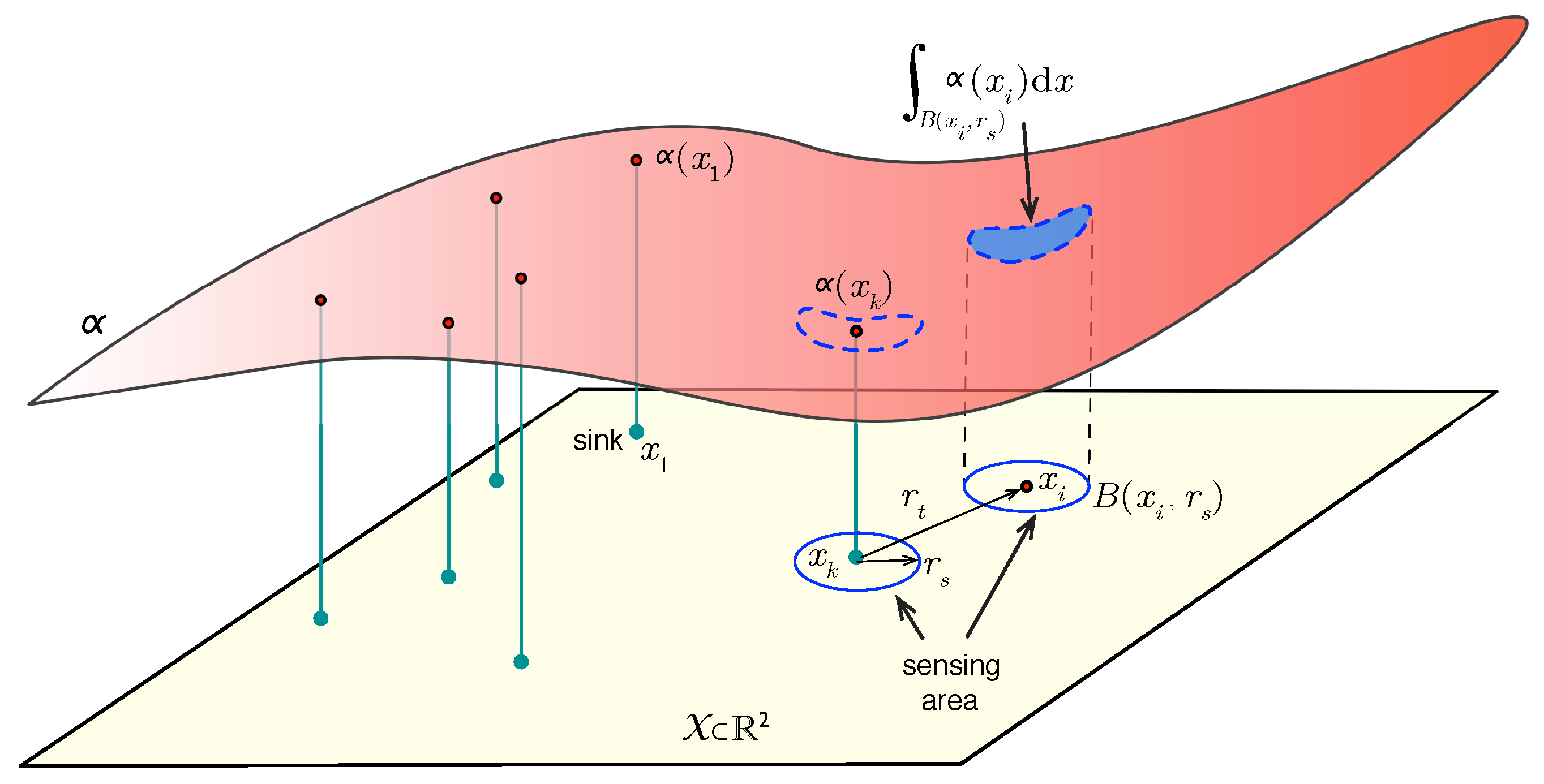
- The sensing range is the minimum significant separation required between two nodes to consider their sensing data independent. The information gathered by sensor i is then given by:where is the open ball in centered in x with radius r. Figure 2 depicts this model.
- The transmission range is the longest separation distance between two mutually communicating nodes, and it determines network connectivity. Let us term active nodes all nodes able to transmit their sensed data to the sink, and let A denote this set of nodes.
3.1. Coverage Objective: Importance

3.2. Energy Objective: Cost
3.3. Multi-Objective Deployment Problem
4. Optimization Methodology

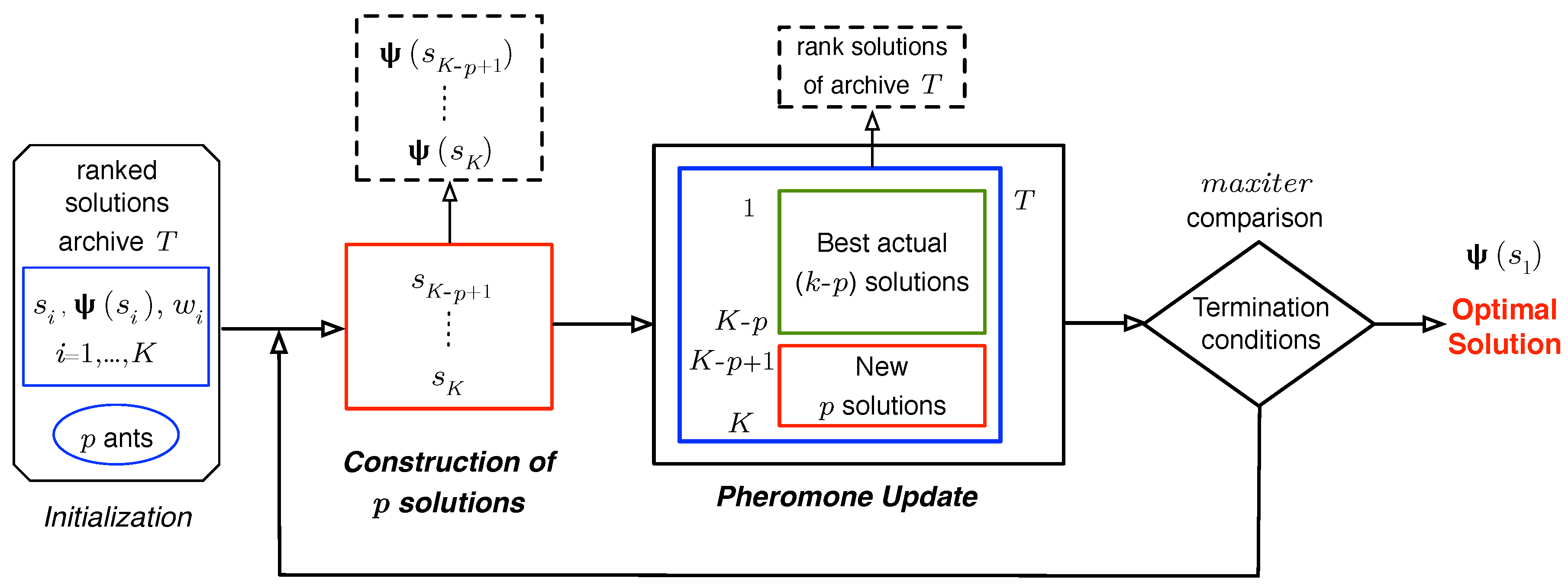
4.1. Initialization

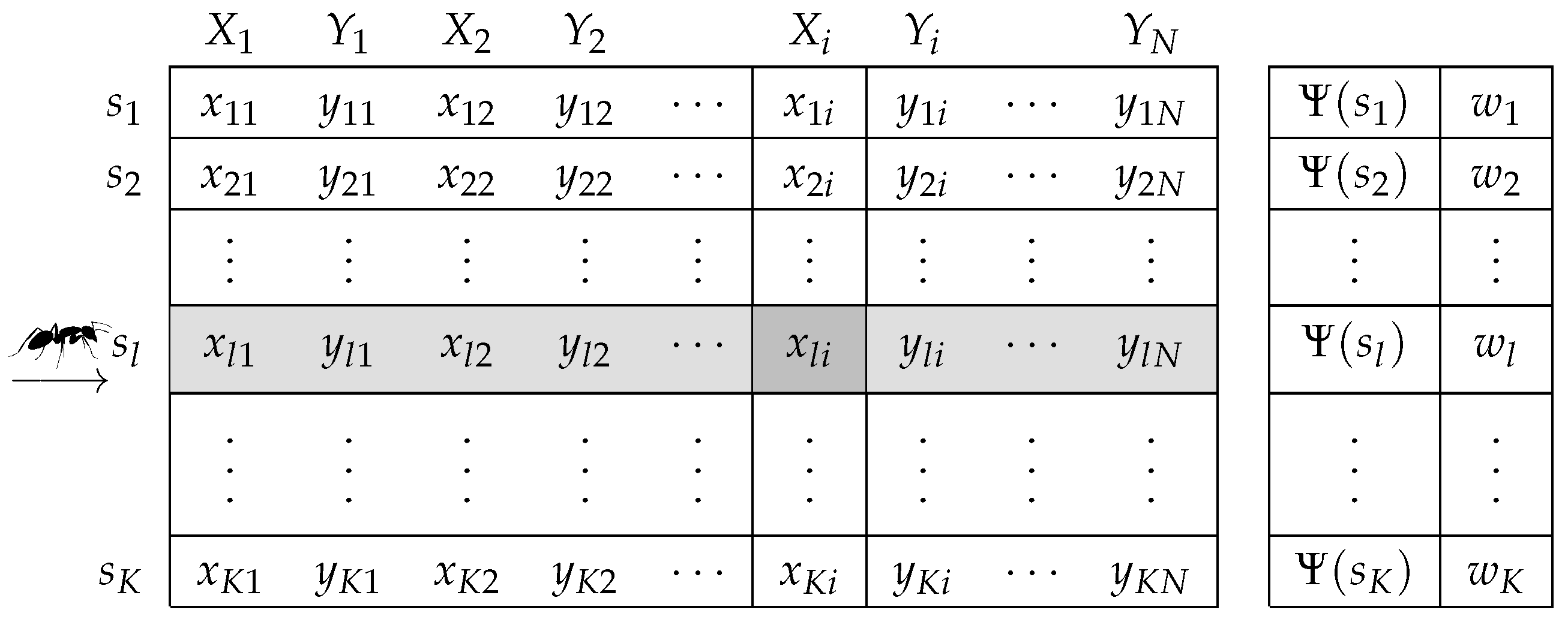
4.2. Construction of Ant-Based Solutions
4.3. Pheromone Updating
5. Placement Algorithm Evaluation
5.1. WSN Planning Preliminaries and Lunar Target Area Selection

- Excluding the centered Dionysius crater, the region of deployment is smooth enough to be considered a flat surface (i.e., it is not rugged). Although there may be some He inside the crater, the amounts are small and distant from other parts of the scenario and, thus, can be ignored.
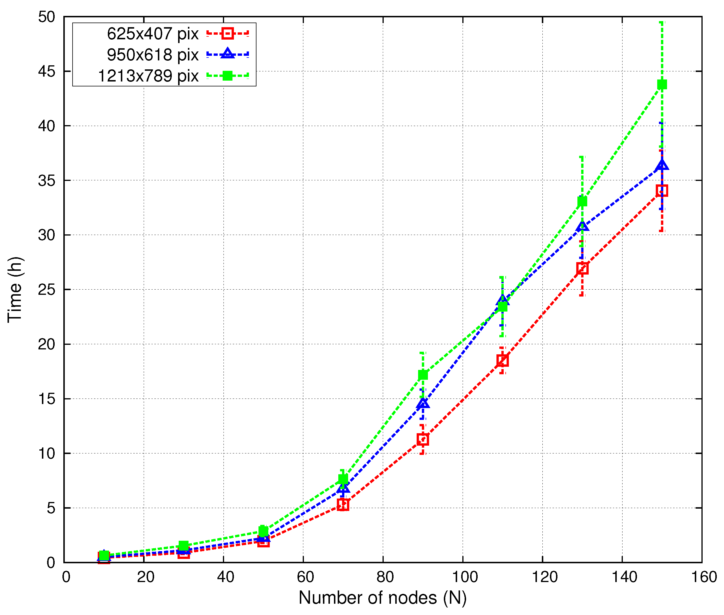
- The maximum number of sensor nodes has been restricted to , because spacecraft payload capacity is always limited [61]. In order to scatter these nodes in our huge target area, parameter needs to be adjusted. In our tests, we have set a long transmission range km.
- Antennas are assumed to be omnidirectional dipoles placed at sufficient height above the Moon surface to ensure that signal propagation (reflection, diffraction, penetration, etc.) is not affected by ground effects. Under these conditions, the propagation model on the lunar surface could be approximated to the free-space model, even for long-range distances [62,63].
- We assume that the transmission power of our nodes may be adjustable between dBm and dBm; we also assume a carrier frequency of MHz. This frequency allows reduced antenna dimensions of cm, which are suitable and easy to manage in space applications and also require less energy consumption than higher operation frequencies.An estimation of the received power at a 6-km distance can be computed using the well-known Friis equation [64].For instance, if we select a transmitting power of dBm (assuming typical dipole gains and a system loss factor of ), then we obtain a received power of dBm. Commercial transceivers of these characteristics are easily available [65].
- The sensing range is set to km (15 pixels in Figure 6c).
- The deployment of nodes on the lunar surface could be achieved using a rover, navigating the lunar surface. This scheme would allow controlled positioning of the nodes, although it might take a long time to put all of the nodes in place. Possible alternative methods include dropping the nodes from a spacecraft or launching them from a rover (Sanz et al. [66]).
5.2. Validation Tests
- Number of solutions within archive T: .
- Number of ants: .
- and .
- .


| number of nodes | |
| transmission range | km |
| sensing range | km |
| transmitter power | dBm |
| T size | |
| number of ants | |
| heuristic parameter | |
| pheromone evaporation rate | |
| termination condition |
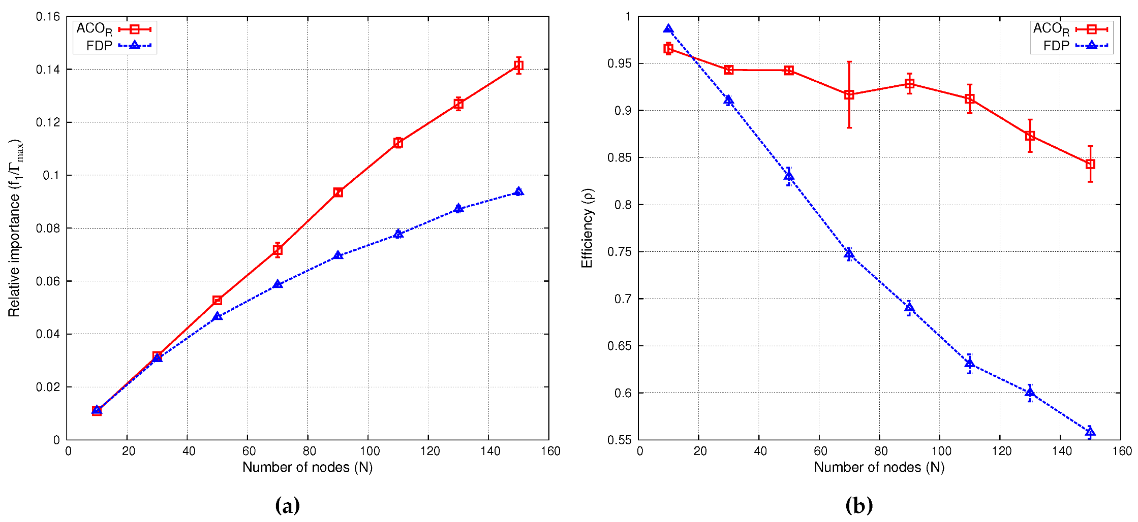
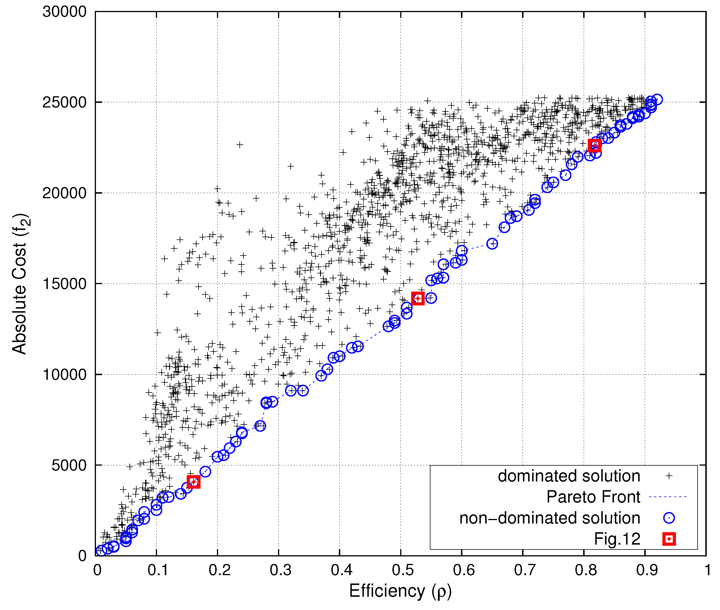
| Relative Importance () | Efficiency (ρ) | |||
|---|---|---|---|---|
| N nodes | FDP | FDP | ||
| 10 | 0.0110 | 0.0110 | 0.9919 | 0.9883 |
| 30 | 0.0321 | 0.0312 | 0.9568 | 0.9328 |
| 50 | 0.0535 | 0.0489 | 0.9581 | 0.8762 |
| 70 | 0.0741 | 0.0600 | 0.9478 | 0.7669 |
| 90 | 0.0947 | 0.0742 | 0.9415 | 0.7377 |
| 110 | 0.1150 | 0.0847 | 0.9356 | 0.6892 |
| 130 | 0.1346 | 0.0919 | 0.9265 | 0.6323 |
| 150 | 0.1533 | 0.0972 | 0.9142 | 0.5800 |

6. Conclusions
Acknowledgments
Author Contributions
Conflicts of Interest
References
- McCracken, G.; Stott, P. Fusion: the Energy of the Universe; Academic Press: Cambridge, MA, USA, 2012. [Google Scholar]
- Kovari, M.; Harrington, C.; Jenkins, I.; Kiely, C. Converting energy from fusion into useful forms. Proc. Inst. Mech. Eng. A 2014, 228, 234–240. [Google Scholar] [CrossRef]
- Crawford, I.A. Lunar Resources: A Review. Prog. Phys. Geogr. 2015, 39, 137–167. [Google Scholar] [CrossRef]
- Fusion Technology Institute. University of Wisconsin-Madison. Lunar Mining of Helium-3. 2014. Available online: http://fti.neep.wisc.edu/research/he3 (accessed on 29 October 2015).
- Simko, T.; Gray, M. Lunar Helium-3 Fuel for Nuclear Fusion Technology, Economics, and Resources. World Future Rev. 2014, 6, 158–171. [Google Scholar] [CrossRef]
- Olson, A.D.; Santarius, J.F.; Kulcinski, G.L. Design of a Lunar Solar Wind Volatiles Extraction System. Available online: http://arc.aiaa.org/doi/abs/10.2514/6.2014-4234 (accessed on 29 January 2016).
- Li, D.; Liu, H.; Zhang, W.; Li, Y.; Xu, C. Lunar 3He estimations and related parameters analyses. Sci. China Earth Sci. 2010, 53, 1103–1114. [Google Scholar] [CrossRef]
- Prasad, K.D.; Murty, S. Wireless Sensor Networks—A potential tool to probe for water on Moon. Adv. Space Res. 2011, 48, 601–612. [Google Scholar] [CrossRef]
- Pabari, J.; Acharya, Y.; Desai, U.; Merchant, S. Concept of wireless sensor network for future in-situ exploration of lunar ice using wireless impedance sensor. Adv. Space Res. 2013, 53, 321–331. [Google Scholar] [CrossRef]
- Zhai, X.; Jing, H.; Vladimirova, T. Multi-sensor data fusion in Wireless Sensor Networks for Planetary Exploration. In Proceedings of the 2014 NASA/ESA Conference on Adaptive Hardware and Systems, Leicester, UK, 14–17 July 2014; pp. 188–195.
- Al-Turjman, F.M.; Hassanein, H.S.; Ibnkahla, M.A. Efficient deployment of wireless sensor networks targeting environment monitoring applications. Comput. Commun. 2013, 36, 135–148. [Google Scholar] [CrossRef]
- Lazarescu, M.T. Design and Field Test of a WSN Platform Prototype for Long-Term Environmental Monitoring. Sensors 2015, 15, 9481–9518. [Google Scholar] [CrossRef] [PubMed]
- Slyuta, E.; Yakovlev, O.; Voropaev, S.; Dubrovskii, A. He implantation and concentrations in minerals and lunar regolith particles. Geochem. Int. 2013, 51, 959–967. [Google Scholar] [CrossRef]
- Fa, W.Z.; Jin, Y.Q. Global inventory of Helium-3 in lunar regoliths estimated by a mul-ti-channel microwave radiometer on the Chang-E 1 lunar satellite. Sci. Bull. 2010, 55, 4005–4009. [Google Scholar] [CrossRef]
- Zheng, Y.; Tsang, K.; Chan, K.; Zou, Y.; Zhang, F.; Ouyang, Z. First microwave map of the Moon with Chang’E-1 data: The role of local time in global imaging. Icarus 2012, 219, 194–210. [Google Scholar] [CrossRef]
- Deif, D.; Gadallah, Y. Classification of Wireless Sensor Networks Deployment Techniques. IEEE Commun. Surv. Tutor. 2014, 16, 834–855. [Google Scholar] [CrossRef]
- Khoufi, I.; Minet, P.; Laouiti, A.; Mahfoudh, S. Survey of deployment algorithms in wireless sensor networks: Coverage and connectivity issues and challenges. Available online: https://hal.inria.fr/hal-01095749/ (accessed on 29 January 2016).
- Tsai, C.W.; Tsai, P.W.; Pan, J.S.; Chao, H.C. Metaheuristics for the deployment problem of WSN: A review. Microprocess. Microsyst. 2015, 39, 1305–1317. [Google Scholar] [CrossRef]
- Socha, K.; Dorigo, M. Ant colony optimization for continuous domains. Eur. J. Oper. Res. 2008, 185, 1155–1173. [Google Scholar] [CrossRef]
- Dorigo, M.; Maniezzo, V.; Colorni, A. Ant system: Optimization by a colony of cooperating agents. IEEE Trans. Syst. Man Cybern. B Cybern. 1996, 26, 29–41. [Google Scholar] [CrossRef] [PubMed]
- Dorigo, M.; Stützle, T. The ant colony optimization metaheuristic: Algorithms, applications, and advances. In Handbook of Metaheuristics; Springer: Berlin, Germany; Heidelberg, Germany, 2003; pp. 250–285. [Google Scholar]
- Kennedy, J. Particle swarm optimization. In Encyclopedia of Machine Learning; Springer: Berlin, Germany; Heidelberg, Germany, 2010; pp. 760–766. [Google Scholar]
- Banimelhem, O.; Mowafi, M.; Aljoby, W. Genetic algorithm based node deployment in hybrid wireless sensor networks. Commun. Netw. 2013, 5, 273–279. [Google Scholar] [CrossRef]
- Pradhan, P.M.; Panda, G. Connectivity constrained wireless sensor deployment using multiobjective evolutionary algorithms and fuzzy decision making. Ad Hoc Netw. 2012, 10, 1134–1145. [Google Scholar] [CrossRef]
- Liao, W.H.; Kao, Y.; Li, Y.S. A sensor deployment approach using glowworm swarm optimization algorithm in wireless sensor networks. Expert Syst. Appl. 2011, 38, 12180–12188. [Google Scholar] [CrossRef]
- Yu, X.; Zhang, J.; Fan, J.; Zhang, T. A faster convergence artificial bee colony algorithm in sensor deployment for wireless sensor networks. Int. J. Distrib. Sens. Netw. 2013. [Google Scholar] [CrossRef]
- Mini, S.; Udgata, S.; Sabat, S. Sensor Deployment and Scheduling for Target Coverage Problem in Wireless Sensor Networks. IEEE Sens. J. 2014, 14, 636–644. [Google Scholar] [CrossRef]
- Sengupta, S.; Das, S.; Nasir, M.; Panigrahi, B. Multi-objective node deployment in WSNs: In search of an optimal trade-off among coverage, lifetime, energy consumption, and connectivity. Eng. Appl. Artif. Intell. 2013, 26, 405–416. [Google Scholar] [CrossRef]
- Kulkarni, R.V.; Forster, A.; Venayagamoorthy, G.K. Computational intelligence in wireless sensor networks: A survey. IEEE Commun. Surv. Tutor. 2011, 13, 68–96. [Google Scholar] [CrossRef]
- Cheng, D.; Xun, Y.; Zhou, T.; Li, W. An energy aware ant colony algorithm for the routing of wireless sensor networks. In Intelligent Computing and Information Science; Springer: Berlin/Heidelberg, Germany, 2011; pp. 395–401. [Google Scholar]
- Saleem, K.; Derhab, A.; Al-Muhtadi, J.; Orgun, M.A. Analyzing ant colony optimization based routing protocol against the hole problem for enhancing user’s connectivity experience. Comput. Hum. Behav. 2015, 51, 1340–1350. [Google Scholar] [CrossRef]
- Saleem, K.; Fisal, N.; Al-Muhtadi, J. Empirical Studies of Bio-Inspired Self-Organized Secure Autonomous Routing Protocol. IEEE Sens. J. 2014, 14, 2232–2239. [Google Scholar] [CrossRef]
- Lin, C.; Wu, G.; Xia, F.; Li, M.; Yao, L.; Pei, Z. Energy efficient ant colony algorithms for data aggregation in wireless sensor networks. J. Comp. Syst. Sci. 2012, 78, 1686–1702. [Google Scholar] [CrossRef]
- Ye, Z.; Mohamadian, H. Adaptive Clustering based Dynamic Routing of Wireless Sensor Networks via Generalized Ant Colony Optimization. IERI Procedia 2014, 10, 2–10. [Google Scholar] [CrossRef]
- Liu, X. An Optimal-Distance-Based Transmission Strategy for Lifetime Maximization of Wireless Sensor Networks. IEEE Sens. J. 2015, 15, 3484–3491. [Google Scholar] [CrossRef]
- Fidanova, S.; Marinov, P.; Paparzycki, M. Multi-objective ACO algorithm for WSN layout: Performance according to number of ants. Int. J. Metaheuristics 2014, 3, 149–161. [Google Scholar] [CrossRef]
- Liu, X. Sensor Deployment of Wireless Sensor Networks Based on Ant Colony Optimization with Three Classes of Ant Transitions. IEEE Commun. Lett. 2012, 16, 1604–1607. [Google Scholar] [CrossRef]
- Liu, X.; He, D. Ant colony optimization with greedy migration mechanism for node deployment in wireless sensor networks. J. Netw. Comput. Appl. 2014, 39, 310–318. [Google Scholar] [CrossRef]
- Liao, W.H.; Kao, Y.; Wu, R.T. Ant colony optimization based sensor deployment protocol for wireless sensor networks. Expert Syst. Appl. 2011, 38, 6599–6605. [Google Scholar] [CrossRef]
- Anil Kumar, N.; Thomas, A. Energy efficiency and network lifetime maximization in wireless sensor networks using Improved Ant Colony Optimization. In Proceedings of the IEEE 3rd International Conference on Computing Communication & Networking Technologies, Coimbatore, India, 26–28 July 2012; pp. 1–5.
- Lin, Y.; Zhang, J.; Chung, H.H.; Ip, W.H.; Li, Y.; Shi, Y.H. An ant colony optimization approach for maximizing the lifetime of heterogeneous wireless sensor networks. IEEE Trans. Syst. Man Cybern. C Appl. Rev. 2012, 42, 408–420. [Google Scholar] [CrossRef]
- Rebai, M.; le Beree, M.; Snoussi, H.; Hnaien, F.; Khoukhi, L. Sensor Deployment Optimization Methods to Achieve Both Coverage and Connectivity in Wireless Sensor Networks. Comput. Oper. Res. 2015, 59, 11–21. [Google Scholar] [CrossRef]
- Aitsaadi, N.; Achir, N.; Boussetta, K.; Pujolle, G. Multi-Objective WSN Deployment: Quality of Monitoring, Connectivity and Lifetime. In Proceedings of the IEEE International Conference on Communications, Cape Town, South Africa, 23–27 May 2010; pp. 1–6.
- Aitsaadi, N.; Achir, N.; Boussetta, K.; Pujolle, G. Artificial potential field approach in WSN deployment: Cost, QoM, connectivity, and lifetime constraints. Comput. Netw. 2011, 55, 84–105. [Google Scholar] [CrossRef]
- Castello, C.; Fan, J.; Davari, A.; Chen, R.X. Optimal sensor placement strategy for environmental monitoring using Wireless Sensor Networks. In Proceedings of the 42nd Southeastern Symposium on System Theory, Tyler, TX, USA, 7–9 March 2010; pp. 275–279.
- Kalayci, T.E.; Uğur, A. Genetic algorithm–based sensor deployment with area priority. Cybern. Syst. 2011, 42, 605–620. [Google Scholar] [CrossRef]
- Castello, C.; Williamson, M.; Gerdes, K.; Harp, D.; Vesselinov, V. Near-optimal placement of monitoring wells for the detection of potential contaminant arrival in a regional aquifer at Los Alamos National Laboratory. In Proceedings of the 44th Southeastern Symposium on System Theory, Jacksonville, FL, USA, 11–13 March 2012; pp. 61–66.
- Sengupta, S.; Das, S.; Nasir, M.; Vasilakos, A.; Pedrycz, W. An Evolutionary Multiobjective Sleep-Scheduling Scheme for Differentiated Coverage in Wireless Sensor Networks. IEEE Trans. Syst. Man Cybern. C Appl. Rev. 2012, 42, 1093–1102. [Google Scholar] [CrossRef]
- Liu, J.; Cheng, L.; Wang, T.; Wang, J. Sparse deployment scheme in mobile sensor networks with prioritized event area. Int. J. Commun. Syst. 2015. [Google Scholar] [CrossRef]
- González-Castaño, F.; Alonso, J.V.; Costa-Montenegro, E.; López-Matencio, P.; Vicente-Carrasco, F.; Parrado-García, F.; Gil-Castiñeira, F.; Costas-Rodríguez, S. Acoustic sensor planning for gunshot location in national parks: A pareto front approach. Sensors 2009, 9, 9493–9512. [Google Scholar] [CrossRef] [PubMed]
- Carrano, R.; Passos, D.; Magalhaes, L.; Albuquerque, C. Survey and Taxonomy of Duty Cycling Mechanisms in Wireless Sensor Networks. IEEE Commun. Surv. Tutor. 2014, 16, 181–194. [Google Scholar] [CrossRef]
- Ram, M.; Kumar, S. Analytical energy consumption model for MAC protocols in wireless sensor networks. In Proceedings of the 2014 International Conference on Signal Processing and Integrated Networks, New Delhi, India, 20–21 February 2014; pp. 444–447.
- Abdulla, A.E.; Nishiyama, H.; Kato, N. Extending the lifetime of wireless sensor networks: A hybrid routing algorithm. Comput. Commun. 2012, 35, 1056–1063. [Google Scholar] [CrossRef]
- Kim, I.Y.; de Weck, O. Adaptive weighted-sum method for bi-objective optimization: Pareto front generation. Struct. Multidiscip. Optim. 2005, 29, 149–158. [Google Scholar] [CrossRef]
- Kroese, D.P.; Taimre, T.; Botev, Z.I. Handbook of Monte Carlo Methods; John Wiley & Sons: Hoboken, NJ, USA, 2013; Volume 706. [Google Scholar]
- Giguere, T.; Hawke, B.; Gaddis, L.; Blewett, D.; Gillis-Davis, J.; Lucey, P.; Smith, G.; Spudis, P.; Taylor, G. Remote sensing studies of the Dionysius region of the Moon. J. Geophys. Res. Planets 2006, 111. [Google Scholar] [CrossRef]
- Lucey, P.G.; Blewett, D.T.; Hawke, B. Mapping the FeO and TiO2 content of the Lunar surface with multispectral imagery. J. Geophys. Res. Planets 1998, 103, 3679–3699. [Google Scholar] [CrossRef]
- Lunar and Planetary Institute. Clementine Mapping Project. 2014. Available online: http://www.lpi.usra.edu/lunar/tools/clementine/ (accessed on 29 October 2015).
- Melluish, R.K. An Introduction to the Mathematics of Map Projections; Cambridge University Press: Cambridge, UK, 2014. [Google Scholar]
- Lunar Reconnaissance Orbiter Camera (LROC) Image Map. 2014. Available online: http://wms.lroc.asu.edu/lroc/ (accessed on 28 October 2015).
- Alvarez, F.; Millen, D.; Rivera, C.; Benito, C.; Lopez, J.; Fernandez, D.; Moreno, L.; Lab, R. New approaches in low power and mass payload for Wireless Sensor Networks (WSNs) for lunar surface exploration. In Proceedings of the IEEE Sensors, Valencia, Spain, 2–5 November 2014; pp. 726–729.
- Hwu, S.U.; Upanavage, M.; Sham, C.C. Lunar Surface Propagation Modeling and Effects on Communications. In Proceedings of the 26th International Communications Satellite Systems Conference, San Diego, CA, USA, 10–12 June 2008; Volume 562.
- Dubois, P.; Botteron, C.; Mitev, V.; Menon, C.; Farine, P.A.; Dainesi, P.; Ionescu, A.; Shea, H. Ad hoc wireless sensor networks for exploration of Solar-system bodies. Acta Astronaut. 2009, 64, 626–643. [Google Scholar] [CrossRef]
- Friis, H.T. A note on a simple transmission formula. Proc. IRE 1946, 34, 254–256. [Google Scholar] [CrossRef]
- XTend RF Modems. 2015. Available online: http://www.digi.com/products/wireless-modems -peripherals/wireless-range-extenders-peripherals/xtend (accessed on 28 October 2015).
- Sanz, D.; Barrientos, A.; Garzón, M.; Rossi, C.; Mura, M.; Puccinelli, D.; Puiatti, A.; Graziano, M.; Medina, A.; Mollinedo, L.; de Negueruela, C. Wireless sensor networks for planetary exploration: Experimental assessment of communication and deployment. Adv. Space Res. 2013, 52, 1029–1046. [Google Scholar] [CrossRef]
© 2016 by the author; licensee MDPI, Basel, Switzerland. This article is an open access article distributed under the terms and conditions of the Creative Commons by Attribution (CC-BY) license (http://creativecommons.org/licenses/by/4.0/).
Share and Cite
López-Matencio, P. An ACOR-Based Multi-Objective WSN Deployment Example for Lunar Surveying. Sensors 2016, 16, 209. https://doi.org/10.3390/s16020209
López-Matencio P. An ACOR-Based Multi-Objective WSN Deployment Example for Lunar Surveying. Sensors. 2016; 16(2):209. https://doi.org/10.3390/s16020209
Chicago/Turabian StyleLópez-Matencio, Pablo. 2016. "An ACOR-Based Multi-Objective WSN Deployment Example for Lunar Surveying" Sensors 16, no. 2: 209. https://doi.org/10.3390/s16020209
APA StyleLópez-Matencio, P. (2016). An ACOR-Based Multi-Objective WSN Deployment Example for Lunar Surveying. Sensors, 16(2), 209. https://doi.org/10.3390/s16020209