1. Introduction
Green spaces and landscapes, both natural and man-made, provide diverse ecological benefits, such as surface runoff mitigation [
1,
2], air quality improvement [
3], biodiversity increment [
4], and heat wave reduction [
5] to urban areas. Particularly, the Urban Heat Island (UHI) effect refers to the phenomenon that temperatures of an urban area are higher than the temperatures of the surrounding area [
6,
7,
8]. The primary cause of this environmental phenomenon has been attributed to the process of urbanization. Only 15% of the world’s population lived in urban areas and in 2020 that number was over 50% [
9]. As places urbanize, there comes with it a change to the urban land cover, primarily via the action of replacing the natural vegetation cover with built-up areas, which can come in many forms but generally are seen as an increase in commercial, residential, and industrial zoning [
10,
11,
12,
13]. This process leads to changes in the physical properties of the land, which in turn leads to an increase in land surface temperature. As the materials making up the surface of the environment change, so do the refraction rates, heat capacity, water retention, and multiple other physical factors that in turn increase land surface temperatures (LST) in the newly developed areas [
14]. Thus, with this increase in temperatures in the urbanizing areas disproportionately from the areas outside of the city, there arises the problems of urban heat islands. For some time, UHI research has been a hot topic of research globally [
15,
16,
17,
18,
19], which has led to many breakthroughs and improvements in the field.
This study focuses on creating a more robust and correct methodology that allows us a more in-depth understanding of not what causes UHI but what influences it the most. More specifically, we are developing and testing a methodology using state-of-the-art techniques (XGBoost and SHAP values) to understand which Land Use Land Cover (LULC) category type has the largest influence on Land Surface Temperature (LST). Additionally, we hypothesize, along with other researchers, that green spaces have the largest impact on LST reduction, and thus UHI, leading us to incorporate an additional test on LULC influence on Park Cooling Intensity (PCI).
Globally, cities have grown exponentially. Large cities have become commonplace and have been studied more intensively. However, there has been less focus on urban areas with a large total area but comparatively smaller population densities, typically being cities experiencing large amounts of urban sprawl even though both high- and low-density cities can experience issues with UHI. For example, the Dallas–Fort Worth metropolitan area, between 2001 to 2011, experienced a 0.148 °C increase in urban LST. This increase has been attributed to the rapid urbanization of the area especially in the suburbs, which, as previously mentioned, is a known cause of increased UHI effects. Additionally, UHI is now considered a cause of severe drought in the metropolitan and surrounding areas in 2011 [
20]. Recent literature on urban heat island generally indicates that the artificial increase of temperatures in cities is happening largely due to changes in the built-up environment [
12,
21,
22,
23]. The increased temperatures effect multiple layers of the urban microclimate from the ground surface to canopy layer (buildings, city features, and people), as well as from the canopy layer to the boundary layer (approximately 1500 m above the ground surface) [
24]. This indicates that the increase in temperatures has an effect larger than just at the street level of cities, as identified at the 2011 North-Texas drought case.
In small-scale temperature studies, the UHI is mainly characterized by the actual measured air temperature [
25,
26,
27]. These kinds of studies mainly focused on the temperature difference between the green space and other land types in the city, and the method of characterizing UHI intensity. In addition, some other studies have added microclimate factors and Local Climate Zone (LCZ) factors in their research to investigate UHI [
7,
12,
28,
29]. These factors include microclimate conditions such as wind speed, wind direction, humidity, solar light intensity, surface reflectance, and other localized effects on temperature [
30,
31,
32]. Those studies showed that green spaces have a cooling effect on the air primarily due to the transpiration of the plants in the spaces; this then contributes to lower UHI levels. In addition, local wind speed and wind direction have been shown to have the ability to modify air temperature. Researchers have also found that higher surface albedo correlates with lower temperatures [
10]. In short, there is an innate complexity in local climates and related environmental conditions.
However, the downside to microclimate data is in its availability and accuracy at a small scale. The measurement of air temperature is limited by the monitoring system, including pieces of equipment, experts, methods, and related factors. The accuracy of data collection is a key factor, and it is difficult to conduct ideal UHI research on a wide range of space-time scales. These data sources are, however, useful in understanding the generalized sources of data studied. While there are methods such as data interpolation and a growing number of ground-based weather monitoring stations, this data area still presents a challenge to researchers.
In Urban Cold Island (UCI) studies, researchers aim to investigate what helps to cool a city. A major area of research in this field is the investigation of parks and green spaces’ effects on UHI mitigation [
33,
34].
There are two main methods used to quantify the cooling effect of parks: Green-space Cooling Intensity (GCI) and Park Cooling Intensity (PCI) [
35,
36]. GCI is defined as the temperature difference between green space and the average temperature of the whole study area, while the PCI is typically determined as the temperature difference between inside the park area and the urban areas within a specified buffer area [
37,
38]. While both methods are used to describe the cooling effect of green spaces and parks, for the purpose of this paper and to better understand the impact of parks on decreasing LST in their immediate area, PCI was chosen.
Reiterating, through the utilization of machine learning boosting algorithms, this research aims to determine which LULC classifications have the largest impact on LST and thus UHI; as well as assess the feasibility of applying these new state-of-the-art machine learning models, being XGBoost, and more modern analysis tools, being SHAP values, to this area of research. The greatest benefit of the XGBoost model is its ability to analyze a large range and scale of data without worries of null values; and as the main model is tree-based, there is a significantly decreased risk of overfitting. In addition, it is borrowed from a game theoretic approach known as SHapley Additive exPlanations (SHAP). SHAP can give a more detailed understanding of which factor has the largest impact on the model. It does this by removing each factor one at a time and trying a combination of factors to see how the combinations change the prediction accuracy. In the end, the machine learning model and analysis tool work together to provide not only a stronger analysis of the LULC-LST relationships but a more human-interpretable result (via SHAP values), which overcomes the largest challenge in current machine learning techniques of result interpretation difficulties.
2. Materials and Methods
The methods of this study follow a similar hypothesis of previous research [
23,
35,
39] believing that vegetation coverage, water bodies/moisture, impervious surface, and park characteristics have an impact on UHI and that the cooling effect of parks is also dependent on the land surface types outside the park spaces [
37,
40]. Many researchers employed the thermal conduct theory, a physical science methodology, to investigate the heat balance between the park and its surrounding area [
41,
42,
43]. This method of study can assist in providing a methodical approach to understanding the cooling effect of parks. However, departing from previous studies, we utilized machine learning techniques to provide a more robust study on the relationship between our chosen factors and the park cooling intensity and land surface temperatures to see which has the higher impact. More specifically, a boosting model was used in the analysis as it could handle null values as well as large datasets. All machine learning algorithms, including boosting models, have the potential to overfit, however, standard multivariate linear regression is guaranteed to overfit due to Stein’s phenomena or as some refer to as Stein’s Paradox. This phenomena states that estimating the maximum likelihood of an average is suboptimal. In Stein’s works, he proved that by shrinking the maximum likelihood estimator, it is possible to get better performing estimators. In machine learning modeling, this is not necessarily a new concept but is typically referred to as regularization [
44].
2.1. Study Area Selection
Dallas (32.7767° N, 96.7970° W) is the largest city in the North Central Texas region. This metropolitan area is situated on a coastal plain, about 400 km north of the Gulf of Mexico. The city and surrounding region has been the center of major economic and demographic structural changes over the past few decades, most notable between 2000 and 2010 seeing a nearly 23% increase in population density with the region projected to be a ‘‘megacity’’ with 15 million inhabitants by the year 2050 [
20]. This has led to rapid industrialization and urbanization of the city and surrounding areas, mainly in the form of urban sprawl.
The growth of the city has brought about a greater density of impervious surfaces, mainly in physical infrastructure, parking lots, buildings, and commercial/industrial areas. With this growth, there has also been a noticeable increased air pollution and energy consumption, and a consistent rise in the UHI. Following with the theories stated in the introduction, the UHI of Dallas has been influenced by the local land surface usage and land coverage, regional climate variations, large-scale climate variability, and long-term climate change due to meteorological variables, like cloud cover, wind speed, and soil moisture [
20].
As much of the previous research has focused on cities that have grown denser and taller, Dallas makes a great sample city to see how the same theories apply to cities that have urbanized but have also grown outward.
2.2. Data Acquisition and Analysis
2.2.1. Data Sources
In this research, land use/land cover data from North Central Texas Council of Governments (NCTCG) was obtained for Dallas, Texas. Additionally, Landsat 8 satellite images from the United States Geological Survey (USGS) were obtained at a resolution of 30 m. The satellite images were an aggregation of 10 images taken over the summer of 2015 in the city to match the county level land use/land cover dataset dates provided by NCTCG.
We chose to focus on summer months as other researchers have found that the UHI intensity and ranges are significantly higher in the summer months when compared to other seasons [
11,
45]. This higher range and intensity are helpful when performing impact analyses due to the ability for the model to easier assess the impact of the independent variables.
2.2.2. Land Use and Land Cover Dataset
Our dataset for land use/land cover was provided by NCTCG via their open data portal [
46]. The NCTCG releases an updated dataset every 5 years for land use/land cover data. At the time of this research, the most recent publicly available dataset, and our chosen dataset, was for the year 2015. Thus, our park’s dataset was constrained to match this temporal frame having parks only built before 2015; in addition, there was a similar temporal restriction on our satellite images collected, which was used for calculating LST.
In total there were 33 separate LULC categories that were aggregated, with guidance from the NCTCG dataset documentation, into 11 separate groups,
Appendix A, being: Residential, Commercial/office, Industrial, Misc. built-up, Transit, Mixed-use, Parks/recreation, Misc. open (green), Misc. open (non-green), Flood control, Parking, and Water.
More specifically—the Misc. built-up is an aggregation of the utility, airport, runway, large stadium, railroad, and communication categories; Misc. open (green) is an aggregation of vacant land, residential acreage, ranch land, timberland, and improved acreage categories; and lastly, Misc. open (non-green) is an aggregation of landfill, construction site, and cemetery categories.
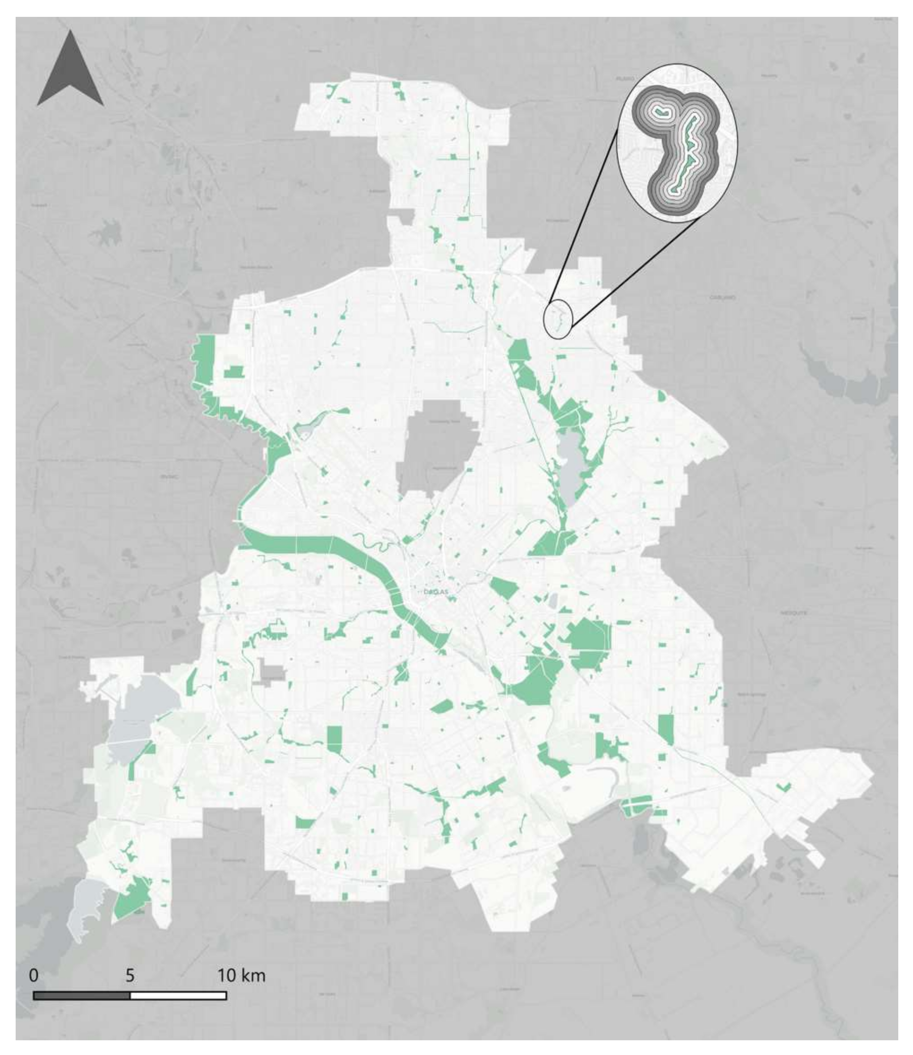
The park location data and polygons were constructed from the parks and recreation category of the NCTCG dataset. The size of the parks within the city varied largely with the largest being over 9 million square meters and the smallest being around 30 square meters. To remove any outliers in the dataset related to park size, we utilized a z-score method. As the z-score is valuable to represent how many standard deviations away the given value is from the mean value, using a z-score threshold of ± 3 allowed us to remove any data points where the park’s size was larger or smaller than 99.7% of the data. After performing that transformation, we were left with a total of 1201 parks (
n = 1201). Overall, the parks used in our dataset had an average of 380,660 square meters. As seen in
Figure 1, the distribution of the parks follows more of a natural path going along rivers and around lakes; however, there is still a decent scattering of parks in and among the suburbs of the city.
The parks’ perimeter acted as the center point for our buffers, created in ArcGIS, at 50 m, 100 m, 150 m, 200 m, 250 m, and 300 m (
Figure 1). The buffer interval (50 m) is a recommended choice as it is almost double the size of our satellite image resolution (30 m) used to calculate our LST data, as mentioned in
Section 2.2.3 [
47]. We chose a 300 m limit to match with previous research, finding that the extent of the parks’ cooling effect does not extend much past that. As well, 300 m has been suggested as the limit to define a “recreational neighborhood” based on how far people are willing to walk. This means that outside of that 300 m buffer distance, the park is no longer considered to be part of the recreational zone [
47,
48,
49,
50].
Lastly, within each of these buffer zones, we calculated the area in square meters occupied by each of the 11 separate LULC classifications that were constructed from the NCTCG dataset.
2.2.3. Retrieval of LST and Average LST Calculations
To retrieve the Land Surface Temperatures (LST) in the city, we utilized the methodology of the Remote Sensing Lab under the Institute of Applied and Computational Mathematics (IACM) [
51]. The lab provides open-source code, which gives us the ability to easily obtain the LST data for our study area. The researchers were able to accurately predict LST with a RMSE of 1.52 °C.
Following the methodology proposed by the IACM, the data has been precision ortho-corrected; corrected for brightness temperature and cloud mask, Landsat surface reflectance, and emissivity; and has undergone atmospheric correction to provide the highest level of accuracy and standardization.
As mentioned, the satellite images we chose for our analysis were captured from the Landsat 8 satellite at a 30 m resolution. With the lab’s methodology, we were able to create 10 separate LST datasets for Dallas over the summer 2015 season, which corresponds with our LULC data date range. These different datasets were averaged together, utilizing ArcMap’s raster calculator, to help with managing limitations of lack of meteorological data as the average of the 10 datasets is a more rounded depiction of the LST than a single dataset from a single satellite image.
After the creation of our LST dataset, the data was further processed in ArcGIS to calculate the average LST within the park borders as well as within buffers around the park at each 50, 100, 150, 200, 250, and 300 m radii. These calculations were then used in the computation of PCI (
Section 2.2.4).
2.2.4. Determination of the Park Cooling Intensity (PCI)
For Park Cooling Intensity (PCI) analysis studies, there are two main approaches to data collection. The first being in person field observation to collect data from the study area manually; and the second being data from monitoring stations or through thermal infrared (TIR) remote sensing [
52,
53]. For this study we chose the latter, utilizing remote sensing. There is a growing availability of high-quality satellite images, taken at regular intervals, over large areas of land. Additionally, there have been improvements in LST retrieval algorithms allowing for more accurate characterizations of the urban thermal environment [
54,
55,
56]. As previously mentioned, for our specific study, our LST retrieval algorithm follows the methodology of the Remote Sensing Lab under the Institute of Applied and Computational Mathematics (IACM) [
51] due to its robustness and flexibility.
When calculated, PCI (1) shows the temperature difference between the inside of the park and the urban area immediately bordering it [
57,
58]. In this study, the PCI (measured in °C) used mean LST in the calculation as opposed to air temperatures.
where Tu refers to the mean LST of the urban area at a buffer zone outside of the park; Tp indicates the mean LST inside the park’s borders.
The buffer zone includes the area around the park, which contains different LULC types: industrial/commercial areas, buildings, roads, etc. (impervious surfaces), and trees and other green spaces.
2.2.5. Dataset Construction
After the collection of the land use/land cover data and Landsat 8 satellite images, it was possible to construct our dataset to be analyzed. As mentioned in
Section 2.2.2, our park data was created from the LULC data collected from the NCTCG using the parks and recreation LULC category to place where the parks in the city are and get their geometry as a shapefile. With the park geometry and location data, it was then possible to calculate the 50, 100, 150, 200, 250, and 300 m buffers using ArcGIS.
Land surface temperatures (LST) were calculated as outlined in
Section 2.2.3 utilizing a third-party methodology and open-source Python code. With the buffers and LST calculated, it was then possible to calculate the park cooling intensity (PCI), outlined in
Section 2.2.4.
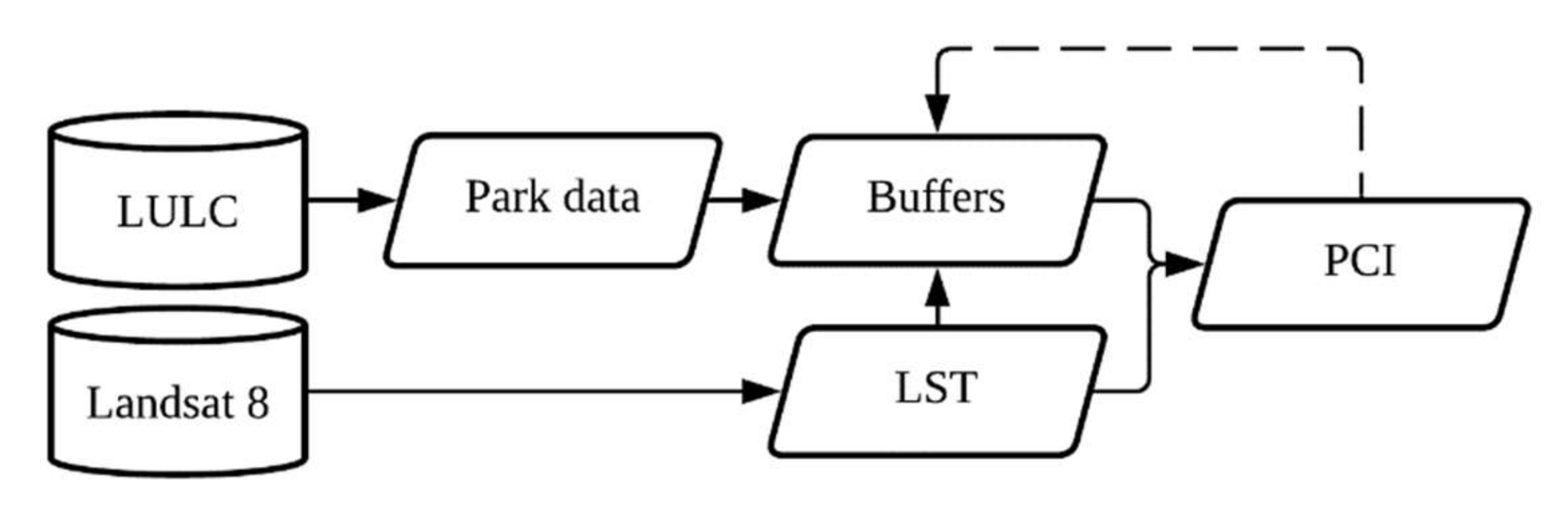
After calculating the park geometry, buffers, LST, and PCI we were then able to complete our dataset by getting spatial statistics of the mean PCI in each buffer around the park, the mean LST, and the proportion of space (in square meters) taken by each LULC category making up each buffer zone. Our data construction framework can be visualized best with
Figure 2.
2.3. Analysis Methods
As previously mentioned, our methodology utilizes machine learning techniques. For our model, Extreme Gradient Boosted (XGBoost) machine learning models were chosen to produce SHAP values that can be used to accurately analyze both the effects of the various LULC classifications on the PCI and LST at the diverse buffer distances.
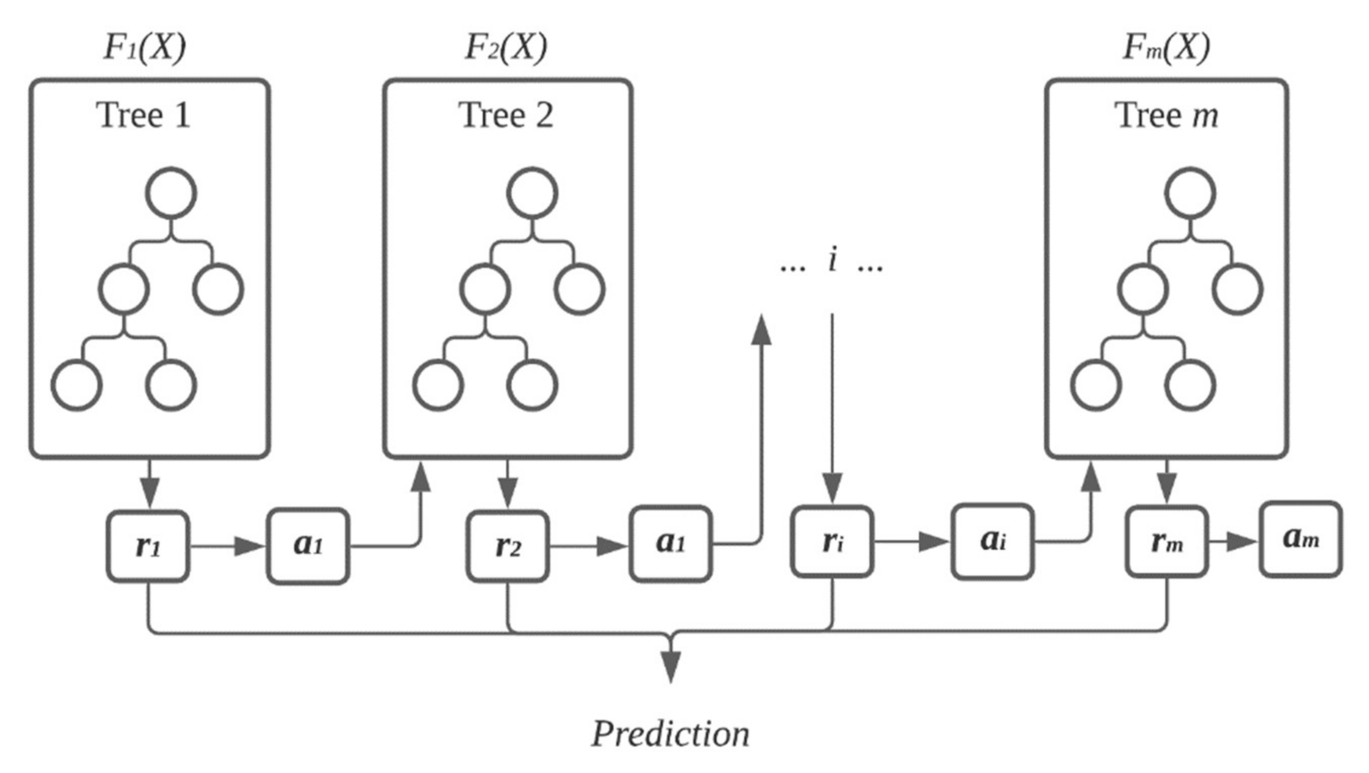
Our model’s framework, visualized in
Figure 3, is as follows, with
ai and
ri making up the regularization parameters,
i being the respected regression tree, and
hi being a function trained to predict residuals (
ri) using
X. XGBoost computes
ai by using the computed residuals and the following Equation (2).
As we are using XGBoost for a regression analysis, the weak learners are regression trees. To get the best estimate, the model makes multiple smaller, and weaker, estimates (regression trees) and then averages their residuals to get the final estimation. The training proceeds iteratively, adding new trees that predict the residuals or errors of prior trees that are then combined with previous trees to make the final prediction. It is called gradient boosting because it uses a gradient descent algorithm to minimize the loss when adding new models.
2.3.1. XGBoost
With our dataset, constructed in
Section 2.2.5, we began constructing our XGBoost model using Python and the XGBoost package (version 1.5.0).
The focus of this analysis was to determine which LULC classification has the largest impact on the land surface temperature and PCI, to give us a better understanding of which of the classifications have the highest impact on changing temperatures and a better understanding on which classifications have the highest impact on parks’ ability to affect temperatures.
XGBoost is a highly flexible, quick, and versatile algorithm that can work through regression, classification, and other problems. It is the evolution from decision-tree based models and uses a gradient boosting framework. For a more detailed breakdown of the model, please refer to Chen’s study [
59] on the creation of the algorithm.
We selected this model due to its high performance and accuracy in preliminary tests as well as for its scalability. With each buffer having varied levels of each of the LULC classifications, we needed a model that could be comparable across each of our buffer zones and a model that could be accurate without the need to construct a new model for each buffer zone. Additionally, XGBoost can handle null values well, on issues that we faced in our dataset (for example, very few 50 m buffers have water and there exists an overall lack of mixed-use LULC classification type among all the buffers).
For the performance analysis, the Root Mean Square Error was employed due to the noisiness of the data as an attempt to add extra weight to large errors.
For the importance modeling analysis, the main scope of the study, we borrowed a game theoretic approach known as SHapley Additive exPlanations (SHAP). SHAP can give a detailed and clear picture of which factor has the largest impact on the model by removing each factor one at a time and trying a combination of factors to see how the combinations change the prediction accuracy.
Our model, as shown in the framework above, followed a 70/30 split on the dataset created in
Section 2.2.5. To calculate our model’s hyper parameters, we did not utilize the popular grid search method and instead opted for the speedier Bayesian Optimization. For models and datasets that can be computationally heavy, the grid search method can be equally heavy and time-consuming. Bayesian Optimization, on the other hand, can find the optimal parameters by learning from previous optimizations. In the end, this method has greater success but is also less computationally expensive and quicker. Using this method, we calculated the parameters shown in
Table 1. Lastly, our model was then trained and tested using Python and XGBoost.
2.3.2. SHAP Values
SHAP values, founded by Lundberg and Lee [
60], are best suited for when you are processing a more complex model, such as gradient boosting or neural networks, and are needed to better understand what decisions the model is making. By using predictive models alone, we can answer questions related to “how much” change takes place, but with the addition of SHAP values we are able to go a step further and begin to answer “why” the changes are happening.
To more easily explain our XGBoost model, we provide summary plots for the SHAP values produced. Each plot contains the LULC category (left hand y-axis), a colormap of the feature value of the individual datapoint (right hand y-axis), and the SHAP value for the individual point (x-axis). These summary plots are similar to the partial dependence plots; however, they have an advantage with their ability to display the extent to which the interaction terms matter.
It is important to note that while these plots explain our XGBoost models, it does not necessarily represent a causal relationship. Since our XGBoost model is trained on observational data, the model is not necessarily attempting to observe causation. With that, the results are not stating causal relationships, and stating an increase in one variable will lead to a change in another; however, the results do present the factors with the highest impact on the models’ predictions.
A main consideration for choosing SHAP as our main tool for analysis is that it is possible to see the overall impact of each datapoint as well as the impact of null data points, which is a similar consideration when choosing to use XGBoost. Traditionally, when there is a point missing, it is replaced with a 0 or an average of similar values; however, in some cases, this can tamper with the data. In our case, replacing the values with a 0 would have skewed our data significantly due to the large number of missing values for some classifications in some buffers; in addition, providing an average number would have skewed our results in the opposite direction and would have taken away the game theory aspect of SHAP.
3. Results
To better understand which land use/land cover classifications had the greatest impact on LST and PCI, we used SHAP values. A SHAP value represents how much the model prediction changes when we observe a certain feature, in the case of this study, the area size of each LULC classification. In the summary plots throughout this section the SHAP values for a single feature are plotted on a row, where the x-axis is the SHAP value. With this method, it is possible to see which features drive the model’s prediction the most, as well as which only affect the prediction a little. As well, in each plot, the individual dots are colored to represent the value of the feature from high to low.
3.1. Relationship between LST and LULC Classifications
The below subsections present the results of the analyzed relationship between park LST and the LULC classifications at each buffer level. While the buffers were at distances of 50, 100, 150, 200, 250, and 300 m, for simplicity the following section will present results at only three separate buffer zones, 100, 200, and 300 m. However, the section will be ended with an overall analysis of all six buffer zones.
To better explain the models, the SHAP values were normalized and summed to 100 for each plot to represent 100% of the model. However, the SHAP values on the summary plots themselves are not normalized and are the true SHAP value for each of the models.
Figure 4 below shows each individual datapoint value compared to the overall SHAP score for the specific point and its LULC classification when modeling for impact on LST. The right
y-axis in the figure shows the feature value, which indicates how high or low the specific buffer’s average LULC area is (with grey features being null values). On the left
y-axis, we can see the individual LULC classifications. And, lastly, on the
x-axis we can see the SHAP value with negative values indicating that the LST is decreased and positive, indicating that LST is increased.
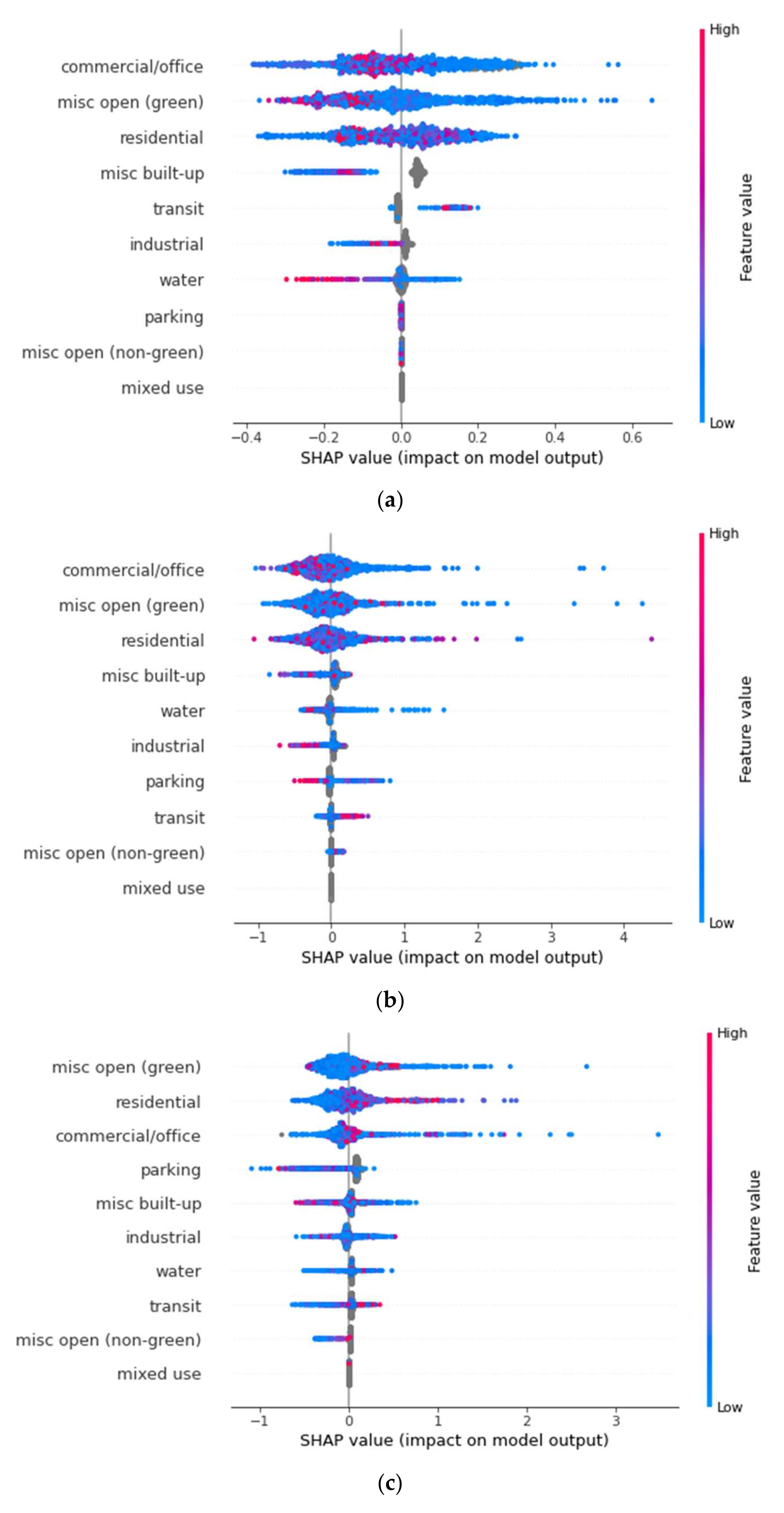
3.1.1. 100-m Buffer
At the 100-m buffer zone, visualized in
Figure 4a, our model returned an RMSE of 1.56. With the minimum LST being 31.49 °C and the maximum being 45.89 °C, we have a range of 14.40 °C, with that consideration the RMSE of 1.56 is decent and shows that the model was able to predict the average temperature of any individual 100-m buffer zone within 1.38 °C. With this current model, “misc. open (green)”, commercial/office, and residential explain 73% of the impact on LST.
In
Figure 4a, “misc. open (green)” has the largest impact on the model overall, explaining roughly 26.32% of the model. Based on these results, there is a negative relationship between this LULC category and LST. The results show that an increase in area coverage of the “misc. open (green)” classification within the 100-m buffer distance of the part has a greater chance to negatively impact LST. Likewise, it shows if the area size of “misc. open (green)” within the 100 m buffer is lower, then there is a greater chance that that area has a higher LST. These results are in line with others that have found green spacing to have a cooling effect on the surrounding areas [
35,
36,
38,
61] as well as case studies that have found the greening of cities as a significant source of UHI mitigation [
5,
25,
27,
33].
By using SHAP values, we can see which factors have the highest chance to increase (the right of the 0.00 mark) or decrease (the left of the 0.00 mark) our dependent variable. As well, the intensity, or level of impact, is represented to show how high or low the feature value is. A high feature value indicates a large presence of the specified feature and vice versa with a low feature value indicating a smaller presence.
The next most impactful feature at the 100-m buffer was the “commercial/office” category, explaining 24.54% of the model, having a more mixed result. With “commercial/office” zones, we can see that there is a mixed effect of high values potentially raising or lowering the LST. However, higher values have a higher impact factor when it comes to raising the LST indicated by the higher SHAP values for ‘high’ feature value data points. When analyzing SHAP values, it is also important to consider the low values and while the case of the commercial/office zones still looks quite mixed, the slight tail of low values going negative does hint that a lower total area of commercial/office zones has a higher impact on decreasing LST. Considering both sides of this, we conclude that at the 100 m buffer distance, commercial/office zone area has a positive impact on LST, in other words, the greater the area of this zone, the greater the LST.
The third most impactful feature was “residential” zones explaining 22.86% of the model. For residential zones, after analyzing the plot, we conclude that, at the 100-m buffer distance, this zone has a positive impact on lowering LST as the higher feature values are to the left of the plot and lower feature values are to the right. We suspect that this is due to the large amounts of suburban parks in the city of Dallas. As suburbs are typically “greener” with yards, tree lined streets, and more green areas overall, they are more likely to act a semi-green/semi-built-up area, have less of an impact on increasing LST, and in this study appear to be collaborating with the parks in lowering LST.
As seen by previous studies, “built-up” areas are more likely to contribute to increased LST [
39,
42,
45]; this can be a partial explainer of the “fuzziness” in the interpretation of the “commercial/office” zones as well as the decreased impact of residential areas as they are generally a mix of both built-up and green spaces that have been shown to have competing effects on LST.
Following these features comes misc. built-up explaining 7.66% of the model with a positive effect on LST; industrial explaining 7.43% and having an overall negative impact on LST but a trend of more area coverage of this type increasing LST; water explaining 6.17% of the model with a positive effect on LST, which we did not expect; transit explaining 5.02% of the model with a positive impact; and, lastly, parking, misc. open (non-green), and mixed-use explaining <0% of the model without any measurable effect.
3.1.2. 200-m Buffer
At the 200-m buffer zone, visualized in
Figure 4b, the same trend from the 100-m buffer continues overall. The RMSE for this model was 1.79 with the min temperature being 31.47 °C and the max being 45.98 °C, making a range of 14.5 °C.
The largest change in increasing the buffer size is that the number of data points also increase, allowing new trends to emerge. Here, the biggest change in impact observed is the somewhat large increase in the impact of “misc. built-up” areas on LST. At the 200-m buffer zone, the misc. built-up feature area size accounts for 21.23% of the model, an increase from 7.66% at the 100 m buffer. This LULC category has a positive trend with LST, with a large tail of low values. The absence of this feature can be associated with areas of lower LST and in areas that this category is present there are increases in LST. This is in line with previous research that has found that the increase of impervious and built-up areas as well as the decrease in trees and vegetation as contributing factors increase LST [
29,
33,
39,
45,
56].
Like the 100 m buffer analysis, the commercial/office classification is one of the more impactful features, explaining 25.14% of the model with a quite clear negative impact on LST, differing from the 100 m buffer zone result. The reason for this shift is not explainable with SHAP values alone and would require further and more in-depth research into the specific makeup of the commercial/office zones in the City of Dallas, something that is outside of the scope of this study.
The third most impactful feature is misc. open (green), explaining 15.28% of the model. The trend here maintains and strengthens from the first model at the 100 m buffer. This is followed by residential (13.20% of the model) with an ambiguous impact; water (9.43% of the model) with a positive impact; transit (7.52% of the model) with a stronger negative impact on LST, differing from the 100 m buffer analysis; industrial (7.03% of the model) with a negative impact on LST; parking (1.17% of the model) with an ambiguous trend; and then misc. open (non-green) and mixed-use having no trends and explaining 0% of the model.
3.1.3. 300-m Buffer
Our last buffer analysis is at the 300-m zone, visualized in
Figure 4c, the furthest out and the one with the most data points. The RMSE for this model was 1.92 with the min temperature being 31.58 °C and the max being 46.11 °C, with a range of 14.53 c.
This buffer zone analysis saw the misc. built-up LULC classification move to the top as the most impactful feature, accounting for 25.81% of the model. For this classification, there is a strong trend showing lower area coverage of misc. built-up areas having a higher negative impact on the model’s prediction. This is followed by commercial/office, having a positive trend on LST, accounting for 19.27% of the model. The third most impactful feature in the 300 m buffer zone was industrial, accounting for 16.16% of the model and having a strong positive impact on LST with lower feature values having a much higher impact on the dependent variable than higher feature values.
The next most impactful feature in this buffer was residential, making up 12.40% of the model. Again, the residential values seem to show less of a trend. One plausible explanation for this is the large and varied types of residences in the city, with this one classification comprising suburban homes, apartment buildings, and even mobile homes.
After residential LULC classifications were misc. open (green) spaces closely following with 11.57% of the model’s explanation. This feature appears to show that high feature values can either increase or decrease the LST of an area, and lower values seem to have no effect. As this feature is a “misc.” feature and acts as an aggregator of smaller classes, this type of result requires more research to better determine which specific features of misc. open (green) are contributing to either the decrease or increase of LST.
Water (with 9.30% of the model) continues to show a positive impact on LST with lower values having a higher impact on lowering LST. This is followed by transit with 1.99% of the models’ impact, and misc. open (non-green) and mixed-use with no trend and 0% of the model’s explanation or not impactful on this specific model.
3.1.4. LST SHAP Comparison
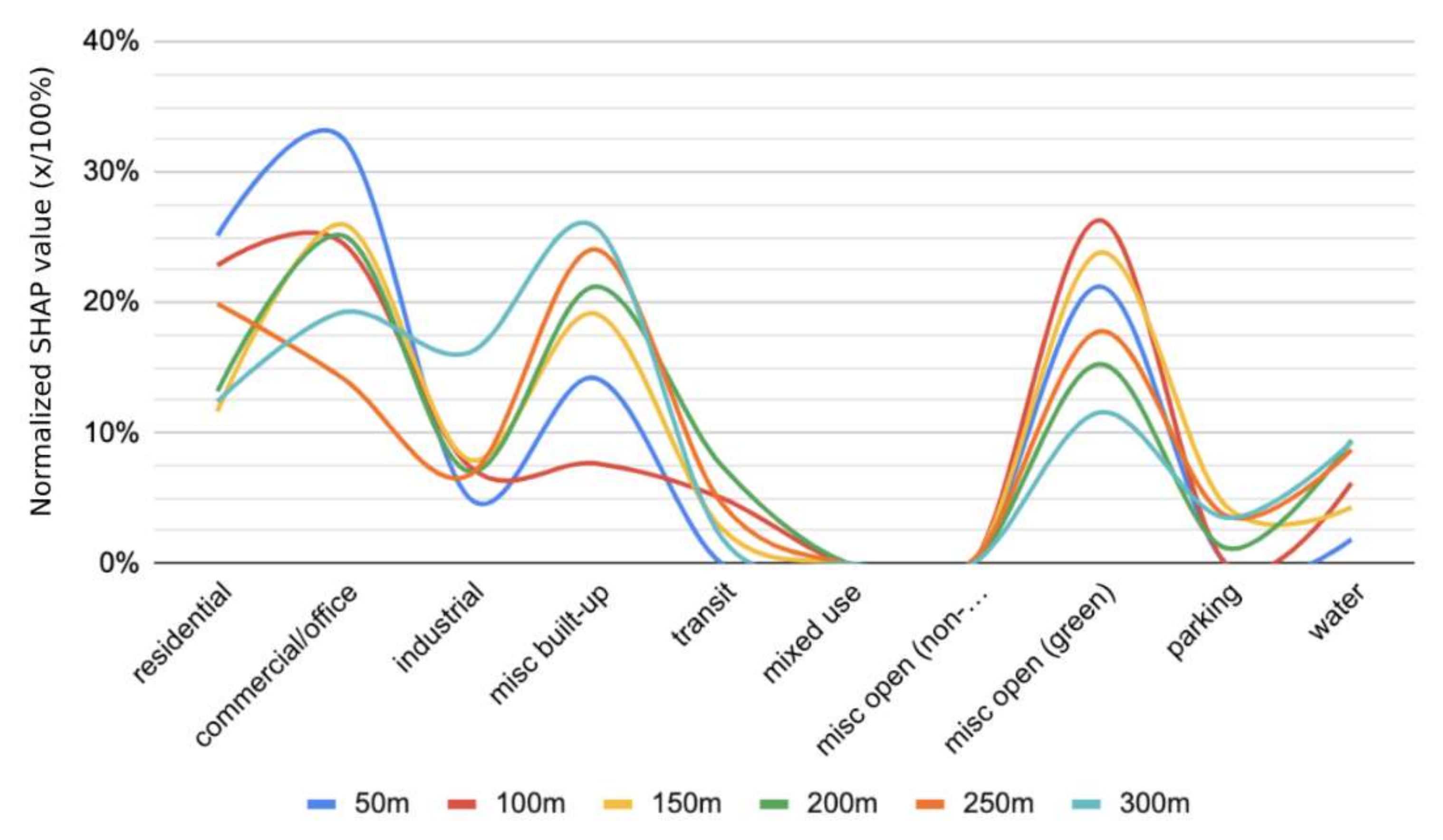
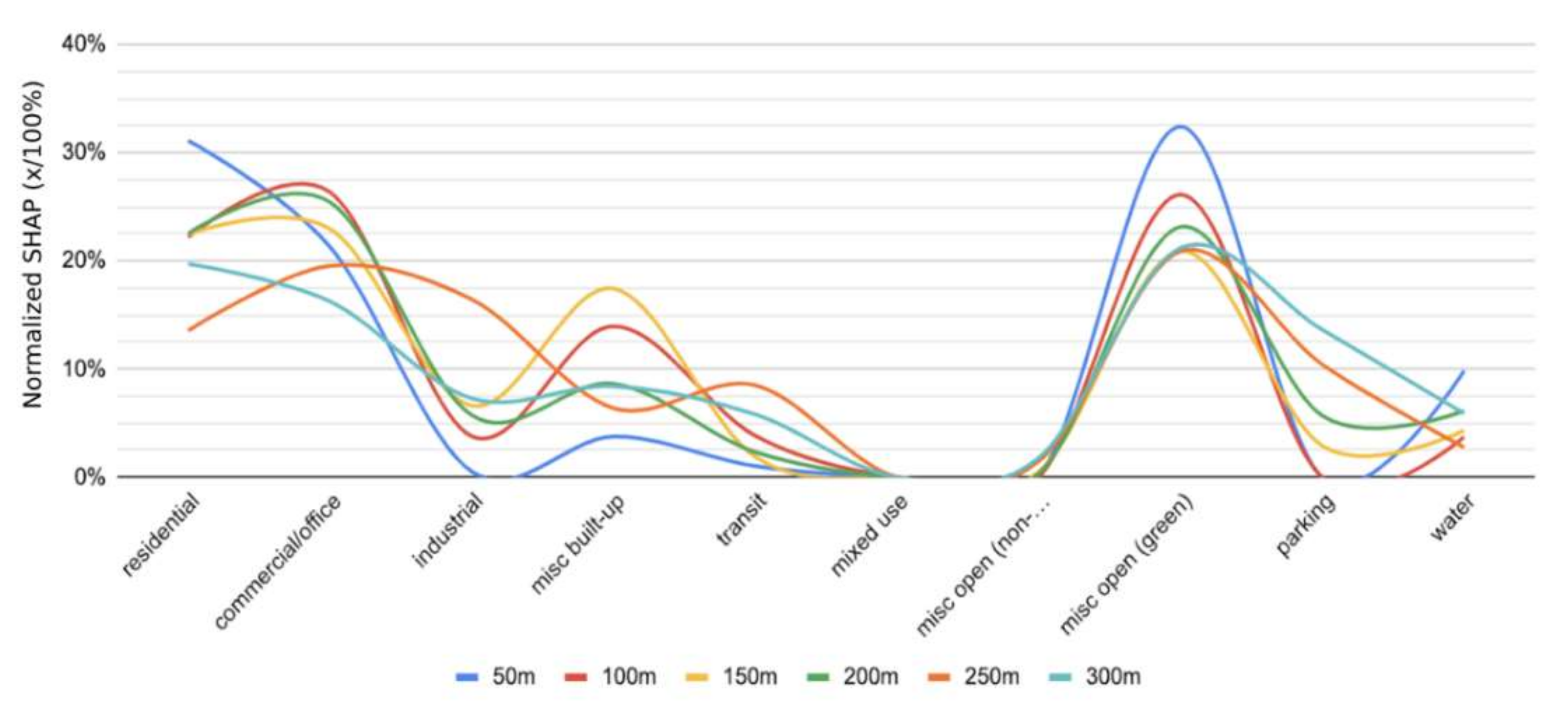
In this section, we combine each of the LULC classes and the average SHAP values across all the points (1201 data points for each model) in each model to both compare the trends among all six buffer zones and then aggregate the SHAP values together as an average to get an idea of the overall impact of each class. To compare the SHAP values between groups, the values were normalized so the values for each of the models sum to 100 as SHAP is not naturally comparable across models.
Figure 5 shows the trends for each of the different buffer zones across each of the LULC categorise. As displayed, each buffer follows roughly the same pattern with “misc. open (green)” and “misc. built-up” being the two with the most similar trends across buffers. This does not come as a surprise as both built-up and green areas have been heavily studied to show their impacts on LST, as cited throughout the paper.
Additionally, the residential and commercial/office are generally a hybrid of built-up and green spaces making their impacts on LST a bit more difficult to measure; however, they do still present a significant impact [
3,
8,
30,
56]. This difficulty in measurement explains their less resemblant trends as there are a multitude of interactions taking place within these categories as well as between them and others.
The “misc. open (non-green)”, “mixed-use”, and “parking” were the least impactful variables across all buffer areas. Notably, for mixed-use, this lack of impact is likely due to the lack of actual mixed-use zoning in the City of Dallas. We also suspect that parking was not as prominent as expected due to it being naturally grouped with other areas such as “commercial/office” and rarely standing on its own.
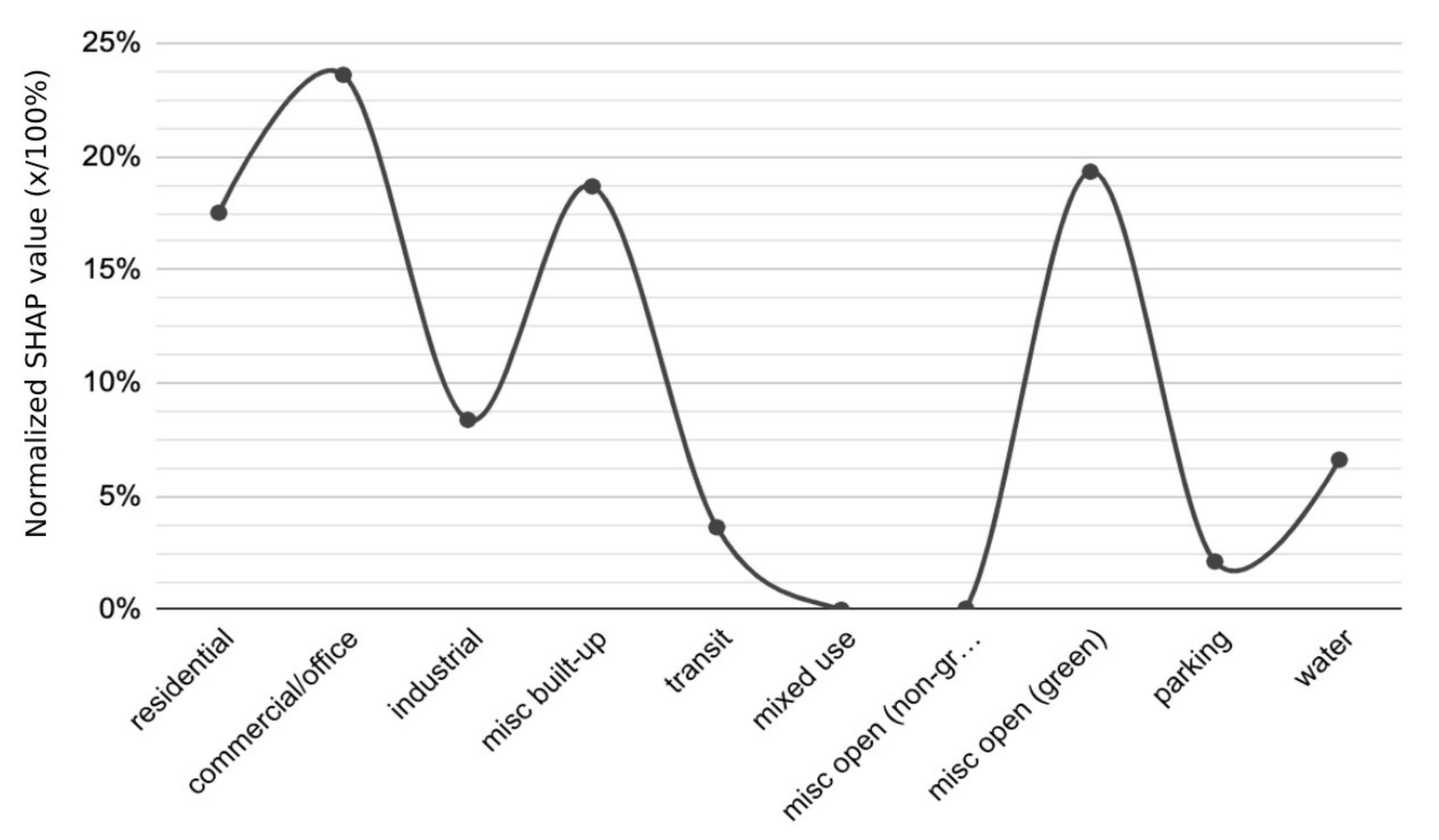
To give a better idea of the aggregate trends, the SHAP values were averaged to produce
Figure 6. In this figure, “commercial/office” is shown as the most impactful LULC category, accounting for 23.61% of the model’s power. From the individual buffer zone breakdowns showing this category having a positive impact LST, we can assume that, overall, that a higher area ratio of “commercial/office” space has the potential to lead to higher LST. However, as mentioned before, this is a difficult assessment to make due to the makeup of these zones, especially in a city like Dallas that has experienced significant urban sprawl. The category with the next highest impact “misc. open (green)” having 19.34% of the prediction power and, again based on the buffer zone breakdowns, has a stronger trend towards decreasing LST. This category is closely followed by “misc. built-up” with 18.69% of the model’s prediction power and, based on the breakdowns, also shows an overall trend of increasing LST. These results of green spaces and built-up areas having large, but opposite, impacts on LST follow results found by other researchers who have found that green areas have a cooling affect while impervious/built-up areas contribute to urban warming [
23,
27,
37,
39,
40,
47].
The remainder of the variables accounted for less than 10% of the model’s prediction power with “industrial” having 8.38% (increasing LST), “water” having 6.62% (no trend), “transit” with 3.64% (no trend), “parking” with 2.13% (no trend), and lastly “mixed-use” with 0% (no trend).
3.2. Relationship between PCI and LULC Classifications
PCI is typically defined as the temperature difference between inside the park area and the urban areas within a set buffer. It gives insight into how much colder the park area is compared to the buffer regions and can give an idea of how a park cools its surrounding areas. Like
Section 3.1, we performed the same analysis while replacing LST with PCI to get a better idea of how the various park characteristics affect the temperatures of the areas around them and not just inside the park itself. If PCI is 0.00, then that means the buffer zone is the same temperature as the park; if the value is positive, then it means the buffer zone temperature is higher when compared to the park, and likewise, when the value is negative it indicates that the buffer zone temperature is lower than the park.
Similar to
Figure 4,
Figure 7 below shows each individual datapoint value compared to the overall SHAP score for the specific point and its LULC classification when modeled for impact on PCI. The right
y-axis in the figure shows the feature value, which indicates how high or low the specific buffer’s average LULC area is (with grey features being null values). On the left
y-axis, we can see the individual LULC classifications. Lastly, on the
x-axis we can see the SHAP value with negative values indicating that the PCI is decreased, and positive indicating that LST is increased.
3.2.1. 100-m Buffer
At the 100 m buffer zone analysis, visualized in
Figure 7a, our model had an RMSE of 1.37. For the 100 m buffer zone, the minimum PCI was −1.128, indicating that, at least one park buffer had a temperature decrease of 1.13 °C in comparison to the park; as well, there is a max PCI of 18.99, indicating an 18.99 °C increase in temperature of at least one of the buffer zones in comparison to the park. The range between the min and max PCI is 20.13, meaning the RMSE for this model is quite good. As would be expected, the LULC classification with the highest impact on the model is similar to those in the LST analysis. However, this time, we are not considering how the feature impacts LST directly but how it impacts the PCI. In other words, we are interested in seeing which LULC class has the biggest impact on increasing and decreasing the cooling effects of the parks.
In the 100 m buffer zone, the “commercial/office”, “misc. open (green)”, and “residential” classes had the largest impacts making up over 75% of the model’s prediction power with 26.36%, 26.13%, and 22.19% shares of the model respectively. Similar to the LST analysis, commercial/office shows a slight impact on decreasing the PCI at the 100 m buffer range. As well, misc. open (green) has a heavy impact on decreasing PCI. This means that both factors, at the 100 m buffer zone, help with the park’s cooling effects.
For residential zones, there is less of an obvious trend for when the area ration of this class increases; however, the plot does indicate that as the area ratio is decreased there is a slight negative impact on PCI.
In the same model, “misc. built-up”, making up 13.97% of the model, is also shown to have a negative impact on PCI with the plot indicating lower values of this class leading to a higher impact on lowering the PCI. This trend is also the same with “transit” (with 3.84% of the model) and “industrial” (3.79% of the model), with all showing a decrease in PCI with a decrease in their feature value and an increase in PCI with an increase in their feature value, or some of both relationships together.
The LULC class here that was very different from the LST analysis was “water”. While it shared only 3.73% of the model’s prediction power, it also showed a very negative impact on PCI. For the model run, the water class was shown to decrease the PCI as its area ratio increased, and the PCI increased as its area ratio increased. The remaining classes had no impact on the model’s prediction power.
3.2.2. 200-m Buffer
This model, visualized in
Figure 7b, gave an RMSE of 1.62, with a min PCI of −1.75 and a max PCI of 22.24, having a range of 23.98. This result was interesting as the results seem to be driven by the lack of a LULC classification rather than the presence of it, and the results are slightly different than the others. However, this model had very similar SHAP values as the 100 m buffer analysis.
For this buffer, the “commercial/office” LULC classification had the highest impact on the model, holding over a quarter of the model’s prediction power at 25.44%. While the trend is slight, there does appear to be a negative impact on PCI with the commercial/office area ratio. This result is the same with the “misc. open (green)”, which has 23.14% of the model prediction.
Unlike the 100 m buffer analysis, “residential” shows a slight positive impact on PCI, meaning that the residential zones can potentially increase the PCI. However, from the plot, this relationship is not obvious. As previously mentioned, the residential class is a bit broad as Dallas has a wide range of housing types (from suburbs to multi-family apartments) that are all grouped into one class.
“Misc. built-up” (8.65% of the model) has a slightly mixed result that indicates the possibility of this class to negatively impact PCI when the feature values are too high or low. This can be due to a limited data size, or due to some other factors involved in this class.
The “water” class (6.13% of the model) continues to show a negative impact on PCI, however, with a higher impact on PCI increasing as the area ratio of water is lower.
In this buffer analysis, the “industrial” class (5.75% of the model) gave a bit of a different result with a plot indicating a negative impact on PCI. This is the same with the “parking” class (5.69% of the model). However, the “transit” class (2.33% of the model) shows a heavy trend in increasing the PCI at this buffer level.
The “misc. open (non-green)” class, while showing a negative impact, only accounted for 0.34% of the model and “mixed-use” accounted for 0%.
3.2.3. 300-m Buffer
At the 300-m buffer zone, visualized in
Figure 7a, our model has an RMSE off 1.59 with the min PCI being −1.94 and the max being 23.15, a range of 25.09, indicating a good RMSE. This model, having the most data points, also produced some of the clearest results for the factors that impact PCI the most.
For this model, the most impactful LULC class was “misc. open (green)", accounting for 21.19% of the model. This feature shows a negative impact on PCI due to the higher PCI values when the feature value is lower. The “residential” class had the next highest impact, sharing 19.73% of the model. The residential feature showed a clear positive impact on the PCI, meaning that higher area ratios of residential zones led to a higher PCI in the 300 m buffer.
After residential was the “commercial/office” class, with 16.26% of the model, also showing a positive impact on PCI. The next feature, “parking” with 13.63% of the model, followed a similar trend and showed an overall positive impact on PCI. However, with parking, there are a couple of rows of data that show a lower PCI with higher parking area ratios. To fully determine what would cause this would require a more robust dissection of the parking LULC class, which is beyond the scope of this study.
One odd result here was that the “misc. built-up” class, holding 8.42% of the model’s prediction power, showed a very slight negative impact on PCI. This goes against the LST analysis, which showed the opposite. The “industrial” class made up 7.29% of the model, with no real trend; “water” made up 5.89% of the model, again with no real trend; then finally, “transit” and “misc. open (non-green)” both showed a positive impact on PCI, making up 5.81% and 1.79% of the model respectively.
3.2.4. PCI SHAP Comparison
Similar to
Section 3.1.4, the various SHAP values and LULC classes were compared to try to determine any overarching trend. Unlike the similar process done for the LST analysis, the PCI analysis does not have as many similar patterns. As seen in
Figure 8, the major similarity between the six buffer zones is the “misc. open (green)” LULC category and to a lesser extent the “commercial/office” and “misc. built-up” classes. This shows that despite the distance from the park, the presence of additional green spaces had a significant impact on the PCI as did residential and commercial/office areas. Interestingly, the built-up and industrial categories had lower impacts the closer to the park they were, and increased in impact until about 150 m away and then the increase became less linear. The best explanation for this is first a potential lack of data, but secondly it is supported by the ideas belonging to thermal conduct theory research and investigations into the heat balance between the park and its surrounding area especially in relation to impervious and built-up areas where it has been found that heat can transfer from these surfaces to parks more easily at the edges of the parks where they come into direct contact. [
41,
42,
43].
Again, as done in
Section 3.1.4, we have aggregated all the SHAP values together to see the average trend among the buffers (
Figure 9). When comparing
Figure 6 and
Figure 9, the overall trends are nearly the same when modeling LULC categories on LST and PCI with
Figure 9 having softer curves. However, with the PCI SHAP averages, “misc. open (green)” spaces show the highest impact on PCI with a 24.11% average and an overall negative trend on PCI, meaning that higher area ratios of “misc. open (green)’’ contribute to lower PCIs and aid in the park’s cooling, which is supported extensively in previous literature on the topic [
16,
27,
37,
38,
40,
47,
61]. Commercial/office and residential are nearly tied with 21.98% and 21.93%, respectively, and both have a slight negative effect on the PCI. As mentioned, and supported by previous research, commercial/office and residential zones are generally a hybrid of built-up and green spaces, making their impacts on temperatures and PCI a bit more difficult to measure; however, they do still present a significant impact [
3,
8,
30,
56]. These values are followed by misc. built-up with 9.77% (a very slight positive effect, or possibly no effect), industrial with 6.74% (a positive effect), parking with 5.44% (a positive effect), water with 5.44% (a negative effect), transit with 3.90% (a positive effect), misc. open (non-green) with 0.68% (no effect), and mixed-use with 0.00% (no effect).
3.3. PCI at Different Buffer Distances
While our research aims to study the impact of each LULC grouping on PCI, it is also important to analyze the extent of the cooling effect. The PCI values were aggregated at each of the buffer distances (50, 100, 150, 200, 250, 300 m) to determine any relationship between the distance and PCI. As seen in
Figure 10, there is an increasing trend in PCI across the buffers.
It can be determined that the parks do have a cooling effect on the surrounding areas, indicated by the PCI increasing as the distance from the parks increases. The largest increase in PCI is from the 50 m to 100-m buffers and then the trend becomes more linear. Previous research found similar results showing that parks had a positive relationship with PCI intensity up to 300 m buffer region [
47]. Additionally, our results are in line with previous research that also found that parks do have a cooling effect on urban areas [
27,
38,
57,
58].
This information is useful as it gives an idea of how the park’s cooling effect changes over distance. If parks were planned better to maximize their cooling effects, taking into consideration the factors investigated in
Section 3.1,
Section 3.2 and
Section 3.3, and we could plan proper buffer distances, then less parks would be necessary.
4. Conclusions
While previous studies have analyzed the impacts of various LULC categories on LST and PCI, our study utilizes a novel methodology incorporating XGBoost machine learning algorithm and state-of-the-art SHAP values for a more rounded analysis benefiting from SHAP’s more unified approach to understanding complex model outputs. Unlike many prediction models, SHAP value outputs are not focused on quantifying how much change the input variables have caused to the output but focus more specifically on how the inputs are impacting the output. In other words, it is not trying to answer, “how much” but “why”. Furthermore, by using SHAP values, we can analyze the results at the individual park level as well as at a more aggregate level without compromising our model or results.
As LST and PCI are two factors that both have an impact on the urban heat island phenomena [
35,
36], this area of research is growing in importance. Furthermore, our results give extra reference to fill gaps in previous research that has focused more on rapidly growing and urbanizing cities that are denser (and densifying) and less on cities that are less dense but still rapidly growing, with large amounts of urban sprawl and suburbanization, such as Dallas, Texas.
In the end, the analysis of this study found that greener areas tend to have a higher impact on both lower LSTs and lower PCIs. This is in line with previous literature such as Du et al., 2017 [
35] and Oliveira et al., 2011 [
36] who studied Green-space Cooling Intensity (GCI) and Park Cooling Intensity (PCI), with us using PCI in our study. Other researchers have utilized PCI and remote sensing to study the effects of parks and green areas on lowering temperatures and found similar results that parks have a cooling affect [
38,
40,
47,
61]. Various case studies have also found the greening of cities as a significant source of UHI mitigation [
5,
25,
27,
33]. While our results are very much in line with previous studies, despite different methodologies and analytical tools, it is impactful to show that the cooling effect of green areas has a measurable impact in a range of urban areas from dense to sprawling.
When considering built-up areas, “misc. built-up” zones had a larger impact LST than PCI. On the other hand, “misc. open (green)” spaces had the highest impact on PCI and the second highest on LST. This is in line with previous research showing that artificial increases of temperatures in cities is happening in large part due to changes in the built-up environment [
21,
22,
23,
62].
Commercial and office zones, generally being more built-up, were found to have a bigger impact on LST than do residential zones; however, when considering PCI, they have practically the same impact. This result is both novel and intriguing as it shows the first divergence of LULC classifications affecting LST and PCI differently. In this specific case, we saw that commercial and office zones have a larger impact on the temperatures themselves than does residential zones, however, when looking at the impact they have on the surrounding park’s ability to cool the buffer zones, they have relatively the same impact; these findings were in line with other research finding that residential as well as middle density are major contributors to UHI. This is an important finding when it comes to planning the zoning and placement of parks.
These results overall indicate that green space planning is crucial for both LST and PCI impacts, and better green space planning can help to mitigate urban heat island effects. Furthermore, our results show that LULC planning should consider currently existing parks in the planning area when attempting to mitigate urban heat island as the different categories affect the LST and PCI differently.
In terms of green space planning in the city of Dallas, a larger focus on planning near and within built-up areas is needed. Building within the areas can more efficiently lower the LST of the zone, however, there are acting forces against the PCI that limit its reach. With that, building parks towards the outside of the built-up zones and nearer to other existing parks and green spaces can help increase the PCI of the new park and extend its reach.
In other words, for adequate green space planning to mitigate UHI, it is necessary to focus not only on building parks in areas that are built-up (which predominantly lowers LST in just that area) but also taking into consideration existing parks and green spaces that can have positive effects on nearby parks, increasing and extending the PCI of the new park (which lowers the temperatures of both the area and surrounding areas). Although creating new parks in empty/vacant lots will anyway have heat reduction effects, local planners are recommended to develop future parks in appropriate places, where they can maximize the UHI reduction impacts. A local comprehensive, green space plan, as well as several land and tree preservation codes should also be adapted by recognizing the differential effects of parks and green spaces to nearby areas and conduct more systematic suitability analysis for finding potential park locations.
Furthermore, our study was able to conclude that the utilization of machine learning boosting algorithms, in our case XGBoost, to generate SHAP values, is indeed a viable method to study the impact of different factors, with us focusing on LULC classification, LST and PCI, two factors found to correlate with UHI. This novel method allows for quicker analyses over larger areas of studies as much of the previous research, obtaining the same results, focused on case studies or smaller level analyses [
25,
26,
27].
Limitations
While this study found several noteworthy policy implications that need to be concerned during the future park development, some limitations still exist, which need to be further concerned in the future study.
First, the main limitations of this study are centered on data availability. For our LULC data, we had to use data produced at the county level for the city of Dallas in 2015. While our results are in line with previous research, a more micro level data input could have potentially yielded more detailed results. As well, more up-to-date data and data over more frequent periods could have contributed to a better study of the city.
However, the 2015 dataset was the most up-to-date available data at the time of this study. The LULC data is produced at 5-year intervals, making the data a challenge to perform longitudinal studies on as the classifications can change significantly over that time. To help solve this data issue, future research could focus on more novel ways to collect LULC data, potentially utilizing satellite images and machine learning techniques.
Again, while this study did align with previous study’s results, another data limitation is the lack of micro level weather data to add as factors in our model. As mentioned beforehand, microclimate and meteorological data has a potentially large impact on the temperature of the study area. There is an innate complexity in local climates and related environmental conditions. The measurement of air temperature is limited by the monitoring system, including pieces of equipment, experts, methods, and related factors. The accuracy of data collection is a key factor, and it is difficult to conduct ideal UHI research on a wide range of space-time scales. These data sources are, however, useful in understanding the generalized sources of data studied. To help lessen the effects of missing these variables, our final LST calculations are based on an average of multiple days over the same month in the study area to help give a more rounded estimation of the temperatures.
Future studies could benefit from incorporating more advanced data detection methods such as utilizing satellite images and machine learning algorithms to detect and classify the various LULC categories or potentially use more advanced models to assist with microclimate data interpolation in areas with less dense spreads of weather monitoring stations. While these would make for excellent research, they are beyond the scope of this current paper, which is focused on utilizing boosting algorithms and SHAP values to build impact assessment models.
Additionally, future studies could incorporate other methods and expand on previous studies such as Li, et al. [
63], which utilized machine learning techniques to predict land use demand and zoning with a focus on urban-industrial zones. By expanding the study, it would be possible to better predict potential future impacts of zoning and thus be able to better plan mitigation of UHI.
Another limitation, which comes with most studies utilizing machine learning, is the limitations around model creation, tuning, and processing. While we have taken all precautions possible to build the best models with the least error and bias, there will always be other considerations that could have been taken to improve the models. To help mitigate this limitation, our approach utilized Bayesian Optimization for our parameter tuning and followed a basic cost–benefit curve comparing accuracy to processing power required.


