Abstract
The aim of this discussion paper is to raise awareness of the conceptual and practical limits of mainstream practices in social measurement and to suggest possible directions for social indicator construction, in view of effectively supporting policies for social sustainability and well-being promotion. We start with a review of the epistemological issues raised by the measurement of social phenomena, investigate the notion of social complexity, and discuss the critical link between it and measurement. We then suggest that social indicators should be primarily designed to build structural syntheses of the data, unfolding the patterns and stylizing the complexity of social phenomena, rather than computed pursuing numerical precision, through hardly interpretable aggregated measures. This calls for tools and algorithms capable of rendering structural information, preserving the essential traits of complexity and overcoming the limitations of classical aggregation procedures. We provide some examples along this line, using real data pertaining to regional well-being in OECD countries.
1. Introduction
The aim of this discussion paper is to highlight and draw attention on some critical, and often overlooked, issues that affect the statistical construction of social indicators, as tools for supporting policy-making and promoting social sustainability and well-being. The starting observation is that, despite the abundance of indicators measuring the many facets of social life, social measurement systems are not yet effective in providing a sound and reliable knowledge base, for sustainability-oriented policy-making. Indeed, it is generally acknowledged that sustainability is a complex process, whose governance must be supported by proper architectures of synthetic indicators, capable of rendering faithful pictures of societal dynamics, to set targets and steering policies towards them. However, looking at the typical indicator systems made available by official organizations, and referred to in public debates, it turns out that indicator production is typically trapped into two “extremes” and apparently opposite positions: either (i) a plethora of elementary indicators are delivered on single societal facets, or (ii) some “hyper-aggregated” global indicators are offered, smuggled as ways to capture and synthesize the complexity of society. Both approaches prove scarcely reliable and valid, as sources of knowledge about social processes, and are dangerous when exploited for sustainability-oriented policy-making. Providing tens or hundreds of elementary indicators dumps on final users the effort to reconstruct meaningful synthetic pictures of the state of society and may enforce the tendency to concentrate on single aspects of it, losing the big picture and leading to policies that can be “locally optimal”, but globally harmful. Aggregated indicators, on the other side, collapse complexity into composite scores, which hide the nuances and multi-faceted nature of social phenomena, are hard to interpret, and lose a great deal of information on the structure and the patterns of society, leading to policies that cannot be fine-tuned to the shape of social needs [1]. So, although opposites, the two approaches share the same essential fallacy: they do not provide structural pictures of society and sustainability, the first by fragmenting them into a number of shattered pieces, the second by reducing and stifling complexity into some unrepresentative average figures. In this respect, the following quotation from https://www.oecdregionalwellbeing.org (accessed on 20 September 2021) is illuminating: “the trade-off between a composite index (which conveys a single unified view, but may dilute information) and a range of indicators (which offers detailed information, but is more difficult to communicate) is widely debated. Translating a composite index into concrete policy messages and actions has proven to be a complex task in practice for regional policy makers. Therefore in the web tool we do not make a single statement about the overall well-being in a region. Instead, we present the information in such a way that users can consider the relative importance of each topic and bring their own personal evaluations to these questions”. More concretely, that the current state of maturity of social sustainability (and well-being, as well) measurement is problematic, also due to the objective complexity of the topic, is easily realized by browsing the web, in search for resources and documents pertaining to sustainability data and reports. Searching for “social sustainability indicators” in Google returns, at the time this paper is being written, more than 200 million results and although just a small part of them may be really pertinent (the same research on Google Scholar returns about 1600 results), this gives the idea of the abundance of “voices” in the public arena. And looking inside just the top ranked results, one sees that the adopted conceptual models, the exploited data and the produced indicators are often very different and hardly comparable, at the extent that one may legitimately ask whether there is a scientific consensus even on the foundations of social sustainability measurement. Given its impact on public debates and policy-making, it seems thus urgent to draw attention on the measurement problem, from both conceptual and practical points of view. In the paper, we deepen these reflections, starting from reconsidering the nature of social measurement and connecting it to the problem of adaptive governance in complex societal systems. We show that the link between the outputs of social measurement processes and the social traits supposed to be measured is much more elusive than one can expect, at the extent that defining policies, relying on precise quantification, can prove definitely unreliable. To support policy-making, social and sustainability indicators should instead stylize and somehow preserve complexity, providing structural pictures of social phenomena, rather than condensing them into composite scores, which confound their facets. This point of view has an impact on the statistical side of indicator construction, calling for the use of complexity-reduction algorithms, alternative to aggregation, and capable of revealing the structural pattern hidden in sustainability data and multi-indicator systems, as we exemplify in the text, using regional well-being data, in OECD countries.
The paper is organized as follows. Section 2 illustrates the nature of social measurement, highlighting some key epistemological subtleties, often overlooked in the practice of social and sustainability indicator construction; Section 3 elaborates on the complexity of modern societies, focusing on some keywords that capture its essential features; Section 4 addresses the problem of social indicator construction, arguing in favor of a structural approach to social measurement, based on non-aggregative statistical procedures; Section 5 provides some examples of non-aggregative synthesis, on the OECD regional well-being multi-indicator system, comparing them to the output of the aggregative approach; Section 6 concludes.
2. The Subtle and Problematic Nature of Social Measurement
Social measurement can be naively defined as the process of assigning grades, scores and numbers to the features, traits or facets of social phenomena, so as to describe them in a mathematical, and often quantitative, way. This activity has a long history [2,3] and is daily performed by researchers, agencies, and organizations, producing an astonishingly great amount of data and indicators, which can spread across society, thronging the public debate and influencing policy-making. The nature of social measurement, however, is much less trivial and more obscure than practitioners may presume [4]. As we briefly show below, trying to unveil it raises foundational problems that social scientists and decision-makers should properly acknowledge, when setting up and exploiting measurement processes and indicator systems, particularly for the design and evaluation of sustainable policies, in complex societies.
We start by noticing that when social traits such as poverty, quality-of-life, and well-being, etc., are mapped into numbers, something more than attaching numerical figures to them is accomplished: indeed, numbers can be compared, treated, and transformed according to the rules and the syntax of mathematics and one expects that computing over them produces results that can be interpreted back, into the social domain of interest. That is, the measurement process is meant to map properties and relations of the traits under investigation into properties and relations of the mathematical target domain, providing representations of the former which preserve their structure. In its simplest form, this is what happens when measurement scales are selected for a specific statistical study: ordinal, interval or ratio scales are ways to specify which kinds of relation are meaningful and preserved in the data generation and treatment process. This point of view is the core of so-called Representational Theory of Measurement, “which remains the most influential mathematical theory of measurement to date” [5,6]. It clarifies that when measuring and building (social) indicators, the key questions are “what kind of structure is being preserved?” and “what kind of computations and deductions can be performed and meaningfully interpreted, in the applicative domain?”. Typical examples of these issues are the construction of psychometric scales [7] and, in a more general setting, the use of factor analysis for indicator construction: here, the well-known indeterminacy of factor scores [8] reveals that different quantitative representations of the same latent traits are compatible with the same input data and that it is not possible, from the data alone, to pick up the most valid one. A further example of this kind of issue, in well-being measurement, comes from [9], where the Authors built rankings of quality-of-life for Irish counties, by using data on subjective well-being. Although these are scored on a 1–7 ordinal scale, in the paper they are inconsistently weighted, averaged and, treated as numerical and even differentiable dependent variables, inserted in classical regression and hedonic models.
As a matter of fact, the construction of measurement processes, as structure-preserving maps, faces great conceptual and practical difficulties. First, in many cases the trait to be measured is not, and often cannot be, neatly defined. This is an instance of so-called definitional uncertainty [10,11], which affects, to a different extent, virtually all of the measurement processes in the social sciences. Definitions of concepts such as “poverty”, “social exclusion”, “well-being”, or “social sustainability” are elusive and depend upon anthropological, sociological, and cultural premises, that are difficult to express unambiguously. The same holds for the statements of the Sustainable Development Goals and of many other social targets, in national and supranational political agendas, which demand suitable tracking indicators. Such an uncertainty issue is often circumvented by de facto assuming and fixing an operative definition for the trait of interest. However, in many cases, these definitions are conventional and may lead to indicator systems that, although internally consistent, may be not completely valid, i.e., may not reflect the latent traits in a clear way. Consider the measurement of monetary poverty: the producers of official statistics often adopt different poor identification criteria (typically, consumption or income thresholds), rendering pictures of society that can be structurally different and even inspire alternative policies. Due to the strong dependence of the measurement outcomes upon the setup of the measurement process, conventionalism may even lead to operationalism, i.e., to the idea that the latent traits of interest are defined by the set of operations actually performed during the measurement. According to this point of view, the objects of measurement are “nothing more than a set of operations” or just “synonymous with the corresponding set of operations” [12,13,14], to the extent that the outcomes of different processes measuring the same trait should be considered as defining different concepts. Although operationalism can be considered an “extreme” epistemological position, surely the design and the choice of statistical tools are not neutral to the measurement process. For example “the intertwining of ethical and epistemic considerations is especially clear when psychometric questionnaires are used in medical contexts to evaluate patient well-being and mental health. In such cases, small changes to the design of a questionnaire or the analysis of its results may result in significant harm or benefit to the patients. These insights highlight the value-laden and contextual nature of the measurement of mental and social phenomena [5]”. Interestingly, some faint traces of operationalism can be found even in the classical axiomatic approach to the construction of socio-economic indicators. For example, in the measurement of inequality, one unambiguously identifies the distributions corresponding to the minimum and to the maximum level of inequality, imposing all axiomatic compliant indicators to attain their minimum and maximum correspondingly. However, the score assigned to an “intermediate” input distribution is, in general, not uniquely determined by the axioms and depends upon the specific formula employed in the evaluation. Thus, in a sense, the chosen formula defines, rather than measures, the inequality level for that input.
To summarize, although at first it may seem like just a problem of proper data generation and consistent statistical treatment, social measurement is actually a quite subtle and elusive activity and it is not easy to state what social indicators really measure, what they really represent and, most importantly, which kind of knowledge they can really support. This last issue, a cornerstone question in the so-called epistemology of measurement, plays a central role in view of policy-making, particularly for social sustainability and well-being promotion. To better realize this, the interaction between the subtleties of social measurement and the complexity of modern societies must be briefly investigated.
3. The Complexity of Modern Societies
Modern societies are often referred to as “complex”, a term which is used to describe systems with many interacting components, whose behavior is hard to model and to predict. To get a deeper and less generic sense of it, however, we now introduce and discuss some keywords that capture its essential features and unveil its critical connection with social measurement.
First, modern societies are complex, since they are entangled, an expression coming from quantum physics, which is now spreading in the social and ecological sciences. “Entangled” here means that all of the processes and actors of societal life are intimately related and none of them can be described and understood independently of the others. These intricate relations, linking all aspects of societies, happen at different societal scales, in a nested and even fractal way. To make a prototypical example, consider unemployment; in the personal and collective trajectories leading people to be and stay unemployed, many issues play a key role: economic crises, literacy and educational problems, health frailties, marginalization, and social capital poverty…and each of these depends upon and involves the same and others facets of personal and societal life, in an inexhaustible and inextricable nested network of connections. Such a deep relational structure makes the functioning of societies highly non-local, in that what happens to a “part” of the system affects the whole and even apparently small shocks (e.g., linked to or derived from technological innovations) can be amplified into large structural effects, making social systems evolving non-linearly. The non-linear dynamics of socio-economic systems mainly manifests through emergence and unpredictability. “Emergence” refers to the appearance of macroscopic ordered patterns, out of the intricate and disordered network of local interactions among socio-economic agents; it often reveals as self-organization: new collective and coherent behaviors appear, shaping society in a dynamical way. Think, for example, to the bottom-up structuring of communities on social networks, with their large-scale effects on public life, or to the collective behaviors of consumers, triggered by information and news (sometimes, even fake). “Unpredictability” states the impossibility of predicting societal dynamics over middle and long temporal horizons. It is of outermost importance to realize that unpredictability is not simply due to a lack of data and adequate models, describing the evolution of societies, or to limited computational power, to effectively elaborate them; rather, it is intrinsic to the very nature of complexity of so-called chaotic systems. The most striking evidence of unpredictability comes from deterministic physical systems and is well described in a famous paper by J. Lighthill [15]: “The Common feature that is found to be characteristic of all chaotic systems is the existence of a predictability horizon. This is the time after which solutions with initial conditions that are the nearest neighbors to the accuracy of specification being used here become remote from one another; doing so, furthermore in a manner which varies in a discontinuous and randomized way in response to changes in just the last decimal place being used to describe the initial conditions. You will want to ask, of course, what happens if we insist on more decimal places being used to describe the initial conditions. The answer is that predictability is changed rather little. In fact, as the number of decimal places increases, the predictability horizon changes with it only linearly. This is because chaotic systems exhibit the property that neighboring solutions diverge exponentially from one another”. In simpler terms, the quotation states that the uncertainty in the knowledge of the initial conditions makes infinite alternative and divergent trajectories possible and even increasing measurement precision does not solve the issue, since starting conditions, nested in the same neighborhood, may induce completely different dynamics. Social systems are much more complex and much less deterministic than physical ones, making their unpredictability even more extreme and ruling out the possibility of modeling their future behavior in a reliable way.
The first consequence of the intricate, evolving, and unpredictable complexity of societies, is that social sustainability cannot be conceived as a state to be achieved once and for all, but is to be addressed as a continuous process, to be carried on, adapting to the emergence of new needs, new behaviors, and new social and societal dynamics. This adaptive process should be indeed supported by adequate systems of social indicators, providing decision-makers with comprehensive sets of information, to help identifying targets and to ease policy design and evaluation. Here, the problematic nature of measurement comes back into play, making the design of social indicator systems a critical and risky task, and calling for new ways to approach indicator construction, as we discuss in the next section.
4. A Structural Point of View on the Measurement of Social Sustainability and Well-Being
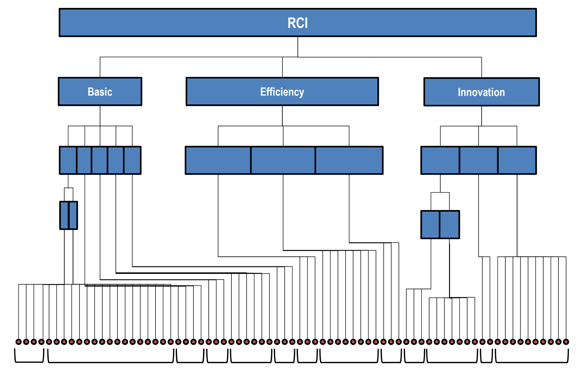
Policies oriented to social sustainability and well-being must be supported by effective social indicator systems, monitoring the network of domains of social and societal life. Reflecting their deep interconnections, such systems are typically built as complex hierarchical architectures which, starting from elementary measures, progressively generate layers of aggregated and composite indicators, within each domain and across them, in the attempt to provide policy-makers with quantified, synthetic, and actionable views on society. A striking example, although regarding an economic, more than social, topic, is provided by the architecture of the Regional Competitiveness Index [16] that, through a complicated sequence of intermediate aggregations, transforms more than 70 elementary indicators, into three main composites and, finally, in the overall index (see Figure 1). Similar architectures inspire the Equitable and Sustainable well-being initiative, carried on by the Italian Statistical Bureau [17] or the system of Sustainability Development Goals [18]. However, in the light of the previous discussions on social measurement and societal complexity, at least three issues make this hierarchical/aggregative approach problematic.

Figure 1.
Architecture of the Regional Competitiveness Index (the dots at the bottom represent elementary indicators).
- It must be acknowledged that not all of the dimensions involved in the description of society can be actually and meaningfully quantified in order to get neat and unambiguous pictures of them. This is clearly expressed by Amartya Sen, with reference to well-being and inequality measurement [19]: “Indeed, the nature of interpersonal comparisons of well-being as well as the task of inequality evaluation as a discipline may admit incompleteness as a regular part of the respective exercises. Both well-being and inequality are broad and partly opaque concepts. Trying to reflect them in the form of totally complete and clear-cut orderings can do less than justice to the nature of these concepts. There is a real danger of overprecision here.” Indeed, the general tendency to quantification, somehow imitating natural sciences, puts aside that in the social sciences numerical precision is often just a computational artifact and that elementary indicators are often expressed in different metrics and refer to non-homogeneous concepts, making final aggregated scores hardly interpretable, due to the absence of a common reference scale;
- The definitional uncertainty and the doubtful validity of many social measurement processes unveil that the attempt to monitor social sustainability, by precisely measuring social processes, is definitely fragile. In the vagueness of the correspondence between social measures and the corresponding social traits, divergent and unpredictable evolutions of the social system are hidden, making it risky to founding policy-making on precise quantification and making it preferable to rely on more robust views;
- Given the deep interdependence of social life domains, it is dangerous to focus on single aspects of well-being and sustainability, as if they could be isolated from the others; indeed, optimizing “locally” may well be “globally” inefficient, leading to unwanted and unexpected consequences, on the system as a whole.
Clearly, there are some cases where numerical precision can be achieved, typically at an elementary level, although the conventional nature of social measures may still hinder their neat interpretation. However, policy-makers usually do not need single pieces of information on elementary aspects of well-being or sustainability; they instead demand meaningful and reference pictures, capable to reveal their facets and their dynamics. To this goal, neither the fragmented view provided by elementary indicators, nor the artificial aggregation of them into composites prove useful and expressive. Pursuing social sustainability and well-being requires “average” indicators to be complemented with indicators capable to resolve differences, render nuances and recognize patterns, so as to adapt policies efficiently (think, for example, to the different forms of poverty, deprivation and social exclusion, which necessarily require different contrasting actions, to be properly addressed [20]). In between elementary indicators and aggregations, social indicators should provide structural syntheses, overcoming the “synthesis-as-aggregation” paradigm, in favor of the “synthesis-as-stylization” point of view. This clearly does not rule out the usefulness of precise measurement and even of building composites, when this is sensible, but emphasizes the need of rendering big pictures.
This approach to social sustainability measurement has some relevant consequences on the way social indicators should be designed. In addition to delivering numbers and scores, they can also produce graphs, maps, diagrams and all of those representations that effectively comprise and convey structural information to final users. More deeply, social indicators should turn input data into some kind of structure, preserving the essential relations and properties of the social traits under investigation, consistently with the representational approach to measurement, mentioned in Section 2 This requires the use of new complexity-reduction algorithms, often referred to as “non-aggregative”, to mark their differences from classical procedures, employed in composite indicator construction, and based on the aggregation of the input variables. In the next section, we provide some simple examples of these tools and show how the structural approach to social indicator construction may work and which outputs it may deliver.
5. Structural Approach to Synthesis: A Few Examples on Well-Being Data
We now provide some examples of structural synthesis of multidimensional indicator systems, applying some non-aggregative procedures to well-being data and comparing their outputs to the results of the principal component algorithm, assumed as “representative” of the classical aggregative approach. We do not aim at a comprehensive and systematic study of well-being here, nor are the examples meant as exhaustive of the non-aggregative approach to data synthesis. We use the dataset only for illustrative purposes, to make the previous discussion more concrete and to stimulate scholars, introducing possible ways to improve the informational power of social sustainability indicators. The following discussion is thus informal and illustrative in nature. Data are collected by OECD and are available on https://www.oecdregionalwellbeing.org/ (accessed on 20 September 2021). The dataset comprises 10 numerical indicators (Education, Jobs, Income, Safety, Health, Environment, Civic engagement, Accessibility to services, Housing, Community, Life satisfaction), measured on a 0–10 numerical scale, for 402 regions in OECD countries (369 after removing missing values). The scores are obtained from elementary indicators, through a normalization and, when needed, an aggregation process, described in [21]. Here, we do not argue the appropriateness of such a process and assume the indicators as valid and reliable.
5.1. Principal Component Aggregation
We start by constructing a composite indicator, using the principal component algorithm with the goal to emulate what is usually done and achieved, in many applied papers on social indicator constructions. We thus take a purely descriptive/explorative perspective, without assuming any theoretical or confirmative model behind the data. To this aim, we (i) center and normalize the variables to unit variance, (ii) compute the Singular Value Decomposition of the standardized data matrix and (iii) extract the first left singular vector, scaled to the first singular value. The first component reproduces about 44% of the total variance, showing that a large part of the variable variations around the means is lost, in the aggregation. By projecting each input standardized variable on the extracted component, it turns out that the latter reproduces them quite differently (see Table 1 and Figure 2), making it not easy to interpret and to use the output, as a tool to drive policies. The accuracy of the synthesis gets improved, by adding the second principal component; this, however, turns out to explain just about 17% of the total variance and is even harder to interpret than the first.

Table 1.
Approximation of the standardized well-being variables, on the first principal component.
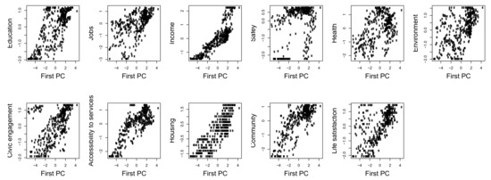
Figure 2.
Standardized input variables, against first principal component.
Admittedly, the interpretation of aggregated synthesis of this many variables of different nature is intrinsically difficult. For exemplificative purposes, and for future comparison with the semantic maps developed in the next paragraph, we then restrict the dataset to six variables (Education, Jobs, Income, Safety, Health, Life satisfaction) and replicate the above procedure, extracting the first two principal components (see Table 2) and building the corresponding two dimensional factor plane, which explains almost 70% of the total variance. Figure 3 shows it, with the projections of the regions of four OECD countries, namely Australia, Italy, Mexico, and United States. The countries do not overlap and occupy different areas of the map; still, it is not easy to give useful interpretation to the output, for two main reasons: (i) the meaning of the axes is not that clear, due to their aggregative nature and (ii) the approximation of the input regions on the plane is not homogeneous and in some cases, it is quite poor. Indeed, computing the ratio between the euclidean norm of the projected profiles and the input profiles, it turns out that, for the mapped countries, approximation errors range between about 12% and about 80%, with a median value of about 45%. The situation is even worse, if all of the input dataset is considered, in that the profiles of some regions are almost orthogonal to the plane, so that the upper bound of the approximation error reaches 99% (this shows that explained variance is a global indicator which does not control for local distortions, i.e., for the quality of the approximations of the single units). All in all, the bidimensional reduction provided by the principal component algorithm is quite problematic, since the resulting data projection is distorted, revealing that the underlying structure of the data is not actually captured. As a consequence, the map is also hardly acceptable as a tool for generating reliable knowledge and supporting policy-making.
Table 2.
Approximation (explained variance) of the six standardized well-being variables, on the first and second principal components (the last column reports the sign of the variable loads in the second principal component).
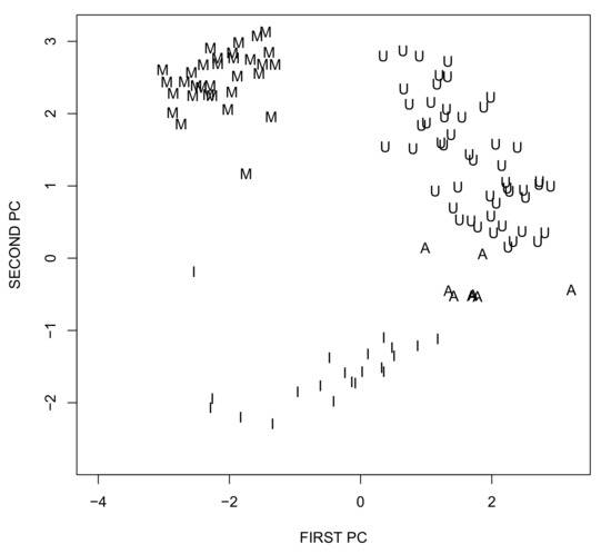
Figure 3.
Principal component plane for the well-being example (A—Australia; I—Italy, M—Mexico; U—United States).
5.2. Semantic Maps of Well-Being
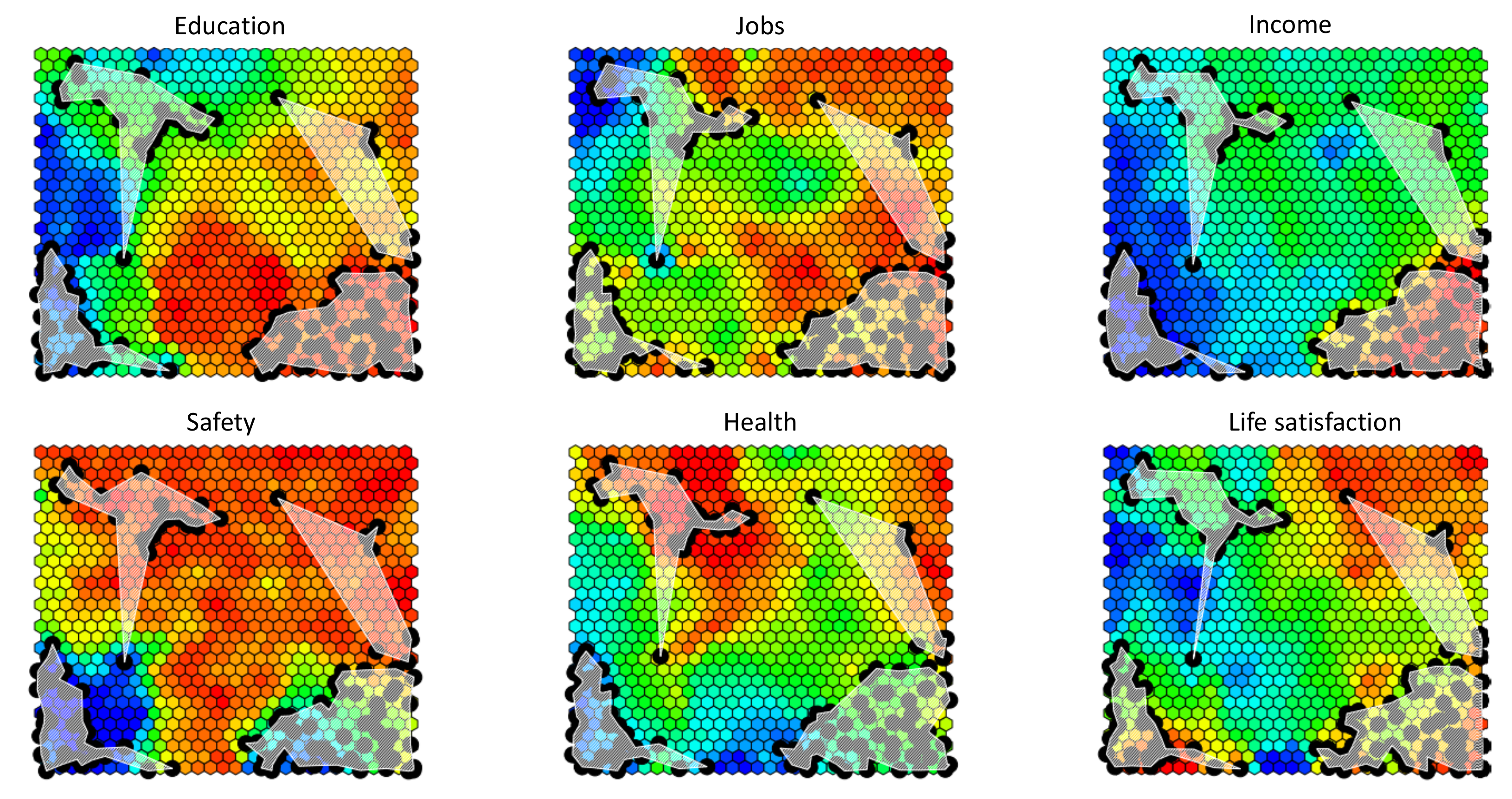
The map of Figure 3 attempts to provide a stylized picture of well-being, without collapsing the data into a single score. As just commented, however, the problem with this approach is that the “well-being space” is reconstructed in an aggregative way (indeed, it is the linear span of the first two principal components), making the final result distorted and non-neat to interpret. To retain the expressive power of this kind of representation, but improving its faithfulness to the underlying structure of the data, the projection space must be constructed without passing through variable aggregations, but directly approximating and reproducing the distribution of the six-dimensional input well-being profiles (that, in this case, are not standardized). This can be achieved by the self-organizing map (SOM) algorithm, a simple kind of neural network, used in non-linear dimensionality reduction, which can be seen as an enhancement of the principal component approach, where the approximating linear subspace is substituted with a topological manifold. The structure of the algorithm is fully described in [22], here it suffices to say that a set of prototypical score configurations (called “codebooks”) are learned from the data and organized in a tidy planar tessellation, just like the tiles of a mosaic, building a background over which statistical units can be mapped. The tessellation is generated by partitioning the input multi-dimensional space into cells, around and in between the highest dense points of the data distribution, and mapping each of them to a tile in the plane. To get an ordered tessellation, where similar codebooks tend to be mapped to nearby tiles, the algorithm generates them through an iterative process, that progressively adapt the codebooks to the input data, based on some metric, typically euclidean, with no intermediate linear variables aggregation. To run the algorithm, some parameters must be fixed, e.g., the dimensions of the output planar map which, in the examples below, is composed of cells (interpreting the map as the sensor of a digital camera, and the cells as pixels, their number can be somehow seen as the resolution of the final picture). Notice that to get smoother results, in the adaptation (learning) phase the input dataset has been replicated and made artificially larger, adding some noise to the original data. Figure 4 provides the output of the procedure. The six different maps are actually the same map, colored in six different ways, to provide an interpretation of the reconstructed well-being space, according to each input variable. Each cell comprises a codebook, i.e., a prototypical six-dimensional score configuration; in the first map, cells are colored according to the value of the Education score, after a color scale ranging from blue (low scores), to red (high scores); in the second map, cells are colored based on the Jobs score and so on, in the following maps, for the other well-being variables. These thermographic visualizations are called component planes and are the standard way of interpreting SOMs, producing semantic maps (notice that no meaningful axes are present here, since the map is built exploiting score profiles distances and not variable covariances). Interestingly, the resulting maps are colored smoothly, revealing the ordering of the codebooks achieved by the algorithm and making it possible to interpret the areas of the map, as a topography of well-being. Notice that SOMs are not metric maps, i.e., the visual distances between cells do not correspond to the distances between the score configurations they represent, which are instead revealed by the corresponding color differences. Once the “semantic background” is set, statistical units are mapped on it, by associating each input score profile to the cell, i.e., the codebook, more similar to it, in the chosen metric. As it can be seen in the figure, the map resolves the well-being patterns of Australia, Italy, Mexico, and the United States in a much more effective way than the previous principal component plane, showing that the four countries occupy semantically different areas of the well-being space. Importantly, the approximation error, on the whole dataset, is here no higher than 9%, showing that the generated SOM succeeds in capturing the underlying non-linear structure of the data, providing a non-aggregative structural synthesis of it.
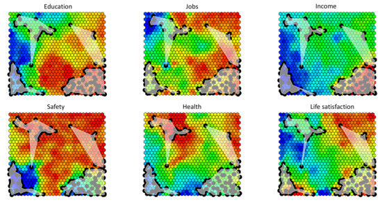
Figure 4.
SOM on the six selected well-being variables. The four white areas correspond to the four countries Australia (top right), Italy (top left), Mexico (bottom left), and United States (bottom right). Black dots represent the single regions of the selected countries; they have been plotted on the map adding some jìttering (i.e., random noise), to ease the visualization and avoid exact superposition (this explains why, in the different planes, the position of the dots is slightly different).
As shown, self-organizing maps are often used for their ability to unveil the complex structure of the data, focusing on the identification of patterns, rather than on the quantification of the underlying latent traits. This is why, in the illustration above, we have given no emphasis to the numerical values corresponding to the colors used in the component plane visualizations. Clearly, in real applications, SOMs can be complemented with other tools, to better inspect the single units, if needed. In any case, the expressive power of this kind of structural maps is utterly higher than those of aggregated indicators or of multidimensional dashboards, so often implemented and made available to the general public and to decision-makers. Surely, the visual interpretation of the map is not easy, involving a superposition of different planes. However, here we are not addressing the visualization/communication issue, as our main interest is in the way SOMs can capture and unfold the data structure.
5.3. Well-Being and Partial Orders
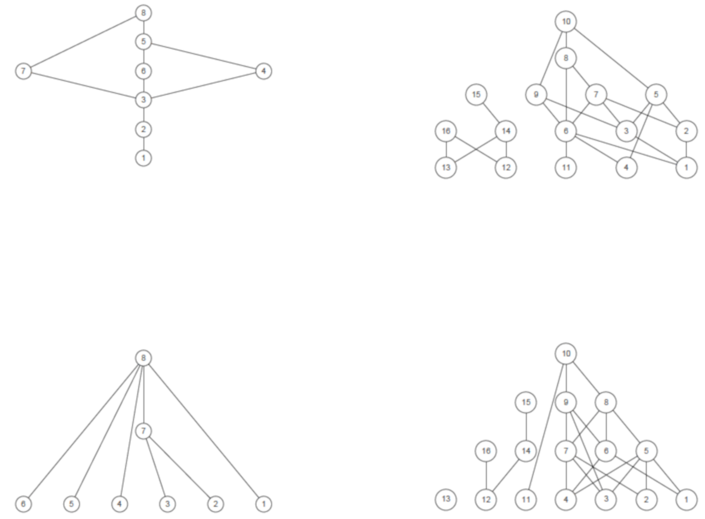
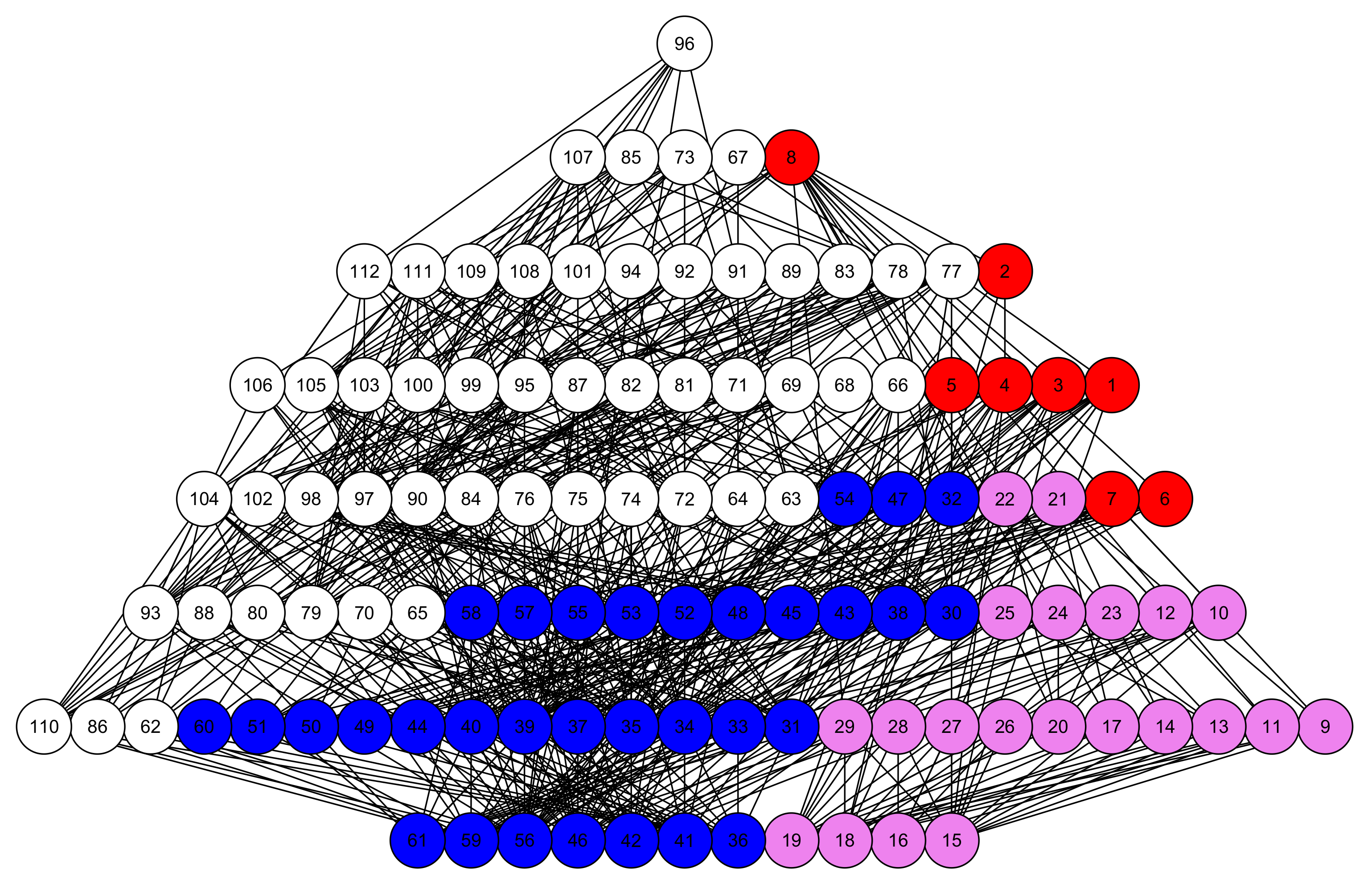
As a final example, we mention some relatively novel tools, for the structural description of multi-indicator systems, based on the notion of partial order relation [23]. We introduce the topic by again quoting Sen who, in [19], states: “The use of partial ordering has two different types of justification in interpersonal comparison or in inequality evaluation. First, as has been just discussed, the ideas of well-being and inequality may have enough ambiguity and fuzziness to make it a mistake to look for a complete ordering of either. This may be called the fundamental reason for incompleteness. Second, even if it is not a mistake to look for one complete ordering, we may not be able in practice to identify it”. In other words, well-being may assume diverse, and non-comparable, shapes and any synthetic description of it should account for their existence, considering them not as “variations/fluctuations” around a “reference well-being state”, but as structural facets of one and the same complex phenomenon. Interestingly, the expression “partial order” does not simply stress the impossibility of getting a final ranking, but refers to a well-defined mathematical structure, which then comes into play to operationalize Sen’s point of view and open the way to new possibilities of social measurement. To give an idea of the role of partial order in the structural synthesis of social data, we turn directly to some very simple examples (more details and applications can be found in cited references). In an attempt to compare and rank the well-being profiles of OECD regions, the most natural ordering criterion is that profile b “dominates” (in well-being terms) profile a (written ) if and only if all of the scores of b are no lower than the corresponding scores of a and at least one is strictly higher. Since, in general, profiles may have conflicting scores, i.e., one can dominate another on some variables, and be dominated by it on others, the above ordering criterion may produce incomparablities, i.e., pairs of profiles that cannot be ordered. Figure 5 reports the networks (technically called Hasse diagrams, after the German mathematician Helmut Hasse) of pairwise comparisons between the well-being profiles of Australian and of German regions, for two different subsets of well-being variables (namely Education-Jobs-Income and Education-Jobs-Income-Life satisfaction). By visually inspecting the upper diagrams, one notices that Australian regions are more comparable than the German ones; indeed, the Australian partial order has both top and bottom regions and is somehow similar to a complete ranking, while the German diagram is more complex, with many incomparable regions, to the extent that it is disconnected, being composed of two juxtaposed diagrams, i.e., of two incomparable components. Adding the Life satisfaction score to the profiles (lower diagrams) deconstructs the partial orders, making them much richer of incomparabilities: in the Australian case, the partial order becomes similar to a so-called antichain, i.e., to a set of incomparable elements, while the German diagram now comprises three disconnected components. This comparability reduction reveals that the Life satisfaction variable induces regional orderings which are not “co-graduated” with those induced by the other variables, increasing the number of conflicting scores in well-being profiles.
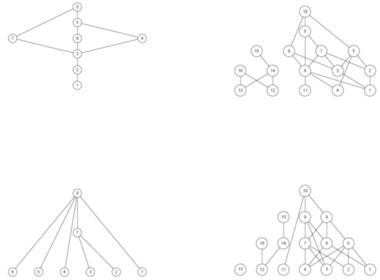
Figure 5.
Hasse diagrams of Australian (left) and German (right) regions. Top diagrams compare regions on Education, Jobs, and Income; bottom diagrams on Education, Jobs, Income, and Life satisfaction. The diagrams must be read from top to bottom (an edge between two nodes means that the higher dominates, in well-being terms, the lower).
Notwithstanding their simplicity, the four Hasse diagrams help provide an idea of the variety of regional well-being and of the existence of structural differences among regions and countries. Indeed, the relevance of partial orders in social measurement is rooted in their capacity of capturing both the vertical dimension (comparability) and horizontal dimension (incomparability) of social phenomena. The first is linked to the concept of “intensity”, the second to their multi-faceted nature, to be considered as a key feature to be preserved in their description, rather than as a form of noise to be discarded (for examples of applications in this spirit, see [20,24,25,26]).
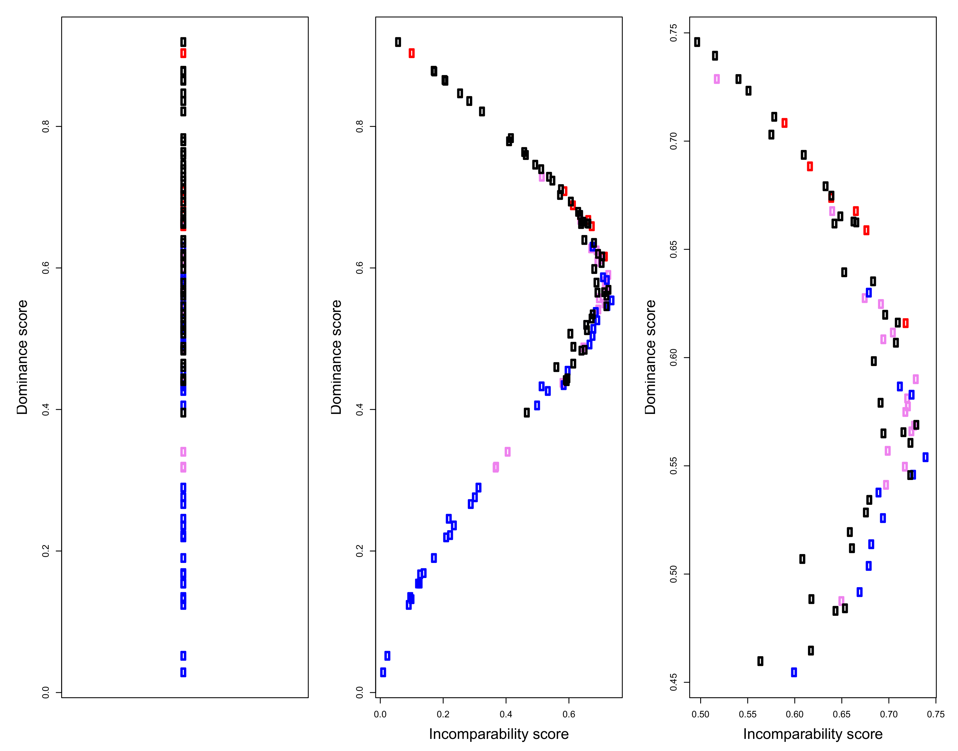
The use of partial orders in social measurement is an example of the Representational Theory of Measurement, introduced at the beginning of the paper. Input data are mapped onto a data structure, which is then exploited, with various mathematical tools, to extract information on the social trait behind the data. An example of this process is briefly given in the following. Figure 6 depicts the Hasse diagrams of well-being profiles on the six variables considered in previous paragraphs, for Australia, Italy, Mexico, and United States. The diagram is too complicated to be visually effective, still one can grasp some interesting insights: US regions occupy the highest positions and tend to dominate Mexican regions; however, they spread both vertically and horizontally, in the diagram, varying both in intensity and in shapes. Mexican regions are dominated also by Australian ones which, as a whole, are not much comparable with US regions; finally Italy, although in the lower part of the diagram, seems not to be heavily dominated by the other countries, many incomparabilities exist between its regions and the other units in the partial order (notice that these visual impressions could be made precise by computing specific structural indicators, but given the informal spirit of the paper, we limit ourselves to this high level description). Implicit in the structure of the diagram, however, there is much information on the degree of dominance of each unit over the others; this information can be used to compute a non-aggregative dominance score, to be used for building a ranking of regional well-being. The formal procedure to compute this score, out of the partial order structure, is technically and computationally non-trivial and is described and made more precise in [27]; its output is depicted in the left panel of Figure 7, which provides a complete ordering of the regions. The ranking reflects the structure of the original Hasse diagram: US regions occupy the highest positions, but are quite spread vertically; one of the Australian regions is placed near the top, but most of them are in the middle of the ranking, like Italy, which however, has one region in the lower part; finally, Mexico is in the bottom section of the ordering. The ranking has the key feature of being non-aggregative, not involving any composite indicator and exploiting only the order relation, induced by the multidimensional comparisons between the well-being profiles. The dominance scores, in fact, reflect just the “relational position” of the regions in the network of comparabilities/incomparabilities and quantify the tendency of the units to be dominating over the others. As a matter of fact, however, the final ranking does not provide a faithful representation of the input data, losing the horizontal dimension of the Hasse diagram. This may be made precise, by complementing the dominance score with a quantification of the degree of incomparability of each region (see [24]), to measure how each of them tends to be idiosyncratic and how “forcing” is to place all of the regions on a single vertical dimension. The middle and right panels of Figure 6 provide scatterplots of Australian, Italian, Mexican, and US regions, along the incomparability and the dominance dimensions; it clearly appears how regions in the middle of the ranking are quite incomparable, making the complete ordering of the left panel, somehow not reliable. This confirms how much care must be taken when looking for simple representations of complex social phenomena.

Figure 6.
Hasse diagram of Australian, Italian, Mexican, and US regions, over the six well-being variables Education, Jobs, Income, Safety, Health and Life satisfaction (color codes: Red—Australia, Violet—Italy; Blue—Mexico; White—United States).
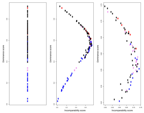
Figure 7.
Left panel: dominance scores and ranking of the Australian, Italian, Mexican and US regions; Middle panel: Dominance/incomparability map, showing the existence of units that can be hardly ranked; Right panel: zoom of the middle part of the dominance/incomparability map. All scores are scaled to [0, 1] theoretical range. (Color codes: Red—Australia, Violet—Italy; Blue—Mexico; Black—United States).
5.4. Final Remark
We end this section with a brief comment. The examples illustrated above are somehow oversimplified and have been developed in a rather naive way, simply to give the flavor of what we have called a structural approach to synthesis. What they have in common is that an effort is made to identify the target structure, such that a faithful map from the data can be built. SOMs are quite an old algorithm, dating back to the 1980s, and there is a very huge body of theoretical and applied research on them; nevertheless, they are not often employed in the social sciences, where dimensional reduction is usually achieved through SVD-based algorithms or factor analysis procedures, with the possible drawbacks highlighted above. Use of partial order theory in data analysis is, instead, quite new. Although some first examples can be traced back to some decades ago, the attempt to systematically import posetic tools into socio-economic statistics is quite recent and still under development; interestingly, it has been motivated by the acknowledgment that new and more suitable data structures were needed, to address the statistical study of many multidimensional social phenomena, e.g., multidimensional deprivation, in a consistent way. The field of non-aggregative algorithms to the synthesis of data systems is indeed much wider than the use of SOMs and posets and is, to a large extent, so far unexplored. It is our belief that advances in this direction, from both theoretical and applied perspectives, will be driven by the increase of sensibility towards the problem of measurement, as tentatively addressed in this paper.
6. Conclusions
Social sustainability and well-being promotion are complex and multi-faceted processes that involve a number of dimensions and components, nested in an intricate network of interactions, requiring articulated indicator systems, to be supported and pursued. Indicators can be of very different types and can be designed for different purposes: setting and pursuing specific targets, designing policies, monitoring and evaluating policy outcomes, etc. In any case, whatever their focus and goals are, they deal with complex traits and must render faithful pictures of them in order to be sound and useful. So, avoiding too simple numerical reductions, which may as well be unreliable and prove dangerous in the view of policy-making, social indicators should be designed to provide structural syntheses of sustainability and well-being traits, overcoming both the fragmentation of elementary indicators and the confounding aggregation of composites. This has relevant implications on the statistical side of indicator construction and require the adoption of non-aggregative procedures, so as to map input data into suitable mathematical structures, designed to preserve as much structural information as possible, as we have exemplified on OECD regional well-being data. Surely, the reliability and validity of social sustainability and well-being measurement are a much wider issue than just that of the statistical procedures employed in indicator construction. Deepening the conceptual roots of social sustainability, identifying the dimensions of well-being, improving the data generation processes, e.g., increasing their spatial and temporal resolution, finding out new ways of communication, etc., are all key elements that must be carefully considered. Raising awareness on the critical nature of social measures and social indicators, we hope that this paper may lead to broader reflections on the necessity of presiding the entire measurement process, making it into a sound source of knowledge and an effective support to policy-making.
Author Contributions
Conceptualization, all authors; methodology, all authors; validation, M.F. and A.A.; formal analysis, all authors; investigation, all authors; data curation, M.F.; software, A.A.; writing—original draft preparation, M.F.; writing—review and editing, all authors; visualization, M.F. All authors have read and agreed to the published version of the manuscript.
Funding
This research received no external funding.
Institutional Review Board Statement
Not applicable.
Informed Consent Statement
Not applicable.
Data Availability Statement
Not applicable.
Conflicts of Interest
The authors declare no conflict of interest.
References
- Ravallion, M. Mashup indices of development. World Bank Res. Obs. 2012, 27, 1–32. [Google Scholar] [CrossRef] [Green Version]
- Shek, D.T.; Wu, F.K. The social indicators movement: Progress, paradigms, puzzles, promise and potential research directions. Soc. Indic. Res. 2018, 135, 975–990. [Google Scholar] [CrossRef] [PubMed] [Green Version]
- Cobb, C.W.; Rixford, C. Lessons Learned from the History of Social Indicators; Redefining Progress: San Francisco, CA, USA, 1998; Volume 1. [Google Scholar]
- Michell, J. Measurement theory: History and philosophy. In International Encyclopedia of the Social & Behavioral Sciences, 2nd ed.; Elsevier: Amsterdam, The Netherlands, 2015; Volume 14. [Google Scholar]
- Stanford Encyclopedia of Philosophy; Measurement in Sciences; Department of Philosophy, Stanford University Library of Congress Catalog Data: 2021. Available online: https://plato.stanford.edu/entries/measurement-science/ (accessed on 20 September 2021).
- Suck, R. Measurement, Representational Theory. In International Encyclopedia of the Social & Behavioral Sciences, 2nd ed.; Elsevier: Amsterdam, The Netherlands, 2015; Volume 14. [Google Scholar]
- Alexandrova, A. First-Person Reports and the Measurement of Happiness. Philos. Psychol. 2008, 21, 571–583. [Google Scholar] [CrossRef]
- Schönemann, P.H.; Steiger, J.H. On the validity of indeterminate factor scores. Bull. Psychon. Soc. 1978, 12, 287–290. [Google Scholar] [CrossRef]
- Moro, M.; Brereton, F.; Ferreira, S.; Clinch, J.P. Ranking quality of life using subjective well-being data. Ecol. Econ. 2008, 65, 448–460. [Google Scholar] [CrossRef]
- Giordani, A.; Mari, L. Modeling measurement: Error and uncertainty. In Error and Uncertainty in Scientific Practice; Boumans, M., Hon, G., Petersen, A., Eds.; University of Amsterdam: Amsterdam, The Netherlands; University of Haifa: Haifa, Israel; VU University Amsterdam: Amsterdam, The Netherlands, 2014; Chapter 4. [Google Scholar]
- Grégis, F. Can we dispense with the notion of ‘true value’in metrology? In Standardization in Measurement; Schlaudt, H., Ed.; Routledge: Oxfordshire, UK, 2015; pp. 95–108. [Google Scholar]
- Bridgman, P.W.; Williams, P. Operational Analysis. Philos. Sci. 1938, 5, 114–131. [Google Scholar] [CrossRef]
- Bridgman, P.W. Some general principles of operational analysis. In Psychological Review; Boring: Hawthorne, CA, USA, 1945; Volume 52, pp. 246–249. [Google Scholar] [CrossRef]
- Bridgman, P.W. The Present State of Operationalism. In The Validation of Scientific Theories; Frank: New York, NY, USA, 1956; pp. 74–79. [Google Scholar]
- Lighthill, M.J. The recently recognized failure of predictability in Newtonian dynamics. Proc. R. Soc. Lond. A Math. Phys. Sci. 1986, 407, 35–50. [Google Scholar]
- Annoni, P.; Dijkstra, L. EU Regional Competitiveness Index; Technical and Scientific Reports of JRC European Commission JRC-IPSC: Brussels, Belgium, 2013. [Google Scholar]
- Italian National Institute of Statistics (ISTAT). Bes Report 2021 Equitable and Sustainable Well-Being in Italy. 2021. Available online: https://www.istat.it/en/well-being-and-sustainability (accessed on 20 September 2021).
- Department of Economic and Social Affairs. Transforming Our World: The 2030 Agenda for Sustainable Development; Technical Report; Unated Nations: San Francisco, CA, USA, 2015; Available online: https://sdgs.un.org/goals (accessed on 20 September 2021).
- Sen, A. Inequality Reexamined; Volume First Hardcove; Oxford University Press: Oxford, UK, 1992. [Google Scholar]
- Rimoldi, S.M.L.; Arcagni, A.; Fattore, M.; Barbiano di Belgiojoso, E. Targeting Policies for Multidimensional Poverty and Social Fragility Relief Among Migrants in Italy, Using F-FOD Analysis. Soc. Indic. Res. 2020, 157, 57–75. [Google Scholar] [CrossRef]
- OECD. Regional Well-Being User Guide. 2018. Available online: https://www.oecdregionalwellbeing.org/assets/downloads/Regional-Well-Being-User-Guide.pdf (accessed on 20 September 2021).
- Kohonen, T. Essentials of the self-organizing map. Neural Netw. 2013, 37, 52–65. [Google Scholar] [CrossRef] [PubMed]
- Davey, B.A.; Priestley, H.A. Introduction to Lattices; Cambridge University Press: Cambridge, UK, 2002. [Google Scholar]
- Rimoldi, S.M.L.; Arcagni, A.; Fattore, M.; Terzera, L. Social and Material Vulnerability of the Italian Municipalities: Comparing Alternative Approaches. Soc. Indic. Res. 2020, 1–18. [Google Scholar] [CrossRef]
- Brüggemann, R.; Patil, G.P. Ranking and Prioritization for Multi-Indicator Systems: Introduction to Partial Order Applications; Springer: Berlin/Heidelberg, Germany, 2011. [Google Scholar]
- Comim, F. A Poset-Generalizability Method for Human Development Indicators. Soc. Indic. Res. 2021, 1–20. [Google Scholar] [CrossRef]
- Fattore, M.; Arcagni, A. Posetic tools in the social sciences: A tutorial exposition. In Measuring and Understanding Complex Phenomena: Indicators and Their Analysis in Different Scientific Fields, Springer Nature, 2nd ed.; Brüggemann, R., Ed.; Elsevier: Amsterdam, The Netherlands, 2021; pp. 219–241. [Google Scholar]


Publisher’s Note: MDPI stays neutral with regard to jurisdictional claims in published maps and institutional affiliations. |
© 2021 by the authors. Licensee MDPI, Basel, Switzerland. This article is an open access article distributed under the terms and conditions of the Creative Commons Attribution (CC BY) license (https://creativecommons.org/licenses/by/4.0/).