Local Interpretable Model-Agnostic Explanations for Classification of Lymph Node Metastases


Abstract
:1. Introduction
2. Materials and Methods
2.1. Dataset
Medical Annotation
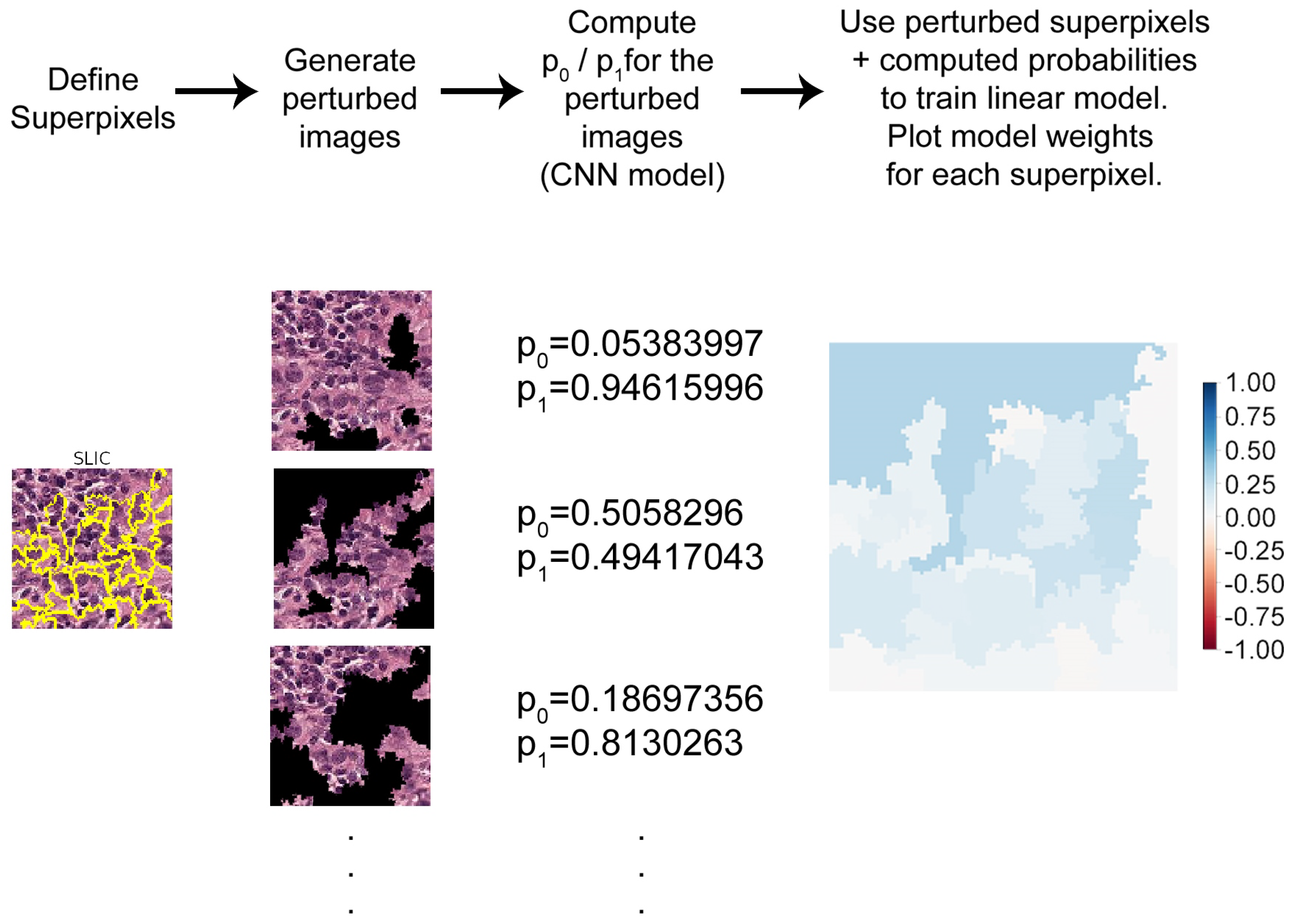
2.2. LIME
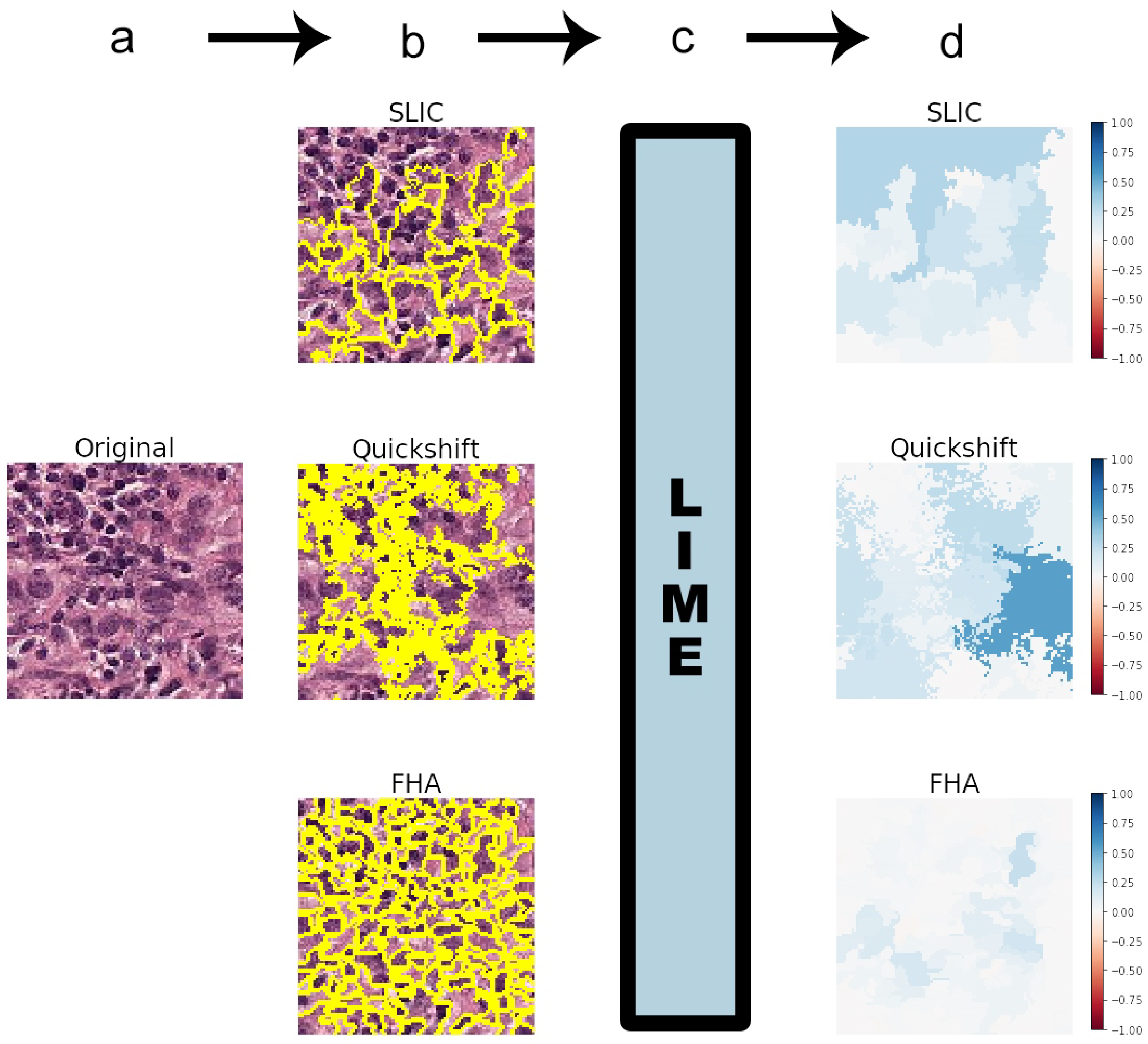
2.3. Segmentation Algorithms
- Felzenszwalb’s [15] efficient graph-based image segmentation (FHA) generates an oversegmentation of an RGB image using tree-based clustering. The main parameter for indirectly determining the number of segments (superpixels) generated is “scale”, which sets an observation level.
- Simple Linear Iterative Clustering (SLIC), by Achanta et al. [16], segments the image by using K-means clustering in the color space. There is a “number of segments” parameter that roughly tries to dictate the number of superpixels generated.
- Quickshift, by Vedaldi et al. [17], performs segmentation by using a quickshift mode seeking algorithm to cluster pixels. There is no specific parameter for controlling the final number of superpixels.
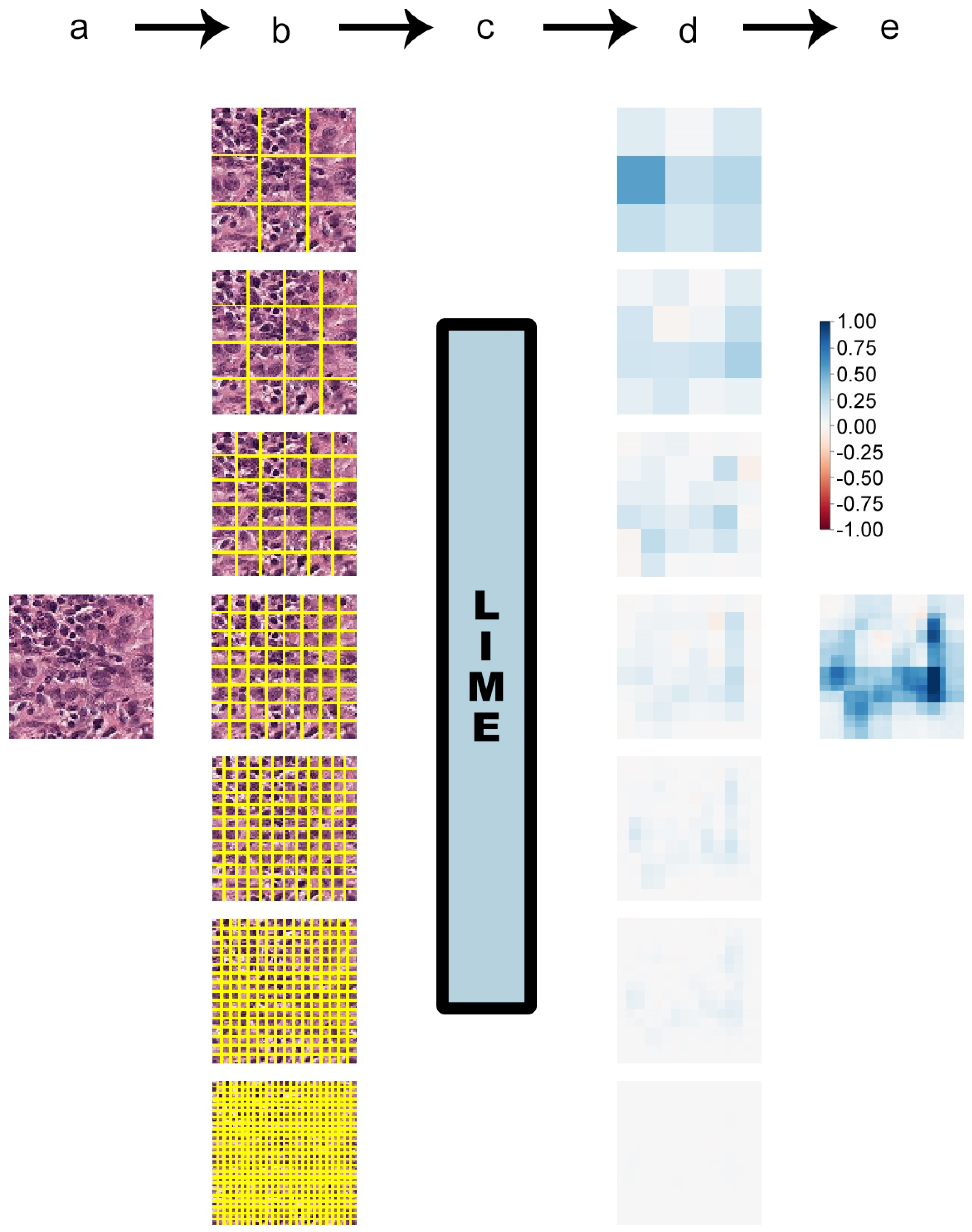
Squaregrid
2.4. Models
2.4.1. Model1
- Input layer ( input dimensions)
- Convolution layer (32 filters, kernels, ReLU activation)
- Convolution layer (32 filters, kernels, ReLU activation)
- Convolution layer (32 filters, kernels, ReLU activation)
- Max pooling ( pooling)
- Dropout (30%)
- Convolution layer (64 filters, kernels, ReLU activation)
- Convolution layer (64 filters, kernels, ReLU activation)
- Convolution layer (64 filters, kernels, ReLU activation)
- Max pooling ( pooling)
- Convolution layer (128 filters, kernels, ReLU activation)
- Convolution layer (128 filters, kernels, ReLU activation)
- Convolution layer (128 filters, kernels, ReLU activation)
- Max pooling ( pooling)
- Flatten
- Dense (256 neurons, ReLU activation)
- Dropout (30%)
- Dense (2 neurons, softmax activation)
2.4.2. VGG19
- Input layer ( input dimensions)
- Convolution layer (64 filters, kernels, ReLU activation)
- Convolution layer (64 filters, kernels, ReLU activation)
- Max pooling ( pooling, stride = (2, 2))
- Convolution layer (128 filters, kernels, ReLU activation)
- Convolution layer (128 filters, kernels, ReLU activation)
- Max pooling ( pooling, stride = (2, 2))
- Convolution layer (256 filters, kernels, ReLU activation)
- Convolution layer (256 filters, kernels, ReLU activation)
- Convolution layer (256 filters, kernels, ReLU activation)
- Convolution layer (256 filters, kernels, ReLU activation)
- Max pooling ( pooling, stride = (2, 2))
- Convolution layer (512 filters, kernels, ReLU activation)
- Convolution layer (512 filters, kernels, ReLU activation)
- Convolution layer (512 filters, kernels, ReLU activation)
- Convolution layer (512 filters, kernels, ReLU activation)
- Max pooling ( pooling, stride = (2, 2))
- Convolution layer (512 filters, kernels, ReLU activation)
- Convolution layer (512 filters, kernels, ReLU activation)
- Convolution layer (512 filters, kernels, ReLU activation)
- Convolution layer (512 filters, kernels, ReLU activation)
- Max pooling ( pooling, stride = (2, 2))
- Dense (1 neurons, sigmoid activation)
3. Results and Discussion
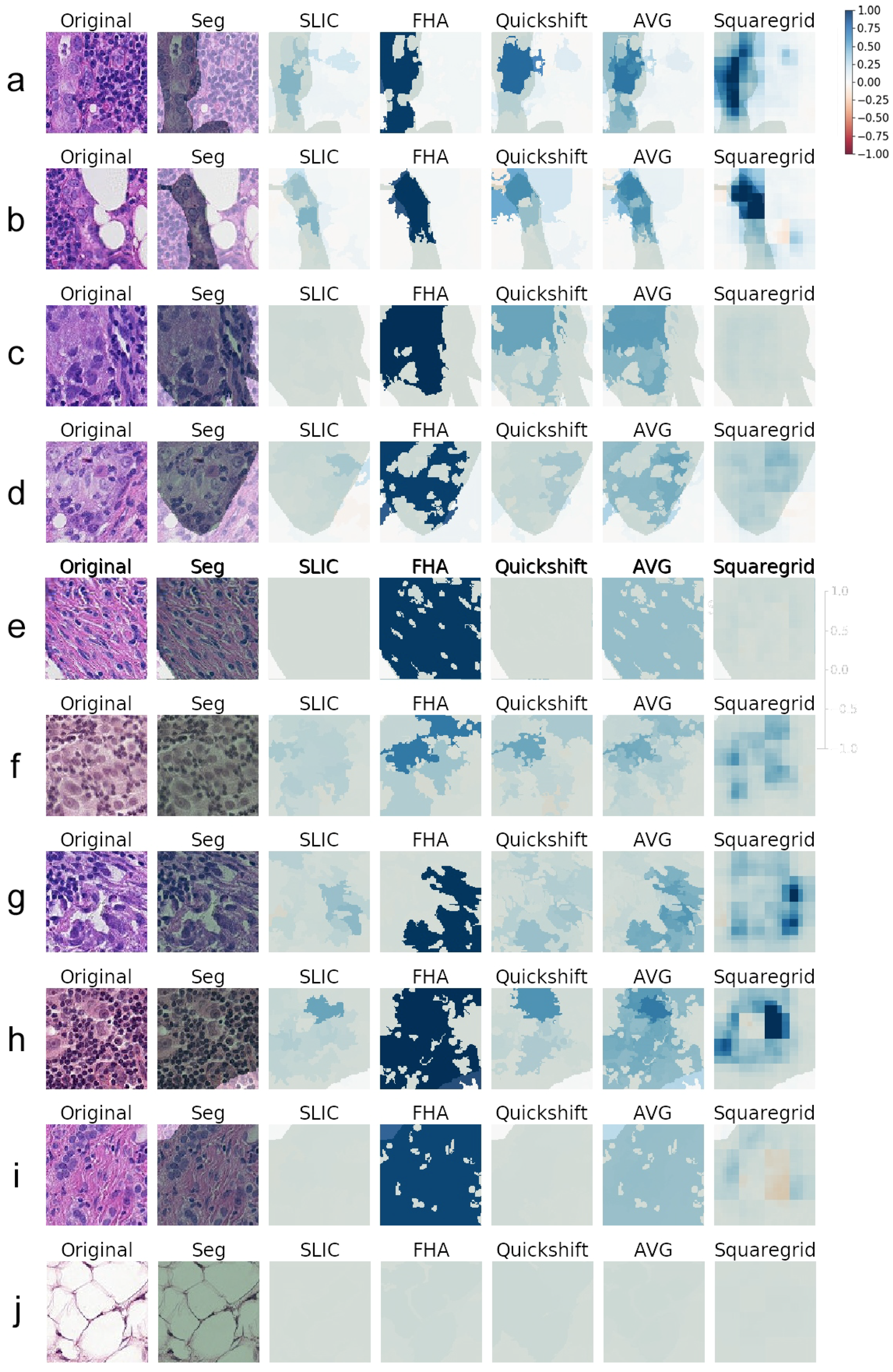
3.1. Generating Explanations
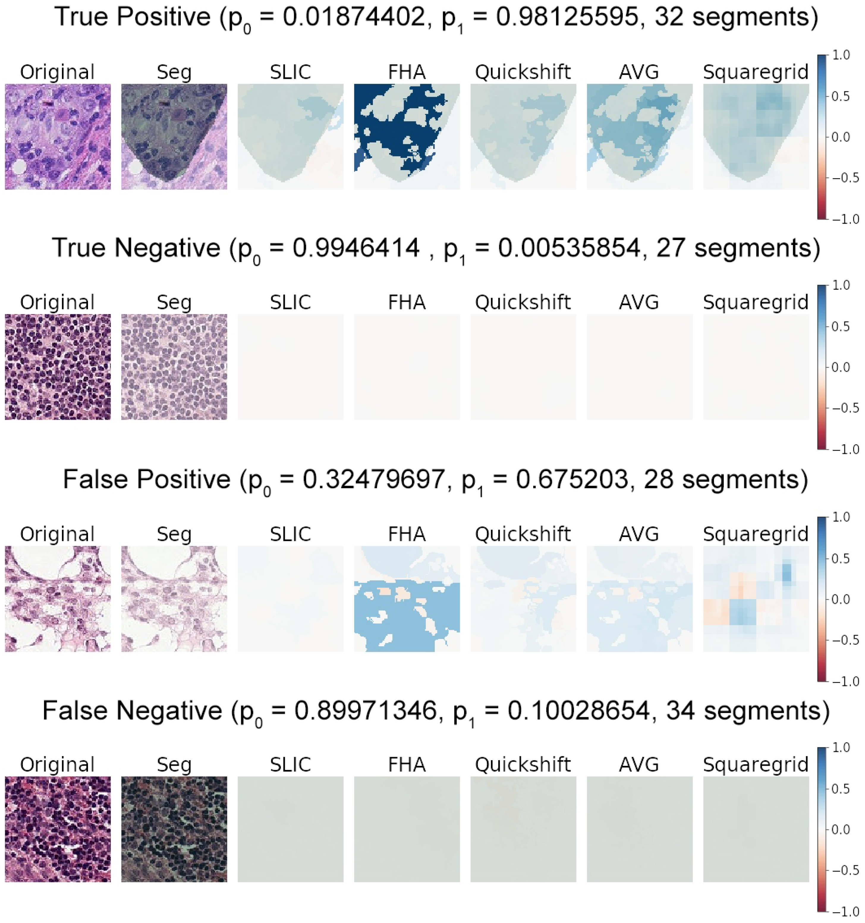
3.2. Comparing SLIC, FHA, and Quickshift
- Cases where the medical annotation (corresponding to metastatic tissue) nearly or fully covered the patch and textures and colors were very homogeneous throughout the patch:
- Cases where the medical annotation nearly or fully covered the patch, but there were multiple different textures and colors:
- Cases where the medical annotation was a smaller subregion of the patch:
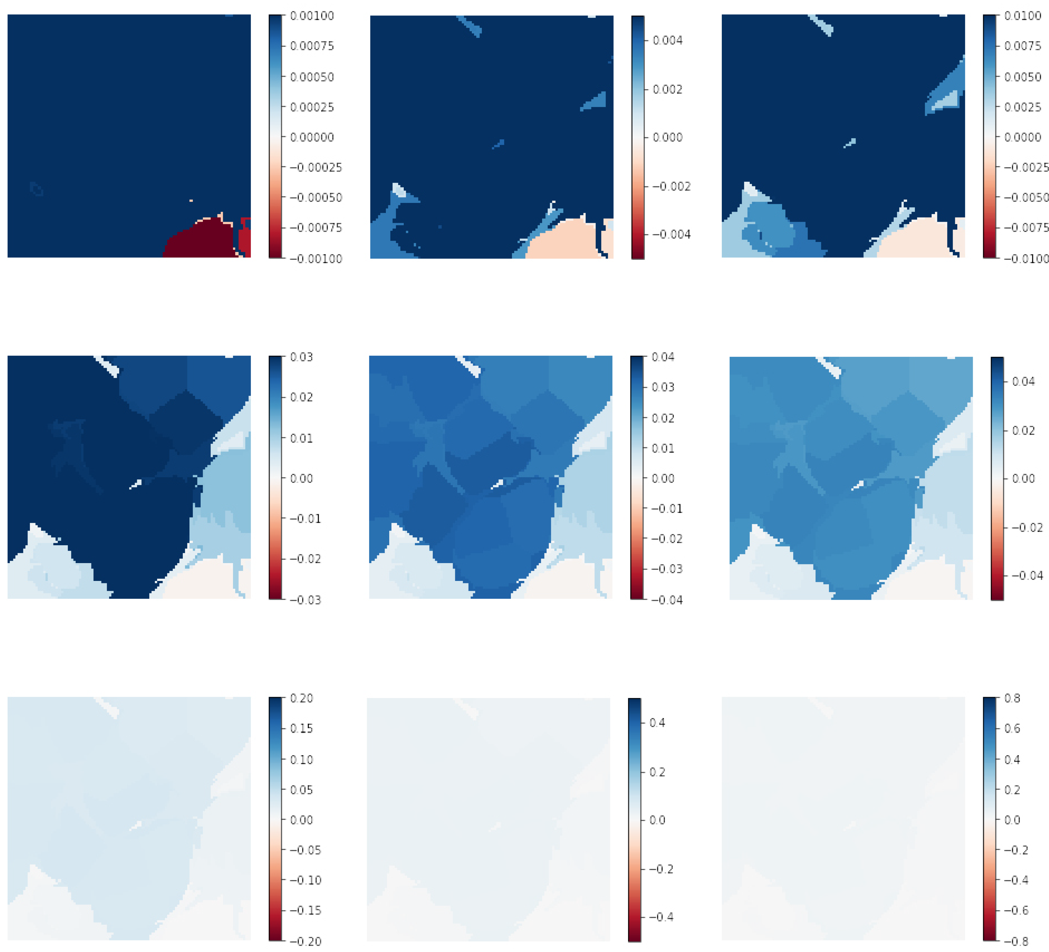
3.3. Squaregrid
3.4. Meaningfulness of Explanations
3.5. Medicine/Biology Basis
4. Conclusions
Author Contributions
Funding
Conflicts of Interest
References
- Ronneberger, O.; Fischer, P.; Brox, T. U-net: Convolutional networks for biomedical image segmentation. In Proceedings of the International Conference on Medical Image Computing and Computer-Assisted Intervention, Munich, Germany, 5–9 October 2015; pp. 234–241. [Google Scholar]
- Kermany, D.S.; Goldbaum, M.; Cai, W.; Valentim, C.C.; Liang, H.; Baxter, S.L.; McKeown, A.; Yang, G.; Wu, X.; Yan, F.; et al. Identifying medical diagnoses and treatable diseases by image-based deep learning. Cell 2018, 172, 1122–1131. [Google Scholar] [CrossRef] [PubMed]
- Miotto, R.; Wang, F.; Wang, S.; Jiang, X.; Dudley, J.T. Deep learning for healthcare: Review, opportunities and challenges. Brief. Bioinform. 2017, 19, 1236–1246. [Google Scholar] [CrossRef] [PubMed]
- Veeling, B.S.; Linmans, J.; Winkens, J.; Cohen, T.; Welling, M. Rotation equivariant CNNs for digital pathology. In Proceedings of the International Conference on Medical Image Computing and Computer-Assisted Intervention, Granada, Spain, 16–20 September 2018; pp. 210–218. [Google Scholar]
- Liu, Y.; Gadepalli, K.; Norouzi, M.; Dahl, G.E.; Kohlberger, T.; Boyko, A.; Venugopalan, S.; Timofeev, A.; Nelson, P.Q.; Corrado, G.S.; et al. Detecting cancer metastases on gigapixel pathology images. arXiv 2017, arXiv:1703.02442. [Google Scholar]
- Bejnordi, B.E.; Veta, M.; Van Diest, P.J.; Van Ginneken, B.; Karssemeijer, N.; Litjens, G.; Van Der Laak, J.A.; Hermsen, M.; Manson, Q.F.; Balkenhol, M.; et al. Diagnostic assessment of deep learning algorithms for detection of lymph node metastases in women with breast cancer. JAMA 2017, 318, 2199–2210. [Google Scholar] [CrossRef] [PubMed]
- Holzinger, A.; Biemann, C.; Pattichis, C.S.; Kell, D.B. What do we need to build explainable AI systems for the medical domain? arXiv 2017, arXiv:1712.09923. [Google Scholar]
- Adadi, A.; Berrada, M. Peeking inside the black-box: A survey on Explainable Artificial Intelligence (XAI). IEEE Access 2018, 6, 52138–52160. [Google Scholar] [CrossRef]
- Ribeiro, M.T.; Singh, S.; Guestrin, C. Why should i trust you?: Explaining the predictions of any classifier. In Proceedings of the 22nd ACM SIGKDD International Conference on Knowledge Discovery and Data Mining, San Francisco, CA, USA, 13–17 August 2016; pp. 1135–1144. [Google Scholar]
- Alber, M.; Lapuschkin, S.; Seegerer, P.; Hägele, M.; Schütt, K.T.; Montavon, G.; Samek, W.; Müller, K.R.; Dähne, S.; Kindermans, P.J. iNNvestigate neural networks! arXiv 2018, arXiv:1808.04260. [Google Scholar]
- Kindermans, P.J.; Hooker, S.; Adebayo, J.; Alber, M.; Schütt, K.T.; Dähne, S.; Erhan, D.; Kim, B. The (un) reliability of saliency methods. arXiv 2017, arXiv:1711.00867. [Google Scholar]
- Veeling, B. The PatchCamelyon (PCam) Deep Learning Classification Benchmark. Available online: https://github.com/basveeling/pcam (accessed on 13 march 2019).
- Veeling, B. Histopathologic Cancer Detection. Available online: https://www.kaggle.com/c/histopathologic-cancer-detection/data (accessed on 13 march 2019).
- Skimage Segmentation Module. Available online: https://scikit-image.org/docs/dev/api/skimage.segmentation.html (accessed on 5 July 2019).
- Felzenszwalb, P.F.; Huttenlocher, D.P. Efficient graph-based image segmentation. Int. J. Comput. Vis. 2004, 59, 167–181. [Google Scholar] [CrossRef]
- Achanta, R.; Shaji, A.; Smith, K.; Lucchi, A.; Fua, P.; Süsstrunk, S. SLIC superpixels compared to state-of-the-art superpixel methods. IEEE Trans. Pattern Anal. Mach. Intell. 2012, 34, 2274–2282. [Google Scholar] [CrossRef] [PubMed]
- Vedaldi, A.; Soatto, S. Quick shift and kernel methods for mode seeking. In Proceedings of the European Conference on Computer Vision, Marseille, France, 12–18 October 2008; pp. 705–718. [Google Scholar]
- Keras. 2015. Available online: https://keras.io (accessed on 5 July 2019).
- CNN—How to Use 160,000 Images without Crashing. Available online: https://www.kaggle.com/vbookshelf/cnn-how-to-use-160-000-images-without-crashing/data (accessed on 5 July 2019).
- 180k img (VGG19) callback. Available online: https://www.kaggle.com/maxlenormand/vgg19-with-180k-images-public-lb-0-968/data (accessed on 5 July 2019).
- Camelyon16. Available online: https://camelyon16.grand-challenge.org/Data/ (accessed on 13 March 2019).
- Elston, C.; Ellis, I. Ppathological prognostic factors in breast cancer. I. The value of histological grade in breast cancer: Experience from a large study with long-term follow-up. Histopathology 1991, 19, 403–410. [Google Scholar] [CrossRef] [PubMed]


© 2019 by the authors. Licensee MDPI, Basel, Switzerland. This article is an open access article distributed under the terms and conditions of the Creative Commons Attribution (CC BY) license (http://creativecommons.org/licenses/by/4.0/).
Share and Cite
Palatnik de Sousa, I.; Maria Bernardes Rebuzzi Vellasco, M.; Costa da Silva, E. Local Interpretable Model-Agnostic Explanations for Classification of Lymph Node Metastases. Sensors 2019, 19, 2969. https://doi.org/10.3390/s19132969
Palatnik de Sousa I, Maria Bernardes Rebuzzi Vellasco M, Costa da Silva E. Local Interpretable Model-Agnostic Explanations for Classification of Lymph Node Metastases. Sensors. 2019; 19(13):2969. https://doi.org/10.3390/s19132969
Chicago/Turabian StylePalatnik de Sousa, Iam, Marley Maria Bernardes Rebuzzi Vellasco, and Eduardo Costa da Silva. 2019. "Local Interpretable Model-Agnostic Explanations for Classification of Lymph Node Metastases" Sensors 19, no. 13: 2969. https://doi.org/10.3390/s19132969
APA StylePalatnik de Sousa, I., Maria Bernardes Rebuzzi Vellasco, M., & Costa da Silva, E. (2019). Local Interpretable Model-Agnostic Explanations for Classification of Lymph Node Metastases. Sensors, 19(13), 2969. https://doi.org/10.3390/s19132969