4.2. Sentiment Analysis
The sentiment of the tweets was analyzed using the online analysis service provided by the MeaningCloud API [
18], which is available on the RapidMiner platform [
17]. This sentiment analysis classifies tweets into sixdifferent categories: very positive (P+), positive (P), neutral (NEU), negative (N), very negative (N+), and none (NONE).
Table 3 shows samples of tweets annotated with a sentiment label.
Our first analysis aimed to understand whether there were differences in sentiment expressed in the urban parks.
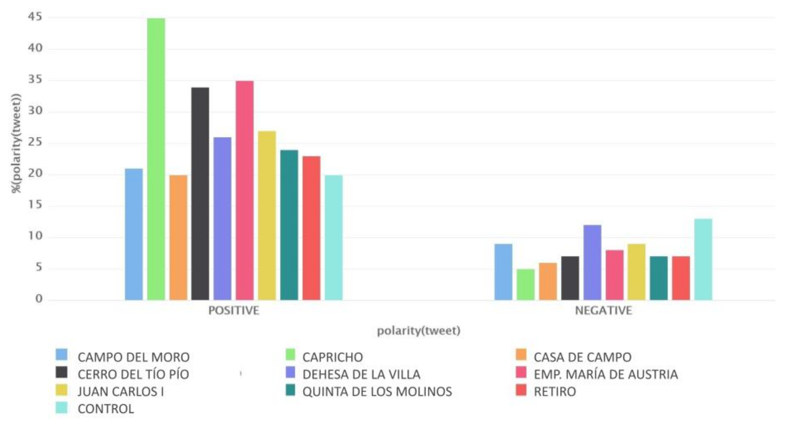
Figure 3 shows the distribution of tweets labeled with sentiments per urban park, considering two categories: positive (P and P+) and negative (N and N+). The urban park with the most positive tweets was El Capricho, which had the highest percentage of positive tweets (45%) and only 5% negative ones. This difference in sentiment can be explained because it is a romantic historical park with restricted access and is open only on weekends. Bertrand et al. [
8] reported that sentiment is generally more positive during the weekend.
Another interesting insight is that urban parks in the city’s southern districts express a more positive sentiment. In particular, we refer to parks Cerro del Tío Pío and Emperatriz María de Austria, whose positive sentiment was 34% and 35%, respectively. However, the number of negative tweets was similar for all parks.
The most negative tweets were found in the Dehesa de la Villa park. However, with 12% negative sentiment tweets, it cannot be concluded that users express more pessimistic views in this park, as it is still a relatively low percentage compared to that of positive ones, which was 26% in this case.
Lastly, the last column of
Figure 3 shows that the control dataset did not stand out because of its number of positive tweets, but it did with the negative ones. Indeed, it was the dataset with the most negative tweets, at 13%.
The second analysis that we carried out aimed to determine if there were differences in the sentiment expressed in urban and national parks. In the Madrid region, there is only one national park, Guadarrama.
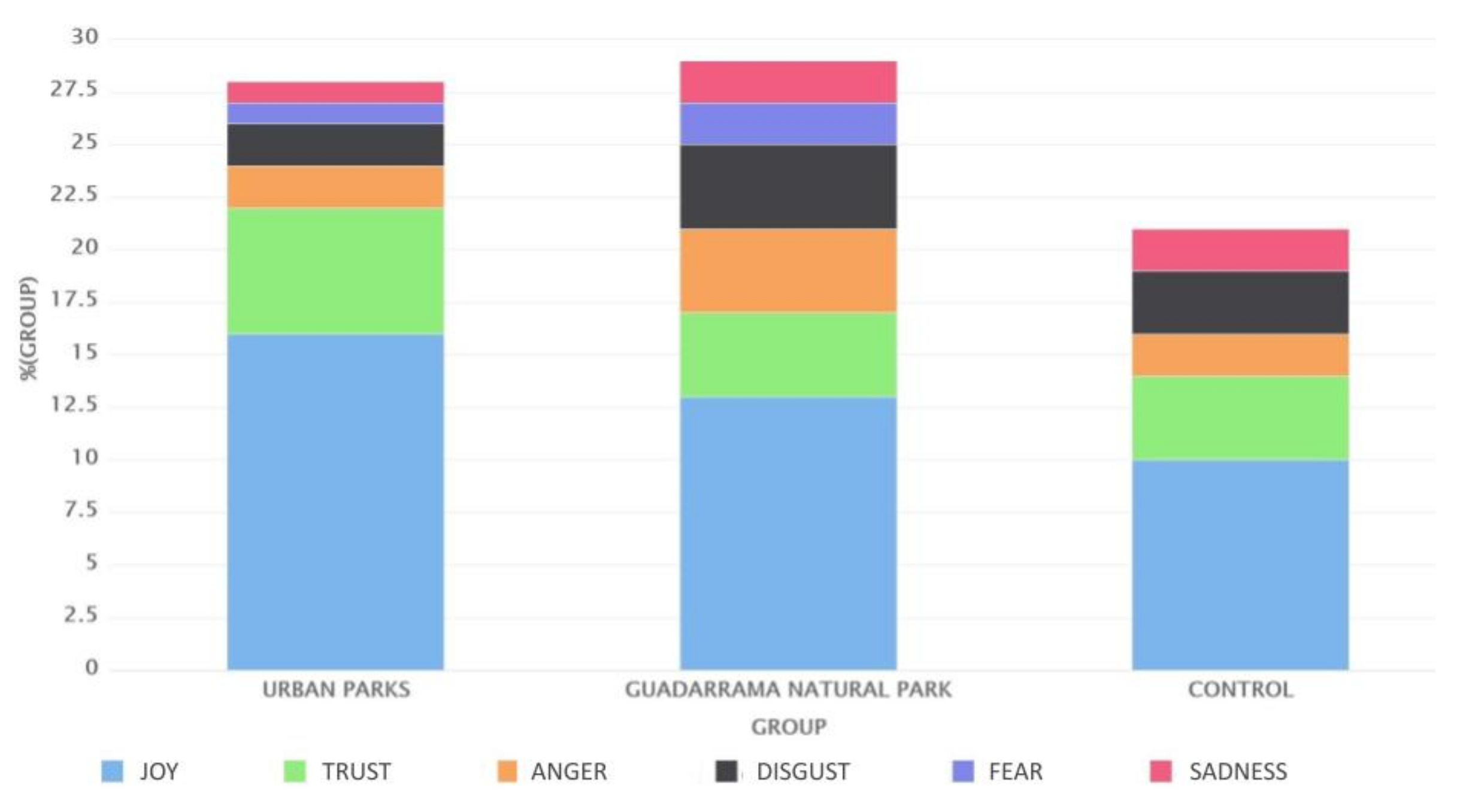
Figure 4 shows the sentiment distribution for urban parks, national parks, and the control dataset, and there was a significant difference. While Guadarrama National Park had the same distribution of positive and negative tweets, urban parks had three times more positive tweets.
In the case of Guadarrama National Park, the negative tweets were almost equal in percentage to the positive ones, unlike in the case of urban parks, where the positive sentiment tweets were more than triple those of negative sentiment. In this case study, we could conclude that people tweet more positively in urban parks than in natural parks.
A large number of tweets were marked as NONE. If we investigate this category more, we find that most of them were photographs or links to Instagram, as mentioned before, which also suggests that something was photographed and posted. However, this happens only in the case of parks. As shown in
Table 4, the percentage of tweets with these characteristics was much higher in the case of parks. This shows that people change their behavior in places with more nature.
We can find a significant difference between the number of posted photos considering whether people were in a park or not. The number of photographs in urban parks was more than double that in the city. Practically all tweets without sentimentin the parks were because they were photographs, unlike the control dataset where tweets with sentiment “NONE” were much more varied. It is clear that, in the parks, more photos were posted.
In the rest of this section, we analyze whether significant differences exist between the collected datasets. To this end, we use the nonparametric Kruskal–Wallis test [
19] to determine if the groups originated from the same distribution.
Table 5 shows the rank assigned to the different polarities before applying the test.
We conducted the nonparametric Kruskal–Wallis test.
Table 6 shows the results of the
p-value for the Kruskal–Wallis hypothesis test (H value), which tests the hypothesis that the medians of k groups are statistically equal. On the basis of these results, we can reject the null hypothesis, and affirm that the three datasets originated from different distributions.
4.3. Emotion Analysis
In this section, we complement the previous sentiment analysis with an emotion analysis. For this, the tweets were labeled with emotions on the basis of Plutchik’s wheel of emotions [
20]. This model considers eight primary bipolar emotions: anger, anticipation, disgust, fear, joy, sadness, surprise, and trust. This analysis was carried out, as in the previous analysis, using MeaningCloud and RapidMiner. In this case, we used the API of Deep Categorization.
Table 7 shows some examples of labeling.
Our hypothesis was that positive emotions are the most common in the tweets in green areas. This would be consistent with the predominance of a positive polarity of tweets in green areas. According to Plutchik’s model, joy and trust are positive emotions, while anger, disgust, fear, and sadness are negative. In contrast, anticipation and surprise emotions can be both positive and negative. Since anticipation and surprise had hardly any representation in the datasets, we excluded them from our analysis.
In emotion analysis, tweets whose sentiment was NONE or NEUTRAL did not return any results in any of the eight emotion tests carried out, which is why the number of analyzed tweets obtained in this section is much lower. A tweet could be annotated with more than one emotion. For example, a message may simultaneously show joy and surprise.
Tweets that contain photographs were discarded, which, even knowing that they were not going to have feelings or emotions, were present in the sentiment analysis for the reasons that we explained earlier.
As previously, we added the control dataset to the study to compare the results between green areas and urban environments.
Figure 5 shows the results with a stacked bar chart that allowed for us to appreciate the percentages of tweets that each emotion had, and whether some areas had more of one or the other. Positive emotions were placed at the bottom of the columns, so that the comparison between positive and negative emotions could be better understood and be able to easily add those that were of the same polarity.
The obtained results are consistent with those of sentiment analysis. Once again, El Capricho Park is where people tweeted the happiest. The emotions of joy and trust had their maximum there, this also being one of the parks with the least negative emotions. The 45% of the total tweets were of a positive emotion versus just 4% of negative, which represents a relevant difference.
The same differences also occurred with the parks in the south of the city. The Cerro del Tío Pío and Emperatriz María de Austria parks were the other two parks with the most positive emotions. Therefore, it is clear that people in this area of Madrid tweet more happily than others. Here, 28% and 33% of the tweets were of a positive emotion, respectively, which, compared to other parks on the graph, was a substantial difference. On the other hand, we found the most negative tweets in the Casa de Campo park. Here, positive tweets had almost the same representation as that of negative ones, with 14% and 11%, respectively.
Furthermore, the control dataset had a large number of negative emotion tweets. This confirmed the results obtained in sentiment analysis that showed that, compared to urban parks, this dataset had more negative tweets than the others did.
Once again, we compared the urban parks of Madrid with the natural park located in this community, Guadarrama National Park. As shown in
Figure 6, the urban parks’ positive emotions were more intense. In urban parks, there were 22% of positive emotion tweets compared to 5% of negative ones. On the other hand, the natural park had 17% positive emotions, and 12% negative emotions. As in sentiment analysis, the difference between positives and negatives was very small compared to that in urban parks. Lastly, it is once again clear that people tweet differently depending on where they do it, and that there are areas that are more positive than others.
4.4. Topic Analysis
In this section, we analyze the topics expressed in the tweets in the Madrid parks. For this purpose, the analysis was carried out using MeaningCloud’s Topics Extraction API, executed in RapidMiner.
Figure 7 shows the results of the analysis in urban parks.
At first glance, some topics clearly stand out from others and represent a large part of the dataset. To begin with, we look at the topic of home and garden. This topic had a good percentage in most datasets; however, there was no trace of it in the control data set. Therefore, being in an urban park not only means that the user is in nature, but it also reflects it in their tweets. On average, in the urban parks in Madrid, this topic represents around 7% of the tweets, while in the control dataset, it barely had a representation.
A similar case occurred with the topic of healthy living. This topic represented only 1% of the tweets in the control dataset, while it represented almost 8% in almost all urban parks. This makes us think that people associate parks with a healthy lifestyle. However, there is an exception: there were two parks in which this topic was hardly mentioned: the Campo del Moro and Retiro parks. In these two parks, the most popular topic was “travel”. This fact can be easily interpreted, as these two parks are central and touristic.
In many parks, the sports topic predominated. There was almost no representation of this topic in the parks that we previously called touristic, and in El Capricho park in which, since it is a restricted-entry park, sports are not the most common. Regarding the topic of books and literature, according to the obtained percentages, the Quinta de Los Molinos and Retiro parks are where people go to read the most or at least where they talk about reading the most.
Unsurprisingly, the only generalized topic, no matter where the user was, was news and politics. This topic was at similar percentages in all datasets, and all of them had a considerable representation. We found the same in analysis at the national level.
Lastly, we focused on the control dataset, which looks different from the rest of the datasets on the graph. Apart from having a much larger variety of topics, those that predominated were very different from those of urban parks. Topics such as medical health, education, careers, food, and drink are some of those in the control dataset that hardly had any representation in the parks. It is clear that each dataset is different, and that many factors can determine the appearance of some topics. However, similarities can be found among them, and this is why some results are obtained and not others.
Now, we compare the average of the urban parks with that of the Guadarrama National Park.
Figure 8 shows this comparison with a similar graph, where we introduce the topics present in a representative number of tweets from at least one of the two groups.
There was a greater variety of topics in natural parks, with the most representative here being News and politics with a 10%, once again being the most common topic in Spain. This was closely followed by the topic of sports, with 9% here, and 7% on average in urban parks; this is the topic with the most significant presence in general. It is clear that sports practice is common in parks, and that users also share it on Twitter. Topics such as healthy living or home and garden were present in both as expected, since they are typical of natural environments. The others were less represented and varied depending on the dataset. Regarding the control dataset, the topic of home and garden related to green areas was not relevant, as expected. In contrast, we saw other topics with more relevance, such as food and drink, news and politics, events and attractions, and medical health.


