Bass always considered design as a toolkit of principles, recommendations, and experiences to consult for approaching specific visual, functional, and communicative requirements. As stated by Pat Kirkham, for Bass, design was a “problem-solving process” that provided him with different aesthetic solutions for answering the different characteristics of the films on which he had to work, that were as different as the title sequences he designed for them [
2] (p. 109). Nevertheless, in his copious production, it is possible to detect some recurrences that—in addition to guaranteeing the recognizable authorship—emphasize the modernist origins of his design method and graphic choices. In this section, the modernist roots and connections of Bass’s work will be tracked down through the identification of some recurring visual and narrative elements and where they can be distinctly recognized. The three visual features identified as fil-rouge in many of his title sequences concern: (i) the use of abstract, decomposed, and often disturbing anatomies; (ii) the preference for basic but dynamic geometric shapes and flat colours; and (iii) the typography, a narrative, and aesthetic devices of great importance and treated with an innovative approach. As emblematic case studies in which it is possible to identify the original and innovative treatment of these elements, the openings of the films
Anatomy of a Murder (1959, dir. Otto Preminger),
The Seven Year Itch (1955, dir. Billy Wilder), and
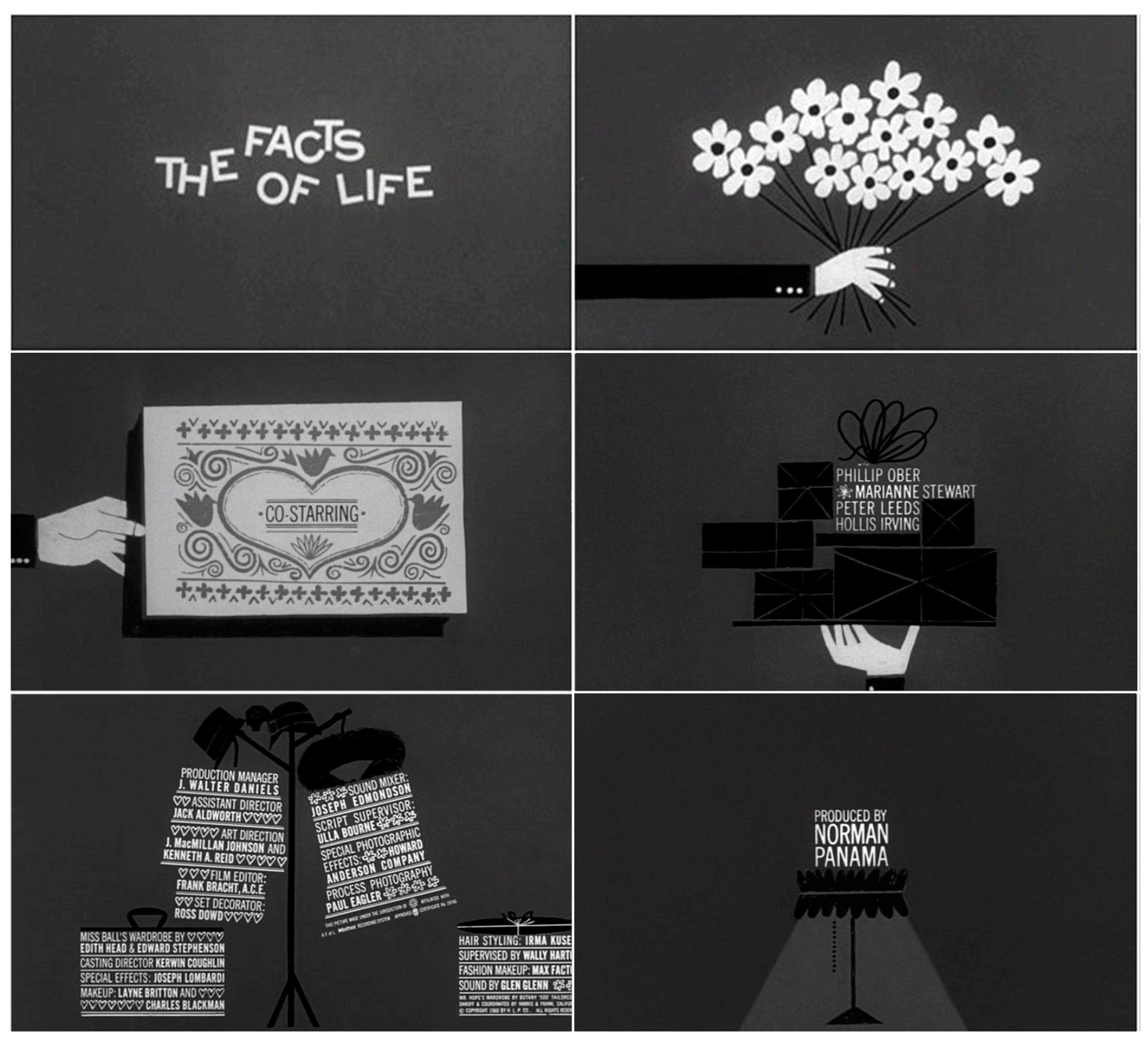
The Facts of Life (1960, dir. Melvyn Frank) have been selected.
3.1. “Anatomy of a Murder” and the Abstract Fragmented Bodies
Bass had a clear fascination with body parts which frequently appear in his designs and film openings. This approach echoes earlier experiments from the Bauhaus, where artists also abstracted bodies—particularly hands—for both artistic and advertising purposes [
13]. For example, Hannes Meyer’s 1929 back cover of the Bauhaus brochure “junge menschen kommt ans bauhaus!” (Young People: Come to the Bauhaus) features a disembodied hand that “encapsulated the Bauhaus educational model, which focused on hands-on workshops where students could actively experiment in conjunction with their teachers” [
4] (p. 193) (
Figure 1). Similarly, Moholy-Nagy’s photo of a hand gripping a paintbrush reinforces this metaphor. The picture, shot by Lucia Moholy-Nagy, indeed portrays the hand as a functional tool that embodies the artist and his craft [
14].
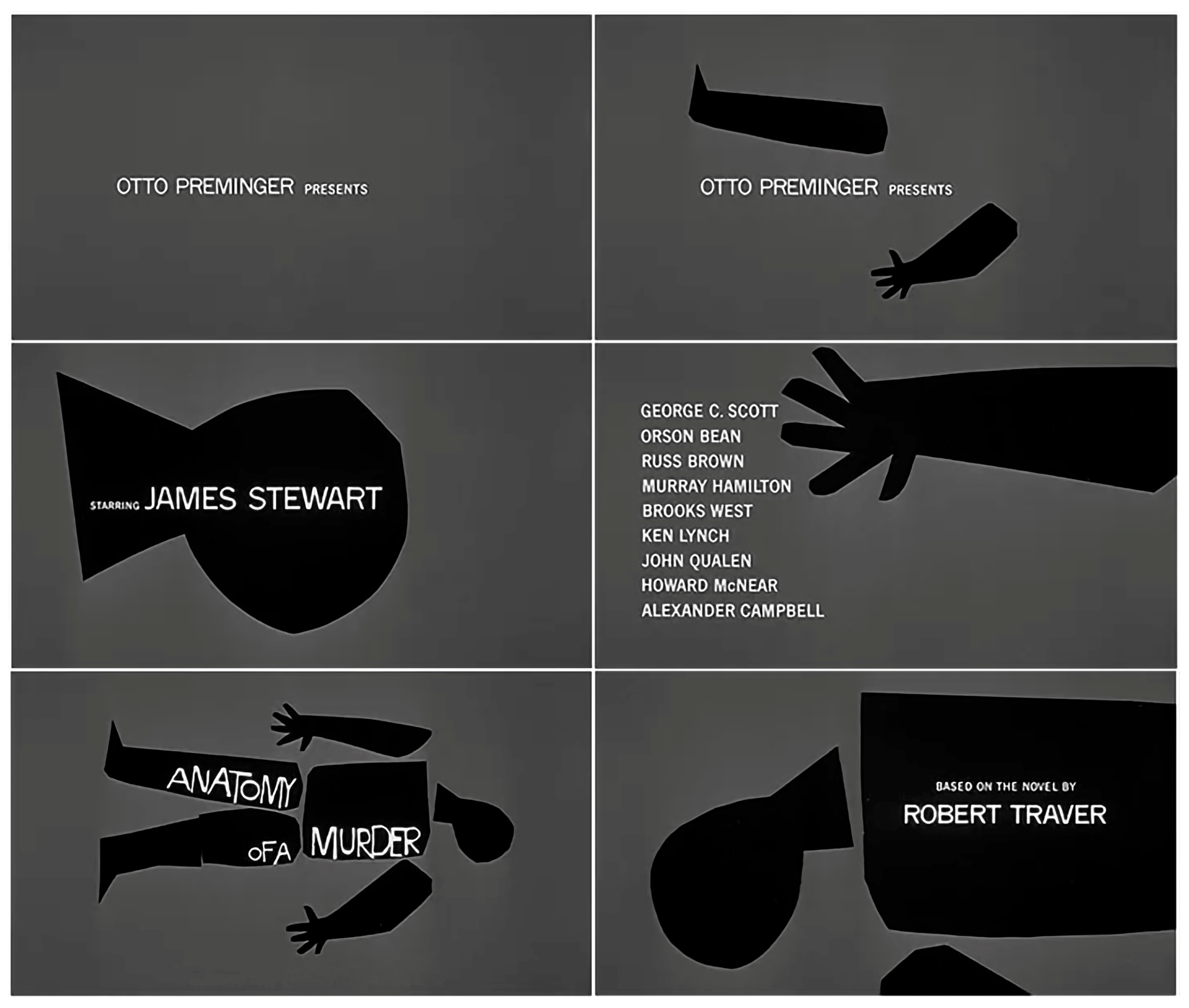
Images of disassembled body parts appear throughout many of Bass’s openings, and this is especially prominent in the title sequence for the 1959 crime drama
Anatomy of a Murder (1959), one of the most iconic of American cinema for its synthetic, expressive, and conceptual strength [
4]. In this opening, Bass transforms the film’s title into a striking visual metaphor by introducing the production team names alongside fragmented body parts, as though assembling a puzzle [
15]. The sequence begins with the full silhouette representing director Otto Preminger, which is then disassembled into isolated limbs and shapes. The sequence is created with simple black paper cutouts on a flat grey background (
Figure 2), without relying on advanced technology. Narratively, the sequence mirrors the film’s core tension: just as the human body is dissected visually, so is the law case at the heart of the story, with facts and testimonies broken down and scrutinized in the courtroom [
2] (p. 131). Bass’s deliberately crude, almost “primitive” aesthetic—with uneven hand-cut shapes and irregular hand lettering—underscores the theme of tension, uncertainty, murder, and dehumanization [
2].
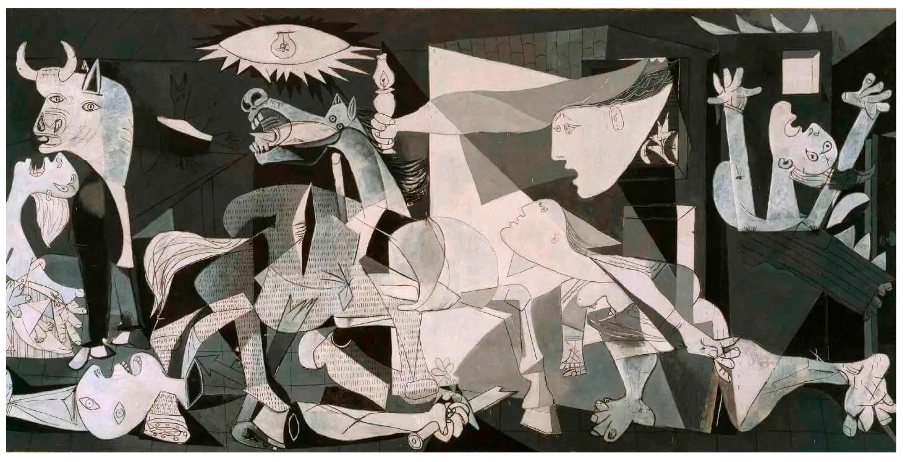
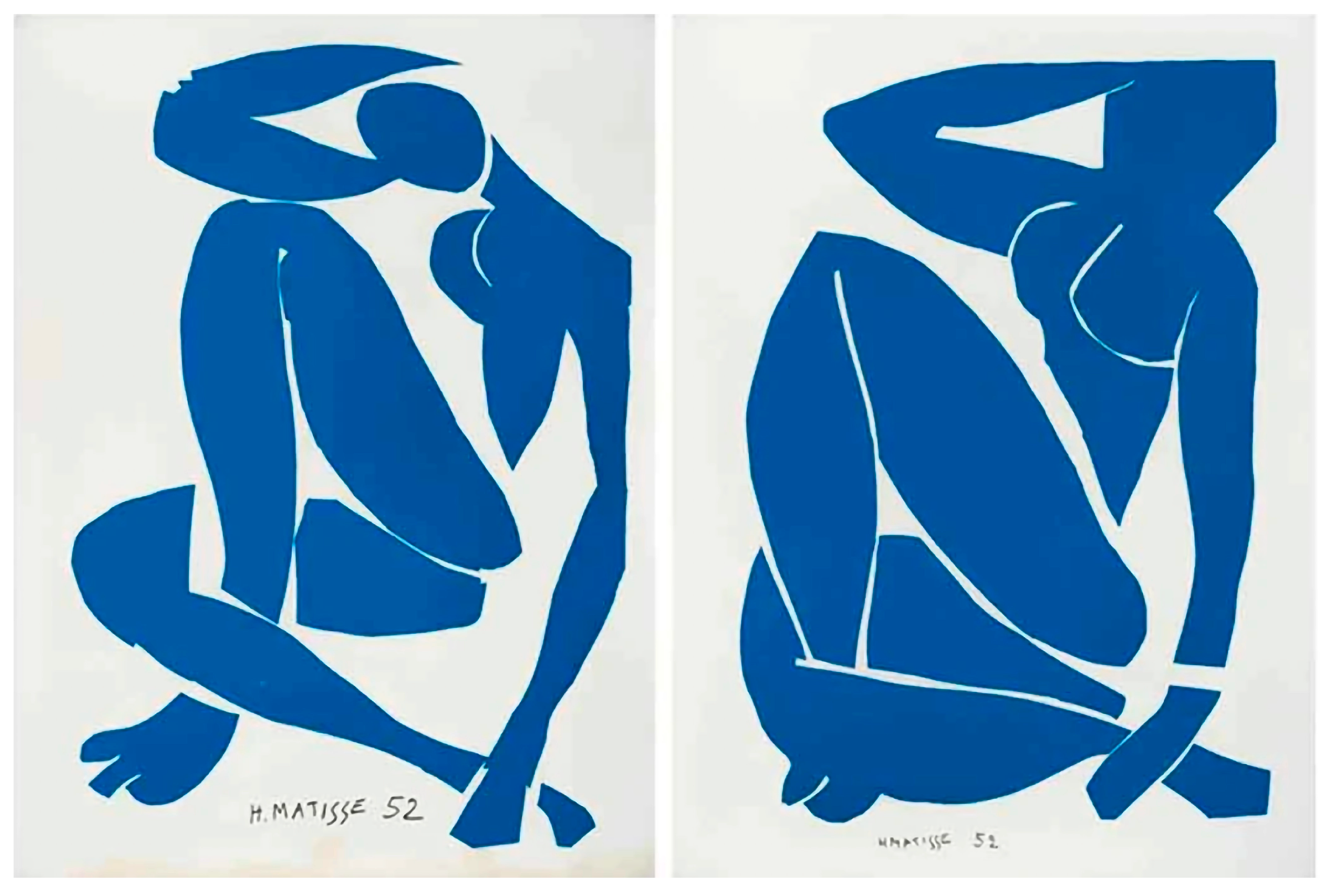
Both the aesthetic and narrative choices suggest some touchpoints between this sequence and two famous twentieth-century works of art: Pablo Picasso’s
Guernica (1937) (
Figure 3) and Henri Matisse’s
Blue Nude III e IV (1952) (
Figure 4). From the point of view of visual language, all three works stage a figurative abstraction: the body is simplified, reduced to elementary forms, but maintains a very strong expressive charge [
16]. In
Anatomy of a Murder (1959), the human figure is reduced to black silhouettes, cut out, and assembled in animation like fragments of paper. A technique that recalls the two-dimensionality of Matisse’s collages, particularly his Blue Nudes, made with coloured paper cut out and glued together. Matisse also works on the reduction of the human figure to a sign: the body is dismantled and recomposed to pure, soft, and abstract forms [
17]. However, where Matisse seeks harmony, contemplation, and calm, Bass introduces a narrative tension that accompanies the viewer towards the heart of the drama, which in some way recalls the tragic and political value of the fragmentation of the bodies in Picasso’s
Guernica. Picasso deforms and decomposes the figures, creating an iconography of pain and destruction and a metaphor for historical violence [
18]. In this sense, Bass’s opening can also be read as a visual representation of the disintegration of identity and truth: what is dismantled before the eyes of the viewer is not just a body, but a court case to be reconstructed [
2]. The use of colour intensifies this dichotomous interpretation:
Anatomy of a Murder (1959) presents a sharp contrast between black and grey, a choice that recalls the monochrome of Guernica, made in shades of grey to amplify the dramatic charge of the visual story. On the contrary, Blue Nude is characterized by a saturated and vibrant colour (cobalt blue), which Matisse uses to create an effect of visual and spiritual lightness [
17]. The visual composition also contributes to this contrast:
Guernica has a chaotic structure, full of internal tension [
18], while
Blue Nudes present a stable and balanced composition. In Bass’s sequence, the arrangement of the body parts occurs according to a sequential, temporal logic and a rhythm that expands the viewer’s sensorial experience, thus managing to mediate between these two polarities: his visual grid is ordered but progressively destabilized by fragmentation.
This comparison must naturally consider that the three works respond to very different needs. Anatomy of a Murder is a work designed for the cinema; it has the function of introducing the tone of the film, suggesting its themes, and predisposing the viewer. Guernica is a work of political denunciation, conceived as a visual monument against war. Blue Nude series is part of Matisse’s formal and spiritual research during the years of his illness: it does not have a narrative or social function but is the product of a poetic reflection on form and colour. However, what these three works have in common is the fact that they treat the human body as a territory of symbolic representation through fragmentation and abstraction which, despite the inevitable formal simplification, make it a powerful communication tool.
As mentioned, the
Anatomy of a Murder (1959) title sequence is not the only one in which Bass has disassembled human anatomical parts using them as visual and narrative tools. Some titles that are worth remembering for having referred to similar imagery are: the opening of the film
Saint Joan (1957, dir. Otto Preminger) for which Bass used the image of a broken body of a woman “who in life battled conventional ideas of femininity” [
2] (p. 125); in the opening of the film
Exodus (1960, dir. Otto Preminger) abstract fighting hands “symbolize the struggle of the Jewish people to establish their own land” [
2] (p. 140); and the opening for
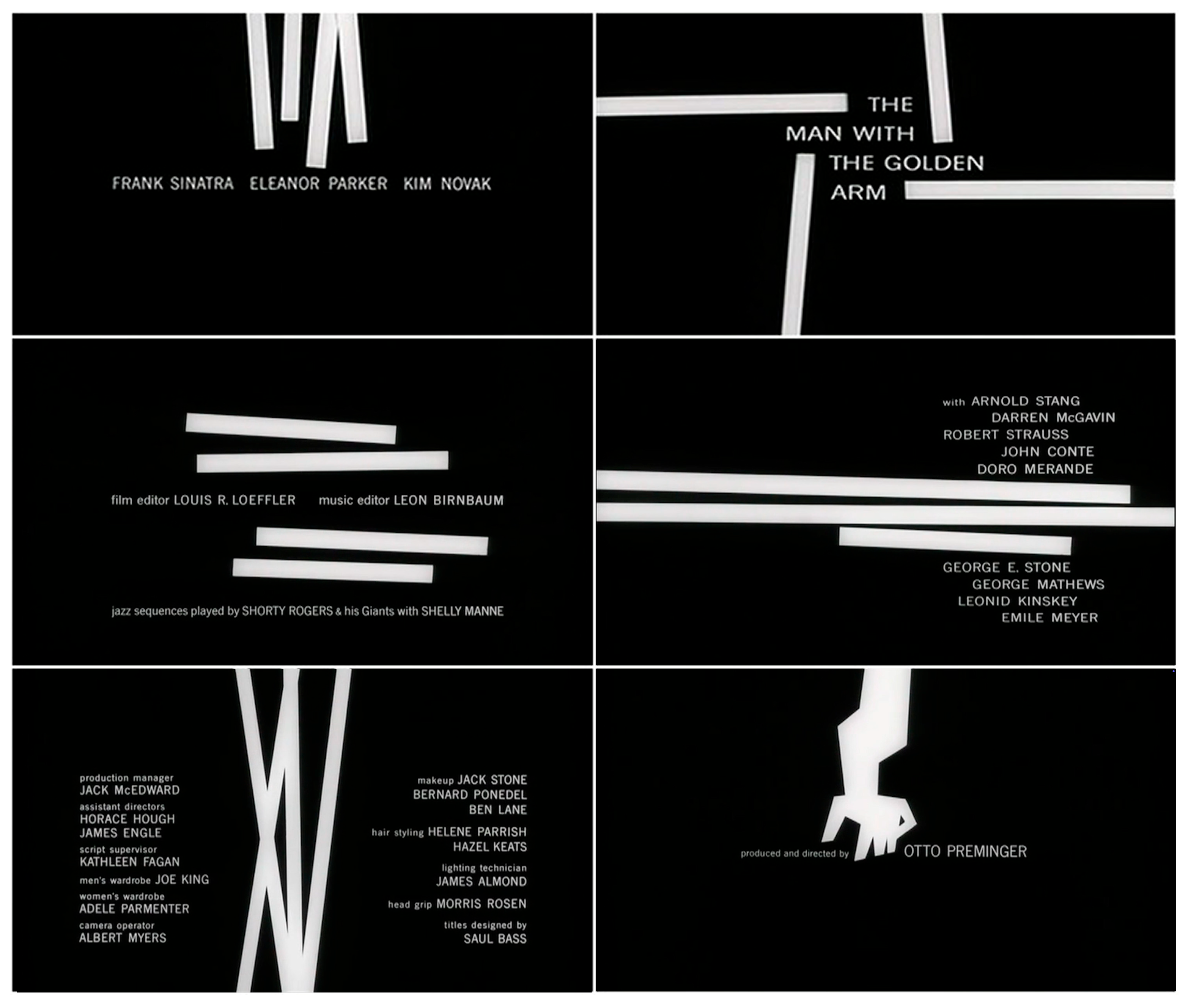
The Man with the Golden Arm (1955, dir. Otto Preminger) for which Bass created the image of a disjointed and disfigured arm that “has the appearance […] of being transformed into something else, just as [the protagonist] in the film is transformed by his addiction” [
2] (p. 116). These recurring images of bodily fragmentation in Bass’s work can be interpreted not just as formal experiments, but as deeply tied to the thematic content of the films themselves. The broken body becomes a metaphor for internal and external conflict—social, psychological, or existential. In
Anatomy of a Murder (1959), as argued above, the literal dissection of a human figure aligns with the narrative dissection of truth in a courtroom, where facts, motives, and identities are examined in pieces. Similarly, in
Saint Joan (1957), the fractured female form echoes both the physical violence inflicted on Joan of Arc and the symbolic shattering of normative gender roles. In
Exodus (1960), the fighting hands embody both collective resistance and personal sacrifice, while in
The Man with the Golden Arm (1955), the mutilated limb visualizes the distortion of self through addiction. All these dismembered bodies serve as powerful visual devices that externalize inner ruptures or historical trauma. they successfully anticipate and condense the film’s emotional stakes into a few evocative, memorable shapes.
3.2. The Geometric Language of “The Seven Year Itch” Opening Title
The opening title of the film
The Seven Year Itch (1955) represents one of the clearest examples of the transposition of the geometric and rigorous language of the artistic avant-gardes into the medium of commercial cinema. In this sequence, Bass animates coloured rectangles and squares that appear on the screen following the rhythm of a jazz soundtrack, composing a modular graphic surface (
Figure 5). This visual grammar resonates deeply with two fundamental models of early twentieth-century art: Piet Mondrian’s orthogonal and neoplastic compositions (
Figure 6) and Paul Klee’s geometric and pictorial grids, as in the case of the painting
Flora on Sand (1927) [
19] (
Figure 7). Although different approaches, all three artists explore the possibility of simple and modulated shapes to generate complex and suggestive visual meanings.
The most evident aspect that these works have in common is their compositional structure based on pure geometric forms, in particular, squares and rectangles. In Bass’s work, these shapes enter the screen as mobile elements, building a sort of kinetic architecture. Each module seems to respond to an invisible grid that orchestrates the appearance and arrangement of the elements over time [
2] (p. 154). In this sense, the opening works as a moving Mondrian grid, in which each rectangle has a precise but changing compositional weight [
20]. Mondrian’s static compositions, on the other hand, are based on a rigid orthogonal grid that articulates the space according to a mathematical balance, made of either coloured or empty white spaces. In Klee’s work, especially in
Flora on Sand, the grid is irregular, the modules become textures, and the distribution of the shapes follows a more fluctuating logic, almost as if they generate a landscape seen from above [
21]. As suggested by Will Grohmann in the richly illustrated book
Paul Klee (1954), the balanced and apparently effortless distribution of colours suggests a hidden natural structure, evoking the organic way plants might grow across a sandy terrain, thus justifying the title
Flora on Sand [
21].
The use of colour also reveals interesting similarities and differences. Bass uses a lively, warm, and saturated palette (red, yellow, pink, orange, green), typical of the American visual culture of the 1950s [
2]. Klee, on the other hand, develops a more intimate and delicate relationship with colour: in his works, the pigment is spread in glazes and warm, often earthy tones, which evoke a slow time, a silent contemplation [
21]. Mondrian, on the contrary, uses only primary colours (red, blue, yellow), combined with neutral white fields and the black lines of the grid. Bass places himself halfway: he retains Mondrian’s modularity but animates colours that recall Klee’s warmth and sensitivity. According to Jan-Christopher Horak Bass’s colour palette emphasizes the topographic aspiration of Klee’s paintings as
Flora on Sand but mixes it with abstract—and geometric—depiction of American modern city plans as he argues that Bass’s colours are “at some level representational, since the browns, ochres, yellows, and lavenders are reminiscent of the New York City brownstones that are the setting of the film” [
4] (p. 231).
An element that radically distinguishes Bass from the other two artists is naturally the temporal dimension. The opening of
The Seven Year Itch (1955) is a composition in progress, which uses time as an expressive element: the shapes appear, flow, and fit together. This movement is not arbitrary, but choreographed with precision, in direct dialogue with the music, and with the hierarchy of information that appears in the black spaces left by the coloured shapes. Bass borrows the balance, clarity, and synthesis of the above-mentioned visual experiences, but translates them into a grammar of time, where graphics, rhythm, and colour merge to create a visual moment that is not only decorative but also semantic and performative [
19]. The use of elementary geometries that create meaning through kinetic, chromatic, compositional and dimensional characteristics is another element that can be tracked down in numerous works by Bass, including the title sequences of the film
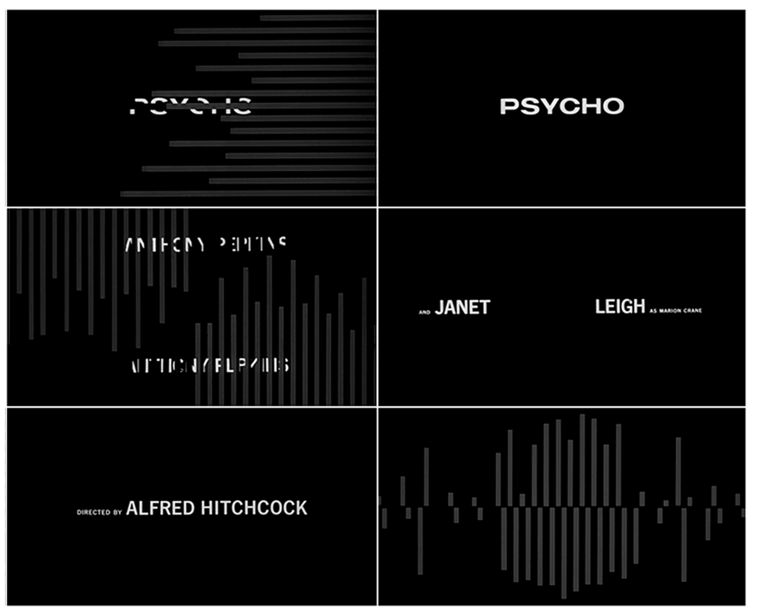
Psycho (1960, dir. Alfred Hitchcock) in which simple bars of equal weight but different heights slide onto the screen in various patterns and oppositions [
2] (p. 183), and again in
The Man with the Golden Arm (1955) in which white bars appear against a black background, disappear and “form abstract patterns before finally coalescing into the film’s symbol.” [
22].
3.3. “The Facts of Life” and the Typography as Active Ingredient
The typographic element in Bass’s works has an unmistakable appeal since it takes up and surpasses the principles of balance, harmony, and contrast derived from the theories and experiments of the Bauhaus [
4] (p. 94), guaranteeing a strong visual impact on the public. In thirty-seven out of fifty-three designed title sequences, Bass uses sans serif type, a typical choice of the International Style, but manually alters the morphology of his letters. His letters are imperfect, “look scrawled, like writing on a blackboard or graffiti on a brick wall, [as they are] written by his own hand” [
4] (p. 97). Bass therefore distances himself from the Bauhaus model, which aimed to suppress individual expression in favour of a mechanical and rigorous aesthetic, and recalls the role of typography as a narrative device not only for its meaning but also for its morphological features, as claimed by the futurists and the protagonists of the typographic revolution in the 1920s, Jan Tschichold, László Moholy-Nagy, Filippo Tommaso Marinetti, and El Lissitzky, pioneers of “the promotion of a more aesthetic approach to typography” [
23]. In
North by Northwest (1959, dir. Alfred Hitchcock), for instance, Bass uses kinetic typography integrated into a grid of converging lines, aligning the movement of the credits with the reflective façade of the C.I.T. Building in Manhattan, where the film is set [
24]. In the opening of
The Man with the Golden Arm (1955), Bass introduces rough, asymmetrical typography that mirrors the fragmented psyche of the main character [
2] (p. 116). In
Not with My Wife, You Don’t! (1966, dir. Norman Panama) title sequence, the typographic element is playful, colourful, and animated in sync with cartoonish visuals, embracing a comic and irreverent tone that reflects the film’s absurd story. In the opening of
It’s a Mad Mad Mad Mad World (1963, dir. Stanley Kramer) typography is integrated into a sequence of stylized animated gags, participating in the graphic composition by taking on the role of the character [
25]. In the openings of these and many other films the originality of the treatment of the letters, always different from each other, never symmetrical, and without serifs, seems to recall the morphological aspirations typical of calligrammatic writing, referring to the poetic practice typical of the avant-garde movements, also called visual poetry, concrete poetry, or experimental poetry, in which the text is laid out so that its visual form reflects or symbolizes the content it conveys [
26,
27].
The opening title of
The Facts of Life (1960) explicitly manifests this intent. The animated sequence uses dynamic letters to compose not only the words of the title and the names of the actors and the production team, but a real visual dramaturgy made of objects, bodies, and symbolic interactions performed by the text, often at the expense of readability (
Figure 8). As stated by Pat Kirkham [
2] (p. 188), the sequence begins:
with gifts of flowers; with candy which reveals the names of actors in the bottom of the paper wrapper when the candy is removed; gifts, one of which is composed of credits. Eventually our two-some progress to a friendly drink, the ice cubes of which are credits; a typographically jewelled necklace is proffered; cigarettes are smoked leaving typographic ashes; […] typographic coats are hung.
And finally, the name of the title sequence designer is engraved on a rotating disc, probably a reference to the soundtrack with the voices of Steve Lawrence and Eydie Gorme that holds together the various images of the sequence like a pearl necklace. Bass thus makes the form of the word speak as much as its content in a dynamic way, adapting to the rapidity of the transitions typical of the animated medium.
Figure 8.
Still frame composition from The facts of Life title sequence by Saul Bass, 1960.
Figure 8.
Still frame composition from The facts of Life title sequence by Saul Bass, 1960.
In the context of modernist experiments, a similar strategy can be found in the typographic compositions of Bass’s indirect teacher László Moholy-Nagy. In the essay
The New Typography of 1923, Moholy-Nagy suggests taking advantage of the “elasticity, variability, [and] freshness” of the text and freeing it from the cultural and compositional constructs that impose a mainly functional and rigid use of the typography [
28]. Moholy-Nagy typography, and so Bass’s, works in combination with illustration, photography, and hypothetically any other “device of civilization” [
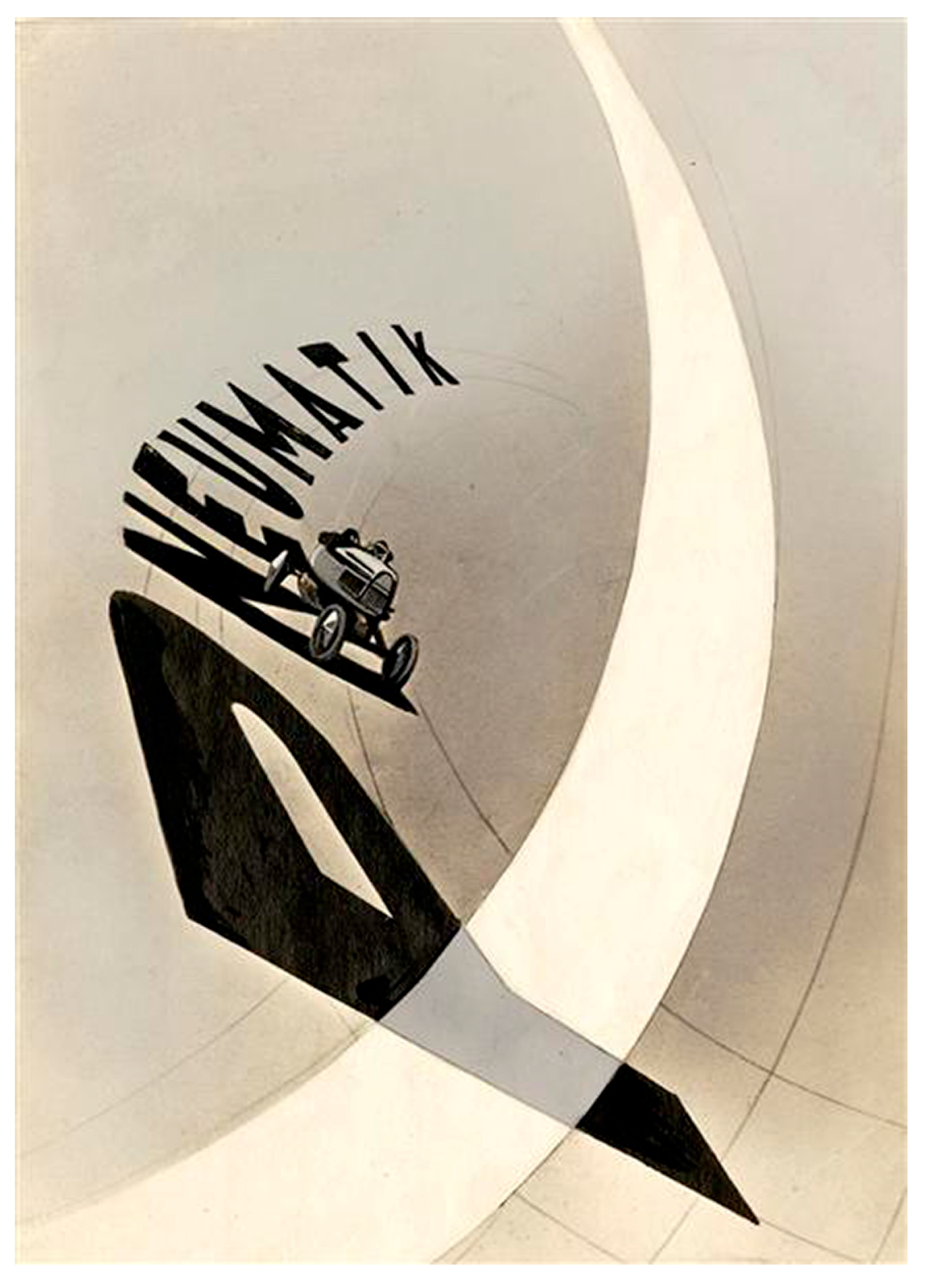
28]. This new graphic design process is clearly recognizable in the poster ‘Pneumatik’ that he designed in 1924. The poster features a photograph of a car driving along a track formed by the letters of the word ‘Pneumatik’ (
Figure 9), highlighting the typographic element’s plasticity, which in this case is exploited for product advertising purposes [
23]. In the dynamic typographic composition Moholy-Nagy experiments with letters, words, and graphic forms and arranges them along diagonal, curved, and perspective trajectories, suggesting movement and elasticity. From Moholy-Nagy to Kepes, Bass inherited the use of typography as a dynamic compositional component in dialogue with the other elements and applies the same principles systematically to motion design, where each part is at the service of narrative communication. Like Moholy-Nagy, therefore, Bass’s text seems to move in the space of the page like an active image [
28]. If the traditional calligram acts in the two-dimensional space of the page and in a contemplative frozen time [
29], both Moholy-Nagy and Bass expand this principle in a dynamic direction. Moholy-Nagy does so in the context of advertising printing, introducing implicit movement thanks to the diagonal arrangement and the tension between typographic elements; Bass, on the other hand, transports these concepts into the cinematographic animation, building a typographic visual choreography that evolves in front of the eyes of the spectator.
