Shiny Dashboard for Monitoring the COVID-19 Pandemic in Spain †


Abstract
:1. Introduction
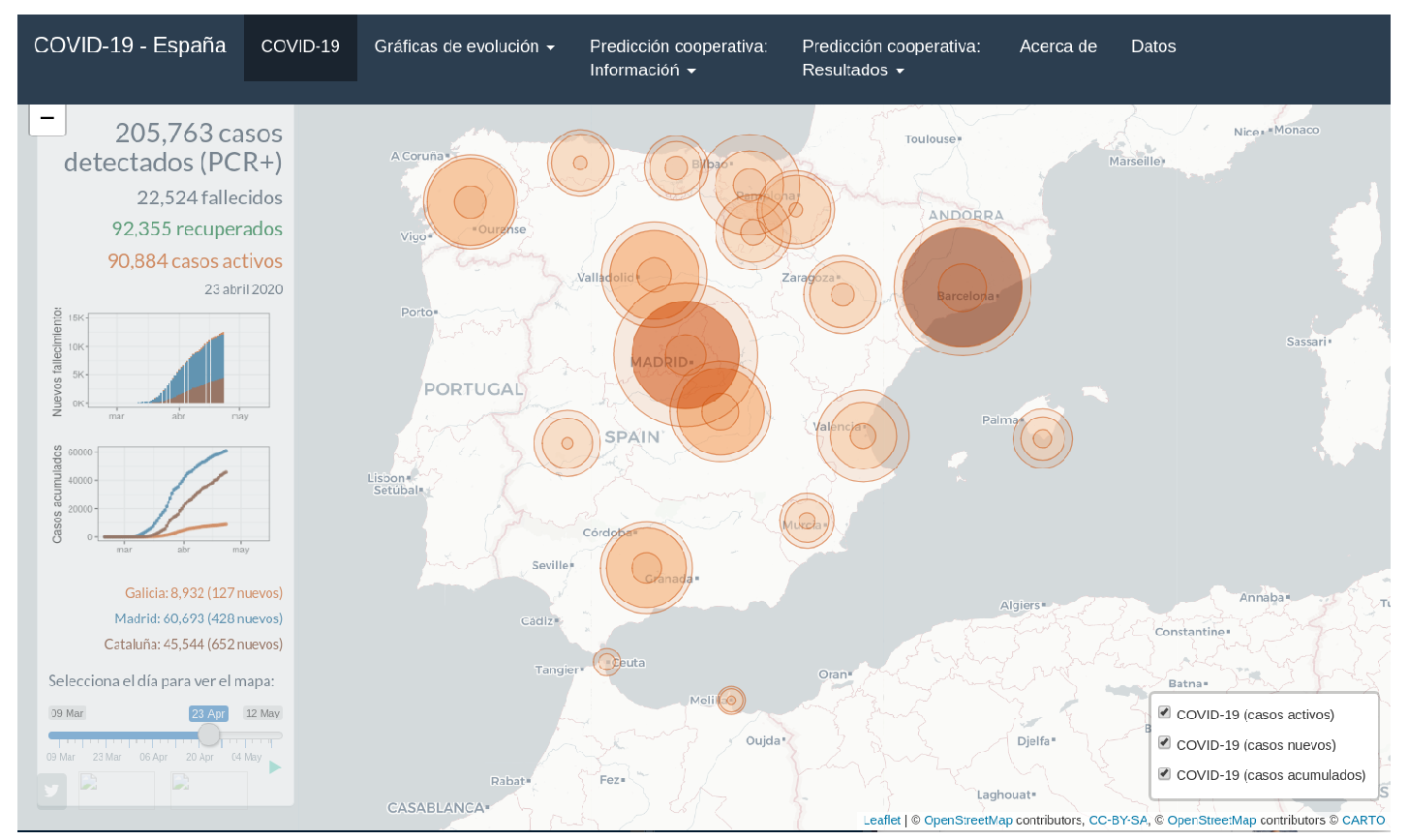
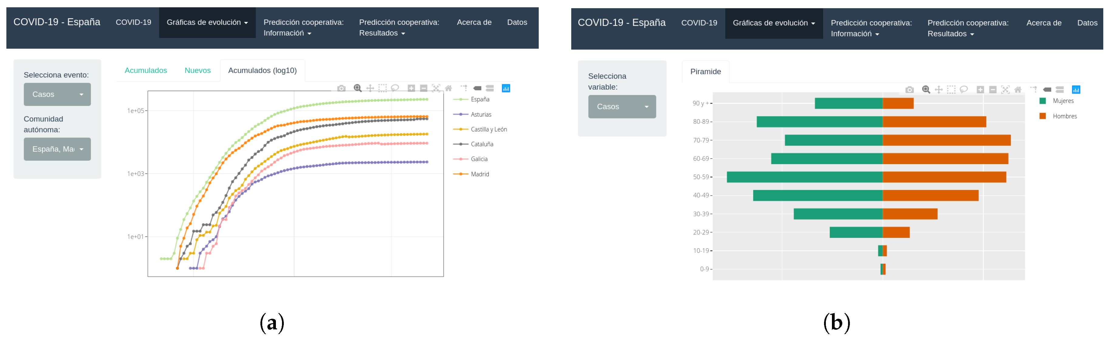
2. Results
3. Conclusions
Funding
Acknowledgments
References
- R Core Team. R: A Language and Environment for Statistical Computing; R Foundation for Statistical Computing: Vienna, Austria, 2020. [Google Scholar]
- Chang, W.; Cheng, J.; Allaire, J.; Xie, Y.; McPherson, J. Shiny: Web Application Framework for R; R Package Version 1.4.0.2; 2020; Available online: https://cran.r-project.org/web/packages/shiny/index.html.
- Wickham, H. Ggplot2: Elegant Graphics for Data Analysis; Springer: New York, NY, USA, 2016. [Google Scholar]
- Sievert, C. Interactive Web-Based Data Visualization with R, Plotly, and Shiny; Chapman and Hall/CRC: London, UK, 2020. [Google Scholar]
Publisher’s Note: MDPI stays neutral with regard to jurisdictional claims in published maps and institutional affiliations. |
© 2020 by the authors. Licensee MDPI, Basel, Switzerland. This article is an open access article distributed under the terms and conditions of the Creative Commons Attribution (CC BY) license (https://creativecommons.org/licenses/by/4.0/).
Share and Cite
Fernandez-Lozano, C.; Cedron, F. Shiny Dashboard for Monitoring the COVID-19 Pandemic in Spain. Proceedings 2020, 54, 23. https://doi.org/10.3390/proceedings2020054023
Fernandez-Lozano C, Cedron F. Shiny Dashboard for Monitoring the COVID-19 Pandemic in Spain. Proceedings. 2020; 54(1):23. https://doi.org/10.3390/proceedings2020054023
Chicago/Turabian StyleFernandez-Lozano, Carlos, and Francisco Cedron. 2020. "Shiny Dashboard for Monitoring the COVID-19 Pandemic in Spain" Proceedings 54, no. 1: 23. https://doi.org/10.3390/proceedings2020054023
APA StyleFernandez-Lozano, C., & Cedron, F. (2020). Shiny Dashboard for Monitoring the COVID-19 Pandemic in Spain. Proceedings, 54(1), 23. https://doi.org/10.3390/proceedings2020054023