1. Introduction
Areas such as tourism and road transport (hereinafter TaRT) employ a greater number of professionals than others by size and staff mobility. This makes them share common requirements: evolution and economic growth, technological scenario, and professional profiles.
Never before have so many sources of data been available, so operating services associated with Data Science is greater than in other sectors. The analyses are usually carried out by non-technological users and, on the contrary, the developments are made from that domain. The problem arises when the visualization has to be oriented to the business domain.
Facilitating the use of Data Science (hereinafter DS) to these professionals is a “gap”. Therefore, it is necessary to know what the user values in visualization and how this challenge has to be addressed. The proposal reflects user preferences to facilitate the tasks of the ICT (Information and Communications Technology) expert.
The proposal puts forward and applies a taxonomy to know user preferences in adaptive visualizations. It is articulated on domain experts and the most valued dimensions are reflected on tools that allow them to be observed. To do this, a series of items are defined and valued in order to check if the dimension that is of interest to address is covered in our approach and, in this way, approach the domain of the user.
2. Contextualization
Normally, users in these areas do not have a high degree of ICT skills, which is usually the case due to factors such as age, previous training, and even lack of vocation.
On the other hand, the management tools used and the disparity of necessary systems make this ecosystem a conglomerate of applications without interconnection in most cases where the concept of single data within the DS does not prevail. On the contrary, the analyses are located in plots causing the data to lose part of its value.
The specific weight of these areas, their maturity, volume of data, and socialization of certain processes make it necessary for them to rely on DS techniques. On the other hand, the variety and origin of the professional profiles and solutions used in conjunction with the age of some systems means that they are not focused on the domain user and their productivity.
Most of these applications have a level of maturity parallel to the sector so that not all technologies used are very current. The migration of these, normally, is being done as is, incurring the same design errors as domain experts are not being used.
This universe of data grows daily with multiple origins and types. Depending on the source consulted, it is estimated that by 2020, we will have zettabytes (billions of terabytes). The proposal presented focuses in part on this universe trying to serve as an example.
The certainty of true and adequate content to the needs of the specific analysis providing it with utility for the user is another of the “gaps” to solve. There are developments that do not contemplate the real needs of the user, the so-called KPI (Key Performance Indicator) or performance indicators. On the contrary, they try to give priority to a demonstration of technical qualities of the developer. Almost daily we see graphics that need an additional effort for their understanding because they focus on artifice and spectacularity rather than on user understanding.
The developments made by people in the field of ICTs are not close to the domain and user experience, so concepts such as utility of data, friendliness, or usability do not prevail. This is why it is important to focus the proposal on the ICT and Business domain experts.
Within the proposal, the data sources are grouped into:
In the context of tourism and transport, there is an increasing interest in data visualization, mainly because of its potential for the analysis and exploration of large data sets.
Chareyron, Da-Rugna, and Raimbault [
1] propose to use geographic visualizations to detect atypical tourist behaviors, using as a source geopositioning information from social network sites (Flickr, Instagram, and Panoramio). The authors also propose the use of node-link graphs to characterize and figure out review sites from users’ communities, such as Tripadvisor. Another type of visualization that can be used to visually summarize hotel reviews are word clouds by Leal et al. [
2]. In the work of Girardin et al. [
3], the authors also use geovisualizations of the movements of tourists, not only from geopositioned data of photos in social networks but also from the location of the phone calls.
Empirical evaluation of user interfaces is not simple, Lieberman [
4], and in the particular case of data visualizations it is even more complex, North [
5], Ellis, Dix [
6]; Elmqvist and Yi, [
7]. That is why it is so important to count on evaluation tools, tools specifically designed for the context, domain, and specific users of the visualizations.
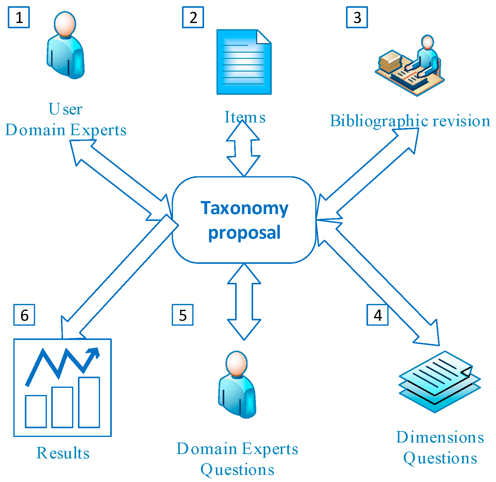
3. Methodology
First, the items to be included are discussed with users of the visualizations in the domain according to usage needs. Second, the bibliographic review of the items is approached to define the dimensions to be studied. Then, the resulting questions for the items could be facilitated to be understood by the domain experts. Third, they are gathered by dimensions, observing the literature review and compatibility with the different domain and users, so that the necessary comparisons for the evaluation could be made (
Figure 1).
The items are grouped to facilitate the proposal regarding:
Pure visualization which is not dependent on the environment, PCs, mobile, etc.
Focalization on the data analyst ecosystem and its domain.
Related to the interaction with users, either from the point of view of simple interaction, such as adaptation and guidance.
Fourth, the resulting dimensions are exposed to domain experts so that the necessary comparisons can be made as objectively as possible.
The visualization of data and its analysis range from the use of color and understanding by the human being, to the guidance with recommended systems assisted with artificial intelligence.
Thomas and Cook [
8], when defining visual analysis, admit human discovery by combining automated and interactive analysis in visual media. The idea is establishing a combination between human reasoning and computational capacity to develop visualizations with user requirements, analytical problems, and data diversity.
3.1. Dimensions of the Study
Given the wide range of possibilities posed by visualization and observing the needs of domain experts, it focuses on three dimensions and their respective items:
Pure visualization not dependent on the environment, PCs, mobiles, etc.
Focused on the data analyst ecosystem and its domain
User interaction, simple interaction, adaptation, and guidance
We will see the dimensions and items whose justification is outside the scope of this article.
3.2. External Domain Experts
Allowing the user to work visually with data and obtain their own conclusions through their perceptual abilities in the exploration process is the objective of a visual analysis. When the user performs a visual exploration, the first thing he does is approximate with an overview of the data he needs to analyze. Normally, analyzing patterns that are known to later access the details, then involving the user allowing it to rethink working hypotheses, if necessary, without the need for complex algorithms and processes, will make the user more confident in the results.
This is one of the reasons that make it necessary to include domain experts in the development and consumption of visualizations; the more heterogeneous these profiles are, the better.
3.2.1. Selection of Entities
The selected entities had to have: domain experts close to the DS, be representative of the workforce, consumers, and ICT developers, as well as a high digitization component.
SME tourism. sector with internal ICT department
SME ICT Consultant specialized in tourism and with a diversity of clients
Large logistics company with internal ICT department
3.2.2. Selection of Profiles
For a better approach to the proposal, profiles of business experts by area and technology experts where everyone has a university degree and more than 10 years of experience will be functionally equipped.
SME Tourism: Business experts in tourism and technology
SME ICT Consultant: Business Expert in technology and technology
Large Logistics Company. Business and technology expert
3.2.3. Tools Used
Each business sector has specific tools, so, in order to illustrate the taxonomy with reference solutions and use given by experts regardless of their area to objectify the comparison, they were selected:
Human–Human: Social networks (Facebook)
Human–Human: Web behavior (Google Analytics)
Human–Machine: Sensors and mobility (Samsung Health)
4. Taxonomy
The proposal raises items grouped by dimensions and designed to arouse reader restlessness and reflection.
4.1. Esthetic
The visualization has to center and stimulate the conscious perception that takes the user toward the point of interest, Gusky [
9], through sufficiently self-explanatory properties so that its use in the distribution of the dashboard is explicit, Norman [
10].
The visual stimuli received by the brain and their response, independent of the method used or algorithm applied, confirm the correlation between the results obtained and the human characteristic of seeing the central objects, Borji, Tavakoli, Sihite, and Itti [
11].
Regardless of cultural nuances and definitions, there is consensus on the use of color as it should be applied with criteria and not merely ornamental. They have to be easily recognizable and differentiable from each other respecting their associated semantics and preferably in pastel tones, so for this dimension, the following is valued:
4.2. Domain of the Ecosystem
The definition of the mental model by analysts in the specific domain is essential when the user faces the abstractions necessary to perform their analysis that can obtain useful data. It depends on the capabilities of analysts to work with the data universe and design data coupling models necessary for interactive visualization to exist, Thomas and Cook.
The capabilities of the users and their differences for adaptation to a certain environment make adaptive interfaces under study, Conati, Carenini, Toker, and Lallé [
12]. There is usually a consensus in:
What user differences we have to consider for adaptation
How to adapt appropriately to user differences
When to reduce intrusion and adapt to maximize adaptation
The speed of perception, visual and verbal memory of the user
Allowing the user to add tags by choosing words that he can freely select to categorize the information and thus index and group the information by serving as a display recovery interface as a “Tag-Cloud”, one of the most valued requirements (Hassan-Montero and Herrero-Solana, [
13]).
Humans have an order of reading that is more accentuated with visual techniques. These are able to establish the order in which the eye visualizes the elements thus reinforcing the interactions we can make and the different types of visualization. This affects how we understand the content that visual narration wants to convey to us. Therefore, it is important to incorporate the narration into its design, Segel and Heer [
14], and allow users to have annotations in the visualizations to make a narrative in the visualization.
It is important to improve the user experience by keeping them informed and offering information as quickly as possible. Times are important to draw the attention of the user and where the information update is being carried out and, thereby, help as much as possible to their understanding. This dimension includes:
4.3. Interaction
Currently, web systems are replacing desktop systems, favored by cloud environments and 4G and 5G communications, which facilitates interaction and development. For this reason, interfaces that are capable of adapting to the user proactively allow more knowledge about the people who need this information and customize it as a previous step to ubiquitous visualization, Hervas, Bravo [
15].
Conceptual characterization of the guidance regarding the gap that may exist in the knowledge of the users of the visualization domain is addressed in the works of Schulz, Streit, May, and Tominski [
16] and Van Wijk [
17].
The grouping into a single paradigm concept, such as guided, conduction, supervision, and a long list of tasks associated with human–machine interaction, is treated by Schulz et al, who coined the term “guidance” to reference to the concepts of guidance or supervision.
One of the most complete reflections we can find for this paradigm is that of Ceneda et al. [
18]: “Guidance is a computer-assisted process that aims to actively resolve a knowledge gap encountered by users during an interactive visual analytics session”.
Making use of the parallel processing of the vision of the human being and guiding attention to the related location on the screen is one of the trends in visualization that arises under the “pop-out” effect. Ware [
19] proposed a three-level model considering pre-authentic parallel processing as one of the stages of human attention.
Visualizations are usually data-oriented and not users and their differences, Conati, Carenini, Harati, Tocker, Fitzgerald, and Flagg. This is so, given that considerations such as cognitive skills, cognitive load or attention have historically been overlooked in the design of visualizations, even when there are clear studies that relate the differences between users and effective visualizations such as those of Allen or Dillon, [
20]. Then, the following will be discussed:
Guidance system
Adaptive Visualizations
5. Results
Table 1 shows the means of the valuations assigned by the domain experts to the different dimensions. The value of each dimension is scored from 1 to 10, with 10 being the maximum. The rows show the profiles of the companies and the columns the dimensions.
We observe independently from the domain that the interaction of the user with the system is the most valued dimension especially for domain experts since it allows them to be participants in the data analysis. Domain experts on their part value more specific knowledge of the domain. The esthetic is the most valued for technological experts since they are far from the domain problem and are more concerned with pure visualization.
6. Conclusions
The exponential growth and heterogeneity of the data makes it necessary to find their usefulness and transversality with technological experts and TaRT. It is necessary to imply these since systems cannot be migrated directly from one domain to another. Trend that we see reflected in large technological corporations that try to sectorize solutions for market niches.
Among the direct reflections obtained in TaRT with the experts consulted, the most common is to want visualizations with functionalities transverse to office automation tools, so it is recommended for implementations to consider:
Align coding, analysis, and modeling tasks
Visualization has to convey important concepts
Be able to modify the model through interactions
Reinforce reasoning through domain information
Correspondence between decisions during visualization that led to planting
Recovery points to undo the narration
Within TaRT, the DS paradigm needs to take into account adaptive visualization where more and more interactive narrative is necessary as a previous step to ubiquitous visualizations, so it is necessary to consider in an inclusive manner the interaction with the domain expert to contribute with his experience. This will end up being a necessary requirement of any development.

