1. Introduction
In order to be able to put the study briefly in a cultural context and to clarify the link among the purpose and meaning of this work and the main references to what has already been subjected to critical analyzes and readings, it is necessary to subdivide research areas and, in the first approximation, to treat separately texts and images; the method here presented is the summa of experiences, analysis, examples repertoires made during several years and has been object of publications and, in particular, subject of congress speech, sponsored research reports and books where you can find the specific bibliography about the themes here presented [
1,
2].
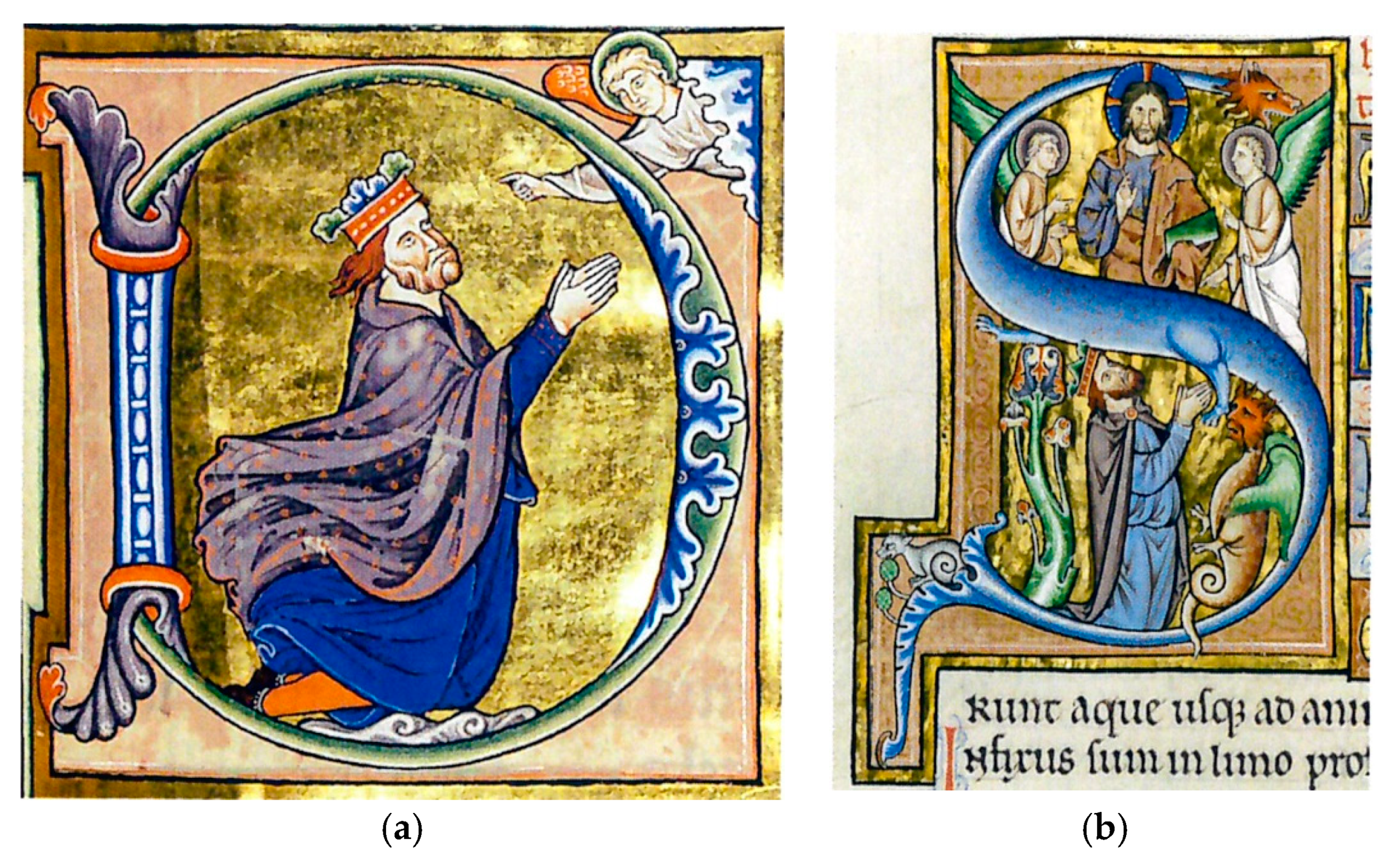
As for the texts, their figurative value is always present, even in the most spontaneous cases of writing, as it is merely a matter of being perceived and visually experienced. This value is emphasized and, therefore, perfectly clear and immediately recognizable, in the aulic forms of transcription even of the past: miniature codes, monograms, autograph transcripts in “calligraphy” are but some of the possible examples we all have as a reference and which are now part of the collective imagination (
Figure 1a,b). Here the text, while retaining its main role as a narrative vehicle, is connoted as a peculiar and significant element of the editorial apparatus, a true perceptive fulcrum for the reader.
However, even in the current practice, there is a clear search for those graphic elements that make the word an ‘image’ and even in this case the story of the representation is full of references: the studies of the possible geometries of the alphabets, as well as the idea of real figured letters well identify this learning strand. Graphics, considered as a discipline generically keeping to designing, representing and communicating for signs, is then continually concerned with achieving written forms (and, consequently, alphabets) that can make the task of reading as easy as possible, up to relate in the projects of the typographic choice and its composition, a ‘medium’ and recipient of communication.
No less incisive and interesting is the role played by the cultural models of the historical period where recurring elements are also found in the typographical design; this is clearly shown by the researches carried out in this field by the avant-gardes, as it is equally relevant, on quite different plans, the economic reflection with the benefits that the designer receives from the design of alphabetical forms that are widely spread, even in the public of not ‘professionals’.
Equally vast and articulated is the reference to images that have a prevalent narrative function that runs out in the image itself and spans within the world of graphics-certainly—but in an equally clear and incisive way in visual art with two-dimensional perception; here a sharp but synthetic discussion is evidently complex, precisely because the areas are so vast and articulated within themselves. Here, however, we will try to give at least one indicative track of a possible critical reading.
First of all, art. It is intuitive and indisputable that any painting, belonging to any historical moment and realized with any technique, is an image that contains a narration; a narration that ends in that particular image, since everything has to be explained and resolved at that particular moment, fixed by the author and explained to the observer in the manner considered the ‘optimum’ in relation to the cultural and social context, as well as in relation to the foreseen purpose.
In this sense, therefore, the differences must be found in the ways in which the work is performed, not so much in the techniques employed, but rather in the will to render the static, fixed, or, on the contrary, moving story; this means reading and recognizing in these works a temporal succession that leads to a narration developed through several "events". This linguistic research was carried into effect both in the insertion of different moments within the same image, and by using several sequential images, spatially organized as if they were only one.
The immediate reference in this sense is given by the polyptych structure of the image, which is composed of several relatively independent parts, and which has spread widely in the West since the 13th century, but which remains until the contemporary time, as attested by the works of authors such as Pellizza da Volpedo, G. Balla, H. Matisse, R. Magritte, F. Bacon.
If, on the one hand, even in the refined linguistic research, the choice of introducing multiple images in sequence to represent a “continuous” tale—introducing to some extent the concept of movement within the image—is undoubtedly the most logical and immediate answer as for the resolution of the above-mentioned question, on the other hand, the desire to condense in one single image the flowing of the time and the consequent change of situations and actions is highly represented in the history of art. We can remember, for example, Braque and Picasso's researches that, through Cubism, come to visualize and theorize the possibility of simultaneous viewing from different points of view and, consequently, of multiple situations within a single image.
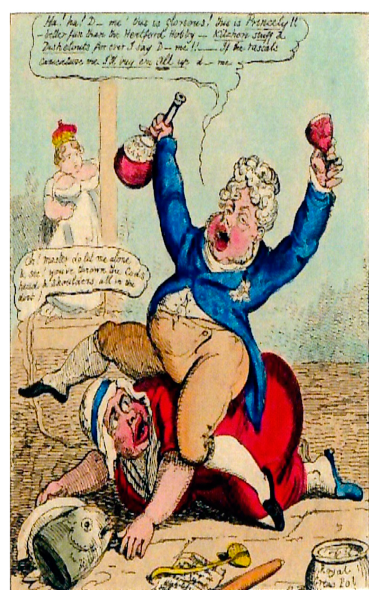
Many similarities arise among the above-written notes in relation to the image in art and what happens in graphics, so that some contemporary authors have been dealing with both painting and graphics and not by chance a ‘manifesto’—a graphic product par excellence—can also be defined as a “story”; even if, in a ‘manifesto’, the presence of textual elements and visual elements is common, and it often happens that all the narration takes place only for images, with the only textual note is represented by the name/brand of the customer (
Figure 2).
2. Materials and Methods
The research theme, therefore, has developed and continues to develop through the creation of a repertoire in a continuous updating of study materials suited to the identification—on one side of the structural constants of visual communication, substantially invariant, although modifiable in composition and, on the other side, of the mechanisms of ideation and design, always up to date. The methods are those of the critical reading of examples and editing of synthetic prospects that tend to analyze individual elements for the purpose of knowledge, comparison and operation.
The graphic material was divided into the main products: starting from the ‘logo’/brand, the manifesto, the packaging graphics, the coordinated image, up to the web communication interface were examined, and for each one of these elements a reading of components was made. Of course, the product that is evidently more complex from the point of view of visual implications is the manifesto, which can therefore be considered paradigmatic for the continuation of work.
The manifesto, in fact, usually encloses the image (visual), the text (the headline and the payoff), and the logo/brand name (potentially both text and image), that is it reproduces the imaging system and text dealt at the beginning. However, it is clear that there is an additional component, often not perceptible in a declared way, that is that of the graphic signs or of those elements, belonging to the image and text world, which however have a different role in relation to the others; moreover, in critically reading a poster (or an editorial page), the role played by the composite grid can not be avoided as it underpins and governs all the perception and fruition of the product.
Ultimately, the essential components of a graphic for communication are text, image, and graphic accessory sign, which are not always explicitly understood: the narration role can, in fact, be given to the image, without any support of the word, so as the word can be considered a single component, enhancing its visual potentiality. Naturally, in the graphics for communication, the presence of the message promoter, whether public or private, for commercial purposes or public utility, will however be inevitable.
A clarification and an example is deserved by the accessory sign, intended as a guide and support to the understanding of the message and the fruition of the product. In this sense, the reference to the page number of a publication is emblematic: number, certainly, yet special, not so much for its form or meaning, but rather its position within its composition. What, in fact, means numbering the pages? It means not only giving a quantitative consistency, but it also means giving the reader the opportunity to find new parts, to mark the suspension point, to move quickly from the index to what is sought and this is achieved by always placing the number at the same point. Here, therefore, the sign-up graphic support and simplification to the enjoyment of an editorial product is the position within the layout.
Starting from the foregoing, the critical reading, pre-requisite to the acquisition of project skills, allows to deal with the operation with not only technical method and competence: in fact, both the text, the images and the graphic signs are no longer untied and separated as different categories, but are organically correlated and mutually incisive.
3. Results
These previous notes about the acquisition of theoretical and methodological informations pertaining to the field of visual and text, have led necessarily, by comparison, to critical considerations and a differentiation of subjects and content on which to experiment them. All this allowed us to define some fundamentals of general validity that support what stated in the title of this contribution, namely to investigate—to make-images as texts and texts as images, separating those applications that should reflect specificity and peculiarities.
These are the main points of contact among visual and textual narrations.
The essential components of communication, that can be reduced to large areas of text, visual and graphic accessory sign, are unchanged;
Relationships and interrelations among components take on similar connotations, but specialize in the two different narrative forms;
Similarities are also found in the determination of theoretical-applicative criteria for the project.
Of course, the basis for these considerations is the determination of some essential features for an effective communication, which is also the subject of researches and publications, of which only a brief start is given, quoting, in particular, the presence of a unicity of meaning (and perhaps above all, obtained through the report of the sign-both verbal and visual-with the context understood as the recipient's ability to understand the message transmitted through their skills, leading to the exclusion of any interpretative ambiguity); the essentiality and readability, which lead to the facilitation of the immediate comprehension of the message; the effectiveness of the design choice, which implies easy memorization of both the sign and its contents.
To this end, further necessary premises are those of the identification, of the explanations -and through exemplifications-of the sharing of the concepts of “icon”, “symbol”, “model”, “stereotype”, and also of the main enunciations of the meanings of “language” and “translation “. Parallelisms have taken place among oral, written and visual narratives, with particular attention to genre hybridization phenomena, including acting experiences with audiovisual media, graphic novels, and so on. Also for these premises, please refer to the detailed discussion of the reasoning and of the critical readings that led to their formulation, contained within volumes and conference proceedings.
As for the third identified component, or the accessory graphic sign, a separate discourse is necessary for the color within the communication products, examined in its various meanings, but above all for its role of fundamental help and support to the understanding of what is displayed. Again, chromatic variations can be related to predominantly iconic or symbolic meanings, and can also intervene heavily in the structuring of reference models, real functional parts of the project itself; this is clearly highlighted in some cases, for example, that of the “yellow” color to identify a well-defined literary genre, first an iconic referring to the color of the covers of Mondadori of publications to police content but, later on, a code, corresponding to the specific narrative category in the broad sense, whether it is literary, whether cinematic or theatrical.
In conclusion, it is critical to read the potentialities and limitations of communication, seen in its possible and recurrent structuring, from the assertion (partially verifiable, partly provocative) that the image is potentially an universal language, while the language is, for itself, not unifying: texts and signs often coexist, sometimes destroy one another, but always constitute visual and narrative forms of well-sighted languages. Knowing how to propose “right” images to understand what is being proposed is a solid foundation for a conscious, targeted, accessible and shared communication project, an indispensable element for improving the quality of contemporary life. The reduced use of written information, for example, reduces the margins of isolation and marginalization of those who are unable to understand the language as best as possible and help the sharing of visual models.
4. Discussion
An acquired awareness in the use of texts and images depending on the purpose of the communication, the reference context, and the target destination leads to a reading of the technical elements substantially different from the traditional one, based on the object's objective structure. In this sense, the notions will no longer be “memorized”, but will be remembered for their perceptive meaning, with a greater guarantee of the information permanence; the typographical characters identified by name leave room for the definition of their “family” of belonging, the composition of the text is linked to the general layout, the use of the communication gives valuable information about the proportioning and readability. In addition, the subdivision into text, image and accessory graphic sign clarifies many design potentials and paves the way for interesting experiments (
Figure 3).
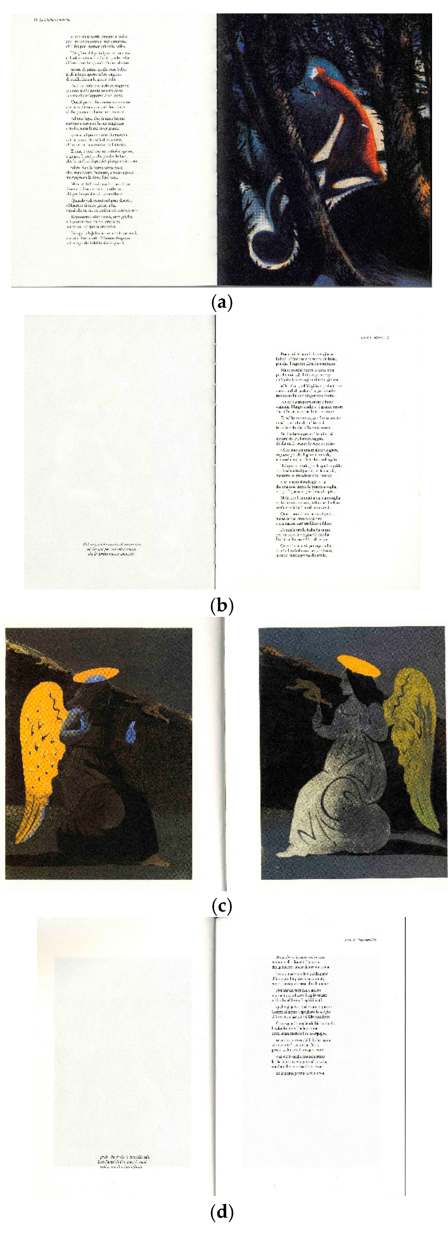
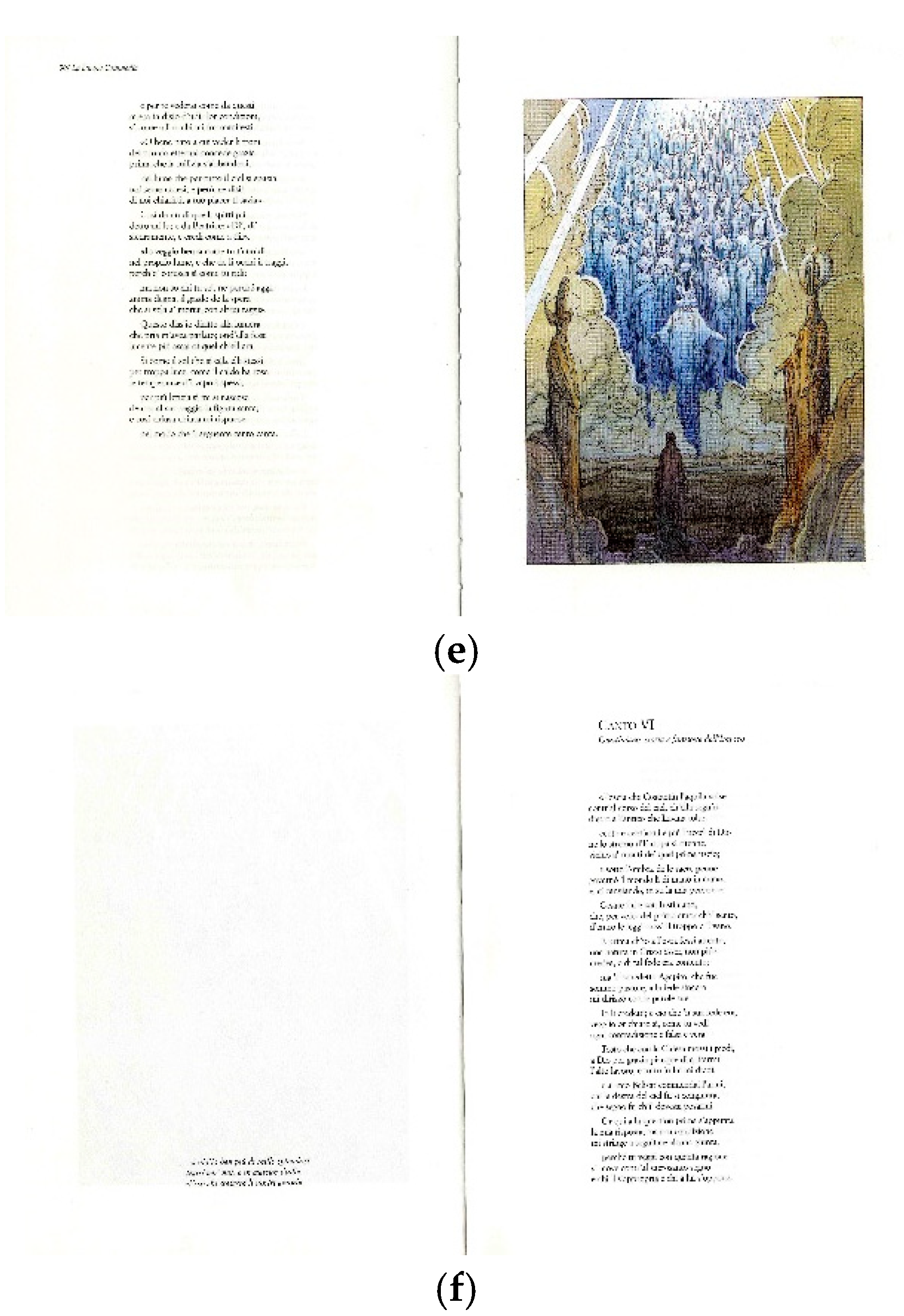
Interestingly, however, it seemed to reason on hybrid transmission patterns of narratives, in which text and image are both necessary to understanding the meaning; in this sense, the world of publications with a set of separately illustrated tables and referring to the text appears at the same time continuous and far: encyclopedias, luxury volumes, great classics, but also school texts and texts dedicated to childhood have been and continue to be compounded in this way, by repeating sentences or words inside the volume to visually zoom in on a concept, a situation, a character. Certainly also choices that are functional to the technical capabilities of the historical period of belonging or for reasons of economy and maximum performance of color images, for example, but can also be a well-defined design choice; over time, in fact, it has been attempted to solve the question of the verbally explained image by organizing a single space and, at the same time, in the contemporary there have been perpetuated choices such as those described above for repetition and explanatory caption, even in prestigious works (
Figure 4a–f).
It is enough to remember a single example for each design choice, starting from what it is termed as an ancestor of the modern cartoon, namely the Annunciation of Ambrogio Lorenzini and, conversely, the case of the Divine Comedy illustrated several times, edited both with tables inserted and endowed with repetition of the reference track with the function of reference and caption, certainly carried out in epochs away from ours (all the Dorè edition), but also at contemporary time (the interesting work carried out by the editions Nuages with the assignment of each of the three parts-Inferno, Purgatory and Heaven- to as many art charts as Mattotti, Glaser and Moebius).
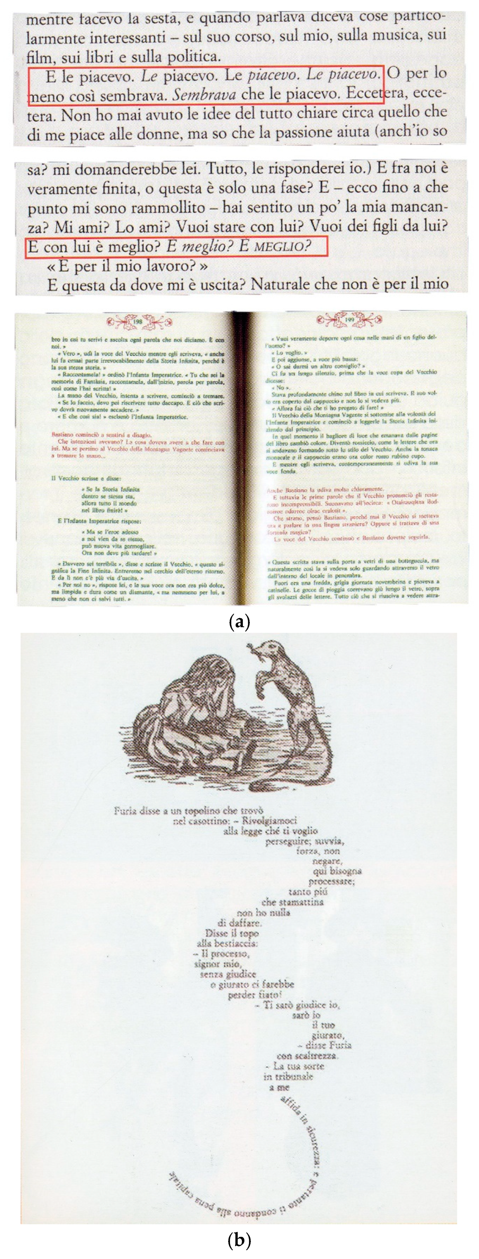
Finally, interesting and intriguing is the use of textual elements written in different shapes within the same text to make some information superfluous and/or to express in an effective and strong way an attitude of the subject at that time protagonist: different chromaticities clarify the reference point of the action (red and green colors to identify the World of Men respectively from Fantasy in the book “The never ending story” of M. Ende), typographical families identify the interlocutor (for example in the book “
L’élegance du Hérrison” by M. Barbery) and different treatments of the phrases mimic the physical attitude (the reiteration of the phrase
is better? That becomes highlighted in italics and then in italics and uppercase in the book “High Fidelty” of N. Hornby). Finally, text made with iconic visual forms suggests reference images, word meanings, character behaviors, as well as emphasize the book that narrates the adventures of Alice and the composition of the text increasingly increasingly rarefied and incomprehensible contained within the “Very strong, incredibly close” volume by J. Safran Foer, which gives the exact perception of what is happening within the brain of a person suffering from mental illness (
Figure 5).
N. Hornby “High fidelity”, in this case the change of letters style-up to capital letters-underlines the emphasys of the words; M. Ende, “Never Ending story” in this case the colour is used as an additional graphic sign in order to distinguish different realities.
5. Conclusions
What has so far been exposed has allowed a “visual culture” to be promoted even in subjects not directly involved in the representation, but however involved as experts in the writing of communicative texts; in short, scholars and professionals who work side by side with visuals and who, consequently, must have some technical knowledge and, above all, a critical conscience about the composition system of a message. In a similar way, also image editors must have the same methodological tools of understanding and awareness of the link between the word and the sign.
The logic of approach to the diffusion of research was precisely that of the overturning of the meaning of writing and representation, accompanied by a reversal of the design logic. The proposed operating technique was that of developing activities increasingly aimed at the training of those who deal mainly with texts, to direct them and involve them in the acquisition of critical reading tools, as well as—on the contrary—for those who are accustomed to reason only in perceptual terms, to make them understand the bond and the consequent consistency that has to link the stylistic textual choices with the visual ones; an essential constraint not to lose sight of the primary purpose of the study program.
The products obtained are very interesting: a personal search of only visual narratives and of images made only with texts; the ability to make text perceptibly imminent, albeit long and technical, by introducing graphic support aids for reading, such as bold, spacing, and lists; working with typographical characters to animate the tale and get an immediate and intuitive understanding of the roles played by the protagonists; translating informations and writing information into images, and so on.
Ultimately, we have tried to emphasize how the ability to understand the image as a text also leads to establishing a connection between “creativity”, written composition and visual elements, with the consequent discovery of communicative languages; emblematic, in this sense, the case of icons and pictograms that, for example, in signposts, translate the word into sign, using both visual realistic languages—even if simplified and stereotyped languages—as well as codes.
The representation therefore changes its substance, no longer technical, nor support, nor just foundation, but an actual downright project.
