1. A Research in Progress
The main objective of this research is to experiment, through infographic representation methods [
1] (p. 31), the informational complexity revealing the phenomenon of the abandonment of small centers in Abruzzo in its various declinations and expressions. This paper is a further step of a wider research, conducted by some professors of the Pescara Architecture Department, which investigates the conformation of some small centers through the combination of representations, infographics, texts and photographs. The study experiments on the field an analytical methodology, aware that the understanding of the contemporary material, social and demographic conditions of the settlements is an indispensable starting point for any future regeneration process. In this contribution, the focus is placed in particular on the demographic dynamics, spy and warning signal fundamental to understand, through consolidated trends, which of these centers are destined in a short time to disappear. Starting from common indexes for the analysis of trends and demographic structure such as the Elders Index, the Foreign Population Index, the ‘Elder per child’ Index, the Dependency Index and so on, the essay brings up a fundamental question: How to transpose, through iconic, highly meaningful and empathic images, statistical and demographics data generally impersonal and little comprehensible to an unprepared eye? It is, in essence, to elaborate an infographic system that expresses with clarity, but also with human participation, data relating to social and economic issues that affect thousands of citizens of these territories in abandonment. The research, therefore, aims to integrate mainly three disciplines: drawing, representation of infographics and demography.
This research operation is fully aware of the fact that nowadays we are completely immersed in a saturated space of information and data. We talk more and more about “smart” cities, intelligent because they can adjust themselves in line with real-time monitoring of every aspect of society. We have more and more advanced and updated physical space measurement and recording tools that are constantly questioning measurement units and scale (we just think about the importance of today's big data, that is, huge sets of heterogeneous data from any kind of instrument or digital platform, whose bulk of data travels on the order of Zettabyte, or billions of Terabytes). The physical world is crossed and woven by new intangible infrastructures, such as the Internet, which help to return an image of the multidimensional and reticular space. All this emphasizes the importance and the need to discover more and more refined modes of representations: to transform information into knowledge, through icons, diagrams and maps, is an essential challenge that our world of networks, but also the material one at a local scale, poses to us while it becomes increasingly complex.
2. Drawing to Communicate Complex Information
Contemporary reality appears to us increasingly opaque and inscrutable nonetheless—or perhaps just for that—the plethora of increasingly sophisticated and powerful digital instruments and the seemingly infinite sources of available information. The world has gained a depth of exploration and a wealth of alternative and conflicting narratives. Its multifaceted and changing appearance needs to be analyzed, interpreted and rendered intelligible through representations and visualizations that can alternately play the role of a guide, a navigator, a magnifying glass or binoculars to explore a complex and fickle environment. Nowadays, the drawing appears to be an important tool to unveil and reveal what is hidden between the folds of data and information. The ability of drawing to show ideas and processes in a direct and intuitive way has evolved over time by becoming a fundamental tool for knowledge, analysis and communication of articulated processes—we think, for example, of its principal role in all phases of the architect’s work—, but it is also place, or rather, “space” of confrontation and emergence for the many forces that interact in creative or organizational dynamics. The space of the drawing, therefore, becomes the ground in which two different and synergic forces act: on the one hand, a descriptive activity of reality that, at the same time, is based on scientific and shared fundamentals, and formulates sufficiently secure and firm descriptions on which to build hypotheses and projects; and, on the other, an adaptive ability to deal with and manage the inconsistencies and transformations of a complex system. It is essentially a matter of providing a working field, a model (theoretical and pragmatic) that is both reliable and flexible to the extent that it allows to “see” and “act” in a constantly evolving reality. In this scenario the action of “seeing” is particularly important and connects with the ability of those who deal with visualization to recognize patterns in an apparently chaotic and continuous set (vision) to make them later recognizable by others, choosing a suitable representation model (visualization) on which to make choices or projects (prevision). From here we understand the reason why in recent years data visualization has gained such importance in every scientific and informational domain. In addition, visualization as a means of investigation and understanding reality is oriented to translate into visual form alphanumeric data, statistical or material, but also more elusive information such as intangible qualities and relationships. In this sense, they are not simply transpositions from an alphanumeric medium to another visual but they are “narratives” offered to be interpreted in many ways by readers.
If we remember Giovanni Anceschi’s seminal studies on communicative interfaces [
2], data visualizations are special forms of “artifacts” designed to create informational and narrative contexts that can interact with users with heterogeneous skills and abilities. Data representations, visualizations, and diagrams serve as common background to extract knowledge from real data and to jointly design projects and solutions to concrete issues. They are versatile and sophisticated tools to improve cognitive and decision-making processes since, by cutting disciplinary boundaries and language conventions, they allow all observers involved to participate actively. These forms of visualization are drawings because are traces drawn on a surface to signify a practically endless possibility of messages. If we consider Gilles Deleuze’s definition of abstract machine [
3], the diagrams, here understood as any form of graph in which “data is encoded with symbols having different shapes, colors or proportions” [
1] (p. 28), are not influenced by the technique and material they are made of but they act as powerful tools to manipulate ideas. At the same time, information drawings are useful tools for seeing and acting on a limited set, they are meaning connectors among the world, its reading, and its possible evolutionary trajectories. Being particular interpretations of the world through specific viewpoints, every form of visualization—from diagrams to timelines, from maps to graphs—expresses a vision of reality that, within the scientific and methodological limits that it poses by itself, is imprecise and not exhaustive. This intrinsic contradiction that moves smoothly between the extremes of reliability and imprecision forces information designers to respect a strict ethical and scientific code during each phase of the elaboration process of these graphical interfaces. It is for this reason that Alberto Cairo, when summarizing the indispensable characteristics that every visualization should have, so that it can be regarded as worthy, places truthfulness in the first place, namely the honesty of admitting that the representative model is neither perfect nor complete but fairly valid [
1] (p. 95) to be able to shed some light on a particular phenomenon and based on sources, data and methods made public. The realization of these visual artifacts, therefore, follows a path that starts from the accurate analysis of the initial data, identifies the most suitable and functional representative models regarding the purpose to be achieved (choosing the scale and the detail level of the representation), arriving to underline remarkable points or breaks within a discrete set that is taken as an exemplifying model of reality. Thanks to the power of images, it is possible to reveal hidden meanings that help to understand phenomena that, due to their complexity, would remain opaque to knowledge. In addition, as highlighted mainly by the increasingly massive use of infographics in the information world, drawings are able to raise public awareness about issues that are difficult to comprehend. Visualizations are the result of a process that select and enunciate a meaning emerging from an information set that is not only visual, but combined with texts and numbers to provide viewer/reader with multiple comprehension tools. They are representations of ideas, stories, narratives that can be read at “first glance” and then deepened discovering new information and layers of meaning. Within this area in constant evolution, drawing lends itself by its very nature to create images that can stimulate, intrigue, provoke, fascinate or, more simply, provide a context on which to debate and take a stand.
The challenge of graphic visualization is to find out which of the visualization models are the ones that are best suited to the observers’ cognitive abilities, to their reality decoding tools and their acquired knowledge, in a few words, to their reading and graphic literacy. To translate real data into a visual model can be read in parallel with that one, in architectural drawing, has always been the main problem of representation, that is “to translate” a three-dimensional object into a two-dimensional surface through the principle of projection and section [
4] choosing the representative method or model (orthogonal projections, axonometric projections or perspective) that best suits the specific purpose of the drawing. As in architectural drawing, data visualization has the undeniable advantage to create a tangible representation of reality, albeit discretized and simplified, on which to act indirectly, simulating transformations, performing analysis and assuming solutions. A visual data model offers a sort of privileged view of the whole that we want to study by helping the observers/agents to have intuitive and multifaceted cognition of the relationships among the parts, of the variables in the game, and of the possible future behaviors and trends be starting from the past. Moreover, these graphics allow us to understand with incisiveness and immediacy how our world is actually a complex and interconnected system in which every single action has repercussions that reverberate in a more or less sensitive way in space and time. And this informed view could lead to more responsible choices from a social, economic and environmental point of view. We think, for example, about journalistic apps, those visualizations that allow us to query a certain model by altering some variables to understand what correlation exists between the data displayed and the lives of each one. It is a new way of considering graphics that, thanks to digital technology and real-time interaction, become real simulators, data processors, or visual databases as in Propublica’s News Apps [
5] and in The Wall Street Journal’s Interactive Diagrams [
6]. New data representations can become effective visual cognitive tools as they can make complex concepts easier to grasp and highlight hidden interconnections. To do this it is necessary to expand the classical languages of visualization going beyond usual maps and diagrams and overcoming the topological and geographic metaphors. In addition to displaying points in space and time, it is advisable to look for models that can translate into images energy fields and power relationships between variables and stakeholders within a specific set. We need graphics that describe reality, but that also give space to the imagination; solid representations, as regards to methods and accuracy of the data, but, at the same time, open to new and unexpected interpretations. The numerous and increasingly articulated theoretical reflections that accompany the information design discipline and the ever-increasing number of examples on the media are the sign of a conscious and innovative approach to the representation models and proof that Complexity Design is acquiring more importance within different areas spanning from design to communication. Those who are involved in representation will increasingly need a wealth of innovative techniques in order to face the challenge of complexity and a research environment where it will be possible to converge and collaborate different multidisciplinary skills.
4. Drawing Depopulation
The graphic designs presented here are an opportunity to investigate the semantic code and the translation process that information can undergo through the drawing. The graphs elaborated are the result of an exploration of the ways in which drawing can take a new role in relation to the different types of demographic data at our disposal, allowing us to understand, and then act, in the intelligible space of information. Regardless of the technological tools used, data mining software, real-time views of datasets or just paper and pencil, this research aims to explore one of the fundamental functions of drawing, that is, to communicate in a simple, direct and empathic way. In the approach of this research, I started trying to pursue two goals: to elaborate a description of the fact of the small and tiny villages in Abruzzo updated to 2017 and to understand what transformations these sample centers have been undergoing in the last twenty years in terms of statistical and urban planning. Before starting, therefore, it was necessary to delimit the survey field by using as a key criterion the absolute number of residents in municipalities. According to the Confcommercio and Legambiente report
1996/2016. Eccellenze e ghost town nell’Italia dei piccoli comuni [
8] a municipality is considered “suffering”, at the risk of settlement discomfort, when it falls below the 5000 inhabitants (the so-called Small Municipalities [
9]). However, this data for Abruzzo opens up a series of cases too large to begin the research. In fact, according to ISTAT data referring to 2017 [
10], in the Region there are 249 municipalities with these characteristics compared to a total of 305. In practice, 82% of Abruzzi municipalities are at risk of depopulation. Going to study even better the data, among these 249 municipalities, 196 have less than 2000 inhabitants—64% of the total—and 58 less than 500 inhabitants—19% of the total—. It is precisely on these 58 municipalities that the first phase of the investigation has been concentrated (
Figure 1), since these are almost uninhabited centers whose risk of extinction is particularly high.
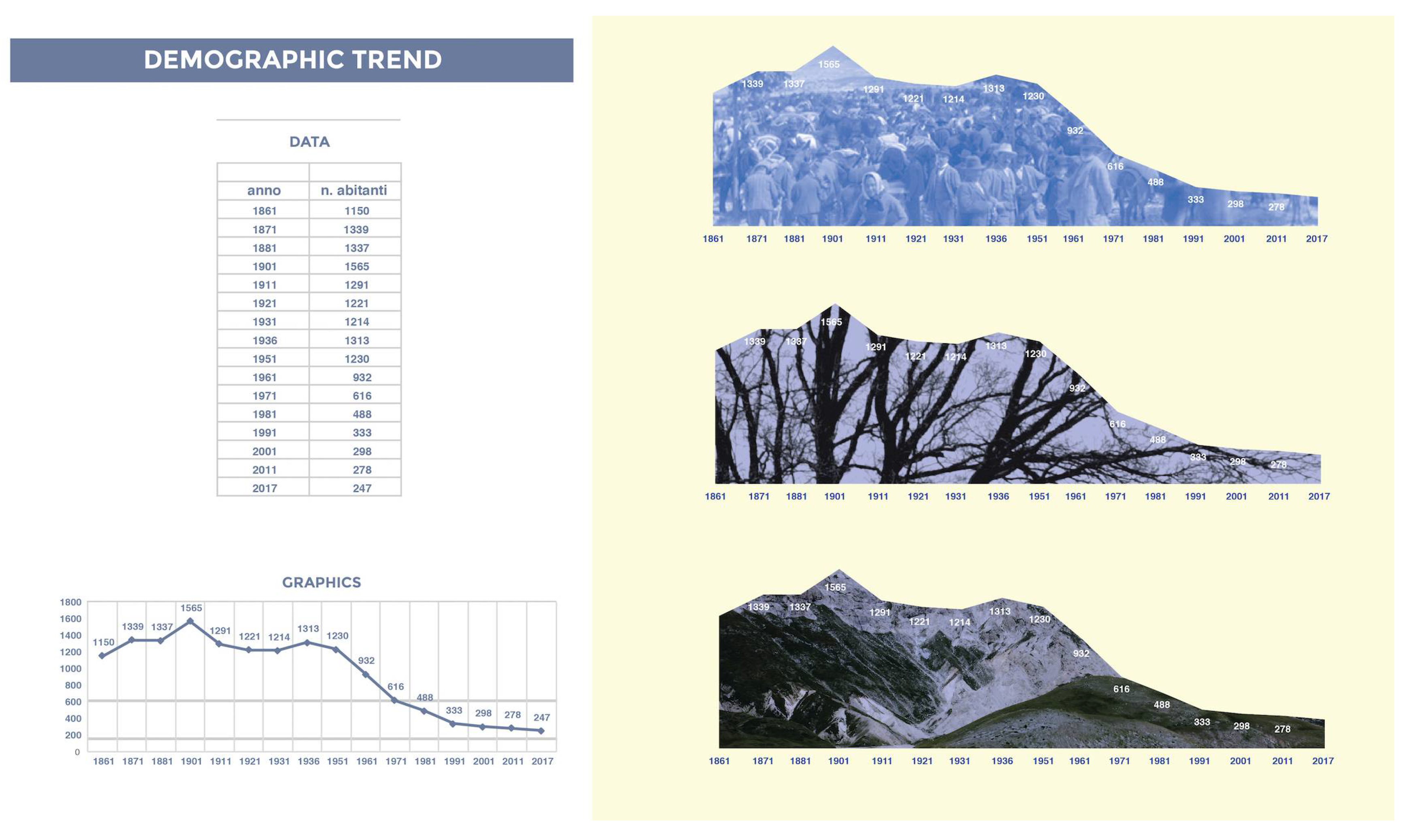
A first part of the research, which is not the subject of this essay, deals with the drafting of thematic maps in which the 249 municipalities have been identified with regard to population aging and depopulation distribution. The second part deals with the detailed description of the 58 municipalities with less than 500 inhabitants through an infographic that includes some basic statistical data to capture population structure and demographic trends. The indicators chosen for these “infographic exercises” are: the demographic trend from 1861 to 2017; The comparison of data by gender and age groups (0–14, 15–64, +65); The percentage of foreign population relative to the total resident population; The ageing index. The case study I choose is the municipality of Corvara, a small town in the province of Pescara that counts 247 inhabitants on the 1 January 2017,. It is worth pointing out that these “exercises in style”, to quote Queneau's famous text [
11], are ongoing experiments that do not want to be exhaustive or definitive but represent possible outcomes of a graphical process to explore alternative views, if we want more empathic and allusive, of classic statistical information. They are stylistic variants played on visual assonances, rhetorical figures, word/images games, figurative rebus that show us how, in the visual language, there are implicit endless potentials that can be left free to express themselves.
Demographic trends. The diagram (
Figure 2) depicting the evolution of the number of inhabitants in the Corvara Municipality is perhaps the most explicit in describing a decline that appears to be swinging until 1951 and then undergo a sharp decline with a percentage variation in the population of almost −100% in 1971. In practice, over the course of twenty years the population has halved and continued to shrink even if with a smaller percentage variation. If the trend were constant, in absence of new births or immigration phenomena, the town would become completely uninhabited over the next fifty years.
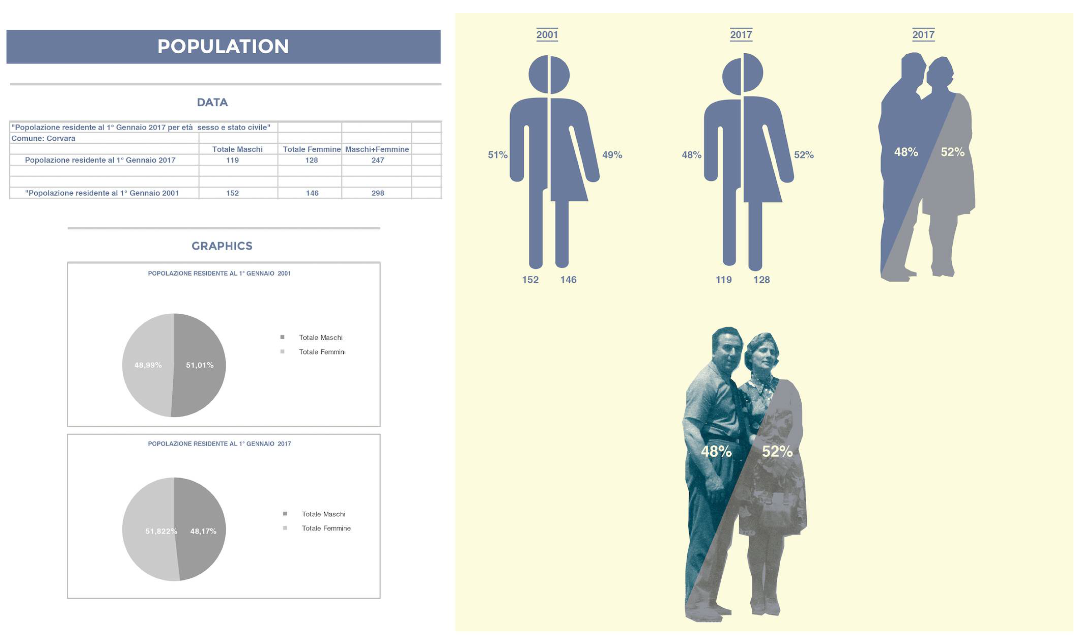
Population. Another useful indicator to describe the state of the resident population is the ratio of the number of male and female residents (
Figure 3). This indicator has been studied comparing the years 2001 and 2017 and highlights a reversal of the trend linked to the general ageing of the population where the female life expectancy is on average more than the male one.
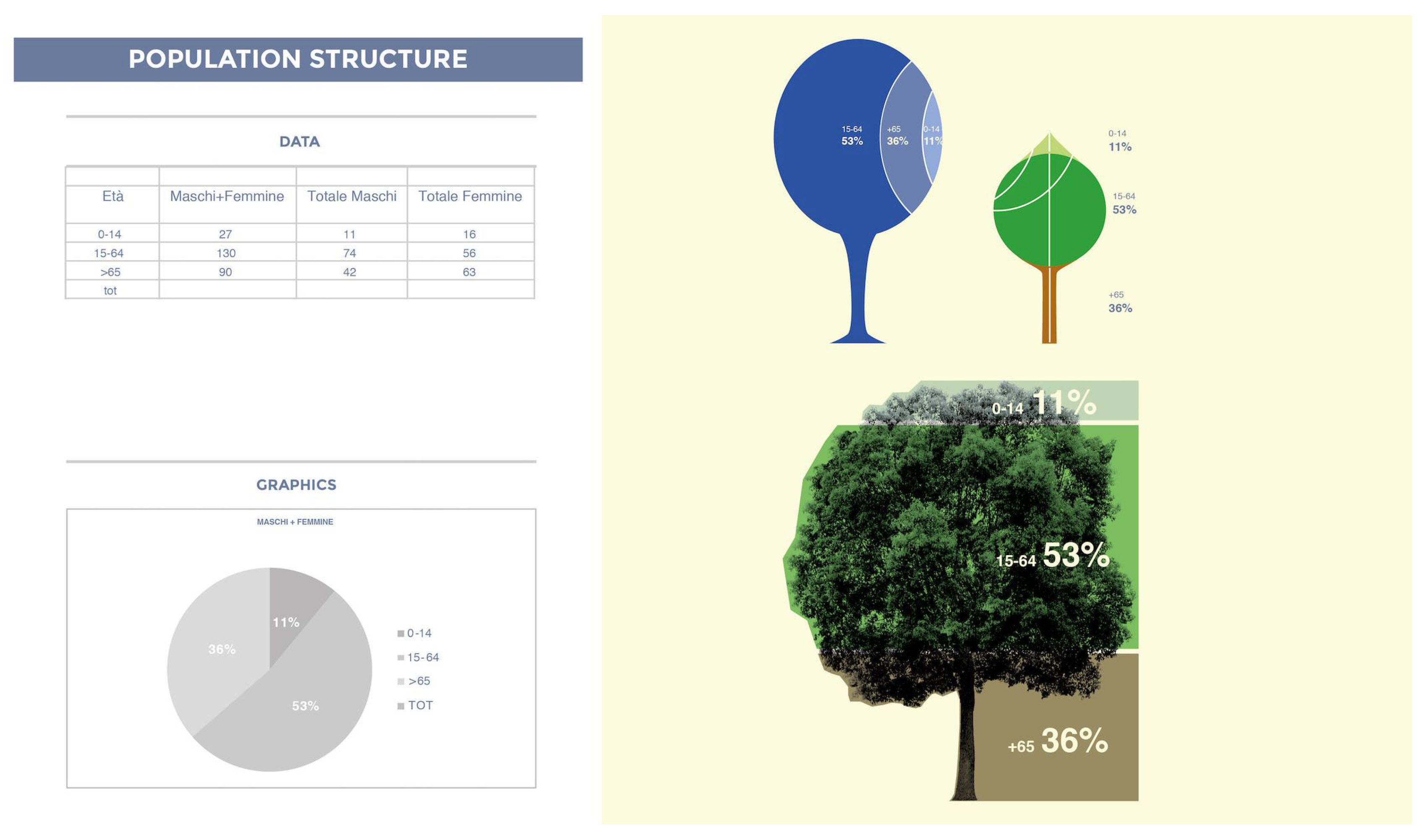
Population Structure. The three age groups describe the structure synthetically by identifying the two extreme parts, children and the elderly, in relation to the middle part (
Figure 4). This is a simplified version of the population (or age) pyramid, whose purpose is to represent the demographic history of a population and its trend. Generally, a population is considered to be growing when the percentage of elderly people is much lower than that of children; it is zero growing when the three percentages are equal; it is shrinking when the percentage of the elderly is greater than that of the children. In this case, I tried to find an iconic image that symbolized the population in the form of a living organism, such as a tree. The parallelism, here, is established between the base of the tree, i.e. the elderly population, the canopy with the age group between 15 and 64 years, and finally the summit part with the youngest part.
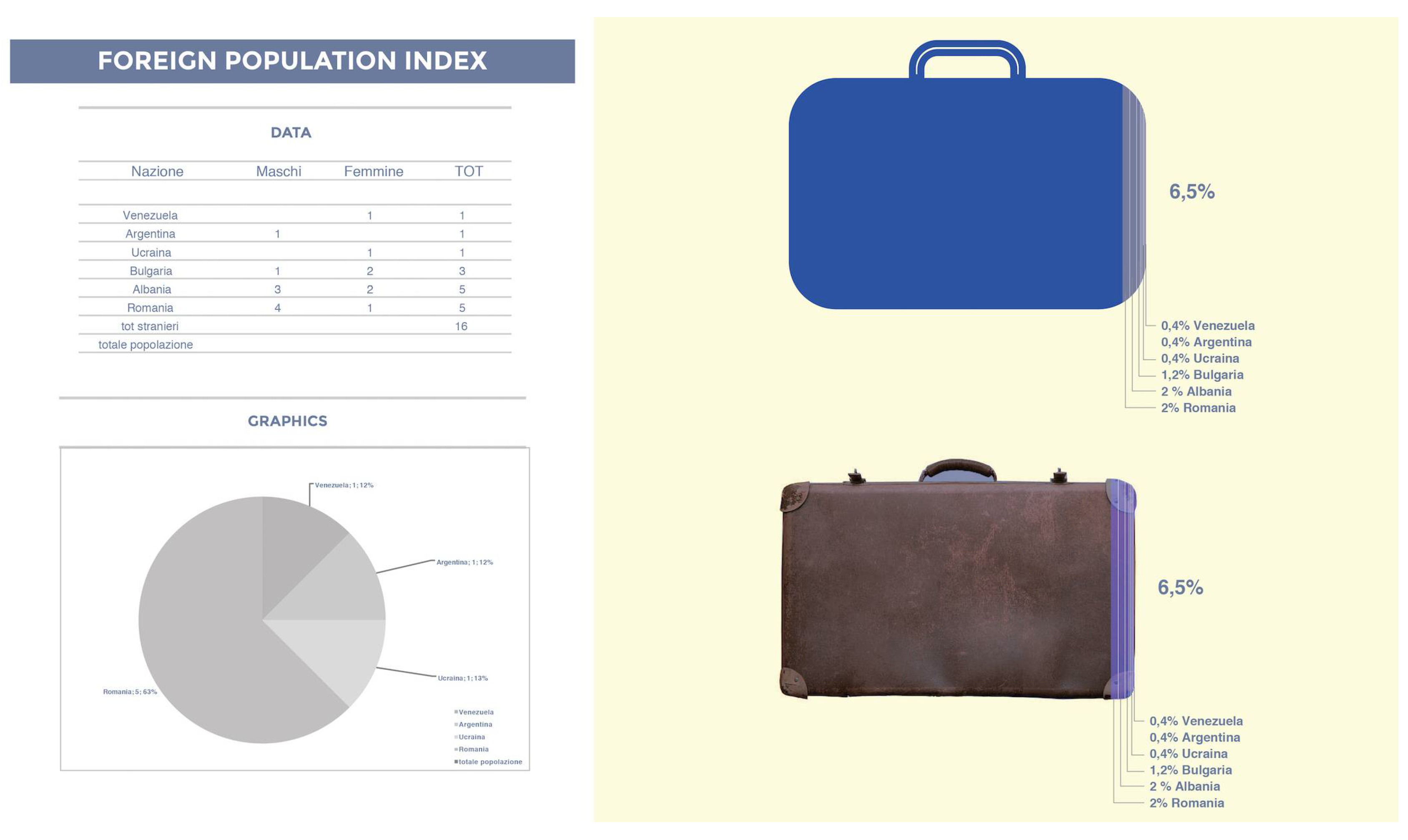
Foreing Population Index. This index, reported at 2017 (
Figure 5), shows the percentage and origin of the foreign inhabitants. To better convey the message it was chosen to use the metaphor of the suitcase that draws the idea of the journey but also that one of the emigrant.
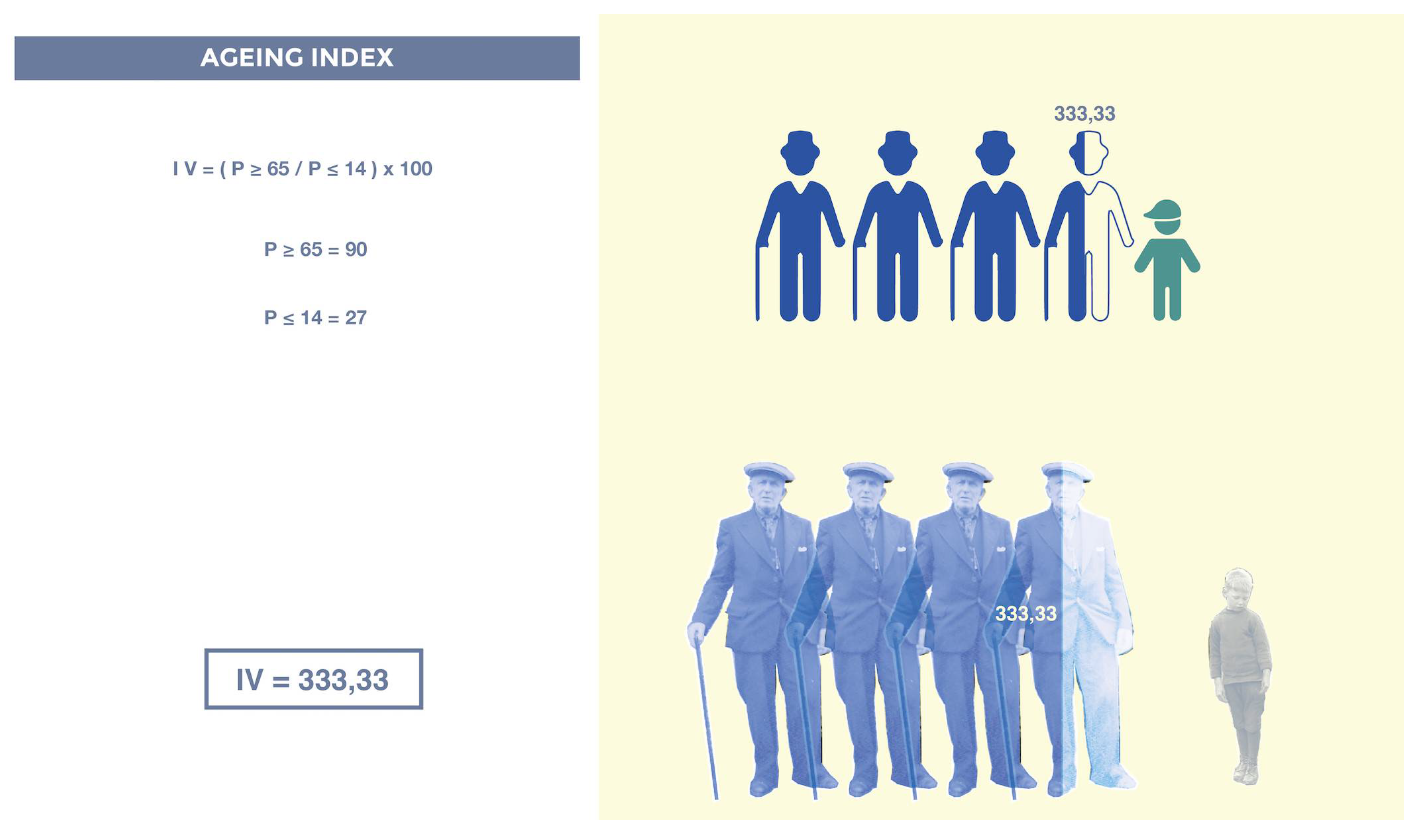
Ageing index. The ageing index is a statistical indicator that describes the weight of the elders in a given population, essentially expressing its degree of aging (
Figure 6). It is defined as the relationship between the elderly population (65 years and older) and the youngest population (0–14 years): Values above 100 indicate a predominance of elderly compared to young people. It is a bit rough but useful indicator, since when a population ages there is generally an increase in the number of elderly people and, at the same time, a decrease in the number of younger subjects. Therefore, in the fraction numerator and denominator vary in the opposite direction, highlighting the effect of aging of the population. We can observe that in the last survey reported in 2017 there are 333.33 elders per 100 young people in Corvara, while in Abruzzo there are 147 (in 1971 there were 52). Considering only the total of municipalities below the 500 inhabitants of the provinces of Chieti and Pescara, the indicator varies in a wide range spanning from 176.19 of Borrello (CH) to 1342.86 of Dogliola (CH). In the case of Corvara, its data (333.33) can be interpreted more easily by dividing it by 100: for every single child between 0 and 14 years there are 3.33 elderly.
5. Conclusions
In this paper, two different themes are intertwined and represent the pulsing heart of the overall research. On the one hand, the theme of depopulation of small and very small Abruzzi centers and on the other hand the increasing capacity of drawing to give substance and voice to complex processes and systems through refined tools in which graphics and statistics are synergistically combined. Moreover, it is no coincidence that today the general attention is focused on small centers thanks to the decision of Mibac to dedicate 2017 to the Italian villages [
12], small towns that the Strategic Development Plan of Tourism defines as a fundamental part of the country’s cultural and tourist offer. The survey of these villages, and the subsequent construction of a hybrid atlas, is part of this renewed interest and proposes a story of places that, from the present state, makes also possible to imagine a feasible future. This research, in which drawing, cartography, statistics and infographic are combined, therefore aims to highlight those energies capable of transforming situations of crisis into moments of change and evolution respecting the defense and enhancement of a legacy of memories and resources in the way of deletion. In a context characterized by the progressive thinning of the spaces of history, it is important to use all our instruments to protect cultural heritage starting from a its constant and careful documentation and interpretation activity. In this logic, to represent the existing world, either it is material such as architecture or abstract as data, is the first, crucial, step before any activity. It is from this double focus inside representation—the first one pointing to the physical space through cartographic drawings, the second one to the fluid space of information—that we have tried to trace a path that exploits the power and versatility of drawing. The attempt is to consider both the reflections oriented to the present, made up of interactive big data visualizations, and the classical reflections regarding the principles of descriptive geometry to articulate a reasoning that highlights the ductility and effectiveness of drawing in delineating the functional articulations of a complex system. The reflection about the reasons of the diagrammatic thinking and about the graphical representation strategies for information and process, becomes more and more important as we realize that we are surrounded by visual architectures in which images and information mingle and support each other, visual artifacts that allow us to access to a depth of information before unimaginable. The challenge for those who work on creating and manipulating images is twofold: first, to use in a wise and transparent way the mechanisms that regulate from within seemingly simple and immediate visual artefacts working together to create and nourish that visual culture that permeates our connected existences; Secondly, to keep together, at the same time, art and science, conservation and design, representation and visualization.


